Embed Size (px)
Citation preview
Beyond Memorability: Visualization Recognition
If Lin
Michelle A. Borkin et al., 2015
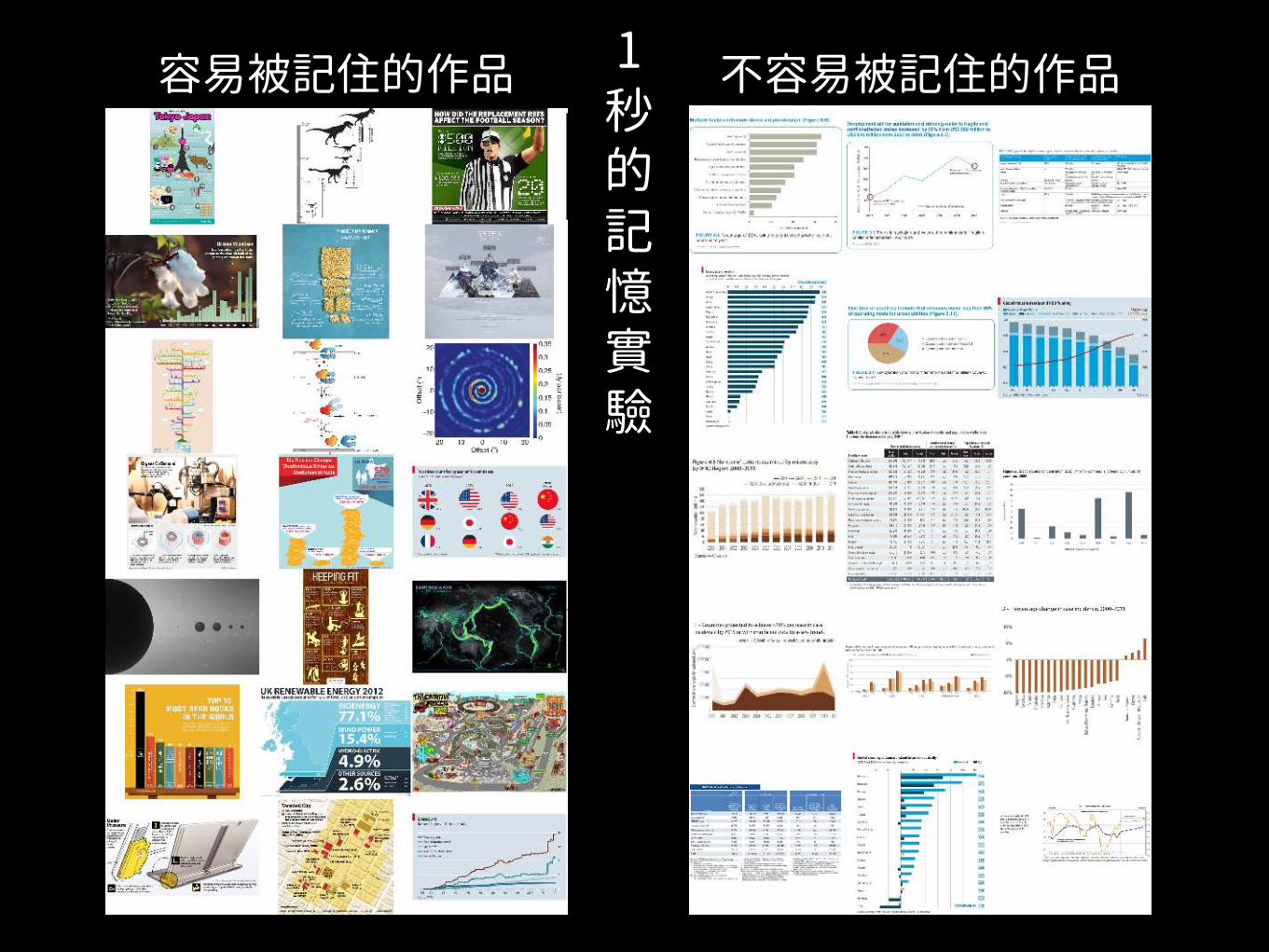
1秒的記憶實驗
容易被記住的作品 不容易被記住的作品
延伸探討• 探討如何有效記憶
• 人們會注意視覺化作品中的那個元素幫助記憶 • 給予更多閱讀時間,對視覺作品的記憶會有什
麼差異?
• 探討如何有效傳達訊息 • 會使用什麼資訊或元素辨識視覺化作品? • 會如何回憶描述一個視覺化作品?
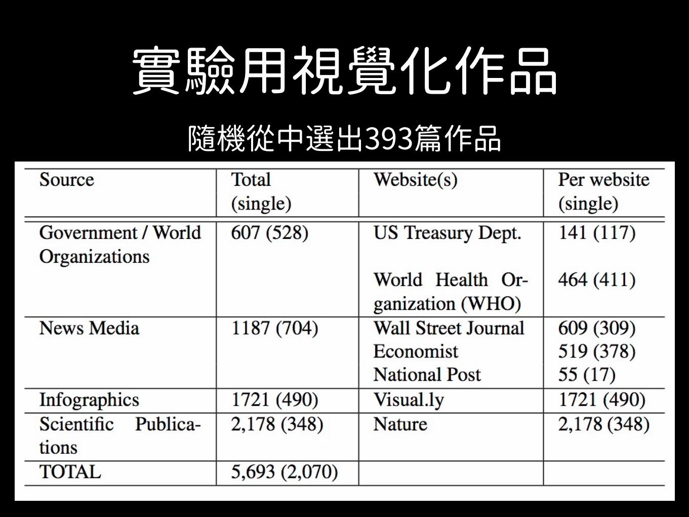
實驗用視覺化作品隨機從中選出393篇作品
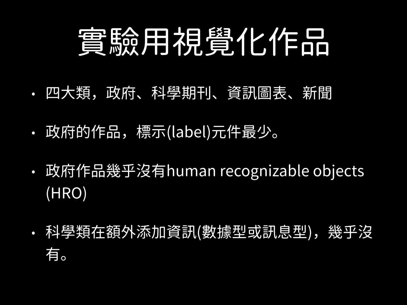
實驗用視覺化作品• 四大類,政府、科學期刊、資訊圖表、新聞
• 政府的作品,標示(label)元件最少。
• 政府作品幾乎沒有human recognizable objects (HRO)
• 科學類在額外添加資訊(數據型或訊息型),幾乎沒有。
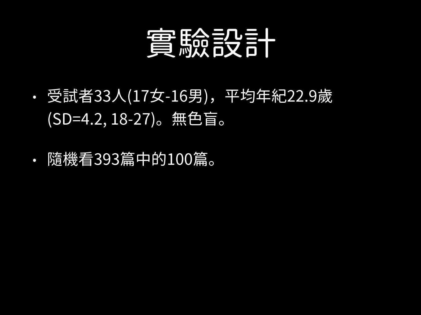
實驗設計• 受試者33人(17女-16男),平均年紀22.9歲
(SD=4.2, 18-27)。無色盲。
• 隨機看393篇中的100篇。
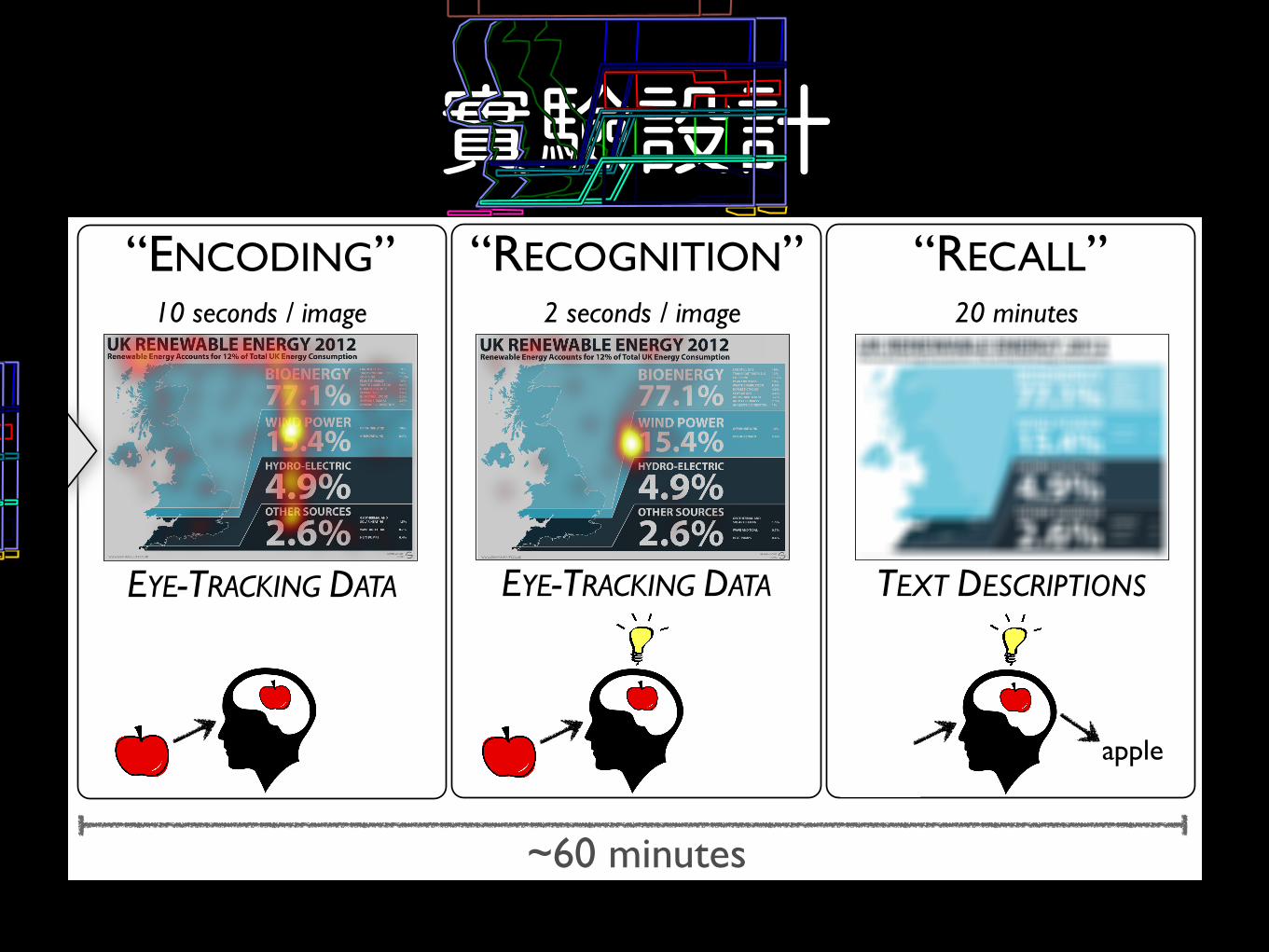
實驗設計THE EXPERIMENT“RECALL”“ENCODING” “RECOGNITION”
EXPERIMENT DESIGN
Encoding
Recognition Recall
LABELED VISUALIZATION DATABASE
393 visualizations
apple
~60 minutes
EYE-TRACKING DATA
Encoding
Recognition Recall
10 seconds / image
Encoding
Recognition Recall2 seconds / image
EYE-TRACKING DATA
Encoding
Recognition Recall20 minutes
TEXT DESCRIPTIONS
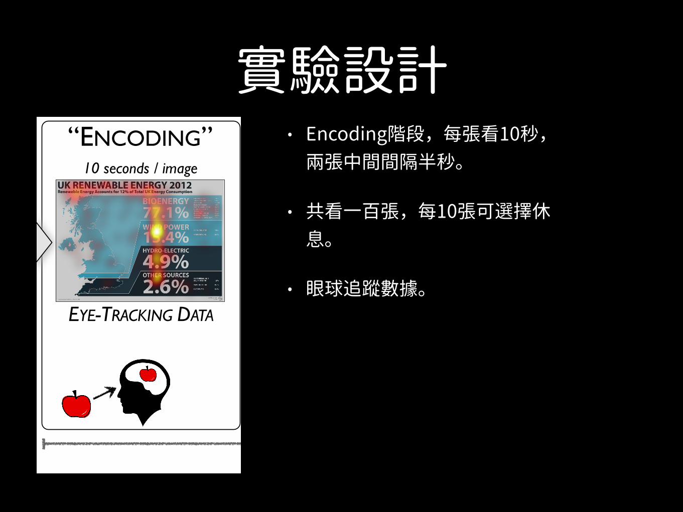
實驗設計• Encoding階段,每張看10秒,
兩張中間間隔半秒。
• 共看一百張,每10張可選擇休息。
• 眼球追蹤數據。
THE EXPERIMENT“RECALL”“ENCODING” “RECOGNITION”
EXPERIMENT DESIGN
Encoding
Recognition Recall
LABELED VISUALIZATION DATABASE
393 visualizations
apple
~60 minutes
EYE-TRACKING DATA
Encoding
Recognition Recall
10 seconds / image
Encoding
Recognition Recall2 seconds / image
EYE-TRACKING DATA
Encoding
Recognition Recall20 minutes
TEXT DESCRIPTIONS
實驗設計THE EXPERIMENT“RECALL”“ENCODING” “RECOGNITION”
EXPERIMENT DESIGN
Encoding
Recognition Recall
LABELED VISUALIZATION DATABASE
393 visualizations
apple
~60 minutes
EYE-TRACKING DATA
Encoding
Recognition Recall
10 seconds / image
Encoding
Recognition Recall2 seconds / image
EYE-TRACKING DATA
Encoding
Recognition Recall20 minutes
TEXT DESCRIPTIONS
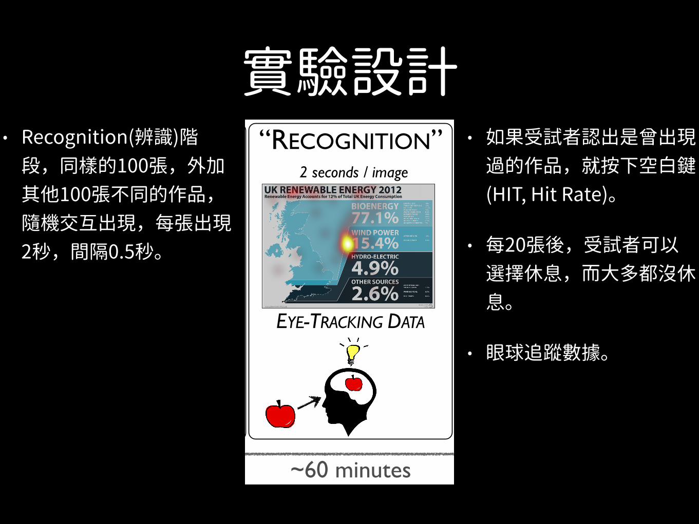
• Recognition(辨識)階段,同樣的100張,外加其他100張不同的作品,隨機交互出現,每張出現2秒,間隔0.5秒。
• 如果受試者認出是曾出現過的作品,就按下空白鍵(HIT, Hit Rate)。
• 每20張後,受試者可以選擇休息,而大多都沒休息。
• 眼球追蹤數據。
實驗設計THE EXPERIMENT“RECALL”“ENCODING” “RECOGNITION”
EXPERIMENT DESIGN
Encoding
Recognition Recall
LABELED VISUALIZATION DATABASE
393 visualizations
apple
~60 minutes
EYE-TRACKING DATA
Encoding
Recognition Recall
10 seconds / image
Encoding
Recognition Recall2 seconds / image
EYE-TRACKING DATA
Encoding
Recognition Recall20 minutes
TEXT DESCRIPTIONS
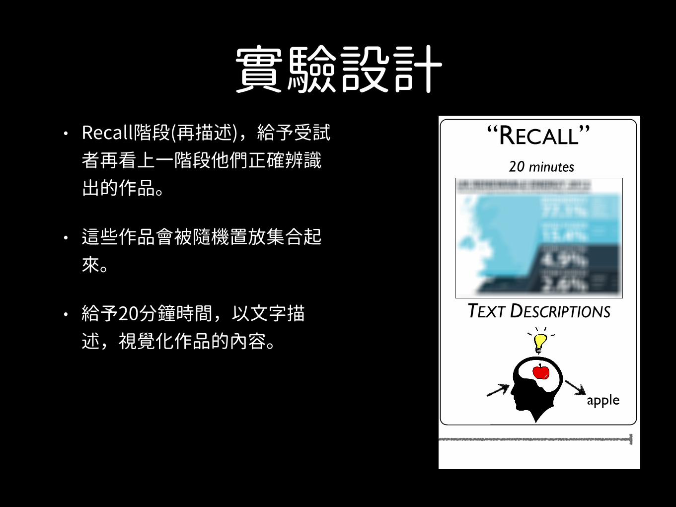
• Recall階段(再描述),給予受試者再看上一階段他們正確辨識出的作品。
• 這些作品會被隨機置放集合起來。
• 給予20分鐘時間,以文字描述,視覺化作品的內容。

實驗設計THE EXPERIMENT“RECALL”“ENCODING” “RECOGNITION”
EXPERIMENT DESIGN
Encoding
Recognition Recall
LABELED VISUALIZATION DATABASE
393 visualizations
apple
~60 minutes
EYE-TRACKING DATA
Encoding
Recognition Recall
10 seconds / image
Encoding
Recognition Recall2 seconds / image
EYE-TRACKING DATA
Encoding
Recognition Recall20 minutes
TEXT DESCRIPTIONS
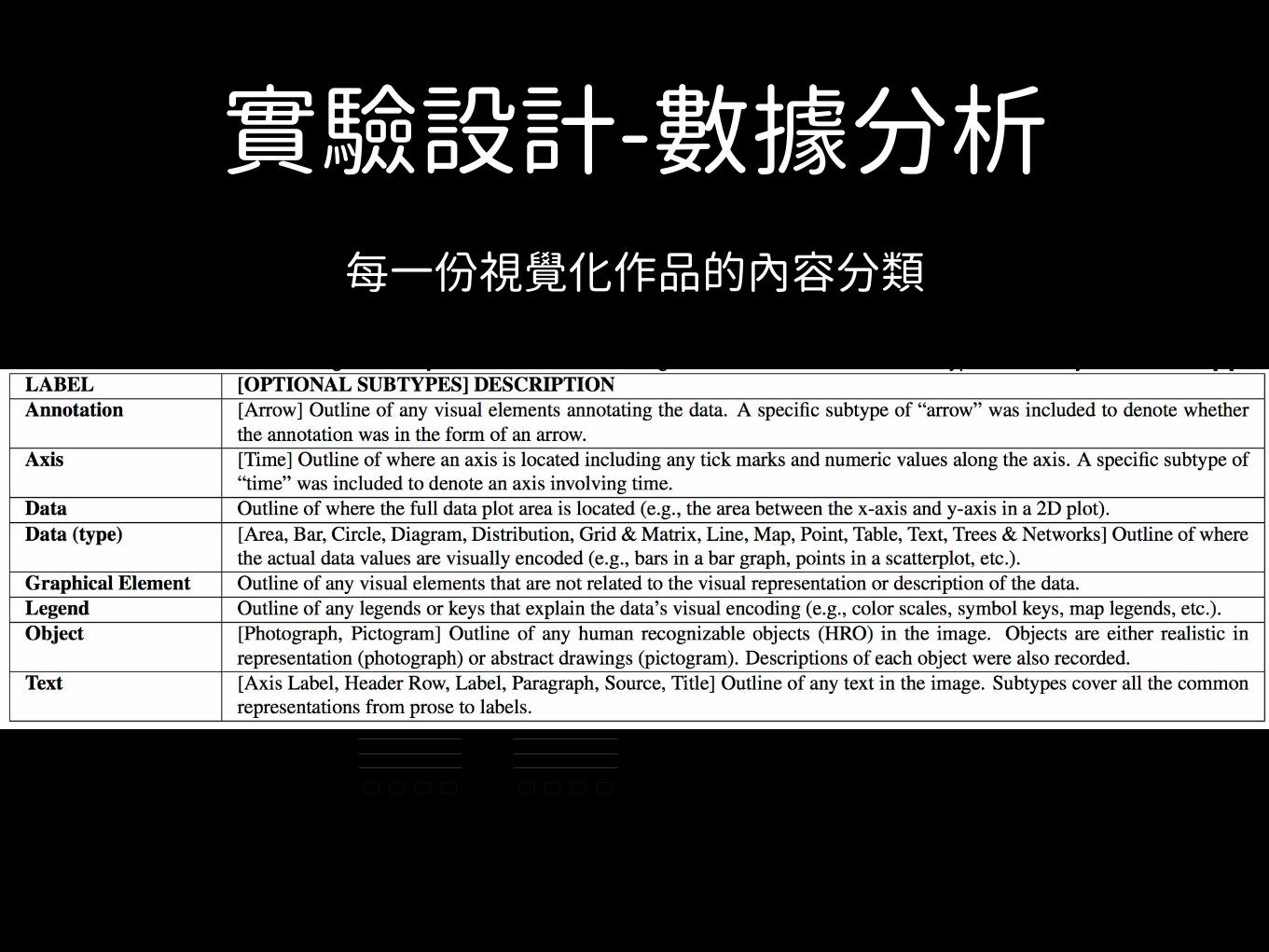
實驗設計-數據分析每一份視覺化作品的內容分類
Table 1. The visualization labeling taxonomy used to annotate our target visualizations. The data subtypes taxonomy is taken from [8].LABEL [OPTIONAL SUBTYPES] DESCRIPTIONAnnotation [Arrow] Outline of any visual elements annotating the data. A specific subtype of “arrow” was included to denote whether
the annotation was in the form of an arrow.Axis [Time] Outline of where an axis is located including any tick marks and numeric values along the axis. A specific subtype of
“time” was included to denote an axis involving time.Data Outline of where the full data plot area is located (e.g., the area between the x-axis and y-axis in a 2D plot).Data (type) [Area, Bar, Circle, Diagram, Distribution, Grid & Matrix, Line, Map, Point, Table, Text, Trees & Networks] Outline of where
the actual data values are visually encoded (e.g., bars in a bar graph, points in a scatterplot, etc.).Graphical Element Outline of any visual elements that are not related to the visual representation or description of the data.Legend Outline of any legends or keys that explain the data’s visual encoding (e.g., color scales, symbol keys, map legends, etc.).Object [Photograph, Pictogram] Outline of any human recognizable objects (HRO) in the image. Objects are either realistic in
representation (photograph) or abstract drawings (pictogram). Descriptions of each object were also recorded.Text [Axis Label, Header Row, Label, Paragraph, Source, Title] Outline of any text in the image. Subtypes cover all the common
representations from prose to labels.
GENDER EQUALITY IN LABOR FORCE PARTICIPATION
ORIGINAL
RATI
O O
F FE
MAL
E TO
M
ALE
0%
25%
50%
75%
100%
CHINA KOREA JAPAN INDIASource: Gender Statistics 2013, World Bank
GENDER EQUALITY IN LABOR FORCE PARTICIPATION
DATA REDUNDANCY
RATI
O O
F FE
MAL
E TO
M
ALE
0%
25%
50%
75%
100%
CHINA KOREA JAPAN INDIASource: Gender Statistics 2013, World Bank
GENDER EQUALITY IN LABOR FORCE PARTICIPATIONCHINA LEADS IN FEMALE LABOR FORCE PARTICIPATION WHEREAS INDIA LAGS SIGNIFICANTLY BEHIND IN 2013
MESSAGE REDUNDANCY
GENDER EQUALITY IN LABOR FORCE PARTICIPATION
DATA & MESSAGE REDUNDANCY
CHINA LEADS IN FEMALE LABOR FORCE PARTICIPATION WHEREAS INDIA LAGS SIGNIFICANTLY BEHIND IN 2013.
CHINA INDIAJAPANKOREA
RATI
O O
F FE
MAL
E TO
M
ALE
0%
25%
50%
75%
100%
CHINA KOREA JAPAN INDIA
RATI
O O
F FE
MAL
E TO
M
ALE
0%
25%
50%
75%
100%
CHINA KOREA JAPAN INDIA
CHINA INDIAJAPANKOREASource: Gender Statistics 2013, World Bank Source: Gender Statistics 2013, World Bank
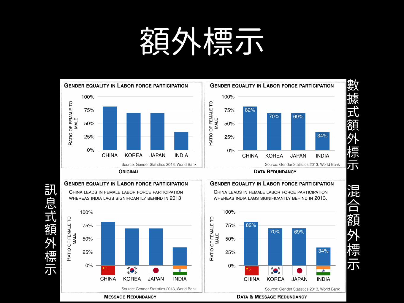
Fig. 3. Illustrative examples of data redundancy (i.e., additional quanti-tative encodings of the data) and message redundancy (i.e., additionalqualitative encodings of the main trend or message of the data). Moreexamples are provided in the Supplemental Material.
such as color, size, or opacity to represent a value already exhibited ina visualization such as the x- or y-axis values. In contrast, a visualiza-tion exhibits message redundancy if the main conclusion or messageof the visualization is explicitly presented to the viewer in multipleways: the addition of explanatory annotations, labels, text, and pic-tures. A visualization can exhibit both data and message redundancy(e.g., lower right panel of Fig. 3).
Annotating redundancy for each target visualization allows us toevaluate whether redundancy enables more effective recognition andrecall. Each of the two types of redundancies were recorded as presentor absent, by three visualization experts. The visualizations were re-viewed and discussed until unanimous consensus was found.
4 ANALYSIS OF LABELED VISUALIZATIONS
The labeled visualizations enable us to gain insight into and study thedistribution and type of visual elements employed across publicationvenues and visualization types. These insights also help us under-stand and put into context the observed trends and results of our study(Sec. 6). Examining the proportion of image area covered by the datalabel, as shown in Fig. 4, we see that it is highest for the scientificjournal visualizations. This is probably due to the publishing contextof scientific journal figures in which the visualization occurs as part ofa paper narrative. Additionally, authors commonly have enforced pagelimits and figure limit constraints, so maximizing information per unitarea is a constraint.
Breaking down this measure of image area for data display by vi-
0%
25%
50%
75%
100%
News media Government Science Infographic
64%
78%
54%58%
Percent of Visualization covered with Data
Perc
ent o
f Vis
ualiz
atio
n
Publication Venue
Fig. 4. Percentage of visualization average pixel area covered by thedata label. Scientific visualizations on average had the highest percent-age of image area devoted to data presentation.
sualization type, we see that diagrams, maps, and tables cover a largerpercentage of the image area than other visualization types. Thesetypes of visualizations tend to have annotations and text labels incor-porated into the data representation itself, thus requiring less of theimage area around the data plot for additional explanations.
Another observation is the difference in the average total numberof elements in a visualization across sources. Visualizations fromgovernment sources have on average 11.9 labeled elements per visu-alization, significantly fewer compared to other visualization sources(p < 0.001, t(177) = 4.79 when compared2 to the numerically closestvisualization source, science). In contrast, visualizations from info-graphic sources have nearly twice as many elements (M = 38.7) ascompared news media (M = 19.7, p < 0.001, t(212) = 5.73) and sci-entific visualizations (M = 18.4, p < 0.001, t(169) = 5.23). The addi-tional elements in the infographic visualizations are mostly in the formof more text, objects, and graphical elements around the data.
Finally, there is a difference between publication venues in the per-centage of the visualization’s area covered by human recognizable ob-jects (HRO). There are no such objects in the government visualiza-tions, and the percentages are generally less for scientific journal vi-sualizations (M = 14%) as compared to news media (M = 25%) andinfographic (M = 29%) visualizations. The human recognizable ob-jects are primarily in the form of company logos (McDonalds, Twitter,Apple, etc.), international flags commonly used in the news media vi-sualizations, and pictograms or photographs of human representationsand computer/technology depictions (see also the word cloud visual-ization in the Supplemental Material).
In addition to the labels, each visualization was examined to de-termine if it exhibited message redundancy, data redundancy, both, orneither. As shown in Fig. 5, all publication venues included visual-
2For all the p-values reported in this paper, t-tests were corrected for multi-ple comparisons.
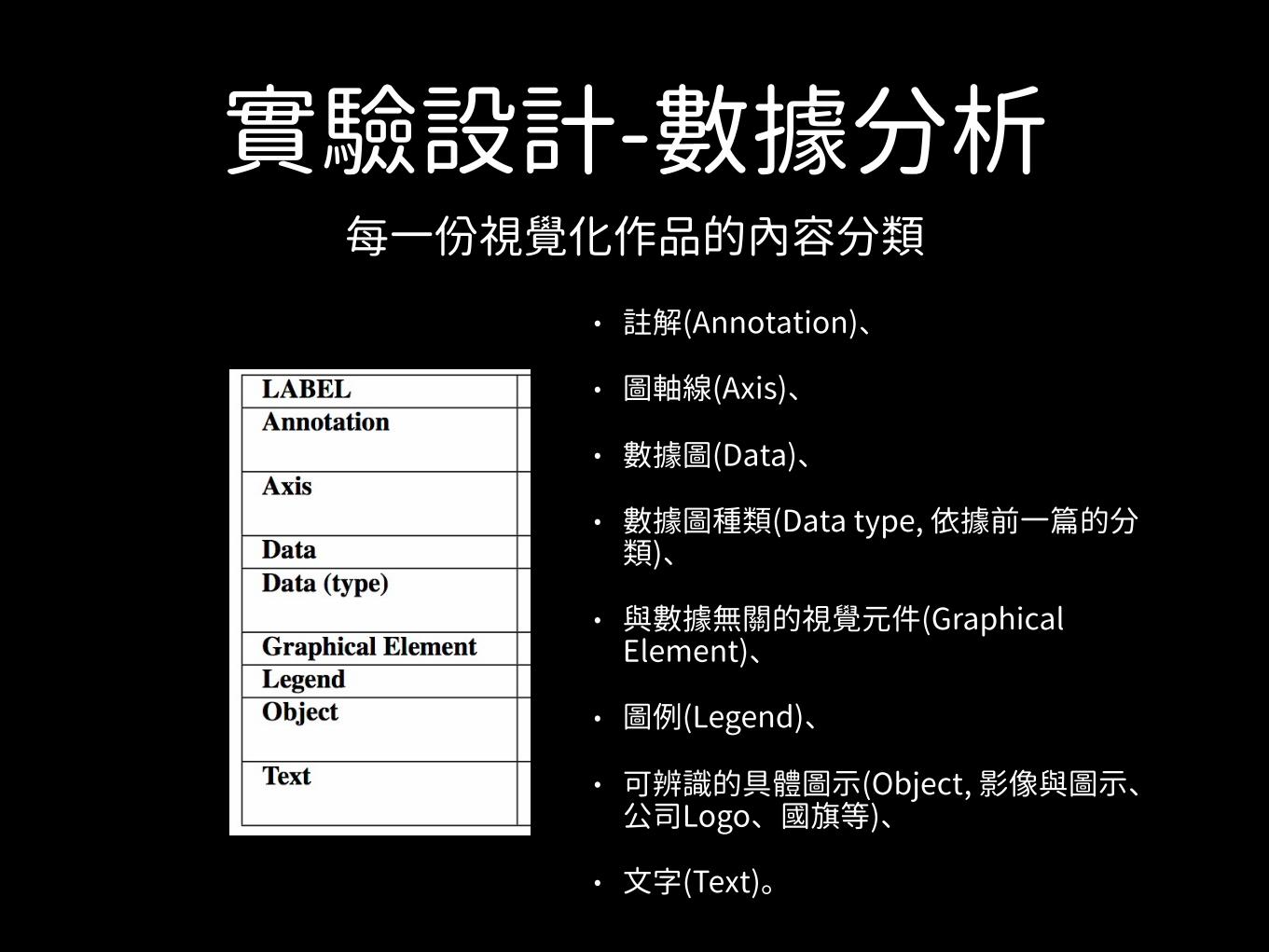
實驗設計-數據分析• 註解(Annotation)、
• 圖軸線(Axis)、
• 數據圖(Data)、
• 數據圖種類(Data type, 依據前一篇的分類)、
• 與數據無關的視覺元件(Graphical Element)、
• 圖例(Legend)、
• 可辨識的具體圖示(Object, 影像與圖示、公司Logo、國旗等)、
• 文字(Text)。
每一份視覺化作品的內容分類
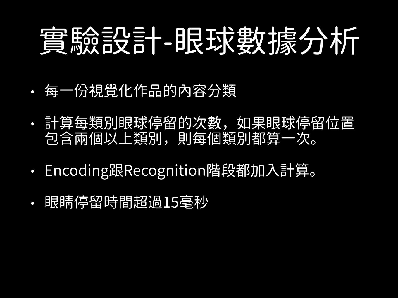
實驗設計-眼球數據分析• 每一份視覺化作品的內容分類
• 計算每類別眼球停留的次數,如果眼球停留位置包含兩個以上類別,則每個類別都算一次。
• Encoding跟Recognition階段都加入計算。
• 眼睛停留時間超過15毫秒
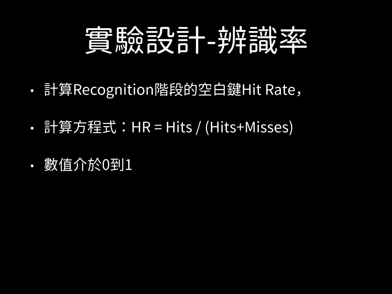
實驗設計-辨識率• 計算Recognition階段的空白鍵Hit Rate,
• 計算方程式:HR = Hits / (Hits+Misses)
• 數 介於0到1
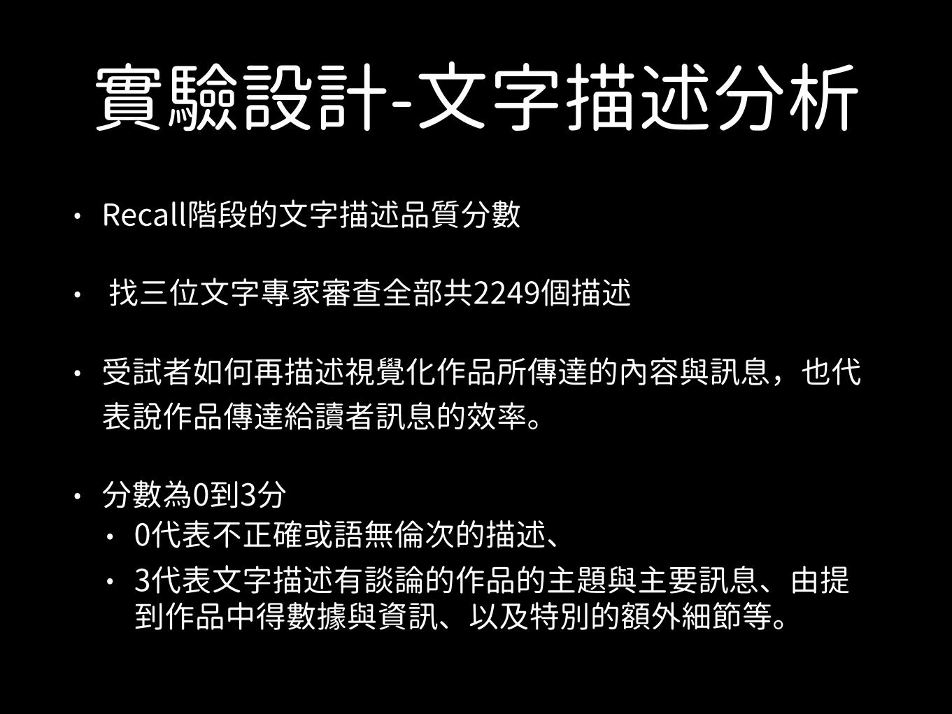
實驗設計-文字描述分析• Recall階段的文字描述品質分數
• 找三位文字專家審 全部共2249個描述
• 受試者如何再描述視覺化作品所傳達的內容與訊息,也代表說作品傳達給讀者訊息的效率。
• 分數為0到3分 • 0代表不正確或語無倫次的描述、 • 3代表文字描述有談論的作品的主題與主要訊息、由提
到作品中得數據與資訊、以及特別的額外細節等。
10秒後辨識結果與1秒結果比較
a)
Visualizations sorted by “at-a-glance” HR0 50 100 150 200 250 300 350 400
0.1
0.2
0.3
0.4
0.5
0.6
0.7
0.8
0.9
1
Images sorted by AMT HR
HR
new HRAMT HR
HR
Raw HR for prolonged exposure studyStandard deviation for raw HR points
b) c)MEMORABILITY ACROSS DIFFERENT ENCODING DURATIONS
HIGH QUALITY
DESCRIPTION
LOW QUALITY
DESCRIPTION
MEMORABLE
FORGETTABLE
MEMORABILITY VERSUS DESCRIPTION QUALITY
Visualizations sorted by “at-a-glance” HR0 50 100 150 200 250 300 350 400
0.2
0.3
0.4
0.5
0.6
0.7
0.8
0.9
1
Images sorted by AMT HR
HR
new HRAMT HR
“at-a-glance”exposure
semantic associations
visual associations
no distinct visual or semantic associations
prolonged exposure
HR
0 50 100 150 200 250 300 350 4000.1
0.2
0.3
0.4
0.5
0.6
0.7
0.8
0.9
1
Images sorted by AMT HR
HR
new HRAMT HRRaw HR for “at-a-glance” study [8]Fitted HR for prolonged exposure study
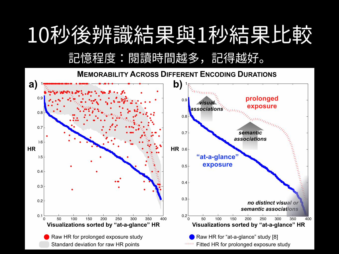
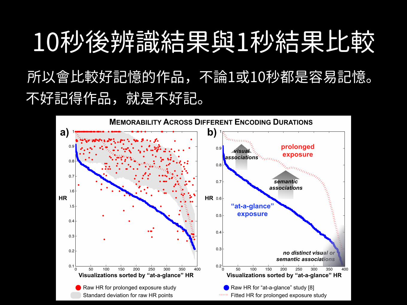
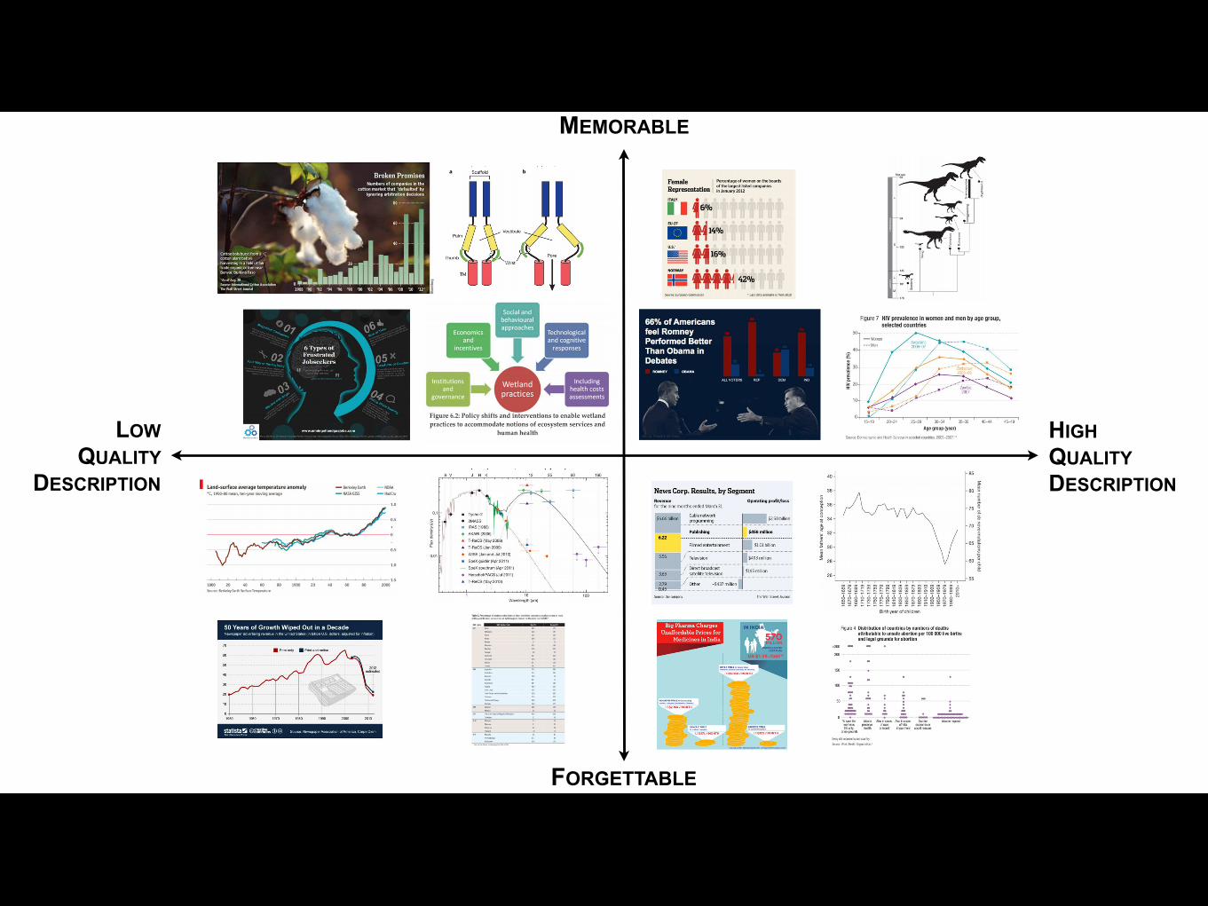
Fig. 6. a) Plot comparing the raw HR (i.e., memorability) scores of target visualizations from the recognition phase of this experiment (after 10seconds of encoding) to the raw HR scores of the same visualizations from the previous experiment [8] (with 1 second of encoding). b) Summarizingthe same data by box filtering the raw HR scores makes the main trends clearer. The most memorable “at-a-glance” visualizations are still the mostmemorable after prolonged exposure, likely due to visual associations. The increase in memorability across experiments for some visualizationscan be explained by additional semantic associations (e.g., title, text, etc.) being invoked. c) The top and bottom ranked visualizations acrossdescription quality and memorability, for all four publication source categories. The y-axis represents recognition HR, and the x-axis representsaverage text description quality at recall. Description quality is also correlated with memorability (Sec. 6.1.4).
We also computed the recognition hit rate (HR) for each visual-ization. This is the fraction of participants who correctly recognizeda visualization when they saw it during the recognition phase of theexperiment. This value ranges from 0 to 1. See the SupplementalMaterial for a discussion of the measurement of memorability in thisexperiment compared to [8].
To quantify the qualitative aspects of the text descriptions collectedduring the recall phase of the experiment, three visualization expertswent through all 2,449 descriptions. The description quality is a mea-sure of how well a participant recalled the content and message of thevisualization. Quality was rated from 0 to 3 where 0 was an incorrector incoherent description, and 3 was a text description that touchedupon the visualization topic, what data or information is presented inthe visualization, the main message of the visualization, and one addi-tional specific detail about the visualization. The quality ratings wereassigned based on unanimous consensus. Each description was alsoreviewed for the visual components explicitly discussed or referencedfrom the visualization including the title and other textual elements.Finally, descriptions were flagged if they were not perfectly accurate(i.e., contained a factual error).
6 EXPERIMENTAL RESULTS AND DISCUSSION
In our previous study [8], we showed that people are highly consistentin which visualizations they recognize and which they forget. Visu-alizations were only shown for 1 second at a time, so we were ableto measure how memorable visualizations are “at-a-glance”. In thisstudy we want to test not just recognizability, but we also want todiscover which visualization elements people encode and are consec-utively able to recall (top right quadrant of Fig. 6c). We also want totest what aspects of a visualization impact how well the main mes-sage of the visualization is understood. For this purpose we extendedencoding time from 1 to 10 seconds and analyzed eye movements atencoding, responses at recognition, and textual descriptions at recall.
6.1 “At-a-glance” vs. “prolonged exposure” memorability
6.1.1 Does “at-a-glance” memorability generalize?
During the recognition phase of the current study, as discussed inSec. 5, hit rates (HR) were generated for each visualization (i.e., whatpercentage of participants correctly identified the visualization as oc-curring during the encoding phase). For the current memorabilitystudy discussed in this paper (with 10 seconds of encoding), the meanHR is 79.70% (SD = 17.98%) as compared to a mean HR of 55.61%
(SD = 15.30%) from the previous study [8] (with 1 second of encod-ing). We compare the memorability scores (HR) of both studies forall the target visualizations in Fig. 6a-b. When time to encode a vi-sualization is increased from 1 to 10 seconds, it is natural for the ab-solute memorability scores to increase. However, what we are moreinterested in is the stability of the relative scores (i.e., ranks) of thevisualizations across studies. We find a Spearman rank correlation of0.62 (p < 0.001) between the memorability scores of the two studies.Note that the inter-participant consistency in the initial study was notperfectly correlated either, with a rank correlation of 0.83 [8]. Thus,the relatively high correlation between the two studies (despite the dif-ference in experimental set-up, participant population, and encodingtime) points to the stability of memorability ranks of the visualiza-tions. We also see that this trend holds if we look separately withineach source category. The Spearman rank correlations between the HRscores of the two studies are: 0.44 for infographics, 0.38 for news, 0.56for government, and 0.59 for science (p< 0.001 for all). Thus, visual-izations that were memorable “at-a-glance” (after only 1 second ofencoding) are often the same ones that are memorable after “pro-longed exposure” (10 seconds of encoding). The same holds for theforgettable visualizations. Thus our initial study’s findings generalizeto a longer encoding time when people can process more of the visualand textual input. However, now that encoding time has increased, wealso notice that 8% of the visualizations that were not previously in thetop third most memorable visualizations move up in rank as comparedto the previous study. In the next section we discuss why some visu-alizations become more memorable after 10 seconds of encoding thanafter 1 second, and why others remain forgettable in both cases.
6.1.2 What are the differences between the most and leastrecognizable visualizations?
We use the eye movements of a participant at recognition time, justbefore a response is made, as indicators of which parts of the visu-alization trigger the response (i.e., help retrieve the memory of thevisualization). We can compare the differences in eye movements forthe visualizations that are “at-a-glance” the most and least recogniz-able [8]. By considering the eye movements made on these visual-izations during 10 seconds of encoding and at recognition time, wecan see what parts of a visualization are encoded and what parts arerequired for recognition.
As shown in Fig. 7, the heat maps overlaid on the visualizationsrepresent the average of all of the participants’ encoding fixations onthe visualization. The fixation patterns in the encoding phase demon-
記憶程度:閱讀時間越多,記得越好。
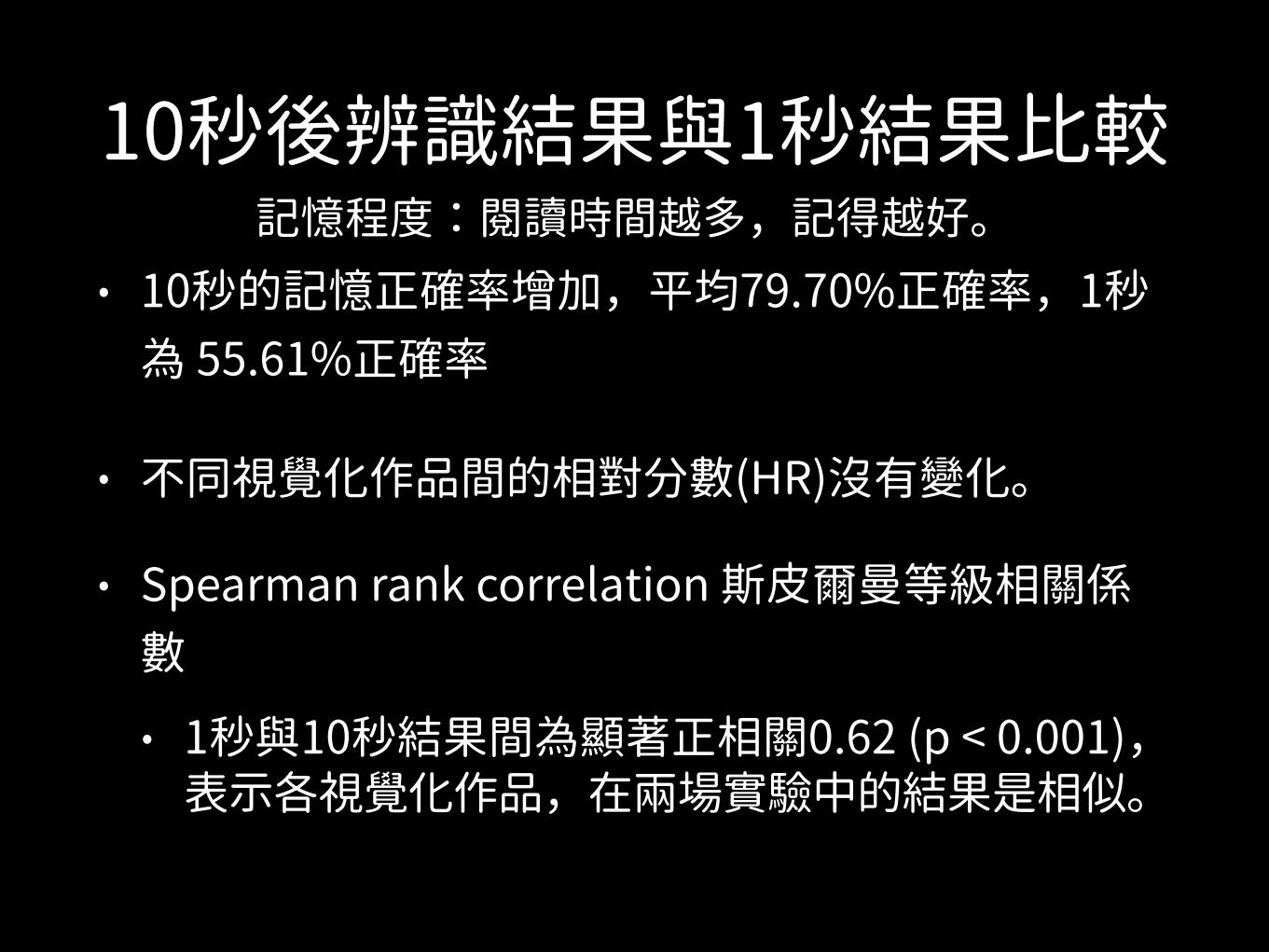
10秒後辨識結果與1秒結果比較
• 10秒的記憶正確率增加,平均79.70%正確率,1秒為 55.61%正確率
• 不同視覺化作品間的相對分數(HR)沒有變化。
• Spearman rank correlation 斯皮爾曼等級相關係數 • 1秒與10秒結果間為顯著正相關0.62 (p < 0.001),
表示各視覺化作品,在兩場實驗中的結果是相似。
記憶程度:閱讀時間越多,記得越好。
10秒後辨識結果與1秒結果比較
a)
Visualizations sorted by “at-a-glance” HR0 50 100 150 200 250 300 350 400
0.1
0.2
0.3
0.4
0.5
0.6
0.7
0.8
0.9
1
Images sorted by AMT HR
HR
new HRAMT HR
HR
Raw HR for prolonged exposure studyStandard deviation for raw HR points
b) c)MEMORABILITY ACROSS DIFFERENT ENCODING DURATIONS
HIGH QUALITY
DESCRIPTION
LOW QUALITY
DESCRIPTION
MEMORABLE
FORGETTABLE
MEMORABILITY VERSUS DESCRIPTION QUALITY
Visualizations sorted by “at-a-glance” HR0 50 100 150 200 250 300 350 400
0.2
0.3
0.4
0.5
0.6
0.7
0.8
0.9
1
Images sorted by AMT HR
HR
new HRAMT HR
“at-a-glance”exposure
semantic associations
visual associations
no distinct visual or semantic associations
prolonged exposure
HR
0 50 100 150 200 250 300 350 4000.1
0.2
0.3
0.4
0.5
0.6
0.7
0.8
0.9
1
Images sorted by AMT HR
HR
new HRAMT HRRaw HR for “at-a-glance” study [8]Fitted HR for prolonged exposure study
Fig. 6. a) Plot comparing the raw HR (i.e., memorability) scores of target visualizations from the recognition phase of this experiment (after 10seconds of encoding) to the raw HR scores of the same visualizations from the previous experiment [8] (with 1 second of encoding). b) Summarizingthe same data by box filtering the raw HR scores makes the main trends clearer. The most memorable “at-a-glance” visualizations are still the mostmemorable after prolonged exposure, likely due to visual associations. The increase in memorability across experiments for some visualizationscan be explained by additional semantic associations (e.g., title, text, etc.) being invoked. c) The top and bottom ranked visualizations acrossdescription quality and memorability, for all four publication source categories. The y-axis represents recognition HR, and the x-axis representsaverage text description quality at recall. Description quality is also correlated with memorability (Sec. 6.1.4).
We also computed the recognition hit rate (HR) for each visual-ization. This is the fraction of participants who correctly recognizeda visualization when they saw it during the recognition phase of theexperiment. This value ranges from 0 to 1. See the SupplementalMaterial for a discussion of the measurement of memorability in thisexperiment compared to [8].
To quantify the qualitative aspects of the text descriptions collectedduring the recall phase of the experiment, three visualization expertswent through all 2,449 descriptions. The description quality is a mea-sure of how well a participant recalled the content and message of thevisualization. Quality was rated from 0 to 3 where 0 was an incorrector incoherent description, and 3 was a text description that touchedupon the visualization topic, what data or information is presented inthe visualization, the main message of the visualization, and one addi-tional specific detail about the visualization. The quality ratings wereassigned based on unanimous consensus. Each description was alsoreviewed for the visual components explicitly discussed or referencedfrom the visualization including the title and other textual elements.Finally, descriptions were flagged if they were not perfectly accurate(i.e., contained a factual error).
6 EXPERIMENTAL RESULTS AND DISCUSSION
In our previous study [8], we showed that people are highly consistentin which visualizations they recognize and which they forget. Visu-alizations were only shown for 1 second at a time, so we were ableto measure how memorable visualizations are “at-a-glance”. In thisstudy we want to test not just recognizability, but we also want todiscover which visualization elements people encode and are consec-utively able to recall (top right quadrant of Fig. 6c). We also want totest what aspects of a visualization impact how well the main mes-sage of the visualization is understood. For this purpose we extendedencoding time from 1 to 10 seconds and analyzed eye movements atencoding, responses at recognition, and textual descriptions at recall.
6.1 “At-a-glance” vs. “prolonged exposure” memorability
6.1.1 Does “at-a-glance” memorability generalize?
During the recognition phase of the current study, as discussed inSec. 5, hit rates (HR) were generated for each visualization (i.e., whatpercentage of participants correctly identified the visualization as oc-curring during the encoding phase). For the current memorabilitystudy discussed in this paper (with 10 seconds of encoding), the meanHR is 79.70% (SD = 17.98%) as compared to a mean HR of 55.61%
(SD = 15.30%) from the previous study [8] (with 1 second of encod-ing). We compare the memorability scores (HR) of both studies forall the target visualizations in Fig. 6a-b. When time to encode a vi-sualization is increased from 1 to 10 seconds, it is natural for the ab-solute memorability scores to increase. However, what we are moreinterested in is the stability of the relative scores (i.e., ranks) of thevisualizations across studies. We find a Spearman rank correlation of0.62 (p < 0.001) between the memorability scores of the two studies.Note that the inter-participant consistency in the initial study was notperfectly correlated either, with a rank correlation of 0.83 [8]. Thus,the relatively high correlation between the two studies (despite the dif-ference in experimental set-up, participant population, and encodingtime) points to the stability of memorability ranks of the visualiza-tions. We also see that this trend holds if we look separately withineach source category. The Spearman rank correlations between the HRscores of the two studies are: 0.44 for infographics, 0.38 for news, 0.56for government, and 0.59 for science (p< 0.001 for all). Thus, visual-izations that were memorable “at-a-glance” (after only 1 second ofencoding) are often the same ones that are memorable after “pro-longed exposure” (10 seconds of encoding). The same holds for theforgettable visualizations. Thus our initial study’s findings generalizeto a longer encoding time when people can process more of the visualand textual input. However, now that encoding time has increased, wealso notice that 8% of the visualizations that were not previously in thetop third most memorable visualizations move up in rank as comparedto the previous study. In the next section we discuss why some visu-alizations become more memorable after 10 seconds of encoding thanafter 1 second, and why others remain forgettable in both cases.
6.1.2 What are the differences between the most and leastrecognizable visualizations?
We use the eye movements of a participant at recognition time, justbefore a response is made, as indicators of which parts of the visu-alization trigger the response (i.e., help retrieve the memory of thevisualization). We can compare the differences in eye movements forthe visualizations that are “at-a-glance” the most and least recogniz-able [8]. By considering the eye movements made on these visual-izations during 10 seconds of encoding and at recognition time, wecan see what parts of a visualization are encoded and what parts arerequired for recognition.
As shown in Fig. 7, the heat maps overlaid on the visualizationsrepresent the average of all of the participants’ encoding fixations onthe visualization. The fixation patterns in the encoding phase demon-
所以會比較好記憶的作品,不論1或10秒都是容易記憶。 不好記得作品,就是不好記。

那麼 最容易與不容易辨識(記憶)得作品
他們之間的差異是如何?
RECO
GNI
TIO
NEN
CODI
NG
MOST RECOGNIZABLE LEAST RECOGNIZABLE
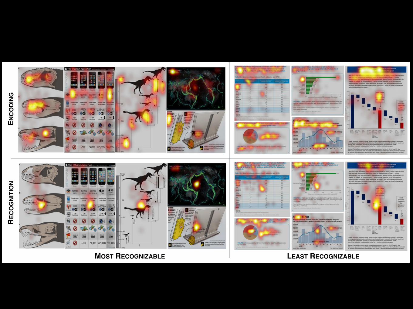
Fig. 7. Examples of the most and least recognizable visualizations from [8]. TOP: Eye-tracking fixation heat maps (i.e., average of all participants’fixation locations) from the encoding phase of the experiment in which each visualization was presented for 10 seconds. The fixation patternsdemonstrate visual exploration of the visualization. BOTTOM: Eye-tracking fixation heat maps from the recognition phase of the experiment inwhich each visualization was presented for 2 seconds or until response. The most recognizable visualizations all have a single focus in the centerindicating quick recognition of the visualization, whereas the least recognizable visualizations have fixation patterns similar to the encoding fixationsindicative of visual exploration (e.g., title, text, etc.) for recognition.
strate patterns of visual exploration (e.g., view graph, read title, look atlegend, etc.), corresponding to the trends described in Sec. 6.2. Thesevisual exploration patterns are seen in both the most and least recog-nizable visualizations.
The heat maps generated for recognition fixations are obtained bytaking only the fixations until a positive response is made, i.e., only thefixations that lead up to a successful recognition, so that we can deter-mine which parts of a visualization participants look at to recognize avisualization. In Fig. 7 we see a distinct difference between the fixa-tion heat maps of the most and least recognizable visualizations in therecognition phase, where the most recognizable visualizations have afixation bias towards the center of the visualization. This indicates thata fixation near the center, with the accompanying peripheral context,provides sufficient information to recognize the visualization withoutrequiring further eye movements. In contrast, the least recognizablevisualizations have fixation heat maps that look more like the fixationpatterns of visual exploration in the encoding phase. These visual-izations are not recognizable “at-a-glance” and participants visuallysearch the visualization for an association, i.e., a component in thevisualization that will help with recognition. The fixations along thetop of the heat map for the least recognizable visualizations generallycorrespond to the location of the title and paragraph text describing thevisualization in further detail. We conducted statistical tests to verifythat the fixation patterns are significantly different between the mostand least recognizable visualizations, and we describe these analysesin the Supplemental Material.
We see that the recognition fixations are significantly differentbetween the most and least recognizable visualizations in that theleast recognizable visualizations require more exploration beforethey can be retrieved from memory. There is more eye movementduring recognition for the least recognizable visualizations indicatingthat people need to look at more parts of a visualization before theycan recognize it. The visual appearance is no longer enough and peo-ple start exploring the text. In the following section we will discusssome possible explanations for this difference and what visualizationelements people may be using for recognition.
6.1.3 Which visualization elements help recognition?We have demonstrated that there is a distinct difference between thefixation patterns of the most and least recognizable visualizations.Which visual elements in the visualization contribute to this differ-ence in fixation patterns, and which elements help explain the overallHR increase for recognition? We believe that people are utilizing two
types of associations to help with visualization recognition: visual as-sociations and semantic associations. The recognizable visualizationstend to contain more human recognizable objects (objects are presentin 74% of the top third most recognizable visualizations) compared tothe least recognizable visualizations (objects are present in 8% of thebottom third least recognizable visualizations). These human recog-nizable objects are examples of visual associations.
The visualizations that are not visually distinct must be recogniz-able due to semantic associations, such as the visualization’s title orsimilar text. In fact, the elements with the highest total fixation timeduring recognition are the titles (M = 274ms) followed by human rec-ognizable objects (M = 246ms, p < 0.01). The titles serve as a seman-tic association, and the objects as a visual association for recognition.Note that in Fig. 7 the fixations outside of the central focus in the leastrecognizable visualizations during recognition correspond to the visu-alizations’ title and other textual elements near the top. Thus thesetypes of semantic associations, i.e., textual components, are used forrecognition if the visualization is not visually distinct or does not con-tain sufficient visual associations.
The least recognizable visualizations likely do not have a strong vi-sual association nor a strong semantic association to assist with recog-nition (Fig. 6b). The least recognizable visualizations after 10 sec-onds have significant overlap with the least memorable visualizationsfrom [8] (after 1 second). Also, of the 1/3 least recognizable visualiza-tions 54% are from government sources (compare that to only 3% ofgovernment sources in the top 1/3 most recognizable visualizations),while of the 1/3 most recognizable visualizations, 49% are from in-fovis sources (and only 2% of the bottom 1/3 least recognizable vi-sualizations are from infovis). Government visualizations tend to usethe same templates and similar aesthetics, contributing to confusionbetween visualizations during recognition. The government visualiza-tions are also heavily composed of the least memorable visualizationtypes including bar and line graphs. The least memorable visualiza-tions “at-a-glance” are also the least recognizable even after pro-longed exposure.
6.1.4 What do people recall after 10 seconds of encoding?
Across 374 target visualizations4, the study participants generated2,733 text descriptions (see Supplemental Material for examples ofparticipant-generated descriptions). The mean length of a descrip-
4We removed visualizations for which participants complained about thetext being too small to read.
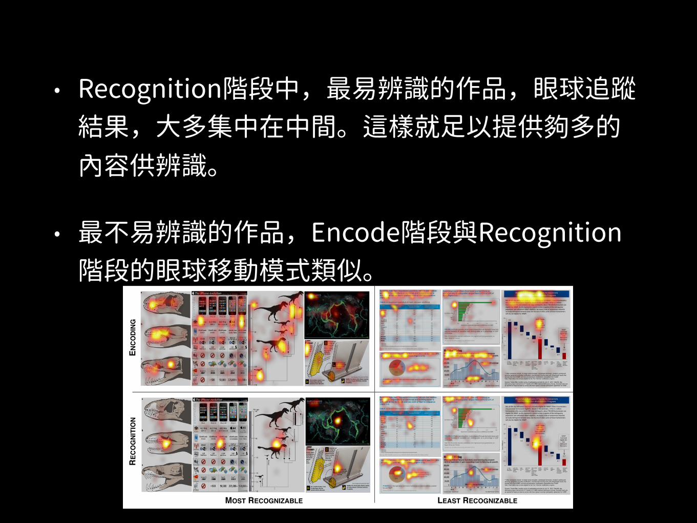
• Recognition階段中,最易辨識的作品,眼球追蹤結果,大多集中在中間。這樣就足以提供 多的內容供辨識。
• 最不易辨識的作品,Encode階段與Recognition階段的眼球移動模式類似。
(2 S
EC)
RECO
GNI
TIO
NEN
CODI
NG
MOST RECOGNIZABLE LEAST RECOGNIZABLE
Fig. 7. Examples of the most and least recognizable visualizations from [8]. TOP: Eye-tracking fixation heat maps (i.e., average of all participants’fixation locations) from the encoding phase of the experiment in which each visualization was presented for 10 seconds. The fixation patternsdemonstrate visual exploration of the visualization. BOTTOM: Eye-tracking fixation heat maps from the recognition phase of the experiment inwhich each visualization was presented for 2 seconds or until response. The most recognizable visualizations all have a single focus in the centerindicating quick recognition of the visualization, whereas the least recognizable visualizations have fixation patterns similar to the encoding fixationsindicative of visual exploration (e.g., title, text, etc.) for recognition.
strate patterns of visual exploration (e.g., view graph, read title, look atlegend, etc.), corresponding to the trends described in Sec. 6.2. Thesevisual exploration patterns are seen in both the most and least recog-nizable visualizations.
The heat maps generated for recognition fixations are obtained bytaking only the fixations until a positive response is made, i.e., only thefixations that lead up to a successful recognition, so that we can deter-mine which parts of a visualization participants look at to recognize avisualization. In Fig. 7 we see a distinct difference between the fixa-tion heat maps of the most and least recognizable visualizations in therecognition phase, where the most recognizable visualizations have afixation bias towards the center of the visualization. This indicates thata fixation near the center, with the accompanying peripheral context,provides sufficient information to recognize the visualization withoutrequiring further eye movements. In contrast, the least recognizablevisualizations have fixation heat maps that look more like the fixationpatterns of visual exploration in the encoding phase. These visual-izations are not recognizable “at-a-glance” and participants visuallysearch the visualization for an association, i.e., a component in thevisualization that will help with recognition. The fixations along thetop of the heat map for the least recognizable visualizations generallycorrespond to the location of the title and paragraph text describing thevisualization in further detail. We conducted statistical tests to verifythat the fixation patterns are significantly different between the mostand least recognizable visualizations, and we describe these analysesin the Supplemental Material.
We see that the recognition fixations are significantly differentbetween the most and least recognizable visualizations in that theleast recognizable visualizations require more exploration beforethey can be retrieved from memory. There is more eye movementduring recognition for the least recognizable visualizations indicatingthat people need to look at more parts of a visualization before theycan recognize it. The visual appearance is no longer enough and peo-ple start exploring the text. In the following section we will discusssome possible explanations for this difference and what visualizationelements people may be using for recognition.
6.1.3 Which visualization elements help recognition?We have demonstrated that there is a distinct difference between thefixation patterns of the most and least recognizable visualizations.Which visual elements in the visualization contribute to this differ-ence in fixation patterns, and which elements help explain the overallHR increase for recognition? We believe that people are utilizing two
types of associations to help with visualization recognition: visual as-sociations and semantic associations. The recognizable visualizationstend to contain more human recognizable objects (objects are presentin 74% of the top third most recognizable visualizations) compared tothe least recognizable visualizations (objects are present in 8% of thebottom third least recognizable visualizations). These human recog-nizable objects are examples of visual associations.
The visualizations that are not visually distinct must be recogniz-able due to semantic associations, such as the visualization’s title orsimilar text. In fact, the elements with the highest total fixation timeduring recognition are the titles (M = 274ms) followed by human rec-ognizable objects (M = 246ms, p < 0.01). The titles serve as a seman-tic association, and the objects as a visual association for recognition.Note that in Fig. 7 the fixations outside of the central focus in the leastrecognizable visualizations during recognition correspond to the visu-alizations’ title and other textual elements near the top. Thus thesetypes of semantic associations, i.e., textual components, are used forrecognition if the visualization is not visually distinct or does not con-tain sufficient visual associations.
The least recognizable visualizations likely do not have a strong vi-sual association nor a strong semantic association to assist with recog-nition (Fig. 6b). The least recognizable visualizations after 10 sec-onds have significant overlap with the least memorable visualizationsfrom [8] (after 1 second). Also, of the 1/3 least recognizable visualiza-tions 54% are from government sources (compare that to only 3% ofgovernment sources in the top 1/3 most recognizable visualizations),while of the 1/3 most recognizable visualizations, 49% are from in-fovis sources (and only 2% of the bottom 1/3 least recognizable vi-sualizations are from infovis). Government visualizations tend to usethe same templates and similar aesthetics, contributing to confusionbetween visualizations during recognition. The government visualiza-tions are also heavily composed of the least memorable visualizationtypes including bar and line graphs. The least memorable visualiza-tions “at-a-glance” are also the least recognizable even after pro-longed exposure.
6.1.4 What do people recall after 10 seconds of encoding?
Across 374 target visualizations4, the study participants generated2,733 text descriptions (see Supplemental Material for examples ofparticipant-generated descriptions). The mean length of a descrip-
4We removed visualizations for which participants complained about thetext being too small to read.
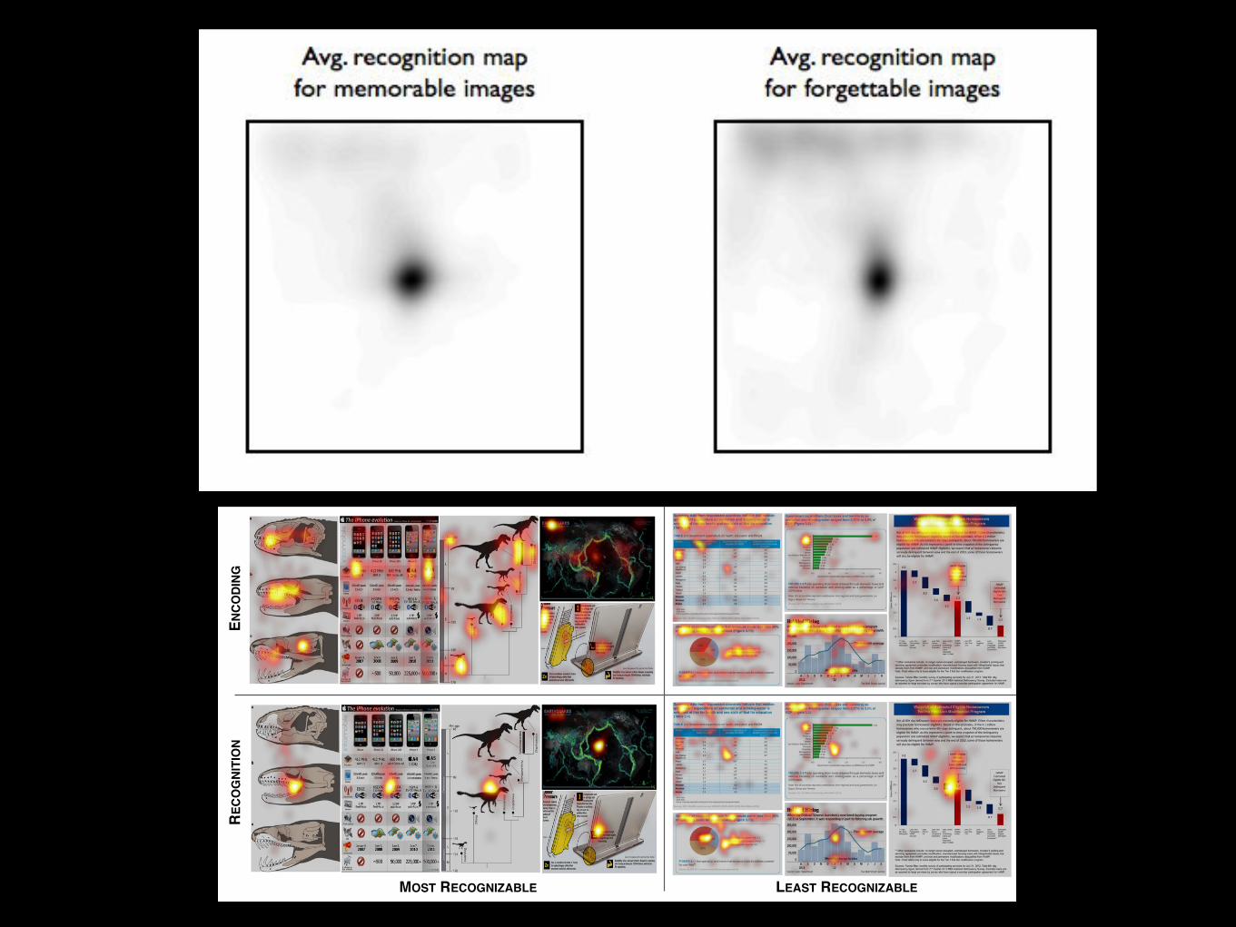
Fig. S7: Average recognition fixation maps for the top 25 most recognizable and bottom 25 least recognizable visualizations: the forgettable images require more visual exploration to recall.
In order to quantify the difference more generally between the fixation patterns for the top 1/3 most recognizable and bottom 1/3 least recognizable visualizations “ataglance” [8], we calculated 3 metrics: the average recognition fixation distance viewed away from the image center, the spatial variances in recognition fixation locations, and the number of distinct loci fixated during recognition. First, we calculated the average distance from the visualization center at which participants fixate. We computed the Euclidean distance between the center of the visualization and each of a participant's recognition fixations on the visualization, and averaged over all of these distances. Participants on average look further away from the center for the least recognizable visualizations (208 pixels) than for the most recognizable visualizations (192 pixels, t(3189) = 6.29, p < 0.001). In order to evaluate the variability of the recognition fixations, for each participant we calculated the variances of the x and y fixation locations over all of the recognition fixations. We then took the mean of these two variance values in order to produce an overall variance value. The most recognizable visualizations have a significantly lower fixation variability (20,395pixel variance) as compared to the least recognizable visualizations (23,424pixel variance, t(3189) = 7.17, p < 0.001). Thus participants need to look around less when recognizing the visualizations that are memorable “ataglance”. We also compared the average number of distinct foci in the recognition fixations. This is equivalent to looking for discrete regions of a visualization where observers stop and focus their attention when retrieving a visualization from memory. For the 1/3 most recognizable and the 1/3 least recognizable visualizations, we computed recognition fixation maps over all user fixations, applied a threshold of 0.1 and counted the number of connected components (each fixation map was scaled so that the intensity values spanned from 0 to 1). We obtained an average of 2.40 connected components (i.e., distinct foci) in the most recognizable visualization fixations maps and an average of 3.53 connected components in the least recognizable visualizations (t(240) = 5.38, p < 0.001). Thus the least recognizable visualizations have more foci (i.e. more distinct places that the observer paid attention to) than the most recognizable visualizations, indicative of visual search for an association for recognition. Over all 3 fixation measures analyzed, there are statistically significant differences between the most and least recognizable visualizations, in that visualizations that are not memorable “ataglance” (the least recognizable) require more exploratory fixations before a participant successfully recognizes the visualization.
10
RECO
GNI
TIO
NEN
CODI
NG
MOST RECOGNIZABLE LEAST RECOGNIZABLE
Fig. 7. Examples of the most and least recognizable visualizations from [8]. TOP: Eye-tracking fixation heat maps (i.e., average of all participants’fixation locations) from the encoding phase of the experiment in which each visualization was presented for 10 seconds. The fixation patternsdemonstrate visual exploration of the visualization. BOTTOM: Eye-tracking fixation heat maps from the recognition phase of the experiment inwhich each visualization was presented for 2 seconds or until response. The most recognizable visualizations all have a single focus in the centerindicating quick recognition of the visualization, whereas the least recognizable visualizations have fixation patterns similar to the encoding fixationsindicative of visual exploration (e.g., title, text, etc.) for recognition.
strate patterns of visual exploration (e.g., view graph, read title, look atlegend, etc.), corresponding to the trends described in Sec. 6.2. Thesevisual exploration patterns are seen in both the most and least recog-nizable visualizations.
The heat maps generated for recognition fixations are obtained bytaking only the fixations until a positive response is made, i.e., only thefixations that lead up to a successful recognition, so that we can deter-mine which parts of a visualization participants look at to recognize avisualization. In Fig. 7 we see a distinct difference between the fixa-tion heat maps of the most and least recognizable visualizations in therecognition phase, where the most recognizable visualizations have afixation bias towards the center of the visualization. This indicates thata fixation near the center, with the accompanying peripheral context,provides sufficient information to recognize the visualization withoutrequiring further eye movements. In contrast, the least recognizablevisualizations have fixation heat maps that look more like the fixationpatterns of visual exploration in the encoding phase. These visual-izations are not recognizable “at-a-glance” and participants visuallysearch the visualization for an association, i.e., a component in thevisualization that will help with recognition. The fixations along thetop of the heat map for the least recognizable visualizations generallycorrespond to the location of the title and paragraph text describing thevisualization in further detail. We conducted statistical tests to verifythat the fixation patterns are significantly different between the mostand least recognizable visualizations, and we describe these analysesin the Supplemental Material.
We see that the recognition fixations are significantly differentbetween the most and least recognizable visualizations in that theleast recognizable visualizations require more exploration beforethey can be retrieved from memory. There is more eye movementduring recognition for the least recognizable visualizations indicatingthat people need to look at more parts of a visualization before theycan recognize it. The visual appearance is no longer enough and peo-ple start exploring the text. In the following section we will discusssome possible explanations for this difference and what visualizationelements people may be using for recognition.
6.1.3 Which visualization elements help recognition?We have demonstrated that there is a distinct difference between thefixation patterns of the most and least recognizable visualizations.Which visual elements in the visualization contribute to this differ-ence in fixation patterns, and which elements help explain the overallHR increase for recognition? We believe that people are utilizing two
types of associations to help with visualization recognition: visual as-sociations and semantic associations. The recognizable visualizationstend to contain more human recognizable objects (objects are presentin 74% of the top third most recognizable visualizations) compared tothe least recognizable visualizations (objects are present in 8% of thebottom third least recognizable visualizations). These human recog-nizable objects are examples of visual associations.
The visualizations that are not visually distinct must be recogniz-able due to semantic associations, such as the visualization’s title orsimilar text. In fact, the elements with the highest total fixation timeduring recognition are the titles (M = 274ms) followed by human rec-ognizable objects (M = 246ms, p < 0.01). The titles serve as a seman-tic association, and the objects as a visual association for recognition.Note that in Fig. 7 the fixations outside of the central focus in the leastrecognizable visualizations during recognition correspond to the visu-alizations’ title and other textual elements near the top. Thus thesetypes of semantic associations, i.e., textual components, are used forrecognition if the visualization is not visually distinct or does not con-tain sufficient visual associations.
The least recognizable visualizations likely do not have a strong vi-sual association nor a strong semantic association to assist with recog-nition (Fig. 6b). The least recognizable visualizations after 10 sec-onds have significant overlap with the least memorable visualizationsfrom [8] (after 1 second). Also, of the 1/3 least recognizable visualiza-tions 54% are from government sources (compare that to only 3% ofgovernment sources in the top 1/3 most recognizable visualizations),while of the 1/3 most recognizable visualizations, 49% are from in-fovis sources (and only 2% of the bottom 1/3 least recognizable vi-sualizations are from infovis). Government visualizations tend to usethe same templates and similar aesthetics, contributing to confusionbetween visualizations during recognition. The government visualiza-tions are also heavily composed of the least memorable visualizationtypes including bar and line graphs. The least memorable visualiza-tions “at-a-glance” are also the least recognizable even after pro-longed exposure.
6.1.4 What do people recall after 10 seconds of encoding?
Across 374 target visualizations4, the study participants generated2,733 text descriptions (see Supplemental Material for examples ofparticipant-generated descriptions). The mean length of a descrip-
4We removed visualizations for which participants complained about thetext being too small to read.
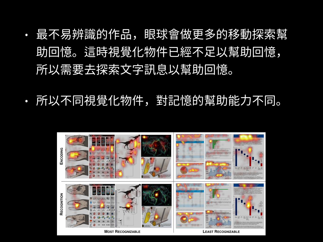
• 最不易辨識的作品,眼球會做更多的移動探索幫助回憶。這時視覺化物件已經不足以幫助回憶,所以需要去探索文字訊息以幫助回憶。
• 所以不同視覺化物件,對記憶的幫助能力不同。
(2 S
EC)
RECO
GNI
TIO
NEN
CODI
NG
MOST RECOGNIZABLE LEAST RECOGNIZABLE
Fig. 7. Examples of the most and least recognizable visualizations from [8]. TOP: Eye-tracking fixation heat maps (i.e., average of all participants’fixation locations) from the encoding phase of the experiment in which each visualization was presented for 10 seconds. The fixation patternsdemonstrate visual exploration of the visualization. BOTTOM: Eye-tracking fixation heat maps from the recognition phase of the experiment inwhich each visualization was presented for 2 seconds or until response. The most recognizable visualizations all have a single focus in the centerindicating quick recognition of the visualization, whereas the least recognizable visualizations have fixation patterns similar to the encoding fixationsindicative of visual exploration (e.g., title, text, etc.) for recognition.
strate patterns of visual exploration (e.g., view graph, read title, look atlegend, etc.), corresponding to the trends described in Sec. 6.2. Thesevisual exploration patterns are seen in both the most and least recog-nizable visualizations.
The heat maps generated for recognition fixations are obtained bytaking only the fixations until a positive response is made, i.e., only thefixations that lead up to a successful recognition, so that we can deter-mine which parts of a visualization participants look at to recognize avisualization. In Fig. 7 we see a distinct difference between the fixa-tion heat maps of the most and least recognizable visualizations in therecognition phase, where the most recognizable visualizations have afixation bias towards the center of the visualization. This indicates thata fixation near the center, with the accompanying peripheral context,provides sufficient information to recognize the visualization withoutrequiring further eye movements. In contrast, the least recognizablevisualizations have fixation heat maps that look more like the fixationpatterns of visual exploration in the encoding phase. These visual-izations are not recognizable “at-a-glance” and participants visuallysearch the visualization for an association, i.e., a component in thevisualization that will help with recognition. The fixations along thetop of the heat map for the least recognizable visualizations generallycorrespond to the location of the title and paragraph text describing thevisualization in further detail. We conducted statistical tests to verifythat the fixation patterns are significantly different between the mostand least recognizable visualizations, and we describe these analysesin the Supplemental Material.
We see that the recognition fixations are significantly differentbetween the most and least recognizable visualizations in that theleast recognizable visualizations require more exploration beforethey can be retrieved from memory. There is more eye movementduring recognition for the least recognizable visualizations indicatingthat people need to look at more parts of a visualization before theycan recognize it. The visual appearance is no longer enough and peo-ple start exploring the text. In the following section we will discusssome possible explanations for this difference and what visualizationelements people may be using for recognition.
6.1.3 Which visualization elements help recognition?We have demonstrated that there is a distinct difference between thefixation patterns of the most and least recognizable visualizations.Which visual elements in the visualization contribute to this differ-ence in fixation patterns, and which elements help explain the overallHR increase for recognition? We believe that people are utilizing two
types of associations to help with visualization recognition: visual as-sociations and semantic associations. The recognizable visualizationstend to contain more human recognizable objects (objects are presentin 74% of the top third most recognizable visualizations) compared tothe least recognizable visualizations (objects are present in 8% of thebottom third least recognizable visualizations). These human recog-nizable objects are examples of visual associations.
The visualizations that are not visually distinct must be recogniz-able due to semantic associations, such as the visualization’s title orsimilar text. In fact, the elements with the highest total fixation timeduring recognition are the titles (M = 274ms) followed by human rec-ognizable objects (M = 246ms, p < 0.01). The titles serve as a seman-tic association, and the objects as a visual association for recognition.Note that in Fig. 7 the fixations outside of the central focus in the leastrecognizable visualizations during recognition correspond to the visu-alizations’ title and other textual elements near the top. Thus thesetypes of semantic associations, i.e., textual components, are used forrecognition if the visualization is not visually distinct or does not con-tain sufficient visual associations.
The least recognizable visualizations likely do not have a strong vi-sual association nor a strong semantic association to assist with recog-nition (Fig. 6b). The least recognizable visualizations after 10 sec-onds have significant overlap with the least memorable visualizationsfrom [8] (after 1 second). Also, of the 1/3 least recognizable visualiza-tions 54% are from government sources (compare that to only 3% ofgovernment sources in the top 1/3 most recognizable visualizations),while of the 1/3 most recognizable visualizations, 49% are from in-fovis sources (and only 2% of the bottom 1/3 least recognizable vi-sualizations are from infovis). Government visualizations tend to usethe same templates and similar aesthetics, contributing to confusionbetween visualizations during recognition. The government visualiza-tions are also heavily composed of the least memorable visualizationtypes including bar and line graphs. The least memorable visualiza-tions “at-a-glance” are also the least recognizable even after pro-longed exposure.
6.1.4 What do people recall after 10 seconds of encoding?
Across 374 target visualizations4, the study participants generated2,733 text descriptions (see Supplemental Material for examples ofparticipant-generated descriptions). The mean length of a descrip-
4We removed visualizations for which participants complained about thetext being too small to read.
那麼 那一類的視覺化物件
能幫助記憶
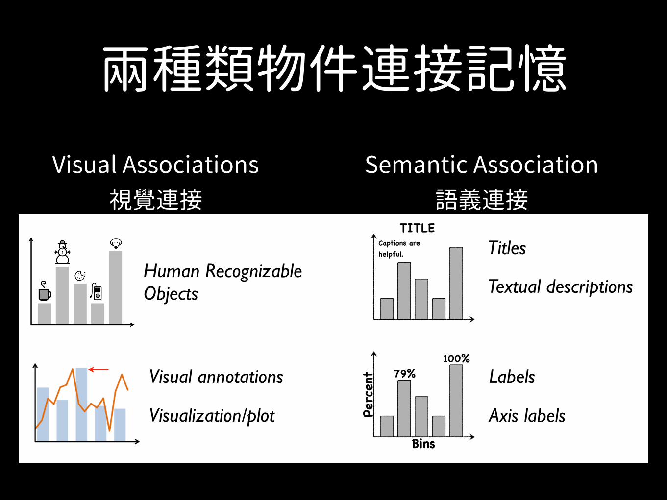
兩種類物件連接記憶Visual Associations Semantic Associations
Human Recognizable Objects
Visual annotations
FOR EXAMPLE... FOR EXAMPLE...
Titles
Labels
Visualization/plot
(bars)
100%Pe
rcen
t
Bins
79%
(bars)
TITLECaptions are helpful.
Textual descriptions
Axis labels
Visual Associations 視覺連接
Semantic Association 語義連接
兩種類物件連接記憶
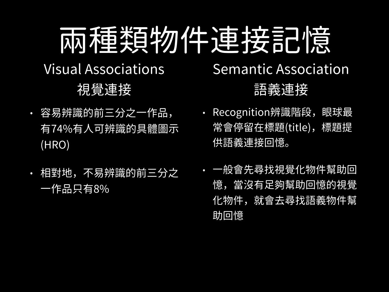
• 容易辨識的前三分之一作品,有74%有人可辨識的具體圖示(HRO)
• 相對地,不易辨識的前三分之一作品只有8%
Visual Associations 視覺連接
Semantic Association 語義連接
• Recognition辨識階段,眼球最常會停留在標題(title),標題提供語義連接回憶。
• 一般會先尋找視覺化物件幫助回憶,當沒有足 幫助回憶的視覺化物件,就會去尋找語義物件幫助回憶
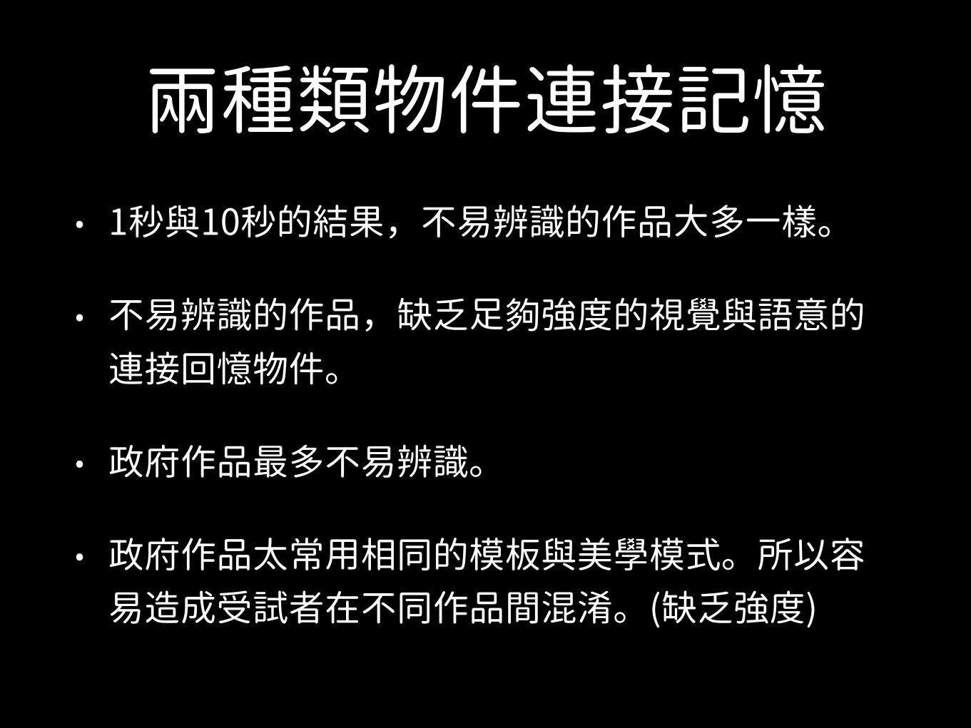
兩種類物件連接記憶• 1秒與10秒的結果,不易辨識的作品大多一樣。
• 不易辨識的作品,缺乏足 強度的視覺與語意的連接回憶物件。
• 政府作品最多不易辨識。
• 政府作品太常用相同的模板與美學模式。所以容易造成受試者在不同作品間混淆。(缺乏強度)
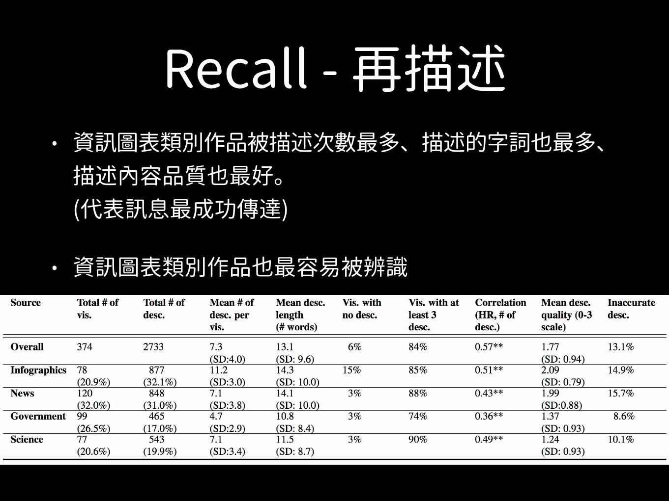
Recall - 再描述• 資訊圖表類別作品被描述次數最多、描述的字詞也最多、
描述內容品質也最好。(代表訊息最成功傳達)
• 資訊圖表類別作品也最容易被辨識
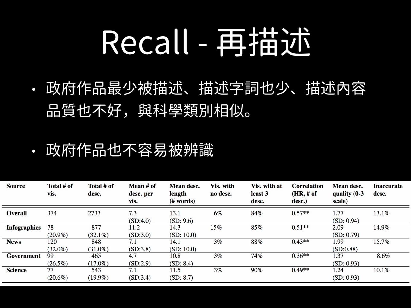
Recall - 再描述• 政府作品最少被描述、描述字詞也少、描述內容
品質也不好,與科學類別相似。
• 政府作品也不容易被辨識
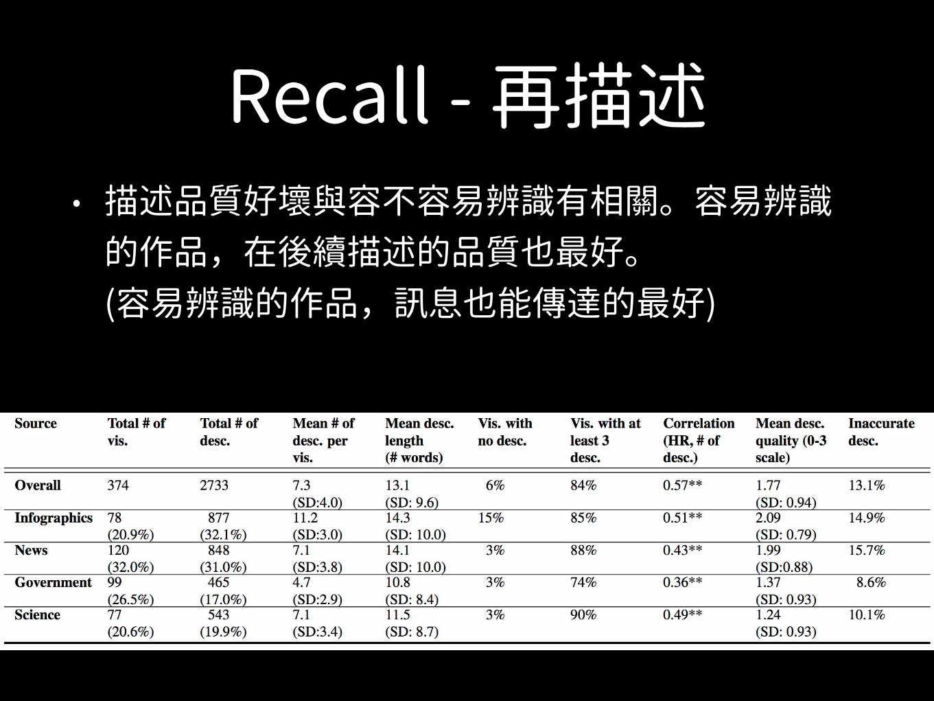
Recall - 再描述• 描述品質好壞與容不容易辨識有相關。容易辨識
的作品,在後續描述的品質也最好。(容易辨識的作品,訊息也能傳達的最好)
HIGH QUALITY DESCRIPTION
LOW QUALITY
DESCRIPTION
MEMORABLE
FORGETTABLE

描述品質好壞與容不容易辨識的關係? 視覺化作品內物件
如何影響記憶與理解
眼球追蹤代表 人從那些物件取得記憶與理解
Recall再描述代表 人對視覺化作品理解程度
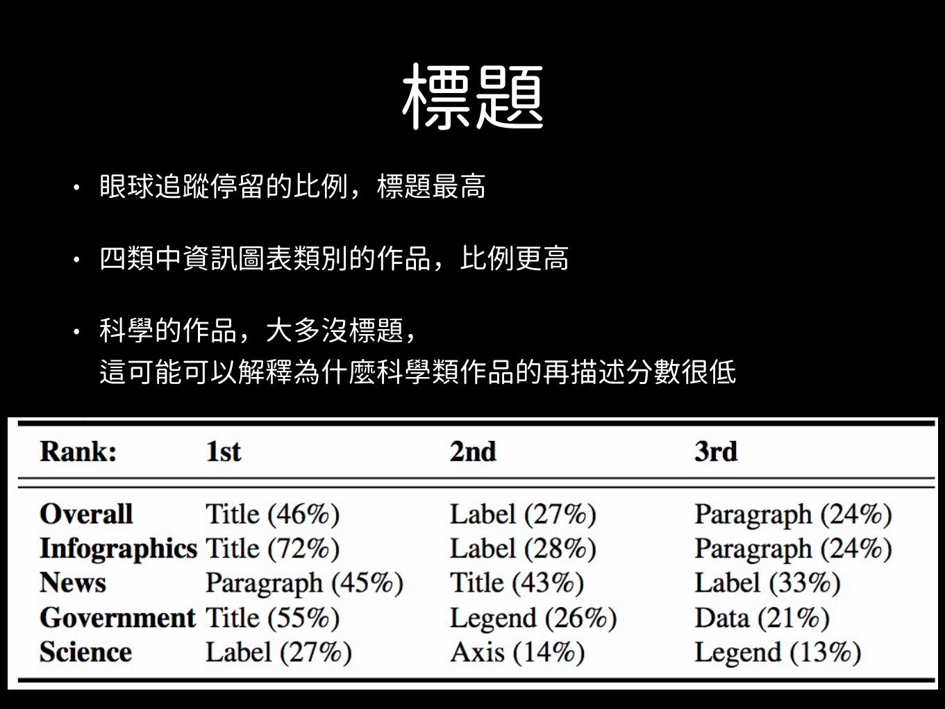
標題• 眼球追蹤停留的比例,標題最高
• 四類中資訊圖表類別的作品,比例更高
• 科學的作品,大多沒標題,這可能可以解釋為什麼科學類作品的再描述分數很低
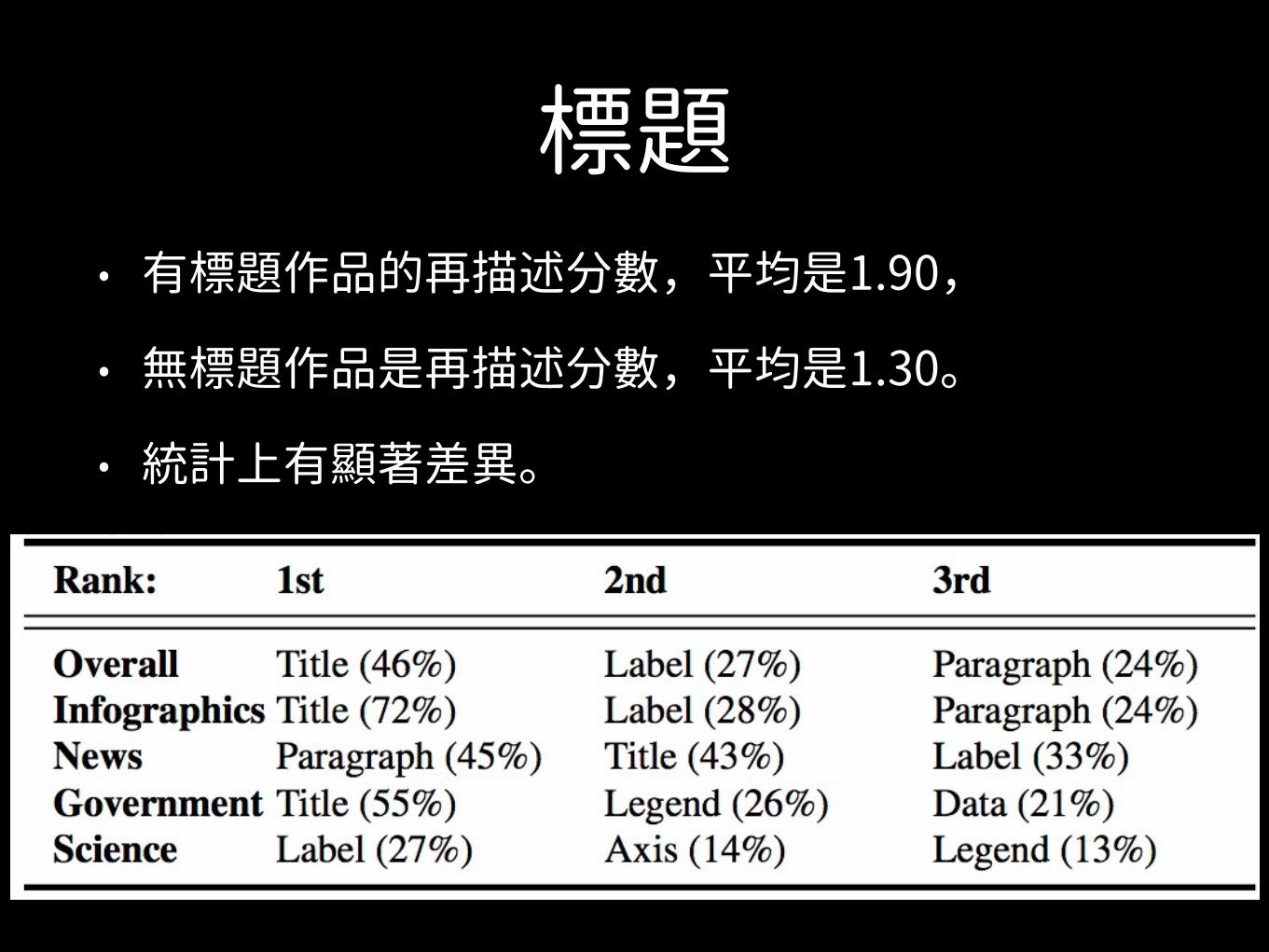
標題• 有標題作品的再描述分數,平均是1.90,
• 無標題作品是再描述分數,平均是1.30。
• 統計上有顯著差異。
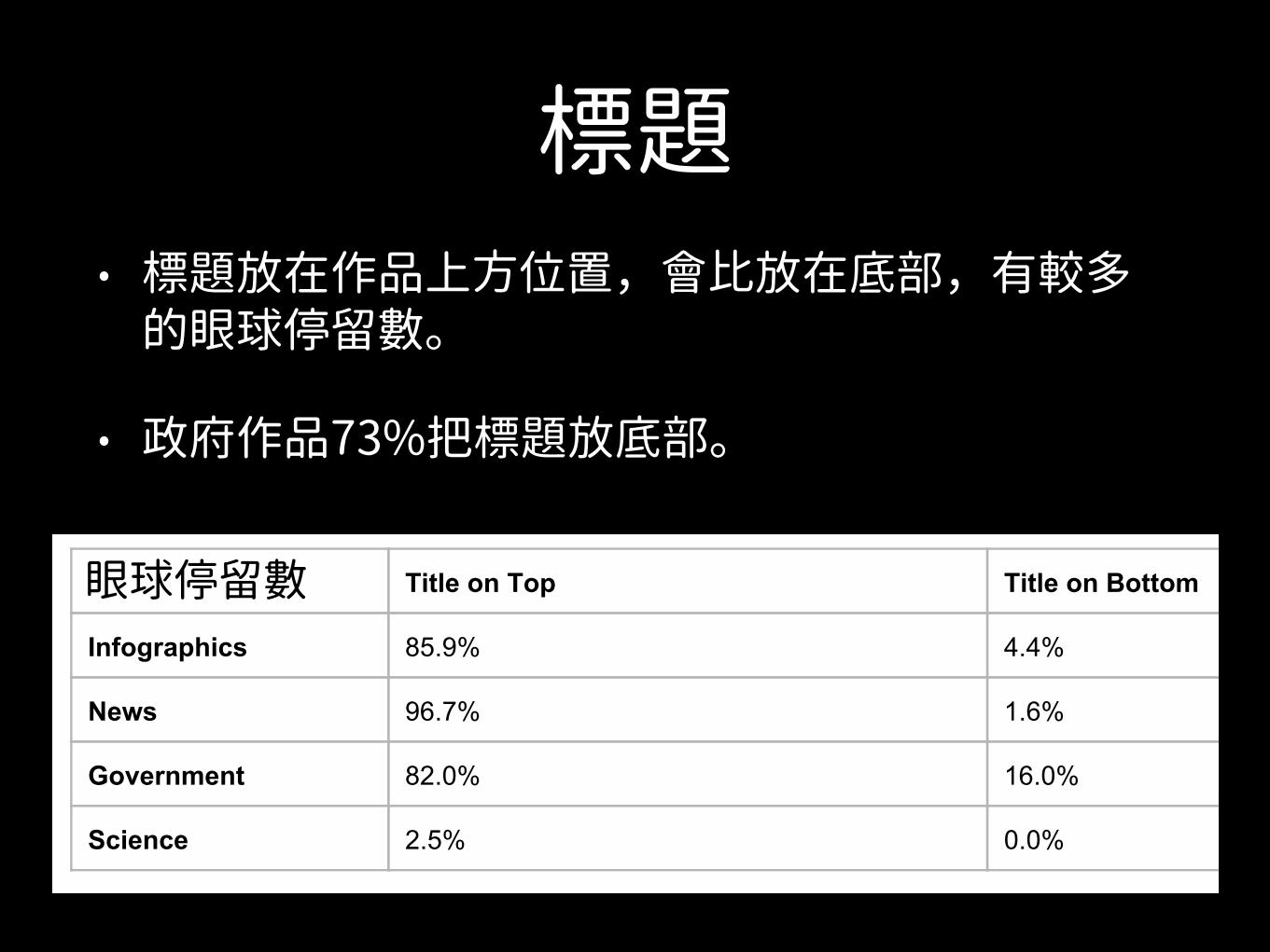
標題• 標題放在作品上方位置,會比放在底部,有較多
的眼球停留數。
• 政府作品73%把標題放底部。
Title: “Redesign Your Place” Text: “A workshop with the employees in Calderara di Reno town council Italy (within the framework of C3 project)” Source: http://visual.ly/redesignyourplace
“Update your place or something like that.a A humanoid figure with tentacles for limbs advertising a product.”
“The square says that something is divided into three groups.”
“something about the italian government city council”
“Somehting about a target perhaps about more effectively running a meeting in Italy or something like that”
Title: “A Taxonomy of Transition” Text: “racial/ethnic selfidentification in Chicago in the year 2010” Source: http://www.radicalcartography.net/index.html?chicagodots via http://visual.ly/
“The colors are ethnicities and the graph is a map of some area showing who lives in what neighborhood.”
“Hispanic is orange and exclusive of other groups.” “chicago ethnicity identification population segregation by races”
“florida map of location of races”
“Chicago race/ ethnicity identity map pink is white orange is hispanic blue is black”
“segregation in chicago”
“Chicago population by neighborhood by race”
In Table S1 we include some statistics about where a title was most commonly located across all our publication source categories. In Table S2 we calculate how frequently titles were fixated (across all participants and all visualization in a specific category) and how often they were described depending on where the title was located. In Table S3 we include the average title length across all visualizations in a given source category.
Table S1: Title Placement: most visualizations had the title located at the top of the visualization. Government visualizations had the most number of visualizations with a title at the bottom.
Title on Top Title on Bottom
Infographics 85.9% 4.4%
News 96.7% 1.6%
Government 82.0% 16.0%
Science 2.5% 0.0%
16
眼球停留數
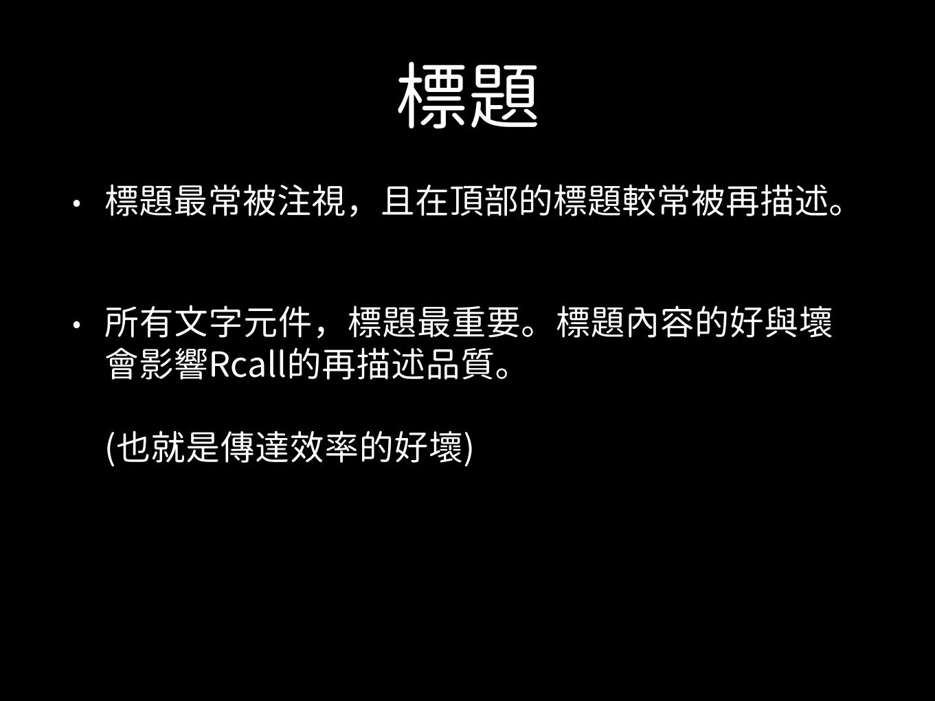
標題• 標題最常被注視,且在頂部的標題較常被再描述。
• 所有文字元件,標題最重要。標題內容的好與壞會影響Rcall的再描述品質。(也就是傳達效率的好壞)
標題
Section 6.2.1: Titles Across the 330 visualizations with at least 3 descriptions, the average description quality of visualizations with titles is 1.90 as compared to 1.30 for visualizations without titles (the difference in quality is statistically significant at p<0.001). These statistics are computed over 2,085 descriptions that were generated for visualizations with titles, and 581 descriptions that were generated for visualizations without titles. The difference between the number of descriptions generated in each case is informative as well. Based on this data, participants were more than 3.5 times more likely to write a description for a visualization that had a title than for one that didn’t, which points to the ease (and correspondingly, difficulty) of encoding and retrieving these visualizations from memory.
However, not all titles are equally effective. Below we provide examples of visualizations that are at the high/low extremes of recognition HR, and quality ratings. The examples are split by “good” (i.e., had a large fraction of participants mention or use the title in their recall text description and received high quality scores) and “bad” (i.e., unutilized titles and received low quality scores):
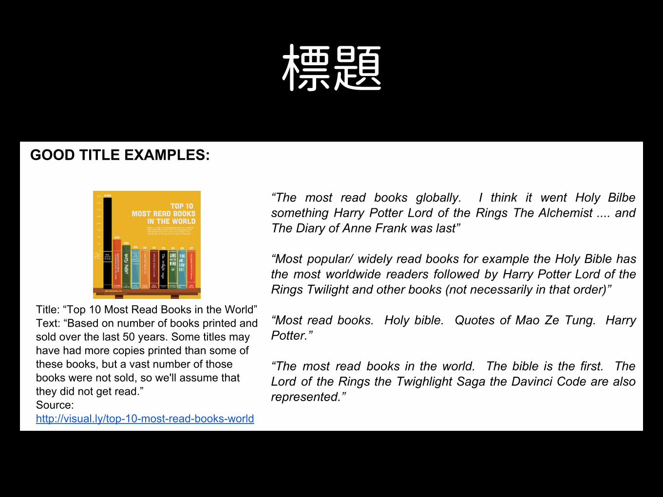
GOOD TITLE EXAMPLES:
Title: “Top 10 Most Read Books in the World” Text: “Based on number of books printed and sold over the last 50 years. Some titles may have had more copies printed than some of these books, but a vast number of those books were not sold, so we'll assume that they did not get read.” Source: http://visual.ly/top10mostreadbooksworld
“The most read books globally. I think it went Holy Bilbe something Harry Potter Lord of the Rings The Alchemist .... and The Diary of Anne Frank was last” “Most popular/ widely read books for example the Holy Bible has the most worldwide readers followed by Harry Potter Lord of the Rings Twilight and other books (not necessarily in that order)” “Most read books. Holy bible. Quotes of Mao Ze Tung. Harry Potter.” “The most read books in the world. The bible is the first. The Lord of the Rings the Twighlight Saga the Davinci Code are also represented.”
14
標題
Title: “Which Birth Dates are Most Common?” Source: http://thedailyviz.com/2012/05/12/howcommonisyourbirthday/ via http://visual.ly/
“Percent of people born on each day of the year. Xaxis is month Yaxis is day. Most popular birthdays are in late summer and early fall.” “This was about which birthdays were most common with darker shades meaning more people being born on that day. September seemed to be the most popular birth month and the end of December had a high number of birthdays.” “months in which people were born...there's a concentration in the late summer seemingly the highest in September” “this was a chart of most common birthdays. the darker the color the more common the birthday. september was the darkest month”
Title: “66% of Americans feel Romney Performed Better Than Obama in Debates” Source: http://visual.ly/didromneyoutperformobamadebate1
“the percentages of people who thought Romney debated better than Obama. (~60% of everyone (~80% Republicans 60% independent and ~35% democrats) At the bottom is a picture of the two gesturing or about to shake hands” “Percentage of people of different political parties who picked either Romney (red) or Obama (blue) as being better at debate. Romney one in all political party categories except in the Democrats” “66% of Americans believe Romney did better in the debate is what the quote on the left top reads. Democrats believed Obama did better with a small majority. Other groups were also considered around 4 total. Fox News viewers may have been one category. Obama pic on left lower Romney on right”
BAD TITLE EXAMPLES:
Title: “Cities” Text: “2010, % change on previous year, forecast” Source: http://www.economist.com/blogs/dailychart/2010/11/global_cities
“Countries list employment and GDP?” “ranking of cities by growth in employment? istanbul was at the top” “Some countries have gotten better on this metric some worse. More better than worse though.” “Increase in employment rate and GDP(?) of different cities internationally.” “Something to do with the economies of developing nations and useable income vs taxed income”
15
數據圖表 Pictograms• 眼球停留第二多。
• 有圖表的Recall再描述品質,比沒圖表顯著好
其他元件• 其他眼球停留較多的元件
• 簡短文字、圖例、表的列標題
• 標題、標示、短訊息的內容,最常被Recall的描述時被使用。
• 科學類作品的Recall描述標題,期刊本來就沒有,所以受試者的描述則變成標示(註解)、軸線標示、圖例為參考。
額外標示
Table 1. The visualization labeling taxonomy used to annotate our target visualizations. The data subtypes taxonomy is taken from [8].LABEL [OPTIONAL SUBTYPES] DESCRIPTIONAnnotation [Arrow] Outline of any visual elements annotating the data. A specific subtype of “arrow” was included to denote whether
the annotation was in the form of an arrow.Axis [Time] Outline of where an axis is located including any tick marks and numeric values along the axis. A specific subtype of
“time” was included to denote an axis involving time.Data Outline of where the full data plot area is located (e.g., the area between the x-axis and y-axis in a 2D plot).Data (type) [Area, Bar, Circle, Diagram, Distribution, Grid & Matrix, Line, Map, Point, Table, Text, Trees & Networks] Outline of where
the actual data values are visually encoded (e.g., bars in a bar graph, points in a scatterplot, etc.).Graphical Element Outline of any visual elements that are not related to the visual representation or description of the data.Legend Outline of any legends or keys that explain the data’s visual encoding (e.g., color scales, symbol keys, map legends, etc.).Object [Photograph, Pictogram] Outline of any human recognizable objects (HRO) in the image. Objects are either realistic in
representation (photograph) or abstract drawings (pictogram). Descriptions of each object were also recorded.Text [Axis Label, Header Row, Label, Paragraph, Source, Title] Outline of any text in the image. Subtypes cover all the common
representations from prose to labels.
GENDER EQUALITY IN LABOR FORCE PARTICIPATION
ORIGINAL
RATI
O O
F FE
MAL
E TO
M
ALE
0%
25%
50%
75%
100%
CHINA KOREA JAPAN INDIASource: Gender Statistics 2013, World Bank
GENDER EQUALITY IN LABOR FORCE PARTICIPATION
DATA REDUNDANCY
RATI
O O
F FE
MAL
E TO
M
ALE
0%
25%
50%
75%
100%
CHINA KOREA JAPAN INDIA
34%
69%70%82%
Source: Gender Statistics 2013, World Bank
GENDER EQUALITY IN LABOR FORCE PARTICIPATIONCHINA LEADS IN FEMALE LABOR FORCE PARTICIPATION WHEREAS INDIA LAGS SIGNIFICANTLY BEHIND IN 2013
MESSAGE REDUNDANCY
GENDER EQUALITY IN LABOR FORCE PARTICIPATION
DATA & MESSAGE REDUNDANCY
CHINA LEADS IN FEMALE LABOR FORCE PARTICIPATION WHEREAS INDIA LAGS SIGNIFICANTLY BEHIND IN 2013.
CHINA INDIAJAPANKOREA
RATI
O O
F FE
MAL
E TO
M
ALE
0%
25%
50%
75%
100%
CHINA KOREA JAPAN INDIA
RATI
O O
F FE
MAL
E TO
M
ALE
0%
25%
50%
75%
100%
CHINA KOREA JAPAN INDIA
34%
69%70%82%
CHINA INDIAJAPANKOREASource: Gender Statistics 2013, World Bank Source: Gender Statistics 2013, World Bank
Fig. 3. Illustrative examples of data redundancy (i.e., additional quanti-tative encodings of the data) and message redundancy (i.e., additionalqualitative encodings of the main trend or message of the data). Moreexamples are provided in the Supplemental Material.
such as color, size, or opacity to represent a value already exhibited ina visualization such as the x- or y-axis values. In contrast, a visualiza-tion exhibits message redundancy if the main conclusion or messageof the visualization is explicitly presented to the viewer in multipleways: the addition of explanatory annotations, labels, text, and pic-tures. A visualization can exhibit both data and message redundancy(e.g., lower right panel of Fig. 3).
Annotating redundancy for each target visualization allows us toevaluate whether redundancy enables more effective recognition andrecall. Each of the two types of redundancies were recorded as presentor absent, by three visualization experts. The visualizations were re-viewed and discussed until unanimous consensus was found.
4 ANALYSIS OF LABELED VISUALIZATIONS
The labeled visualizations enable us to gain insight into and study thedistribution and type of visual elements employed across publicationvenues and visualization types. These insights also help us under-stand and put into context the observed trends and results of our study(Sec. 6). Examining the proportion of image area covered by the datalabel, as shown in Fig. 4, we see that it is highest for the scientificjournal visualizations. This is probably due to the publishing contextof scientific journal figures in which the visualization occurs as part ofa paper narrative. Additionally, authors commonly have enforced pagelimits and figure limit constraints, so maximizing information per unitarea is a constraint.
Breaking down this measure of image area for data display by vi-
0%
25%
50%
75%
100%
News media Government Science Infographic
64%
78%
54%58%
Percent of Visualization covered with Data
Perc
ent o
f Vis
ualiz
atio
n
Publication Venue
Fig. 4. Percentage of visualization average pixel area covered by thedata label. Scientific visualizations on average had the highest percent-age of image area devoted to data presentation.
sualization type, we see that diagrams, maps, and tables cover a largerpercentage of the image area than other visualization types. Thesetypes of visualizations tend to have annotations and text labels incor-porated into the data representation itself, thus requiring less of theimage area around the data plot for additional explanations.
Another observation is the difference in the average total numberof elements in a visualization across sources. Visualizations fromgovernment sources have on average 11.9 labeled elements per visu-alization, significantly fewer compared to other visualization sources(p < 0.001, t(177) = 4.79 when compared2 to the numerically closestvisualization source, science). In contrast, visualizations from info-graphic sources have nearly twice as many elements (M = 38.7) ascompared news media (M = 19.7, p < 0.001, t(212) = 5.73) and sci-entific visualizations (M = 18.4, p < 0.001, t(169) = 5.23). The addi-tional elements in the infographic visualizations are mostly in the formof more text, objects, and graphical elements around the data.
Finally, there is a difference between publication venues in the per-centage of the visualization’s area covered by human recognizable ob-jects (HRO). There are no such objects in the government visualiza-tions, and the percentages are generally less for scientific journal vi-sualizations (M = 14%) as compared to news media (M = 25%) andinfographic (M = 29%) visualizations. The human recognizable ob-jects are primarily in the form of company logos (McDonalds, Twitter,Apple, etc.), international flags commonly used in the news media vi-sualizations, and pictograms or photographs of human representationsand computer/technology depictions (see also the word cloud visual-ization in the Supplemental Material).
In addition to the labels, each visualization was examined to de-termine if it exhibited message redundancy, data redundancy, both, orneither. As shown in Fig. 5, all publication venues included visual-
2For all the p-values reported in this paper, t-tests were corrected for multi-ple comparisons.
數據式額外標示
訊息式額外標示
混合額外標示
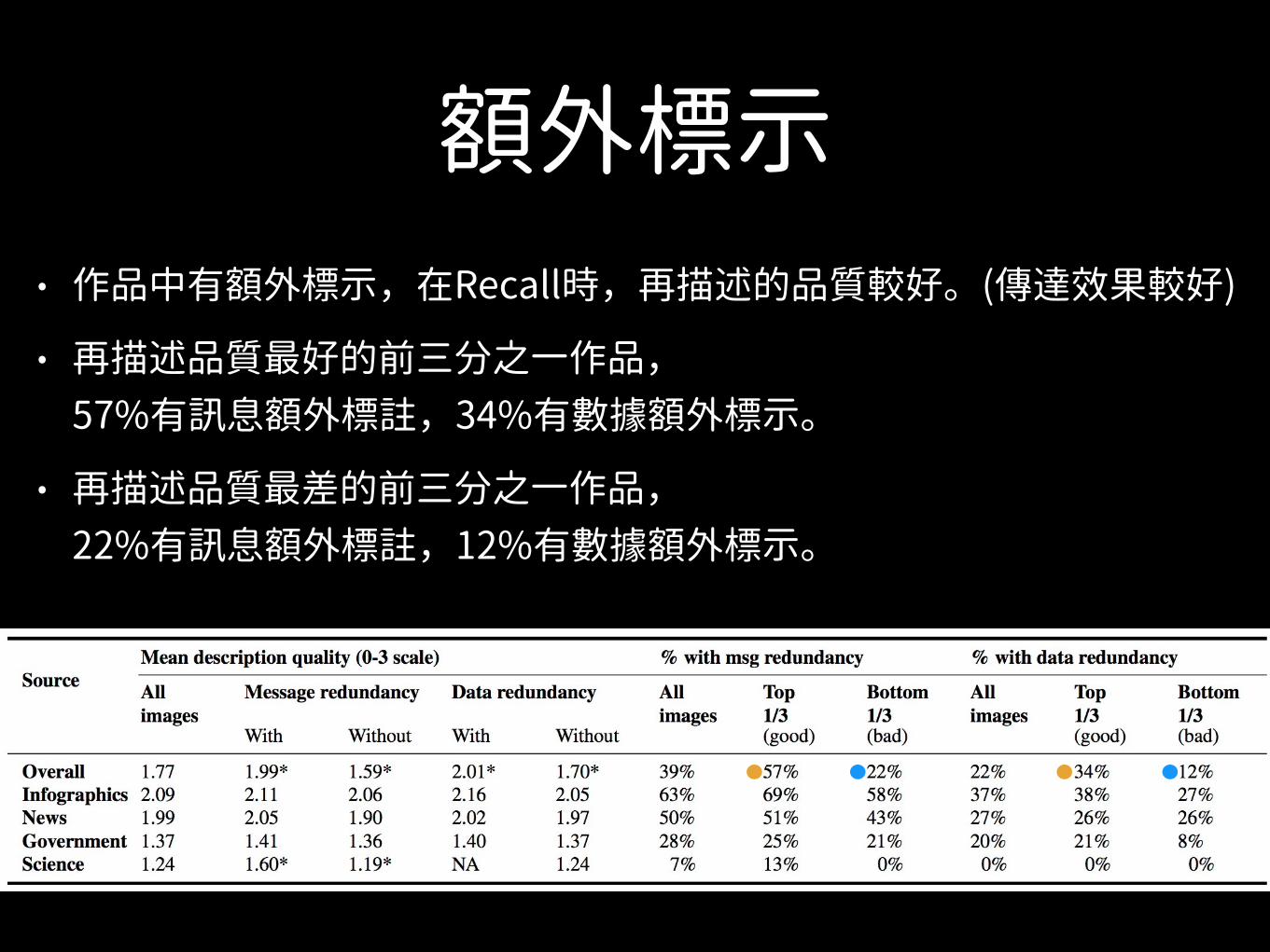
額外標示• 作品中有額外標示,在Recall時,再描述的品質較好。(傳達效果較好)
• 再描述品質最好的前三分之一作品,57%有訊息額外標註,34%有數據額外標示。
• 再描述品質最差的前三分之一作品,22%有訊息額外標註,12%有數據額外標示。
額外標示• 資訊圖表類有較多的額外標示
• 額外標示,與作品容不容易辨識及再描述品質有關。
• 額外標示能幫助閱讀者抓住作品的主要訊息,且改善作品的辨識與再描述品質。
總結• 容易辨識的視覺化作品,內容與細節也容易回想。
描述內容也較好
• 標題的內容會顯著影響,人們接收作品的訊息的狀況,以及再描述的狀況。
• 數據圖也能幫助腦中有效地回憶,也能幫助傳遞訊息
• 額外標示能使作品更容易被再描述與理解。
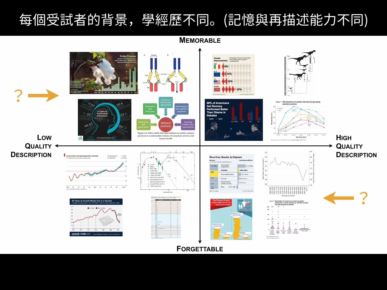
對研究的評論與批判• 每個受試者實驗100張作品,
但不是100張都相同。
• 每個受試者的背景,學經歷不同。(記憶與再描述能力不同)
• 隨機取樣(X) 系統隨機取樣(?)
HIGH QUALITY DESCRIPTION
LOW QUALITY
DESCRIPTION
MEMORABLE
FORGETTABLE
?
?
每個受試者的背景,學經歷不同。(記憶與再描述能力不同)
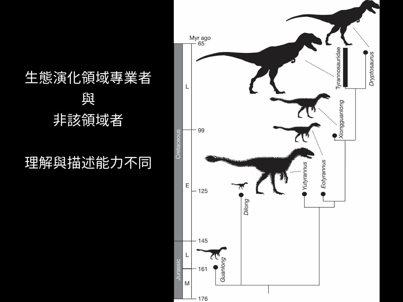
生態演化領域專業者 與
非該領域者
理解與描述能力不同

「謝謝。」