Embed Size (px)
Citation preview

portfolioj.swendsen

3
Description
PROGRAMS
COURSE & SECTION
INSTRUCTOR
DATE
OBJECTIVE
Bianca Rodriguez
Comm 130 - Section 16process
PHONE: 720-541-4070
EMAIL: [email protected]
INSTAGRAM: jesswendesign
WEBSITE: https://jswendsen.wordpress.com
Web Page Mock-Up..........4Montage..........6
Infographic..........8Brochure..........10
Magazine Cover..........12Business Identity..........14
Photo Design..........16HTML & CSS Coding..........18
Prezi Presentation..........20
Jessica A. Swendsen table of contents

5
Description
PROGRAMS
COURSE & SECTION
INSTRUCTOR
DATE
OBJECTIVE
Bianca Rodriguez
Comm 130 - Section 16process
WEb page mock-up
Design an attractive website layout with the use of a grid to achieve perfect alignment.
First I began sketching what I wanted my layout to be like. I sketched 3 very different layouts and chose the third to work from. Then, I brought the layout idea in to Photoshop and created a wire frame using a 24 column grid. I wanted my layout to have boxes that would eventually slide or change to different photos, so I chose a grid layout that would allow many photographs to be displayed at once. I also chose to have my navigation bar stack down the left side. After the wire frame I began to add in the content; photogrpahs, ads, and company logo. I also added a gallery slide icon on the bottom left. The idea there is that the highlighted area – corresponding to squares in the grid in the body of the webpage – would show which box in the grid was currently animating or changing photographs or advertisements.
Photoshop
Nov. 16, 2016
Create an attractive, professional looking website highlighting interesting and unique photography that people interested in photography or having professional photos taken would be drawn to.

7
Description
PROGRAMS
COURSE & SECTION
INSTRUCTOR
DATE
OBJECTIVE
Bianca Rodriguez
Comm 130 - Section 16process
Montage
First I thought about which spiritual message I wanted to design this project around. Once I had that finalized, I spent a great deal of time searching for pictures that conveyed how I felt about the message I am trying to share. I also looked for images that had similar colors so they would be easier to layer together. Then, once I had all the images I wanted to use I sketched a few ideas for how I wanted the final project to be laid out.Next, I opened up Photoshop and edited each of the images slightly to help their colors blend a little more in the final draft. Then I began layering the images together. To blend them I used the masking tool. Then I added in the text and after searching through the font I had, decided nothing fit my theme so I went online to find text that worked well together and that caught the feeling of the design.
Photoshop
Oct. 19, 2016
Share a bit of my own personal testimony and spirituality using my talents in photoshop and design. Inspire or inform others through the emotions compelled through viewing the image.
Create a spiritual poster montage using images and type.

9
Description
PROGRAMS
COURSE & SECTION
INSTRUCTOR
DATE
OBJECTIVE
Bianca Rodriguez
Comm 130 - Section 16process
Infographic
I spent a fair amount of time thinking about what topic I wanted to design an infographic for.Next, I began looking for all the information I would need to show information about this topic.Once I had that narrowed down I began sketching out my icons and graphs and then the layout.Then I took my ideas into illustrator and spent a lot of time creating graphics and arranging them nicely on my art board.I submitted my rough draft for critique, an after some constructive criticism, took my draft back into Illustrator and tweaked a few things and this is my final result. Actually I would love to keep adding information, as there is more that I find interesting, but what I included gets the basic message across.
Photoshop
Nov. 2, 2016
Create a professional looking infographic that informs people about an effective way to lose weight and feel better. It is meant for those interested in learning more about being a healthier version of themselves
Design an infographic that portrays data in an aesthetically pleasing image.
11
Description
PROGRAMS
COURSE & SECTION
INSTRUCTOR
DATE
OBJECTIVE
Bianca Rodriguez
Comm 130 - Section 16process
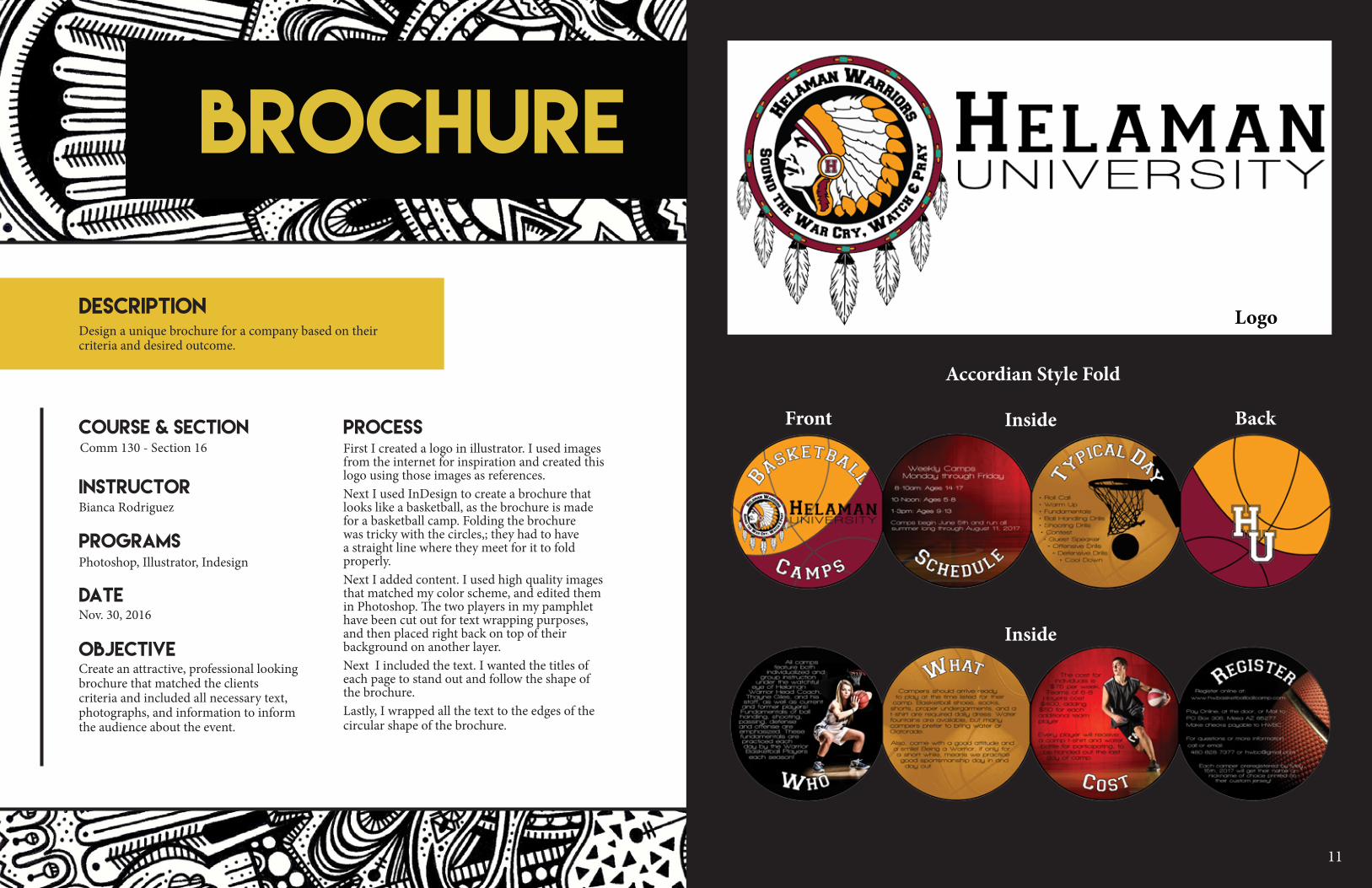
brochure
First I created a logo in illustrator. I used images from the internet for inspiration and created this logo using those images as references.Next I used InDesign to create a brochure that looks like a basketball, as the brochure is made for a basketball camp. Folding the brochure was tricky with the circles,; they had to have a straight line where they meet for it to fold properly.Next I added content. I used high quality images that matched my color scheme, and edited them in Photoshop. The two players in my pamphlet have been cut out for text wrapping purposes, and then placed right back on top of their background on another layer. Next I included the text. I wanted the titles of each page to stand out and follow the shape of the brochure. Lastly, I wrapped all the text to the edges of the circular shape of the brochure.
Photoshop, Illustrator, Indesign
Nov. 30, 2016
Create an attractive, professional looking brochure that matched the clients criteria and included all necessary text, photographs, and information to inform the audience about the event.
Design a unique brochure for a company based on their criteria and desired outcome.
Accordian Style Fold
Front Inside
Inside
Back
Logo

13
Description
PROGRAMS
COURSE & SECTION
INSTRUCTOR
DATE
OBJECTIVE
Bianca Rodriguez
Comm 130 - Section 16process
magazine cover
First I began by sketching my layout and taking my ideas into InDesign. Then I chose a high-resolution photo that I felt would be appropriate for my cover and chose a color scheme based on the colors in the image. I brought my image into Photoshop and cleaned it up and adjusted the levels and colors to make it look nice. Then I took it to InDesign began to place my text in predetermined places.For my first draft I looked at a lot of Good Housekeeping magazine covers as that is the title I chose to use for my magazine. I noticed they used a lot of different fonts. I tried that in my first draft, but it was too messy looking. So I changed all the text to one of two chosen fonts, aligned them all, and added a bar code.
Photoshop, Indesign
Sept. 28, 2016
Create an attractive, professional looking magazine cover that reflects interesting facts about myelf.
Design a magazine cover that showcases a self-portrait as well as articles about yourself.

15
Description
PROGRAMS
COURSE & SECTION
INSTRUCTOR
DATE
OBJECTIVE
Bianca Rodriguez
Comm 130 - Section 16process
business identity
First, I decided on a business to create a logo for. Then I came up with a name, color scheme, and ideas for how I wanted to the logo to look. Next I sketched out these ideas for the logo on paper and took them into Illustrator and began piecing them together. Mostly I used the pen and type tools. After I had my logo created, I was able to start designing the letterhead and business card (front and back), and mailing envelope. I decided for a fun design element I would use the fox’s bow tie from my logo to create a pattern for the sides of my stationary.For a finished feel and to get an idea what all these documents would look like printed I went online and found this mock-up. I took it into Photoshop to layer in my designs and the result looks very similar to how this stationary would look if printed.
Illustrator, InDesign, Photoshop
Oct. 26, 2016
Create a logo and stationary set that portrays the playfulness, whimsy, and professionalism of this unique photography company.
Create a logo for a company, service or organization and establish a visual identity across several documents.

17
Description
PROGRAMS
COURSE & SECTION
INSTRUCTOR
DATE
OBJECTIVE
Bianca Rodriguez
Comm 130 - Section 16process
photo design
First I set out to take a great picture. I wanted to use this project to showcase the beautiful place where I live, so I began looking for great landscapes and dramatic lighting. I took a bunch of images at a little reservoir near my home at dusk for perfect lighting. I sifted through my photos and took my favorie image into Photoshop and edited it using the levels, vibrance/saturation, selective color, and sharpness tools. I chose to use the Colorado Flag as my design element on the image, as it also has the colors found in my photo. I created the flag and laid it on top of the photo, using the color picker tool to make sure the colors matched exactly. I also turned the opacity down to let the photo come through the flag. Last I added the color swatches and color text and faded them into the water.
Photoshop
Oct 12, 2016
Create an attractive, professional looking flier that would inspire people interested in travel or nature to come and visit the gorgeous place that I am lucky enough to get to call home.
Use photography and design skills to create an attractive image using a color scheme based on colors in the image.

19
Description
PROGRAMS
COURSE & SECTION
INSTRUCTOR
DATE
OBJECTIVE
Bianca Rodriguez
Comm 130 - Section 16process
html & css
As I have never used HTML or CSS before, I began by learning some basics about code. I had to do a lot of trouble shooting using the internet to look up things that were unclear in the outline for this project.Then I downloaded the template provided and began piecing my website together. I created my HTML file and started adding my content and tags. Then I created my CSS file and made sure to link it in the HTML code.I made customizations in my CSS to match the colors in my logo and changed the fonts to what I preferred. Then I played around with the design and changed borders, font colors, and the background to match my logo.I created the background in photoshop using the fox’s bowtie for inspiration and then put that image as my background in my HTML code.
Photoshop, Illustrator, Notepad++
Nov. 9, 2016
This poject was created to learn about HTML and CSS coding and to provide some background on how the logo was designed and created for the Business Identity project.
Code a custom webpage with HTML and CSS dedicated to the logo created in the Business Identity project (pg 14).

21
Description
PROGRAMS
COURSE & SECTION
INSTRUCTOR
DATE
OBJECTIVE
Bianca Rodriguez
Comm 130 - Section 16process
prezipresentation
First I watched tutorials about Prezi to familliarize myself with the software. I chose running as the topic for my presentation and based my design around things I typically see on my neighborhood runs. I sketched out my idea and began designing the background in Photoshop. I chose to go with a circular design and animate my presentation in a clockwise sequence around that design.In Prezi I inserted my background and began creating invisible frames for each slide of my presentation. Then I added the text for each slide. This content included tips and tricks for achieving a great run. The animation for the presentation was set to zoom in and out of each slide moving around the circle and finally ended back where it began, just like if I went for a run in real life; I always end up back at home.
Photoshop, Prezi.com
Oct. 5, 2016
Inspire the viewer, through engaging design and animation, to get out and go for a run using the tips and tricks mentioned in this Prezi presentation in order to have their best run ever.
Create a presentation to demonstrate the features and capabilities of the Prezi software.
For full presentaiton go to: https://prezi.com/okc26e6lpu5c/just-run/?utm_campaign=share&utm_medium=copy