Embed Size (px)
Citation preview

1
Lecture 8:
Deep Dive: Menus
Brad Myers
05-899A/05-499A: Interaction Techniques
Spring, 2014
© 2014 - Brad Myers
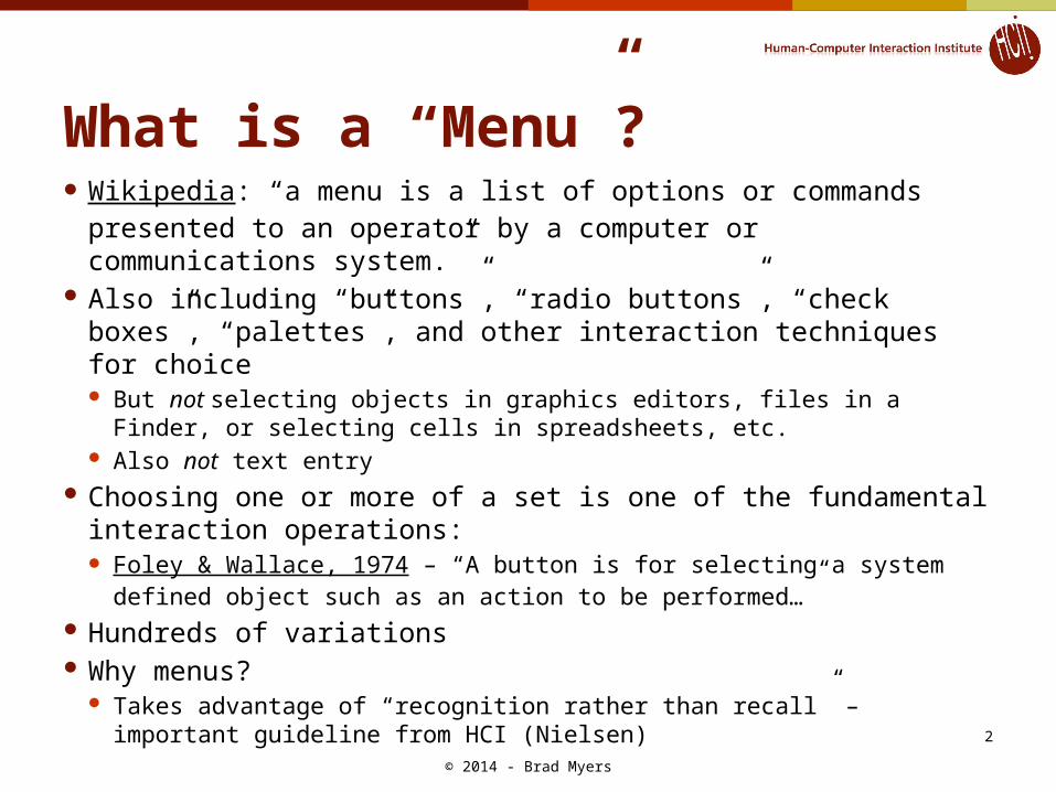
What is a “Menu”? Wikipedia: “a menu is a list of options or commands presented
to an operator by a computer or communications system.” Also including “buttons”, “radio buttons”, “check boxes”,
“palettes”, and other interaction techniques for choice But not selecting objects in graphics editors, files in a Finder, or
selecting cells in spreadsheets, etc. Also not text entry
Choosing one or more of a set is one of the fundamental interaction operations: Foley & Wallace, 1974 – “A button is for selecting a system defined
object such as an action to be performed…” Hundreds of variations Why menus?
Takes advantage of “recognition rather than recall” – important guideline from HCI (Nielsen)
© 2014 - Brad Myers
2
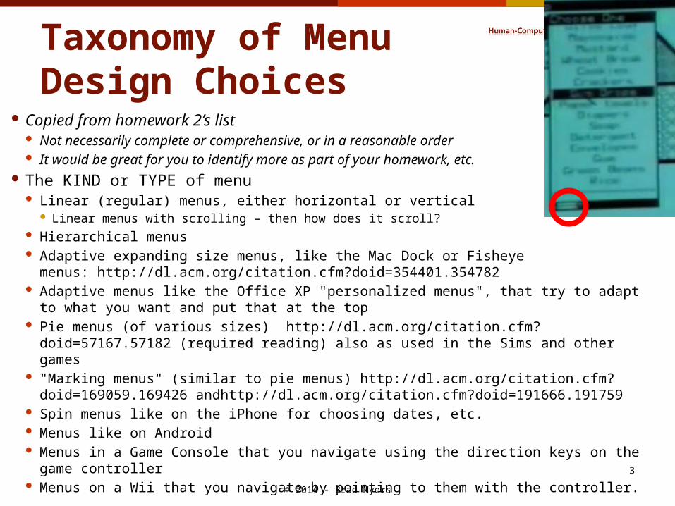
Taxonomy of MenuDesign Choices
Copied from homework 2’s list Not necessarily complete or comprehensive, or in a reasonable order It would be great for you to identify more as part of your homework, etc.
The KIND or TYPE of menu Linear (regular) menus, either horizontal or vertical
Linear menus with scrolling – then how does it scroll? Hierarchical menus Adaptive expanding size menus, like the Mac Dock or Fisheye
menus: http://dl.acm.org/citation.cfm?doid=354401.354782 Adaptive menus like the Office XP "personalized menus", that try to adapt to what you
want and put that at the top Pie menus (of various sizes) http://dl.acm.org/citation.cfm?doid=57167.57182 (required
reading) also as used in the Sims and other games "Marking menus" (similar to pie menus) http://dl.acm.org/citation.cfm?
doid=169059.169426 andhttp://dl.acm.org/citation.cfm?doid=191666.191759 Spin menus like on the iPhone for choosing dates, etc. Menus like on Android Menus in a Game Console that you navigate using the direction keys on the game
controller Menus on a Wii that you navigate by pointing to them with the controller.
© 2014 - Brad Myers
3
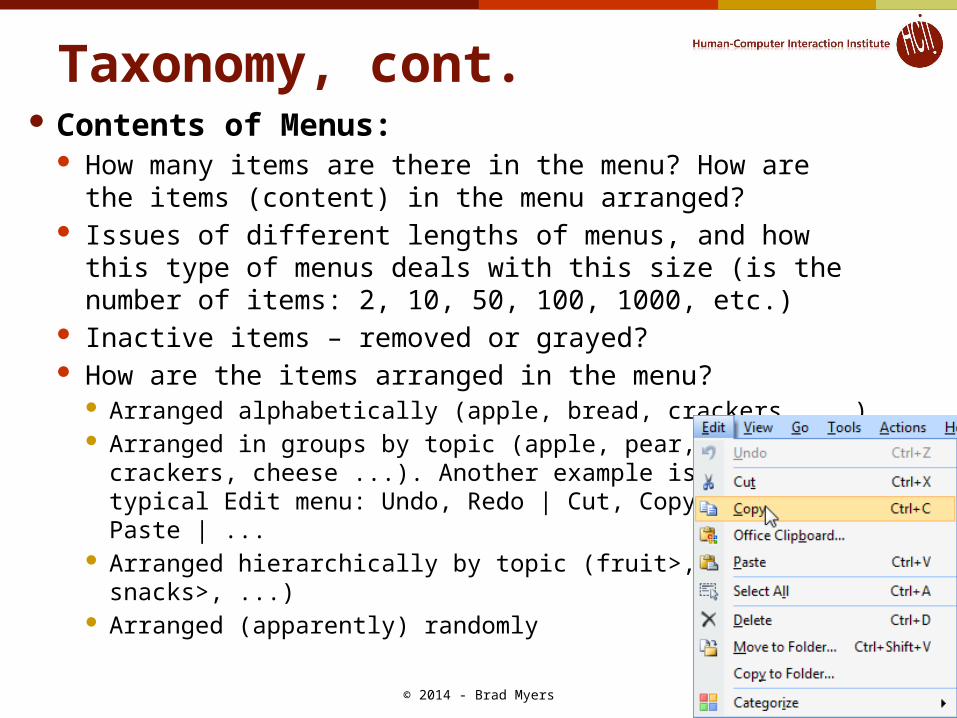
Taxonomy, cont. Contents of Menus:
How many items are there in the menu? How are the items (content) in the menu arranged?
Issues of different lengths of menus, and how this type of menus deals with this size (is the number of items: 2, 10, 50, 100, 1000, etc.)
Inactive items – removed or grayed? How are the items arranged in the menu?
Arranged alphabetically (apple, bread, crackers, ...) Arranged in groups by topic (apple, pear, |,
crackers, cheese ...). Another example is thetypical Edit menu: Undo, Redo | Cut, Copy, Paste | ...
Arranged hierarchically by topic (fruit>,snacks>, ...)
Arranged (apparently) randomly© 2014 - Brad Myers
4

Taxonomy, cont. Interactions with the Menu:
How does the user interact with the menu: Which specific mouse buttons or keyboard keys? How is the menu initially invoked?
Fixed menu, always on the screen. At the top edge of the screen, like on Macintosh, versus somewhere else, like on Windows. Also includes palettes, toolbars of icons, etc.
Popup menu with a particular mouse button over any relevant object. For example, the right-mouse context menu.
Popup menu from a specific icon or widget. E.g., an "option button" like for fonts How does the user interact with the items in the menu?
Press and hold, move to item, release on item Press and release ("click") to start, click again to stop
What is the feedback to the user for: Hovering the mouse over an item without clicking Pressing down over an item Releasing over an item
How does the user get to sub-menus, if any? Slide out of an item to get its submenu. Click on an item to get its submenu.
If there are multiple ways of using the same menus, then what are the alternatives. For example, are there keyboard accelerators? Do the menus work with the keyboard arrow keys?
© 2014 - Brad Myers
5
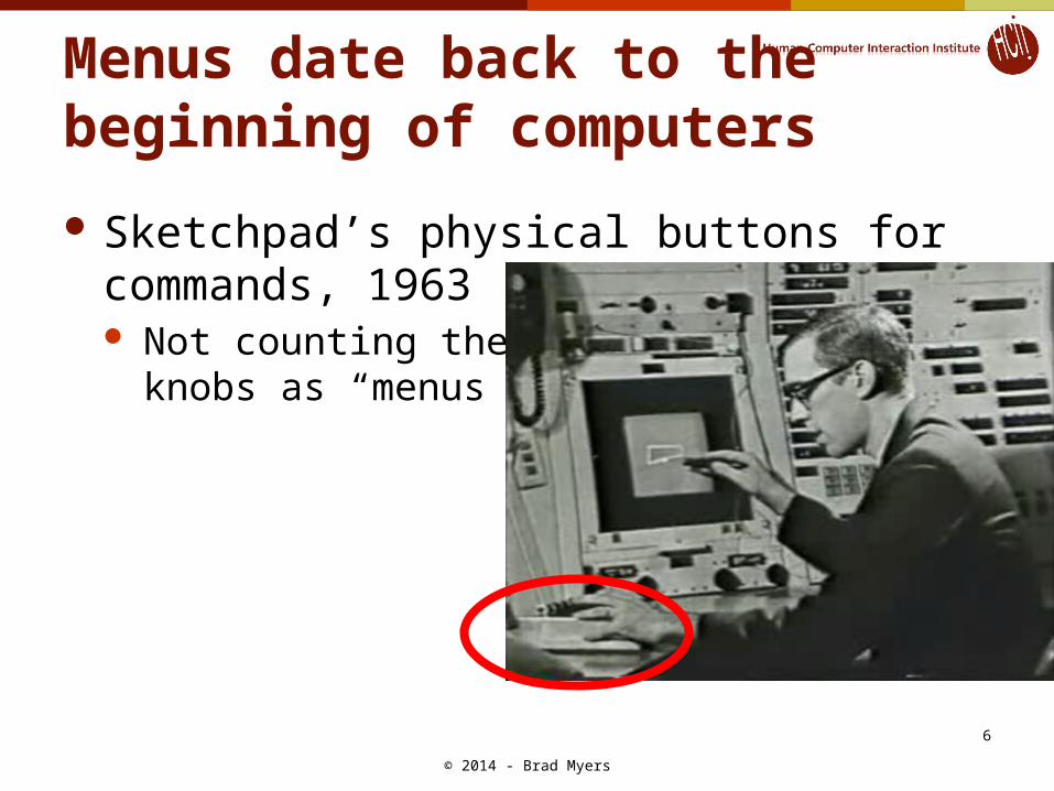
Menus date back to the beginning of computers
Sketchpad’s physical buttons for commands, 1963 Not counting the
knobs as “menus”
© 2014 - Brad Myers
6
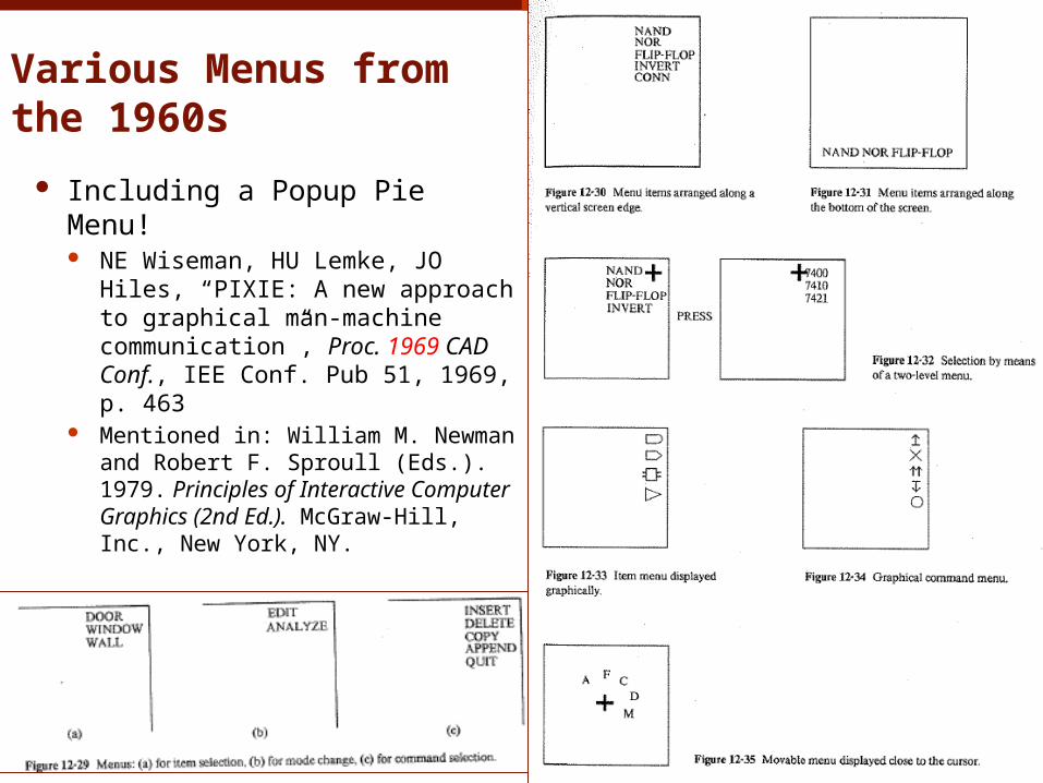
Various Menus from the 1960s
Including a Popup Pie Menu! NE Wiseman, HU Lemke, JO
Hiles, “PIXIE: A new approach to graphical man-machine communication”, Proc. 1969 CAD Conf., IEE Conf. Pub 51, 1969, p. 463
Mentioned in: William M. Newman and Robert F. Sproull (Eds.). 1979. Principles of Interactive Computer Graphics (2nd Ed.). McGraw-Hill, Inc., New York, NY.
© 2014 - Brad Myers
7
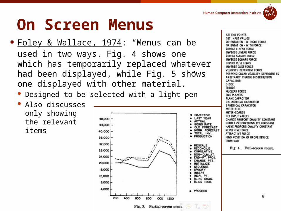
On Screen Menus Foley & Wallace, 1974: “Menus can be used
in two ways. Fig. 4 shows one which has temporarily replaced whatever had been displayed, while Fig. 5 shows one displayed with other material.” Designed to be selected with a light pen Also discusses
only showingthe relevantitems
© 2014 - Brad Myers
8
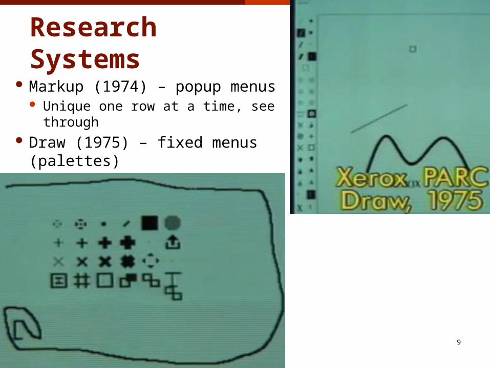
Xerox PARC Research Systems
Markup (1974) – popup menus Unique one row at a time, see through
Draw (1975) – fixed menus (palettes)
© 2014 - Brad Myers
9
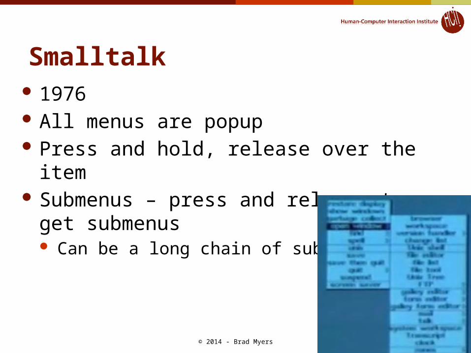
Smalltalk 1976 All menus are popup Press and hold, release over the item Submenus – press and release to get
submenus Can be a long chain of submenus
© 2014 - Brad Myers
10

Soft keys WordStar, June 1979 Mostly used function keys = “soft keys”
© 2014 - Brad Myers
11

Star & Viewpoint
© 2014 - Brad Myers
12
1981 Command buttons Menu buttons
Didn’t need many commands since universal commands, and most were on the keyboard Top row could change functions
Fewer capabilities Removes
unavailable items Tried to get rid
of even thesemenus
Also in prop.Sheets (1985)

Star Property Sheets David Smith invented Property Sheets / Dialog
Boxes for Star Choose one of a set (“choice parameters”),
many of a set (“state parameters”): Whether rectangles touch (one) or not (many)
© 2014 - Brad Myers
13
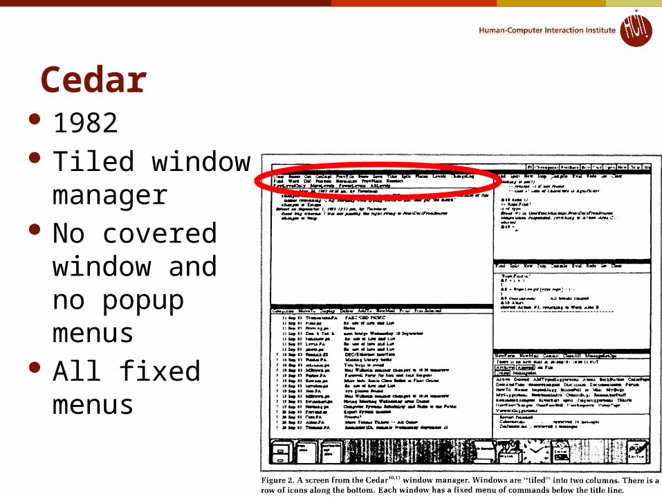
Cedar 1982 Tiled window
manager No covered
window and no popup menus
All fixed menus
© 2014 - Brad Myers
14
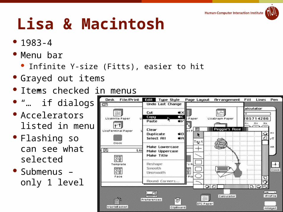
Lisa & Macintosh 1983-4 Menu bar
Infinite Y-size (Fitts), easier to hit Grayed out items Items checked in menus “…” if dialogs Accelerators
listed in menu Flashing so
can see whatselected
Submenus –only 1 level
© 2014 - Brad Myers
15
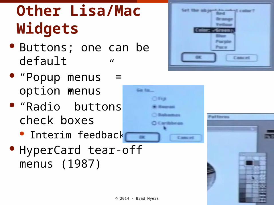
Other Lisa/MacWidgets
Buttons; one can be default “Popup menus” = option
menus “Radio” buttons,
check boxes Interim feedback
HyperCard tear-offmenus (1987)
© 2014 - Brad Myers
16
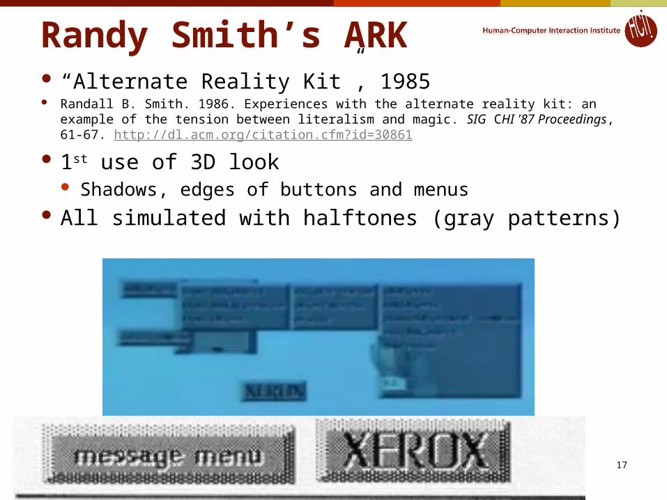
Randy Smith’s ARK “Alternate Reality Kit”, 1985 Randall B. Smith. 1986. Experiences with the alternate reality kit: an example of
the tension between literalism and magic. SIG CHI '87 Proceedings, 61-67. http://dl.acm.org/citation.cfm?id=30861
1st use of 3D look Shadows, edges of buttons and menus
All simulated with halftones (gray patterns)
© 2014 - Brad Myers
17
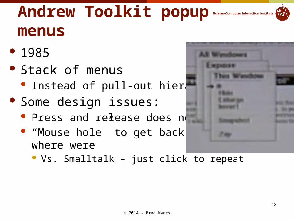
Andrew Toolkit popup menus 1985 Stack of menus
Instead of pull-out hierarchy Some design issues:
Press and release does nothing “Mouse hole” to get back to
where were Vs. Smalltalk – just click to repeat
© 2014 - Brad Myers
18
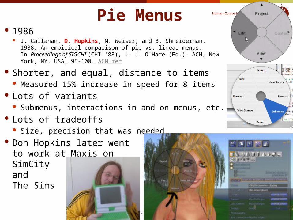
Pie Menus
© 2014 - Brad Myers
19
1986 J. Callahan, D. Hopkins, M. Weiser, and B. Shneiderman. 1988. An
empirical comparison of pie vs. linear menus. In Proceedings of SIGCHI (CHI '88), J. J. O'Hare (Ed.). ACM, New York, NY, USA, 95-100. ACM ref
Shorter, and equal, distance to items Measured 15% increase in speed for 8 items
Lots of variants Submenus, interactions in and on menus, etc.
Lots of tradeoffs Size, precision that was needed
Don Hopkins later wentto work at Maxis onSimCityandThe Sims
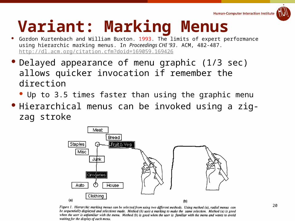
Variant: Marking Menus
© 2014 - Brad Myers
20
Gordon Kurtenbach and William Buxton. 1993. The limits of expert performance using hierarchic marking menus. In Proceedings CHI '93. ACM, 482-487. http://dl.acm.org/citation.cfm?doid=169059.169426
Delayed appearance of menu graphic (1/3 sec) allows quicker invocation if remember the direction Up to 3.5 times faster than using the graphic menu
Hierarchical menus can be invoked using a zig-zag stroke

Original Microsoft 1988 3 different keyboard mechanisms
Control-xxx or function keys ALT then letter
(moded) =“mnemonics”
Arrow keys then<Enter>
2 different mouse: Press-and-hold Click-click
© 2014 - Brad Myers
21

Office XP “Personalized Menus”
2001 Most frequently used in short version Arrow to get the rest
Would be interspersed, not at the end Many people disabled them
© 2014 - Brad Myers
22
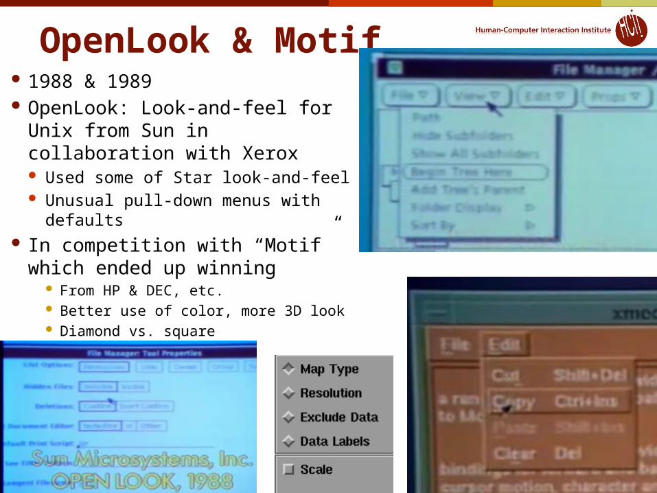
OpenLook & Motif 1988 & 1989 OpenLook: Look-and-feel for Unix
from Sun in collaboration with Xerox Used some of Star look-and-feel Unusual pull-down menus with
defaults In competition with “Motif” which
ended up winning From HP & DEC, etc. Better use of color, more 3D look Diamond vs. square
© 2014 - Brad Myers
23
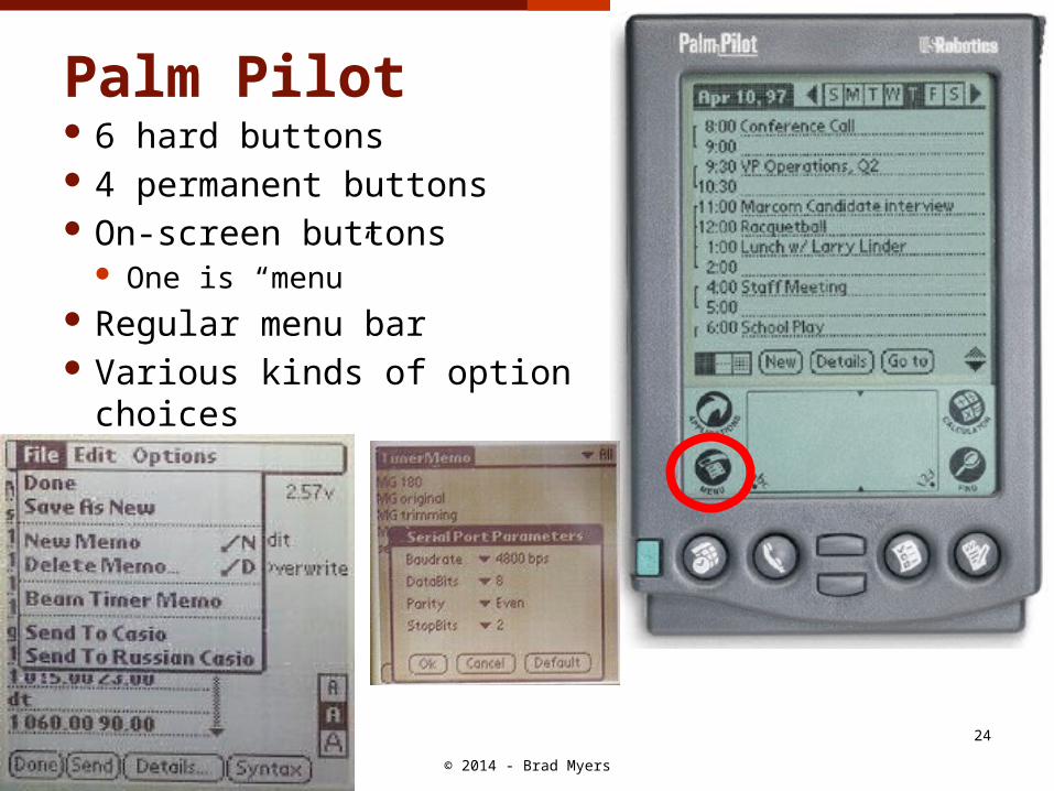
Palm Pilot 6 hard buttons 4 permanent buttons On-screen buttons
One is “menu” Regular menu bar Various kinds of option choices
© 2014 - Brad Myers
24
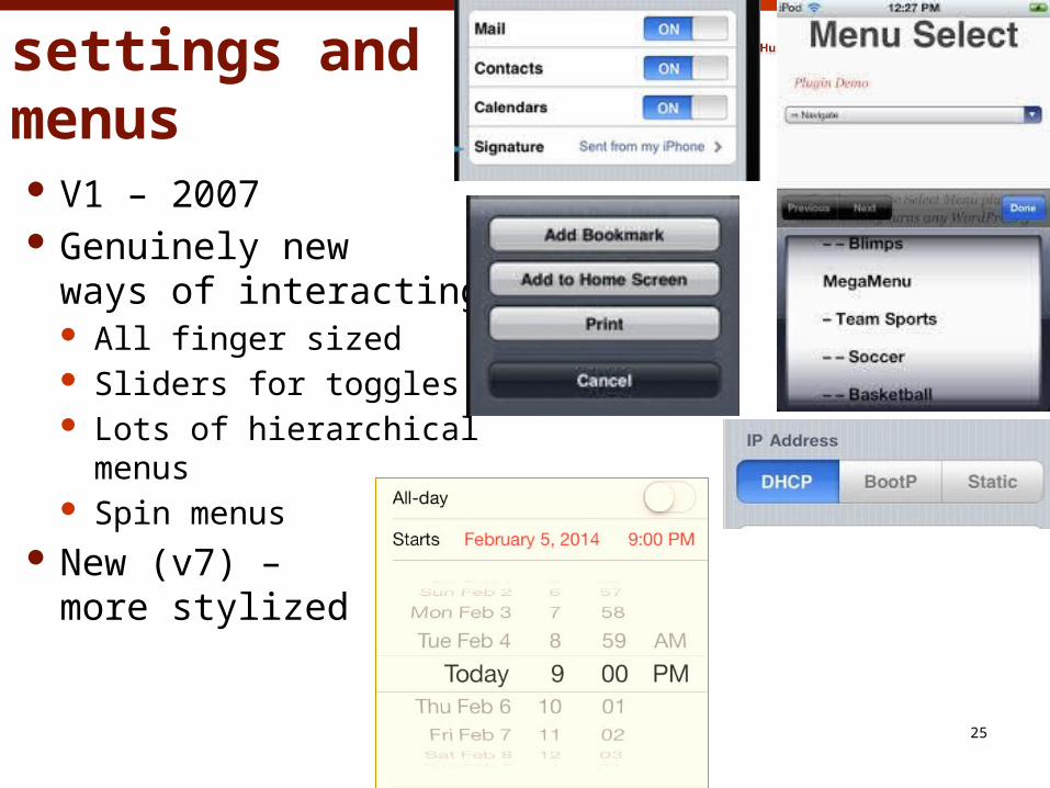
iPhone settings and menus V1 – 2007 Genuinely new
ways of interacting All finger sized Sliders for toggles Lots of hierarchical
menus Spin menus
New (v7) – more stylized
© 2014 - Brad Myers
25
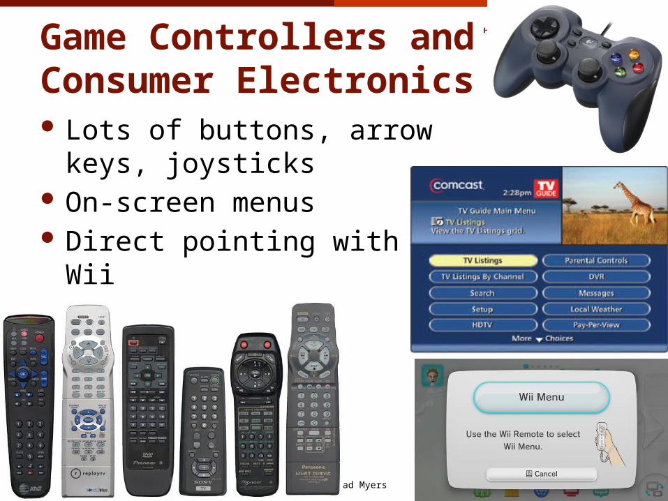
Game Controllers and Consumer Electronics Lots of buttons, arrow keys,
joysticks On-screen menus Direct pointing with Wii
© 2014 - Brad Myers
26
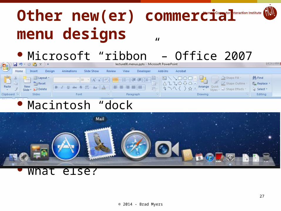
Other new(er) commercial menu designs Microsoft “ribbon” – Office 2007
Macintosh “dock”
What else?
© 2014 - Brad Myers
27
© 2014 - Brad Myers
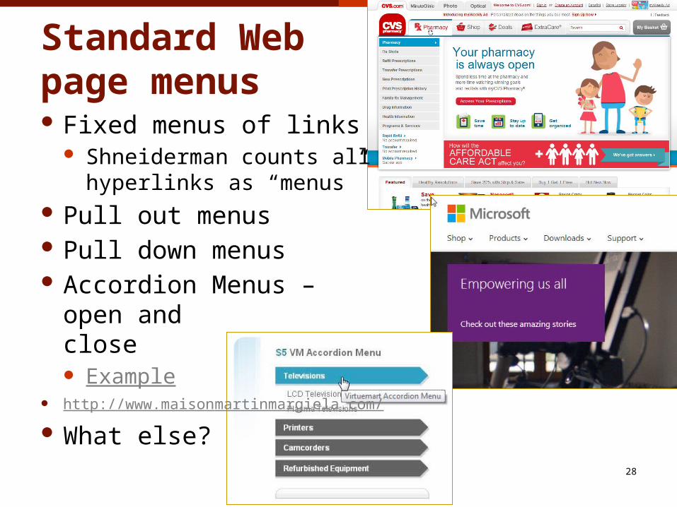
Standard Web page menus Fixed menus of links
Shneiderman counts allhyperlinks as “menus”
Pull out menus Pull down menus Accordion Menus –
open andclose Example
http://www.maisonmartinmargiela.com/
What else?28
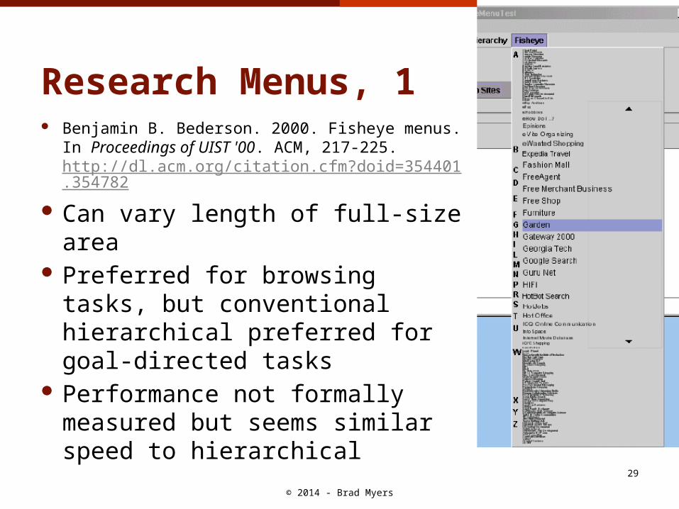
Research Menus, 1 Benjamin B. Bederson. 2000. Fisheye menus.
In Proceedings of UIST '00. ACM, 217-225. http://dl.acm.org/citation.cfm?doid=354401.354782
Can vary length of full-size area Preferred for browsing tasks,
but conventional hierarchical preferred for goal-directed tasks
Performance not formally measured but seems similar speed to hierarchical
© 2014 - Brad Myers
29
© 2014 - Brad Myers
30
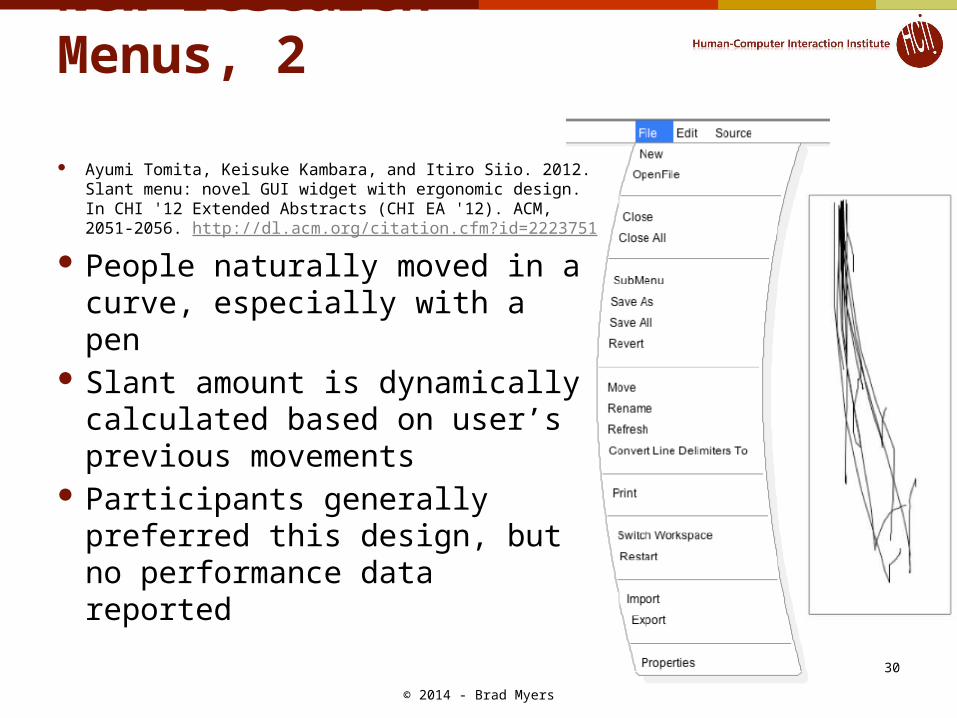
New research Menus, 2
Ayumi Tomita, Keisuke Kambara, and Itiro Siio. 2012. Slant menu: novel GUI widget with ergonomic design. In CHI '12 Extended Abstracts (CHI EA '12). ACM, 2051-2056. http://dl.acm.org/citation.cfm?id=2223751
People naturally moved in a curve, especially with a pen
Slant amount is dynamically calculated based on user’s previous movements
Participants generally preferred this design, but no performance data reported
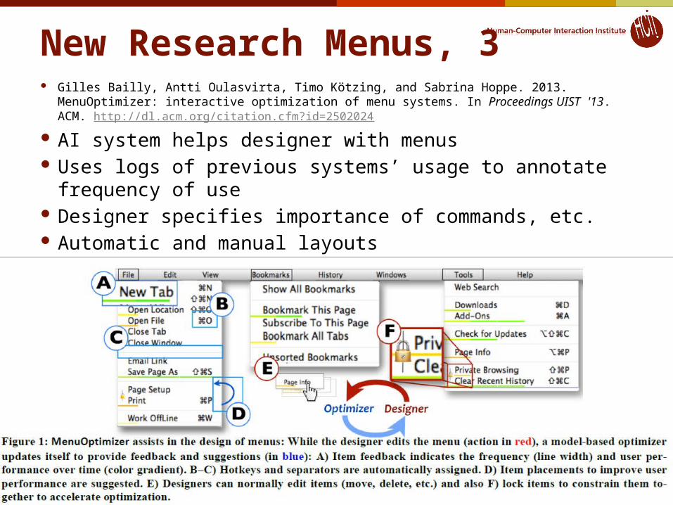
New Research Menus, 3 Gilles Bailly, Antti Oulasvirta, Timo Kötzing, and Sabrina Hoppe. 2013. MenuOptimizer: interactive
optimization of menu systems. In Proceedings UIST '13. ACM. http://dl.acm.org/citation.cfm?id=2502024
AI system helps designer with menus Uses logs of previous systems’ usage to annotate frequency of
use Designer specifies importance of commands, etc. Automatic and manual layouts
© 2014 - Brad Myers
31
Recommendations onMenu Design Hundreds of research studies on menu design choices Whole 368-page book just on menu design:
Kent L. Norman, The Psychology of Menu Selection: Designing Cognitive Control at the Human/Computer Interface, Ablex Publishing Corporation, 1991, (ISBN: 0-89391-553-X), on-line
Shneiderman’s 2010 textbook has a 43-page chapter on Menus Ben Shneiderman and Catherine Plaisant. Designing the User Interface: Strategies for Effective Human-
Computer Interaction (5th Edition). Reading, MA, Addison Wesley/Pearson. 2010.
Names must be “comprehensive and distinctive” Logical hierarchy less error-prone and faster than random or
alphabetical (64-item menus) [McDonald 1983] Hard to come up with good names Should be non-overlapping, familiar, distinct Can use “card sorting” to help elicit users’ categorization Especially when domain is familiar to users But this effect disappears with practice & familiarity [Card 82]
Can also be a network (graph) instead of a tree Multiple ways to get to same place © 2014 - Brad Myers
32
Smith and Mosier, 1986 Sidney L. Smith and Jane N. Mosier. Guidelines for Designing User Interface
Software. Bedford, MA, MITRE. Aug, 1986. 478 pages. http://hcibib.org/sam/
36 guidelines about menus Some are outdated
3.1.3/4 – allow selection by pointing Some are obvious
3.1.3/9 – provide feedback of what selected Others are still relevant
3.1.3/11 – options should be worded as commands and not questions
3.1.3/13 – letter codes (mnemonics, shortcuts) are preferably the first letter of the command
3.1.3/14 – use consistent codes 3.1.3/21 – “logical” order, e.g., in order will be used or most
frequent first© 2014 - Brad Myers
33
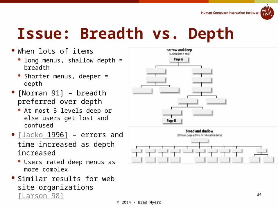
Issue: Breadth vs. Depth When lots of items
long menus, shallow depth = breadth
Shorter menus, deeper = depth
[Norman 91] – breadth preferred over depth At most 3 levels deep or else
users get lost and confused [Jacko 1996] – errors and
time increased as depth increased Users rated deep menus as
more complex Similar results for web site
organizations [Larson 98] © 2014 - Brad Myers
34
Lots of Items Long list or hierarchy?
[Ceaparu, 2004] studied 645 items One alphabetical list or good categories Categories were significantly faster and
preferred Mixed results about reordering based
on frequency of use [Mitchell 1989] – users were disoriented
when reordered and slower [Greenberg 1985] – users were faster
when most frequent were at top [Sears 1994] -- Combined, split menu
works well = adaptive part plus all items© 2014 - Brad Myers
35