Embed Size (px)
Citation preview
AB HELSINKI UNIVERSITY OF TECHNOLOGY
Department of Computer Science and Engineering
Laboratory of Computer and Information Science
Mikko Korpela
Analysis of changes in gene expressiontime series data
Master’s Thesis submitted in partial fulfilment of the requirements for thedegree of Master of Science in Technology.
Espoo, 14th February 2006
Supervisor: Professor (pro tem) Jaakko HollménInstructor: Professor (pro tem) Jaakko Hollmén
HELSINKI UNIVERSITY OF TECHNOLOGY ABSTRACT OFDepartment of Computer Science and Engineering MASTER’S THESIS
Author DateMikko Korpela 14th Feb 2006
Pages85
Title of thesisAnalysis of changes in gene expression time series data
Professorship ProfessorshipComputer and information science Code T-122
SupervisorProf. (pro tem) Jaakko Hollmén
InstructorProf. (pro tem) Jaakko Hollmén
Gene expression is the process by which genes control the biological functions of an or-ganism through the production of proteins. DNA microarray technology enables simul-taneous evaluation of the expression of tens of thousands of genes. By using multiplearrays, expression measurements can be done in different conditions and time points.
In this thesis, a gene expression data set is analysed. The data originate from experimentswhere the effect of asbestos on three different cell lines was studied. First, the data aresubjected to various quality control methods. The work continues with descriptions ofpreprocessing and analysis methods.
The purpose of preprocessing is, among other things, to reduce non-biological variationin the data and to enable the comparison of measurements from different arrays. TheRMA preprocessing method is used here. The method consists of the following steps:background correction, normalisation, log-transformation, and summarisation.
Preprocessed expression values are joined into time series which describe the differencesbetween asbestos exposed and normal samples. A recent clustering method designed forshort time series is employed in the analysis of the time series. The method includes theassessment of each cluster’s statistical significance. The clustering scheme is laid out onan algorithmic level. An error in one part of the method is corrected, and an additionalintermediate phase is also introduced.
Information available on genes is used in the analysis of clustering results. For example,it is interesting if a cluster has a significant amount of genes that have the same biologicalfunction. Also the clustering of known asbestos-related genes is studied. The implemen-tation of the clustering algorithm is tested by repeating an experiment done on syntheticdata. Finally, some results related to the asbestos data are shown. Actual conclusions areleft for biologists to draw.
Keywordsbioinformatics, DNA microarray, gene expression, time series, clustering,preprocessing, asbestos
ii
TEKNILLINEN KORKEAKOULU DIPLOMITYÖN TIIVISTELMÄTietotekniikan osasto
Tekijä PäiväysMikko Korpela 14.2.2006
Sivumäärä85
Työn nimiGeeniekspressioaikasarjadatan muutosten analysointi
Professuuri KoodiInformaatiotekniikka T-122
Työn valvojaMa. Prof. Jaakko Hollmén
Työn ohjaajaMa. Prof. Jaakko Hollmén
Geeniekspressio tarkoittaa prosessia, jossa geenit säätelevät organismin biologisia toi-mintoja proteiinituotannon kautta. Geenisirutekniikka mahdollistaa kymmenien tuhan-sien geenien ekspression samanaikaisen arvioinnin. Useita siruja käyttämällä ekspres-siomittauksia voidaan tehdä eri olosuhteissa ja aikapisteissä.
Tässä diplomityössä analysoidaan geeniekspressiodatajoukkoa. Data on peräisin kokeis-ta, joissa tutkittiin asbestin vaikutusta kolmea erilaista solutyyppiä edustaviin näytteisiin.Ensin datan laatu tarkistetaan eri tavoin. Työ jatkuu esikäsittely- ja analyysimenetelmienkuvauksilla.
Esikäsittelyn tarkoituksena on muun muassa vähentää datassa olevaa biologisista syistäriippumatonta vaihtelua ja mahdollistaa eri siruista peräisin olevien mittausten keskinäi-nen vertailu. Tässä työssä käytetään RMA-esikäsittelymenetelmää, joka koostuu seuraa-vista vaiheista: taustakorjaus, normalisointi, logaritminen muunnos ja yhteenveto.
Esikäsitellyistä ekspressioarvoista muodostetaan aikasarjoja, jotka kuvaavat asbestikäsi-teltyjen ja normaalien näytteiden välisiä muutoksia. Aikasarjojen analysointiin käytetääntuoretta klusterointimenetelmää, joka on suunniteltu lyhyille aikasarjoille ja sisältää klus-terien tilastollisen merkitsevyyden arvioinnin. Menetelmä käydään läpi algoritmitasolla,ja siihen esitetään yksi korjaus sekä ylimääräinen välivaihe.
Klusteroinnin tulosten analysoinnissa käytetään hyväksi geeneistä saatavilla olevaa tie-toa. Esimerkiksi on kiinnostavaa, jos jossain klusterissa on huomattavan paljon samanbiologisen toiminnon toteuttavia geenejä. Myös tunnettujen asbestiin liittyvien geenienklusteroitumista tutkitaan. Klusterointialgoritmin toteutuksen toiminta testataan toista-malla synteettisellä datalla tehty koe. Lopussa esitetään joukko asbestidataan liittyviätuloksia. Varsinaisten päätelmien tekeminen jätetään biologeille.
Avainsanatbioinformatiikka, geenisiru, geeniekspressio, aikasarja, klusterointi, esi-käsittely, asbesti
iii

Acknowledgements
This Master’s Thesis was carried out at the Laboratory of Computer andInformation Science of Helsinki University of Technology (TKK).
First, I want to thank my instructor and supervisor Jaakko Hollmén forall the advice he has given me during this work and previous projects.
I wish to thank all the people from TKK, University of Helsinki, andFinnish Institution of Occupational Health that are involved in this geneexpression project. My special thanks go to Leo Lahti, Pamela Lindholm,and Penny Nymark for the helpful discussions we had, both in person andthrough e-mail.
My gratitude also goes to the people sharing room B310 with me, andto other people in the laboratory: you are an important part of a nice andrelaxed work environment.
Finally, I would like to thank my family for the invaluable support theyhave given me in the course of my life and studies.
Otaniemi, 14th February 2006
Mikko Korpela
iv
Contents
1 Introduction 11.1 Gene expression and microarrays . . . . . . . . . . . . . . . . . 21.2 Asbestos and health . . . . . . . . . . . . . . . . . . . . . . . . . 21.3 Objectives and scope . . . . . . . . . . . . . . . . . . . . . . . . 31.4 Structure of the thesis . . . . . . . . . . . . . . . . . . . . . . . . 4
2 Gene expression data 62.1 Microarray technologies . . . . . . . . . . . . . . . . . . . . . . 6
2.1.1 Oligonucleotide arrays . . . . . . . . . . . . . . . . . . . 62.1.2 cDNA arrays . . . . . . . . . . . . . . . . . . . . . . . . 7
2.2 Data used in the thesis . . . . . . . . . . . . . . . . . . . . . . . 7
3 Quality control and preprocessing 93.1 Quality control . . . . . . . . . . . . . . . . . . . . . . . . . . . 9
3.1.1 Quality of data is important . . . . . . . . . . . . . . . . 93.1.2 Qualitative QC . . . . . . . . . . . . . . . . . . . . . . . 93.1.3 Quantitative QC . . . . . . . . . . . . . . . . . . . . . . 113.1.4 QC verdict . . . . . . . . . . . . . . . . . . . . . . . . . . 15
3.2 Preprocessing . . . . . . . . . . . . . . . . . . . . . . . . . . . . 153.2.1 Preprocessing — what does it mean here? . . . . . . . . 153.2.2 Robust multichip average . . . . . . . . . . . . . . . . . 153.2.3 Other preprocessing methods . . . . . . . . . . . . . . . 193.2.4 Concluding thoughts . . . . . . . . . . . . . . . . . . . . 20
4 Clustering gene expression time series data 214.1 Introduction . . . . . . . . . . . . . . . . . . . . . . . . . . . . . 214.2 Motivation for clustering and analysis of its applicability . . . 214.3 Clustering short time series data . . . . . . . . . . . . . . . . . 23
4.3.1 An algorithm designed for the task . . . . . . . . . . . . 244.3.2 Enumerating model profiles . . . . . . . . . . . . . . . . 254.3.3 Selecting distinct profiles . . . . . . . . . . . . . . . . . 264.3.4 Clustering and finding significant profiles . . . . . . . 31
v
CONTENTS vi
4.3.5 Grouping significant profiles . . . . . . . . . . . . . . . 354.4 Other approaches to clustering . . . . . . . . . . . . . . . . . . 384.5 Analysis of clustering results . . . . . . . . . . . . . . . . . . . 39
4.5.1 Annotation data . . . . . . . . . . . . . . . . . . . . . . . 394.5.2 Enriched terms . . . . . . . . . . . . . . . . . . . . . . . 414.5.3 Order of genes within a cluster . . . . . . . . . . . . . . 434.5.4 Known asbestos-related genes . . . . . . . . . . . . . . 45
5 Experiments and results 465.1 Synthetic data . . . . . . . . . . . . . . . . . . . . . . . . . . . . 465.2 Data from asbestos exposure experiment . . . . . . . . . . . . 48
5.2.1 RMA preprocessing . . . . . . . . . . . . . . . . . . . . 485.2.2 Further preprocessing . . . . . . . . . . . . . . . . . . . 495.2.3 Clustering . . . . . . . . . . . . . . . . . . . . . . . . . . 525.2.4 Analysis of clusters . . . . . . . . . . . . . . . . . . . . . 58
6 Summary and conclusions 616.1 Future work . . . . . . . . . . . . . . . . . . . . . . . . . . . . . 62
A Figures and tables 63
Bibliography 73

Abbreviations and notations
CDF Cumulative distribution functioncDNA Complementary DNACPU Central processing unitDNA Deoxyribonucleic acidGO Gene ontologyMIAME Minimum information about a microarray experimentMM Mismatch (probe)PDF Probability density functionPM Perfect match (probe)QC Quality controlRMA Robust multichip averageRNA Ribonucleic acidSOM Self-organising mapS, X, Y Random variabless, x, y Instances of random variables or arbitrary numbersx, y, z Vectorsxi i:th element of xx Mean of xx · y Dot product of vectors x and yd(x, y) Distance between vectors x and yBin(N, p) Binomial distribution, #trials N, probability of success pexp(α) Exponential distribution with mean 1/αN(µ, σ2) Normal distribution with mean µ and variance σ2
φ(x) PDF of N(0, 1) evaluated at xΦ(x) CDF of N(0, 1) evaluated at xp, p1, p2, pi Expression profilesL, P, R, R′ Sets (of profiles)|P| Number of elements in a set PR ⊂ P R is a subset of PP ∪ R Union of sets P and RP ∩ R Intersection of sets P and RP \ R Set difference of P and R
vii

Chapter 1
Introduction
Large amounts of data are being produced in the world today, by both indi-viduals and organisations. Evolving technology makes the storage of everincreasing amounts of data possible, although there are some valid concernsabout whether the advanced storage technologies and formats used todaycan stand the test of time.
The analysis of the data or data mining [21], however, is another story,and probably presents a bigger challenge than the storage side. As fastercomputers become available, the capacity available for data analysis alsogrows. Unfortunately, a computer doesn’t function by itself, but needs pre-cise instructions. Data analysis is based on intelligence, something that com-puters may have in science fiction novels but not in the real world. There isa need for people who can operate computers using familiar and new meth-ods of data analysis. The vast amounts of data are a challenge — not onlyto computers, but also to data analysts.
One example of the “data explosion” can be seen in weather forecasting.The first weather forecasts relied on locally obtained data and experiencegathered over time. For example, a clear sky on a winter evening is a goodindicator of a cold night ahead. Now, fast communication networks andadvanced observational instruments such as satellites and radars providemeasurement data from all over the world. Thanks to sophisticated pre-diction models and increasing computer resources, the data can be used toproduce more accurate and longer range forecasts than ever before.
Biological and medical research projects also produce lots of data withthe help of advances in measurement technology. The analysis of these datais especially rewarding, since it can result in a better understanding of bio-logical organisms. The discovery of the mechanism behind a disease mightultimately result in the development of a new drug or better diagnosis cri-teria. It is unlikely that an expert in biology or medicine would simulta-neously be a skilled data analyst. It is also certain that the “average” data
1
CHAPTER 1. INTRODUCTION 2
analyst is not a biologist. A collaborative mode of work — where the strengthsof different people are utilised in pursuit of a common goal — is needed.This thesis concerns itself with the analysis of gene expression data, one ofmany types of biological data studied today.
1.1 Gene expression and microarrays
The recent advancement of microarray technology is a welcome develop-ment in the study of molecular biology. With this technology, the activityof tens of thousands of genes can be measured simultaneously. It is evenpossible to capture information about all the genes of a given organism.
DNA microarrays [27] are used to measure RNA levels in cell samples.The measured levels can be used as an estimate of the amount of differentproteins produced in cells. For a simple introduction to the relevant biolog-ical phenomena, see e.g. [23]. Simply put, DNA is copied into RNA in thenucleus of a cell. The RNA leaves the nucleus, and acts as a messenger inthe production of proteins. The whole process, from DNA in a gene to RNA,and further to proteins, is called gene expression. Microarray data are oftencalled gene expression measurements, although the results are only indirectestimates of the rate of protein production.
Proteins have several functions in living organisms. Therefore, gene ex-pression measurements can be used to shed some light on various biologicalprocesses. The uses of microarray data reach from experiments with simpleorganisms like yeast to research on human cancers [22].
Gene expression measurements are typically carried out with several mi-croarrays over a range of parameters, such as temperature, time, or expo-sure to some chemical agent. For more reliable results, a few replicate mea-surements are often made with the same parameters. All in all, with eachmicroarray providing up to tens of thousands of data points, the amount ofdata collected in these experiments can best be described as huge. This callsfor computer aided analysis.
1.2 Asbestos and health
Asbestos is the general name used for the following fibrous minerals: amo-site, chrysotile, crocidolite, and the fibrous varieties of actinolite, anthophyl-lite, and tremolite. All of these except for chrysotile belong to the amphibolefamily of minerals. All forms of asbestos are health hazards, but amphibolesare considered more dangerous than chrysotile. [5]
The usage of asbestos dates back at least 2500 years. The earliest reportson some of the health hazards related to asbestos are about one hundred

CHAPTER 1. INTRODUCTION 3
years old [44]. Today, there is a broad consensus on the adverse health ef-fects of asbestos. Despite that, asbestos is still used in the world. The largestconsumers of asbestos in the year 2000 were Brazil, China, India, Japan,Thailand, and the former Soviet Union as a whole, especially Russia [54].
Airborne asbestos fibres enter the human body through the respiratorytract. Some inhaled fibres are later removed from the lungs, but others maymove through the lungs and never leave the body [5]. When retained inthe body, asbestos has the potential to cause serious diseases such as as-bestosis, lung cancer, and mesothelioma [38]. Asbestosis and lung cancerare related to high cumulative exposure to asbestos, whereas mesotheliomacan occur with smaller fibre burdens. Most mesothelioma cases (70–80 %)are asbestos-related. By contrast, lung cancer is not specific to asbestos andalso has other major risk factors such as smoking [14].
Asbestos-related health effects can mainly be observed in people whohave worked for sufficiently long periods in some particular fields like con-struction, shipbuilding, or asbestos manufacturing. Among these workers,exposure to asbestos is classified as “definite” or “probable” [51]. Some ev-idence exists that household members of asbestos workers might be at riskof developing mesothelioma. Still, cases arising from domestic exposureare rare. There is also practically no evidence of urban air pollution causingmesothelioma [33].
The usage of asbestos in Finland peaked between the 1950s and 1970s.Correspondingly, the peak in asbestos-related diseases is expected to be be-tween the 1990s and 2020s [44]. It has been estimated that asbestos will havegiven rise to 2000 cancer deaths in Finland by the year 2010 [29]. About30000 new asbestos-related cancer cases are estimated to occur annuallyin the population of 800 million living in Western Europe, North America,Japan, and Australia [51].
Due to the long time delay between exposure to asbestos and the devel-opment of the related diseases, there is clearly an opportunity to treat anemerging disease in its early stages. Understanding the effects of asbestoson gene expression could contribute to that goal. However, before some-thing can be understood, it must first be studied. That should be plenty ofmotivation for biomedical scientists and data analysts.
1.3 Objectives and scope
The aim of the thesis is to extract information from the gene expression datathat are subjected to analysis. The information should reveal significantfeatures of the data in a way that helps collaborating biological researchersconduct further analyses and make hypotheses of the effect of asbestos on
CHAPTER 1. INTRODUCTION 4
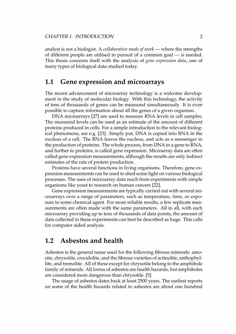
gene expression.Figure 1.1 is a very rough diagram about the phases of a gene expression
experiment. More detailed diagrams also exist; see for example [27, p. 17].This thesis is about computer aided data analysis, the middle phase in the
hypotheses,validation,. . .
RNA, microarrays,scanners,. . .
Furtheranalysis
Laboratorywork
quality control,preprocessing,cluster analysis,. . .
data analysisComputer aided
Figure 1.1: Gene expression analysis pipeline
figure. The thesis covers the basic theory of the different steps in that phase:quality control, preprocessing, and cluster analysis. The reader should beable to learn the theoretical principles of gene expression analysis to theextent that is necessary to understand what was done in the experimentalpart of the thesis.
The clustering algorithm discussed in Section 4.3 is covered more thor-oughly than other methods applied in the course of the work. One reasonfor this special treatment is the importance of the algorithm for our analy-ses. Another reason is its novelty. There is also some value to presentingthe algorithm as pseudo code in contrast to the verbal description in thearticle [16] that introduced the algorithm.
The first and the last phase of Figure 1.1 are performed by collaboratorswho are more familiar with the biological side of gene expression. The helpof these experts is also valuable during the middle phase.
1.4 Structure of the thesis
After this introduction, Chapter 2 presents the data used in the thesis. Somegeneral information about microarray data is also offered. Chapter 3 de-scribes the first parts of the analysis process used in this thesis. The purposeof these stages is to transform the data into a form more suitable for the fol-lowing phases of analysis. The comparison and co-analysis of data comingfrom different microarrays are enabled with the normalisation method de-scribed in this chapter. Some quality control procedures are also introducedand used to check the quality of the data.
CHAPTER 1. INTRODUCTION 5
The data analysis methods used in the thesis are described in Chapter 4.The main method is a recently developed clustering algorithm that is de-signed for the kind of data explored in this work. The experiments andresults of the thesis are presented in Chapter 5. The chapter doesn’t containany final biological conclusions, which are better left to experts in that field.The results are more about what phenomena can be seen in the data, from acomputer scientist’s point of view. Further processing and validation of theresults by biologists is necessary before the results are fitted into a greaterbiological framework.
Chapter 6 is a summary of the work done in this thesis, and offers someconcluding remarks. Appendix A contains some supplementary figures anddata tables produced in the course of the analyses that are better shownseparately from the main text.
Chapter 2
Gene expression data
2.1 Microarray technologies
As explained in Section 1.1, microarrays are a tool for producing gene ex-pression measurements. The following sections briefly describe two popu-lar microarray technologies.
2.1.1 Oligonucleotide arrays
Oligonucleotide arrays are a class of microarrays mainly developed by acompany called Affymetrix. The arrays are manufactured with a photolitho-graphic masking technique, much in the same way as integrated circuits [27,pp. 77–88]. Each Affymetrix array contains up to 1.3 · 106 probes [1].
Here are some of the terms that are most frequently used in connectionwith oligonucleotide microarrays [27, pp. 77–78]:
Probe An oligonucleotide, 25 bases1 in length, situated on a microarray.These are also called 25-mers.
Perfect match (PM) probe A probe designed to match with a certain se-quence of nucleotides in the genome
Mismatch (MM) probe A probe that is the same as its companion PM, ex-cept that one base has been switched. These are designed to measurenon-specific hybridisation.
Probe pair The combination of a PM probe and the corresponding MMprobe
1The DNA bases are adenine (A), thymine (T), guanine (G), and cytosine (C).
6
CHAPTER 2. GENE EXPRESSION DATA 7
Probe set A set of probe pairs. In the latest Affymetrix microarrays, a probeset typically contains 11 probe pairs [1]. The PM probes of a probe setusually match to different parts of a single gene. A probe set as a wholetherefore measures the expression of a gene. Since there still is somework to be done before the human genome is accurately dissected [39],not all probe sets on an array correspond to actual well-known genes.
2.1.2 cDNA arrays
Robotically spotted cDNA arrays, introduced in [46], represent the othermajor type of microarrays. They have both advantages and disadvantagescompared to oligonucleotide arrays. Among the favourable points are cus-tomisability of the arrays and the fact that two different samples can be com-petitively hybridised to the same array. Disadvantages of cDNA arrays in-clude their more variable quality and the relative difficulty of measuring ab-solute quantities. Instead of absolute expression values, the expression ratioof the two samples is the quantity that is typically measured with cDNA ar-rays. The probes on a cDNA array are about 2 · 103 bases long, much longerthan the 25-mers in oligonucleotide arrays. [27, pp. 73–76]
2.2 Data used in the thesis
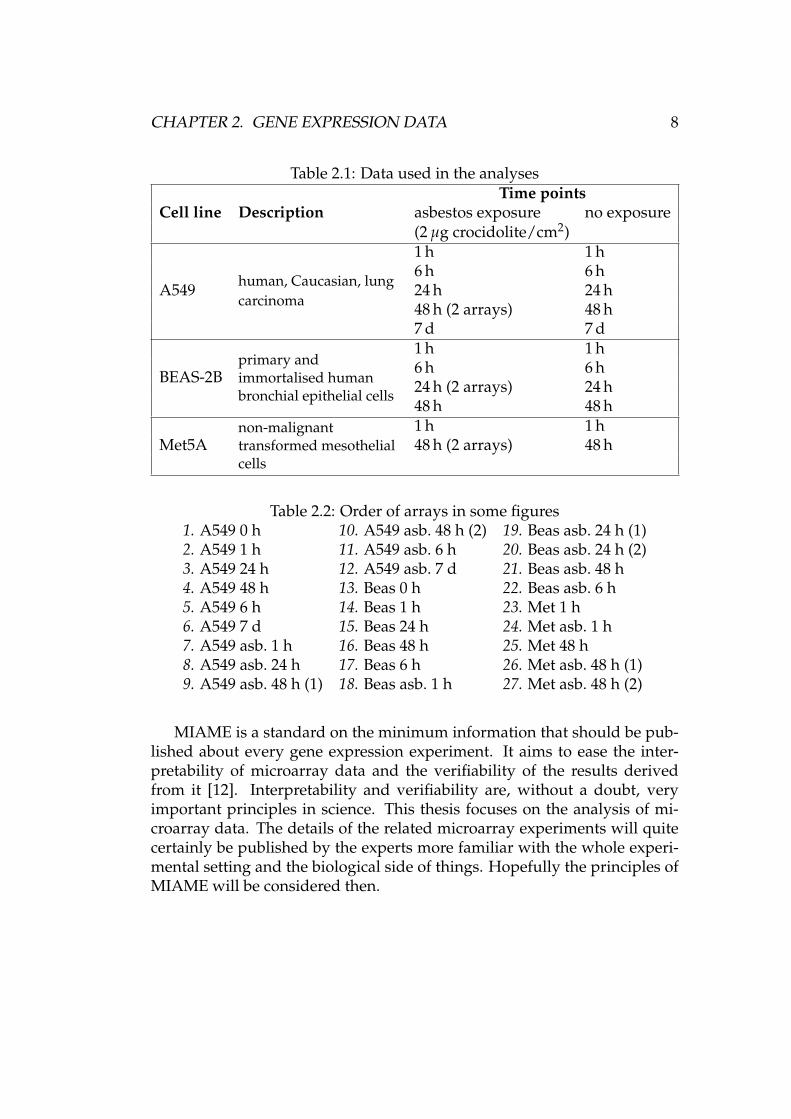
The data used in this thesis are gene expression values summarised in Ta-ble 2.1 (courtesy of Penny Nymark), acquired with Affymetrix oligonucleo-tide microarrays, model GeneChip Human Genome U133 Plus 2.0. The dataare from a treatment-response experiment where the effect of asbestos ongene expression is studied. The microarrays indicate the development ofthe gene expression levels over time with both asbestos exposed and non-exposed samples.
In addition to the 25 microarrays listed in the table, there are also twoextra arrays (A549 0 h and BEAS-2B 0 h) that are mainly used in the pre-processing stage. Thus the total number of arrays available is 27 (25 +2). Each array has 54675 probe sets, of which 38500 correspond to “well-characterized human genes” [1]. That makes the total number of probe setsin all 27 arrays almost 1.5 million. The number of probes is roughly 20 timesbigger. That is a considerable amount of data!
Table 2.2 gives the microarrays a numerical order. The same numberingscheme is used in various figures, where a simple number is more conve-nient than a longer description of each array. The figures are located inChapter 5 and Appendix A. In the table, asbestos exposure is denoted with“asb.”
CHAPTER 2. GENE EXPRESSION DATA 8
Table 2.1: Data used in the analyses
Cell line DescriptionTime points
asbestos exposure no exposure(2 µg crocidolite/cm2)
A549 human, Caucasian, lungcarcinoma
1 h 1 h6 h 6 h24 h 24 h48 h (2 arrays) 48 h7 d 7 d
BEAS-2Bprimary andimmortalised humanbronchial epithelial cells
1 h 1 h6 h 6 h24 h (2 arrays) 24 h48 h 48 h
Met5Anon-malignanttransformed mesothelialcells
1 h 1 h48 h (2 arrays) 48 h
Table 2.2: Order of arrays in some figures1. A549 0 h 10. A549 asb. 48 h (2) 19. Beas asb. 24 h (1)2. A549 1 h 11. A549 asb. 6 h 20. Beas asb. 24 h (2)3. A549 24 h 12. A549 asb. 7 d 21. Beas asb. 48 h4. A549 48 h 13. Beas 0 h 22. Beas asb. 6 h5. A549 6 h 14. Beas 1 h 23. Met 1 h6. A549 7 d 15. Beas 24 h 24. Met asb. 1 h7. A549 asb. 1 h 16. Beas 48 h 25. Met 48 h8. A549 asb. 24 h 17. Beas 6 h 26. Met asb. 48 h (1)9. A549 asb. 48 h (1) 18. Beas asb. 1 h 27. Met asb. 48 h (2)
MIAME is a standard on the minimum information that should be pub-lished about every gene expression experiment. It aims to ease the inter-pretability of microarray data and the verifiability of the results derivedfrom it [12]. Interpretability and verifiability are, without a doubt, veryimportant principles in science. This thesis focuses on the analysis of mi-croarray data. The details of the related microarray experiments will quitecertainly be published by the experts more familiar with the whole experi-mental setting and the biological side of things. Hopefully the principles ofMIAME will be considered then.
Chapter 3
Quality control and preprocessing
3.1 Quality control
3.1.1 Quality of data is important
Quality control (QC) is an important part of the gene expression analysispipeline. We want our possible biological hypotheses or conclusions to bebased on biologically sound data. Many spurious phenomena can emergefrom noisy high-dimensional data. The analysis of data with large uncer-tainties requires time and money that could be better spent elsewhere. Fur-thermore, the possibly false results so obtained are often worse than no re-sults at all. For these reasons, quality control is the first phase of the analysisin this thesis. Although some uncertainties will remain due to the nature ofthe data, any serious quality problems can hopefully be ruled out.
3.1.2 Qualitative QC
Visual inspection of intensity images of gene expression data can revealproblems resulting from faulty equipment. Microarrays themselves mayhave spatial artefacts, unique to each array. Additionally, microarray scan-ners may produce uneven results in different parts of the scanned array.
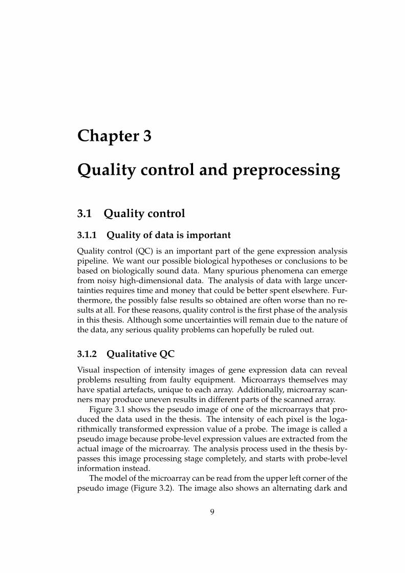
Figure 3.1 shows the pseudo image of one of the microarrays that pro-duced the data used in the thesis. The intensity of each pixel is the loga-rithmically transformed expression value of a probe. The image is called apseudo image because probe-level expression values are extracted from theactual image of the microarray. The analysis process used in the thesis by-passes this image processing stage completely, and starts with probe-levelinformation instead.
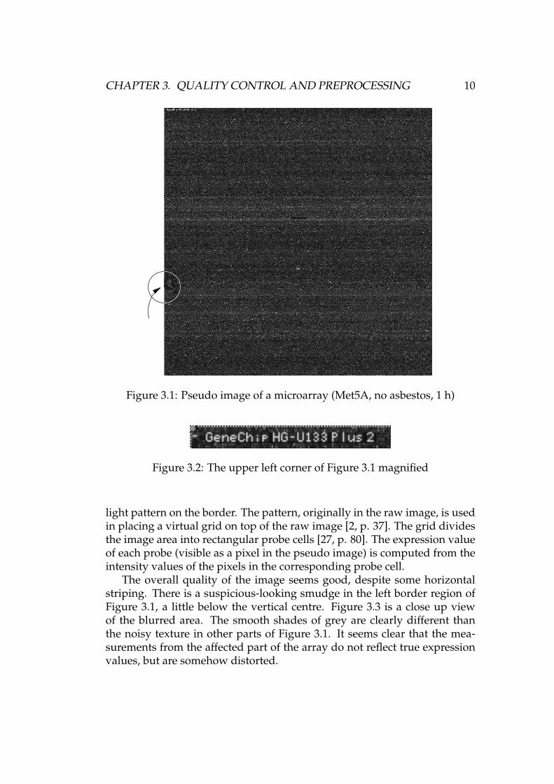
The model of the microarray can be read from the upper left corner of thepseudo image (Figure 3.2). The image also shows an alternating dark and
9
CHAPTER 3. QUALITY CONTROL AND PREPROCESSING 10
Figure 3.1: Pseudo image of a microarray (Met5A, no asbestos, 1 h)
Figure 3.2: The upper left corner of Figure 3.1 magnified
light pattern on the border. The pattern, originally in the raw image, is usedin placing a virtual grid on top of the raw image [2, p. 37]. The grid dividesthe image area into rectangular probe cells [27, p. 80]. The expression valueof each probe (visible as a pixel in the pseudo image) is computed from theintensity values of the pixels in the corresponding probe cell.
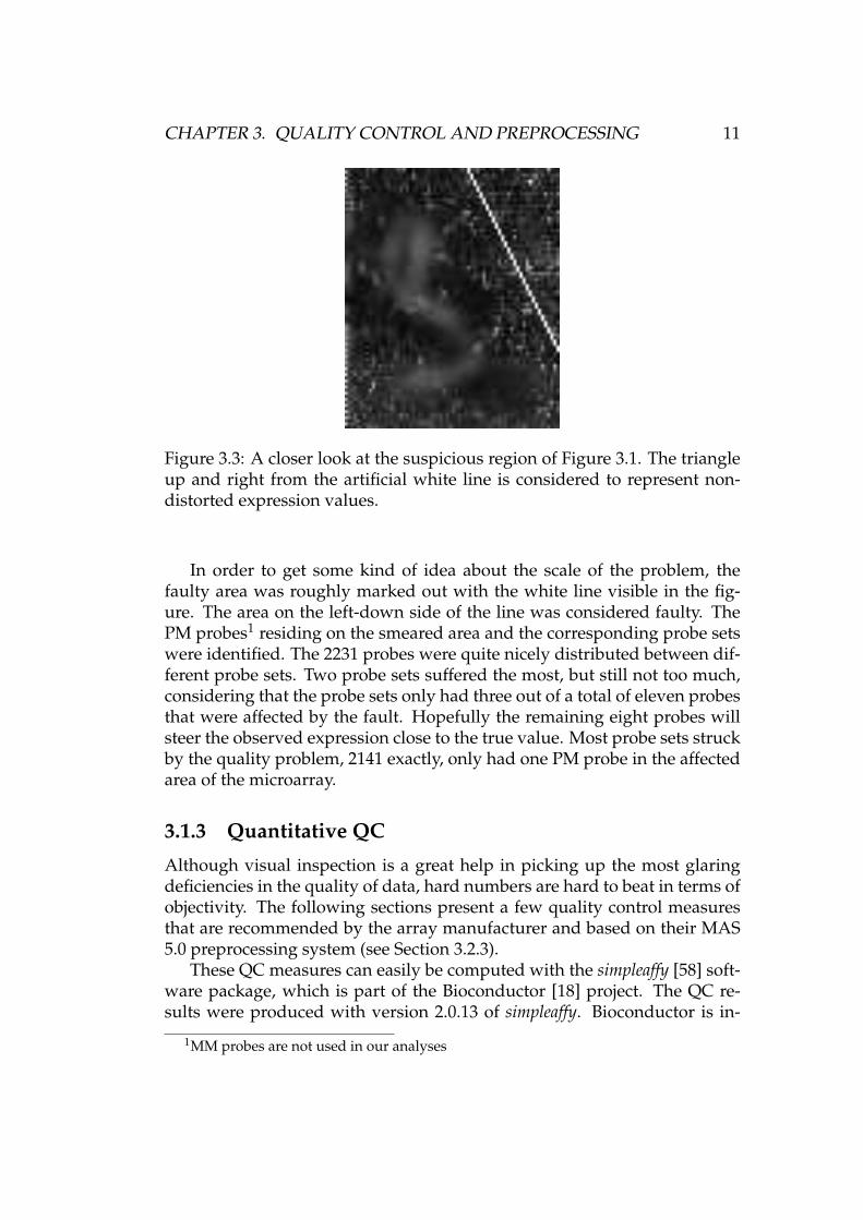
The overall quality of the image seems good, despite some horizontalstriping. There is a suspicious-looking smudge in the left border region ofFigure 3.1, a little below the vertical centre. Figure 3.3 is a close up viewof the blurred area. The smooth shades of grey are clearly different thanthe noisy texture in other parts of Figure 3.1. It seems clear that the mea-surements from the affected part of the array do not reflect true expressionvalues, but are somehow distorted.
CHAPTER 3. QUALITY CONTROL AND PREPROCESSING 11
Figure 3.3: A closer look at the suspicious region of Figure 3.1. The triangleup and right from the artificial white line is considered to represent non-distorted expression values.
In order to get some kind of idea about the scale of the problem, thefaulty area was roughly marked out with the white line visible in the fig-ure. The area on the left-down side of the line was considered faulty. ThePM probes1 residing on the smeared area and the corresponding probe setswere identified. The 2231 probes were quite nicely distributed between dif-ferent probe sets. Two probe sets suffered the most, but still not too much,considering that the probe sets only had three out of a total of eleven probesthat were affected by the fault. Hopefully the remaining eight probes willsteer the observed expression close to the true value. Most probe sets struckby the quality problem, 2141 exactly, only had one PM probe in the affectedarea of the microarray.
3.1.3 Quantitative QC
Although visual inspection is a great help in picking up the most glaringdeficiencies in the quality of data, hard numbers are hard to beat in terms ofobjectivity. The following sections present a few quality control measuresthat are recommended by the array manufacturer and based on their MAS5.0 preprocessing system (see Section 3.2.3).
These QC measures can easily be computed with the simpleaffy [58] soft-ware package, which is part of the Bioconductor [18] project. The QC re-sults were produced with version 2.0.13 of simpleaffy. Bioconductor is in-
1MM probes are not used in our analyses
CHAPTER 3. QUALITY CONTROL AND PREPROCESSING 12
tegrated with R [42], a free software environment for statistical computingand graphics. The programming language used in R is mostly compatiblewith the S programming language [53].
Quantitative QC measures are objective as such, but their interpretationis quite difficult and best left to domain experts. Thus the discussion aboutthe QC measures and their results is kept brief here.
The following QC measures are calculated on the probe or probe setlevel, after the image processing stage, without the actual scanned imageof the microarray. Another option is quality control based on image pro-cessing. For more information on this kind of QC, see e.g. [45] and [22, pp.24–28]. The image processing procedures tend to differ based on the type ofthe microarrays used. The processing of image data originating from Affy-metrix arrays is typically done with proprietary software provided by thearray manufacturer, as was done with the microarrays related to this thesis.
Average background
Background signal means the part of the signal measured from a microar-ray that is caused by auto-fluorescence and non-specific binding [2, p. 87].Microarrays that are to be compared should have comparable backgroundvalues [2, p. 38].
The average background levels measured from the data of Section 2.2 arepresented in Figure A.1(a). Array 26 stands out in the crowd, but otherwisethe numbers look comparable enough to the untrained eye. Considering thelack of “official guidelines regarding background” [2, p. 38], the results arenot analysed any further here.
Scale factor
Scale factor or scaling factor reflects the overall expression level of an ar-ray, or more specifically the amount of scaling needed to bring the trimmedmean2 expression level of the array to a certain level that is common toall the arrays [57, p. 4]. The scaling is applied at the probe set level [2,pp. 47–48]. It is intuitively clear that all arrays in the same experimentshould ideally have similar scale factors. Comparatively large and smallscale factors, indicative of low and high overall expression levels respec-tively, should raise some suspicions.
Affymetrix recommend that the scale factors of microarrays to be com-pared with each other shouldn’t differ more than 3-fold [2, p. 40]. It is not
2A certain percentage of the smallest and largest values are excluded from the trimmedmean
CHAPTER 3. QUALITY CONTROL AND PREPROCESSING 13
entirely clear, however, what 3-fold means here. In the opinion of the au-thor, the upper limit of range (x, 3x) is 3-fold compared to the lower limit.That is, a 3-fold difference between two numbers means that the ratio of thelarger number to the smaller one is three. This is very simple.
Another interpretation is that “within 3-fold” [57, p. 4] describes therange (y, y + 3) in a logarithmic scale. Confusion is unavoidable, as a ratioof three suddenly becomes a ratio of eight (23 = 8) due to the use of thelog2 scale in the graphical QC overview plots produced by simpleaffy. Anarbitrarily large ratio between the largest and the smallest scale factor couldbe made to fit this interpretation of 3-fold by choosing a suitable logarithmbase. The author thinks that this interpretation of “within 3-fold” is wrong.If this isn’t the case, then the word “fold” must have a new implicit meaningwhen used in connection with scale factors.
In the author’s opinion, the documentation of the simpleaffy package isnot clear on all aspects. The use of the logarithmic scale is not motivated oreven mentioned in any of the three relevant articles or manuals [34, 57, 58].The use of the log2 scale was discovered by carefully comparing raw, non-transformed scale factors and the graphical output of the simpleaffy package.The use of the log2 scale is also apparent from the source code of the pack-age. Having the source code of a program available for inspection is useful,but it shouldn’t have to make up for insufficient documentation.
Figure A.2 shows the scale factors of the arrays used in this thesis, andthree interpretations of a “within 3-fold” range. The scale factors are notwithin 3-fold in the traditional sense, as can be seen from Figure A.2(c). Ifarrays 23 and 25 — both measuring the Met5A cell line — are excluded(see Table 2.2 for the array numbering scheme), the scale factors of the otherarrays are within 3-fold. In other words, the largest scale factor is less thanthree times the size of the smallest one.
Figure A.2(a) shows the scale factors in the log2 scale as in simpleaffy. The±1.5 range around the mean logarithmic scale factor is also shown. Thiscorresponds to the interpretation of “within 3-fold” used in simpleaffy. Theuse of the mean scale factor as the centre point of the allowed range wasapparent from [57]. The exact meaning of “mean” could be confirmed byreading the relevant part of the source code of simpleaffy. Thus, the centreof the range in Figure A.2(a) is the mean of the logarithmic scale factors, notthe logarithm of the mean scale factor. As can be seen in the figure, the scalefactor of array number 23 is out of the range. According to [57], simpleaffyshould have alerted the user about this, but it didn’t.
Figure A.2(b) is the same as Figure A.2(a), but the centre point of the±1.5range is a little different. Now all the scale factors fit the log2 interpretationof the “within 3-fold” rule.
CHAPTER 3. QUALITY CONTROL AND PREPROCESSING 14
Number of genes called present
The MAS 5.0 preprocessing method has a “detection algorithm” where eachprobe set on a microarray is assigned to one of three expression classes:present, marginal, or absent [2, pp. 42–44]. The number of probe sets calledpresent can be compared to the total number of probe sets on an array. Theresult is the “percent present” statistic, which should be similar across ar-rays in the same experiment [57, p. 4].
Figure A.1(b) shows the “percent present” statistic of each array de-scribed in Table 2.2. There is some variation in the numbers, but generallyspeaking they seem to be quite well in line with each other. Array number23 has the lowest percentage of probe sets called present. As seen in Fig-ure A.2, it also has the highest scale factor. According to [57, p. 4], these twofacts together may mean that less RNA was used with array 23 than withthe other arrays. Remember that there is also a clearly visible defect in thepseudo image of the array, as shown in Figure 3.1.
3’ to 5’ ratios
Some long genes are measured with several probe sets, which represent dif-ferent parts of the gene’s RNA transcript. The ratio of expression signalsfrom the 3’ and 5’ probe sets3 can be used as a QC measure [57, p. 4].
Two genes, β-actin and GAPDH, are used as quality control genes dueto their ubiquitous expression in most cell types [57, p. 4]. Figure A.1(c)shows the log2 3’ to 5’ ratios of these genes in the arrays of Table 2.2. Theratios were computed with simpleaffy. It is clear from the source code thatthe package uses log2-ratios of MAS 5.0 expression signals, but the docu-mentation [57, pp. 4, 8–9] is again very confusing. Firstly, the use of loga-rithmic scale is not mentioned. Secondly, the suggested thresholds of 1.25(GAPDH) and 3 (β-actin) would be more logical in a linear scale, since MAS5.0 expression signal — the foundation of 3’ to 5’ ratios — follows a linearscale [2, p. 45]. Affymetrix documentation also mentions a threshold ratioof 3, but does not refer to the use of logarithms scale [2, p. 39][3, p. 5.B.19].
In addition to the 3’ to 5’ ratios, Figure A.1(c) also shows the limits sug-gested in [57]. Almost all the ratios lie below the limits. The use of thelogarithmic scale with these ratios is quite controversial, similarly as withscale factors. Affymetrix documentation suggests that observing the vari-ation between 3’ to 5’ ratios may be a better approach than using a strict,more or less arbitrary threshold value [3, p. 5.B.19]. In Figure A.1(c), thevariation between arrays measuring the same cell line (arrays 1–12, 13–22,
3For an explanation on the 3’ and 5’ ends of a DNA strand, see [49, p. 9]
CHAPTER 3. QUALITY CONTROL AND PREPROCESSING 15
23–27) is quite noticeable. However, there is no single outlier array, but thevariation is more of an overall phenomenon.
3.1.4 QC verdict
Qualitative QC — the microarray intensity images — didn’t reveal anythingtoo alarming, even considering the blurred region of Figure 3.1. When itcomes to the results of the quantitative QC measures, the limited experi-ence of the author doesn’t allow any far reaching conclusions. The datafrom array 23, however, is somewhat suspicious, considering both the qual-itative analysis and two quantitative QC measures: scale factor and numberof genes called present (percent present). Still, the quality of the data seemsto be sufficient for further analyses.
3.2 Preprocessing
3.2.1 Preprocessing — what does it mean here?
Preprocessing is not an accurately defined term. It can mean different thingsfor different researchers. Here it stands for the computation of expressionvalues from probe-level data. The goal is to achieve a reliable measure of theabundance of different RNA sequences. The various preprocessing meth-ods designed for oligonucleotide arrays take probe-level data (PM and MMprobes) as their input and produce a summary value for each probe set. Thesummary value is passed on to later stages of the analysis pipeline as themeasure of expression for the gene in question.
Section 3.2.2 covers one method for preprocessing gene expression dataproduced with oligonucleotide arrays. The method is also used in the ex-perimental part of the thesis. Other preprocessing methods are briefly dis-cussed in Section 3.2.3.
3.2.2 Robust multichip average
Robust multichip average (RMA) [10, 24, 25] is a relatively simple but verypowerful stochastic model based preprocessing method. It is implementedin affy [17], a software package also part of the Bioconductor [18] project.
The RMA expression measure can be summarised [25] in three or foursteps, depending on whether log-transformation is considered a step of itsown:
1. Background correction of probe values
CHAPTER 3. QUALITY CONTROL AND PREPROCESSING 16
2. Normalisation of probe values across arrays using quantile normali-sation
3. Logarithmic (base 2) transformation of probe values
4. Computation of probe set level expression measures
Step 1 starts with raw probe values, and each following step uses the outputof the previous stage as its input. The four steps of RMA are described hereone by one.
Background correction
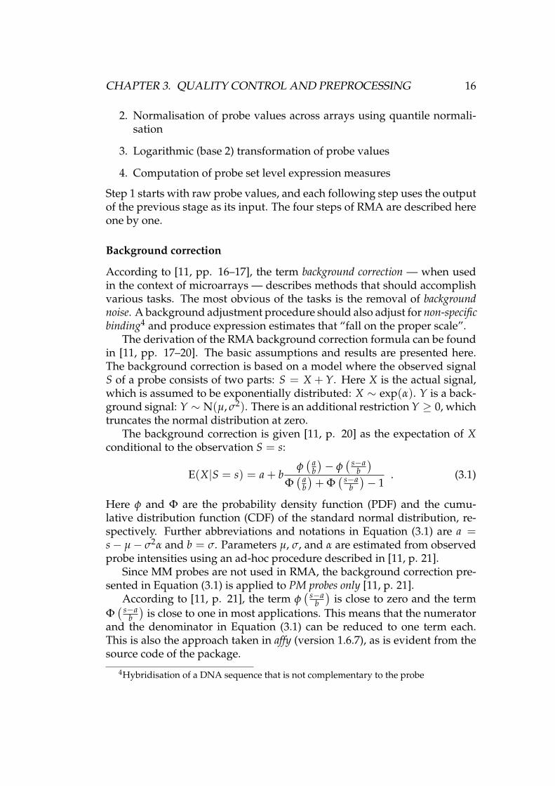
According to [11, pp. 16–17], the term background correction — when usedin the context of microarrays — describes methods that should accomplishvarious tasks. The most obvious of the tasks is the removal of backgroundnoise. A background adjustment procedure should also adjust for non-specificbinding4 and produce expression estimates that “fall on the proper scale”.
The derivation of the RMA background correction formula can be foundin [11, pp. 17–20]. The basic assumptions and results are presented here.The background correction is based on a model where the observed signalS of a probe consists of two parts: S = X + Y. Here X is the actual signal,which is assumed to be exponentially distributed: X ∼ exp(α). Y is a back-ground signal: Y ∼ N(µ, σ2). There is an additional restriction Y ≥ 0, whichtruncates the normal distribution at zero.
The background correction is given [11, p. 20] as the expectation of Xconditional to the observation S = s:
E(X|S = s) = a + bφ( a
b)− φ
( s−ab)
Φ( a
b)+ Φ
( s−ab)− 1
. (3.1)
Here φ and Φ are the probability density function (PDF) and the cumu-lative distribution function (CDF) of the standard normal distribution, re-spectively. Further abbreviations and notations in Equation (3.1) are a =s− µ− σ2α and b = σ. Parameters µ, σ, and α are estimated from observedprobe intensities using an ad-hoc procedure described in [11, p. 21].
Since MM probes are not used in RMA, the background correction pre-sented in Equation (3.1) is applied to PM probes only [11, p. 21].
According to [11, p. 21], the term φ( s−a
b)
is close to zero and the termΦ( s−a
b)
is close to one in most applications. This means that the numeratorand the denominator in Equation (3.1) can be reduced to one term each.This is also the approach taken in affy (version 1.6.7), as is evident from thesource code of the package.
4Hybridisation of a DNA sequence that is not complementary to the probe

CHAPTER 3. QUALITY CONTROL AND PREPROCESSING 17
Normalisation across arrays
Normalisation aims to remove the non-biological variation between microar-rays used in the same experiment [11, p. 39]. The different scale factors ofFigure A.2 — although strictly speaking an indication of variation betweenarrays on the probe set level, not the probe level — show that there can in-deed be differences between the overall expression levels of arrays belong-ing to the same experiment.
RMA uses quantile normalisation [10], which is applied to backgroundcorrected PM probe values. Quantile normalisation not only unifies theirmeans, but also makes the distribution of PM probe values identical in everyarray. The method has been tested against other normalisation methods andfound to perform well with regard to both the quality of the results and therunning time of the algorithm [10].
It is apparent that quantile normalisation involves the following assump-tion about the distribution of gene expression values: the distribution isroughly the same, regardless of which tissue sample is studied. Some genesare more strongly expressed in one sample than another while other genesbehave in the reverse manner, and the end result is a similar distribution ofexpression values in all samples. The degree to which the assumption holdsnaturally depends on the particular samples used.
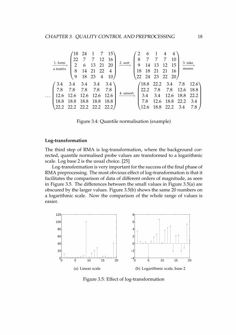
Quantile normalisation is easily done with the following four steps. Thelist is adapted from [10].
1. Form a matrix X with dimensions p × n. Here p is the number ofprobes and n is the number of arrays. Each array (PM probes) is acolumn of the matrix.
2. Sort each column of X, which gives you Xsort.
3. Take the mean across rows of Xsort. Assign the mean to every elementin the row, which gives you X′sort.
4. Rearrange each column of X′sort to have the same ordering as in theoriginal X. This gives you Xnormalised, which has the same distributionof numbers in each column.
Figure 3.4 illustrates the process. The numbers in each column of the ex-ample matrix are unique. Thus there are no tied ranks, which would makethe sorted order of the affected column ambiguous. In a situation with tiedranks, the order of equal numbers depends on the sorting algorithm used.When there are hundreds of thousands of values in each column, as in thecase of the microarray data used here, the effect of such ambiguities on anyindividual normalised value is probably very small.
CHAPTER 3. QUALITY CONTROL AND PREPROCESSING 18
1. form−−−−→a matrix
18 24 1 7 1522 7 7 12 162 6 13 21 208 14 21 22 49 18 23 4 10
2. sort−−−→
2 6 1 4 48 7 7 7 109 14 13 12 1518 18 21 21 1622 24 23 22 20
3. take−−−→means
. . .
3.4 3.4 3.4 3.4 3.47.8 7.8 7.8 7.8 7.812.6 12.6 12.6 12.6 12.618.8 18.8 18.8 18.8 18.822.2 22.2 22.2 22.2 22.2
4. unsort−−−−→
18.8 22.2 3.4 7.8 12.622.2 7.8 7.8 12.6 18.83.4 3.4 12.6 18.8 22.27.8 12.6 18.8 22.2 3.412.6 18.8 22.2 3.4 7.8
Figure 3.4: Quantile normalisation (example)
Log-transformation
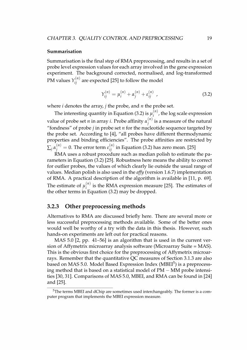
The third step of RMA is log-transformation, where the background cor-rected, quantile normalised probe values are transformed to a logarithmicscale. Log base 2 is the usual choice. [25]
Log-transformation is very important for the success of the final phase ofRMA preprocessing. The most obvious effect of log-transformation is that itfacilitates the comparison of data of different orders of magnitude, as seenin Figure 3.5. The differences between the small values in Figure 3.5(a) areobscured by the larger values. Figure 3.5(b) shows the same 20 numbers ona logarithmic scale. Now the comparison of the whole range of values iseasier.
0 5 10 15 200
20
40
60
80
100
120
(a) Linear scale
0 5 10 15 20−4
−2
0
2
4
6
8
(b) Logarithmic scale, base 2
Figure 3.5: Effect of log-transformation
CHAPTER 3. QUALITY CONTROL AND PREPROCESSING 19
Summarisation
Summarisation is the final step of RMA preprocessing, and results in a set ofprobe level expression values for each array involved in the gene expressionexperiment. The background corrected, normalised, and log-transformedPM values Y(n)
ij are expected [25] to follow the model
Y(n)ij = µ
(n)i + α
(n)j + ε
(n)ij , (3.2)
where i denotes the array, j the probe, and n the probe set.The interesting quantity in Equation (3.2) is µ
(n)i , the log scale expression
value of probe set n in array i. Probe affinity α(n)j is a measure of the natural
“fondness” of probe j in probe set n for the nucleotide sequence targeted bythe probe set. According to [4], “all probes have different thermodynamicproperties and binding efficiencies”. The probe affinities are restricted by
∑j α(n)j = 0. The error term ε
(n)ij in Equation (3.2) has zero mean. [25]
RMA uses a robust procedure such as median polish to estimate the pa-rameters in Equation (3.2) [25]. Robustness here means the ability to correctfor outlier probes, the values of which clearly lie outside the usual range ofvalues. Median polish is also used in the affy (version 1.6.7) implementationof RMA. A practical description of the algorithm is available in [11, p. 69].The estimate of µ
(n)i is the RMA expression measure [25]. The estimates of
the other terms in Equation (3.2) may be dropped.
3.2.3 Other preprocessing methods
Alternatives to RMA are discussed briefly here. There are several more orless successful preprocessing methods available. Some of the better oneswould well be worthy of a try with the data in this thesis. However, suchhands-on experiments are left out for practical reasons.
MAS 5.0 [2, pp. 41–56] is an algorithm that is used in the current ver-sion of Affymetrix microarray analysis software (Microarray Suite = MAS).This is the obvious first choice for the preprocessing of Affymetrix microar-rays. Remember that the quantitative QC measures of Section 3.1.3 are alsobased on MAS 5.0. Model Based Expression Index (MBEI5) is a preprocess-ing method that is based on a statistical model of PM−MM probe intensi-ties [30, 31]. Comparisons of MAS 5.0, MBEI, and RMA can be found in [24]and [25].
5The terms MBEI and dChip are sometimes used interchangeably. The former is a com-puter program that implements the MBEI expression measure.
CHAPTER 3. QUALITY CONTROL AND PREPROCESSING 20
GCRMA [60] may be considered a more advanced or more complicatedversion of RMA. The main difference between RMA and GCRMA is thebackground correction method used. The normalisation and expressionvalue summarisation steps are the same in both methods [60, p. 14]. Per-fectMatch is an implementation of another preprocessing method, which isbased on a model called PDNN (position-dependent nearest neighbour) [61].MAS 5.0, RMA, PerfectMatch, and GCRMA are compared in [59].
3.2.4 Concluding thoughts
A comparative benchmark for preprocessing methods is discussed in [13].The accompanying web site, http://affycomp.biostat.jhsph.edu/, has over60 benchmark results in each category (on 17th Nov 2005). There are clearlyso many approaches to the preprocessing problem, that they all cannot becovered here.
None of the expression measures can decisively be declared the best.Many of the different techniques are quite well founded in theory, but theanalysis of microarray data is not the easiest of endeavours. Although somecomparisons have been made when “the truth” about the data is known, therelative performance of the different methods with real world data is hardto predict and varies from case to case. RMA is the method of choice in thisthesis, because it is an established method with mostly good performancecharacteristics, and there is a free implementation available. On one handthe elegant and relatively simple theory behind RMA is quite impressive.On the other hand, some parts of RMA, at least background correction, maybe too simple.
Chapter 4
Clustering gene expression timeseries data
4.1 Introduction
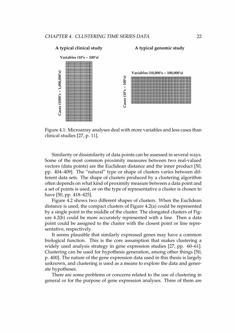
Microarray analyses differ from typical clinical studies, as shown in Fig-ure 4.1. The number of variables (genes) in microarray data is large, whilethe number of cases (microarrays) is small. Using standard biostatisticaltechniques would require more cases than what is usually available withmicroarray data. Keeping that in mind, methods used in computational sci-ences and machine learning are more appropriate tools for analysis. [27, pp.10–12]
4.2 Motivation for clustering and analysis of itsapplicability
Cluster analysis is an instrument of descriptive modelling in the broad field ofdata mining. A descriptive model presents the main features of the data ina convenient form. Cluster analysis aims to find “whether the data fall intodistinct groups”, which would mean that the data set is heterogeneous. [21,pp. 271, 293].
Clustering means the organisation of data points into groups. The clus-ters should be “sensible”, which usually means that points in the same clus-ter should be somehow “similar”, and points in different clusters shouldbe “different”. The discovery of differences between groups of data pointsand similarities within members of individual groups will hopefully leadto useful findings. Clustering belongs to the problem class of unsupervisedlearning or learning without a teacher. [50, p. 397]
21
CHAPTER 4. CLUSTERING TIME SERIES DATA 22
������������������������������������������������������������������
������������������������������������������������������������������
������������������������������������������������������������������
������������������������������������������������������������������Variables (10’s − 100’s)
Variables (10,000’s − 100,000’s)
A typical clinical study A typical genomic study
Ca
ses
(10
’s −
10
0’s
)
Ca
ses
(10
00
’s −
1,0
00
,00
0’s
)
Figure 4.1: Microarray analyses deal with more variables and less cases thanclinical studies [27, p. 11].
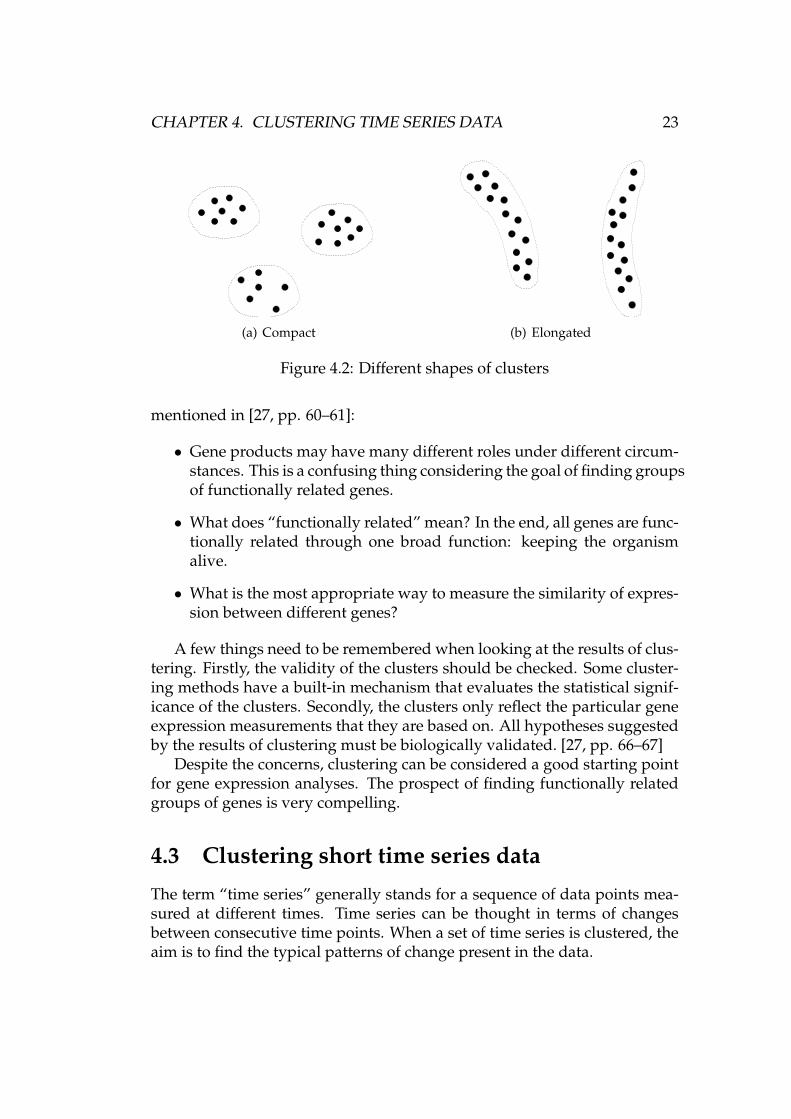
Similarity or dissimilarity of data points can be assessed in several ways.Some of the most common proximity measures between two real-valuedvectors (data points) are the Euclidean distance and the inner product [50,pp. 404–409]. The “natural” type or shape of clusters varies between dif-ferent data sets. The shape of clusters produced by a clustering algorithmoften depends on what kind of proximity measure between a data point anda set of points is used, or on the type of representative a cluster is chosen tohave [50, pp. 418–425].
Figure 4.2 shows two different shapes of clusters. When the Euclideandistance is used, the compact clusters of Figure 4.2(a) could be representedby a single point in the middle of the cluster. The elongated clusters of Fig-ure 4.2(b) could be more accurately represented with a line. Then a datapoint could be assigned to the cluster with the closest point or line repre-sentative, respectively.
It seems plausible that similarly expressed genes may have a commonbiological function. This is the core assumption that makes clustering awidely used analysis strategy in gene expression studies [27, pp. 60–61].Clustering can be used for hypothesis generation, among other things [50,p. 400]. The nature of the gene expression data used in this thesis is largelyunknown, and clustering is used as a means to explore the data and gener-ate hypotheses.
There are some problems or concerns related to the use of clustering ingeneral or for the purpose of gene expression analyses. Three of them are
CHAPTER 4. CLUSTERING TIME SERIES DATA 23
(a) Compact (b) Elongated
Figure 4.2: Different shapes of clusters
mentioned in [27, pp. 60–61]:
• Gene products may have many different roles under different circum-stances. This is a confusing thing considering the goal of finding groupsof functionally related genes.
• What does “functionally related” mean? In the end, all genes are func-tionally related through one broad function: keeping the organismalive.
• What is the most appropriate way to measure the similarity of expres-sion between different genes?
A few things need to be remembered when looking at the results of clus-tering. Firstly, the validity of the clusters should be checked. Some cluster-ing methods have a built-in mechanism that evaluates the statistical signif-icance of the clusters. Secondly, the clusters only reflect the particular geneexpression measurements that they are based on. All hypotheses suggestedby the results of clustering must be biologically validated. [27, pp. 66–67]
Despite the concerns, clustering can be considered a good starting pointfor gene expression analyses. The prospect of finding functionally relatedgroups of genes is very compelling.
4.3 Clustering short time series data
The term “time series” generally stands for a sequence of data points mea-sured at different times. Time series can be thought in terms of changesbetween consecutive time points. When a set of time series is clustered, theaim is to find the typical patterns of change present in the data.
CHAPTER 4. CLUSTERING TIME SERIES DATA 24
Time series data, such as the data described in Section 2.2, have an im-portant special property. The time points have a particular order, and therecould be some dependencies between them. For example, small changes ingene expression between consecutive time points might be more probablethan larger variations.
Many clustering methods can be used on very different types of data.For a given purpose, a general solution may be less powerful than a morespecialised one. When clustering time series data, it is beneficial to choosean algorithm that takes the special nature of the data into account. It shouldalso be remembered that the data used in the thesis consist of only a fewdifferent time points.
4.3.1 An algorithm designed for the task
We use an algorithm designed for clustering short time series gene expres-sion data. The data used in the thesis fit this description perfectly. Thealgorithm, presented in [16], doesn’t seem to have a name. In this thesis, itwill occasionally be called “Ernst’s algorithm”. There is a Java implemen-tation of the algorithm available. It is free for non-commercial research use,and can be obtained from http://www.cs.cmu.edu/∼jernst/st/ (referenced20th Jan 2006). The following step-by-step list presents the algorithm in anutshell:
1. Enumerate all possible model profiles. A user selectable parameter cdetermines the maximum amount of change units between time points.See Section 4.3.2.
2. Select a set of m distinct model profiles. See Section 4.3.3.
3. Assign each data profile to a model profile. A clustering is formed.See Section 4.3.4.
4. Identify significant model profiles (clusters) with a permutation test.See Section 4.3.4.
5. Group significant profiles. Similar model profiles are grouped together.This step is covered in Section 4.3.5, but omitted in our analyses of thegene expression data.
An interesting aspect about the algorithm is that it uses model profilesthat are independent of the data. A permutation test then determines whichprofiles were significantly present in the data at hand. This approach ap-peals to the common sense: we want to select distinct model profiles thathelp us bring out the different clusters in our data.
CHAPTER 4. CLUSTERING TIME SERIES DATA 25
In [16], the algorithm was found to perform favourably in comparisonwith another algorithm designed for time series data, CAGED [43]. Ac-cording to [16], one reason for this was the tendency of CAGED to produceclusters that contain too many genes, which hinders its ability to bring outthe special features of small but significant clusters.
4.3.2 Enumerating model profiles
The first step of the clustering algorithm is to enumerate all the possibleexpression profiles. Strictly speaking, this is hardly possible, since the num-ber of different expression profiles is practically unlimited. The approachtaken in [16] is to discretise the amount of change between consecutive timepoints. The first value of the model profiles is zero by design. If x is the ex-pression value at time point t, then the value at t + 1 can take integer valuesbetween x − c and x + c. Thus the maximum amount of change betweenconsecutive time points is c units. The units are scale-invariant, which isevident from the distance measure used in the algorithm (see Section 4.3.3).
The parameter c can be called the smoothness parameter, for example.The bigger c is, the more time the clustering algorithm takes to run. Thechoice of c only increases the running times of the profile enumeration andprofile selection phases. Other parts of the algorithm are not affected. Al-though it might be somewhat tempting to use a big value of c, increasing it“too much” provides diminishing returns. Tests referred to in [16] suggestthat very similar results are achieved with values c ∈ {1, 2, 3}.
Another factor limiting the choice of c is the number of all possible modelprofiles:
|P| = (2c + 1)n−1 , (4.1)
where n is the number of time points in a profile. With the relatively modestvalues of n = 6 and c = 3, |P| = 16807. Choosing c = 2 brings thatnumber down to 3125. Having a large number of profiles is also a problemin the following phase of the algorithm, where pairwise distances betweenprofiles are computed. The complexity of calculating all pairwise distancesin a given data set is quadratic in the number of data points.
Algorithm 4.1 is a simple recursive solution for enumerating the possi-ble model profiles. The parameters are the length of the profiles n and thesmoothness parameter c. The resulting set P contains all profiles that startwith a zero, have n time points, and fulfil the constraint on change per timeunit set by the choice of c.
CHAPTER 4. CLUSTERING TIME SERIES DATA 26
Algorithm 4.1 ENUMERATEPROFILES A recursive algorithm for enumerat-ing all possible model profiles
ENUMERATEPROFILES(n, c)1 if n = 12 then P← {0} � a set containing one profile with the initial zero3 else P← {}4 Prec ← ENUMERATEPROFILES(n− 1, c)5 while |Prec| > 06 do let p be any profile in Prec7 Prec ← Prec \{p}8 let pend be the value at the last time point of p9 let S be the set of integers from pend−c to pend +c
10 while |S| > 011 do let s be any number in S12 S← S \ {s}13 let q be the profile where s is appended to the end of p14 P← P ∪ {q}15 return P
4.3.3 Selecting distinct profiles
It is obvious that the number of model profiles needs to be reduced. With3125 or even 16807 model profiles, the resulting clusters would be verysmall, and some of the clusters would be quite similar to each other. That isclearly against our goal, which is to find significant and distinct patterns ofexpression.
When a set R consisting of m distinct profiles needs to be selected, thereare many different ways to formulate the problem. Here, true to [16], we tryto maximise the minimum distance between any two profiles p1 and p2 inR ⊂ P, where P is the set of all possible model profiles:
arg maxR:R⊂P,|R|=m
minp1,p2∈R
d(p1, p2). (4.2)
Here d is a distance measure. An obvious alternative would be to maximisethe average of all pairwise distances in R.
The selection criterion of Equation (4.2) requires a measure for objec-tively judging the distance between two profiles. The distance measure usedhere — and throughout the different phases of this clustering algorithm —is
d(x, y) = 1− ρ(x, y), (4.3)
CHAPTER 4. CLUSTERING TIME SERIES DATA 27
where ρ(x, y) is Pearson’s correlation coefficient between the two profiles(vectors) x and y, shown in Equation (4.4). In the equation, n is the lengthof the vectors.
ρ(x, y) = ∑ni=1 aibi√
∑ni=1 a2
i
√∑n
i=1 b2i
, ai = xi − x, bi = yi − y (4.4)
Actually, it is not accurate to call Equation (4.3) a distance measure, be-cause it does not fulfil two conditions [50, p. 404] of a metric: triangularinequality (see Equation (4.5)) and Equation (4.6).
d(x, z) ≤ d(x, y) + d(y, z), ∀x, y, z ∈ X (4.5)
d(x, y) = d0 if and only if x = y (4.6)
The X in Equation (4.5) is the domain of all vectors that d operates on.The d0 in Equation (4.6) is the minimum distance between any two vectors,which in the case of Equation (4.3) is zero. Although a more accurate namefor Equation (4.3) would be for example “dissimilarity measure” [50, p. 404],the name “distance measure” is often used in this thesis.
According to [16], the solution to Equation (4.2) is NP-hard. However,the solution can be approximated in polynomial time. The greedy algorithmof Algorithm 4.2 — with the distance measure of Equation (4.3) — is guar-anteed to achieve a set R, where the minimum distance between profiles isat least a quarter of that in the best set R′ [16].
Algorithm 4.2 SELECTVECTORSMAXMINDIST A greedy algorithm forchoosing m distinct profiles (appeared in [16])
SELECTVECTORSMAXMINDIST(d, P, m)1 let p1 ∈ P be the profile that always goes down one unit between time points2 R← {p1}3 L← P \ {p1}4 for i← 2 to m5 do let p ∈ L be the profile that maximises minp1∈Rd(p, p1)6 R← R ∪ {p}7 L← L \ {p}8 return R
There is a small problem in Algorithm 4.2 in the case of equally goodprofiles. More specifically, there are often several profiles, not one profile p,
CHAPTER 4. CLUSTERING TIME SERIES DATA 28
that maximise the minimum distance to profiles already in R. Algorithm 4.2doesn’t take these situations into account. Instead, it assumes that there isone optimal choice for every situation, in the greedy sense.
The improved Algorithm 4.3 is a simple randomised algorithm [36]. Itis a modification of Algorithm 4.2 and fixes the problem by randomly se-lecting one of the best candidate profiles. The user can specify the numberof repeated runs with the parameter repeats. The results achieved with theimproved algorithm are typically a little better than with the original algo-rithm, assuming that the ambiguity in the original algorithm is rectified ina deterministic way.
Algorithm 4.3 SELECTVECTORSMAXMINDISTRANDOM A randomisedgreedy algorithm for choosing m distinct profiles
SELECTVECTORSMAXMINDISTRANDOM(d, P, m, repeats)1 distbest ← −∞2 for i← 1 to repeats3 do Rt ← SELECTHELPER(d, P, m)4 disttemp ← min(p1,p2)∈Rt×Rt d(p1, p2)5 if disttemp > distbest6 then distbest ← disttemp7 R← Rt8 return R
SELECTHELPER(d, P, m)1 let p1 ∈ P be the profile that always goes down one unit between time points2 R← {p1}3 L← P \ {p1}4 for i← 2 to m5 do let p ∈ L randomly be one of the profiles that maximise minp1∈Rd(p, p1)6 R← R ∪ {p}7 L← L \ {p}8 return R
Table 4.1 shows a comparison of the deterministic Algorithm 4.2 and therandomised Algorithm 4.3. The results of the deterministic algorithm de-pend on implementation details: a single profile must somehow be chosenin the case of multiple equally good options. Clearly something is done dif-ferently in the implementation used in [16], because the minimum distance
CHAPTER 4. CLUSTERING TIME SERIES DATA 29
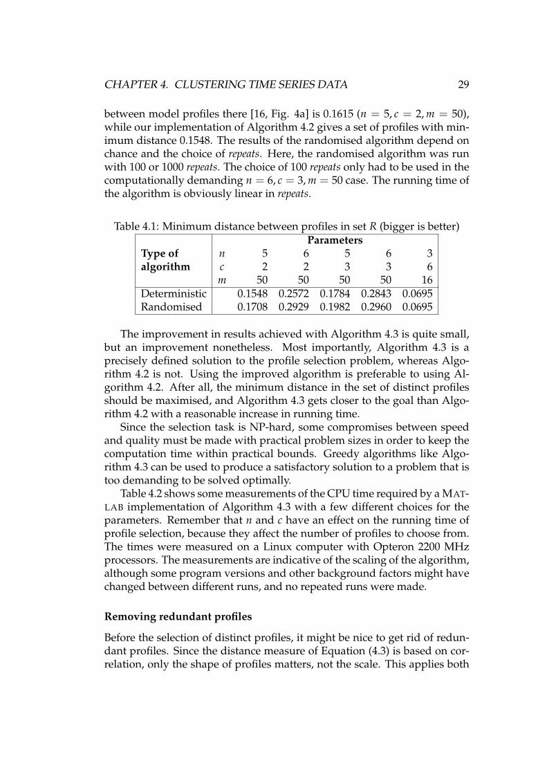
between model profiles there [16, Fig. 4a] is 0.1615 (n = 5, c = 2, m = 50),while our implementation of Algorithm 4.2 gives a set of profiles with min-imum distance 0.1548. The results of the randomised algorithm depend onchance and the choice of repeats. Here, the randomised algorithm was runwith 100 or 1000 repeats. The choice of 100 repeats only had to be used in thecomputationally demanding n = 6, c = 3, m = 50 case. The running time ofthe algorithm is obviously linear in repeats.
Table 4.1: Minimum distance between profiles in set R (bigger is better)
Type ofalgorithm
Parametersn 5 6 5 6 3c 2 2 3 3 6m 50 50 50 50 16
Deterministic 0.1548 0.2572 0.1784 0.2843 0.0695Randomised 0.1708 0.2929 0.1982 0.2960 0.0695
The improvement in results achieved with Algorithm 4.3 is quite small,but an improvement nonetheless. Most importantly, Algorithm 4.3 is aprecisely defined solution to the profile selection problem, whereas Algo-rithm 4.2 is not. Using the improved algorithm is preferable to using Al-gorithm 4.2. After all, the minimum distance in the set of distinct profilesshould be maximised, and Algorithm 4.3 gets closer to the goal than Algo-rithm 4.2 with a reasonable increase in running time.
Since the selection task is NP-hard, some compromises between speedand quality must be made with practical problem sizes in order to keep thecomputation time within practical bounds. Greedy algorithms like Algo-rithm 4.3 can be used to produce a satisfactory solution to a problem that istoo demanding to be solved optimally.
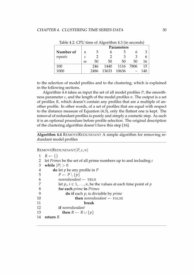
Table 4.2 shows some measurements of the CPU time required by a MAT-LAB implementation of Algorithm 4.3 with a few different choices for theparameters. Remember that n and c have an effect on the running time ofprofile selection, because they affect the number of profiles to choose from.The times were measured on a Linux computer with Opteron 2200 MHzprocessors. The measurements are indicative of the scaling of the algorithm,although some program versions and other background factors might havechanged between different runs, and no repeated runs were made.
Removing redundant profiles
Before the selection of distinct profiles, it might be nice to get rid of redun-dant profiles. Since the distance measure of Equation (4.3) is based on cor-relation, only the shape of profiles matters, not the scale. This applies both
CHAPTER 4. CLUSTERING TIME SERIES DATA 30
Table 4.2: CPU time of Algorithm 4.3 (in seconds)
Number ofrepeats
Parametersn 5 6 5 6 3c 2 2 3 3 6m 50 50 50 50 16
100 246 1440 1116 7806 151000 2486 13633 10636 – 140
to the selection of model profiles and to the clustering, which is explainedin the following sections.
Algorithm 4.4 takes as input the set of all model profiles P, the smooth-ness parameter c, and the length of the model profiles n. The output is a setof profiles R, which doesn’t contain any profiles that are a multiple of an-other profile. In other words, of a set of profiles that are equal with respectto the distance measure of Equation (4.3), only the flattest one is kept. Theremoval of redundant profiles is purely and simply a cosmetic step. As suchit is an optional procedure before profile selection. The original descriptionof the clustering algorithm doesn’t have this step [16].
Algorithm 4.4 REMOVEREDUNDANT A simple algorithm for removing re-dundant model profiles
REMOVEREDUNDANT(P, c, n)1 R← {}2 let Primes be the set of all prime numbers up to and including c3 while |P| > 04 do let p be any profile in P5 P← P \ {p}6 nonredundant← TRUE7 let pi, i ∈ 1, . . . , n, be the values at each time point of p8 for each prime in Primes9 do if each pi is divisible by prime
10 then nonredundant← FALSE11 break12 if nonredundant13 then R← R ∪ {p}14 return R
CHAPTER 4. CLUSTERING TIME SERIES DATA 31
4.3.4 Clustering and finding significant profiles
The clustering of the expression profiles can be done with Algorithm 4.5.Algorithms 4.6, 4.7, and 4.8 are helper functions. The algorithms are basedon their written descriptions found in [16].
Algorithm 4.5 STSCLUSTER A clustering algorithm for Short Time Seriesgene expression data. See algorithms 4.6, 4.7, and 4.8 for related helperfunctions. This is a detailed description of Ernst’s algorithm [16].
STSCLUSTER(G, P, DoGrouping, α, δ)1 � G is an array of gene expression profiles2 � P is an array of model profiles3 let d, d(x, y) = 1− ρ(x, y) be a distance function4 let n be the length of each profile in G and P5 let perm be the “straight” permutation (1 . . . n)6 Idx← ASSIGNTOCLUSTERS(d, P, G, perm)7 let T be an array (length |P|) containing the column-sums of Idx8 [Pval, E]← PERMTEST(d, T, P, G)9 sort Pval in ascending order, resulting in permutation perms
10 R← P11 apply perms to R, E, and T12 apply perms to columns of Idx � columns (model profiles) change places13 ns ← 0 � number of significant clusters14 for i← 1 to |R|15 do if Pval[i] < α/ |R| � Bonferroni correction16 then ns ← ns + 117 else break18 if DoGrouping � Optionally group significant profiles19 then Rgrp← GROUPPROFILES(R, ns, T, d, δ)20 else Rgrp← NIL21 return [R, Pval, Idx, E, ns, Rgrp]
The main function, presented in Algorithm 4.5, always takes as inputthe gene expression profiles to be clustered G, the distinct model profiles P,and a significance threshold α. Parameter DoGrouping determines whethersimilar model profiles are grouped together, and δ adjusts the sensitivity ofthat optional grouping. In [16], the grouping phase is considered an integralpart of the algorithm. However, assigning a meaningful value to δ might bedifficult. Analysis of clustering results would also be somewhat more com-plicated with grouped profiles. The grouping phase is discussed in more
CHAPTER 4. CLUSTERING TIME SERIES DATA 32
detail in Section 4.3.5.The clustering algorithm returns many values. R contains the same
model profiles that were given in P, this time in the order of increasingP-value. Pval are the P-values of the model profiles, where a value smallenough means that the number of data profiles belonging to the cluster rep-resented by the model profile is significantly large. The clustering resultsare contained in Idx, a two-dimensional array, where Idx[i, j] marks whetherdata profile i belongs to cluster j or not. It is zero if profile i doesn’t belong tocluster j, and 1/n if the profile belongs to a total of n different clusters, oneof which is cluster j. The chance of a data profile belonging to more than onecluster seems quite theoretic. In all our experiments, each data profile wasassigned to a single cluster. Return value E is the expected number of genesin each cluster according to some assumptions discussed later, in Section“Permutation test”. The number of significant model profiles, or significantclusters, is returned in ns. Rgrp contains the groups of significant profiles, ifDoGrouping was set to TRUE.
Algorithm 4.6 simply assigns the given data profiles G to clusters repre-sented by the model profiles P. Each data profile is assigned to the closestmodel profile. The distance between profiles is measured by d, which is thedistance measure of Equation (4.3) when this algorithm is called from Al-gorithm 4.5. As mentioned before, there is a possibility of more than onemodel profile having the smallest distance to a data profile, in which casethe data profile is assigned equally to all of the model profiles. Input pa-rameter perm determines if and how the order of time points is changed inthe data profiles. Array Cl contains the result of the clustering.
Algorithm 4.6 ASSIGNTOCLUSTERS Helper function for Algorithm 4.5
ASSIGNTOCLUSTERS(d, P, G, perm)1 let Cl be a |G| × |P| zero array2 let Gs be the same as G except that each profile is permuted according to perm3 let D be a |Gs| × |P| array where D[i, j] = d(Gs[i], P[j])4 for i← 1 to |Gs|5 do � We are looking at the i:th row of D (denoted D[i, ])6 let Idx be the index (indices) of the minimum value(s) of D[i, ]7 for j← 1 to |Idx|8 do Cl [i, Idx [j]]← 1/ |Idx| � i:th row of Cl is altered9 return Cl
CHAPTER 4. CLUSTERING TIME SERIES DATA 33
Permutation test
Algorithm 4.7 is a permutation test [20] for determining the significance ofclusters. A significant cluster is one that has many genes (data profiles)assigned to it compared to the expected number of genes according to anull hypothesis. The null hypothesis in this case is that the data have notime structure, which means that there are no dependencies between timepoints. [16]
Algorithm 4.7 PERMTEST Helper function for Algorithm 4.5
PERMTEST(d, T, P, G)1 let n be the length of each profile in P2 let N be the list of integers from 1 to n3 let Perms be the set of all permutationsa on N4 let Cl be a |G| × |P| zero array5 for each perm in Perms � sum up clusterings in all permutations6 do Cl← Cl +ASSIGNTOCLUSTERS(d, P, G, perm)7 � count total number of genes assigned to each cluster8 let S be an array (length |P|) containing the column-sums of Cl9 � count expected number of genes according to null hypothesis
10 for i← 1 to |P|11 do E[i]← S[i]/ |Perms| � |Perms| = n!12 for i← 1 to |P| � compute P-value for each cluster13 do Pval[i]← 1− BINOCDF(T[i]− 1, |G| , E[i]/ |G|)14 � BINOCDF(n, N, p) is an external function for computing the . . .15 � cumulative binomial distribution function with parameters N and p at n16 return [Pval, E]
aUsing a smaller set of permutations would reduce running time and might givean acceptable approximation of the P-values.
In order to dismantle the time structure possibly present in the data, Al-gorithm 4.7 applies the clustering implemented in Algorithm 4.6 to all n!permutations achieved by changing the order of the n time points in the ex-pression profiles. If we let sj
i be the number of expression profiles assignedto cluster i = 1, . . . , m in permutation j = 1, . . . , n!, then Ei = (∑j sj
i)/n! isthe expected number of profiles assigned to the cluster, when consideringa random permutation. This corresponds to the idea of independent timepoints presented in the null hypothesis. It is worth remembering, that gen-erally Ei 6= |G| /m. [16]
CHAPTER 4. CLUSTERING TIME SERIES DATA 34
The parameters of Algorithm 4.7 are distance measure d, model pro-files P, data profiles G, and T, which is an array containing the number ofdata profiles assigned to each cluster. The algorithm computes the P-valueP(X ≥ Ti) of each cluster i having at least Ti genes. X is assumed to followthe binomial distribution X ∼ Bin(|G| , Ei/ |G|) [16], where Ei/ |G| is theprobability of a random profile belonging to cluster i according to the nullhypothesis.
Algorithm 4.7 returns both the P-values and the expected number ofgenes in each cluster. These are Pval and E in the pseudocode, respectively.
The returned P-values are used in the main program, Algorithm 4.5. Theclusters are sorted in ascending order of P-values. A Bonferroni correction([55], [35, p. 8]) is applied to the P-values in order to compensate for the mul-tiple statistical tests in determining the significant clusters. Thus the signifi-cance criterion for cluster i is that its P-value is smaller than the significancethreshold divided by the number of clusters, i.e. P(X ≥ Ti) < α/m.
Algorithm 4.7 computes a clustering for all permutations of the data, in-cluding the “straight”, original permutation. The clustering of the unaltereddata is also computed in Algorithm 4.5. A small proportion of the runningtime of the clustering algorithm could be shaved off by eliminating the re-dundant computation.
Profiles starting with zero
As stated in Section 4.3.2, the first time point of each model profile usedby the clustering algorithm is always zero. Behind this choice lies an as-sumption presented in [16]. The assumption is that a “raw” time series x isconverted into a time series y containing log ratios, where the value at eachtime point is compared to the value at the first time point:
yi = log(xi/x1) = log xi − log x1. (4.7)
The choice of the logarithm base is arbitrary and will not affect the distancesbetween profiles. This can be seen from Equation (4.8) which gives the rela-tionship between logarithmic values with bases a and b. Since the change oflogarithm base only means a constant scaling, the distance measure of Equa-tion (4.3) is not affected. The fact that y1 is zero seems to go well with theidea of model profiles starting with zero. The clustering algorithm operateson the converted time series.
logb x =loga xloga b
(4.8)
It can easily be seen from the definition of the correlation coefficient (seeEquation (4.4)), that the distance measure of Equation (4.3) is immune to
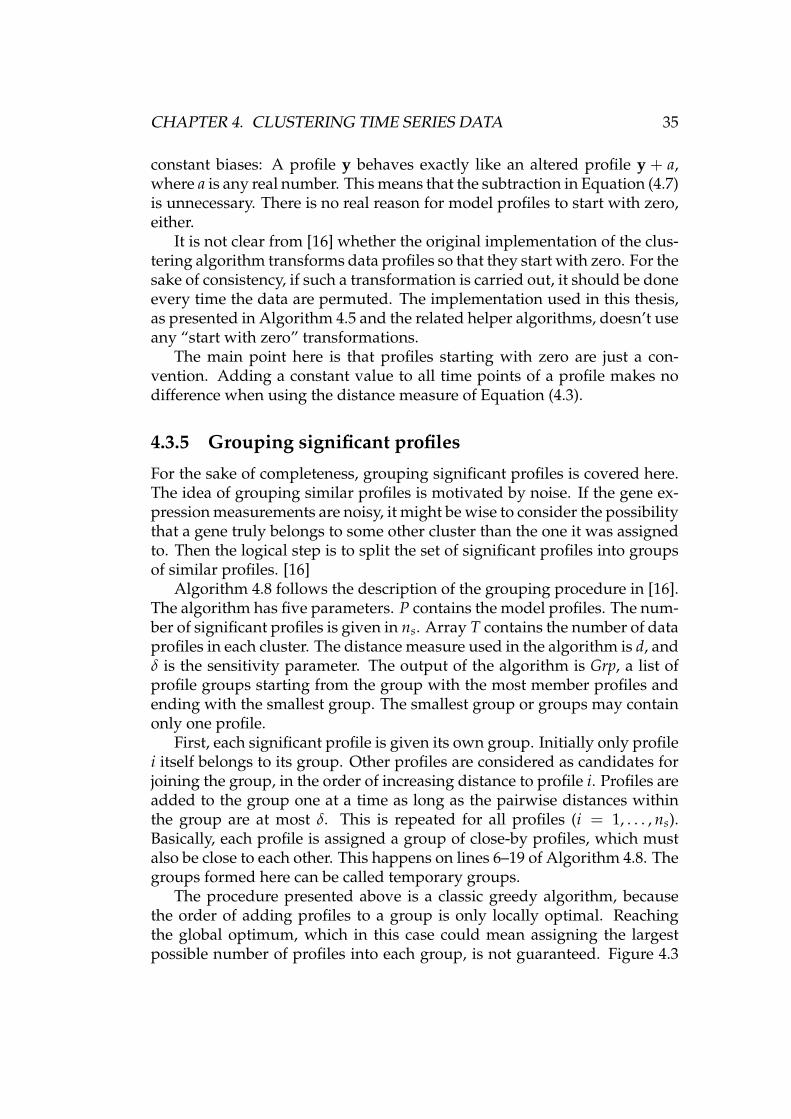
CHAPTER 4. CLUSTERING TIME SERIES DATA 35
constant biases: A profile y behaves exactly like an altered profile y + a,where a is any real number. This means that the subtraction in Equation (4.7)is unnecessary. There is no real reason for model profiles to start with zero,either.
It is not clear from [16] whether the original implementation of the clus-tering algorithm transforms data profiles so that they start with zero. For thesake of consistency, if such a transformation is carried out, it should be doneevery time the data are permuted. The implementation used in this thesis,as presented in Algorithm 4.5 and the related helper algorithms, doesn’t useany “start with zero” transformations.
The main point here is that profiles starting with zero are just a con-vention. Adding a constant value to all time points of a profile makes nodifference when using the distance measure of Equation (4.3).
4.3.5 Grouping significant profiles
For the sake of completeness, grouping significant profiles is covered here.The idea of grouping similar profiles is motivated by noise. If the gene ex-pression measurements are noisy, it might be wise to consider the possibilitythat a gene truly belongs to some other cluster than the one it was assignedto. Then the logical step is to split the set of significant profiles into groupsof similar profiles. [16]
Algorithm 4.8 follows the description of the grouping procedure in [16].The algorithm has five parameters. P contains the model profiles. The num-ber of significant profiles is given in ns. Array T contains the number of dataprofiles in each cluster. The distance measure used in the algorithm is d, andδ is the sensitivity parameter. The output of the algorithm is Grp, a list ofprofile groups starting from the group with the most member profiles andending with the smallest group. The smallest group or groups may containonly one profile.
First, each significant profile is given its own group. Initially only profilei itself belongs to its group. Other profiles are considered as candidates forjoining the group, in the order of increasing distance to profile i. Profiles areadded to the group one at a time as long as the pairwise distances withinthe group are at most δ. This is repeated for all profiles (i = 1, . . . , ns).Basically, each profile is assigned a group of close-by profiles, which mustalso be close to each other. This happens on lines 6–19 of Algorithm 4.8. Thegroups formed here can be called temporary groups.
The procedure presented above is a classic greedy algorithm, becausethe order of adding profiles to a group is only locally optimal. Reachingthe global optimum, which in this case could mean assigning the largestpossible number of profiles into each group, is not guaranteed. Figure 4.3

CHAPTER 4. CLUSTERING TIME SERIES DATA 36
Algorithm 4.8 GROUPPROFILES Helper function for Algorithm 4.5
GROUPPROFILES(P, ns, T, d, δ)1 if ns = 02 then return NIL3 let D be a ns × ns array where D[i, j] = d(P[i], P[j])4 let G be a ns × ns zero array, except that G[i, i] = 1, i = 1 . . . ns5 � G[i, j] will indicate whether profile j belongs to the group of profile i6 for i← 1 to ns � Grow each profile’s group7 do sort D[i, ] in ascending order resulting in permutation perm8 let I be the array 1 . . . ns permuted with perm9 � Try adding profiles to the group one candidate at a time
10 for j← 2 to ns11 do let Ix be the indices of the ones in G[i, ]12 OK← TRUE13 for k← 1 to |Ix|14 do if D[I[j], Ix[k]] > δ15 then OK← FALSE16 break17 if OK18 then G[i, I[j]]← 119 else break20 GroupNumber← 121 while G has non-zero element(s)22 do let S be a zero array of length ns23 for i← 1 to ns � count number of data profiles in each group24 do S[i]← 025 let Ix be the indices of ones in G[i, ]26 for j← 1 to |Ix|27 do S[i]← S[i] + T[Ix[j]]28 let ix be the index of (one of) the maximum value(s) in S29 let Ixgrp be the indices of the ones in G[ix, ]30 Grp[GroupNumber]← Ixgrp � Grp must be a dynamic structure31 G[ix, ]← 0 � Assign zeros to a whole row32 for i← 1 to
∣∣Ixgrp∣∣
33 do G[, Ixgrp[i]]← 0 � Assign zeros to a whole column34 GroupNumber← GroupNumber +135 return Grp
CHAPTER 4. CLUSTERING TIME SERIES DATA 37
illustrates this principle with Euclidean distances on a plane. If the closestpoint is added to the group first, adding the other points becomes impossi-ble. The shaded area is the intersection of the δ-radius neighbourhoods ofthe black dot and the white dots.
δ
δ
δ
δ
δ
Figure 4.3: When selecting a group for the black point, a greedy algorithmwill come to a dead end by choosing the closest (grey) point. δ is the distancethreshold.
Figure 4.4 shows a case of five different profiles, and serves as an exam-ple of greedy profile selection when using the distance measure of Equa-tion (4.3). The pairwise distances are shown in the matrix
D =
0 0.3937 0.3937 0.3937 0.3937
0.3937 0 0.8235 1.2647 0.82350.3937 0.8235 0 0.4412 0.29410.3937 1.2647 0.4412 0 0.44120.3937 0.8235 0.2941 0.4412 0
,
where dij is the distance between profiles i and j. When choosing a groupfor profile 1, the greedy profile selection method starts by choosing one ofthe other four profiles as a candidate for membership in the group. Since thedistances d1j, j = 2, . . . , 5, are equal, the choice will depend on implementa-tion details. Let’s assume that the distance between any pair of profiles in agroup can be at most 0.5 (δ = 0.5). If profile 2 is chosen, profiles 3–5 fail tomeet the distance criterion, their distances to profile 2 being 0.8235, 1.2647,and 0.8235 respectively. Profiles 1, 3, 4, and 5 would make a nice group witha maximum pairwise distance of 0.4412.
CHAPTER 4. CLUSTERING TIME SERIES DATA 38
1 2 3 4 5
Figure 4.4: When selecting a group for profile 1, a greedy algorithm mightchoose profile 2 and come to a dead end
After a temporary group has been built for each profile, a final groupingis formed by selecting the largest temporary groups one by one. The largestgroup is the one that has the most data profiles. Since each significant profilemust reside in a single final group, the profiles that belong to a selectedgroup are removed from every other temporary group. A new group isadded to the list of final groups until there are no profiles left to be grouped.This happens on lines 21–34 of Algorithm 4.8.
Identifying groups of similar model profiles seems like a good idea, yetthere are some problems. As mentioned before, it is not trivial to assign ameaningful value to δ. In the biological results of [16], a value of δ = 0.3 isused. The value stems from the similarity between replicate measurementson the same biological sample. If the data contain very few such replicates,as is the case with the data used in this thesis, the variability of expressionprofiles due to non-biological reasons is difficult to estimate.
The grouping of model profiles also complicates the analysis of the clus-tering results, or at least raises some questions. Should the results of thegrouping be integrated into the clustering of the data profiles by combiningthe clusters that belong to the same group, or would some kind of sepa-rate treatment of the grouping results be more appropriate? What is theessence of Algorithm 4.8, and what kind of compromises does it make, be-ing a greedy algorithm?
For the reasons stated above, significant model profiles are not groupedin the cluster analyses done in this thesis. Although the similarities betweenmodel profiles are not assessed in this way, the results will probably not besignificantly affected.
4.4 Other approaches to clustering
Some other clustering methods applicable to gene expression analysis arediscussed here in short. A nice review of various different methods is avail-able in [37, pp. 24–36].
CHAPTER 4. CLUSTERING TIME SERIES DATA 39
Self-organising map (SOM) [28] is an artificial neural network algorithmwhich uses a low-dimensional topologically connected lattice to representhigh-dimensional data. The cluster structure of the data can be visualisedwith the U-matrix [52], which shows how far from each other the map unitshave stretched in the input data space.
Out of all clustering methods, hierarchical clustering [50, pp. 449–487]may have been [37, p. 30] the first that was applied [15] to gene expressiondata. There are two types of hierarchical clustering algorithms: agglomera-tive and divisive. Both produce a hierarchy of clusterings instead of a singleclustering.
K-means is a very basic clustering method, where each data vector isassigned to the closest prototype vector. Each prototype vector is the meanof the data vectors belonging to its own cluster. Euclidean distance is oftenthe distance measure of choice. [50, pp. 531–533]
There are also other clustering methods. One of them uses a shape-basedsimilarity measure [8]. Another method is based on Hidden Markov Models(HMMs) [47]. Both of these are designed for gene expression time seriesdata.
4.5 Analysis of clustering results
4.5.1 Annotation data
Annotation data (file date 21st Jun 2005) were downloaded from the Affy-metrix web site, http://www.affymetrix.com/. The data file is in a commaseparated values (CSV) format, where each row is a record representing oneprobe set. The fields of a record are enclosed in double quotes and separatedby a comma. This is a very nice storage format, because it is relatively easyto extract any given field with a text oriented tool such as awk [6].
The annotation file contains information assembled from various pub-lic databases. The following fields were used in the experiments made forthis thesis: “Gene Title”, “Chromosomal Location”, and “Gene OntologyBiological Process”. The absence of a “Gene Title” was used as a pruningcriterion. This is explained in Section 5.2.2.
Chromosomal location
The “Chromosomal Location” of a probe set is the location of the corre-sponding nucleotide sequence or sequences in the human genome. Somepossible locations are 10p12.33 — chromosome 10, band p12 in the p (petit)arm, sub-band p12.3, sub-sub-band p12.33 — and Xq26-q28 — X chromo-some, bands q26 to q28 in the q (queue) arm [49, p. 49]. The amount of dif-
CHAPTER 4. CLUSTERING TIME SERIES DATA 40
ferent locations was reduced by removing any sub-band information fromthe data in the CSV file. If the chromosomal location of a probe set could notbe associated with a single band, the location was marked as missing. Forexample, 10p12.33 turned out as 10p12, and Xq26-q28 was marked as miss-ing data. Also probe sets with multiple entries for chromosomal locationwere stripped of location information.
The aforementioned simplification procedure was applied in order toreduce the number of different locations. Without the simplification, therewould be many locations with only one or a few probe sets. The reductionin the number of location categories and particularly the resulting increasein the number of probe sets in each category are desirable features whenlooking for enriched locations.
The simplification of chromosomal locations can also be motivated by in-formation like 3q22.2 being too specific when looking for areas of the genomewhere something special seems to be happening. This observation stemsfrom the fact that when looking for enriched terms, the relationship of theterms, such as proximity of locations in the genome, is not taken into ac-count in any way. The enrichment of a term, such as a certain location, isassessed independently from other terms. Section 4.5.2 contains more infor-mation about enriched terms. When using the method described there forthe analysis of enriched chromosomal locations, the scale of observation isadjusted by manipulating the detail level of the location data accordingly,as described above.
From a technical point of view, the above-mentioned simplification ofchromosomal locations is a convenient way to get rid of excess details andany ambiguities in the data. However, some information obviously gets lostin the process. In the case of multiple locations (e.g. 3q12 and 5q33.1) perprobe set, it seems acceptable to discard the information, as the interpreta-tion of this kind of ambiguities is well beyond the scope of this thesis. Arange like Xq26-q28, however, could be converted to the set of band-levellocations in the range: Xq26, Xq27, and Xq28. Doing that would save someinformation from being thrown away.
Integrating the chromosomal location of genes into the analysis of clus-tering results can be motivated with earlier findings about the similaritiesin the expression of genes with nearby locations. For example, the densityof genes expressed in two different types of tissues was studied in [9]. Thestudy revealed some regions of the genome where the density in one of thetissue types was much greater than in the other. Before any major conclu-sions about the co-expression of close-by genes are made, it is worth remem-bering that local microarray artefacts such as scratches can interfere with theanalysis of regularities in gene expression that are related to chromosomallocation. This depends on the design of the microarrays in question [26].
CHAPTER 4. CLUSTERING TIME SERIES DATA 41
It seems safe to say, that a microarray design with probes ordered accord-ing to chromosomal location is especially troublesome in this respect, andgenerally a bad idea.
Biological process
The “Gene Ontology Biological Process” of a probe set describes the biolog-ical process or objective the gene represented by the probe set is involvedin. Examples include “inflammatory response” and “cholesterol biosynthe-sis”. Like chromosomal location, biological process is used in the enrich-ment analyses done in this thesis, described in Section 4.5.2. The two otherGene Ontology (GO) categories besides “biological process” are “molecularfunction” and “cellular component”. [7]
The biological processes were taken “as is”, and not interpreted in anyway. Some of the terms were quite general, while others were more de-tailed. As an example, consider the elaborate “branched chain family aminoacid metabolism” and the plain “metabolism”. Even though the former isclearly an instance of the latter, the relationship or hierarchy between differ-ent terms is not considered here.
4.5.2 Enriched terms
Clustering methods such as the one described in Section 4.3 produce a setof clusters, but how can the results be interpreted? Looking at a picture ofthe expression profiles in a cluster may provide some interesting informa-tion, but will leave many questions unanswered. Another way to approachthe problem is to integrate some additional data with the clustering results.Annotation data such as chromosomal location and biological process, bothdescribed in Section 4.5.1, can be of great help in discovering some of thecharacteristic features of each cluster.
One way to describe a cluster is to find out the annotation terms thatare significantly more common in the cluster than in a reference set. Let’sconsider a single annotation term, for example the biological process “phos-pholipid biosynthesis”. Let n be the number of probe sets the term is asso-ciated with, and let n + m be the total number of probe sets in the referenceset. Now think of a randomly selected cluster containing N probe sets, thecluster being a subset of the reference set. Let x be the number of probe setsin the cluster that are associated with the annotation term. Then the prob-ability of exactly i occurrences of the term in the cluster can be computedfrom the hypergeometric distribution. See Equation (4.9) for a definition ofthe distribution (adapted from [56]).
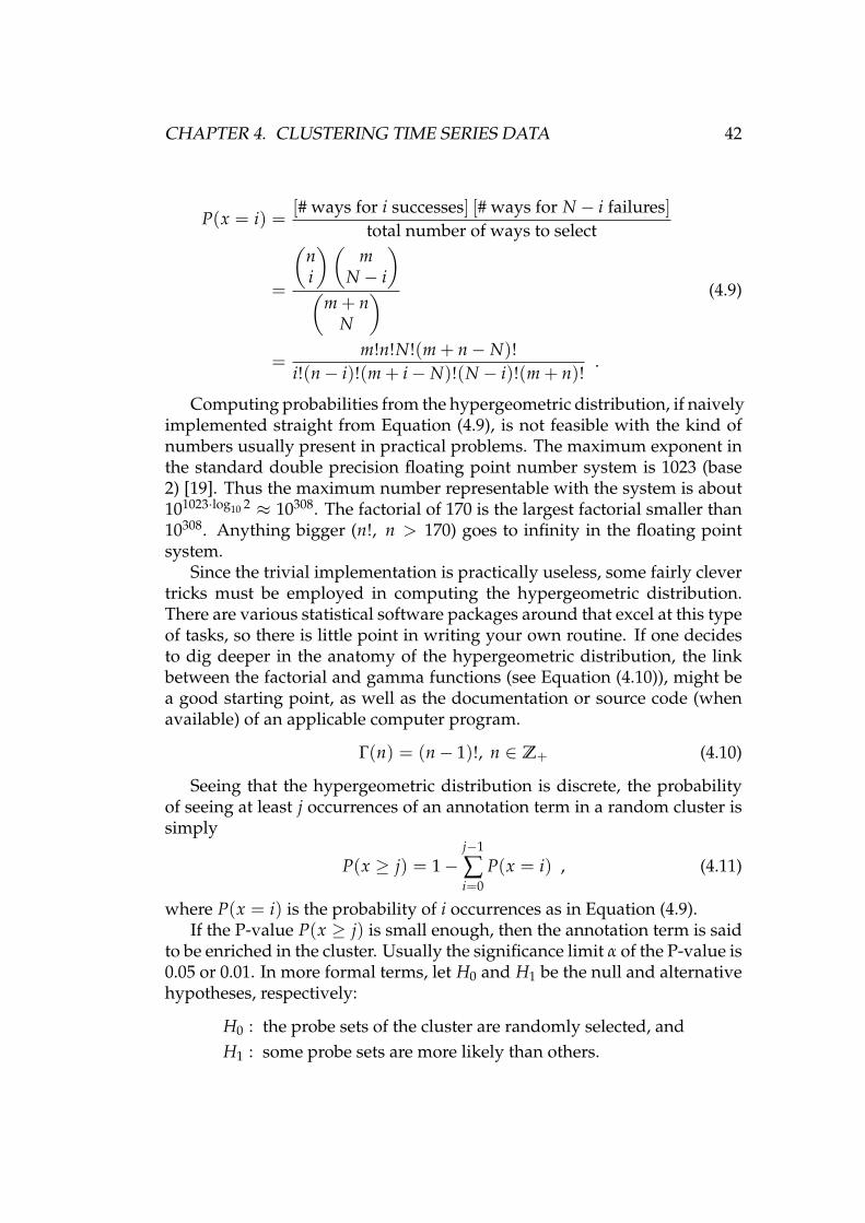
CHAPTER 4. CLUSTERING TIME SERIES DATA 42
P(x = i) =[# ways for i successes] [# ways for N − i failures]
total number of ways to select
=
(ni
)(m
N − i
)(
m + nN
)=
m!n!N!(m + n− N)!i!(n− i)!(m + i− N)!(N − i)!(m + n)!
.
(4.9)
Computing probabilities from the hypergeometric distribution, if naivelyimplemented straight from Equation (4.9), is not feasible with the kind ofnumbers usually present in practical problems. The maximum exponent inthe standard double precision floating point number system is 1023 (base2) [19]. Thus the maximum number representable with the system is about101023·log10 2 ≈ 10308. The factorial of 170 is the largest factorial smaller than10308. Anything bigger (n!, n > 170) goes to infinity in the floating pointsystem.
Since the trivial implementation is practically useless, some fairly clevertricks must be employed in computing the hypergeometric distribution.There are various statistical software packages around that excel at this typeof tasks, so there is little point in writing your own routine. If one decidesto dig deeper in the anatomy of the hypergeometric distribution, the linkbetween the factorial and gamma functions (see Equation (4.10)), might bea good starting point, as well as the documentation or source code (whenavailable) of an applicable computer program.
Γ(n) = (n− 1)!, n ∈ Z+ (4.10)
Seeing that the hypergeometric distribution is discrete, the probabilityof seeing at least j occurrences of an annotation term in a random cluster issimply
P(x ≥ j) = 1−j−1
∑i=0
P(x = i) , (4.11)
where P(x = i) is the probability of i occurrences as in Equation (4.9).If the P-value P(x ≥ j) is small enough, then the annotation term is said
to be enriched in the cluster. Usually the significance limit α of the P-value is0.05 or 0.01. In more formal terms, let H0 and H1 be the null and alternativehypotheses, respectively:
H0 : the probe sets of the cluster are randomly selected, andH1 : some probe sets are more likely than others.
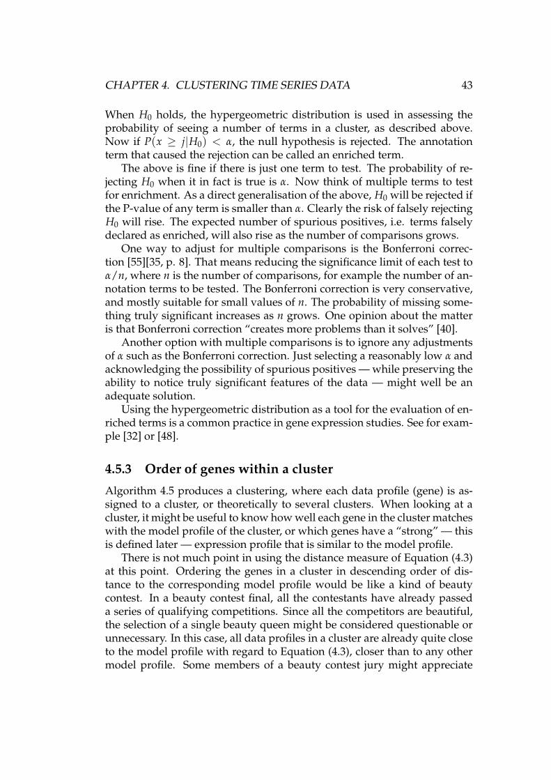
CHAPTER 4. CLUSTERING TIME SERIES DATA 43
When H0 holds, the hypergeometric distribution is used in assessing theprobability of seeing a number of terms in a cluster, as described above.Now if P(x ≥ j|H0) < α, the null hypothesis is rejected. The annotationterm that caused the rejection can be called an enriched term.
The above is fine if there is just one term to test. The probability of re-jecting H0 when it in fact is true is α. Now think of multiple terms to testfor enrichment. As a direct generalisation of the above, H0 will be rejected ifthe P-value of any term is smaller than α. Clearly the risk of falsely rejectingH0 will rise. The expected number of spurious positives, i.e. terms falselydeclared as enriched, will also rise as the number of comparisons grows.
One way to adjust for multiple comparisons is the Bonferroni correc-tion [55][35, p. 8]. That means reducing the significance limit of each test toα/n, where n is the number of comparisons, for example the number of an-notation terms to be tested. The Bonferroni correction is very conservative,and mostly suitable for small values of n. The probability of missing some-thing truly significant increases as n grows. One opinion about the matteris that Bonferroni correction “creates more problems than it solves” [40].
Another option with multiple comparisons is to ignore any adjustmentsof α such as the Bonferroni correction. Just selecting a reasonably low α andacknowledging the possibility of spurious positives — while preserving theability to notice truly significant features of the data — might well be anadequate solution.
Using the hypergeometric distribution as a tool for the evaluation of en-riched terms is a common practice in gene expression studies. See for exam-ple [32] or [48].
4.5.3 Order of genes within a cluster
Algorithm 4.5 produces a clustering, where each data profile (gene) is as-signed to a cluster, or theoretically to several clusters. When looking at acluster, it might be useful to know how well each gene in the cluster matcheswith the model profile of the cluster, or which genes have a “strong” — thisis defined later — expression profile that is similar to the model profile.
There is not much point in using the distance measure of Equation (4.3)at this point. Ordering the genes in a cluster in descending order of dis-tance to the corresponding model profile would be like a kind of beautycontest. In a beauty contest final, all the contestants have already passeda series of qualifying competitions. Since all the competitors are beautiful,the selection of a single beauty queen might be considered questionable orunnecessary. In this case, all data profiles in a cluster are already quite closeto the model profile with regard to Equation (4.3), closer than to any othermodel profile. Some members of a beauty contest jury might appreciate
CHAPTER 4. CLUSTERING TIME SERIES DATA 44
tallness as a feature. In the gene expression world, there is a good reason tolook for “tall” or “strong” expression profiles. A profile with large positiveor negative values suggests the presence of real biological variation. Smalldeviations from zero can more easily be attributed to random noise.
The dot product of a data profile x and a model profile y,
x · y =n
∑i=1
xiyi (4.12)
can be used as a sorting criterion. A large value basically indicates that thedata profile has strong deviations from zero to the same direction as themodel profile. The genes in a cluster can be sorted in descending order ofdot product. The dot products are computed between each data profile andthe model profile of the cluster. This procedure leaves the most interesting,most strongly expressed genes of the cluster at the top of the list, and thegenes with the relatively flat profiles near the bottom.
Figure 4.5 shows an example of model profiles ordered with the dotproduct method. The strongest profiles are easily distinguishable from theweakest ones. The example is from a cluster of 1108 data profiles. Thestrongest profile has a dot product of 11.0670 with the model profile, whereasthe number is 1.8021 for the weakest profile.
−0.5
0
0.5
1
1.5
2
2.5
3
3.5
4
modelstrongest2nd strongestweakest2nd weakest
Figure 4.5: Ordering genes in a cluster according to dot product
Remember that the scale of profiles doesn’t matter when using the cor-relation based distance measure of Equation (4.3): a profile x behaves in thesame way as ax, the same profile multiplied by an arbitrary positive num-ber a. The sorting method based on dot product is a good and simple wayto make use of the scale.
CHAPTER 4. CLUSTERING TIME SERIES DATA 45
4.5.4 Known asbestos-related genes
A table containing information on a number of genes was received from oneof our collaborators. The genes were collected from publications that stud-ied the effect of asbestos on gene expression in connection with asbestos-induced lung cancer or mesothelioma. The corresponding probe set identi-fiers were also listed in the table.
The list of known asbestos-related genes can be used in the analysis ofclustering results. For example, it would be interesting if such genes weremostly assigned to significant clusters, and if the genes also ranked high inthe internal order of their respective clusters, as described in Section 4.5.3.
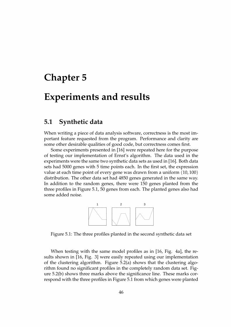
Chapter 5
Experiments and results
5.1 Synthetic data
When writing a piece of data analysis software, correctness is the most im-portant feature requested from the program. Performance and clarity aresome other desirable qualities of good code, but correctness comes first.
Some experiments presented in [16] were repeated here for the purposeof testing our implementation of Ernst’s algorithm. The data used in theexperiments were the same two synthetic data sets as used in [16]. Both datasets had 5000 genes with 5 time points each. In the first set, the expressionvalue at each time point of every gene was drawn from a uniform (10, 100)distribution. The other data set had 4850 genes generated in the same way.In addition to the random genes, there were 150 genes planted from thethree profiles in Figure 5.1, 50 genes from each. The planted genes also hadsome added noise.
1 2 3
Figure 5.1: The three profiles planted in the second synthetic data set
When testing with the same model profiles as in [16, Fig. 4a], the re-sults shown in [16, Fig. 3] were easily repeated using our implementationof the clustering algorithm. Figure 5.2(a) shows that the clustering algo-rithm found no significant profiles in the completely random data set. Fig-ure 5.2(b) shows three marks above the significance line. These marks cor-respond with the three profiles in Figure 5.1 from which genes were planted
46
CHAPTER 5. EXPERIMENTS AND RESULTS 47
to the second simulated data set. In other words, the algorithm and our im-plementation work as expected. Figure 5.2 also shows a point emphasisedin [16]: some expression profiles are more likely than others to appear bychance. Remember that the expected number of genes is computed witha permutation test (see Section 4.3.4), which has the effect of randomly or-dered time points. By taking this into account, Ernst’s algorithm is able todetect significant clusters, be they small or large. If the expected size of acluster was constant, in this case 5000/50 = 100, cluster 3 with less than 100probe sets would certainly not be noticed as significant.
0 50 100 150 200 2500
50
100
150
200
250
300
Number expected
Num
ber
assi
gned
0.001 significance boundaryProfile
(a) Random data
0 50 100 150 200 2500
50
100
150
200
250
300
Number expected
Num
ber
assi
gned
12
3
0.001 significance boundaryProfile
(b) Random data and planted data fromthree profiles
Figure 5.2: Expected number of genes vs. number of genes assigned, simu-lated data of [16]
In [16], the clustering algorithm was also tested with some biologicaldata. That experiment was not repeated with our implementation of the al-gorithm, because the details of the gene pruning criteria presented in [16]and the supplementary web site http://www.cs.cmu.edu/∼jernst/st/ (ref-erenced 2nd Dec 2005) were not quite clear enough. The computation ofcorrelation with missing time points was not covered at all, although corre-lation was used as a criterion in the pruning procedure, and the data con-tained missing time points. The pruning procedure of [16] left 2243 out of24192 genes for the cluster analysis. Since this result could not be duplicatedhere, the cluster analysis wasn’t done either.
Algorithm 4.8 was not tested against reference results due to the prob-lems described above.
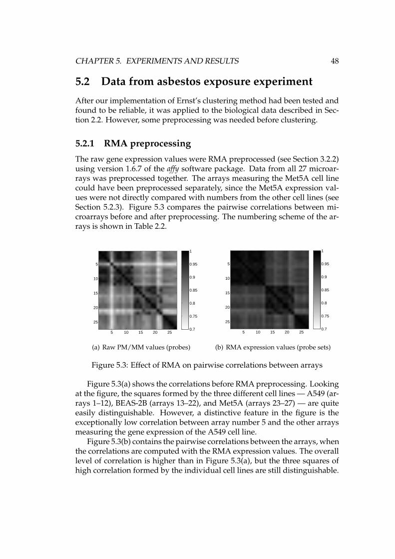
CHAPTER 5. EXPERIMENTS AND RESULTS 48
5.2 Data from asbestos exposure experiment
After our implementation of Ernst’s clustering method had been tested andfound to be reliable, it was applied to the biological data described in Sec-tion 2.2. However, some preprocessing was needed before clustering.
5.2.1 RMA preprocessing
The raw gene expression values were RMA preprocessed (see Section 3.2.2)using version 1.6.7 of the affy software package. Data from all 27 microar-rays was preprocessed together. The arrays measuring the Met5A cell linecould have been preprocessed separately, since the Met5A expression val-ues were not directly compared with numbers from the other cell lines (seeSection 5.2.3). Figure 5.3 compares the pairwise correlations between mi-croarrays before and after preprocessing. The numbering scheme of the ar-rays is shown in Table 2.2.
5 10 15 20 25
5
10
15
20
25
0.7
0.75
0.8
0.85
0.9
0.95
1
(a) Raw PM/MM values (probes)
5 10 15 20 25
5
10
15
20
25
0.7
0.75
0.8
0.85
0.9
0.95
1
(b) RMA expression values (probe sets)
Figure 5.3: Effect of RMA on pairwise correlations between arrays
Figure 5.3(a) shows the correlations before RMA preprocessing. Lookingat the figure, the squares formed by the three different cell lines — A549 (ar-rays 1–12), BEAS-2B (arrays 13–22), and Met5A (arrays 23–27) — are quiteeasily distinguishable. However, a distinctive feature in the figure is theexceptionally low correlation between array number 5 and the other arraysmeasuring the gene expression of the A549 cell line.
Figure 5.3(b) contains the pairwise correlations between the arrays, whenthe correlations are computed with the RMA expression values. The overalllevel of correlation is higher than in Figure 5.3(a), but the three squares ofhigh correlation formed by the individual cell lines are still distinguishable.
CHAPTER 5. EXPERIMENTS AND RESULTS 49
The most notable thing is that array number 5 doesn’t stand out anymore,but is highly correlated with the other A549 arrays.
5.2.2 Further preprocessing
A few additional preprocessing measures were also taken before subject-ing the data to clustering. These are very simple and straightforward stepsthat are more naturally described here as part of the experimental settingthan together with the more sophisticated procedures described in Chap-ter 3. Whereas RMA preprocessing deal with probe level data, the followingmeasures operate on RMA preprocessed, probe set level data.
Averaging of replicate experiments
The data available for analyses were described in Table 2.1. For the mostpart there is only one microarray measurement per biological condition, buta few conditions were tested twice. It is quite clear that there isn’t much tobe gained from the few replicates, but it isn’t wise to throw data away, either.
In those time points and biological conditions where two arrays wereused, the RMA values of the arrays were simply averaged. That is, xi =(xi1 + xi2)/2, where i is the index of the probe set, xi is the new averagedvalue, and {xi1, xi2} are the individual RMA values. Remember that RMAvalues are on a logarithmic scale. The following equation shows that the av-erage of logarithmic values corresponds to the geometric mean of the valueson a linear scale, or more specifically, to its logarithm:
log
(n
∏i=1
ai
)1/n
︸ ︷︷ ︸geometric mean of ai
=1n
logn
∏i=1
ai =1n
n
∑i=1
log ai︸ ︷︷ ︸arithmetic mean of log ai
. (5.1)
Even though the replicate arrays don’t provide much protection for mea-surement noise, the goal of bringing out biologically relevant features of thedata is still within reach. When looking at the data as a whole with the helpof clustering, uncertainties regarding the exact expression levels of singlegenes are not likely to affect the overall results too much.
Creation of log-ratio time series
As the subject of the thesis suggests, we are interested in the changes in geneexpression caused by asbestos. That being the case, it seems reasonable tointegrate the two cases, “asbestos exposure” and “no asbestos exposure”, sothat a single number reflects the difference between them.
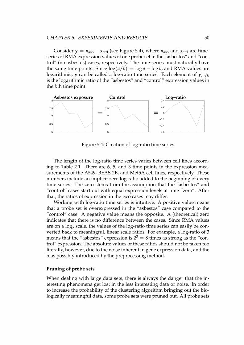
CHAPTER 5. EXPERIMENTS AND RESULTS 50
Consider y = xasb − xctrl (see Figure 5.4), where xasb and xctrl are time-series of RMA expression values of one probe set in the “asbestos” and “con-trol” (no asbestos) cases, respectively. The time-series must naturally havethe same time points. Since log(a/b) = log a− log b, and RMA values arelogarithmic, y can be called a log-ratio time series. Each element of y, yi,is the logarithmic ratio of the “asbestos” and “control” expression values inthe i:th time point.
6
6.5
7
7.5
8
6
6.5
7
7.5
8
−0.6
−0.4
−0.2
0
0.2
0.4
− =
Asbestos exposure Control Log−ratio
Figure 5.4: Creation of log-ratio time series
The length of the log-ratio time series varies between cell lines accord-ing to Table 2.1. There are 6, 5, and 3 time points in the expression mea-surements of the A549, BEAS-2B, and Met5A cell lines, respectively. Thesenumbers include an implicit zero log-ratio added to the beginning of everytime series. The zero stems from the assumption that the “asbestos” and“control” cases start out with equal expression levels at time “zero”. Afterthat, the ratios of expression in the two cases may differ.
Working with log-ratio time series is intuitive. A positive value meansthat a probe set is overexpressed in the “asbestos” case compared to the“control” case. A negative value means the opposite. A (theoretical) zeroindicates that there is no difference between the cases. Since RMA valuesare on a log2 scale, the values of the log-ratio time series can easily be con-verted back to meaningful, linear scale ratios. For example, a log-ratio of 3means that the “asbestos” expression is 23 = 8 times as strong as the “con-trol” expression. The absolute values of these ratios should not be taken tooliterally, however, due to the noise inherent in gene expression data, and thebias possibly introduced by the preprocessing method.
Pruning of probe sets
When dealing with large data sets, there is always the danger that the in-teresting phenomena get lost in the less interesting data or noise. In orderto increase the probability of the clustering algorithm bringing out the bio-logically meaningful data, some probe sets were pruned out. All probe sets
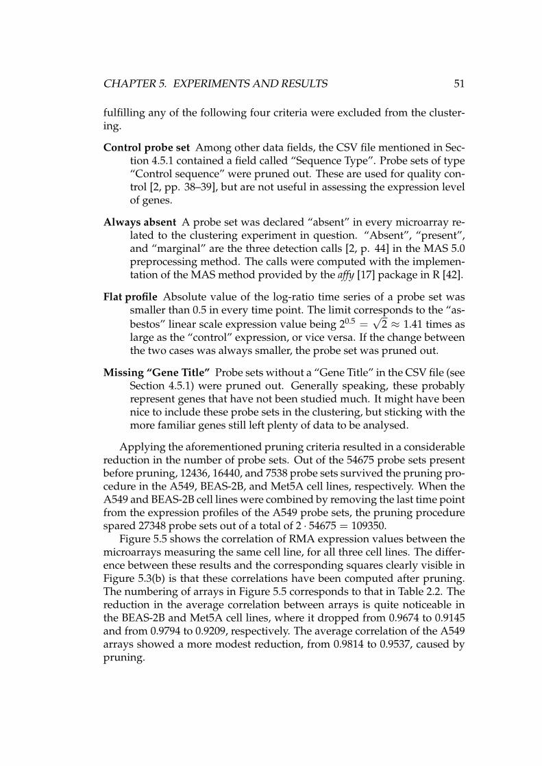
CHAPTER 5. EXPERIMENTS AND RESULTS 51
fulfilling any of the following four criteria were excluded from the cluster-ing.
Control probe set Among other data fields, the CSV file mentioned in Sec-tion 4.5.1 contained a field called “Sequence Type”. Probe sets of type“Control sequence” were pruned out. These are used for quality con-trol [2, pp. 38–39], but are not useful in assessing the expression levelof genes.
Always absent A probe set was declared “absent” in every microarray re-lated to the clustering experiment in question. “Absent”, “present”,and “marginal” are the three detection calls [2, p. 44] in the MAS 5.0preprocessing method. The calls were computed with the implemen-tation of the MAS method provided by the affy [17] package in R [42].
Flat profile Absolute value of the log-ratio time series of a probe set wassmaller than 0.5 in every time point. The limit corresponds to the “as-bestos” linear scale expression value being 20.5 =
√2 ≈ 1.41 times as
large as the “control” expression, or vice versa. If the change betweenthe two cases was always smaller, the probe set was pruned out.
Missing “Gene Title” Probe sets without a “Gene Title” in the CSV file (seeSection 4.5.1) were pruned out. Generally speaking, these probablyrepresent genes that have not been studied much. It might have beennice to include these probe sets in the clustering, but sticking with themore familiar genes still left plenty of data to be analysed.
Applying the aforementioned pruning criteria resulted in a considerablereduction in the number of probe sets. Out of the 54675 probe sets presentbefore pruning, 12436, 16440, and 7538 probe sets survived the pruning pro-cedure in the A549, BEAS-2B, and Met5A cell lines, respectively. When theA549 and BEAS-2B cell lines were combined by removing the last time pointfrom the expression profiles of the A549 probe sets, the pruning procedurespared 27348 probe sets out of a total of 2 · 54675 = 109350.
Figure 5.5 shows the correlation of RMA expression values between themicroarrays measuring the same cell line, for all three cell lines. The differ-ence between these results and the corresponding squares clearly visible inFigure 5.3(b) is that these correlations have been computed after pruning.The numbering of arrays in Figure 5.5 corresponds to that in Table 2.2. Thereduction in the average correlation between arrays is quite noticeable inthe BEAS-2B and Met5A cell lines, where it dropped from 0.9674 to 0.9145and from 0.9794 to 0.9209, respectively. The average correlation of the A549arrays showed a more modest reduction, from 0.9814 to 0.9537, caused bypruning.
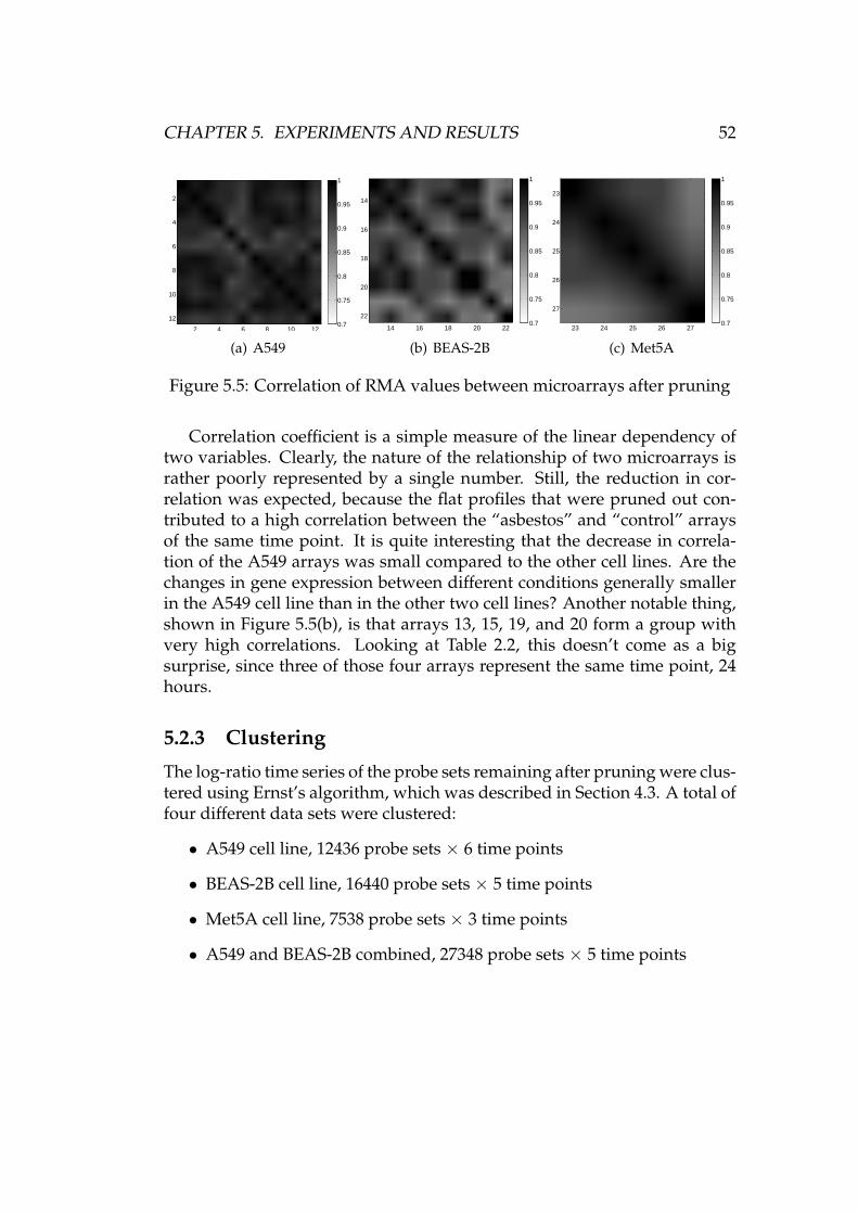
CHAPTER 5. EXPERIMENTS AND RESULTS 52
2 4 6 8 10 12
2
4
6
8
10
120.7
0.75
0.8
0.85
0.9
0.95
1
(a) A549
14 16 18 20 22
14
16
18
20
220.7
0.75
0.8
0.85
0.9
0.95
1
(b) BEAS-2B
23 24 25 26 27
23
24
25
26
27
0.7
0.75
0.8
0.85
0.9
0.95
1
(c) Met5A
Figure 5.5: Correlation of RMA values between microarrays after pruning
Correlation coefficient is a simple measure of the linear dependency oftwo variables. Clearly, the nature of the relationship of two microarrays israther poorly represented by a single number. Still, the reduction in cor-relation was expected, because the flat profiles that were pruned out con-tributed to a high correlation between the “asbestos” and “control” arraysof the same time point. It is quite interesting that the decrease in correla-tion of the A549 arrays was small compared to the other cell lines. Are thechanges in gene expression between different conditions generally smallerin the A549 cell line than in the other two cell lines? Another notable thing,shown in Figure 5.5(b), is that arrays 13, 15, 19, and 20 form a group withvery high correlations. Looking at Table 2.2, this doesn’t come as a bigsurprise, since three of those four arrays represent the same time point, 24hours.
5.2.3 Clustering
The log-ratio time series of the probe sets remaining after pruning were clus-tered using Ernst’s algorithm, which was described in Section 4.3. A total offour different data sets were clustered:
• A549 cell line, 12436 probe sets × 6 time points
• BEAS-2B cell line, 16440 probe sets × 5 time points
• Met5A cell line, 7538 probe sets × 3 time points
• A549 and BEAS-2B combined, 27348 probe sets × 5 time points
CHAPTER 5. EXPERIMENTS AND RESULTS 53
A549 cell line
Figure A.3 shows the model profiles of the A549 clustering. The profiles arein the order1 of decreasing significance (increasing P-value). The 12 signifi-cant profiles are shaded with grey. The number of profiles, m, was chosen tobe 50, which is the same number as in the experiments in [16]. It is quite anarbitrary choice, but we think it offers a decent selection of distinct profiles.Parameter c, the maximum amount of change between the time points of amodel profile, was chosen to be 3. The model profiles were acquired withthe randomised version of profile selection, Algorithm 4.3.
Figure A.4 shows the data profiles associated with each model profileof the A549 clustering. The figure is quite messy and crammed with in-formation, but it gives a general idea about the range of variation or thedistribution of data profiles in each cluster.
BEAS-2B cell line
Figures A.5 and A.6 show the model profiles and the corresponding clustersof the BEAS-2B clustering. Again, the model profiles were selected with therandomised algorithm from the set of profiles bound by the rule c = 3. Now16 profiles out of 50 were found to be significant.
Met5A cell line
The model profiles and clusters of the Met5A cell line are in figures A.7and A.8. Due to the shortness of the time series, only 16 model profileswere selected. That was a rough estimate of the number of profiles neededto sufficiently represent all the different expression profiles with three timepoints. Three profiles were found to be significant.
Looking at Figure A.8, some of the clusters look quite similar. Figure 5.6shows the effect of the number of selected model profiles on the minimumdistance between the profiles with Algorithm 4.3, when c = 6 and n = 3.The minimum distance drops significantly when the ninth profile is se-lected. Comparing Figure 5.6 and Table 4.1 reveals that the n = 3, m = 8minimum distance (0.2794) is close to the n = 6, m = 50, c ∈ {2, 3} min-imum distances, whereas the n = 3, m = 16 minimum distance is muchworse. Picking the ninth model profile already decreases the minimum dis-tance noticeably. Thus, m = 8 might be a better choice than m = 16, thenumber used in the experiment.
The model profiles of the Met5A clustering were chosen with the ran-domised algorithm, but parameter c of Algorithm 4.1 was increased to 6.
1See Section “Numerical precision” for remarks on computational limitations
CHAPTER 5. EXPERIMENTS AND RESULTS 54
2 4 6 8 10 12 14 160
0.5
1
1.5
2
Number of profilesM
inim
um d
ista
nce
Figure 5.6: Number of profiles selected vs. minimum distance between pro-files (c = 6, n = 3)
With c = 6 and n = 3, the total number of different model profiles accord-ing to Equation (4.1) is 169. Only 96 remain after the removal of redundantprofiles. Compare these numbers to 16807 and 16322 profiles to choose fromwith c = 3 and n = 6, and you will understand why c = 6, n = 3 are easyon Algorithm 4.3, as seen in Table 4.2. Of course, the number of profiles toselect, m, also affects the running time. Although the running time of Al-gorithm 4.3 would easily allow it, the benefits of further increasing c wouldprobably be very small.
Combined A549 and BEAS-2B cell lines
Figures A.9 and A.10 show the model profiles and the corresponding clus-ters of the combined A549 and BEAS-2B clustering. The model profiles usedhere were the same 50 profiles with 5 time points each as in the BEAS-2Bclustering. 13 significant profiles were found.
Originally there were two ideas for the implementation of the joint clus-tering. The first option, which was eventually chosen, is shown in Fig-ure 5.7(a). The discarded option is shown in Figure 5.7(b). The optionsdiffer in the way that the data sets would be combined.
The first option included unifying the length of the time series, and keep-ing the time series from the two cell lines separate. This procedure roughlydoubles the total number of profiles to be clustered. The A549 and BEAS-2Btime series are close to each other in length: 6 and 5 time points, respectively.The time points are also the same, except for the last time point of the A549time series (7 days), which is missing from the BEAS-2B data set. Althoughthrowing away data is generally not recommended, dropping the last timepoint of the A549 data set was considered acceptable.
The second option was to join the time series together: for each probe set,
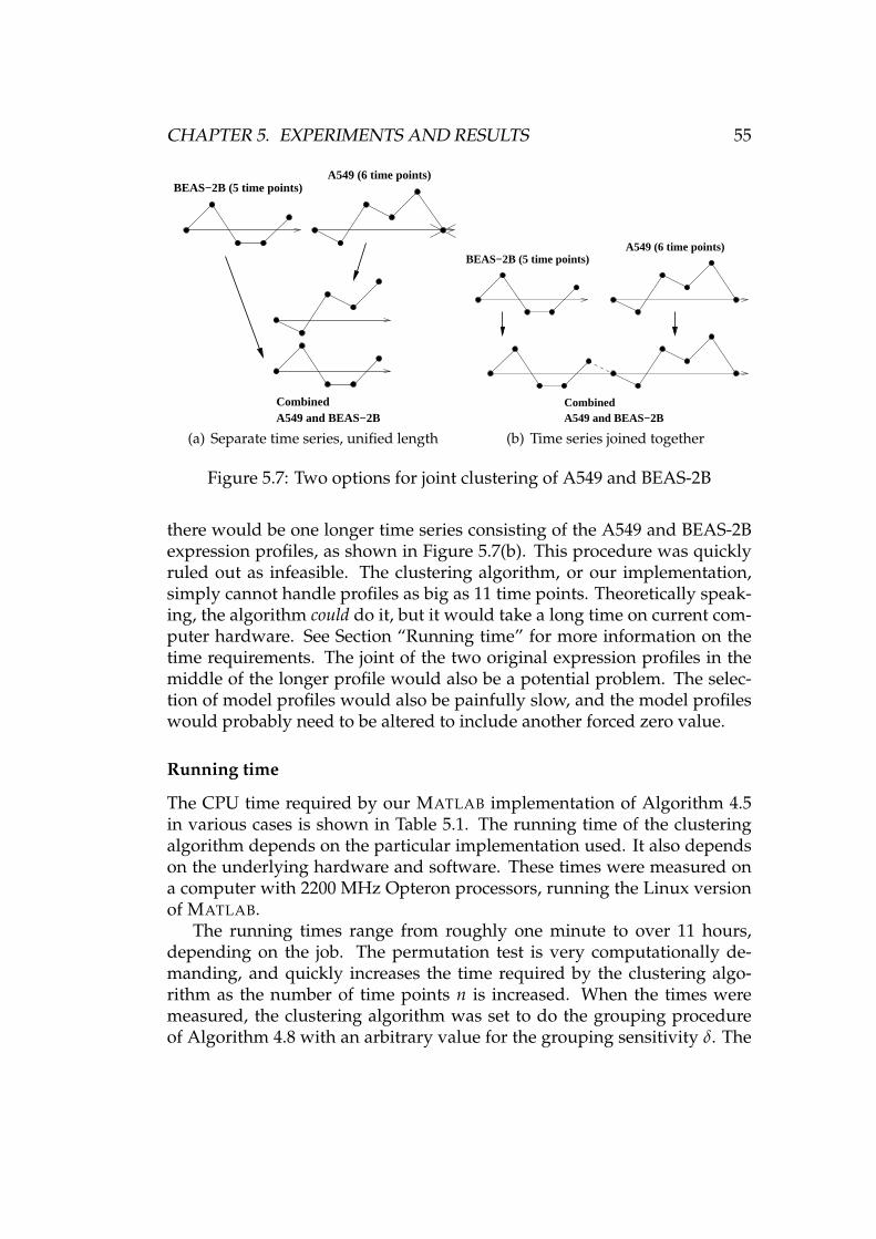
CHAPTER 5. EXPERIMENTS AND RESULTS 55
CombinedA549 and BEAS−2B
BEAS−2B (5 time points)A549 (6 time points)
(a) Separate time series, unified length
CombinedA549 and BEAS−2B
BEAS−2B (5 time points)A549 (6 time points)
(b) Time series joined together
Figure 5.7: Two options for joint clustering of A549 and BEAS-2B
there would be one longer time series consisting of the A549 and BEAS-2Bexpression profiles, as shown in Figure 5.7(b). This procedure was quicklyruled out as infeasible. The clustering algorithm, or our implementation,simply cannot handle profiles as big as 11 time points. Theoretically speak-ing, the algorithm could do it, but it would take a long time on current com-puter hardware. See Section “Running time” for more information on thetime requirements. The joint of the two original expression profiles in themiddle of the longer profile would also be a potential problem. The selec-tion of model profiles would also be painfully slow, and the model profileswould probably need to be altered to include another forced zero value.
Running time
The CPU time required by our MATLAB implementation of Algorithm 4.5in various cases is shown in Table 5.1. The running time of the clusteringalgorithm depends on the particular implementation used. It also dependson the underlying hardware and software. These times were measured ona computer with 2200 MHz Opteron processors, running the Linux versionof MATLAB.
The running times range from roughly one minute to over 11 hours,depending on the job. The permutation test is very computationally de-manding, and quickly increases the time required by the clustering algo-rithm as the number of time points n is increased. When the times weremeasured, the clustering algorithm was set to do the grouping procedureof Algorithm 4.8 with an arbitrary value for the grouping sensitivity δ. The
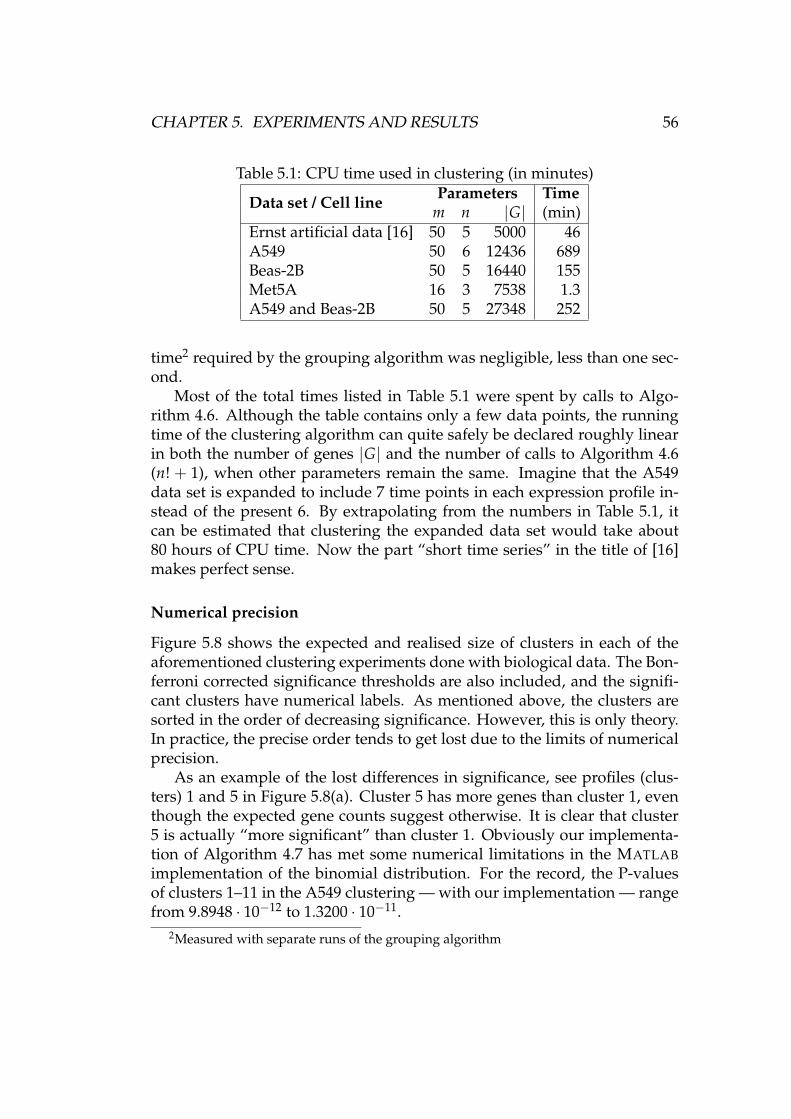
CHAPTER 5. EXPERIMENTS AND RESULTS 56
Table 5.1: CPU time used in clustering (in minutes)
Data set / Cell line Parameters Time(min)m n |G|
Ernst artificial data [16] 50 5 5000 46A549 50 6 12436 689Beas-2B 50 5 16440 155Met5A 16 3 7538 1.3A549 and Beas-2B 50 5 27348 252
time2 required by the grouping algorithm was negligible, less than one sec-ond.
Most of the total times listed in Table 5.1 were spent by calls to Algo-rithm 4.6. Although the table contains only a few data points, the runningtime of the clustering algorithm can quite safely be declared roughly linearin both the number of genes |G| and the number of calls to Algorithm 4.6(n! + 1), when other parameters remain the same. Imagine that the A549data set is expanded to include 7 time points in each expression profile in-stead of the present 6. By extrapolating from the numbers in Table 5.1, itcan be estimated that clustering the expanded data set would take about80 hours of CPU time. Now the part “short time series” in the title of [16]makes perfect sense.
Numerical precision
Figure 5.8 shows the expected and realised size of clusters in each of theaforementioned clustering experiments done with biological data. The Bon-ferroni corrected significance thresholds are also included, and the signifi-cant clusters have numerical labels. As mentioned above, the clusters aresorted in the order of decreasing significance. However, this is only theory.In practice, the precise order tends to get lost due to the limits of numericalprecision.
As an example of the lost differences in significance, see profiles (clus-ters) 1 and 5 in Figure 5.8(a). Cluster 5 has more genes than cluster 1, eventhough the expected gene counts suggest otherwise. It is clear that cluster5 is actually “more significant” than cluster 1. Obviously our implementa-tion of Algorithm 4.7 has met some numerical limitations in the MATLABimplementation of the binomial distribution. For the record, the P-valuesof clusters 1–11 in the A549 clustering — with our implementation — rangefrom 9.8948 · 10−12 to 1.3200 · 10−11.
2Measured with separate runs of the grouping algorithm
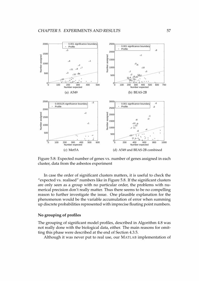
CHAPTER 5. EXPERIMENTS AND RESULTS 57
0 100 200 300 400 5000
500
1000
1500
2000
Number expected
Num
ber
assi
gned
1
2
3 4
5
6
78
9
10
11
12
0.001 significance boundaryProfile
(a) A549
0 100 200 300 400 500 600 7000
500
1000
1500
2000
2500
Number expected
Num
ber
assi
gned
1
2
3
4
5 6
7
8
9
10
111213
1415
16
0.001 significance boundaryProfile
(b) BEAS-2B
0 100 200 300 400 500 6000
500
1000
1500
2000
2500
Number expected
Num
ber
assi
gned
1
2
30.003125 significance boundaryProfile
(c) Met5A
0 200 400 600 800 10000
500
1000
1500
2000
2500
3000
Number expected
Num
ber
assi
gned
12
3
4
5
6
7
8
910
1112
13
0.001 significance boundaryProfile
(d) A549 and BEAS-2B combined
Figure 5.8: Expected number of genes vs. number of genes assigned in eachcluster, data from the asbestos experiment
In case the order of significant clusters matters, it is useful to check the“expected vs. realised” numbers like in Figure 5.8. If the significant clustersare only seen as a group with no particular order, the problems with nu-merical precision don’t really matter. Thus there seems to be no compellingreason to further investigate the issue. One plausible explanation for thephenomenon would be the variable accumulation of error when summingup discrete probabilities represented with imprecise floating point numbers.
No grouping of profiles
The grouping of significant model profiles, described in Algorithm 4.8 wasnot really done with the biological data, either. The main reasons for omit-ting this phase were described at the end of Section 4.3.5.
Although it was never put to real use, our MATLAB implementation of
CHAPTER 5. EXPERIMENTS AND RESULTS 58
Algorithm 4.8 was tested with the biological data using various arbitraryvalues for parameter δ. The algorithm generally produced groups that con-tained “reasonably” similar profiles. The algorithm also passed a basic san-ity check, namely that the output of an algorithm should change accordinglywhen adjusting the input. In this case, the average size of profile groupsgrew with increasing δ, just as was expected.
5.2.4 Analysis of clusters
The clustering results were analysed using the annotation data and the meth-ods described in Section 4.5. The results from the various clustering experi-ments were also compared to each other. An outline of the results obtainedduring the analyses is presented in the following sections. As explainedbefore and shown in Figure 1.1, the results are not conclusive. They willbe and have been subjected to further analysis by collaborating biomedicalexperts. The enrichment results may be somewhat affected by the fact thatsome genes are measured with more than one probe set.
Biological process
The 54675 probe sets on the microarray were found to be annotated with1921 different biological processes. The file containing the annotations wasdescribed in Section 4.5.1. For each of the four clusterings described in Sec-tion 5.2.3, the enriched biological processes were recorded. That means ev-ery biological process with a P-value smaller than 0.01 in at least one signif-icant cluster. See Section 4.5.2 for a discussion of enriched terms.
Table 5.2 is a summary of the results. It shows the number of termsenriched in each of the four individual clusterings. The table also showssome comparative results. For example, the number of biological processesenriched in at least one cluster of the A549 clustering is 240. The number isquite big compared to the total of 1921 different terms. Fortunately, a lessintimidating set of terms can be obtained by applying some set operations tothe results. For example, there are 26 biological processes that are enrichedin each of the four clusterings, and 28 terms enriched in each of the threeclusterings corresponding to the individual cell lines. These 28 terms arelisted in Table A.1.
Collecting the enriched terms from all clusters and comparing the resultsof the individual clusterings is only one of several different ways of tryingto reduce the vast amounts of data into something that is both biologicallyrelevant and understandable. Another option is to pick an interesting clus-ter and look at the terms that are enriched there. Looking at Figure 5.8(a),cluster 5 of the A549 clustering seems quite interesting due to its big ratio of
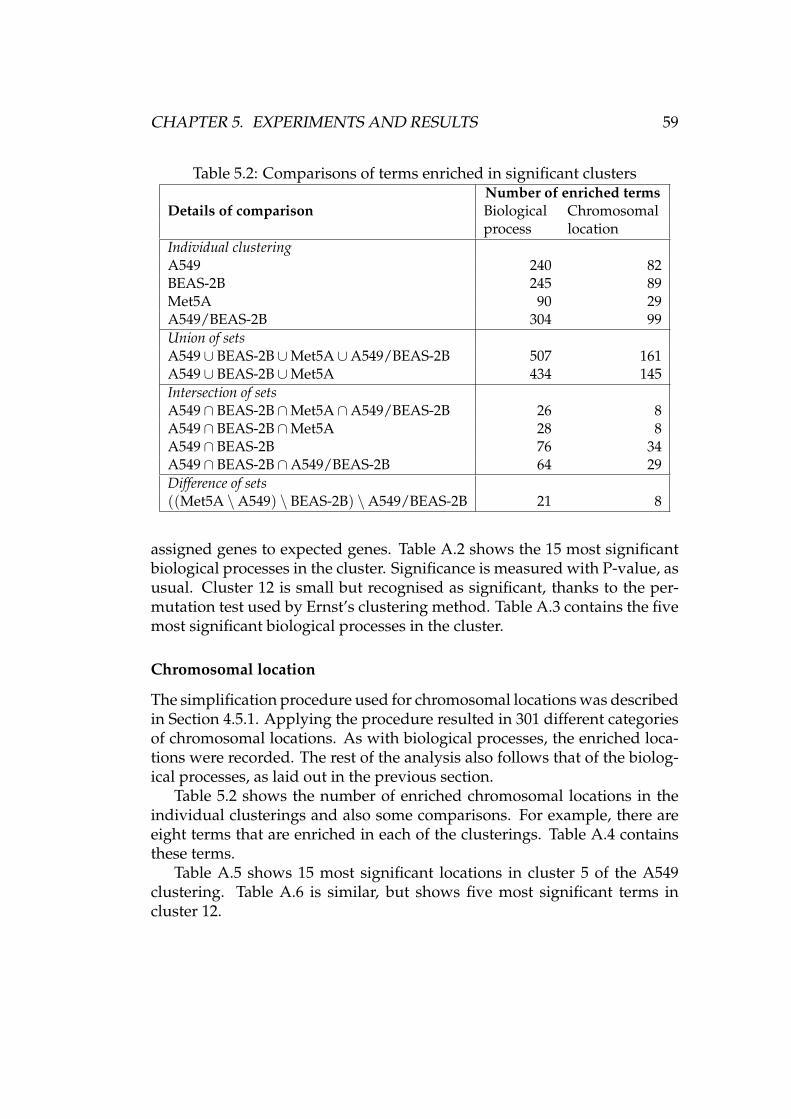
CHAPTER 5. EXPERIMENTS AND RESULTS 59
Table 5.2: Comparisons of terms enriched in significant clusters
Details of comparisonNumber of enriched termsBiologicalprocess
Chromosomallocation
Individual clusteringA549 240 82BEAS-2B 245 89Met5A 90 29A549/BEAS-2B 304 99Union of setsA549∪ BEAS-2B∪Met5A∪A549/BEAS-2B 507 161A549∪ BEAS-2B∪Met5A 434 145Intersection of setsA549∩ BEAS-2B∩Met5A∩A549/BEAS-2B 26 8A549∩ BEAS-2B∩Met5A 28 8A549∩ BEAS-2B 76 34A549∩ BEAS-2B∩A549/BEAS-2B 64 29Difference of sets((Met5A \A549) \ BEAS-2B) \A549/BEAS-2B 21 8
assigned genes to expected genes. Table A.2 shows the 15 most significantbiological processes in the cluster. Significance is measured with P-value, asusual. Cluster 12 is small but recognised as significant, thanks to the per-mutation test used by Ernst’s clustering method. Table A.3 contains the fivemost significant biological processes in the cluster.
Chromosomal location
The simplification procedure used for chromosomal locations was describedin Section 4.5.1. Applying the procedure resulted in 301 different categoriesof chromosomal locations. As with biological processes, the enriched loca-tions were recorded. The rest of the analysis also follows that of the biolog-ical processes, as laid out in the previous section.
Table 5.2 shows the number of enriched chromosomal locations in theindividual clusterings and also some comparisons. For example, there areeight terms that are enriched in each of the clusterings. Table A.4 containsthese terms.
Table A.5 shows 15 most significant locations in cluster 5 of the A549clustering. Table A.6 is similar, but shows five most significant terms incluster 12.
CHAPTER 5. EXPERIMENTS AND RESULTS 60
Order of genes within a cluster
As explained in Section 4.5.3, the genes (probe sets) in each cluster weresorted in the order of decreasing dot product with the corresponding modelprofile. The results were submitted to our collaborators for further analysis.The author feels that presenting a sample of these gene lists here wouldn’tbe very meaningful.
Known asbestos-related genes
The table of asbestos-related genes and probe sets was mentioned in Sec-tion 4.5.4. The clustering of the probe sets was studied by recording theclusters to which each probe set in the list was assigned. Enriched clusters— that is clusters with surprisingly many asbestos-related genes comparedto what can be expected under the assumption that the probe sets in thelist are a random selection — were assessed similarly to enriched biologicalprocesses and chromosomal locations.
Table A.7 reflects the clustering of probe sets that are associated withgenes overexpressed in conjunction with lung cancer. The table shows thenumber of those probe sets assigned to each significant cluster of the A549cell line, and the probability of seeing at least as many probe sets accordingto the hypergeometric distribution (see equations (4.9) and (4.11)). Five ofthe 47 probe sets in the list are in cluster 5, and the corresponding P-value is0.0135, which is quite low.
Table A.8 deals with probe sets (genes) overexpressed in mesothelioma,and their clustering in the Met5A cell line. Six of the 53 probe sets are incluster 2, which gives a low P-value of 0.0065.
Chapter 6
Summary and conclusions
In this thesis, a practical data analysis task dealing with gene expressionmeasurements was carried out. The world of microarrays and gene expres-sion was briefly introduced. Then, a description of the data set at hand waspresented. The data had been gathered using 27 microarrays with the in-tent of studying the effect of asbestos on three different cell lines. Therewere measurements from a few different time points and two conditions:asbestos exposure and no exposure.
The quality of the data was checked both qualitatively and quantita-tively. Despite some quality concerns, the data were judged as eligible forfurther analyses. Preprocessing was covered in Section 3.2. Some of themain functions of preprocessing are adjustment for background noise andremoval of non-biological variation between arrays. A well-known prepro-cessing method called RMA was chosen.
Chapter 4 described the analysis techniques used with the preprocessedgene expression data. Clustering as a term encompasses a host of differentstrategies for diving data points into distinct groups. Here, gene expres-sion time series were the data points, and the goal was to find significantpatterns of expression. A recent clustering method designed for short timeseries gene expression data was described, and the related algorithms werelaid out in detail. One part of the clustering method, profile selection, wasimproved with the introduction of a simple randomised algorithm that isa modification to the original, inadequately specified algorithm. Anotherphase, removal of redundant profiles, was added to the clustering method.Some techniques for the analysis of clusters were also discussed.
The experiments and an overview of the results of the thesis were pre-sented in Chapter 5. Our implementation of the clustering algorithm wastested with synthetic data and found to be reliable. After that, it was usedon the asbestos exposure gene expression data set. Some measures wereused to prune out some data that was not likely to contain interesting infor-
61
CHAPTER 6. SUMMARY AND CONCLUSIONS 62
mation. The remaining gene expression time series were clustered with thepreviously described algorithm. The clusters were analysed by searchingfor overrepresented biological processes and chromosomal locations. A listof known asbestos-related genes was also used.
The practical data analysis part of this thesis started with very low-leveldata. Some rather advanced processing methods were needed in order toextract some information from it. The results achieved during this work donot constitute a complete understanding of the problem at hand. However,they are a good basis for further research done by people more familiarwith the biological side of gene expression. This was only a link in the dataanalysis chain, but quite a significant one.
6.1 Future work
Any future work done by us in this gene expression project probably de-pends on the needs of the other scientists involved with this collaborativestudy. The size of our result data set is considerably smaller than that of theraw microarray measurement set we started with. Still, it can be quite diffi-cult to find the interesting information among the results. When somethingattracts the domain experts’ attention, they will be able to ask more specificquestions about the results. Then we can do some more focused analyseson specific parts of the clustering results.
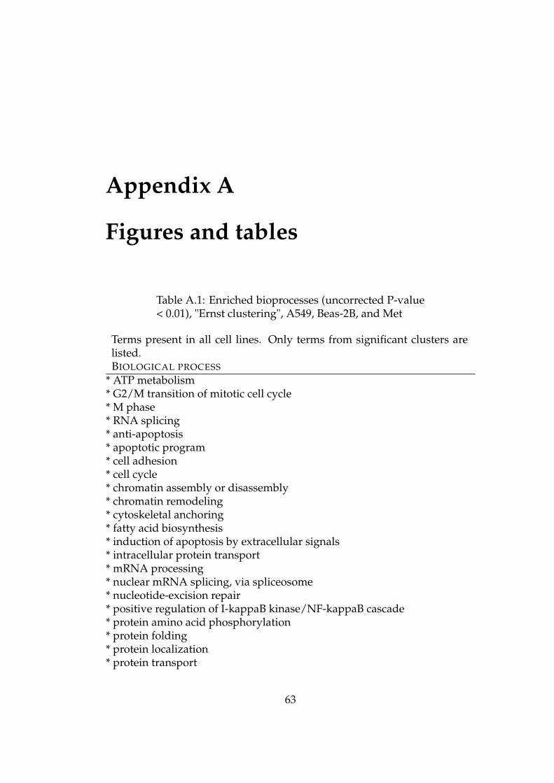
Appendix A
Figures and tables
Table A.1: Enriched bioprocesses (uncorrected P-value< 0.01), "Ernst clustering", A549, Beas-2B, and Met
Terms present in all cell lines. Only terms from significant clusters arelisted.BIOLOGICAL PROCESS
* ATP metabolism* G2/M transition of mitotic cell cycle* M phase* RNA splicing* anti-apoptosis* apoptotic program* cell adhesion* cell cycle* chromatin assembly or disassembly* chromatin remodeling* cytoskeletal anchoring* fatty acid biosynthesis* induction of apoptosis by extracellular signals* intracellular protein transport* mRNA processing* nuclear mRNA splicing, via spliceosome* nucleotide-excision repair* positive regulation of I-kappaB kinase/NF-kappaB cascade* protein amino acid phosphorylation* protein folding* protein localization* protein transport
63
APPENDIX A. FIGURES AND TABLES 64
Table A.1: (continued)
Biological process* protein ubiquitination* regulation of cell cycle* regulation of transcription from RNA polymerase II promoter* regulation of transcription, DNA-dependent* transcription* ubiquitin cycle
Table A.2: 15 most important biological processes incluster 5 of A549
Terms are listed in the order of increasing P-value.P-VALUE BIOLOGICAL PROCESS
0.000000 antigen presentation, endogenous antigen0.000000 antigen processing, endogenous antigen via MHC class I0.000000 intracellular protein transport0.000000 protein folding0.000000 regulation of cell cycle0.000002 antigen presentation0.000002 small GTPase mediated signal transduction0.000003 lipid metabolism0.000008 metabolism0.000020 rRNA processing0.000049 protein-mitochondrial targeting0.000099 negative regulation of cell growth0.000151 proline biosynthesis0.000151 ATP metabolism0.000177 membrane fusion
Table A.3: 5 most important biological processes incluster 12 of A549
Terms are listed in the order of increasing P-value.P-VALUE BIOLOGICAL PROCESS
0.000000 glutathione biosynthesis0.000030 receptor clustering0.000030 synapse organization and biogenesis0.000150 acetylcholine receptor signaling, muscarinic pathway0.000209 clustering of voltage-gated sodium channels
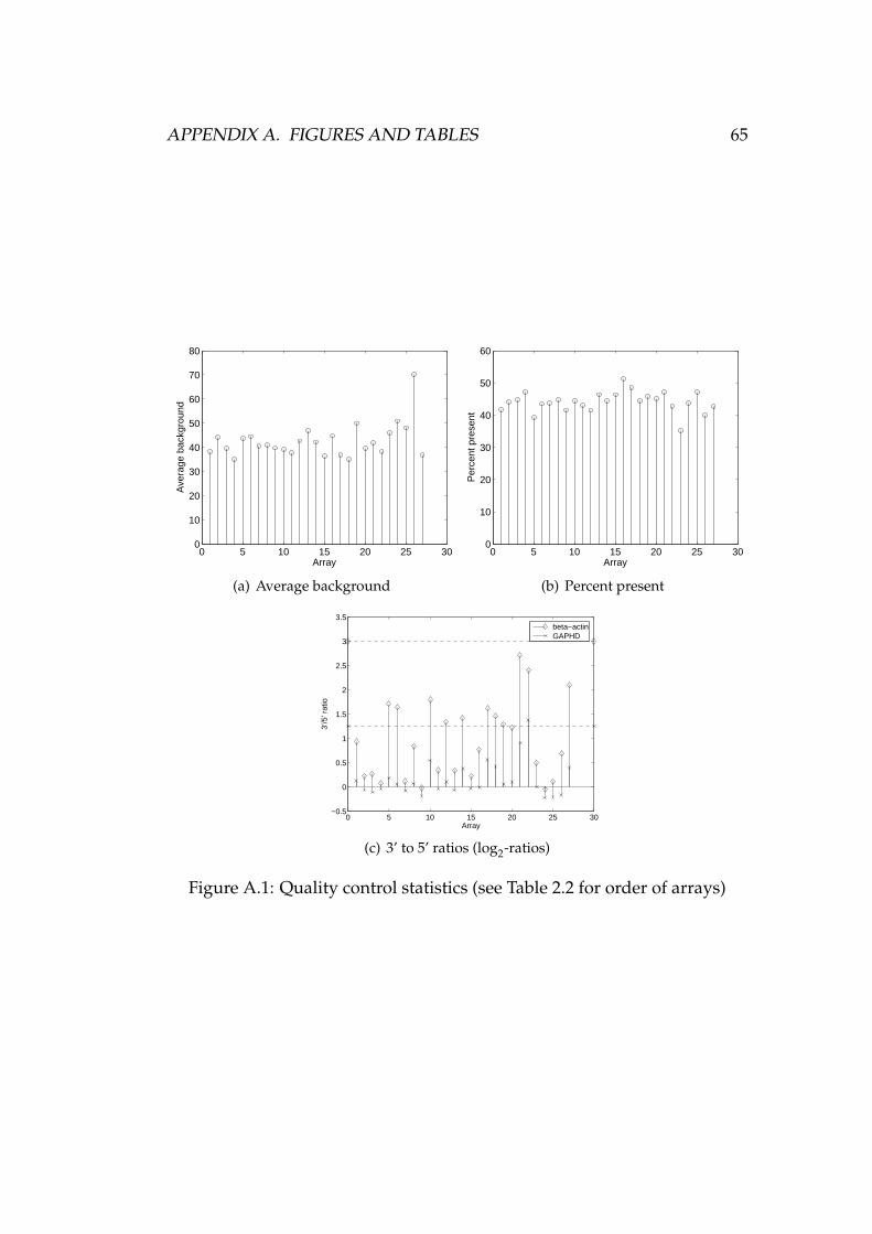
APPENDIX A. FIGURES AND TABLES 65
0 5 10 15 20 25 300
10
20
30
40
50
60
70
80
Array
Ave
rage
bac
kgro
und
(a) Average background
0 5 10 15 20 25 300
10
20
30
40
50
60
Per
cent
pre
sent
Array
(b) Percent present
0 5 10 15 20 25 30−0.5
0
0.5
1
1.5
2
2.5
3
3.5
Array
3’/5
’ rat
io
beta−actinGAPHD
(c) 3’ to 5’ ratios (log2-ratios)
Figure A.1: Quality control statistics (see Table 2.2 for order of arrays)
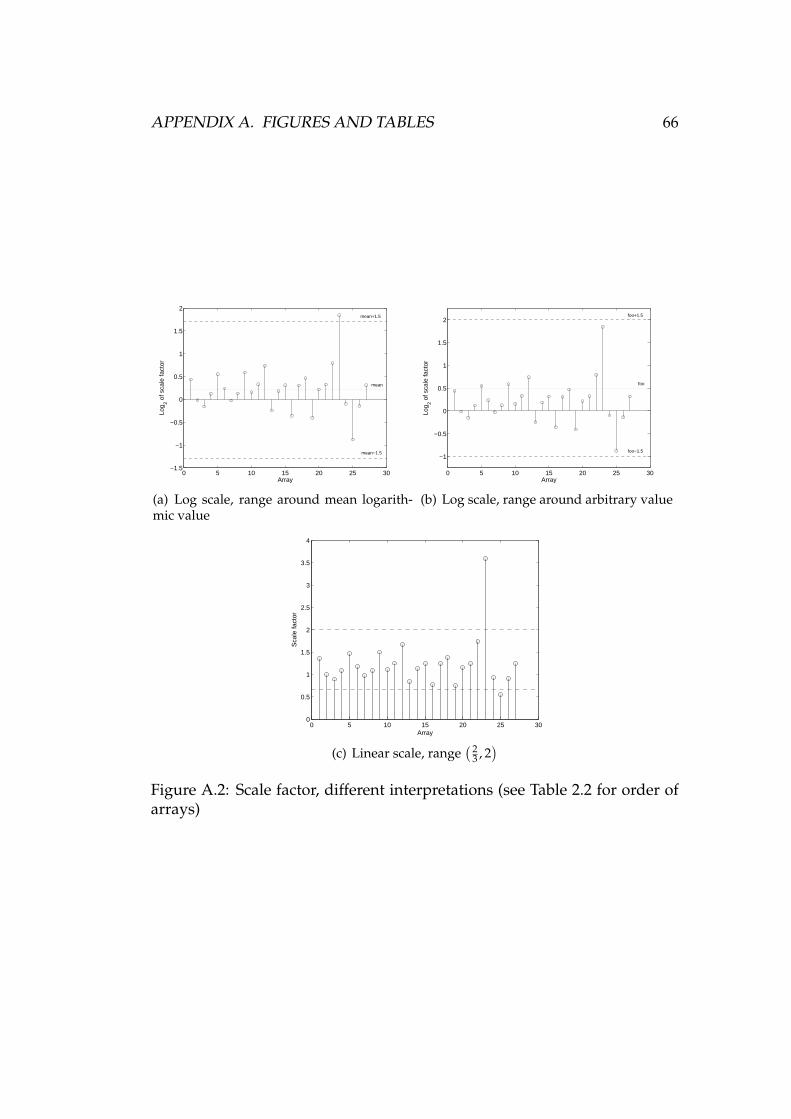
APPENDIX A. FIGURES AND TABLES 66
0 5 10 15 20 25 30−1.5
−1
−0.5
0
0.5
1
1.5
2
Array
Log 2 o
f sca
le fa
ctor
mean+1.5
mean−1.5
mean
(a) Log scale, range around mean logarith-mic value
0 5 10 15 20 25 30
−1
−0.5
0
0.5
1
1.5
2
Array
Log 2 o
f sca
le fa
ctor
foo+1.5
foo−1.5
foo
(b) Log scale, range around arbitrary value
0 5 10 15 20 25 300
0.5
1
1.5
2
2.5
3
3.5
4
Sca
le fa
ctor
Array
(c) Linear scale, range( 2
3 , 2)
Figure A.2: Scale factor, different interpretations (see Table 2.2 for order ofarrays)
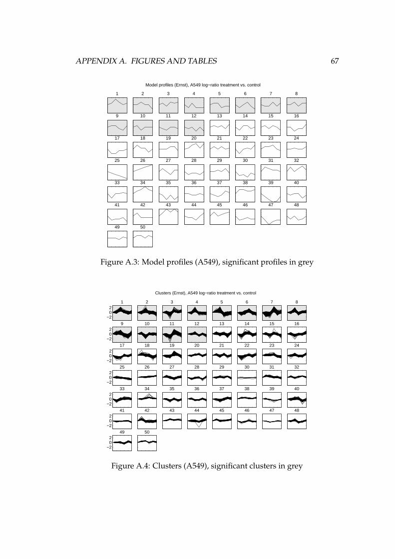
APPENDIX A. FIGURES AND TABLES 67
1 2 3 4 5 6 7 8
9 10 11 12 13 14 15 16
17 18 19 20 21 22 23 24
25 26 27 28 29 30 31 32
33 34 35 36 37 38 39 40
41 42 43 44 45 46 47 48
49
Model profiles (Ernst), A549 log−ratio treatment vs. control
50
Figure A.3: Model profiles (A549), significant profiles in grey
−202
1 2 3 4 5 6 7 8
−202
9 10 11 12 13 14 15 16
−202
17 18 19 20 21 22 23 24
−202
25 26 27 28 29 30 31 32
−202
33 34 35 36 37 38 39 40
−202
41 42 43 44 45 46 47 48
−202
49
Clusters (Ernst), A549 log−ratio treatment vs. control
50
Figure A.4: Clusters (A549), significant clusters in grey
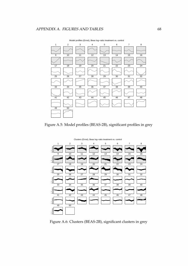
APPENDIX A. FIGURES AND TABLES 68
1 2 3 4 5 6 7 8
9 10 11 12 13 14 15 16
17 18 19 20 21 22 23 24
25 26 27 28 29 30 31 32
33 34 35 36 37 38 39 40
41 42 43 44 45 46 47 48
49
Model profiles (Ernst), Beas log−ratio treatment vs. control
50
Figure A.5: Model profiles (BEAS-2B), significant profiles in grey
−4−2
02
1 2 3 4 5 6 7 8
−4−2
02
9 10 11 12 13 14 15 16
−4−2
02
17 18 19 20 21 22 23 24
−4−2
02
25 26 27 28 29 30 31 32
−4−2
02
33 34 35 36 37 38 39 40
−4−2
02
41 42 43 44 45 46 47 48
−4−2
02
49
Clusters (Ernst), Beas log−ratio treatment vs. control
50
Figure A.6: Clusters (BEAS-2B), significant clusters in grey
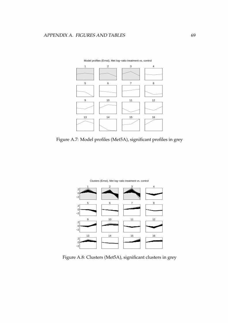
APPENDIX A. FIGURES AND TABLES 69
1 2 3 4
5 6 7 8
9 10 11 12
13 14 15
Model profiles (Ernst), Met log−ratio treatment vs. control
16
Figure A.7: Model profiles (Met5A), significant profiles in grey
−2
02
1 2 3 4
−2
02
5 6 7 8
−2
02
9 10 11 12
−2
02
13 14 15
Clusters (Ernst), Met log−ratio treatment vs. control
16
Figure A.8: Clusters (Met5A), significant clusters in grey
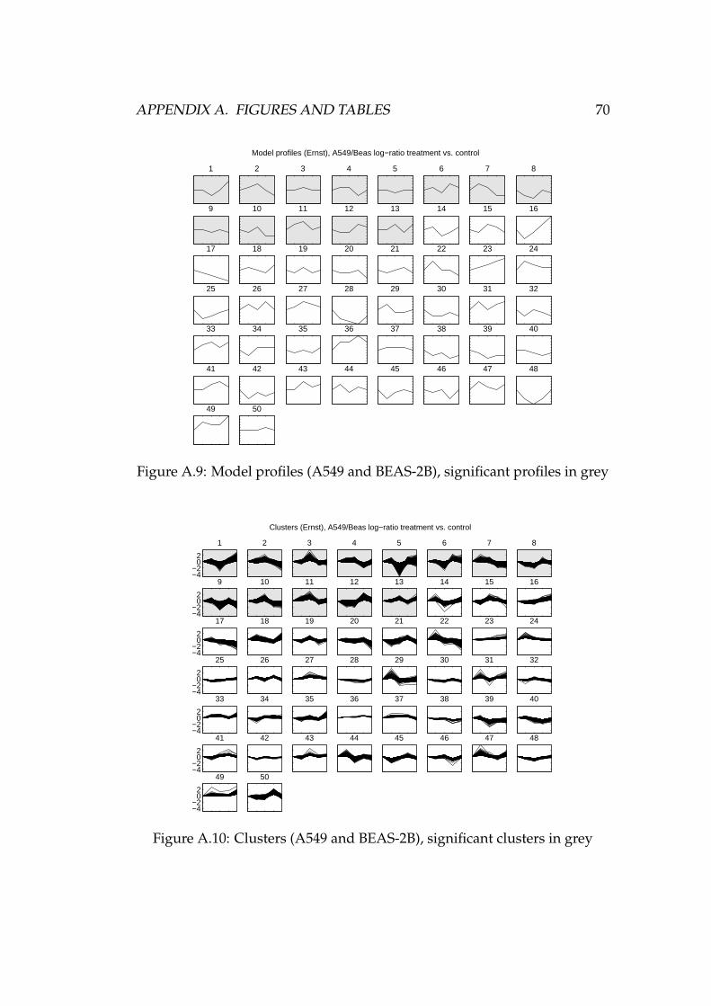
APPENDIX A. FIGURES AND TABLES 70
1 2 3 4 5 6 7 8
9 10 11 12 13 14 15 16
17 18 19 20 21 22 23 24
25 26 27 28 29 30 31 32
33 34 35 36 37 38 39 40
41 42 43 44 45 46 47 48
49
Model profiles (Ernst), A549/Beas log−ratio treatment vs. control
50
Figure A.9: Model profiles (A549 and BEAS-2B), significant profiles in grey
−4−2
02
1 2 3 4 5 6 7 8
−4−2
02
9 10 11 12 13 14 15 16
−4−2
02
17 18 19 20 21 22 23 24
−4−2
02
25 26 27 28 29 30 31 32
−4−2
02
33 34 35 36 37 38 39 40
−4−2
02
41 42 43 44 45 46 47 48
−4−2
02
49
Clusters (Ernst), A549/Beas log−ratio treatment vs. control
50
Figure A.10: Clusters (A549 and BEAS-2B), significant clusters in grey
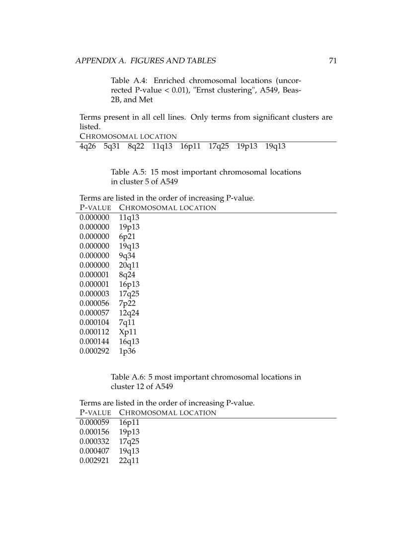
APPENDIX A. FIGURES AND TABLES 71
Table A.4: Enriched chromosomal locations (uncor-rected P-value < 0.01), "Ernst clustering", A549, Beas-2B, and Met
Terms present in all cell lines. Only terms from significant clusters arelisted.CHROMOSOMAL LOCATION
4q26 5q31 8q22 11q13 16p11 17q25 19p13 19q13
Table A.5: 15 most important chromosomal locationsin cluster 5 of A549
Terms are listed in the order of increasing P-value.P-VALUE CHROMOSOMAL LOCATION
0.000000 11q130.000000 19p130.000000 6p210.000000 19q130.000000 9q340.000000 20q110.000001 8q240.000001 16p130.000003 17q250.000056 7p220.000057 12q240.000104 7q110.000112 Xp110.000144 16q130.000292 1p36
Table A.6: 5 most important chromosomal locations incluster 12 of A549
Terms are listed in the order of increasing P-value.P-VALUE CHROMOSOMAL LOCATION
0.000059 16p110.000156 19p130.000332 17q250.000407 19q130.002921 22q11
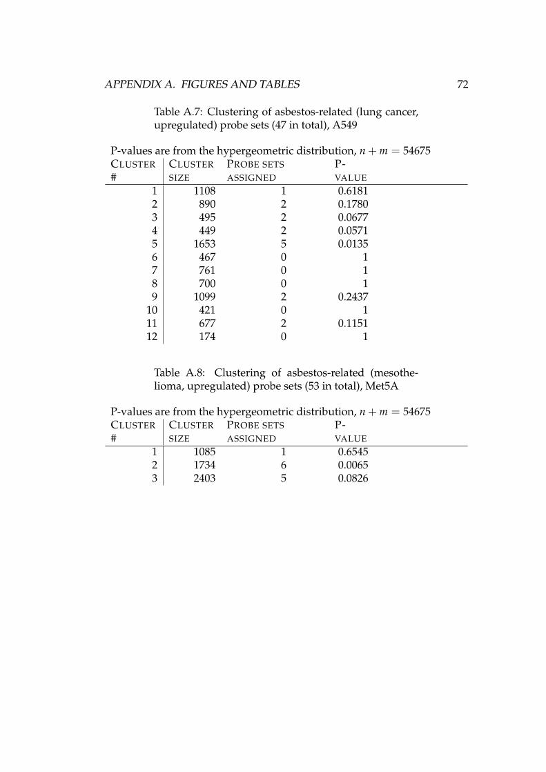
APPENDIX A. FIGURES AND TABLES 72
Table A.7: Clustering of asbestos-related (lung cancer,upregulated) probe sets (47 in total), A549
P-values are from the hypergeometric distribution, n + m = 54675CLUSTER#
CLUSTERSIZE
PROBE SETSASSIGNED
P-VALUE
1 1108 1 0.61812 890 2 0.17803 495 2 0.06774 449 2 0.05715 1653 5 0.01356 467 0 17 761 0 18 700 0 19 1099 2 0.2437
10 421 0 111 677 2 0.115112 174 0 1
Table A.8: Clustering of asbestos-related (mesothe-lioma, upregulated) probe sets (53 in total), Met5A
P-values are from the hypergeometric distribution, n + m = 54675CLUSTER#
CLUSTERSIZE
PROBE SETSASSIGNED
P-VALUE
1 1085 1 0.65452 1734 6 0.00653 2403 5 0.0826

Bibliography
[1] Affymetrix, Inc., Santa Clara, CA, USA. Data Sheet, GeneChip HumanGenome Arrays, 2004.
[2] Affymetrix, Inc., Santa Clara, CA, USA. GeneChip Expression Analysis:Data Analysis Fundamentals, 2004.
[3] Affymetrix, Inc., Santa Clara, CA, USA. GeneChip Expression AnalysisTechnical Manual, 2004.
[4] Affymetrix, Inc., Santa Clara, CA, USA. GeneChip Expression Platform:Comparison, Evolution, and Performance, 2004.
[5] Agency for Toxic Substances and Disease Registry (ATSDR). Toxico-logical profile for asbestos. Technical report, U.S. Department of Healthand Human Services, Public Health Service, Atlanta, GA, USA, 2001.
[6] A. V. Aho, B. W. Kernighan, and P. J. Weinberger. The AWK ProgrammingLanguage. Addison-Wesley, 1988.
[7] M. Ashburner, C. A. Ball, J. A. Blake, D. Botstein, H. Butler, J. M. Cherry,A. P. Davis, K. Dolinski, S. S. Dwight, J. T. Eppig, M. A. Harris, D. P.Hill, L. Issel-Tarver, A. Kasarskis, S. Lewis, J. C. Matese, J. E. Richard-son, M. Ringwald, G. M. Rubin, and G. Sherlock. Gene Ontology: toolfor the unification of biology. Nature Genetics, 25:25–29, May 2000.
[8] R. Balasubramaniyan, E. Hullermeier, N. Weskamp, and J. Kamper.Clustering of gene expression data using a local shape-based similaritymeasure. Bioinformatics, 21(7):1069–1077, 2005.
[9] A. Bisognin, S. Bortoluzzi, and G. Danieli. Detection of chromosomalregions showing differential gene expression in human skeletal muscleand in alveolar rhabdomyosarcoma. BMC Bioinformatics, 5(1):68, 2004.
[10] B. Bolstad, R. Irizarry, M. Astrand, and T. Speed. A comparison of nor-malization methods for high density oligonucleotide array data basedon variance and bias. Bioinformatics, 19(2):185–193, 2003.
73
BIBLIOGRAPHY 74
[11] B. M. Bolstad. Low Level Analysis of High-density Oligonucleotide ArrayData: Background, Normalization and Summarization. PhD thesis, Univer-sity of California, Berkeley, 2004.
[12] A. Brazma, P. Hingamp, J. Quackenbush, G. Sherlock, P. Spellman,C. Stoeckert, J. Aach, W. Ansorge, C. A. Ball, H. C. Causton, T. Gaaster-land, P. Glenisson, F. C. P. Holstege, I. F. Kim, V. Markowitz, J. C.Matese, H. Parkinson, A. Robinson, U. Sarkans, S. Schulze-Kremer,J. Stewart, R. Taylor, J. Vilo, and M. Vingron. Minimum informationabout a microarray experiment (MIAME)—toward standards for mi-croarray data. Nature Genetics, 29:365–371, Dec. 2001.
[13] L. M. Cope, R. A. Irizarry, H. A. Jaffee, Z. Wu, and T. P. Speed. A bench-mark for Affymetrix GeneChip expression measures. Bioinformatics,20(3):323–331, 2004.
[14] P. De Vuyst. Guidelines for attribution of lung cancer to asbestos. InProceedings of an International Expert Meeting on Asbestos, Asbesto-sis and Cancer [41], pages 92–96.
[15] M. B. Eisen, P. T. Spellman, P. O. Brown, and D. Botstein. Cluster analy-sis and display of genome-wide expression patterns. Proceedings of theNational Academy of Sciences, 95(25):14863–14868, 1998.
[16] J. Ernst, G. J. Nau, and Z. Bar-Joseph. Clustering short time series geneexpression data. Bioinformatics, 21(Suppl. 1):i159–168, 2005.
[17] L. Gautier, L. Cope, B. M. Bolstad, and R. A. Irizarry. affy–analysis ofAffymetrix GeneChip data at the probe level. Bioinformatics, 20(3):307–315, 2004.
[18] R. C. Gentleman, V. J. Carey, D. M. Bates, B. Bolstad, M. Dettling, S. Du-doit, B. Ellis, L. Gautier, Y. Ge, J. Gentry, K. Hornik, T. Hothorn, W. Hu-ber, S. Iacus, R. Irizarry, F. Leisch, C. Li, M. Maechler, A. J. Rossini,G. Sawitzki, C. Smith, G. Smyth, L. Tierney, J. Y. H. Yang, and J. Zhang.Bioconductor: Open software development for computational biologyand bioinformatics. Genome Biology, 5:R80, 2004.
[19] D. Goldberg. What every computer scientist should know aboutfloating-point arithmetic. ACM Computing Surveys, 23(1):5–48, 1991.
[20] P. Good. Permutation Tests — A Practical Guide to Resampling Methods forTesting Hypotheses. Springer Series in Statistics. Springer-Verlag, secondedition, 2000.
BIBLIOGRAPHY 75
[21] D. Hand, H. Mannila, and P. Smyth. Principles of Data Mining. The MITPress, Cambridge, MA, USA, 2001.
[22] S. Hautaniemi. Studies of Microarray Data Analysis with Applications forHuman Cancers. PhD thesis, Tampere University of Technology, 2003.
[23] A. Hughes. The central dogma and basic transcription. http://cnx.rice.edu/content/m11415/1.5/, July 2003. Web-document (Connex-ions Web site). Referenced 27th Jan 2006.
[24] R. A. Irizarry, B. M. Bolstad, F. Collin, L. M. Cope, B. Hobbs, and T. P.Speed. Summaries of Affymetrix GeneChip probe level data. NucleicAcids Research, 31(4):e15—, 2003.
[25] R. A. Irizarry, B. Hobbs, F. Collin, Y. D. Beazer-Barclay, K. J. Antonellis,U. Scherf, and T. P. Speed. Exploration, normalization, and summariesof high density oligonucleotide array probe level data. Biostatistics,4(2):249–264, 2003.
[26] Y. Kluger, H. Yu, J. Qian, and M. Gerstein. Relationship between geneco-expression and probe localization on microarray slides. BMC Ge-nomics, 4(1):49, 2003.
[27] I. S. Kohane, A. T. Kho, and A. J. Butte. Microarrays for an IntegrativeGenomics. The MIT Press, Cambridge, MA, USA, 2003.
[28] T. Kohonen. Self-Organizing Maps. Springer-Verlag, 3rd edition, 2001.
[29] S. Langård and T. Haug. Screening and early diagnosis of asbestosisand asbestos-related cancers. In Proceedings of an International ExpertMeeting on Asbestos, Asbestosis and Cancer [41], pages 85–91.
[30] C. Li and W. H. Wong. Model-based analysis of oligonucleotide arrays:Expression index computation and outlier detection. Proceedings of theNational Academy of Sciences, 98(1):31–36, 2001.
[31] C. Li and W. H. Wong. Model-based analysis of oligonucleotide ar-rays: model validation, design issues and standard error application.Genome Biology, 2(8):research0032.1–0032.11, 2001.
[32] A. E. Loraine, M. L. Salmi, S. C. Stout, and S. J. Roux. Gene-ontology-based analysis of gene expression changes in early development of cer-atopteris spores. In CSB Workshops, pages 95–96. IEEE Computer Soci-ety, 2005.

BIBLIOGRAPHY 76
[33] J. C. McDonald and A. D. McDonald. The epidemiology of mesothe-lioma in historical context. European Respiratory Journal, 9(9):1932–1942,1996.
[34] C. J. Miller. Description of simpleaffy: easy analysis routines for Affymetrixdata, May 2005. Electronic documentation from simpleaffy v. 2.0.13.
[35] R. G. Miller. Simultaneous statistical inference. Springer-Verlag, NewYork, NY, USA, second edition, 1981.
[36] R. Motwani and P. Raghavan. Randomized Algorithms. Cambridge Uni-versity Press, Cambridge, UK, 1995.
[37] J. Nikkilä. Exploratory cluster analysis of genomic high-throughput data setsand their dependencies. PhD thesis, Helsinki University of Technology,2005.
[38] J. E. Parker. Radiological criteria: The use of chest imaging techniquesin asbestos-related diseases. In Proceedings of an International ExpertMeeting on Asbestos, Asbestosis and Cancer [41], pages 28–40.
[39] E. Pennisi. Gene counters struggle to get the right answer. Science,301(5636):1040–1041, 2003.
[40] T. V. Perneger. What’s wrong with Bonferroni adjustments. BritishMedical Journal, 316(7139):1236–1238, 1998.
[41] Proceedings of an International Expert Meeting on Asbestos, Asbestosis andCancer, number 14 in People and work research reports, Helsinki, Fin-land, 1997. Finnish Institute of Occupational Health.
[42] R Development Core Team. R: A language and environment for statisticalcomputing. R Foundation for Statistical Computing, Vienna, Austria,2005. ISBN 3-900051-07-0.
[43] M. F. Ramoni, P. Sebastiani, and I. S. Kohane. Cluster analysis of geneexpression dynamics. Proceedings of the National Academy of Sciences,99(14):9121–9126, 2002.
[44] J. Rantanen. Global asbestos epidemic — is it over? In Proceedings ofan International Expert Meeting on Asbestos, Asbestosis and Cancer[41], pages 1–4.
[45] S. Ruosaari and J. Hollmén. Image analysis for detecting faulty spotsfrom microarray images. In S. Lange, K. Satoh, and C. H. Smith, ed-itors, Proceedings of the 5th International Conference on Discovery Science

BIBLIOGRAPHY 77
(DS 2002), volume 2534 of Lecture Notes in Computer Science, pages 259–266. Springer-Verlag, 2002.
[46] M. Schena, D. Shalon, R. W. Davis, and P. O. Brown. Quantitativemonitoring of gene expression patterns with a complementary DNAmicroarray. Science, 270(5235):467–470, Oct. 1995.
[47] A. Schliep, A. Schonhuth, and C. Steinhoff. Using hidden Markovmodels to analyze gene expression time course data. Bioinformatics,19(Suppl. 1):255i–263, 2003.
[48] P. Spellman and G. Rubin. Evidence for large domains of similarlyexpressed genes in the drosophila genome. Journal of Biology, 1(1):5,2002.
[49] T. Strachan and A. P. Read. Human molecular genetics. Garland Science,New York, NY, USA, 3rd edition, 2004.
[50] S. Theodoridis and K. Koutroumbas. Pattern Recognition. AcademicPress, San Diego, CA, USA, second edition, 2003.
[51] A. Tossavainen. Asbestos, asbestosis and cancer. Exposure criteria forclinical diagnosis. In Proceedings of an International Expert Meetingon Asbestos, Asbestosis and Cancer [41], pages 8–27.
[52] A. Ultsch and H. Siemon. Kohonen’s self organizing feature maps forexploratory data analysis. In Proc. INNC’90, Int. Neural Network Conf.,pages 305–308, Dordrecht, Netherlands, 1990. Kluwer.
[53] W. N. Venables and B. D. Ripley. S Programming. Springer-Verlag, NewYork, NY, USA, 2000.
[54] R. L. Virta. Worldwide asbestos supply and consumption trends from1900 to 2000. Technical Report 2003-83, U.S. Department of the Interior,U.S. Geological Survey, 2003.
[55] E. W. Weisstein. Bonferroni correction. http://mathworld.wolfram.com/BonferroniCorrection.html. From MathWorld—A Wolfram WebResource. Web-document. Referenced 15th Dec 2005.
[56] E. W. Weisstein. Hypergeometric distribution. http://mathworld.wolfram.com/HypergeometricDistribution.html. From MathWorld—A Wolfram Web Resource. Web-document. Referenced 11th Nov 2005.
[57] C. Wilson, S. D. Pepper, and C. J. Miller. QC and Affymetrix data. Pa-terson Institute for Cancer Research. Electronic documentation fromsimpleaffy v. 2.0.13.

BIBLIOGRAPHY 78
[58] C. L. Wilson and C. J. Miller. Simpleaffy: a BioConductor pack-age for Affymetrix quality control and data analysis. Bioinformatics,21(18):3683–3685, 2005.
[59] Z. Wu and R. A. Irizarry. Preprocessing of oligonucleotide array data.Nature Biotechnology, 22:656–658, June 2004.
[60] Z. Wu, R. A. Irizarry, R. Gentleman, F. M. Murillo, and F. Spencer. Amodel based background adjustment for oligonucleotide expressionarrays. Number 1 in Johns Hopkins University, Dept. of BiostatisticsWorking Papers. May 2004.
[61] L. Zhang, M. F. Miles, and K. D. Aldape. A model of molecular in-teractions on short oligonucleotide microarrays. Nature Biotechnology,21:818–821, July 2003.