Embed Size (px)
DESCRIPTION
Christaine Maynessa Dichosa
Citation preview
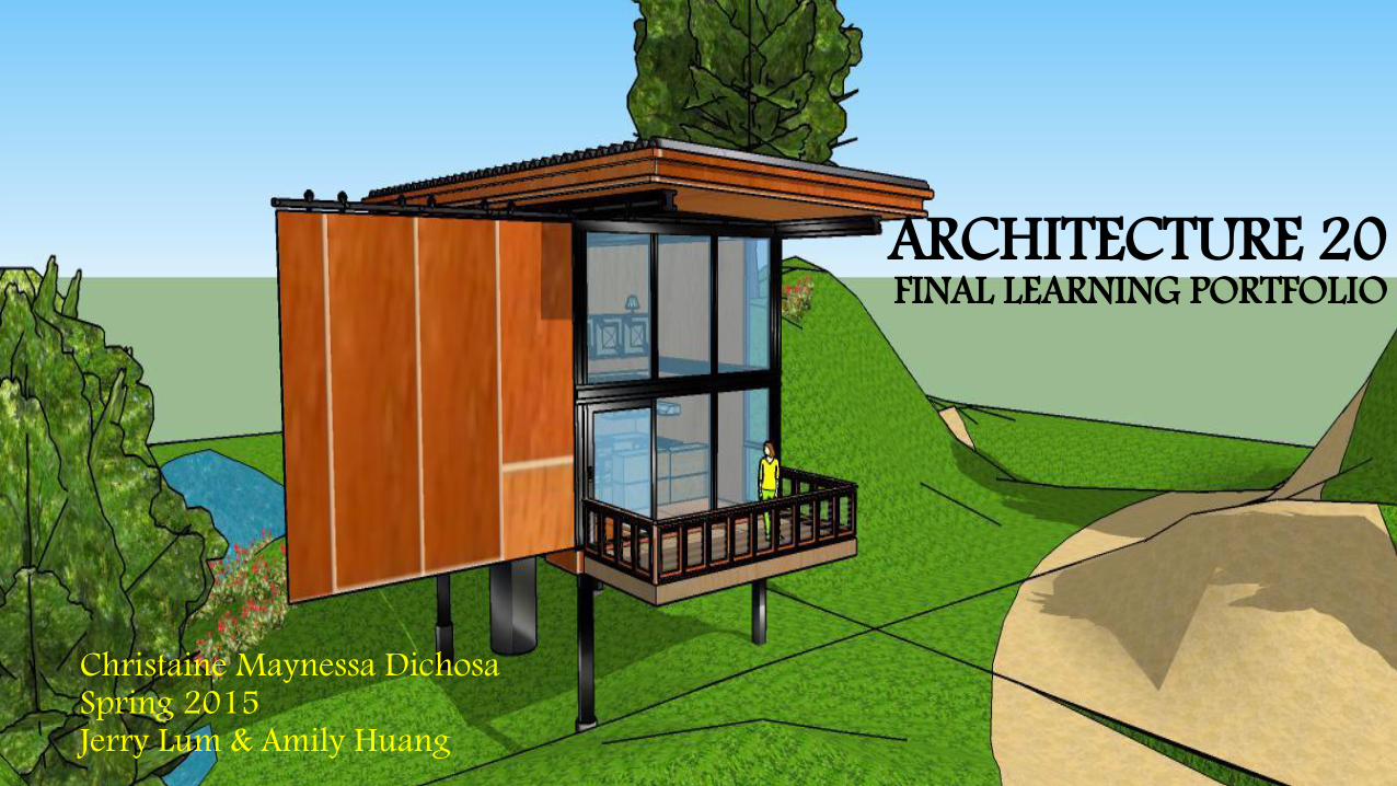
Christaine Maynessa DichosaSpring 2015Jerry Lum & Amily Huang
ARCHITECTURE 20FINAL LEARNING PORTFOLIO
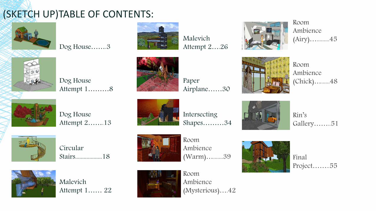
(SKETCH UP)TABLE OF CONTENTS:
Dog House…….3
Dog House Attempt 1………8
Dog House Attempt 2…….13
Circular Stairs...................18
Malevich Attempt 1…… 22
MalevichAttempt 2….26
PaperAirplane……30
Intersecting Shapes………34
RoomAmbience(Warm)….......39
RoomAmbience(Mysterious)….42
RoomAmbience(Airy)….........45
RoomAmbience(Chick)…......48
Rin’sGallery……..51
FinalProject……..55

WEEK 1: ICE BREAKER: “ A DOG HOUSE 1.0”
Perspective View
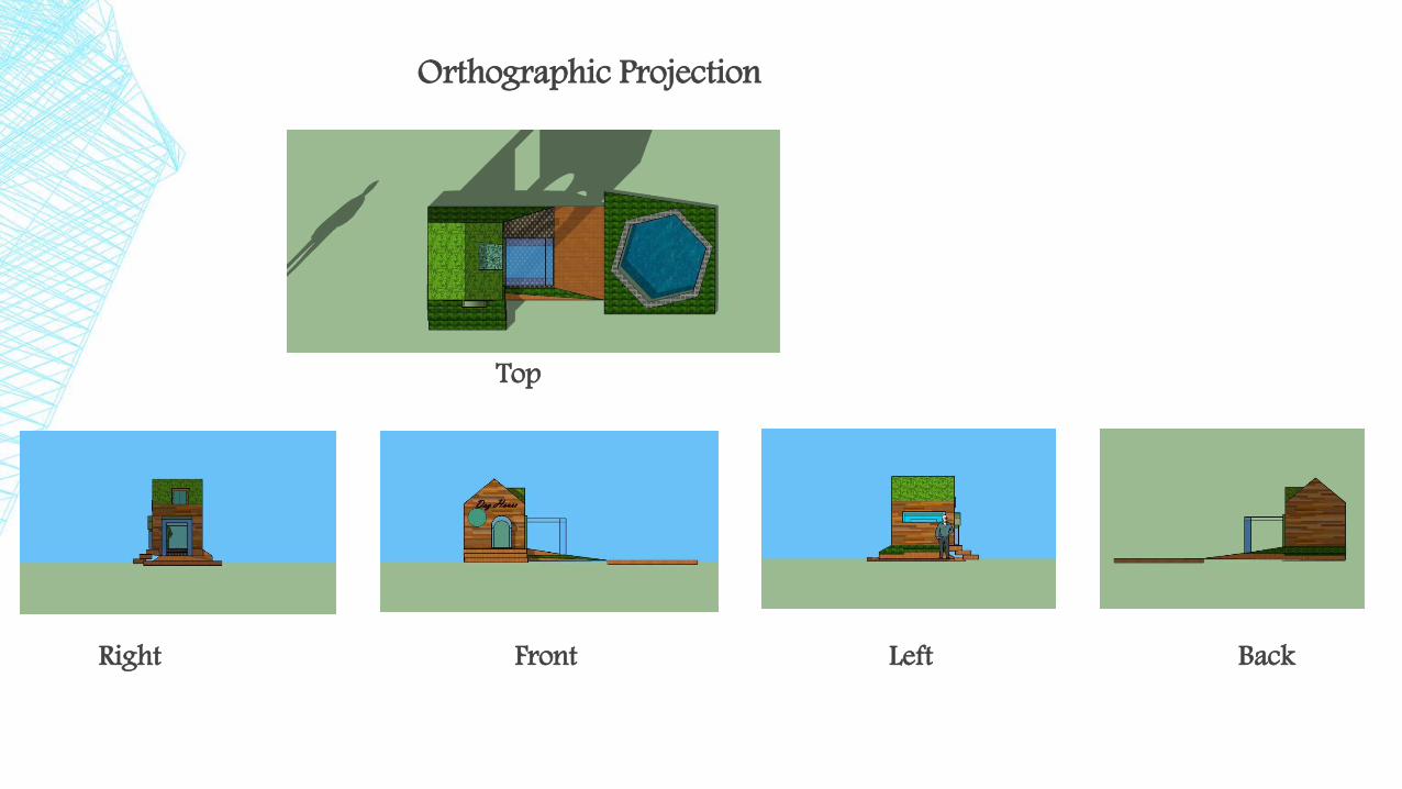
Orthographic Projection
Top
Right Front Left Back
Strengths: - In my first attempt in using sketch up I was able to enjoy playing around with some of the tools in the
big toolbar menu, especially the paint bucket tool bar. I discovered a lot of options in the paint bucket tool, like the transparent, water, and wood colors; and this have helped me visualize how I want to create my dog house.
- I also got used to using the rectangle, move, and the push/pull button, which helped me a lot in finishing my first dog house. Moreover, in this first iteration I enjoyed using the line and push/pull tool because not only are they easy to use, they also give me a lot of control in my work.
- Furthermore, one of my strength in this activity is that I took a lot of experimentations, exploration, and risk in creating my first attempt in using the sketch up basic tools, which might be helpful for me in my future work.
Weaknesses:- There are a lot of structural issues on my first iteration- Also there are less or no repetition at all in my design, which made my structure lack in integrity- There are also no proportion, material and color, and structural/construction integrity.- Moreover, even though my design looks sophisticated, I did not do well in communicating my intention to my
audience.

Challenges in using the tools:-I have difficulties in using the pan, move and orbit tools.
-I keep forgetting to save and to click the select button, which often destroy my work.
-I experience mental block. That is why, I lost a lot of time figuring out how I should start. Also, I have a hard timecoming up with an approach for my first iteration.
-I am also not yet familiar with the side commands, which is another reason why I have a hard time using mymove tool.
Approach that works best for me/ to solve a problem:- What I did to address my issue in the orbit and pan button is that I practiced using just these commands for about
30-40 minutes so that I can feel comfortable in using them. I just created a simple box and started orbiting and panningit until I feel confident in using them when creating my design. Although not yet perfect.
- To solve my “forgetfullness” issue in saving my progress, I tried to write it in a piece of paper and put it in front of me so that Ican remind myself. I also did this to the select button (but still I forget it sometimes).
- I really have a hard time using the move button because the element that I want to move keeps on moving to places that I don’t want it to go. Furthermore, I am not yet familiar with the side commands, which is another reason why I can’t control this tool. So, to address this problem I tried to integrate elements that needed the move command in order to practice myself in using this button. Such as, the pathway to the pool, aligning the stairs, and the bottom structure of my dog house.
- Furthermore, to address my mental block issues, I research to the internet and scan pictures to help inspire me in doing my designs.
LEARNING/DISCOVERIES:- By exploring sketch up I was able to discover the paint bucket tool, which I really enjoyed
experimenting. For being a novice in using this program, the Bucket tool help makes my design look more complicated for a beginner.
- Also I learned how to transport, by clicking the edit menu and the file button, a photo in the toolbar to use it as one of the color option and making my design look good. However, every time I use my imported color image in my design, it keeps on repeating, which made it look like a tile instead of a whole color. I hope I can find a way to use this command properly in the future.
- Moreover, I learned that to make a “complex” design, it should be structural, and the elements of the dog house should have repetition so that it would look as one design. Furthermore, I learn that any color will not do. I should also think carefully about my structure’s color scheme, does it look connected or not, because randomly putting colors in a design can make it look like a “Frankenstein”, which what happened in my first attempt dog house.
- Furthermore, I learn that my imagination and creativity skill still need a lot of improvements, which is why I hope that by keep on learning about this program and by a lot of practice I would be able to design like the other architects.
- So, in my next attempt in using sketch up I will try to integrate my new learnings in this program. I will put repetition to enhance the integrity of my structure. I will also remember to think critically my color combination, to not make it look all over the place. In addition, I will continue my positive, playful, and serious attitude in using this program so that I can stop myself in procrastinating my homework for sketch up.
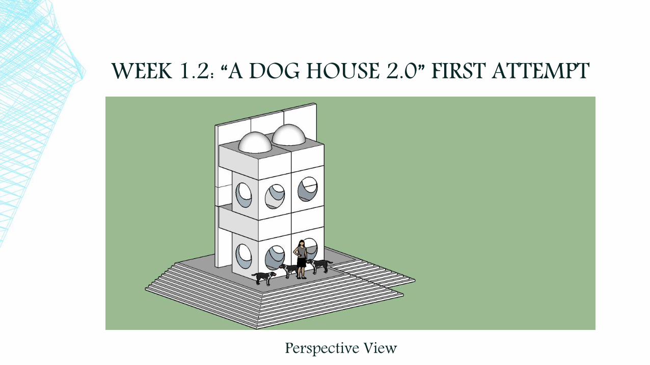
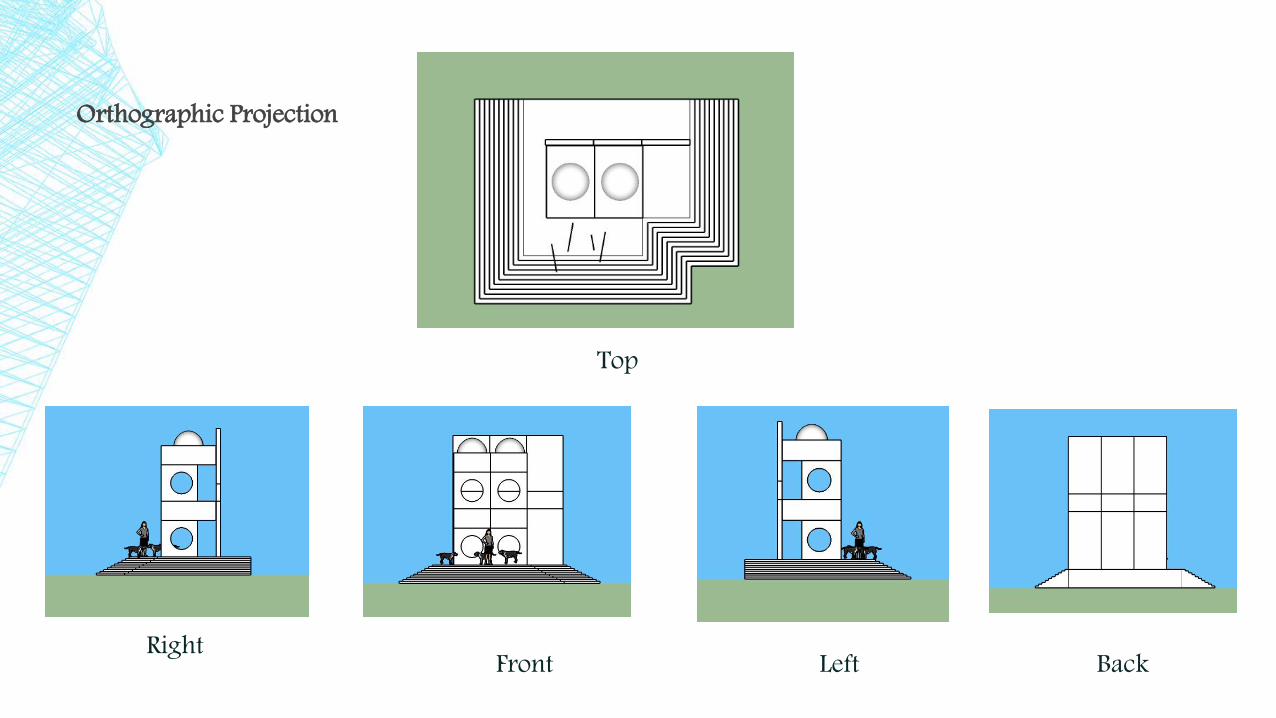
WEEK 1.2: “A DOG HOUSE 2.0” FIRST ATTEMPT
Perspective View
BackFront
Top
LeftRight
Orthographic Projection

▪ Strengths:- One strength of this design is that there is now integrity and correct structural elements found in this model.
- Another strength of this design is although it look simple without the color, it is beginning to look complex because I was able to construct it structurally. There is even a stairs, adding more complexity in the design.
- Although this was an activity given in class, I am happy that I was able to recreate it despite the challenges I experienced in creating this second attempted dog house. And because this activity was made in response to my weakness in the first iteration, I really worked hard to finish this, even if this is just an activity.
▪ Weaknesses:- One prominent weakness in this design is it can not be seen as a dog house.- Moreover, it is very symmetrical, which made it boring to look.- There is also no color in the design, making it look simple yet complex at the same time. - Another weakness that I experienced in creating this structure is how to use the
component, how to construct the dome, and the stairs.
CHALLENGES IN USING THE TOOLS:
- Unlike the first iteration when I was just exploring, I encountered a lot of difficulties in the second iteration (which annoyed my sister because I keep asking a lot of question).
- Because we were introduced to a lot of new tools I was having a difficult time to follow. Such as, using the follow me tool, making a figure into a component, and making the dome.
▪ Approach that works best for me/ to solve a problem:- To address my problem with the follow me tool I ask my sister to teach me step by step on how to use it
properly, after going home. Then after knowing the procedure I wrote it on a piece of paper and starts to practice it for about 3 to 4 times before proceeding in finishing the activity. I know 3-4 times of practice is not enough, but having a little amount of time, this amount is enough to help me familiarize the step in order to use it for my third attempt dog house, which I will do later.
- Next is my problem with component. This command is a problem for me because I keep on forgetting that I need to edit the component first before adding and subtracting something. Because of this problem it keeps on wasting my time and keeps on destroying my progress. So to solve this difficulty like what I did to solve the “saving and follow me problem” I wrote it in paper. I also redo my steps immediately whenever I feel that there is a problem, which is very helpful for me.
- Lastly, is my problem in creating a dome(a half circle). Because of my problem about the component, I keep on messing up when I start to do the dome in the roof. Moreover, since I also have a problem with the follow me tool, creating this shape was very challenging. However, after I practiced with the two difficult tools, creating the dome begins to become simpler to do. But to make my self more comfortable in making this shape, I practiced multiple times before creating it in my structure. Thus, I was able to create a perfect dome.

LEARNINGS/DISCOVERIES:
▪ My first discovery is that I can not edit my structure without clicking the “edit component” command because by not doing so, all the edits that I did will just destroy my work even more.
▪ Although we did not tackle this in class I was able to find a shortcut in using the pan command: scroll button+ left click= pan. Discovering this shortcut was very helpful for me because I don’t need to press the shift key button; and a much easier way in exploring around.
▪ Also, despite my bad relationship with the component, I did like it for being easy to move around and to even copy because I don’t need to triple click the figure all the time.
▪ Moreover, I learned how helpful it is to use the tape measure tool because not only can I put my preferred measurement, it is also make shapes easier since I just need to follow it.
▪ Thus, I learned a lot in this activity. Despite being the most difficult activity so far, I was very happy to all the new discoveries and new things that I was able to understand after practicing to execute the tools and commands that I was frustrated in before. And with the help of my sister I was able to understand the things that I missed in class.
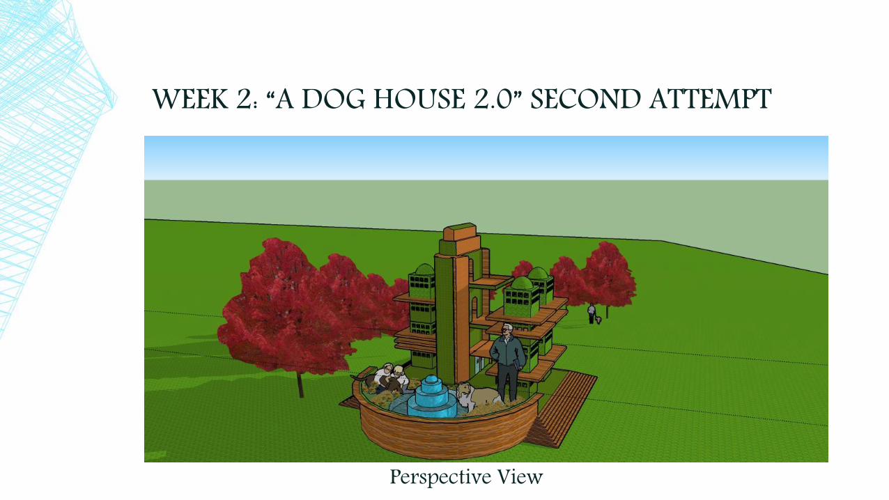
WEEK 2: “A DOG HOUSE 2.0” SECOND ATTEMPT
Perspective View
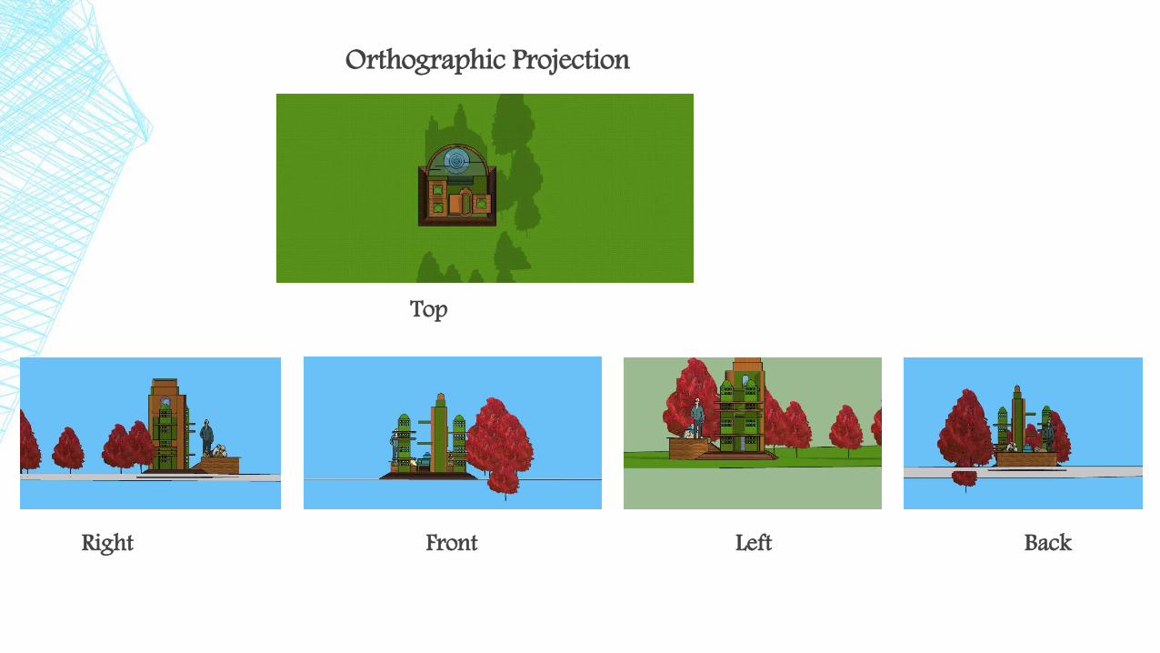
Orthographic Projection
Top
Right Front Left Back
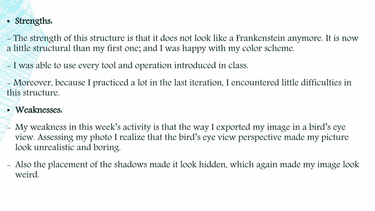
▪ Strengths:- The strength of this structure is that it does not look like a Frankenstein anymore. It is now a little structural than my first one; and I was happy with my color scheme. - I was able to use every tool and operation introduced in class.- Moreover, because I practiced a lot in the last iteration, I encountered little difficulties in this structure.▪ Weaknesses:- My weakness in this week’s activity is that the way I exported my image in a bird’s eye
view. Assessing my photo I realize that the bird’s eye view perspective made my picture look unrealistic and boring.
- Also the placement of the shadows made it look hidden, which again made my image look weird.

CHALLENGES IN USING THE TOOLS:
- Because I was able to practice the tools introduced to us, I did not encounter much difficulties in creating my third dog house. My color combination also made my work look integrated, which is an improvement for me.
- However, I did find it challenging to find an inspiring image for my design.
- I also find it hard to locate the shadow menu. And I still get confused in using it.
▪ Approach that works best for me/ to solve a problem:
- To solve my problem in using the shadow command, I ask my classmates and also my sister (when we got home) to teach how to operate it. And as I found out it is not that hard as I think it would be.
- However, I was not able to practice a lot in exporting my image because I was not able to manage my time properly this week, which I really regretted a lot. But I will continue to explore possible angles which would help me create an awe inspiring image in my design
LEARNINGS/DISCOVERIES:
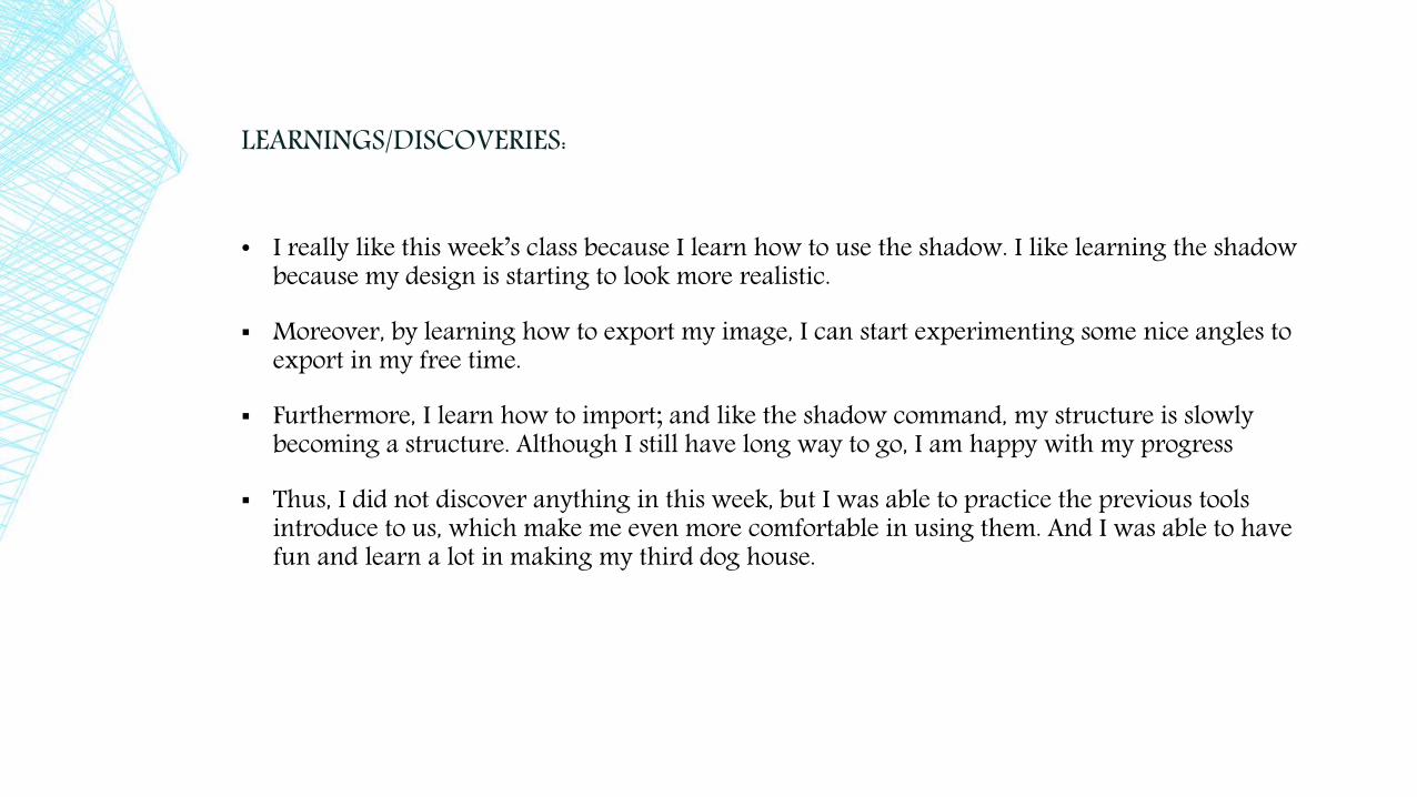
• I really like this week’s class because I learn how to use the shadow. I like learning the shadow because my design is starting to look more realistic.
▪ Moreover, by learning how to export my image, I can start experimenting some nice angles to export in my free time.
▪ Furthermore, I learn how to import; and like the shadow command, my structure is slowly becoming a structure. Although I still have long way to go, I am happy with my progress
▪ Thus, I did not discover anything in this week, but I was able to practice the previous tools introduce to us, which make me even more comfortable in using them. And I was able to have fun and learn a lot in making my third dog house.
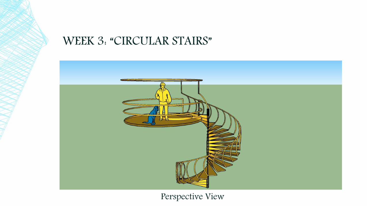
WEEK 3: “CIRCULAR STAIRS”
Perspective View
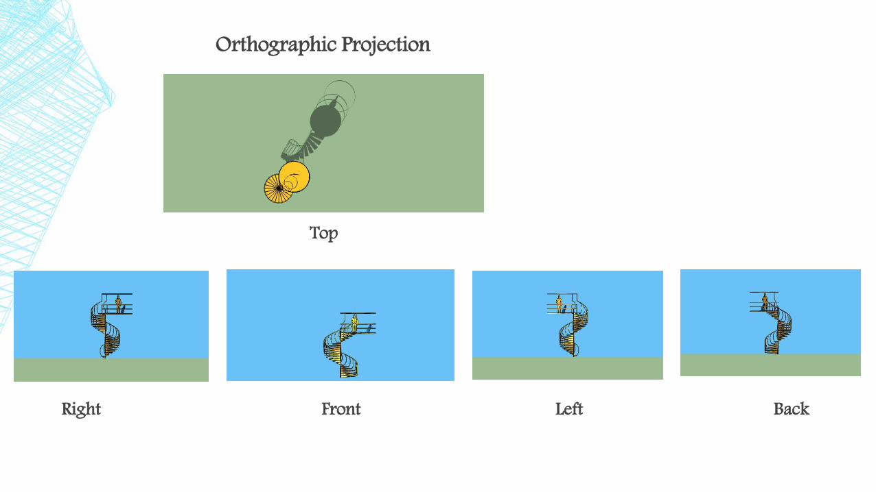
Orthographic Projection
Top
Right Front Left Back

▪ Strengths:- The center support and the circular hand rail is very inventive, imaginative and complex- The exported image is a lot better than my first attempt in the previous iteration.▪ Weaknesses:- The problem that I encountered in this week is the animation. Even though I was happy
when we started incorporating animation, my first attempt make it look, as Jerry said, an intoxicated bird flying towards my circular stairs.
- I also encountered some problem in using the move button in this iteration because fusing the “temporary space” with my stairs was hard.

APPROACH THAT WORKS BEST FOR ME/ TO SOLVE A PROBLEM:- What I did to improve my animation is that I tried to animate a simple box. I show its
every angle and I tried to see how I can develop my animation to not to look jerky. - For the move button, however, I just did my best to incorporate it by applying my
previous learning. Furthermore, this is where I appreciate the hold commands because it really helped me create a successful circular stair design.
Learnings/Discoveries:- In this week’s iteration I learn to value the importance of making a figure into a
component and using the hold commands. For, without these features I wouldn’t have finish this work.
- Moreover, I discover how useful the push/pull button really is because without it I would have created my daring center support and hand rails.
- Furthermore, I learned how helpful layering is because I can easily hide and unhide my components without making it fully disappear.
- Thus, the more I use the sketch up the more I learn its importance in creating a magnificent design, which makes me like using the sketch up more and more.

WEEK 4: “A MALEVICH INSPIRED CONSTRUCTION”ATTEMPT 1
Perspective View

Orthographic Projection
Top
Right Front Left Back
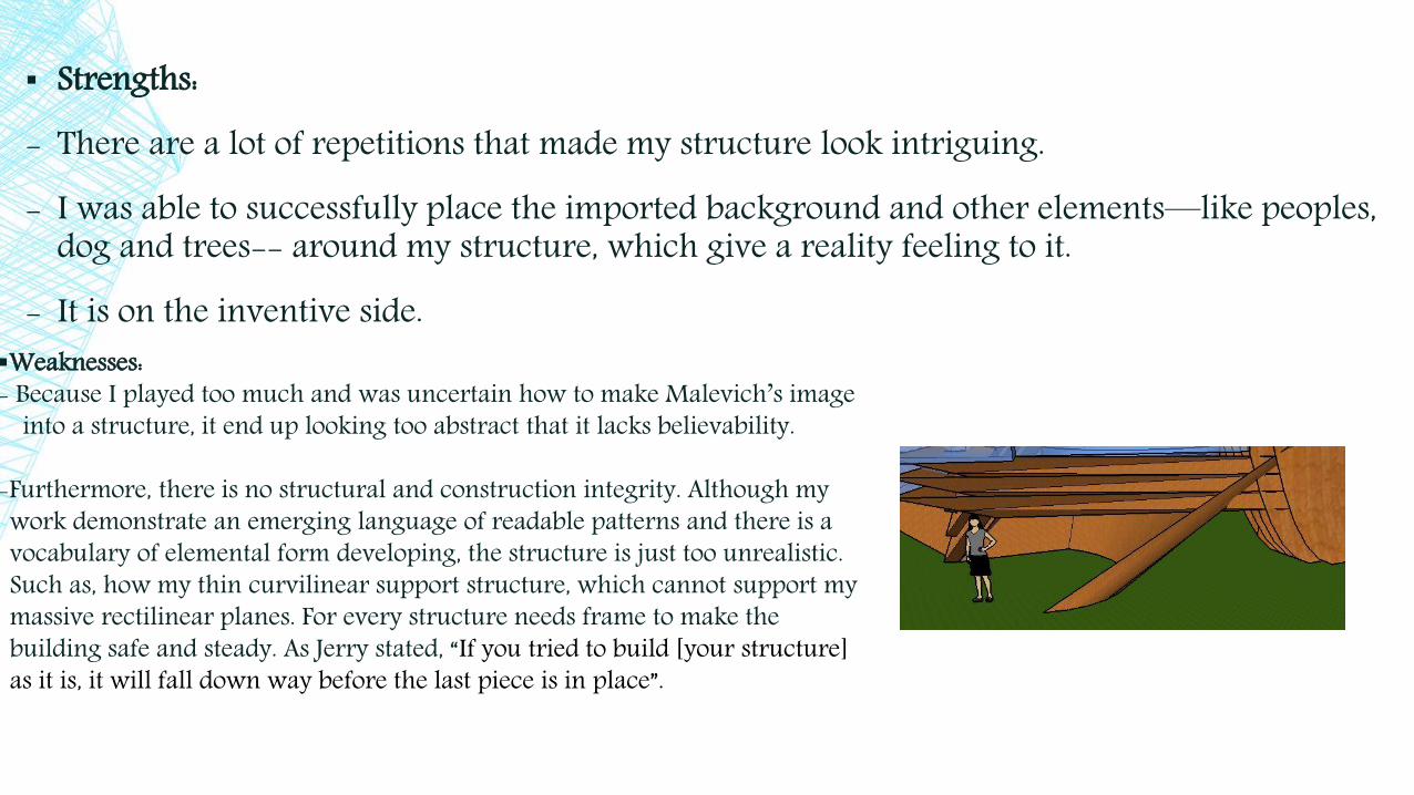
▪ Strengths:- There are a lot of repetitions that made my structure look intriguing.- I was able to successfully place the imported background and other elements—like peoples,
dog and trees-- around my structure, which give a reality feeling to it.- It is on the inventive side.
Weaknesses: - Because I played too much and was uncertain how to make Malevich’s image
into a structure, it end up looking too abstract that it lacks believability.
-Furthermore, there is no structural and construction integrity. Although my work demonstrate an emerging language of readable patterns and there is a vocabulary of elemental form developing, the structure is just too unrealistic. Such as, how my thin curvilinear support structure, which cannot support my massive rectilinear planes. For every structure needs frame to make the building safe and steady. As Jerry stated, “If you tried to build [your structure] as it is, it will fall down way before the last piece is in place”.
APPROACH THAT WORKS BEST FOR ME/ TO SOLVE A PROBLEM:
- One approach that I can do to minimize my structural problem again is that I should start studying images and plans so that it can increase my understanding on how to make a believable and workable structure.
- I should also start using the x-ray and layering tool because by doing so can increase my productivity.
Learnings/Discoveries:- I learn how to use the parallel projection in this iteration. Using parallel projection is very helpful because architect students, like me, can easily export elevation photos that can be incorporated in our portfolios.
- In addition, I learn that using the x-ray and layering tool can help me improve my work because with x-ray, applying elements inside would just be simple; and by using layering I can organize my elements, which can really be helpful.
- I also learn that having little knowledge about architecture can really be a problem and can minimize my full potential in creativity. Having imagination alone and too much fun is not enough to enable me to create an inspiring design.
WEEK 4: “A MALEVICH INSPIRED CONSTRUCTION”ATTEMPT 2
Perspective View

Orthographic Projection
Top
Right Front Left Back

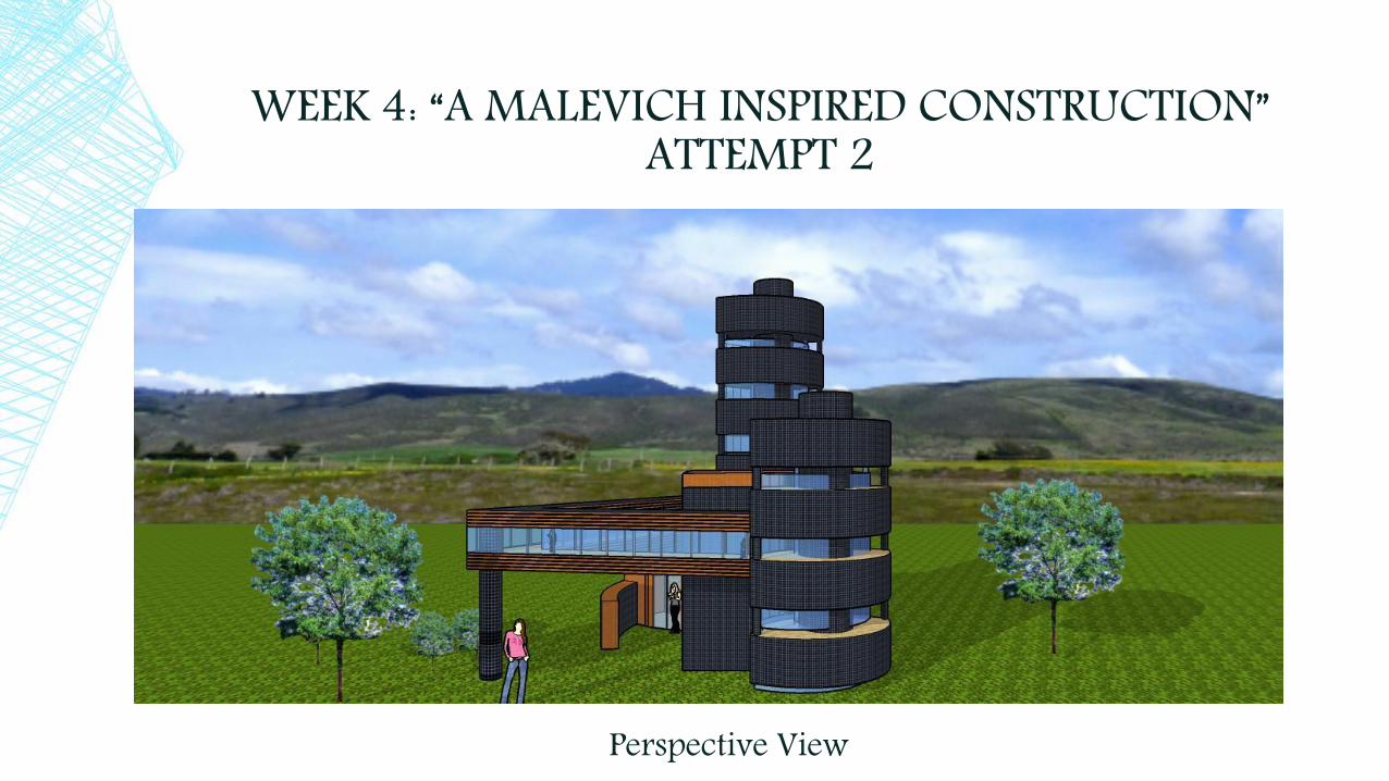
▪ Strengths:- There is a development in my second attempt Malevich inspired
construction, compare to my first attempt.- Moreover, there is an improvement in my animation making,
which I have fun producing and experimenting in order to get a good animation.
- There is also an improvement in my use of architectonic language because I looked at the best design of any structure and tried to do it in my own language.
- In addition, I was able to make a believable design and not just a random created structure.
▪ Weaknesses:- It can still be develop into a more complex design. For, the second
attempt Malevich looks a little plain and literal.- There are problems with the proportion of the people in related
to the structure.

APPROACH THAT WORKS BEST FOR ME/ TO SOLVE A PROBLEM:
- I should continue studying inspiring and structurally correct design so that I can continue to improve my capability to make a beautiful and awe inspiring structure.
- I should also take into account the right proportions so that the size of my design won’t be all over the place.
Learnings/Discoveries:- In this week’s activity I was able to continuously practice the tools that we have been using in the previous iterations.
- I also learn that simplicity with a correct structural element can become beautiful.
- In addition, I now appreciate getting inspirational ideas from others, which I can make it my own, and not just relying on my own ideas and experiences.
- I am also getting comfortable in using the tools, especially the ones that I hated. Such as, the follow me tool, making and editing components, the move tool, etc. Thus, showing me that the statement “practice makes perfect” really is true.
WEEK 4: PAPER AIR PLANE
Perspective View

Dramatic Pictures:
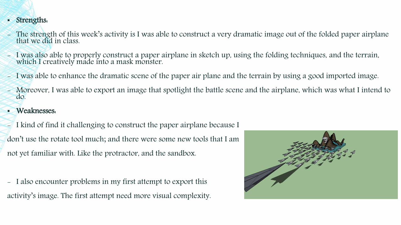
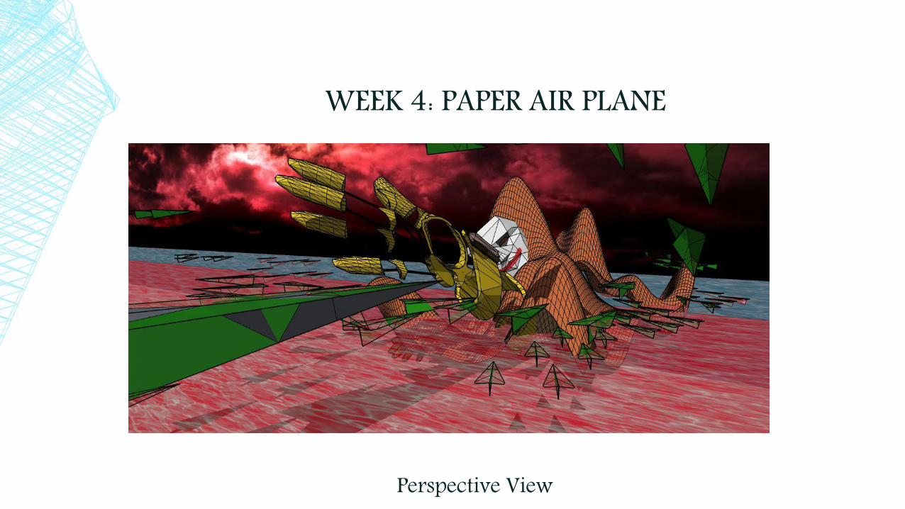
▪ Strengths:- The strength of this week’s activity is I was able to construct a very dramatic image out of the folded paper airplane
that we did in class.- I was also able to properly construct a paper airplane in sketch up, using the folding techniques, and the terrain,
which I creatively made into a mask monster.- I was able to enhance the dramatic scene of the paper air plane and the terrain by using a good imported image.- Moreover, I was able to export an image that spotlight the battle scene and the airplane, which was what I intend to
do.▪ Weaknesses:- I kind of find it challenging to construct the paper airplane because I don’t use the rotate tool much; and there were some new tools that I am not yet familiar with. Like the protractor, and the sandbox.
- I also encounter problems in my first attempt to export this activity’s image. The first attempt need more visual complexity.
APPROACH THAT WORKS BEST FOR ME/ TO SOLVE A PROBLEM:
- Although I have trouble with the sandbox, I was able to construct a good terrain by familiarizing myself with the from scratch tool and Smoove tool. After I got familiarize with them I find it easy to construct the terrains, or for my image, a mountain monster.
- The approach that I did to the airplane is that I wrote the step by step procedure in how to construct it. Then I start folding paper air planes for about 10 times (5 times at school, and 5-6 times at home). Because of this I can easily use the rotate move, and protractor tool, which I might incorporate to my next design.
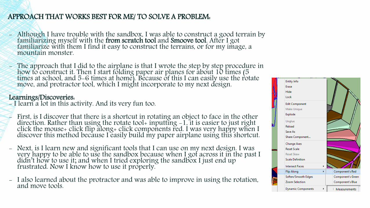
Learnings/Discoveries:- I learn a lot in this activity. And its very fun too. - First, is I discover that there is a shortcut in rotating an object to face in the other
direction. Rather than using the rotate tool+ inputting -1, it is easier to just right click the mouse+ click flip along+ click components red. I was very happy when I discover this method because I easily build my paper airplane using this shortcut.
- Next, is I learn new and significant tools that I can use on my next design. I was very happy to be able to use the sandbox because when I got across it in the past I didn’t how to use it; and when I tried exploring the sandbox I just end up frustrated. Now I know how to use it properly.
- I also learned about the protractor and was able to improve in using the rotation, and move tools.

WEEK 5: “INTERSECTING SHAPES
Perspective view
Top
Right Front Left Back
Orthographic Projection
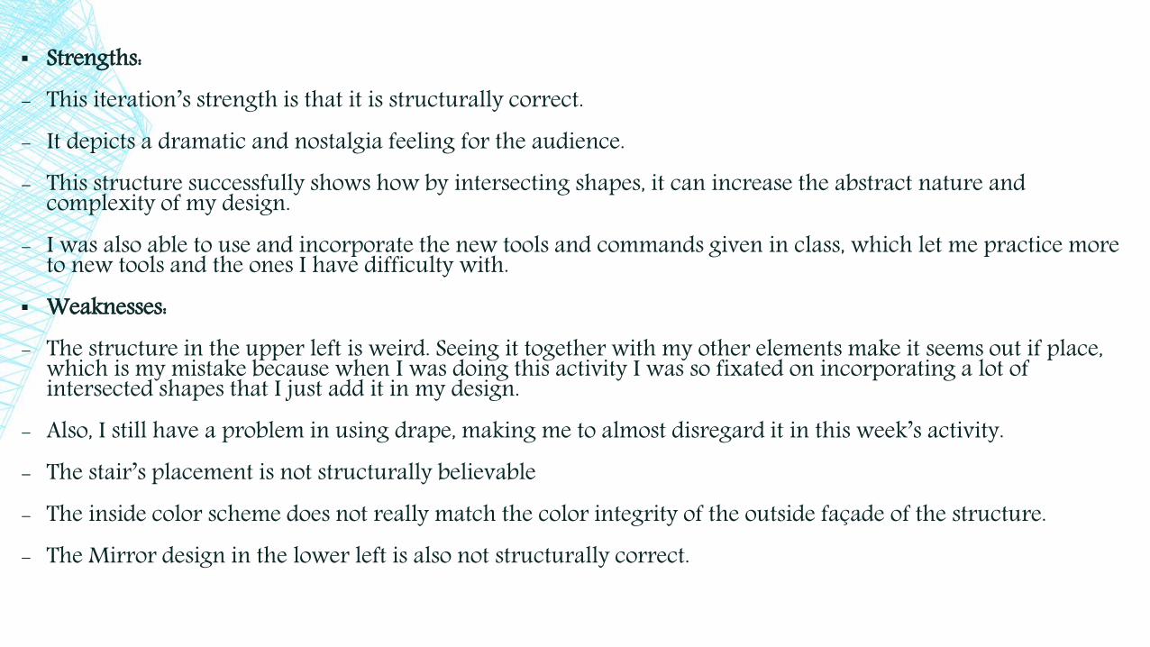
▪ Strengths:- This iteration’s strength is that it is structurally correct.- It depicts a dramatic and nostalgia feeling for the audience.- This structure successfully shows how by intersecting shapes, it can increase the abstract nature and
complexity of my design.- I was also able to use and incorporate the new tools and commands given in class, which let me practice more
to new tools and the ones I have difficulty with.▪ Weaknesses:- The structure in the upper left is weird. Seeing it together with my other elements make it seems out if place,
which is my mistake because when I was doing this activity I was so fixated on incorporating a lot of intersected shapes that I just add it in my design.
- Also, I still have a problem in using drape, making me to almost disregard it in this week’s activity.- The stair’s placement is not structurally believable- The inside color scheme does not really match the color integrity of the outside façade of the structure.- The Mirror design in the lower left is also not structurally correct.

APPROACH THAT WORKS BEST FOR ME/ TO SOLVE A PROBLEM:
- What I did to approach my problem about the drape tool is that I asked the professor to explain to me again how to use it.
- I also practiced a lot, but still encounters some trouble in using this tool properly. However, I am now starting to get used to using this tool; I just need a little bit of practice,
- As for the final form of my design, I experimented a lot in order to come up with something to do, then I remembered that I want to further improve my second attempted Malevich, which is what I used as my inspiration for the design.
- I decided to use the second Malevich because with the help of intersection I might be able to improve my previous design. And together with my previous learnings I want to see if I can challenge myself and asses how far have I progressed.
- Moreover, I integrated the stairs so that I can put it to use. Learnings/Discoveries:- In this week’s activity I was able to understand what I have been doing wrong when using the drape tool. I realize, after Jerry went through it again, that I first need my terrain elements to be in a group or on a component, then use the drape.- I also learned that I need to think carefully the elements I am adding in my structure, even if
I am pressured. - Although following the requirement is essential in creating my structure, I should not be to
fixated and pressured on it because it can lead to unreasonable solutions. Such us, the element located in the left side of my structure (the weird roof and the massive glass panels).

WEEK 6: DIFFERENT AMBIENCE OF A ROOM
Perspective View
Warm
Mysterious
Airy
Sophisticated

WARM, BECKONING, AND INTIMATE

▪ Strengths:- I was successful in portraying the warm and beckoning
ambience in the room.- It has complexity in the structural design.- Moreover, the outside 3D trees was able to reinforce the warm
feeling the room depicts in the picture. Meaning there is a relationship between the inside and outside space.
- Excellent light and shadow manipulation.- Much more developed than my first attempt. ▪ Weaknesses:- My First attempt in creating a warm ambience room was
exaggerated, which is why I decided to redesign the room again. As shown in the picture it mostly look like a “Love Hotel” than a room. But I did not discard my first idea entirely because I left some of the element that is found on my first design and expanded it.
APPROACH THAT WORKS BEST FOR ME/ TO SOLVE A PROBLEM:
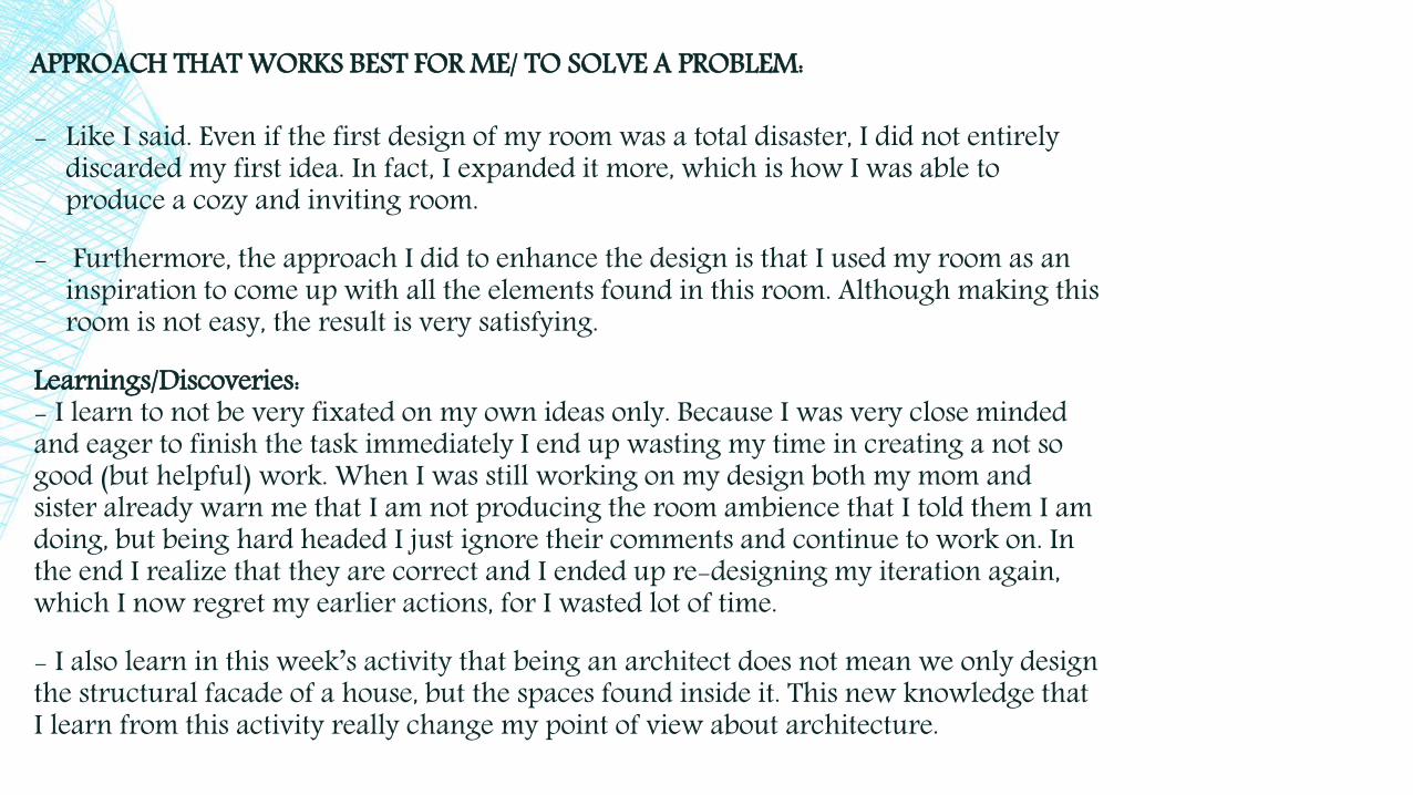
- Like I said. Even if the first design of my room was a total disaster, I did not entirely discarded my first idea. In fact, I expanded it more, which is how I was able to produce a cozy and inviting room.
- Furthermore, the approach I did to enhance the design is that I used my room as an inspiration to come up with all the elements found in this room. Although making this room is not easy, the result is very satisfying.
Learnings/Discoveries:- I learn to not be very fixated on my own ideas only. Because I was very close minded and eager to finish the task immediately I end up wasting my time in creating a not so good (but helpful) work. When I was still working on my design both my mom and sister already warn me that I am not producing the room ambience that I told them I am doing, but being hard headed I just ignore their comments and continue to work on. In the end I realize that they are correct and I ended up re-designing my iteration again, which I now regret my earlier actions, for I wasted lot of time.
- I also learn in this week’s activity that being an architect does not mean we only design the structural facade of a house, but the spaces found inside it. This new knowledge that I learn from this activity really change my point of view about architecture.

THOUGHT PROVOKING, AND MYSTERIOUS

▪ Strengths:- I was successful in creating a mysterious yet thought provoking structure. The design show
the thought provoking and mysterious experience because the inspiration of this room is the library.
- The design is inventive and playful, yet believable. There is structural stability and integrity. And the elements in the room enhance the preferred ambience, which are mysterious and thought provoking.
▪ Weaknesses:- The problem of this design is that, its too mysterious that it almost feel gloomy. Seeing my
finished product, I notice that I was very focused on the two requirement that I forgot to make it a cheerful yet mysterious design.
- The color scheme makes the atmosphere of the room seems depressing. And it looks, based on my observation, unwelcoming.
APPROACH THAT WORKS BEST FOR ME/ TO SOLVE A PROBLEM:
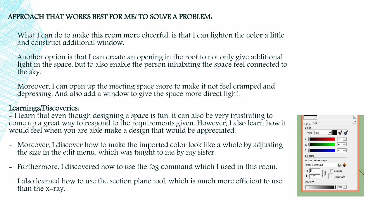
- What I can do to make this room more cheerful, is that I can lighten the color a little and construct additional window.
- Another option is that I can create an opening in the roof to not only give additional light in the space, but to also enable the person inhabiting the space feel connected to the sky.
- Moreover, I can open up the meeting space more to make it not feel cramped and depressing. And also add a window to give the space more direct light.
Learnings/Discoveries:- I learn that even though designing a space is fun, it can also be very frustrating to come up a great way to respond to the requirements given. However, I also learn how it would feel when you are able make a design that would be appreciated.- Moreover, I discover how to make the imported color look like a whole by adjusting
the size in the edit menu, which was taught to me by my sister.- Furthermore, I discovered how to use the fog command which I used in this room.- I also learned how to use the section plane tool, which is much more efficient to use
than the x-ray.
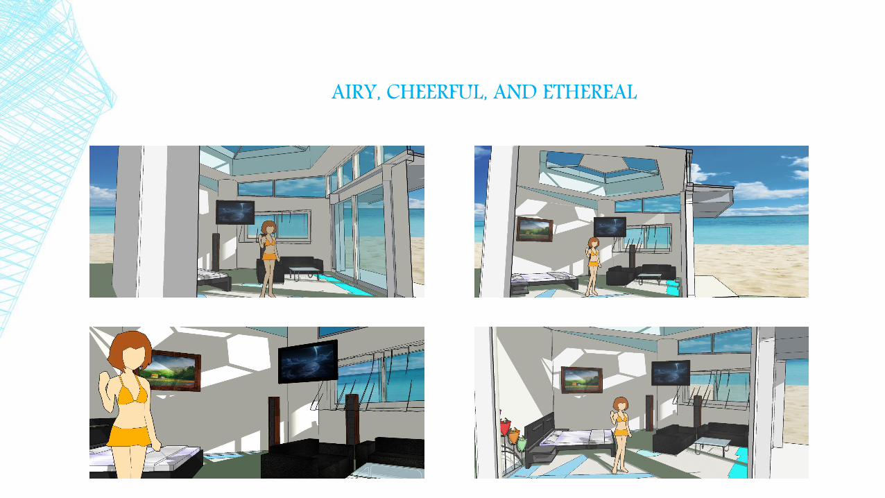
AIRY, CHEERFUL, AND ETHEREAL
▪ Strengths:- The strength of this room is that I was able meet all the requirements needed. I was able to
portray the cheerful, airy, and ethereal ambience in the image.- The light and shadow manipulation really enhance the space. And the imported
background work well with the interior space of the room.- Having more negative space in this room increases the ethereal and airy feeling of the
space.Weaknesses:- Before, I have a problem in finding the right angle to capture a good image that can relax
the audience when seeing it.

APPROACH THAT WORKS BEST FOR ME/ TO SOLVE A PROBLEM:
- I approach this problem by looking at images that emits the required aura of the room, which is breezy, and calming.
- Even though I am already comfortable using almost all the tools taught to us in class, I should still continue it to make it even more easier for me to use.
Learnings/Discoveries:- In this week’s activity I learn that despite me knowing how to use the materials, I still make mistake sometimes.
- I also learned how important it is to make a connection to both the interior spaces and the outer spaces to improve my work even better.

MEDITATIVE, CHICK, AND SOPHISTICATED
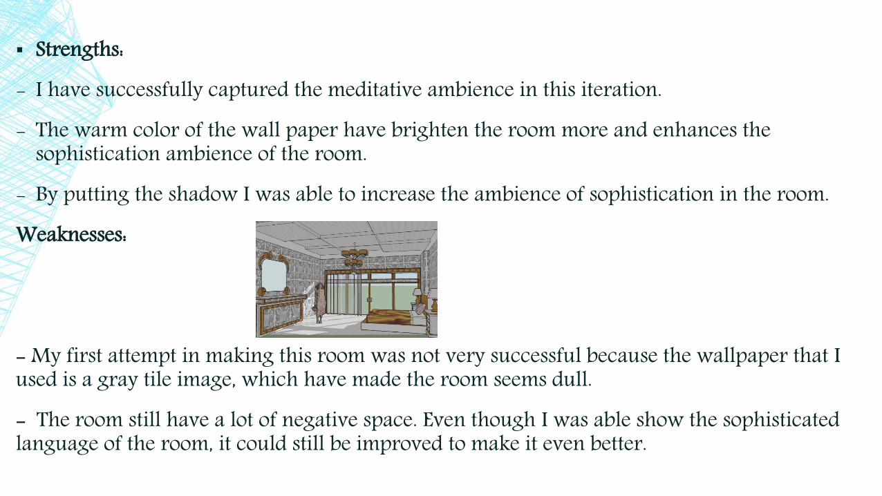
▪ Strengths:- I have successfully captured the meditative ambience in this iteration.- The warm color of the wall paper have brighten the room more and enhances the
sophistication ambience of the room.- By putting the shadow I was able to increase the ambience of sophistication in the room.Weaknesses:
- My first attempt in making this room was not very successful because the wallpaper that I used is a gray tile image, which have made the room seems dull.- The room still have a lot of negative space. Even though I was able show the sophisticated language of the room, it could still be improved to make it even better.

APPROACH THAT WORKS BEST FOR ME TO SOLVE A PROBLEM:
- To solve the dullness of the room, I experimented a lot of color in the background, and found out that warm color works best with my design. Now it is more bright and cheerful compare to the last one.
- Moreover, the room seems a little bare because of all the negative spaces in it. So, maybe I can add a little more elements to make develop it more.
Learnings/Discoveries:- I learned that designing a space is not very easy as I thought it would be in the beginning. I now found out how there are a lot of endless approaches I can do to meet the requirement, at the same time produce an awe inspiring result.
- I also learned that a chick design room does not necessarily need to be pink. By experimentation, I was able to find another alternative to produce a chick ambience, using the right home materials.
- I learned that to produce a successful space I must manipulate the dimensions of the room, use the appropriate color palette, and use the right furniture that correlates with the atmosphere of the room.
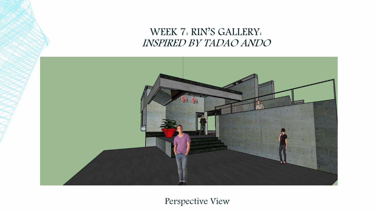
WEEK 7: RIN’S GALLERY: INSPIRED BY TADAO ANDO
Perspective View
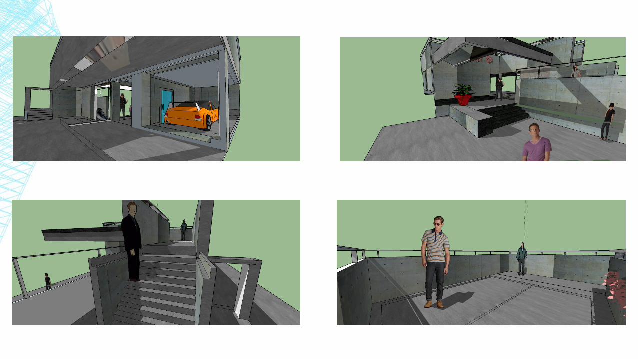
▪ Strengths:- Successfully constructed the Rin’s Gallery image into a realistic structure. - I was able to closely perfected the color of the structure to the original image.- The cantilevered roof added a great complexity to the structure.Weaknesses:- Some of the elements might not be structurally correct.- If there was still more time, I could have evolve it more into an interesting space.- Some of the space does not converse in harmony with the whole structure, such as the
balcony and the parking space.

APPROACH THAT WORKS BEST FOR ME/ TO SOLVE A PROBLEM:
- Truthfully, I have a lot of trouble in constructing a continued structure using the Rin’sGallery image. However, applying all the things that I learned in the class, I was able to construct this fine structure.
- There are a lot of uninteresting spaces in the structure. If I have manage my time properly I would have refine the structure more, and be open to new ideas in constructing the image into reality.
- For the spaces that don’t coincide with the structure, I would have produce of a more better use of the space rather than leaving it bear.
Learnings/Discoveries:
- Doing this activity, I learned how to create a design that have a proper perspective and proportions. - I really find this activity challenging because unlike Malevich’s image, which only test the
students creativity, this iteration made realize how important perspective is in creating a great structure.
- I also discovered how fun it is to be able to create a new work just by importing an image. - This made me realize how awesome Sketch up really is because with its help I learn how
to be open minded in a lot of things when it comes to designing.

FINAL PROJECT
Perspective View

Orthographic Projection
Top
Right Front Left Back

INTERIOR:

▪ Strengths:- I was able to reproduce the cabin with almost precise details.- I was able to apply every tool that we use from the beginning of the semester and some of
my discoveries.- Moreover, this final project shows how much I evolve since the very first dog house.- Was able to apply all the accumulated knowledge that I learned through out the class.- Also, I was able to successfully apply the drape tool all by myself.Weakness/ Approach to solve the problem:- I encounter a problem in making the stairs in the back because its hard to get a face.
However, luckily my sister knows how to solve my problem, which she taught me in detailed steps. Thus, I was able to create my stairs.
Learnings/Discoveries:
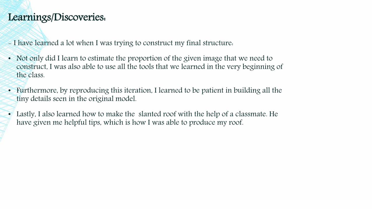
- I have learned a lot when I was trying to construct my final structure:
• Not only did I learn to estimate the proportion of the given image that we need to construct, I was also able to use all the tools that we learned in the very beginning of the class.
• Furthermore, by reproducing this iteration, I learned to be patient in building all the tiny details seen in the original model.
• Lastly, I also learned how to make the slanted roof with the help of a classmate. He have given me helpful tips, which is how I was able to produce my roof.
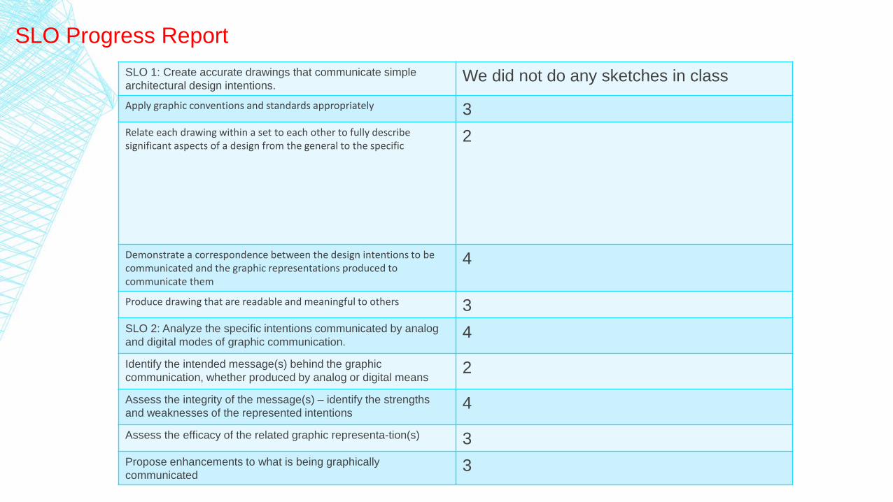
SLO 1: Create accurate drawings that communicate simple
architectural design intentions. We did not do any sketches in class
Apply graphic conventions and standards appropriately 3
Relate each drawing within a set to each other to fully describe significant aspects of a design from the general to the specific
2
Demonstrate a correspondence between the design intentions to be communicated and the graphic representations produced to communicate them
4
Produce drawing that are readable and meaningful to others 3
SLO 2: Analyze the specific intentions communicated by analog
and digital modes of graphic communication. 4
Identify the intended message(s) behind the graphic
communication, whether produced by analog or digital means 2
Assess the integrity of the message(s) – identify the strengths
and weaknesses of the represented intentions 4
Assess the efficacy of the related graphic representa-tion(s) 3
Propose enhancements to what is being graphically
communicated 3
SLO Progress Report

SLO 3: Apply use of scales, line quality, graphic conventions, and
drawing systems and techniques. 4
Create clear and appropriately ordered hierarchies of visual
information 2
Compose elements of a drawing in a clear organized manner that
relates visual information on each drawing and between sets of
related drawings
1
SLO 4: Demonstrate an understanding of the purposes of various
architectural graphic techniques. 2
Identify the similarities and differences between:
Orthographic projections: plan, section, elevations, and
details
4
Paraline drawing: isometric and oblique3
Perspective drawing: 1-, 2- and 3-point1
Compare and contrast the graphic systems describe directly
above2
Demonstrate an integrated use of analog and digital tools in the
process of developing a set of design intentions4
SLO Progress Report – continued

RHINO SEQUENCE

(RHINO) TABLE OF CONTENT:
Week 1:
- Pear exercise(sweep) …… 64
- Chosen Pattern + Hand Drawings…………… 65
- 1st pattern iteration…….... 66-67
Week 2:
- Chair exercise…………….. 68
- Array exercise…………….. 69
- 2nd pattern iteration…… 70
Week 3:- Bottle exercise …………….. 71- Shoe exercise………………. 72- Final pattern iteration …. 73-74- Introduction to Fruit
Morphology Project(Control point exercise).. 75-76
Week 4:- Bracelet exercise (Flow curve). 77- Flow surf and surface tool
exercise………………………………... 78- Helix and Spiral exercise……… 79- 1st iteration Fruit Morphology. 80
Week 5:- Duck exercise…………………….. 81-82- Field Trip………………………...…. 83-84- 2nd iteration Fruit
Morphology……… 85-86
Week 6:- Boat exercise……………………….. 87- Turtle Boy exercise………….. 88-89- 3rd iteration Fruit Morphology. 90
Week 7:- Cutting Plane……….. 91- 4th iteration Fruit
Morphology…………. 92- 5th iteration Fruit
Morphology………… 93- 1st &2nd Layout……. 94
Week 8:- Rail Revolve exercise. 95- Final iteration………. 96- Inverse image………. 97- 3rd Layout……………. 98- Final layout………….… 99

WEEK 1: GETTING STARTED TO RHINO
▪ Pear Exercise (Sweep)
- In this pear design I was able to practice the sweep and loft tool. (I was happy because I now remember using these two tools).
- The strength of this design is the interesting negative spaces it have.
- Moreover, despite looking simple, I was able to apply all the tools that we have tackled in class activity. But I am still having trouble with the rotate tool.
- Also because of the different effects that the rhino have, I was able to create a pear that look like its bone is being peel off of it.
- Furthermore, because of the Rhino effect, it makes my design look complex. I never knew that the loft elements that I added in the structure made it look like my pear structure had skeleton.
- Thus, I am very happy with my pear design outcome.
WEEK 1: GETTING STARTED TO RHINO
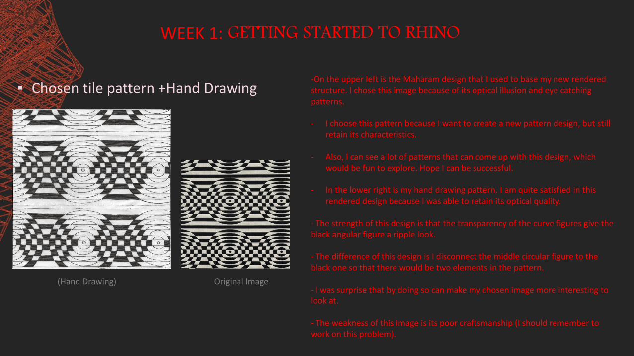
▪ Chosen tile pattern +Hand Drawing -On the upper left is the Maharam design that I used to base my new rendered structure. I chose this image because of its optical illusion and eye catching patterns.
- I choose this pattern because I want to create a new pattern design, but still retain its characteristics.
- Also, I can see a lot of patterns that can come up with this design, which would be fun to explore. Hope I can be successful.
- In the lower right is my hand drawing pattern. I am quite satisfied in this rendered design because I was able to retain its optical quality.
- The strength of this design is that the transparency of the curve figures give the black angular figure a ripple look.
- The difference of this design is I disconnect the middle circular figure to the black one so that there would be two elements in the pattern.
- I was surprise that by doing so can make my chosen image more interesting to look at.
- The weakness of this image is its poor craftsmanship (I should remember to work on this problem).
(Hand Drawing) Original Image

FIRST PATTERN ITERATION

WEEK 1: GETTING STARTED TO RHINO
▪ 1st Pattern Iteration
- This is the patterns I come up with using my interpretation sketch of the Maharam image.
- To come up with this pattern I used the split, move, sweep, layering, copy (a lot), and bubblegum tools.
- But despite my success in applying the new tools that I learned, I still encounter a lot of difficulty using Rhino to create this pattern because it is very easy to forget how to use the tools, with only two days of not touching the Rhino.
- Moreover, I found out that this software is much more difficult to handle than sketch-up; and constant practice is the only way to familiarize this software.
- I was not also able to use the rotation and network because I forgot how to do them. Even when I have the step by step process on my notes, I still have difficulties using the tools.
- Moreover, in the upper image I tried to select some patterns to get some inspiration. Sadly it did not help me at all, but the end result can be a new design in itself.
- The weakness of this design is its too plain. So maybe I can play with this pattern some more to see if I can find new inspiration.

WEEK 2: RHINO PRACTICE EXERCISE
▪ Chair Exercise -In this activity I practiced the commands that we did in class; such as, the pipe, mirror, fillet curve, osnap, and ortho. Moreover, I have fun using the cplanes because after knowing how it work it help me a lot in finishing this activity.
- I also included old commands that we learn in the pear activity in order to create my chair with a pillow. I used the curve from cross section profile to create the yellow pillow and the cloth in my chair. And I used loft and planar curve to close open curves.
- In addition, I learn to use extrude, which is how I was able to create the black bottom structure of my chair. I also played around with the colors; like the green lights, it is just lines with a lighter color of green to create this effect like its glowing.
- The strengths of this activity for me is its color scheme and the bottom structure really made the chair comfortable to sit on.
- The weakness of this design is its not really realistically structured. And I just added new elements in the chair which is why the original is still visible.
- Also, another weakness I encounter creating this iteration is my control of using rhino. Because I am still a beginner in this software, I keep on forgetting to turn off the osnap and grid snap, which messes me up.
- Overall, I like this activity and I have enjoy building it.
WEEK 2: RHINO PRACTICE EXERCISE
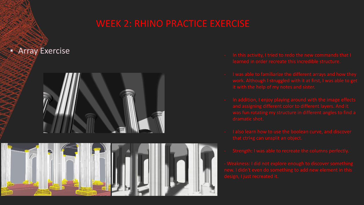
▪ Array Exercise - In this activity, I tried to redo the new commands that I
learned in order recreate this incredible structure.
- I was able to familiarize the different arrays and how they work. Although I struggled with it at first, I was able to get it with the help of my notes and sister.
- In addition, I enjoy playing around with the image effects and assigning different color to different layers. And it was fun rotating my structure in different angles to find a dramatic shot.
- I also learn how to use the boolean curve, and discover that ctrl+g can unsplit an object.
- Strength: I was able to recreate the columns perfectly.
- Weakness: I did not explore enough to discover something new. I didn't even do something to add new element in this design, I just recreated it.
WEEK 2: RHINO PRACTICE EXERCISE
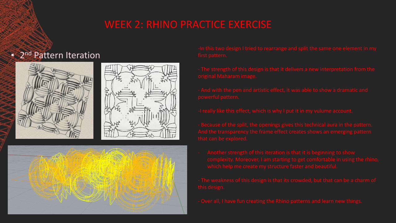
▪ 2nd Pattern Iteration -In this two design I tried to rearrange and split the same one element in my first pattern.
- The strength of this design is that it delivers a new interpretation from the original Maharam image.
- And with the pen and artistic effect, it was able to show a dramatic and powerful pattern.
-I really like this effect, which is why I put it in my vulume account.
- Because of the split, the openings gives this technical aura in the pattern. And the transparency the frame effect creates shows an emerging pattern that can be explored.
- Another strength of this iteration is that it is beginning to show complexity. Moreover, I am starting to get comfortable in using the rhino, which help me create my structure faster and beautiful.
- The weakness of this design is that its crowded, but that can be a charm of this design.
- Over all, I have fun creating the Rhino patterns and learn new things.

WEEK 3: FINISHING PATTERN ITERATION + STARTING FINAL PROJECT
▪ Bottle Exercise- In this iteration I learn how to use the sweep 2, offset, loft, extract
isocurve, extrude curve tapered, and cap.
- I also discovered how to use stretch, which I applied to the mug and the transparent canister. Furthermore, I used the gumball to manipulate some of the shapes of the bottle. Such as, the thin and longer bottles.
- Moreover, I was playing around in creating different transformation from the original bottle to not only practice the new command, but to see if I can create other type of bottles by applying the commands that I recently know.
- The strength of this structure is that I was able to use the commands that I learn to create this different variation from the original bottle that we build in class.
- I also learn about how to make an object transparent and glossy.
- The weakness is that these are just random shapes.

WEEK 3: FINISHING PATTERN ITERATION + STARTING FINAL PROJECT
▪ Shoe Exercise
- I really like this shoe iteration because I was able to think critically in order to create this simple shoe. In order to finished this iteration I tried to used all my previous knowledge of the commands and applied it.
- I have a lot of trial and error just to finish this iteration. I also discover the control points, which is how I was able to create the fold in my shoe.
- Furthermore, I also found out about the gloss command, which is how I was able to make the shoe looks shiny.
- Thus, I have fun in creating this design

Final Pattern Iteration

WEEK 3: FINISHING PATTERN ITERATION + STARTING FINAL PROJECT
▪ Final Pattern Iteration
- By eliminating some of the elements in the center, I was able to take away the messy nature of my previous design. And by adding new elements using the loft, extract isocurve, and pipe, I was able to create this structure.
- Furthermore, I like this image because the transparency and gloss of the background created this optical illusion that looks like the black curve have a lens when in fact there is none.
- I also love the outcome of this pattern iteration because I was able to create something new with the messy pattern that I post last time.
- The strength of this iteration is that I was able use the effects and capture angles as my advantage to create this dramatic technical shots.
- In addition, I am happy with this final iteration because I was able to retain my original image’s optical characteristic, despite having a new transformation.
- The weakness of this design is that it can still be improve.

WEEK 3: FINISHING PATTERN ITERATION + STARTING FINAL PROJECT
▪ Introduction to Fruit Morphology
This is a banana flower:
- I chose this vegetable as my basis for the fruit morphology because inside this has a complex pattern that I can use and manipulate for the project.
- I chose these drawing because its patterns is not very simple and complex, which is a good start to trace in rhino.
- I also chose this image because I can fill some of the negative space and make it a solid. I can, maybe, use array and see what I come create.

OTHER HAND SKETCHES:

WEEK 4: INTRODUCTION TO THE FINAL PROJECT
▪ Bracelet Exercise (Flow Curve)
- This is one of my best image because the inter lapping surfaces in the black bracelet make it look like it is sparkling every time I move the screen.
- I Also like how the spiraling pipe in the red-black bracelet add more complexity to its black base.
- the commands that I use to create this designs are loft, extrude curve, color manipulation, spiral, and pipe.
WEEK 4: INTRODUCTION TO THE FINAL PROJECT
▪ Flow Surf Exercise + Surface Tools
Exercise
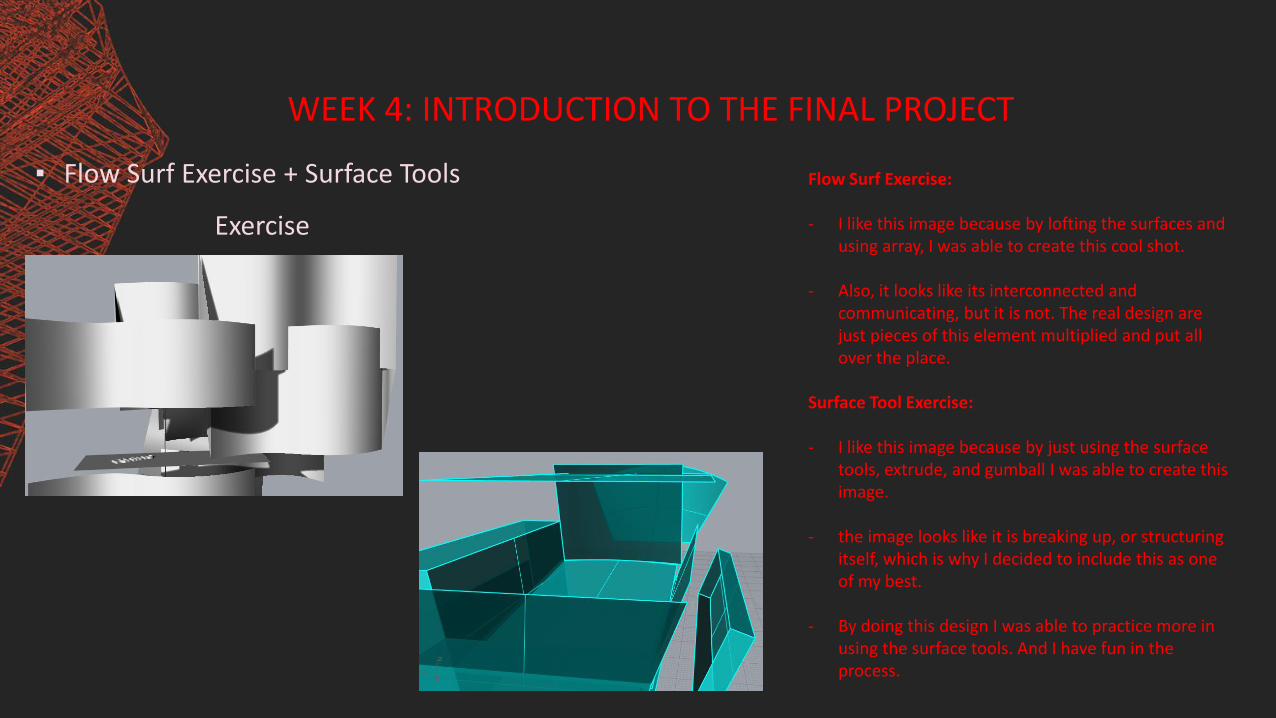
Flow Surf Exercise:
- I like this image because by lofting the surfaces and using array, I was able to create this cool shot.
- Also, it looks like its interconnected and communicating, but it is not. The real design are just pieces of this element multiplied and put all over the place.
Surface Tool Exercise:
- I like this image because by just using the surface tools, extrude, and gumball I was able to create this image.
- the image looks like it is breaking up, or structuring itself, which is why I decided to include this as one of my best.
- By doing this design I was able to practice more in using the surface tools. And I have fun in the process.

WEEK 4: INTRODUCTION TO THE FINAL PROJECT
▪ Helix and Spiral Exercise
- In this iteration I was able to learn how to use the drape, helix and spiral tool.
- When I first tried to redo the spiral and helix tool, it is difficult for me to do it because I keep on forgetting how to operate these tools properly, especially the helix tool.
- However in this iteration I was able to create this colorful structure by using the helix tool and incorporating the Rail sweep in order to create this braiding shapes.
- Also, I was able to come across drape, which is like the blanket covering the structure. Even though I used this tool to become the syrup of my structure, I now found out that I should have used this tool on my duck exercise. By using this tool, I could have easily created the flowing water.
- The strength of this activity is that I was able to discover new tool that I can incorporate to my final Fruit Morphology.
- I also learned how to use the ribbon, which might be the missing element I need to improve my final project.
- Therefore, doing this activity had been insightful for me and this new knowledge can help me improve my final work.

WEEK 4: INTRODUCTION TO THE FINAL PROJECT
▪ 1st iteration Fruit Morphology
- What I did is trace my chosen image using isocurve, then manipulated it in order to come up with this finish product.
- Other commands that I used are planar curve, extrude, pipe, extract isocurve, array, and gumball.
- I also chose this color to represent the color of my chosen vegetable, which was the banana flower. Although I tried to add the original color of the vegetable without looking childish, I was not very successful in doing so.
- However, for my first try, I am satisfied with what I finish. Although it still need a lot more improvements.

DUCK ACTIVITY
Three Best Duck Activity Image
WEEK 5: CONTINUATION TO FINAL PROJECT
▪ Duck Exercise
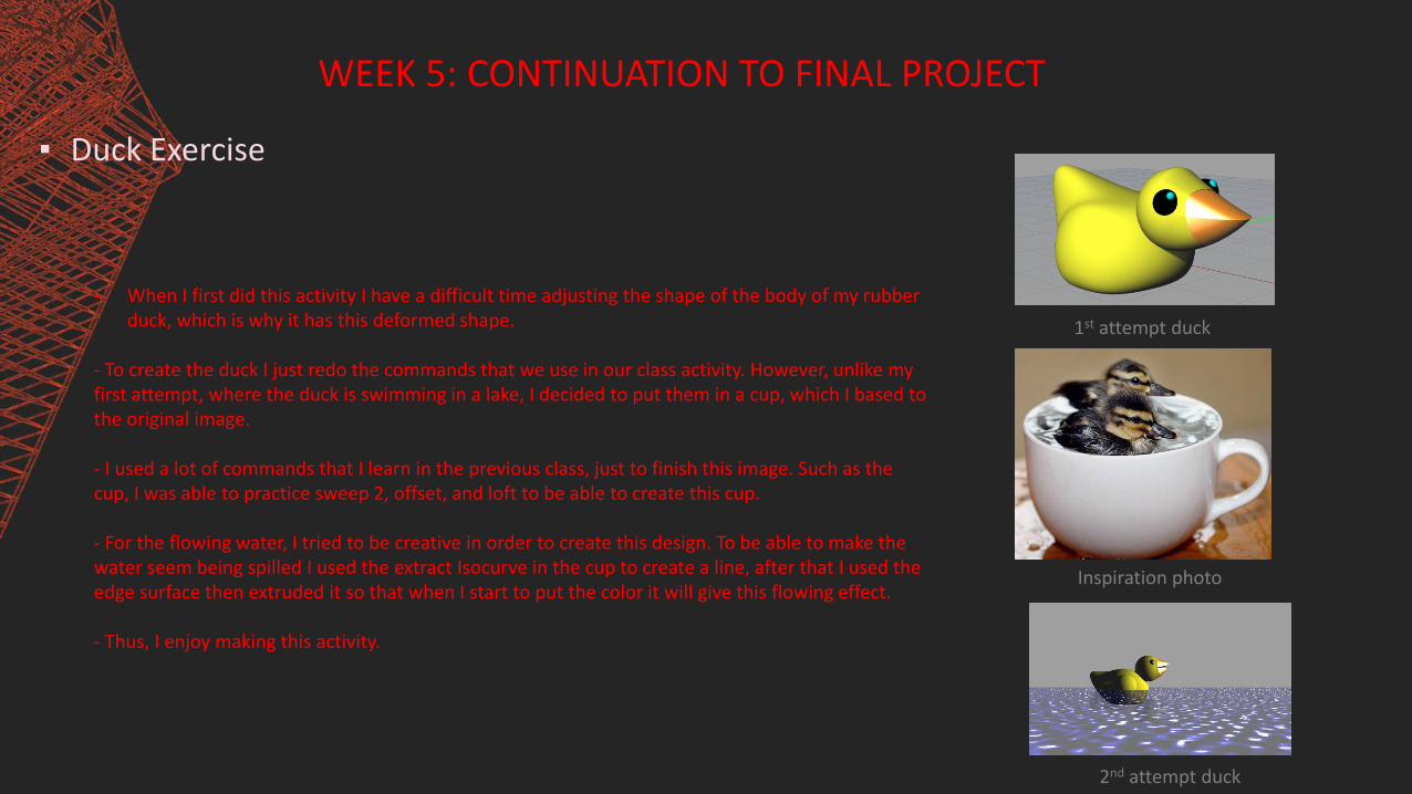
- When I first did this activity I have a difficult time adjusting the shape of the body of my rubber duck, which is why it has this deformed shape.
- To create the duck I just redo the commands that we use in our class activity. However, unlike my first attempt, where the duck is swimming in a lake, I decided to put them in a cup, which I based to the original image.
- I used a lot of commands that I learn in the previous class, just to finish this image. Such as the cup, I was able to practice sweep 2, offset, and loft to be able to create this cup.
- For the flowing water, I tried to be creative in order to create this design. To be able to make the water seem being spilled I used the extract Isocurve in the cup to create a line, after that I used the edge surface then extruded it so that when I start to put the color it will give this flowing effect.
- Thus, I enjoy making this activity.
1st attempt duck
Inspiration photo
2nd attempt duck
FIELD TRIP
WEEK 5: CONTINUATION TO FINAL PROJECT
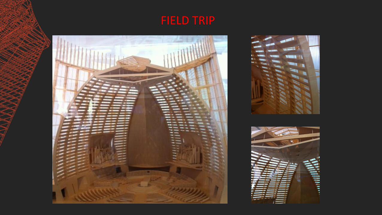
▪ Field Trip
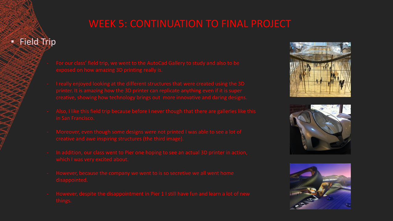
- For our class’ field trip, we went to the AutoCad Gallery to study and also to be exposed on how amazing 3D printing really is.
- I really enjoyed looking at the different structures that were created using the 3D printer. It is amazing how the 3D printer can replicate anything even if it is super creative, showing how technology brings out more innovative and daring designs.
- Also, I like this field trip because before I never though that there are galleries like this in San Francisco.
- Moreover, even though some designs were not printed I was able to see a lot of creative and awe inspiring structures (the third image).
- In addition, our class went to Pier one hoping to see an actual 3D printer in action, which I was very excited about.
- However, because the company we went to is so secretive we all went home disappointed.
- However, despite the disappointment in Pier 1 I still have fun and learn a lot of new things.
WEEK 5: CONTINUATION TO FINAL PROJECT
▪ 2nd Fruit Morphology Iteration
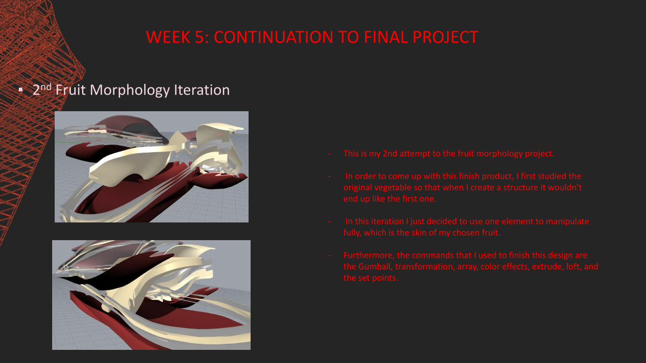
- This is my 2nd attempt to the fruit morphology project.
- In order to come up with this finish product, I first studied the original vegetable so that when I create a structure it wouldn't end up like the first one.
- In this iteration I just decided to use one element to manipulate fully, which is the skin of my chosen fruit.
- Furthermore, the commands that I used to finish this design are the Gumball, transformation, array, color effects, extrude, loft, and the set points.

Continuation:
- The strength of this design is that it is more structural looking and less literal, unlike my first attempt.
- Also, the color coordination is much better. For in order for me to come up with this finish product I decided to integrate the elements that mostly gotten my attention when examining the banana flower, which were the color of its outer skin,
inner pulp, and the slimy jell surrounding it.
Inspiration image
WEEK 6: CONTINUATION TO FINAL PROJECT 2
▪ Boat Exercise
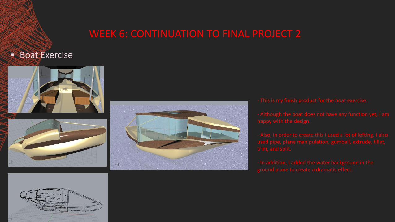
- This is my finish product for the boat exercise.
- Although the boat does not have any function yet, I am happy with the design.
- Also, in order to create this I used a lot of lofting. I also used pipe, plane manipulation, gumball, extrude, fillet, trim, and split.
- In addition, I added the water background in the ground plane to create a dramatic effect.

WEEK 6: CONTINUATION TO FINAL PROJECT 2
▪ Turtle Boy Exercise
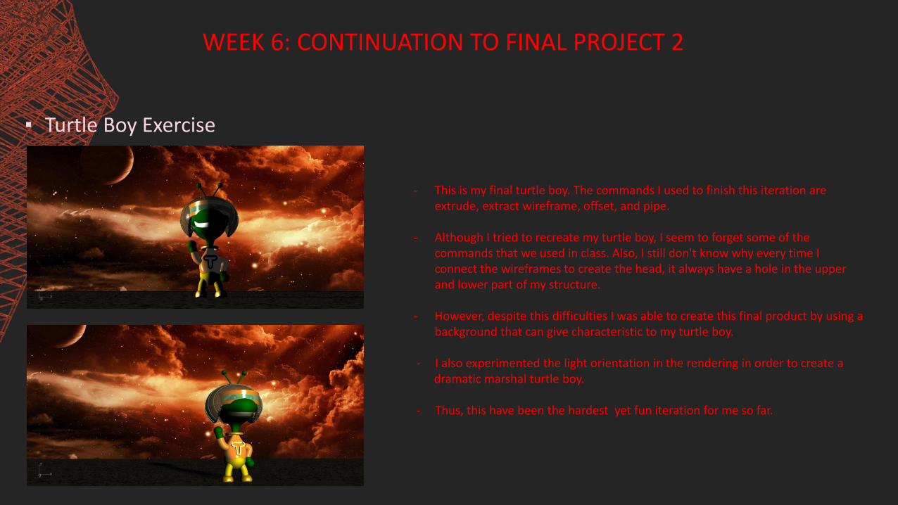
- This is my final turtle boy. The commands I used to finish this iteration are extrude, extract wireframe, offset, and pipe.
- Although I tried to recreate my turtle boy, I seem to forget some of the commands that we used in class. Also, I still don't know why every time I connect the wireframes to create the head, it always have a hole in the upper and lower part of my structure.
- However, despite this difficulties I was able to create this final product by using a background that can give characteristic to my turtle boy.
- I also experimented the light orientation in the rendering in order to create a dramatic marshal turtle boy.
- Thus, this have been the hardest yet fun iteration for me so far.

WEEK 6: CONTINUATION TO FINAL PROJECT 2
▪ 3rd Fruit Morphology Iteration - What inspire me to create this end result is the recent form of my decaying vegetable. As I was studying the vegetable that I decayed, I discover that for the long time it was staying in the plate some of its string leaves began to swirl, and the outside shell opened and show a little bit of the flower it have.
- So by integrating my findings, I created this vertical element to represent the peeling shell of the banana flower. And the piped element inside represents the flower.
- I also copy and rotate my second iteration and tried to tweak it using gumball. Moreover, my sister also taught me how to use the extract wireframe command, which help me create the structure of my design.
- Although I was able to further transform this iteration, I feel like I am beginning to ran out of ideas on how to fully developed this design into a much more interesting and realistic architecture.
- Moreover, I don't have any idea on how I can integrate the recent commands that I learned.
- Thus, I still have a long way to go in terms of this iteration.

WEEK 7: CONTINUATION TO FINAL PROJECT 3
▪ Cutting Plane Exercise
- In this three different perspectives of the sectioned spaceship I was trying to see what might it be like inside the ship. And what can the pilot see inside.
- I also added the chair in the back implying that I would be the third passenger.
- Moreover, by doing this iteration I was able practice sectioning, which can be very helpful for my final morphology iteration.
- The strength in doing this activity is that I got to redo some of the commands I learned before to create the chair. And I was amaze at what rhino can do.
- The weakness of this activity is that I just spent my time playing with the clipping plane. I should have also tried to explore more in improving this spaceship.
WEEK 7: CONTINUATION TO FINAL PROJECT 3
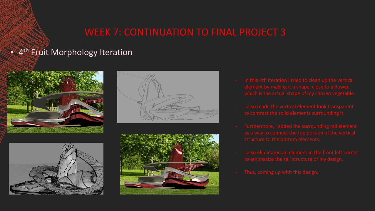
▪ 4th Fruit Morphology Iteration
- In this 4th iteration I tried to clean up the vertical element by making it a shape close to a flower, which is the actual shape of my chosen vegetable.
- I also made the vertical element look transparent to contrast the solid elements surrounding it.
- Furthermore, I added the surrounding rail element as a way to connect the top portion of the vertical structure to the bottom elements.
- I also eliminated an element in the front left corner to emphasize the rail structure of my design.
- Thus, coming up with this design.
WEEK 7: CONTINUATION TO FINAL PROJECT 3
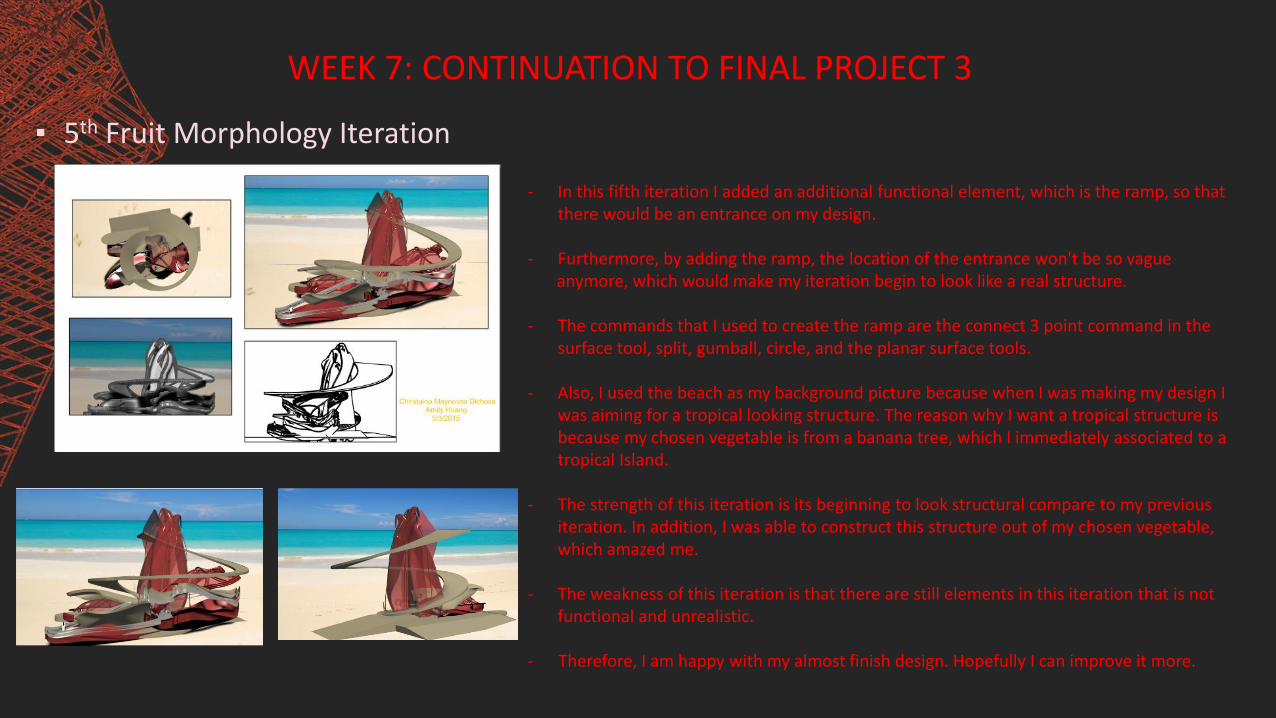
▪ 5th Fruit Morphology Iteration
- In this fifth iteration I added an additional functional element, which is the ramp, so that there would be an entrance on my design.
- Furthermore, by adding the ramp, the location of the entrance won't be so vague anymore, which would make my iteration begin to look like a real structure.
- The commands that I used to create the ramp are the connect 3 point command in the surface tool, split, gumball, circle, and the planar surface tools.
- Also, I used the beach as my background picture because when I was making my design I was aiming for a tropical looking structure. The reason why I want a tropical structure is because my chosen vegetable is from a banana tree, which I immediately associated to a tropical Island.
- The strength of this iteration is its beginning to look structural compare to my previous iteration. In addition, I was able to construct this structure out of my chosen vegetable, which amazed me.
- The weakness of this iteration is that there are still elements in this iteration that is not functional and unrealistic.
- Therefore, I am happy with my almost finish design. Hopefully I can improve it more.

WEEK 8: FINAL PROJECT AND LAYOUT
▪ 1st and 2nd Layout Attempt - These two images are my first and second attempt in making a layout image.
- Having no knowledge on how to create a layout, creating these images have been difficult for me. At first I just thought that I should just need to put my progress image.
- However, I now learn that every image that I put in my layout should have a purpose. Also there should be hierarchy in the image so that when people look at my image their eyes should flow to the important part of the layout.
- The strength of this image is that I was able to unconsciously apply some important characteristics to create a good layout. Such as hierarchy and repetition.
- The weakness of these layout is that the way I put the images doesn’t have any intention. The upper left image is just all over the page, while the lower right image are all just equal.
- Another problem of these layouts are that the image style doesn’t correlate with one another.

WEEK 8: FINAL PROJECT AND LAYOUT
Rail Revolve Activity
- This is what I have created using the Rail Revolve tool. I was very happy when we did this activity in class because when I attempted using this command at home I didn’t know how to make it work, which is why I wasn’t able to use the rail revolve on my final iteration.
- If I was able to use this, I would have improve my final design.
- In addition, the concept of this design was supposed to be a sun being enveloped by the freezing ice. However, as I was playing around it some more, the design become more like a flower than a sun.
- The strength of this design is that every time I use different program effects in this design I also got a more interesting outcome, like it is three different iteration.
- The weakness is that I did not try integrating other tools to make this design a little bit complex, which would have been fun.
- Thus, over all I really like learning this activity. And enjoy coming up with a deign using the rail revolve tool.

WEEK 8: FINAL PROJECT AND LAYOUT
▪ Final Fruit Morphology Iteration - In this final iteration of my Fruit Morphology project, I only did
some minor fixes because I don’t want my design to be overly complex, since having simplicity is one characteristic of a good structure.
- I only played around with the transparency and color scheme of the vertical element to emphasize its presence in my structure. For by making the color more transparent and lighter it help make the structure look more futuristic.
- Moreover, by differentiating the color of the vertical structure to the horizontal ones, I was able to meet on of my goal, which is to make the jell like structure be the eye catching part of the finish product.
- I did this because when I was studying my vegetable when it was freshly cut the first thing that I notice is its gelatin like liquid that is covering the fruit, wanting to share that feeling I created the vertical structure.
WEEK 8: FINAL PROJECT AND LAYOUT
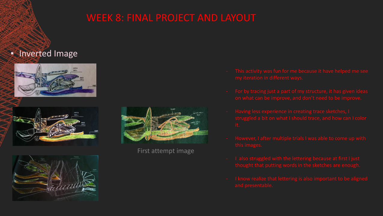
▪ Inverted Image
- This activity was fun for me because it have helped me see my iteration in different ways.
- For by tracing just a part of my structure, it has given ideas on what can be improve, and don’t need to be improve.
- Having less experience in creating trace sketches, I struggled a bit on what I should trace, and how can I color it.
- However, I after multiple trials I was able to come up with this images.
- I also struggled with the lettering because at first I just thought that putting words in the sketches are enough.
- I know realize that lettering is also important to be aligned and presentable.
First attempt image

WEEK 8: FINAL PROJECT AND LAYOUT
▪ Third attempt Layouts
- This is my third attempt in creating the layout of my final project. Doing this layout, I notice that it was still crowded and there are still no emphasis on some of my images, which is similar to the problem of my first and second layout.
- Although the images that I used already have a concept as to why I included it in the page, it still end up looking crowded and symmetrical.
- Because by me wanting to include everything that I did in class, I ended up forgetting about emphasis and simplicity.
- Also I struggle in choosing which image is best to include in the layout, and even if I tried to create emphasis in the layout size it still keeps on becoming symmetrical.
- Moreover, the concept of the page is still unclear, and there is no relationship in the pages of my layouts, which I should really be including to my final layout attempt.

WEEK 8: FINAL PROJECT AND LAYOUT
▪ Final Layouts
- I am happy with my final layout because I was able to improve it compare to my last three attempts.
- Although they are still not perfect, I was able to clearly present my ideas to the audience.
- I never thought that I will be able to improve this much. With the help of professor Amily and Jerry, I was able to organize the pages that I need to present to class and other people.
- Also, I am happy with the comments and feedbacks given to me in class because I was able to see some problems others see that I don’t.
- However, even though I am happy with my layout structure I still need to increase my confident in terms of presenting in front.
- Because even when I want to speak more, I always get tonged tied and nervous in front of people. So even if I want to elaborate further the concept of my final project I was not able to do so.
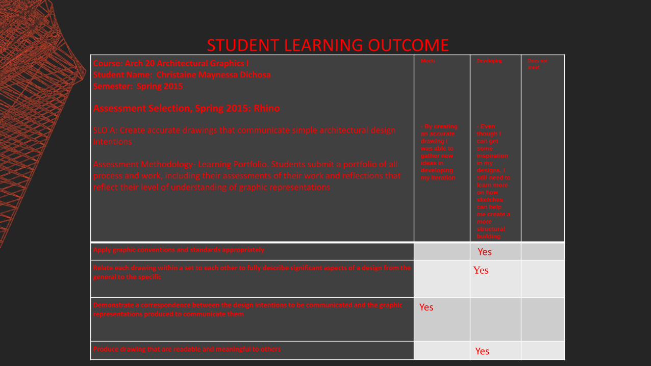
STUDENT LEARNING OUTCOMECourse: Arch 20 Architectural Graphics IStudent Name: Christaine Maynessa DichosaSemester: Spring 2015
Assessment Selection, Spring 2015: Rhino
SLO A: Create accurate drawings that communicate simple architectural design intentions
Assessment Methodology- Learning Portfolio. Students submit a portfolio of all process and work, including their assessments of their work and reflections that reflect their level of understanding of graphic representations
Meets
- By creating
an accurate
drawing I
was able to
gather new
ideas in
developing
my iteration
Developing
- Even
though I
can get
some
inspiration
in my
designs, I
still need to
learn more
on how
sketches
can help
me create a
more
structural
building
Does not meet
Apply graphic conventions and standards appropriately Yes
Relate each drawing within a set to each other to fully describe significant aspects of a design from the general to the specific
Yes
Demonstrate a correspondence between the design intentions to be communicated and the graphic representations produced to communicate them
Yes
Produce drawing that are readable and meaningful to others Yes
CONCLUSIONThis class have really taught me a lot in using 3D sketch up and Rhino, which can
help me in the future. Raging from Orthographic plans, proper structuring and using the tools, I now know how to create a structure in 3D, which I never thought I would learn. I have to admit that the class is not easy and very time consuming, but with proper time management, practice, and positive thinking I am now able to produce great designs. Moreover, by taking this class I now understand that being an architect is much more complicated than what I think it to be. Now I know that architects does not design a building, but creating inspiring spaces, which could accommodate the people inhabiting inside.
I really have fun taking this class. Assessing my very first activities I realize that I really improved a lot since then. I now start to carefully evaluate what I need to do and at the same time practice to apply all the new information that I learn in class. Also Jerry and Amily’s feedbacks to my work, have helped me a lot in knowing my weakness and give helpful suggestions that I never thought before. Now, I am very happy of my growth. Therefore, with practice, positive and creative thinking, and time management I was able to survive this far.