Embed Size (px)
Citation preview
CSS Style Sheets—A Set of Rules
The appearance of web pages is largely dependent on the interpretation the client’s browser program
makes of the HTML tags, especially the paragraph and heading tags. Font properties can be semi‐
controlled within HTML with the FONT and BASEFONT tags, but their use is cumbersome.
Styles define appearance elements that override the default browser’s settings. Styles simplify coding
HTML pages and provide a simple method for implementing a style sheet. Styles can be used to control
the appearance of text, typography, color and background, and layout and provide more control than is
available in native HTML. A style consists of a rule composed of one or more selectors and one or more
pairs of property‐value.
CSS styles are best considered to be partners with HTML. Theoretically HTML is used to hold “content”,
text and images, and CSS is used to control the visual appearance. But there are some HTML elements
that cannot be reliably reproduced with CSS. New versions of the CSS standard try to remedy the gap,
but they are not ready for prime time.
This paper describes the standard. But be aware that different browsers implement CSS differently! Not
all features of the standard are operable in all browsers, and some features work differently than
specified. Because of this, test all styles for operability and consistency and design to degrade gracefully
in the browsers with which the site is expected to be viewed.
Contents
Elements of a Rule ................................................... 2 Comments............................................................. 2
Editing Rules ............................................................ 2 Selector Forms .......................................................... 2 General Notes....................................................... 3 Pseudo‐Element Examples ................................... 4
Application: How a Style is Applied.................... 4 Media.................................................................... 5 Applying Styles Conditionally ............................. 5
Methods of Incorporating Styles in HTML .......... 6 The Cascade, i.e., Precedence Rules ...................... 7 Specificity ............................................................. 7 Types of HTML Elements and the Inheritance
of Styles ........................................................... 7 Property Groups ...................................................... 8 Units .......................................................................... 8 Units and Resolution ........................................... 9 Choosing a Unit ................................................... 9 Scaling.................................................................. 9 Screen Sizes and Resolution............................... 10
Link Properties and Selectors............................... 11 Link Pseudo‐Class Selectors ............................... 11
Typeface Properties ............................................... 12
Which Fonts Can You Use? ...............................15 Font Family Stacks .............................................15
Typography Properties..........................................16 List Properties .........................................................17 Color & Background Properties ...........................19 Box Properties.........................................................20 Table Border Properties .........................................22 Layout & Positioning Properties ..........................23 Layer & Transparency Properties ........................27 Transparent Images ............................................28 Applying Transparency to HTML Elements......29
Interaction ...............................................................30 Special Techniques .................................................31 Layout Issues and Monitors ...............................31 Layout Techniques ..............................................32 Line Techniques ..................................................45 Border Techniques ..............................................45 Table Techniques.................................................45 Link Techniques ..................................................47 Image Techniques................................................49 Menu Techniques................................................50 Interaction Techniques........................................52
Bibliography & Resources .....................................52
3/19/2015 2:49:00 PM Page 1 of 53 Copyright 2000–2015 by Susan J. Dorey
CSS Style Sheets—A Set of Rules
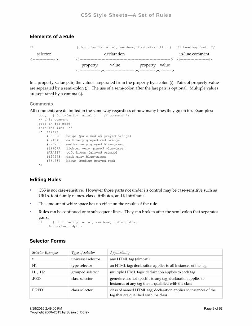
Elements of a Rule
H1 { font-family: arial, verdana; font-size: 14pt } /* heading font */
selector
< ‐‐‐‐‐‐‐‐‐‐‐‐‐‐‐‐ >
declaration in‐line comment
< ‐‐‐‐‐‐‐‐‐‐‐‐‐‐‐‐‐‐‐‐‐‐‐‐‐‐‐‐‐‐‐‐‐‐‐‐‐‐‐‐‐‐‐‐‐‐‐‐‐‐‐‐‐‐‐‐‐‐‐‐‐‐‐‐‐‐ > <‐‐‐‐‐‐‐‐‐‐‐‐‐‐‐‐‐‐‐‐‐‐>
property value property value
< ‐‐‐‐‐‐‐‐‐‐‐‐‐‐‐ >< ‐‐‐‐‐‐‐‐‐‐‐‐‐‐‐‐‐‐‐‐ >< ‐‐‐‐‐‐‐‐‐‐‐ >< ‐‐‐‐‐‐‐ >
In a property‐value pair, the value is separated from the property by a colon (:). Pairs of property‐value
are separated by a semi‐colon (;). The use of a semi‐colon after the last pair is optional. Multiple values
are separated by a comma (,).
Comments
All comments are delimited in the same way regardless of how many lines they go on for. Examples: body { font-family: arial } /* comment */ /* this comment goes on for more than one line */ /* colors #F5EFDF beige (pale medium-grayed orange) #574E45 dark very greyed red orange #728785 medium very grayed blue-green #899C9A lighter very grayed blue-green #AFA287 soft brown (grayed orange) #627573 dark gray blue-green #884737 brown (medium grayed red) */
Editing Rules
CSS is not case‐sensitive. However those parts not under its control may be case‐sensitive such as
URLs, font family names, class attributes, and id attributes.
The amount of white space has no effect on the results of the rule.
Rules can be continued onto subsequent lines. They can broken after the semi‐colon that separates
pairs: h1 { font-family: arial, verdana; color: blue; font-size: 14pt }
Selector Forms
Selector Example Type of Selector Applicability
universal selector any HTML tag (almost!)
H1 type selector an HTML tag; declaration applies to all instances of the tag
H1, H2 grouped selector multiple HTML tags; declaration applies to each tag
.RED class selector generic class not specific to any tag; declaration applies to
instances of any tag that is qualified with the class
P.RED class selector class of named HTML tag; declaration applies to instances of the
tag that are qualified with the class
3/19/2015 2:49:00 PM Page 2 of 53 Copyright 2000–2015 by Susan J. Dorey
CSS Style Sheets—A Set of Rules
Selector Example Type of Selector Applicability
P.RED.BLUE class selector applies to instances of the tag that are qualified with both classes
#abc123 ID selector id, used in same way as class; declaration applies to instances of
any tag that is qualified with the id
H1#abc123 ID selector id of named HTML tag; declaration applies to instances of the tag
that is qualified with the id
H1 B descendant selector multiple HTML tags; declaration applies to <B> only when it is a
descendant of <H1>; a descendant element is contained by an
ancestor
#abc descendant selector applies to all descendants of any tag qualified by the id
H2 + H3 adjacent selector declaration applies to <H3> when it is immediately preceded by
<H2> [doesn’t work in IE 6]
UL > LI child selector applies to <LI> only when it is a child of <UL>
UL.S > LI child selector applies to <LI> only when it is a child of <UL CLASS=S>
Q:BEFORE pseudo‐element
selector
generates content to be placed before the HTML tag
Q:AFTER pseudo‐element
selector
generates content to be placed after the HTML tag
P:FIRST‐LINE pseudo‐element
selector
applies to the first line of every instance of the HTML tag; note that
the length (and content) of the first line depends on several factors
.cab:FIRST‐LETTER pseudo‐element
selector
applies to the first letter of every instance of the HTML tag;
typically used for initial caps and drop caps
A:LINK pseudo‐class
selector
declaration applies to instances of linked text that has not been
visited
A:VISITED dynamic pseudo‐
class selector
declaration applies to instances of linked text that has been visited
A:ACTIVE pseudo‐class
selector
declaration applies to instances of linked text that is currently
being selected (e.g., by a mouse button press)
A:HOVER dynamic pseudo‐
class selector
declaration applies to instances of text when the mouse is moved
over it
LI.MENU:HOVER dynamic pseudo‐
class selector
declaration applies to instances of text when the mouse is moved
over it
LI:FOCUS dynamic pseudo‐
class selector
declaration applies to instances of text when it gets the focus
A:FOCUS:HOVER dynamic pseudo‐
class selector
declaration applies to instances of text when it gets the focus and
the mouse hovers over it
A.SPECIAL:LINK class selector declaration applies to instances of linked text that has not been
visited and is qualified with the class
P.NAVBAR A:LINK descendant pseudo‐
class selector
declaration applies to <A> only when it is a descendant of <P>
P:FIRST‐CHILD descendant pseudo‐
class selector
applies to the first child of the HTML tag
General Notes
1. Use of ID selector allows style properties to be set on a per‐element basis, while ignoring structural
elements of HTML. This use is discouraged.
2. Class and id names should not include underscore characters.
3/19/2015 2:49:00 PM Page 3 of 53 Copyright 2000–2015 by Susan J. Dorey
CSS Style Sheets—A Set of Rules
3. A child is also a descendant, but a descendant is not necessarily a child—it could be a grandchild.
4. There are more types of selectors that make more distinctions. These are well described by the CSS
specification.
5. I am generally avoiding selectors which IE does not support.
Pseudo-Element Examples P.start:BEFORE { content: “Start here. “; } <P CLASS=start>Please follow these directions carefully.</P>
is rendered “Start here. Please follow these directions carefully.”
Q:BEFORE { content: open-quote; color: red; } Q:AFTER { content: close-quote; color: blue; } <P>John Paul Jones said <Q>Ihave not yet begun to fight.</Q> This helped set his reputation.</P>
This is rendered: John Paul Jones said “I have not yet begun to fight.” This helped set his reputation.
(Content can be one or more text characters, but not a character reference like –.)
IMG:BEFORE { content: attr(alt); }
inserts the text of the HTML “alt” attribute before the image; if the image is not displayed, the user will
still see the “alt” text.
P:first-line { text-transform: uppercase} /* width of line depends on containing block */ <P>This somewhat long paragraph will span several lines, the first of which will be styled differently.</P>
P:first-letter { font-size: 300%; color: blue; font-weight: 800} <P>This somewhat long paragraph will span several lines, the first character of which will be styled differently.</P>
These pseudo elements do not work in IE6/Win and IE7.
Application: How a Style is Applied
Rules are composed of one or more styles (as property‐value pairs) and a selector. The style(s) are
applied to HTML elements that match the selector. For example, p {color: red} applies to all <P>s,
where it sets the text color to red.
Class and id are invoked specifically: <P CLASS=red> <P CLASS="red"> <H2 ID=abc123> <A CLASS=SPECIAL HREF="…" <DIV CLASS="red right" (space-separated list of classes)
Styles may be inherited (generally inline elements inherit the style of the parent block element, e.g.,
bold text within a paragraph inherits the style of the paragraph—unless the bold tag has a style
defined for it). This is discussed in detail on page 7.
When properties in 2+ rules are in conflict, precedence “rules” determine which applies—the
“cascade” effect.
Each property has its own inheritance “rule.”
A good way to begin is to set the basic font properties with the BODY selector as paragraph and list
items inherit its properties. Tables inherit color but not size (in IE5.1) Set table font properties
separately with the TD selector.
When CSS is in‐lined, be sure to include the HTML tag:
3/19/2015 2:49:00 PM Page 4 of 53 Copyright 2000–2015 by Susan J. Dorey
CSS Style Sheets—A Set of Rules
<META HTTP_EQUIV="Content-Style-Type" CONTENT="text/css">
Media
1. A linked or imported stylesheet can be flagged as specific to one or more media. In HTML: <LINK REL="stylesheet" TYPE="text/css" HREF="main-styles.css" MEDIA="screen, print"> <LINK REL="stylesheet" TYPE="text/css" HREF="print-styles.css" MEDIA="print"> <LINK REL="stylesheet" TYPE="text/css" HREF="all-styles.css" MEDIA="all">
2. An AT media rule can be included in a set of rules: @media print {
@import "print-styles.css" body { margin: 0; font-size: 10pt; }
}
3. The AT media does not work in IE6, what works is: <LINK REL="stylesheet" TYPE="text/css" HREF="screen-styles.css" MEDIA="screen"> <LINK REL="stylesheet" TYPE="text/css" HREF="print-styles.css" MEDIA="print">
4. If you have one stylesheet for print and a second for screen, the former must mimic the latter, i.e., no
style of the latter will be available to the former.
5. If one stylesheet is for screen and print and a second for print only, then the second stylesheet only
needs to specify which elements should be printed differently.
6. If using a print stylesheet with an embedded stylesheet, you may want to specify the MEDIA
attribute for the latter with value = “screen, print.”
Applying Styles Conditionally
When coping with browser incompatibilities, it can become necessary to use certain styles in some
situations but not others, e.g., when the browser is IE or not.
Windows IE 5+ supports conditional comments. They are embedded within HTML comments and are
consequently ignored by other browsers.
<!--[if IE 6]> Special instructions for IE 6 here <![endif]--> <!--[if IE]> Special instructions for any IE version here <![endif]-->
Within the comment you can include operators:
!: NOT <!‐‐[if ! IE]>
gt: greater than <!‐‐[if gt IE 6]>
gte: greater than or equal to <!‐‐[if gte IE 6]>
lt: less than <!‐‐[if lt IE 6]>
lte: less than or equal to <!‐‐[if lte IE 5.5]>
&: AND <!‐‐[if (gt IE 5)&(lt IE 7)]>
These conditional comments must be placed in HTML, they have no meaning within a separate CSS file.
Uses:
Add a <LINK> tag referring to a browser‐specific stylesheet. See the next section for examples.
3/19/2015 2:49:00 PM Page 5 of 53 Copyright 2000–2015 by Susan J. Dorey
CSS Style Sheets—A Set of Rules
Customize an element’s CLASS name in order to have browser‐specific selectors.
Example: div.foo { color: inherit; } .ie div.foo { color: red; } .ie7 div.foo { color: blue; } . . . <!--[if IE ]> <body class="ie"> <![endif]--> <!--[if IE 7]> <body class="ie7"> <![endif]--> <!--[if !IE]>--> <body> <!--<![endif]-->
Run a script conditionally. <!--[if gte IE 5]> <SCRIPT LANGUAGE="Javascript"> alert("Congratulations! You are running Internet Explorer 5 or greater."); </SCRIPT> <![endif]-->
Include content conditionally. <!--[if lt IE 7]> <p>Please upgrade to Internet Explorer version 7.</p> <![endif]>
Methods of Incorporating Styles in HTML
link to incorporate separate stylesheet file, in HEAD section include <LINK>
embed/internal place rules in HEAD section, include rules within <STYLE> and </STYLE>
tags
inline place rules within the STYLE attribute of an HTML tag, e.g., <H1
STYLE=”declaration”>
@import rule lets one stylesheet (external file or internal) link to a second, external, one;
early browsers do not understand the syntax and simply ignore the
statement (and the stylesheet it references). @import rules must precede any
other CSS rules in a stylesheet.
<LINK REL="stylesheet" TYPE="text/css" HREF="path/filename"> <STYLE TYPE="text/css" MEDIA=”screen”> rules </STYLE> <P STYLE="font-size: 12pt">abcdef</P> <LINK REL="stylesheet" TYPE="text/css" HREF="import.css"> where import.css contains only @import "modern.css"; <STYLE TYPE="text/css"> @import "modern.css"; </STYLE> <STYLE TYPE="text/css"> @import url("modern.css"); </STYLE> <STYLE TYPE="text/css"> @import "modern.css" print, tv; </STYLE>
Best practice: Use a separate stylesheet file for standards‐compliant CSS. If you find a specific browser
requires a workaround (aka hack), put that CSS in its own file and list it in the HTML after the main CSS
file (to take advantage of the cascading effect wherein the last‐defined style overrides any preceding
ones). You can include IE version‐specific CSS files by using Microsoft’s non‐standard extension. <!--[if IE 6]> <LINK REL="stylesheet"” TYPE="text/css" HREF="csshacks/style-ie6.css"> <![endif]--> <!--[if IE 5]> <LINK REL="stylesheet" TYPE="text/css" HREF="csshacks/style-ie5.css"> <![endif]-->
3/19/2015 2:49:00 PM Page 6 of 53 Copyright 2000–2015 by Susan J. Dorey
CSS Style Sheets—A Set of Rules
<!--[if IE 5.5000]> <LINK REL="stylesheet" TYPE="text/css" HREF="csshacks/style-ie55.css"> <![endif]--> <!--[if IE gte 6]> <LINK REL="stylesheet" TYPE="text/css" HREF="csshacks/style-ie7.css"> <![endif]--> <!--[if !IE 6]> <LINK REL="stylesheet" TYPE="text/css" HREF="csshacks/style-notie6.css" <![endif]--> <!--[if !IE]> <LINK REL="stylesheet" TYPE="text/css" HREF="csshacks/style-notie.css" <![endif]-->
You can hide a single rule of CSS from Win IE 5.0 and earlier by putting a comment directly after the
selector: p/* */ { font-weight: 700; }
The Cascade, i.e., Precedence Rules
When more than one rule applies to an element, the rule with the highest precedence is used. The
various conditions are listed here in order of precedence, where 1 is the highest.
1. “! important” e.g., p {text‐indent: 1em ! important }
2. media type
3. weight and origin
for origin:
1 = inline styles
2 = embedded stylesheet
3 = @import stylesheet
4 = linked stylesheet
for weight:
if there are 2+ imported stylesheets, the last
one listed has precedence
if there are 2+ more linked stylesheets, the
last one listed has precedence
4. specificity
5. all other conditions being equal, the last rule in the stylesheet
Specificity
There is a complex algorithm for calculating specificity. Generally, ID selectors have the greatest
specificity followed by the number of classes in a selector, then the number of element names in a
selector.
IE6 gets the cascade wrong in come cases: #x a:hover { rule } doesn’t have precedence over a:hover <DIV ID=x> <A> text</A></DIV>
Types of HTML Elements and the Inheritance of Styles
Some property values are inherited by the children of an element in the document tree—this is not the
cascade. Each property is defined as inheritable or not. Generally text‐related properties are inheritable
and box‐related properties are not. Consult the CSS2 Specification Appendix F Full Property Table for
details on a particular property.
There are two CSS features that affect inheritance:
Generally properties which are not inheritable have the value “inherit” which forces the HTML
element to inherit the property value of its parent.
3/19/2015 2:49:00 PM Page 7 of 53 Copyright 2000–2015 by Susan J. Dorey
CSS Style Sheets—A Set of Rules
The “*” universal selector, while strictly not involved in inheritance, has a similar result: it applies to
all elements.
The type of an HTML element can affect the inheritance of styles. Some CSS properties apply only to
blocks.
block: generally block begins at left margin; example <P>, <OL>, <DIV>
inline: generally contained within a block; example <I>, <SUB>, <A>, <SPAN>
empty: have no content; example <BR>, <IMG>
some elements can be either block or inline: <LI>, <TH>, <TD>
<DIV> … </DIV> creates a block
<SPAN> … </SPAN> creates inline content
replaced element: is any element whose appearance and dimensions are defined by an external
resource. Examples include images (<IMG> tags), plugins (<OBJECT> tags), and form elements
(<BUTTON>, <TEXTAREA>, <INPUT>, and <SELECT> tags). All other elements types can be
referred to as non‐replaced elements.
Property Groups
typeface (font) face, size, weight, style
typography spacing, line height, alignment
color and background colored elements, background color and image
layout and positioning margin, padding, border, width, height, position
layer and transparency z‐index, filter, opacity
Units
Length is used to specify horizontal and vertical distances and font size, it is specified with a number and
a unit of measure.
absolute inch (in), centimeter (cm), millimeter (ml), point (pt), pica (pc)
relative, not‐scalable pixel (px)
relative, scalable %, em, x‐height (ex)
“Scalable” means the browser can change dimensions with the Text Size (IE) or Zoom (Firefox) tool.
point: 1 pt = 1/72 inch; more applicable to printed documents
pica: 1 pc = 12 pt; more applicable to printed documents
pixel: relative to resolution of the canvas
em: relative to the height of the element’s font, one em is the height of the element’s font; when used
for font‐size, it refers to the font‐size of the parent element; it scales with the size of the font
x‐height: height of letter “x”; this is a common unit of measure in typography and is relative to the
typeface (font)1. This unit seems most useful when used with a font family stack.
percentage: relative to browser’s default size
1 With the type size controlled by the x‐height, the size of the text letters varies by the font. For example, with
Verdana, 2ex is the same size as 1em, whereas with Palatino Linotype, 2ex is smaller than 1em.
3/19/2015 2:49:00 PM Page 8 of 53 Copyright 2000–2015 by Susan J. Dorey
CSS Style Sheets—A Set of Rules
Units that are relative to the element’s font are most useful in horizontal and vertical distance
specifications.
The CSS2 specification allows lengths to be stated in numbers with or without decimals. I can find no
limit to the number of decimal places which may be used, but I did find an article claiming 3 decimals
were allowed. However . . . browser support is typically limited to 1 or 2 decimals. Some browsers round
up, others round down. I conclude it is pointless to specify a dimension like 1.125em, best to stick with
1.1em or 1.12em. If you limit yourself to one decimal place, you will avoid the rounding discrepancies of
the browsers.
Units and Resolution
The unfortunate truth about resolution is that all text size UOMs are resolution‐dependent. Some people
think that points are resolution‐independent (as they are in print media), but unfortunately they are not
handled consistently by the various browsers, meaning not all browsers are standards‐compliant when it
comes to rendering points. Given the same font‐size (regardless of unit), letters appear smaller at finer
resolutions than at coarser ones.
Complete control over letter size is an impossibility.
See page 31 for a discussion of this as it pertains to page layout.
Choosing a Unit
There is a lot of public discussion about which unit is the most reliably rendered by browsers. Have pity
on the browsers which must contend with the operating system, the monitor’s size, and the monitor’s
resolution! In fact “pixel‐perfect” designs—which can be rendered identically on every monitor and with
every browser—are strictly not possible. The obstacles are based on (1) the absence of a unit of measure
that can be rendered identically on any monitor and (2) the deviations in the implementation of the
standards by browsers—the so‐called non‐compliance.
Be aware that “screen size” and “screen resolution” are not synonyms. Some years ago a 14ʺ screen
would be 800 pixels wide, today it is often 1400 px. As a consequence all elements shrink with the site
itself, making it difficult to read on a more “modern” screen. A 9 px font that looks okay on an 800 px
wide screen looks like a 5 px font on a state‐of‐the‐art laptop. Hopelessly small!
The units currently held to be the most reliably rendered are the em and the pixel. Use of em may
provide the best typographical control for spacing of boxes (margins and paddings) and text indents
while the pixel may be best for font sizes. Use the point for font sizes on a print stylesheet. I beg your
forbearance for the examples in this document that use points, they were written before I learned better.
IE 6/7 and Firefox 3 render text sizes differently—even when the UOM is em or pixel. The only consistent
UOM is the default (achieved by not specifying a font size); the use of a percentage of the default to
adjust it up or down is equally reliable. Because of my preference that a web page be rendered identically
in different browsers and the text be scalable, I now prefer the UOM percentage for some layouts and
most text.
Scaling
It was the intention of the WWW creators that text be presented in ways that could be adjusted by the
user—to reflect their priorities and needs. The most obvious adjustment is to the size of the text, what I
call scaling. The browsers support this in different ways: Internet Explorer provides a tool for the user to
3/19/2015 2:49:00 PM Page 9 of 53 Copyright 2000–2015 by Susan J. Dorey
CSS Style Sheets—A Set of Rules
change the text size to: Medium (the default), Smaller, Smallest, Larger, and Largest. Mozilla Firefox
provides a zoom tool which lets the user increase or decrease the text size one step at a time.
But, unless the text is styled with a scalable unit of measure, it cannot be resized by the user. More and
more websites these days are not scalable. Personally, I think this is a grievous error. It is easier for the
web site’s designers to choose a non‐scalable unit of measure. By doing so, they are declaring their own
convenience has precedence over the convenience of the user.
I recommend testing the effects of the text styles you are considering with different browsers and using
their text size adjustment tools. I found that IE 6 renders the default serif font at the Medium size: 1em
size smaller than at 2ex, but identical at larger and smaller settings. Firefox 3 is different, the differences
in units is retained as the text becomes larger and smaller.
Personally, I find the percentage unit of measure the most predictable and reliable for use with text. This
is discussed further in the next section.
My thanks to Craig Grannell whose article Setting Web Type to a Baseline Grid includes the following
fabulous tip: “By setting the web page’s overall font‐size value to 62.5% in the BODY rule, text can be
sized in ems using a value a tenth of the target pixel size.” This means that if you want text to look like it
is sized as 12 pixels, you can specify it as 1.2 ems. body { font-size: 62.5%; } h1 { font-size: 2.7em; }
This tip is based on the following: The default size for ‘medium’ text in all modern browsers is 16px. You
can reduce this to 10px by setting body size to 10 16 = 62.5%. This is best done in the BODY selector.
Now 1em = 10px anyplace in the document.
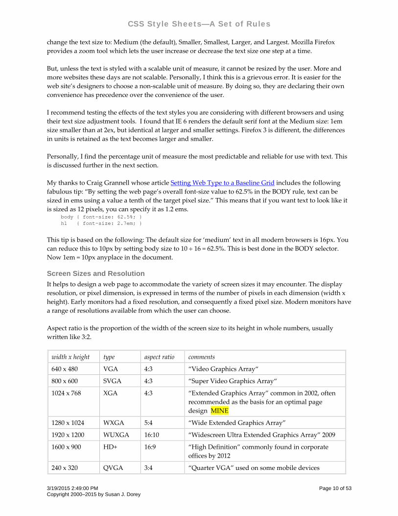
Screen Sizes and Resolution
It helps to design a web page to accommodate the variety of screen sizes it may encounter. The display
resolution, or pixel dimension, is expressed in terms of the number of pixels in each dimension (width x
height). Early monitors had a fixed resolution, and consequently a fixed pixel size. Modern monitors have
a range of resolutions available from which the user can choose.
Aspect ratio is the proportion of the width of the screen size to its height in whole numbers, usually
written like 3:2.
width x height type aspect ratio comments
640 x 480 VGA 4:3 “Video Graphics Array“
800 x 600 SVGA 4:3 “Super Video Graphics Array“
1024 x 768 XGA 4:3 “Extended Graphics Array” common in 2002, often
recommended as the basis for an optimal page
design MINE
1280 x 1024 WXGA 5:4 “Wide Extended Graphics Array”
1920 x 1200 WUXGA 16:10 “Widescreen Ultra Extended Graphics Array” 2009
1600 x 900 HD+ 16:9 “High Definition” commonly found in corporate
offices by 2012
240 x 320 QVGA 3:4 “Quarter VGA” used on some mobile devices
3/19/2015 2:49:00 PM Page 10 of 53 Copyright 2000–2015 by Susan J. Dorey
CSS Style Sheets—A Set of Rules
The browser window can be the same size as the screen, or smaller, at the discretion of the user.
The number of pixels per inch (ppi) is a function of both the resolution setting of the monitor and the
width of the monitor. The ppi for a particular monitor is greater with a finer resolution, like 1600 x 1200,
than with a coarser resolution, say 1280 x 1024. When the resolution is the same but the monitor sizes are
different, the ppi is smaller on the wider monitor.
The web page designer must decide how to accommodate a window that is wider or narrower than the
page content. You can find lots of advice with Google. I tend to prefer liquid layouts (whose width fits the
actual window size) with some maximum width. You can use a set of stylesheets, each designed for a
range of window sizes, but will need JavaScript to pick and load the stylesheet.
Link Properties and Selectors
These properties apply to the A tag. They can also apply to other tags.
outline‐width 0 | 1px
outline‐style 0 | solid | dashed
outline‐color white | #336699 | rgb(255,0,0) | invert
outline 0 | none | 1px solid red [IE 8+]
Outline properties control the style of dynamic outlines. The outline is drawn over a box, i.e., it is always
on top and does not influence the position or size of the box. The three outline properties have the same
values as corresponding border properties. An outline is used to indicate the element with the focus.
IE and Firefox use a default focus outline that is a finely dotted rectangle, IE’s is black while Firefox uses
the same color as the text.
The outline is not always a good idea. But it is desirable to indicate the focus in some way, see below and
page 47. The way to turn off the focus outline for all A elements is: A { outline: 0 } A { outline: none } /* this is the same as the preceding example */
Note that IE 7 ignores the outline property.
Link Pseudo-Class Selectors
There are five link pseudo classes that refer to the state of a link:
Pseudo Class Type Applies to
:link static links that have not yet been visited
:visited static links that have been visited by the user
:hover dynamic while user designates element with a pointing device, but does not
activate it
:active dynamic while an element is being activated (between the time the user presses
the mouse button and releases it)
3/19/2015 2:49:00 PM Page 11 of 53 Copyright 2000–2015 by Susan J. Dorey
CSS Style Sheets—A Set of Rules
Pseudo Class Type Applies to
:focus dynamic while an element has the focus (accepts keyboard events)
Sometimes these are mutually exclusive, sometimes they are not. The static pseudo‐classes are mutually
exclusive. The three dynamic pseudo classes are not mutually exclusive in CSS2.1
The CSS2 specification does not define a number of interaction details. Among them it does not define
how “the states are entered and left.” And “user agents are not required to reflow a currently displayed
document due to pseudo‐class transitions.” This leeway and the inevitable native differences in the
browsers’ implementation of the link states can drive you crazy trying to get the link interaction in a page
to work identically in IE 7 and Firefox 3, for example.
You will have less work and grief if you accept some differences in interaction between the browsers.
In HTML 4.0 the link pseudo‐classes apply to A elements with an “href” attribute. Consequently the
following two rules have similar effects: A:link { color: red } :link { color: red }
1. It’s best to have separate entries for each of A: LINK, A: VISITED, A: ACTIVE, and A:HOVER, in this
order. The sequence matters!
2. In my test, when I set only A:ACTIVE and A:VISITED (not as a group), the order did not change the
results in IE7 and Firefox 3.
3. If you group A:HOVER and A:VISITED, HOVER should precede ACTIVE.
4. The browsers differ in their handling of the link states (no surprise).
5. See also page 47 for a thorough discussion of styling links and handling browser differences.
Typeface Properties
In the following lists of properties, a “Y” indicates the property is implemented in the principal browsers, a “P”
means partially implemented, a “N” means not implemented. An underlined value is the initial value.
font‐family Y arial | helvetica, “New Century Schoolbook” | sans‐serif
font‐style Y normal | italic | oblique
font‐variant normal | small‐caps
font‐weight Y normal | bold | bolder | lighter | 100 | 200 | … | 900 (400 is normal)
font‐size Y 12pt | 1em
medium | xx‐small | x‐small | small | large | x‐large | xx‐large
larger | smaller
150%
font‐stretch ultra‐condensed | extra‐condensed | condensed | semi‐condensed |normal |
semi‐expanded | expanded | extra‐expanded | ultra‐expanded | wider |
narrower
font EXAMPLE: bold italic 24pt helvetica
1 The dynamic link pseudo‐classes were mutually exclusive in CSS1.
3/19/2015 2:49:00 PM Page 12 of 53 Copyright 2000–2015 by Susan J. Dorey
CSS Style Sheets—A Set of Rules
Font‐family can have more than one value. They are specified in the order in which they should be used
and are separated by commas. If the first font family is not available, then the next font family is tried.
It’s a good practice to always specify a generic font family like “serif”, “sans‐serif”, or “monospace” as
the last choice. font-family: verdana, arial, sans-serif; font-family: “Book Antiqua”, times, “times roman”, serif;
If you are going to specify typeface properties (and why wouldn’t you?) be sure to specify them for all
necessary elements. The CSS2 specification says that all the typeface properties are inherited. That
suggests that when you specify a typeface for the BODY tag, it will apply to LI and TD as well. But this is
not the case in some browsers (this is a specification conformance issue). IE6, as I recall, does not let LI
and TD inherit from BODY. To be safe, specify typeface properties for BODY (I changed my mind, see
below) and other text block elements. Be aware that inheritance does not apply to font‐weight and font‐
size; unless specified explicitly, header tags are rendered larger and bold.
The following table gives font‐size equivalents for pixels and percentages; “default” is the value when not
specified in any way, i.e., there is no font‐size given and browser text size is set to “medium.” “Default
px” is the default font‐size in pixels. “Default %” is the percentage that corresponds to the default font‐
size in pixels.
Tag Default px Default %
P 16px 100%
H1 32px 200%
H2 24px 150%
H3 18px 110%
other non Hx 16px 100%
When font‐size is stated as a percent, that percentage is applied to the font‐size set in the BODY tag. If
there is no font‐size set for the BODY tag, then the percentage applies to the default size. Consequently, if
BODY is 12px, then H1 at 200% is 24px (that is, 200% of 12px), not 32px. Here’s the rub: If you use % for
all font‐sizes, you have to work out the percent values for each element other than P and its variants to
achieve the rendered size you want. If you want to set non‐P tag sizes as a percent of their default size,
you cannot set a font‐size on BODY.
Best practices:
Use a scalable UOM for font‐size. My choice is the percentage.
Do not set font‐size on the BODY tag. There are some valid exceptions to this rule.
Use the following table to find percent sizes that correpond to pixels sizes when there is no BODY font‐
size. It doesn’t matter what the tag is, the percent is calculated as the desired px divided by 16.
Desired px Corresponding %
9px 56%
10px 63%
11px 69%
12px 78%
13px 81%
14px 88%
3/19/2015 2:49:00 PM Page 13 of 53 Copyright 2000–2015 by Susan J. Dorey
CSS Style Sheets—A Set of Rules
Desired px Corresponding %
17px 106%
18px 113%
20px 125%
The challenge is when HTML elements with font‐size as % are nested. In this case the descendant selector
base size is that of the parent.
The following obeservations were made after testing font‐size UOMs and text size scaling with two
browsers, IE 6 and Firefox 3.0.6:
For the most part IE and Firefox render text sizes differently. The only consistent UOM is the default;
the use of a percentage of the default to adjust it up or down is equally reliable. By “consistent” and
“reliable” I mean that the text is rendered the same in both browsers at different scaling settings.
The ex UOM reflects the font face. It behaves differently with Palatino Linotype than the default
font. Having it scale predictably likely means using font family stacks.
The 1em size is virtually identical to the 2ex size.
CAUTION: The following discussion has some errors which are not apparent to me right now (October
2010). The basic error is that there is no font‐size = normal, so I cannot figure out what I had tested to
come up with the following. And I’ve moved on from IE 6 to IE 7, so these observations may no longer
hold.
A test of Windows Internet Explorer 6.0 reveals the following interesting facts:
Font size = normal is rendered in different sizes for each tag P, H1, H2, H3, and H4. The H tags are
rendered as bold. H4 is rendered in a size that appears to be the same as P.
Font sizes medium, small, large, and larger are rendered in the same size for each tag P, H1, H2, H3,
and H4. The H tags are rendered as bold.
For P medium is the same size as normal when the browser text size = Medium.
For P larger appears smaller than medium when the browser text size = Medium.
The sizes at which text with Font sizes normal, medium, large, larger, small, smaller are rendered is
affected by the browser’s View Text Size setting.
You can use the following correspondences to choose a relative font size that corresponds, at the
browser’s Text size = Medium setting, to the size you desire. The main shortcoming of this table is that it
discusses font size in points. You should use points only in printed pages.
<P> <P> <H1> <H1> <H2> <H2>
normal 100% normal 200% normal 153%
8 pt 71% 13 pt 107%
9 pt 76% 14 pt 113%
10 pt 81% 15 pt 122%
11 pt 95% 16 pt 129% 16 pt 129%
12 pt 100% 17 pt 145% 17 pt 145%
13 pt 107% 18 pt 153% 18 pt 153%
24 pt 200%
It appears that “normal” font size for H1 is 24 pt. And that “normal” for H2 is 18 pt.
3/19/2015 2:49:00 PM Page 14 of 53 Copyright 2000–2015 by Susan J. Dorey
CSS Style Sheets—A Set of Rules
Which Fonts Can You Use?
Generally the fonts displayed on a web page are ones that exist on the reader’s computer. There’s no
point in designing a web page around a font like Adobe Garamond because few readers are likely to have
this font on their computers. So when you specify fonts, choose ones that are likely to exist on visitors’
computers regardless of operating system and browser—for Mac and Windows, Netscape and IE—such
as:
arial, helvetica, verdana
times, times roman, times new roman
courier, courier new
symbol
Windows 97 fonts (commonly bundled with the OS) are likely to be found on visitors’ computers:
book antiqua, bookman old style
cooper black
copperplate gothic
Webdings font is supplied with:
IE4, IE4.01 SP1, IE4.01 SP2, IE5, Office 2000 Premium, Windows 2000, Windows 98, Windows 98
Second Edition, Windows XP; Macintosh System X
Microsoft typography is discussed on its website: www.microsoft.com/typography. It has a page that
lists the fonts used by the various Microsoft products. Fonts shipped with Apple products can be found
at wikipedia: http://en.wikipedia.org/wiki/Apple_fonts#Fonts_in_Mac_OS_X.
Design is easier when you know the environment of your readers because it is fixed. This is often the
case on intranets.
Font Family Stacks
I thank Stephen Morley (http://safalra.com) for his comments on font family stacks. All quotes in this
section are from his webpage “The Myth of the ‘Web‐Safe’ Fonts” (http://safalra.com/web‐
design/typography/web‐safe‐fonts‐myth/).
It is good practice to specify more than one typeface in the font‐family property. But a web design that
looks good when any of the specified typefaces is used needs care in the choice of the typefaces.
“Typefaces differ in many respects, but the most significant variable effecting readability is the ‘aspect
ratio’ — the ratio of the height of minuscules (lowercase letters) to the overall height. Typefaces such as
Verdana have large aspect ratio to aid readability, but this has the effect of making the characters look
larger than those of other typefaces at the same point size.”
Because all typefaces in the font‐family will be presented with the same font‐size, you should choose a
family of typefaces that has similar aspect ratios. Stephen Morley calls these groups “font family stacks.”
He recommends:
A ‘wide’ sans serif stack composed of Verdana and Geneva. “Both typefaces have a large aspect
ratio, leading to their characters appearing wide in comparison to most typefaces.” Be sure to specify
“sans‐serif” as the last font.
A ‘narrow’ sans serif stack composed of Tahoma, Arial, and Helvetica. “All three are normal sans
serif typefaces, although Tahoma has a slightly larger aspect ratio for which narrower character
spacing compensates.” Be sure to specify “sans‐serif” as the last font.
3/19/2015 2:49:00 PM Page 15 of 53 Copyright 2000–2015 by Susan J. Dorey
CSS Style Sheets—A Set of Rules
A ‘wide’ serif stack composed of Georgia, Utopia, and Palatino. “Both are normal serif typefaces,
and they are almost identical in appearance.” Be sure to specify “serif” as the last font.
A monospace stack composed of Courier New and Courier. “Both are monospace typefaces, suitable
for samples of computer programming code.” Be sure to specify “monospace” as the last font.
Typography Properties
word‐spacing normal | 1em | ‐2px
letter‐spacing normal | 2px | 0.2em
text‐decoration P none | underline | overline | line‐through | blink
vertical‐align
(in‐line elements
and table cells only)
baseline | sub | super | top | text‐top | middle | bottom | text‐bottom
10% | ‐50%
text‐transform none | capitalize | uppercase | lowercase
text‐align P left | right | center | justify (N)
text‐indent Y 0 | 5px | 120% | ‐2em [for first formatted line]
line‐height normal | 1.2 | 150% | 1.5em
text‐shadow none | [see specs]
white‐space normal | pre |nowrap
The line‐height property applies to the height of boxes generated by non‐replaced inline elements. The
height of an inline box may be different than the font size of the text in the box (say, when line‐height >
1em); in that case there may be space above and below rendered letters. The excess of line‐height over
font‐size is called leading. Half the leading is called half‐leading.
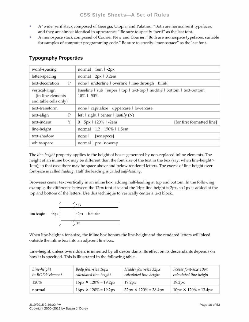
Browsers center text vertically in an inline box, adding half‐leading at top and bottom. In the following
example, the difference between the 12px font‐size and the 14px line‐height is 2px, so 1px is added at the
top and bottom of the letters. Use this technique to vertically center a text block.
When line‐height < font‐size, the inline box honors the line‐height and the rendered letters will bleed
outside the inline box into an adjacent line box.
Line‐height, unless overridden, is inherited by all descendants. Its effect on its descendants depends on
how it is specified. This is illustrated in the following table.
Line‐height
in BODY element
Body font‐size 16px
calculated line‐height
Header font‐size 32px
calculated line‐height
Footer font‐size 10px
calculated line‐height
120% 16px 120% = 19.2px 19.2px 19.2px
normal 16px 120% = 19.2px 32px 120% = 38.4px 10px 120% = 13.4px
3/19/2015 2:49:00 PM Page 16 of 53 Copyright 2000–2015 by Susan J. Dorey
CSS Style Sheets—A Set of Rules
Line‐height
in BODY element
Body font‐size 16px
calculated line‐height
Header font‐size 32px
calculated line‐height
Footer font‐size 10px
calculated line‐height
20px 20px 20px 20px
1.5 16px 1.5 = 24px 32px 1.5 = 48px 10px 1.5 = 15px
Thus there are best practices for the use of line‐height:
for the BODY element use 1.4 or 1.5
for all headers use 1.2 (12‐2010 I’ve come to prefer 1.0)
The height of the line boxes is determined by the tallest inline box or replaced element. Within a line box
there could be text of different sizes and/or superscripts and/or subscripts, each of which can increase the
line box height. You can prevent a superscript and subscript from increasing the height of the line box by: sup, sub { line-height: 0; }
The vertical‐align property applies to vertical positioning of the contents of an inline box within a line
box—but only in the context of a parent inline‐level element or a parent block‐level element that
generates anonymous inline boxes. So, in the following examples it applies to the SUP and SUB elements: <P> . . . <SUP> . . . </SUP> . . . </P> <P> . . . <SUB> . . . </SUB> . . . </P>
This also works with TD elements and IMG elements.
The white‐space property controls word‐wrapping and the collapse of sequences of white space.
“normal” specifies line breaks per normal word‐wrapping and the collapse of multiple contiguous
blank characters.
“pre” prevents the collapse of white space, allowing line breaks at newline characters.
“nowrap” prevents line breaks within text except for newline characters. This is useful in preventing
line breaks on hyphens in dates.
Be aware that while preformatted text may appear as desired on the screen, it may cause the printed page
to shrink to fit. I discovered this on a web page with a three‐column table. The preformatted text fit well
within its cell when viewed on the screen, but when printed it was too wide for the printed cell (because
the printed page width was much less than the screen width); the browser shrunk all the page elements
so that the preformatted text could be printed completely within its cell’s width. This was true for IE and
Firefox 3.
List Properties
list‐style‐type disc | circle | square | decimal | decimal‐leading‐zero | lower‐roman |
upper‐roman | lower‐alpha | upper‐alpha | none
list‐style‐image <uri> | none |
example: ul {list‐style‐image: url(yellow_square.gif)} image can be created
with Visio
list‐style‐position outside | inside
Font and color properties of list text are inherited from BODY and P selectors and can be overridden by
LI and UL/OL selectors. Color properties of list bullets/numbers are inherited in order from the (1) UL
text color property and (2) LI text color property (so LI overrides UL). The only way to color a LI text
differently than its bullet is to apply a local style with SPAN. You can size the LI text with a style applied
3/19/2015 2:49:00 PM Page 17 of 53 Copyright 2000–2015 by Susan J. Dorey
CSS Style Sheets—A Set of Rules
to the UL, LI, or with SPAN. Styles cannot change the bullet size; use a custom image to do this. Note
that IE’s default text size does control the bullet size! Background color does not apply to bullet.
List item example:
list‐style‐position:
outside
* text of list item xxxxxxxxxxxxxxxxxxxxxxxxxxxxxxxxxxxx
xxxxxxxxxxxxxxxxxxxxxxxxxxxxxxxxxxxxxxxxxxxxxxxxxxxxxxxxxxxxxx
list‐style‐position:
inside
* text of list item xxxxxxxxxxxxxxxxxxxxxxxxxxxxxxxxxxxx
xxxxxxxxxxxxxxxxxxxxxxxxxxxxxxxxxxxxxxxxxxxxxxxxxxxxxxxxxxxxxx
Tips:
1. Use UL/OL margin‐left to control position of the bullets.
2. To reduce left margin of list: <ol style=”margin‐left: 0”>. Putting this code in <STYLE> or separate
stylesheet file doesn’t work in IE 5.1, but it does in IE6. Setting the list left margin to “0” makes the
list item text align at the left margin of the parent element (often BODY); the bullets are placed in the
left margin.
3. Use UL list‐style‐type = none to make simple, compact list.
4. Use LI left padding to control space between bullet and text.
5. Use a negative OL/UL margin‐top (e.g., ‐18px) to eliminate white space above the list. The amount
of margin depends on the size of the font.
6. Use LI top/bottom margin(s) to control space between list items.
7. Use negative LI text‐indent to effect a hanging indent.
8. For list of entries which are indented differently (like a site map): <STYLE> ul.map {list-style-type: none; line-height: 16px; margin-left: 0px} .p5 {margin-left: 20pt} /* using px didn’t work properly */ .p10 {margin-left: 40pt} </STYLE> <UL CLASS=map> <DIV CLASS=p5> <LI>this line is to be indented 5 spaces </DIV> <DIV CLASS=p10> <LI>this line is to be indented 10 spaces </DIV> </UL>
NOTE: in example #8, each LI must be in a DIV, so you must use DIVs without CLASS for those LIs
that do not need indention.
9. The color of the LI controls the color of the bullet. To have the color of the list item text differ from
the color of the bullet, use SPAN to specify the color of the text: <STYLE> li { color: red } li span { color: blue } </STYLE> . . .
3/19/2015 2:49:00 PM Page 18 of 53 Copyright 2000–2015 by Susan J. Dorey
CSS Style Sheets—A Set of Rules
<UL> <LI><SPAN>this line is colored differently from its bullet</SPAN> </UL>
10. In Firefox UL ignores the * universal selector.
11. IE’s non‐standard implementation of the box model is especially evident in lists. If you applied a
border to a UL, you would see:
in Firefox3, the border surrounds both the bullets and the list item text
in IE6, the border surrounds only the list item text, leaving the bullets outside.
This makes controlling the location of the bullets so that it appears the same in Firefox and IE6
problematic (because any left margin is applied to the box, the bullets will be in different locations).
My solution is to remove the padding and specify the left margin, which has the effect in Firefox of
moving the box inside the bullets to match IE: ul.square { list-style-type: square; padding: 0; margin-left: 15px; }
See Layout Techniques for more tips.
Color & Background Properties
color Y black | rgb(255,0,0) | #FF1122 [for all elements]
background‐color P transparent | black | rgb(255,0,0) | #FF1122 | inherit [for all elements]
background‐image Y none | url(pic.jpg) | inherit
background‐repeat repeat | no‐repeat | repeat‐x | repeat‐y
background‐
attachment
scroll | fixed
background‐position right top | center center | left bottom | 50% 0% | 18px 0px
0% 0%
background ‘background‐color’ ‘background‐image’ ‘background‐repeat’ ‘background‐
attachment’ ‘background‐position’
[missing properties are set to their default value]
Background can be a solid color and/or an image. If not specified, it is not inherited from the parent
element, but appears that way because the default value of background‐color is “transparent.” The
default BODY background color is white. A background image overlays the background color.
In terms of the box model, “background” applies to the content, padding, and border areas; margins are
always transparent. When a border is not a solid line, the background is visible behind it. (Border colors
and styles are set with the border properties.)
An image can be positioned in different ways:
Initial position can be specified as coordinates relative to the top left corner of the element, stated as
a percentage or absolute length. The CSS property is background‐position. This only applies to block‐
level and replaced elements.
Image can be fixed in the viewport or allowed to scroll. The CSS property is background‐attachment.
Image can be repeated (tiled) horizontally and/or vertically. The CSS property is background‐repeat.
Image is limited to within the box’s border edge—unless it is fixed within the viewport.
3/19/2015 2:49:00 PM Page 19 of 53 Copyright 2000–2015 by Susan J. Dorey
CSS Style Sheets—A Set of Rules
You can create a vertical line that extends the height of the viewport with: body { background-color: #ACBFDB; max-width: 1024px; margin-left: 164px; padding-left: 20px; margin-right: 15%; padding-right: 20px; margin-top: 0; background-image: url(BeigeD14x1px.gif); background-repeat: repeat-y; background-position: 150px 0px; font-family: verdana, arial, san-serif; font-size: 77%; }
The only way I’ve found to make the vertical line start some distance below the top of the page is to cover
it up with a top margin on BODY. In this case, the HTML rule must follow the BODY rule. (Setting the
background‐position: 150px 50px had no effect, nor did margin‐top: 50px; in the latter, the box shifted
down but the image did not.) html { border-top: 18px solid #ACBFDB; margin: 0; padding: 0; }
Best to specify background for BODY element than for the HTML element.
When an image 10px wide and 1px tall is repeated vertically the result is a 10pixel wide vertical line.
When an image 10px tall and 1px wide is repeated horizontally the result is a 10pixel wide horizontal
line. Sometimes this is the only way to render a thick line in just the right place.
You can place a “border” at the bottom of the page with: html { background-image: url(Beige1x20px.gif); background-repeat: repeat-x; background-position: bottom left;}
Here the image is 20px tall and 1px wide. This background image cannot be combined with another
background image for the HTML or BODY elements.
Use caution when positioning the image with percentages: Any percentage refers to a position on the
image AND on the containing box. As the window is resized, the relative position of the image and the
content will change.
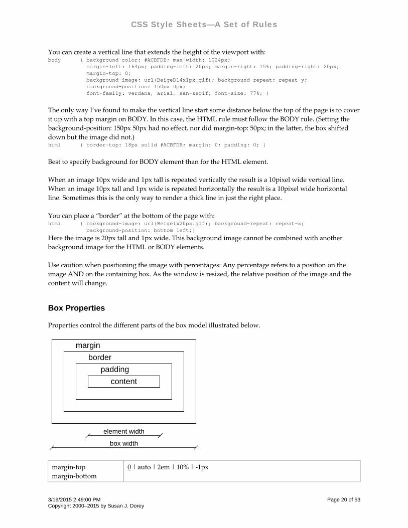
Box Properties
Properties control the different parts of the box model illustrated below.
content
margin
border
padding
element width
box width
margin‐top
margin‐bottom
0 | auto | 2em | 10% | ‐1px
3/19/2015 2:49:00 PM Page 20 of 53 Copyright 2000–2015 by Susan J. Dorey
CSS Style Sheets—A Set of Rules
margin‐left
margin‐right
margin
0 | ‘margin‐top’ ‘margin‐right’ ‘margin‐bottom’ ‘margin‐left’ | top‐and‐
bottom left‐and‐right [applies to all sides]
padding‐top
padding‐bottom
padding‐left
padding‐right
padding
0 | 2em | 20%
0 | ‘padding‐top’ ‘padding‐right’ ‘padding‐bottom’ ‘padding‐left’ | top‐and‐
bottom left‐and‐right [applies to all sides]
border‐top‐width
border‐bottom‐width
border‐left‐width
border‐right‐width
border‐width
medium | thin | thick | 1em
0 | ‘border‐width‐top’ ‘border‐width‐right’ ‘border‐width‐bottom’ ‘border‐
width‐left’ | top‐and‐bottom left‐and‐right [applies to all sides]
border‐top‐color
border‐bottom‐color
border‐left‐color
border‐right‐color
border‐color Y
white | rgb(255,0,0) | #336699 [initial value is the value of the
‘color’ property]
0 | ‘border‐color‐top’ ‘border‐color‐right’ ‘border‐color‐bottom’ ‘border‐
width‐left’ | top‐and‐bottom left‐and‐right [applies to all sides]
border‐top‐style
border‐bottom‐style
border‐left‐style
border‐right‐style
border‐style P
none | solid | double | groove | ridge | inset | outset | dotted | dashed
[last 2 are N]
0 | ‘border‐style‐top’ ‘border‐style‐right’ ‘border‐style‐bottom’ ‘border‐style‐
left’ | top‐and‐bottom left‐and‐right [applies to all sides]
border‐top
border‐bottom
border‐left
border‐right
border
‘border‐width’ ‘border‐style’ ‘border‐color’ e.g., 1px solid red
‘border‐width’ ‘border‐style’ ‘border‐color’ | none
[missing properties are set to their default value; applies to all sides]
‐moz‐background‐clip padding | . . . [applies to Mozilla browsers like Firefox]
In CSS1 the box model only applied to block elements, but in CSS2 it applies to all elements. You
can always change the box type for inline elements to block: display: block.
Margins are always transparent so parent element shines through.
Padding area uses same background as element itself.
Technically, padding and margin properties are not inherited. But placement of an element is
relative to its ancestors. For instance, margins can apply to both <UL> and <LI>.
Collapsing margins. Vertical margins between 2 adjoining block boxes or two nested block boxes in
the normal flow collapse, meaning that adjoining margins combine to form a single margin with a
length = the greater of the two adjacent margins.
3/19/2015 2:49:00 PM Page 21 of 53 Copyright 2000–2015 by Susan J. Dorey
CSS Style Sheets—A Set of Rules
In IE 7, but not Firefox 3, a bottom margin on a footer element is ignored. You can make the space
appear by using bottom padding instead.
Margin, padding, and border properties can be specified for all sides at once. For example, margin:
5px applies to all four sides; padding: 3px applies to all four sides; border: 3px solid red applies width,
style, and color to all sides.
Margin, padding, and border properties can be specified for all sides at once and each side can have
a different value. For example, border‐color: red blue green yellow specifies the top margin as red, the
right margin as blue, the bottom margin as green, and the left margin as yellow. Note that the
individual margins are specified in clockwise movement from the top of the box.
Border style is touchy. In IE6 all styles except solid are not rendered properly if the width is 2px or
less or the color is not the default. The double style needs at least 3px width to be rendered. The
other styles are difficult to see with a width of 1px. A width of 5px makes the style stronger and
visible in any color, however they are rendered the best in the default color.
In a table, when a border is not a solid line, the table background is visible behind it. The W3C
specification says “Borders are drawn in front of the elementʹs background” which in the case of a
TD means the TD’s background shows behind a dotted TD border. The table’s background should
only affect the table border. Well, then IE7 does this correctly, but Firefox 3 does not. I had a case
with a box with a gray background and a background‐image that ran down the right side where
there was a dotted border, in FF the gray background showed beneath the dotted border.
The solution to the above problem is property { -moz-background-clip: padding; }. It blocks the box
background from beneath the border for Firefox 3.
If you apply a border to BODY, the bottom border is rendered after the last BODY tag, which for a
short page could be mid‐screen. If you want a border to appear for the entire screen (view port),
define it for the HTML tag (although even this may vary by browser—NOT in IE7 and FF3): html { border: 6px solid white; }
You can simulate a page border with background image, see page 19.
The application of the box model is discussed in the section Layout & Positioning Properties.
Table Border Properties
Tables and their cells use the same box properties as described above—with the exception that internal
table elements do not have margins (per the CSS spec). Tables (not internal table elements) have three
additional properties.
border‐collapse collapse | separate | inherit
border‐spacing 0 | 1pt | 2px | 1px 3px | inherit
empty‐cells show | hide | inherit
Separate borders look like:
3/19/2015 2:49:00 PM Page 22 of 53 Copyright 2000–2015 by Susan J. Dorey
CSS Style Sheets—A Set of Rules
Collapsed borders look like:
When borders are separate you can specify the space between the inter‐cell borders. You can specify the
same amount of space between vertically‐adjacent cells as for horizontally‐adjacent cells, or you can
specify a different space for each:
border-spacing: 4px 6px the space between horizontally‐adjacent cells is 4px, and the space
between vertically‐adjacent cells is 6px.
The empty‐cells property applies to separated borders.
At least in IE 6, even if the table and its cells have a border: none, there will be an inter‐cell gap of 1 pixel.
Setting border‐collapse: collapse removes this gap.
Layout & Positioning Properties
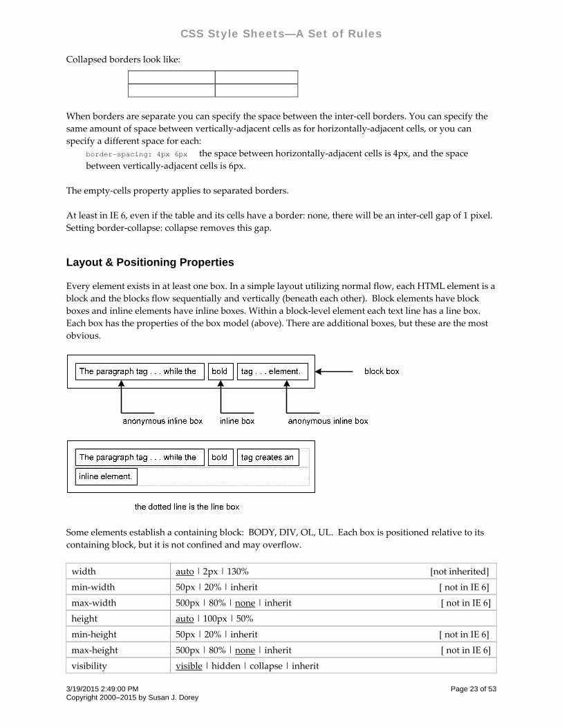
Every element exists in at least one box. In a simple layout utilizing normal flow, each HTML element is a
block and the blocks flow sequentially and vertically (beneath each other). Block elements have block
boxes and inline elements have inline boxes. Within a block‐level element each text line has a line box.
Each box has the properties of the box model (above). There are additional boxes, but these are the most
obvious.
Some elements establish a containing block: BODY, DIV, OL, UL. Each box is positioned relative to its
containing block, but it is not confined and may overflow.
width auto | 2px | 130% [not inherited]
min‐width 50px | 20% | inherit [ not in IE 6]
max‐width 500px | 80% | none | inherit [ not in IE 6]
height auto | 100px | 50%
min‐height 50px | 20% | inherit [ not in IE 6]
max‐height 500px | 80% | none | inherit [ not in IE 6]
visibility visible | hidden | collapse | inherit
3/19/2015 2:49:00 PM Page 23 of 53 Copyright 2000–2015 by Susan J. Dorey
CSS Style Sheets—A Set of Rules
position static | relative | absolute | fixed
top 10px | 20% | auto | 0 [relative to top edge of containing block]
bottom 10px | 20% | auto | 0 [relative to bottom edge of containing block]
left 10px | 20% | auto | 0 [relative to left edge of containing block]
right 10px | 20% | auto | 0 [relative to right edge of containing block]
float none | left | right [refers to side of current line]
clear none | left | right | both [if floating elements are allowed and
on which sides]
display inherit | inline | block | list‐item | none | run‐in |table | etc.
table‐layout auto | fixed | inherit
overflow visible | hidden | scroll | auto | inherit
clip auto | inherit | rect (<top> <right> <bottom> <left>)
The width property applies to the content only (what W3C calls “bounding box”); it is exclusive of border,
margin, and padding. Width and height properties do not apply to in‐line elements. The value of auto is
calculated based on the flow, positioning, left and right margins, and if the element is replaced. Word
wrap is controlled by the width property, not the size of the viewport. When the width exceeds the
viewport, a horizontal scroll bar appears.
The max‐width property can be set at the BODY element to apply to all content. The content is reflowed as
the viewport width is changed, there is no horizontal scroll bar. On the BODY tag it does not affect
background color, i.e., background color is applied to the entire viewport regardless of width. This
property is not a good idea on the BODY element in print stylesheets.
The height property applies to the content height of boxes generated by block‐level, inline‐block, and
replaced elements; it does not apply to non‐replaced inline‐level elements. It excludes padding.
When height is specified as a percentage, it refers to the height of the current element’s containing block. If
the containing box height is not set explicitly, i.e., it depends on content, then the value is interpreted as
“auto.” When height: auto, if the element is block‐level non‐replaced in the normal flow, then the
computed height reflects the content. Thus, you cannot use height: 100% to force a child DIV to have the
same height as its parent TD. Darn!
The visibility property applies to all elements. Hidden objects still affect the layout. Use display: none to
remove an element from the layout.
The display property can be used to make a box non‐existent. This means its content is both invisible and
it does not take up space on the page. It is often used in conjunction with JavaScript that changes the
property from none to block and back again when something happens. It can also be used to change the
default type of an HTML element (e.g., from inline to block and vice versa). Value run‐in creates a run‐in
box which becomes the first inline box of a block box—a run‐in heading.
The display property can be used to define a table. You can use DIVs or OLs to hold content. <DIV ID=”table” STYLE=”display: table”>
<DIV ID=”heading” STYLE=”display: table-row”> . . .</DIV> <DIV ID=”body” STYLE=”display: table-row”>
<DIV ID=”leftcol” STYLE=”display:table-cell”> . . . </DIV> <DIV ID=”centcol” STYLE=”display:table-cell”> . . . </DIV>
3/19/2015 2:49:00 PM Page 24 of 53 Copyright 2000–2015 by Susan J. Dorey
CSS Style Sheets—A Set of Rules
<DIV ID=”ritecol” STYLE=”display:table-cell”> . . . </DIV> </DIV> <DIV ID=”footer” STYLE=”display: table-row”> . . .</DIV>
</DIV>
The table‐layout property sets the algorithm used to display the table cells, rows, and columns. There are
two values—fixed and auto (automatic).
The fixed table layout allows the browser to lay out the table faster than the automatic table layout.
In a fixed table layout, the horizontal layout only depends on the tableʹs width, the width of the
columns, and not the content of the cells.
By using fixed table layout, the user agent can begin to display the table once the entire first row has
been received.
In an auto table layout, the column width is set by the widest unbreakable content in the column
cells.
The auto layout algorithm is sometimes slow since it needs to access all the content in the table
before determining the final layout.
The overflow property specifies how the content of a block is clipped when it overflows the box. Visible
specifies the content is not clipped, and may be rendered outside the box. Hidden specifies the content is
clipped. Scroll specifies the content is clipped and a scroll bar is always present. Auto is variable; it may
be that the content is clipped and the scroll bar is presented only when there is an overflow.
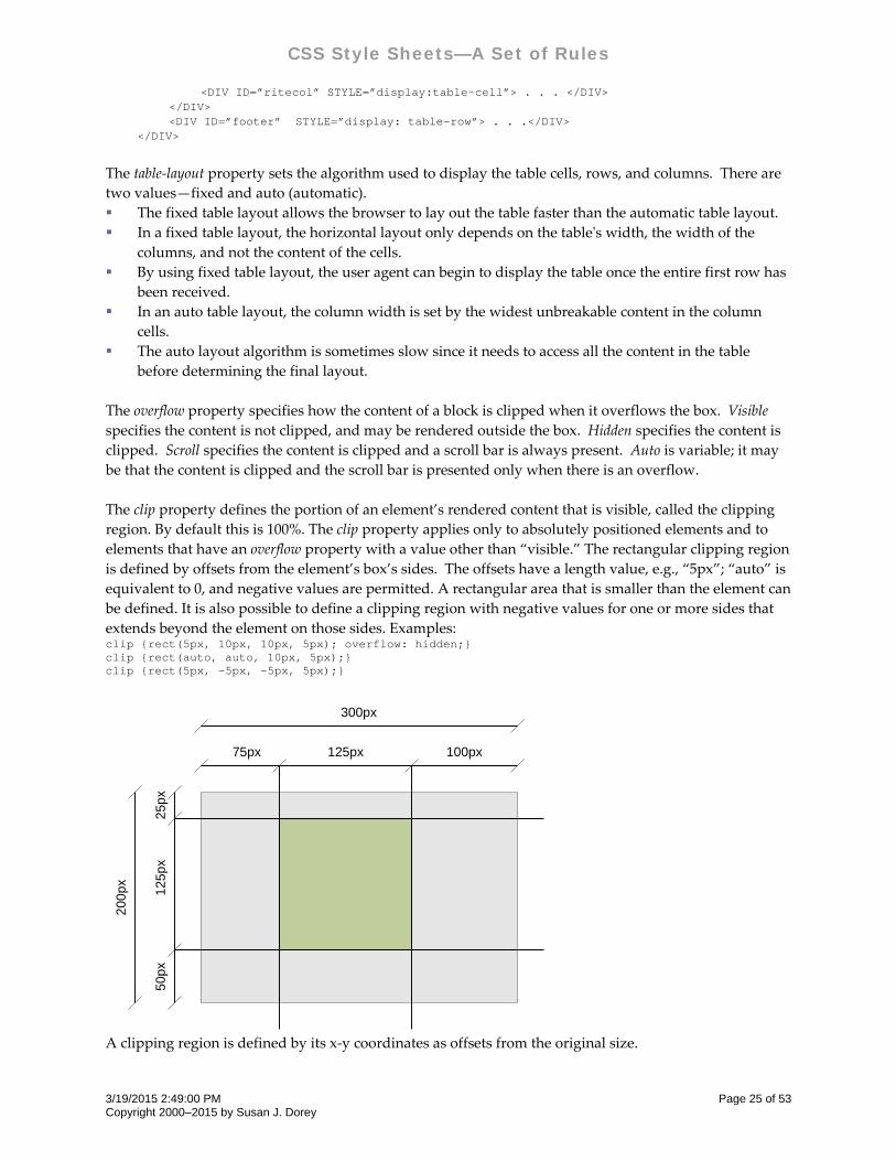
The clip property defines the portion of an element’s rendered content that is visible, called the clipping
region. By default this is 100%. The clip property applies only to absolutely positioned elements and to
elements that have an overflow property with a value other than “visible.” The rectangular clipping region
is defined by offsets from the element’s box’s sides. The offsets have a length value, e.g., “5px”; “auto” is
equivalent to 0, and negative values are permitted. A rectangular area that is smaller than the element can
be defined. It is also possible to define a clipping region with negative values for one or more sides that
extends beyond the element on those sides. Examples: clip {rect(5px, 10px, 10px, 5px); overflow: hidden;} clip {rect(auto, auto, 10px, 5px); }clip {rect(5px, -5px, -5px, 5px);}
300px
75px 125px 100px
200
px 125
px
25px
50p
x
A clipping region is defined by its x‐y coordinates as offsets from the original size.
3/19/2015 2:49:00 PM Page 25 of 53 Copyright 2000–2015 by Susan J. Dorey
CSS Style Sheets—A Set of Rules
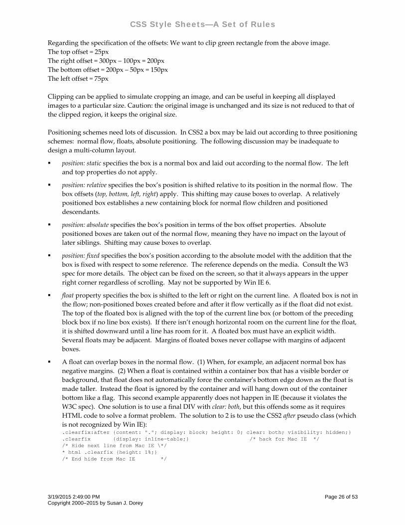
Regarding the specification of the offsets: We want to clip green rectangle from the above image.
The top offset = 25px
The right offset = 300px – 100px = 200px
The bottom offset = 200px – 50px = 150px
The left offset = 75px
Clipping can be applied to simulate cropping an image, and can be useful in keeping all displayed
images to a particular size. Caution: the original image is unchanged and its size is not reduced to that of
the clipped region, it keeps the original size.
Positioning schemes need lots of discussion. In CSS2 a box may be laid out according to three positioning
schemes: normal flow, floats, absolute positioning. The following discussion may be inadequate to
design a multi‐column layout.
position: static specifies the box is a normal box and laid out according to the normal flow. The left
and top properties do not apply.
position: relative specifies the box’s position is shifted relative to its position in the normal flow. The
box offsets (top, bottom, left, right) apply. This shifting may cause boxes to overlap. A relatively
positioned box establishes a new containing block for normal flow children and positioned
descendants.
position: absolute specifies the box’s position in terms of the box offset properties. Absolute
positioned boxes are taken out of the normal flow, meaning they have no impact on the layout of
later siblings. Shifting may cause boxes to overlap.
position: fixed specifies the box’s position according to the absolute model with the addition that the
box is fixed with respect to some reference. The reference depends on the media. Consult the W3
spec for more details. The object can be fixed on the screen, so that it always appears in the upper
right corner regardless of scrolling. May not be supported by Win IE 6.
float property specifies the box is shifted to the left or right on the current line. A floated box is not in
the flow; non‐positioned boxes created before and after it flow vertically as if the float did not exist.
The top of the floated box is aligned with the top of the current line box (or bottom of the preceding
block box if no line box exists). If there isn’t enough horizontal room on the current line for the float,
it is shifted downward until a line has room for it. A floated box must have an explicit width.
Several floats may be adjacent. Margins of floated boxes never collapse with margins of adjacent
boxes.
A float can overlap boxes in the normal flow. (1) When, for example, an adjacent normal box has
negative margins. (2) When a float is contained within a container box that has a visible border or
background, that float does not automatically force the containerʹs bottom edge down as the float is
made taller. Instead the float is ignored by the container and will hang down out of the container
bottom like a flag. This second example apparently does not happen in IE (because it violates the
W3C spec). One solution is to use a final DIV with clear: both, but this offends some as it requires
HTML code to solve a format problem. The solution to 2 is to use the CSS2 after pseudo class (which
is not recognized by Win IE): .clearfix:after {content: "."; display: block; height: 0; clear: both; visibility: hidden;} .clearfix {display: inline-table;} /* hack for Mac IE */ /* Hide next line from Mac IE \*/ * html .clearfix {height: 1%;} /* End hide from Mac IE */
3/19/2015 2:49:00 PM Page 26 of 53 Copyright 2000–2015 by Susan J. Dorey
CSS Style Sheets—A Set of Rules
For the HTML, just add a class of .clearfix to any element containing a float needing to be cleared.
Should this container box be placed following a previous external float, the IE height fix will trigger
Microsoftʹs proprietary and illegal Float Model, for which you will be sorry.
With preformatted text, such as done with HTML tags PRE and BLOCKQUOTE and the CSS white‐
space:pre property, you can snug the border of the containing box to the text within with float. Say
the width of a block is 1000 px and there is preformatted text no wider than 500px, if you apply float
to the preformatted text, its border will shrink to just the width of the widest line. A left float will
shift the box to the left of its containing box, a right float will shift the box to the right of its
containing box; in neither case will the horizontal alignment of the preformatted text change.
The clear property specifies which sides of an element’s box(es) may NOT be adjacent to an earlier
floated box. It only applies to elements that generate boxes that are not absolutely positioned. This
property applied to all elements in CSS1. In CSS2 and CSS 2.1 the clear property only applies to
block‐level elements. Value left positions the current box below any earlier left‐floated boxes. Value
right positions the current box below any earlier right‐floated boxes. Value none positions the
current box below all earlier floated boxes. When clear is used on a floated box the top outer edge of
the current box is positioned below the bottom outer edge of the earlier floated box(es) within its
floated parent container (?).
Layer & Transparency Properties
CSS provides a way to layer positioned content that straight HTML cannot. Content can be placed above
or below (the third dimension, the z axis) other content. Layering can provide a convenient way to place
a box outside of the normal flow. It can also be used to dynamically cover up or reveal lower boxes.
There is one CSS property for layers:
z‐index 0 | 3 | auto [stacking order of layers; 0 is base]
Transparency in visual material is like the use of a scrim on a stage set—it allows the viewer to see
through the surface to the background, but only slightly. Transparency is a property of an upper layer
that sits on top of a lower layer, it partially reveals the lower layer.
Transparency and opacity are opposite ends of the same spectrum: the greater the transparency the less
the opacity, and vice versa.
In CSS complete transparency is the default, so that lower boxes can be seen underneath higher boxes. A
box layered on top of another can employ a semi‐transparent background to partially obscure the lower
box, or a completely opaque background to completely obscure the lower box. These effects can be
achieved in a variety of ways, some of which are detailed below.
The closest to a standard established by the W3C for transparency is a CSS 3.0 recommendation; it was
formalized after the browser vendors implemented the capability. There are four CSS properties that
effect transparency:
Property Values of x Example Applicable Browsers
filter: alpha(opacity=x) 0 x 100 filter: alpha(opacity=50) Internet Explorer
opacity: x 0 x 1.0 opacity: 0.5 Safari and Mozilla
3/19/2015 2:49:00 PM Page 27 of 53 Copyright 2000–2015 by Susan J. Dorey
CSS Style Sheets—A Set of Rules
Property Values of x Example Applicable Browsers
‐moz‐opacity: x 0 x 1.0 ‐moz‐opacity: 0.5 Mozilla 1.6 and below
color: rgba(r, g, b, x) 0 x 1.0 color: rgba(15, 30, 120, 0.4) none yet
In each of these properties the greater the value of x, the greater the opacity (and the less the
transparency). The “opacity” property is the CSS recommendation. Be sure to use both filter and opacity
properties together. The –moz‐opacity property is likely no longer necessary.
In the W3C recommendation, the transparency‐opacity property applies to all elements. As currently
implemented, transparency applies to the elements for which it is specified and all of their descendants. 1
There are some challenging quirks to the implementation:
Each browser implements transparency differently, witness the different CSS properties. Some
browsers have additional requirements.
CSS opacity requires, for IE6, the use of (1) positioning (with the position: absolute or float property)
of the container element or (2) “zoom: 1” in the transparent element. This is not needed for an
IMAGE tag. (Zoom is a non‐standard CSS property used only by IE.)
If you apply transparency to the BODY selector, it applies to all elements on the page regardless of
layers.
Descendant elements have the same transparency as their parent element, which is why the text of a
P element within a transparent DIV is also transparent. Effect a non‐transparent descendant element
by positioning it on top of the transparent element (perhaps with the margin property or the z‐layer
property).
Placing transparent text over an image can result in the text edges looking jagged. Use of
“background: transparent” can improve this, more so in Firefox than IE6. Depending on the image, a
better solution is to use the image as the background for the text; be sure not to use margins or
padding for the text as this will shift the text background so it is not aligned with the underlying
image.
Using Javascript to effect transparency can be done, but it is tricky and why have a design that
cannot be done by straight CSS?
Transparent Images
Images themselves can be created to include transparency. The only formats that support transparency
are the GIF and PNG formats. The transparent GIF format is GIF89a (as opposed to the non‐transparent
GIF87). PNG images can have single color 100% transparency (like GIF) or variable transparency (aka
alpha channel, or 256 levels of transparency per pixel); the alpha channel is in addition to the RGB
channels.
Transparency is handled differently by browsers. Please note that Microsoft Internet Explorer for
Windows doesnʹt support variable transparency (though it does support single color transparency in both
PNGs and GIFs). Apparently IE7 does support variable transparency.
I typically create diagrams with Visio. I can save Visio shapes as JPEG, PNG, or GIF. But I have only had
success creating an image file with a transparent background with GIF settings: Background Color =
1 When opacity is specified for an element, it applies to all contents of that element: text, background, image. If you
want to limit the opacity to one of the three, you must put the others in a non‐descendant element.
3/19/2015 2:49:00 PM Page 28 of 53 Copyright 2000–2015 by Susan J. Dorey
CSS Style Sheets—A Set of Rules
Default, Transparency = color R255 G255 B255 (white), Resolution = Screen, Size = Source, Data Format =
non‐interlace, and Color Translation = Normal.
Applying Transparency to HTML Elements
In the following examples the opacity property is used by itself for simplicity of illustration only. When
you try this be sure to add the filter property.
You can apply transparency directly to an image: <IMG SRC=". . ." STYLE="opacity: 0.4">
You can apply transparency to an image via its container: <DIV STYLE="margin:0 auto;"><SPAN STYLE="opacity: .25; zoom: 1;"><IMG SRC=". . ." width="50" height="50"></SPAN></DIV>
You can apply transparency to text and its background: <DIV STYLE="font-weight: 800; color: black; background-color: blue; opacity: 0.4; zoom: 1">All the text and the background color here are 60% transparent.</DIV>
You can apply transparency to the background of a box but not the text by placing the text in a non‐
descendant element: <DIV STYLE="background-color: #ff9944; opacity: 0.3; zoom: 1; height: 36px;"></DIV> <P STYLE="font-weight: 800; color: black; margin-top: -30px;"> This text is a P that is not contained within the DIV. The DIV is 70% transparent and reveals its container, in this case BODY. The text is pushed on top of the transparent box with a negative top margin.</p> <DIV STYLE="background-color: #ff9944; opacity: 0.3; zoom: 1; height: 36px;"> </DIV> <P STYLE="font-weight: 800; color: black; position: relative; top: -50px;"> This text is a P that is not contained within the transparent DIV. The P is positioned on top of the transparent DIV with relative positioning.</P>
You can place semi‐transparent text over an image; in this case a background prevents the text edges
from looking jagged: <DIV STYLE="background: url(filename) repeat"> <P STYLE="color: white; background: transparent; opacity: 0.5; zoom: 1;">The text is 50% transparent while the background image is not. The text has some jagged edges in IE6.</P></DIV> <DIV STYLE="background: url(SnowRings.jpg); height: 300px; width: 460px;"> <P STYLE="color: white; font-weight: bold; font-size: 40px; background: url(SnowRings.jpg); opacity: 0.7; zoom: 1;"> The text has no jagged edges.</P></DIV>
You can apply or remove transparency on hyperlinks: <STYLE TYPE="text/css"> a.linkopacity img {filter:alpha(opacity=50); opacity: 0.5;} a.linkopacity:hover img {filter:alpha(opacity=100); opacity: 1.0;} </STYLE> . . . <A CLASS="linkopacity" HREF=". . ."><IMG SRC="image.jpg" WIDTH="100" HEIGHT="119" STYLE="border: 1px solid black;"></A>
You can imitate the look of sepia prints by layering a semi‐transparent image on top of a solid color
background. <DIV STYLE="background-color: blue"> <IMG SRC="filename" STYLE="opacity: 0.5"> </DIV>
3/19/2015 2:49:00 PM Page 29 of 53 Copyright 2000–2015 by Susan J. Dorey
CSS Style Sheets—A Set of Rules
You can place fully opaque text on a semi‐transparent image. In the example the image fills the
window. <BODY STYLE="background-color: #BBC6C0; margin: 0; padding: 0"> <IMG SRC="SnowRings.jpg" STYLE="filter: alpha(opacity=30); opacity: 0.3"> <DIV STYLE="z-layer: 5; position: absolute; top: 1px; left: 1px; margin: 10px"> <H1>This text should be fully opaque and with a semi-transparent background image.</H1> <P>Is that what happens? YES!</P> </DIV>
There is a different effect when you (1) layer a semi‐transparent image over a colored background
than when you (2) layer a semi‐transparent colored background over an image. They can look
identical if you reverse the opacity of (1). For example (1) matches (2) when the opacity in (1) is 70%
and the opacity in (2) is 30%.
It is not possible to apply transparency to only the background of inline text (within SPAN). You
could get the same effect by layering an identical text element on top of the first and placing a semi‐
transparent SPAN in the lower element. That way the semi‐transparent text will be overlaid by fully
opaque text.
The Alpha Channel filter used to effect semi‐transparency has several attributes. According to the
Microsoft Developer Network “you can set the opacity as uniform or graded, in a linear or radial
fashion.” This is discussed at msdn2.microsoft.com/en‐us/library/ms532967(VS.85).aspx. There are
examples at www.jegsworks.com/demos/DemoDHTML/filter‐alpha.htm.
Interaction
Interaction, the dynamic response to the user’s action, can be achieved in CSS by the dynamic pseudo‐
class selectors:
:hover applies when user designates an element but does not activate it; this seems
akin to the mouseover event
[IE 6 applies only to A tag,1 implemented in IE 7b3]
:focus applies while an element has the focus; elements get focus by access with
[Tab] key or mousedown. The ability to get the focus can be disabled with
JavaScript (such as “blur()”), but this is a bad practice. Focus persists after (1)
link is active (and linked‐to page is loaded) and (2) browser Back button is
selected.
[not in IE 6 and 7b3]
:active applies while an element is being activated; a link remains active when the
user returns via the browser’s back‐button
Assigning these selectors to style rules enables CSS alone to dynamically change the appearance of
content. Implementation of these selectors is incomplete, be sure to check with other sources like
http://www.satzansatz.de/cssd/pseudocss.html#active‐and‐focus .
While common dynamic responses are to change color, background, and border, a more dramatic
treatment is to make elements appear and disappear.
1 So use the A tag without the HREF attribute, and assign it at least two classes, one to suppress normal A styling and
the other to effect the HOVER.
3/19/2015 2:49:00 PM Page 30 of 53 Copyright 2000–2015 by Susan J. Dorey
CSS Style Sheets—A Set of Rules
There are a few design issues for appearing/disappearing elements:
the effect their existence has on the page layout. The display:none property removes an element from
the layout while the visibility:hidden property does not. However, if the element exists in its own
higher layer (z‐index), it has no effect on the page layout.
how quickly the transition is effected. With just CSS the transition can appear abrupt. JavaScript can
be employed to add a delay period.
Another dynamic response is to change the cursor icon. Normally the cursor is an I bar when moved over
text, an arrow when moved over non‐text elements, or a pointer when moved over links. If a page
contains dynamic responses, you may want to indicate their presence by changing the cursor. The cursor
property is used to specify the type of cursor:
cursor default | crosshair | pointer | url(“filename”) | wait | help | auto
The default value is often rendered as an arrow. The text value is often rendered as an I‐bar. The wait value
is often rendered as an hourglass. The help value is often rendered as a question mark or an arrow with
question mark. The auto value directs the browser to determine the cursor based on the current context. If
providing a custom cursor image, it is a good idea to specify more than one and/or a generic cursor in the
event the user agent cannot handle the custom cursor:
P { cursor: url("first.cur", url("path/second.cur"), default; }
For custom cursors, the image that you use for the cursor must be either a .cur, .csr, or .ani file format.
The .ani format is animated. The file must be on your website.
Special Techniques
Layout Issues and Monitors
A common goal of a web designer is to have each page rendered so that all text can be viewed with only a
vertical scrollbar, at most. That is, text fits horizontally within the width of the monitor’s screen. This was
a simple matter when all screens were the same width.
Screens are available in the original 4:3 aspect ratio format and the new widescreen 16:9 and 16:10 aspect
ratios as well as a few others. The aspect ratio refers to the ratio between the width of the screen and its
height, screens being wider than they are high. The early VGA display mode had a resolution of 640 x
480, the SVGA had a resolution of 800 x 600. In the first case, the screen was 640 pixels wide, in the second
case the screen was 800 pixels wide. In those days it was safe to design web pages with a width of 640
pixels. But with today’s common wide‐screen resolutions, 1280 x 800 and 1440 x 900, that leaves a lot of
screen “real estate” going to waste.
Modern monitors are available in a variety of sizes from 15” to 21” and beyond (measured diagonally),
and with a variety of video adapters. Modern operating systems offer the ability to choose a resolution.
So how do you design a page layout that looks good at each end of the spectrum? Some choices are easier
than others. But keep in mind that real design is about working well within restrictions.
3/19/2015 2:49:00 PM Page 31 of 53 Copyright 2000–2015 by Susan J. Dorey
CSS Style Sheets—A Set of Rules
1. Limit page width to 640 pixels and either center the page within the screen or fix the left margin.
This is called a fixed layout. See Layout Techniques and Table Techniques for details on centering content
within the screen.
2. Allow page width to match screen width. This requires a careful layout so that lines of text do not
become too long to read easily. This involves specifying widths as percentages and is often called a liquid
layout.
3. Optimize Web pages for 1024 x 768 (currently the most widely used screen size), but use a liquid
layout that stretches well for any resolution, from 800 x 600 to 1280 x 1024. The so‐called liquid layout is
nice, but it merely resizes the same layout into a larger space. It does not address the fact that at larger
resolutions you have the ability to offer an entirely different experience.
4. Use onResize JavaScript code to choose a stylesheet to match the resolution. There is a good
discussion of this at http://particletree.com/features/dynamic‐resolution‐dependent‐layouts/ These are
sometimes called adaptive layouts. <link rel="stylesheet" type="text/css" href="css/default.css" title="default"> <link rel="alternate stylesheet" type="text/css" href="css/thin.css" title="thin"> <link rel="alternate stylesheet" type="text/css" href="css/wide.css" title="wide"> <link rel="alternate stylesheet" type="text/css" href="css/wider.css" title="wider"> <script type="text/javascript"> function chooseStylesheet() { var browserWidth = getBrowserWidth(); if (browserWidth < 750){ changeLayout("thin"); } if ((browserWidth >= 750) && (browserWidth <= 950)){ changeLayout("wide");} if (browserWidth > 950){ changeLayout("wider"); } } function getBrowserWidth() { if (window.innerWidth){ return window.innerWidth;} else if (document.documentElement && document.documentElement.clientWidth != 0){ return document.documentElement.clientWidth; } else if (document.body){return document.body.clientWidth;} return 0; } function changeLayout(sheetTitle) { } </script> . . . <body onResize=”chooseStylesheet()”>
5. Use JavaScript to set the value of CSS properties based on the screen width. There is a good
discussion of this at http://www.themaninblue.com/writing/perspective/2004/09/21/ and
http://www.alistapart.com/articles/switchymclayout
Layout Techniques
Web pages whose content exceeds the viewport will be presented with a vertical scroll bar. Some page
designs look different with the scroll bar than without it, in this case as you click from page to page
where some pages have a vertical scroll bar and some do not, the content will be seen to jump. There is a
perfectly nifty solution that reserves space for the vertical scroll bar: html { overflow-y: scroll }
Remember that BODY defines a box and has margins, borders, and padding. This is why a table will not
automatically extend to the full width of the screen. It can be helpful to clear the margins and padding:
3/19/2015 2:49:00 PM Page 32 of 53 Copyright 2000–2015 by Susan J. Dorey
CSS Style Sheets—A Set of Rules
body { margin: 0; padding: 0; }
It’s a good idea to assign font and margin properties to the BODY element. If you use tables and lists,
you will have to assign similar properties to TD and LI (because they do not inherit from BODY). body, td, li { font-family: verdana; font-size: 9px }
Default text margins, such as for paragraphs and lists, can be overridden by CSS. They can be increased
or reduced. You can push a line of text all the way up to the preceding line by a negative top margin.
Overlapping text and images is done with negative margins and short line height; in CSS2 this can be
done with absolute positioning and layers.
Be careful using width in CSS. Don’t use a fixed width greater than the narrowest screen that is
commonly expected to be used (e.g., 15” monitor with 800 x 600 resolution), or else a horizontal scroll bar
will appear. A fixed width must be no greater than 650px for the whole line to print, or else the right side
is truncated. Better to use relative length width (specified with %). A better way to handle the printing
problem is with a print stylesheet.
Center the BODY with CSS. The correct way to center an element is to set its left and right margins to
“auto.” <body style="margin-left: auto; margin-right: auto; width:640px;"> . . . </body>
Designing a web page to improve search engine access to the actual content may result in locating code
that renders non‐content items (like navigation links) at the top of the web page—at the bottom of the
HTML file (where they are read last by web crawlers). These items are positioned absolutely in a higher
layer: #top { z-index: 3; position: absolute; top: 15px; right: 20px; text-align: right; }
You can overlay a horizontally centered BODY with an absolutely‐positioned block that is also
centered—essentially combining the previous two designs. In this case first you create an absolutely‐
positioned block, then create a child block that is horizontally centered with the same width as BODY. body { margin: 0 auto; max-width: 600px; padding: 0; } #top { z-index: 3; position: absolute; top: 15px; left: 15px; right: 15px; } #fix { margin: 0 auto; max-width: 600px; } . . . <body> <p>This is a base body content and can have several blocks.</p> <div id=top> <div id=fix> <p>text of top line</p> </div> </div>
There are some layout HTML elements that cannot be reproduced with CSS, especially to do with tables.
The ability in CSS to float a box is nice, but does not in all cases substitute for an HTML table.
Text within a box can have a border and be indented (margin‐left) and have internal margins (padding). <DIV STYLE=”font-family: Arial, Verdana, sans-serif; font-size: 9pt; font-weight: 500; color: #100080; vertical-align: middle; text-align: left; padding: 20px; border: 1px solid black; width: 500; margin-left: 15%”> text goes here </DIV>
3/19/2015 2:49:00 PM Page 33 of 53 Copyright 2000–2015 by Susan J. Dorey
CSS Style Sheets—A Set of Rules
A hanging indent can be effected with a left margin and a negative text indent: <P STYLE=”margin-left: 15px; text-indent: -15px”>The first line of this text starts at 0 relative to its containing block, all subsequent lines are indented 15 pixels.</P>
Another way to reduce the space between two paragraphs is to set the top margin of the second
paragraph to a negative value.
When there isn’t enough space for a full paragraph break, you can put more white space between two
consecutive lines with the SPAN tab using the CSS HEIGHT property: <P>Standard paragraph style prevails here, especially line height.<BR> <SPAN STYLE=”height: 26px”></SPAN>This line is lower than the preceding line’s normal spacing. The amount of spacing is up to you.</P>
Note: this is okay in IE 5.5 but not IE6. In IE 6: <P>blah blah blah <IMG SRC=”single-pixel.gif” HEIGHT=20 WIDTH=1 ALIGN=top> <BR> blah blah blah</P>
Hanging punctuation. Commonly long quotes are indented and bracketed by quotation marks. If you
do nothing the quotation marks will be aligned with the left margin of the text. Hanging punctuation
puts them into the left margin so the text lines up. blockquote { text-indent: -0.5em; }
Centered box. No text on either side. <P STYLE=”border: 3px inset; position: relative: left: 30%; width: 40%; padding: 10px”> text </P>
Text overlays on an image. Perhaps the easiest way to do this so that the overlays stay in position when
the page is scaled is to put them in a DIV with a background image. You can force the size of the DIV to
match that of the image with WIDTH and HEIGHT. Each overlay is an absolutely positioned P, with its
position relative to the DIV. The DIV is relatively positioned in order to establish a new containing block
for positioned descendants.
.hot { font-family: arial, helvetica, sans-serif; font-size: 200%; font-weight: 800; border: 2px solid white; padding: 4px; } . . . <DIV STYLE=”background-image: url(pic.jpg); width: 120px; height: 200px; position: relative”> <P STYLE="position: absolute; top: 25px; left: 40px" class=hot>text</P> <P STYLE="position: absolute; top: 100px; left: 20px" class=hot>text</P> </DIV>
Text aligned right on the same baseline. This is commonly used to place secondary information on the
same line visually. Semantically the texts are different. Example:
Title Text on the Left lesser text on the right
The challenge here is aligning text of different heights on the same baseline in such a way that all the text
is scalable. The solution: <p style="float:right; margin-top:-42px; height:24px; line-height:24px">[Print]</p> <h2 style="height:24px; line-height:24px">Title Text on the Left</h2>
In this example, the amount of the top margin for the text on the right was determined by trial and error.
Were the text the same size, you would not need to control the height, line height, and top margin.
3/19/2015 2:49:00 PM Page 34 of 53 Copyright 2000–2015 by Susan J. Dorey
CSS Style Sheets—A Set of Rules
This result needs more work if you are going to place the text within an absolutely positioned box, such
as when you locate this code just before the </BODY> statement and when the content is to be rendered at
the top of the page. This particular example adds links to the text on the right and an image to the text on
the left; the image had to be cropped to remove a visual padding so that the actual image and text are
visually set on the baseline. The design layout holds at different zooms. body { font-family: arial, helvetica, sans-serif; font-size: 80%; } #top { z-index: 3; position: absolute; top: 15px; left: 15px; right: 15px; padding-bottom: 3px; } #auxnav { float: right; font-size: 85%; padding-top: 6px; margin-right: 6px; width: 150px; text-align: right; } p.crop { width: 300px; overflow: hidden; } p.crop img { margin: 0 0 -11px 0; } . . . <div id=top> <p id=auxnav> [ <a HREF="../index.html" class=n hidefocus="true">Home</a>, <a HREF="../software/index.html" class=n hidefocus="true">Software</a> ] </p> <p class=crop><img src="../favicon16.ico" class=logo height="32" width="32"> Susan Dorey Designs Portfolio </p> </div>
Another variation of the above handles the problem where the floated right box is not sitting on the same
baseline as the left box: <p id=auxnav><span style="display: block; padding-top: 9px"> [ <a HREF="../index.html" class=n hidefocus="true">Home</a>, <a HREF="../software/index.html" class=n hidefocus="true">Software</a> ] </span></p>
Keeping text on a baseline grid. Print typographers have long designed documents so text aligns with a
vertical grid. You can do this with web pages and thereby improve the page’s vertical rhythm. Start by
establishing a baseline height, then specifying line heights, margins, and padding to maintain that height
over the variety of HTML elements that compose the content. Paragraph text can adhere to the baseline
height (with line‐height). You will need to pay particular attention to the box model for headings and lists
as the browser default values do not fit the baseline height.
You must use ems for all vertical measurements in order that typographic integrity is maintained
when text is resized.
Start by clearing all browser vertical measurements: * {margin: 0; padding: 0}
Every variation from the basic text size should take up multiples of the baseline height. This can be
accomplished by adjusting the line‐height and margin accordingly.
Typically the space between paragraphs is set by browsers with a top and bottom margin of 1em.
But if you are using a baseline height of 18px based on a body font‐size of 12px, you can maintain
the grid with top and bottom margin of 18 ÷ 12 = 1.5em .
If you are using a subheading sized at 14px, you must set the line‐height to 18 ÷ 14 = 1.286em.
Correspondingly, set the top and bottom margins to the same dimension.
You can use asymmetrical margins for headings, provided the margins combine to be multiples of
the basic line height. For example combine a top margin as 1.5 line height with a bottom margin of
0.5 line height.
Layer two letters (or phrases) with slight offset: <STYLE> DIV#one { z-index: 0; position:absolute; top: 100px; left: 100px;
3/19/2015 2:49:00 PM Page 35 of 53 Copyright 2000–2015 by Susan J. Dorey
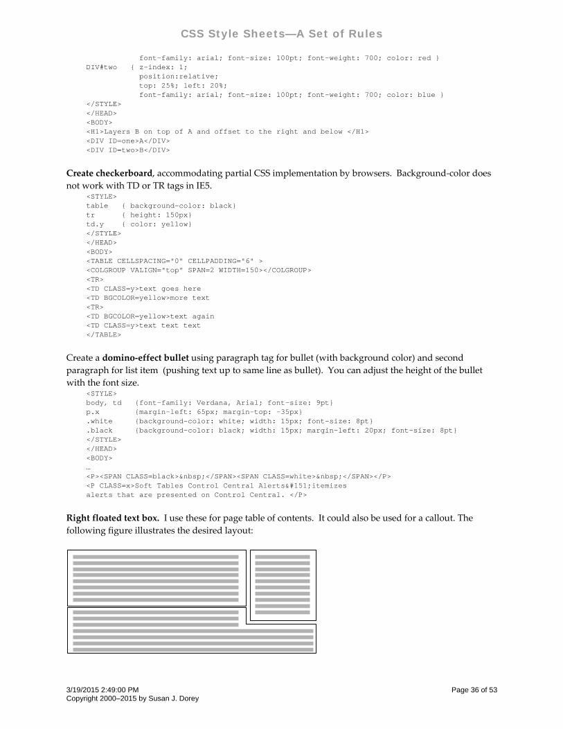
CSS Style Sheets—A Set of Rules
font-family: arial; font-size: 100pt; font-weight: 700; color: red } DIV#two { z-index: 1; position:relative; top: 25%; left: 20%; font-family: arial; font-size: 100pt; font-weight: 700; color: blue } </STYLE> </HEAD> <BODY> <H1>Layers B on top of A and offset to the right and below </H1> <DIV ID=one>A</DIV> <DIV ID=two>B</DIV>
Create checkerboard, accommodating partial CSS implementation by browsers. Background‐color does
not work with TD or TR tags in IE5. <STYLE> table { background-color: black} tr { height: 150px} td.y { color: yellow} </STYLE> </HEAD> <BODY> <TABLE CELLSPACING="0" CELLPADDING="6" > <COLGROUP VALIGN="top" SPAN=2 WIDTH=150></COLGROUP> <TR> <TD CLASS=y>text goes here <TD BGCOLOR=yellow>more text <TR> <TD BGCOLOR=yellow>text again <TD CLASS=y>text text text </TABLE>
Create a domino‐effect bullet using paragraph tag for bullet (with background color) and second
paragraph for list item (pushing text up to same line as bullet). You can adjust the height of the bullet
with the font size. <STYLE> body, td {font-family: Verdana, Arial; font-size: 9pt} p.x {margin-left: 65px; margin-top: -35px} .white {background-color: white; width: 15px; font-size: 8pt} .black {background-color: black; width: 15px; margin-left: 20px; font-size: 8pt} </STYLE> </HEAD> <BODY> … <P><SPAN CLASS=black> </SPAN><SPAN CLASS=white> </SPAN></P> <P CLASS=x>Soft Tables Control Central Alerts—itemizes alerts that are presented on Control Central. </P>
Right floated text box. I use these for page table of contents. It could also be used for a callout. The
following figure illustrates the desired layout:
3/19/2015 2:49:00 PM Page 36 of 53 Copyright 2000–2015 by Susan J. Dorey
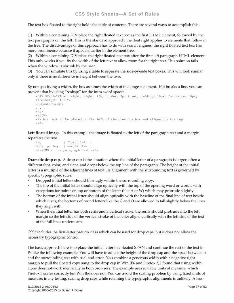
CSS Style Sheets—A Set of Rules
The text box floated to the right holds the table of contents. There are several ways to accomplish this.
(1) Within a containing DIV place the right floated text box as the first HTML element, followed by the
text paragraphs on the left. This is the standard approach, the float right applies to elements that follow in
the tree. The disadvantage of this approach has to do with search engines: the right floated text box has
more prominence because it appears earlier in the element tree.
(2) Within a containing DIV place the right floated text box after the first left paragraph HTML element.
This only works if you fix the width of the left text to allow room for the right text. This solution fails
when the window is shrunk by the user.
(3) You can simulate this by using a table to separate the side‐by‐side text boxes. This will look similar
only if there is no difference in height between the two.
By not specifying a width, the box assumes the width of the longest element. If it breaks a line, you can
prevent that by using “ ” for the intra‐word spaces. <DIV STYLE=”float: right; right: 15%; border: 3px inset; padding: 10px; font-size: 10px; line-height: 1.5 ”> <P>Contents<BR> . . . </P> </DIV> <P>this text to be placed to the left of the previous box and aligned on the top. </P>
Left floated image. In this example the image is floated to the left of the paragraph text and a margin
separates the two. img { float: left } body p, img { margin: 2em } <P><IMG . . .> paragraph text </P>
Dramatic drop cap. A drop cap is the situation where the initial letter of a paragraph is larger, often a
different font, color, and slant, and drops below the top line of the paragraph. The height of the initial
letter is a multiple of the adjacent lines of text. Its alignment with the surrounding text is governed by
specific typographic rules:
Dropped initial letters should fit snugly within the surrounding copy.
The top of the initial letter should align optically with the top of the opening word or words, with
exceptions for points on top or bottom of the letter (like A or W) which may protrude slightly.
The bottom of the initial letter should align optically with the baseline of the final line of text beside
which it sits; the bottoms of round letters like the C and O are allowed to fall slightly below the lines
they align with.
When the initial letter has both serifs and a vertical stroke, the serifs should protrude into the left
margin so the left side of the vertical stroke of the letter aligns vertically with the left side of the text
of the full lines underneath.
CSS2 includes the first‐letter pseudo class which can be used for drop caps, but it does not allow the
necessary typographic control.
The basic approach here is to place the initial letter in a floated SPAN and continue the rest of the text in
Ps like the following example. You will have to adjust the height of the drop cap and the space between it
and the surrounding text with trial‐and‐error. You combine a generous width with a negative right
margin to pull the floated copy snug to the drop cap in Win IE6 and Firefox 3; I found that using width
alone does not work identically in both browsers. The example uses scalable units of measure, which
Firefox 3 scales correctly but Win IE6 does not. You can avoid the scaling problem by using fixed units of
measure; in my testing, scaling drop caps while retaining the typographic alignments is unlikely. A less‐
3/19/2015 2:49:00 PM Page 37 of 53 Copyright 2000–2015 by Susan J. Dorey
CSS Style Sheets—A Set of Rules
than‐100% line height for the drop cap forces it up on the line, but so does a negative top margin which
lets me get the bottom margin correct. <STYLE> p { font: normal normal .9em verdana; line-height: 1.3; } .drop { font: bold italic 6.6em "times new roman"; color: gray; border: none; float: left; width: 50px; margin-top: -16px; margin-bottom: -21px; margin-right: -16px; } </STYLE> </HEAD> <BODY> <P><SPAN class=drop>i</SPAN>n this instance of a drop cap, the initial letter is lower case. I saw this done in a fashion magazine and found the effect dramatic. If you want to achieve the typographers’ preferences regarding alignment with the top line of the paragraph and the last floated line, plan to use a custom style for each letter. You will have to adjust the drop cap’s margins to effect the best separation. In this example the initial letter is exactly 4 lines tall.</P>
Many web sites offer advice on drop caps. None that I have seen produce typographically‐correct drop
caps, let alone ones that are scalable.
Arrange list items in columns where the list items flow horizontally. For example:
list item 1 list item 2 list item 3 list item 4 list item 5
list item 6
The width property in the UL selector keeps the list in one box and keeps the following text away.
div.toc { font-size: 90%; border: 1px solid black; line-height: 1.5; } div.toc ul { list-style-type: none; width: 100%} div.toc li { width: 200px; padding-left: 10px; padding-right: 30px; width: 180px; float: left; } <DIV CLASS=toc> <UL> <LI><A HREF="#navt">Navigation Tips</A> <LI><A HREF="#docs">Other Documents</A> <LI><A HREf="#glan">At A Glance</A> <LI><A HREF="#list">List of Family Members</a> <LI><A HREF="#note">Notes for the Reader</A> <LI><A HREF="#cont">Contact Me</A> </UL> </DIV>
Make columns from list items with list‐style: none and float: left. The width and margin of the LI rule
controls how many columns there are. The following example will create 4 columns. The P elements are
placed below their LI element, making a pair of rows. When there are more than four LIs, the next 1–4
ones will make a second pair of rows.
<STYLE> ol { padding: 10px 0px; margin: 0px 0px } ol li { list-style: none; float: left; width: 20%; margin: 2px } ol li p { margin: 0px 0px 5px 0px } </STYLE> . . . <!-- this list makes a four column table of x pairs of 2 rows --> <OL> <LI>cell1a <P>cell2a</P>
3/19/2015 2:49:00 PM Page 38 of 53 Copyright 2000–2015 by Susan J. Dorey
CSS Style Sheets—A Set of Rules
<LI>cell1b <P>cell2b</P> <LI>cell1c <P>cell2c</P> <LI>cell1d <P>cell2d</P> <LI>cell1e <P>cell2e</P> <LI>cell1f <P>cell2f</P> </OL>
Floating thumbnails. This can be used to enable a series of thumbnail images with a caption centered
under each to flow across the page and wrap as the window is resized. From
realworldstyle.com/thumb_float.html. <STYLE> div.float { float: left; width: 120px; padding: 10px; } div.float p { text-align: center; } </STYLE> <BODY> <DIV CLASS="float"> <IMG SRC="image1.gif"><BR> <P>caption 1</P> </DIV> <DIV CLASS="float"> <IMG SRC="image2.gif"><BR> <P>caption 2</P> </DIV> <DIV CLASS="float"> <IMG SRC="image3.gif"><BR> <P>caption 3</P> </DIV>
When you have several groups of thumbnails that you want to group visually with a background and/or
border, enclose them in a container DIV. Because when you float an element with CSS, it no longer takes
up any “space” and the background and border show up above the images instead of surrounding them,
you need to put some content other than the floated DIVs into the container DIV. Like a spacer DIV:
div.container { border: 2px dashed #333; background-color: #fff; } div.spacer { clear: both; } . . . <BODY> <DIV CLASS="container"> <DIV CLASS="spacer"> </DIV> <DIV CLASS="float"><IMG SRC="image1.gif"><BR><P>caption 1</P></DIV> <DIV CLASS="float"><IMG SRC="image2.gif"><BR><P>caption 2</P></DIV> <DIV CLASS="float"><IMG SRC="image3.gif"><BR><P>caption 3</P></DIV> <DIV CLASS="spacer"> </DIV> </DIV>
Page header and/or footer with fixed positioning. #header { position: fixed; width: 100%; height: 15%; top: 0; right: 0; bottom: auto; left: 0; } #footer { position: fixed; width: 100%; height: 150px; top: auto; right: 0; bottom: 0; left: 0; } <BODY> <DIV ID=header> . . . </DIV> . . . <DIV ID=footer> . . . </DIV>
3/19/2015 2:49:00 PM Page 39 of 53 Copyright 2000–2015 by Susan J. Dorey
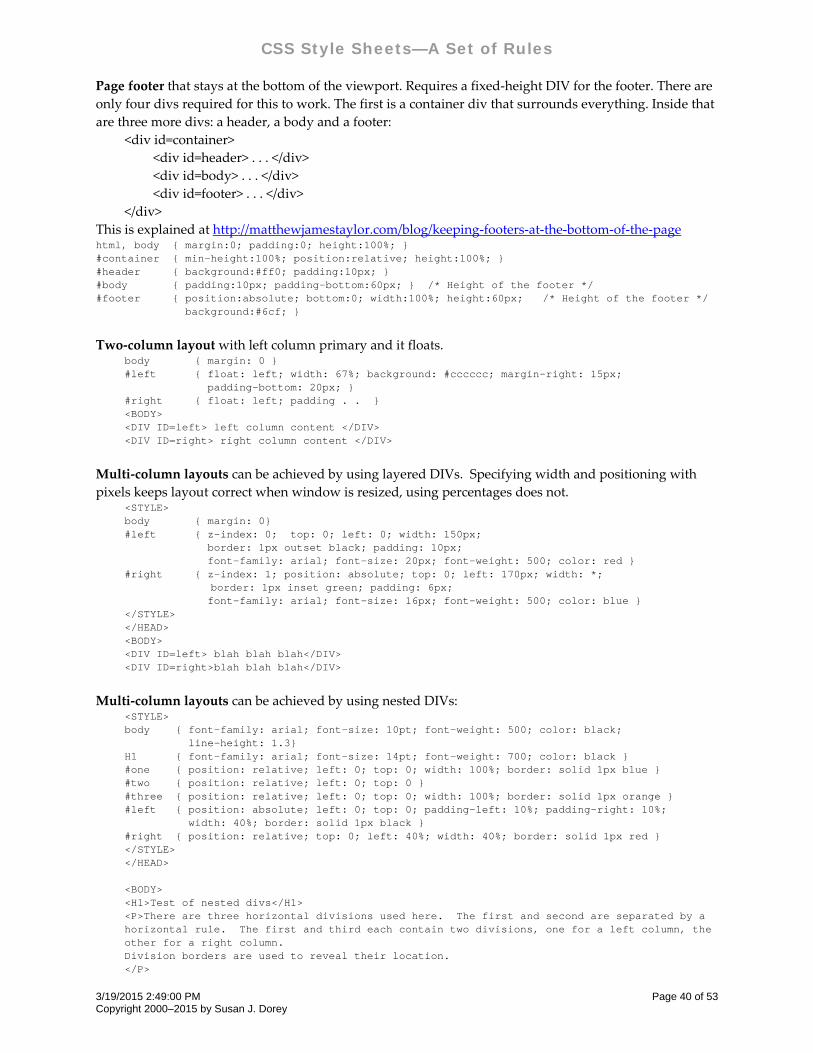
CSS Style Sheets—A Set of Rules
Page footer that stays at the bottom of the viewport. Requires a fixed‐height DIV for the footer. There are
only four divs required for this to work. The first is a container div that surrounds everything. Inside that
are three more divs: a header, a body and a footer:
<div id=container>
<div id=header> . . . </div>
<div id=body> . . . </div>
<div id=footer> . . . </div>
</div>
This is explained at http://matthewjamestaylor.com/blog/keeping‐footers‐at‐the‐bottom‐of‐the‐page html, body { margin:0; padding:0; height:100%; } #container { min-height:100%; position:relative; height:100%; } #header { background:#ff0; padding:10px; } #body { padding:10px; padding-bottom:60px; } /* Height of the footer */ #footer { position:absolute; bottom:0; width:100%; height:60px; /* Height of the footer */ background:#6cf; }
Two‐column layout with left column primary and it floats. body { margin: 0 } #left { float: left; width: 67%; background: #cccccc; margin-right: 15px; padding-bottom: 20px; } #right { float: left; padding . . } <BODY> <DIV ID=left> left column content </DIV> <DIV ID=right> right column content </DIV>
Multi‐column layouts can be achieved by using layered DIVs. Specifying width and positioning with
pixels keeps layout correct when window is resized, using percentages does not. <STYLE> body { margin: 0} #left { z-index: 0; top: 0; left: 0; width: 150px; border: 1px outset black; padding: 10px; font-family: arial; font-size: 20px; font-weight: 500; color: red } #right { z-index: 1; position: absolute; top: 0; left: 170px; width: *; border: 1px inset green; padding: 6px; font-family: arial; font-size: 16px; font-weight: 500; color: blue } </STYLE> </HEAD> <BODY> <DIV ID=left> blah blah blah</DIV> <DIV ID=right>blah blah blah</DIV>
Multi‐column layouts can be achieved by using nested DIVs: <STYLE> body { font-family: arial; font-size: 10pt; font-weight: 500; color: black; line-height: 1.3} H1 { font-family: arial; font-size: 14pt; font-weight: 700; color: black } #one { position: relative; left: 0; top: 0; width: 100%; border: solid 1px blue } #two { position: relative; left: 0; top: 0 } #three { position: relative; left: 0; top: 0; width: 100%; border: solid 1px orange } #left { position: absolute; left: 0; top: 0; padding-left: 10%; padding-right: 10%; width: 40%; border: solid 1px black } #right { position: relative; top: 0; left: 40%; width: 40%; border: solid 1px red } </STYLE> </HEAD> <BODY> <H1>Test of nested divs</H1> <P>There are three horizontal divisions used here. The first and second are separated by a horizontal rule. The first and third each contain two divisions, one for a left column, the other for a right column. Division borders are used to reveal their location. </P>
3/19/2015 2:49:00 PM Page 40 of 53 Copyright 2000–2015 by Susan J. Dorey
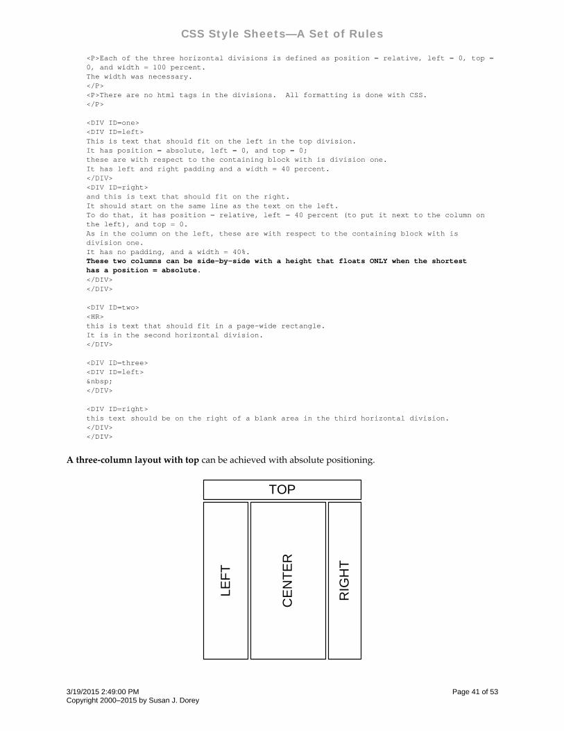
CSS Style Sheets—A Set of Rules
<P>Each of the three horizontal divisions is defined as position = relative, left = 0, top = 0, and width = 100 percent. The width was necessary. </P> <P>There are no html tags in the divisions. All formatting is done with CSS. </P> <DIV ID=one> <DIV ID=left> This is text that should fit on the left in the top division. It has position = absolute, left = 0, and top = 0; these are with respect to the containing block with is division one. It has left and right padding and a width = 40 percent. </DIV> <DIV ID=right> and this is text that should fit on the right. It should start on the same line as the text on the left. To do that, it has position = relative, left = 40 percent (to put it next to the column on the left), and top = 0. As in the column on the left, these are with respect to the containing block with is division one. It has no padding, and a width = 40%. These two columns can be side-by-side with a height that floats ONLY when the shortest has a position = absolute. </DIV> </DIV> <DIV ID=two> <HR> this is text that should fit in a page-wide rectangle. It is in the second horizontal division. </DIV> <DIV ID=three> <DIV ID=left> </DIV> <DIV ID=right> this text should be on the right of a blank area in the third horizontal division. </DIV> </DIV>
A three‐column layout with top can be achieved with absolute positioning.
TOP
LEF
T
CE
NT
ER
RIG
HT
3/19/2015 2:49:00 PM Page 41 of 53 Copyright 2000–2015 by Susan J. Dorey
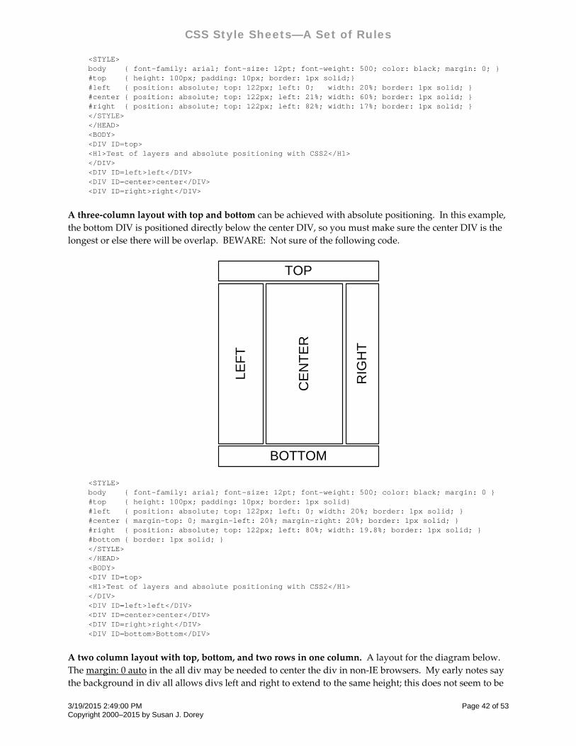
CSS Style Sheets—A Set of Rules
<STYLE> body { font-family: arial; font-size: 12pt; font-weight: 500; color: black; margin: 0; } #top { height: 100px; padding: 10px; border: 1px solid;} #left { position: absolute; top: 122px; left: 0; width: 20%; border: 1px solid; } #center { position: absolute; top: 122px; left: 21%; width: 60%; border: 1px solid; } #right { position: absolute; top: 122px; left: 82%; width: 17%; border: 1px solid; } </STYLE> </HEAD> <BODY> <DIV ID=top> <H1>Test of layers and absolute positioning with CSS2</H1> </DIV> <DIV ID=left>left</DIV> <DIV ID=center>center</DIV> <DIV ID=right>right</DIV>
A three‐column layout with top and bottom can be achieved with absolute positioning. In this example,
the bottom DIV is positioned directly below the center DIV, so you must make sure the center DIV is the
longest or else there will be overlap. BEWARE: Not sure of the following code.
TOP
BOTTOM
LEF
T
CE
NT
ER
RIG
HT
<STYLE> body { font-family: arial; font-size: 12pt; font-weight: 500; color: black; margin: 0 } #top { height: 100px; padding: 10px; border: 1px solid} #left { position: absolute; top: 122px; left: 0; width: 20%; border: 1px solid; } #center { margin-top: 0; margin-left: 20%; margin-right: 20%; border: 1px solid; } #right { position: absolute; top: 122px; left: 80%; width: 19.8%; border: 1px solid; } #bottom { border: 1px solid; } </STYLE> </HEAD> <BODY> <DIV ID=top> <H1>Test of layers and absolute positioning with CSS2</H1> </DIV> <DIV ID=left>left</DIV> <DIV ID=center>center</DIV> <DIV ID=right>right</DIV> <DIV ID=bottom>Bottom</DIV>
A two column layout with top, bottom, and two rows in one column. A layout for the diagram below.
The margin: 0 auto in the all div may be needed to center the div in non‐IE browsers. My early notes say
the background in div all allows divs left and right to extend to the same height; this does not seem to be
3/19/2015 2:49:00 PM Page 42 of 53 Copyright 2000–2015 by Susan J. Dorey
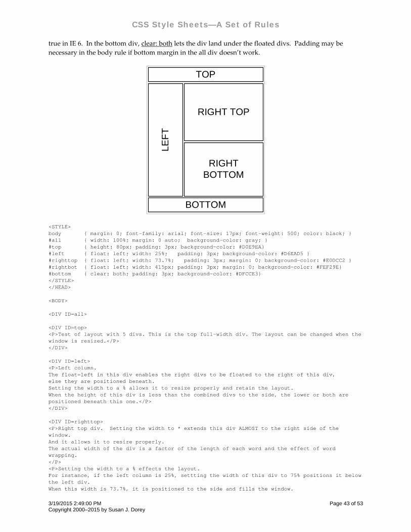
CSS Style Sheets—A Set of Rules
true in IE 6. In the bottom div, clear: both lets the div land under the floated divs. Padding may be
necessary in the body rule if bottom margin in the all div doesn’t work.
TOP
LEF
T
RIGHT TOP
BOTTOM
RIGHT BOTTOM
<STYLE> body { margin: 0; font-family: arial; font-size: 17px; font-weight: 500; color: black; } #all { width: 100%; margin: 0 auto; background-color: gray; } #top { height: 80px; padding: 3px; background-color: #D0E9EA} #left { float: left; width: 25%; padding: 3px; background-color: #D6EAD5 } #righttop { float: left; width: 73.7%; padding: 3px; margin: 0; background-color: #E0DCC2 } #rightbot { float: left; width: 415px; padding: 3px; margin: 0; background-color: #FEF29E} #bottom { clear: both; padding: 3px; background-color: #DFCCE3} </STYLE> </HEAD> <BODY> <DIV ID=all> <DIV ID=top> <P>Test of layout with 5 divs. This is the top full-width div. The layout can be changed when the window is resized.</P> </DIV> <DIV ID=left> <P>Left column. The float=left in this div enables the right divs to be floated to the right of this div, else they are positioned beneath. Setting the width to a % allows it to resize properly and retain the layout. When the height of this div is less than the combined divs to the side, the lower or both are positioned beneath this one.</P> </DIV> <DIV ID=righttop> <P>Right top div. Setting the width to * extends this div ALMOST to the right side of the window. And it allows it to resize properly. The actual width of the div is a factor of the length of each word and the effect of word wrapping. </P> <P>Setting the width to a % effects the layout. For instance, if the left column is 25%, settting the width of this div to 75% positions it below the left div. When this width is 73.7%, it is positioned to the side and fills the window.
3/19/2015 2:49:00 PM Page 43 of 53 Copyright 2000–2015 by Susan J. Dorey
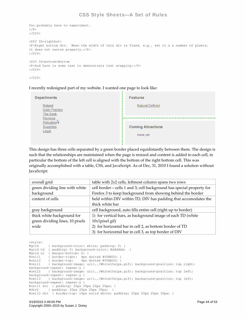
CSS Style Sheets—A Set of Rules
You probably have to experiment. </P> </DIV> <DIV ID=rightbot> <P>Right bottom div. When the width of this div is fixed, e.g., set to a a number of pixels, it does not resize properly.</P> </DIV> <DIV ID=bottom>Bottom <P>And here is some text to demonstrate text wrapping.</P> </DIV> </DIV>
I recently redesigned part of my website. I wanted one page to look like:
This design has three cells separated by a green border placed equidistantly between them. The design is
such that the relationships are maintained when the page is resized and content is added to each cell, in
particular the bottom of the left cell is aligned with the bottom of the right bottom cell. This was
originally accomplished with a table, CSS, and JavaScript. As of Dec, 31, 2010 I found a solution without
JavaScript:
overall grid table with 2x2 cells, leftmost column spans two rows
green dividing line with white
background
cell border—cells 1 and 3; cell background has special property for
Firefox 3 to keep background from showing behind the border
content of cells held within DIV within TD, DIV has padding that accomodates the
thick white bar
gray background cell background, auto fills entire cell (right up to border)
thick white background for
green dividing lines, 10 pixels
wide
1) for vertical bars, as background image of each TD (white
10x1pixel gif)
2) for horizontal bar in cell 2, as bottom border of TD
3) for horizontal bar in cell 3, as top border of DIV
<style> #grid { background-color: white; padding: 0; } #grid td { padding: 0; background-color: #dddddd; } #grid ul { margin-bottom: 0; } #cell1 { border-right: 4px dotted #00BE00; } #cell3 { border-top: 4px dotted #00BE00; } #cell1 { background-image: url(../White10x1px.gif); background-position: top right; background-repeat: repeat-y } #cell2 { background-image: url(../White10x1px.gif); background-position: top left; background-repeat: repeat-y } #cell3 { background-image: url(../White10x1px.gif); background-position: top left; background-repeat: repeat-y } #cell1 div { padding: 20px 30px 20px 20px; } #div2 { padding: 20px 20px 20px 30px; } #cell3 div { border-top: 10px solid white; padding: 20px 20px 20px 30px; }
3/19/2015 2:49:00 PM Page 44 of 53 Copyright 2000–2015 by Susan J. Dorey
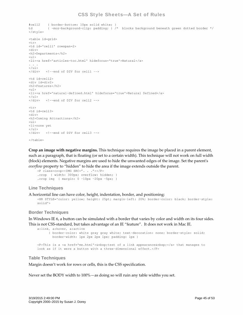
CSS Style Sheets—A Set of Rules
#cell2 { border-bottom: 10px solid white; } td { -moz-background-clip: padding; } /* blocks background beneath green dotted border */ </style> <table id=grid> <tr> <td id="cell1" rowspan=2> <div> <h2>Departments</h2> <ul> <li><a href="articles-toc.html" hidefocus="true">Natural</a> . . . </ul> </div> <!--end of DIV for cell1 --> <td id=cell2> <div id=div2> <h2>Features</h2> <ul> <li><a href="natural-defined.html" hidefocus="true">Natural Defined</a> </ul> </div> <!--end of DIV for cell2 --> <tr> <td id=cell3> <div> <h2>Coming Attractions</h2> <ul> <li>none yet </ul> </div> <!--end of DIV for cell3 --> </table>
Crop an image with negative margins. This technique requires the image be placed in a parent element,
such as a paragraph, that is floating (or set to a certain width). This technique will not work on full width
(block) elements. Negative margins are used to hide the unwanted edges of the image. Set the parentʹs
overflow property to “hidden” to hide the area if the image extends outside the parent. <P class=crop><IMG SRC=”. . .”></P> .crop { width: 300px; overflow: hidden; } .crop img { margin: 0 -10px -20px -5px; }
Line Techniques
A horizontal line can have color, height, indentation, border, and positioning: <HR STYLE="color: yellow; height: 25pt; margin-left: 20%; border-color: black; border-style: solid">
Border Techniques
In Windows IE 6, a button can be simulated with a border that varies by color and width on its four sides.
This is not CSS‐standard, but takes advantage of an IE “feature”. It does not work in Mac IE. a:link, a:hover, a:active { border-color: white gray gray white; text-decoration: none; border-style: solid; border-width: 1px 2px 2px 1px; padding: 1px } <P>This is a <a href="me.html"> test of a link appearance </a> that manages to look as if it were a button with a three-dimensional effect.</P>
Table Techniques
Margin doesn’t work for rows or cells, this is the CSS specification.
Never set the BODY width to 100%—as doing so will ruin any table widths you set.
3/19/2015 2:49:00 PM Page 45 of 53 Copyright 2000–2015 by Susan J. Dorey
CSS Style Sheets—A Set of Rules
The declaration max‐width doesn’t seem to work on the TABLE element. At least not in IE 7, it does work
as expected in Firefox 3..
Set column width with CSS: td {width: 50% }
Note that in HTML you can set the column width to “*” which sets it to the available space, which can be
handy when the window width is changed by the user. This capability does not exist in CSS. If you need
it, do it in HTML. Well, not so as it turns out. The CSS solution is to set the widths on the first TDs, or
perhaps use TH for this; for the column for which you would use “*” in HTML, use width: 100% in CSS.
If you want to control the column widths, be sure to set the table width: table {width: 100% }
Make table be a certain percentage width: <table style="width: 70%; margin-left: 15%; margin-right: 15%;"> . . . </table>
Caution: According to a web page I read, “widths on tables have always been more like a polite advice
than a strict rule. If the table needs more space than the width allows, it takes more space.”
Center a table with CSS. The “correct” way to center a table is to set its left and right margins to “auto.”
Non‐compliant browsers complicate this. Some will incorrectly center a table if it is contained within a
block having text‐align: center. <div style="text-align: center;"> <table style="margin-left: auto; margin-right: auto; text-align: left;"> . . . </table> </div>
Make table be a certain percentage width with fixed‐width side margins: <table style="width: 97.5%; margin-left: 10px; margin-right: 10px;"> . . . </table>
Make table be fixed width, in this example 100px but could be any width: tr, td {text-align: left;} . . . <div style="width: 98%; margin: 1%"> <table style="text-align: center; margin-left: auto; margin-right: auto; width: 100px"> . . . </table> </div>
When the BODY element is centered with max‐width and auto side margins, you won’t be able to use
width = 100% and fixed‐width table side margins and keep the table within the body (when the viewport
is narrowed, the table will extend beyond the BODY border into the white space on the right). If you want
the table to have visual side margins (i.e., white space that looks like side margins) and remain within the
BODY element borders, then you must style the table similarly: <table style="width: 97.5%; margin-left: 10px; margin-right: 10px">
This styling lets the table remain within the BODY when the viewport is narrowed. In this case,
max‐width won’t work right, especially when one column has width = “*”.
3/19/2015 2:49:00 PM Page 46 of 53 Copyright 2000–2015 by Susan J. Dorey
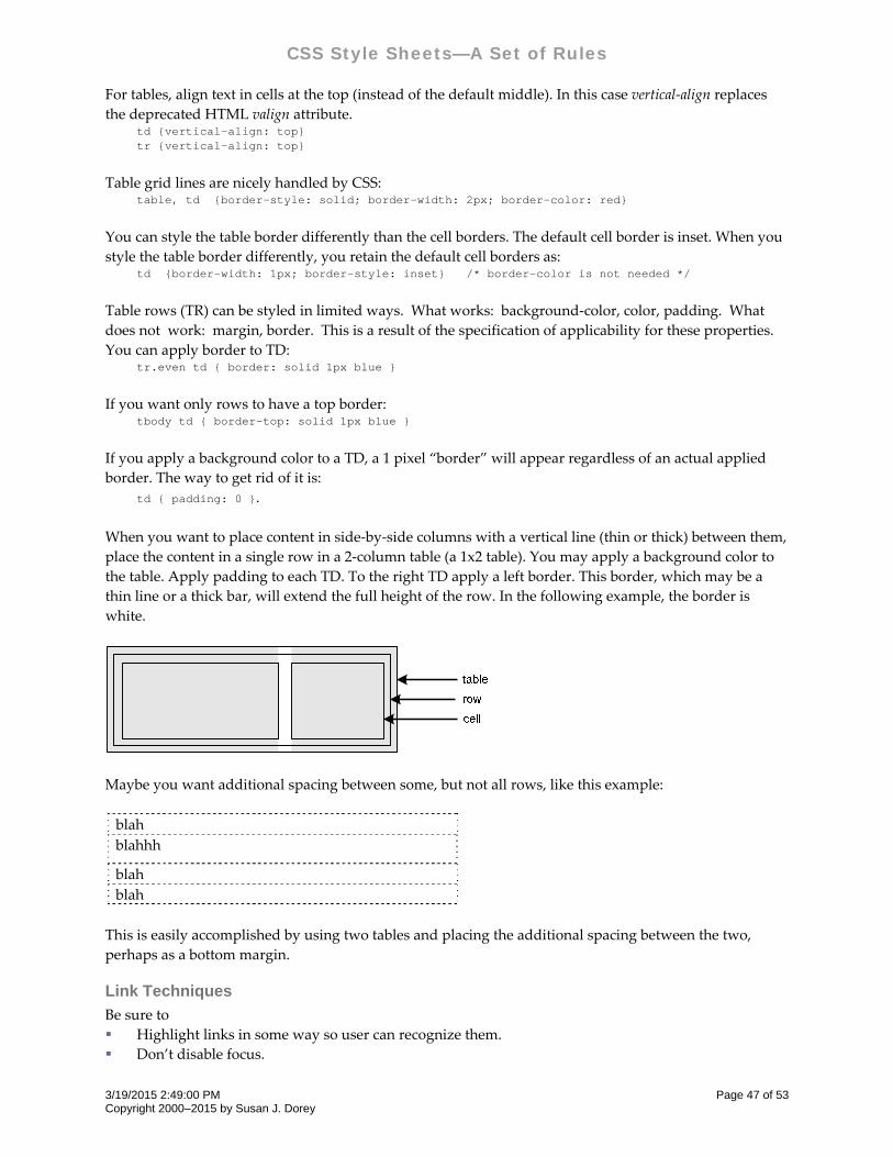
CSS Style Sheets—A Set of Rules
For tables, align text in cells at the top (instead of the default middle). In this case vertical‐align replaces
the deprecated HTML valign attribute. td {vertical-align: top} tr {vertical-align: top}
Table grid lines are nicely handled by CSS: table, td {border-style: solid; border-width: 2px; border-color: red}
You can style the table border differently than the cell borders. The default cell border is inset. When you
style the table border differently, you retain the default cell borders as: td {border-width: 1px; border-style: inset} /* border-color is not needed */
Table rows (TR) can be styled in limited ways. What works: background‐color, color, padding. What
does not work: margin, border. This is a result of the specification of applicability for these properties.
You can apply border to TD: tr.even td { border: solid 1px blue }
If you want only rows to have a top border: tbody td { border-top: solid 1px blue }
If you apply a background color to a TD, a 1 pixel “border” will appear regardless of an actual applied
border. The way to get rid of it is:
td { padding: 0 }.
When you want to place content in side‐by‐side columns with a vertical line (thin or thick) between them,
place the content in a single row in a 2‐column table (a 1x2 table). You may apply a background color to
the table. Apply padding to each TD. To the right TD apply a left border. This border, which may be a
thin line or a thick bar, will extend the full height of the row. In the following example, the border is
white.
Maybe you want additional spacing between some, but not all rows, like this example:
blah
blahhh
blah
blah
This is easily accomplished by using two tables and placing the additional spacing between the two,
perhaps as a bottom margin.
Link Techniques
Be sure to
Highlight links in some way so user can recognize them.
Don’t disable focus.
3/19/2015 2:49:00 PM Page 47 of 53 Copyright 2000–2015 by Susan J. Dorey
CSS Style Sheets—A Set of Rules
Reflect focus by unique highlighting. Browsers typically present a dotted outline around a link, if
you hide this be sure to use a different highlighting technique.
Don’t disable [Tab] access to links.1
Consider differentiating visually between the various states of a link: link (unvisited), hover, focus
active, visited.
Consider positioning the focus on the first link when the page opens in order to facilitate [Tab]
access to the page links.
Consider styling the ACTIVE state to make it obvious. (I use a pen‐and‐tablet instead of a mouse.
Sometimes a tap on a link gives it the focus but does not activate it. Without special styling the only
way to tell the link is not active is when the page is not replaced.)
Browsers have a default method of highlighting the presence of a link. For text it is underlined and
colored differently. For an image it is given as a border. You can override this styling with CSS.
For text choose from different techniques for highlighting the presence of the link:
bold text
underline text
no underlining
differently colored text
different background color
font‐weight: bold
text‐decoration: underline
border‐bottom: 3px solid black (not IE 7)
text‐decoration: none
color: pink
background‐color: pink
For an image, you can remove the border: a:link img {border: none }
If you want the style applied to all link variations: a img { border: none }
Browsers typically render a fine dotted border for the FOCUS state (the focus outline). You can remove
this with JavaScript and CSS: <A HREF=". . ." hidefocus="true"><IMG . . .></A> /* for IE 7 */ a { outline: none } /* for Firefox */
You can set the focus on the first link when the page opens: <script type="text/javascript"> function setfocus() { document.links[0].focus(); } </script> </head> <body onload="setfocus()">
Browsers are different, for example:
State Link Opens in New Window IE 7 Firefox 3
after link activated yes status = link, active, focus status = visited
after link activated no status = visited status = visited
1 Using the blur method for the onfocus event handler, <A HTML = . . .” ONFOCUS=”blur()”> . . . </A> will disable the
focus. This will disable [Tab] access and is a bad idea.
3/19/2015 2:49:00 PM Page 48 of 53 Copyright 2000–2015 by Susan J. Dorey
CSS Style Sheets—A Set of Rules
For the first case, if you want to automatically revert to VISITED, you must use JavaScript to remove the
focus from the link (but it does not remove “active”). Note that the HIDEFOCUS attribute is specific to IE
only; and be aware that in hiding the focus outline, you are also hiding any indication that a link has the
focus. <A HREF=" . . . " TARGET="_blank" HIDEFOCUS="true">link text here</A>
You may want to style links differently for mouse navigation than for tabbed navigation. The former is
accomplished by the pointer device (typically a mouse). The latter is accomplished by moving through
links with the [Tab] key.
For tabbed navigation, the only way users can see which link they are on—which link has the focus—is if
the FOCUS state is styled uniquely. You can use a different property to indicate FOCUS. For example
border-bottom: 3px solid black. This works just find in Firefox 3 but not at all in IE 7 (which seems to
consider this state ACTIVE). Some developers use the technique of blurring the focus (onfocus=”blur()”)
which may be fine for mouse navigation, but not for tabbed navigation; this has the undesirable result of
obscuring which link has the focus during tabbed navigation.
Tabbed navigation in IE 7 seems to set the link state to ACTIVE (not FOCUS which seems more
appropriate).
It may prove desirable to use JavaScript for mouse event handlers. It may be that an onmousedown event handler can block the focus outline in IE7 with blur(). QuirksMode.org has a good discussion of mouse
event handlers: http://www.quirksmode.org/js/events_mouse.html
The onmousedown attribute is similar to the onclick attribute, but differs in that the event is
triggered the moment the mouse button is pressed on the element, rather than at the point at which
the mouse button is released (onclick is effectively a combination of onmousedown and onmouseup
event on the element in question). This event isn’t often seen in practice, possibly because it can so
easily cause events to be triggered accidentally. If you’re using an onclick event, the user can move
the cursor off the element, release the mouse button, and avoid triggering the action if it was an
accidental button press; this is not the case with onmousedown. [from sitepoint.com]
Should you think of using JavaScript to force the browsers to behave identically, be aware that while you
can use JavaScript to change CSS2 properties, you cannnot refer to the pseudo classes selectors, thus you
cannot access those states directly.
Image Techniques
Floating thumbnails are effected: see page 39.
Image loading sequence may be the same as HTML sequence when HEIGHT and WIDTH are omitted.
When you want to layer text over an image, create the text as one or more P elements within a DIV
having the image as background. In the sample code below, the image is 422x586 pixels. The DIV is sized
to hold a border and a padding of 2px, so it is larger than the actual image. Centering the image in the
DIV provides a visual padding (like a matte on a framed painting). .hot { font-family: arial, helvetica, sans-serif; font-size: 200%; font-weight: 800; border: 2px solid red; width: 40px; height: 40px; padding-top: 6px; text-align: center; } . . . div style="width: 430px; height: 594px; border: 2px solid #989898; background-image: url(jobsd/4b.jpg); background-repeat: no-repeat; background-position: center center; margin-bottom: 1em">
3/19/2015 2:49:00 PM Page 49 of 53 Copyright 2000–2015 by Susan J. Dorey
CSS Style Sheets—A Set of Rules
<p style="position: relative; top: 25px; left: 40px" class=hot>1</p> <p style="position: relative; top: 100px; left: 20px" class=hot>2</p> </div>
Presenting an image as a background is super—until you print the page. Browsers do not print
backgrounds by default. IE has a setting on Tools, Internet Options, Advanced to print backgrounds.
Some browsers have no such setting. What to do?
1. Don’t use images as background if they are critical to the content. Instead insert them with the IMG
HTML tag.
2. Use DIVs with absolute positioning and filled with an IMG, all with a z‐index that puts it behind the
content. The images will print and look like a background.
3. Include both the image as an IMG tag and as a CSS background. On the screen stylesheet use
display: none to hide the IMG tag. On the print stylesheet use display: none to hide the element with
the background.
Present images with border and matting: <img src=” . . .” class=”left”> img.left { border: 2px solid white; padding: 6px; margin-right: 2em; float-left; }
Menu Techniques
A menu is considered to be a list of navigation choices. A menu contains a list of menu items, each list has
either a horizontal or vertical orientation. Each menu item may be associated with (have) a lower level
menu with one or more menu items.
There are a number of ways in which menus can be presented.
Fixed. Entire menu is always visible, the layout indicates relationships.
Dynamic. The main menu is always visible, but the lower level menus appear only when their
parent menu item is selected.
Cascading. A form of dynamic menu where the main menu is always visible, while each next lower
level menu appears below a horizontal list or to the side of a vertical list. Consequently the levels
alternate between horizontal and vertical.
Expand/collapse. A lower level menu appears when the expand (+) icon is activated, disappears
when the collapse (‐) icon is activated. Menu entries typically appear below but may appear to the
side. Not all menu items can be expanded/collapsed. This may be used to reflect a vertical tree
structure.
Fixed lower level menu appears dynamically. All subordinate menu entries, regardless of level,
appear at once when the main menu item is selected.
Not all menu items may have a hypertext link, some may be headings. At any level, there may be a mix of
menu item types—links and headings.
Methods of selecting a menu in order to open its lower level items:
click: done with HTML A tag or onClick event.
mouseover (event): needs JavaScript.
hover (pseudo‐class): can be done with CSS alone.
Menu items can be represented by several HTML tags: UL/LI, TD, IMG, SPAN, DT/DD, Hn. Of these,
UL/LI is the most semantically appropriate (MENU as a list was deprecated in favor of UL). Using a UL
for a horizontal menu requires property list‐style: none. It can be helpful to contain the entire menu in a
DIV. When all lower level menu items appear at once, they can be contained in a DIV; the DIV can
employ a mouseout event handler to close it.
3/19/2015 2:49:00 PM Page 50 of 53 Copyright 2000–2015 by Susan J. Dorey
CSS Style Sheets—A Set of Rules
Operationally, the issues seem to be:
How are lower menu levels displayed and what does the user have to do to make it happen?
How long are the lower menu levels displayed and what does the user have to do to make them
disappear? It can be aggravating to the user to have opened a four‐level menu one level at a time
only to have the cursor slip off—letting all lower levels close. This situation is made more likely
when menu items are small and/or have little margins or padding.
If there are more than two levels, how can the user “back up”? or do they have to start over?
Example of a menu with a fixed lower level menu that appears dynamically: http://jhu.edu/ The lower
level menu appears on mouseover‐hover and stays open as long as the cursor is positioned on it; it may
have one or more levels. The main menu is a horizontal UL, the box for the lower level menus is a child
DIV with visibility:hidden and z‐index:9999. The mouseout event is used to hide the submenu box.
Example of a menu with a fixed lower level menu that appears dynamically: http://artgallery.yale.edu/
The lower level menu appears when a main menu item is clicked and stays open as long as the cursor is
positioned on it; it may have one or more levels. The lower level menu is on a higher layer, when it
appears it does not displace other content. [While I like the appearance and operation of the menu, I do
not care for how it and the rest of the page is implemented, with lots of JavaScript and tables.]
An example of a cascading menu is at website:
http://demotemplates.joomlashack.com/aqua_dark/index.php?option=com_content&task=view&id=11&It
emid=47 All behavior is controlled by CSS. In HTML the main menu is a UL, each submenu is its own
UL. Each menu item is a LI. Each submenu UL is nested in its parent’s LI:
<LI> . . . <UL><LI> . . . </LI><LI> . . . </LI></UL></LI>
The menu is contained in a DIV with id = tabmenu, which is contained in a DIV with class = menutab.
Use of CSS classes and IDs:
In the main menu, menu items with no sub‐menu have LI class = mainlevel
In the main menu, menu items with a sub‐menu have no LI class
Main menu items with no submenu have A class = mainlevel
Main menu items with a submenu have A class = child
Submenu items with no submenu have A class = sublevel
Submenu items with a submenu have A class = child
The active menu item has LI ID = active
The active submenu item has A class = sublevel_current
The active submenu item has A ID = active_menu
Key CSS elements that control the appearance:
.menutab { background: . . . }
#tabmenu { float: none; position: relative; z‐index: 900; background: . . . }
#tabmenu ul { float: left; list‐style: none; position: relative }
#tabmenu ul li { position: relative }
#tabmenu a { float: left }
#tabmenu ul li.mainlevel { background: . . . }
#tabmenu ul li.mainlevel a.mainlevel,
#tabmenu ul li.mainlevel a.mainlevel_current,
#tabmenu ul li.mainlevel a.child
{display: block; background: . . . }
#tabmenu ul li.mainlevel a.child {display: block }
3/19/2015 2:49:00 PM Page 51 of 53 Copyright 2000–2015 by Susan J. Dorey
CSS Style Sheets—A Set of Rules
#tabmenu ul li#active.mainlevel { background: . . . }
#tabmenu ul li.mainlevel a#active_menu,
#tabmenu ul li#active.mainlevel a.child { display: block, background: . . . }
#tabmenu li { float: left; background: none }
#tabmenu ul ul a { background: none }
#tabmenu li.hover ul,
#tabmenu li li.hover ul,
#tabmenu li li li.hover ul,
#tabmenu li li li li.hover ul,
#tabmenu li.iehover ul,
#tabmenu li li.iehover ul,
#tabmenu li li li.iehover ul,
#tabmenu li li li li.iehover ul,
{ background: . . .}
[define hover colors:] #tabmenu li.hover a,
#tabmenu.li.iehover a
{ color: . . . }
Ditto for ul li a.hover and its variants
See the website for more details.
Interaction Techniques
Text can be hidden by display: none and then made visible by display: block. Text can be toggled back and
forth by JavaScript that dynamically changes the display value; e.g., …. thisText.display = “none” … .
Change the appearance of content in response to events. For example, change the background color
when the mouse pointer hovers over the content. The basic approach: (1) in HTML have event handlers
set the content’s class name(s), (2) in CSS define the style for the changed appearance using the class
name from #1. In the following example, the content whose appearance is changed when the mouse
pointer hovers over it is placed within a DL, but it also could be a DIV, SPAN, P, or something else.
There is no CSS for dl.pkg. <STYLE> dl { border-bottom: 1px solid #ccc; padding: 10px 0; } dl.over { background-color: #eee; } </STYLE> . . . <DL CLASS="pkg" ONMOUSEOVER="this.className = 'over pkg';" ONMOUSEOUT="this.className = 'pkg'"> this content is restyled . . . </DL>
Bibliography & Resources
World Wide Web Consortium is the
standards‐making body; they publish the
specifications
www.w3.org/Style/CSS/
CSS Pointers Group css.nu
uses of symbol font www.bbsinc.com/symbol.html
color test www.bbsinc.com/bbs‐cgi‐bin/colorEditor.cgi
known issues developer.netscape.com/support/bugs/known/css.html
3/19/2015 2:49:00 PM Page 52 of 53 Copyright 2000–2015 by Susan J. Dorey
CSS Style Sheets—A Set of Rules
3/19/2015 2:49:00 PM Page 53 of 53 Copyright 2000–2015 by Susan J. Dorey
implementation across several browsers www.quirksmode.org
css.nu/pointers/bugs.html
www.westciv.com.au/style_master/academy/browser_su
pport
www.thesitewizard.com/css/excludecss.shtml
www.w3.org/Style/CSS/#support (as of 1‐07 look for the
line “These sources document the level of support in
various browsers:”)
www.positioniseverything.net/explorer.html (CSS bugs
in IE)
ditto – for HTML webdev.wrox.co.uk/reference/html4db/result.asp
CSS validation service jigsaw.w3.org/css‐validator/
design ideas www.csszengarden.com
www.mezzoblue.com/zengarden/resources
www.alistapart.com/
global reset styles1 http://perishablepress.com/press/2007/10/23/a‐killer‐
collection‐of‐global‐css‐reset‐styles/
1 This is highly worthwhile reading. Each browser implements CSS in its own way, which all too often is at variance
with the standards and with other browsers. “Using a well‐crafted set of global CSS reset styles enables designers to
make assumptions about the default behavior of browsers.” These styles reset the default browser styles. And help to
minimize the browser differences. The reset styles are placed at the top of your stylesheet.