Embed Size (px)
Citation preview

8/3/2019 Dossier 2011 Eng
http://slidepdf.com/reader/full/dossier-2011-eng 1/51
1 de 51
Theory dossier
Data analysisCourse 2011-2012
1) Introduction. Basic concepts. Sampling....................................................................................... 2 2) Graphical description of a variable .............................................................................................. 2 Numerical description of a variable .................................................................................................... 2
1. Data transformation. .............................................................................................................. 2 1. Measures of position ........................................................................................... 4 2. Measures of spread and form .............................................................................. 5 3. Other tranformations ........................................................................................... 6
2. Grouped data .......................................................................................................................... 8 1. Computation of the median and the quartiles ...................................................... 8 2. Computation of the mean and the standard deviation ......................................... 9
Normal distribution. ........................................................................................................................... 10 Datasets with two variables (I)........................................................................................................... 10
Two numerical variables ................................................................................................................ 10 Excessive dispersion: the median and mean trace ......................................................................... 10 Non linear regression ..................................................................................................................... 11 One numerical and one categorical variable .................................................................................. 15
Example: a non-ranked categorical variable and a numerical variable. Income and county..................................................................................................................................... 15 Example: analysis of a ranked categorical variable. Income and schooling............... 18
Datasets with two variables (II) ......................................................................................................... 21 Two categorical variables ............................................................................................................... 21
Time series ......................................................................................................................................... 22 Introduction .................................................................................................................................... 22 Composition ................................................................................................................................... 22 Analysis of the trend and the cycle: the long term ......................................................................... 25
Fitting mathematical functions................................................................................................... 25 Moving averages ........................................................................................................................ 26
Short term fluctuations ................................................................................................................... 29 Seasonal variations ..................................................................................................................... 29
Predition with time series ............................................................................................................... 31 The trend .................................................................................................................................... 32 The seasonal component ............................................................................................................ 32
Measures of inequality and concentration ......................................................................................... 35
Inequality measures........................................................................................................................ 35 Concentration indices ..................................................................................................................... 41
Index numbers.................................................................................................................................... 43 Simple indices ................................................................................................................................ 45 Complex indices ............................................................................................................................. 46
Laspeyres index.......................................................................................................................... 46 Paasche index ............................................................................................................................. 48
Measuring inflation ........................................................................................................................ 48 Nominal and real growth................................................................................................................ 50
8/3/2019 Dossier 2011 Eng
http://slidepdf.com/reader/full/dossier-2011-eng 2/51
2 de 51
1) Introduction. Basic concepts. Sampling.
How to identify individuals, variables and observations, how to organize the data adequately toenter them into the computer and how to construct a frequency table?.
Three points:
1) What is and what do we do in statistics? Moore, pages in the prolog.2) Data analysis: variables and data organization. Chapter 1, pag. 3-5
Data collection: samples. Chapter 3, pag. 205-225
2) Graphical description of a variable
Bar diagrams, piecharts, histograms, stemplots, time-series graphs.
Moore, Chap. 1, pag. 6-22
Numerical description of a variable
Center and spread measures. Boxplot. Standard deviation. Data transformation.
Moore, Chap. 1, pag. 32-51
1. Data transformation.
We have often to change the units of measure of our data. In these cases it is useful to have an ideaon how our descriptive measure will change.
The most common transformation of our data is what we call origin change and scale change of ourdata. Sometimes we have to apply these two types of change at the same time.
An origin change is produced when we sum a positive or negative constant to our data. If we callour original variable X , and a is any positive or negative constant, an origin change will beproduced if we sum a to each case in our data and we will get a transformed variable that we call Y
. We can express this transformation by the following equation:
Y X a= −
We call it origin change because from a graphical point of view, the transformation implies a shift
towards the right or the left of the data (depending on a being positive or negative, respectively)over the horizontal axis.
A case where we can find such a transformation is the following: consider a group of people whohave between 2 and 8 euros in their pockets. Each one of them receives a present of 7 euros. Thechange is shown in the following chart:

8/3/2019 Dossier 2011 Eng
http://slidepdf.com/reader/full/dossier-2011-eng 3/51

8/3/2019 Dossier 2011 Eng
http://slidepdf.com/reader/full/dossier-2011-eng 4/51
4 de 51
Sometimes these two transformations have to be applied at the same time. We can find an example
in the conversion from Fahrenheit degrees to Celsius degrees. If C are Celsius degrees and F areFahrenheit degrees, the formula is:
C=F − 32
1 .8
In general a transformation of a variable X to a variable Y , that includes an origin change and a scalechange, can be represented by the formula:
Y=X − a
b
where a is a a positive or negative constant and b is a larger or smaller than 1 positive constant.
We call these transformations also linear transformations. We use the word linear because thefunction that we apply to go from X to Y is a linear function.
Linear transformations are not the only ones that we can apply to the data, despite being the mostcommon ones. At the end of this section we will also talk of non-linear transformations.
What happens to our summary measures when we apply linear transformations?
Do we have to recompute all the measures when we apply a linear transfomation?
The answer is negative. We will see in what comes next how the summary measures are affected infront of linear transformations of the typ Y = (X-a)/b.
1. Measures of position
If X R is a measure of position of a dataset with a numerical variable X to which we apply a linear
transformation obtaining a new variable Y=(X-a)/b, we can find the same unit of measure for thenew variable Y by the following formula::
RY = R
X − a
b
That is we apply the same transformation that we apply to the summary measure.
Proving this results is straightforward. The measures of position are also linear functions of the data(for instance the mean), and therefore we can apply directly the same linear transformation to the
summary measure.

8/3/2019 Dossier 2011 Eng
http://slidepdf.com/reader/full/dossier-2011-eng 5/51
5 de 51
Suppose for instance that we are told that at New York the average temperature in September is 70degrees Fahrenheit. Can we know the average temperature in Celsius degrees without having to askfor the daily temperatures to recompute the mean? We do not need the case by case dailytemperature, the average temperature in Celsius degrees is:
70− 32
1 .8= 21.1Celsiusdegrees
This result is valid for all measures of position (median, quartiles, etc.)1.
2. Measures of spread and form
As we had stated before, linear transformations imply a change of origin and change of scale. Thechange of origin implies simply a shift of the histogram without affecting its form. Consequently,the measures of spread, symmetry, kurtosis and so on, are not affected by changes of origin.Conversely, changes of scale do affect them in a predictable way.
Linear transformations affect the measures of spread, but not the measures of form. If X R is ameasure of spread of a dataset with a numerical variable X and we apply a linear transformation to
these data we obtain a new variable Y=(X+a)/b, the same measure of spread in the dataset Y will be: X
Y
R R
b=
That is, only the change of scale is applied2.
Example:
At the car repair shop “Mario Bros.” they employ seven workers with the following wages:
Wages (in pesetas)
Wages (in pesetas)
140.000 150.000 170.000 130.000 160.000 180.000
The mean and the standard deviation of the wages are:
155.000
18.708,29 X
X
s
=
=
We are told that in December the workers will get a pay raise of 20000 pesetas, and at the beginningof 2001 Spain is abandoning the peseta and adopting the euro.
What will be the mean and standard deviation of the wages, now expressed in euros, taking intoaccount the raise of 20000 pesetas (120.20 €)? We will have to compute the wage of each workerduring December, sum 20000 pesetas and divide by 166.386 to obtain the January wages in Euros?
It is not needed, using the previous results, the mean in January is:
1 If b was negative, the formula could not be applied for resistent measures and if the distribution was skewed,
the skewness would be reversed, but there are no practical cases where we need a negative b.2 If b was negative, this would not affect the result and the new measure would end up being divided by theabsolute value of b,but remember what we said from negatives b, they are not found in actual measure changes and sowe assume b is always positive.

8/3/2019 Dossier 2011 Eng
http://slidepdf.com/reader/full/dossier-2011-eng 6/51
6 de 51
20000 155000 200001051.771
166.386 166.386
X Y
+ += = =
and the standard deviation
112.4391166.386
X Y
ss = =
We could have obviously computed the new wages:
Wages (in euros)
853.44 913.54 1033.74 793.34 973.64 1093.84
and now compute the mean and the standard deviation, which would lead us obviously to the sameresults.
3. Other tranformations
In practical applications the most common transformations are linear, since they are associated withchanges in unit of measure of the data.
Non-linear transformations are less common and are used to change the form of the distributions.Sometimes skewed distributions can be converted into symmetric distributions using thesetransformations, and once they are symmetrical we can use summary numbers such as the mean orthe standard deviation which are not adequate to use if the distribution is skewed.
Non-linear transformations are based on non-linear functions, such a the logarithmic, exponential orpolynomial function.
Let us consider for instance the following dataset, corresponding to the returns obtained at the stockmarket by various investors, in thousands of euros:
Returns
10 15.84 25.11 31.62 50.11
10 15.84 25.11 39.81 63.09
12.58 15.84 25.11 39.8112.58 25.11 31.62 39.81
12.58 25.11 31.62 50.11
Let us draw the histogram:

8/3/2019 Dossier 2011 Eng
http://slidepdf.com/reader/full/dossier-2011-eng 7/51
7 de 51
We can appreciate that is quite skewed to the right, indicating that most investors obtain reducedreturns with a couple of lucky ones (or maybe they know more about stock market investments) thatobtain higher returns.
In this distribution we would not be able to apply the mean or the standard deviation, since they are
skewed. For this reason we apply a non-linear transformation, in this case a logarithmictransformation reduce the skewness of the data. The transformation that we apply to the original X is
log( )Y X =
where log denotes the logarithm in base 10. The data that we obtain now are:
Returns
1 1.2 1.4 1.5 1.7
1 1.2 1.4 1.6 1.8
1.1 1.2 1.4 1.6
1.1 1.4 1.5 1.6
1.1 1.4 1.5 1.7
If we draw the histogram now we obtain:
This histogram is clearly more symmetric and now we can use the mean or the standard deviation if we want.
8/3/2019 Dossier 2011 Eng
http://slidepdf.com/reader/full/dossier-2011-eng 8/51
8 de 51
Do we have properties for the summary measures like the ones that we have for lineartransformations, so that we can predict their values without the need to recompute all the data andcompute the numerical measures from there?
For the case of non-linear transformations we do not have similar properties. This means that themean of the data that we transformed with the logarithmic function, for instance, is not equal to thelogarithm of the mean of the original data.
2. Grouped data
We call grouped data a data set of one numerical variable presented in a frequency table. Very oftenwe find statistical information that is presented in this format at publications from statisticalagencies, government or economic press. In this case we do not know the original information, thatis the data case by case, and we have to work with the data grouped in intervals or ranges. We willsee in this section that we still can compute practically all the numerical summaries and we can
perform a fairly accurate description of the data set.
1. Computation of the median and the quartiles
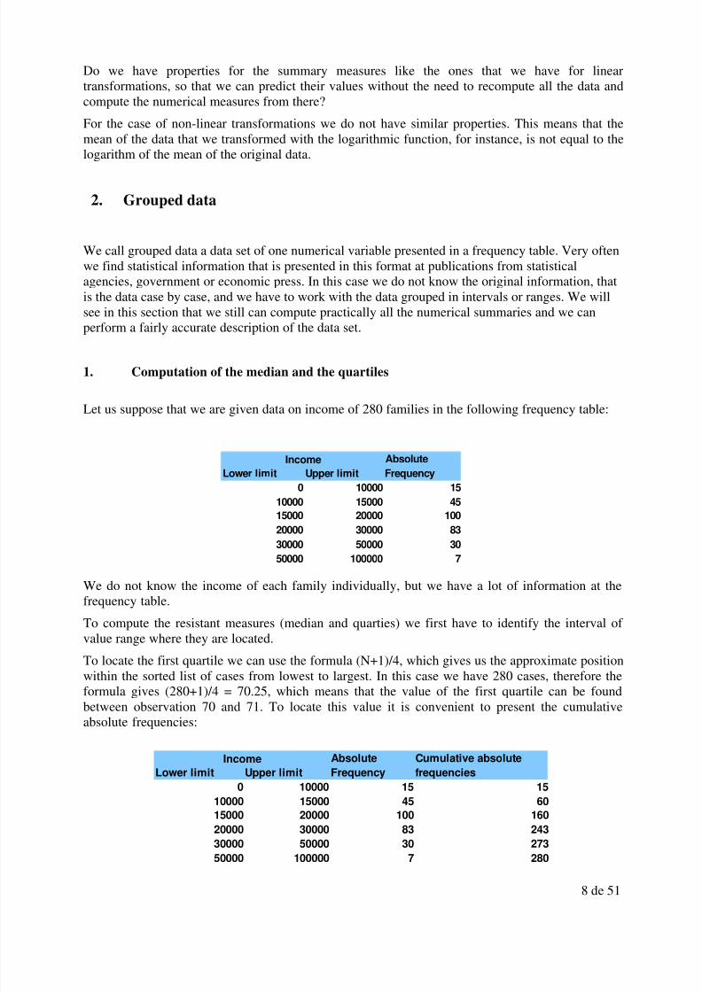
Let us suppose that we are given data on income of 280 families in the following frequency table:
We do not know the income of each family individually, but we have a lot of information at thefrequency table.
To compute the resistant measures (median and quarties) we first have to identify the interval of value range where they are located.
To locate the first quartile we can use the formula (N+1)/4, which gives us the approximate positionwithin the sorted list of cases from lowest to largest. In this case we have 280 cases, therefore theformula gives (280+1)/4 = 70.25, which means that the value of the first quartile can be foundbetween observation 70 and 71. To locate this value it is convenient to present the cumulativeabsolute frequencies:
Income Absolute
Lower limit Upper limit Frequency
0 10000 15
10000 15000 45
15000 20000 100
20000 30000 83
30000 50000 30
50000 100000 7
Income Absolute Cumulative absolute
Lower limit Upper limit Frequency frequencies
0 10000 15 15
10000 15000 45 60
15000 20000 100 160
20000 30000 83 24330000 50000 30 273
50000 100000 7 280

8/3/2019 Dossier 2011 Eng
http://slidepdf.com/reader/full/dossier-2011-eng 9/51
9 de 51
In which interval can we find observations 70 and 71? In the first inteval we cannot find them, sincewe accumulate until case 15, and in the second one neither, because we accumulate until case 60.We see that cases 70 and 71 can be found in the third interval, since it accumulates from case 61until case 60. Therefore the first quartile can be found in the third interval since it contains caseswith values between 15000 and 20000. But which is its value? We cannot know it exactly, but we
can approximate it by the midpoint of the interval: 17500.
We now do the same for the median and for the third quartile. For the median, its position can beobtained by using the formula (N+1)/2 = 281/2 = 140.5, which means that its value can becomputed by taken the mean of observations 140 and 141. Where can be these observations befound? See that they are also in the third interval or value range, since we had said that this intervalaccumulates cases between position 61 and position 160. We approximate the value of the medianby the midpoint of this interval and we obtain 17500. Therefore in this case we would give the samevalue for the first quartile and the median. Of course if we had the original data and if we couldcompute exactly the first quartile and the median, their values would not be exactly the same, butgiven the distribution of values that we have they would not be too different.
Finally to compute the third quartile we look at its location by using the formula 3(N+1)/4 = 210.75,which means that we can find it between cases 210 and 211. With the help of the cumulativefrequencies we can see that these observations can be found in the fourth interval, since itaccumulates between observation 161 until observation 243. Its value can be approximated by themidpoint of this interval, that is 25000.
2. Computation of the mean and the standard deviation
We can also compute the mean and the standard deviation. To compute the mean let us suppose thatthe values of each interval are equal to the midpoint or class mark of the interval. For instance forthe first interval we will assume that all cases that fall in the first interval have a value equal to5000, and we know that there are 15 cases in this interval (its absolute frequency). Doing the samefor all intervals we can compute the sum that we find in the numerator of the formula for the mean,and dividing by the total number of cases we have an approximate mean. The computations can beseen in the following table:
To obtain the mean we have to divide the (approximate) total sum of the values of all cases by thetotal of cases that we have, that is 6187500/280 = 22098.21, which will give us an approximatemean for these cases.
To compute the standard deviation we will use its formula, using also the midpoints of the intervalsand their frequency as values for the data and using the approximate mean that we just computed.
Absolute
the interval Frequency Interval sum
5000 15 15*5000 75000
12500 45 45*12500 56250017500 100 100*17500 1750000
25000 83 83*25000 2075000
40000 30 30*40000 120000075000 7 7*75000 525000
Total sum 6187500
Midponint of

8/3/2019 Dossier 2011 Eng
http://slidepdf.com/reader/full/dossier-2011-eng 10/51
10 de 51
To finish the computation of the standard deviation we have to divide the total sum of the squareddeviations by N-1, that is 280-1=279, and compute the square root of the result, so that we obtain12055.51, which is an approximate standard deviation for this data set.
Normal distribution.
Moore, pag. 51-75
Datasets with two variables (I)
Two numerical variables
Moore, chapter 2, 97 a 173
Excessive dispersion: the median and mean trace
We find ourselves in a lot of cases in front of a scatterplot for two numerical variables where wecannot figure out any relationship, because there is excessive dispersion which may be cause bysome factor that we are not directly interested in analyzing. Consider for example the relationshipbetween gas consumptions and car speed. The speed of a car clearly has an effect on gasconsumption, but there can be a lot of other factors also having an effect on gas consumption, suchas opposite wind, road quality, and so on.
The following scatterplot shows gas consumption per 100 km in liters against average car speed inkm/h for a sample of cars of the same make:
Deviation with Squared Absolute Squared deviation by
the interval respect the mean Deviations Frequency interval frequency
5000 -17098.21 292348931.76 15 4385233976.4
12500 -9598.21 92125717.47 45 4145657286.35
17500 -4598.21 21143574.62 100 2114357461.73
25000 2901.79 8420360.33 83 698889907.53
40000 17901.79 320473931.76 30 9614217952.81
75000 52901.79 2798598931.76 7 19590192522.32Total sum of deviations 40548549107.14
Midpooint of

8/3/2019 Dossier 2011 Eng
http://slidepdf.com/reader/full/dossier-2011-eng 11/51
11 de 51
As we can see in the scatterplot, there does not seem to be a clear relation. May be there is just avery weak negative relation between the two variables, as it is shown by the correlation coefficientand the value of the slope. But as we said before, it is possible that other factors are influecing thespread in gas consumption that we observe, and this may be hiding the relationship between thetwo varaibles.
In order to try to clarify this relationship we can apply a tool known as the median or mean trace. Itconsists in dividing the rank of variation of the explanatory variable in a number of equally sizedsector, and computing the median (or the mean) of the dependent variable within these sectors. Thevalues of these medians (or means) are plotted in the scatterplot against the midpoint of each sector,and this may help in clarifying if there is any relationship between the variables.
For instance in our case we divide the rank of variation of speed in 5 setor, and for each sector wecompute the median of gas consumption:
The median trace is the read line joining the medians that we have computed for each sector,represented by red dots. As it can be seen in the diagram, it seems that the minimum consumption of gas can be observed when cars are running between 90 and 95 km/h.
It is convenient to try with different numbers of sectors to try to see if the median or mean tracegives us some information on the relationship between the two variables.
We have to be careful though with this technique since the elimination of dispersion (by computing
medians or means) always implies a stronger relationship between the original variables. Commonsense has also to be applied so that a false or artificial relationship is avoided.
Non linear regression
The regression analysis techniques between two numerical variables that we have seen so farpresuppose a linear relationship between the variables that we want to analyze. When therelationship is non-linear, the fit can be very poor and we can incur in large prediction errors.Consider for instance a dataset analyzing the relationship between advertising expenditure and salesfor a sample of firms. Intuitively, we can argue that as the expenditure in advertising goes up, salesalso go up because of the stimulus received by consumers, but this stimulus has a decreasing effect,in other words, after some point the effect of expenditure in sales starts to decrease.

8/3/2019 Dossier 2011 Eng
http://slidepdf.com/reader/full/dossier-2011-eng 12/51
12 de 51
The following scatterplot shows a sample of firms for which we have information on the level of advertising expenditure and their sales, both variables in thousands of euros:
As we can see at the diagram, there is a clear positive association between advertising and sales, butthe relationship is not linear, the scatter of points suggests some sort of function but it is not a line.
We can confirm this with a residual diagram:
The residual diagram clearly shows that the fit between predicted values and real values makessystematic errors, whith regions where residuals are either systematically positive o systematicallynegative.
In this section we will learn a series of simple techniques that will allow us to continue applying the
linear regression technique to some of the non-linear relationships that we may encounter.
The idea that we will apply is based in a mathematical technique known as change of variables.Before presenting this technique we make a digression to explain some properties of logarithmswhich are going to be useful for our explanation and the techniques we are going to explainafterwards.
The logarithm of a value over a given basis is the exponent of the power calculation using the givenbasis to obtain that value. For instance the logarithm of 100 with basis equal to 10 is 2, since100 10. Some useful properties of logarithms are the following:
log log log log log

8/3/2019 Dossier 2011 Eng
http://slidepdf.com/reader/full/dossier-2011-eng 13/51
13 de 51
We can now present the idea of the change of variables. Let us assume that we have equation of thefollowing type:
10
The relationship between Y and X is clearly non-linear, since linear relations only allow for X to be
multiplied by a constant and to have another additive independent term (in other words, equationsof the form Y = a + bX, where a and b are two constants.
But we can do the following. Take logarithms on the left hand side and right hand side of theequation, so that the equality is kept:
10
We now apply the properties of logarithms that we have mentioned, and we obtain:
3 10 7
And given that log 10 1 we have:
3 7 Now we do the following change of variables:
log
log
And we can now write our equation as:
3 7
Notice that now with respect to and our equation is now linear. This is the idea that will allowas to continue applying our linear regression techniques despite the fact that the relationship
between our numerical variables is non-linear, whenever this non-linear relationships is of the typethat we can solve with simple transformations, we cannot apply this technique to all non-linearrelationships. But we can try with a couple of simple transformations and check if the relationshipbecomes linear with the transformed variables.
We will apply this idea to our simple example with a sample of firms. This model is knows as log-log (because we transform taking logarithms both the dependent and the explanatory variables).Instead of using logarithms with basis 10 as in our example, we will use the so called natural logarithms, which are used because they have some convenient properties. The basis for theselogarithms is a constant called e = 2.71828… (we only show the first 5 decimals). The inversefunction to the natural logarithm function ln is the exponential function, that is thatwe usually denote by exp .
To apply this model to our data, let us present the first 10 cases:
Advertising Sales
2.96 17.31
3.43 18.17
1.7 16.33
2.49 17.2
1.91 16.63
2,63 17.26
1.78 16,471.82 16.5
2.45 17.28

8/3/2019 Dossier 2011 Eng
http://slidepdf.com/reader/full/dossier-2011-eng 14/51
14 de 51
1.34 16
We compute the natural logarithm for each value of Advertising and each value of Sales, and weobtain:
ln(Advertising) ln(Sales)
1,09 2,85
1,23 2,9
0,53 2,79
0,91 2,84
0,65 2,81
0,97 2,85
0,58 2,8
0,6 2,8
0,89 2,85
0,29 2,77
Making this transformation for all the cases of the dataset and representing the transformedvariables in a scatterplot, we get:
If we compare this scatterdiagram with the transformed data with the original scatterplot we can seethat now the relationship seems clearly lineal, and therefore we can compute the regression line andmake accurate predictions with this transformed model. If we enter the transformed data in the
computer, we can obtain the constant and the slope of this regression:ln(Sales) = 2.73 + 0.13 ln(Advertising)
What prediction would we make for the sales if a firm has an advertising expenditure equal to 2000euros? The prediction with our regression is:
2.73 + 0.13 ln (2) = 2.82
But notice that this is no the prediction of Sales directly, but of ln(Sales). To obtain the prediction inthe value of Sales directly, we have to use the inverse function to the logarithmic function, that isthe exponential function. So we finally obtain:
exp(2,82) = 16,78 milers d’euros
This is our prediction of Sales.
If we try the log-log trasnsformation but the scatterplot shows that the relationship is still not linear,

8/3/2019 Dossier 2011 Eng
http://slidepdf.com/reader/full/dossier-2011-eng 15/51
15 de 51
we can try with other types of transformations.
Semi-log: In this model we just transform with logarithms the dependent variable, but not theexplanatory variable. The relation is now of the following type : ln( y) = a + b X .
Reciprocal: We only transform the explanatory variable, taking the reciprocal of this variable, and
the model would be now
.
How do we know when to apply the log-log model, the semi-log model or the reciprocal? Theoriginal dispersion diagram can give us some idea, if the form that we are observing suggests alogarithmic relationship or of the type implied by the reciprocal function. But in practical terms wecan represent the scatterplot for the three cases and determine visually which is the transformationthat provides the best fit.
One numerical and one categorical variable
When we analyze a dataset with one numerical variable and one categorical variable wer are tryingto find relationships between the two variables. Usually the analysis consists in studying the valuesof the numerical variable for each category defined by the the categorical variable.
It is important to remember that the values, groups or categories of the categorical variable can beordered or not, and this defines two types of categorical variables:
• Non-ranked categorical variables: the cateogories of the categorical variable do not have anatural ordering, we just rank or sort them artificially (by alphabetic order, by number, orother arbitrary criteria). An example can be the variable “County of residence”. Thisvariable does not have a natural order, we can sort them by alphabetical order or by anyother arbitrary criterium
•
Ranked categorical variable: ranked categorical variables follow a natural order. Forinstance consider Schooling with No schooling / Primary school / High school / College ascategories. This variable is ordered, because before attengind High School a subject hasattended Primary School, and so on. Another example could be Income Level with thefollowing categories: Low Income / Middle Income /High Income. Here the rank is based ona numerical variable, income, which is behind the construction of the categorical income.
In case that the categorical variable does not have a natural order, that is we have non-rankedcategorical variable, we have to analyze it for each group or categoy, and see if the distribution of the numerical variable changes if we change the group or category. To see this we use all numericaland graphical summaries that we know to analyze the numerical variable (numerical: mean,standard deviation, median, quartiles, and so on ; graphical: histograms, boxplots, and so on).
In case that the categorical variable has a natural order, that is it is a ranked categorical variable, weperform the same analysis than before, studying the numerical variable within each group definedby the categorical variable, but now we can talk of association of the variables, as there is anumerical value behind the categorical variable and we can say for instance that “income ispositively associated with schooling”, despite schooling being categorical.
Example: a non-ranked categorical variable and a numerical variable. Income and county.
We present next income and county or residence for 20 individuals:
Individual Income (Euros) County1 12000 Barcelonès

8/3/2019 Dossier 2011 Eng
http://slidepdf.com/reader/full/dossier-2011-eng 16/51
16 de 51
2 15000 Barcelonès3 16000 Baix Llobregat4 14000 Maresme5 20000 Vallès Occidental6 21000 Baix Llobregat7 30000 Vallès Oriental
8 22000 Vallès Occidental9 14000 Barcelonès10 17000 Barcelonès11 10000 Maresme12 11000 Baix Llobregat13 19000 Baix Llobregat14 13000 Maresme15 21000 Vallès Occidental16 25000 Vallès Oriental17 22000 Vallès Oriental18 23000 Vallès Oriental
19 16000 Vallès Occidental20 17000 Maresme
Primer presentem els principals resums numèrics per comarca de residència:
County AllBaix
LlobregatBarcelonès Maresme
VallèsOccidental
Vallès Oriental
Sample size 20 4 4 4 4 4
Mean 17900 16750 14500 13500 19750 25000
StanDev 5118,59 4349,33 2081,67 2886,75 2629,96 3559,03
Coeff of Var 0,29 0,26 0,14 0,21 0,13 0,14
Skewness 0,51 -0,83 0 0 -1,44 1,33
Kurtosis 0,03 -0,04 0,39 0,91 2,23 1,5
Min 10000 11000 12000 10000 16000 22000
Q1 14000 14750 13500 12250 19000 22750
Median 17000 17500 14500 13500 20500 24000
Q3 21250 19500 15500 14750 21250 26250
Max 30000 21000 17000 17000 22000 30000
We can appreciate that the distribution of income varies from one county to the other. For instanceat the Barcelonès county average income and spread are small than at the Vallès Occidental. We cantherefore say that income is related to county of residence.
We can also present graphical summaries. The two most common numerical summaries arehistograms for each category or group of categorical variables and boxplots.
These are the histograms:

8/3/2019 Dossier 2011 Eng
http://slidepdf.com/reader/full/dossier-2011-eng 17/51
17 de 51
The histograms allow us to see that the Vallès Occidental and the Vallès Oriental have a distributionthat is more o the right than the other counties, showing that in general income levels are higher inthese counties.
11000 13000 15000 17000 19000 21000 23000 25000 27000 290000
0,5
1
1,5
County: Baix Llobregat
Income (Euros)
F r e q u e n c y
11000 13000 15000 17000 19000 21000 23000 25000 27000 29000
0
1
2
3
County: Barcelonès
Income (Euros)
F r e q u e n c y
11000 13000 15000 17000 19000 21000 23000 25000 27000 29000
0
0,5
1
1,5
County: Maresme
Income (Euros)
F r e q u e n c y
11000 13000 15000 17000 19000 21000 23000 25000 27000 29000
0
1
2
3
County: Vallès Occidental
Income (Euros)
F r e q u e n c y
11000 13000 15000 17000 19000 21000 23000 25000 27000 29000
0
1
2
3
County: Vallès Oriental
Income Euros
F r e q u e n c
y

8/3/2019 Dossier 2011 Eng
http://slidepdf.com/reader/full/dossier-2011-eng 18/51
18 de 51
Another graphical representation which is very useful is the boxplot, which is based on resistantmeasures. Here we have the boxplots of income for each county:
The boxplots show that there are important differences in income for the different counties, andtherefor the variables are related. If there was no relation, the distribution of the numerical variableshould be the same for any group of the categorical variable that we considered.
Example: analysis of a ranked categorical variable. Income and schooling.
We present next data on income and schooling for 20 individuals:
Individual Income (Euros) Schooling1 12000 2. Primary2 15000 1. No degree
3 16000 5. Master4 14000 3. High School5 20000 4. Bachelor6 21000 5. Master7 30000 5. Master8 22000 4. Bachelor9 14000 2. Primary10 17000 2. Primary11 10000 1. No degree12 11000 1. No degree13 19000 3. High School14 13000 2. Primary15 21000 4. Bachelor16 25000 4. Bachelor17 22000 3. High School18 23000 3. High School19 12000 1. No degree20 32000 5. Master
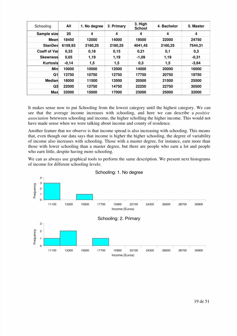
The main numerical summaries by groups can be seen in the following table:
0
5000
10000
15000
20000
25000
30000
35000
Baix Llobregat Barcelonès Maresme Vallès Occidental Vallès Oriental
Income (Euros)
8/3/2019 Dossier 2011 Eng
http://slidepdf.com/reader/full/dossier-2011-eng 19/51
19 de 51
Schooling All 1. No degree 2. Primary3. HighSchool
4. Bachelor 5. Master
Sample size 20 4 4 4 4 4
Mean 18450 12000 14000 19500 22000 24750
StanDev 6159,93 2160,25 2160,25 4041,45 2160,25 7544,31
Coeff of Var 0,33 0,18 0,15 0,21 0,1 0,3
Skewness 0,65 1,19 1,19 -1,09 1,19 -0,31
Kurtosis -0,14 1,5 1,5 0,3 1,5 -3,64
Min 10000 10000 12000 14000 20000 16000
Q1 13750 10750 12750 17750 20750 19750
Median 18000 11500 13500 20500 21500 25500
Q3 22000 12750 14750 22250 22750 30500
Max 32000 15000 17000 23000 25000 32000
It makes sense now to put Schooling from the lowest category until the highest category. We can
see that the average income increases with schooling, and here we can describe a positiveassociation beteween schooling and income, the higher scholling the higher income. This would nothave made sense when we were talking about income and county of residence.
Another feature that we observe is that income spread is also increasing with schooling. This meansthat, even though our data says that income is higher the higher schooling, the degree of variabilityof income also increases with schooling. Those with a master degree, for instance, earn more thanthose with lower schooling than a master degree, but there are people who earn a lot and peoplewho earn little, despite having more schooling.
We can as always use graphical tools to perform the same description. We present next histogramsof income for different schooling levels:
11100 13300 15500 17700 19900 22100 24300 26500 28700 30900
0
1
2
3
4
Schooling: 1. No degree
Income (Euros)
F r e q u e n c y
11100 13300 15500 17700 19900 22100 24300 26500 28700 30900
0
1
2
3
Schooling: 2. Primary
Income (Euros)
F r e q u e n c y

8/3/2019 Dossier 2011 Eng
http://slidepdf.com/reader/full/dossier-2011-eng 20/51
20 de 51
We observe the same that we noticed in the numerical summaries table. There is a positive
association between study level and income, and the spread of income increases with schooling.Histograms are not the only graphical tool that we can use to perform this description. Another toolthat we have are mean , standard deviation or other summaries plots, so that we can compare them:
We can see clearly that average income increases with schooling.
We can also study plots of other numerical summaries, such as the standard deviation:
11100 13300 15500 17700 19900 22100 24300 26500 28700 309000
1
2
3
Schooling: 3. High School
Income (Euros)
F r e q u e n c y
11100 13300 15500 17700 19900 22100 24300 26500 28700 30900
0
1
2
3
Schooling: 4. Bachelor
Income (Euros)
F r e q u e n c y
11100 13300 15500 17700 19900 22100 24300 26500 28700 30900
0
1
2
3
Schooling: 5. Master
Income (Euros)
F r e q u e n c y
1. No degree 2. Primary 3. High School 4. Bachelor 5. Master
0
5000
10000
15000
20000
25000
30000
Mean
Income (Euros)

8/3/2019 Dossier 2011 Eng
http://slidepdf.com/reader/full/dossier-2011-eng 21/51
21 de 51
This diagram shows us that income spread also increases, except for the level of bachelor, and thelargest spread can be found for the Master level. This means that altghough income increase wichschooling, there is also people who obtain a Master degree and are not able to improve their income
and therefore in this group there are people earning a lot and people earning very little.Finally, side by side boxplots are also useful in this case:
It can be seen clearly that the median income is increasing with schooing. Furthermore the boxesget wider for higher levels of schooling, except for the bachelor degree, clearly indicating thatincome variability is increasing.
Datasets with two variables (II)
Two categorical variables
Moore, 173-203
1. No degree 2. Primary 3. High School 4. Bachelor 5. Master
0
1000
2000
3000
4000
5000
6000
7000
8000
Standard Deviation
Income (Euros)
0
5000
10000
15000
20000
25000
30000
35000
1. No degree 2. Primary 3. High School 4. Bachelor 5. Master
Income (Euros)

8/3/2019 Dossier 2011 Eng
http://slidepdf.com/reader/full/dossier-2011-eng 22/51
22 de 51
Time series
Introduction
A time series is a dataset refered to a variable, ordered chronologically. The series can be annual,quarterly, monthly, daily or even by the hour or minute such as stock market transactions,depending on the frequency of data collection. It is difficult to think of any science discipline wherethere is no times series recorded. The time series gives us information on the variation of a variablealong time (for instance the unemployment rate, poverty rate, growth rate, and so on). Economic ormanagerial decisions very often have to be based on the behavior of different variables in previousperiods and have to predict what is going to happen in coming periods.
The graphical representation of a time series is done by putting time as an independent variable (x-axis) and the values of the series as the dependent variable (y-axis).
There are a lot of different techniques to work with time series. Predictions on the future can be
based on simple perceptions of experts but also on very sophisticated analysis based on largeamount of data and interrelations between variables. In any case everything has to be based on thepast behavior of the variable. If we observe that a variable had a more or less systematic behavior inthe past it is logic to think that this type of behavior will continue in the future. This concept is thebasis for statistical prediction.
There are lot of predictions being done all the time with economic time series. Opening the businessand economics section of any newspaper can give us good examples. For instance the governmenthas to take a lot of decisions based on predictions of next year GNP (Gross National Product).
Composition
The variation in past values of a time series are based on a diversity of factors. Some of them areeconomic factors (such as an economic crisis in any region of the world and its impact on the stockmarkets worldwide), some others are natural (such as natural disasters or bad weather impactingagriculture) and finally some other are institutional (such as the adoption of the Euro curreny).Some of these factors affect the series in the long term and some others in the medium or shortterm.
Let us see some examples:
o Short term: less than one year.
1. periodic factors (things repeating each year but with a frequency smaller than a year).For instance: electricity consumption has a short term seasonal component since every
summer consumption is smaller than in winter. It used to be much smaller, but since a lotof homes have installed air conditioning the gap has reduced. Also economic activity,and therefore GNP, has a different behavior during August since it is a period of holidaysfor a lot of firms, at least in Spain. If we observe that in the past production has fallen10% we can predict that this will happen again in the future.
2. unique factors: a natural disaster, the finantial crisis of a country, the bankruptcy of alarge firm, and so on. These are factors affecting the short term, but we cannot predictthem since they are unique and there is no expectation that they can repeat periodically.
o Medium term (approximately a perior over a year and shorter than five years). These type of of factors are usually associated with the business cycle. For instance a recession usuallylasts between 2 and 5 years. They are also irregular with respect to when they happen andtheir duration, but sometimes they can be predicted.

8/3/2019 Dossier 2011 Eng
http://slidepdf.com/reader/full/dossier-2011-eng 23/51
23 de 51
o Long term (approximately more than five years). These refer to structural changes forinstance in population growth or in the economy that have a long-term impact. For instancein the long-term the European societies are experiencing an increasing aging of theirpopulation.
More analitically, we consider that a series is formed by four basic components (but not all of themneed to be present in all series), that we describe next:
T Trend: behavior of the series in the long term.
C Cycle: The time series can show cyclical behavior extending for more than one year. For
instance car sales are larger when the economy is booming than when we are in the
middle of a recession. These cycles have an undetermined duration, but they usually last
more than one year. There is no regularity in these fluctuations. For instance, sometimes
we have 2 years of recession and 1 year of boom, but some other times we have 3 years of
recession and 2 year of boom, and so on. This distiguishes cycles from seasonal
fluctuations, which we are going to describe next, because seasonal fluctuations havealways the same duration and periodicity (for Christmas there is always an increase in
sales, for instance).
E Seasonality: this is a periodic behavior repeating one or more times during the same year.
It happens when the series is influenced by seasonal factors. For instance the sale of toys,
which always increase for Christmas and a little bit less for the Summer. Another example
is the unemployment rate, which in Spain no matter if the economic is in a good or bad
moment always decreases for Summer due to seasonal (summer) jobs.
I Irregular: this behavior is completely random and impossible to predict. For instance: an
unexpected shock such as the September 11 of 2001 events in New York.
If the series can have these four components, it would be helpful to be able to distinguish themseparately. This way when a data is announced such as “the unemployment rate has diminished 0.7points” we could distinguis which part of this decrease is due to a purely seasonal factor, maybe weare in Spring and jobs are fixed-term jobs are being created in the service sector, and which part isdue to the business cycle or a long-term trend.
If we assume that the four components of a series are related in a particular way, we can separatethese components with the help of a series of techniques that we are going to present next.
It is generally supposed that the components of a series define to types of series, mainly, and theseare multiplicative and additive. It is also possible to have mixed forms, but they are not used toooften.
The additive model assumes that the value of a time series, Y , is the sum of its four components.That is:
Y T C E I = + + +
The multiplicative model assumes that the value of a times series, Y , is the product of the its fourcomponents, that is:
Y T C E I = ⋅ ⋅ ⋅
Basically the additive model asssumes that the four component (the four causes of variation of the
series) are independent. This means that the fact that the trend of the series implies a growth or adecrease does not affect any of the other components (For instance occupation has increasedsteadily since 1900 but the short term seasonal fluctuations are not affected by this long-term trend).

8/3/2019 Dossier 2011 Eng
http://slidepdf.com/reader/full/dossier-2011-eng 24/51
24 de 51
For the case of the multiplicative model, the four components can be related. For this type of seriesseasonal fluctuations can be for instance larger during booms than during recessions.
A mixed model:
Y T C E I = ⋅ + ⋅
The following table shows as a simple experiment that shows how an additive and multiplicativemodel look like. In the first series, which we denote Y 1, the four components are related additively.In the second, which we denote Y2, the four components are related by the multiplicative model.
Trend Seasonal Cyclic Irregular Y1 Y2
1 1 1 -0.30 2.70 -0.30
2 0 2 0.42 4.42 0.00
3 -1 3 -0.21 4.79 1.93
4 1 2 -0.35 6.65 -2.79
5 0 1 -0.17 5.83 0.00
6 -1 0 0.29 5.29 0.00
7 1 -1 0.49 7.49 -3.46
8 0 0 0.26 8.26 0.00
9 -1 1 0.45 9.45 -4.04
10 1 2 0.33 13.33 6.54
11 0 3 -0.22 13.78 0.00
12 -1 4 0.07 15.07 -3.32
13 1 3 -0.37 16.63 -14.62
14 0 2 -0.17 15.83 0.0015 -1 1 -0.37 14.63 5.50
This four components, which are the same for both series, give rise to very different behaviordepending on being combined additively or multiplicatively. This can be seen in the next chart:
1 2 3 4 5 6 7 8 9 10 11 12 13 14 15
-2
0
2
4
6
8
10
12
14
16
Trend
Seasonal
CyclicIrregular

8/3/2019 Dossier 2011 Eng
http://slidepdf.com/reader/full/dossier-2011-eng 25/51
25 de 51
To constructe this example we departed from the 4 components and we formed the two series. Butwhat if we are only given the value of the time series, can we identify and separate the 4components? The answer to this question is yes. We will show next some simple ways of doing it(there are more comple methodds and also more accurate, but it is not possible to see them in anintroductory course).
Analysis of the trend and the cycle: the long term
In order to isolate the the trend component of a series, we can try to adjust a line or any otherfunction to a time series. There are different mathematical functions that we can use to describe thetrend of some series.
Per tal d’aïllar el component de tendència d’una sèrie, podem intentar ajustar una recta o una corbaa la sèrie temporal. Hi ha una sèrie de funcions matemàtiques que són d’utilitat per descriure latendència d’algunes sèries.
Fitting mathematical functions
We can assume that the trend component , T , of a series follows a mathematicl model such as:
Line
t T a b t = + ⋅ , where t indexes times.
We will only work with the linear model, that is the line, but the model can be any other function of time, for instance:
Polynomial
2t
T a b t c t = + ⋅ + ⋅ (second order polynomial)
2 3t
T a b t c t d t = + ⋅ + ⋅ + ⋅ (third order polynomial)
1 2 3 4 5 6 7 8 9 10 11 12 13 14 15
-20
-15
-10
-5
0
5
10
15
20
Y1Y2

8/3/2019 Dossier 2011 Eng
http://slidepdf.com/reader/full/dossier-2011-eng 26/51
26 de 51
Exponential
t
t T a b= ⋅
Reciprocal
1 t T a b t = + ⋅
Power
b
t T a t = ⋅
Logarithmic
logt
T a b t = + ⋅
The values for the parameters dependo on the scale we user for t . For instance, if we have annualdata, we can use 1989, 1990, 1991, and so on, or also 1, 2, 3, ... , we just have to make sure it is aconsecutive list of evenly-spaced numbers.
Moving averages
A second possible method consistes of getting rid of the spread of the series by eliminating theshort-term movements. This is done by taking means of consecutive values and “smoothing” theseries. This method is known as moving averages. With this method the trend or the cycle of a series is computed as the mean of a series of consecutive cases.
For instante, if we think that each 5 years approximately the economy restarts a new cycle, wecould try to take averages of values consisting of 5 consecutive years. We take groups of 5 and wemove one year up, eliminating one year and adding one year, so that we always have 5 years in themean. We can also this in groups of 3 if we think that is the relevant period where the cycles startrepeating themselves. The number of cases we include in each mean is called the order of themoving average, for instance in this example the order is 5.
Here we show moving averages of order 3 and order 5 for eleven years, notice that in case of order3 we cannot compute it for the first year and

8/3/2019 Dossier 2011 Eng
http://slidepdf.com/reader/full/dossier-2011-eng 27/51
27 de 51
Year Original Moving average Moving average
series order 3 order 5
1 1 - -2 2 2,0=(1+2+3)/3 -3 3 2,3=(2+3+2)/3 1,8=(1+2+3+2+1)/5
4 2 2,0=(3+2+1)/3 2,0=(2+3+2+1+2)/55 1 1,7 2,26 2 2,0 2,47 3 3,0 2,68 4 3,3 2,89 3 3,0 3,010 2 2,7 3,211 3 3,0 3,412 4 4,0 3,613 5 4,3 3,8
14 4 4,0 4,015 3 3,7 4,216 4 4,0 4,417 5 5,0 4,618 6 5,3=(5+6+5)/3 4,8=(4+5+6+5+4)/519 5 5,0=(6+5+4)/3 -20 4 - -
Graphical representation:
As it can be seen in the graph, the moving average of order 5 seems to be a good way of representing the trend (here it coincides with a line but it does not need to be so).
If the total number of periods of the time series is odd (3,5,7, and so on) the moving averagecorresponds exactly to a period of the series, that is if we are computing the series for periods 1,2,and 3 the moving average will correspond exactly with the value of the trend in period 2.
In case that the number of periods to include in the mean is even (2,4, 6, and so on) we find aproblem because the mean does not correspond to any particular period, but to a moment betweentwo periods. For instance if the order of the moving average is 4, and we are computing the movingaverage with a group formed by periods 1, 2, 3 and 4, the mean corresponds to a period between 2and 3, but we do not have the value of the trend at period 2 or 3, but in the middle of these two
0 5 10 15 20 25
0
1
2
3
4
5
6
7
Original series
Moving average order 3
Moving average order 5
Year

8/3/2019 Dossier 2011 Eng
http://slidepdf.com/reader/full/dossier-2011-eng 28/51
28 de 51
periods. This problem is known as the problem of centering the moving average. We find it forinstance for montly data (where moving averages of order 12 are sometimes computed) of quarterlydata (4 quarters within a year, moving average of order 4).
The way to solve this problem is to compute centered moving averages. Suppose we want tocompute the trend of occupation with quarterly data, and therefore we would like to use an orderequal to 4. Let us suppose that the first case corresponds to first quarter of 2005. We compute the
first moving average with a group that goes from the first quarter of 2005 until the fourth quarter of 2005. To which quarter is this value associated? The average is associated to a moment between thesecond quarter and the third quarter. To solve this we associate this moving average with the secondquarter and continue computing the rest of moving averages. On a second step we compute movingaverages of order 2 with the moving averages of order 4 that we had computed in the first step, asshown in the following example:
Period Series Moving averages Centered moving
Order 4 averages
Order 4
2005, Q1 18492
2005, Q2 18894 18972,75
2005, Q3 19191 19199,75 19086,25
2005, Q4 19314 19399,5 19299,63
2006, Q1 19400 19575,5 19487,5
2006, Q2 19693 19747,25 19661,38
2006, Q3 19895 19914,5 19830,88
2006, Q4 20001 20083 19998,75
2007, Q1 20069 20236,75 20159,88
2007, Q2 20367 20355,5 20296,13
2007, Q3 20510 20438,75 20397,13
2007, Q4 20476 20453,25 20446
2008, Q1 20402 20412,25 20432,75
2008, Q2 20425 20257,25 20334,75
2008, Q3 20346 19929,25 20093,25
2008, Q4 19856 19559,25 19744,25
2009, Q1 19090
2009, Q2 18945
As seen in the example we first take the average of the first four quarters and continue computingthe moving averages of order 4, and then we take another round of moving averages of order 2. Thissecond step is always done with moving averages of order 2, no matter what the order of the firststep (but always for orders which are even, for odd orders it is not needed since the moving averageis already centered).
The trend of this series is seen in the following way:

8/3/2019 Dossier 2011 Eng
http://slidepdf.com/reader/full/dossier-2011-eng 29/51
29 de 51
Short term fluctuations
Seasonal variations
Seasonal variations follow a recurrent pattern along time. Weather or social habits are importantsources of seasonal variations. We can find seasonal components within days, weeks, quarters ormonths, depending on the frequency of the data. They are called seasonal because they repeat in apredictable manner, like the seasons of the year.
Seasonal variations have to be predicted to manage correctly a firm or the economy in general,
since for particular periods a firm may run out of capacity or some other periods may haveimportant overcapacity.
A simple way of computing a seasonal index is by using a technique based on using the movingaverages to compute the trend.
The technique can be applied to additive or multiplicative models. Here we will explain it with theadditive model. For the multiplicative model we can simply substitute the substractions bydivisions, the sums by multiplications and the arithmetic mean (sum all the terms and divide by N)by the geometric mean (multiply all terms and take the N-th root).
We start with a series Y formed by the four usual components according to the model
Y T C E I = + + +
We first try to isolate the trend and cycle using a moving average with the appropriate order. Forinstance if the series is quarterly, we compute a centered moving average of order 4. The final seriesof centered moving averages of order 4 is theoretically T+C since we do not isolate the cyclicalcomponent and therefore it ends up mixed with the trend. We could also compute the trend usingthe method of adjusting a line and the results would be similar.
Next we substract the trend that we have computed from the original series and we obtain:
( )T C E I T C E I + + + − + = +
2005, Q1
2005, Q2
2005, Q3
2005, Q4
2006, Q1
2006, Q2
2006, Q3
2006, Q4
2007, Q1
2007, Q2
2007, Q3
2007, Q4
2008, Q1
2008, Q2
2008, Q3
2008, Q4
2009, Q1
2009, Q2
17995
18495
18995
19495
19995
20495
20995
Time series
Moving averages
Time
S e r i e s

8/3/2019 Dossier 2011 Eng
http://slidepdf.com/reader/full/dossier-2011-eng 30/51
30 de 51
We obtain a new series which gathers the seasonal component mixed with the irregular component.We now need to eliminate this irregular component if we want to isolate the seasonal componentand construct a seasonal index.
The nature or the irregular component is random. It does not follow any regular behavior and itcannot be predicted. If we could predict it it would be added to any of the other regular components.It is reasonable to assume therefore that if we take a mean of the irregular components for a given
period (for instance for all first quarters) is 0 in the case of the additive model (1 in the case of themultiplicative model). This way if we assume that the seasonal component of each quarter isidentical year after year , we can take teh mean of the values corresponding to a given quarter of the
E+I series and we will obtain component E . For instance, if our series starts in 2005 and finishes onthe second quarter of 2009, to compute the seasonal component of January we would compute:
2005 1 2005 1 2006 1 2006 1 2007 1 2007 1 2008 1 2008 1 2009 1 2009 11 5
Q Q Q Q Q Q Q Q Q Q
Q
E I E I E I E I E I E
+ + + + + + + + +
=
Since we have assumed that all seasonal components of the same quarter are the the same, that is:
2005 1 2006 1 2007 1 2008 1 2009 1 1Q Q Q Q Q Q E E E E E E = = = = =
and that the average of the irregulaar component is equal to 0, we obtain
( )1 2005 1 2006 1 2007 1 2008 1 2009 1
1 1
50
5Q Q Q Q Q Q
Q Q
E I I I I I E E
+ + + + +
= + =
We do the same for each quarter and we obtain the 4 numbers representing the seasonal component.(In the multiplicative case it is common to express the seasonal component in an index form, and so
we multiply this number by 100).Notice that if the value of the seasonal component is 0 for any quarter, in fact for that quarter thereis no seasonal component. The values of the seasonal component vary around 0. When it is largerthan 0 the series will be right on the trend and when it is smaller than 0 it will be below the trend (inthe multiplicative case the seasonal components vary around 100).

8/3/2019 Dossier 2011 Eng
http://slidepdf.com/reader/full/dossier-2011-eng 31/51
31 de 51
Series Period
18492 2005, Q1
18894 2005, Q2
19191 2005, Q3
19314 2005, Q4
19400 2006, Q1
19693 2006, Q219895 2006, Q3
20001 2006, Q4
20069 2007, Q1
20367 2007, Q2
20510 2007, Q3
20476 2007, Q4
20402 2008, Q1
20425 2008, Q2
20346 2008, Q3
19856 2008, Q419090 2009, Q1
18945 2009, Q2
ODStatistics computes the seasonal components for us:
Predition with time series
We want to predict GNP for 2009 in Catalunya, and we have a seris for Catalan GNP for four-
month periods, from 2004 to 2008 (for instance 2004-3 means the third four-month period of 2004).To make a prediction for 2009 we can use in this case the method of the regresssion line. To obtaina more reliable prediction we can correct afterwards this prediction with the seasonal component.

8/3/2019 Dossier 2011 Eng
http://slidepdf.com/reader/full/dossier-2011-eng 32/51
32 de 51
Year – Period GNP
2004-1 1018
2004-2 1037
2004-3 1050
2005-1 1093
2005-2 1102
2005-3 1113
2006-1 1146
2006-2 1160
2006-3 1172
2007-1 1208
2007-2 1219
2007-3 1227
2008-1 1266
2008-2 1278
2008-3 1280
The trend
We can use the regression line. The explanatory variable is time, we will index it by 1, 2, 3, .. 15.The dependent variable is our series, GNP (Y ). We want to predict the values of the three 4-monthperiods of 2009 (2009-1, 2009-2 and 2009-3).
The regresión line is
ˆ 19,5 1002 (or if you prefer 19.5 1002)Y t GNP Time= × + = × +
The prediction of the trend is
19.5 x 16 = 131419.5 x 17 = 133419.5 x 18 = 1353
Period Predictio
n
Tim
e
2009-1 1314 162009-2 1334 172009-3 1353 18
But we need to also predict the seasonal factor. For this we use our method to compute the seasonalcomponents.
The seasonal component
We use an additive model. We now compute the trend by moving averages of order 3 to substract
the trend from the series (we could also do it with the linear trend that we computed in the previoussection). Here are the moving averages of order 3:

8/3/2019 Dossier 2011 Eng
http://slidepdf.com/reader/full/dossier-2011-eng 33/51
33 de 51
Period Series Moving averages
Order 3
2004-1 1018
2004-2 1037 1035
2004-3 1050 1060
2005-1 1093 1081,67
2005-2 1102 1102,67
2005-3 1113 1120,33
2006-1 1146 1139,67
2006-2 1160 1159,33
2006-3 1172 1180
2007-1 1208 1199,67
2007-2 1219 1218
2007-3 1227 1237,33
2008-1 1266 12572008-2 1278 1274,67
2008-3 1280
etc.
And from here
Period Series Moving averages Seasonal
Order 3 Components
and Irregular
2004-1 1018
2004-2 1037 1035 2
2004-3 1050 1060 -10
2005-1 1093 1081,67 11,33
2005-2 1102 1102,67 -0,67
2005-3 1113 1120,33 -7,332006-1 1146 1139,67 6,33
2006-2 1160 1159,33 0,67
2006-3 1172 1180 -8
2007-1 1208 1199,67 8,33
2007-2 1219 1218 1
2007-3 1227 1237,33 -10,33
2008-1 1266 1257 9
2008-2 1278 1274,67 3,33
2008-3 1280
To eliminate the irregular factor we take means of the values correspondints to each 4-month periodseparately. For instance for the second 4-month period:

8/3/2019 Dossier 2011 Eng
http://slidepdf.com/reader/full/dossier-2011-eng 34/51
34 de 51
2
sum of values of second 4-month period 2 0.67 0.67 1 3.331.27
number of 4-month periods 5 E
− + + += = =
With this same procedure we can obtain the seasonal component for the first (8.75) and the second(-8.92) 4-month periods seasonal components.
Our prediction is finally adjusted for these seasonal components:
Period Prediction
2009-1 1314+8.75=1322.752009-2 1334+1.27=1335.27
2009-3 1353-8.92=1344.08
8/3/2019 Dossier 2011 Eng
http://slidepdf.com/reader/full/dossier-2011-eng 35/51
35 de 51
Measures of inequality and concentration
Very often we are interested in measuring the distribution of values of a variable between theindividuals or objects respresenting each case. We can for instance want to analyze income
distribution within the Spanish population, the wage distribution within a firm or the dividendsbetween the stakeholders of a corporation. All these problems are problems of where we have tocompare the values between the different individuals, for instance: is there a large wage inequalitywithin the firm? We will present in this section measures of inequality and concentration, whichwill give us a summary of the degree of inequality within a distribution.
Notice that inequality and concentration are related conceptse, the more inequality betweendifferent individuals, the more concentrated the values of the distribution for a small number of individuals.
Inequality measures
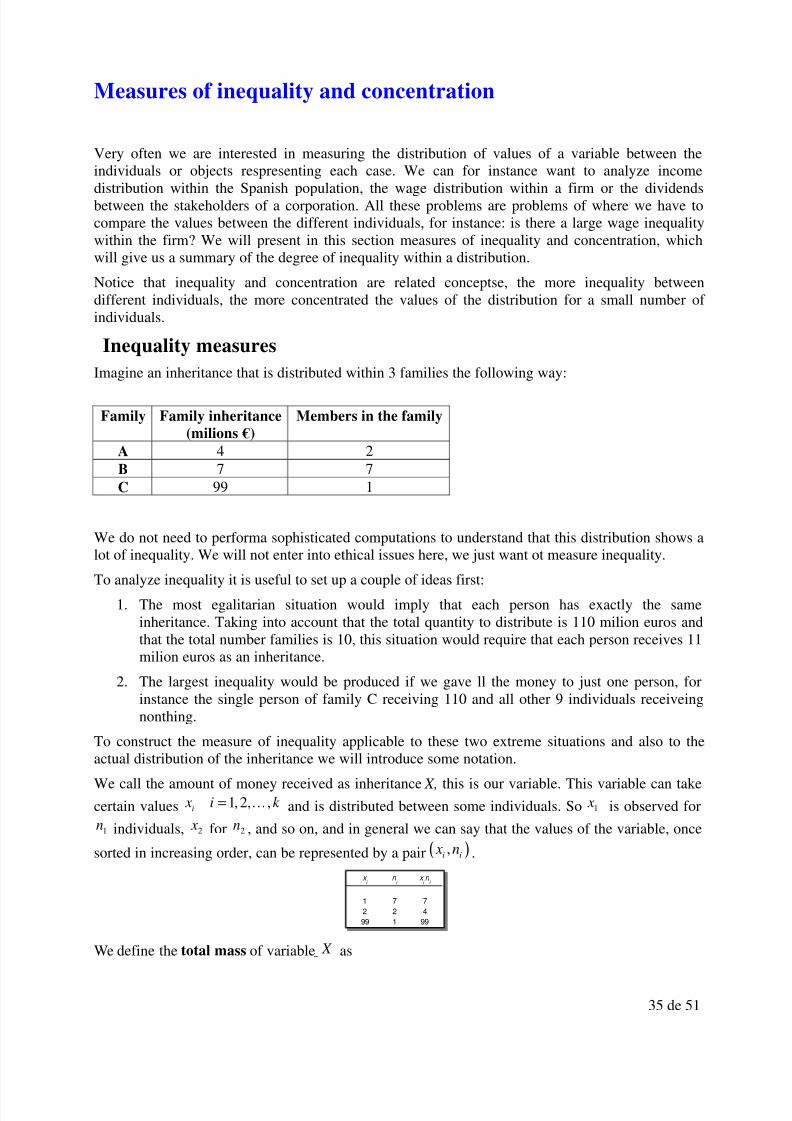
Imagine an inheritance that is distributed within 3 families the following way:
Family Family inheritance
(milions €)
Members in the family
A 4 2B 7 7C 99 1
We do not need to performa sophisticated computations to understand that this distribution shows a
lot of inequality. We will not enter into ethical issues here, we just want ot measure inequality.To analyze inequality it is useful to set up a couple of ideas first:
1. The most egalitarian situation would imply that each person has exactly the sameinheritance. Taking into account that the total quantity to distribute is 110 milion euros andthat the total number families is 10, this situation would require that each person receives 11milion euros as an inheritance.
2. The largest inequality would be produced if we gave ll the money to just one person, forinstance the single person of family C receiving 110 and all other 9 individuals receiveingnonthing.
To construct the measure of inequality applicable to these two extreme situations and also to theactual distribution of the inheritance we will introduce some notation.
We call the amount of money received as inheritance X, this is our variable. This variable can take
certain values 1,2, ,i x i k = K and is distributed between some individuals. So 1 x is observed for
1n individuals, 2 x for 2n , and so on, and in general we can say that the values of the variable, once
sorted in increasing order, can be represented by a pair ( ),i i
x n .
We define the total mass of variable X as
1 7 7
2 2 4
99 1 99
x i
n i
x i n
i

8/3/2019 Dossier 2011 Eng
http://slidepdf.com/reader/full/dossier-2011-eng 36/51
36 de 51
1
k
k i i
i
A x n=
= ∑
In our example:
The total mass is just the total inheritance, the sum of all the values for our variable.
In our case X is the quantity received by each inheritor (for instante family B receive 7 milion and
since there are 7 members in theory the personal inheritance is 1 milion, therefore 1 1 x = ) and k A is
the tota inheritance to distribute (since we have 3 families, we write 3
A
). Rememembering that wehave ordered the k possible values of X in increasing order, we can define
1
i
i j j
j
A x n=
= ∑
for any i k < as the cumulative income for the i N first individuals.
The proportion of these i N individuals over total population N (in our case the total number of inheritors 10) would be
ii
N p
N =
and the proportion of the part of the family inheritance over the total would bei
i
k
Aq
A=
Whenever there is inequality in the distribution of the inheritance, we will have that
i iq p<
1 7 7
2 2 4
99 1 99
110
x i
n i
x i n i
Ak =
1 7 7 7 7
2 2 4 9 11
99 1 99 10 110
110
x i
n i
x i n i
N i
Ai
Ak =
0 0
1 7 7 7 7 0,7 0,06
2 2 4 9 11 0,9 0,1
99 1 99 10 110 1 1
x i
n i
x i n i
N i
Ai
p i
q i

8/3/2019 Dossier 2011 Eng
http://slidepdf.com/reader/full/dossier-2011-eng 37/51
37 de 51
that is as we acumulate individuals (starting from the ones that inherited less, remember that wesorted them in increasing order of X ) we will acumulate proportionally less money from theinheritance.
The difference between the two proportions will tive us a measure of inequality between thefamilies with respect to the received inheritance. Only for the case of a perfectly egalitarian
distribution we would havei i p q=
. We can represent this situatio with a graph. At the vertical axiswe put the inheritance proportion iq and at the horizontal axis we put the inheritors proportion i
p .The situation of equidistribution of perfectly egalitariaon distribution is represented by the diagonal:
But only rarely we find perfectly egalitarian situations, we will always find individuals i p that get
smaller proportions of wealth iq , and consequently if we joint the dots, we will obtain a curve that
is under the diagonal (since i iq p< ):
This is the so called Lorenz Curve. In the horizontal axis we have the i p ‘s, that is the cumulative
proportions of the population (cumulative relative frequencies in the graph) and in the vertical axis
we have the iq ’s , proportions of cumulative values of the variable.
If we had all the inheritance concentrated in just one person, the Lorenz curve would be the green
line, we would have that iq = 0 for all the proportions of the population except 1
i p = , where i
q =1.

8/3/2019 Dossier 2011 Eng
http://slidepdf.com/reader/full/dossier-2011-eng 38/51
38 de 51
To construct a numerical summary of the inequality we compute the sumo of the differences
i i p q− . It is obvious that k k p q− =0 always holds (100% of the population acumulates 100% of theinheritance) and therefore we only need to compute the sum of the difference until 1k − , that is
( )1
1
k
i i
i
p q−
=
−∑ .
But we need a relative measure, so that it can inform us of the degree of inequality. To accomplish
this we divide the value 1.44 by the maximum value that the sum can take (maximum inequality).Recall that the maximum inequality happens when one individual receives all the inheritance.
Therefore in the case of maximum inequality 0 1,2, , 1iq for i k = = −K and we have that
( ) ( )1 1 1
1 1 1
0k k k
i i i i
i i i
p q p p− − −
= = =
− = − =∑ ∑ ∑
Now we can define the Lorenz-Gini inequality Index as
( )1
1
1
1
k
i i
i L
k
i
i
p q
I
p
−
=
−
=
−
=
∑
∑
This index will always be between 0 and 1. It is usually used for large samples and therefore the
data is given in a frequency table. In that case i x stands fro the class mark of interval or class i and
in stands for the absolute frequency of the interval and k is the number of intervals. The Lorez-Gini inequality index for the example that we have considered is:

8/3/2019 Dossier 2011 Eng
http://slidepdf.com/reader/full/dossier-2011-eng 39/51
39 de 51
The points of the Lorenz curve gives a description of the inheritance distribution (or of the variablethat we are analyzing). I this case family B, representing 70% of the population (all the inheritors)has received only 6% of the total inheritance. If we add to this group family B, and now we have90% of the total sample, we still would have only 10% of the total inheritance. This allows us to saythat in this distribution there is a large inequality. The Lorenz-Gini inequality index has a value of 0.898.
Let us now examine another example:
Here the distribution is clearly more egalitarian. This can be confirmed by plotting the Lorenzcurve:

8/3/2019 Dossier 2011 Eng
http://slidepdf.com/reader/full/dossier-2011-eng 40/51
40 de 51
The closer the index to 1 the largest the inequality (or the largest the concentration of the values of
the variable in one or a few individuals.) It is also true that index L I is a ratio between the areabetween the diagonal and the curve and the triangle below the diagonal.
We can also define an inequality based on comparing the values of the variable between each pair
of individuals of the population. This is called the difference index. What would be the maximum
difference possible? Imagine again that an individual has received all the inheritance, which is
1
k
i i
i
x n=
∑ . We compute the difference of the wealth of this individual with the 1 N − . Let us suppose
we have 3 families as in the case of the previous example and that the last family has received thefull inheritance:
Family ( i ) B A C
Members ( in
)
7 2 1
Wealth ( i x ) 0 0 110
We compute the differences between each pair of families:
B( i x = 0, in =
7)A( i x = 0, in =
2)C( i x = 110, in = 1)
B( i x = 0, in = 7) 0
A( i x = 0, in = 2) 0 0
C ( i x = 110, in = 1 (110-0)*7 (110-0)*2 0
Therefore the maximum value of the sum of differences is:
( )1
Maximum value = 1k
i i
i
N x n=
− ∑
(in our case (10-1)*110 = 990)
We will use again this maximum value to normalize our measure. We now can observe thedifference between each pair of individuals.
Family ( i ) B A C
Members ( in
)
7 2 1
Wealth ( i x ) 1 2 99
To compare all individuals we take into account the number of members r of of the first family ands of the second family and we compare all the individuals from one family with all the individuals
of the other familiy, that is ( )r s r s x x n n− whenever the difference is positive, that is whenever r s> :

8/3/2019 Dossier 2011 Eng
http://slidepdf.com/reader/full/dossier-2011-eng 41/51
41 de 51
B( 1 x = 1, 1n = 7) A( 2 x = 2, 2n =
2)C( 3 x = 99, 3n =
1)
B ( 1 x = 1, 1n = 7) 0
A ( 2 x = 2, 2n = 2) (2-1)*7*2=14 0
C ( 3 x = 99, 3n =
1)(99-1)*7*1=686 (99-2)*2*1=194 0
The sum of actual differences is 14 + 686 + 194 = 894.
This is the difference index, and we can compute it with the formula:
( )
( )1
1
r s r s
r sG k
i i
i
x x n n
I
N x n
>
=
−
=
−
∑
∑
In our example the value of the index is 894/990 = 0.9030
The interpretation of this index is the same as for the case of the Lorenz-Gini inequality index, andit also varies between 0 and 1, with 1 as the maximum inequality or maximum concentration.
If we compare the Lorenz-Gini Index and the Difference Index we see that they give similar results.
These indices are relative measures, therefore it will be possible to compare distributions of different variables. In other words these indices are dimensionless. So if there is a change of measure, like a proportional increase of 8% of the values for all the individuals, the indices will not
be affected.
Concentration indices
Very often we need to know the market shares of firms, for instance we we want to perform amarketing study for a new product. What is the sales concentration of firms? What is the marketshare of each firm? The concentration of market shares is not the same in the market for potatoes,where a very large number of producers each one sells very little quantities, than in the Barcelona –Madrid air shuttle, where a few airlines concentrate all the sales. We will interested in measuringthe concentration of firms.
We first start by presenting a very simple index that takes a look at the largest firms. If they do notconcentrate the sales, then the index is going to have a low value showing low concentration. We
sort the firms in decreasing order of market share and we denote is the share of firm i, the index k
C is defined as:
1
k
k i
i
C s=
= ∑
k can be any of the first largest firms that we want to include in the index, the most common are the
largest two firms or the largest four firms. For instance 4C represents the sum of the market shares
of the tour largest firms. The value of k C varies between a minimum concentration k n , being n thetotal number of firms and the value of maximum concentration 1. Minimum concentration isproduced when all the firms have the same market share.

8/3/2019 Dossier 2011 Eng
http://slidepdf.com/reader/full/dossier-2011-eng 42/51
42 de 51
Another widely used concentration index is the Herfindahl index, and its definition is:
2
1
n
i
i
H s=
= ∑
The value of H varies betweeen the minimum concentration 1/n (all firms are equal) and themaximum value of concentration 1.
These indices have advantages and disadvantages. Index C k is very easy to compute, but H has clearadvantages as it takes into account all firms in the market.
The properties of H that make it a very convenient tool for measuring market concentration are thefollowing:
1. Non ambiguous character . If we have two markets, index H can unambiguously say whichof the two markets has a largest concentration.
2. Scale invariance. The relative size of each firm does not affect the computation of H .
3. Transference. Index H increases its value as the share of a small firm decreases in favour of
the share of a large firm, in other word when concentration increases.4. Monotoniciy. If all n firms of the market had equal shares, measure H would be decreasing
with respect to n
5. Cardinality. If we divide each firm in k equal firms, measure H would decrease in the sameproportion.

8/3/2019 Dossier 2011 Eng
http://slidepdf.com/reader/full/dossier-2011-eng 43/51
43 de 51
Index numbers
An index numer is a statistical measure expressing the changes registered in a variable along time,combining simultaneously information about the levels and rates of growh (or decrease) of the
variable. It helps in analyzing the evolution of the variable, since its values give directly a measureof growh and they give accurate information on the original series.
We can use this technique to analyze the growth of a variable in percentual terms:
YearNumber ofForeigners
Index
1998 637085 100
1999 748954 117.56
2000 923879 145.02
2001 1370657 215.15
2002 1977946 310.472003 2664168 418.18
2004 3034326 476.28
2005 3730610 585.57
2006 4144166 650.49
2007 4519554 709.41
2008 5268762 827.01
1996 1998 2000 2002 2004 2006 2008 2010
0
1000000
2000000
3000000
4000000
5000000
6000000
Number of Foreigners
1996 1998 2000 2002 2004 2006 2008 20100
100
200
300
400
500
600
700
800
900
Index

8/3/2019 Dossier 2011 Eng
http://slidepdf.com/reader/full/dossier-2011-eng 44/51
44 de 51
The original series and the index contain the same information. The only difference is that the indexis computed on a scale whose base is 100, and this helps a lot in quickly checking how much theseries has increased (or decreased). For instance we could see that in the 11 years the number of foreigners has increased 8-fold. Or we can also see that betwee 1998 and 1999 the number of foreigners gre 17%. We can also perform these computations with the original series, but the indexallows us to do the computations very fast.
The indices can also be used not only to check the evolution of variables along time, but also tocompare the values of a variable for different individuals. For instance, in the following table wefind a comparison of GDP (Gross Domestic Product) per capit using the European Union of 27countries as the basis for comparison (EU 27 = 100).

8/3/2019 Dossier 2011 Eng
http://slidepdf.com/reader/full/dossier-2011-eng 45/51
45 de 51
Simple indices
The two previous examples correspond to indices which we call simple indices, because they onlydescribe the evolution of one single variable. We will formally call simple index a ration betweeneach number of a series and the value that takes that series in the base period. We usually express an
index with a basis equal to 100, so we multiply the ratio by 100. That is:
/00
100t
t
X i
X = ×
Wher t X is the value of the variable for which we are constructing an index in period t and 0 X
represents the value of the variable in the base period. Here /0t i is read as “the value of the (simple)
index in period t base 0.
Example:Price of Milk Index
2008-12 0.70 € 100
2009-1 0.69 € 98.57
2009-2 0.69 € 98.57
2009-3 0.68 € 97.14
2009-4 0.68 € 97.14
2009-5 0.66 € 94.292009-6 0.66 € 94.29
2009-7 0.65 € 92.86
2009-8 0.65 € 92.86
In this example the base period is the first, december of 2008. Notice that the original variable has aunit of measure, in this case euros, but the index is dimensionless.
We also observe that the value of the index in the base period is always 100 (if t coincides with the
base period we trivially obtain that ( )0/0 0 0 100 100i X X = × = ).
The index allows us to quickly compute for instance that the price of milk during August of 2009 is(100-93=) 7% lower then in December of 2008.
Choosing December 2008 as the basis period is probably the most natural election, but we canchoose any other period as the base period. For instance:

8/3/2019 Dossier 2011 Eng
http://slidepdf.com/reader/full/dossier-2011-eng 46/51

8/3/2019 Dossier 2011 Eng
http://slidepdf.com/reader/full/dossier-2011-eng 47/51
47 de 51
expenditure of 711€. We express these weights in terms of proportions instead of percentages.
3) We now compute simple indices of the price of each product separately
4) Finally, we compute a complex index of the joint evolution of prices as a weighted averageof the simple indices of prices, where the weights are computed in step 2.
Product A Product B Product C Laspeyres
Period Weight Index Weight Index Weight Index Index
1 0.02 100 0.28 100 0.7 100 100
2 150 120 120 120.46
3 130 140 120 125.78
That is:
1/1
2/1
3/1
0.02*100 0.28*100 0.7*100 100
0.02*150 0.28*120 0.7*120 120.46
0.02*130 0.28*140 0.7*120 125.78
L
L
L
I
I
I
= + + =
= + + =
= + + =
We write
/0 0 /01
J
L j jt t
j
I w i=
= ∑
Where J represents the total number of products or categories, 0 j
w is the weight of each product j in
the total expenditure of the base period and /0 j
t i is the value of the simple index of the price of product j in period t on the basis of period 0.
Another way of writing the formula is:
0 0 0 0 /0 0 /0 /0
1 1 1 01 1
01
1
j j j j j J J J L j j j t t t t J J j j j j j
j j jo o o oi i
J j j
t j
J j j
o oi
q p q p p I w i i
pq p q p
q p
q p
= = =
= =
=
=
= = = =
=
∑ ∑ ∑∑ ∑
∑∑
That is the Laspeyres index can be interpreted as the ration between the basket of products in the

8/3/2019 Dossier 2011 Eng
http://slidepdf.com/reader/full/dossier-2011-eng 48/51
48 de 51
base period evaluated at the current prices and the same basket evaluated at the prices of the baseperiod.
Paasche index
An alternative way to elaborate a complex index is by means of the weighted mean of simpleindices where, contrary to the previous index where the weights were fixed at the base period, theweights are being computed for the current year.
We can write the index as:
/0 /01
J P j j
t t t
j
I w i=
= ∑
with0
01
j j j t
t J j j
t j
p qw
p q=
=
∑.
We observe that another way of writing this formula is:
10 0 /0 /0
1 1 00 0 01 1 1
J j j j j j j j J J
t t jP jt t t t t J J J j j j j j j j
j jt t t j j j
p q p q p q p I i
p p q p q p q
=
= =
= = =
= = =
∑∑ ∑
∑ ∑ ∑
With the data of the previous example we obtain:
Product A Product B Product C Paasche
Period Weight Index Weight Index Weight Index Index
1 0.02 100 0.28 100 0.7 100 100
2 0.02 150 0.29 120 0.69 120 120.51
3 0.02 130 0.23 140 0.75 120 124.74
It can be noticed that in this case the difference between the two indices is very small. This is not
always the case, if the consumption patterns change along the periods, these two indices may givedifferent results.
Measuring inflation
Inflation refers to changes in prices. Usually it refers to changes in the Consumer Price Index (CPI),a Laspeyres index that is computed in most countries. In Spain it is called “Índice de Precios alConsumo (IPC)” and is computed by the Instituto Nacional de Estadística (National Institute of Statistics).
INE publishes various inflation indices:

8/3/2019 Dossier 2011 Eng
http://slidepdf.com/reader/full/dossier-2011-eng 49/51
49 de 51
The montly variation of inflation or monthly inflation rate is the growth rate of the CPI indexbetween two consecutive months. That is:
month month 1
month 1
Monthly inflation rate of month = 100t t
t
CPI CPI t
CPI
−
−
−×
The annual variation or interannual inflation rate is the growth rate of the CPI between any monthand the same month but one year ago:
month month one year ago
month t one year ago
Interannual inflation rate month = 100t t CPI CPI t
CPI
−
×
The cumulative annual variation or cumulative inflation rate is the growth rate of the CPI betweenany month and the beginning of the current year:

8/3/2019 Dossier 2011 Eng
http://slidepdf.com/reader/full/dossier-2011-eng 50/51
50 de 51
month beginning of current year
beginning of current year
Cumulative inflation rate month = 100t CPI CPI t
CPI
−
×
Applying these formulas to actual data:
Monthly inflation rate August 2009 =106.698 106.327
100 0.3%106.327
− × =
Intearnnual inflation rate August 2009 =106.698 107.571
100 0.8%107.571
− × = −
Cumulative inflation rate August 2009 =106.698 106.909
100 0.2%
106.909
− × = −
That is, from July 200 to August 2009 prices increased a 0.3%, but they have diminised 0.2% fromthe beginning of the year or 0.8% if we compare it with the prices one year ago.
Nominal and real growth
Consider that your wage was 2000€ in 2002 and in 2009 is 2400€. Has your wage increased?Certainly, your wage is 20% larger in 2009. But, are you better off than 8 years ago? We cannotanswer this question without knowing how the prices of goods and services have evolved since2002, maybe everything is more expensive and you cannot buy as many things with 2400€ in 2009that what you could buy with 2000€ in 2002.
If this was a real case, we could try to obtain information on the evolution of prices. For Spain wecan find this information at the Instituto Nacional de Estadística web site:

8/3/2019 Dossier 2011 Eng
http://slidepdf.com/reader/full/dossier-2011-eng 51/51
We observe that prices have increased 20.68% between 2002 and 2009 (we compute a simple indexbetwen 2002 and 2009). Therefore if your wage only increased 20% you are not better off, you areslightly worse off. We say that your wage has increased in nominal terms, that is its denominationin euros has increased, but no in real terms, that is you cannot buy more things with your wage nowcompared to the past.
How much has really changed your purchasing power?One way of asssessing the real change in your wage is to deflact the nominal value, that is reducewhatever is only due to general price increase. To deflact means to eliminate the effect of inflationon the evolution of a monetary magnitude.
In our case it is very simple, we simply divide the nominal wages of 2002 and 2009 by the value of the IPC index and multiply by 100. The result tells us what would be your wage if prices were theprices of 2006 (this is the base for the index).
This way 2000€ of 2002 are equivalent to (2000€/88)*1000 = 2272.72€ of 2006. And 2400€ of 2009 are equivalent to (2400/106.2)*100 = 2259.89€ of 2006. In real terms the wage has notincreased but slightly decreased (it has fallen 0.59%).