Embed Size (px)
Citation preview

Gestalt Principles of Perception

ClosureClosure
A form exhibits closure when its separate elements are placed so that you perceive the design as a whole rather than as disparate sections. — Introduction to Two Dimensional Design
The principle of closure enables designers to reduce complexity by using a smaller number of elements to organize and communicate information. — Universal Principles of Design

Closure
The elements are perceived holistically as a single pattern fi rst (circle), and then as individual elements. — Universal Principles of Design

Closure
People supply the images in between each frame. This allows us to “see” the fi gure climbing the stairs. This same principle is at work in fi lm and comics.

Closure
Elements in text and graphics can be minimized to allow viewers to participate in the completion of the pattern. The result is a more interesting design. — Universal Principles of Design

Proximity
Proximity refers to distance between the parts compris-ing a form. Elements that are closer together appear to be related. — Introduction to Two Dimensional Design
Elements that are close together are perceived to be more related than elements that are farther apart. The grouping resulting from proximity reduces the complex-ity of designs... — Universal Principles of Design

Proximity
Proximity between the circles influences how they are grouped—as columns, a square group of circles, or rows. — Universal Principles of Design

Proximity
This rendering of a sign at Big Bend National Park has undoubtedly sent many hikers in unintended directions. The proximity between unrelated words (e.g., Chisos and South) lends itself to misinterpreta-tion. Positioning the related words closer togther corrects the problem. — Universal Principles of Design

Proximity
Window controls are often placed on the center console between seats. The lack of proximity between the controls and the window makes it a poor design. A better location would be on the door itself.
— Universal Principles of Design

Similarity
Similarity among parts in a form helps hold the form together and can be an effective way to create mean-ing. Elements similar in size appear related. — Introduction to Two Dimensional Design
Elements that are similar are perceived to be more related than elements that are dissimilar. — Universal Principles of Design

Similarity
Similarity among elements influences how they are grouped—here by color, size, and shape. Note the strength of color as a grouping strategy relative to size and shape.
— Universal Principles of Design

Similarity
This remote control uses color, size, and shape to group functions. Note the relationship between the anticipated frequency of use of the buttons and their relative size and shape.
— Universal Principles of Design

Similarity
Similarity is commonly used in camoufl age. For example, the mimic octopus can assume the color, pattern, and approximate form of one of its fi ercest predators—the highly poisonous sole fi sh—as well as many other marine organisms.
— Universal Principles of Design
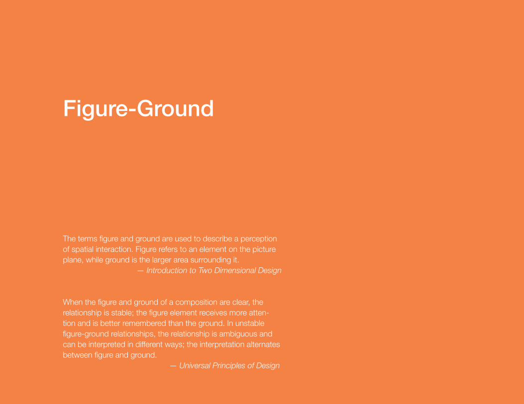
Figure-Ground
The terms figure and ground are used to describe a perception of spatial interaction. Figure refers to an element on the picture plane, while ground is the larger area surrounding it. — Introduction to Two Dimensional Design
When the figure and ground of a composition are clear, the relationship is stable; the figure element receives more atten-tion and is better remembered than the ground. In unstable figure-ground relationships, the relationship is ambiguous and can be interpreted in different ways; the interpretation alternates between figure and ground. — Universal Principles of Design

Figure-Ground
The Rubin vase is unstable because it can be perceived as a white vase on a black background or two black faces looking at each other on a white background. — Universal Principles of Design

Figure-Ground
Initially, there is no stable figure-ground relationship in this image. However, after a moment, the Dalmatian pops out and the figure-ground relationship stabilizes. — Universal Principles of Design

Figure-Ground
Placing the spa name below the horizon line in the logo makes it a fig-ure element—it will receive more attention and be better remembered than the design that places the name at the top of the logo. — Universal Principles of Design

Figure-Ground
The FedEx logo utilizes the principle of fi gure-ground in a clever way. The negative space between the “E” and “X” is both fi gure and ground. The fi gure is an arrow and the ground is negative space that allows us to see two letterforms instead of an orange rectangle.

Other Principles of Perception
Reading Left to Right
Reading Horizontally
Grouping and Organizing

Reading Left to Right
What syllables or words do you see spontaneously?There is nothing to guide the eye; there is no visual order.We do notice size differences, but reading direction, left to right, is the most important factor that guides us. — 2d Visual Perception
Reading Horizontally
Which syllables do you read first, the horizontal or the vertical ones? The spacing is the same in both directions. Out of habit we read horizontally more easily than vertically. — 2d Visual Perception

Reading Horizontally
Here the direction of reading is clearly horizontal.Our eye is guided by the use of different typefaces. — 2d Visual Perception

Grouping and Organizing
Which of these is easier to read and understand?The bottom set of text has been grouped and organized using space. This is makes it easier quickly grasp the content.
![Local function vs. local closure function · Local function vs. local closure function ... Let ˝be a topology on X. Then Cl (A) ... [Kuratowski 1933]. Local closure function](https://img.pdfslide.tips/doc/110x75/5afec8997f8b9a256b8d8ccd/local-function-vs-local-closure-function-vs-local-closure-function-let-be.jpg)