Embed Size (px)
Citation preview

INTERNATIONAL BENCHMARKING OF HOSPITAL UTILISATION:
How does the South African private hospital sector compare?
Final
21 November 2014

Insight Actuaries and Consultants Final
Table of Contents 1 Introduction ...................................................................................................................................... 1
2 Background and context ................................................................................................................... 2
2.1 South African context ................................................................................................................................. 2
2.2 Prior investigation comparing hospital admission rates in South Africa and the USA ............................... 3
3 Country selection .............................................................................................................................. 3
4 Data ................................................................................................................................................... 9
4.1. South African data ...................................................................................................................................... 9
4.2. International data sources ....................................................................................................................... 10
4.3. Data cleaning ............................................................................................................................................ 11
4.4. Data definitions ........................................................................................................................................ 11
5 Methodology ................................................................................................................................... 13
5.1 Removing outpatient cases and day cases ............................................................................................... 13
5.2 Scaling up the HASA data ......................................................................................................................... 14
5.3 Adjusting for demographic profile and burden of disease (case mix) ...................................................... 14
5.3.1 What is case mix? ................................................................................................................................ 14
5.3.2 Choice of risk adjustment factors ........................................................................................................ 15
5.4 Maternity cases and newborns ................................................................................................................ 21
6 Results ............................................................................................................................................. 22
6.1 Comparison to Countries in the European Hospital Morbidity Database ................................................ 22
6.2 Comparison to OECD Countries ............................................................................................................... 28
7 Conclusion ....................................................................................................................................... 32

Insight Actuaries and Consultants Final
List of Tables Table 3-‐1: Per capita GNI (2012) and population (2012) for countries identified for comparison .............................. 6 Table 4-‐1: Countries where data could not be sourced ............................................................................................. 10 Table 4-‐2: Final list of countries included in comparison .......................................................................................... 11 Table 5-‐1: Disease chapters ....................................................................................................................................... 15
List of Figures Figure 2-‐1: Beds per 1000 ............................................................................................................................................ 3 Figure 3-‐1: GNI per capita ............................................................................................................................................ 8 Figure 4-‐1: Age and gender distribution of the South African medical scheme population (2011-‐2013) ................... 9 Figure 4-‐2: Inclusion of newborns as separate admissions ....................................................................................... 12 Figure 5-‐1: Day cases as a proportion of total admissions ........................................................................................ 14 Figure 5-‐2: Age distribution of in-‐patient admissions (HASA) ................................................................................... 16 Figure 5-‐3: Age distribution of average length of stay (HASA) .................................................................................. 16 Figure 5-‐4: Age distribution comparison across countries ........................................................................................ 17 Figure 5-‐5: Age and gender distribution of in-‐patient admissions (HASA) ................................................................ 18 Figure 5-‐6: Age and gender distribution of average length of stay (HASA) ............................................................... 18 Figure 5-‐7: In-‐patient admissions per disease chapter (HASA) .................................................................................. 19 Figure 5-‐8: Average length of stay per disease chapter (HASA) ................................................................................ 20 Figure 5-‐9: Variation in the proportion of admissions per disease chapter across countries ................................... 21 Figure 6-‐1: Variation in the day cases per 1000 across EHMD countries .................................................................. 23 Figure 6-‐2: Impact of risk adjustments on average length of stay figures (EHMD) ................................................... 24 Figure 6-‐3: Impact of risk adjustments on in-‐patient admission rate per 1 000 (EHMD) .......................................... 25 Figure 6-‐4: Relationship between unadjusted length of stay and unadjusted admission rate per 1000 (EHMD) ..... 25 Figure 6-‐5: Relationship between risk-‐adjusted length of stay and risk-‐adjusted admission rate per 1000 (EHMD)26 Figure 6-‐6: Risk-‐Adjusted Bed days per 1 000 (EHMD) .............................................................................................. 27 Figure 6-‐7: Risk-‐Adjusted Bed days per 1 000 excluding maternity cases and newborns (EHMD) ............................ 27 Figure 6-‐8: Percentage change in average length of stay due to risk adjustment (OECD) ........................................ 29 Figure 6-‐9: Risk-‐Adjusted Bed days per 1 000 (OECD) ............................................................................................... 30 Figure 6-‐10: Relationship between bed days per 1 000 and beds per 1 000 ............................................................. 31

International Benchmarking of Hospital Utilisation 1
Insight Actuaries and Consultants Final
1 Introduction
This project was commissioned by the Hospital Association of South Africa (HASA). The aim of the project is to compare the hospital-‐inpatient admission rates and length of stay of the South African medical scheme population with a set of international comparators. This project is an update of work undertaken in 2009 by van Eck and Besesar (2009) where a comparison was undertaken between the South African medical scheme population and the USA. The original analysis was undertaken to in response a report produced by the Council for Medical Schemes highlighting how much higher admission rates in South Africa were compared to the USA.
Rather than simply update the South African to USA comparison, we have elected to broaden the comparator set to a wider set of countries. The recent working paper published by the OECD health division on specialist pricing practices in some OECD countries (Kumar, de Lagasnerie, Maiorano, & Forti, 2014) included much discussion on hospital pricing and it was deemed useful to supplement this information with an updated and broadened study on hospital utilisation. An international comparison is useful in developing reasonable expectations of the utilisation that can be achieved in the private hospital sector in South Africa. However, health care systems are, by nature, complex and multi-‐faceted. This makes drawing conclusions from the experiences of other countries difficult. It is advisable to consider observed hospital utilisation in the broader health policy context.
In section 2 we contextualise the utilisation of hospital services by the medical scheme population by providing a brief of overview of the South African health system. We refer to publically available information on both the public and private hospital sector. We also provide a brief review of the previous study undertaken by van Eck and Besesar (2009) for context.
The data sources that were used are discussed in section 4. The comparative nature of the research was complicated by differences in the quality and depth of available material for each country. The amount of available and useful information varies depending on the data source and country. The data checking and cleaning that was undertaken is clearly documented, and particular issues relating to data definitions are highlighted.
In section 5 we provide a brief overview of the technical considerations for conducting an international comparison. The necessary adjustments to the data (both the South African and comparator country data) in order to make the data sets more directly comparable are explained in section 5.
The analysis and finding are presented in section 6.

International Benchmarking of Hospital Utilisation 2
Insight Actuaries and Consultants Final
2 Background and context
2.1 South African context
In the 2010/11 fiscal year, health sector expenditure in South Africa made up 8.8% of GDP (Blecher, Kolliparai, De Jager, & Zulu, 2011). Just over half (50.4%) of this expenditure occurred in the private sector (Blecher et al., 2011). South Africa has a dual healthcare system, with publicly-‐funded and -‐provided healthcare, operating in parallel to privately-‐funded and -‐provided healthcare. This means that there are two distinct sectors (public and private) offering hospital services that are separately financed, and that deliver care to (mostly) different subsets of patients.
Private hospitals are concentrated in the major metropolitan areas and facilities are predominantly owned by three major hospital groups (Life Healthcare, Mediclinic and Netcare). They largely provide services to medical scheme beneficiaries. As at the end of 2013 there were approximately 8.8 million beneficiaries covered by medical schemes, representing 16.25% of the population (Council for Medical Schemes, 2014; Statistics South Africa, 2014). Medical schemes are tax-‐exempt, not-‐for-‐profit entities owned by their members. They provide near-‐indemnity health insurance cover and are regulated under social-‐solidarity principles.
The private hospital sector in South Africa is substantial and is of significant importance in the provision of healthcare in South Africa. This is illustrated in a recent report by Econex (2013) who estimated that the private sector constitutes 35% of hospitals and 28% of hospital beds. There are 3.96 beds available in the private hospital sector per 1 000 medical scheme beneficiaries.
The true level of bed availability is slightly lower than this as there are some non-‐medical-‐scheme patients who utilise private hospitals on an out-‐of-‐pocket basis, or who are covered by other insurance mechanisms (for example, hospital cash plans, medical insurance and critical illness cover). When we compare bed availability to other countries (

International Benchmarking of Hospital Utilisation 3
Insight Actuaries and Consultants Final
Figure 2-‐1) we see that the South African private sector sits below the median (4.13) and mean (4.67).

International Benchmarking of Hospital Utilisation 4
Insight Actuaries and Consultants Final
Figure 2-‐1: Beds per 1000
Source: OECD Health Statistics Database 2014 and Econex (2013)
This perspective does not serve to address the issue of the relative resourcing of the public and private hospital sectors in South Africa (and the equity implications thereof), but it does provide international context for the resourcing of the private sector in an absolute sense.
2.2 Prior investigation comparing hospital admission rates in South Africa and the USA
In response to a Council for Medical Scheme (CMS) research brief (2008), which offered a comparison of USA and South African private sector ‘in-‐patient admission rate trends’, van Eck and Besesar (2009) attempted to critique the methodology and results of the CMS findings by performing an analysis of their own.
The CMS “in considering the significantly higher admission rate in South Africa’s private hospital sector combined with a much lower average length of stay, concludes that patients of low acuity are being systematically admitted to hospital (i.e. supplier induced demand)” (Council for Medical Schemes, 2008).
van Eck and Besesar (2009) argue that the CMS analysis did not take into account a number of data and structural differences between the South African and USA health systems. “The USA has a very well developed day clinic and surgical centre (a form of unattached operating theatre) infrastructure. Admissions to and treatment at such facilities are not measured in the ’in-‐patient admissions’ reported by the American Hospital Association… By comparison, such ambulatory and day case ’admissions’ are treated at acute care hospitals in the South African private sector, thus distorting comparisons”. Consequently, van Eck and Besesar (2009) removed all day cases and ambulatory admissions from the South African medical schemes data in order to make it comparable to the USA’s in-‐patient admissions.
They found that there is also “strong evidence that after adjusting for those factors which are outside the influence of the hospital industry, the admission rates are a lot closer than suggested by a direct comparison of the headline admission rates published in the two countries i.e. a difference of 21.7 admissions per 1 000 rather than 169.5 admissions per 1 000” (van Eck & Besesar, 2009).
3 Country selection
0
2
4
6
8
10
12 M
exic
o C
hile
Tu
rkey
S
wed
en
Can
ada
New
Zea
land
U
nite
d K
ingd
om
Uni
ted
Sta
tes
Irela
nd
Spa
in
Isra
el
Por
tuga
l D
enm
ark
Icel
and
Italy
A
ustra
lia
Sou
th A
frica
N
orw
ay
Slo
veni
a N
ethe
rland
s G
reec
e S
witz
erla
nd
Luxe
mbo
urg
Est
onia
Fi
nlan
d B
elgi
um
Fran
ce
Slo
vak
Rep
ublic
P
olan
d C
zech
Rep
ublic
H
unga
ry
Aus
tria
Ger
man
y K
orea

International Benchmarking of Hospital Utilisation 5
Insight Actuaries and Consultants Final
A variety of approaches to determine a comparator country set are possible. Thematically, the comparator set can be identified considering the healthcare system characteristics of each country, or by considering the economic characteristics of each country, with each approach having its own challenges. In this paper we have elected to consider an economic basis for comparison because of the diversity and multi-‐faceted nature of healthcare systems.
The primary basis for the comparison to be made was the Gross National Income (GNI) per capita of each nation. GNI is one possible measure of national income and output (another example would be Gross Domestic Product or GDP). A “domestic” measure is geographical in nature, whilst a “national” measure is based on citizenship of a country. A “national” measure makes sense for our purposes because we are interested in the sub-‐population that belongs to medical schemes (i.e. we are not using a geographical boundary).
Economic measures are also differentiated as “expenditure” or “income” measures. The word “product” (as in GDP) is a general term that can relate to either of these measures. An “expenditure” approach focuses on estimating output by measuring the total amount of money spent. By contrast, an “income” approach equate total output to total factor income (including employee compensation, interest income, rental income, royalties and profit). We have selected an income measure because there is a clear differential between the incomes of those covered by medical schemes, and those not.
The World Bank classifies South Africa as an “upper-‐middle-‐income” country based on a GNI per capita of $6,820. Income inequality in South Africa means that the population can be segmented into an upper-‐income group and a lower-‐middle-‐income group. Furthermore, we know that medical scheme cover is concentrated in the top-‐two income quintiles of the South African population (McIntyre, 2010). Given that this research aims to compare the utilisation of private hospitals only, it makes sense to compare this sector with countries with similar economic profiles to the sub-‐population using these facilities. The corollary is also true – it would not be meaningful to compare the performance of the South African public hospital sector to countries classified as upper-‐middle-‐income or upper-‐income.
The concept of GNI does not apply to sub-‐populations, and it is therefore not possible to calculate the GNI of the medical scheme population. General Household Survey (GHS) data was used to segment the South African population into medical scheme and non-‐medical scheme sub-‐populations, and to estimate the income differential between the two sub-‐populations. This method is not accurate in the sense that the GHS does not reflect all sources of income. However, it does provide a useful proxy.
From this segmentation a GNI figure of $25,416 was estimated for the medical-‐scheme sub-‐population. This is comparable to an upper-‐income country using the World Banks definitions. By contrast the non-‐medical-‐scheme sub-‐population was estimated to have a GNI of $3 446.
The GNI figures used to identify comparable countries were obtained from the World Bank and are calculated for the year 2012 using the Atlas method1. This dataset was comprehensive but there were some countries where GNI data was unavailable. However, most of these were small island states and the only two countries of potential significance for this investigation with missing data were Argentina and North Korea. The GNI for Argentina was obtained for the year 2011 from tradingeconomics.com. This was then inflated using US consumer inflation to a figure for 2012.
The list of countries was then trimmed down by using two simple criteria. The first was that all countries with GNI of less than half of the derived South African ‘private’ figure of $25,416 were excluded. Following this all countries
1 The Atlas Method was developed by the World Bank in order to allow for comparisons that were not impacted by exchange rate volatility and consequently uses a three year exchange rate average for conversion to a standardised currency (typically dollars). More information is available at http://econ.worldbank.org/

International Benchmarking of Hospital Utilisation 6
Insight Actuaries and Consultants Final
with populations of less than one million people were excluded as these were typically small island states (including some tax-‐havens). This resulted in a list of 44 countries (listed alphabetically in

International Benchmarking of Hospital Utilisation 7
Insight Actuaries and Consultants Final
Table 3-‐1). The sourcing of the hospital data for these countries is discussed further in section 4.2.
International Benchmarking of Hospital Utilisation 8
Insight Actuaries and Consultants Final
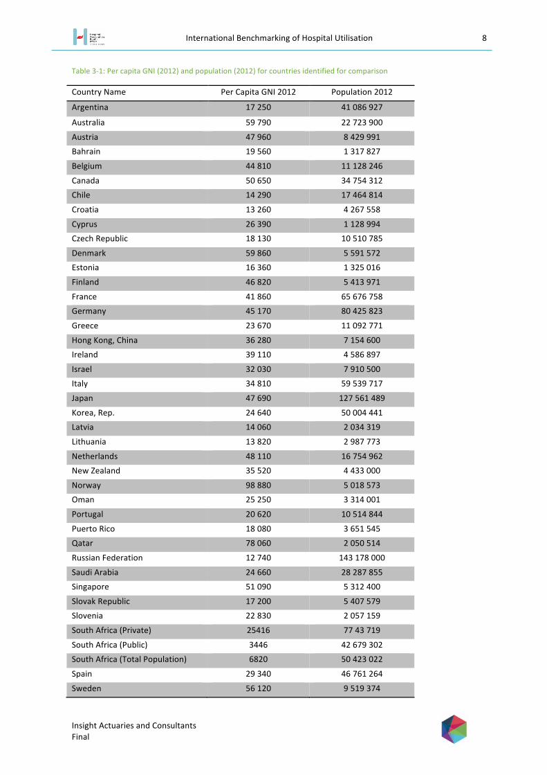
Table 3-‐1: Per capita GNI (2012) and population (2012) for countries identified for comparison
Country Name Per Capita GNI 2012 Population 2012
Argentina 17 250 41 086 927
Australia 59 790 22 723 900
Austria 47 960 8 429 991
Bahrain 19 560 1 317 827
Belgium 44 810 11 128 246
Canada 50 650 34 754 312
Chile 14 290 17 464 814
Croatia 13 260 4 267 558
Cyprus 26 390 1 128 994
Czech Republic 18 130 10 510 785
Denmark 59 860 5 591 572
Estonia 16 360 1 325 016
Finland 46 820 5 413 971
France 41 860 65 676 758
Germany 45 170 80 425 823
Greece 23 670 11 092 771
Hong Kong, China 36 280 7 154 600
Ireland 39 110 4 586 897
Israel 32 030 7 910 500
Italy 34 810 59 539 717
Japan 47 690 127 561 489
Korea, Rep. 24 640 50 004 441
Latvia 14 060 2 034 319
Lithuania 13 820 2 987 773
Netherlands 48 110 16 754 962
New Zealand 35 520 4 433 000
Norway 98 880 5 018 573
Oman 25 250 3 314 001
Portugal 20 620 10 514 844
Puerto Rico 18 080 3 651 545
Qatar 78 060 2 050 514
Russian Federation 12 740 143 178 000
Saudi Arabia 24 660 28 287 855
Singapore 51 090 5 312 400
Slovak Republic 17 200 5 407 579
Slovenia 22 830 2 057 159
South Africa (Private) 25416 77 43 719
South Africa (Public) 3446 42 679 302
South Africa (Total Population) 6820 50 423 022
Spain 29 340 46 761 264
Sweden 56 120 9 519 374

International Benchmarking of Hospital Utilisation 9
Insight Actuaries and Consultants Final
Switzerland 80 950 7 996 861
Trinidad and Tobago 14 780 1 337 439
United Arab Emirates 38 620 9 205 651
United Kingdom 38 300 63 695 687
United States 52 350 313 873 685
Uruguay 13 670 3 395 253
Shown graphically we can more easily see how the South African GNI, split into “public” and “private” using the described methodology, compares to the countries listed (Figure 3-‐1).

International Benchmarking of Hospital Utilisation 10
Insight Actuaries and Consultants Final
Figure 3-‐1: GNI per capita
-‐
0 20 000 40 000 60 000 80 000 100 000 120 000
South Africa (Public) South Africa (Total Population)
Russian Federation Croatia
Uruguay Lithuania
Latvia Chile
Trinidad and Tobago Estonia
Slovak Republic Argentina
Puerto Rico Czech Republic
Bahrain Portugal Slovenia
Greece Korea, Rep.
Saudi Arabia Oman
South Africa (Private) Cyprus
Spain Israel
Italy New Zealand
Hong Kong, China United Kingdom
United Arab Emirates Ireland France
Belgium Germany
Finland Japan
Austria Netherlands
Canada Singapore
United States Sweden Australia Denmark
Qatar Switzerland
Norway
GNI Per Capita

International Benchmarking of Hospital Utilisation 11
Insight Actuaries and Consultants Final
4 Data
4.1. South African data
The dataset used for the purpose of deriving and adjusting the admission rates and length of stay for the South African medical scheme population was provided by participating HASA members to Insight Actuaries and Consultants (‘HASA data’). The data includes all admissions to acute-‐care private hospitals (practice code 057/058) from Life Healthcare, Mediclinic and Netcare.
Data was obtained directly from the hospitals due to some concerns with the data published by the Council for Medical Schemes (CMS). In addition, the CMS publish highly summarised data. For the purposes of this project, detailed data were required in order to adjust appropriately for differences between countries in case-‐mix and demographic profile (see section 5.3).
Data were aggregated over a three year period (2011, 2012 and 2013). Summary data were provided by age bands, gender and ICD10-‐3 code. The key variables provided were:
§ The number of day cases § The number of admissions (including day cases) § The number of bed days
The age and gender profile of the South African medical scheme population was obtained from collated medical scheme statutory returns for 2011 and 2012. The total medical scheme population for 2013 was available from the CMS Annual Report 2013/14 (Council for Medical Schemes, 2014). The 2013 age and gender distribution was assumed to be the same as for 2012. The aggregate age and gender profile for the three-‐year period can be seen in Figure 4-‐1.
Figure 4-‐1: Age and gender distribution of the South African medical scheme population (2011-‐2013)
0% 1% 1% 2% 2% 3% 3% 4% 4% 5% 5%
<1
1-4
5-9
10-1
4
15-1
9
20-2
4
25-2
9
30-3
4
35-3
9
40-4
4
45-4
9
50-5
4
55-5
9
60-6
4
65-6
9
70-7
4
75+
Pro
porti
on o
f tot
al p
opul
atio
n
Age Band
Male Female

International Benchmarking of Hospital Utilisation 12
Insight Actuaries and Consultants Final
4.2. International data sources
A thorough desktop search was conducted which resulted in data being obtained for 34 countries out of the 44 countries initially sought. Data were required in a format that would enable comparison on a like-‐for-‐like basis – the required level of detail was not available for all countries. The 10 countries that data could not be sourced for are listed in Table 4-‐1. There were challenges in finding data for the countries, including language differences. This is a particular problem where the subtlety of data definitions is a concern. In addition, data are frequently retained by governments but not available for public use or where available for public use are not in a format that would be useful for this analysis (for example, only reporting data for the top 100 diagnostic groups).
Table 4-‐1: Countries where data could not be sourced
Country Name Per Capita GNI 2012 Population 2012
Bahrain 19 560 1 317 827 Hong Kong, China 36 280 7 154 600 Oman 25 250 3 314 001 Puerto Rico 18 080 3 651 545 Qatar 78 060 2 050 514 Russian Federation 12 740 143 178 000 Saudi Arabia 24 660 28 287 855 Trinidad and Tobago 14 780 1 337 439 United Arab Emirates 38 620 9 205 651 Uruguay 13 670 3 395 253
Data was found from three distinct sources. These were the OECD, the European Hospital Morbidity Database and from national governments. It should be noted that from the first two sources there were some additional nations for which data was found. It was decided to include these data in the available database. These were Hungary, Iceland, Luxemburg, Malta, Mexico, Poland and Turkey.
The OECD collects data on hospital utilisation of all of its 34 member nations. Figures for discharges and length of stay were available by broad diagnostic category (chapter level ICD-‐10 code). However, the data were not available by age, gender and diagnostic category. All the data in this database had consistent definitions and it is these definitions that were used and are defined in section 4.4.
The second major source was the European Hospital Morbidity Database (EHMD), a data repository of all publically available European hospital data. The data for each country was in as much detail as was available for that country and aimed to include information on day cases, bed days and discharges (and hence length of stay) broken down into diagnostic category and by age and gender. However, not all countries in the database had their data in such a detailed format, with a number of countries only providing data by broad diagnostic category or simply providing aggregate figures. Some countries also simply provided discharges or lacked data on day cases. In addition the countries used four different diagnostic groupings: ICD 9-‐3, ICD 10-‐3, ICD 10-‐4 and ISHMT (International Shortlist for Hospital Morbidity Tabulation). The latter three are compatible groupings and consequently we were able to map the data for all these nations onto the ISHMT format. However, the countries with data in ICD 9-‐3 coding were not compatible and could consequently not be used. In addition, to ensure that there data used were relevant, the most recent year of data was used provided that this was from 2010 or later. This database was consequently reduced from a list of 32 to just 22 countries where comprehensive age, gender and diagnostic data were available. The definitions used for day cases, bed days and discharges were the same as used by the OECD which was highly beneficial.

International Benchmarking of Hospital Utilisation 13
Insight Actuaries and Consultants Final
The final general source of data obtained was from individual national governments (either their health department or a statistics department). However, these data were not used, other than as a check on the data obtained from the other two sources as in all cases it was either superseded by the data from the other sources or did not provide any useful additional information.
The final list of countries with the most comprehensive data source is given in Table 4-‐2. There are 38 comparator countries in the final set.
Table 4-‐2: Final list of countries included in comparison
Country Primary Source Country Primary Source Australia OECD Latvia EHMD Austria EHMD Lithuania EHMD Belgium OECD Luxembourg EHMD Canada OECD Malta EHMD Chile OECD Mexico OECD Croatia EHMD Netherlands EHMD Cyprus EHMD New Zealand OECD Czech Republic EHMD Norway OECD Denmark OECD Poland EHMD Estonia OECD Portugal OECD Finland EHMD Slovak Republic EHMD France EHMD Slovenia EHMD Germany EHMD South Africa (Private) HASA Greece OECD Spain EHMD Hungary EHMD Sweden OECD Iceland EHMD Switzerland EHMD Ireland EHMD Turkey OECD Israel OECD United Kingdom EHMD Italy EHMD United States OECD Korea OECD
4.3. Data cleaning
The data were cleaned, checked for errors and collated.
The data obtained from the OECD was of a high standard and consequently, cleaning and checking resulted in very few changes or adjustments to the data.
The EHMD data required more adjustments to be in a readily useable form. The different diagnostic coding used by different countries required careful cross-‐mapping. In order to do this a crosswalk was developed. Furthermore, certain population groups had to be combined to ensure comparability with the South African data (for example, the South African data combined all ages above 75).
It is possible that the data for some countries does not include all hospitals (for example, only public or publically-‐funded hospitals are included).
4.4. Data definitions

International Benchmarking of Hospital Utilisation 14
Insight Actuaries and Consultants Final
For both the OECD database and the EHMD the same definitions were used for discharges (in-‐patient discharges), bed days, average length of stay and day cases. Consequently these were the definitions that were used for the analysis. The definitions are as follows
Discharge (or in-‐patient Discharge): the release of a patient who was formally admitted into a hospital for treatment and/or care and who stayed for a minimum of one night. This includes emergency cases and urgent admissions when they resulted in an overnight stay and hence formal admission as well as patients admitted as day-‐care patients but who have been retained overnight due to complication. Inpatient Discharge excludes day cases and outpatient cases. A discharge was counted as a discharge from any hospital including death, transfer to a different hospital and discharges of healthy newborns. Any transfers within a hospital were not counted as a discharge.
The South African data refer to admissions, and no discharges. It was assumed that these are broadly consistent (i.e. that the mortality-‐rate in hospital is not material at a system-‐wide level).
It is important to note that in the South African private sector healthy newborn babies are not counted as separate admissions (as distinct from their mothers) since separate accounts are not created for them. On inspection (comparing maternity-‐related admissions to admissions for under 1s) it appeared that there were other countries were this is the case (Figure 4-‐2). Consequently, for these countries the admission rate will be understated relative to comparator countries (as will bed days per 1000).
Figure 4-‐2: Inclusion of newborns as separate admissions
South Africa appears unusual in that the gap between the two sets of admission rates is larger than most countries (France to the UK in Figure 4-‐2), but smaller than counties were newborns are clearly excluded (Latvia to Luxembourg in Figure 4-‐2). In South Africa, newborn babies with complications are admitted in their own right and this may account for the difference.
Bed-‐day: day during which a person admitted as an inpatient is confined to a bed and in which the patient stays overnight in a hospital. The number of bed-‐days for a patient is counted as the date of discharge minus the date of admission (for example, a patient admitted on the 25th and discharged on the 26th is counted as 1 day).
Average length of stay (ALOS): calculated by dividing the number of bed-‐days by the number of discharges during the year
0%
5%
10%
15%
20%
25%
Fran
ce
Icel
and
Net
herla
nds
Italy
S
love
nia
Slo
vak
Rep
ublic
G
erm
any
Sw
itzer
land
Li
thua
nia
Cze
ch R
epub
lic
Pol
and
Cyp
rus
Hun
gary
C
roat
ia
Uni
ted
Kin
gdom
S
outh
Afri
ca
Latv
ia
Aus
tria
Spa
in
Mal
ta
Finl
and
Irela
nd
Luxe
mbo
urg
Proportion of admissions <1 Proportion of admissions (Chapter 15)

International Benchmarking of Hospital Utilisation 15
Insight Actuaries and Consultants Final
Day cases: cases where the patient was either, never formally admitted and allocated a bed, or where the bed-‐days for the patient are zero i.e. the patient entered and left hospital on the same calendar day.
5 Methodology
The project is focussed on measures of hospital utilisation (as distinct from total expenditure, or the pricing of hospital services). The key measures that are used are: in-‐patient admission rate per 1 000 lives, average length of stay and bed days per 1 000 lives.
According to the OECD (2013): “The average length of stay in hospitals (ALOS) is often used as an indicator of efficiency. All other things being equal, a shorter stay will reduce the cost per discharge and shift care from inpatient to less expensive post-‐acute settings. However, shorter stays tend to be more service intensive and more costly per day. Too short a length of stay could also cause adverse effects on health outcomes, or reduce the comfort and recovery of the patient. If this leads to a greater readmission rate, costs per episode of illness may fall only slightly, or even rise.”
They go on to say: “Hospital discharge rates measure the number of patients who leave a hospital after receiving care. Together with the average length of stay, they are important indicators of hospital activities.”
The bed days per 1 000 measure brings these two measures together.
5.1 Removing outpatient cases and day cases
All the data used excluded outpatients and day cases. This includes all ambulatory cases, visits to emergency units (that did not result in an admission), and same-‐day cases. This was also done in the van Eck and Besesar (2009) study.
The proportion that day cases constitute of total admissions varies considerably from country to country (Figure 5-‐1). This is largely driven by structural differences. As van Eck and Besesar (2009) point out, countries like the USA have a well-‐developed infrastructure of day clinics and unattached operating theatres (surgi-‐centres). The equivalent facilities are not as widely available in South Africa. There is recently increased activity in this sector where specialist day hospitals are attracting investment2. Consequently ambulatory and day cases are treated in acute care facilities on a ‘day-‐case’ basis. The inclusion of these cases in the comparison would distort the South African admission rate upwards, and the average length of stay downwards. Compared to other countries (Figure 5-‐1) South Africa’s day-‐case rate is slightly above the median and average for comparator countries where the data were available.
2 http://www.moneyweb.co.za/moneyweb-‐industrials/day-‐hospital-‐groups-‐seeks-‐buyin-‐from-‐medical-‐schem

International Benchmarking of Hospital Utilisation 16
Insight Actuaries and Consultants Final
Figure 5-‐1: Day cases as a proportion of total admissions
5.2 Scaling up the HASA data
The data obtained for South African private hospitals represents a subset of the market. The three large hospital groups from whom data were obtained represent 78.3% of beds in the private sector.
In order to derive the in-‐patient admission rate to private hospitals in South Africa, it was assumed that the proportion of admissions seen by the three large hospital groups is equal to the proportion of private hospital licensed beds in these groups. It was also assumed that there were no significant differences in average length of stay between the hospitals included in the dataset and those excluded. Using this proportion, the HASA admissions data was proportionately increased to represent a figure for the total medical scheme population.
5.3 Adjusting for demographic profile and burden of disease (case mix)
5.3.1 What is case mix?3
The term “case mix” refers to the relative proportions of the type or mix of patients treated by a hospital (Fetter, Shin, Freeman, Averill and Thompson, 1980). Individual patients receive different amounts and types of services dependent on their diagnosis and the course of treatment prescribed (Fetter et al., 1980). A hospital treating a group of patients that require a more sophisticated and expensive set of treatments, such as surgeries, is considered to have a more “severe case mix” or a “heavier case mix” in comparison to a hospital treating a group of patients with minor ailments.
The term “case mix” is also a generic term used to describe statistically developed grouping mechanisms which are used to group patients, in order to assist the planning and management of health care (Heavens, 1999). These are also known as “case mix groupers”.
Whilst Diagnosis Related Groups (DRG) classification systems (grouping patient treatments into a restricted set of clinically and economically homogeneous groups, according to the resources used) have been implemented in a number of countries, there remain important differences in the systems actually used, limiting comparability.
3 This section was taken from (Dreyer, 2013)
0%
10%
20%
30%
40%
50%
60%
70%
Cze
ch R
epub
lic
Ger
man
y
Hun
gary
Lith
uani
a
Cyp
rus
Slo
veni
a
Aus
tria
Pol
and
Latv
ia
Italy
Sou
th A
frica
Finl
and
Mal
ta
Luxe
mbo
urg
Cro
atia
Uni
ted
Kin
gdom
Irela
nd
Day
cas
es a
s a
prop
ortio
n of
adm
issi
ons

International Benchmarking of Hospital Utilisation 17
Insight Actuaries and Consultants Final
5.3.2 Choice of risk adjustment factors
The choice of risk adjustment factors for this study was constrained by data availability. For the OECD data it was not possible to adjust by age and gender, and the only consistent clinical information available across countries was the high-‐level disease chapter.
Table 5-‐1: Disease chapters
Chapter Number
Description of Disease Chapters
1 Infectious and parasitic diseases 2 Neoplasms 3 Diseases of the blood and bloodforming organs 4 Endocrine, nutritional and metabolic diseases 5 Mental and behavioural disorders 6 Diseases of the nervous system 7 Diseases of the eye and adnexa 8 Diseases of the ear and mastoid process 9 Diseases of the circulatory system
10 Diseases of the respiratory system 11 Diseases of the digestive system 12 Diseases of the skin and subcutaneous tissue 13 Diseases of musculoskeletal system and connective tissue 14 Diseases of the genitourinary system 15 Pregnancy, childbirth and the puerperium 16 Certain conditions originating in the perinatal period 17 Congenital malformations, deformations and chromosomal abnormalities
18 Symptoms, signs and abnormal clinical and laboratory findings, n.e.c.
19 Injury, poisoning and other consequences of external causes 21 Factors influencing health status and contact with health services 23 All causes
The countries covered in the European database have more information available to enable more precise risk adjustment. For these countries we were able to adjust for age, gender and ISHMT group.
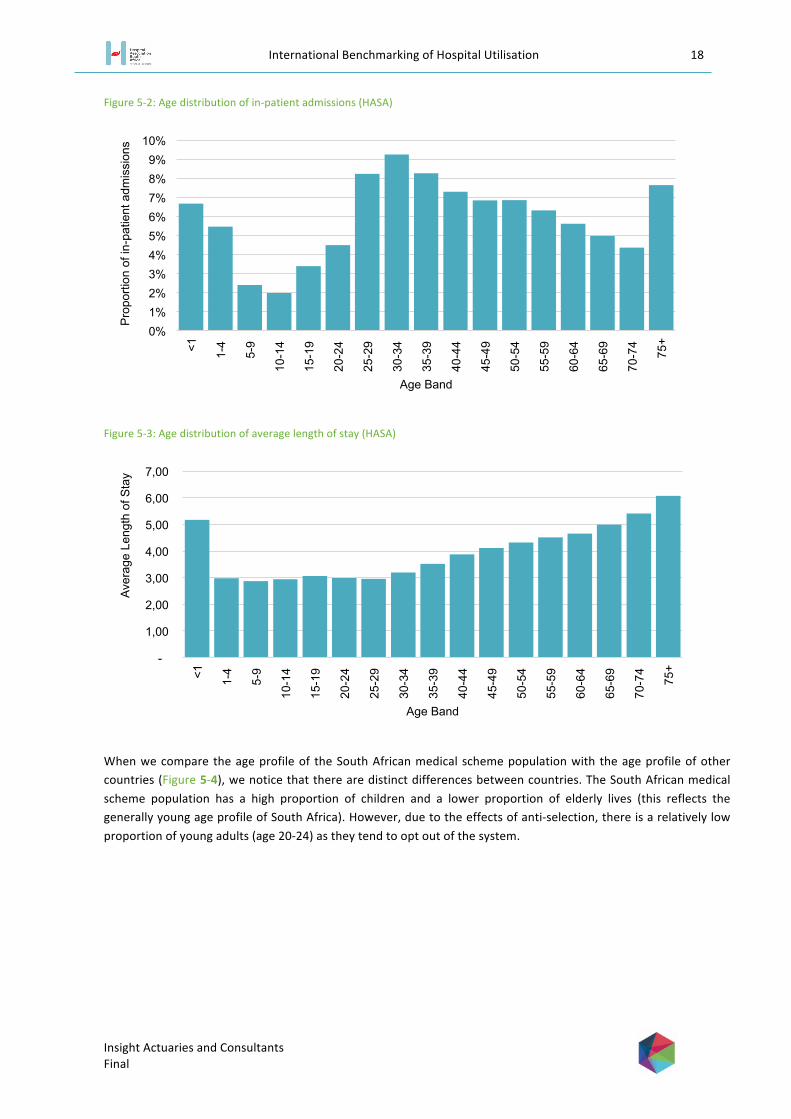
The importance of adjusting for differences in age profile between countries can clearly be seen from the HASA data. The impact of age on admission rates can be seen in Error! Reference source not found.. The “maternity hump” (increase in admissions over the child-‐bearing years) can clearly be seen. In Error! Reference source not found. we can see that the average length of stay rises with age (with the exception of neonatal cases).
International Benchmarking of Hospital Utilisation 18
Insight Actuaries and Consultants Final
Figure 5-‐2: Age distribution of in-‐patient admissions (HASA)
Figure 5-‐3: Age distribution of average length of stay (HASA)
When we compare the age profile of the South African medical scheme population with the age profile of other countries (Figure 5-‐4), we notice that there are distinct differences between countries. The South African medical scheme population has a high proportion of children and a lower proportion of elderly lives (this reflects the generally young age profile of South Africa). However, due to the effects of anti-‐selection, there is a relatively low proportion of young adults (age 20-‐24) as they tend to opt out of the system.
0% 1% 2% 3% 4% 5% 6% 7% 8% 9%
10%
<1
1-4
5-9
10-1
4
15-1
9
20-2
4
25-2
9
30-3
4
35-3
9
40-4
4
45-4
9
50-5
4
55-5
9
60-6
4
65-6
9
70-7
4
75+
Pro
porti
on o
f in-
patie
nt a
dmis
sion
s
Age Band
-
1,00
2,00
3,00
4,00
5,00
6,00
7,00
<1
1-4
5-9
10-1
4
15-1
9
20-2
4
25-2
9
30-3
4
35-3
9
40-4
4
45-4
9
50-5
4
55-5
9
60-6
4
65-6
9
70-7
4
75+
Aver
age
Leng
th o
f Sta
y
Age Band

International Benchmarking of Hospital Utilisation 19
Insight Actuaries and Consultants Final
Figure 5-‐4: Age distribution comparison across countries
The profile of admissions is distinctly different for males and females. Figure 5-‐5 illustrates the distribution of in-‐patient admissions by age and gender. The significant effect of the child-‐bearing years can clearly be seen. This is also reflected in the shorter average length of stay for females in those years (Figure 5-‐6).
0,00%
1,00%
2,00%
3,00%
4,00%
5,00%
6,00%
7,00%
8,00%
9,00%
<1
1-4
5-9
10-1
4
15-1
9
20-2
4
25-2
9
30-3
4
35-3
9
40-4
4
45-4
9
50-5
4
55-5
9
60-6
4
65-6
9
70-7
4
75+
Austria
Switzerland
Cyprus
Czech Republic
Spain
Finland
France
Croatia
Iceland
Italy
Netherlands
Slovak Republic
South Africa

International Benchmarking of Hospital Utilisation 20
Insight Actuaries and Consultants Final
Figure 5-‐5: Age and gender distribution of in-‐patient admissions (HASA)
Figure 5-‐6: Age and gender distribution of average length of stay (HASA)
0%
1%
2%
3%
4%
5%
6%
7%
8% <1
1-4
5-9
10-1
4
15-1
9
20-2
4
25-2
9
30-3
4
35-3
9
40-4
4
45-4
9
50-5
4
55-5
9
60-6
4
65-6
9
70-7
4
75+
Pro
porti
on o
f in-
patie
nt a
dmis
sion
s
Age Band
Male Female
-
1,00
2,00
3,00
4,00
5,00
6,00
7,00
<1
1-4
5-9
10-1
4
15-1
9
20-2
4
25-2
9
30-3
4
35-3
9
40-4
4
45-4
9
50-5
4
55-5
9
60-6
4
65-6
9
70-7
4
75+
Aver
age
Leng
th o
f Sta
y
Age Band
Male Female

International Benchmarking of Hospital Utilisation 21
Insight Actuaries and Consultants Final
The proportion of cases in various clinical categories can be seen in Figure 5-‐7, together with the variations in average length of stay per clinical category (Figure 5-‐8)Error! Reference source not found..
Figure 5-‐7: In-‐patient admissions per disease chapter (HASA)
0% 2% 4% 6% 8% 10% 12% 14% 16%
Respiratory system
Pregnancy, childbirth and the puerperium
Digestive system
Circulatory system
External causes
Musculoskeletal system and connective tissue
Genitourinary system
Infectious and parasitic
Neoplasms
Nervous system
Endocrine, nutritional and metabolic
Factors influencing health status and contact
Mental and behavioural
Skin and subcutaneous tissue
Perinatal period
Symptoms, signs and abnormal clinical and
Blood and bloodforming organs
Ear and mastoid process
Congenital and chromosomal
Eye and adnexa
Proportion of in-patient admissions

International Benchmarking of Hospital Utilisation 22
Insight Actuaries and Consultants Final
Figure 5-‐8: Average length of stay per disease chapter (HASA)
The distribution of admissions across these categories varies substantially between countries (Figure 5-‐9). In part this will be explained by differences in the age and gender profile, but the burden of disease will also have an effect. Unfortunately, the disease chapters are organised anatomically and do not provide a “resource-‐use-‐homogenous” grouping (as would, for example, DRGs).
- 2,00 4,00 6,00 8,00 10,00 12,00 14,00
Perinatal period
Mental and behavioural
Congenital and chromosomal
Neoplasms
Circulatory system
Respiratory system
Skin and subcutaneous tissue
Endocrine, nutritional and metabolic
Infectious and parasitic
External causes
Blood and bloodforming organs
Nervous system
Digestive system
Musculoskeletal system and connective
Genitourinary system
Pregnancy, childbirth and the
Factors influencing health status and
Ear and mastoid process
Symptoms, signs and abnormal clinical
Eye and adnexa
Average Length of Stay

International Benchmarking of Hospital Utilisation 23
Insight Actuaries and Consultants Final
Figure 5-‐9: Variation in the proportion of admissions per disease chapter across countries
5.4 Maternity cases and newborns
In the van Eck and Besesar (2009) study an explicit adjustment was done for to allow for differences in the maternity rate. A higher than normal maternity rate is expected in the South African medical scheme environment due to high levels of anti-‐selection. This was not explicitly allowed for in this study, but is adjusted for to some extent in the risk adjustment (ISHMT chapter 15). Differences in the maternity rate also affect admission rates for under-‐1s. This is compounded by the differences in the way in which newborns are dealt with in the data. We provide a set of results where both maternity cases and newborns are removed.
0 0,1 0,2 0,3 0,4 0,5 0,6 0,7 0,8 0,9
1
Aus
tria
Bul
garia
S
witz
erla
nd
Cyp
rus
Cze
ch R
epub
lic
Ger
man
y E
ston
ia
Spa
in
Finl
and
Fran
ce
Cro
atia
H
unga
ry
Irela
nd
Icel
and
Italy
Li
thua
nia
Luxe
mbo
urg
Latv
ia
The
form
er Y
ugos
lav
Mal
ta
Net
herla
nds
Pol
and
Rom
ania
S
wed
en
Slo
veni
a S
lova
k R
epub
lic
Turk
ey
Uni
ted
Kin
gdom
S
outh
Afri
ca
Pro
porti
on o
f tot
al in
-pat
ient
adm
issi
ons
1 2 3 4 5 6 7 8 9 10 11 12 13 14 15 16 17 18 19 21

International Benchmarking of Hospital Utilisation 24
Insight Actuaries and Consultants Final
6 Results
Results are presented separately for the two major data sources that were utilised: the EHMD and the OECD. This is because of the differences in the extent of risk adjustments that could be performed.
Results are risk-‐adjusted at various levels depending on the data available within each data set used. Admission rates are adjusted for age and gender where this information is available. Length of stay is risk-‐adjusted for age, gender and ISHMT classification where this information is available (all comparator countries data are risk adjusted to South Africa’s mix of factors).
The results in this report are focussed on how South Africa compares at an aggregate level to a set of other countries. The factors driving the utilisation of each individual country are complex, and require substantial understanding of each of the health systems. Factors influencing utilisation will include both the supply side and demand side. According to the OECD (2013): “Hospital activities are affected by a number of factors, including the demand for hospital services, the capacity of hospitals to treat patients, the ability of the primary care sector to prevent avoidable hospital admissions, and the availability of post-‐acute care settings to provide rehabilitative and long-‐term care services”.
6.1 Comparison to Countries in the European Hospital Morbidity Database
Of the two data sources, the EHMD is the richer source and presents scope to adjust for age, gender and case-‐mix. We present the results of the comparison of South Africa with the countries in this dataset first.
Day cases (as defined in section 4.4: including same-‐day cases and ambulatory cases) are reported explicitly for most countries in the comparator set. As seen in Figure 6-‐1 South Africa’s private sector sees higher than average (68 versus 60 per 1 000) day cases than the comparator countries for which day cases data are available. South Africa’s figure is close to the 75th percentile for day cases per 1 000 (70). Differences between countries in the number of day cases per 1000 may be due to structural differences (for example, the existence and popularity of day clinics and the availability of doctors after hours). A low day-‐case rate may also point to unnecessary admissions for low-‐acuity cases (i.e. it may be more efficient for cases to be treated as day cases as opposed to being admitted).

International Benchmarking of Hospital Utilisation 25
Insight Actuaries and Consultants Final
Figure 6-‐1: Variation in the day cases per 1000 across EHMD countries
Further analysis is done excluding same-‐day admissions for South Africa and comparator countries.
In Figure 6-‐2, countries are sorted by the raw unadjusted length of stay. Two adjustments done: the first is just based on the high-‐level disease chapters. This is in line with the adjustments that were possible for the OECD countries (section 7.2). The second adjustment was more granular and took into account age, gender and the more detailed diagnosis codes as these are available from EHMD. Raw length of stay figures range from 5.6 to 11.1, whereas length of stay adjusted for age, gender and ISHMT range from 4.9 to 8. Risk adjustment narrows the range observed, or put another way, risk profile differences explain some of the variation seen between countries.
0
50
100
150
200
250
Ger
man
y Th
e fo
rmer
Yug
osla
v C
ypru
s H
unga
ry
Sw
eden
S
love
nia
Lith
uani
a Is
rael
Ita
ly
Pol
and
Finl
and
Rom
ania
D
enm
ark
Aus
tria
Latv
ia
Est
onia
S
outh
Afri
ca
Luxe
mbo
urg
Mal
ta
Nor
way
C
roat
ia
Bel
gium
U
nite
d K
ingd
om
Irela
nd
Mea
n M
edia
n 75
% p
erce
ntile
Day
cas
es p
er 1
000

International Benchmarking of Hospital Utilisation 26
Insight Actuaries and Consultants Final
Figure 6-‐2: Impact of risk adjustments on average length of stay figures (EHMD)
It is important to note that the differences in average length of stay between countries are overstated if we do not adjust fully for age, gender and case-‐mix. It is also important to note that the average length of stay in South Africa is lower than all other compactor countries, even once the data for comparator countries has been risk adjusted. The result of the risk-‐adjustment is particularly extreme for Finland where the population has a very different age profile to South Africa. Finland spends 2.1% of GDP on long-‐term care which is likely to skew average length of stay figures.
In Figure 6-‐3 countries are sorted by the raw, unadjusted admission rate per 1 000. The risk adjustment was based on age and gender (i.e. the admission rates per age and gender category were reweighted based on the structure of the South African population). Admission rates range between 78.7 and 273.4 per 1 000, whereas risk adjusted admission rates range between 49.8 and 228 per 1 000.
0
2
4
6
8
10
12
Sou
th A
frica
N
ethe
rland
s Fr
ance
C
ypru
s Ic
elan
d Ire
land
S
pain
S
love
nia
Uni
ted
Kin
gdom
S
lova
k R
epub
lic
Pol
and
Mal
ta
Latv
ia
Italy
Li
thua
nia
Luxe
mbo
urg
Sw
itzer
land
A
ustri
a G
erm
any
Hun
gary
C
roat
ia
Cze
ch R
epub
lic
Finl
and
Aver
age
Leng
th o
f Sta
y
Raw Adjusted for Chapters Adjusted for Age, Gender and ISHMT

International Benchmarking of Hospital Utilisation 27
Insight Actuaries and Consultants Final
Figure 6-‐3: Impact of risk adjustments on in-‐patient admission rate per 1 000 (EHMD)
The impact of the adjustment is greatest for countries with an elderly population (for example, Finland, Germany and Austria). The in-‐patient admission rate per 1 000 for South Africa (175.76) is higher than the average (149.08) for comparator countries on a risk-‐adjusted basis, and closer to the 70th percentile (177.37).
A relatively high admission rate would be expected in a market with private health insurance and private delivery, as compared to a publically-‐funded or publically-‐delivered system where rationing is likely to be tighter. All of the comparator countries have a large public sector coverage or a high percentage of health care expenditure in the public sector. Amongst the comparator countries, the average extent of public sector coverage is 77%, and the average percentage of health care expenditure in the public sector is 72%.
Rationing mechanisms such as waiting lists for elective procedures, strict gate-‐keeper and referral pathway rules, exclusions from benefit package serve to reduce the admission rate. When people buy private health insurance, they buy increased access and freedom of choice, and therefore it would be expected that admission rates may be higher than national systems.
It is also important to note that the South African medical scheme market is voluntary. There is evidence of adverse selection against schemes (Ramjee, Vieyra, Abraham, Kaplan, & Taylor, 2014): a feature of the environment that would impact adversely on admission rates.
Despite the nature of the South African medical scheme market, admission rates are not excessively high relative to the comparator set. Furthermore, the lower LOS (Figure 6-‐2) indicates the efficient use of resources for those lives that are admitted. It is useful to consider admission rate and length of stay together.
Figure 6-‐4 is shown on a raw basis, before risk adjustment.
0
50
100
150
200
250
300 C
ypru
s S
pain
N
ethe
rland
s Ita
ly
Irela
nd
Uni
ted
Kin
gdom
M
alta
Ic
elan
d Lu
xem
bour
g C
roat
ia
Pol
and
Latv
ia
Sw
itzer
land
S
love
nia
Fran
ce
Sou
th A
frica
Fi
nlan
d S
lova
k R
epub
lic
Cze
ch R
epub
lic
Hun
gary
Li
thua
nia
Ger
man
y A
ustri
a
Adm
issi
on R
ate
per 1
000
live
s
Raw Adjusted for Age and Gender

International Benchmarking of Hospital Utilisation 28
Insight Actuaries and Consultants Final
Figure 6-‐4: Relationship between unadjusted length of stay and unadjusted admission rate per 1000 (EHMD)
While South Africa is above the middle of the range against comparator countries for admission rate, it has a noticeably lower LOS.
The figures are considered on a risk adjusted below (Figure 6-‐5).
Figure 6-‐5: Relationship between risk-‐adjusted length of stay and risk-‐adjusted admission rate per 1000 (EHMD)
Risk adjustment for length of stay is done using age, gender and ISHMT (i.e. full risk adjustment). Risk adjustment for in-‐patient admission rate per 1000 is done using age and gender. On a risk adjusted basis South Africa remains above average in terms of admission rate and the lowest in terms of length of stay. Admission rates and length of stay figures can be combined to derive a bed days per 1 000 which indicates the overall utilisation level of hospital services across comparator countries (Figure 6-‐6).
0
50
100
150
200
250
300
0 2 4 6 8 10 12
Adm
issi
on R
ate
per 1
000
lives
Average Length of Stay
0
50
100
150
200
250
0 1 2 3 4 5 6 7 8 9
Ris
k-A
djus
ted
Adm
issi
on R
ate
per 1
000
lives
Risk-Adjusted Average Length of Stay

International Benchmarking of Hospital Utilisation 29
Insight Actuaries and Consultants Final
Figure 6-‐6: Risk-‐Adjusted Bed days per 1 000 (EHMD)
South Africa ranks 8th out of 23 countries in terms of total bed days per 1 000 population, on a risk-‐adjusted basis (Figure 6-‐6). If we repeat this analysis but exclude maternity cases and newborns this shifts to a rank of 9th out of 23 countries (Figure 6-‐7). The biggest decreases in bed days per 1 000 are for those countries where newborns are counted as separate admissions and those where the maternity rate is high.
Figure 6-‐7: Risk-‐Adjusted Bed days per 1 000 excluding maternity cases and newborns (EHMD)
Given the role of the private sector and the range and level of services provided in private hospitals in South Africa, this position gives no cause for alarm in terms of excessive or spurious utilisation.
0 200 400 600 800
1 000 1 200 1 400 1 600 1 800
Cyp
rus
Spa
in
Net
herla
nds
Irela
nd
Uni
ted
Kin
gdom
Ic
elan
d Ita
ly
Sou
th A
frica
M
alta
Fr
ance
Lu
xem
bour
g P
olan
d S
love
nia
Latv
ia
Finl
and
Sw
itzer
land
S
lova
k R
epub
lic
Cro
atia
H
unga
ry
Cze
ch R
epub
lic
Aus
tria
Ger
man
y Li
thua
nia
Ris
k-A
djus
ted
Bed
day
s pe
r 100
0 liv
es
0
200
400
600
800
1 000
1 200
1 400
1 600
Cyp
rus
Net
herla
nds
Spa
in
Italy
Ire
land
Fr
ance
U
nite
d K
ingd
om
Icel
and
Sou
th A
frica
M
alta
Lu
xem
bour
g P
olan
d S
love
nia
Latv
ia
Slo
vak
Rep
ublic
S
witz
erla
nd
Cro
atia
Fi
nlan
d H
unga
ry
Cze
ch R
epub
lic
Ger
man
y Li
thua
nia
Aus
tria
Ris
k-A
djus
ted
Bed
day
s pe
r 100
0 liv
es

International Benchmarking of Hospital Utilisation 30
Insight Actuaries and Consultants Final
6.2 Comparison to OECD Countries
The OECD dataset does not have utilisation data by age and gender, or detailed clinical coding. For these countries the only risk adjustment done was to the average length of stay based on the high level disease chapters. No adjustment is possible for the admission rate, as demographic profile information is required for such an adjustment. Nevertheless, adjusting for the known clinical chapter differences causes some notable changes to observed country statistics Figure 6-‐8 and Figure 6-‐9.

International Benchmarking of Hospital Utilisation 31
Insight Actuaries and Consultants Final
Figure 6-‐8: Percentage change in average length of stay due to risk adjustment (OECD)
-30% -20% -10% 0% 10% 20% 30%
Latvia Finland Estonia
Switzerland Germany Australia
Luxembourg Austria
Hungary Sweden Croatia Korea
Romania Lithuania
Czech Republic Slovenia
Slovak Republic Poland
Macedonia Israel Malta Spain
Belgium Cyprus
Canada Bulgaria
Denmark Iceland
South Africa Italy
United States New Zealand
Greece United Kingdom
Norway France
Chile Portugal
Netherlands Ireland Turkey Mexico

International Benchmarking of Hospital Utilisation 32
Insight Actuaries and Consultants Final
Figure 6-‐9: Risk-‐Adjusted Bed days per 1 000 (OECD)
On this larger comparator set, South Africa ranks 9th out of 42 countries at 713 bed days per 1 000 (Figure 6-‐9). Mexico shows the lowest figure in the comparator set at 234 per 1 000, and Korea is the highest at 2 486 per 1 000.
0 500 1 000 1 500 2 000 2 500
Mexico Cyprus
Chile United States
Canada Spain
Netherlands Turkey
South Africa Portugal
Denmark Norway Iceland Ireland
Sweden Australia
Macedonia France
Italy Malta
United Kingdom Israel Latvia
Poland Belgium
Luxembourg Estonia
Slovenia New Zealand
Switzerland Croatia
Slovak Republic Greece
Romania Bulgaria Finland
Hungary Lithuania
Czech Republic Austria
Germany Korea
Risk-Adjusted Bed Days per 1000

International Benchmarking of Hospital Utilisation 33
Insight Actuaries and Consultants Final
Figure 6-‐10: Relationship between bed days per 1 000 and beds per 1 000
The OECD data set also contains information on the hospital beds available in each comparator country. Plotting this against the bed days used per 1 000 a very clear pattern emerges (Figure 6-‐10). Bed days used correlates very highly with available beds per 1 000 (80%). South Africa is aligned with this correlated pattern, with comparatively low available beds and bed days used. Note that we have not adjusted the available beds downward to reflect the use of these beds in South Africa for same-‐day admissions, as has been discussed above.
-
500
1 000
1 500
2 000
2 500
3 000
0 2 4 6 8 10 12
Ris
k-A
djus
ted
Bed
Day
s pe
r 100
0
Beds per 1000
International Benchmarking of Hospital Utilisation 34
Insight Actuaries and Consultants Final
7 Conclusion
Undertaking an international comparison of hospital utilisation is potentially useful as a means of establishing expectations for South Africa and identifying characteristics of the environment that are particularly unusual. However, it is clear that it is important to undertake such comparisons carefully. It is particularly important that comparisons are on a like-‐for-‐like basis, and do not ignore differences in data definitions, patient demographics and clinical case-‐mix.
It is also important to select a relevant comparator set. We have used an economic basis for comparison as opposed to a health-‐systems basis. Given that the private sector in South Africa typically serves higher-‐income individuals, we have used the income differentials between covered and uncovered lives as a proxy for GNI. Comparator countries were chosen that are in a similar GNI per capita bracket as the South African private sector. We also only selected countries with a sufficiently large populations so as to make comparisons meaningful. For these comparator countries we can compare the utilisation of hospital services by looking at day cases per 1 000, overnight admission rates per 1 000 and average length of stay. Results are risk adjusted to make them more directly comparable.
In interpreting the results it is necessary to consider structural differences between countries, for example, the extent to which care is rationed and prioritised, the split between types of facilities, the availability and access to facilities and the way in which care is financed. For example, some countries may have a large number of nursing homes and step-‐down facilities which may impact average length of stay.
Considering two separate data sources, South Africa appears to have mid-‐ to high-‐ range admission rates with low length of stays. On a combined basis, the bed days used per 1 000 for South Africa appears near the lower end of the spectrum which would indicate South Africa is making fairly efficient use of its hospital resources.

International Benchmarking of Hospital Utilisation 35
Insight Actuaries and Consultants Final
References Blecher, M., Kolliparai, A., De Jager, P., & Zulu, N. (2011). Health Financing. In A. Padarath & R. English (Eds.), South
African Health Review 2011 Durban: Health Systems Trust. Council for Medical Schemes. (2008). Research Brief 1 of 2008. Evaluation of Medical Schemes’ Cost Increases.
Pretoria. Council for Medical Schemes. (2014). Annual Report 2013-‐14. Pretoria: Council for Medical Schemes. Dreyer, K. (2013). The Evaluation of Case-‐Mix Adjusted Efficiency Scores: The Case of the South African Private
Hospital Industry. (MBusSc), University of Cape Town, Cape Town. Econex. (2013). The South African Private Healthcare Sector: Role and Contribution to the Economy. Stellenbosch. Kumar, A., de Lagasnerie, G., Maiorano, F., & Forti, A. (2014). Pricing and competition in Specialist Medical Services:
An Overview for South Africa OECD Health Working Papers (Vol. 70): OECD Publishing McIntyre, D. (2010). Private sector involvement in funding and providing health services in South Africa:
Implications for equity and access to health care EQUINET Discussion Paper (Vol. 84): Regional Network for Equity in Health in East and Southern Africa (EQUINET).
OECD. (2013). Health at a glance 2013: OECD Indicators OECD Publishing. Ramjee, S., Vieyra, T., Abraham, M., Kaplan, J., & Taylor, R. (2014). National Health Insurance and South Africa's
private sector. South African Health Review, 93-‐103. Statistics South Africa. (2014). Mid-‐year population estimates 2014 P0302. Pretoria. van Eck, H., & Besesar, S. (2009). Hospital Admission Rates for the Medical Scheme Population in SA: Is there a
Supplier Induced Demand Problem? In HASA (Ed.), Private Hospital Review (Vol. 2009). Sandton, South Africa.