Embed Size (px)
Citation preview
Hiroshi Sugimoto
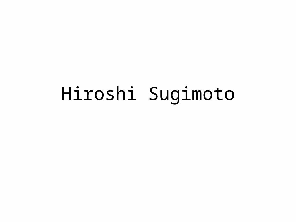
Empire State Building, Shreve Lamb & Harmon, 1997
Gelatin-silver print58 x 47 inches
Source: http://www.pbs.org/art21/slideshow/popup.php?slide=779
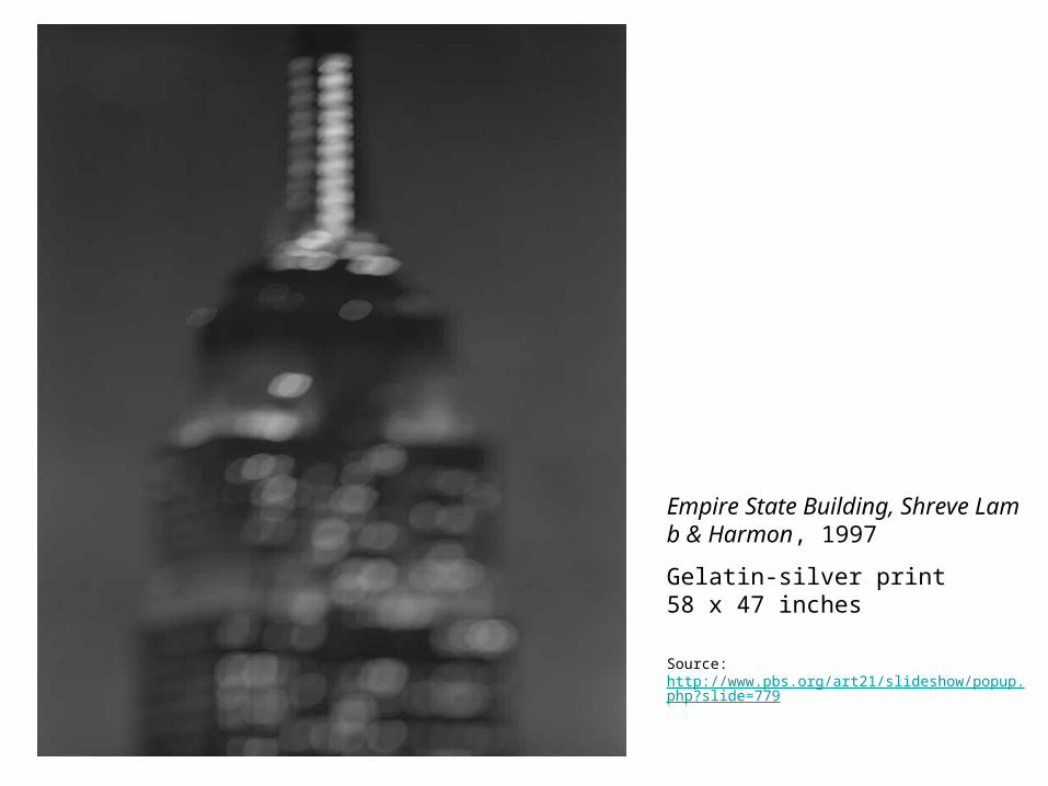
E.U.R. Palazzo Della Civiltà Romana, Marcello Piacentini, 1998Gelatin-silver print47 x 58 3/4 inchesSource: http://www.pbs.org/art21/slideshow/popup.php?slide=760
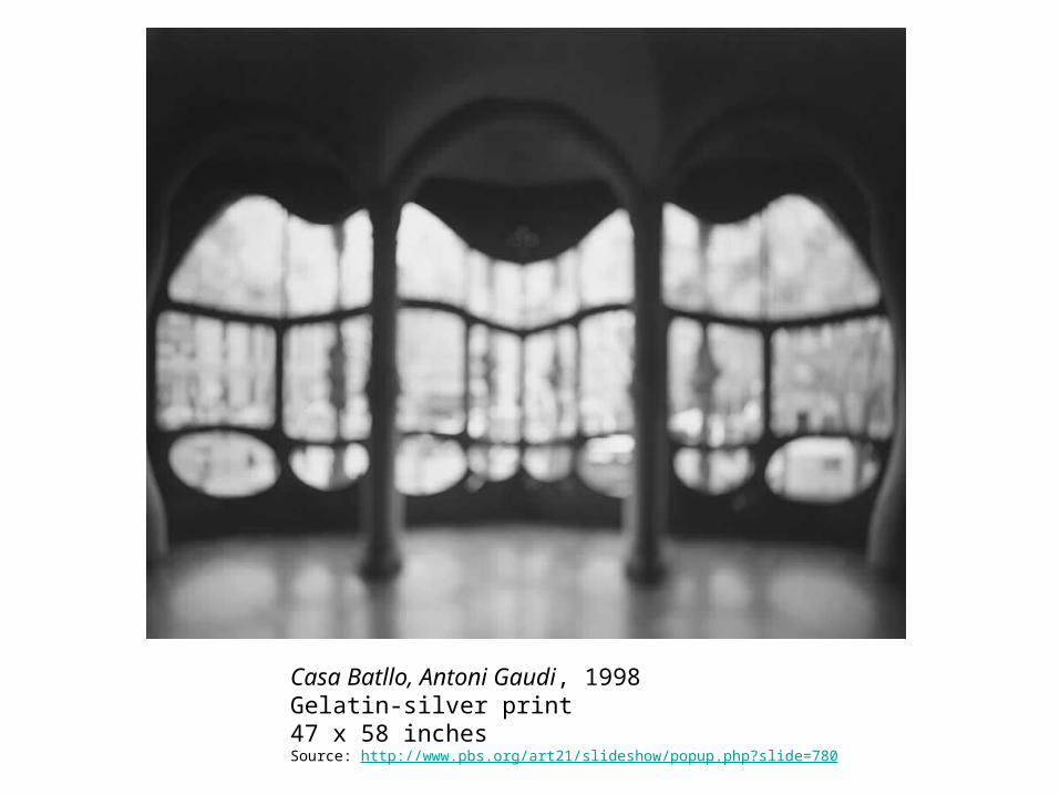
Casa Batllo, Antoni Gaudi, 1998Gelatin-silver print47 x 58 inchesSource: http://www.pbs.org/art21/slideshow/popup.php?slide=780
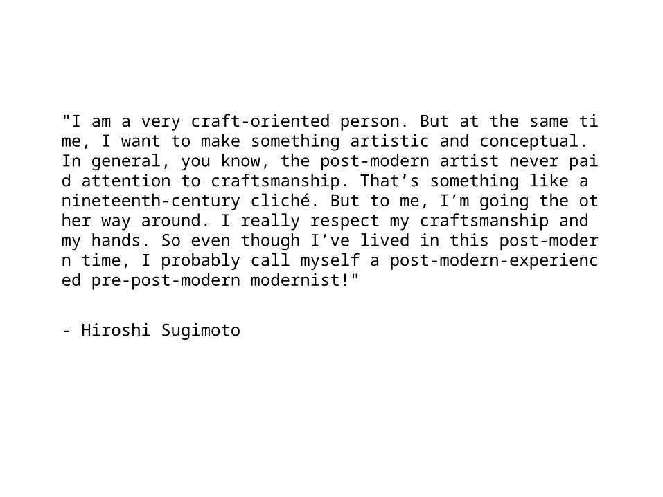
"I am a very craft-oriented person. But at the same time, I want to make something artistic and conceptual. In general, you know, the post-modern artist never paid attention to craftsmanship. That’s something like a nineteenth-century cliché. But to me, I’m going the other way around. I really respect my craftsmanship and my hands. So even though I’ve lived in this post-modern time, I probably call myself a post-modern-experienced pre-post-modern modernist!"
- Hiroshi Sugimoto
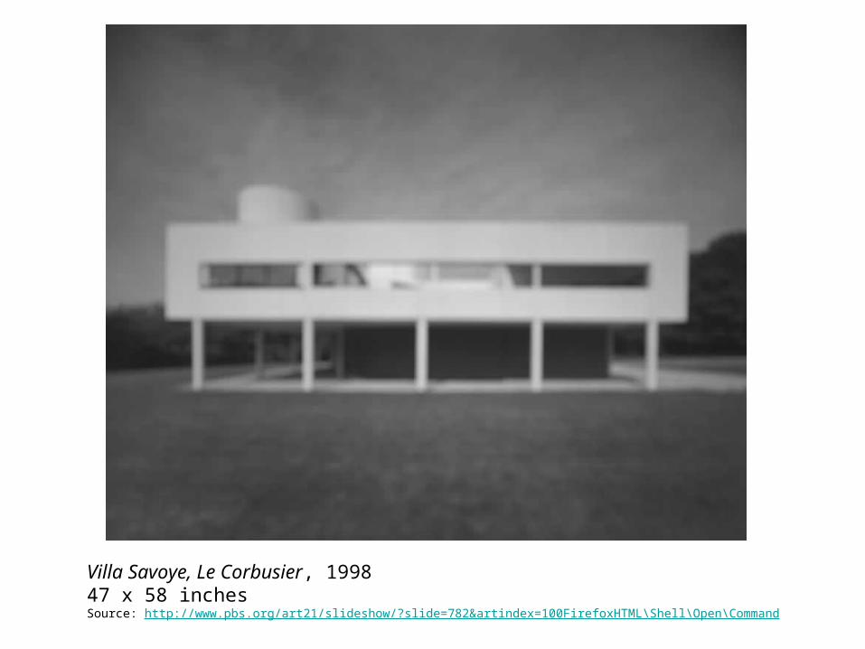
Villa Savoye, Le Corbusier, 199847 x 58 inchesSource: http://www.pbs.org/art21/slideshow/?slide=782&artindex=100FirefoxHTML\Shell\Open\Command
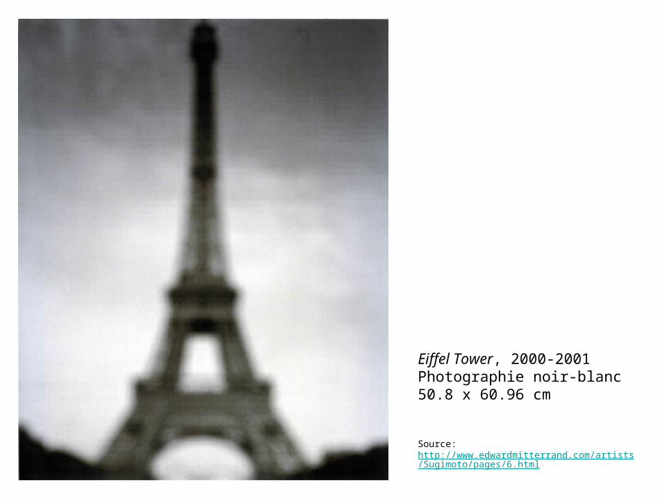
Eiffel Tower, 2000-2001Photographie noir-blanc 50.8 x 60.96 cm
Source: http://www.edwardmitterrand.com/artists/Sugimoto/pages/6.html
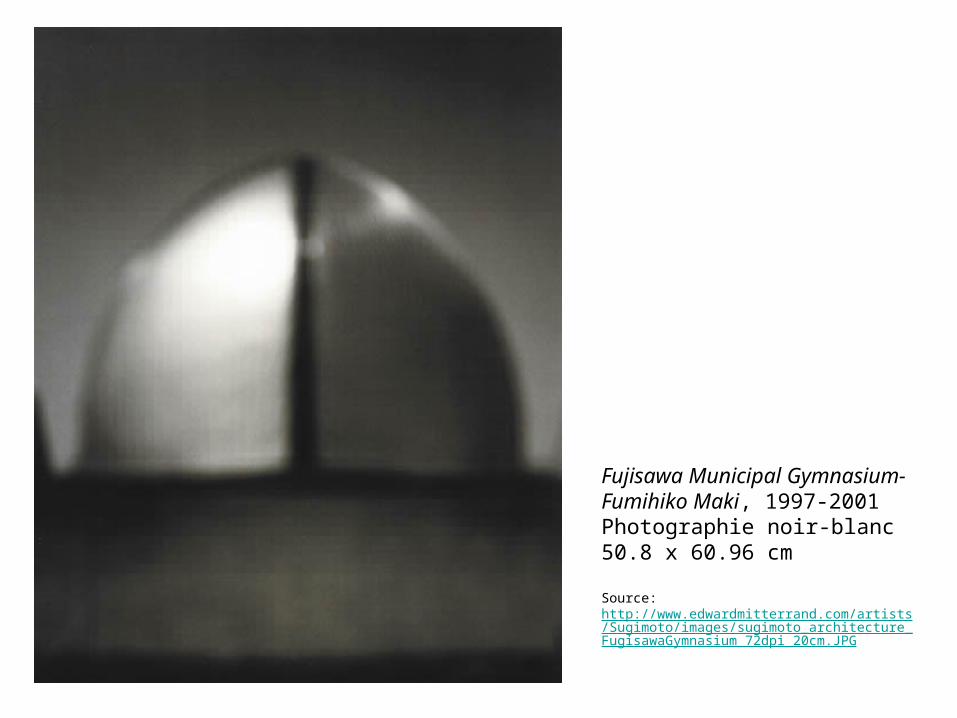
Fujisawa Municipal Gymnasium-Fumihiko Maki, 1997-2001Photographie noir-blanc 50.8 x 60.96 cm
Source: http://www.edwardmitterrand.com/artists/Sugimoto/images/sugimoto_architecture_FugisawaGymnasium_72dpi_20cm.JPG
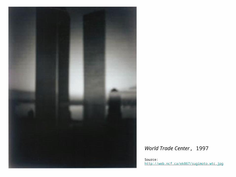
World Trade Center, 1997
Source: http://web.ncf.ca/ek867/sugimoto.wtc.jpg
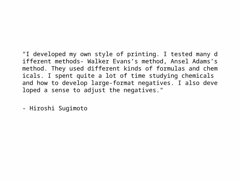
"I developed my own style of printing. I tested many different methods- Walker Evans’s method, Ansel Adams’s method. They used different kinds of formulas and chemicals. I spent quite a lot of time studying chemicals and how to develop large-format negatives. I also developed a sense to adjust the negatives."
- Hiroshi Sugimoto
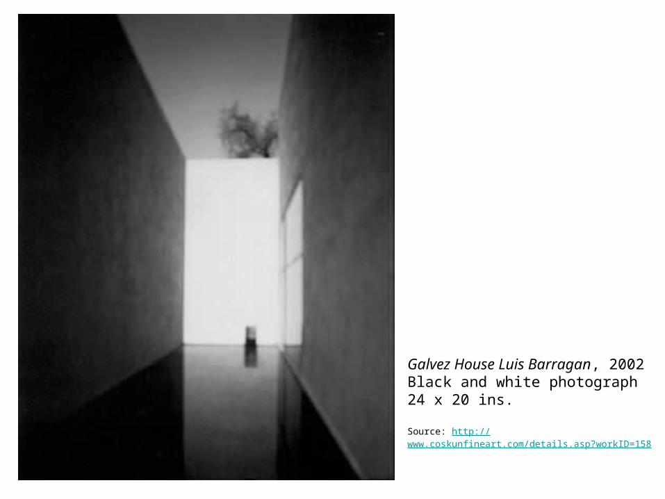
Galvez House Luis Barragan, 2002 Black and white photograph 24 x 20 ins.
Source: http://www.coskunfineart.com/details.asp?workID=158
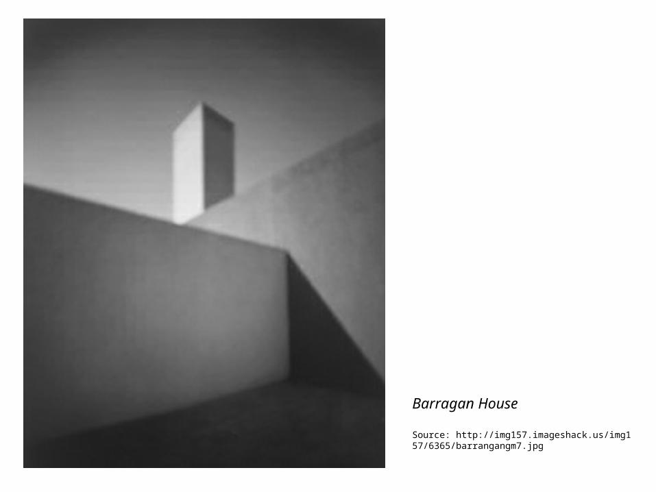
Barragan House
Source: http://img157.imageshack.us/img157/6365/barrangangm7.jpg
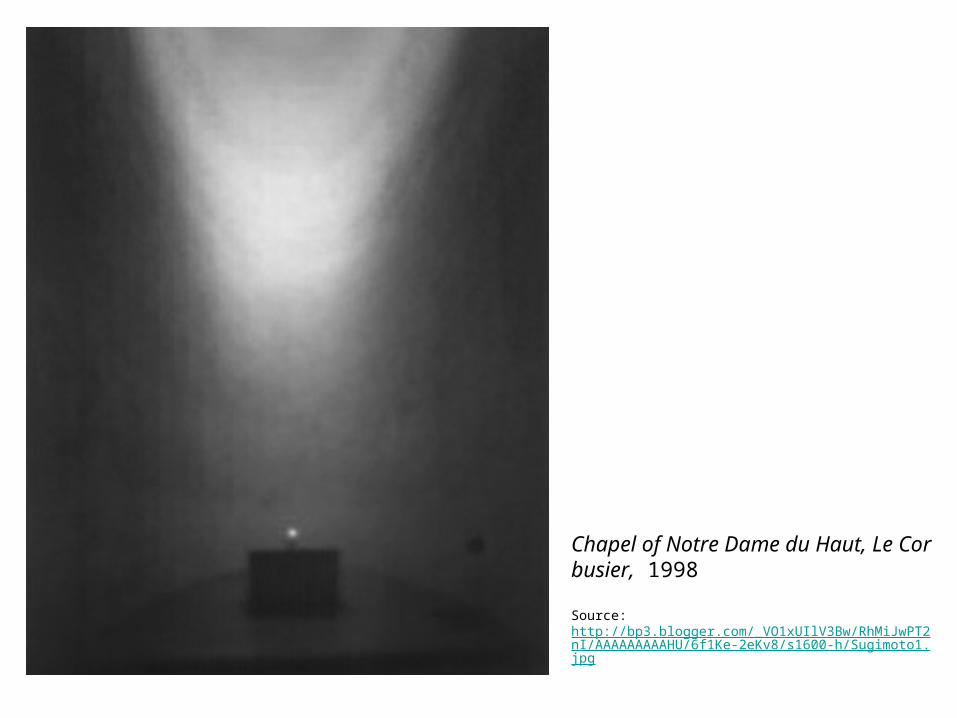
Chapel of Notre Dame du Haut, Le Corbusier, 1998
Source: http://bp3.blogger.com/_VO1xUIlV3Bw/RhMiJwPT2nI/AAAAAAAAAHU/6f1Ke-2eKv8/s1600-h/Sugimoto1.jpg
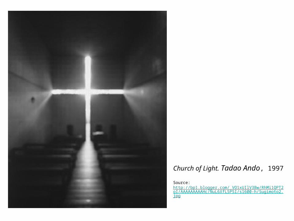
Church of Light. Tadao Ando, 1997
Source: http://bp1.blogger.com/_VO1xUIlV3Bw/RhMi1QPT2oI/AAAAAAAAAHc/NuL6XfL5P5I/s1600-h/Sugimoto2.jpg
"What kind of gray tone creates these nice gray tones? And what level of grayness makes black tones, not losing the medium tones, but extremely deep black? And then, highlights should be interesting but never washed out. There’s no pure white; there are always some tones there. Even in the deepest shadow, there’s a tone which is possible to print on the silver surface, but not in a catalogue."
- Hiroshi Sugimoto
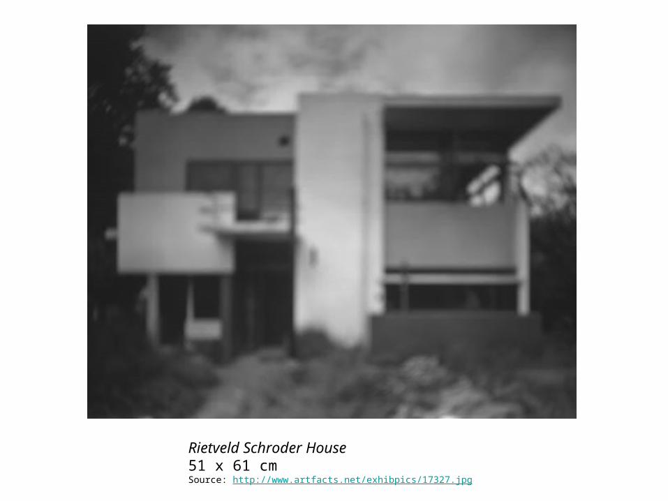
Rietveld Schroder House51 x 61 cmSource: http://www.artfacts.net/exhibpics/17327.jpg
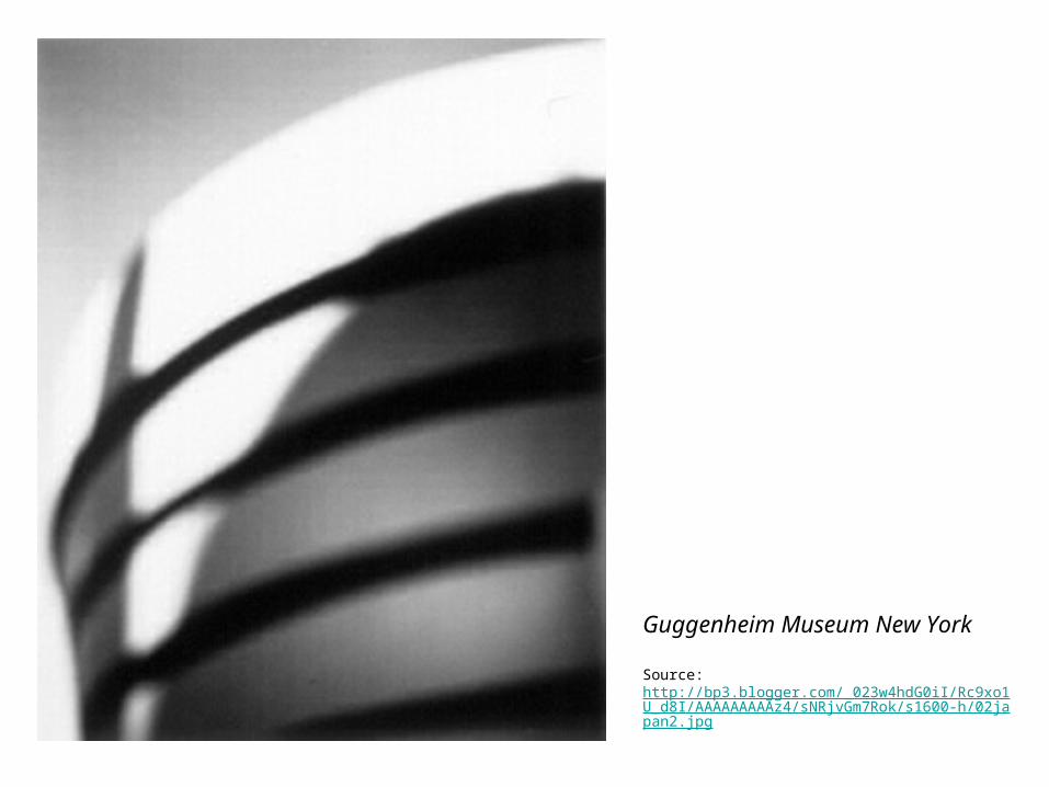
Guggenheim Museum New York
Source: http://bp3.blogger.com/_023w4hdG0iI/Rc9xo1U_d8I/AAAAAAAAAz4/sNRjvGm7Rok/s1600-h/02japan2.jpg
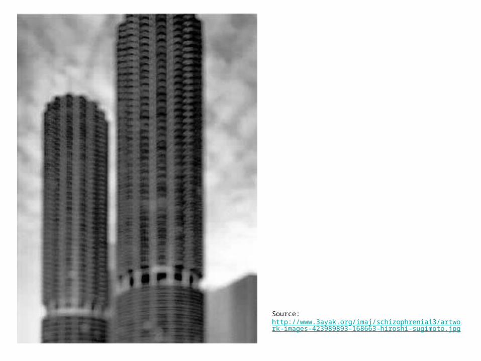
Source: http://www.3ayak.org/imaj/schizophrenia13/artwork-images-423989893-168663-hiroshi-sugimoto.jpg
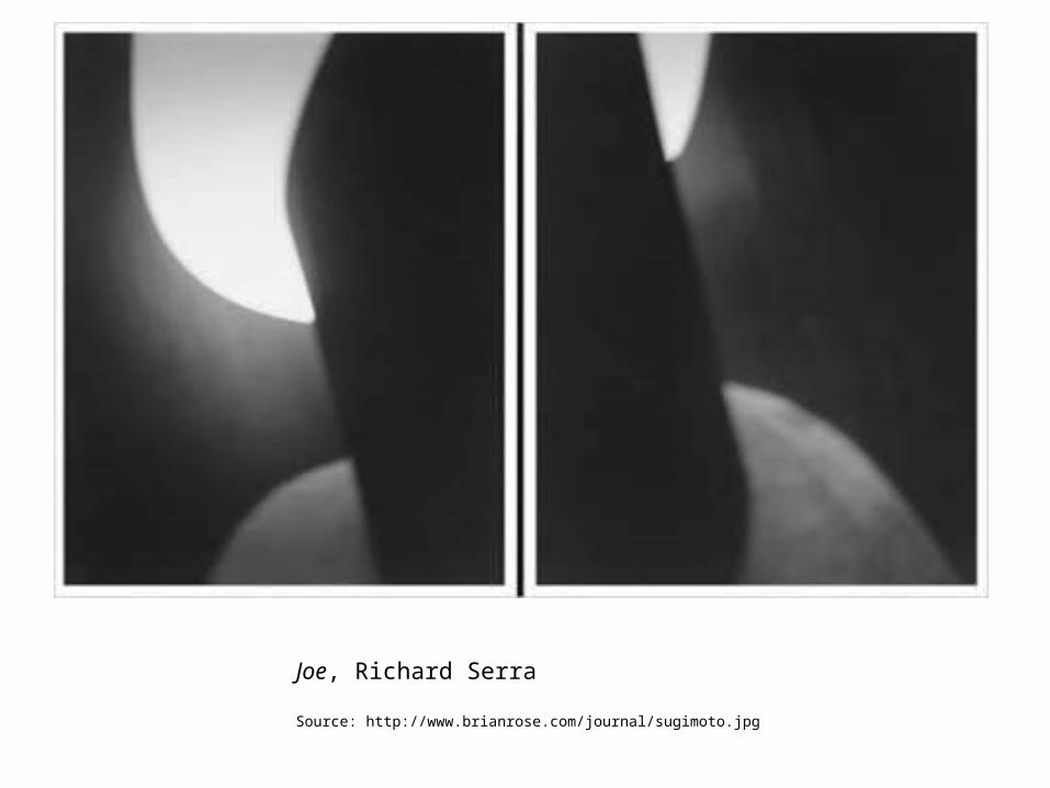
Joe, Richard Serra
Source: http://www.brianrose.com/journal/sugimoto.jpg
"This is about studying the silver reactions- and the colors of the metal as silver, and the surface of ink tones. The colors of the metal...silver metal, silver colors. That makes the tones of the images so rich. I’m a great fan of this process and the colors of silver- how to make as fine tones as possible, as a silver-print maker."
- Hiroshi Sugimoto
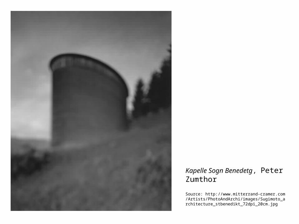
Kapelle Sogn Benedetg, Peter Zumthor
Source: http://www.mitterrand-cramer.com/Artists/PhotoAndArchi/images/Sugimoto_architecture_stbenedikt_72dpi_20cm.jpg
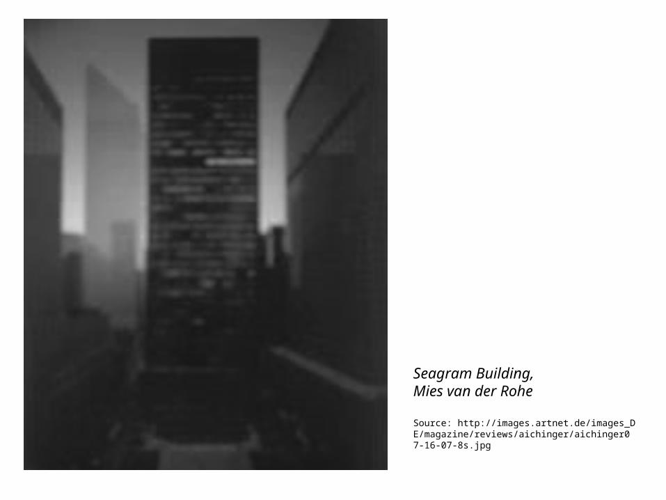
Seagram Building, Mies van der Rohe
Source: http://images.artnet.de/images_DE/magazine/reviews/aichinger/aichinger07-16-07-8s.jpg
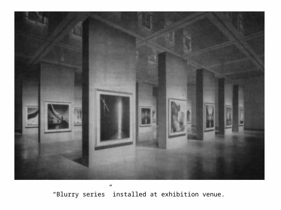
“Blurry series” installed at exhibition venue.
End
Last edited: January 20, 2009
SM4134

![LUIZ SUGIMOTO sugimoto@reitoria.unicamp.br O fotógrafo ... · olho] é que percebi o uso que tinha feito do souvenir, deslocando o seu signi-ficado”, diz o fotógrafo. O processo](https://img.pdfslide.tips/doc/110x75/5c636d8709d3f2777f8b4915/luiz-sugimoto-sugimoto-o-fotografo-olho-e-que-percebi-o-uso-que-tinha.jpg)