Embed Size (px)
Citation preview
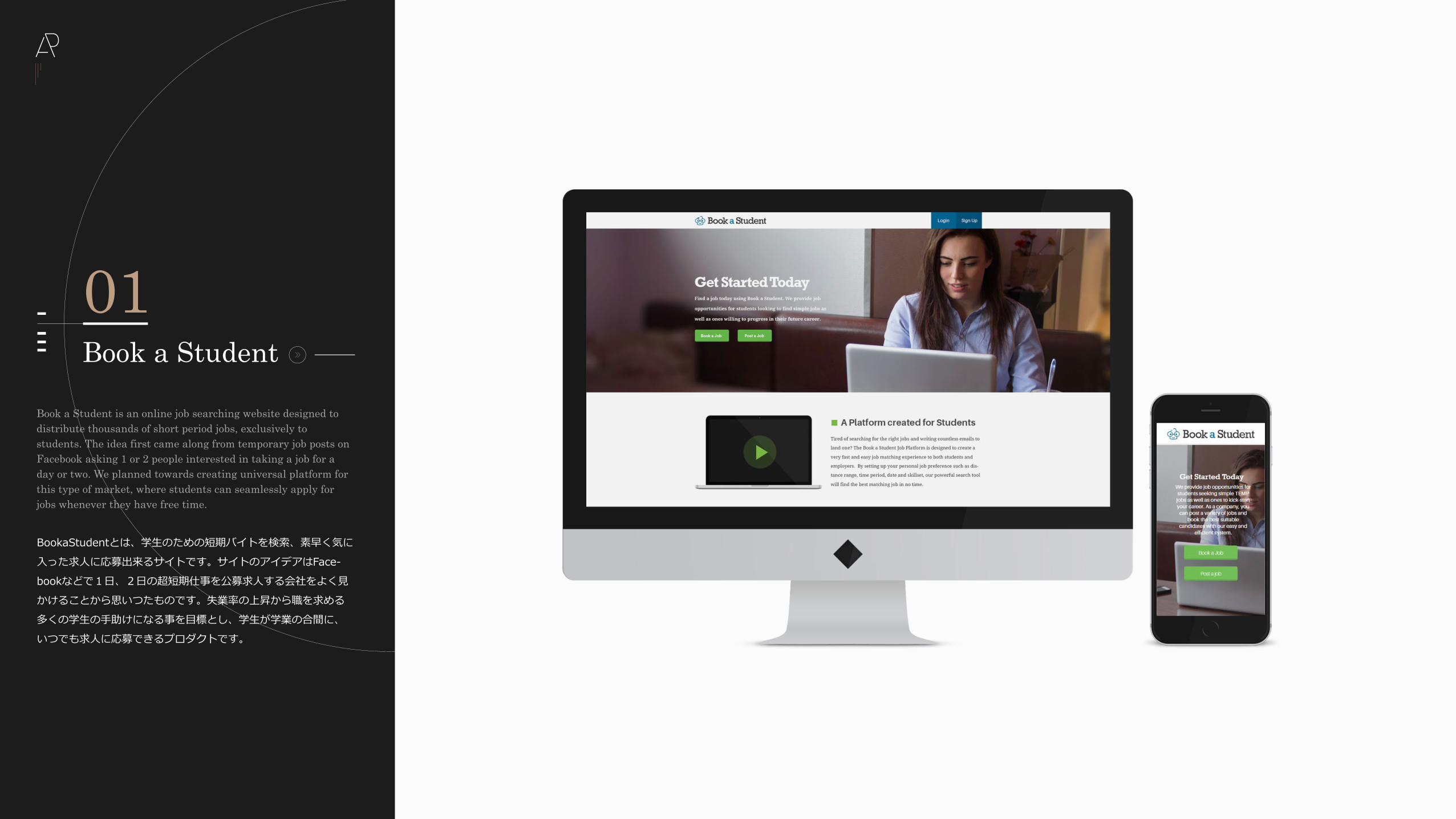
Book a Student 01
Book a Student is an online job searching website designed to distribute thousands of short period jobs, exclusively to students. The idea first came along from temporary job posts on Facebook asking 1 or 2 people interested in taking a job for a day or two. We planned towards creating universal platform for this type of market, where students can seamlessly apply for jobs whenever they have free time.
BookaStudentとは、学生のための短期バイトを検索、素早く気に入った求人に応募出来るサイトです。サイトのアイデアはFace-bookなどで1日、2日の超短期仕事を公募求人する会社をよく見かけることから思いつたものです。失業率の上昇から職を求める多くの学生の手助けになる事を目標とし、学生が学業の合間に、いつでも求人に応募できるプロダクトです。
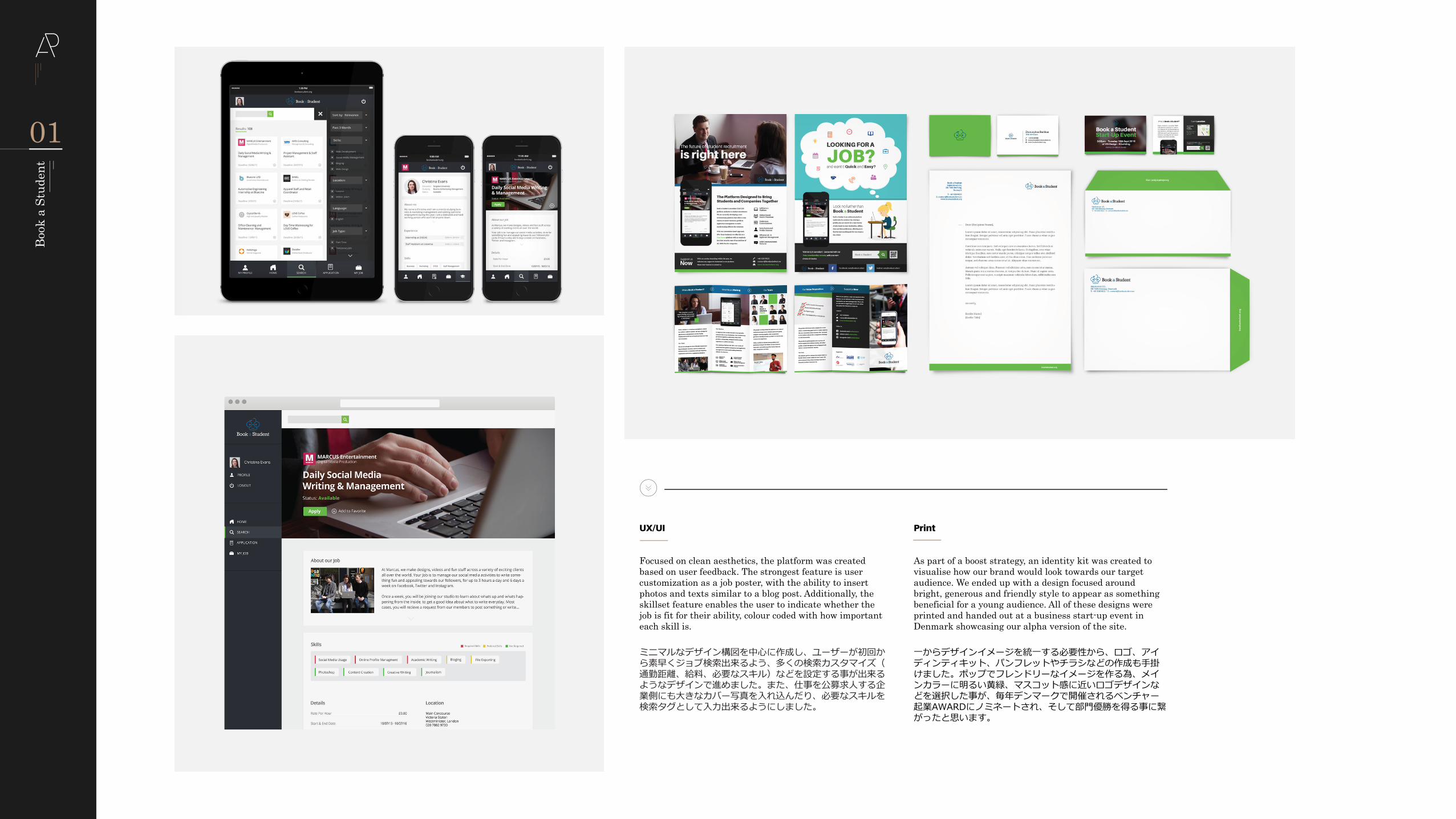
UX/UI
Focused on clean aesthetics, the platform was created based on user feedback. The strongest feature is user customization as a job poster, with the ability to insert photos and texts similar to a blog post. Additionally, the skillset feature enables the user to indicate whether the job is fit for their ability, colour coded with how important each skill is.
As part of a boost strategy, an identity kit was created to visualise how our brand would look towards our target audience. We ended up with a design focused around bright, generous and friendly style to appear as something beneficial for a young audience. All of these designs were printed and handed out at a business start-up event in Denmark showcasing our alpha version of the site.
ミニマルなデザイン構図を中心に作成し、ユーザーが初回から素早くジョブ検索出来るよう、多くの検索カスタマイズ(通勤距離、給料、必要なスキル)などを設定する事が出来るようなデザインで進めました。また、仕事を公募求人する企業側にも大きなカバー写真を入れ込んだり、必要なスキルを検索タグとして入力出来るようにしました。
一からデザインイメージを統一する必要性から、ロゴ、アイディンティキット、パンフレットやチラシなどの作成も手掛けました。ポップでフレンドリーなイメージを作る為、メインカラーに明るい黄緑、マスコット感に近いロゴデザインなどを選択した事が、毎年デンマークで開催されるベンチャー起業AWARDにノミネートされ、そして部門優勝を得る事に繋がったと思います。
01
Book
a S
tude
nt
Yoga Japan02
Starting out as a small yoga community in Tokyo, Hello Yoga is a community website, supplying all kinds of relevant articles to help users achieve a stress-free lifestyle with yoga. Originally formulated in English, the renewal of HelloYoga was planned with whole Japanese translation, suitable as a bilingual website for westerners and Japanese to enjoy. Together with an enthusiast-level studio named Be Yoga Japan, we worked towards promoting these two brands together to boost
当初、東京の小さなヨガコミュニティとして始めたHelloYogaは、現在は世界中のヨガ情報やストレスフリーな生活についての記事を紹介するサイトです。元々は英語のみの発信でしたが、英日2ヶ国語で提供出来るよう、サイトのリニューアルを行いました。エキスパートクラスのスタジオ、Be Yoga Japanと共に二つのブランドの知名度を上げる事を目標に取り組みました。
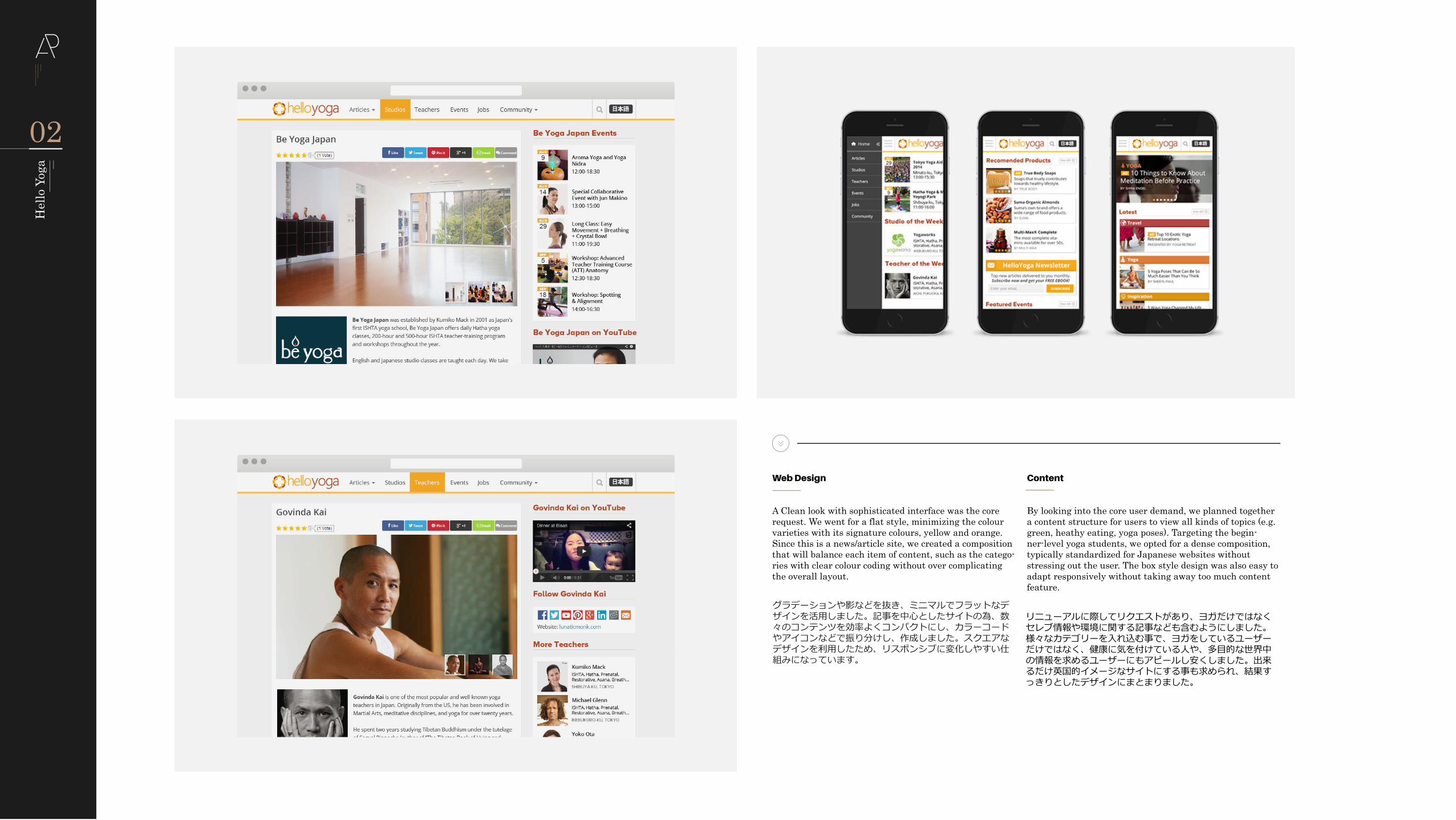
Web Design
A Clean look with sophisticated interface was the core request. We went for a flat style, minimizing the colour varieties with its signature colours, yellow and orange. Since this is a news/article site, we created a composition that will balance each item of content, such as the catego-ries with clear colour coding without over complicating the overall layout.
Content
By looking into the core user demand, we planned together a content structure for users to view all kinds of topics (e.g. green, heathy eating, yoga poses). Targeting the begin-ner-level yoga students, we opted for a dense composition, typically standardized for Japanese websites without stressing out the user. The box style design was also easy to adapt responsively without taking away too much content feature.
グラデーションや影などを抜き、ミニマルでフラットなデザインを活用しました。記事を中心としたサイトの為、数々のコンテンツを効率よくコンパクトにし、カラーコードやアイコンなどで振り分けし、作成しました。スクエアなデザインを利用したため、リスポンシブに変化しやすい仕組みになっています。
リニューアルに際してリクエストがあり、ヨガだけではなくセレブ情報や環境に関する記事なども含むようにしました。様々なカテゴリーを入れ込む事で、ヨガをしているユーザーだけではなく、健康に気を付けている人や、多目的な世界中の情報を求めるユーザーにもアピールし安くしました。出来るだけ英国的イメージなサイトにする事も求められ、結果すっきりとしたデザインにまとまりました。
02
Hel
lo Y
oga
Responsive Newsletter
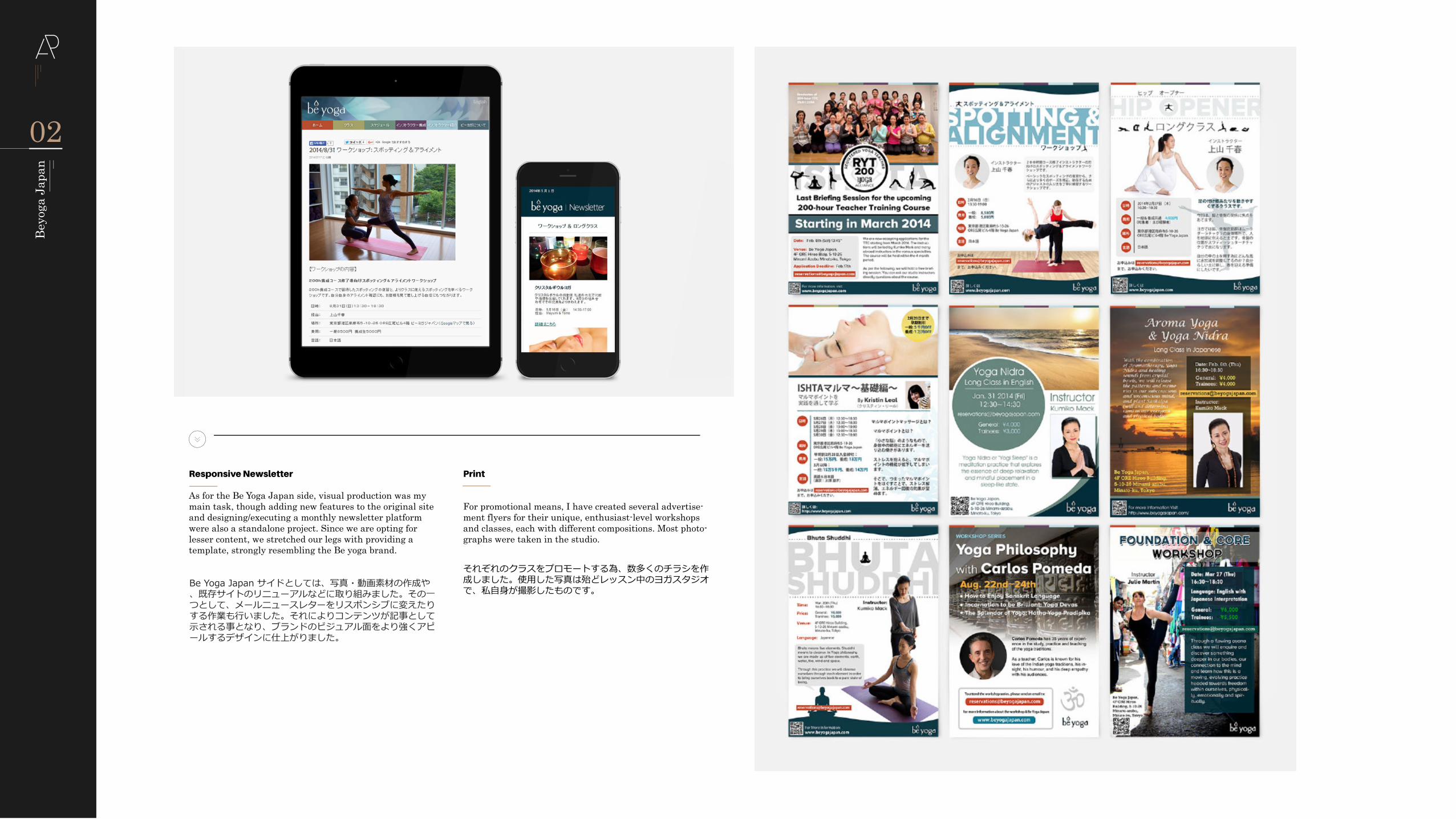
As for the Be Yoga Japan side, visual production was my main task, though adding new features to the original site and designing/executing a monthly newsletter platform were also a standalone project. Since we are opting for lesser content, we stretched our legs with providing a template, strongly resembling the Be yoga brand.
For promotional means, I have created several advertise-ment flyers for their unique, enthusiast-level workshops and classes, each with different compositions. Most photo-graphs were taken in the studio.
Be Yoga Japan サイドとしては、写真・動画素材の作成や、既存サイトのリニューアルなどに取り組みました。その一つとして、メールニュースレターをリスポンシブに変えたりする作業も行いました。それによりコンテンツが記事として示される事となり、ブランドのビジュアル面をより強くアピールするデザインに仕上がりました。
それぞれのクラスをプロモートする為、数多くのチラシを作成しました。使用した写真は殆どレッスン中のヨガスタジオで、私自身が撮影したものです。
02
Beyo
ga J
apan
Cafe Nazar03
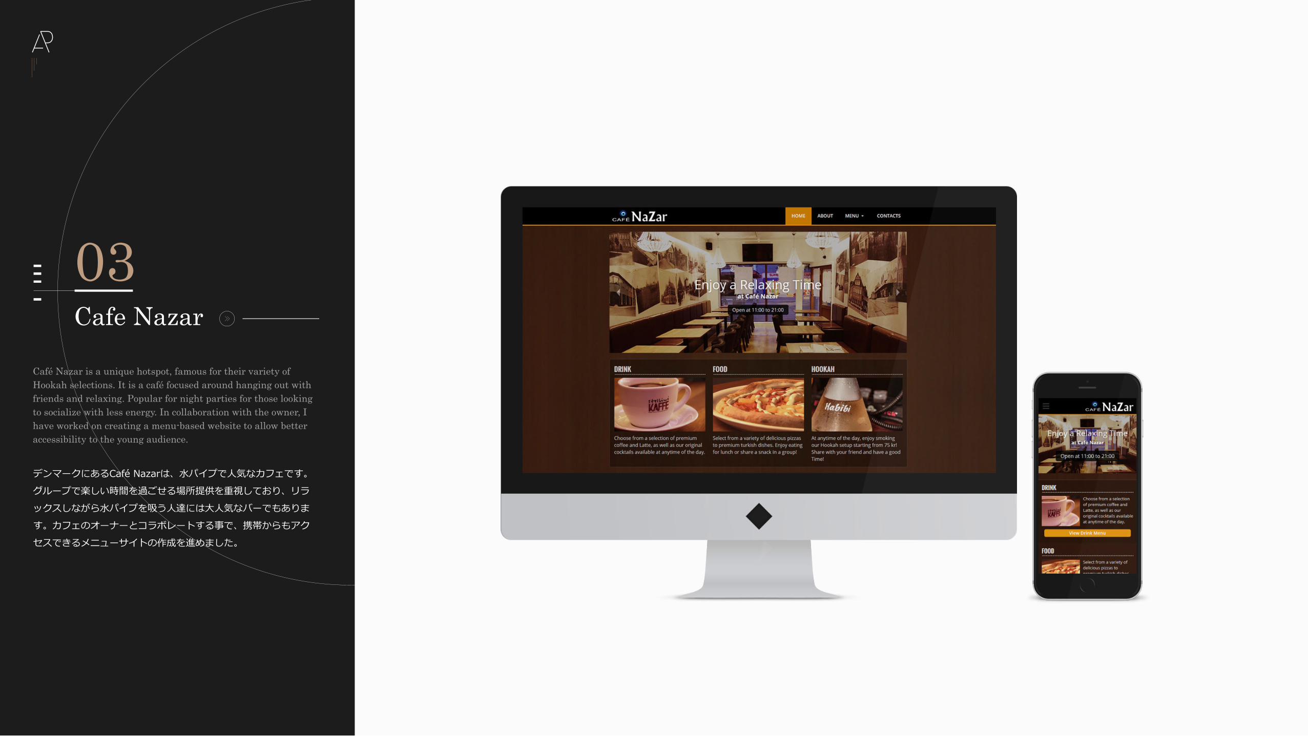
Café Nazar is a unique hotspot, famous for their variety of Hookah selections. It is a café focused around hanging out with friends and relaxing. Popular for night parties for those looking to socialize with less energy. In collaboration with the owner, I have worked on creating a menu-based website to allow better accessibility to the young audience.
デンマークにあるCafé Nazarは、水パイプで人気なカフェです。グループで楽しい時間を過ごせる場所提供を重視しており、リラックスしながら水パイプを吸う人達には大人気なバーでもあります。カフェのオーナーとコラボレートする事で、携帯からもアクセスできるメニューサイトの作成を進めました。
Concept
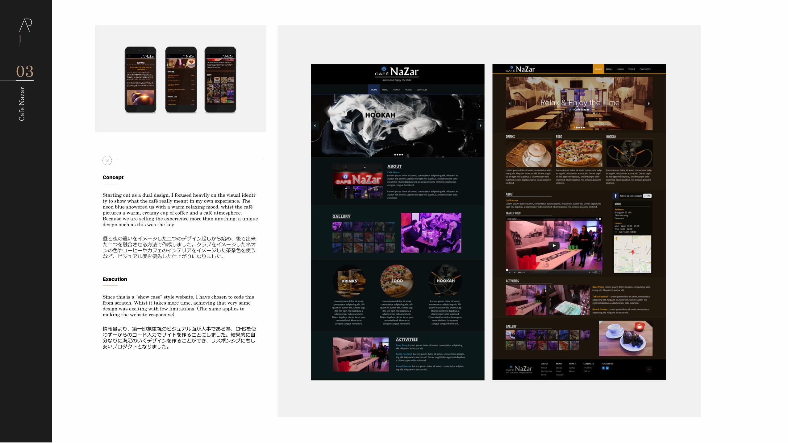
Starting out as a dual design, I focused heavily on the visual identi-ty to show what the café really meant in my own experience. The neon blue showered us with a warm relaxing mood, whist the café pictures a warm, creamy cup of coffee and a café atmosphere. Because we are selling the experience more than anything, a unique design such as this was the key.
Execution
Since this is a “show case” style website, I have chosen to code this from scratch. Whist it takes more time, achieving that very same design was exciting with few limitations. (The xame applies to making the website responsive).
昼と夜の違いをイメージした二つのデザイン起しから始め、後で出来た二つを融合させる方法で作成しました。クラブをイメージしたネオンの色やコーヒーやカフェのインテリアをイメージした茶系色を使うなど、ビジュアル度を優先した仕上がりになりました。
情報量より、第一印象重視のビジュアル面が大事である為、CMSを使わず一からのコード入力でサイトを作ることにしました。結果的に自分なりに満足のいくデザインを作ることができ、リスポンシブにもし安いプロダクトとなりました。
03
Cafe
Naz
ar
Lotte Kjaer04
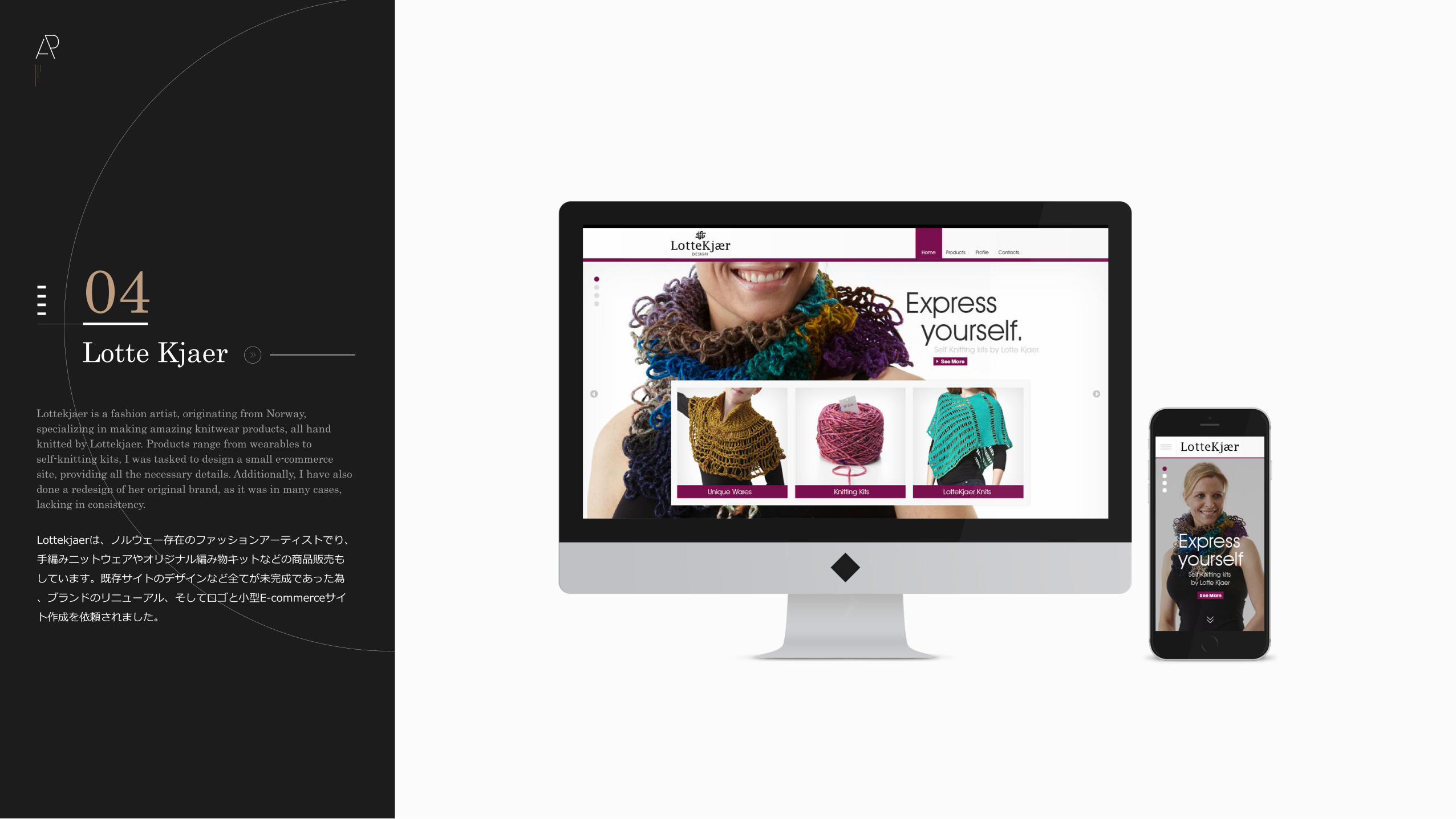
Lottekjaer is a fashion artist, originating from Norway, specializing in making amazing knitwear products, all hand knitted by Lottekjaer. Products range from wearables to self-knitting kits, I was tasked to design a small e-commerce site, providing all the necessary details. Additionally, I have also done a redesign of her original brand, as it was in many cases, lacking in consistency.
Lottekjaerは、ノルウェー存在のファッションアーティストでり、手編みニットウェアやオリジナル編み物キットなどの商品販売もしています。既存サイトのデザインなど全てが未完成であった為、ブランドのリニューアル、そしてロゴと小型E-commerceサイト作成を依頼されました。
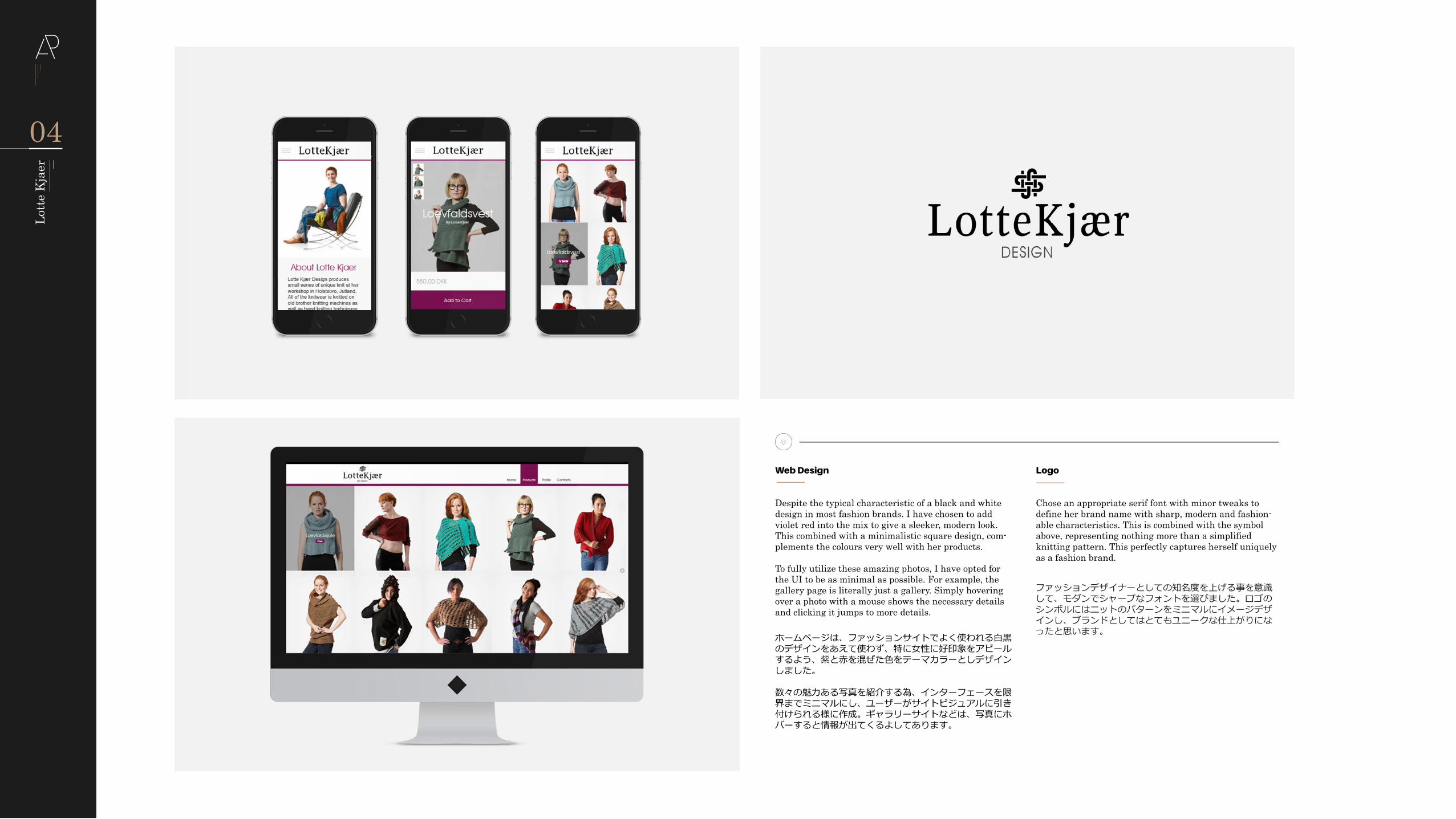
Logo
Chose an appropriate serif font with minor tweaks to define her brand name with sharp, modern and fashion-able characteristics. This is combined with the symbol above, representing nothing more than a simplified knitting pattern. This perfectly captures herself uniquely as a fashion brand.
Web Design
Despite the typical characteristic of a black and white design in most fashion brands. I have chosen to add violet red into the mix to give a sleeker, modern look. This combined with a minimalistic square design, com-plements the colours very well with her products.
To fully utilize these amazing photos, I have opted for the UI to be as minimal as possible. For example, the gallery page is literally just a gallery. Simply hovering over a photo with a mouse shows the necessary details and clicking it jumps to more details.
ファッションデザイナーとしての知名度を上げる事を意識して、モダンでシャープなフォントを選びました。ロゴのシンボルにはニットのパターンをミニマルにイメージデザインし、ブランドとしてはとてもユニークな仕上がりになったと思います。ホームページは、ファッションサイトでよく使われる白黒
のデザインをあえて使わず、特に女性に好印象をアピールするよう、紫と赤を混ぜた色をテーマカラーとしデザインしました。
数々の魅力ある写真を紹介する為、インターフェースを限界までミニマルにし、ユーザーがサイトビジュアルに引き付けられる様に作成。ギャラリーサイトなどは、写真にホバーすると情報が出てくるよしてあります。
04
Lott
e K
jaer