Embed Size (px)
Citation preview

Software Engineer
Brendan Gregg
Performance Visualizations
USENIX/LISA’10November, 2010

• G’Day, I’m Brendan
• ... also known as “shouting guy”
2
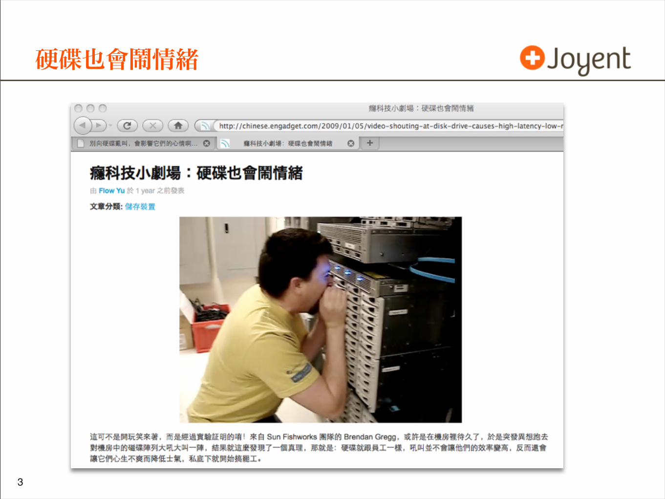
硬碟也會鬧情緒
•
3
• I do performance analysis
• and I’m a DTrace addict
4
•
5
Agenda
• Performance
• Workload Analysis and Resource Monitoring
• Understanding available and ideal metrics before plotting
• Visualizations
• Current examples
• Latency
• Utilization
• Future opportunities
• Cloud Computing
6
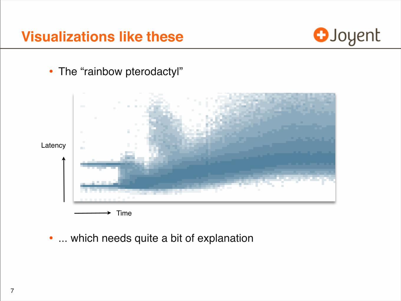
Visualizations like these
• The “rainbow pterodactyl”
• ... which needs quite a bit of explanation
7
Time
Latency
Primary Objectives
• Consider performance metrics before plotting
• See the value of visualizations
• Remember key examples
8
Secondary Objectives
• Consider performance metrics before plotting
• Why studying latency is good
• ... and studying IOPS can be bad
• See the value of visualizations
• Why heat maps are needed
• ... and line graphs can be bad
• Remember key examples
• I/O latency, as a heat map
• CPU utilization by CPU, as a heat map
9
Content based on
• “Visualizing System Latency”, Communications of the ACM July 2010, by Brendan Gregg
• and more
10

Understanding the metrics before we visualize them
Performance
11
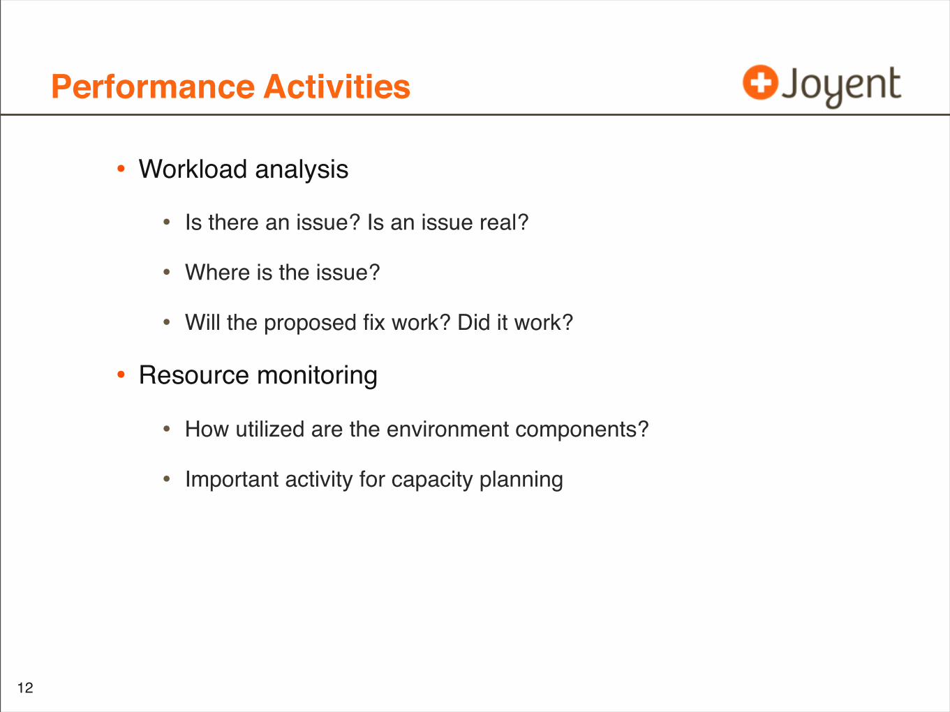
Performance Activities
12
• Workload analysis
• Is there an issue? Is an issue real?
• Where is the issue?
• Will the proposed fix work? Did it work?
• Resource monitoring
• How utilized are the environment components?
• Important activity for capacity planning
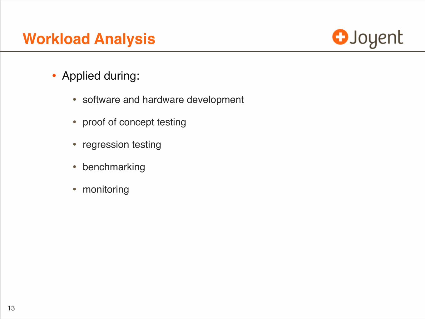
Workload Analysis
• Applied during:
• software and hardware development
• proof of concept testing
• regression testing
• benchmarking
• monitoring
13
Workload Performance Issues
• Load
• Architecture
14
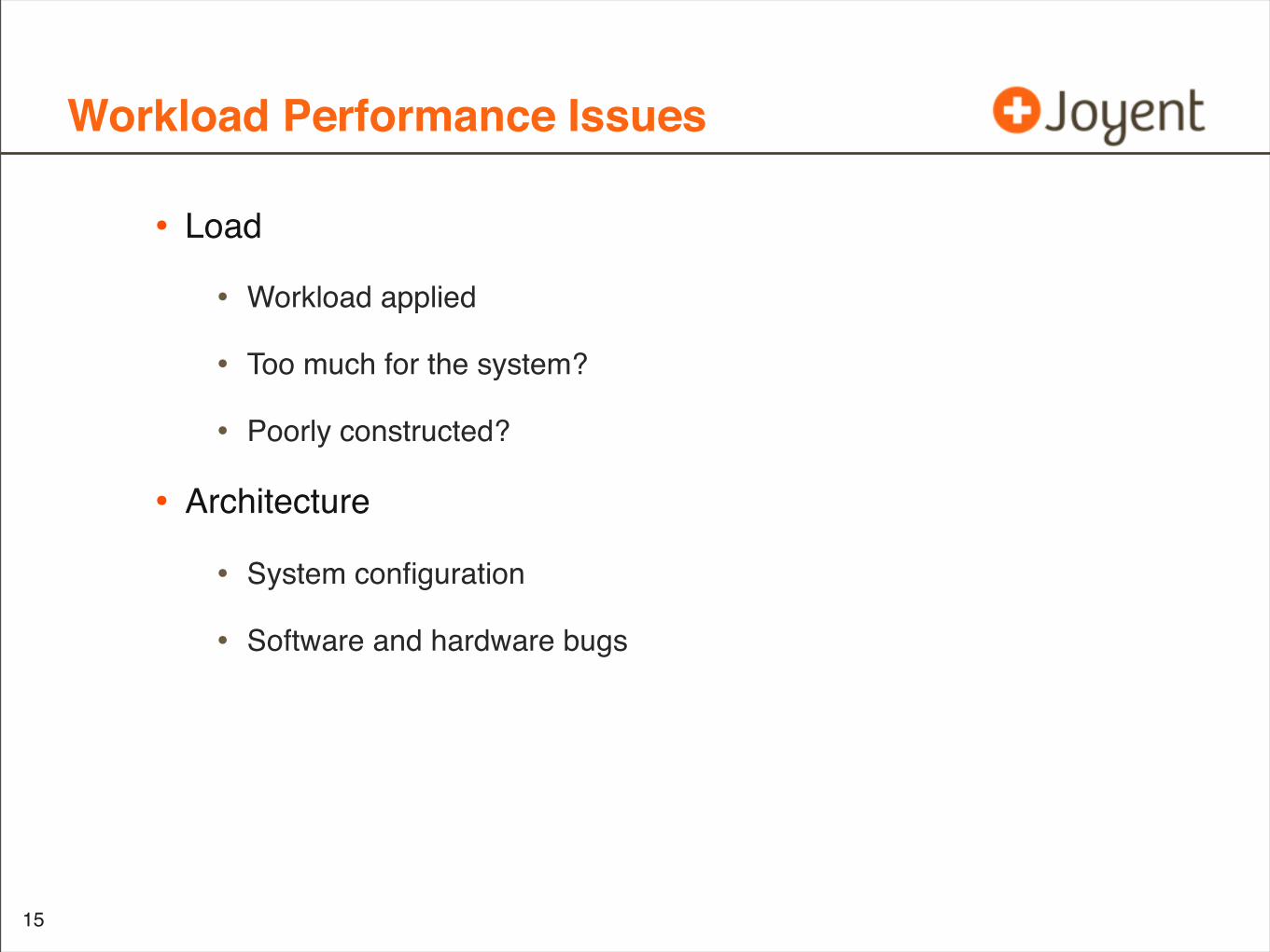
Workload Performance Issues
• Load
• Workload applied
• Too much for the system?
• Poorly constructed?
• Architecture
• System configuration
• Software and hardware bugs
15
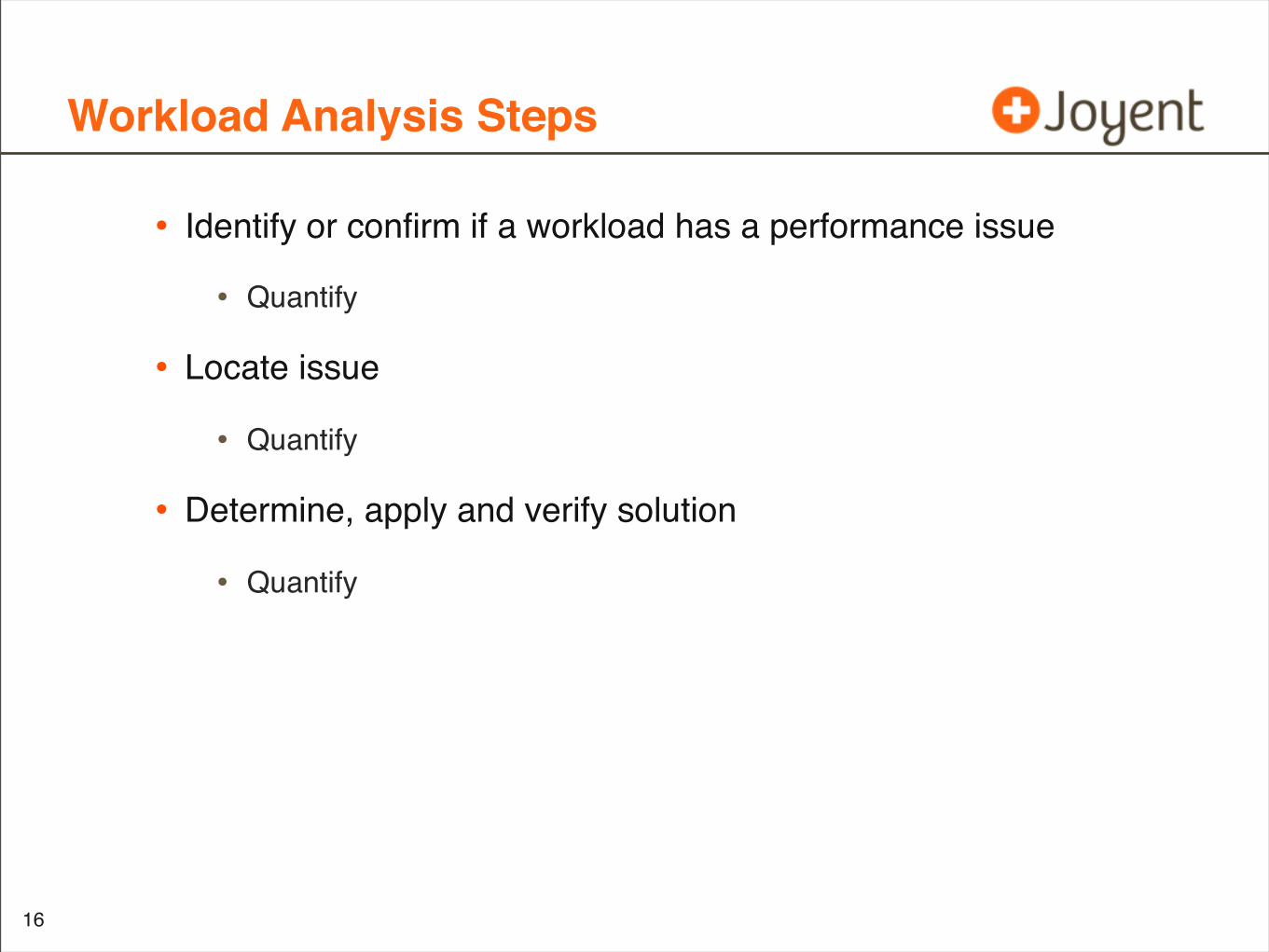
Workload Analysis Steps
• Identify or confirm if a workload has a performance issue
• Quantify
• Locate issue
• Quantify
• Determine, apply and verify solution
• Quantify
16
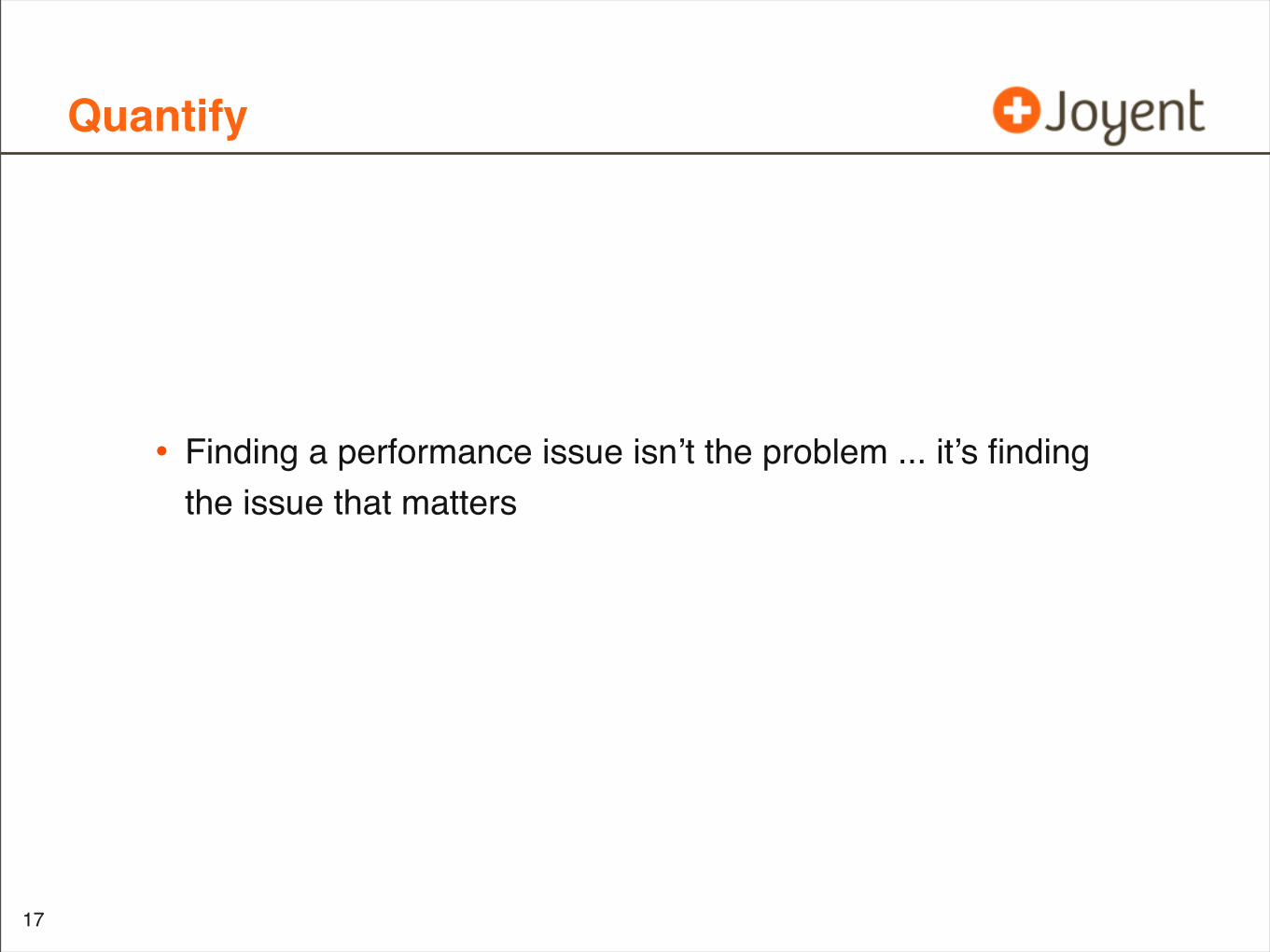
Quantify
• Finding a performance issue isn’t the problem ... it’s finding the issue that matters
17
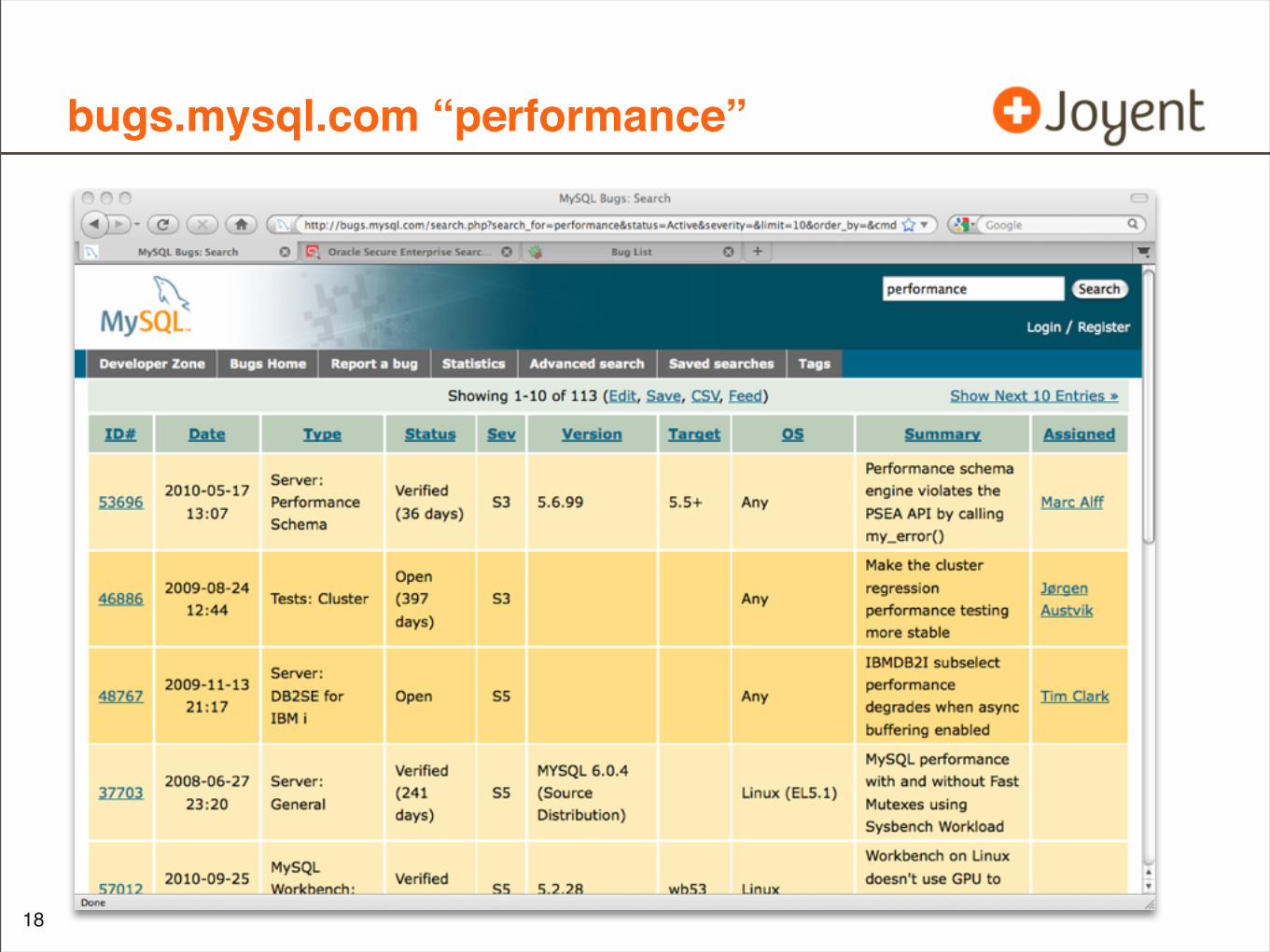
bugs.mysql.com “performance”
•
18
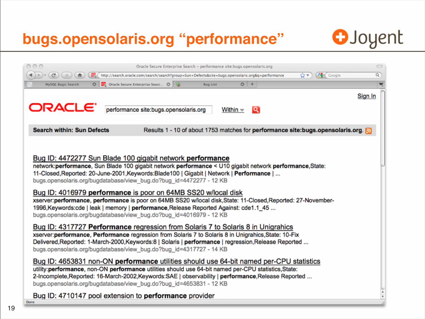
bugs.opensolaris.org “performance”
•
19
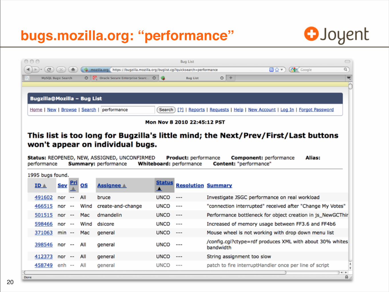
bugs.mozilla.org: “performance”
•
20
“performance” bugs
• ... and those are just the known performance bugs
• ... and usually only of a certain type (architecture)
21
How to Quantify
• Observation based
• Choose a reliable metric
• Estimate performance gain from resolving issue
• Experimentation based
• Apply fix
• Quantify before vs. after using a reliable metric
22
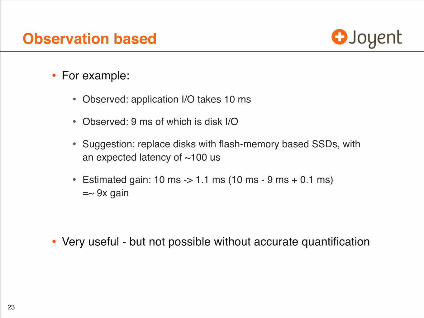
Observation based
• For example:
• Observed: application I/O takes 10 ms
• Observed: 9 ms of which is disk I/O
• Suggestion: replace disks with flash-memory based SSDs, with an expected latency of ~100 us
• Estimated gain: 10 ms -> 1.1 ms (10 ms - 9 ms + 0.1 ms)=~ 9x gain
• Very useful - but not possible without accurate quantification
23
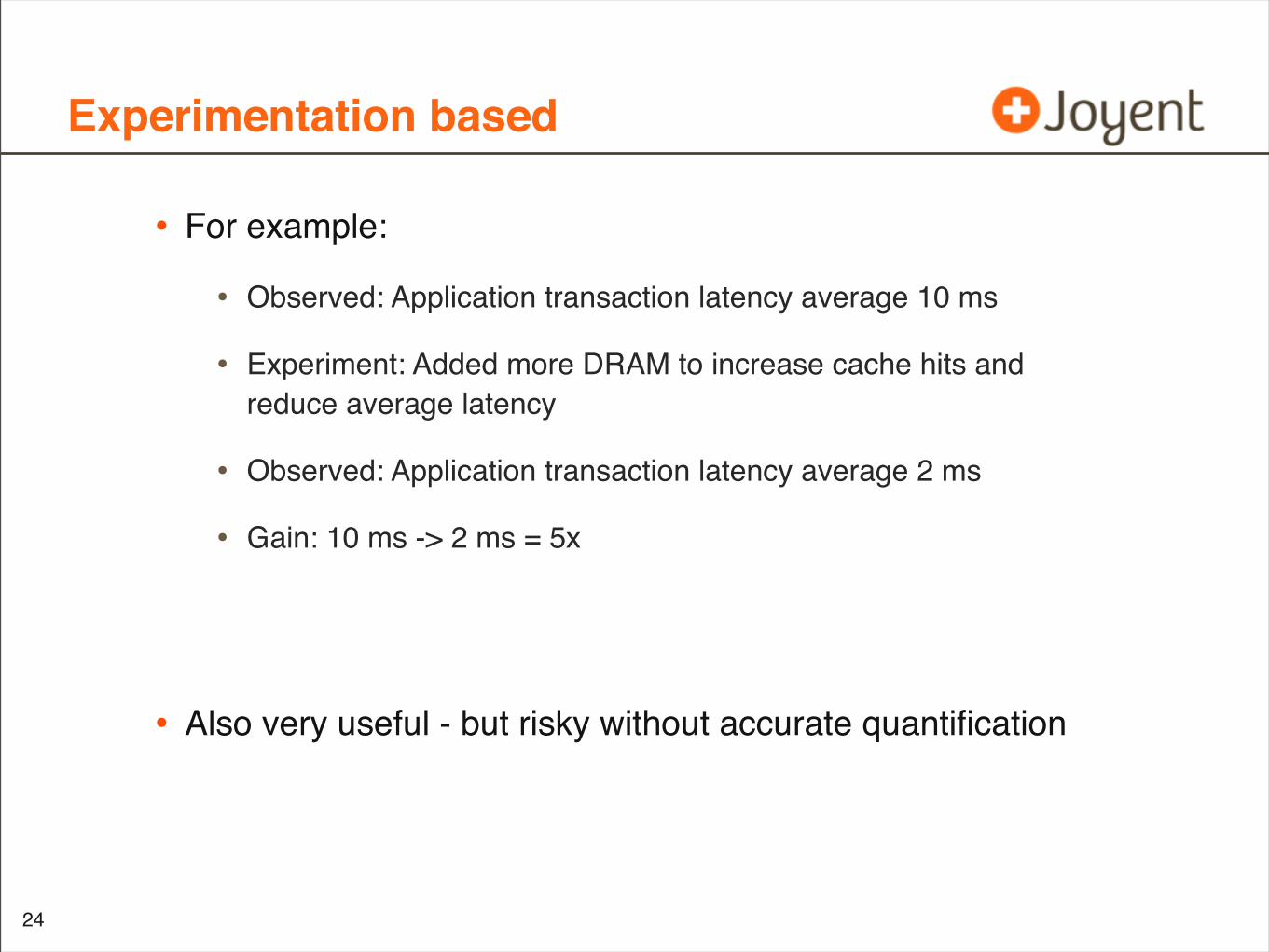
Experimentation based
• For example:
• Observed: Application transaction latency average 10 ms
• Experiment: Added more DRAM to increase cache hits and reduce average latency
• Observed: Application transaction latency average 2 ms
• Gain: 10 ms -> 2 ms = 5x
• Also very useful - but risky without accurate quantification
24
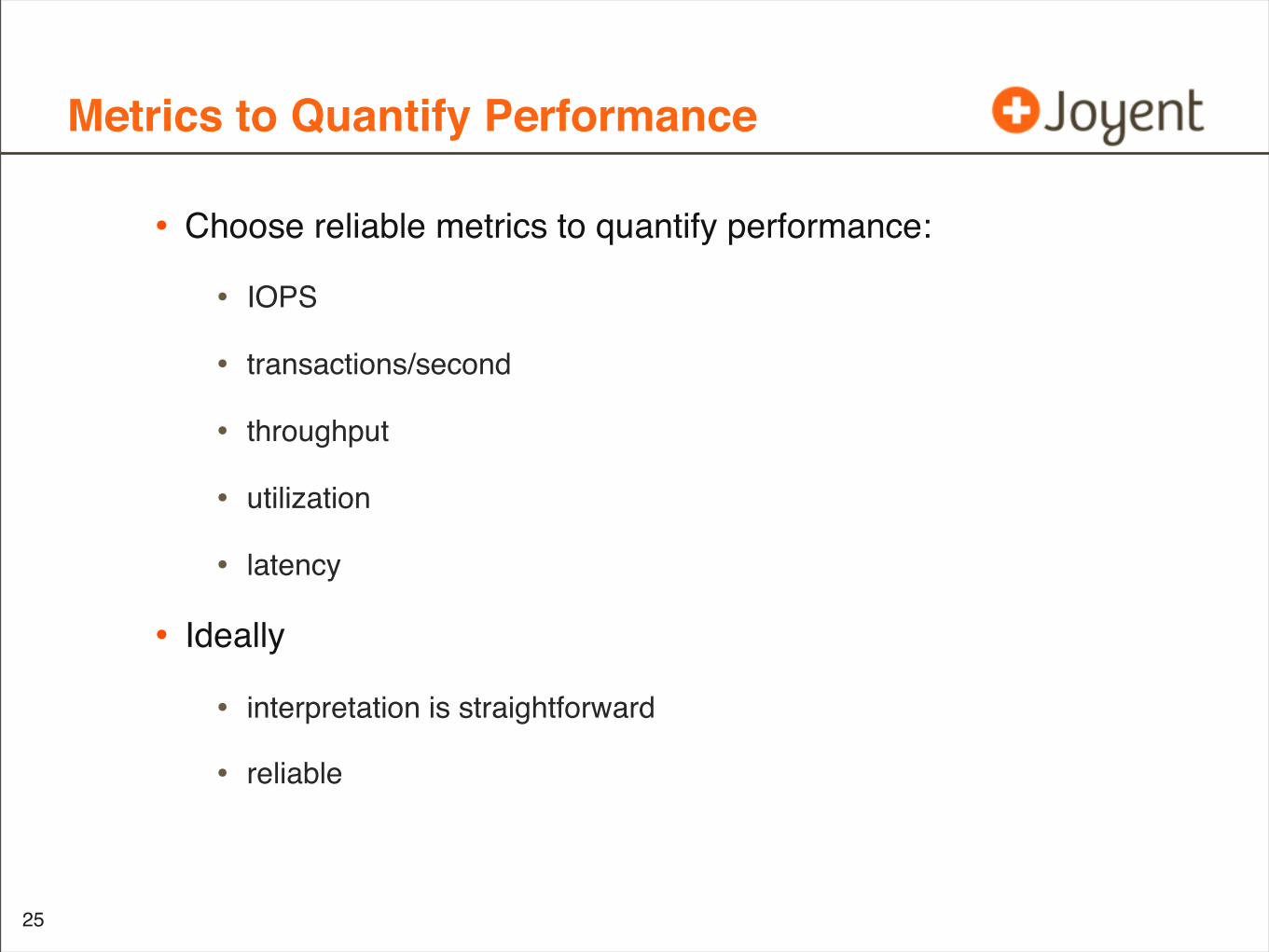
Metrics to Quantify Performance
• Choose reliable metrics to quantify performance:
• IOPS
• transactions/second
• throughput
• utilization
• latency
• Ideally
• interpretation is straightforward
• reliable
25
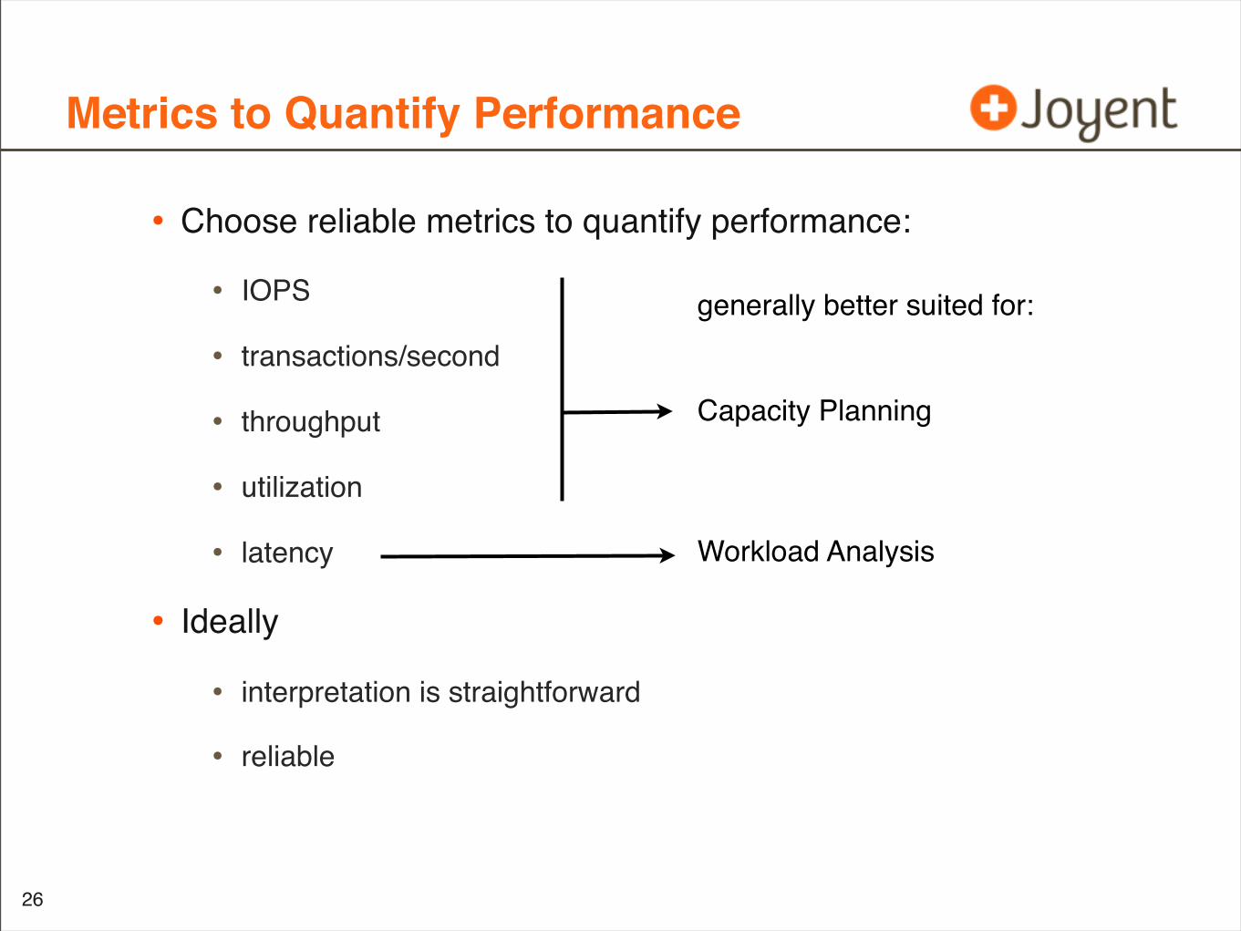
Metrics to Quantify Performance
• Choose reliable metrics to quantify performance:
• IOPS
• transactions/second
• throughput
• utilization
• latency
• Ideally
• interpretation is straightforward
• reliable
26
generally better suited for:
Capacity Planning
Workload Analysis
Metrics Availability
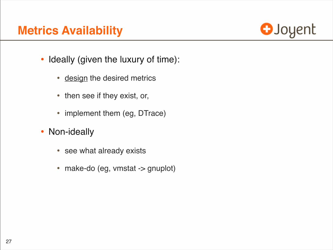
• Ideally (given the luxury of time):
• design the desired metrics
• then see if they exist, or,
• implement them (eg, DTrace)
• Non-ideally
• see what already exists
• make-do (eg, vmstat -> gnuplot)
27
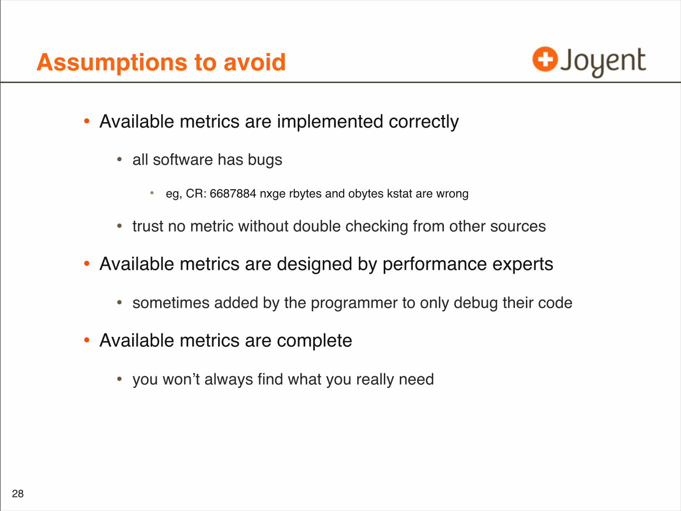
Assumptions to avoid
• Available metrics are implemented correctly
• all software has bugs
• eg, CR: 6687884 nxge rbytes and obytes kstat are wrong
• trust no metric without double checking from other sources
• Available metrics are designed by performance experts
• sometimes added by the programmer to only debug their code
• Available metrics are complete
• you won’t always find what you really need
28
Getting technical
• This will be explained using two examples:
• Workload Analysis
• Capacity Planning
29
Example: Workload Analysis
• Quantifying performance issues with IOPS vs latency
• IOPS is commonly presented by performance analysis tools
• eg: disk IOPS via kstat, SNMP, iostat, ...
30
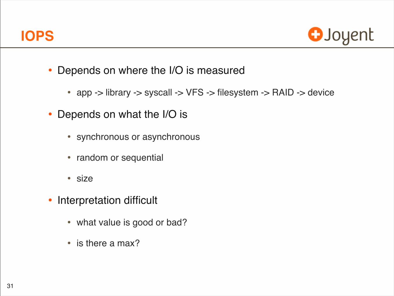
IOPS
• Depends on where the I/O is measured
• app -> library -> syscall -> VFS -> filesystem -> RAID -> device
• Depends on what the I/O is
• synchronous or asynchronous
• random or sequential
• size
• Interpretation difficult
• what value is good or bad?
• is there a max?
31
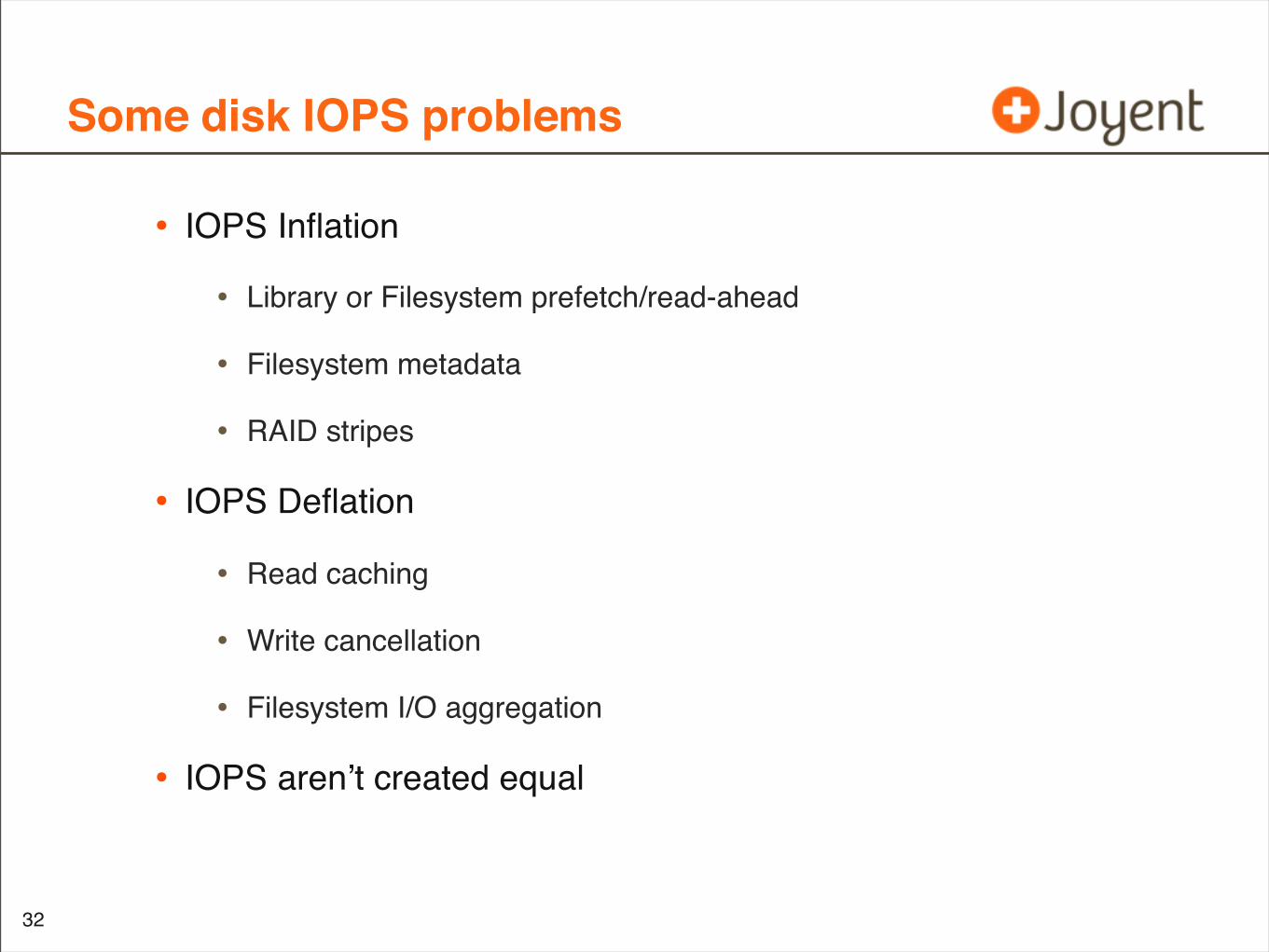
Some disk IOPS problems
• IOPS Inflation
• Library or Filesystem prefetch/read-ahead
• Filesystem metadata
• RAID stripes
• IOPS Deflation
• Read caching
• Write cancellation
• Filesystem I/O aggregation
• IOPS aren’t created equal
32
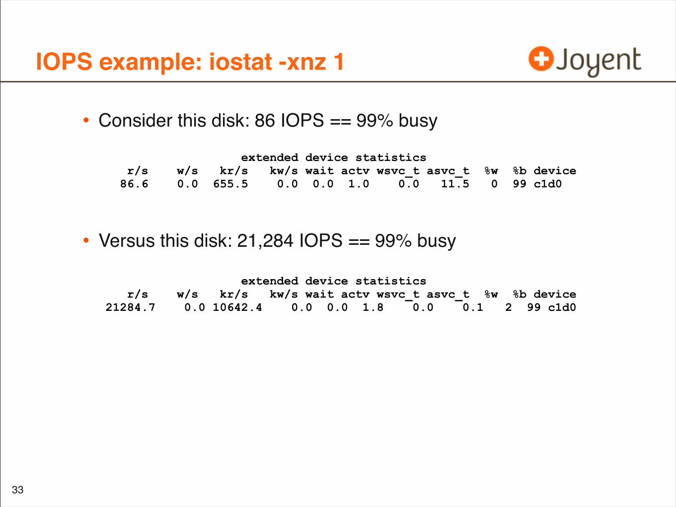
IOPS example: iostat -xnz 1
• Consider this disk: 86 IOPS == 99% busy
• Versus this disk: 21,284 IOPS == 99% busy
33
extended device statistics r/s w/s kr/s kw/s wait actv wsvc_t asvc_t %w %b device 21284.7 0.0 10642.4 0.0 0.0 1.8 0.0 0.1 2 99 c1d0
extended device statistics r/s w/s kr/s kw/s wait actv wsvc_t asvc_t %w %b device 86.6 0.0 655.5 0.0 0.0 1.0 0.0 11.5 0 99 c1d0
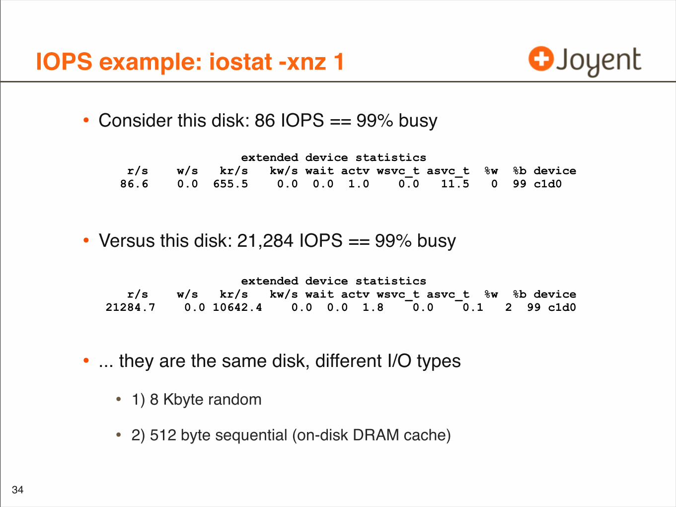
IOPS example: iostat -xnz 1
• Consider this disk: 86 IOPS == 99% busy
• Versus this disk: 21,284 IOPS == 99% busy
• ... they are the same disk, different I/O types
• 1) 8 Kbyte random
• 2) 512 byte sequential (on-disk DRAM cache)
34
extended device statistics r/s w/s kr/s kw/s wait actv wsvc_t asvc_t %w %b device 21284.7 0.0 10642.4 0.0 0.0 1.8 0.0 0.1 2 99 c1d0
extended device statistics r/s w/s kr/s kw/s wait actv wsvc_t asvc_t %w %b device 86.6 0.0 655.5 0.0 0.0 1.0 0.0 11.5 0 99 c1d0
Using IOPS to quantify issues
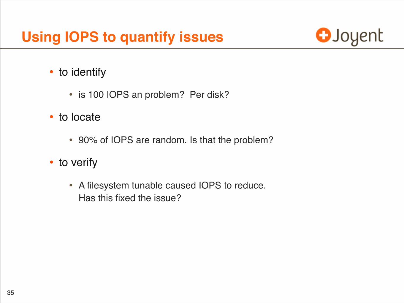
• to identify
• is 100 IOPS an problem? Per disk?
• to locate
• 90% of IOPS are random. Is that the problem?
• to verify
• A filesystem tunable caused IOPS to reduce.Has this fixed the issue?
35
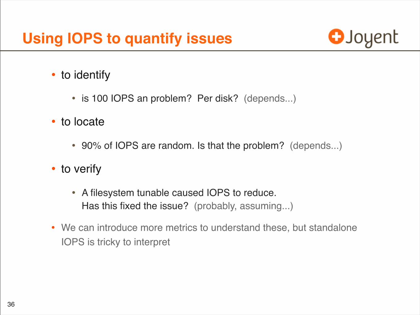
Using IOPS to quantify issues
• to identify
• is 100 IOPS an problem? Per disk? (depends...)
• to locate
• 90% of IOPS are random. Is that the problem? (depends...)
• to verify
• A filesystem tunable caused IOPS to reduce.Has this fixed the issue? (probably, assuming...)
• We can introduce more metrics to understand these, but standalone IOPS is tricky to interpret
36
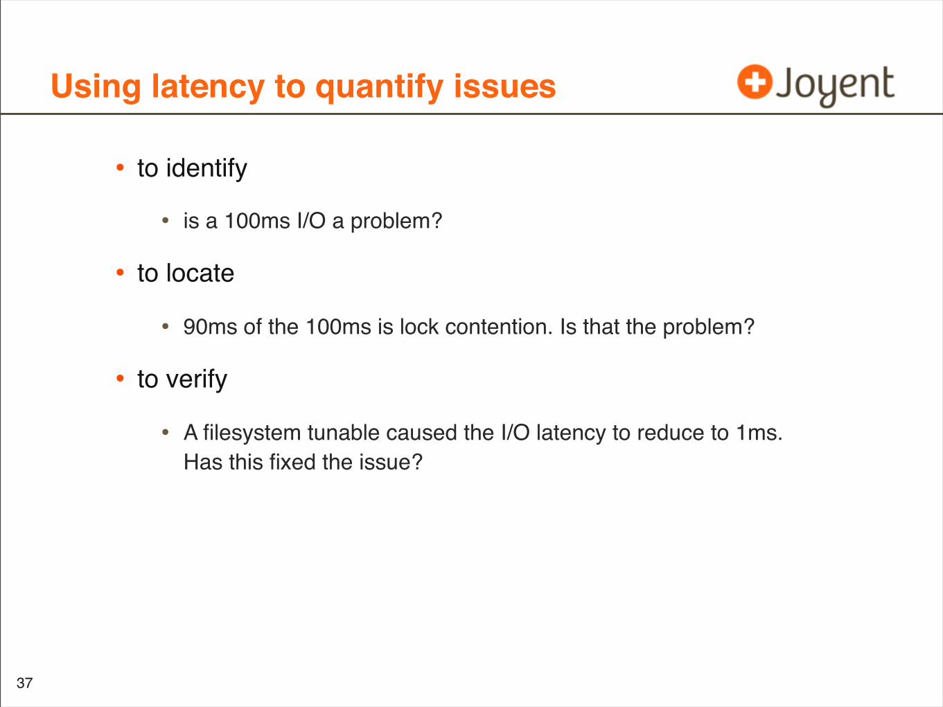
Using latency to quantify issues
• to identify
• is a 100ms I/O a problem?
• to locate
• 90ms of the 100ms is lock contention. Is that the problem?
• to verify
• A filesystem tunable caused the I/O latency to reduce to 1ms.Has this fixed the issue?
37
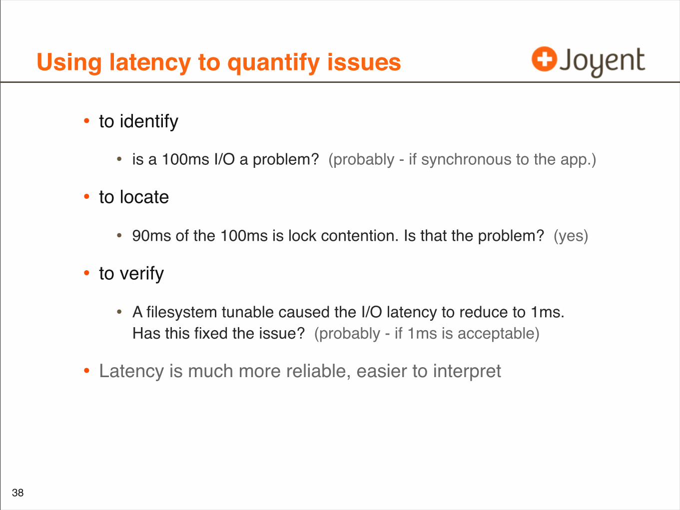
Using latency to quantify issues
• to identify
• is a 100ms I/O a problem? (probably - if synchronous to the app.)
• to locate
• 90ms of the 100ms is lock contention. Is that the problem? (yes)
• to verify
• A filesystem tunable caused the I/O latency to reduce to 1ms.Has this fixed the issue? (probably - if 1ms is acceptable)
• Latency is much more reliable, easier to interpret
38
Latency
• Time from I/O or transaction request to completion
• Synchronous latency has a direct impact on performance
• Application is waiting
• higher latency == worse performance
• Not all latency is synchronous:
• Asynchronous filesystem threads flushing dirty buffers to diskeg, zfs TXG synchronous thread
• Filesystem prefetchno one is waiting at this point
• TCP buffer and congestion window: individual packet latency may be high, but pipe is kept full for good throughput performance
39
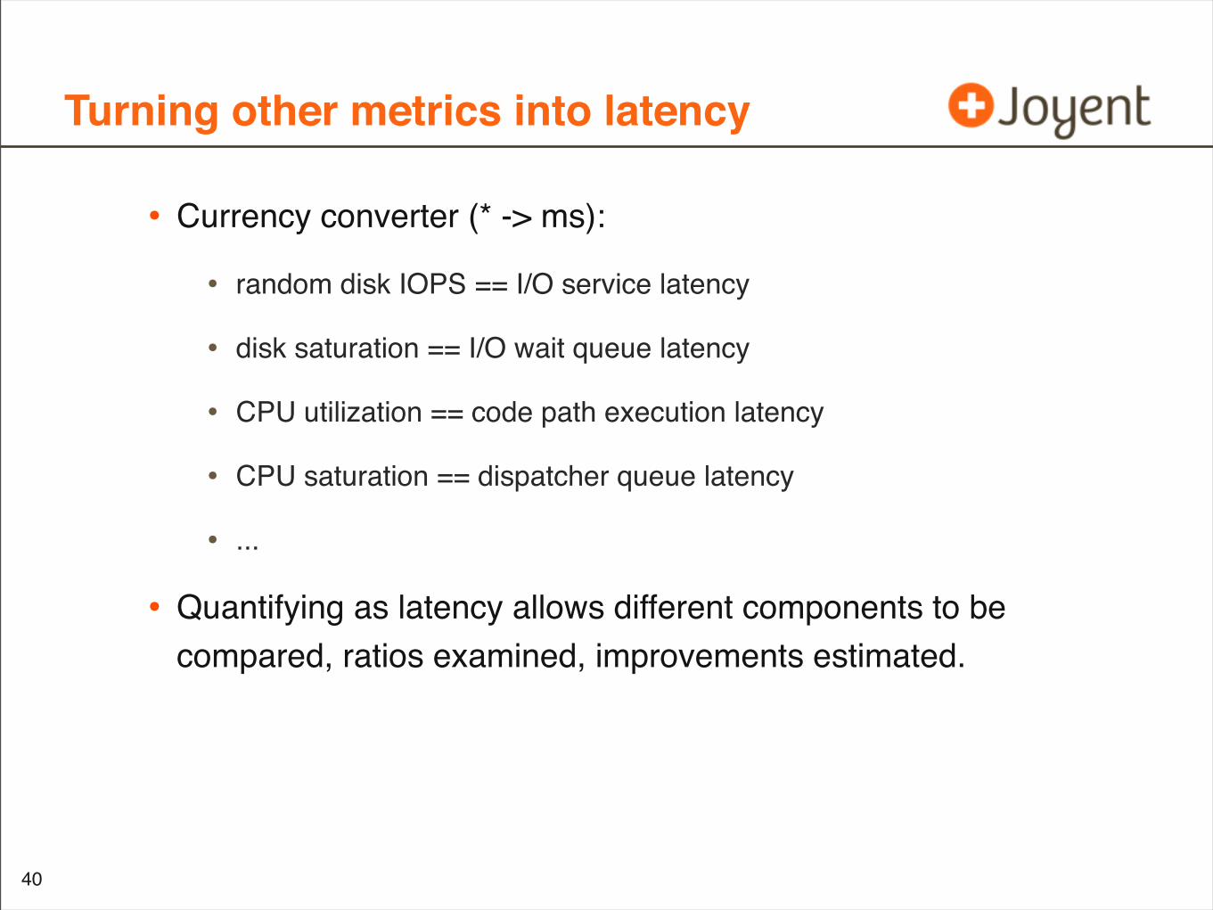
Turning other metrics into latency
• Currency converter (* -> ms):
• random disk IOPS == I/O service latency
• disk saturation == I/O wait queue latency
• CPU utilization == code path execution latency
• CPU saturation == dispatcher queue latency
• ...
• Quantifying as latency allows different components to be compared, ratios examined, improvements estimated.
40
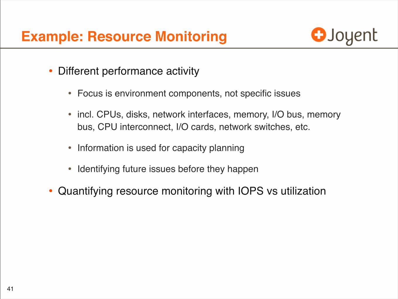
Example: Resource Monitoring
• Different performance activity
• Focus is environment components, not specific issues
• incl. CPUs, disks, network interfaces, memory, I/O bus, memory bus, CPU interconnect, I/O cards, network switches, etc.
• Information is used for capacity planning
• Identifying future issues before they happen
• Quantifying resource monitoring with IOPS vs utilization
41
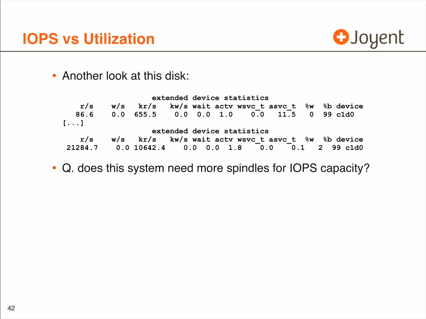
IOPS vs Utilization
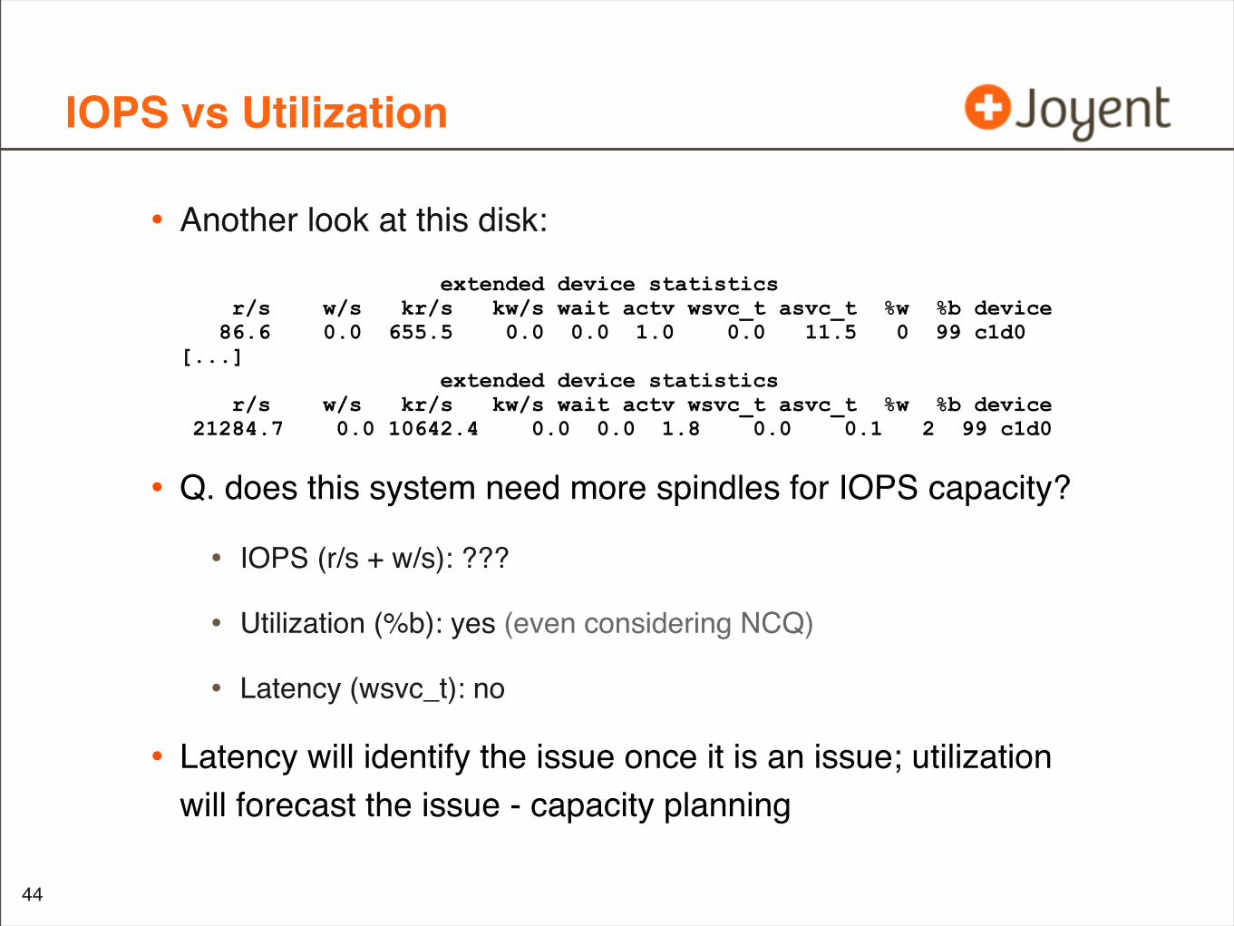
• Another look at this disk:
• Q. does this system need more spindles for IOPS capacity?
42
extended device statistics r/s w/s kr/s kw/s wait actv wsvc_t asvc_t %w %b device 86.6 0.0 655.5 0.0 0.0 1.0 0.0 11.5 0 99 c1d0[...] extended device statistics r/s w/s kr/s kw/s wait actv wsvc_t asvc_t %w %b device 21284.7 0.0 10642.4 0.0 0.0 1.8 0.0 0.1 2 99 c1d0
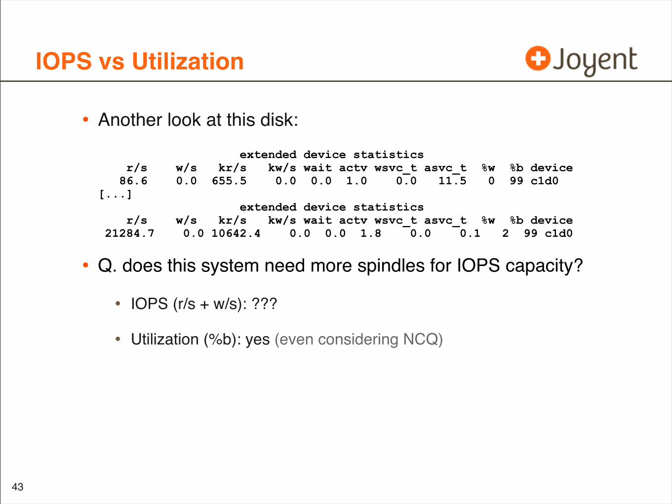
IOPS vs Utilization
• Another look at this disk:
• Q. does this system need more spindles for IOPS capacity?
• IOPS (r/s + w/s): ???
• Utilization (%b): yes (even considering NCQ)
43
extended device statistics r/s w/s kr/s kw/s wait actv wsvc_t asvc_t %w %b device 86.6 0.0 655.5 0.0 0.0 1.0 0.0 11.5 0 99 c1d0[...] extended device statistics r/s w/s kr/s kw/s wait actv wsvc_t asvc_t %w %b device 21284.7 0.0 10642.4 0.0 0.0 1.8 0.0 0.1 2 99 c1d0
IOPS vs Utilization
• Another look at this disk:
• Q. does this system need more spindles for IOPS capacity?
• IOPS (r/s + w/s): ???
• Utilization (%b): yes (even considering NCQ)
• Latency (wsvc_t): no
• Latency will identify the issue once it is an issue; utilization will forecast the issue - capacity planning
44
extended device statistics r/s w/s kr/s kw/s wait actv wsvc_t asvc_t %w %b device 86.6 0.0 655.5 0.0 0.0 1.0 0.0 11.5 0 99 c1d0[...] extended device statistics r/s w/s kr/s kw/s wait actv wsvc_t asvc_t %w %b device 21284.7 0.0 10642.4 0.0 0.0 1.8 0.0 0.1 2 99 c1d0
Performance Summary
• Metrics matter - need to reliably quantify performance
• to identify, locate, verify
• try to think, design
• Workload Analysis
• latency
• Resource Monitoring
• utilization
• Other metrics are useful to further understand the nature of the workload and resource behavior
45
Objectives
• Consider performance metrics before plotting
• Why latency is good
• ... and IOPS can be bad
• See the value of visualizations
• Why heat maps are needed
• ... and line graphs can be bad
• Remember key examples
• I/O latency, as a heat map
• CPU utilization by CPU, as a heat map
46
Current Examples
Visualizations
47
Latency
Visualizations
• So far we’ve picked:
• Latency
• for workload analysis
• Utilization
• for resource monitoring
48
Latency
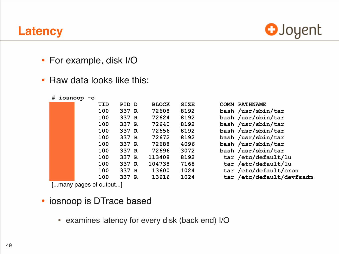
• For example, disk I/O
• Raw data looks like this:
• iosnoop is DTrace based
• examines latency for every disk (back end) I/O
49
# iosnoop -oDTIME UID PID D BLOCK SIZE COMM PATHNAME125 100 337 R 72608 8192 bash /usr/sbin/tar138 100 337 R 72624 8192 bash /usr/sbin/tar127 100 337 R 72640 8192 bash /usr/sbin/tar135 100 337 R 72656 8192 bash /usr/sbin/tar118 100 337 R 72672 8192 bash /usr/sbin/tar108 100 337 R 72688 4096 bash /usr/sbin/tar87 100 337 R 72696 3072 bash /usr/sbin/tar9148 100 337 R 113408 8192 tar /etc/default/lu8806 100 337 R 104738 7168 tar /etc/default/lu2262 100 337 R 13600 1024 tar /etc/default/cron76 100 337 R 13616 1024 tar /etc/default/devfsadm[...many pages of output...]
Latency Data
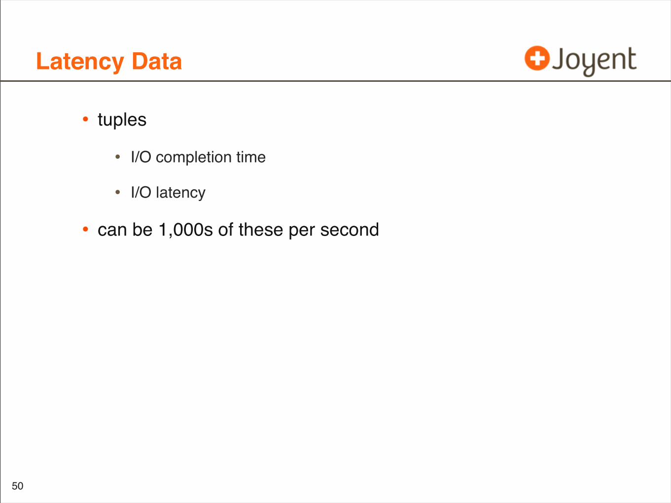
• tuples
• I/O completion time
• I/O latency
• can be 1,000s of these per second
50
Summarizing Latency
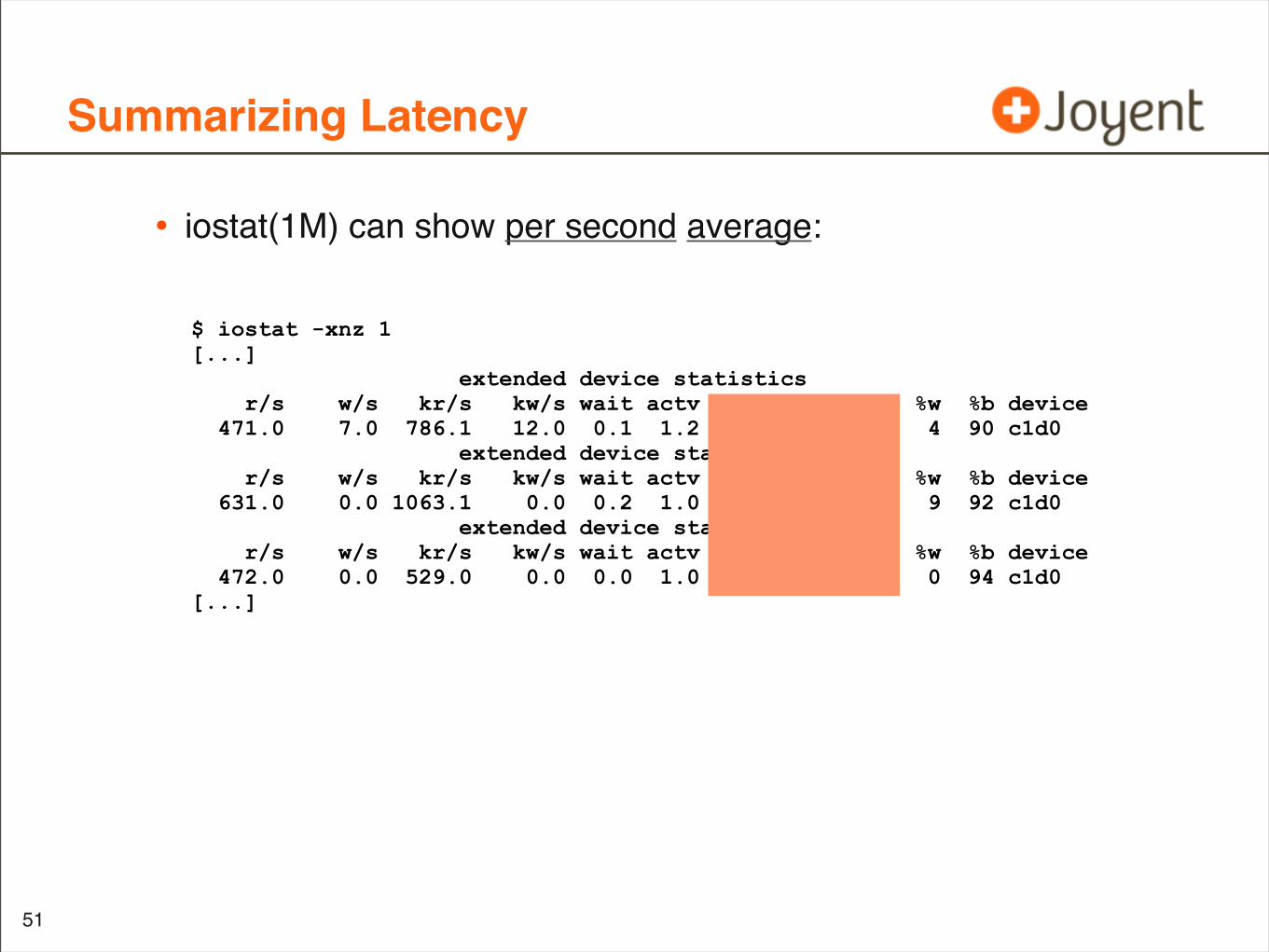
• iostat(1M) can show per second average:
51
$ iostat -xnz 1[...] extended device statistics r/s w/s kr/s kw/s wait actv wsvc_t asvc_t %w %b device 471.0 7.0 786.1 12.0 0.1 1.2 0.2 2.5 4 90 c1d0 extended device statistics r/s w/s kr/s kw/s wait actv wsvc_t asvc_t %w %b device 631.0 0.0 1063.1 0.0 0.2 1.0 0.3 1.6 9 92 c1d0 extended device statistics r/s w/s kr/s kw/s wait actv wsvc_t asvc_t %w %b device 472.0 0.0 529.0 0.0 0.0 1.0 0.0 2.1 0 94 c1d0[...]
Per second
• Condenses I/O completion time
• Almost always a sufficient resolution
• (So far I’ve only had one case where examining raw completion time data was crucial: an interrupt coalescing bug)
52
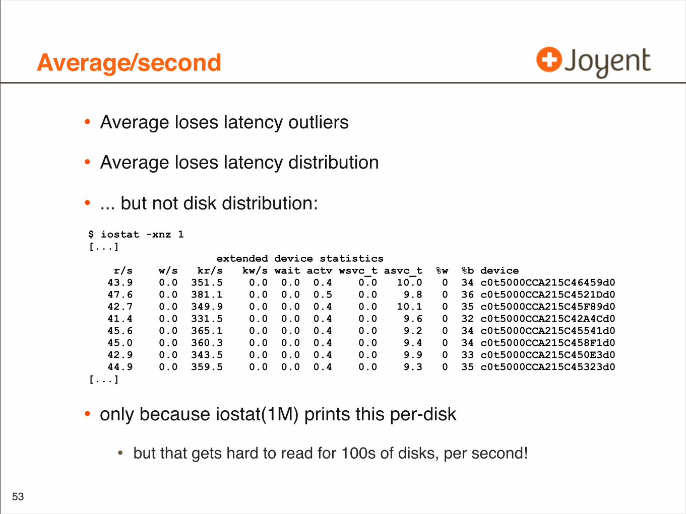
Average/second
• Average loses latency outliers
• Average loses latency distribution
• ... but not disk distribution:
• only because iostat(1M) prints this per-disk
• but that gets hard to read for 100s of disks, per second!
53
$ iostat -xnz 1[...] extended device statistics r/s w/s kr/s kw/s wait actv wsvc_t asvc_t %w %b device 43.9 0.0 351.5 0.0 0.0 0.4 0.0 10.0 0 34 c0t5000CCA215C46459d0 47.6 0.0 381.1 0.0 0.0 0.5 0.0 9.8 0 36 c0t5000CCA215C4521Dd0 42.7 0.0 349.9 0.0 0.0 0.4 0.0 10.1 0 35 c0t5000CCA215C45F89d0 41.4 0.0 331.5 0.0 0.0 0.4 0.0 9.6 0 32 c0t5000CCA215C42A4Cd0 45.6 0.0 365.1 0.0 0.0 0.4 0.0 9.2 0 34 c0t5000CCA215C45541d0 45.0 0.0 360.3 0.0 0.0 0.4 0.0 9.4 0 34 c0t5000CCA215C458F1d0 42.9 0.0 343.5 0.0 0.0 0.4 0.0 9.9 0 33 c0t5000CCA215C450E3d0 44.9 0.0 359.5 0.0 0.0 0.4 0.0 9.3 0 35 c0t5000CCA215C45323d0[...]
Latency outliers
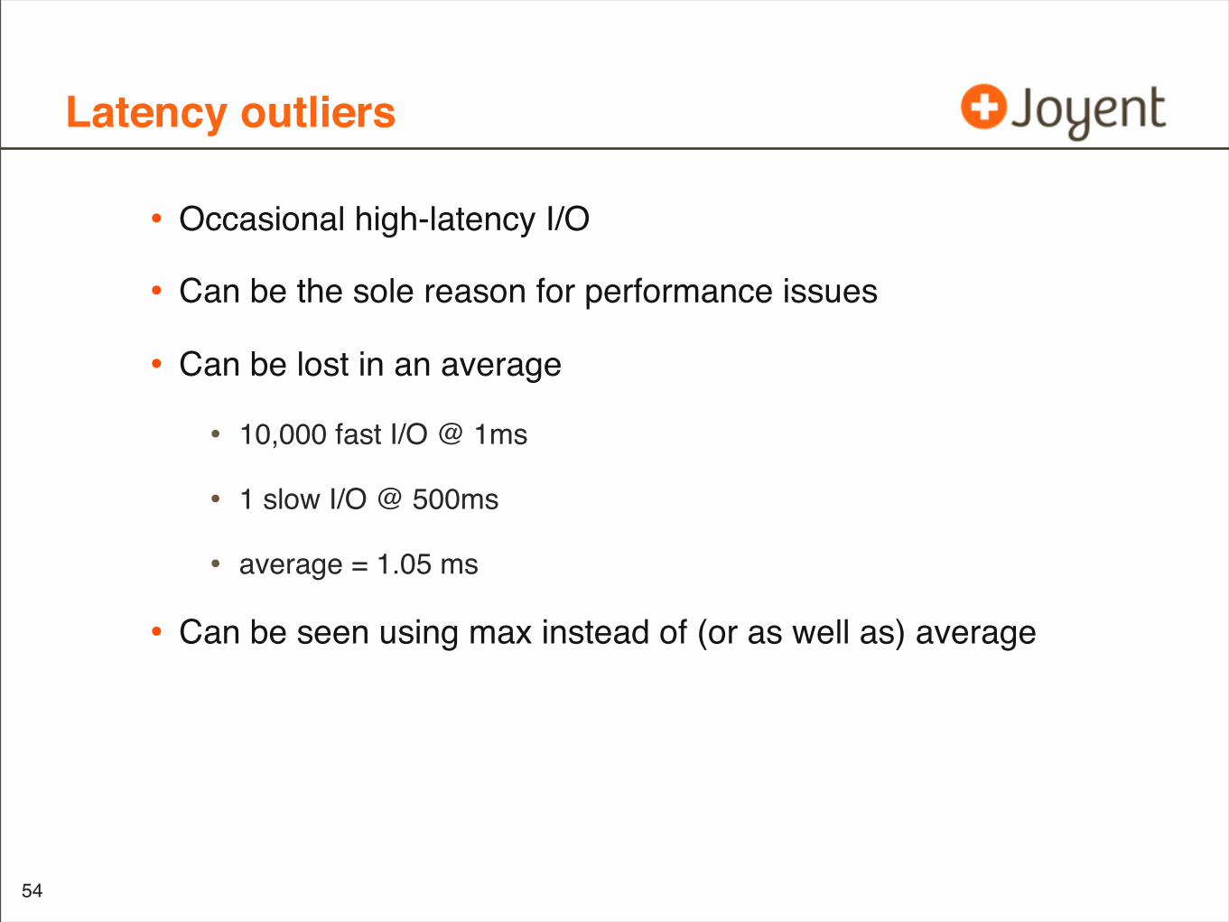
• Occasional high-latency I/O
• Can be the sole reason for performance issues
• Can be lost in an average
• 10,000 fast I/O @ 1ms
• 1 slow I/O @ 500ms
• average = 1.05 ms
• Can be seen using max instead of (or as well as) average
54
Maximum/second
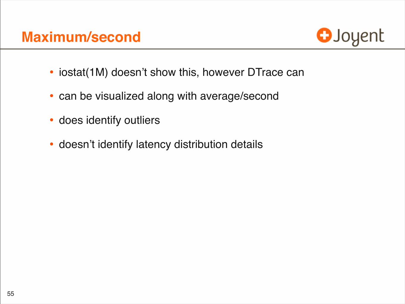
• iostat(1M) doesn’t show this, however DTrace can
• can be visualized along with average/second
• does identify outliers
• doesn’t identify latency distribution details
55
Latency distribution
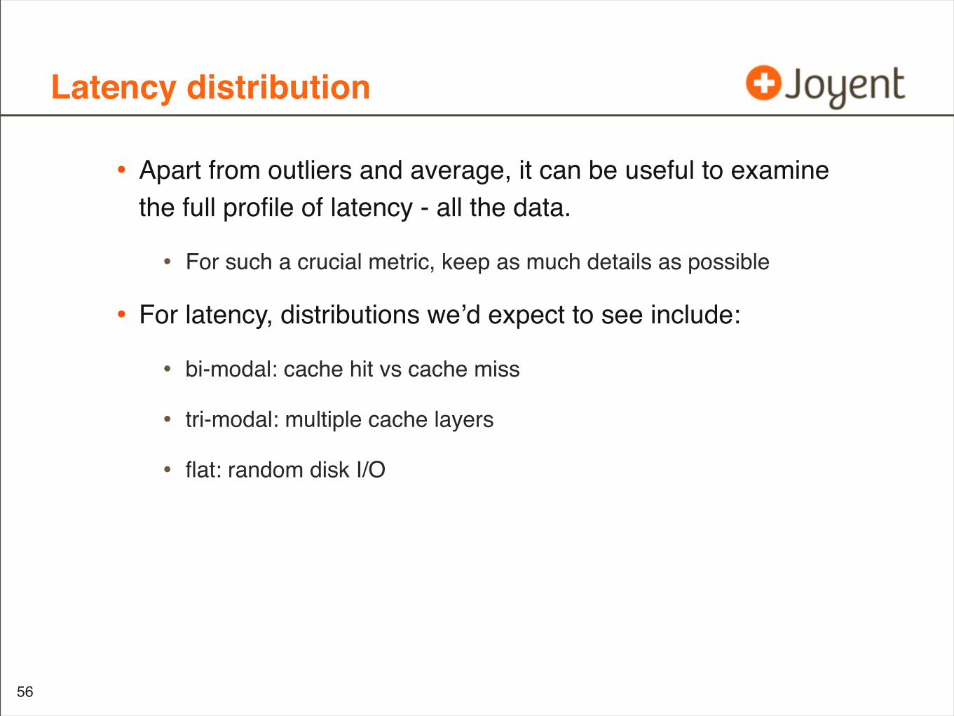
• Apart from outliers and average, it can be useful to examine the full profile of latency - all the data.
• For such a crucial metric, keep as much details as possible
• For latency, distributions we’d expect to see include:
• bi-modal: cache hit vs cache miss
• tri-modal: multiple cache layers
• flat: random disk I/O
56
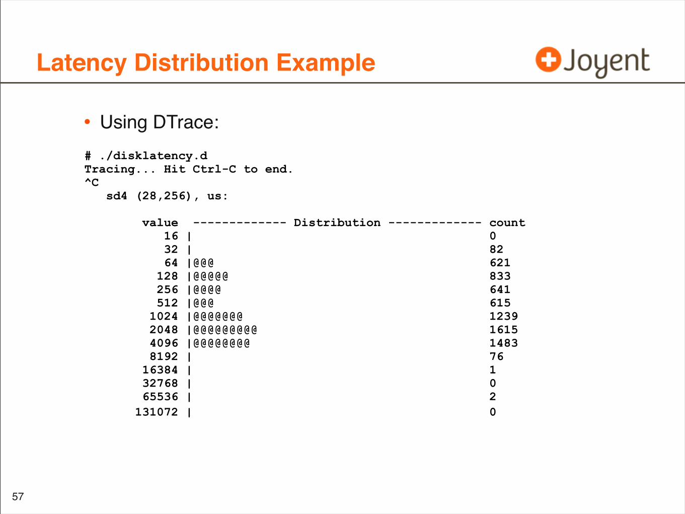
Latency Distribution Example
• Using DTrace:
57
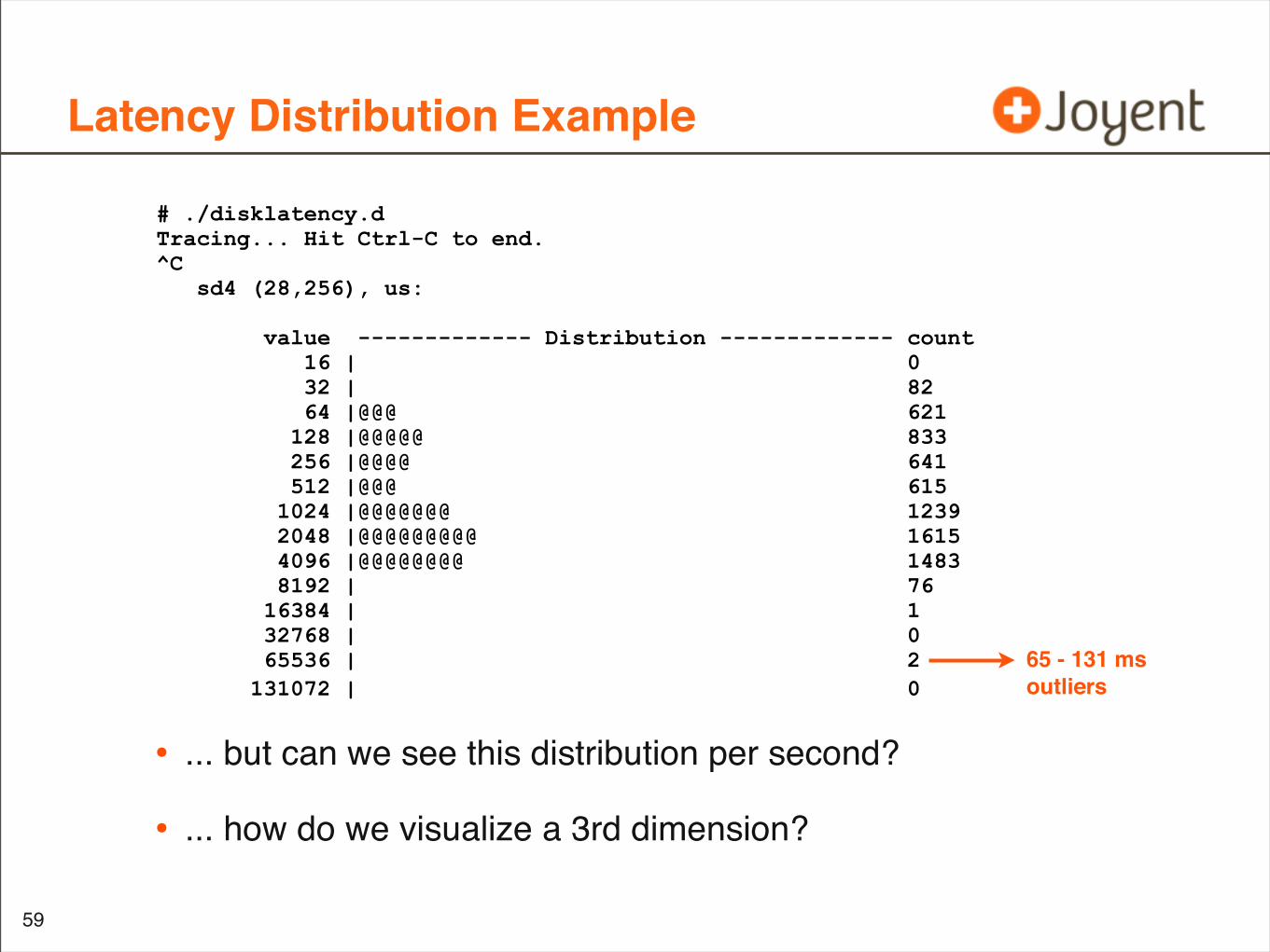
# ./disklatency.d Tracing... Hit Ctrl-C to end.^C sd4 (28,256), us:
value ------------- Distribution ------------- count 16 | 0 32 | 82 64 |@@@ 621 128 |@@@@@ 833 256 |@@@@ 641 512 |@@@ 615 1024 |@@@@@@@ 1239 2048 |@@@@@@@@@ 1615 4096 |@@@@@@@@ 1483 8192 | 76 16384 | 1 32768 | 0 65536 | 2 131072 | 0
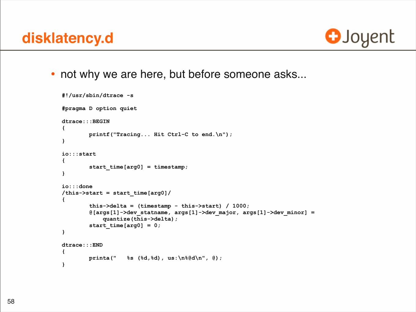
disklatency.d
• not why we are here, but before someone asks...
58
#!/usr/sbin/dtrace -s #pragma D option quiet dtrace:::BEGIN { printf("Tracing... Hit Ctrl-C to end.\n"); }
io:::start { start_time[arg0] = timestamp; } io:::done /this->start = start_time[arg0]/ { this->delta = (timestamp - this->start) / 1000; @[args[1]->dev_statname, args[1]->dev_major, args[1]->dev_minor] = quantize(this->delta); start_time[arg0] = 0;} dtrace:::END { printa(" %s (%d,%d), us:\n%@d\n", @); }
Latency Distribution Example
• ... but can we see this distribution per second?
• ... how do we visualize a 3rd dimension?
59
# ./disklatency.d Tracing... Hit Ctrl-C to end.^C sd4 (28,256), us:
value ------------- Distribution ------------- count 16 | 0 32 | 82 64 |@@@ 621 128 |@@@@@ 833 256 |@@@@ 641 512 |@@@ 615 1024 |@@@@@@@ 1239 2048 |@@@@@@@@@ 1615 4096 |@@@@@@@@ 1483 8192 | 76 16384 | 1 32768 | 0 65536 | 2 131072 | 0
65 - 131 msoutliers
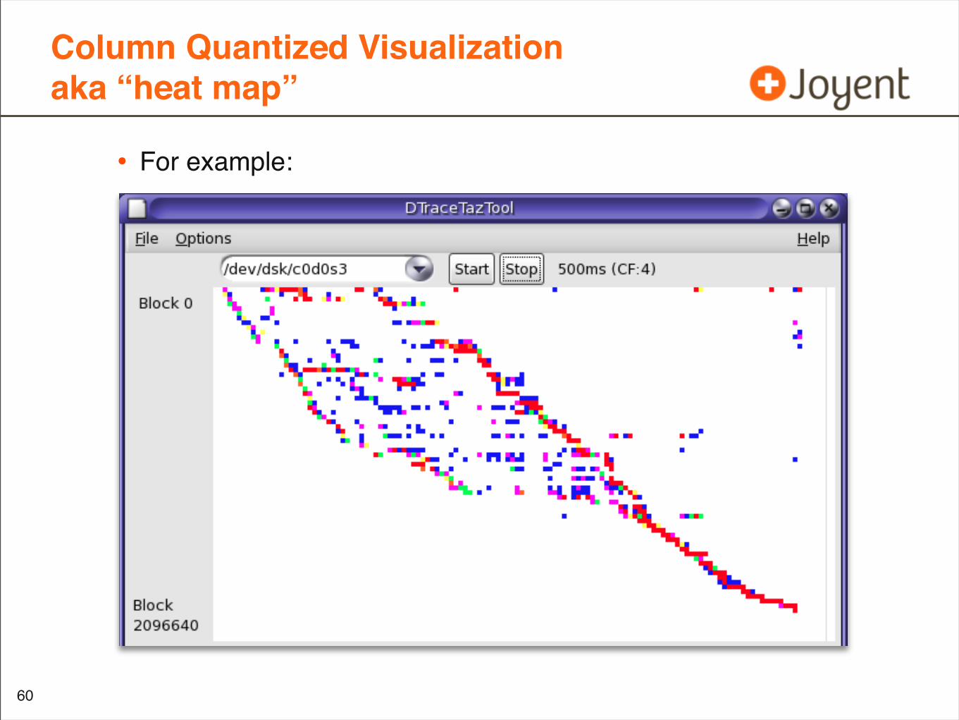
Column Quantized Visualizationaka “heat map”
• For example:
•
60
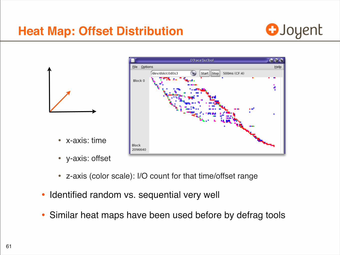
Heat Map: Offset Distribution
• x-axis: time
• y-axis: offset
• z-axis (color scale): I/O count for that time/offset range
• Identified random vs. sequential very well
• Similar heat maps have been used before by defrag tools
61
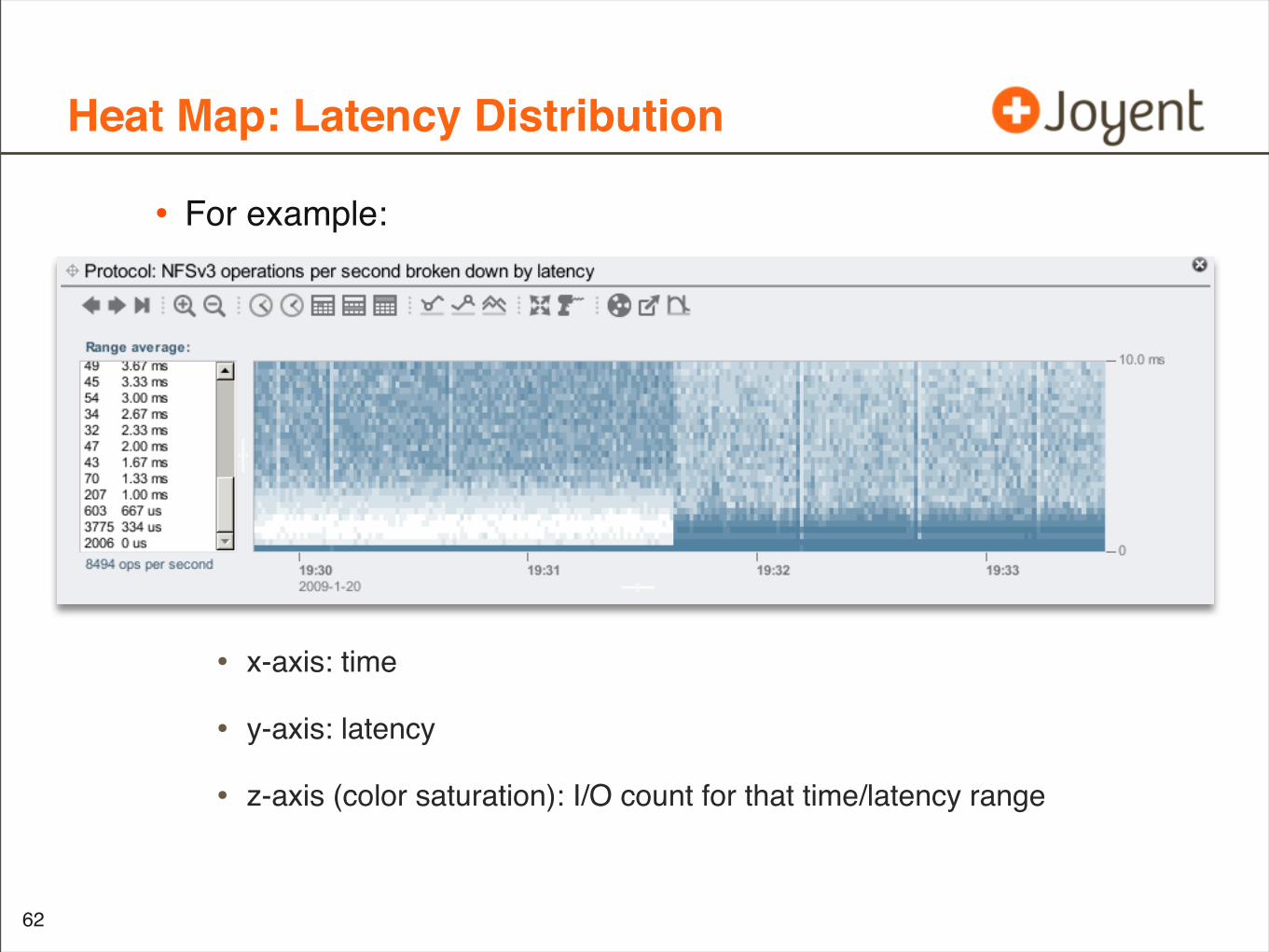
Heat Map: Latency Distribution
• For example:
• x-axis: time
• y-axis: latency
• z-axis (color saturation): I/O count for that time/latency range
62
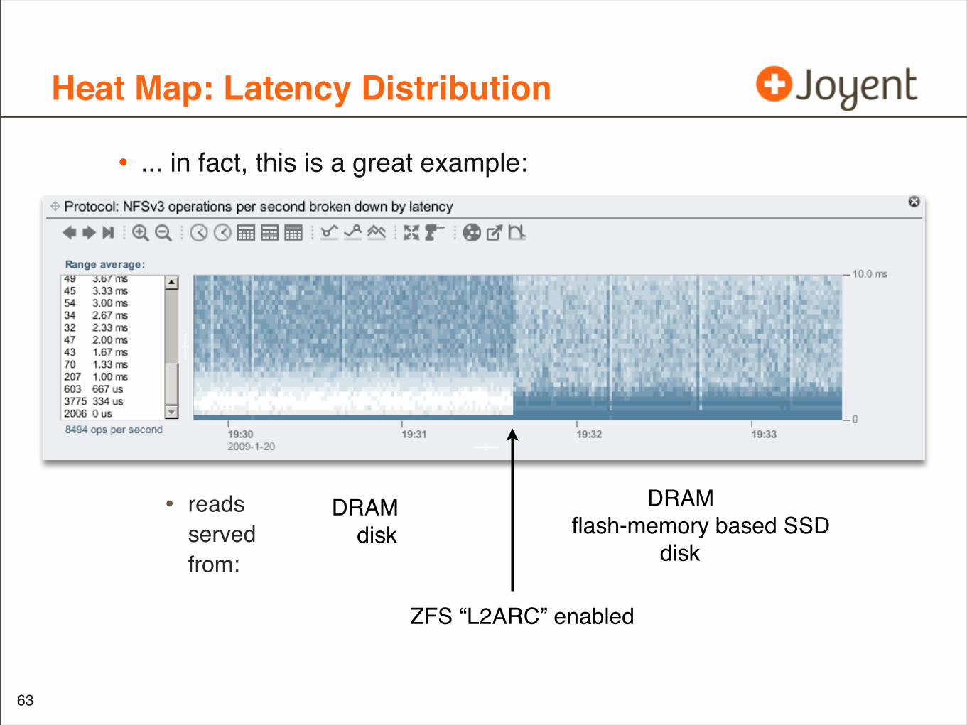
Heat Map: Latency Distribution
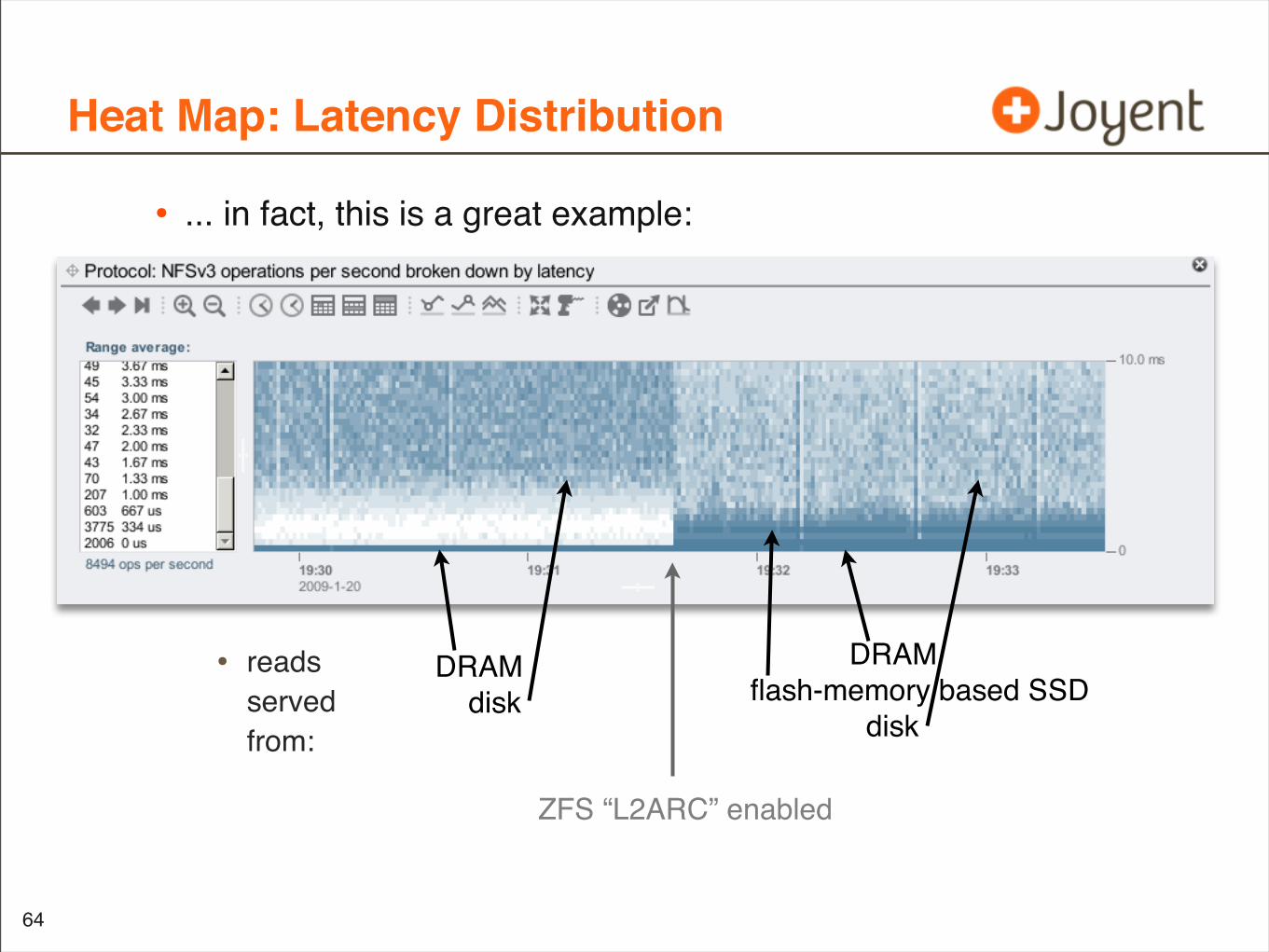
• ... in fact, this is a great example:
• readsservedfrom:
63
DRAM disk
DRAMflash-memory based SSD disk
ZFS “L2ARC” enabled
Heat Map: Latency Distribution
• ... in fact, this is a great example:
• readsservedfrom:
64
DRAM disk
DRAMflash-memory based SSD disk
ZFS “L2ARC” enabled
Latency Heat Map
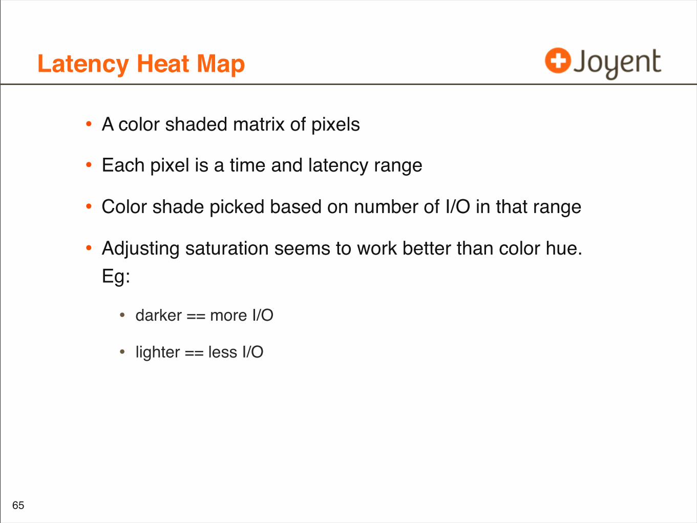
• A color shaded matrix of pixels
• Each pixel is a time and latency range
• Color shade picked based on number of I/O in that range
• Adjusting saturation seems to work better than color hue. Eg:
• darker == more I/O
• lighter == less I/O
65
Pixel Size
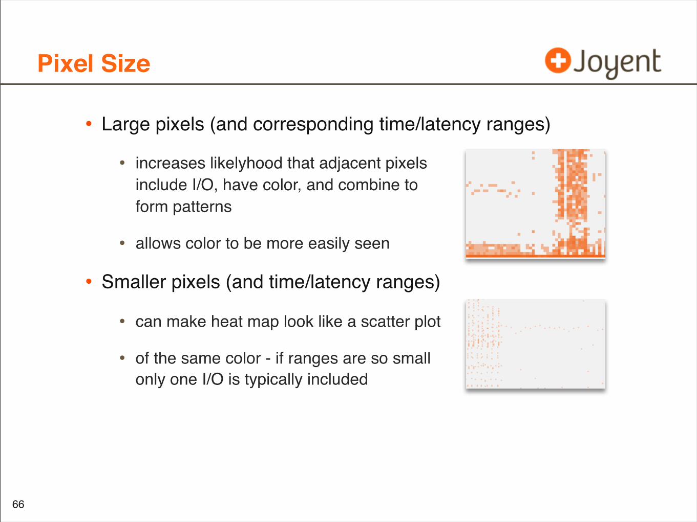
• Large pixels (and corresponding time/latency ranges)
• increases likelyhood that adjacent pixelsinclude I/O, have color, and combine toform patterns
• allows color to be more easily seen
• Smaller pixels (and time/latency ranges)
• can make heat map look like a scatter plot
• of the same color - if ranges are so smallonly one I/O is typically included
66
Color Palette
• Linear scale can make subtle details (outliers) difficult to see
• observing latency outliers is usually of high importance
• outliers are usually < 1% of the I/O
• assigning < 1% of the color scale to them will washout patterns
• False color palette can be used to emphasize these details
• although color comparisons become more confusing - non-linear
67
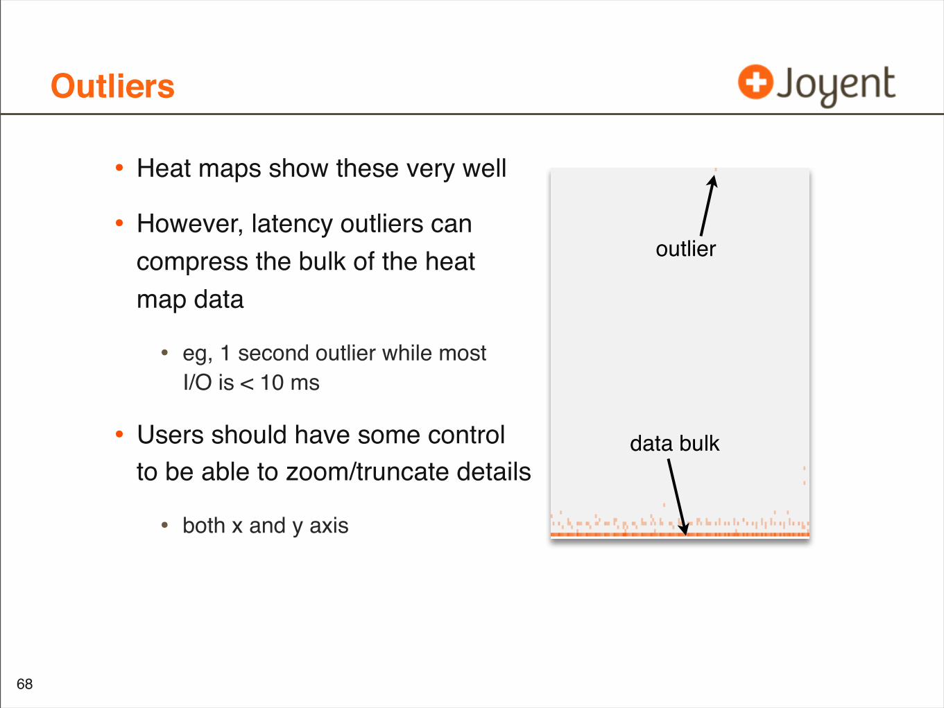
Outliers
• Heat maps show these very well
• However, latency outliers cancompress the bulk of the heatmap data
• eg, 1 second outlier while mostI/O is < 10 ms
• Users should have some controlto be able to zoom/truncate details
• both x and y axis
68
outlier
data bulk
Data Storage
• Since heat-maps are three dimensions, storing this data can become costly (volume)
• Most of the data points are zero
• and you can prevent storing zero’s by only storing populated elements: associative array
• You can reduce to a sufficiently high resolution, and resample lower as needed
• You can also be aggressive at reducing resolution at higher latencies
• 10 us granularity not as interesting for I/O > 1 second
• non-linear resolution
69
Other Interesting Latency Heat Maps
• The “Icy Lake”
• The “Rainbow Pterodactyl”
• Latency Levels
70
The “Icy Lake” Workload
• About as simple as it gets:
• Single client, single thread, sequential synchronous 8 Kbyte writes to an NFS share
• NFS server: 22 x 7,200 RPM disks, striped pool
• The resulting latency heat map was unexpected
71
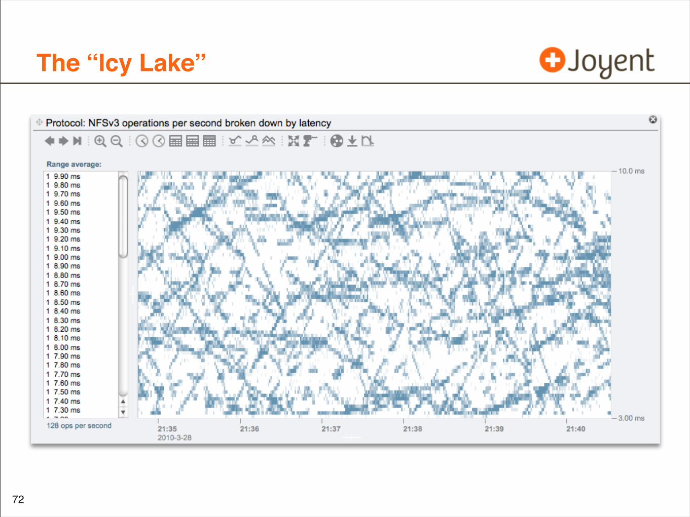
The “Icy Lake”
•
72
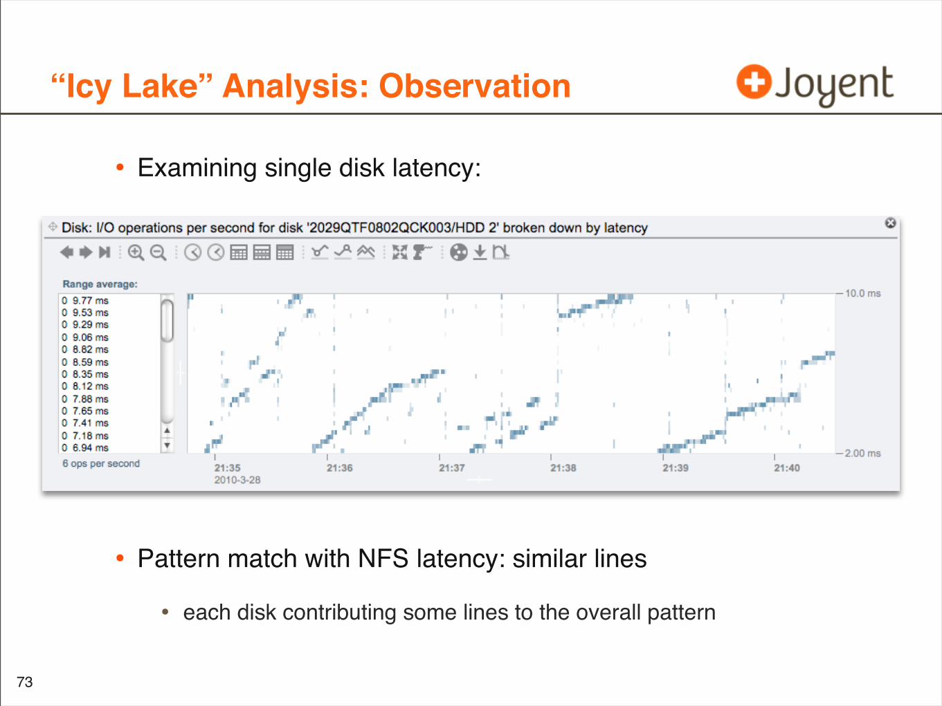
“Icy Lake” Analysis: Observation
• Examining single disk latency:
• Pattern match with NFS latency: similar lines
• each disk contributing some lines to the overall pattern
73
Pattern Match?
• We just associated NFS latency with disk device latency, using our eyeballs
• see the titles on the previous heat maps
• You can programmatically do this (DTrace), but that can get difficult to associate context across software stack layers (but not impossible!)
• Heat Maps allow this part of the problem to be offloaded to your brain
• and we are very good at pattern matching
74
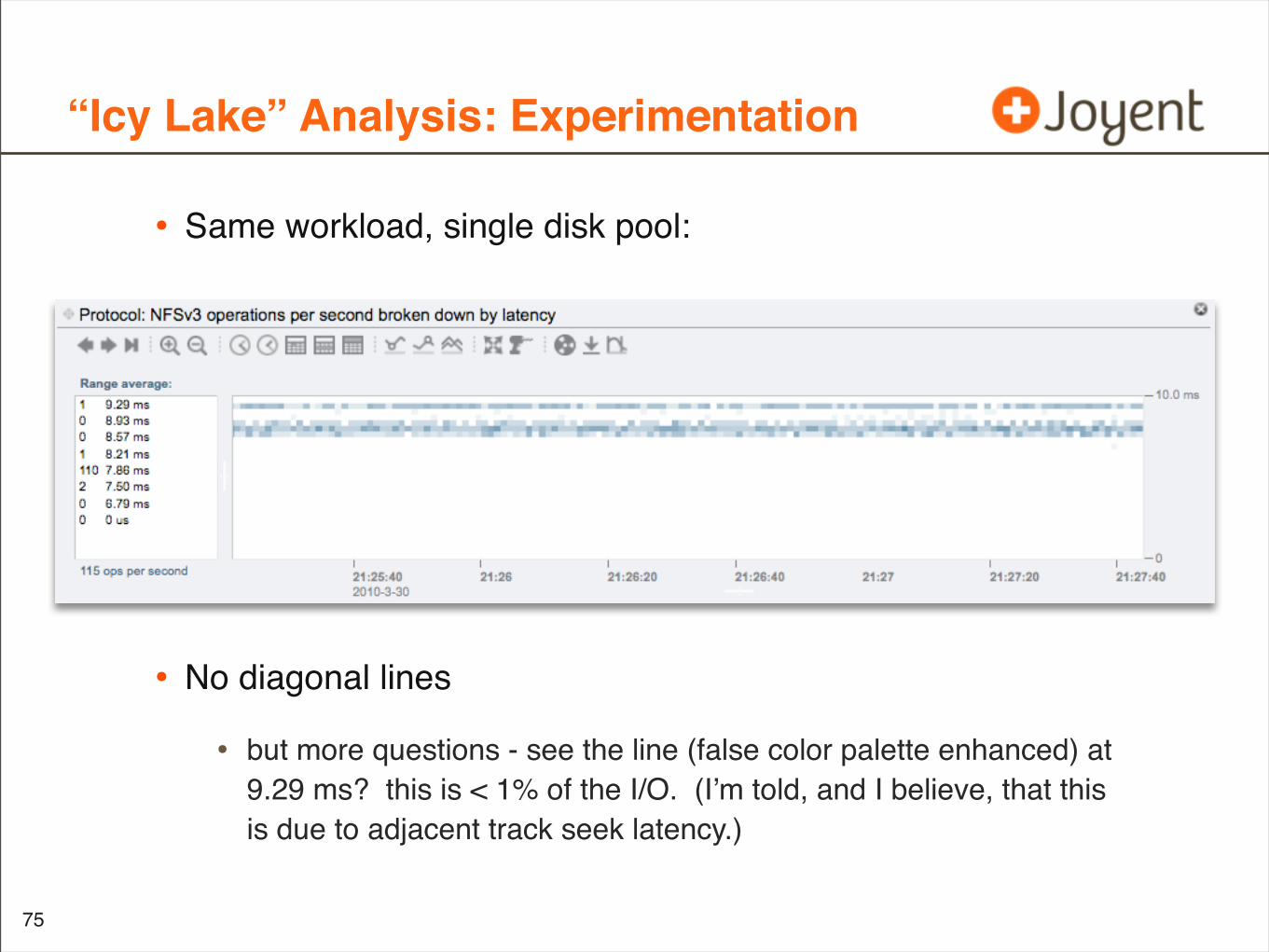
“Icy Lake” Analysis: Experimentation
• Same workload, single disk pool:
• No diagonal lines
• but more questions - see the line (false color palette enhanced) at 9.29 ms? this is < 1% of the I/O. (I’m told, and I believe, that this is due to adjacent track seek latency.)
75
“Icy Lake” Analysis: Experimentation
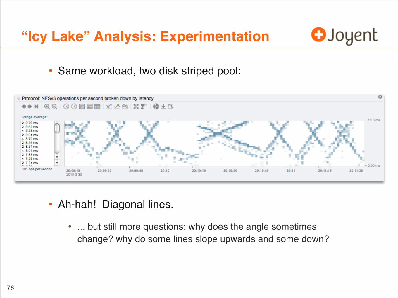
• Same workload, two disk striped pool:
• Ah-hah! Diagonal lines.
• ... but still more questions: why does the angle sometimes change? why do some lines slope upwards and some down?
76
“Icy Lake” Analysis: Experimentation
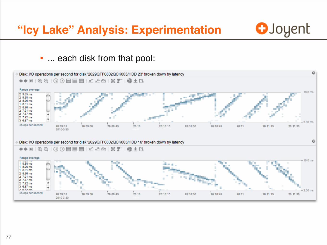
• ... each disk from that pool:
•
77
“Icy Lake” Analysis: Questions
• Remaining Questions:
• Why does the slope sometimes change?
• What exactly seeds the slope in the first place?
78
“Icy Lake” Analysis: Mirroring
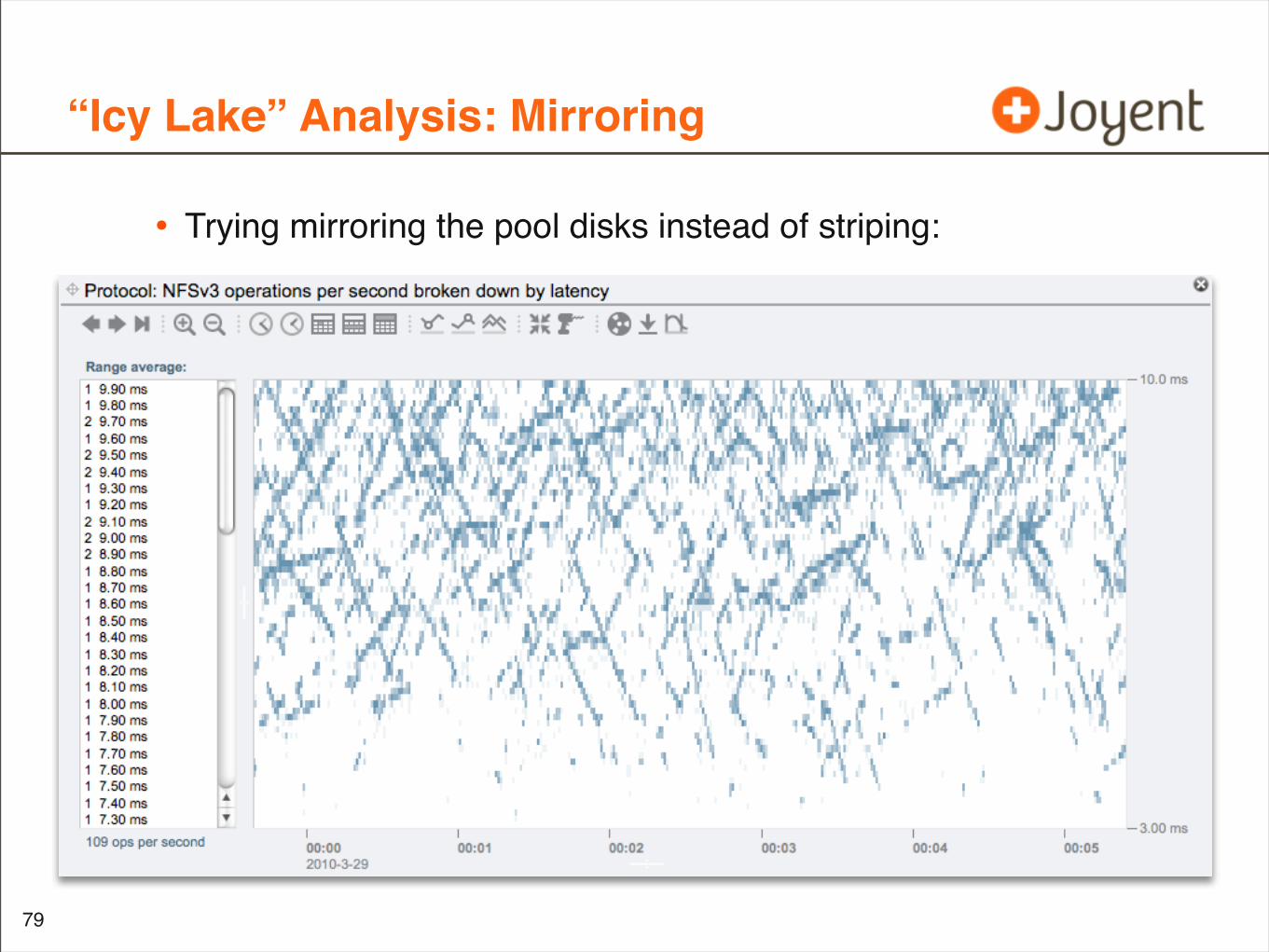
• Trying mirroring the pool disks instead of striping:
79
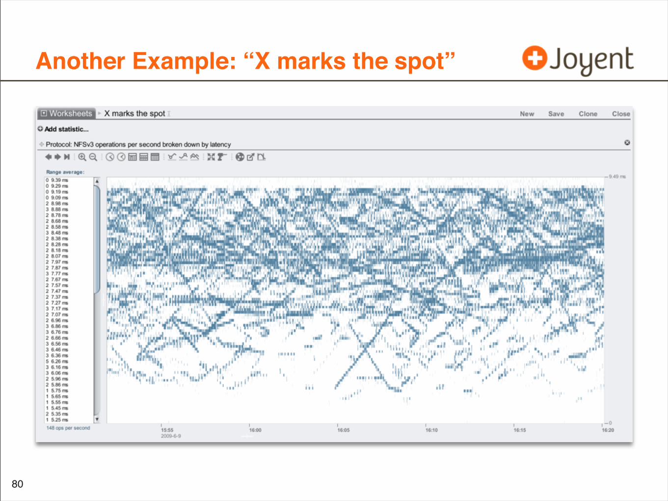
Another Example: “X marks the spot”
80
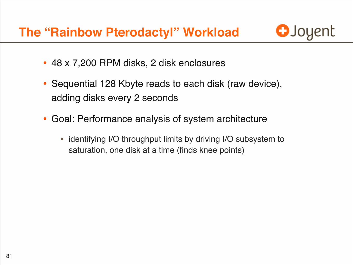
The “Rainbow Pterodactyl” Workload
• 48 x 7,200 RPM disks, 2 disk enclosures
• Sequential 128 Kbyte reads to each disk (raw device), adding disks every 2 seconds
• Goal: Performance analysis of system architecture
• identifying I/O throughput limits by driving I/O subsystem to saturation, one disk at a time (finds knee points)
81
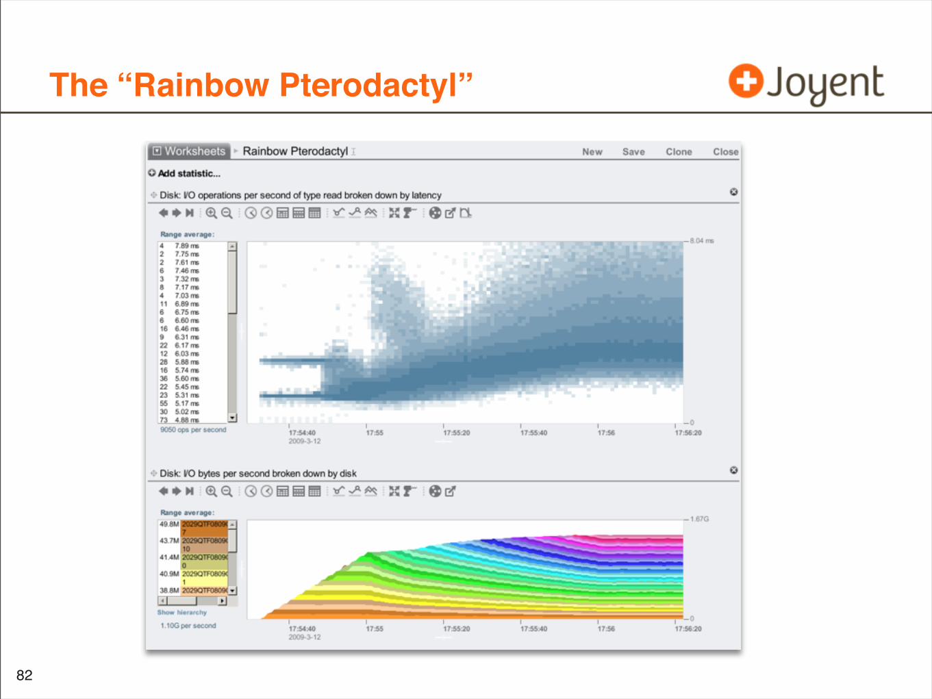
The “Rainbow Pterodactyl”
82
The “Rainbow Pterodactyl”
83
The “Rainbow Pterodactyl”
84
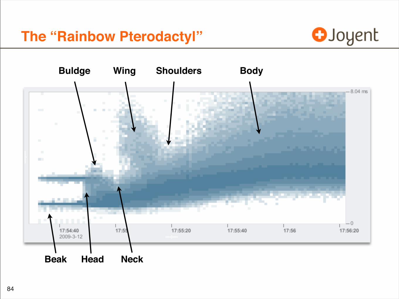
Beak Head Neck
Wing Shoulders BodyBuldge
The “Rainbow Pterodactyl”: Analysis
• Hasn’t been understood in detail
• Would never be understood (or even known) without heat maps
• It is repeatable
85
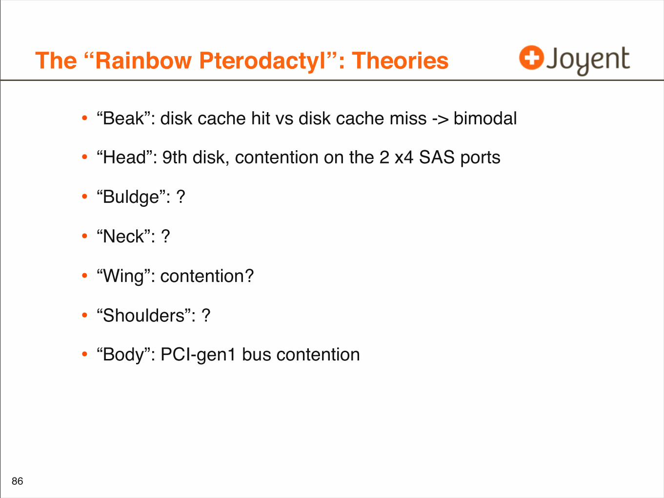
The “Rainbow Pterodactyl”: Theories
• “Beak”: disk cache hit vs disk cache miss -> bimodal
• “Head”: 9th disk, contention on the 2 x4 SAS ports
• “Buldge”: ?
• “Neck”: ?
• “Wing”: contention?
• “Shoulders”: ?
• “Body”: PCI-gen1 bus contention
86
Latency Levels Workload
• Same as “Rainbow Pterodactyl”, stepping disks
• Instead of sequential reads, this is repeated 128 Kbyte reads (read -> seek 0 -> read -> ...), to deliberately hit from the disk DRAM cache to improve test throughput
87
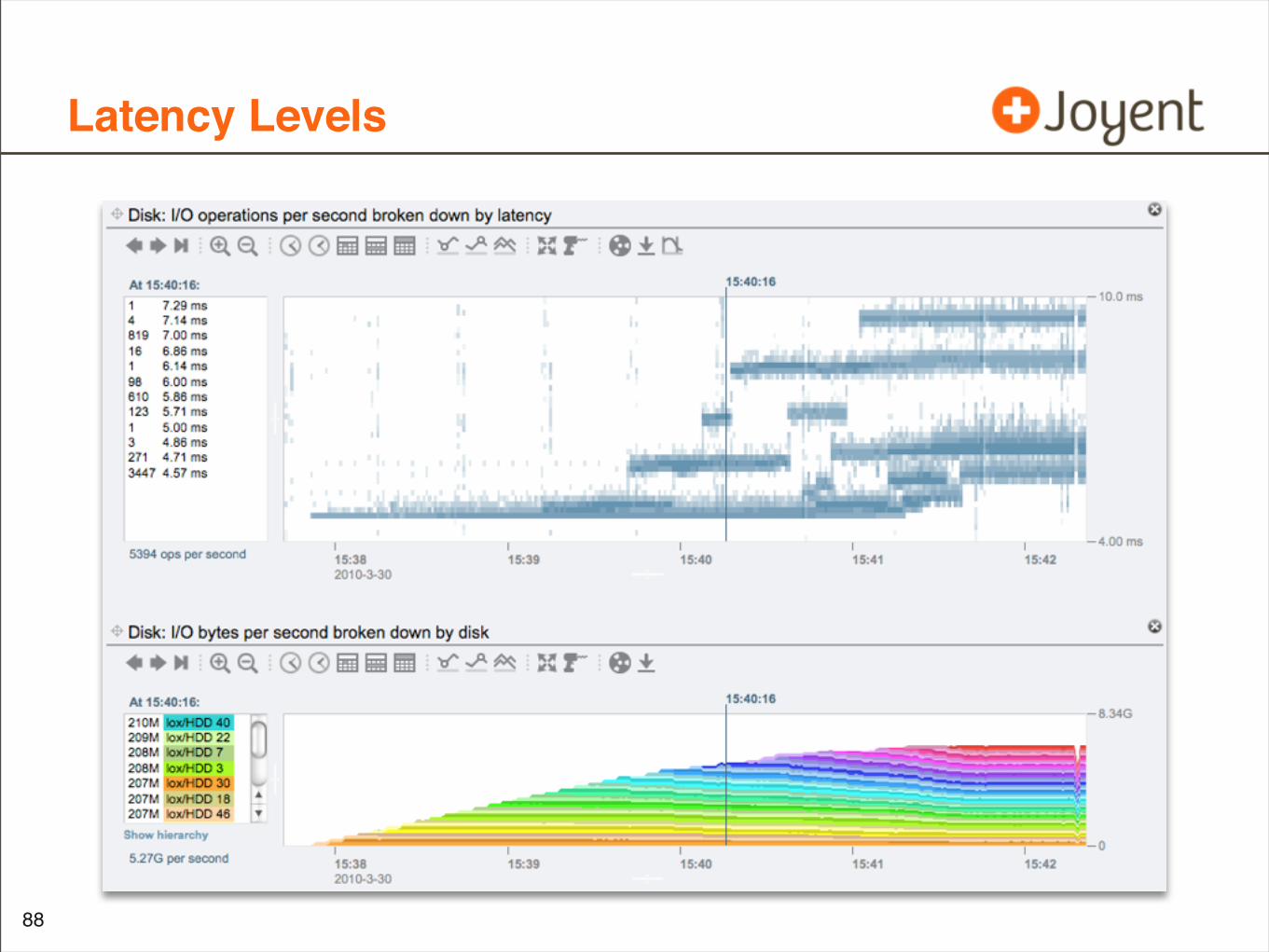
Latency Levels
•
88
Latency Levels Theories
• ???
89
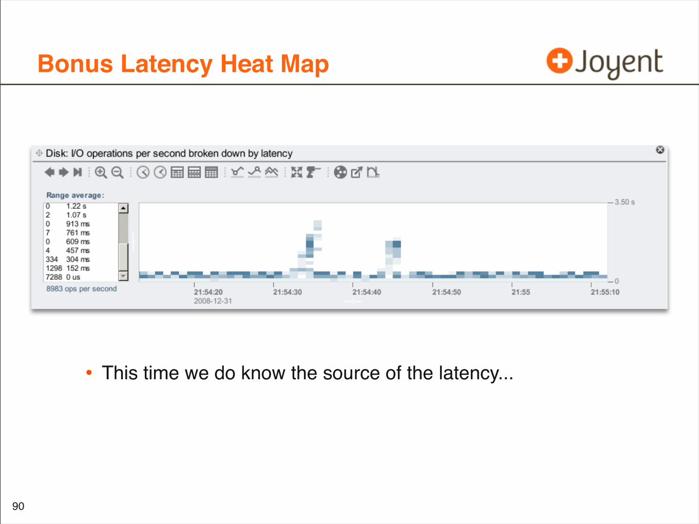
Bonus Latency Heat Map
• This time we do know the source of the latency...
90

硬碟也會鬧情緒
•
91
Latency Heat Maps: Summary
• Shows latency distribution over time
• Shows outliers (maximums)
• Indirectly shows average
• Shows patterns
• allows correlation with other software stack layers
92
Similar Heat Map Uses
• These all have a dynamic y-axis scale:
• I/O size
• I/O offset
• These aren’t a primary measure of performance (like latency); they provide secondary information to understand the workload
93
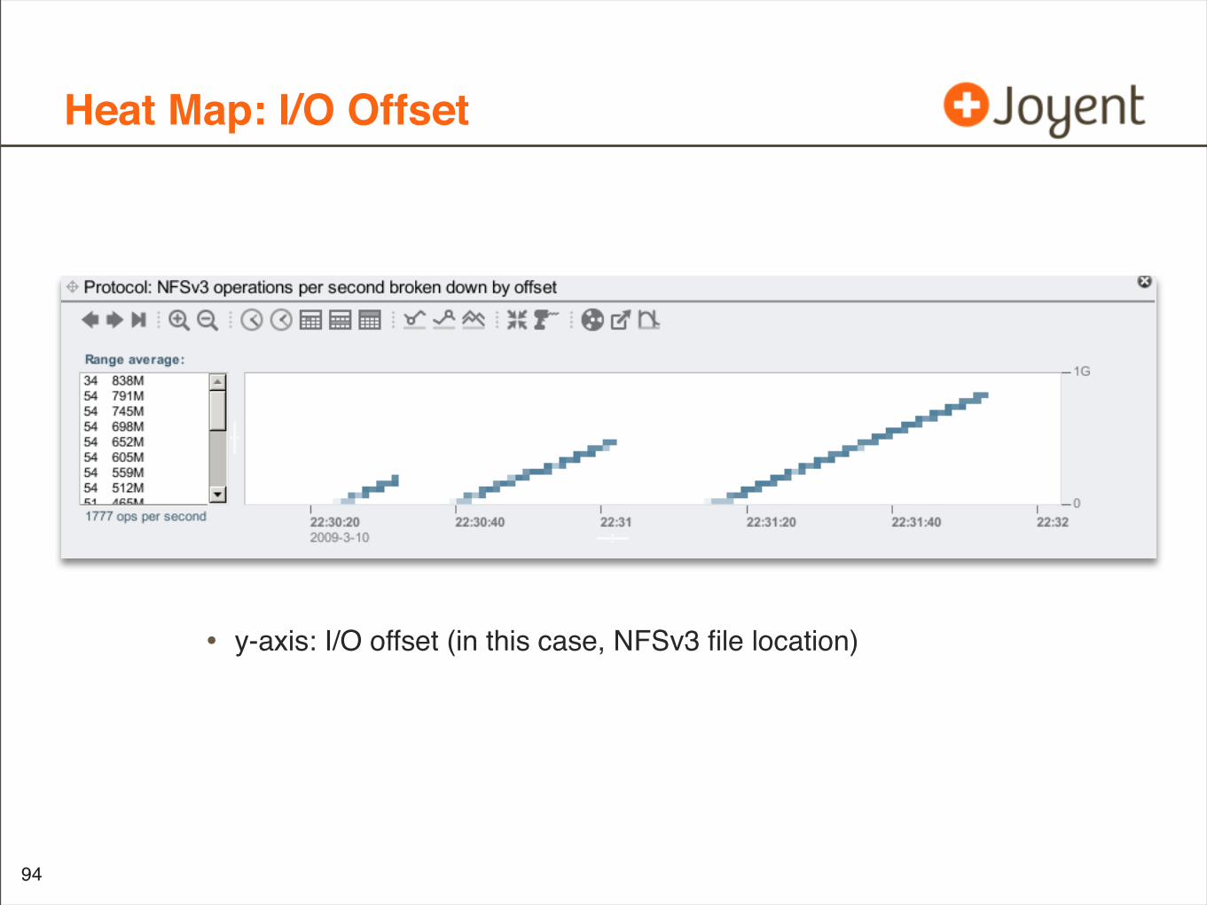
Heat Map: I/O Offset
94
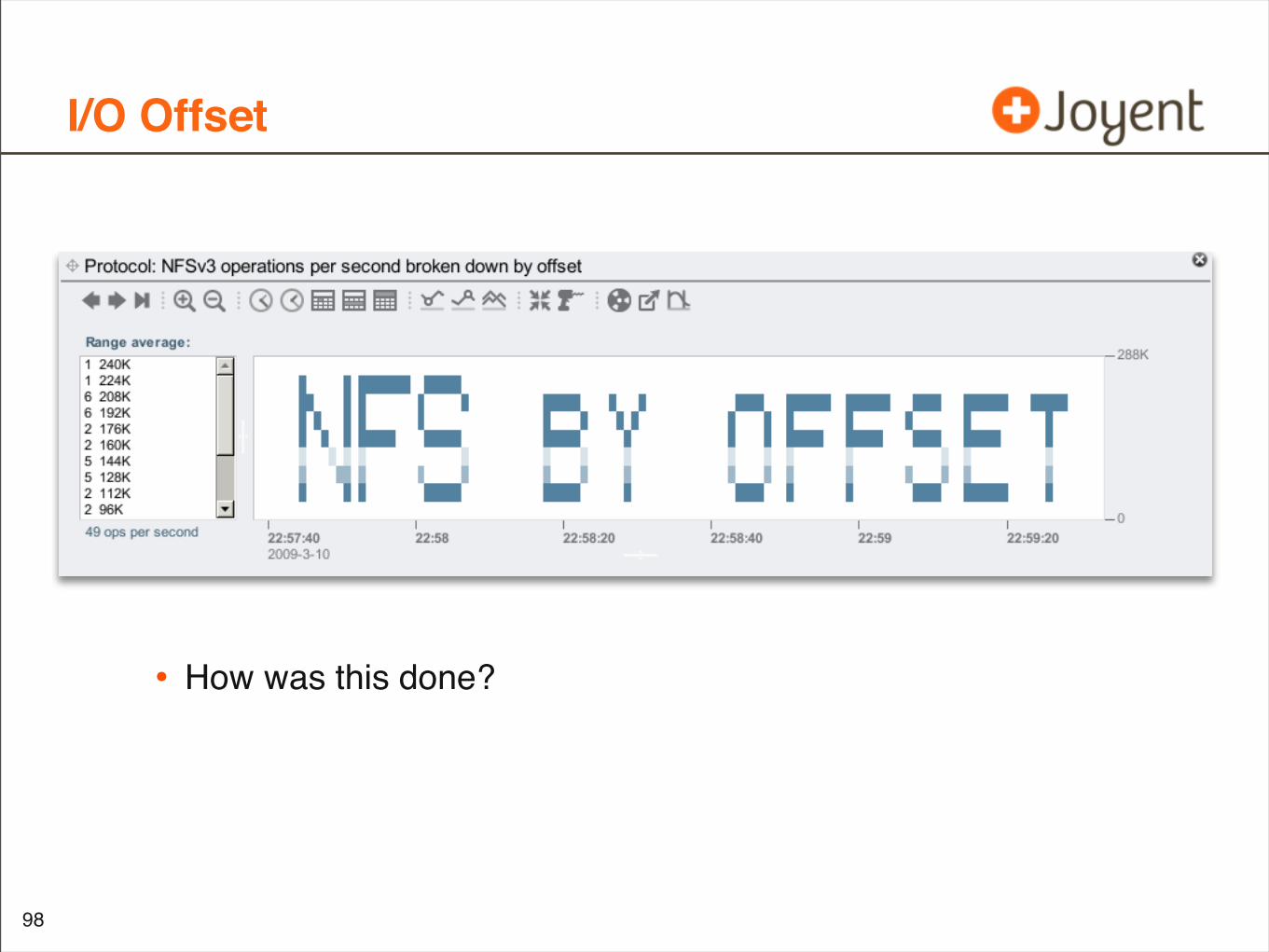
• y-axis: I/O offset (in this case, NFSv3 file location)
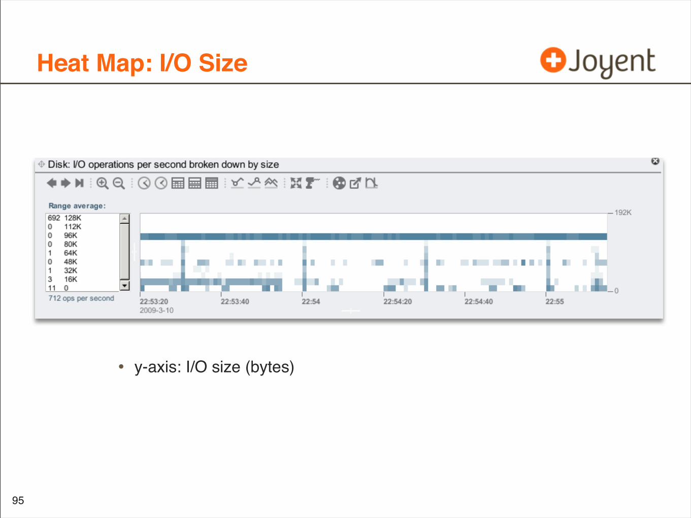
Heat Map: I/O Size
95
• y-axis: I/O size (bytes)
Heat Map Abuse
96
• What can we ‘paint’ by adjusting the workload?
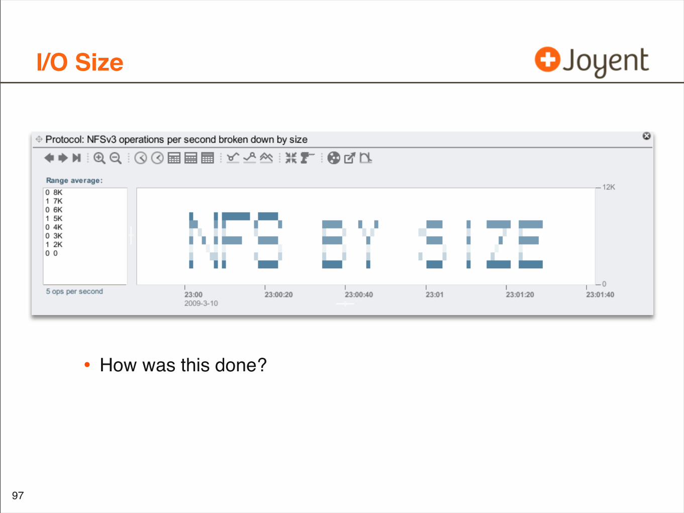
I/O Size
97
• How was this done?
I/O Offset
98
• How was this done?
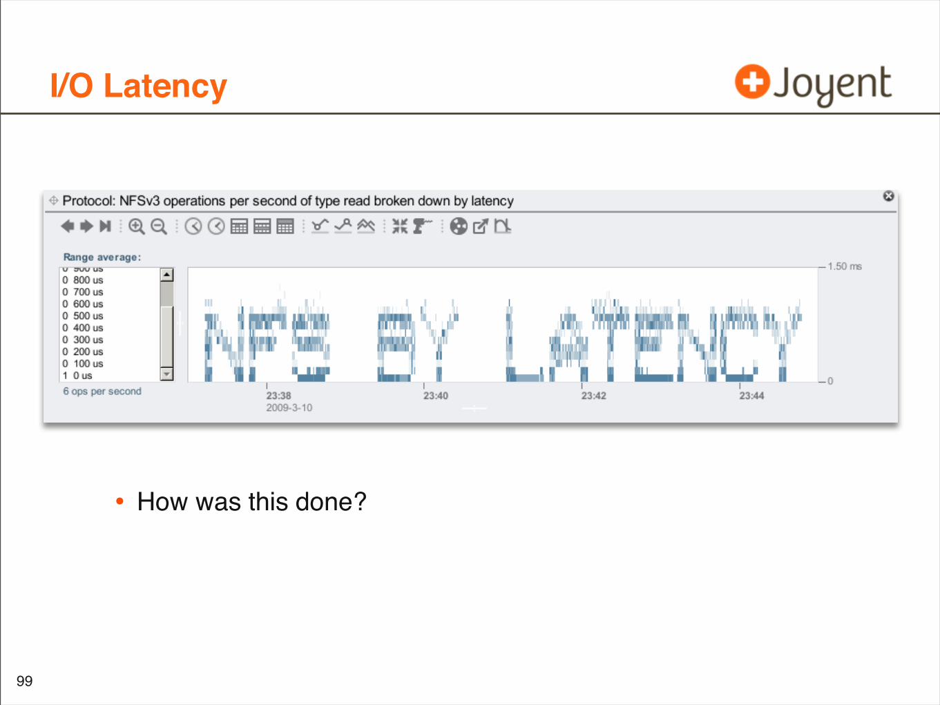
I/O Latency
99
• How was this done?

Current Examples
Visualizations
100
Utilization
CPU Utilization
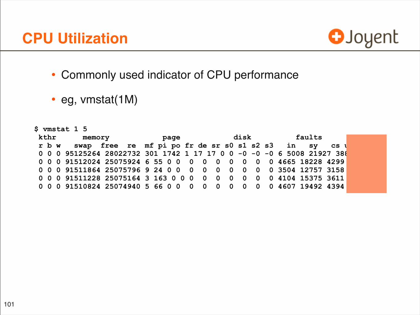
• Commonly used indicator of CPU performance
• eg, vmstat(1M)
101
$ vmstat 1 5 kthr memory page disk faults cpu r b w swap free re mf pi po fr de sr s0 s1 s2 s3 in sy cs us sy id 0 0 0 95125264 28022732 301 1742 1 17 17 0 0 -0 -0 -0 6 5008 21927 3886 4 1 94 0 0 0 91512024 25075924 6 55 0 0 0 0 0 0 0 0 0 4665 18228 4299 10 1 89 0 0 0 91511864 25075796 9 24 0 0 0 0 0 0 0 0 0 3504 12757 3158 8 0 92 0 0 0 91511228 25075164 3 163 0 0 0 0 0 0 0 0 0 4104 15375 3611 9 5 86 0 0 0 91510824 25074940 5 66 0 0 0 0 0 0 0 0 0 4607 19492 4394 10 1 89
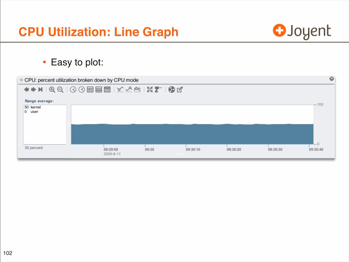
CPU Utilization: Line Graph
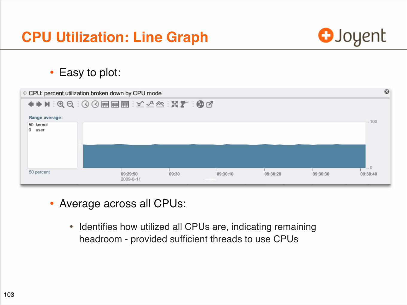
• Easy to plot:
102
CPU Utilization: Line Graph
• Easy to plot:
• Average across all CPUs:
• Identifies how utilized all CPUs are, indicating remaining headroom - provided sufficient threads to use CPUs
103
CPU Utilization by CPU
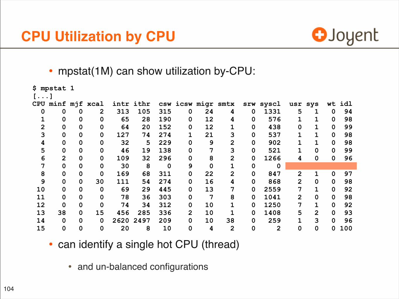
• mpstat(1M) can show utilization by-CPU:
• can identify a single hot CPU (thread)
• and un-balanced configurations
104
$ mpstat 1[...]CPU minf mjf xcal intr ithr csw icsw migr smtx srw syscl usr sys wt idl 0 0 0 2 313 105 315 0 24 4 0 1331 5 1 0 94 1 0 0 0 65 28 190 0 12 4 0 576 1 1 0 98 2 0 0 0 64 20 152 0 12 1 0 438 0 1 0 99 3 0 0 0 127 74 274 1 21 3 0 537 1 1 0 98 4 0 0 0 32 5 229 0 9 2 0 902 1 1 0 98 5 0 0 0 46 19 138 0 7 3 0 521 1 0 0 99 6 2 0 0 109 32 296 0 8 2 0 1266 4 0 0 96 7 0 0 0 30 8 0 9 0 1 0 0 100 0 0 0 8 0 0 0 169 68 311 0 22 2 0 847 2 1 0 97 9 0 0 30 111 54 274 0 16 4 0 868 2 0 0 98 10 0 0 0 69 29 445 0 13 7 0 2559 7 1 0 92 11 0 0 0 78 36 303 0 7 8 0 1041 2 0 0 98 12 0 0 0 74 34 312 0 10 1 0 1250 7 1 0 92 13 38 0 15 456 285 336 2 10 1 0 1408 5 2 0 93 14 0 0 0 2620 2497 209 0 10 38 0 259 1 3 0 96 15 0 0 0 20 8 10 0 4 2 0 2 0 0 0 100
CPU Resource Monitoring
• Monitor overall utilization for capacity planning
• Also valuable to monitor individual CPUs
• can identify un-balanced configurations
• such as a single hot CPU (thread)
• The virtual CPUs on a single host can now reach the 100s
• its own dimension
• how can we display this 3rd dimension?
105
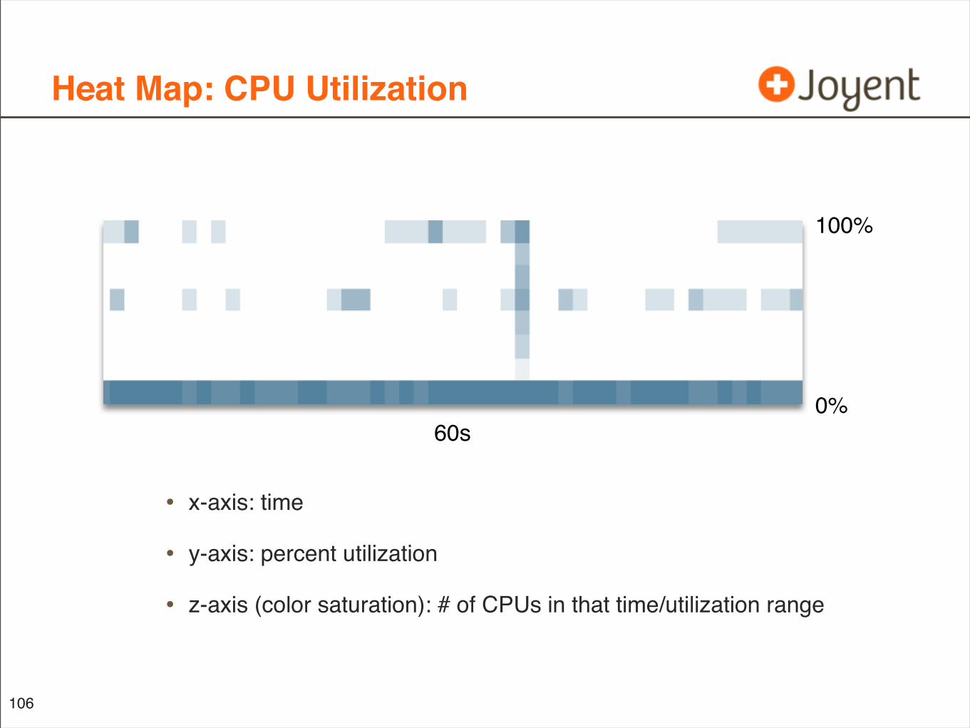
Heat Map: CPU Utilization
• x-axis: time
• y-axis: percent utilization
• z-axis (color saturation): # of CPUs in that time/utilization range
106
60s0%
100%

Heat Map: CPU Utilization
• Single ‘hot’ CPUs are a common problem due to application scaleability issues (single threaded)
• This makes identification easy, without reading pages of mpstat(1M) output
107
60s0%
100%
idle CPUs single ‘hot’ CPU
Heat Map: Disk Utilization
• Ditto for disks
• Disk Utilization heat map can identify:
• overall utilization
• unbalanced configurations
• single hot disks (versus all disks busy)
• Ideally, the disk utilization heat map is tight (y-axis) and below 70%, indicating a well balanced config with headroom
• which can’t be visualized with line graphs
108
Back to Line Graphs...
• Are typically used to visualize performance, be it IOPS or utilization
• Show patterns over time more clearly than text (higher resolution)
• But graphical environments can do much more
• As shown by the heat maps (to start with); which convey details line graphs cannot
• Ask: what “value add” does the GUI bring to the data?
109
Resource Utilization Heat Map Summary
• Can exist for any resource with multiple components:
• CPUs
• Disks
• Network interfaces
• I/O busses
• ...
• Quickly identifies single hot component versus all components
• Best suited for physical hardware resources
• difficult to express ‘utilization’ for a software resource
110

Future Opportunities
Visualizations
111
So far analysis has been for a single server
What about the cloud?
Cloud Computing
112
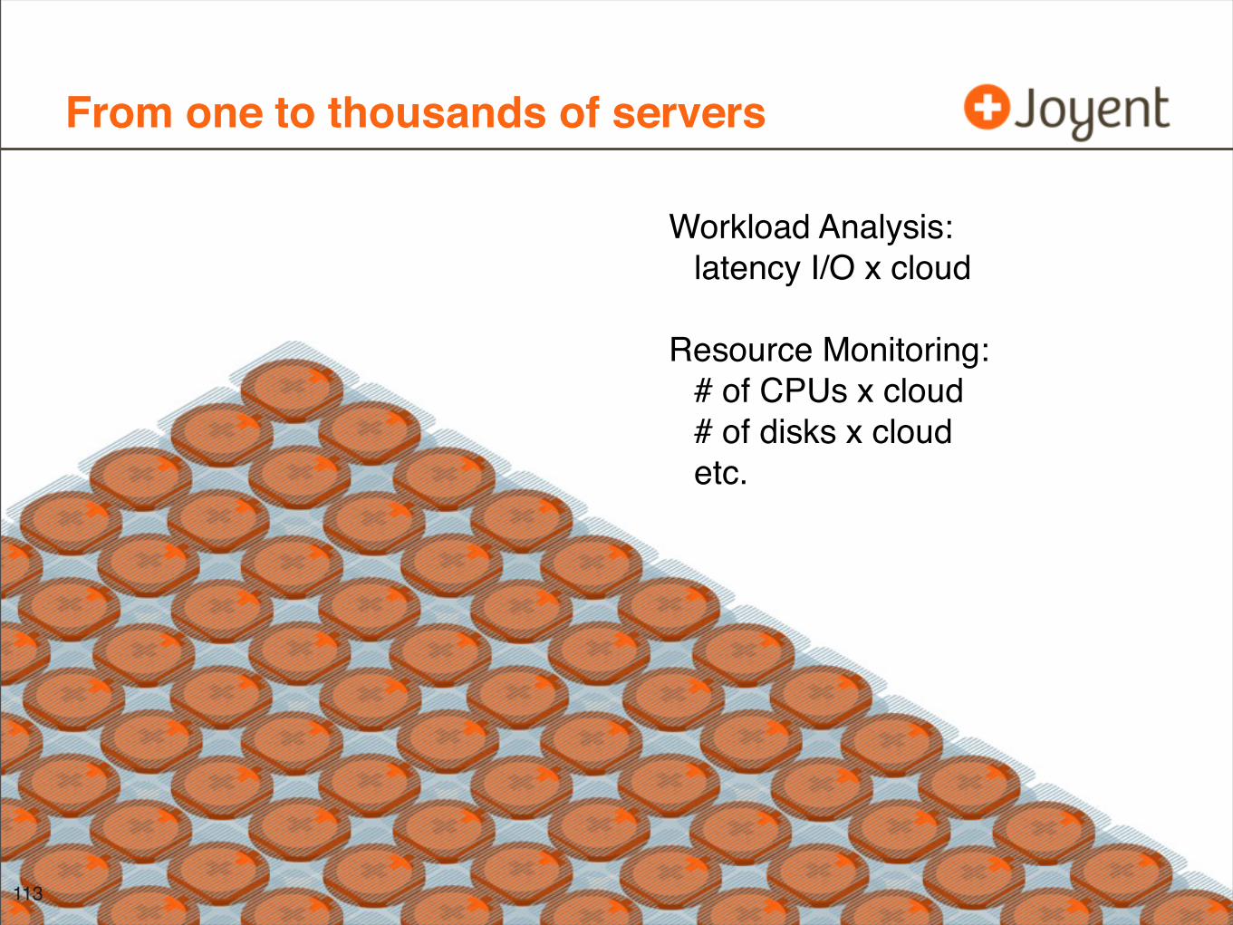
From one to thousands of servers
113
Workload Analysis:latency I/O x cloud
Resource Monitoring:# of CPUs x cloud# of disks x cloudetc.
Heat Maps for the Cloud
114
• Heat Maps are promising for cloud computing observability:
• additional dimension accommodates the scale of the cloud
• Find outliers regardless of node
• cloud-wide latency heat map just has more I/O
• Examine how applications are load balanced across nodes
• similar to CPU and disk utilization heat maps
• mpstat and iostat’s output are already getting too long
• multiply by 1000x for the number of possible hosts in a large cloud application
Proposed Visualizations
• Include:
• Latency heat map across entire cloud
• Latency heat maps for cloud application components
• CPU utilization by cloud node
• CPU utilization by CPU
• Thread/process utilization across entire cloud
• Network interface utilization by cloud node
• Network interface utilization by port
• lots, lots more
115
Cloud Latency Heat Map
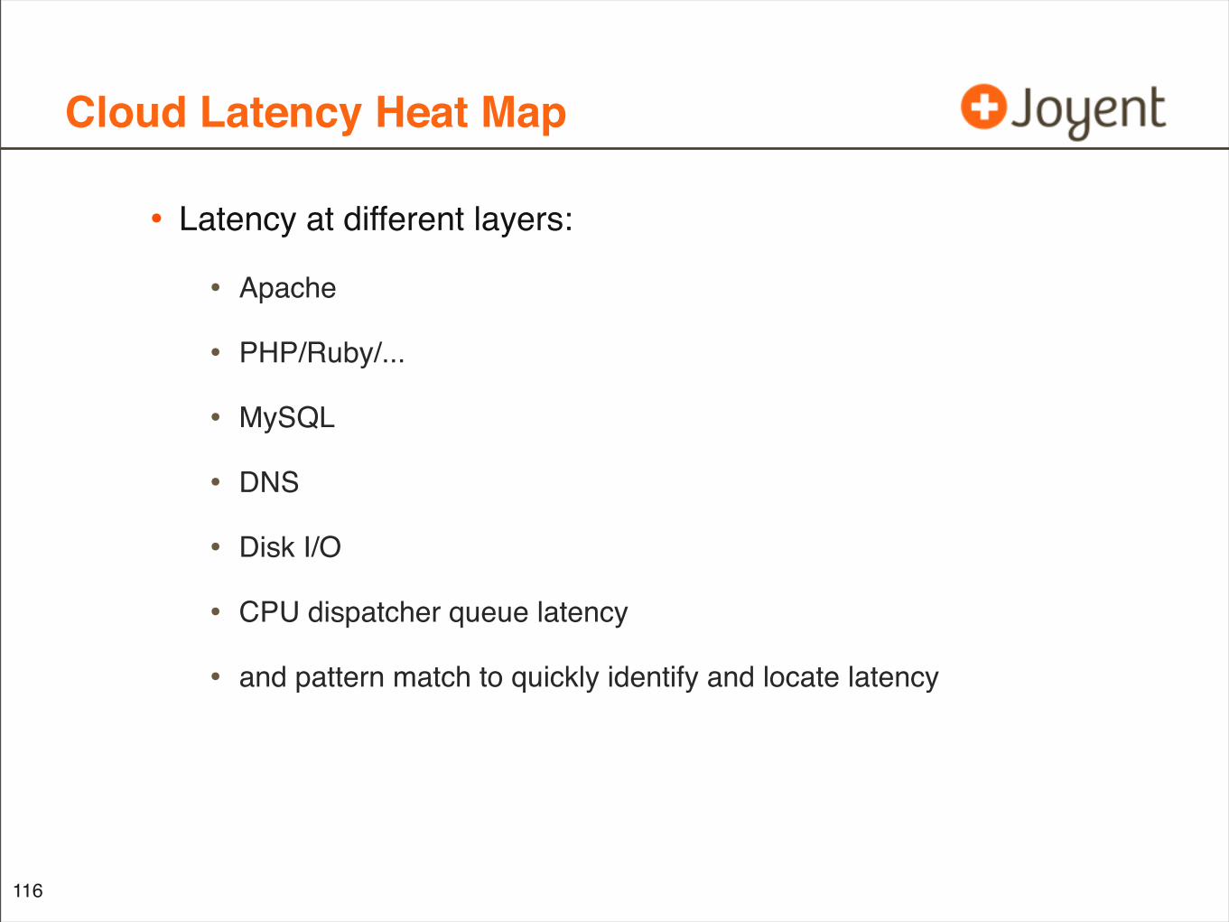
• Latency at different layers:
• Apache
• PHP/Ruby/...
• MySQL
• DNS
• Disk I/O
• CPU dispatcher queue latency
• and pattern match to quickly identify and locate latency
116
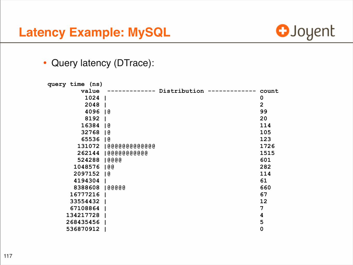
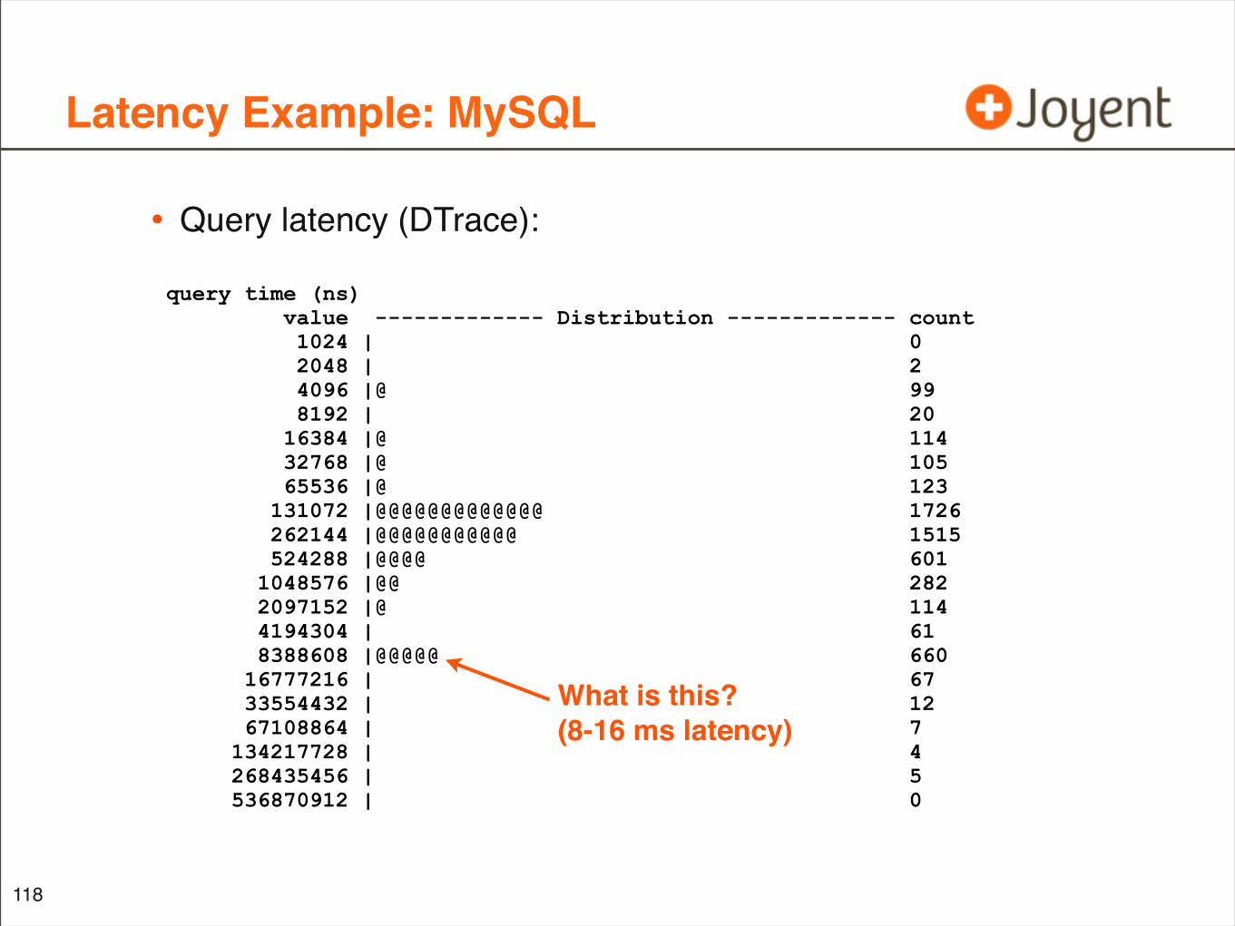
Latency Example: MySQL
• Query latency (DTrace):
117
query time (ns) value ------------- Distribution ------------- count 1024 | 0 2048 | 2 4096 |@ 99 8192 | 20 16384 |@ 114 32768 |@ 105 65536 |@ 123 131072 |@@@@@@@@@@@@@ 1726 262144 |@@@@@@@@@@@ 1515 524288 |@@@@ 601 1048576 |@@ 282 2097152 |@ 114 4194304 | 61 8388608 |@@@@@ 660 16777216 | 67 33554432 | 12 67108864 | 7 134217728 | 4 268435456 | 5 536870912 | 0
Latency Example: MySQL
• Query latency (DTrace):
118
query time (ns) value ------------- Distribution ------------- count 1024 | 0 2048 | 2 4096 |@ 99 8192 | 20 16384 |@ 114 32768 |@ 105 65536 |@ 123 131072 |@@@@@@@@@@@@@ 1726 262144 |@@@@@@@@@@@ 1515 524288 |@@@@ 601 1048576 |@@ 282 2097152 |@ 114 4194304 | 61 8388608 |@@@@@ 660 16777216 | 67 33554432 | 12 67108864 | 7 134217728 | 4 268435456 | 5 536870912 | 0
What is this?(8-16 ms latency)
Latency Example: MySQL
119
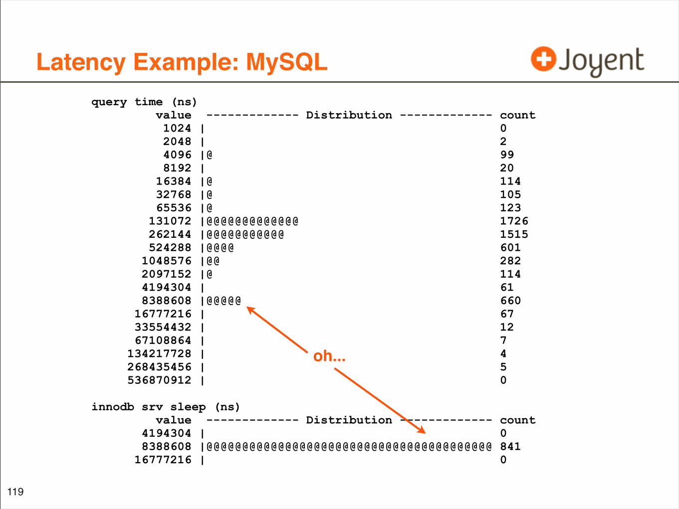
query time (ns) value ------------- Distribution ------------- count 1024 | 0 2048 | 2 4096 |@ 99 8192 | 20 16384 |@ 114 32768 |@ 105 65536 |@ 123 131072 |@@@@@@@@@@@@@ 1726 262144 |@@@@@@@@@@@ 1515 524288 |@@@@ 601 1048576 |@@ 282 2097152 |@ 114 4194304 | 61 8388608 |@@@@@ 660 16777216 | 67 33554432 | 12 67108864 | 7 134217728 | 4 268435456 | 5 536870912 | 0
innodb srv sleep (ns) value ------------- Distribution ------------- count 4194304 | 0 8388608 |@@@@@@@@@@@@@@@@@@@@@@@@@@@@@@@@@@@@@@@@ 841 16777216 | 0
oh...
Latency Example: MySQL
120
• Spike of MySQL query latency: 8 - 16 ms
• innodb thread concurrency back-off sleep latency: 8 - 16 ms
• Both have a similar magnitude (see “count” column)
• Add the dimension of time as a heat map, for more characteristics to compare
• ... quickly compare heat maps from different components of the cloud to pattern match and locate latency
Cloud Latency Heat Map
• Identify latency outliers, distributions, patterns
• Can add more functionality to identify these by:
• cloud node
• application, cloud-wide
• I/O type (eg, query type)
• Targeted observability (DTrace) can be used to fetch this
• Or, we could collect it for everything
• ... do we need a 4th dimension?
121
4th Dimension!
• Bryan Cantrill @Joyent coded this 11 hours ago
• assuming it’s now about 10:30am during this talk
• ... and I added these slides about 7 hours ago
122
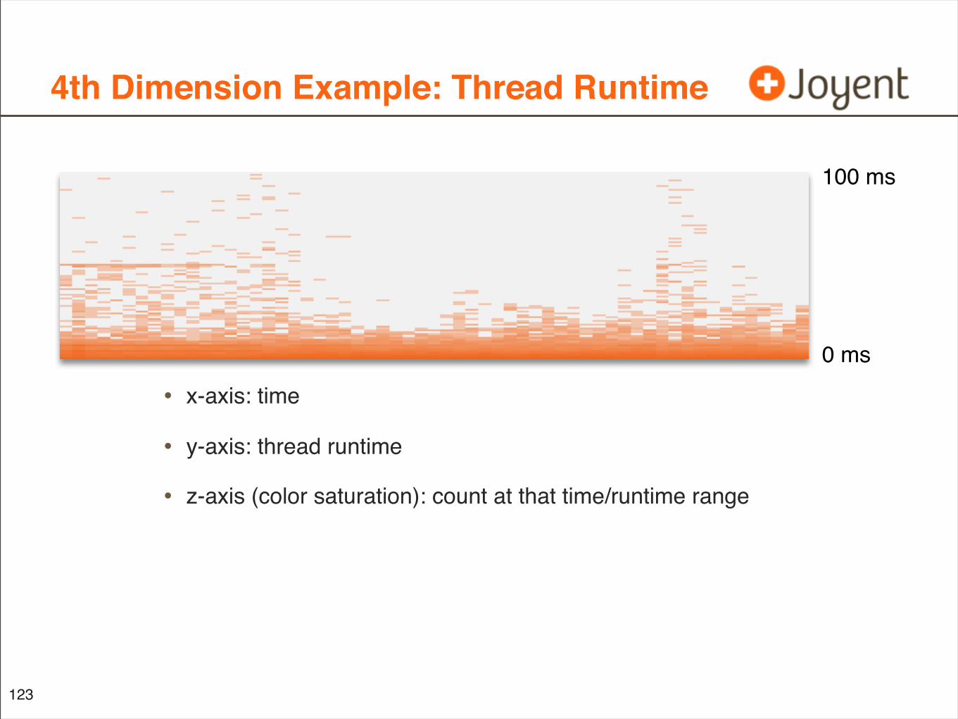
4th Dimension Example: Thread Runtime
• x-axis: time
• y-axis: thread runtime
• z-axis (color saturation): count at that time/runtime range
123
0 ms
100 ms
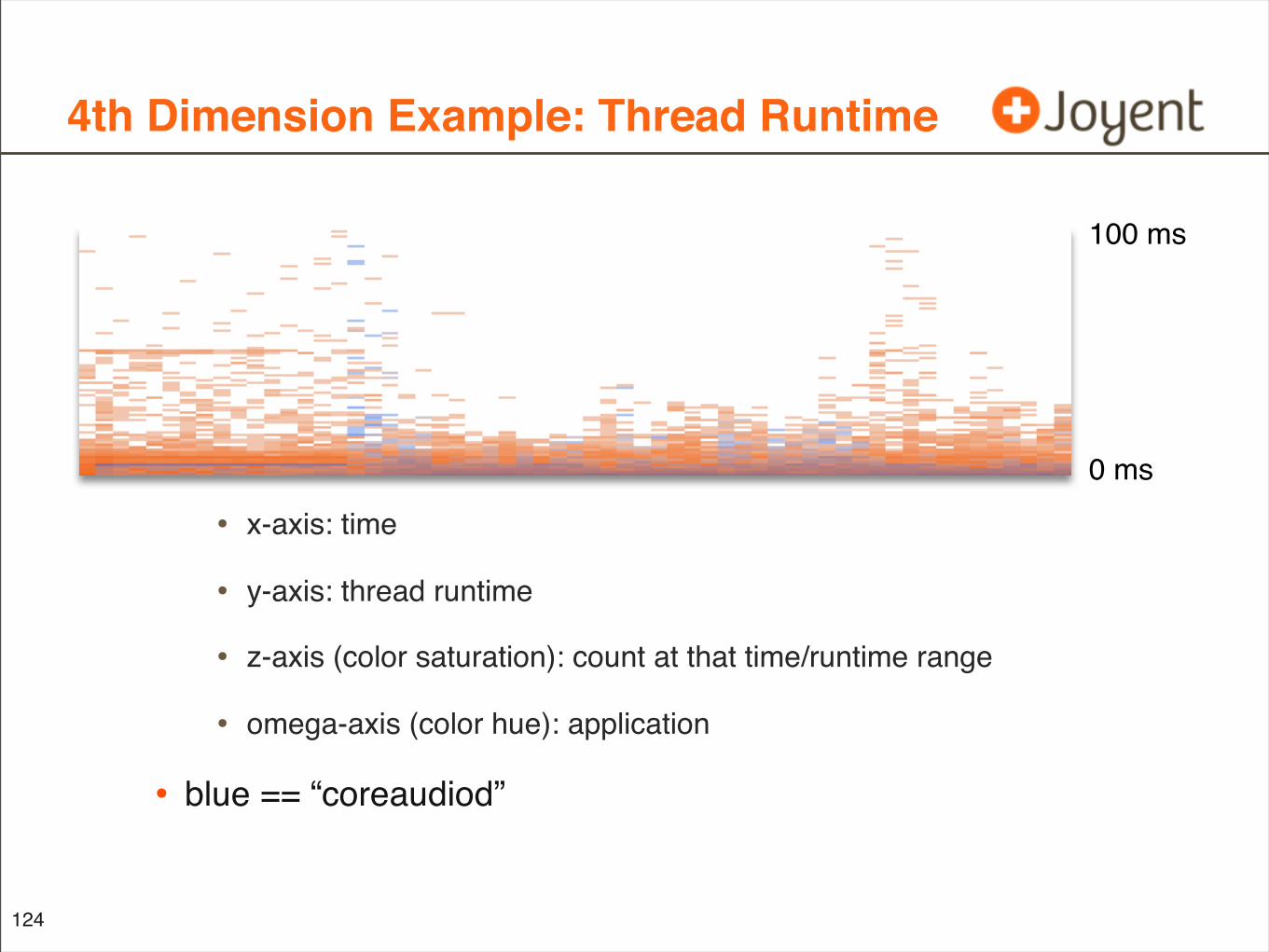
4th Dimension Example: Thread Runtime
• x-axis: time
• y-axis: thread runtime
• z-axis (color saturation): count at that time/runtime range
• omega-axis (color hue): application
• blue == “coreaudiod”
124
0 ms
100 ms
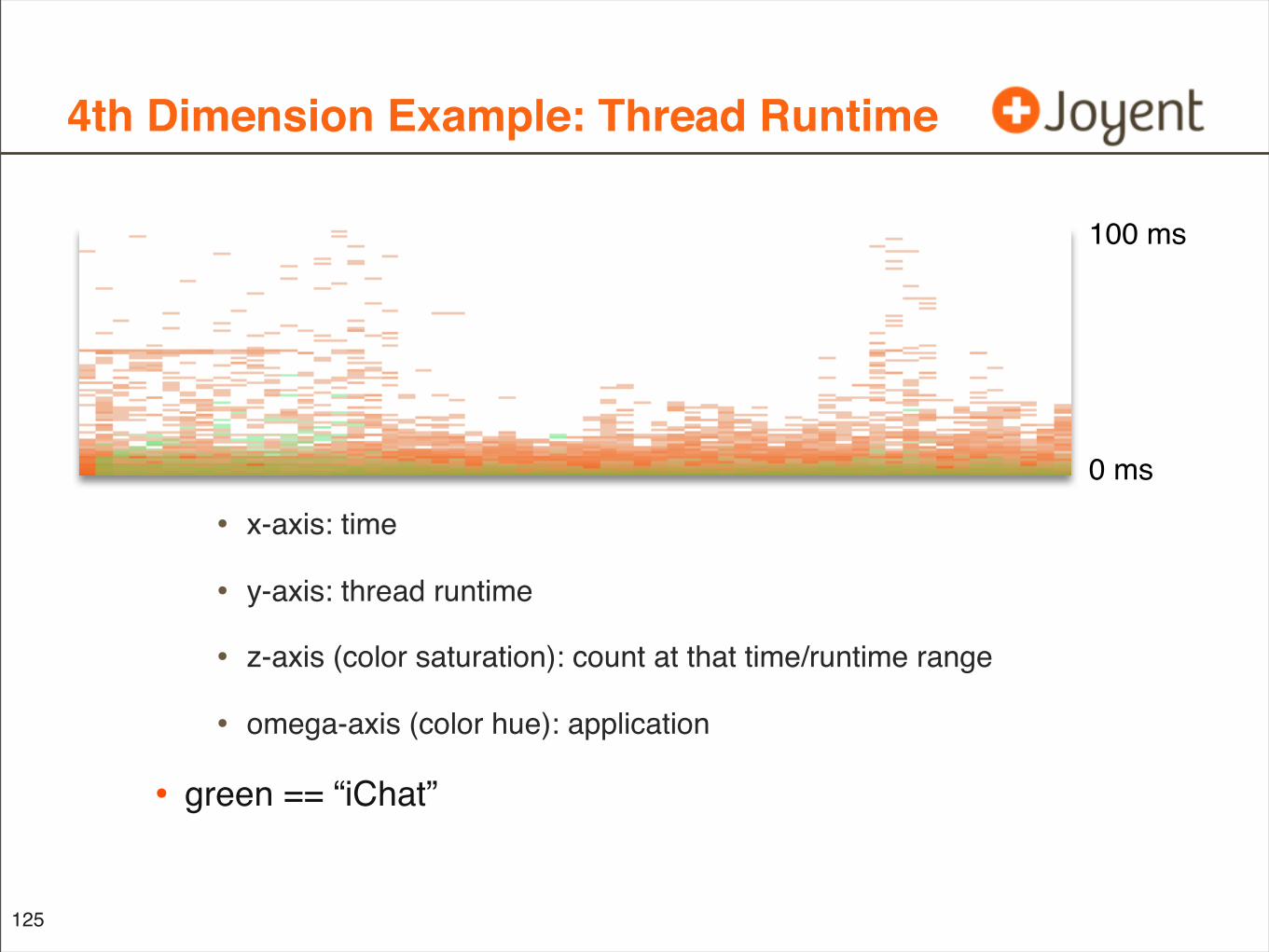
4th Dimension Example: Thread Runtime
• x-axis: time
• y-axis: thread runtime
• z-axis (color saturation): count at that time/runtime range
• omega-axis (color hue): application
• green == “iChat”
125
0 ms
100 ms
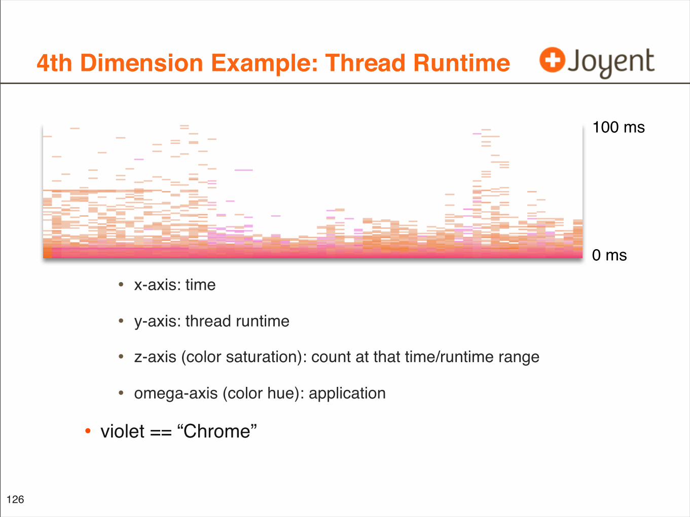
4th Dimension Example: Thread Runtime
• x-axis: time
• y-axis: thread runtime
• z-axis (color saturation): count at that time/runtime range
• omega-axis (color hue): application
• violet == “Chrome”
126
0 ms
100 ms
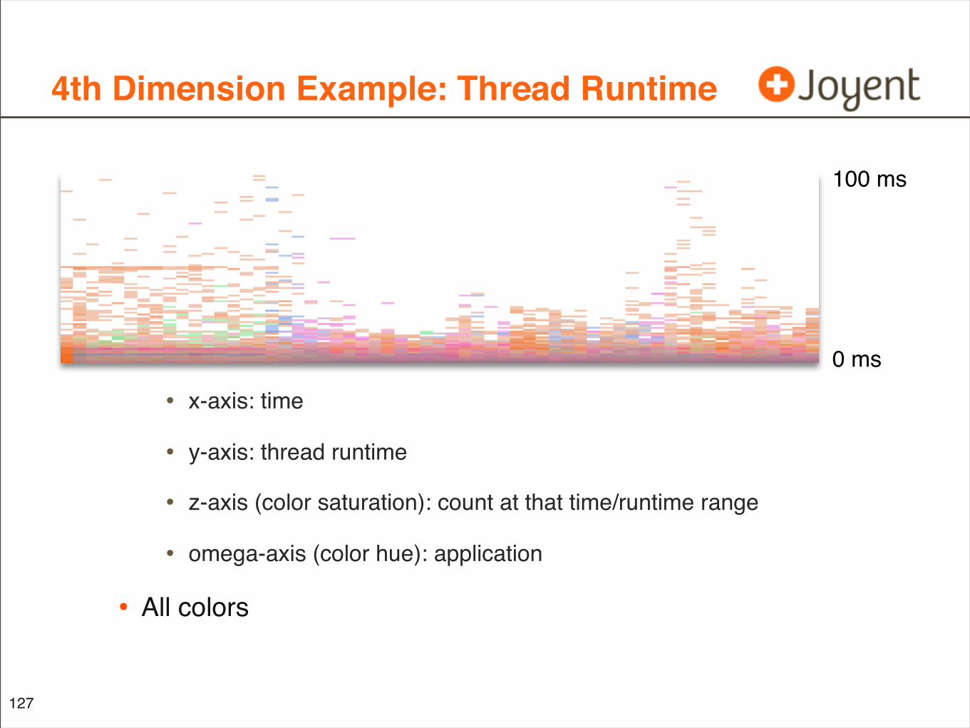
4th Dimension Example: Thread Runtime
• x-axis: time
• y-axis: thread runtime
• z-axis (color saturation): count at that time/runtime range
• omega-axis (color hue): application
• All colors
127
0 ms
100 ms
“Dimensionality”
• While the data supports the 4th dimension, visualizing this properly may become difficult (we are eager to find out)
• The image itself is still only 2 dimensional
• May be best used to view a limited set, to limit the number of different hues; uses can include:
• Highlighting different cloud application types: DB, web server, etc.
• Highlighting one from many components: single node, CPU, disk, etc.
• Limiting the set also helps storage of data
128
More Visualizations
• We plan much more new stuff
• We are building a team of engineers to work on it; including Bryan Cantrill, Dave Pacheo, and mysqlf
• Dave and I have only been at Joyent for 2 1/2 weeks
129
Beyond Performance Analysis
• Visualizations such as heat maps could also be applied to:
• Security, with pattern matching for:
• robot identification based on think-time latency analysis
• inter-keystroke-latency analysis
• brute force username latency attacks?
• System Administration
• monitoring quota usage by user, filesystem, disk
• Other multi-dimensional datasets
130
Objectives
• Consider performance metrics before plotting
• Why latency is good
• ... and IOPS can be bad
• See the value of visualizations
• Why heat maps are needed
• ... and line graphs can be bad
• Remember key examples
• I/O latency, as a heat map
• CPU utilization by CPU, as a heat map
131
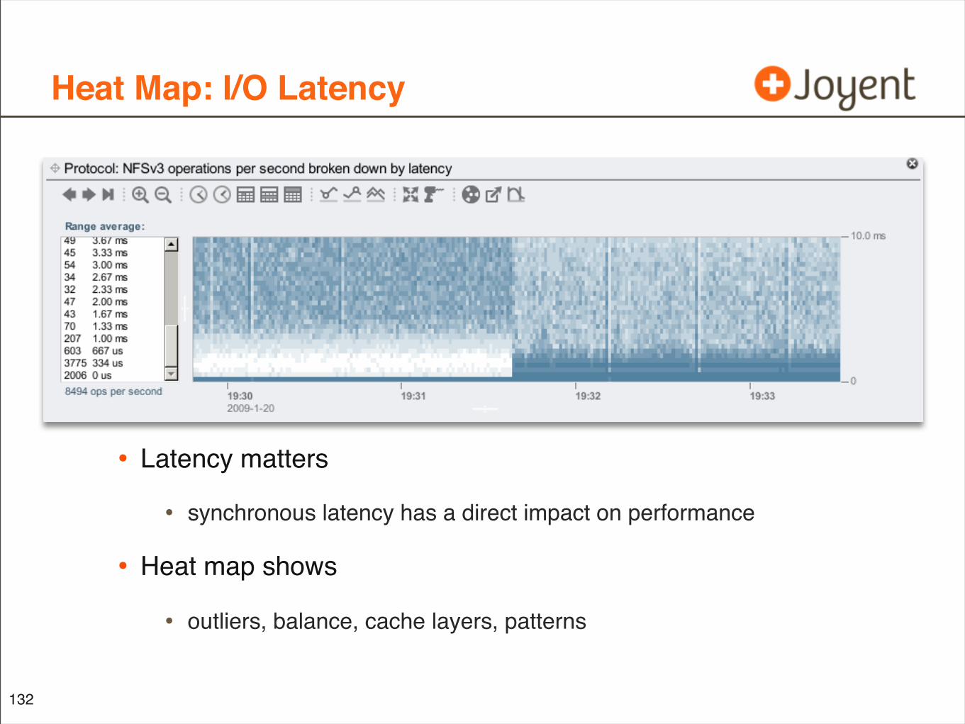
Heat Map: I/O Latency
• Latency matters
• synchronous latency has a direct impact on performance
• Heat map shows
• outliers, balance, cache layers, patterns
132
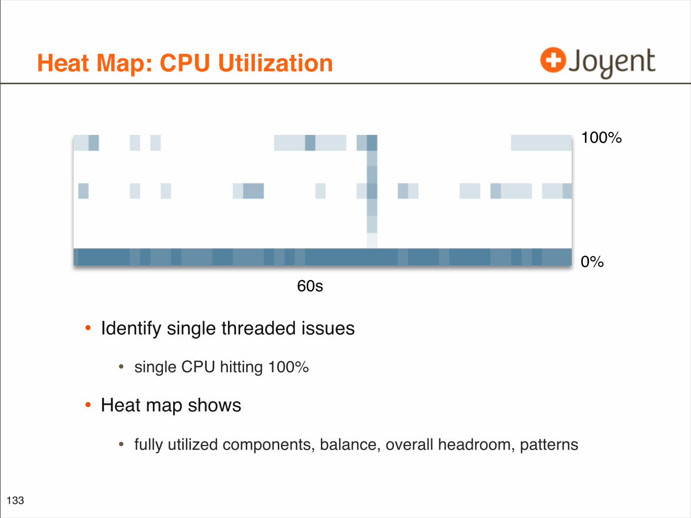
Heat Map: CPU Utilization
• Identify single threaded issues
• single CPU hitting 100%
• Heat map shows
• fully utilized components, balance, overall headroom, patterns
133
100%
0%60s
Tools Demonstrated
134
• For Reference:
• DTraceTazTool
• 2006; based on TazTool by Richard McDougall 1995. Open source, unsupported, and probably no longer works (sorry).
• Analytics
• 2008; Oracle Sun ZFS Storage Appliance
• “new stuff” (not named yet)
• 2010; Joyent; Bryan Cantrill, Dave Pacheco, Brendan Gregg
Question Time
• Thank you!
• How to find me on the web:
• http://dtrace.org/blogs/brendan
• http://blogs.sun.com/brendan <-- is my old blog
• twitter @brendangregg
135