Embed Size (px)
Citation preview

Pertemuan 01
Pendahuluan
Aji Setiawan
Matakuliah : Statistika
Tahun : 2015
Versi : Revisi
1
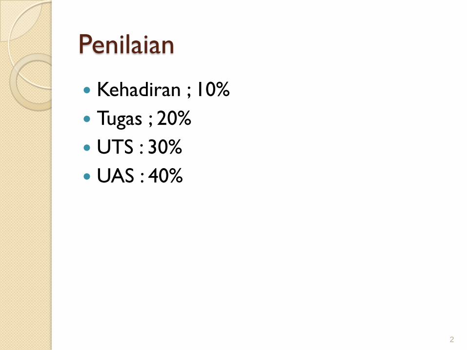
Penilaian
Kehadiran ; 10%
Tugas ; 20%
UTS : 30%
UAS : 40%
2

Learning Outcomes
Pada akhir pertemuan ini, diharapkan mahasiswa
akan mampu :
Mahasiswa akan dapat menjelaskan
tentang statistika, data, populasi, sampel,
variabel, penyajian data, dan skala
pengukuran.
3

Outline Materi
Definisi statistika
Jenis-jenis Data
Pengumpulan dan Penyajian Data
Teknik Sampling
Distribusi Frekuensi
Skala pengukuran
4

What is Statistics?
Analysis of data (in short)
Design experiments and data collection
Summary information from collected data
Draw conclusions from data and make
decision based on finding
5

Design of Survey Research
Choose an Appropriate Mode of Response
◦ Reliable primary modes Personal interview
Telephone interview
Mail survey
◦ Less reliable self-selection modes (not appropriate for making inferences about the population)
Television survey
Internet survey
Printed survey in newspapers and magazines
Product or service questionnaires
6

Reasons for Drawing a Sample
Less Time Consuming Than a Census
Less Costly to Administer Than a Census
Less Cumbersome and More Practical to
Administer Than a Census of the Targeted
Population
7

Types of Sampling Methods
8
Quota
Samples
Non-Probability Samples
(Convenience)
Judgement Chunk
Probability Samples
Simple
Random
Systematic
Stratified
Cluster

Probability Sampling
Subjects of the Sample are Chosen Based
on Known Probabilities
9
Probability Samples
Simple
RandomSystematic Stratified Cluster
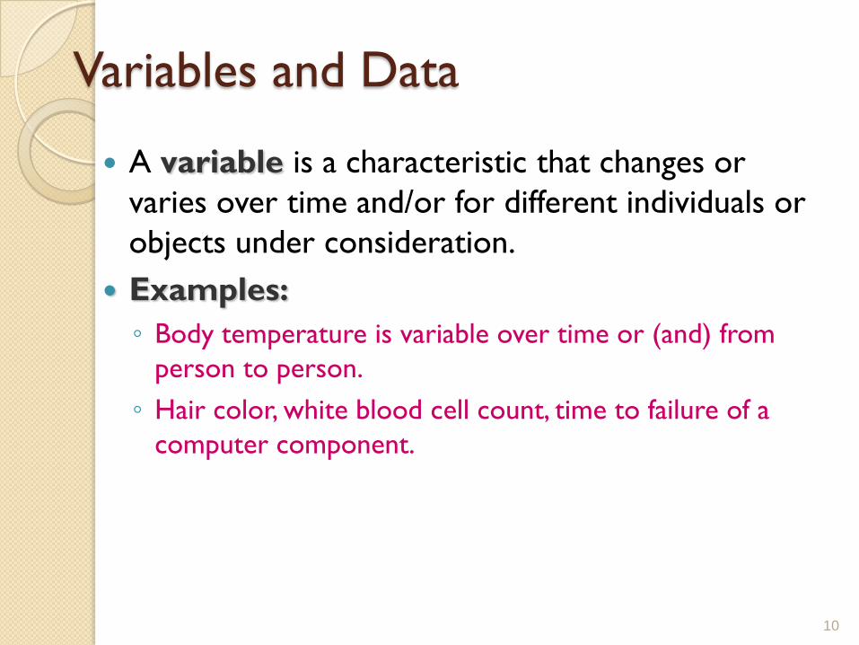
Variables and Data
A variable is a characteristic that changes or
varies over time and/or for different individuals or
objects under consideration.
Examples:
◦ Body temperature is variable over time or (and) from
person to person.
◦ Hair color, white blood cell count, time to failure of a
computer component.
10

Definitions
An experimental unit is the individual or object on which a variable is measured.
A measurement results when a variable is actually measured on an experimental unit.
A set of measurements, called data, can be either a sample or a population.
11

Example
Variable
◦ Hair color
Experimental unit
◦ Person
Typical Measurements
◦Brown, black, blonde, etc.
12
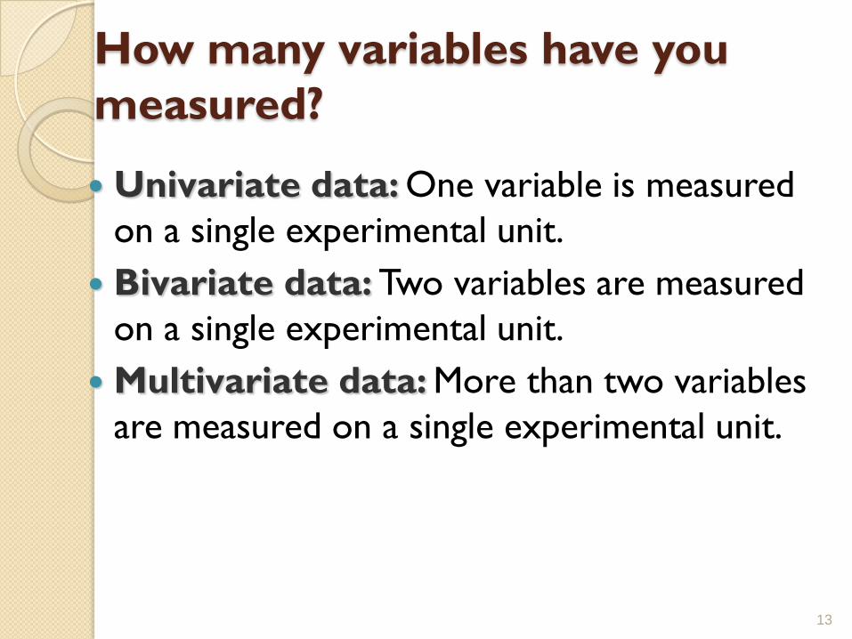
How many variables have you
measured?
Univariate data: One variable is measured
on a single experimental unit.
Bivariate data: Two variables are measured
on a single experimental unit.
Multivariate data: More than two variables
are measured on a single experimental unit.
13

Types of Variables
14
Qualitative Quantitative
Discrete Continuous

Types of Variables
15
•Qualitative variables measure a quality
or characteristic on each experimental
unit. (Categorical Data)
•Examples:•Hair color (black, brown, blonde…)
•Make of car (Dodge, Honda, Ford…)
•Gender (male, female)
•State of birth (California, Arizona,….)

Types of Variables
16
•Quantitative variables measure a
numerical quantity on each experimental
unit.
Discrete if it can assume only a
finite or countable number of values.
Continuous if it can assume the
infinitely many values corresponding
to the points on a line interval.

Examples
For each orange tree in a grove, the number of oranges is measured.
◦ Quantitative discrete
For a particular day, the number of cars entering a college campus is measured.
◦ Quantitative discrete
Time until a light bulb burns out
◦ Quantitative continuous
17

Graphing Qualitative Variables
Use a data distribution to describe:
◦ What values of the variable have been measured
◦ How often each value has occurred
“How often” can be measured 3 ways:
◦ Frequency in each category
◦ Relative frequency = Frequency/n
(proportion in each category)
◦ Percent = 100 x Relative frequency
18

Example A bag of M&M®s contains 25 candies:
Raw Data:
Statistical Table:
19
Color Tally Frequency Relative
Frequency
Percent
Red 5 5/25 = .20 20%
Blue 3 3/25 = .12 12%
Green 2 2/25 = .08 8%
Orange 3 3/25 = .12 12%
Brown 8 8/25 = .32 32%
Yellow 4 4/25 = .16 16%
m
m
m
mm
mm
m
m m
m
m
mm m
m
m m
mmmm
mmm
m
m
m
m
m
m
mmmm
mm
m
m m
m mm m m mm
m m m

Graphs
20
Bar Chart:
How often a particular
category was observed
Pie Chart:
How the measurements are
distributed among the
categories

Graphing Quantitative Variables
A single quantitative variable measured for different population segments or for different categories of classification can be graphed using apie or bar chart.
21
A Big Mac hamburger
costs $3.64 in
Switzerland, $2.44 in
the U.S. and $1.10 in
South Africa.

Dotplots
The simplest graph for quantitative data
Plots the measurements as points on a horizontal axis, stacking the points that duplicate existing points.
Example: The set 4, 5, 5, 7, 6
22
4 5 6 7
Applet

Stem and Leaf Plots A simple graph for quantitative data
Uses the actual numerical values of each data point.
23
–Divide each measurement into two parts: the stemand the leaf.
–List the stems in a column, with a vertical line to their right.
–For each measurement, record the leaf portion in the same row as its matching stem.
–Order the leaves from lowest to highest in each stem.
–Provide a key to your coding.

Example
24
The prices ($) of 18 brands of walking shoes:
90 70 70 70 75 70 65 68 60
74 70 95 75 70 68 65 40 65
4 0
5
6 5 8 0 8 5 5
7 0 0 0 5 0 4 0 5 0
8
9 0 5
4 0
5
6 0 5 5 5 8 8
7 0 0 0 0 0 0 4 5 5
8
9 0 5
Reorder

Tabulating and Graphing Numerical
Data
25
0
1
2
3
4
5
6
7
1 0 2 0 3 0 4 0 5 0 6 0
Numerical Data
Ordered Array
Stem and Leaf
Display
Histograms Ogive
Tables
2 144677
3 028
4 1
41, 24, 32, 26, 27, 27, 30, 24, 38, 21
21, 24, 24, 26, 27, 27, 30, 32, 38, 41
Frequency Distributions
Cumulative Distributions
Polygons
Ogive
0
2 0
4 0
6 0
8 0
1 0 0
1 2 0
1 0 2 0 3 0 4 0 5 0 6 0

Tabulating Numerical Data:
Frequency Distributions
Sort raw data in ascending order:
12, 13, 17, 21, 24, 24, 26, 27, 27, 30, 32, 35, 37, 38, 41, 43, 44, 46,
53, 58
Find range: 58 - 12 = 46
Select number of classes: 5 (usually between 5 and 15)
Compute class interval (width): 10 (46/5 then round up)
Determine class boundaries (limits): 10, 20, 30, 40, 50, 60
Compute class midpoints: 15, 25, 35, 45, 55
Count observations & assign to classes
26

Frequency Distributions, Relative Frequency
Distributions and Percentage Distributions
27
Class Frequency
10 but under 20 3 .15 15
20 but under 30 6 .30 30
30 but under 40 5 .25 25
40 but under 50 4 .20 20
50 but under 60 2 .10 10
Total 20 1 100
Relative
FrequencyPercentage
Data in ordered array:
12, 13, 17, 21, 24, 24, 26, 27, 27, 30, 32, 35, 37, 38, 41, 43, 44, 46, 53, 58

Graphing Numerical Data:
The Histogram
28
Histogram
0
3
6
5
4
2
0
0
1
2
3
4
5
6
7
5 15 25 36 45 55 More
Fre
qu
en
cy
Data in ordered array:
12, 13, 17, 21, 24, 24, 26, 27, 27, 30, 32, 35, 37, 38, 41, 43, 44, 46, 53, 58
No Gaps
Between
Bars
Class MidpointsClass Boundaries

Graphing Numerical Data:
The Frequency Polygon
29
F r e q u e n c y
0
1
2
3
4
5
6
7
5 1 5 2 5 3 6 4 5 5 5 M o r e
Class Midpoints
Data in ordered array:
12, 13, 17, 21, 24, 24, 26, 27, 27, 30, 32, 35, 37, 38, 41, 43, 44, 46, 53, 58

Tabulating Numerical Data:
Cumulative Frequency
30
Cumulative Cumulative
Class Frequency % Frequency
10 but under 20 3 15
20 but under 30 9 45
30 but under 40 14 70
40 but under 50 18 90
50 but under 60 20 100
Data in ordered array:
12, 13, 17, 21, 24, 24, 26, 27, 27, 30, 32, 35, 37, 38, 41, 43, 44, 46, 53, 58

Graphing Numerical Data:
The Ogive (Cumulative % Polygon)
31
Ogive
0
20
40
60
80
100
10 20 30 40 50 60
Class Boundaries (Not Midpoints)
Data in ordered array:
12, 13, 17, 21, 24, 24, 26, 27, 27, 30, 32, 35, 37, 38, 41, 43, 44, 46, 53, 58

Key Concepts
I. How Data Are Generated
1. Experimental units, variables, measurements
2. Samples and populations
3. Univariate, bivariate, and multivariate data
II. Types of Variables
1. Qualitative or categorical
2. Quantitative
a. Discrete
b. Continuous
III. Graphs for Univariate Data Distributions
1. Qualitative or categorical data
a. Pie charts
b. Bar charts
32
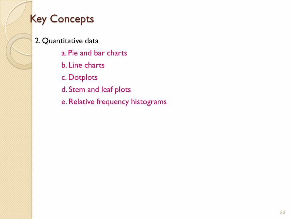
Key Concepts
2. Quantitative data
a. Pie and bar charts
b. Line charts
c. Dotplots
d. Stem and leaf plots
e. Relative frequency histograms
33

Tugas
◦ Jelaskan pengertian dari pengukuran :
Nominal
Ordinal
Interval
Rasio
3434