Embed Size (px)
DESCRIPTION
Practical Tools PhD - Hadley-Wickham
Citation preview
0
10000
20000
000
50000
!
!
!
!
!
!
!
!
!!
!
!
!
!
!
!
!
!
!
!
!
!
!
!!
!
!
!
!
!
!
!
!!
!
!
!
!
!
!
!
!
!
!
!
!
!
!
!
!
!
!
!
!
!
!
!
!
!
!!
!
!
!
!!
!
!!
!
!
!
!
!
!
!!
!!!!!
!
!
!
!!!!
I1
SI2
SI1VVS2
VVS1
IF
!
!
!
!
!
!
!
!
!!!
!
!
!
!
!!
!
!
!
!
!
!
!
!
!
!
!
!
!
!
!
!
!
!!
!
!
!
!
!
!
!
!
!
!
!!
!
!
!
!
!
!
!
!
!
! !
!
!
! !
!
!
!
!
!
!
!
!
!
!
!
!
!
!
!
!
!
!
!
!
!
!
!
!
!
!!
!
!
!!
!
!
!
!
!
!
!
!!
!
!
!!
!
!
!
!
!
!
!
!
!
!
!
!
!
!
!
!
!
!
!
!
!
! !
!
!
!
!
!
!!
!
!
!
!
!
!
!
!
!
!
!
!
!
!!!
!
!
!
!
!
!
!
!
!
!!
!
!
!
!
!
!
!
!!
!
!
!
! !
!!
!
!
!
!
!
!!
!
!
!
! !
!
!
!
!
!
!
!
!
!
!!
!
!
!
!
!
!
!
!
!
!
!
!
!!
!
!
!
!
!! !
!
!
!
!
!
!
!
!
!
!
!
!
!
!
!
!
!!
!
!
!
!
!
!!
!
!
!!
!
!
!
!
!
!
!
!
!
!!
!
!!
!!
!!
!
!
!
!
!
!
!
!
!
!
!
!
!
!
!
!!
!
!
!
!
!
!
!
!
!
!
!
!
!!
!
! !
!!
!
!
!!
!
!!
!
!
!!
!
!
!
!!
!
!
!
!!
!
!
!
!
!
!
!
!
!
!!
!
!
!!
!
!
!
!
!
!
!
!
!
!
!!
!
!
!
!
!
!
!
!
!
!
!
!
!
!
!
!
!!
!!
!
!
!
!
!! !
!
!!!
!
!
!
!
!
!!
!
!
!
!
!
!
!
!
!!
!
!
!
!
!
!
!
!
!
!
!!
!
!
! !
!
!
!
!!
!
!!
!
!
!
!
!
!!!
!
!
!
!
!
!
!
!
!
!
!
!
!
!
!
!
!
!
!
!
!
!
!!
!
!
!
!
!
!
!
!
!
!
!
!
!
!
!!
!
!
!
!
!
!
!
!
!
!
!
! !
!!
!
!!
!!
!!
!
!
!
!
!
!
!
!
!
!
!
!
!
!
!
!
!
!
!
!
!
!
!
!
!
!
!
!
!
!
!!!
!
!
!
!
!
!
!
!
!
!
!!
!
!
!
!!
!
!
!
!!
!
!
!
!
!
!
!
!
!
!
!
!
!
!
!
!
!
!
!
!
!
!
!
!
!
!
!!
!
!
!
!
!
!
!
!
!!
!
!
!
!
!
!
!
!
!
!
!
!
!
!
!
!
!
!
!
!
!
!
! !
!
!
!
! !
!
!!
!
!
!
!
!!
!
!
!
!!
!
!
!
!
!
!
!
!
!
!
!
!
!
!
!
!
!! !
!
!!
!!
!
!
!
!!
!
!!!
!
!!!
!
!
!
!
!
!
!
!
!
!
! !
!
!
!
!
!
!
!
!
!
!
!
!
!
!
!!
!
!
! !
!
!
!
!
!
!
!
!
!
!
!
!
!
!
!
!
!
!
!!
!
!
!
!
!
!
!
!
!
!
!
!
!
!
!
!
!
!
!
!
!
!
!
!!
!
!
!
!!!
!
!
!
!
!
!
!
!
! !
!
!
!
!
!
!
!
!
!!
!
!
!
!
!
!
!
!
!
!
!
!!
!!
!
!
!
!
!!
!
!
!
!
! !!!
!
!!
!
!
!
!
!
!
!
! !!
!
!
!!!
!
!
!
!
!
!
!
!
!
!
!
!!
!
!
!
!
! !
!
!
!
!
!
!!
!
!
!
!
!
!
!
!
!
!
!
!
! !
!
!!
!!
!
!
!
!
!
!
!!
!
!
!
!
!!
!
!
!
!
!
!
!
!!
!
!
!
!
!
!
!
!
!
!
!
!
!
!
!
!
!
!
!
!
!!!
!
!
!
!
!
!
!
!
!
!
!
!
!!
!
!
!
!!!
!
!
!
!
!
!
!
!
!
!
!
!
!
!
!
!
!
!!
!
!
!
!
!!
!
!
!
!
!!
!
!!
!
!
!
!
!
!
!
!
!
!
!
!
!
!
!
!
!!
!! !
!
!
!
!
!!!
!
!
!
!!
!
!! !
!
!
!
!
!
!
!
!
!
!
!
!!
!
!
!
!
!
!!
!
!
!
!
!
!!!
!
!
!
!!
!
!
!
!
!
!
!
!
!
!
!
!
!
!!
!
!
!
!
!
!
!
!
!
!
!
!
!
!
!
!
!
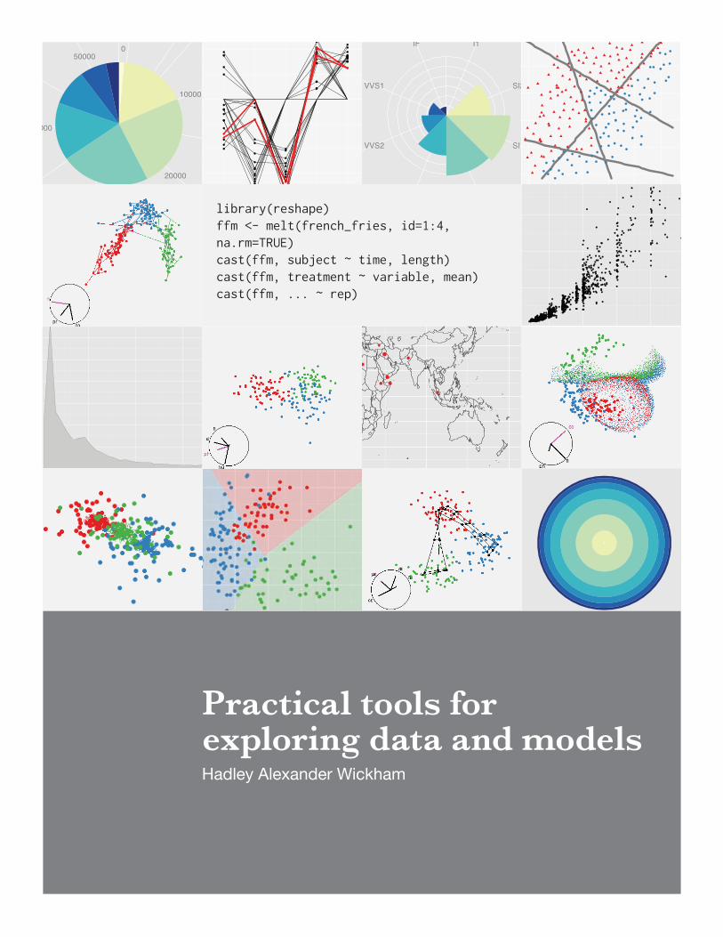
library(reshape)ffm <- melt(french_fries, id=1:4, na.rm=TRUE)cast(ffm, subject ~ time, length)cast(ffm, treatment ~ variable, mean)cast(ffm, ... ~ rep)
Practical tools for exploring data and modelsHadley Alexander Wickham

2

Contents
List of tables 3
List of figures 7
Acknowledgements 11
1 Introduction 131.1 Reshaping data . . . . . . . . . . . . . . . . . . . . . . . . . . . . . . . . . . 131.2 Plotting data . . . . . . . . . . . . . . . . . . . . . . . . . . . . . . . . . . . 141.3 Visualising models . . . . . . . . . . . . . . . . . . . . . . . . . . . . . . . . 15
2 Reshaping data with the reshape package 17Abstract . . . . . . . . . . . . . . . . . . . . . . . . . . . . . . . . . . . . . . . . . 172.1 Introduction . . . . . . . . . . . . . . . . . . . . . . . . . . . . . . . . . . . . 172.2 Conceptual framework . . . . . . . . . . . . . . . . . . . . . . . . . . . . . . 182.3 Melting data . . . . . . . . . . . . . . . . . . . . . . . . . . . . . . . . . . . . 19
2.3.1 Melting data with id variables encoded in column names . . . . . . . 202.3.2 Already molten data . . . . . . . . . . . . . . . . . . . . . . . . . . . 212.3.3 Missing values in molten data . . . . . . . . . . . . . . . . . . . . . . 21
2.4 Casting molten data . . . . . . . . . . . . . . . . . . . . . . . . . . . . . . . 222.4.1 Basic use . . . . . . . . . . . . . . . . . . . . . . . . . . . . . . . . . 222.4.2 High-dimensional arrays . . . . . . . . . . . . . . . . . . . . . . . . . 252.4.3 Lists . . . . . . . . . . . . . . . . . . . . . . . . . . . . . . . . . . . . 262.4.4 Aggregation . . . . . . . . . . . . . . . . . . . . . . . . . . . . . . . . 282.4.5 Margins . . . . . . . . . . . . . . . . . . . . . . . . . . . . . . . . . . 282.4.6 Returning multiple values . . . . . . . . . . . . . . . . . . . . . . . . 29
2.5 Other convenience functions . . . . . . . . . . . . . . . . . . . . . . . . . . . 302.5.1 Factors . . . . . . . . . . . . . . . . . . . . . . . . . . . . . . . . . . . 312.5.2 Data frames . . . . . . . . . . . . . . . . . . . . . . . . . . . . . . . . 312.5.3 Miscellaneous . . . . . . . . . . . . . . . . . . . . . . . . . . . . . . . 31
2.6 Case study: French fries . . . . . . . . . . . . . . . . . . . . . . . . . . . . . 312.6.1 Investigating balance . . . . . . . . . . . . . . . . . . . . . . . . . . . 322.6.2 Tables of means . . . . . . . . . . . . . . . . . . . . . . . . . . . . . . 332.6.3 Investigating inter-rep reliability . . . . . . . . . . . . . . . . . . . . 34
2.7 Where to go next . . . . . . . . . . . . . . . . . . . . . . . . . . . . . . . . . 352.8 Acknowledgements . . . . . . . . . . . . . . . . . . . . . . . . . . . . . . . . 35
3
Contents
3 A layered grammar of graphics 37
Abstract . . . . . . . . . . . . . . . . . . . . . . . . . . . . . . . . . . . . . . . . . 373.1 Introduction . . . . . . . . . . . . . . . . . . . . . . . . . . . . . . . . . . . . 373.2 How to build a plot . . . . . . . . . . . . . . . . . . . . . . . . . . . . . . . . 38
3.2.1 A more complicated plot . . . . . . . . . . . . . . . . . . . . . . . . . 393.2.2 Summary . . . . . . . . . . . . . . . . . . . . . . . . . . . . . . . . . 42
3.3 Components of the layered grammar . . . . . . . . . . . . . . . . . . . . . . 423.3.1 Layers . . . . . . . . . . . . . . . . . . . . . . . . . . . . . . . . . . . 443.3.2 Scales . . . . . . . . . . . . . . . . . . . . . . . . . . . . . . . . . . . 463.3.3 Coordinate system . . . . . . . . . . . . . . . . . . . . . . . . . . . . 473.3.4 Faceting . . . . . . . . . . . . . . . . . . . . . . . . . . . . . . . . . . 48
3.4 A hierarchy of defaults . . . . . . . . . . . . . . . . . . . . . . . . . . . . . . 483.5 An embedded grammar . . . . . . . . . . . . . . . . . . . . . . . . . . . . . 513.6 Implications of the layered grammar . . . . . . . . . . . . . . . . . . . . . . 52
3.6.1 Histograms . . . . . . . . . . . . . . . . . . . . . . . . . . . . . . . . 533.6.2 Polar coordinates . . . . . . . . . . . . . . . . . . . . . . . . . . . . . 543.6.3 Transformations . . . . . . . . . . . . . . . . . . . . . . . . . . . . . 55
3.7 Perceptual issues . . . . . . . . . . . . . . . . . . . . . . . . . . . . . . . . . 583.8 A poetry of graphics? . . . . . . . . . . . . . . . . . . . . . . . . . . . . . . . 593.9 Conclusions . . . . . . . . . . . . . . . . . . . . . . . . . . . . . . . . . . . . 603.10 Acknowledgements . . . . . . . . . . . . . . . . . . . . . . . . . . . . . . . . 61
4 Visualising statistical models: Removing the blindfold 63
Abstract . . . . . . . . . . . . . . . . . . . . . . . . . . . . . . . . . . . . . . . . . 634.1 Introduction . . . . . . . . . . . . . . . . . . . . . . . . . . . . . . . . . . . . 634.2 What is a model? Terminology and definitions . . . . . . . . . . . . . . . . . 654.3 Display the model in data-space . . . . . . . . . . . . . . . . . . . . . . . . . 66
4.3.1 Tools for visualising high-d data and models . . . . . . . . . . . . . . 664.3.2 Representing models as data . . . . . . . . . . . . . . . . . . . . . . 674.3.3 Case study: MANOVA . . . . . . . . . . . . . . . . . . . . . . . . . . 684.3.4 Case study: Classification models . . . . . . . . . . . . . . . . . . . . 704.3.5 Case study: Hierarchical clustering . . . . . . . . . . . . . . . . . . . 72
4.4 Collections are more informative than singletons . . . . . . . . . . . . . . . 734.4.1 Case study: Linear models . . . . . . . . . . . . . . . . . . . . . . . . 76
4.5 Don’t just look at the final result; explore how the algorithm works . . . . . 784.5.1 Case study: Projection pursuit . . . . . . . . . . . . . . . . . . . . . . 804.5.2 Case study: self organising maps . . . . . . . . . . . . . . . . . . . . 81
4.6 Pulling it all together: visualising neural networks . . . . . . . . . . . . . . . 844.6.1 Model in data space . . . . . . . . . . . . . . . . . . . . . . . . . . . 854.6.2 Looking at multiple models: ensemble . . . . . . . . . . . . . . . . . 864.6.3 Looking at multiple models: random starts . . . . . . . . . . . . . . . 864.6.4 Real data . . . . . . . . . . . . . . . . . . . . . . . . . . . . . . . . . 88
4.7 Conclusion . . . . . . . . . . . . . . . . . . . . . . . . . . . . . . . . . . . . 894.8 Acknowledgements . . . . . . . . . . . . . . . . . . . . . . . . . . . . . . . . 90
4

Contents
5 Conclusion and future plans 915.1 Practical tools . . . . . . . . . . . . . . . . . . . . . . . . . . . . . . . . . . . 915.2 Data analysis . . . . . . . . . . . . . . . . . . . . . . . . . . . . . . . . . . . 925.3 Impact . . . . . . . . . . . . . . . . . . . . . . . . . . . . . . . . . . . . . . . 925.4 Future work . . . . . . . . . . . . . . . . . . . . . . . . . . . . . . . . . . . . 935.5 Final words . . . . . . . . . . . . . . . . . . . . . . . . . . . . . . . . . . . . 93
Bibliography 94
5

Contents
6

List of Tables
2.1 First few rows of the French fries dataset . . . . . . . . . . . . . . . . . . . . 32
3.1 Simple dataset. . . . . . . . . . . . . . . . . . . . . . . . . . . . . . . . . . . 383.2 Simple dataset with variables named according to the aesthetic that they use. 383.3 Simple dataset with variables mapped into aesthetic space. . . . . . . . . . . 393.4 Simple dataset faceted into subsets. . . . . . . . . . . . . . . . . . . . . . . . 413.5 Local scaling, where data are scaled independently within each facet. Note
that each facet occupies the full range of positions, and only uses one colour.Comparisons across facets are not necessarily meaningful. . . . . . . . . . . 42
3.6 faceted data correctly mapped to aesthetics. Note the similarity to Table 3.3. 423.7 Some statistical transformations provided by ggplot2. The user is able to
supplement this list in a straight forward manner. . . . . . . . . . . . . . . . 453.8 Specification of Figure 3.11 in GPL (top) and ggplot2 (bottom) syntax. . . . 52
7

List of Tables
8

List of Figures
3.1 Graphics objects produced by (from left to right): geometric objects, scalesand coordinate system, plot annotations. . . . . . . . . . . . . . . . . . . . . 40
3.2 The final graphic, produced by combining the pieces in Figure 3.1. . . . . . 403.3 A more complicated plot, which is faceted by variable D. Here the faceting
uses the same variable that is mapped to colour so that there is some redun-dancy in our visual representation. This allows us to easily see how the datahas been broken into panels. . . . . . . . . . . . . . . . . . . . . . . . . . . . 41
3.4 Mapping between components of Wilkinson’s grammar (left) and the lay-ered grammar (right) . . . . . . . . . . . . . . . . . . . . . . . . . . . . . . . 43
3.5 Difference between GPL (top) and ggplot2 (bottom) parameterisations. . . 443.6 Four representations of an interval geom. From left to right: as a bar, as a
line, as a error bar, and (for continuous x) as a ribbon. . . . . . . . . . . . . 463.7 Examples of four scales from ggplot2. From left to right: continuous variable
mapped to size and colour, discrete variable mapped to shape and colour.The ordering of scales seems upside-down, but this matches the labelling ofthe y-axis: small values occur at the bottom. . . . . . . . . . . . . . . . . . . 47
3.8 Examples of axes and grid lines for three coordinate systems: Cartesian,semi-log and polar. The polar coordinate system illustrates the difficultiesassociated with non-Cartesian coordinates: it is hard to draw the axes cor-rectly! . . . . . . . . . . . . . . . . . . . . . . . . . . . . . . . . . . . . . . . 48
3.9 Difference between GPL (top) and ggplot2 (bottom) parameterisations. Notethat z is included in the position specification for the GPL element. . . . . . 48
3.10 (Left) Scatterplot of price vs carat. (Right) scatterplot of price vs carat, withlog-transformed scales, and a linear smooth layered on top. . . . . . . . . . 49
3.11 Plot of birth rate minus death rate in selected countries. . . . . . . . . . . . 513.12 Two histograms of diamond price produced by the histogram geom. (Left)
Default bin width, 30 bins. (Right) Custom $50 bin width reveals missingdata. . . . . . . . . . . . . . . . . . . . . . . . . . . . . . . . . . . . . . . . 53
3.13 Variations on the histogram. Using a ribbon (left) to produce a frequencypolygon, or points (right) to produce an unnamed graphic. . . . . . . . . . . 54
3.14 Pie chart (left) and bullseye chart (right) showing the distribution of dia-monds across clarity (I1 is worst, IF is best). A radial chart is the polarequivalent of the spineplot: in the pie chart, categories have equal radiusand variable angle; in the radial chart, categories have equal angle and vari-able radius. . . . . . . . . . . . . . . . . . . . . . . . . . . . . . . . . . . . . 55
9
List of Figures
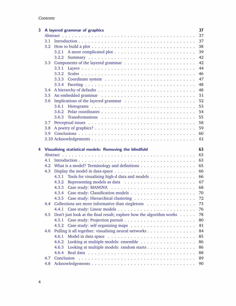
3.15 Bar chart (left) and equivalent Coxcomb plot (right) of clarity distribution.The Coxcomb plot is a bar chart in polar coordinates. Note that the cate-gories abut in the Coxcomb, but are separated in the bar chart: this is anexample of a graphical convention that differs in different coordinate systems. 56
3.16 Transforming the data (left) vs transforming the scale (right). From a dis-tance the plots look identical. Close inspection is required to see that thescales and minor grid lines are different. Transforming the scale is to bepreferred as the axes are labelled according to the original data, and so areeasier to interpret. The presentation of the labels still requires work. . . . . 56
3.17 Transforming the scales (left) vs transforming the coordinate system (right).Coordinate system transformations are the final step in drawing the graphic,and affect the shape of geometric objects. Here a straight line becomes acurve. . . . . . . . . . . . . . . . . . . . . . . . . . . . . . . . . . . . . . . . 57
3.18 Linear model fit to raw data (left) vs linear model fit to logged data, thenback-transformed to original scale (right). . . . . . . . . . . . . . . . . . . . 57
4.1 Three interesting projections from the grand tour of the wine data, illus-trating (from left to right) an outlying blue point, an outlying red point,and that the groups are fairly distinct. Animated version available at http://vimeo.com/823263. . . . . . . . . . . . . . . . . . . . . . . . . . . . . . . 67
4.2 (Far left) The active window containing the brush, and (right) the cor-responding points brushed in another view, with three snapshots as wemove the brush down. Selected points are enlarged and coloured black.Here brushing shows us that the data lies in a spiral in 3d: as we movearound the 2d curve from mid-right to bottom-left we move from highto low values of the conditioned variable. Animated version available athttp://vimeo.com/823262. . . . . . . . . . . . . . . . . . . . . . . . . . . . 68
4.3 Example where MANOVA would detect a difference between the groups, buttwo ANOVAs would not. Groups are distinct in 2d (left), but overlap on bothmargins (right). . . . . . . . . . . . . . . . . . . . . . . . . . . . . . . . . . . 69
4.4 Two projections of the wine data with 84% confidence regions around thegroup means. Large points are data, small points are a sample on the surfaceof the confidence region. While the confidence ellipsoids appear to overlapin a few projections (left), in most views we see that the means are distant(right). The groups may overlap, but their means are significantly different. 69
4.5 A 2d LDA classifier on the wine dataset. (Left) entire classification regionshown and (right) only boundary between regions. Data points are shownas large circles. . . . . . . . . . . . . . . . . . . . . . . . . . . . . . . . . . . 70
4.6 Views of a 3d radial SVM classifier. From left to right: boundary, red, greenand blue regions. Variables used: color, phenols, and flavanoids. Animatedversion available at http://vimeo.com/821284. . . . . . . . . . . . . . . . . 71
10

List of Figures
4.7 Informative views of a 5d SVM with polynomial kernel. It’s possible to seethat the boundaries are largely linear, with a “bubble” of blue pushing intothe red. A video presentation of this tour is available at . Variables used:color, phenols, flavanoids, proline and dilution. Animated version availablefrom http://vimeo.com/823271. . . . . . . . . . . . . . . . . . . . . . . . . 71
4.8 Dendrograms from a hierarchical clustering performed on wine dataset. (Left)Wards linkage and (right) single linkage. Points coloured by wine variety.Wards linkage finds three clusters of roughly equal size, which correspondfairly closely to three varieties of wine. Single linkage creates many clustersby adding a single point, producing the dark diagonal stripes. . . . . . . . . 72
4.9 (Right) A informative projection of the flavanoid, colour, and proline vari-ables for a hierarchical clustering of the wine data, with Wards linkage.Edges are coloured by cluster, to match the majority variety. The varietiesare arranged in a rough U shape, with a little overlap, and some of the out-lying blue points have been clustered with the red points. (Left) Only redlinks and blue points shown to focus in on the points that clustered with thewrong group. Animated version available at http://vimeo.com/768329. . . 73
4.10 Relationship between five levels of summary statistics for a collection of lin-ear models. Arrows indicate one-to-many relationships, e.g. for each model-level summary, there are many model-observation and model-estimate statis-tics. . . . . . . . . . . . . . . . . . . . . . . . . . . . . . . . . . . . . . . . . 77
4.11 Model summary statistics, each scaled to [0, 1] to aid comparison. A greyline connects the best models. The intercept only model is not displayed.Degrees of freedom include calculation of intercept and variance. Thesesummary statistics suggest that a 6 df/4 variable model has the best tradeoffbetween complexity and performance. . . . . . . . . . . . . . . . . . . . . . 77
4.12 (Left) Raw coefficients are useful when variables are measured on a com-mon scale. (Right) In this case, as with most data sets, looking at the stan-dardised coefficients is more informative, as we can judge relative strengthon a common scale. The education variable has the most negative coeffi-cients. Only catholic and infant mortality variables are consistently relatedto increased fertility. . . . . . . . . . . . . . . . . . . . . . . . . . . . . . . . 78
4.13 (Left) Parallel coordinates plot of standardised coefficient vs variable. (Right)Scatterplot of R2 vs degrees of freedom. The four models with positive val-ues of the agriculture coefficient have been highlighted in both plots. Thesemodels all fit the data poorly, and include neither examination nor educa-tion variables. . . . . . . . . . . . . . . . . . . . . . . . . . . . . . . . . . . . 79
4.14 (Left) Scatterplot of R2 vs degrees of freedom. (Right) Parallel coordinatesplot of standardised coefficient vs variable. The two best models have beenhighlighted in red in both plots. . . . . . . . . . . . . . . . . . . . . . . . . . 79
4.15 Variation of the clumpy index over time. Simulated annealing with 20 ran-dom starts, run until 40 steps or 400 tries. Red points indicate the fourhighest values. . . . . . . . . . . . . . . . . . . . . . . . . . . . . . . . . . . 81
11
List of Figures
4.16 Four projections of the data with highest values of clumpiness, found by thesimulated annealing shown in Figure 4.15. Plots are ordered left to rightfrom highest to lowest. All these projections have good separation betweenthe green group at the others, but not between the red and blue groups.Looking at the top 15 maxima does not find any projections that separatethese two groups. . . . . . . . . . . . . . . . . . . . . . . . . . . . . . . . . 81
4.17 One of the guided tour runs of Figure 4.15 with new guided tours launchedfrom particularly good projections. Red line shows path of original simu-lated annealing. . . . . . . . . . . . . . . . . . . . . . . . . . . . . . . . . . . 82
4.18 (Left) A visualisation of the model space. Each node is represented by a bya Coxcomb plot which represents the position of that node in the data space.(Right) A projection of the model embedded in the data space. . . . . . . . 82
4.19 (Top) Time series of mean distance from point to corresponding node, overtime. (Bottom) Distance to corresponding node for each individual point.Note the difference in scale! Mean points are coloured by radius. Alpha isnot displayed, but deceases linearly from 0.05 to 0. . . . . . . . . . . . . . . 83
4.20 Iterations 1, 5, 25 and 100. After only one iteration the model seems to runthrough the centre of groups fairly well, and changes little over the next 99iterations. The net performs as we expect, extracting the 1d path betweenthe 3 groups. . . . . . . . . . . . . . . . . . . . . . . . . . . . . . . . . . . . 84
4.21 Simple two class, two dimension, classification problem. The classes can becompletely separated by an easily seen non-linear boundary. . . . . . . . . . 85
4.22 Visualising the classification surface. (Left) An image plot, showing proba-bility that a new observation belongs to class B, and (right) a contour plotshowing five iso-probability contour lines (10%, 25%, 50%, 75%, 90%).This classifier perfectly distinguishes the two classes, and is very sharp. . . . 85
4.23 Visualisation of the hidden nodes of a neural network. (Top) The probabilitysurfaces for the hidden nodes are displayed side-by-side. (Bottom) The 50%probability contours from the nodes are overlaid on a single plot. We seehow each node identifies one linear break producing the final classificationboundary shown in Figure 4.22. . . . . . . . . . . . . . . . . . . . . . . . . . 87
4.24 Summary of 600 neural networks with two, three and four hidden nodes.(Top) Scatterplot of prediction accuracy vs internal criterion. (Bottom) His-tograms of prediction accuracy. Most networks achieve an accuracy of 92%,with just a few that do much better or much worse. . . . . . . . . . . . . . . 87
4.25 Classification boundaries from all 600 neural networks, broken down bynumber of numbers and groups based on accuracy. Sub-linear models haveaccuracy in [0%, 91.5%], linear in [91.5%, 92.5%], super-linear in [92.5%, 98%],and excellent in [98%, 100%]. Most of the boundaries are linear, a few getone of the bumps, and quite a few of the four node networks get the overallform right, even if they are not perfectly accurate. . . . . . . . . . . . . . . . 88
4.26 How the 50% probability line for each node changes with time. 100 runswith 5 iterations between each. Nodes start similarly, move rapidly in thefirst few iterations, then slow down, converging to surfaces that are quitedifferent. Animated version available at http://www.vimeo.com/767832. . 89
12

Acknowledgements
First and foremost, I would like to thank my major professors, Di Cook and Heike Hof-mann. They have unstintingly shared their fantastic excitement about, and knowledge of,statistical graphics and data analysis. They have helped me to have a truly internationaleducation and have introduced me to many important figures in the field. They have keptme motivated throughout my PhD and have bought me far too many coffees and cakes. Ican only hope that I can be as good towards my future students as they have been to me.
Many others have shaped this thesis. The generous support of Antony Unwin and TonyRossini allowed me to spend two summers in Europe learning from masters of statisticalgraphics and computing. Discussions with Leland Wilkinson and Graham Wills (in personand over email) have substantially deepened my understanding of the grammar. PhilipDixon has never hesitated to share his encyclopaedic knowledge of statistical procedures,and has provided me with so many interesting problems through the AES consulting group.My entire committee have provided many interesting questions and have challenged meto think about my personal philosophy of statistics.
Last but not least, I’d like to thank my family for their unceasing love and support (notto mention the financial rescue packages!) and my friends, in Ames and in Auckland, forkeeping me sane!
13

List of Figures
14
Chapter 1
Introduction
This thesis describes three families of tools for exploring data and models. It is organisedin roughly the same way that you perform a data analysis. First, you get the data in a formthat you can work with; Section 1.1 introduces the reshape framework for restructuringdata, described fully in Chapter 2. Second, you plot the data to get a feel for what isgoing on; Section 1.2 introduces the layered grammar of graphics, described in Chapter 3.Third, you iterate between graphics and models to build a succinct quantitative summaryof the data; Section 1.3 introduces strategies for visualising models, discussed in Chapter 4.Finally, you look back at what you have done, and contemplate what tools you need to dobetter in the future; Chapter 5 summarises the impact of my work and my plans for thefuture.
The tools developed in this thesis are firmly based in the philosophy of exploratory dataanalysis (Tukey, 1977). With every view of the data, we strive to be both curious andsceptical. We keep an open mind towards alternative explanations, never believing wehave found the best model. Due to space limitations, the following papers only give aglimpse at this philosophy of data analysis, but it underlies all of the tools and strategiesthat are developed. A fuller data analysis, using many of the tools developed in this thesis,is available in Hobbs et al. (To appear).
1.1 Reshaping data
While data is a crucial part of statistics, it is not often that the form of data itself is discussed.Most of our methods assume that the data is a rectangular matrix, with observations in therows and variables in the columns. Unfortunately, this is rarely how people collect andstore data. Client data is never in the correct format and often requires extensive work toget it into the right form for analysis.
Data reshaping is not a traditional statistical topic, but it is an important part of dataanalysis. Unfortunately it has largely been overlooked in the statistical literature. It is dis-cussed in the computer science and database literature (Gray et al., 1997; Shoshani, 1997)but these communities fail to address particularly statistical concerns, such as missing dataand the need to adjust the roles of rows and columns for particular analyses.
Chapter 2 describes a framework that encompasses statistical ideas of data reshapingand aggregating. The reshape framework divides the task into two components, first de-scribing the structure of the input data (melting) and then the structure of the output
15
1 Introduction
(casting). This framework is implemented in the reshape package and the chapter hasbeen published in the Journal of Statistical Software (Wickham, 2007c).
1.2 Plotting data
Plotting data is a critical part of exploratory data analysis, helping us to see the bulk of ourdata, as well as highlighting the unusual. As Tukey once said: “numerical quantities focuson expected values, graphical summaries on unexpected values.”
Unfortunately, current open-source systems for creating graphics are sorely lacking froma practical perspective. The R environment for statistical computing provides the richest setof graphical tools, split into two libraries: base graphics (R Development Core Team, 2007)and lattice (Sarkar, 2006). Base graphics has a primitive pen on paper model, and whilelattice is a step up, it has fundamental limitations. Compared to base graphics, lattice takescare of many of the minor technical details that require manual tweaking in base graphics,in particular providing matching legends and maintaining common scales across multipleplots. However, attempting to extend lattice raises fundamental questions: why are thereseparate functions for scatterplot and dotplots when they seem so similar? Why can youonly log transform scales and not use other functions? What makes adding error bars toa plot so complicated? Extending lattice also reveals another problem. Once a lattice plotobject is created, it is very difficult to modify it in a maintainable way: the components ofthe lattice model of graphics (Becker et al., 1996) are designed for a very specific type ofdisplay, and do not generalise well to other graphics we may wish to produce.
To do better, we need a framework that incorporates a very wide range of graphics.There have been two main attempts to develop such a framework of statistical graphics, byBertin and Wilkinson. Bertin (1983) focuses on geographical visualisation, but also laysout principles for sound graphical construction, including suggested mappings betweendifferent types of variables and visual properties. All graphics are hand drawn, and whilethe underlying principles are sound, the practice of drawing graphics on a computer israther different. The Grammar of Graphics (Wilkinson, 2005) is more modern and presentsa way to concisely and formally describe a graphic. Instead of coming up with a newname for your graphic, and giving a lengthy, textual description, you can instead describethe exact components which define your graphic. The grammar is composed of sevencomponents, as follows:
• Data. The most important part of any plot. Data reshaping is the responsibility ofthe algebra, which consists of three operators (nesting, crossing and blending).
• Transformations create new variables from functions of existing variables, e.g. log-transforming a variable.
• Scales control the mapping between variables and aesthetic properties like colourand size.
• The geometric element specifies the type of object used to display the data, e.g.points, lines, bars.
16
1.3 Visualising models
• A statistic optionally summarises the data. Statistics are critical parts of certaingraphics (e.g. the bar chart and histogram).
• The coordinate system is responsible for computing positions on the 2d plane ofthe plotting surface, which is usually the Cartesian coordinate system. A subset ofthe coordinate system is facetting, which displays different subsets of the data insmall multiples, generalisation of trellising (Becker et al., 1996) which allows fornon-rectangular layout.
• Guides, axes and legends, enable the reading of data values from the graph.
Wilkinson’s grammar successfully describes a broad range of graphics, but is hamperedby a lack of an available implementation: we can not use the grammar or test its claims.These issues are discussed by Cox (2007), which provides a comprehensive review of thebook.
To resolve these two problems, I implemented the grammar in R. This started as a directimplementation of the ideas in the book, but as I proceeded it became clear that thereare areas in which the grammar could be improved. This lead to the development ofa grammar of layered graphics, described in Chapter 3. The work extends and refinesthe work of Wilkinson, and is implemented in the R package ggplot2 (Wickham, 2008).This chapter has been tentatively accepted by the Journal of Computational and GraphicalStatistics, and a revised version will be resubmitted shortly.
1.3 Visualising models
Graphics give us a qualitative feel for the data, helping us to make sense of what’s goingon. That is often not enough: many times we also need a precise mathematical modelwhich allows us to make predictions with quantifiable uncertainty. A model is also usefulas a concise mathematical summary, succinctly describing the main features of the data.
To build a good model, we need some way to compare it to the data and investigatehow well it captures the salient features. To understand the model and how well it fits thedata, we need tools for exploratory model analysis Unwin et al. (2003); Urbanek (2004).Graphics and models make different assumptions and have different biases. Models are notprone to human perceptual biases caused by the simplifying assumptions we make aboutthe world, but they do have their own set of simplifying assumptions, typically requiredto make mathematical analysis tractable. Using one to validate the other allows us toovercome the limitations of each.
Chapter 4 describes three strategies for visualising statistical models. These strategiesemphasise displaying the model in the context of the data, looking at many models and ex-ploring the process of model fitting, as well as the final result. This chapter pulls togethermy experience building visualisations for classification, clustering and ensembles of linearmodels, as implemented by the R packages clusterfly (Wickham, 2007b), classifly(Wickham, 2007a), and meifly (Wickham, 2007a). I plan to submit this paper to Compu-tational Statistics.
17

1 Introduction
18
Chapter 2
Reshaping data with the reshape package
Abstract
This paper presents the reshape package for R, which provides a common framework formany types of data reshaping and aggregation. It uses a paradigm of ‘melting’ and ‘cast-ing’, where the data are ‘melted’ into a form which distinguishes measured and identifyingvariables, and then ‘cast’ into a new shape, whether it be a data frame, list, or high dimen-sional array. The paper includes an introduction to the conceptual framework, practicaladvice for melting and casting, and a case study.
2.1 Introduction
Reshaping data is a common task in real-life data analysis, and it’s usually tedious andfrustrating. You’ve struggled with this task in Excel, in SAS, and in R: how do you get yourclients’ data into the form that you need for summary and analysis? This paper describesversion 0.8.1 of the reshape package for R (R Development Core Team, 2007), whichpresents a new approach that aims to reduce the tedium and complexity of reshaping data.
Data often has multiple levels of grouping (nested treatments, split plot designs, or re-peated measurements) and typically requires investigation at multiple levels. For example,from a long term clinical study we may be interested in investigating relationships overtime, or between times or patients or treatments. To make your job even more difficult,the data probably has been collected and stored in a way optimised for ease and accuracyof collection, and in no way resembles the form you need for statistical analysis. You needto be able to fluently and fluidly reshape the data to meet your needs, but most softwarepackages make it difficult to generalise these tasks, and new code needs to be written foreach new case.
While you’re probably familiar with the idea of reshaping, it is useful to be a little moreformal. Data reshaping involves a rearrangement of the form, but not the content, of thedata. Reshaping is a little like creating a contingency table, as there are many ways toarrange the same data, but it is different in that there is no aggregation involved. Thetools presented in this paper work equally well for reshaping, retaining all existing data,and aggregating, summarising the data, and later we will explore the connection betweenthe two.
In R, there are a number of general functions that can aggregate data, for example
19
2 Reshaping data with the reshape package
tapply, by and aggregate, and a function specifically for reshaping data, reshape. Eachof these functions tends to deal well with one or two specific scenarios, and each requiresslightly different input arguments. In practice, you need careful thought to piece togetherthe correct sequence of operations to get your data into the form that you want. Thereshape package grew out of my frustrations with reshaping data for consulting clients,and overcomes these problems with a general conceptual framework that uses just twofunctions: melt and cast.
The paper introduces this framework, which will help you think about the fundamentaloperations that you perform when reshaping and aggregating data, but the main emphasisis on the practical tools, detailing the many forms of data that melt can consume and thatcast can produce. A few other useful functions are introduced, and the paper concludeswith a case study, using reshape in a real-life example.
2.2 Conceptual framework
To help us think about the many ways we might rearrange a data set, it is useful to thinkabout data in a new way. Usually, we think about data in terms of a matrix or data frame,where we have observations in the rows and variables in the columns. For the purposes ofreshaping, we can divide the variables into two groups: identifier and measured variables.
1. Identifier (id) variables identify the unit that measurements take place on. Id vari-ables are usually discrete, and are typically fixed by design. In ANOVA notation (Yijk),id variables are the indices on the variables (i, j, k); in database notation, id variablesare a composite primary key.
2. Measured variables represent what is measured on that unit (Y ).
It is possible to take this abstraction one step further and say there are only id variables anda value, where the id variables also identify what measured variable the value represents.For example, we could represent this data set, which has two id variables (subject andtime):
subject time age weight height1 John Smith 1 33 90 22 Mary Smith 1 2
as:
subject time variable value1 John Smith 1 age 332 John Smith 1 weight 903 John Smith 1 height 24 Mary Smith 1 height 2
where each row now represents one observation of one variable. This operation is calledmelting and produces ‘molten’ data. Compared to the original data set, the molten datahas a new id variable ‘variable’, and a new column ‘value’, which represents the value of
20
2.3 Melting data
that observation. We now have the data in a form in which there are only id variables anda value.
From this form, we can create new forms by specifying which variables should form thecolumns and rows. In the original data frame, the ‘variable’ id variable forms the columns,and all identifiers form the rows. We don’t have to specify all the original id variables inthe new form. When we don’t, the combination of id variables will no longer identify onevalue, but many, and we will aggregate the data as well as reshaping it. The function thatreduces these many numbers to one is called an aggregation function.
The following section describes the melting operation in detail, as implemented in thereshape package.
2.3 Melting data
Melting a data frame is a little trickier in practice than it is in theory. This section describesthe practical use of the melt function in R.
In R, melting is a generic operation that can be applied to different data storage objectsincluding data frames, arrays and matrices. This section describes the most common case,melting a data frame. Reshape also provides support for less common data structures,including high-dimensional arrays and lists of data frames or matrices. The built-in docu-mentation for melt, ?melt, lists all objects that can be melted, and provides links to moredetails. ?melt.data.frame documents the most common case of melting a data frame.
The melt function needs to know which variables are measured and which are identifiers.This distinction should be obvious from your design: if you fixed the value, it is an idvariable. If you don’t specify them explicitly, melt will assume that any factor or integercolumn is an id variable. If you specify only one of measured and identifier variables,melt assumes that all the other variables are the other sort. For example, with the smithsdataset, as shown above, all the following calls have the same effect:
melt(smiths, id=c("subject","time"),measured=c("age","weight","height"))
melt(smiths, id=c("subject","time"))melt(smiths, id=1:2)melt(smiths, measured=c("age","weight","height"))melt(smiths)
R> melt(smiths)subject time variable value
1 John Smith 1 age 33.002 Mary Smith 1 age NA3 John Smith 1 weight 90.004 Mary Smith 1 weight NA5 John Smith 1 height 1.876 Mary Smith 1 height 1.54
(If you want to run these functions yourself, the smiths dataset is included in the reshapepackage)
21
2 Reshaping data with the reshape package
Melt doesn’t make many assumptions about your measured and id variables: there canbe any number, in any order, and the values within the columns can be in any order too. Inthe current implementation, there is only one assumption that melt makes: all measuredvalues must be of the same type, e.g. numeric, factor, date. We need this assumptionbecause the molten data is stored in a R data frame, and the value column can be only onetype. Most of the time this isn’t a problem as there are few cases where it makes sense tocombine different types of variables in the cast output.
2.3.1 Melting data with id variables encoded in column names
A more complicated case is where the variable names contain information about morethan one variable. For example, here we have an experiment with two treatments (A andB) with data recorded on two time points (1 and 2), and the column names represent boththe treatment and the time at which the measurement was taken. It is important to makethese implicit variables explicit as part of the data preparation process, as it ensures all idvariables are represented in the same way.
R> trial <- data.frame(id = factor(1:4), A1 = c(1, 2, 1, 2),+ A2 = c(2, 1, 2, 1), B1 = c(3, 3, 3, 3))R> (trialm <- melt(trial))
id variable value1 1 A1 12 2 A1 23 3 A1 14 4 A1 25 1 A2 26 2 A2 17 3 A2 28 4 A2 19 1 B1 310 2 B1 311 3 B1 312 4 B1 3
To fix this we need to create a time and treatment column after melting:
R> (trialm <- cbind(trialm,+ colsplit(trialm$variable, names = c("treatment", "time"))+ ))
id variable value treatment time1 1 A1 1 A 12 2 A1 2 A 13 3 A1 1 A 14 4 A1 2 A 15 1 A2 2 A 2
22
2.3 Melting data
6 2 A2 1 A 27 3 A2 2 A 28 4 A2 1 A 29 1 B1 3 B 110 2 B1 3 B 111 3 B1 3 B 112 4 B1 3 B 1
This uses the colsplit function described in ?colsplit, which deals with the simplecase where variable names are concatenated together with some separator. In generalvariable names can be constructed in many different ways and may need a custom regularexpression to tease apart multiple components.
2.3.2 Already molten data
Sometimes your data may already be in molten form. In this case, all that is necessary isto ensure that the value column is named ‘value’. See ?rename for one way to do this.
2.3.3 Missing values in molten data
Finally, it’s important to discuss what happens to missing values when you melt your data.Explicitly coded missing values usually denote sampling zeros rather than structural miss-ings, which are usually implicit in the data. Clearly a structural missing depends on thestructure of the data and as we are changing the structure of the data, we might expectsome changes to structural missings. Structural missings change from implicit to explicitwhen we change from a nested to a crossed structure. For example, imagine a dataset withtwo id variables, sex (male or female) and pregnant (yes or no). When the variables arenested (ie. both on the same dimension) then the missing value ‘pregnant male’ is encodedby its absence. However, in a crossed view, we need to add an explicit missing as there willnow be a cell which must be filled with something. This is illustrated below:
sex pregnant value1 male no 102 female no 143 female yes 4
sex no yes1 female 14 42 male 10
In this vein, one way to describe the molten form is that it is perfectly nested: thereare no crossings. For this reason, it is possible to encode all missing values implicitly, byomitting that combination of id variables, rather than explicitly, with an NA value. However,you may expect these to be in the data frame, and it is a bad idea for a function to throwdata away by default, so you need to explicitly state that implicit missing values are ok. Inmost cases it is safe to get rid of them, which you can do by using na.rm = TRUE in thecall to melt. The two different results are illustrated below.
R> melt(smiths)subject time variable value
23
2 Reshaping data with the reshape package
1 John Smith 1 age 33.002 Mary Smith 1 age NA3 John Smith 1 weight 90.004 Mary Smith 1 weight NA5 John Smith 1 height 1.876 Mary Smith 1 height 1.54
R> melt(smiths, na.rm = TRUE)subject time variable value
1 John Smith 1 age 33.002 John Smith 1 weight 90.003 John Smith 1 height 1.874 Mary Smith 1 height 1.54
If you don’t use na.rm = TRUE you will need to make sure to account for possible missingvalues when aggregating (Section 2.4.4, page 28), for example, by supplying na.rm =TRUE to mean, sum or var.
2.4 Casting molten data
Once you have your data in the molten form, you can use cast to rearrange it into theshape that you want. The cast function has two required arguments:
• data: the molten data set to reshape
• formula: the casting formula which describes the shape of the output format (if youomit this argument, cast will return the data frame in the classic form with measuredvariables in the columns, and all other id variables in the rows)
Most of this section explains the different casting formulas you can use. It also explainsthe use of two other optional arguments to cast:
• fun.aggregate: aggregation function to use, if necessary
• margins: what marginal values should be computed
2.4.1 Basic use
The casting formula has this basic form col_var_1 + col_var_2 ~ row_var_1 + row_var_2.This describes which variables you want to appear in the columns and which in the rows.These variables need to come from the molten data frame or be one of the following specialvariables:
• . corresponds to no variable, useful when creating formulas of the form . ~ x orx ~ ., that is, a single row or column.
24
2.4 Casting molten data
• ... represents all variables not already included in the casting formula. Includingthis in your formula will guarantee that no aggregation occurs. There can be onlyone ... in a cast formula.
• result variable is used when your aggregation formula returns multiple results.See Section 2.4.6, page 29 for more details.
The first set of examples illustrate reshaping: all the original variables are used. The firsttwo examples show two ways to put the data back into its original form, with measuredvariables in the columns and all other id variables in the rows. The second and thirdexamples are variations of this form where we put subject and then time in the columns.
R> cast(smithsm, time + subject ~ variable)time subject age weight height
1 1 John Smith 33 90 1.872 1 Mary Smith NA NA 1.54
R> cast(smithsm, ... ~ variable)subject time age weight height
1 John Smith 1 33 90 1.872 Mary Smith 1 NA NA 1.54
R> cast(smithsm, ... ~ subject)time variable John Smith Mary Smith
1 1 age 33.00 NA2 1 weight 90.00 NA3 1 height 1.87 1.54
R> cast(smithsm, ... ~ time)subject variable 1
1 John Smith age 33.002 John Smith weight 90.003 John Smith height 1.874 Mary Smith height 1.54
Because of the limitations of R data frames, it is not possible to label the columns androws completely unambiguously. For example, note the last three examples where the dataframe has no indication of the name of the variable that forms the columns. Additionally,some data values do not make valid column names, e.g. ’John Smith’. To use thesewithin R, you often need to surround them with backticks, e.g. df$‘John Smith‘.
The following examples demonstrate aggregation. Aggregation occurs when the combi-nation of variables in the cast formula does not identify individual observations. In thiscase an aggregation function reduces the multiple values to a single one. See Section 2.4.4,page 28 for more details. These examples use the french fries dataset included in thereshape package. It is data from a sensory experiment on french fries, where different
25

2 Reshaping data with the reshape package
types of frier oil, treatment, were tested by different people, subject, over ten weekstime.
The most severe aggregation is reduction to a single number, described by the cast for-mula . ~ .
R> ffm <- melt(french_fries, id = 1:4, na.rm = TRUE)
R> cast(ffm, . ~ ., length)value (all)
1 (all) 3471
Alternatively, we can summarise by the values of a single variable, either in the rows orcolumns.
R> cast(ffm, treatment ~ ., length)treatment (all)
1 1 11592 2 11573 3 1155
R> cast(ffm, . ~ treatment, length)value 1 2 3
1 (all) 1159 1157 1155
The following casts show the different ways we can combine two variables: one each inrow and column, both in row or both in column. When multiple variables appear in thecolumn specification, their values are concatenated to form the column names.
R> cast(ffm, rep ~ treatment, length)rep 1 2 3
1 1 579 578 5752 2 580 579 580
R> cast(ffm, treatment ~ rep, length)treatment 1 2
1 1 579 5802 2 578 5793 3 575 580
R> cast(ffm, treatment + rep ~ ., length)treatment rep (all)
1 1 1 5792 1 2 5803 2 1 578
26

2.4 Casting molten data
4 2 2 5795 3 1 5756 3 2 580
R> cast(ffm, rep + treatment ~ ., length)rep treatment (all)
1 1 1 5792 1 2 5783 1 3 5754 2 1 5805 2 2 5796 2 3 580
R> cast(ffm, . ~ treatment + rep, length)value 1_1 1_2 2_1 2_2 3_1 3_2
1 (all) 579 580 578 579 575 580
As illustrated above, the order in which the row and column variables are specified isvery important. As with a contingency table, there are many possible ways of displayingthe same variables, and the way that they are organised will reveal different patternsin the data. Variables specified first vary slowest, and those specified last vary fastest.Because comparisons are made most easily between adjacent cells, the variable you aremost interested in should be specified last, and the early variables should be thought ofas conditioning variables. An additional constraint is that displays have limited width butessentially infinite length, so variables with many levels may need to be specified as rowvariables.
2.4.2 High-dimensional arrays
You can use more than one ~ to create structures with more than two dimensions. Forexample, a cast formula of x ~ y ~ z will create a 3D array with x, y, and z dimensions.You can also still use multiple variables in each dimension: x + a ~ y + b ~ z + c. Thefollowing example shows the resulting dimensionality of various casting formulas. I don’tshow the actual output here because it is too large. You may want to verify the results foryourself:
R> dim(cast(ffm, time ~ variable ~ treatment, mean))[1] 10 5 3
R> dim(cast(ffm, time ~ variable ~ treatment + rep, mean))[1] 10 5 6
R> dim(cast(ffm, time ~ variable ~ treatment ~ rep, mean))[1] 10 5 3 2
27
2 Reshaping data with the reshape package
R> dim(cast(ffm, time ~ variable ~ subject ~ treatment ~ rep))[1] 10 5 12 3 2
R> dim(cast(ffm, time ~ variable ~ subject ~ treatment ~+ result_variable, range))[1] 10 5 12 3 2
The high-dimensional array form is useful for sweeping out margins with sweep, ormodifying with iapply (Section 2.5, page 30).
The ~ operator is a type of crossing operator, as all combinations of the variables willappear in the output table. Compare this to the + operator, where only combinations thatappear in the data will appear in the output. For this reason, increasing the dimensionalityof the output, i.e. using more ~s, will generally increase the number of structural missings.This is illustrated below:
R> sum(is.na(cast(ffm, ... ~ .)))[1] 0
R> sum(is.na(cast(ffm, ... ~ rep)))[1] 9
R> sum(is.na(cast(ffm, ... ~ subject)))[1] 129
R> sum(is.na(cast(ffm, ... ~ time ~ subject ~ variable ~ rep)))[1] 129
Margins of high-dimensional arrays are currently unsupported.
2.4.3 Lists
You can also use cast to produce lists. This is done with the | operator. Using multiplevariables after | will create multiple levels of nesting.
R> cast(ffm, treatment ~ rep | variable, mean)$potato
treatment 1 21 1 6.772414 7.0034482 2 7.158621 6.8448283 3 6.937391 6.998276
$butterytreatment 1 2
1 1 1.797391 1.762931
28
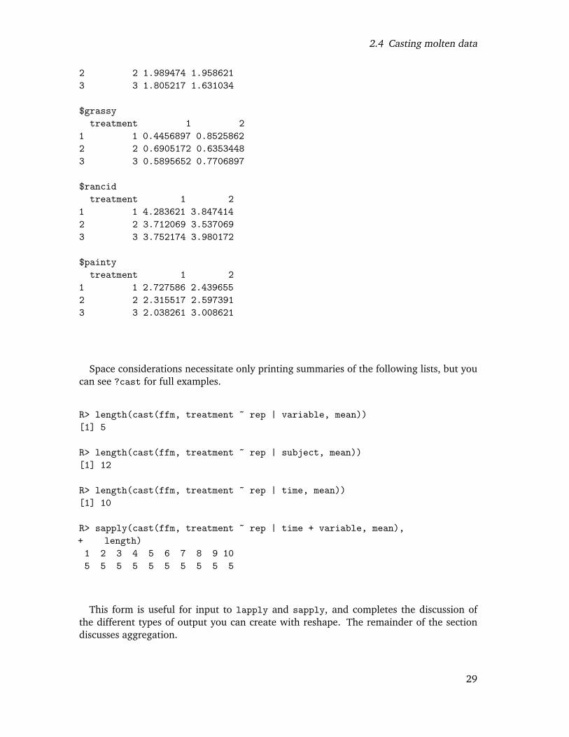
2.4 Casting molten data
2 2 1.989474 1.9586213 3 1.805217 1.631034
$grassytreatment 1 2
1 1 0.4456897 0.85258622 2 0.6905172 0.63534483 3 0.5895652 0.7706897
$rancidtreatment 1 2
1 1 4.283621 3.8474142 2 3.712069 3.5370693 3 3.752174 3.980172
$paintytreatment 1 2
1 1 2.727586 2.4396552 2 2.315517 2.5973913 3 2.038261 3.008621
Space considerations necessitate only printing summaries of the following lists, but youcan see ?cast for full examples.
R> length(cast(ffm, treatment ~ rep | variable, mean))[1] 5
R> length(cast(ffm, treatment ~ rep | subject, mean))[1] 12
R> length(cast(ffm, treatment ~ rep | time, mean))[1] 10
R> sapply(cast(ffm, treatment ~ rep | time + variable, mean),+ length)1 2 3 4 5 6 7 8 9 105 5 5 5 5 5 5 5 5 5
This form is useful for input to lapply and sapply, and completes the discussion ofthe different types of output you can create with reshape. The remainder of the sectiondiscusses aggregation.
29
2 Reshaping data with the reshape package
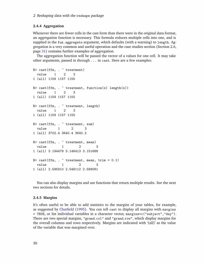
2.4.4 Aggregation
Whenever there are fewer cells in the cast form than there were in the original data format,an aggregation function is necessary. This formula reduces multiple cells into one, and issupplied in the fun.aggregate argument, which defaults (with a warning) to length. Ag-gregation is a very common and useful operation and the case studies section (Section 2.6,page 31) contains further examples of aggregation.
The aggregation function will be passed the vector of a values for one cell. It may takeother arguments, passed in through ... in cast. Here are a few examples:
R> cast(ffm, . ~ treatment)value 1 2 3
1 (all) 1159 1157 1155
R> cast(ffm, . ~ treatment, function(x) length(x))value 1 2 3
1 (all) 1159 1157 1155
R> cast(ffm, . ~ treatment, length)value 1 2 3
1 (all) 1159 1157 1155
R> cast(ffm, . ~ treatment, sum)value 1 2 3
1 (all) 3702.4 3640.4 3640.2
R> cast(ffm, . ~ treatment, mean)value 1 2 3
1 (all) 3.194478 3.146413 3.151688
R> cast(ffm, . ~ treatment, mean, trim = 0.1)value 1 2 3
1 (all) 2.595910 2.548112 2.589081
You can also display margins and use functions that return multiple results. See the nexttwo sections for details.
2.4.5 Margins
It’s often useful to be able to add statistics to the margins of your tables, for example,as suggested by Chatfield (1995). You can tell cast to display all margins with margins= TRUE, or list individual variables in a character vector, margins=c("subject","day").There are two special margins, "grand col" and "grand row", which display margins forthe overall columns and rows respectively. Margins are indicated with ‘(all)’ as the valueof the variable that was margined over.
30
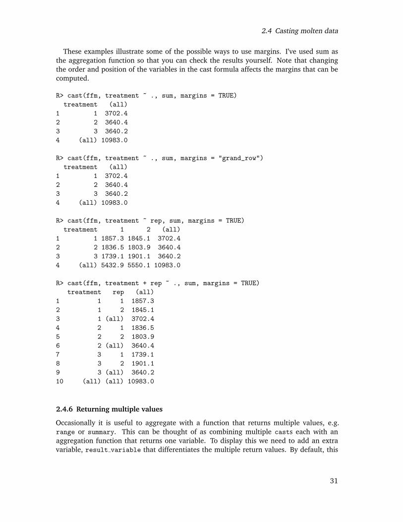
2.4 Casting molten data
These examples illustrate some of the possible ways to use margins. I’ve used sum asthe aggregation function so that you can check the results yourself. Note that changingthe order and position of the variables in the cast formula affects the margins that can becomputed.
R> cast(ffm, treatment ~ ., sum, margins = TRUE)treatment (all)
1 1 3702.42 2 3640.43 3 3640.24 (all) 10983.0
R> cast(ffm, treatment ~ ., sum, margins = "grand_row")treatment (all)
1 1 3702.42 2 3640.43 3 3640.24 (all) 10983.0
R> cast(ffm, treatment ~ rep, sum, margins = TRUE)treatment 1 2 (all)
1 1 1857.3 1845.1 3702.42 2 1836.5 1803.9 3640.43 3 1739.1 1901.1 3640.24 (all) 5432.9 5550.1 10983.0
R> cast(ffm, treatment + rep ~ ., sum, margins = TRUE)treatment rep (all)
1 1 1 1857.32 1 2 1845.13 1 (all) 3702.44 2 1 1836.55 2 2 1803.96 2 (all) 3640.47 3 1 1739.18 3 2 1901.19 3 (all) 3640.210 (all) (all) 10983.0
2.4.6 Returning multiple values
Occasionally it is useful to aggregate with a function that returns multiple values, e.g.range or summary. This can be thought of as combining multiple casts each with anaggregation function that returns one variable. To display this we need to add an extravariable, result variable that differentiates the multiple return values. By default, this
31
2 Reshaping data with the reshape package
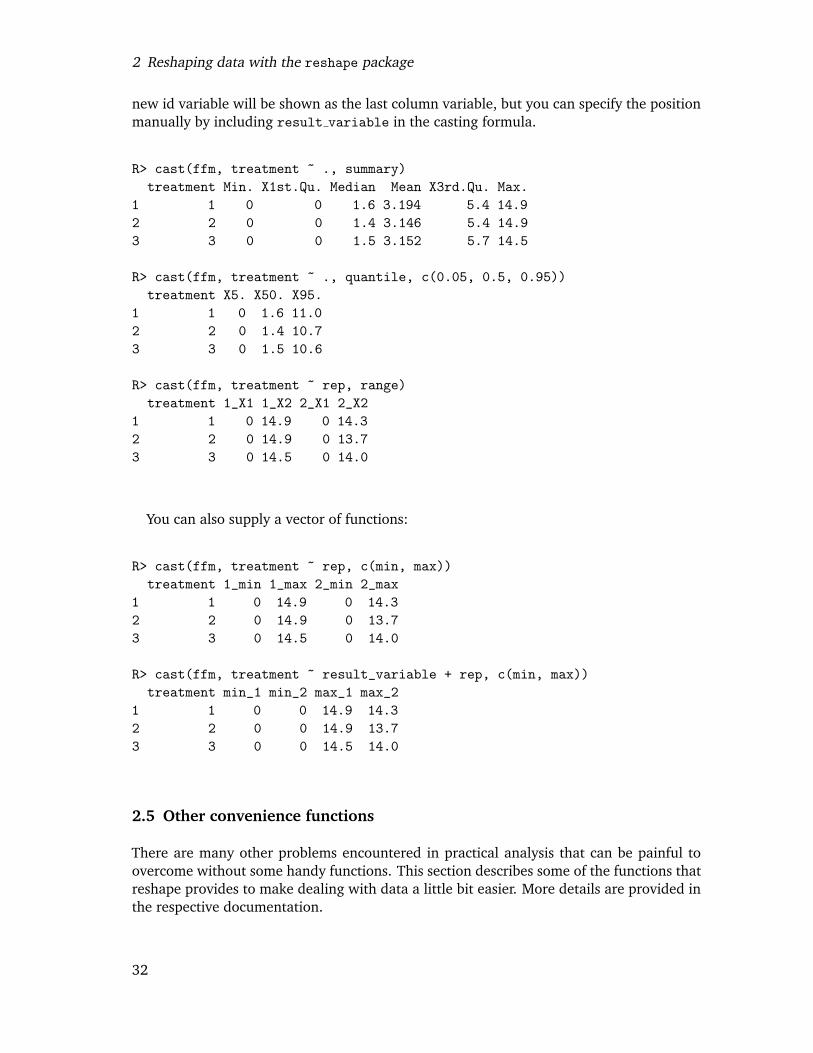
new id variable will be shown as the last column variable, but you can specify the positionmanually by including result variable in the casting formula.
R> cast(ffm, treatment ~ ., summary)treatment Min. X1st.Qu. Median Mean X3rd.Qu. Max.
1 1 0 0 1.6 3.194 5.4 14.92 2 0 0 1.4 3.146 5.4 14.93 3 0 0 1.5 3.152 5.7 14.5
R> cast(ffm, treatment ~ ., quantile, c(0.05, 0.5, 0.95))treatment X5. X50. X95.
1 1 0 1.6 11.02 2 0 1.4 10.73 3 0 1.5 10.6
R> cast(ffm, treatment ~ rep, range)treatment 1_X1 1_X2 2_X1 2_X2
1 1 0 14.9 0 14.32 2 0 14.9 0 13.73 3 0 14.5 0 14.0
You can also supply a vector of functions:
R> cast(ffm, treatment ~ rep, c(min, max))treatment 1_min 1_max 2_min 2_max
1 1 0 14.9 0 14.32 2 0 14.9 0 13.73 3 0 14.5 0 14.0
R> cast(ffm, treatment ~ result_variable + rep, c(min, max))treatment min_1 min_2 max_1 max_2
1 1 0 0 14.9 14.32 2 0 0 14.9 13.73 3 0 0 14.5 14.0
2.5 Other convenience functions
There are many other problems encountered in practical analysis that can be painful toovercome without some handy functions. This section describes some of the functions thatreshape provides to make dealing with data a little bit easier. More details are provided inthe respective documentation.
32
2.6 Case study: French fries
2.5.1 Factors
• combine factor combines levels in a factor. For example, if you have many smalllevels you can combine them together into an ‘other’ level.
• reorder factor reorders a factor based on another variable. For example, you canorder a factor by the average value of a variable for each level.
2.5.2 Data frames
• rescaler performs column-wise rescaling of data frames, with a variety of differentscaling options including rank, common range and common variance. It automati-cally preserves non-numeric variables.
• merge.all merges multiple data frames together, an extension of merge in base R. Itassumes that all columns with the same name should be equated.
• rbind.fill rbinds two data frames together, filling in any missing columns in thesecond data frame with missing values.
2.5.3 Miscellaneous
• round any allows you to round a number to any degree of accuracy, e.g. to the near-est 1, 10, or any other number.
• iapply is an idempotent version of the apply function. It is idempotent in the sensethat iapply(x, a, function(x) x) is guaranteed to return x for any value of a.This is useful when dealing with high-dimensional arrays as it will return the arrayin the same shape that you sent it. It also supports functions that return matrices orarrays in a sensible manner.
2.6 Case study: French fries
These data are from a sensory experiment investigating the effect of different frying oils onthe taste of French fries over time. There are three different types of frying oils (treatment),each in two different fryers (rep), tested by 12 people (subject) on 10 different days (time).The sensory attributes recorded, in order of desirability, are potato, buttery, grassy, rancid,painty flavours. The first few rows of the data are shown in Table 2.1.
We first melt the data to use in subsequent analyses.
R> ffm <- melt(french_fries, id = 1:4, na.rm = TRUE)R> head(ffm)
time treatment subject rep variable value1 1 1 3 1 potato 2.92 1 1 3 2 potato 14.03 1 1 10 1 potato 11.04 1 1 10 2 potato 9.95 1 1 15 1 potato 1.2
33
2 Reshaping data with the reshape package
time trt subject rep potato buttery grassy rancid painty1 1 3 1.00 2.90 0.00 0.00 0.00 5.501 1 3 2.00 14.00 0.00 0.00 1.10 0.001 1 10 1.00 11.00 6.40 0.00 0.00 0.001 1 10 2.00 9.90 5.90 2.90 2.20 0.001 1 15 1.00 1.20 0.10 0.00 1.10 5.101 1 15 2.00 8.80 3.00 3.60 1.50 2.30
Table 2.1: First few rows of the French fries dataset
6 1 1 15 2 potato 8.8
2.6.1 Investigating balance
One of the first things we might be interested in is how balanced this design is, and ifthere are many different missing values. We are interested in missingness, so we removedexplicit missing values to put structural and non-structural missings on an equal footing.
We can investigate balance using length as our aggregation function:
R> cast(ffm, subject ~ time, function(x) 30 - length(x),+ margins=T)
subject 1 2 3 4 5 6 7 8 9 10 (all)1 3 30 30 30 30 30 30 30 30 30 NA 2702 10 30 30 30 30 30 30 30 30 30 30 3003 15 30 30 30 30 25 30 30 30 30 30 2954 16 30 30 30 30 30 30 30 29 30 30 2995 19 30 30 30 30 30 30 30 30 30 30 3006 31 30 30 30 30 30 30 30 30 NA 30 2707 51 30 30 30 30 30 30 30 30 30 30 3008 52 30 30 30 30 30 30 30 30 30 30 3009 63 30 30 30 30 30 30 30 30 30 30 30010 78 30 30 30 30 30 30 30 30 30 30 30011 79 30 30 30 30 30 30 29 28 30 NA 26712 86 30 30 30 30 30 30 30 30 NA 30 27013 (all) 360 360 360 360 355 360 359 357 300 300 3471
Each subject should have had 30 observations at each time, so by displaying the differ-ence we can more easily see where the data are missing.
R> cast(ffm, subject ~ time, function(x) 30 - length(x))subject 1 2 3 4 5 6 7 8 9 10
1 3 0 0 0 0 0 0 0 0 0 NA2 10 0 0 0 0 0 0 0 0 0 03 15 0 0 0 0 5 0 0 0 0 0
34
2.6 Case study: French fries
4 16 0 0 0 0 0 0 0 1 0 05 19 0 0 0 0 0 0 0 0 0 06 31 0 0 0 0 0 0 0 0 NA 07 51 0 0 0 0 0 0 0 0 0 08 52 0 0 0 0 0 0 0 0 0 09 63 0 0 0 0 0 0 0 0 0 010 78 0 0 0 0 0 0 0 0 0 011 79 0 0 0 0 0 0 1 2 0 NA12 86 0 0 0 0 0 0 0 0 NA 0
There are two types of missing observations here: a non-zero value, or a missing value.A missing value represents a subject with no records at a given time point; they did notturn up on that day. A non-zero value represents a subject who did turn up, but perhapsdue to a recording error, missed some observations.
We can also easily see the range of values that each variable takes:
R> cast(ffm, variable ~ ., c(min, max))variable min max
1 potato 0 14.92 buttery 0 11.23 grassy 0 11.14 rancid 0 14.95 painty 0 13.1
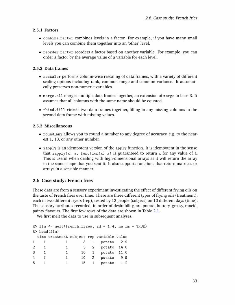
Better than just looking at the ranges is to look at the distribution, with a histogram.Here we use the molten data directly, facetting (aka conditioning or trellising) by themeasured variable.
R> qplot(value, data=ffm, geom="histogram",+ facets = . ~ variable, binwidth=1)
2.6.2 Tables of means
When creating these tables, it is a good idea to restrict the number of digits displayed. Youcan do this globally, by setting options(digits=2), or locally, by using round any.
35
2 Reshaping data with the reshape package
Since the data are fairly well balanced, we can do some (crude) investigation as to theeffects of the different treatments. For example, we can calculate the overall means foreach sensory attribute for each treatment:
R> options(digits = 2)R> cast(ffm, treatment ~ variable, mean,+ margins = c("grand_col", "grand_row"))
treatment potato buttery grassy rancid painty (all)1 1 6.9 1.8 0.65 4.1 2.6 3.22 2 7.0 2.0 0.66 3.6 2.5 3.13 3 7.0 1.7 0.68 3.9 2.5 3.24 (all) 7.0 1.8 0.66 3.9 2.5 3.2
It doesn’t look like there is any effect of treatment. This could be confirmed using a moreformal analysis of variance.
2.6.3 Investigating inter-rep reliability
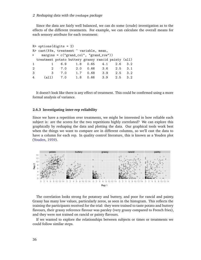
Since we have a repetition over treatments, we might be interested in how reliable eachsubject is: are the scores for the two repetitions highly correlated? We can explore thisgraphically by reshaping the data and plotting the data. Our graphical tools work bestwhen the things we want to compare are in different columns, so we’ll cast the data tohave a column for each rep. In quality control literature, this is known as a Youden plot(Youden, 1959).
The correlation looks strong for potatoey and buttery, and poor for rancid and painty.Grassy has many low values, particularly zeros, as seen in the histogram. This reflects thetraining the participants received for the trial: they were trained to taste potato and butteryflavours, their grassy reference flavour was parsley (very grassy compared to French fries),and they were not trained on rancid or painty flavours.
If we wanted to explore the relationships between subjects or times or treatments wecould follow similar steps.
36

2.7 Where to go next
2.7 Where to go next
You can find a quick reference and more examples in ?melt and ?cast. You can findsome additional information on the reshape website http://had.co.nz/reshape, includ-ing copies of presentations and papers related to reshape.
I would like to include more case studies of reshape in use. If you have an interesting ex-ample, or there is something you are struggling with please let me know: [email protected].
2.8 Acknowledgements
I’d like to thank Antony Unwin for his comments about the paper and package, which havelead to a significantly more consistent and user-friendly interface. The questions and com-ments of the users of the reshape package, Kevin Wright, Francois Pinard, Dieter Menne,Reinhold Kleigl, and many others, have also contributed greatly to the development of thepackage.
This material is based upon work supported by the National Science Foundation underGrant No. 0706949.
37

2 Reshaping data with the reshape package
38
Chapter 3
A layered grammar of graphics
Abstract
A grammar of graphics is a tool which enables us to concisely describe the components of agraphic. A grammar of graphics allows us to move beyond named graphics and gain insightinto the deep structure that underlies statistical graphics. This paper builds on Wilkinson(2005), describing extensions and refinements developed while building an open sourceimplementation of the grammar of graphics for R, ggplot2.
The topics in this paper include an introduction to the grammar by working through theprocess of creating a plot, and discussing the components that we need. The grammar isthen presented formally and compared to Wilkinson’s grammar, highlighting the hierarchyof defaults, and the implications of embedding a graphical grammar into a programminglanguage. The power of the grammar is illustrated with a selection of examples that ex-plore different components, and their interactions, in more detail. The paper concludes bydiscussing some perceptual issues, and thinking about how we can build on the grammarto learn how to create graphical “poems”.
3.1 Introduction
What is a graphic? How can we succinctly describe a graphic? And how can we create thegraphic that we have described? These are important questions for the field of statisticalgraphics.
One way to answer these questions is to develop a grammar, “the fundamental principlesor rules of an art or science” (OED Online, 1989). A good grammar will allow us to gaininsight into the composition of complicated graphics, and reveal unexpected connectionsbetween seemingly different graphics (Cox, 1978). A grammar provides a strong founda-tion for understanding a diverse range of graphics. A grammar may also help guide us onwhat a well-formed or correct graphic looks like, but there will still be many grammaticallycorrect but nonsensical graphics. This is easy to see by analogy to the English language:good grammar is just the first step in creating a good sentence.
The seminal work in graphical grammars is “The Grammar of Graphics” by Wilkinsonet al. (2005), which proposes a grammar which can be used to describe and construct awide range of graphics. This paper proposes an alternative parameterisation of the gram-mar, based around the idea of building up a graphic from multiple layers of data. The
39
3 A layered grammar of graphics
grammar differs from Wilkinson’s in its arrangement of the components, the developmentof a hierarchy of defaults, and in that it is embedded inside another programming language.These three sections form the core of the paper, and compare and contrast to Wilkinson’sgrammar. These sections are followed by some implications of the grammar, a discussionof perceptual issues otherwise not mentioned by the grammar, and finally some ideas forbuilding higher level tools to support data analysis.
The ideas presented in this paper have been implemented in the open-source R pack-age, ggplot2, available from CRAN. More details about the grammar and implementa-tion, including a comprehensive set of examples, can be found on the package websitehttp://had.co.nz/ggplot2. Ggplot2 is the analogue of GPL, the implementation ofWilkinson’s grammar in SPSS.
3.2 How to build a plot
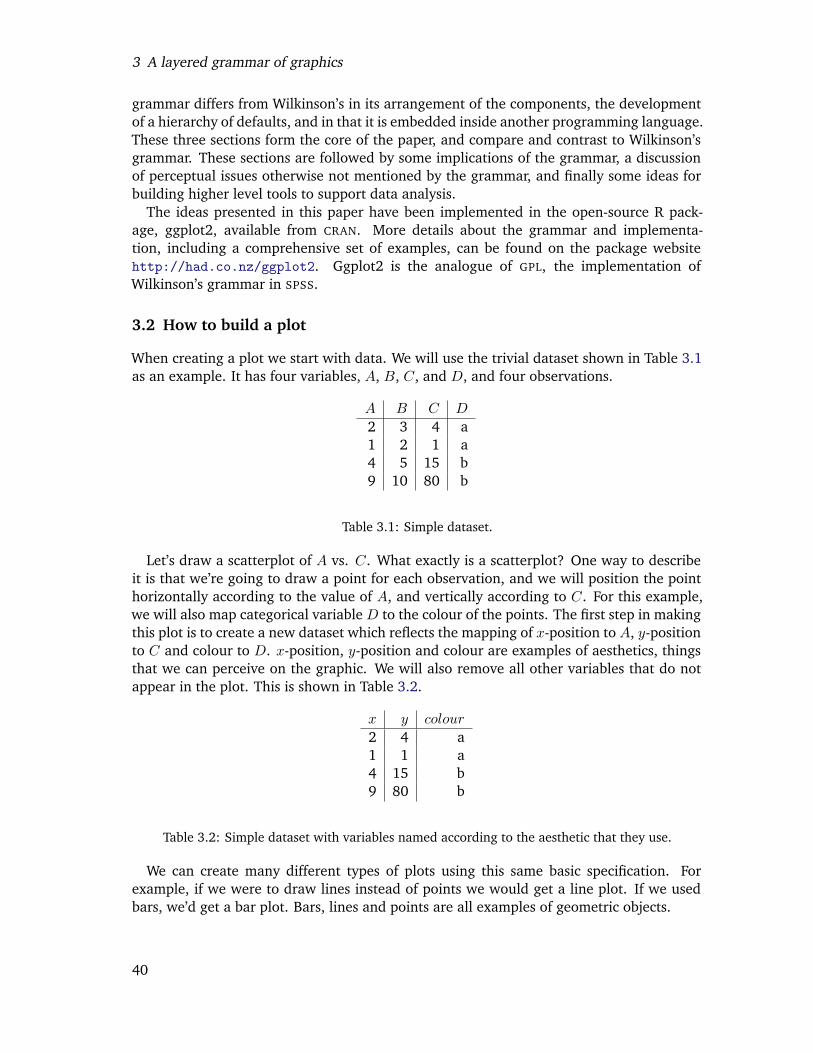
When creating a plot we start with data. We will use the trivial dataset shown in Table 3.1as an example. It has four variables, A, B, C, and D, and four observations.
A B C D
2 3 4 a1 2 1 a4 5 15 b9 10 80 b
Table 3.1: Simple dataset.
Let’s draw a scatterplot of A vs. C. What exactly is a scatterplot? One way to describeit is that we’re going to draw a point for each observation, and we will position the pointhorizontally according to the value of A, and vertically according to C. For this example,we will also map categorical variable D to the colour of the points. The first step in makingthis plot is to create a new dataset which reflects the mapping of x-position to A, y-positionto C and colour to D. x-position, y-position and colour are examples of aesthetics, thingsthat we can perceive on the graphic. We will also remove all other variables that do notappear in the plot. This is shown in Table 3.2.
x y colour
2 4 a1 1 a4 15 b9 80 b
Table 3.2: Simple dataset with variables named according to the aesthetic that they use.
We can create many different types of plots using this same basic specification. Forexample, if we were to draw lines instead of points we would get a line plot. If we usedbars, we’d get a bar plot. Bars, lines and points are all examples of geometric objects.
40
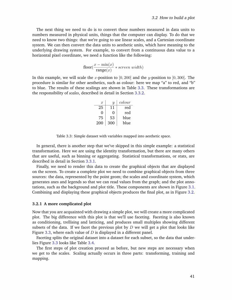
3.2 How to build a plot
The next thing we need to do is to convert these numbers measured in data units tonumbers measured in physical units, things that the computer can display. To do that weneed to know two things: that we’re going to use linear scales, and a Cartesian coordinatesystem. We can then convert the data units to aesthetic units, which have meaning to theunderlying drawing system. For example, to convert from a continuous data value to ahorizontal pixel coordinate, we need a function like the following:
floor(x−min(x)range(x)
∗ screen width)
In this example, we will scale the x-position to [0, 200] and the y-position to [0, 300]. Theprocedure is similar for other aesthetics, such as colour: here we map “a” to red, and “b”to blue. The results of these scalings are shown in Table 3.3. These transformations arethe responsibility of scales, described in detail in Section 3.3.2.
x y colour
25 11 red0 0 red
75 53 blue200 300 blue
Table 3.3: Simple dataset with variables mapped into aesthetic space.
In general, there is another step that we’ve skipped in this simple example: a statisticaltransformation. Here we are using the identity transformation, but there are many othersthat are useful, such as binning or aggregating. Statistical transformations, or stats, aredescribed in detail in Section 3.3.1.
Finally, we need to render this data to create the graphical objects that are displayedon the screen. To create a complete plot we need to combine graphical objects from threesources: the data, represented by the point geom; the scales and coordinate system, whichgenerates axes and legends so that we can read values from the graph; and the plot anno-tations, such as the background and plot title. These components are shown in Figure 3.1.Combining and displaying these graphical objects produces the final plot, as in Figure 3.2.
3.2.1 A more complicated plot
Now that you are acquainted with drawing a simple plot, we will create a more complicatedplot. The big difference with this plot is that we’ll use faceting. Faceting is also knownas conditioning, trellising and latticing, and produces small multiples showing differentsubsets of the data. If we facet the previous plot by D we will get a plot that looks likeFigure 3.3, where each value of D is displayed in a different panel.
Faceting splits the original dataset into a dataset for each subset, so the data that under-lies Figure 3.3 looks like Table 3.4.
The first steps of plot creation proceed as before, but new steps are necessary whenwe get to the scales. Scaling actually occurs in three parts: transforming, training andmapping.
41
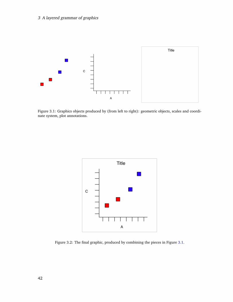
3 A layered grammar of graphics
Figure 3.1: Graphics objects produced by (from left to right): geometric objects, scales and coordi-nate system, plot annotations.
Figure 3.2: The final graphic, produced by combining the pieces in Figure 3.1.
42
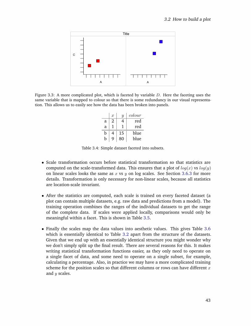
3.2 How to build a plot
Figure 3.3: A more complicated plot, which is faceted by variable D. Here the faceting uses thesame variable that is mapped to colour so that there is some redundancy in our visual representa-tion. This allows us to easily see how the data has been broken into panels.
x y colour
a 2 4 reda 1 1 redb 4 15 blueb 9 80 blue
Table 3.4: Simple dataset faceted into subsets.
• Scale transformation occurs before statistical transformation so that statistics arecomputed on the scale-transformed data. This ensures that a plot of log(x) vs log(y)on linear scales looks the same as x vs y on log scales. See Section 3.6.3 for moredetails. Transformation is only necessary for non-linear scales, because all statisticsare location-scale invariant.
• After the statistics are computed, each scale is trained on every faceted dataset (aplot can contain multiple datasets, e.g. raw data and predictions from a model). Thetraining operation combines the ranges of the individual datasets to get the rangeof the complete data. If scales were applied locally, comparisons would only bemeaningful within a facet. This is shown in Table 3.5.
• Finally the scales map the data values into aesthetic values. This gives Table 3.6which is essentially identical to Table 3.2 apart from the structure of the datasets.Given that we end up with an essentially identical structure you might wonder whywe don’t simply split up the final result. There are several reasons for this. It makeswriting statistical transformation functions easier, as they only need to operate ona single facet of data, and some need to operate on a single subset, for example,calculating a percentage. Also, in practice we may have a more complicated trainingscheme for the position scales so that different columns or rows can have different xand y scales.
43

3 A layered grammar of graphics
x y colour
a 200 300 reda 0 0 redb 0 0 redb 200 300 red
Table 3.5: Local scaling, where data are scaled independently within each facet. Note that eachfacet occupies the full range of positions, and only uses one colour. Comparisons across facets arenot necessarily meaningful.
x y colour
a 25 11 reda 0 0 redb 75 53 blueb 200 300 blue
Table 3.6: faceted data correctly mapped to aesthetics. Note the similarity to Table 3.3.
3.2.2 Summary
In the examples above, we have seen some of the components that make up a plot:
• data and aesthetic mappings,
• geometric objects,
• scales,
• and faceting.
We have also touched on two other components:
• statistical transformations,
• and the coordinate system.
Together, the data, mappings, statistical transformation and geometric object form a layer.A plot may have multiple layers, for example, when we overlay a scatterplot with asmoothed line.
3.3 Components of the layered grammar
To be precise, the layered grammar defines the components of a plot as:
• A default dataset and set of mappings from variables to aesthetics.
• One or more layers, each composed of a geometric object, a statistical transformation,and a position adjustment, and optionally, a dataset and aesthetic mappings.
44
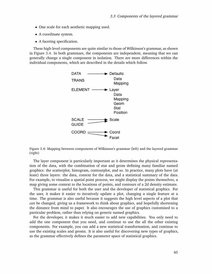
3.3 Components of the layered grammar
• One scale for each aesthetic mapping used.
• A coordinate system.
• A faceting specification.
These high-level components are quite similar to those of Wilkinson’s grammar, as shownin Figure 3.4. In both grammars, the components are independent, meaning that we cangenerally change a single component in isolation. There are more differences within theindividual components, which are described in the details which follow.
Figure 3.4: Mapping between components of Wilkinson’s grammar (left) and the layered grammar(right)
The layer component is particularly important as it determines the physical representa-tion of the data, with the combination of stat and geom defining many familiar namedgraphics: the scatterplot, histogram, contourplot, and so. In practice, many plots have (atleast) three layers: the data, context for the data, and a statistical summary of the data.For example, to visualise a spatial point process, we might display the points themselves, amap giving some context to the locations of points, and contours of a 2d density estimate.
This grammar is useful for both the user and the developer of statistical graphics. Forthe user, it makes it easier to iteratively update a plot, changing a single feature at atime. The grammar is also useful because it suggests the high level aspects of a plot thatcan be changed, giving us a framework to think about graphics, and hopefully shorteningthe distance from mind to paper. It also encourages the use of graphics customised to aparticular problem, rather than relying on generic named graphics.
For the developer, it makes it much easier to add new capabilities. You only need toadd the one component that you need, and continue to use the all the other existingcomponents. For example, you can add a new statistical transformation, and continue touse the existing scales and geoms. It is also useful for discovering new types of graphics,as the grammar effectively defines the parameter space of statistical graphics.
45
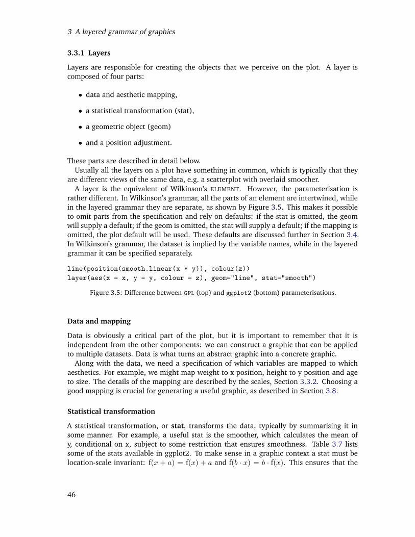
3 A layered grammar of graphics
3.3.1 Layers
Layers are responsible for creating the objects that we perceive on the plot. A layer iscomposed of four parts:
• data and aesthetic mapping,
• a statistical transformation (stat),
• a geometric object (geom)
• and a position adjustment.
These parts are described in detail below.Usually all the layers on a plot have something in common, which is typically that they
are different views of the same data, e.g. a scatterplot with overlaid smoother.A layer is the equivalent of Wilkinson’s ELEMENT. However, the parameterisation is
rather different. In Wilkinson’s grammar, all the parts of an element are intertwined, whilein the layered grammar they are separate, as shown by Figure 3.5. This makes it possibleto omit parts from the specification and rely on defaults: if the stat is omitted, the geomwill supply a default; if the geom is omitted, the stat will supply a default; if the mapping isomitted, the plot default will be used. These defaults are discussed further in Section 3.4.In Wilkinson’s grammar, the dataset is implied by the variable names, while in the layeredgrammar it can be specified separately.
line(position(smooth.linear(x * y)), colour(z))layer(aes(x = x, y = y, colour = z), geom="line", stat="smooth")
Figure 3.5: Difference between GPL (top) and ggplot2 (bottom) parameterisations.
Data and mapping
Data is obviously a critical part of the plot, but it is important to remember that it isindependent from the other components: we can construct a graphic that can be appliedto multiple datasets. Data is what turns an abstract graphic into a concrete graphic.
Along with the data, we need a specification of which variables are mapped to whichaesthetics. For example, we might map weight to x position, height to y position and ageto size. The details of the mapping are described by the scales, Section 3.3.2. Choosing agood mapping is crucial for generating a useful graphic, as described in Section 3.8.
Statistical transformation
A statistical transformation, or stat, transforms the data, typically by summarising it insome manner. For example, a useful stat is the smoother, which calculates the mean ofy, conditional on x, subject to some restriction that ensures smoothness. Table 3.7 listssome of the stats available in ggplot2. To make sense in a graphic context a stat must belocation-scale invariant: f(x + a) = f(x) + a and f(b · x) = b · f(x). This ensures that the
46
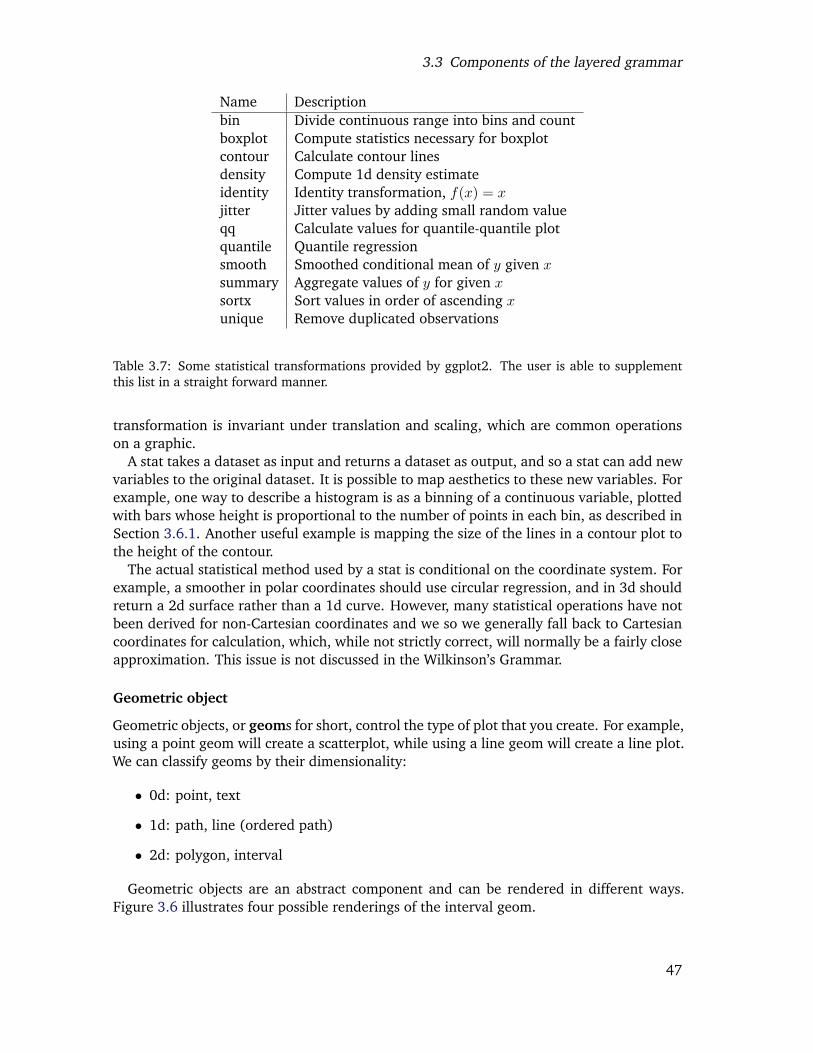
3.3 Components of the layered grammar
Name Descriptionbin Divide continuous range into bins and countboxplot Compute statistics necessary for boxplotcontour Calculate contour linesdensity Compute 1d density estimateidentity Identity transformation, f(x) = xjitter Jitter values by adding small random valueqq Calculate values for quantile-quantile plotquantile Quantile regressionsmooth Smoothed conditional mean of y given xsummary Aggregate values of y for given xsortx Sort values in order of ascending xunique Remove duplicated observations
Table 3.7: Some statistical transformations provided by ggplot2. The user is able to supplementthis list in a straight forward manner.
transformation is invariant under translation and scaling, which are common operationson a graphic.
A stat takes a dataset as input and returns a dataset as output, and so a stat can add newvariables to the original dataset. It is possible to map aesthetics to these new variables. Forexample, one way to describe a histogram is as a binning of a continuous variable, plottedwith bars whose height is proportional to the number of points in each bin, as described inSection 3.6.1. Another useful example is mapping the size of the lines in a contour plot tothe height of the contour.
The actual statistical method used by a stat is conditional on the coordinate system. Forexample, a smoother in polar coordinates should use circular regression, and in 3d shouldreturn a 2d surface rather than a 1d curve. However, many statistical operations have notbeen derived for non-Cartesian coordinates and we so we generally fall back to Cartesiancoordinates for calculation, which, while not strictly correct, will normally be a fairly closeapproximation. This issue is not discussed in the Wilkinson’s Grammar.
Geometric object
Geometric objects, or geoms for short, control the type of plot that you create. For example,using a point geom will create a scatterplot, while using a line geom will create a line plot.We can classify geoms by their dimensionality:
• 0d: point, text
• 1d: path, line (ordered path)
• 2d: polygon, interval
Geometric objects are an abstract component and can be rendered in different ways.Figure 3.6 illustrates four possible renderings of the interval geom.
47
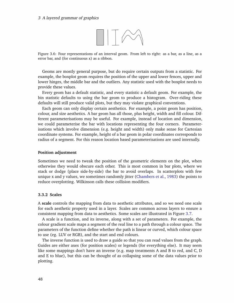
3 A layered grammar of graphics
Figure 3.6: Four representations of an interval geom. From left to right: as a bar, as a line, as aerror bar, and (for continuous x) as a ribbon.
Geoms are mostly general purpose, but do require certain outputs from a statistic. Forexample, the boxplot geom requires the position of the upper and lower fences, upper andlower hinges, the middle bar and the outliers. Any statistic used with the boxplot needs toprovide these values.
Every geom has a default statistic, and every statistic a default geom. For example, thebin statistic defaults to using the bar geom to produce a histogram. Over-riding thesedefaults will still produce valid plots, but they may violate graphical conventions.
Each geom can only display certain aesthetics. For example, a point geom has position,colour, and size aesthetics. A bar geom has all those, plus height, width and fill colour. Dif-ferent parameterisations may be useful. For example, instead of location and dimension,we could parameterise the bar with locations representing the four corners. Parameter-isations which involve dimension (e.g. height and width) only make sense for Cartesiancoordinate systems. For example, height of a bar geom in polar coordinates corresponds toradius of a segment. For this reason location based parameterisations are used internally.
Position adjustment
Sometimes we need to tweak the position of the geometric elements on the plot, whenotherwise they would obscure each other. This is most common in bar plots, where westack or dodge (place side-by-side) the bar to avoid overlaps. In scatterplots with fewunique x and y values, we sometimes randomly jitter (Chambers et al., 1983) the points toreduce overplotting. Wilkinson calls these collision modifiers.
3.3.2 Scales
A scale controls the mapping from data to aesthetic attributes, and so we need one scalefor each aesthetic property used in a layer. Scales are common across layers to ensure aconsistent mapping from data to aesthetics. Some scales are illustrated in Figure 3.7.
A scale is a function, and its inverse, along with a set of parameters. For example, thecolour gradient scale maps a segment of the real line to a path through a colour space. Theparameters of the function define whether the path is linear or curved, which colour spaceto use (eg. LUV or RGB), and the start and end colours.
The inverse function is used to draw a guide so that you can read values from the graph.Guides are either axes (for position scales) or legends (for everything else). It may seemlike some mappings don’t have an inverse (e.g. map treatments A and B to red, and C, Dand E to blue), but this can be thought of as collapsing some of the data values prior toplotting.
48
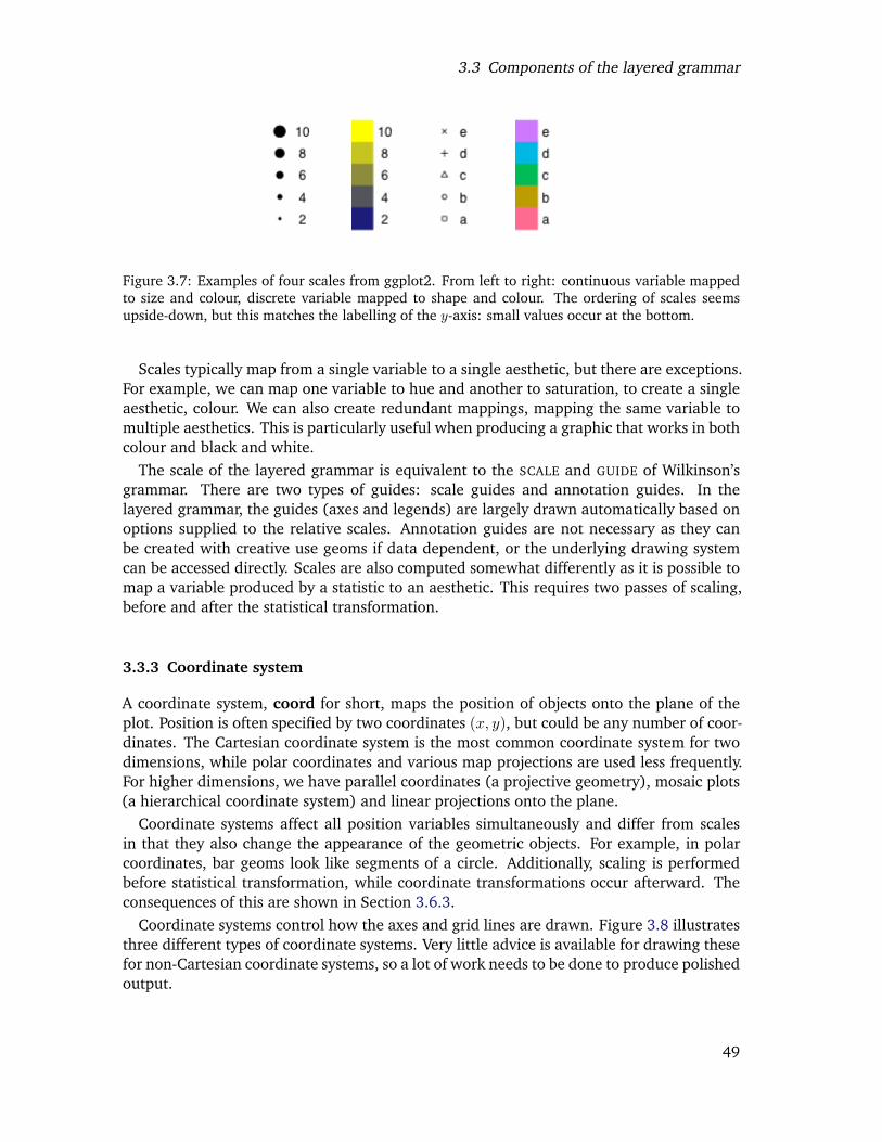
3.3 Components of the layered grammar
Figure 3.7: Examples of four scales from ggplot2. From left to right: continuous variable mappedto size and colour, discrete variable mapped to shape and colour. The ordering of scales seemsupside-down, but this matches the labelling of the y-axis: small values occur at the bottom.
Scales typically map from a single variable to a single aesthetic, but there are exceptions.For example, we can map one variable to hue and another to saturation, to create a singleaesthetic, colour. We can also create redundant mappings, mapping the same variable tomultiple aesthetics. This is particularly useful when producing a graphic that works in bothcolour and black and white.
The scale of the layered grammar is equivalent to the SCALE and GUIDE of Wilkinson’sgrammar. There are two types of guides: scale guides and annotation guides. In thelayered grammar, the guides (axes and legends) are largely drawn automatically based onoptions supplied to the relative scales. Annotation guides are not necessary as they canbe created with creative use geoms if data dependent, or the underlying drawing systemcan be accessed directly. Scales are also computed somewhat differently as it is possible tomap a variable produced by a statistic to an aesthetic. This requires two passes of scaling,before and after the statistical transformation.
3.3.3 Coordinate system
A coordinate system, coord for short, maps the position of objects onto the plane of theplot. Position is often specified by two coordinates (x, y), but could be any number of coor-dinates. The Cartesian coordinate system is the most common coordinate system for twodimensions, while polar coordinates and various map projections are used less frequently.For higher dimensions, we have parallel coordinates (a projective geometry), mosaic plots(a hierarchical coordinate system) and linear projections onto the plane.
Coordinate systems affect all position variables simultaneously and differ from scalesin that they also change the appearance of the geometric objects. For example, in polarcoordinates, bar geoms look like segments of a circle. Additionally, scaling is performedbefore statistical transformation, while coordinate transformations occur afterward. Theconsequences of this are shown in Section 3.6.3.
Coordinate systems control how the axes and grid lines are drawn. Figure 3.8 illustratesthree different types of coordinate systems. Very little advice is available for drawing thesefor non-Cartesian coordinate systems, so a lot of work needs to be done to produce polishedoutput.
49
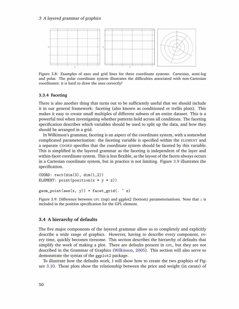
3 A layered grammar of graphics
Figure 3.8: Examples of axes and grid lines for three coordinate systems: Cartesian, semi-logand polar. The polar coordinate system illustrates the difficulties associated with non-Cartesiancoordinates: it is hard to draw the axes correctly!
3.3.4 Faceting
There is also another thing that turns out to be sufficiently useful that we should includeit in our general framework: faceting (also known as conditioned or trellis plots). Thismakes it easy to create small multiples of different subsets of an entire dataset. This is apowerful tool when investigating whether patterns hold across all conditions. The facetingspecification describes which variables should be used to split up the data, and how theyshould be arranged in a grid.
In Wilkinson’s grammar, faceting is an aspect of the coordinate system, with a somewhatcomplicated parameterisation: the faceting variable is specified within the ELEMENT anda separate COORD specifies that the coordinate system should be faceted by this variable.This is simplified in the layered grammar as the faceting is independent of the layer andwithin-facet coordinate system. This is less flexible, as the layout of the facets always occursin a Cartesian coordinate system, but in practice is not limiting. Figure 3.9 illustrates thespecification.
COORD: rect(dim(3), dim(1,2))ELEMENT: point(position(x * y * z))
geom_point(aes(x, y)) + facet_grid(. ~ z)
Figure 3.9: Difference between GPL (top) and ggplot2 (bottom) parameterisations. Note that z isincluded in the position specification for the GPL element.
3.4 A hierarchy of defaults
The five major components of the layered grammar allow us to completely and explicitlydescribe a wide range of graphics. However, having to describe every component, ev-ery time, quickly becomes tiresome. This section describes the hierarchy of defaults thatsimplify the work of making a plot. There are defaults present in GPL, but they are notdescribed in the Grammar of Graphics (Wilkinson, 2005). This section will also serve todemonstrate the syntax of the ggplot2 package.
To illustrate how the defaults work, I will show how to create the two graphics of Fig-ure 3.10. These plots show the relationship between the price and weight (in carats) of
50
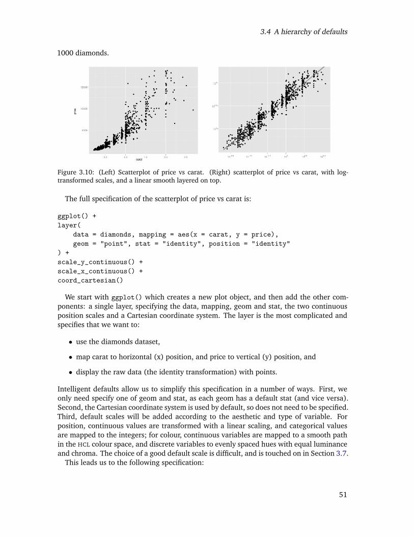
3.4 A hierarchy of defaults
1000 diamonds.
Figure 3.10: (Left) Scatterplot of price vs carat. (Right) scatterplot of price vs carat, with log-transformed scales, and a linear smooth layered on top.
The full specification of the scatterplot of price vs carat is:
ggplot() +layer(
data = diamonds, mapping = aes(x = carat, y = price),geom = "point", stat = "identity", position = "identity"
) +scale_y_continuous() +scale_x_continuous() +coord_cartesian()
We start with ggplot() which creates a new plot object, and then add the other com-ponents: a single layer, specifying the data, mapping, geom and stat, the two continuousposition scales and a Cartesian coordinate system. The layer is the most complicated andspecifies that we want to:
• use the diamonds dataset,
• map carat to horizontal (x) position, and price to vertical (y) position, and
• display the raw data (the identity transformation) with points.
Intelligent defaults allow us to simplify this specification in a number of ways. First, weonly need specify one of geom and stat, as each geom has a default stat (and vice versa).Second, the Cartesian coordinate system is used by default, so does not need to be specified.Third, default scales will be added according to the aesthetic and type of variable. Forposition, continuous values are transformed with a linear scaling, and categorical valuesare mapped to the integers; for colour, continuous variables are mapped to a smooth pathin the HCL colour space, and discrete variables to evenly spaced hues with equal luminanceand chroma. The choice of a good default scale is difficult, and is touched on in Section 3.7.
This leads us to the following specification:
51
3 A layered grammar of graphics
ggplot() +layer(
data = diamonds, mapping = aes(x = carat, y = price),geom = "point"
)
Typically, we will specify a default dataset and mapping in the ggplot call, and use ashorthand for the layer:
ggplot(diamonds, aes(x = carat, y = price)) +geom_point()
Any aesthetics specified in the layer will override the defaults. Similarly, if a datasetis specified in the layer, it will override the plot default. To get to the second plot ofFigure 3.10 we need to add another layer, and override the default linear-transforms withlog-transformations:
ggplot(diamonds, aes(x = carat, y = price)) +geom_point() +stat_smooth(method = lm) +scale_x_log10() +scale_y_log10()
which is short hand for:
ggplot() +layer(data = diamonds, mapping = aes(x = carat, y = price),geom = "point", stat = "identity", position = "identity") +layer(data = diamonds, mapping = aes(x = carat, y = price),geom = "smooth", position = "identity",stat = "smooth", method = lm) +scale_y_log10() +scale_x_log10() +coord_cartesian
Even with these many defaults, the explicit grammar syntax is rather verbose, and usu-ally spans multiple lines. This makes it difficult to rapidly experiment with different plots,very important when searching for revealing graphics. For this reason the verbose gram-mar is supplemented with qplot, short for quick plot, which makes strong assumptionsto reduce the amount of typing needed. It also mimics the syntax of the plot function,making ggplot2 easier to use for people already familiar with base R graphics.
The qplot function assumes that multiple layers will use the same data and aestheticmappings, and defaults to creating a scatterplot. This allows us to recreate the first plotwith this concise code:
52
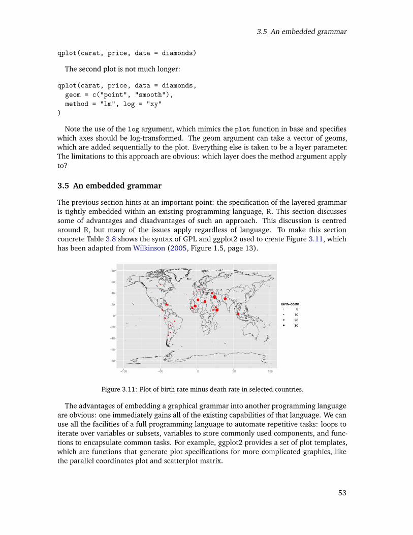
3.5 An embedded grammar
qplot(carat, price, data = diamonds)
The second plot is not much longer:
qplot(carat, price, data = diamonds,geom = c("point", "smooth"),method = "lm", log = "xy"
)
Note the use of the log argument, which mimics the plot function in base and specifieswhich axes should be log-transformed. The geom argument can take a vector of geoms,which are added sequentially to the plot. Everything else is taken to be a layer parameter.The limitations to this approach are obvious: which layer does the method argument applyto?
3.5 An embedded grammar
The previous section hints at an important point: the specification of the layered grammaris tightly embedded within an existing programming language, R. This section discussessome of advantages and disadvantages of such an approach. This discussion is centredaround R, but many of the issues apply regardless of language. To make this sectionconcrete Table 3.8 shows the syntax of GPL and ggplot2 used to create Figure 3.11, whichhas been adapted from Wilkinson (2005, Figure 1.5, page 13).
Figure 3.11: Plot of birth rate minus death rate in selected countries.
The advantages of embedding a graphical grammar into another programming languageare obvious: one immediately gains all of the existing capabilities of that language. We canuse all the facilities of a full programming language to automate repetitive tasks: loops toiterate over variables or subsets, variables to store commonly used components, and func-tions to encapsulate common tasks. For example, ggplot2 provides a set of plot templates,which are functions that generate plot specifications for more complicated graphics, likethe parallel coordinates plot and scatterplot matrix.
53
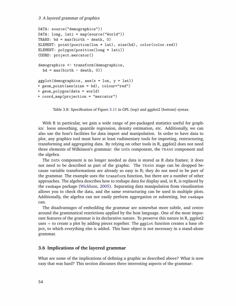
3 A layered grammar of graphics
DATA: source("demographics")|DATA: long, lati = map(source("World"))TRANS: bd = max(birth - death, 0)ELEMENT: point(position(lon * lat), size(bd), color(color.red))ELEMENT: polygon(position(long * lati))COORD: project.mercator()
demographics <- transform(demographics,bd = max(birth - death, 0))
ggplot(demographics, aes(x = lon, y = lat))+ geom_point(aes(size = bd), colour="red")+ geom_polygon(data = world)+ coord_map(projection = "mercator")
Table 3.8: Specification of Figure 3.11 in GPL (top) and ggplot2 (bottom) syntax.
With R in particular, we gain a wide range of pre-packaged statistics useful for graph-ics: loess smoothing, quantile regression, density estimation, etc. Additionally, we canalso use the host’s facilities for data import and manipulation. In order to have data toplot, any graphics tool must have at least rudimentary tools for importing, restructuring,transforming and aggregating data. By relying on other tools in R, ggplot2 does not needthree elements of Wilkinson’s grammar: the DATA component, the TRANS component andthe algebra.
The DATA component is no longer needed as data is stored as R data frames; it doesnot need to be described as part of the graphic. The TRANS stage can be dropped be-cause variable transformations are already so easy in R; they do not need to be part ofthe grammar. The example uses the transform function, but there are a number of otherapproaches. The algebra describes how to reshape data for display and, in R, is replaced bythe reshape package (Wickham, 2005). Separating data manipulation from visualisationallows you to check the data, and the same restructuring can be used in multiple plots.Additionally, the algebra can not easily perform aggregation or subsetting, but reshapecan.
The disadvantages of embedding the grammar are somewhat more subtle, and centrearound the grammatical restrictions applied by the host language. One of the most impor-tant features of the grammar is its declarative nature. To preserve this nature in R, ggplot2uses + to create a plot by adding pieces together. The ggplot function creates a base ob-ject, to which everything else is added. This base object is not necessary in a stand-alonegrammar.
3.6 Implications of the layered grammar
What are some of the implications of defining a graphic as described above? What is noweasy that was hard? This section discusses three interesting aspects of the grammar:
54
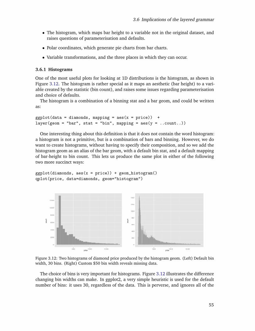
3.6 Implications of the layered grammar
• The histogram, which maps bar height to a variable not in the original dataset, andraises questions of parameterisation and defaults.
• Polar coordinates, which generate pie charts from bar charts.
• Variable transformations, and the three places in which they can occur.
3.6.1 Histograms
One of the most useful plots for looking at 1D distributions is the histogram, as shown inFigure 3.12. The histogram is rather special as it maps an aesthetic (bar height) to a vari-able created by the statistic (bin count), and raises some issues regarding parameterisationand choice of defaults.
The histogram is a combination of a binning stat and a bar geom, and could be writtenas:
ggplot(data = diamonds, mapping = aes(x = price)) +layer(geom = "bar", stat = "bin", mapping = aes(y = ..count..))
One interesting thing about this definition is that it does not contain the word histogram:a histogram is not a primitive, but is a combination of bars and binning. However, we dowant to create histograms, without having to specify their composition, and so we add thehistogram geom as an alias of the bar geom, with a default bin stat, and a default mappingof bar-height to bin count. This lets us produce the same plot in either of the followingtwo more succinct ways:
ggplot(diamonds, aes(x = price)) + geom_histogram()qplot(price, data=diamonds, geom="histogram")
Figure 3.12: Two histograms of diamond price produced by the histogram geom. (Left) Default binwidth, 30 bins. (Right) Custom $50 bin width reveals missing data.
The choice of bins is very important for histograms. Figure 3.12 illustrates the differencechanging bin widths can make. In ggplot2, a very simple heuristic is used for the defaultnumber of bins: it uses 30, regardless of the data. This is perverse, and ignores all of the
55
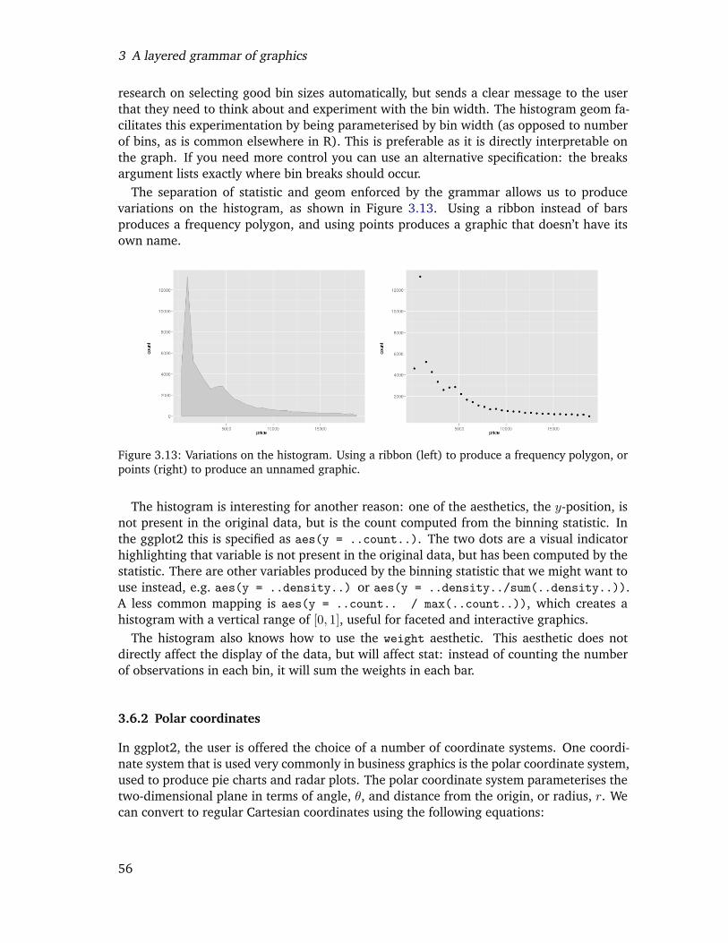
3 A layered grammar of graphics
research on selecting good bin sizes automatically, but sends a clear message to the userthat they need to think about and experiment with the bin width. The histogram geom fa-cilitates this experimentation by being parameterised by bin width (as opposed to numberof bins, as is common elsewhere in R). This is preferable as it is directly interpretable onthe graph. If you need more control you can use an alternative specification: the breaksargument lists exactly where bin breaks should occur.
The separation of statistic and geom enforced by the grammar allows us to producevariations on the histogram, as shown in Figure 3.13. Using a ribbon instead of barsproduces a frequency polygon, and using points produces a graphic that doesn’t have itsown name.
Figure 3.13: Variations on the histogram. Using a ribbon (left) to produce a frequency polygon, orpoints (right) to produce an unnamed graphic.
The histogram is interesting for another reason: one of the aesthetics, the y-position, isnot present in the original data, but is the count computed from the binning statistic. Inthe ggplot2 this is specified as aes(y = ..count..). The two dots are a visual indicatorhighlighting that variable is not present in the original data, but has been computed by thestatistic. There are other variables produced by the binning statistic that we might want touse instead, e.g. aes(y = ..density..) or aes(y = ..density../sum(..density..)).A less common mapping is aes(y = ..count.. / max(..count..)), which creates ahistogram with a vertical range of [0, 1], useful for faceted and interactive graphics.
The histogram also knows how to use the weight aesthetic. This aesthetic does notdirectly affect the display of the data, but will affect stat: instead of counting the numberof observations in each bin, it will sum the weights in each bar.
3.6.2 Polar coordinates
In ggplot2, the user is offered the choice of a number of coordinate systems. One coordi-nate system that is used very commonly in business graphics is the polar coordinate system,used to produce pie charts and radar plots. The polar coordinate system parameterises thetwo-dimensional plane in terms of angle, θ, and distance from the origin, or radius, r. Wecan convert to regular Cartesian coordinates using the following equations:
56
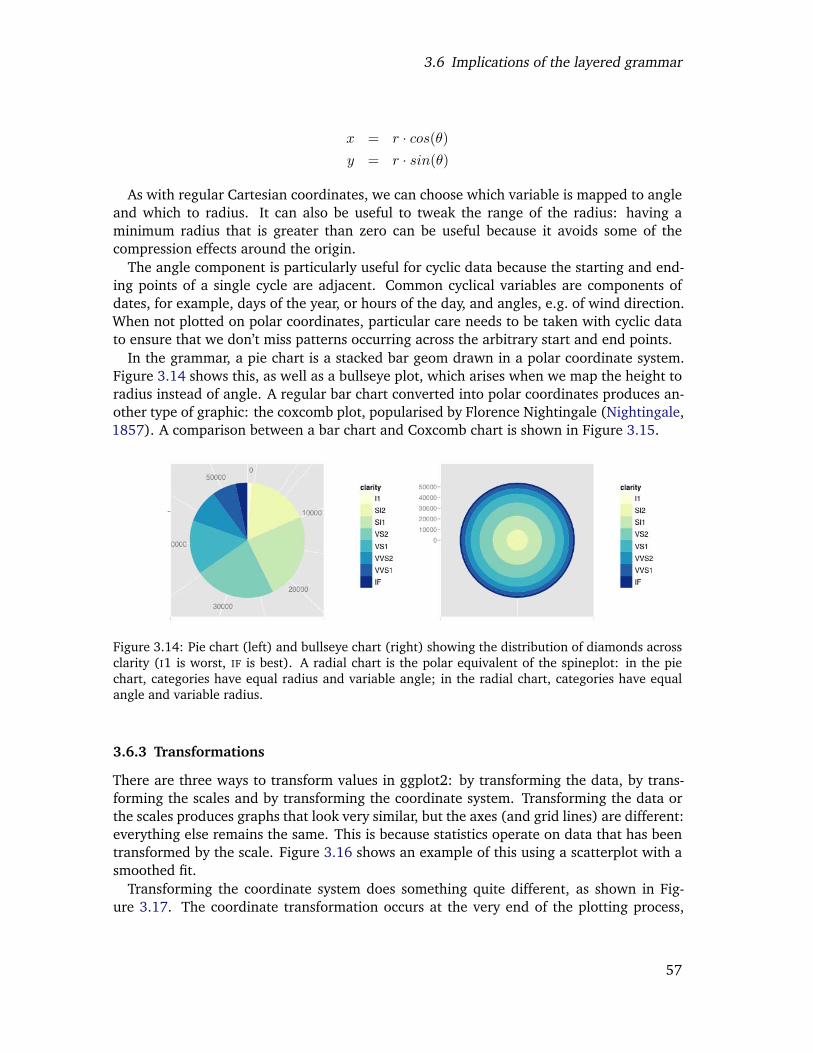
3.6 Implications of the layered grammar
x = r · cos(θ)y = r · sin(θ)
As with regular Cartesian coordinates, we can choose which variable is mapped to angleand which to radius. It can also be useful to tweak the range of the radius: having aminimum radius that is greater than zero can be useful because it avoids some of thecompression effects around the origin.
The angle component is particularly useful for cyclic data because the starting and end-ing points of a single cycle are adjacent. Common cyclical variables are components ofdates, for example, days of the year, or hours of the day, and angles, e.g. of wind direction.When not plotted on polar coordinates, particular care needs to be taken with cyclic datato ensure that we don’t miss patterns occurring across the arbitrary start and end points.
In the grammar, a pie chart is a stacked bar geom drawn in a polar coordinate system.Figure 3.14 shows this, as well as a bullseye plot, which arises when we map the height toradius instead of angle. A regular bar chart converted into polar coordinates produces an-other type of graphic: the coxcomb plot, popularised by Florence Nightingale (Nightingale,1857). A comparison between a bar chart and Coxcomb chart is shown in Figure 3.15.
Figure 3.14: Pie chart (left) and bullseye chart (right) showing the distribution of diamonds acrossclarity (I1 is worst, IF is best). A radial chart is the polar equivalent of the spineplot: in the piechart, categories have equal radius and variable angle; in the radial chart, categories have equalangle and variable radius.
3.6.3 Transformations
There are three ways to transform values in ggplot2: by transforming the data, by trans-forming the scales and by transforming the coordinate system. Transforming the data orthe scales produces graphs that look very similar, but the axes (and grid lines) are different:everything else remains the same. This is because statistics operate on data that has beentransformed by the scale. Figure 3.16 shows an example of this using a scatterplot with asmoothed fit.
Transforming the coordinate system does something quite different, as shown in Fig-ure 3.17. The coordinate transformation occurs at the very end of the plotting process,
57
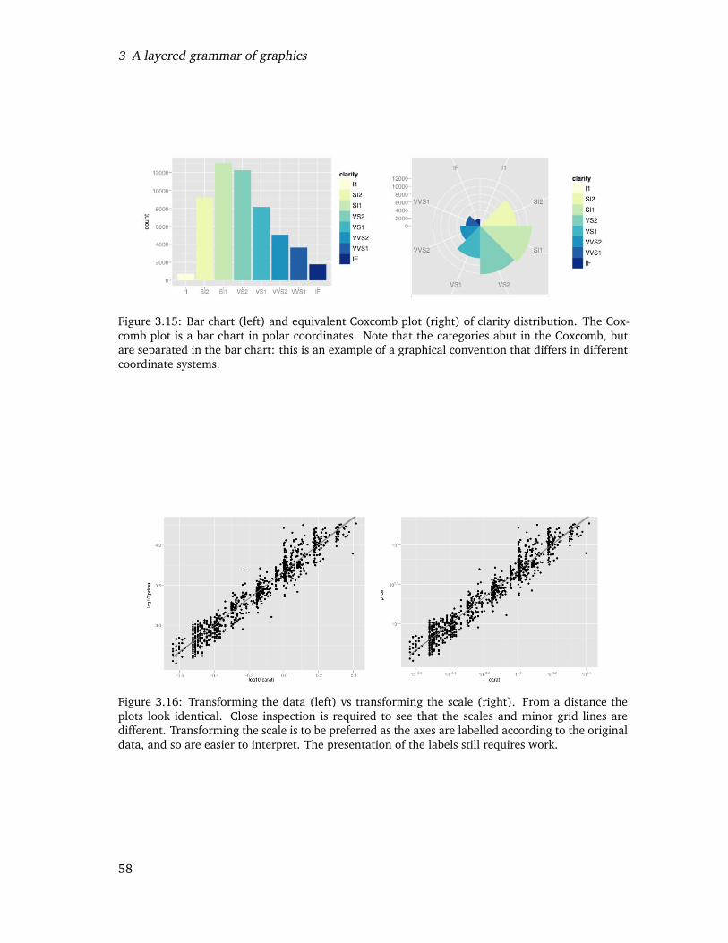
3 A layered grammar of graphics
Figure 3.15: Bar chart (left) and equivalent Coxcomb plot (right) of clarity distribution. The Cox-comb plot is a bar chart in polar coordinates. Note that the categories abut in the Coxcomb, butare separated in the bar chart: this is an example of a graphical convention that differs in differentcoordinate systems.
Figure 3.16: Transforming the data (left) vs transforming the scale (right). From a distance theplots look identical. Close inspection is required to see that the scales and minor grid lines aredifferent. Transforming the scale is to be preferred as the axes are labelled according to the originaldata, and so are easier to interpret. The presentation of the labels still requires work.
58
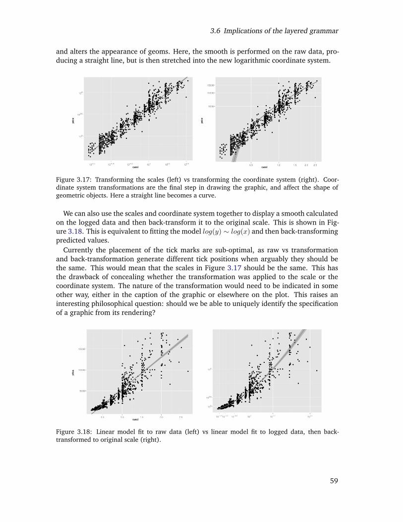
3.6 Implications of the layered grammar
and alters the appearance of geoms. Here, the smooth is performed on the raw data, pro-ducing a straight line, but is then stretched into the new logarithmic coordinate system.
Figure 3.17: Transforming the scales (left) vs transforming the coordinate system (right). Coor-dinate system transformations are the final step in drawing the graphic, and affect the shape ofgeometric objects. Here a straight line becomes a curve.
We can also use the scales and coordinate system together to display a smooth calculatedon the logged data and then back-transform it to the original scale. This is shown in Fig-ure 3.18. This is equivalent to fitting the model log(y) ∼ log(x) and then back-transformingpredicted values.
Currently the placement of the tick marks are sub-optimal, as raw vs transformationand back-transformation generate different tick positions when arguably they should bethe same. This would mean that the scales in Figure 3.17 should be the same. This hasthe drawback of concealing whether the transformation was applied to the scale or thecoordinate system. The nature of the transformation would need to be indicated in someother way, either in the caption of the graphic or elsewhere on the plot. This raises aninteresting philosophical question: should we be able to uniquely identify the specificationof a graphic from its rendering?
Figure 3.18: Linear model fit to raw data (left) vs linear model fit to logged data, then back-transformed to original scale (right).
59
3 A layered grammar of graphics
3.7 Perceptual issues
The grammar describes the components of the plot, but not their appearance. To createappealing, useful graphics it is necessary to devote considerable effort to these “minor”construction details, bearing in mind the cognitive psychology of perception. Difficultyarises because many of these issues are subjective: they may look nice to me, but lookhorrid to you, and there is little research available to guide these design choices. Thepoints below illustrate some of the decisions which we have made, and some of the issuesthat we have struggled with.
• Grey background and white grid lines. This follows from the advice of Tufte (1990,1997, 2001, 2006) and Brewer (1994a); Carr (1994, 2002); Carr and Sun (1999).We can still see the gridlines to aid in the judgement of position (Cleveland, 1993),but they have little visual impact and we can easily “tune” them out. The grey back-ground gives the plot a similar colour (in a typographical sense) to the remainder ofthe text, ensuring that the graphics fit in with the flow of a text without jumping outwith a bright white background. Finally, the grey background creates a continuousfield of colour which ensures that the plot is perceived as a single visual entity.
• Data points are not plotted next to the margins of the plot. This is an old, butimportant, guideline from Cleveland and McGill (1987). Data points need to beplaced some distance from the axis so that the components of the axis and the dataare not confused. In ggplot2 there are different rules depending on whether the axisis continuous or discrete. For continuous data, 5% extra space is added, and fordiscrete data half a bar is added. These can be fine tuned by the user if necessary.
• Placing tick marks on axes is difficult, and currently ggplot2 uses the pretty func-tion in base R. This is original work by Martin Maechler (personal comm.), which hasnot been published. I also experimented with the heuristics discussed in Wilkinson(2005), but to my eye these produced poor results. Other methods are discussed inMurdoch (2000); Nelder (1976); Sparks (1971); Stirling (1981); Thayer and Storer(1969). There has been little recent work on “optimal” tick mark placement, es-pecially for non-linear scales. Minor grid lines are also displayed, by default, onebetween each major tick mark. This helps judge if scale is non-linear.
A wide range of scales are implemented in ggplot2 (any function with an inverse),so a rule was needed for placing minor tick marks. Following the typical display of alog-log plot, major tick marks are evenly spaced on the plot, while minor tick marksare evenly spaced in the original data space.
• The direct representation of the data, the geom, is the most important. While scalesand coordinate systems are important in that we need to be able to trust them, andmay sometimes want to read off values, typically we will use other tools to get exactvalues (eg. interactive identification, or reading off table of values), and we arelargely interested in the gestalt. In ggplot2, we spent most ink on the geom, not onthe guides.
60
3.8 A poetry of graphics?
• The colour of default colour scales is difficult. Initially ColorBrewer (Brewer, 1994a,b)palettes were used. Unfortunately, they have a major drawback in that they are de-signed for maps, where the coloured areas are large and contiguous. For scatterplots,where the colour regions are small and separate, the colours are not very distinguish-able. In general, smaller areas require brighter, more saturated colours. There is aperceptual interaction between the colour and the size of the region that is coloured(Ihaka, 2003) that is difficult to model and adjust for.
Currently, different scales are used for categorical or continuous variables. For contin-uous data, a colour scale generated by linearly interpolating between two colours inHCL space (eg. blue and yellow). Categorical variables are mapped to evenly spacedhues, with equal luminance and chroma. These choices are good, but not great: thecategorical colours can look muddy and unattractive, and print to black and whiteas indistinguishable shades of grey; and much care needs to be taken when choosingstarting colours for the continuous scale.
3.8 A poetry of graphics?
The grammar tells us what words make up our graphical “sentences”, but offers no adviceon how to write well. How can we build on top of the grammar to help data analysts buildcompelling, revealing graphics? What would a poetry of graphics look like? The ideas inthis section draw inspiration from the tools that word processors provide to try and helpus write better.
With ggplot2, we already have the equivalent of a spelling checker: the plot simplywon’t work unless the components have been correctly specified. How about a grammarchecker? This tool would identify common mistakes and warn the user. This is a helpfulfirst step: a grammar checker ensures that you haven’t made any obvious mistakes, butwill not significantly improve your prose, and sometimes the warnings may be incorrect.For graphics, some readily detected problems and possible solutions are:
• Too many variables. It is hard to see the relationship between more than three vari-ables in a single panel: two position and one other. We should warn the user whentoo many aesthetics are used, and suggest alternatives, such as faceting.
• Overplotting. It is easy to draw incorrect conclusions about the distribution of pointsin the presence of overplotting. There are many possible solutions. We could sup-plement the plot with the contours of a 2d density estimate, or colour each point bythe local density (Unwin et al., 1996). Other solutions are suggested in Carr et al.(1987); Cleveland and McGill (1984); Huang et al. (1997).
• Alphabetical ordering. Categorical variables are often displayed in alphabetical or-dering. Wainer (2000, 2004) calls this mistake “Alabama first!” due to the propensityfor states to be listed in alphabetical order. Ordering by some property of the data(e.g. mean or median) often makes the plot more useful (Becker et al., 1996).
• Polar coordinates. We know that humans are better at judging length than angle orarea (Cleveland and McGill, 1987), and polar coordinates have a singularity at the
61
3 A layered grammar of graphics
origin which makes it difficult to judge angle for objects with small radius. Shouldwe always warn users when they choose to use this coordinate system?
We can also provide tools to help the analyst get started; instead of a blank page, wecould start with a template, containing some potentially useful views. One approach isto calculate a measure of interest for a wide number of possible plots and then showthe most interesting. This is the basic idea behind scagnostics (Wilkinson et al., 2005)and projection pursuit (Cook et al., 2008b; Friedman, 1987), which explore the space ofscatterplots generated by projection. We can also explore other parameter spaces, as theaspect ratio of the plot, as in Heer and Agrawala (2006), which create multiple plots eachbanking a different component to 45◦ (as recommended by Cleveland (1993)). Similarly,instead of displaying the histogram with the optimal bin width, we could display the fiveor ten most revealing.
Beyond that, it seems difficult to see how to do much more algorithmically, and we needto turn to education and training. The grammar provides a good foundation for teaching,as it helps students to see the deeper themes underlying different graphics, as well asproviding a tool for describing and drawing graphics.
3.9 Conclusions
The aim of the grammar is to “bring together in a coherent way things that previouslyappeared unrelated and which also will provide a basis for dealing systematically withnew situations” (Cox, 1978). How well have we succeeded?
With the histogram, we saw how a familiar graphic can be broken into its componentparts, and then those parts changed independently to get variations on an old friend. Inthe polar coordinates examples, we saw the deep similarities that underlie the bar chart,pie chart and Coxcomb chart. We also accidentally created an unusual chart, the bullseyeplot, and saw how it is like the polar equivalent of the spineplot. The transformationexamples showed the usefulness of multiple transformation stages, and how we can mimicthe common statistical practice of back-transformation using graphics alone.
One area where this grammar is not so strong is area plots: bar charts, spineplots, his-tograms, mosaic plots, etc. (Hartigan and Kleiner, 1981; Hofmann, 2003). While theycan be constructed with the grammar, it gives no great insight into their underlying struc-ture, or how we can create new, useful, variations. This suggests that it may be fruitful todescribe “sub-grammars” for particular families of plots.
The layered grammar does not include user interaction with plot; all plots are static andseparate. Clearly there is huge scope for adding interaction to this grammar. Some typesof interaction will be easier to add than others. For example connecting a slider to the binwidth of a histogram. Here we connect some user interface element to some specificationof the plot. This type of interaction includes zooming and panning (changing scale limits),but not linked brushing. Linked brushing is an example of interaction with the underly-ing data, and incorporating this type of interaction into the grammar will require deeperthought. Speed is also a challenge; to be seamlessly perceived an interactive graphic mustbe updated multiple times a second, whereas many ggplot2 graphics take over a second todraw.
62

3.10 Acknowledgements
The grammar is powerful and useful, but not all encompassing. As well as specialisingthe grammar for particular families of graphics, we also need to support the creation ofattractive, useful plots. The ideas outlined in the last section suggest ways to build on topof the grammar to support graphical data analysis and exploration.
ggplot2 is available from http://had.co.nz/ggplot2.
3.10 Acknowledgements
This material is based upon work supported by the National Science Foundation underGrant No. 0706949.
63

3 A layered grammar of graphics
64
Chapter 4
Visualising statistical modelsRemoving the blindfold
Abstract
This paper discusses strategies for visualising statistical models. It is organised aroundthree strategies: display the model in the data space; look all members of a collection;and explore the process of model fitting, not just the end result. Case studies developvisualisations for MANOVA, classification algorithms, hierarchical clustering, ensembles oflinear models, projection pursuit, self organising maps and neural networks.
4.1 Introduction
There are very many well-known techniques for visualising statistical data, but far fewerfor statistical models. This paper pulls together some general techniques for visualisingstatistical models, stressing the importance of displaying the model in the context of thedata. Why do we need to be able to visualise statistical models? What should a good visu-alisation of a model help us to do? There are three questions that graphics are particularlywell suited to answering:
• What is the model? While we always know the general form of the model, inspectionof the numerical parameters may give no insight into the details of its structure. Forexample, looking at the estimates for natural spline terms in a linear model will notreveal the shape of the curve. A graphical summary of the model will often be moreinterpretable, particularly to non-statisticians.
• How well does the model fit the data? Graphics allow us to compare the shape of themodel to the data, giving us diagnostics that not only indicate if something is wrong,but also suggest ways to fix the problem.
• How can we do better? Graphics also provide us with inspiration. The form of amodel is fixed and it is unlikely to surprise us. A linear model will never reveal anon-linear relationship, or that there are clusters in the data. If we know exactlywhat we are looking for, then numerical methods are provably most efficient. Buthow often does that occur?
65
4 Visualising statistical models: Removing the blindfold
Developing good visualisations for models requires some general strategies. This paperis organised around three of them:
• Display the model in data space (not data in the model space). We should strive todisplay the essence of model in the high-d data space, rather low-d summaries of thedata produced by the model.
• Look at all members of a collection, not just one. Multiple models will often givemore insight than a single model; looking at many local optima may give more insightthan look at a single global optimum; looking at multiple summaries statistics is moreinformative than looking at one.
• Explore the process of fitting, not just the end result. Understanding how the al-gorithm works allows us to better understand how the data contributes to the finalmodel.
Each strategy is described in detail in the following sections, and is illustrated by one ormore case studies. The paper concludes with a larger case study that develops informativenew visualisations for neural networks, using all of the strategies discussed in the paper.
Many of these techniques have grown out of our work with rggobi (Temple Lang et al.,2007), an R package which connects the statistical programming environment of R (?)with the interactive and dynamic graphics of GGobi (Swayne et al., 2003). This paper tiestogether the ideas underlying three R packages that use rggobi: classifly (Wickham,2007a), clusterfly (Wickham, 2007b), and meifly (Wickham, 2006). The importanceof a tight connection between statistical and graphical environments has long been recog-nised, particularly in Lisp-Stat (Tierney, 1990), the ancestors of rggobi (Swayne et al.,1991), Datadesk (Velleman, 1992), ViSta (Young et al., 1993), ARC (Cook, 1998), Mon-drian (Theus, 2003) and iplots (Urbanek and Wichtrey, 2007). A recent trend has beento use R as the statistical computation engine and develop interactive graphics in anotherlanguage. This is the approach of Mondrian, iplots, rggobi, Klimt (Urbanek, 2002b) andGauguin (Gribov, 2007).
The techniques described in this paper make extensive use of dynamic and interactivegraphics. To supplement the static snapshots of these tools, we have provided a numberof movies. Each movie is hyperlinked from the section it is used, and a complete listing isavailable at http://www.vimeo.com/album/8875. These movies should work on any mod-ern browser, but a broadband internet connection is recommended. As well as interactivegraphics, good static graphics play an important role, especially when communicating re-sults in papers and presentations. This paper uses the ggplot2 package (Wickham, 2008)extensively to rapidly go from graphics in our heads to graphics on the page. The majorityof graphics in this paper were produced with a few lines of code. This is a considerablehelp when exploring a wide range of possible representations: the less time it takes toproduce a single representation, the more time you have to try other options.
One dataset (Asuncion and Newman, 2007) is used throughout this paper. It contains in-formation on 178 wines made with grapes from 3 varieties, and with 13 variables describ-ing physical composition (including chemical constituents and colour). As the variablesare not directly comparable, we have standardised them to range [0, 1]. In addition to this
66
4.2 What is a model? Terminology and definitions
dataset, there several simpler simulated datasets are used to focus attention on specificpoints.
4.2 What is a model? Terminology and definitions
Before we continue, it’s worth discussing in more detail what exactly a model is, since“model” is such an overloaded term. We use it to refer to different levels of specificity:model family, model form and fitted model, as described below.
• The model family describes, at the broadest possible level, the connection betweenthe variables of interest. For example, the linear model predicts a single continuousresponse to a linear combination of predictor variables, and assumes normally dis-tributed error, Y |X ∼ Normal(µ = AX, σ). The model family is almost always speci-fied by the statistician (i.e. you can’t use a test to determine whether you should usea linear model or model-based clustering).
• The model form specifies exactly how the variables of interest are connected withinthe framework of the model family. For example, the model form of a linear modelspecifies which variable is the response, and which variables are the predictors, e.g.height|age, sex ∼ Normal(µ = b + a1 · age + a2 · sex, σ). The model form might bespecified a priori by the statistician, or chosen by a model-selection procedure.
• The fitted model is a concrete instance of the model form where all parameters havebeen estimated from data, and the model can be used to generate predictions. Forexample, height|age, sex ∼ Normal(µ = 10 + 5 · age + 3 · sex, σ = 4). Typically,the fitted model optimises some criterion for the given data, e.g. the linear modelminimises the total squared deviation between responses and predictions.
Bayesian models can be described in a similar manner, although there we tend to focuson the the distributions of the parameters given the data, rather than a single estimatedvalue.
Not all techniques used by statisticians have these explicit probabilistic models, but thebasic breakdown remains the same. For example, neural networks are a model family,the model form specifies the variables and number of nodes, and the fitted model willhave estimates for the parameters of each node. Neural networks are a good example ofwhere going from the model form to the fitted model is difficult. We must use numericalmethods, and convergence to a global optimum is not guaranteed. This means to findthe “best” fitted model (i.e. the model with the highest criterion value) we need multiplerandom starts. We will come back to this in Section 4.6.
Knowing the model family and form does not guarantee we know what the fitted modellooks like. For example, the parameters of the linear model can be interpreted as thechange in the response when the predictor is changed by one unit, if all other variablesare held constant. This seems easy to interpret, but most models have interdependenciesbetween the predictors which means variables do not change independently, as with in-teractions or polynomial terms. For more complex models, there may never be any directinterpretation of any of the model parameters.
67
4 Visualising statistical models: Removing the blindfold
4.3 Display the model in data-space
A major theme of this paper is the importance of visualising the model in the context of thedata, displaying the model in the high-dimensional data space, or for short, showing them-in-ds. This is important because it allows us see how well (or how poorly) the modelresponds to the data. The opposite of visualising the model in data space is visualising thedata in the model space (d-in-ms), where the data is displayed in some low-dimensionalspace generated by the model. Both methods have their uses, but m-in-ds displays areparticularly helpful for understanding and critiquing the model.
To compare these approaches, think of a linear model. One of the most common diag-nostics is a plot of fitted values versus residuals. This is a d-in-ms display because we areplotting summary statistics from the model in a low-d view. An m-in-ds approach wouldbe to generate the full regression surface, and visualise it in the context of the data; thisis hard, but often revealing. For an m-in-ds approach, we can still use the residuals, butwe would want to see them in the context of the entire predictor space. For categoricalpredictors, another approach would be to use population marginal means (Searle et al.,1980) to summarise the categorical coefficients in such way that they are interpretable inthe data space.
More generally, what will a model embedded in the data space look like? We definethe data space to be the region over which we can reliably make inferences, usually ahypercube containing the data, unless the variables are highly dependent, in which casethe data space might be a small subspace of the full cube. We can say a few things about theform of models in general because almost all models share two important characteristics:they summarise the data and interpolate the data space. This means that the model willhave many fewer dimensions than the data, and it will take values over the entire dataspace, even where there are no data. This implies that models are manifolds, or high-dsurfaces.
It will be challenging to visualise the model in the data space: we have high-d datapoints and a high-d model manifold. The following subsections describe some general toolsfor high-d visualisation, and develop some ideas for representing the model in the dataspace. Finally, three case studies illustrate the m-in-ds strategy for MANOVA, classificationalgorithms and hierarchical clustering.
4.3.1 Tools for visualising high-d data and models
To visualise data and models in many dimensions, we need some good tools. While itis possible to investigate high-d objects with only static graphics, it is much easier to doso interactively. We will use two basic tools extensively: the grand tour, to look at manyprojections of the data; and linked brushing, to interactively conditioning the data andlook at many subsections of the data. These tools are described briefly below, and inmore detail in Cook and Swayne (2007). Other tools, such as the parallel coordinate plot(Inselberg, 1985; Wegman, 1990), are also useful, but we prefer the tour because for lowto moderate-d it gives a more immediately interpretable view of the data.
When we have a 3d object, how do we figure out what shape it is? We pick it up and lookat it from multiple sides, joining a sequence of 2d views into a 3d model. The grand tourgeneralises this idea to more than n-d, generating a sequence of 2d projections of an n-d
68
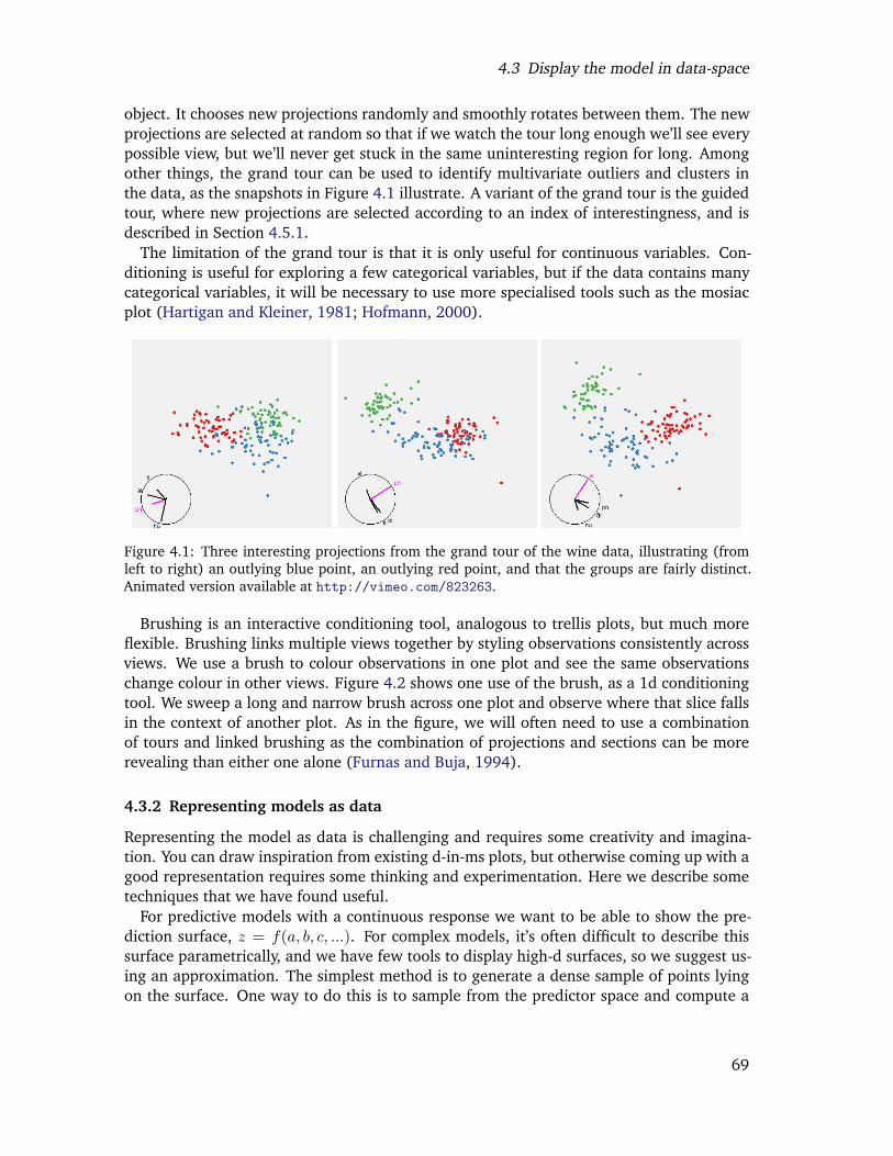
4.3 Display the model in data-space
object. It chooses new projections randomly and smoothly rotates between them. The newprojections are selected at random so that if we watch the tour long enough we’ll see everypossible view, but we’ll never get stuck in the same uninteresting region for long. Amongother things, the grand tour can be used to identify multivariate outliers and clusters inthe data, as the snapshots in Figure 4.1 illustrate. A variant of the grand tour is the guidedtour, where new projections are selected according to an index of interestingness, and isdescribed in Section 4.5.1.
The limitation of the grand tour is that it is only useful for continuous variables. Con-ditioning is useful for exploring a few categorical variables, but if the data contains manycategorical variables, it will be necessary to use more specialised tools such as the mosiacplot (Hartigan and Kleiner, 1981; Hofmann, 2000).
Figure 4.1: Three interesting projections from the grand tour of the wine data, illustrating (fromleft to right) an outlying blue point, an outlying red point, and that the groups are fairly distinct.Animated version available at http://vimeo.com/823263.
Brushing is an interactive conditioning tool, analogous to trellis plots, but much moreflexible. Brushing links multiple views together by styling observations consistently acrossviews. We use a brush to colour observations in one plot and see the same observationschange colour in other views. Figure 4.2 shows one use of the brush, as a 1d conditioningtool. We sweep a long and narrow brush across one plot and observe where that slice fallsin the context of another plot. As in the figure, we will often need to use a combinationof tours and linked brushing as the combination of projections and sections can be morerevealing than either one alone (Furnas and Buja, 1994).
4.3.2 Representing models as data
Representing the model as data is challenging and requires some creativity and imagina-tion. You can draw inspiration from existing d-in-ms plots, but otherwise coming up with agood representation requires some thinking and experimentation. Here we describe sometechniques that we have found useful.
For predictive models with a continuous response we want to be able to show the pre-diction surface, z = f(a, b, c, ...). For complex models, it’s often difficult to describe thissurface parametrically, and we have few tools to display high-d surfaces, so we suggest us-ing an approximation. The simplest method is to generate a dense sample of points lyingon the surface. One way to do this is to sample from the predictor space and compute a
69
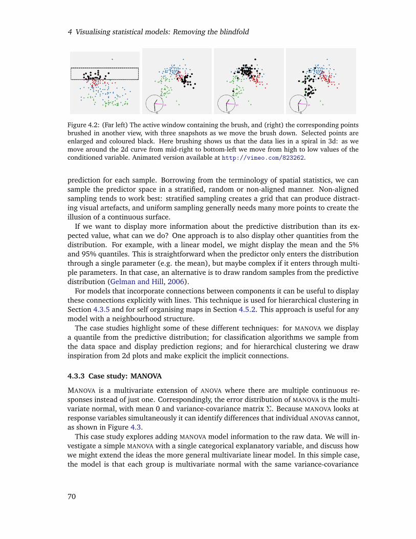
4 Visualising statistical models: Removing the blindfold
Figure 4.2: (Far left) The active window containing the brush, and (right) the corresponding pointsbrushed in another view, with three snapshots as we move the brush down. Selected points areenlarged and coloured black. Here brushing shows us that the data lies in a spiral in 3d: as wemove around the 2d curve from mid-right to bottom-left we move from high to low values of theconditioned variable. Animated version available at http://vimeo.com/823262.
prediction for each sample. Borrowing from the terminology of spatial statistics, we cansample the predictor space in a stratified, random or non-aligned manner. Non-alignedsampling tends to work best: stratified sampling creates a grid that can produce distract-ing visual artefacts, and uniform sampling generally needs many more points to create theillusion of a continuous surface.
If we want to display more information about the predictive distribution than its ex-pected value, what can we do? One approach is to also display other quantities from thedistribution. For example, with a linear model, we might display the mean and the 5%and 95% quantiles. This is straightforward when the predictor only enters the distributionthrough a single parameter (e.g. the mean), but maybe complex if it enters through multi-ple parameters. In that case, an alternative is to draw random samples from the predictivedistribution (Gelman and Hill, 2006).
For models that incorporate connections between components it can be useful to displaythese connections explicitly with lines. This technique is used for hierarchical clustering inSection 4.3.5 and for self organising maps in Section 4.5.2. This approach is useful for anymodel with a neighbourhood structure.
The case studies highlight some of these different techniques: for MANOVA we displaya quantile from the predictive distribution; for classification algorithms we sample fromthe data space and display prediction regions; and for hierarchical clustering we drawinspiration from 2d plots and make explicit the implicit connections.
4.3.3 Case study: MANOVA
MANOVA is a multivariate extension of ANOVA where there are multiple continuous re-sponses instead of just one. Correspondingly, the error distribution of MANOVA is the multi-variate normal, with mean 0 and variance-covariance matrix Σ. Because MANOVA looks atresponse variables simultaneously it can identify differences that individual ANOVAs cannot,as shown in Figure 4.3.
This case study explores adding MANOVA model information to the raw data. We will in-vestigate a simple MANOVA with a single categorical explanatory variable, and discuss howwe might extend the ideas the more general multivariate linear model. In this simple case,the model is that each group is multivariate normal with the same variance-covariance
70

4.3 Display the model in data-space
Figure 4.3: Example where MANOVA would detect a difference between the groups, but two ANOVAswould not. Groups are distinct in 2d (left), but overlap on both margins (right).
matrix. To summarise this model we’ll display a 84% confidence region around the mean.84% corresponds to 1.4 standard errors of the mean, used because the standard error ofthe difference is 1.4× (
√2) that of standard error of the mean. If two 84% confidence
regions don’t overlap, then the means must be at least 2 standard errors apart and thussignificantly different at the 5% level.
Generating the points on the surface of the confidence region is straightforward. First,we draw points from a d-dimensional standard multivariate normal, then project these ontothe surface of a sphere by normalising each row to distance 1. Next, we skew this sphereto match the desired variance-covariance matrix, blow it up to give the appropriate cl-levelconfidence ellipsoid, and translate it by the group mean. This generates a p-dimensionalellipsoid, which in 2d projections will look like a filled ellipse. Figure 4.4 shows the resultof this approach applied to the wine data.
Figure 4.4: Two projections of the wine data with 84% confidence regions around the group means.Large points are data, small points are a sample on the surface of the confidence region. While theconfidence ellipsoids appear to overlap in a few projections (left), in most views we see that themeans are distant (right). The groups may overlap, but their means are significantly different.
Extending this idea to deal with multivariate linear models is straightforward, althoughvisualising the resulting surfaces will be difficult. If the model contains continuous vari-ables, then we will no longer have point predictors of the mean, but instead continuousfunctions each surrounded by a confidence region. We can generate these confidenceregions by randomly sampling the predictor space and then generating the confidence re-gion for each sampled point as for MANOVA. Visualisation is complicated when we havemultiple response and predictor variables as we want to keep them separate, e.g. a linear
71
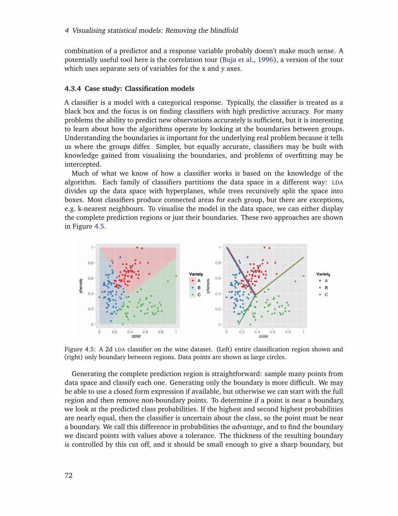
4 Visualising statistical models: Removing the blindfold
combination of a predictor and a response variable probably doesn’t make much sense. Apotentially useful tool here is the correlation tour (Buja et al., 1996), a version of the tourwhich uses separate sets of variables for the x and y axes.
4.3.4 Case study: Classification models
A classifier is a model with a categorical response. Typically, the classifier is treated as ablack box and the focus is on finding classifiers with high predictive accuracy. For manyproblems the ability to predict new observations accurately is sufficient, but it is interestingto learn about how the algorithms operate by looking at the boundaries between groups.Understanding the boundaries is important for the underlying real problem because it tellsus where the groups differ. Simpler, but equally accurate, classifiers may be built withknowledge gained from visualising the boundaries, and problems of overfitting may beintercepted.
Much of what we know of how a classifier works is based on the knowledge of thealgorithm. Each family of classifiers partitions the data space in a different way: LDA
divides up the data space with hyperplanes, while trees recursively split the space intoboxes. Most classifiers produce connected areas for each group, but there are exceptions,e.g. k-nearest neighbours. To visualise the model in the data space, we can either displaythe complete prediction regions or just their boundaries. These two approaches are shownin Figure 4.5.
Figure 4.5: A 2d LDA classifier on the wine dataset. (Left) entire classification region shown and(right) only boundary between regions. Data points are shown as large circles.
Generating the complete prediction region is straightforward: sample many points fromdata space and classify each one. Generating only the boundary is more difficult. We maybe able to use a closed form expression if available, but otherwise we can start with the fullregion and then remove non-boundary points. To determine if a point is near a boundary,we look at the predicted class probabilities. If the highest and second highest probabilitiesare nearly equal, then the classifier is uncertain about the class, so the point must be neara boundary. We call this difference in probabilities the advantage, and to find the boundarywe discard points with values above a tolerance. The thickness of the resulting boundaryis controlled by this cut off, and it should be small enough to give a sharp boundary, but
72

4.3 Display the model in data-space
large enough that the set of boundary points is dense. This is a tricky trade-off. It may bepossible to use adaptive sampling, sampling more densely in regions closer to the boundary,to do better.
If the classification function does not generate posterior probabilities, a k-nearest neigh-bours approach on the grid of predictions can be used. If the neighbours of a point areall the same class, then the point is not on a boundary. This method can be applied toany classification function, but is slow, O(n2), because it computes all pairwise distancesto find the nearest neighbours. In practice, this imposes a limit of around 20,000 points.
Figure 4.6 illustrates the results of a support vector machine (Cortes and Vapnik, 1995)with radial kernel fitted to three variables from the wine data. We see the red regionis contained almost completely inside the blue region, except where it abuts the greenregion. The boundaries and regions are straightforward to understand because our brainsare adept at 3d modelling. http://www.vimeo.com/821284 explores the boundaries inanother way, by brushing along the advantage variable. This shows that the boundariesare equal sharp between the different groups.
As we move beyond 3d it gets harder to see what is going on, but if we persevere wecan find informative views. Figure 4.7 shows three informative views of a polynomialkernel with five variables. It looks like the boundary is largely flat (linear), apart froma region that bulges out of the blue into red. This is easier to see interactively, as athttp://vimeo.com/823271.
Figure 4.6: Views of a 3d radial SVM classifier. From left to right: boundary, red, green andblue regions. Variables used: color, phenols, and flavanoids. Animated version available at http://vimeo.com/821284.
Figure 4.7: Informative views of a 5d SVM with polynomial kernel. It’s possible to see that theboundaries are largely linear, with a “bubble” of blue pushing into the red. A video presentation ofthis tour is available at . Variables used: color, phenols, flavanoids, proline and dilution. Animatedversion available from http://vimeo.com/823271.
73

4 Visualising statistical models: Removing the blindfold
These ideas are implemented in the R package classifly (Wickham, 2007a), whichcan visualise classifiers generated by LDA and QDA (Venables and Ripley, 2002), SVM (Dim-itriadou et al., 2006), neural networks (Venables and Ripley, 2002), trees (Therneau andAtkinson, 2008), random forests (Liaw and Wiener, 2002) and logistic regression; and itcan easily to be extended to deal with other classifiers. More specific visualisations mayalso be useful for each of these families of models: Section 4.6 discusses neural networks;Cook et al. (2008a), support vector machines; and KLIMT provides many tools for visualis-ing trees (Urbanek, 2002a,b, 2003).
4.3.5 Case study: Hierarchical clustering
Agglomerative hierarchical clustering methods build up clusters point by point, iterativelyjoining the two closest points or clusters. This requires a distance metric, and a method forcalculating the distance between two clusters (linkage). There are a number of commonmethods: use the closest distance (simple linkage), the largest distance (complete linkage),the average distance (UPGMA), or the distance between cluster centroids (Ward’s). Eachof these methods finds clusters of somewhat different shapes: single linkage forms longskinny clusters, average linkage forms more spherical clusters.
The most common visualisation of a hierarchical clustering is a dendrogram, a d-in-ms display. There are also a number of other methods of this type: icicles (Kruskal andLandwehr, 1983), silhouettes (Trauwaert et al., 1989) and clustergrams (Schonlau, 2002).Figure 4.8 shows two dendrograms produced by clustering the wine dataset with Wardslinkage and single linkage. These dendrograms aren’t very informative. For the Wardsclustering we can see that there are three major clusters, and for single linkage the clustersseem to grow mainly by adding a single point to an existing cluster. We can’t see what theclusters have in common, or what variables are important for the clustering.
Figure 4.8: Dendrograms from a hierarchical clustering performed on wine dataset. (Left) Wardslinkage and (right) single linkage. Points coloured by wine variety. Wards linkage finds threeclusters of roughly equal size, which correspond fairly closely to three varieties of wine. Singlelinkage creates many clusters by adding a single point, producing the dark diagonal stripes.
To do better we need to display the model in data space. Buja et al. (1996) draws in-spiration from the dendrogram and suggests an interesting idea: connect the observationsin the data space according to their hierarchy in the clustering. For intermediate nodes inthe hierarchy, representing clusters containing more than one point, we supplement the
74
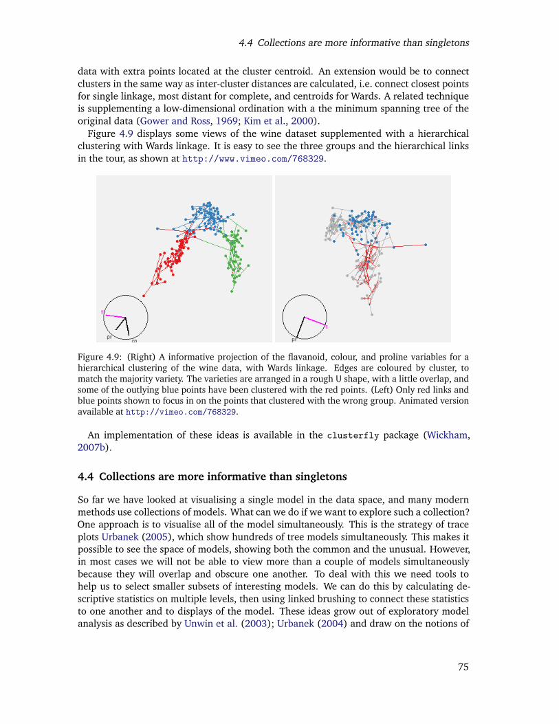
4.4 Collections are more informative than singletons
data with extra points located at the cluster centroid. An extension would be to connectclusters in the same way as inter-cluster distances are calculated, i.e. connect closest pointsfor single linkage, most distant for complete, and centroids for Wards. A related techniqueis supplementing a low-dimensional ordination with a the minimum spanning tree of theoriginal data (Gower and Ross, 1969; Kim et al., 2000).
Figure 4.9 displays some views of the wine dataset supplemented with a hierarchicalclustering with Wards linkage. It is easy to see the three groups and the hierarchical linksin the tour, as shown at http://www.vimeo.com/768329.
Figure 4.9: (Right) A informative projection of the flavanoid, colour, and proline variables for ahierarchical clustering of the wine data, with Wards linkage. Edges are coloured by cluster, tomatch the majority variety. The varieties are arranged in a rough U shape, with a little overlap, andsome of the outlying blue points have been clustered with the red points. (Left) Only red links andblue points shown to focus in on the points that clustered with the wrong group. Animated versionavailable at http://vimeo.com/768329.
An implementation of these ideas is available in the clusterfly package (Wickham,2007b).
4.4 Collections are more informative than singletons
So far we have looked at visualising a single model in the data space, and many modernmethods use collections of models. What can we do if we want to explore such a collection?One approach is to visualise all of the model simultaneously. This is the strategy of traceplots Urbanek (2005), which show hundreds of tree models simultaneously. This makes itpossible to see the space of models, showing both the common and the unusual. However,in most cases we will not be able to view more than a couple of models simultaneouslybecause they will overlap and obscure one another. To deal with this we need tools tohelp us to select smaller subsets of interesting models. We can do this by calculating de-scriptive statistics on multiple levels, then using linked brushing to connect these statisticsto one another and to displays of the model. These ideas grow out of exploratory modelanalysis as described by Unwin et al. (2003); Urbanek (2004) and draw on the notions of
75
4 Visualising statistical models: Removing the blindfold
descriptive statistics (Bickel and Lehmann, 1975a,b).Collections of models arise in many ways, and in most cases most of the models are
ignored and we only look at the best model. This is perilous as we may miss alternativemodels that explain the data almost as well as the best model, and suggest substantiallydifferent explanations for the phenomenon of interest. Here are some collections that mayarise in practice:
• From exploring the space of all possible models. For a given model family, we cangenerate all possible model forms. e.g. for a linear model, we can generate allpossible linear models with main effects. This will often produce too many modelsto possibly fit or compare, so typically we will use some model selection algorithmto explore the space of “best” models. Typically, only the best, or maybe the two orthree best models are examined.
• During the the process of data analysis. When analysing a data set, we may createand discard many models in an attempt to reveal the salient features of the data. Itmay be useful see all of these models simultaneously.
• While trying to find a global optima. When model fitting is not guaranteed to con-verge to a global optimum, we may have a collection generated from multiple ran-dom starts. This is useful for multidimensional scaling, neural networks, k-meansclustering, and self organising maps. Typically, only the model with the highest crite-rion value is examined.
• By varying model settings. If a model has some tuning parameters, we can system-atically alter them and observe the result, e.g. the penalty parameter in lasso, or thedegrees of freedom in a smoothing term. Often, cross-validation is used to select asingle optimal model.
• By fitting the same model to different datasets. These datasets might be groupswithin a larger dataset (perhaps a prequel to fitting mixed effects model), or mighthave been generated by leaving-one-out, cross validation, bootstrapping, permuting,simulating, as part of a sensitivity analysis or by adding random noise to the response(Luo et al., 2006). Typically, these multiple models are collapsed into a small set ofsummary statistics.
• As an intrinsic part of the model. Certain model families use ensembles of simple sub-models: neural networks (ensembles of logistic models), random forests (ensemblesof trees), bagging, and boosting. Typically, we just look at the overall model, andignore how each part contributes to the whole.
• By treating each iteration as a model. If we are interested in exploring the processof model fitting, and the algorithm is iterative, we might treat each iteration as aseparate model. This gives a unique ordering to the models and is described in depthin Section 4.5. Typically, we only look at the last iteration.
In this section, we focus on displaying the space of models, with the assumption thatthis space will be linked to additional m-in-ds displays. These extra displays will help us
76
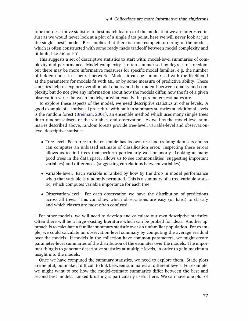
4.4 Collections are more informative than singletons
tune our descriptive statistics to best match features of the model that we are interested in.Just as we would never look at a plot of a single data point, here we will never look at justthe single “best” model. Best implies that there is some complete ordering of the models,which is often constructed with some ready made tradeoff between model complexity andfit built, like AIC or BIC.
This suggests a set of descriptive statistics to start with: model-level summaries of com-plexity and performance. Model complexity is often summarised by degrees of freedom,but there may be more informative measures for specific model families, e.g. the numberof hidden nodes in a neural network. Model fit can be summarised with the likelihoodat the parameters for models fit with ML, or by some measure of predictive ability. Thesestatistics help us explore overall model quality and the tradeoff between quality and com-plexity, but do not give any information about how the models differ, how the fit of a givenobservation varies between models, or what exactly the parameters estimates are.
To explore these aspects of the model, we need descriptive statistics at other levels. Agood example of a statistical procedure with built in summary statistics at additional levelsis the random forest (Breiman, 2001), an ensemble method which uses many simple treesfit to random subsets of the variables and observation. As well as the model-level sum-maries described above, random forests provide tree-level, variable-level and observation-level descriptive statistics:
• Tree-level. Each tree in the ensemble has its own test and training data sets and socan computes an unbiased estimate of classification error. Inspecting these errorsallows us to find trees that perform particularly well or poorly. Looking at manygood trees in the data space, allows us to see commonalities (suggesting importantvariables) and differences (suggesting correlations between variables).
• Variable-level. Each variable is ranked by how by the drop in model performancewhen that variable is randomly permuted. This is a summary of a tree-variable statis-tic, which computes variable importance for each tree.
• Observation-level. For each observation we have the distribution of predictionsacross all trees. This can show which observations are easy (or hard) to classify,and which classes are most often confused.
For other models, we will need to develop and calculate our own descriptive statistics.Often there will be a large existing literature which can be probed for ideas. Another ap-proach is to calculate a familiar summary statistic over an unfamiliar population. For exam-ple, we could calculate an observation-level summary by computing the average residualover the models. If models in the collection have common parameters, we might createparameter-level summaries of the distribution of the estimates over the models. The impor-tant thing is to generate descriptive statistics at multiple levels, in order to gain maximuminsight into the models.
Once we have computed the summary statistics, we need to explore them. Static plotsare helpful, but make it difficult to link between summaries at different levels. For example,we might want to see how the model-estimate summaries differ between the best andsecond best models. Linked brushing is particularly useful here. We can have one plot of
77

4 Visualising statistical models: Removing the blindfold
model-level statistics and one of model-estimate-level statistics and use brushing to linkbetween them. This idea is described in more detail in the case study.
The RAFT tool (Breiman and Cutler, 2008) for visualising random forests provides agood set of static graphics, but provides no way to link between the plots, and no m-in-dsvisualisations. This is a problem: if we found a single tree that did a particularly good job,we would like to see how it divides up the data space. Without linked graphics it is difficultto see exactly what is going on within a random forest, and to see how they compare toother models.
4.4.1 Case study: Linear models
In this case study we’ll explore a collection of linear models containing all possible maineffects models for a given dataset (or a large subset of these models). We will assume wehave m models describing a data set with n observations and p variables. If all possiblemain effects models are fit, there will be 2p − 1 models in the collection. We will exploresummary statistics on five levels:
• Model level: model fit statistics. m observations.
• Model-estimate level: coefficient estimates on various scales. m× p observations.
• Estimate level: summary of estimates over the models. p observations.
• Model-observation level: residuals and influence measures. m× n observations.
• Observation level: the original data, plus summaries of residual behaviour. n obser-vations.
The relationship between these different levels is shown schematically in Figure 4.10. Inthis case study, we will focus on the the model and model-estimate level summaries. Theremainder are discussed more fully in Wickham (2007d).
We will use a data set on fertility in French-speaking Swiss provinces in the late 1800’s(Mosteller and Tukey, 1977). We are interested in predicting fertility based on the pro-portional of agricultural workers, average performance on an army examination, amountof higher education, proportion of Catholics and infant mortality. There are 47 observa-tions and six predictor variables, giving a collection containing 31 (25 − 1) models. Thedata itself is rather irrelevant but it is a well-worn dataset which presents many interestingfeatures.
Figure 4.11 shows the model-level summary statistics: a measure of model complexity,degrees of freedom; and five measurements of model fit, log-likelihood, AIC, BIC, R2 andadjusted R2. The pattern is very similar across measures, with improvement in modelquality decelerating as model complexity increases. The improvement plateaus after sixdegrees of freedom, suggesting that a six df/four variable model is the ‘best’ (one degreeof freedom is used by the estimate of intercept, and one by the estimate of the variance).
Each model contains between 1 and p variables, and for each variable in each model wecalculate:
• The raw estimate. Useful when all covariates are on the same scale.
78
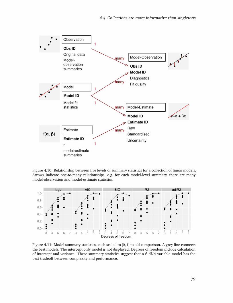
4.4 Collections are more informative than singletons
Figure 4.10: Relationship between five levels of summary statistics for a collection of linear models.Arrows indicate one-to-many relationships, e.g. for each model-level summary, there are manymodel-observation and model-estimate statistics.
Figure 4.11: Model summary statistics, each scaled to [0, 1] to aid comparison. A grey line connectsthe best models. The intercept only model is not displayed. Degrees of freedom include calculationof intercept and variance. These summary statistics suggest that a 6 df/4 variable model has thebest tradeoff between complexity and performance.
79
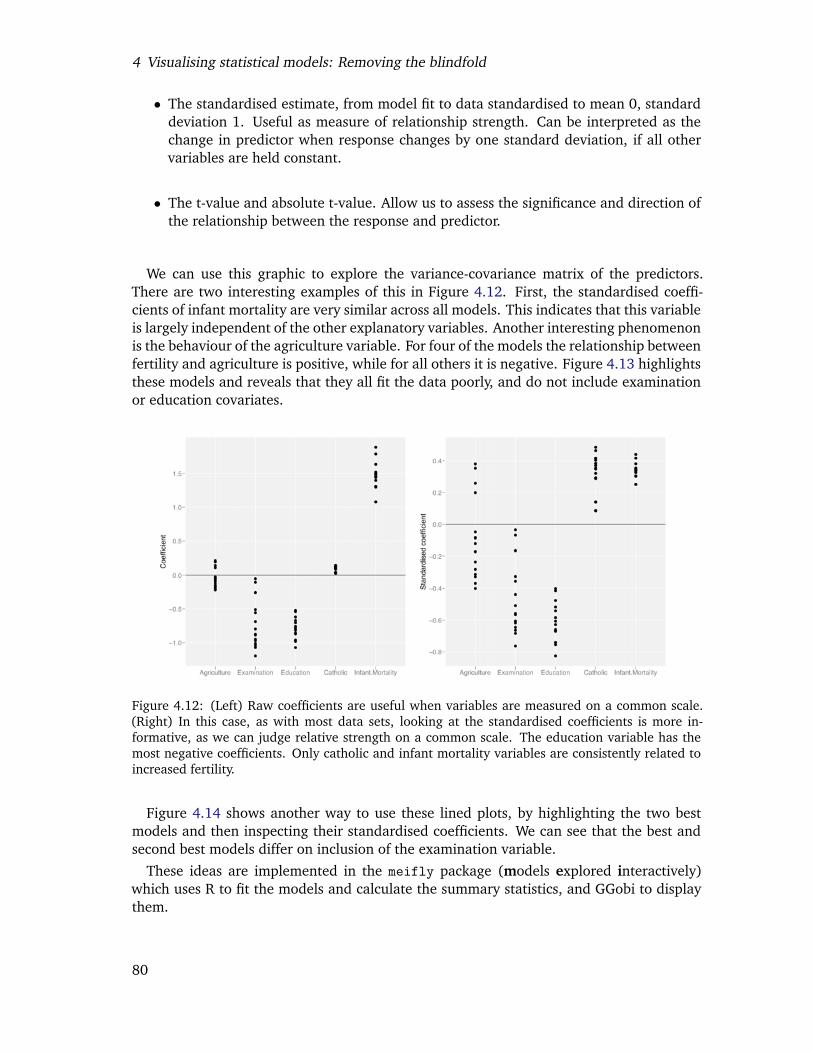
4 Visualising statistical models: Removing the blindfold
• The standardised estimate, from model fit to data standardised to mean 0, standarddeviation 1. Useful as measure of relationship strength. Can be interpreted as thechange in predictor when response changes by one standard deviation, if all othervariables are held constant.
• The t-value and absolute t-value. Allow us to assess the significance and direction ofthe relationship between the response and predictor.
We can use this graphic to explore the variance-covariance matrix of the predictors.There are two interesting examples of this in Figure 4.12. First, the standardised coeffi-cients of infant mortality are very similar across all models. This indicates that this variableis largely independent of the other explanatory variables. Another interesting phenomenonis the behaviour of the agriculture variable. For four of the models the relationship betweenfertility and agriculture is positive, while for all others it is negative. Figure 4.13 highlightsthese models and reveals that they all fit the data poorly, and do not include examinationor education covariates.
Figure 4.12: (Left) Raw coefficients are useful when variables are measured on a common scale.(Right) In this case, as with most data sets, looking at the standardised coefficients is more in-formative, as we can judge relative strength on a common scale. The education variable has themost negative coefficients. Only catholic and infant mortality variables are consistently related toincreased fertility.
Figure 4.14 shows another way to use these lined plots, by highlighting the two bestmodels and then inspecting their standardised coefficients. We can see that the best andsecond best models differ on inclusion of the examination variable.
These ideas are implemented in the meifly package (models explored interactively)which uses R to fit the models and calculate the summary statistics, and GGobi to displaythem.
80
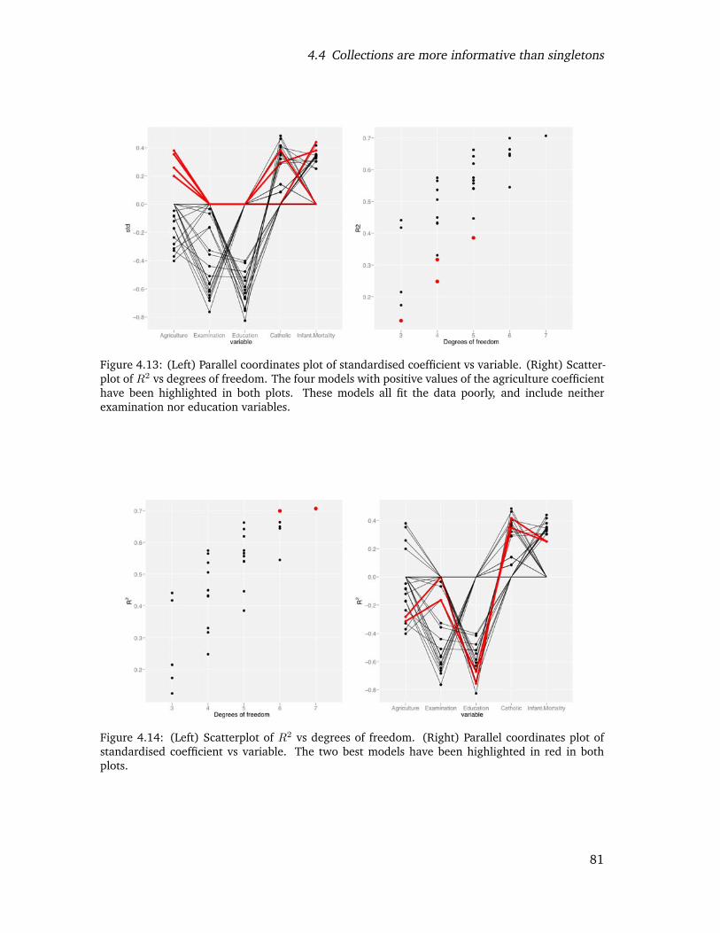
4.4 Collections are more informative than singletons
Figure 4.13: (Left) Parallel coordinates plot of standardised coefficient vs variable. (Right) Scatter-plot of R2 vs degrees of freedom. The four models with positive values of the agriculture coefficienthave been highlighted in both plots. These models all fit the data poorly, and include neitherexamination nor education variables.
Figure 4.14: (Left) Scatterplot of R2 vs degrees of freedom. (Right) Parallel coordinates plot ofstandardised coefficient vs variable. The two best models have been highlighted in red in bothplots.
81
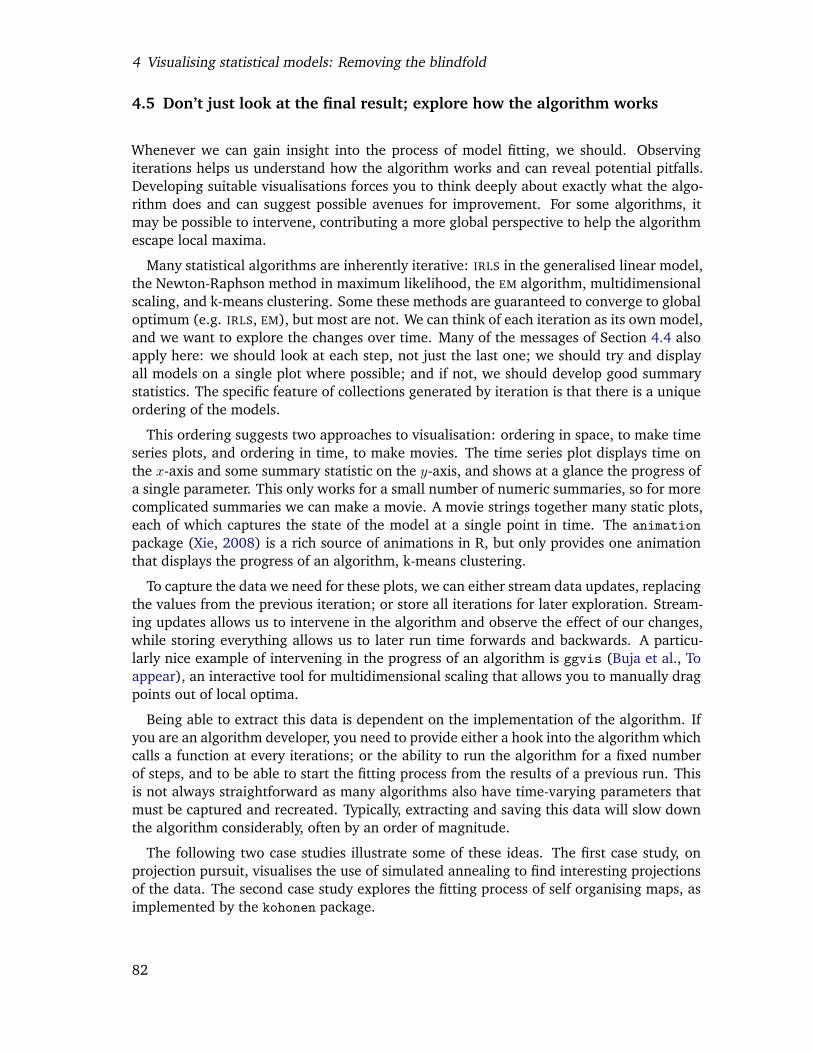
4 Visualising statistical models: Removing the blindfold
4.5 Don’t just look at the final result; explore how the algorithm works
Whenever we can gain insight into the process of model fitting, we should. Observingiterations helps us understand how the algorithm works and can reveal potential pitfalls.Developing suitable visualisations forces you to think deeply about exactly what the algo-rithm does and can suggest possible avenues for improvement. For some algorithms, itmay be possible to intervene, contributing a more global perspective to help the algorithmescape local maxima.
Many statistical algorithms are inherently iterative: IRLS in the generalised linear model,the Newton-Raphson method in maximum likelihood, the EM algorithm, multidimensionalscaling, and k-means clustering. Some these methods are guaranteed to converge to globaloptimum (e.g. IRLS, EM), but most are not. We can think of each iteration as its own model,and we want to explore the changes over time. Many of the messages of Section 4.4 alsoapply here: we should look at each step, not just the last one; we should try and displayall models on a single plot where possible; and if not, we should develop good summarystatistics. The specific feature of collections generated by iteration is that there is a uniqueordering of the models.
This ordering suggests two approaches to visualisation: ordering in space, to make timeseries plots, and ordering in time, to make movies. The time series plot displays time onthe x-axis and some summary statistic on the y-axis, and shows at a glance the progress ofa single parameter. This only works for a small number of numeric summaries, so for morecomplicated summaries we can make a movie. A movie strings together many static plots,each of which captures the state of the model at a single point in time. The animationpackage (Xie, 2008) is a rich source of animations in R, but only provides one animationthat displays the progress of an algorithm, k-means clustering.
To capture the data we need for these plots, we can either stream data updates, replacingthe values from the previous iteration; or store all iterations for later exploration. Stream-ing updates allows us to intervene in the algorithm and observe the effect of our changes,while storing everything allows us to later run time forwards and backwards. A particu-larly nice example of intervening in the progress of an algorithm is ggvis (Buja et al., Toappear), an interactive tool for multidimensional scaling that allows you to manually dragpoints out of local optima.
Being able to extract this data is dependent on the implementation of the algorithm. Ifyou are an algorithm developer, you need to provide either a hook into the algorithm whichcalls a function at every iterations; or the ability to run the algorithm for a fixed numberof steps, and to be able to start the fitting process from the results of a previous run. Thisis not always straightforward as many algorithms also have time-varying parameters thatmust be captured and recreated. Typically, extracting and saving this data will slow downthe algorithm considerably, often by an order of magnitude.
The following two case studies illustrate some of these ideas. The first case study, onprojection pursuit, visualises the use of simulated annealing to find interesting projectionsof the data. The second case study explores the fitting process of self organising maps, asimplemented by the kohonen package.
82

4.5 Don’t just look at the final result; explore how the algorithm works
4.5.1 Case study: Projection pursuit
The guided tour (Cook et al., 1995) is a combination of the grand tour and projectionpursuit. Instead of randomly picking new projections, as in the grand tour, the guided touronly picks new projections that are more interesting, by optimising an index of interesting-ness with simulated annealing (Kirkpatrick et al., 1983). This case study investigates howwe can gain insight into the path that the simulated annealing takes. The indices we usein this example come from the graphic theoretic scagnostics of Wilkinson et al. (2005) andare implemented in the scagnostics package (Hofmann et al., 2006).
Figure 4.15 shows a time series of the scagnostic index being optimised, clumpiness,which is takes high values when the data is grouped into distinct clumps. We can see thatthe paths are not monotone: there is a stochastic component to simulated annealing whichhelps it avoid local optima. Each of the points on the plot corresponds to a projectionmatrix, and it is interesting to see if all the peaks correspond to the same or differentprojections. Figure 4.16 shows the four projections with highest clumpiness. Visualisingthe projection matrices themselves is difficult (each column corresponds to a point on ap-dimensional hypersphere) but can be revealing (Cook et al., 2008b).
Figure 4.15: Variation of the clumpy index over time. Simulated annealing with 20 random starts,run until 40 steps or 400 tries. Red points indicate the four highest values.
Figure 4.16: Four projections of the data with highest values of clumpiness, found by the simulatedannealing shown in Figure 4.15. Plots are ordered left to right from highest to lowest. All theseprojections have good separation between the green group at the others, but not between the redand blue groups. Looking at the top 15 maxima does not find any projections that separate thesetwo groups.
83
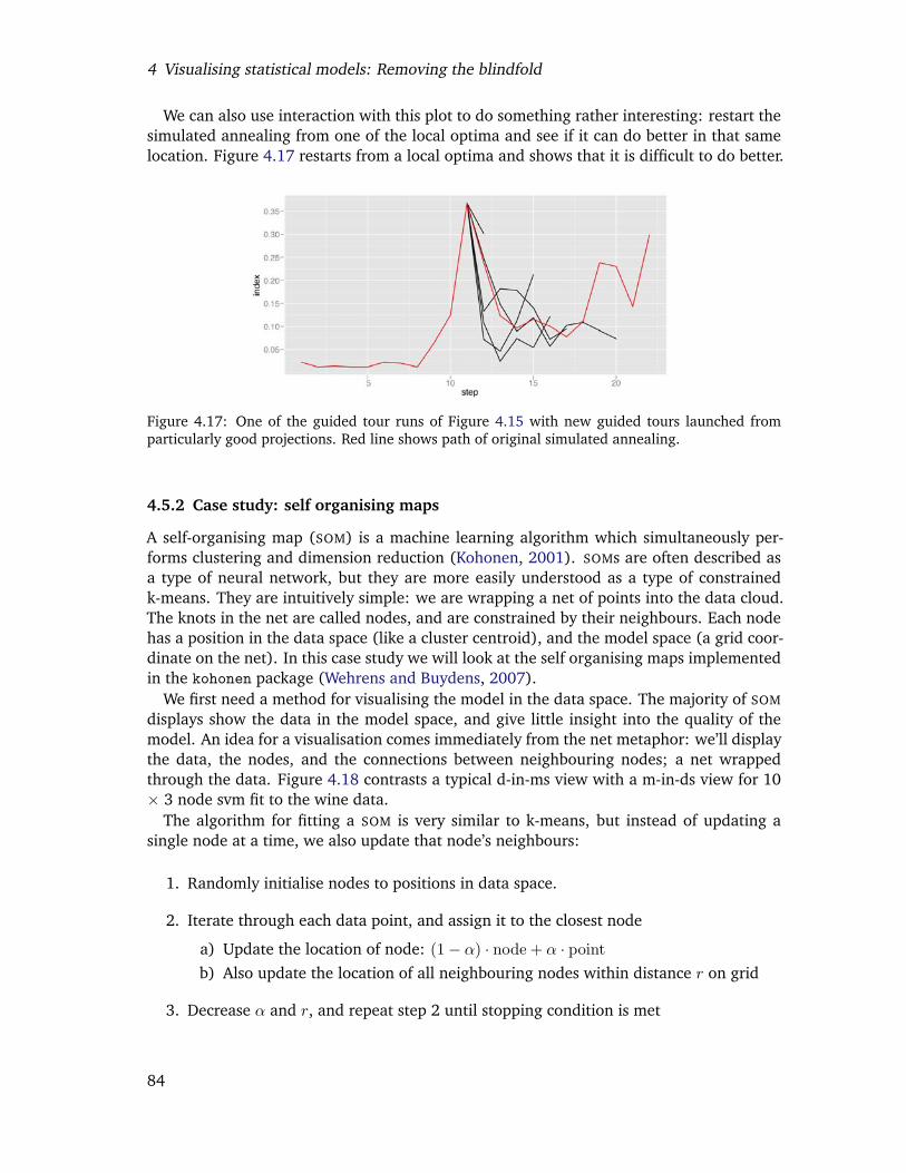
4 Visualising statistical models: Removing the blindfold
We can also use interaction with this plot to do something rather interesting: restart thesimulated annealing from one of the local optima and see if it can do better in that samelocation. Figure 4.17 restarts from a local optima and shows that it is difficult to do better.
Figure 4.17: One of the guided tour runs of Figure 4.15 with new guided tours launched fromparticularly good projections. Red line shows path of original simulated annealing.
4.5.2 Case study: self organising maps
A self-organising map (SOM) is a machine learning algorithm which simultaneously per-forms clustering and dimension reduction (Kohonen, 2001). SOMs are often described asa type of neural network, but they are more easily understood as a type of constrainedk-means. They are intuitively simple: we are wrapping a net of points into the data cloud.The knots in the net are called nodes, and are constrained by their neighbours. Each nodehas a position in the data space (like a cluster centroid), and the model space (a grid coor-dinate on the net). In this case study we will look at the self organising maps implementedin the kohonen package (Wehrens and Buydens, 2007).
We first need a method for visualising the model in the data space. The majority of SOM
displays show the data in the model space, and give little insight into the quality of themodel. An idea for a visualisation comes immediately from the net metaphor: we’ll displaythe data, the nodes, and the connections between neighbouring nodes; a net wrappedthrough the data. Figure 4.18 contrasts a typical d-in-ms view with a m-in-ds view for 10× 3 node svm fit to the wine data.
The algorithm for fitting a SOM is very similar to k-means, but instead of updating asingle node at a time, we also update that node’s neighbours:
1. Randomly initialise nodes to positions in data space.
2. Iterate through each data point, and assign it to the closest node
a) Update the location of node: (1− α) · node + α · pointb) Also update the location of all neighbouring nodes within distance r on grid
3. Decrease α and r, and repeat step 2 until stopping condition is met
84
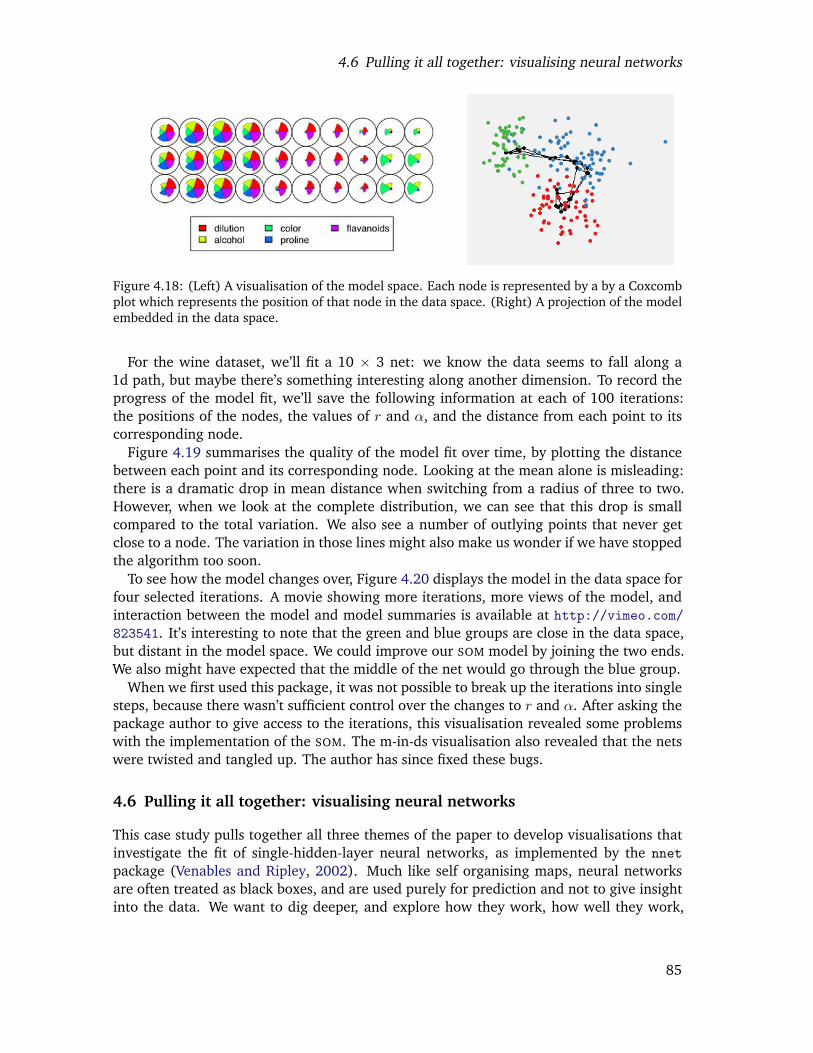
4.6 Pulling it all together: visualising neural networks
Figure 4.18: (Left) A visualisation of the model space. Each node is represented by a by a Coxcombplot which represents the position of that node in the data space. (Right) A projection of the modelembedded in the data space.
For the wine dataset, we’ll fit a 10 × 3 net: we know the data seems to fall along a1d path, but maybe there’s something interesting along another dimension. To record theprogress of the model fit, we’ll save the following information at each of 100 iterations:the positions of the nodes, the values of r and α, and the distance from each point to itscorresponding node.
Figure 4.19 summarises the quality of the model fit over time, by plotting the distancebetween each point and its corresponding node. Looking at the mean alone is misleading:there is a dramatic drop in mean distance when switching from a radius of three to two.However, when we look at the complete distribution, we can see that this drop is smallcompared to the total variation. We also see a number of outlying points that never getclose to a node. The variation in those lines might also make us wonder if we have stoppedthe algorithm too soon.
To see how the model changes over, Figure 4.20 displays the model in the data space forfour selected iterations. A movie showing more iterations, more views of the model, andinteraction between the model and model summaries is available at http://vimeo.com/823541. It’s interesting to note that the green and blue groups are close in the data space,but distant in the model space. We could improve our SOM model by joining the two ends.We also might have expected that the middle of the net would go through the blue group.
When we first used this package, it was not possible to break up the iterations into singlesteps, because there wasn’t sufficient control over the changes to r and α. After asking thepackage author to give access to the iterations, this visualisation revealed some problemswith the implementation of the SOM. The m-in-ds visualisation also revealed that the netswere twisted and tangled up. The author has since fixed these bugs.
4.6 Pulling it all together: visualising neural networks
This case study pulls together all three themes of the paper to develop visualisations thatinvestigate the fit of single-hidden-layer neural networks, as implemented by the nnetpackage (Venables and Ripley, 2002). Much like self organising maps, neural networksare often treated as black boxes, and are used purely for prediction and not to give insightinto the data. We want to dig deeper, and explore how they work, how well they work,
85
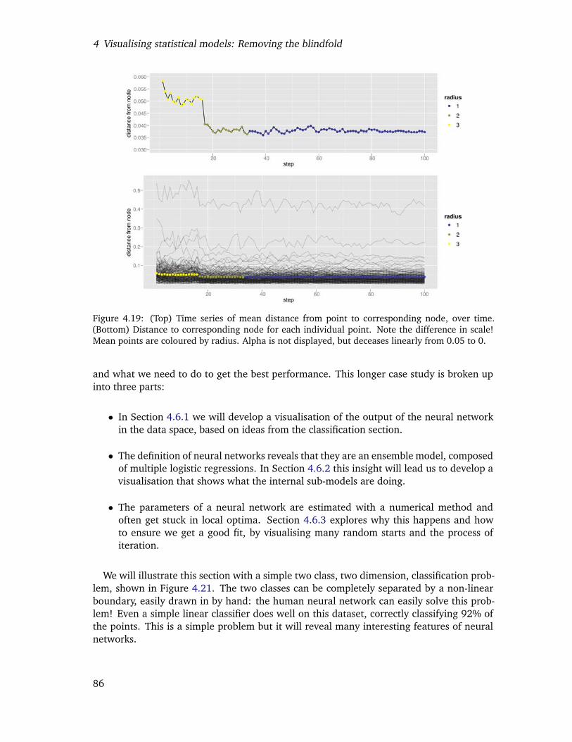
4 Visualising statistical models: Removing the blindfold
Figure 4.19: (Top) Time series of mean distance from point to corresponding node, over time.(Bottom) Distance to corresponding node for each individual point. Note the difference in scale!Mean points are coloured by radius. Alpha is not displayed, but deceases linearly from 0.05 to 0.
and what we need to do to get the best performance. This longer case study is broken upinto three parts:
• In Section 4.6.1 we will develop a visualisation of the output of the neural networkin the data space, based on ideas from the classification section.
• The definition of neural networks reveals that they are an ensemble model, composedof multiple logistic regressions. In Section 4.6.2 this insight will lead us to develop avisualisation that shows what the internal sub-models are doing.
• The parameters of a neural network are estimated with a numerical method andoften get stuck in local optima. Section 4.6.3 explores why this happens and howto ensure we get a good fit, by visualising many random starts and the process ofiteration.
We will illustrate this section with a simple two class, two dimension, classification prob-lem, shown in Figure 4.21. The two classes can be completely separated by a non-linearboundary, easily drawn in by hand: the human neural network can easily solve this prob-lem! Even a simple linear classifier does well on this dataset, correctly classifying 92% ofthe points. This is a simple problem but it will reveal many interesting features of neuralnetworks.
86
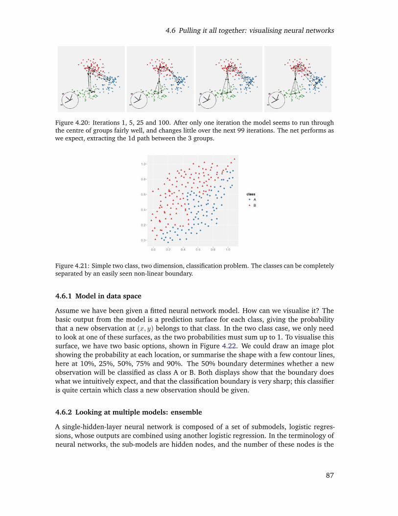
4.6 Pulling it all together: visualising neural networks
Figure 4.20: Iterations 1, 5, 25 and 100. After only one iteration the model seems to run throughthe centre of groups fairly well, and changes little over the next 99 iterations. The net performs aswe expect, extracting the 1d path between the 3 groups.
Figure 4.21: Simple two class, two dimension, classification problem. The classes can be completelyseparated by an easily seen non-linear boundary.
4.6.1 Model in data space
Assume we have been given a fitted neural network model. How can we visualise it? Thebasic output from the model is a prediction surface for each class, giving the probabilitythat a new observation at (x, y) belongs to that class. In the two class case, we only needto look at one of these surfaces, as the two probabilities must sum up to 1. To visualise thissurface, we have two basic options, shown in Figure 4.22. We could draw an image plotshowing the probability at each location, or summarise the shape with a few contour lines,here at 10%, 25%, 50%, 75% and 90%. The 50% boundary determines whether a newobservation will be classified as class A or B. Both displays show that the boundary doeswhat we intuitively expect, and that the classification boundary is very sharp; this classifieris quite certain which class a new observation should be given.
4.6.2 Looking at multiple models: ensemble
A single-hidden-layer neural network is composed of a set of submodels, logistic regres-sions, whose outputs are combined using another logistic regression. In the terminology ofneural networks, the sub-models are hidden nodes, and the number of these nodes is the
87
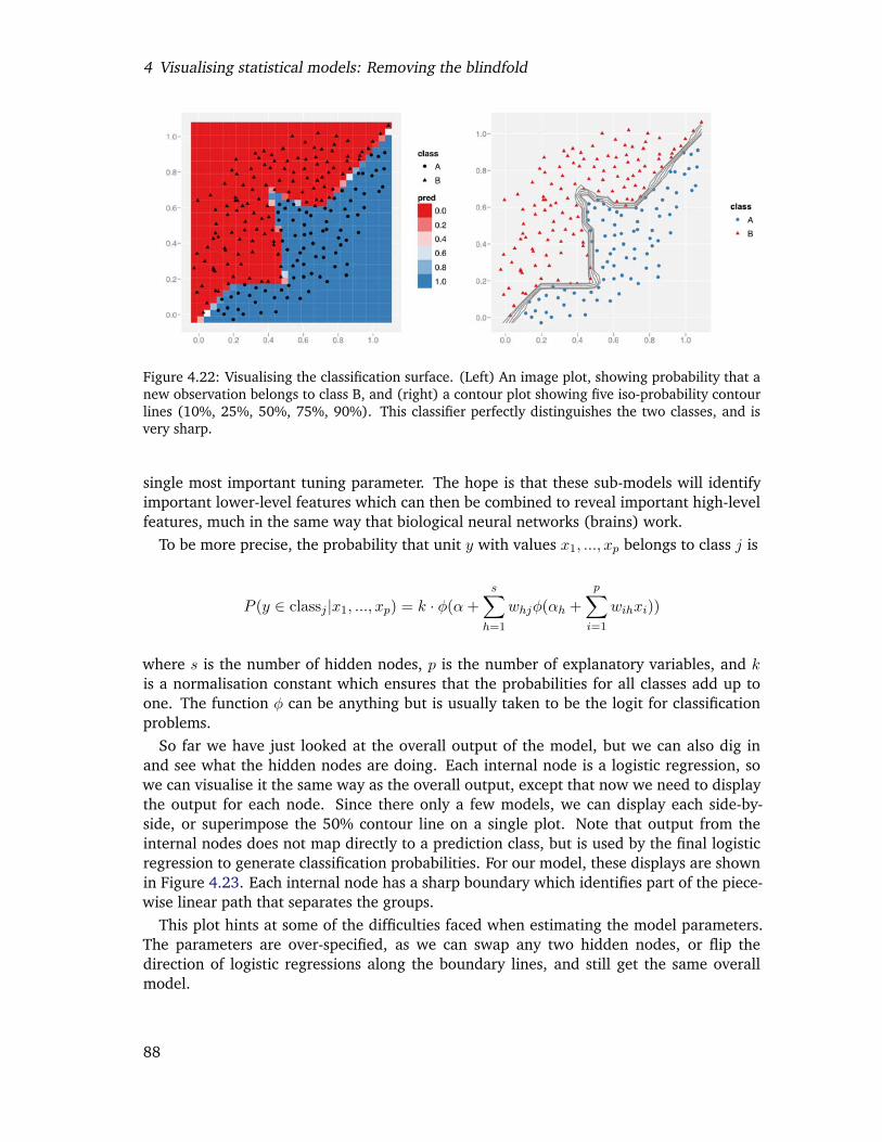
4 Visualising statistical models: Removing the blindfold
Figure 4.22: Visualising the classification surface. (Left) An image plot, showing probability that anew observation belongs to class B, and (right) a contour plot showing five iso-probability contourlines (10%, 25%, 50%, 75%, 90%). This classifier perfectly distinguishes the two classes, and isvery sharp.
single most important tuning parameter. The hope is that these sub-models will identifyimportant lower-level features which can then be combined to reveal important high-levelfeatures, much in the same way that biological neural networks (brains) work.
To be more precise, the probability that unit y with values x1, ..., xp belongs to class j is
P (y ∈ classj |x1, ..., xp) = k · φ(α+s∑
h=1
whjφ(αh +p∑
i=1
wihxi))
where s is the number of hidden nodes, p is the number of explanatory variables, and kis a normalisation constant which ensures that the probabilities for all classes add up toone. The function φ can be anything but is usually taken to be the logit for classificationproblems.
So far we have just looked at the overall output of the model, but we can also dig inand see what the hidden nodes are doing. Each internal node is a logistic regression, sowe can visualise it the same way as the overall output, except that now we need to displaythe output for each node. Since there only a few models, we can display each side-by-side, or superimpose the 50% contour line on a single plot. Note that output from theinternal nodes does not map directly to a prediction class, but is used by the final logisticregression to generate classification probabilities. For our model, these displays are shownin Figure 4.23. Each internal node has a sharp boundary which identifies part of the piece-wise linear path that separates the groups.
This plot hints at some of the difficulties faced when estimating the model parameters.The parameters are over-specified, as we can swap any two hidden nodes, or flip thedirection of logistic regressions along the boundary lines, and still get the same overallmodel.
88
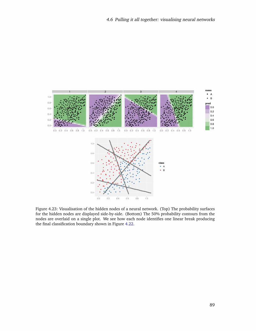
4.6 Pulling it all together: visualising neural networks
Figure 4.23: Visualisation of the hidden nodes of a neural network. (Top) The probability surfacesfor the hidden nodes are displayed side-by-side. (Bottom) The 50% probability contours from thenodes are overlaid on a single plot. We see how each node identifies one linear break producingthe final classification boundary shown in Figure 4.22.
89
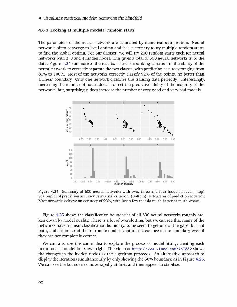
4 Visualising statistical models: Removing the blindfold
4.6.3 Looking at multiple models: random starts
The parameters of the neural network are estimated by numerical optimisation. Neuralnetworks often converge to local optima and it is customary to try multiple random startsto find the global optima. For our dataset, we will try 200 random starts each for neuralnetworks with 2, 3 and 4 hidden nodes. This gives a total of 600 neural networks fit to thedata. Figure 4.24 summarises the results. There is a striking variation in the ability of theneural network to correctly separate the two classes, with prediction accuracy ranging from80% to 100%. Most of the networks correctly classify 92% of the points, no better thana linear boundary. Only one network classifies the training data perfectly! Interestingly,increasing the number of nodes doesn’t affect the predictive ability of the majority of thenetworks, but, surprisingly, does increase the number of very good and very bad models.
Figure 4.24: Summary of 600 neural networks with two, three and four hidden nodes. (Top)Scatterplot of prediction accuracy vs internal criterion. (Bottom) Histograms of prediction accuracy.Most networks achieve an accuracy of 92%, with just a few that do much better or much worse.
Figure 4.25 shows the classification boundaries of all 600 neural networks roughly bro-ken down by model quality. There is a lot of overplotting, but we can see that many of thenetworks have a linear classification boundary, some seem to get one of the gaps, but notboth, and a number of the four-node models capture the essence of the boundary, even ifthey are not completely correct.
We can also use this same idea to explore the process of model fitting, treating eachiteration as a model in its own right. The video at http://www.vimeo.com/767832 showsthe changes in the hidden nodes as the algorithm proceeds. An alternative approach todisplay the iterations simultaneously by only showing the 50% boundary, as in Figure 4.26.We can see the boundaries move rapidly at first, and then appear to stabilise.
90
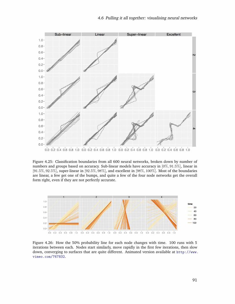
4.6 Pulling it all together: visualising neural networks
Figure 4.25: Classification boundaries from all 600 neural networks, broken down by number ofnumbers and groups based on accuracy. Sub-linear models have accuracy in [0%, 91.5%], linear in[91.5%, 92.5%], super-linear in [92.5%, 98%], and excellent in [98%, 100%]. Most of the boundariesare linear, a few get one of the bumps, and quite a few of the four node networks get the overallform right, even if they are not perfectly accurate.
Figure 4.26: How the 50% probability line for each node changes with time. 100 runs with 5iterations between each. Nodes start similarly, move rapidly in the first few iterations, then slowdown, converging to surfaces that are quite different. Animated version available at http://www.vimeo.com/767832.
91
4 Visualising statistical models: Removing the blindfold
4.6.4 Real data
Even though we have used a very simple example we have still discovered many inter-esting features of the neural network algorithm. In real life the neural network will beconsiderably more complicated: more data points, more internal nodes, and more possibleclasses. However, we can continue to use the same ideas, with a few tweaks:
• If there are more than two classes, we can longer summarise the model with a singleprobability surface, but we will need one for each class. When computing classi-fication boundaries we will need to use the advantage statistic developed in Sec-tion 4.3.4.
• If there are more than two input variables, we will need to use high-dimensional toolsto visualise the classification surface. These were also described in Section 4.3.4.
• More data points shouldn’t affect our choice of visualisations, but it will make theneural networks slower to fit. This may affect our ability to try the many possiblerandom starts necessary to find a good fit.
4.7 Conclusion
We have presented three important strategies for visualising models: visualise the modelin data space, collections are more informative than singletons and explore the process ofmodel fitting. These were illustrated with many case studies that developed informativevisualisations using the strategies outline in the paper. The tight connection between Rand GGobi facilitated the development of all of the examples, and has resulted in thedevelopment of R packages that one can easily download and try out.
To make these tools useful in practical model building we need to improve our abilityto visualise high-d data and surfaces. We have the basic tools, but as the number of di-mensions increases, the number of potential views becomes overwhelming. How can weprovide support for finding revealing views, while maintaining the ability of the analystto look for the unexpected? We have touched on projection pursuit for finding interestingviews of the data, and we expect developing descriptive statistics that summarise both themodel and data to be a fruitful approach. The challenge is, as always, developing goodsummaries, but our graphical tools can help us develop these for low-d data for applicationto high-d data.
We also need better tools to visualise high-d surfaces. In this paper we have gone toconsiderable lengths to approximate high-dimensional surfaces with a dense set of points.Development of better sampling methods would be useful, but the development of higherdimensional drawing primitives is more of a priority. GGobi currently provides 0d (points)and 1d (lines) primitives, can we supplement these with 2d primitives (triangles?) as well?The development of adaptive contouring algorithms for high-d would also be useful.
The case studies in this paper are just a beginning and we hope that others pick up theseideas to develop visualisations for more models in a wider array of statistical and graphicalenvironments.
92

4.8 Acknowledgements
4.8 Acknowledgements
This material is based upon work supported by the National Science Foundation underGrant No. 0706949.
93

4 Visualising statistical models: Removing the blindfold
94
Chapter 5
Conclusion and future plans
The three papers in this thesis described three practical tools for exploring data and models.Chapter 2, “Reshaping data with the reshape package”, described a framework for reshap-ing data. Chapter 3, “A layered grammar of graphics”, described a framework for staticstatistical graphics. Chapter 4, “Visualising statistical models: removing the blindfold”,described strategies for visualising statistical models. These papers are united by theirpractical nature and their philosophy of data analysis. In this conclusion I will expand onthese unifying themes, investigate the impact of my work and discuss future directions.
5.1 Practical tools
A particular emphasis of my work is the development of practical tools. The ideas pre-sented in this thesis are implemented in the open-source R packages reshape, ggplot2,classifly, clusterfly, and meifly, all of which are available from CRAN.
This emphasis on practical tools grows out of my experiences in consulting and teaching.The variety of data formats provided by my consulting clients and the difficulty restructur-ing them with existing tools led to the reshape package, while ggplot2 grew out of myfrustration with existing graphics tools in R, particularly the plots that were easy to imag-ine but took hours of work to create. For me, reshape and ggplot2 substantially reducethe time between the conception and realisation of a data structuring or graphic, giving memore time to dig into the data. This has also increased the number of investigations that Ican perform on the fly, while in front of a client, which is particularly useful for shorteningthe communication loop.
Teaching R forces you to re-see R through the eyes of a beginner. You are forced toreconsider all of the idiosyncrasies that you once struggled with, but have now becomeso internalised that you don’t realise they are there. R has some delights. The modellingframework is particularly strong: once you have mastered the linear model, you can easilyuse extensions like the generalised linear or the mixed effects model, and learning newmodel classes is straightforward. But data analysis is not just about fitting models, andother aspects of R are not so pleasant. For example, the built-in graphics and data manipu-lation tools seem to consist only of special cases, all with different parameters and differentoutputs. This requires much rote memorisation to master, and makes it hard for studentsto see the underlying themes. By building consistent frameworks for thought and action,reshape and ggplot2 make it much easier to teach data analysis because you can focus on
95
5 Conclusion and future plans
the big picture and not worry so much about the minor details.The tools for models visualisation are also pedagogically useful, as they give students a
way to see how the methods work. They fit naturally in to the process of data analysis andforce students to consider their models in the light of the data.
5.2 Data analysis
The process of data analysis is not a straight line from point A to B, but involves muchcircling back, and looking at the map to see we’ve been and where we should go next.Often we will need to return to previous findings to reinterpret them in terms of what wehave since learned. Not only will our models of the data change, but also our visualisationsand even the form of the data itself. Velleman (1997) captures this spirit well with hisaphorism “The process of data analysis is one of parallel evolution. Interrelated aspects of theanalysis evolve together, each affecting the others.” While presented separately, in practicethe three tools of this thesis work together to build our understanding of the data. Thisprocess can be seen in more depth in Hobbs et al. (To appear), which involved multiplere-expressions of the data, and many plots and models that never saw the light of day.
While powerful, these tools are lacking in one respect. They fail to combat what FrancisBacon describes as “The human understanding, on account of its own nature, readily sup-poses a greater order and uniformity in things than it finds. And . . . it devises parallels andcorrespondences and relations which are not there.” We need tools to combat the innatehuman ability to see patterns in random data, and the innate desire to tell stories aboutdata. To balance our curiosity we need methods to encourage scepticism and remind us toquestion what we see. Of course classical statistics provides a great number of these tools,but how can we apply them in an exploratory, graphical situation? Buja et al. (1988);Swayne et al. (1998) provide some initial ideas from which I hope to build from in thefuture.
5.3 Impact
It is difficult to judge the impact of your work. Unfortunately, because of the way thatCRAN is set up, it is not possible to know exactly how many times my packages have beendownloaded. However, last month around 1,600 people viewed package related pages onmy website and 18 people emailed me a question about one of my packages. An additionalindicator of impact is that for graphics and data manipulation problems posed on R-help,others will offer a solution using reshape or ggplot. For my reshape paper, the Journal ofStatistical Software tracks the number of downloads and as of March 28 2008, the paperhas been download 982 times, approximately five times per day on average since it waspublished.
Professionally, my work has resulted in an invitation to teach a 3-day course at theUniversity of Zurich in July 2007, and to speak at the World Congress for Probability andStatistics in Singapore in July 2008.
96
5.4 Future work
5.4 Future work
I see much of my future work evolving around two obvious deficiencies of the layeredgrammar: it is purely static, with no interaction; and it gives no insight into area plotsfor categorical data. I am also interested in developing other frameworks that facilitatecommon tasks in data analysis, and in building a toolkit for graphical inference.
Interactive graphics are an important family of tools because they speed up the processof data analysis. With a well designed interactive graphics package, the time betweensteps is further decreased because we can modify the previous representation, rather thanhaving to start from scratch. This makes it important to extend the layered grammar to alsodescribe interaction. Currently, the layered grammar is purely static; it does not describehow we can interact with the plot to change what it displays.
Extending the grammar to include interaction will be challenging. In preparation forthis work, I have begun studying the types of interaction present in GGobi (Swayne et al.,2003), Mondrian (Theus, 2003), MANET (Unwin et al., 1996) and Excel. A particularly im-portant component of interactive graphics is linked brushing, and am currently working ona paper about this with Graham Wills. One of the biggest challenges in adapting ggplot2to incorporate interaction will be ensuring that plotting is fast enough so that the sequenceof static plots is seamless. To this end, I have been working on the data pipeline which un-derlies GGobi (Wickham et al., Accepted), particularly how the pipeline coordinates eventsacross different views of the same data.
The grammar poorly describes area plots for categorical data: spine charts, mosaic plots,equal-bin-size plots, fluctuation diagrams (Hartigan and Kleiner, 1984; Hofmann, 2001;Unwin et al., 1996), and the closely related treemaps (Shneiderman, 1992) and dimen-sional stacking (LeBlanc et al., 1990). These plots represent each combination of categor-ical levels by a rectangle with area proportional to the number of observations, hence thename area plot. The plots differ primarily in whether they focus on conditional or jointdistributions, and whether or not marginal distributions are visible. With Heike Hofmann,I am working on an extension to the grammar that describes all of these plots in a consis-tent framework, helping us to see the underlying commonalities and to suggest new plottypes. There is also an interesting connection with log-linear models, particularly as a toolfor removing marginal effects once they have been recognised.
I am also interested in developing better tools for other data analysis tasks. For example,a common problem-solving strategy is to break a big problem into small chunks, operateon each chunk individually and then join them all back together. In R, there are a numberof functions that support parts of this strategy, but they are scattered and inconsistent.
5.5 Final words
This thesis has presented three practical tools that support data analysis, improving ourability to explore data and models. The tools are not just computational, but also providemental tools that support a cohesive philosophy of data analysis that stresses iteration andprogressively building our understanding of the data.
97

5 Conclusion and future plans
98

Bibliography
A. Asuncion and D. Newman. UCI machine learning repository, 2007. URL http://www.ics.uci.edu/~mlearn/MLRepository.html.
R. A. Becker, W. S. Cleveland, and M.-J. Shyu. The visual design and control of trellisdisplay. Journal of Computational and Graphical Statistics, 5(2):123–155, 1996.
J. Bertin. Semiology of Graphics. University of Wisconsin Press, Madison, WI, 1983.
P. J. Bickel and E. L. Lehmann. Descriptive statistics for nonparametric models. I: Introduc-tion. The Annals of Statistics, 3:1038–1044, 1975a.
P. J. Bickel and E. L. Lehmann. Descriptive statistics for nonparametric models. II: Location.The Annals of Statistics, 3:1045–1069, 1975b.
L. Breiman. Random forests. Machine Learning, 45(1):5–32, 2001.
L. Breiman and A. Cutler. RAFT Documentation, 2008. URL http://www.webcitation.org/5WCgv1oW9. Accessed from http://www.stat.berkeley.edu/
~breiman/RandomForests/cc_graphicsdoc.htm on 2008-03-09.
C. A. Brewer. Color use guidelines for mapping and visualization. In A. MacEachrenand D. Taylor, editors, Visualization in Modern Cartography, chapter 7, pages 123–147.Elsevier Science, Tarrytown, NY, 1994a.
C. A. Brewer. Guidelines for use of the perceptual dimensions of color for mapping andvisualization. In Color Hard Copy and Graphic Arts III, Proceedings of the InternationalSociety for Optical Engineering (SPIE), San Jose, volume 2171, pages 54–63, 1994b.
A. Buja, D. Asimov, C. Hurley, and J. A. McDonald. Elements of a viewing pipeline for dataanalysis. In Dynamic Graphics for Statistics. Wadsworth, Inc., 1988.
A. Buja, D. Cook, D. Asimov, , and C. Hurley. Theory and computational methods fordynamic projections in high-dimensional data visualization. Technical report, ATT,1996. URL http://www.research.att.com/~andreas/papers/dynamic-projections.ps.gz.
A. Buja, D. F. Swayne, M. L. Littman, N. Dean, and H. Hofmann. Interactive data visualiza-tion with multidimensional scaling. Journal of Computational and Graphical Statistics, Toappear. URL http://www-stat.wharton.upenn.edu/~buja/PAPERS/paper-mds-jcgs.pdf.
99

Bibliography
D. Carr. Using gray in plots. ASA Statistical Computing and Graphics Newsletter, 2(5):11–14,1994. URL http://www.galaxy.gmu.edu/~dcarr/lib/v5n2.pdf.
D. Carr. Graphical displays. In A. H. El-Shaarawi and W. W. Piegorsch, editors, Encyclopediaof Environmetrics, volume 2, pages 933–960. John Wiley & Sons, Ltd, Chichester, 2002.URL http://www.galaxy.gmu.edu/%7Edcarr/lib/EnvironmentalGraphics.pdf.
D. Carr and R. Sun. Using layering and perceptual grouping in statistical graphics. ASAStatistical Computing and Graphics Newsletter, 10(1):25–31, 1999.
D. B. Carr, R. J. Littlefield, W. L. Nicholson, and J. S. Littlefield. Scatterplot matrix tech-niques for large n. Journal of the American Statistical Association, 82(398):424–436,1987.
J. Chambers, W. Cleveland, B. Kleiner, and P. Tukey. Graphical methods for data analysis.Wadsworth, 1983.
C. Chatfield. Problem Solving : A Statistician’s Guide. Chapman & Hall, 1995.
W. Cleveland. A model for studying display methods of statistical graphics. Journal ofComputational and Graphical Statistics, 2:323–364, 1993. URL http://stat.bell-labs.com/doc/93.4.ps.
W. S. Cleveland and R. McGill. Graphical perception: Theory, experimentation and ap-plication to the development of graphical methods. Journal of the American StatisticalAssociation, 79(387):531–554, 1984.
W. S. Cleveland and R. McGill. Graphical perception: The visual decoding of quantitativeinformation on graphical displays of data. Journal of the Royal Statistical Society. SeriesA (General), 150(3):192–229, 1987.
D. Cook and D. F. Swayne. Interactive and Dynamic Graphics for Data Analysis: With Exam-ples Using R and GGobi. Springer, 2007.
D. Cook, A. Buja, J. Cabrera, and C. Hurley. Grand tour and projection pursuit. Journal ofComputational and Graphical Statistics, 4(3):155–172, 1995.
D. Cook, D. Caragea, and H. Wickham. Visual methods for examining SVM classifiers. InS. Simoff, M. H. Bohlen, and A. Mazeika, editors, Data Mining: Theory, Techniques andTools for Visual Analytics, LNCS State of the Art Surveys. 2008a.
D. Cook, E.-K. Lee, A. Buja, and H. Wickham. Grand tours, projection pursuit guided toursand manual controls. In C.-h. Chen, W. Hardle, and A. Unwin, editors, Handbook ofData Visualization, Springer Handbooks of Computational Statistics, chapter III.2, pages295–314. Springer, 2008b.
R. D. Cook. Regression Graphics: Ideas for Studying Regressions through Graphics. JohnWiley Sons, 1998.
C. Cortes and V. Vapnik. Support-vector networks. Machine Learning, 20(3):273–297,1995.
100

Bibliography
D. R. Cox. Some remarks on the role in statistics of graphical methods. Applied Statistics,27(1):4–9, 1978.
N. J. Cox. The grammar of graphics. Journal of Statistical Software, 17, 2007. URLhttp://www.jstatsoft.org/v17/b03/v17b03.pdf.
E. Dimitriadou, K. Hornik, F. Leisch, D. Meyer, , and A. Weingessel. e1071: Misc Functionsof the Department of Statistics (e1071), TU Wien, 2006. R package version 1.5-16.
J. H. Friedman. Exploratory projection pursuit. Journal of American Statistical Association,82:249–266, 1987.
G. W. Furnas and A. Buja. Prosection views: Dimensional inference through sections andprojections. Journal of Computational and Graphical Statistics, 3(4):323–353, 1994.
A. Gelman and J. Hill. Data Analysis Using Regression and Multilevel/Hierarchical Models.Cambridge University Press, 2006.
J. C. Gower and G. J. S. Ross. Minimum spanning trees and single linkage cluster analysis.Applied Statistics, 18:54–64, 1969.
J. Gray, S. Chaudhuri, A. Bosworth, A. Layman, D. Reichart, and M. Venkatrao. Data cube:A relational aggregation operator generalizing group-by, cross-tab, and sub-totals. DataMining and Knowledge Discovery, 1:29–53, 1997.
A. Gribov. Gauguin (grouping and using glyphs uncovering individual nuances), 2007.URL http://rosuda.org/software/Gauguin/gauguin.html.
J. A. Hartigan and B. Kleiner. Mosaics for contingency tables. In Computer Science andStatistics: Proceedings of the 13th Symposium on the Interface, pages 268–273, FairfaxStation, VA, 1981. Interface Foundation of North America, Inc.
J. A. Hartigan and B. Kleiner. A mosaic of television ratings. The American Statistician, 38(1):32–35, 1984.
J. Heer and M. Agrawala. Multi-scale banking to 45 degrees. IEEE Transactions on Visual-ization and Computer Graphics, 12(5), 2006.
J. Hobbs, H. Wickham, H. Hofmann, and D. Cook. Glaciers melt as mountains warm: Agraphical case study. Computational Statistics, To appear. Special issue for ASA StatisticalComputing and Graphics Data Expo 2007.
H. Hofmann. Exploring categorical data: Interactive mosaic plots. Metrika, 51(1):11–26,2000.
H. Hofmann. Graphical Tools for the Exploration of Multivariate Categorical Data. BOD,2001.
H. Hofmann. Constructing and reading mosaicplots. Computational Statistics and DataAnalysis, 43(4):565–580, 2003.
101
Bibliography
H. Hofmann, L. Wilkinson, H. Wickham, D. T. Lang, and A. Anand. scagnostics: Computescagnostics., 2006. R package version 0.1.0.
C. Huang, J. A. McDonald, and W. Stuetzle. Variable resolution bivariate plots. Journal ofComputational and Graphical Statistics, 6:383–396, 1997.
R. Ihaka. Colour for presentation graphics. In Proceedings of the 3rd International Workshopon Distributed Statistical Computing (DSC 2003), 2003. URL http://www.ci.tuwien.ac.at/Conferences/DSC-2003/Proceedings/Ihaka.pdf.
A. Inselberg. The Plane with Parallel Coordinates. The Visual Computer, 1:69–91, 1985.
S.-S. Kim, S. Kwon, and D. Cook. Interactive visualization of hierarchical clusters usingMDS and MST. Metrika, 51(1):39–51, 2000.
S. Kirkpatrick, C. D. Gelatt, and M. P. Vecchi. Optimization by simulated annealing. Science,220:671–680, 1983.
T. Kohonen. Self-Organizing Maps, volume 30 of Springer Series in Information Science.Springer, 2001.
J. B. Kruskal and J. M. Landwehr. Icicle plots: Better displays for hierarchical clustering.The American Statistician, 37:162–168, 1983.
J. LeBlanc, M. Ward, and N. Wittels. Exploring n-dimensional databases. In Proceedings ofVisualization ’90, pages 230–237, 1990.
A. Liaw and M. Wiener. Classification and regression by randomforest. R News, 2(3):18–22,2002. URL http://CRAN.R-project.org/doc/Rnews/.
X. Luo, L. A. Stefanski, and D. D. Boos. Tuning variable selection procedures by addingnoise. Technometrics, 48(2):165–175, 2006.
F. Mosteller and J. W. Tukey. Data Analysis and Regression: A Second Course in Statistics.Addison-Wesley, Reading Mass., 1977.
D. Murdoch. Drawing a scatterplot. Chance, 13(3):53–55, 2000.
J. A. Nelder. Algorithm AS 96: A simple algorithm for scaling graphs. Applied Statistics, 25(1):94–96, 1976.
F. Nightingale. Notes on matters affecting the health, efficiency and hospital administrationof the British Army. Private publication, London, 1857.
OED Online. The Oxford English Dictionary. Oxford University Press, 2nd ed edition, 1989.URL http://dictionary.oed.com/cgi/entry/50097652.
R Development Core Team. R: A Language and Environment for Statistical Comput-ing. R Foundation for Statistical Computing, Vienna, Austria, 2007. URL http://www.R-project.org. ISBN 3-900051-07-0.
102
Bibliography
D. Sarkar. lattice: Lattice Graphics, 2006. R package version 0.14-16.
M. Schonlau. The clustergram: A graph for visualizing hierarchical and non-hierarchicalcluster analyses. The Stata Journal, 3:316–327, 2002. URL http://www.schonlau.net/clustergram.html.
S. R. Searle, F. M. Speed, and G. A. Milliken. Population marginal means in the linearmodel: An alternative to least squares means. The American Statistician, 34(0):216–221,1980.
B. Shneiderman. Tree visualization with tree-maps: 2-d space-filling approach. ACM Trans.Graph., 11(1):92–99, 1992. ISSN 0730-0301. doi: http://doi.acm.org/10.1145/102377.115768.
A. Shoshani. Olap and statistical databases: Similarities and differences. In Proc. ACMPODS ’97, pages 185–196, 1997.
D. N. Sparks. Algorithm AS 44: Scatter diagram plotting. Applied Statistics, 20(3):327–331,1971.
W. D. Stirling. Algorithm AS 168: Scale selection and formatting. Applied Statistics, 30(3):339–344, 1981.
D. Swayne, A. Buja, and N. Hubbell. XGobi meets S: integrating software for data analysis.Computing Science and Statistics, 23:430–434, 1991.
D. F. Swayne, D. Cook, and A. Buja. Xgobi: Interactive dynamic data visualization in the xwindow system. Journal of Computational and Graphical Statistics, 7(1):113–130, 1998.
D. F. Swayne, D. Temple Lang, A. Buja, and D. Cook. GGobi: Evolving from XGobi into anextensible framework for interactive data visualization. Computational Statistics & DataAnalysis, 43:423–444, 2003.
D. Temple Lang, D. Swayne, H. Wickham, and M. Lawrence. rggobi: Interface between Rand GGobi, 2007. URL http://www.ggobi.org/rggobi. R package version 2.1.7.
R. P. Thayer and R. F. Storer. Algorithm AS 21: Scale selection for computer plot. AppliedStatistics, 18(2):206–208, 1969.
T. M. Therneau and B. Atkinson. rpart: Recursive Partitioning, 2008. R port by Brian Ripley.R package version 3.1-39.
M. Theus. Interactive data visualiating using Mondrian. Journal of Statistical Software, 7(11):1–9, 2003.
L. Tierney. Lisp-Stat: an object-oriented environment for statistical computing and dynamicgraphics. John Wiley & Sons, New York; Chichester, 1990.
E. Trauwaert, P. Rousseeuw, and L. Kaufman. Some silhouette-based graphics for clusteringinterpretation. Belgian Journal of Operations Research, Statistics and Computer Science,29(3):35–55, 1989.
103
Bibliography
E. R. Tufte. Envisioning information. Graphics Press, Chesire, Connecticut, 1990.
E. R. Tufte. Visual explanations. Graphics Press, Chesire, Connecticut, 1997.
E. R. Tufte. The visual display of quantitative information. Graphics Press, Chesire, Con-necticut, 2001.
E. R. Tufte. Beautiful evidence. Graphics Press, Chesire, Connecticut, 2006.
J. W. Tukey. Exploratory data analysis. Addison Wesley, 1977.
A. Unwin, C. Volinsky, and S. Winkler. Parallel coordinates for exploratory modellinganalysis. Computational Statistics & Data Analysis, 43(4):553–564, 2003. URL http://rosuda.org/~unwin/AntonyArts/uvwCSDA.pdf.
A. R. Unwin, G. Hawkins, H. Hofmann, and B. Siegl. Interactive graphics for data setswith missing values - MANET. Journal of Computational and Graphical Statistics, 5(2):113–122, 1996.
S. Urbanek. Exploring statistical forests. In Proceedings of the Joint Statistical Meetings,2002a. URL http://simon.urbanek.info/research/pub/urbanek-jsm02.pdf.
S. Urbanek. Different ways to see a tree - klimt. In Proceedings of the 14th Conferenceon Computational Statistics, Compstat 2002, 2002b. URL http://simon.urbanek.info/research/pub/urbanek-cs02.pdf.
S. Urbanek. Interactive construction and analysis of trees. In Proceedings of theJoint Statistical Meetings, 2003. URL http://simon.urbanek.info/research/pub/urbanek-jsm03.pdf.
S. Urbanek. Exploratory Model Analysis. An Interactive Graphical Framework for ModelComparison and Selection. PhD thesis, Universitat Augsburg, 2004.
S. Urbanek. Following traces of lost models. In Proceedings of the Joint Statistical Meetings,2005. URL http://simon.urbanek.info/research/pub/urbanek-jsm05.pdf.
S. Urbanek and T. Wichtrey. iplots: iPlots - interactive graphics for R, 2007. URL http://www.iPlots.org/. R package version 1.1-1.
P. F. Velleman. Data desk. The New Power of Statistical Vision. Data Description Inc, 1992.URL http://www.datadesk.com/products/data_analysis/datadesk/.
P. F. Velleman. The philosophical past and the digital future of data analysis: 375 yearsof philosophical guidance for software design on the occassion of john w. tukey’s 80thbirthday. In The practice of data analysis: Essays in honor of John W. Tukey. PrincetonUniversity Press, 1997.
W. N. Venables and B. D. Ripley. Modern Applied Statistics with S. Springer, New York,fourth edition, 2002. URL http://www.stats.ox.ac.uk/pub/MASS4. ISBN 0-387-95457-0.
104
Bibliography
H. Wainer. Visual revelations: graphical tales of fate and deception from Napoleon Bonaparteto Ross Perot. Lawrence Erlbaum, 2000.
H. Wainer. Graphic discovery: A trout in the milk and other visual adventures. PrincetonUniversity Press, 2004.
E. J. Wegman. Hyperdimensional data analysis using parallel coordinates. Journal of theAmerican Statistical Association, 85(411):664–675, 1990.
R. Wehrens and L. Buydens. Self- and super-organising maps in R: the kohonen package.Journal of Statistical Software, 21(5), 2007. URL http://www.jstatsoft.org/v21/i05.
H. Wickham. classifly: Explore classification models in high dimensions, 2007a. URL http://had.co.nz/classifly. R package version 0.2.3.
H. Wickham. clusterfly: Explore clustering interactively using R and GGobi, 2007b. URLhttp://had.co.nz/clusterfly. R package version 0.2.3.
H. Wickham. ggplot2: An implementation of the Grammar of Graphics, 2008. URL http://had.co.nz/ggplot2. R package version 0.6.
H. Wickham. meifly: Interactive model exploration using GGobi, 2006. URL http://had.co.nz/meifly. R package version 0.1.1.
H. Wickham. reshape: Flexibly reshape data., 2005. URL http://had.co.nz/reshape/. Rpackage version 0.7.1.
H. Wickham. Reshaping data with the reshape package. Journal of Statistical Software, 21(12), 2007c. URL http://www.jstatsoft.org/v21/i12/paper.
H. Wickham. Meifly: Models explored interactively. Technical Report 4, Departmentof Statistics, Iowa State University, 2007d. URL http://www.stat.iastate.edu/preprint/articles/2007-04.pdf.
H. Wickham, M. Lawrence, D. Cook, A. Buja, H. Hofmann, and D. F. Swayne. The plumbingof interactive graphics. Computational Statistics, Accepted. Special issue for Proceedingsof the 5th International Workshop on Directions in Statistical Computing.
L. Wilkinson. The Grammar of graphics. Statistics and Computing. Springer, 2nd edition,2005.
L. Wilkinson, A. Anand, and R. Grossman. Graph-theoretic scagnostics. In IEEE Symposiumon Information Visualization, pages 157–164, 2005.
Y. Xie. animation: Demonstrate Animations in Statistics, 2008. URL http://R.yihui.name.R package version 0.1-7.
W. Youden. Graphical diagnosis of interlaboratory test results. Industrial Quality Control,15:24–28, 1959.
F. W. Young, R. A. Faldowski, and M. M. McFarlane. Multivariate statistical visualization.In C. Rao, editor, Handbook of statistics, volume 9, pages 959–998. Elsevier, 1993.
105