THE RIGHT FONT FOR THE JOB
EFFECT OF TYPEFACE-PRODUCT CONGRUENCY ON ATTITUDE
TOWARDS THE AD
Tim SmitsKU Leuven
PRESENTED @ EMAC2015Collaboration:
Robin Van der SarGoele Aerts (KU Leuven)
2
BACKGROUND
“The great art in writing advertisements, is the finding out a proper method to catch the reader's eye, without which a good thing may pass over unobserved, or be lost among commissions of bankrupt. […] I must not here omit the blind Italian character, which being scarce legible, always fixes and detains the eye, and gives the curious reader something like the satisfaction of prying into a secret.”
Typeface @ emac2015
3
BACKGROUND
“The great art in writing advertisements, is the finding out a proper method to catch the reader's eye, without which a good thing may pass over unobserved, or be lost among commissions of bankrupt. […] I must not here omit the blind Italian character, which being scarce legible, always fixes and detains the eye, and gives the curious reader something like the satisfaction of prying into a secret.”
Addison, 1710Typeface @ emac2015
4
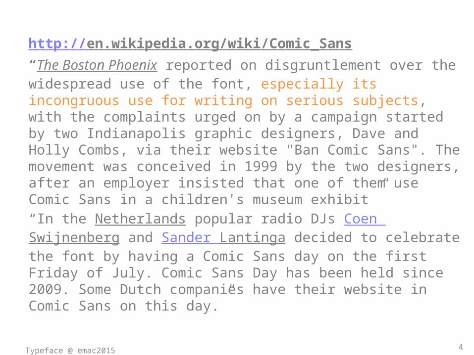
http://en.wikipedia.org/wiki/Comic_Sans “The Boston Phoenix reported on disgruntlement over the widespread use of the font, especially its incongruous use for writing on serious subjects, with the complaints urged on by a campaign started by two Indianapolis graphic designers, Dave and Holly Combs, via their website "Ban Comic Sans". The movement was conceived in 1999 by the two designers, after an employer insisted that one of them use Comic Sans in a children's museum exhibit ”“In the Netherlands popular radio DJs Coen Swijnenberg and Sander Lantinga decided to celebrate the font by having a Comic Sans day on the first Friday of July. Comic Sans Day has been held since 2009. Some Dutch companies have their website in Comic Sans on this day.”
Typeface @ emac2015
5
CONGRUENCY IN ADSMatch between a creative choice and strategic (brand) positioning : colors, endorsers, humor, pictorial features, typeface
Two types of evidence on congruency:1. Schema-theory (Mandler, 1982): Moderate
incongruity is most persuasiveHeckler & Childres, 1992; Törn, 2012; Halkias & Kokkinaki, 2013; Yoon, 2013; …
2. Numerous findings where a match between creative details and the ad results in more persuasion
Typeface @ emac2015
6
• Image properties: Peracchio & Meyers-Levy, 2005• Online banners & banner blindness: Hervet et al, 2010• Endorser relevance: Sengupta et al, 1997• Logo color: Bottomley & Doyle, 2006• …
Janssens, De Pelsmacker & Geuens, 2012 both effects: internet page + ad-Congruence benefit for limited processing-Incongruence benefit for extended processing
Typeface @ emac2015
7
HYPOTHESES ON TYPEFACE CONGRUENCE1. Congruence > Incongruence
Typeface is a subtle ad element, thus a Type 2 effect
2. Negative effect of incongruence especially when overselling
Advertising a casual product with a luxurious typeface
Typeface @ emac2015
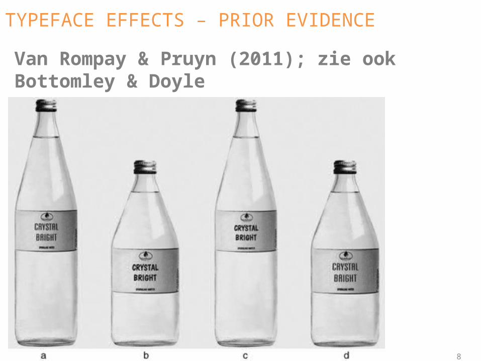
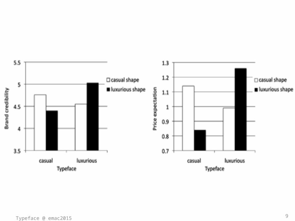
TYPEFACE EFFECTS – PRIOR EVIDENCEVan Rompay & Pruyn (2011); zie ook Bottomley & Doyle
8
9Typeface @ emac2015
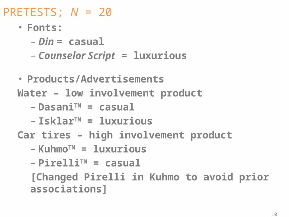
PRETESTS; N = 20• Fonts: – Din = casual– Counselor Script = luxurious
• Products/AdvertisementsWater – low involvement product– DasaniTM = casual– IsklarTM = luxurious
Car tires – high involvement product– KuhmoTM = luxurious– PirelliTM = casual [Changed Pirelli in Kuhmo to avoid prior associations]
10
11
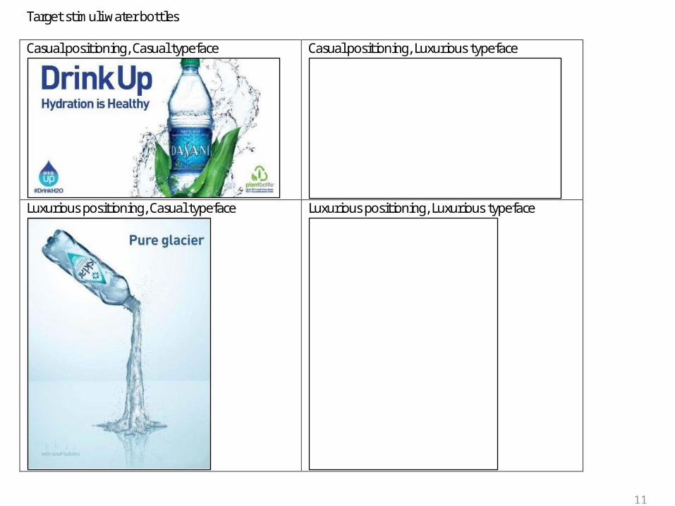
Target stimuli water bottles
Casual positioning, Casual typeface
Casual positioning, Luxurious typeface
Luxurious positioning, Casual typeface
Luxurious positioning, Luxurious typeface
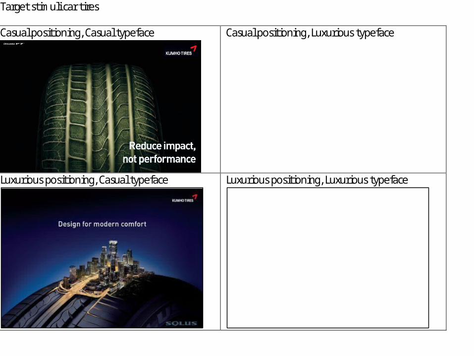
Target stimuli car tires
Casual positioning, Casual typeface
Casual positioning, Luxurious typeface
Luxurious positioning, Casual typeface
Luxurious positioning, Luxurious typeface
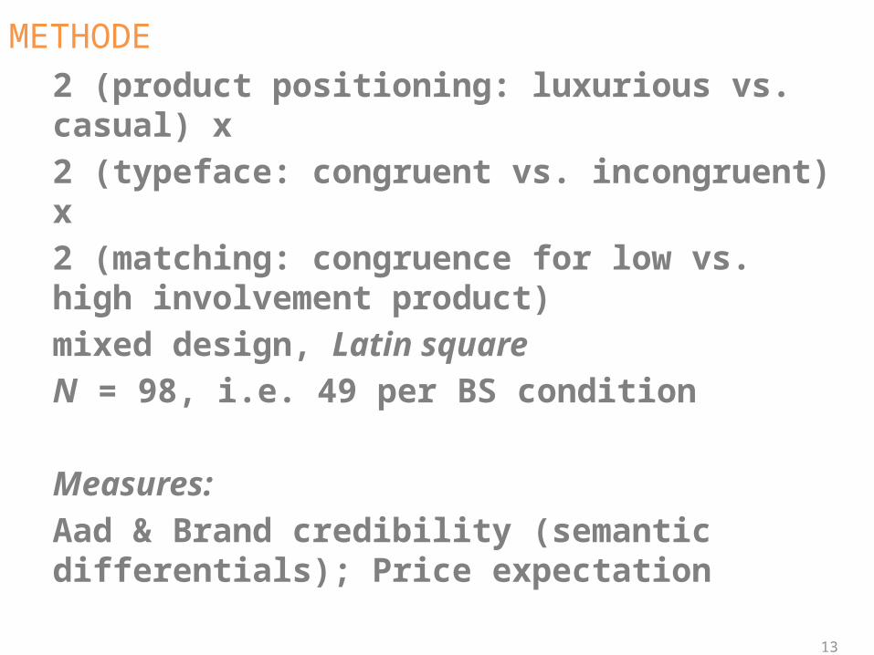
METHODE2 (product positioning: luxurious vs. casual) x 2 (typeface: congruent vs. incongruent) x 2 (matching: congruence for low vs. high involvement product) mixed design, Latin square N = 98, i.e. 49 per BS condition
Measures:Aad & Brand credibility (semantic differentials); Price expectation
13
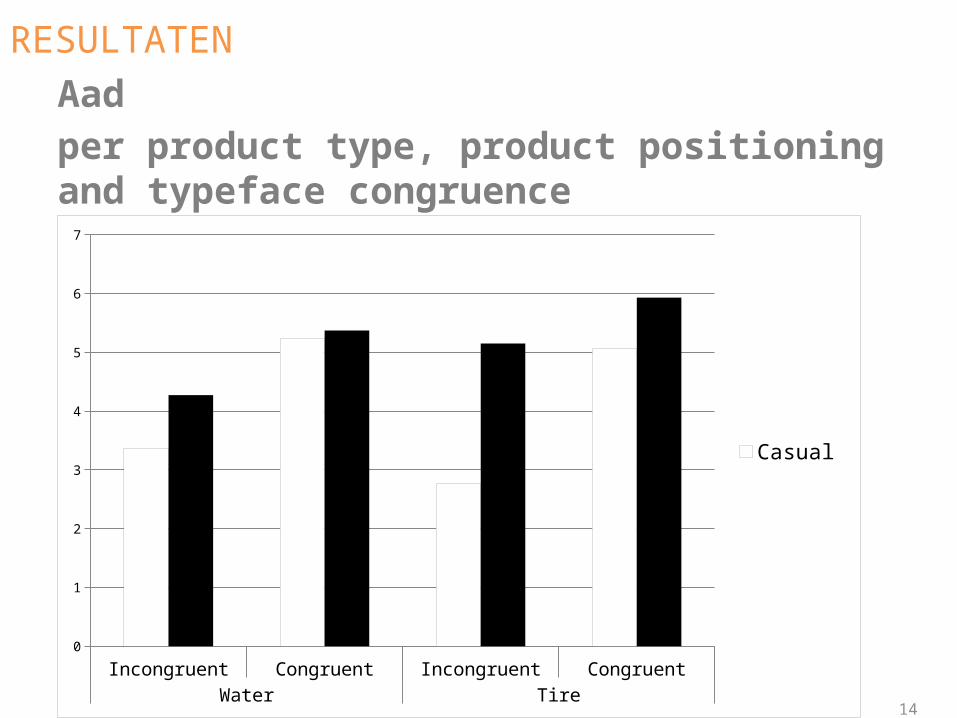
RESULTATENAadper product type, product positioning and typeface congruence
14
Incongruent Congruent Incongruent CongruentWater Tire
0
1
2
3
4
5
6
7
CasualLuxurious
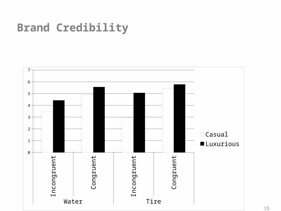
Brand Credibility
15
Incongruent Congruent Incongruent CongruentWater Tire
0
1
2
3
4
5
6
7
CasualLuxurious
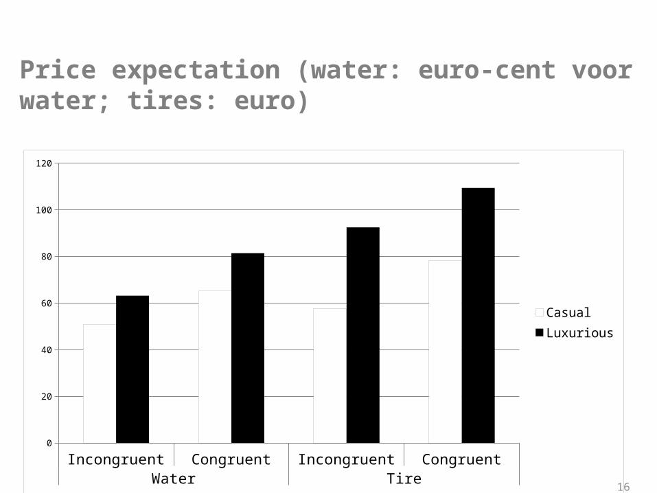
Price expectation (water: euro-cent voor water; tires: euro)
16
Incongruent Congruent Incongruent CongruentWater Tire
0
20
40
60
80
100
120
CasualLuxurious
DISCUSSION/CONCLUSIONAd typeface seems to fit within the subtle type of congruence effects where congruence is more persuasive than (moderate) incongruence
Effect for low & high involvement product
Replicability of negative effect for casual incongruity? Is this an attention effect?
17
THE RIGHT FONT FOR THE JOB
EFFECT OF TYPEFACE-PRODUCT CONGRUENCY ON ATTITUDE
TOWARDS THE AD
Tim SmitsKU Leuven
PRESENTED @ emac2015Collaboration:
Robin Van der SarGoele Aerts (KU Leuven)
Recommended