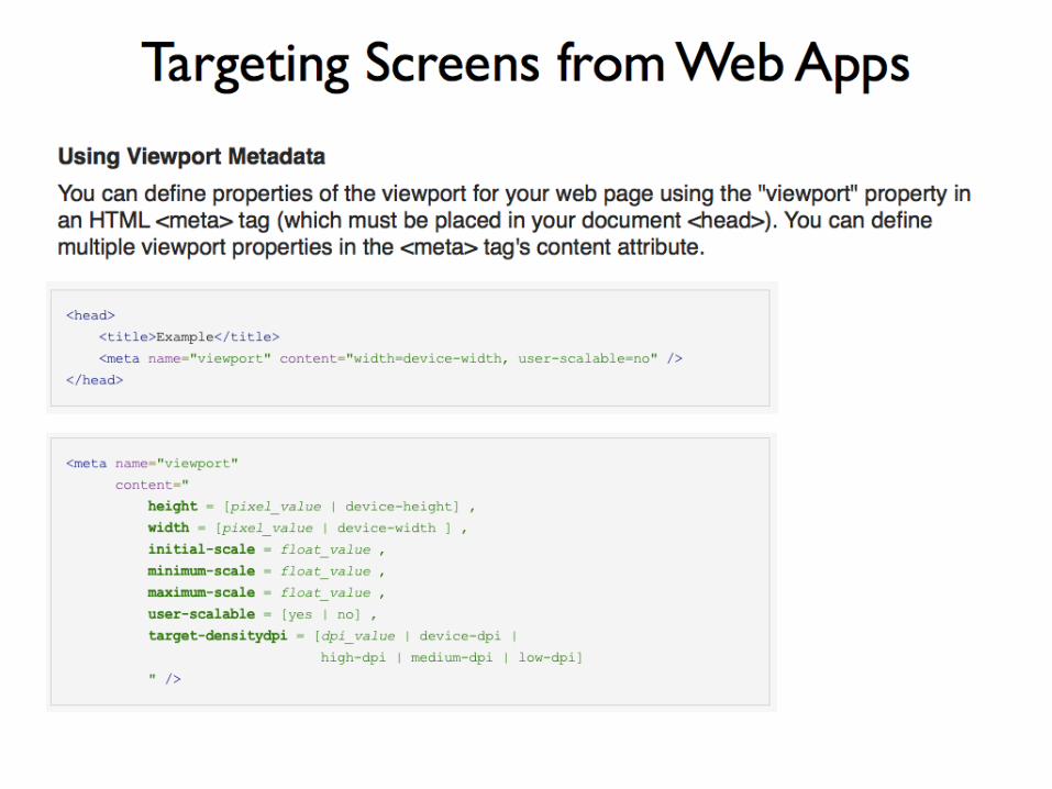
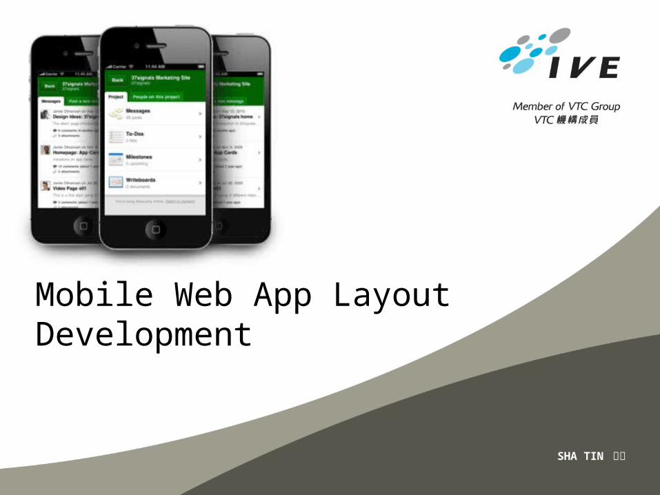
SHA TIN 沙田
Mobile Web App LayoutDevelopment
• Content adaptation – you create many versions of your site
• No content adaptation – Don’t need to create different version
Two basic approaches to create cross-platform mobile designs
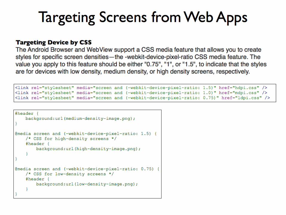
• Web standards is just an easy way to say “a web page based on the XHTML 1.0 and CSS 2.1 specification, coded in such a way that the majority of presentation elements are omitted from the XHTML markup and defined in the CSS instead
• HTML: Page structure
• CSS: Page presentation
• JavaScript: Page behavior
Web Standards
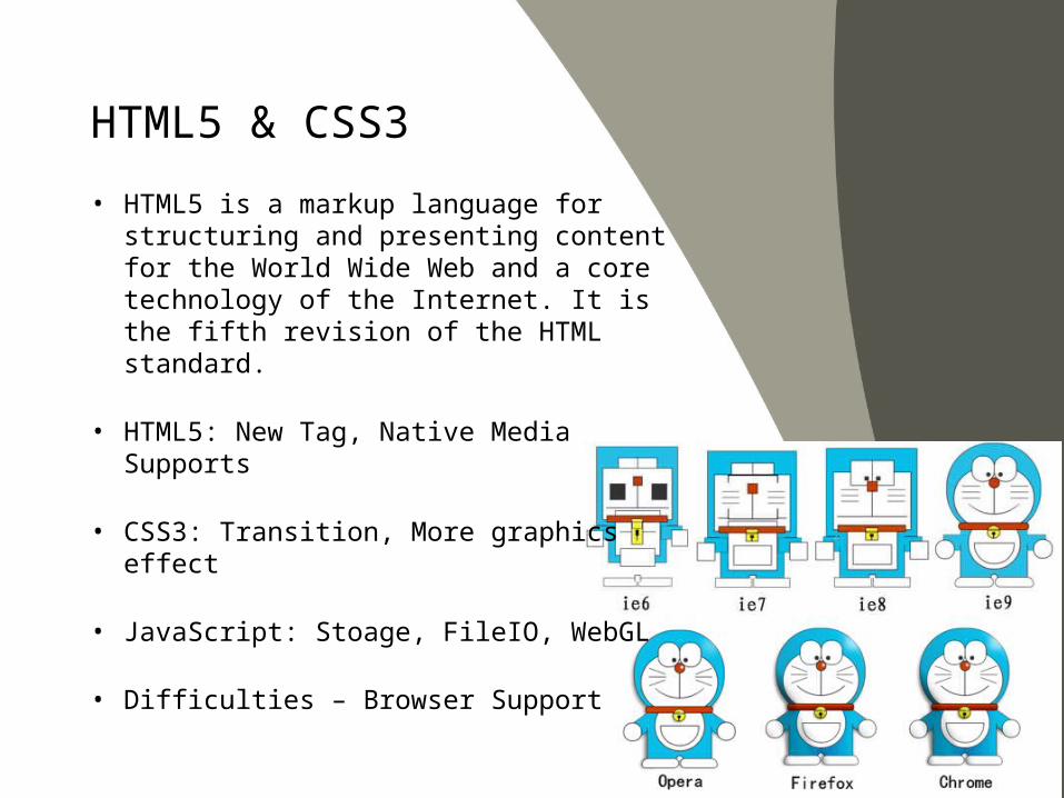
HTML5 & CSS3
• HTML5 is a markup language for structuring and presenting content for the World Wide Web and a core technology of the Internet. It is the fifth revision of the HTML standard.
• HTML5: New Tag, Native Media Supports
• CSS3: Transition, More graphics effect
• JavaScript: Stoage, FileIO, WebGL
• Difficulties – Browser Support
• Design in layers of degradation
• Use Progressive Enhancement
Designing for Multiple Mobile Browsers
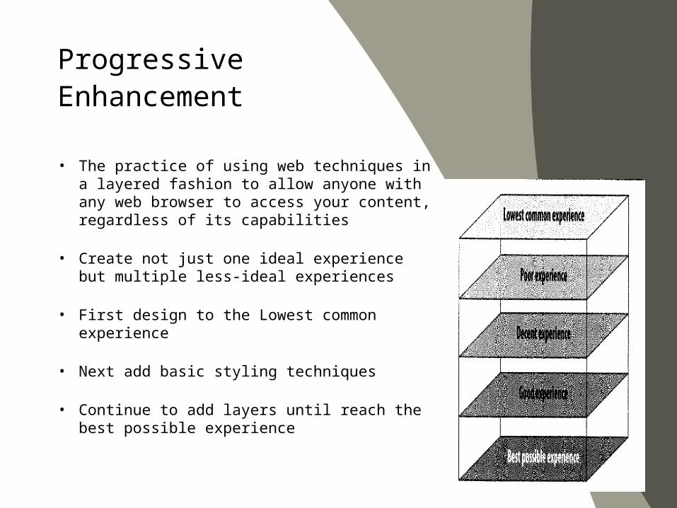
• The practice of using web techniques in a layered fashion to allow anyone with any web browser to access your content, regardless of its capabilities
• Create not just one ideal experience but multiple less-ideal experiences
• First design to the Lowest common experience
• Next add basic styling techniques
• Continue to add layers until reach the best possible experience
Progressive Enhancement
• Techniques for mobile web• Always code your markup semantically.• Have a device plan• Have both your lowest common denominator
and high-end device designs before you begin to code
• Test on different mobile devices from the beginning to the end to ensure that your incremental work will display correctly in the intended devices
• If you plan to add a desktop layer, always create the mobile version first
Mobile progressive enhancement techniques
• Both design and development• Remember that your design might be viewed on a
small 120-pixel screen for the lower-end phones, or on a 320-pixel screen for the smartphones
• Fixed versus fluid designs• Fixed-width has provided slightly more
reliable rendering across devices. Problem is that it might limit the viewable content.
• Single-column versus multiple-column layout• Not employ a multicolumn layout on a lower-
end device• Consider whether you’re designing for touch.
If your target devices support touch, then it is OK to use multiple columns.
• If the device does not support touch, then opt for a single-column design
Designing for Multiple Displays


• Define each of the progressive enhancement layers
• Determining what will be that center, common experience and what layers you intend to support
Device Plans
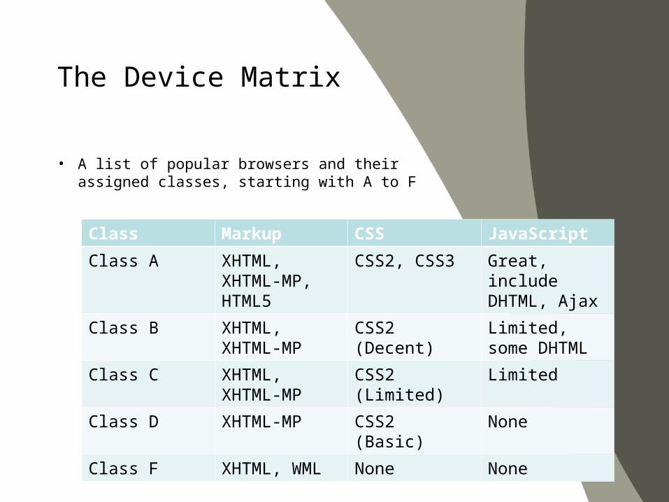
• A list of popular browsers and their assigned classes, starting with A to F
The Device Matrix
Class Markup CSS JavaScript
Class A XHTML, XHTML-MP, HTML5
CSS2, CSS3 Great, include DHTML, Ajax
Class B XHTML, XHTML-MP
CSS2 (Decent) Limited, some DHTML
Class C XHTML, XHTML-MP
CSS2 (Limited) Limited
Class D XHTML-MP CSS2 (Basic) None
Class F XHTML, WML None None
• Markup is used to make content readable by mobile browsers
• HTML is the language of the Web• In mobile, it use different markup language• WAP is the stack in which the mobile web lives, it is
a protocol unto itself
Markup
• XHTML-MP is a modularization of XHTML Basic• XHTML Basic is a subset of XHTML• XHTML-MP has evolved to become the predominant
language for the mobile web• Safely be assumed to be used in devices
manufactured since 2002
XHTML – MP Overview
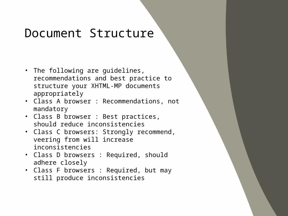
• The following are guidelines, recommendations and best practice to structure your XHTML-MP documents appropriately
• Class A browser : Recommendations, not mandatory• Class B browser : Best practices, should reduce
inconsistencies• Class C browsers: Strongly recommend, veering
from will increase inconsistencies• Class D browsers : Required, should adhere closely• Class F browsers : Required, but may still produce
inconsistencies
Document Structure
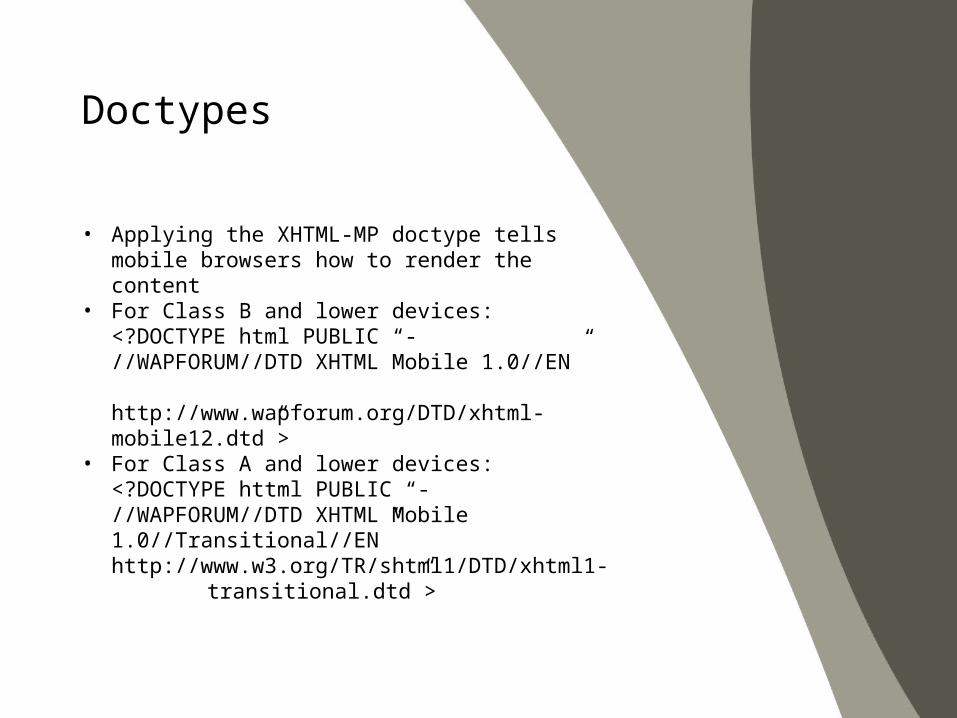
• Applying the XHTML-MP doctype tells mobile browsers how to render the content
• For Class B and lower devices:<?DOCTYPE html PUBLIC “- //WAPFORUM//DTD XHTML Mobile 1.0//EN” http://www.wapforum.org/DTD/xhtml-mobile12.dtd”>
• For Class A and lower devices:<?DOCTYPE httml PUBLIC “- //WAPFORUM//DTD XHTML Mobile 1.0//Transitional//EN” http://www.w3.org/TR/shtml1/DTD/xhtml1-transitional.dtd”>
Doctypes
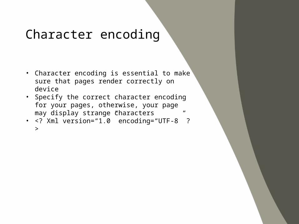
• Character encoding is essential to make sure that pages render correctly on device
• Specify the correct character encoding for your pages, otherwise, your page may display strange characters
• <? Xml version=“1.0” encoding=“UTF-8” ?>
Character encoding
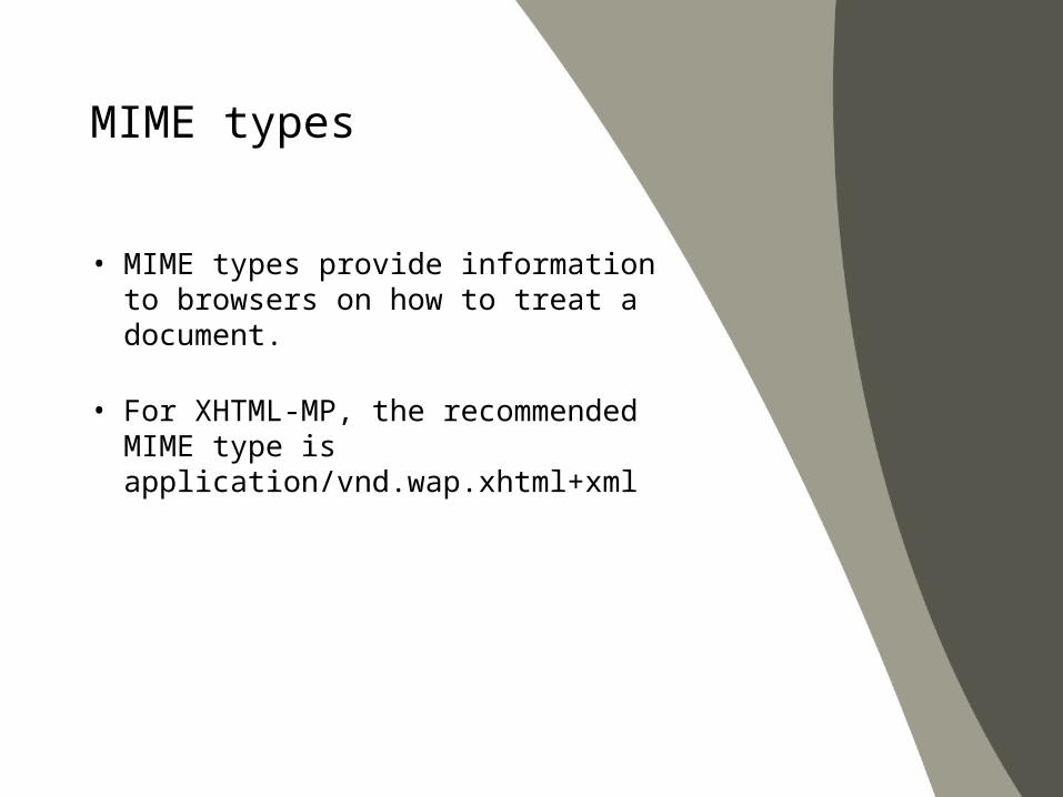
• MIME types provide information to browsers on how to treat a document.
• For XHTML-MP, the recommended MIME type is application/vnd.wap.xhtml+xml
MIME types
• Page titles surrounded by the <title> element
• Good titles increase the findability and usability of web page
• Most of the devices use the page title as a default label for book-marks
Page titles
• Mobile browsers prioritize markup before presentation
• Loading stylesheets and images last• Use external stylesheets, separating your markup
and presentation and decreasing the overall page size
Use of stylesheets
• Most of the mobile devices don’t support embedded objects or scripts
• It’s not possible for users to install plugins• Avoid using it unless you can’t find another means to
express your design
Objects and scripts
• Auto Refresh the page• <meta http-equiv=“refresh” content=“0” />• Avoid creating periodically auto-refreshed pages,• If use, provide a way to stop it
Auto refresh
• Using markup to redirect pages increases the load time and cost as a result of downloading and processing another page
Redirects
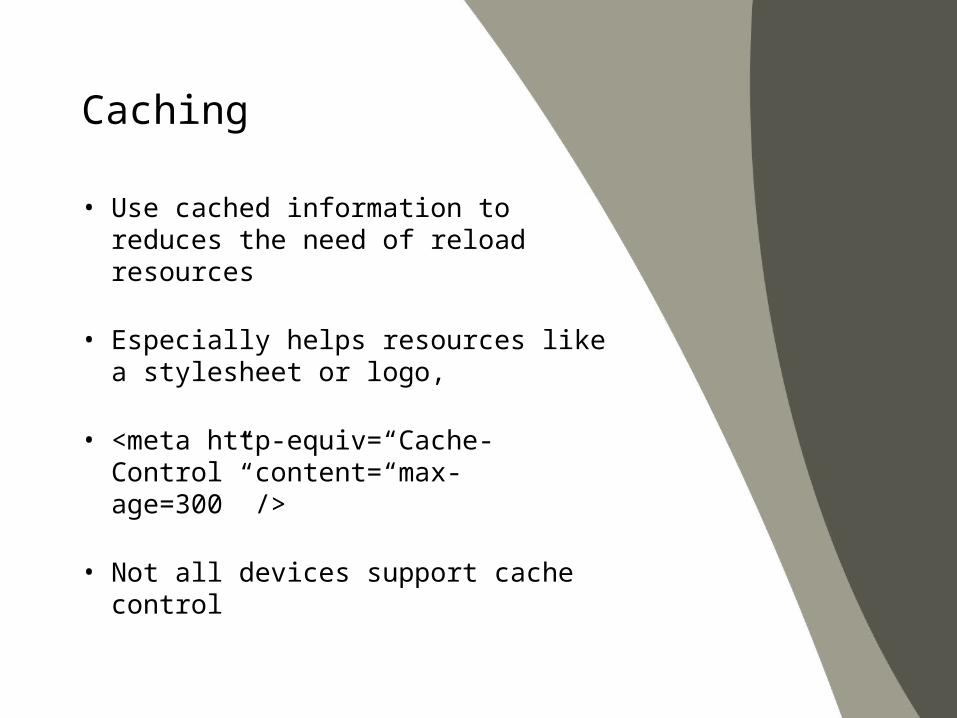
• Use cached information to reduces the need of reload resources
• Especially helps resources like a stylesheet or logo,
• <meta http-equiv=“Cache-Control” content=“max-age=300” />
• Not all devices support cache control
Caching
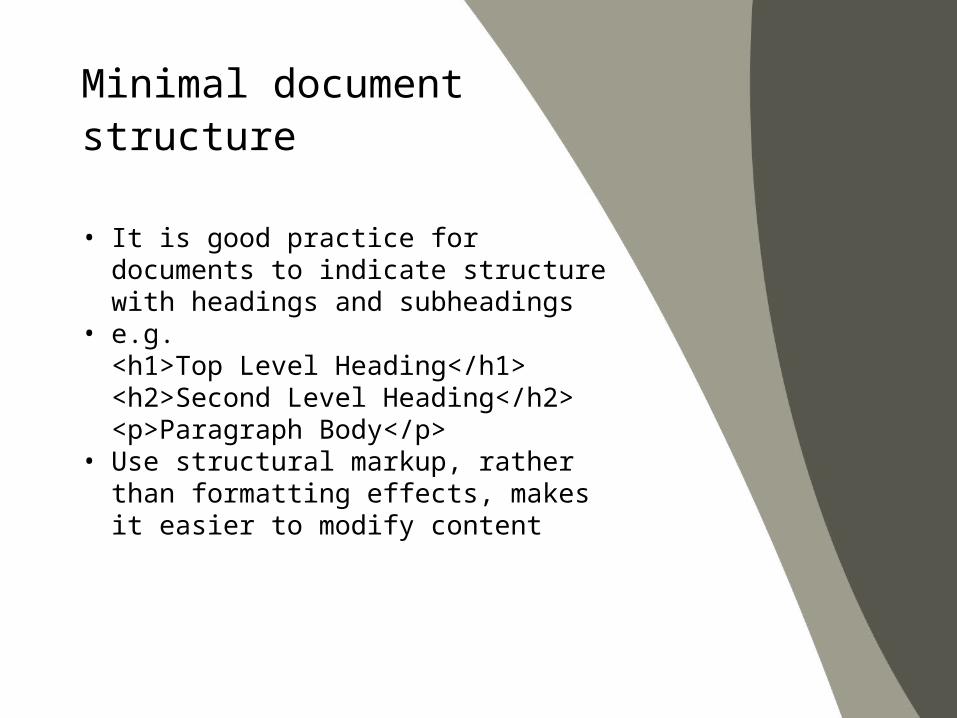
• It is good practice for documents to indicate structure with headings and subheadings
• e.g. <h1>Top Level Heading</h1><h2>Second Level Heading</h2><p>Paragraph Body</p>
• Use structural markup, rather than formatting effects, makes it easier to modify content
Minimal document structure
• <p> …. </p>• The paragraph is the tag you will probably
use the most• Each paragraph of text should be
wrapped in the paragraph tag• Paragraph will apply default margins to
the top and bottom on the element, which can be modified in the CSS
Text Elements - Paragraphs
• <bq> … </bq>• The blockquote is used for quotations or comments• Used as a wrapper tag for one or more paragraph
tag• It create the inherit margin around the entire element
to give the appearance of being indented from the primary text
• You can define the margins for blockquotes in CSS
Text Elements - Quotations
• em, strong, small, abbr, acronym, cite, dfn, code, kbd, smp, var, del, ins
• Use <span class=“phrase”>…</span>• Phrase elements may not be fully
supported on Class C or lower devices
Text Elements – Phrase elements
• <ul><li>…</li></ul>• Unordered lists are a hallmark in web-standards-
based design• Used for navigation lists and structuring nested
content
Text Elements – Unordered lists
• <ol><li>…</li></ol>• Ordered lists are not used as often as unordered lists
in desktop sites• For mobile device, use ordered lists for all your
navigation lists that have fewer than 10 items
Text Elements – Ordered lists
• <dl><dt>…</dt><dd>….</dd></dl>• Definition list is for lists that contain term and
definition pairs.• Useful for creating repetitive lists where you simply
need a title and do not wish to use a header
Text Elements – Definition lists
• <div>….</div><span>…</span>• div is used to identify and label any block-level
division of text or content• span is used to identify a grouping of inline elements
Text Elements – Structural elements
• <br />, <hr />• Line breaks and horizontal rules work as expected
on virtually all mobile devices
Text Elements – Line breaks
• nonbreaking space, &, <, >, ‘, “, TM, ©• Common characters not found in the normal
alphanumeric character set• Must be specified in XHTML as character references
starting with an & and ending with a ;• For example, a nonbreaking space would be coded
as and an ampersand is &
Text Elements – Character entity references
• Links are the foundation of how hypertext works• It take you to new pages or be used as an anchor to
content further down the page• With XHTML-MP, links can also initiate a telephone
call and perform other device actions• Due to the constrained screen size, there are
additional best practices surrounding links
Creating Links
• Too many links on a page makes it difficult for the user to navigate and read content
• Try to limit links to 10 links per page• Add access keys to links, so that users can navigate
with the keypad as well<a href=“#itme1” accesskey=“1”>Item1</a>
Creating Links – Number of links
• Navigating a mobile site can be difficult and cumbersome
• You can simplify navigation and limit scrolling by provide keyboard shortcuts to the common links
Creating Links – Access keys
• For the mobile device, XHTML-MP includes a means to initiate a telephone call within a <a> element
• By prefacing the full phone number, including country code, with tel: within the href attribute<a href=tel:+155 12121222>Call me</a>
Creating Links – Initiating telephone calls
• The desktop web is rick with a variety of embedded content
• Due to hardware limitation of mobile devices, you cannot assume that all mobile devices can display image in the same capabilities
Images and Objects
• Nearly all mobile devices support the JPEG, GIF and PNG formats
• 8-bit PNG and 24-bit PNG with alpha transparency are supposed to be supported as of WAP 2.0
• Use PNGs as they are the recommended image format for the mobile web
Images and Objects – Image types
• The safe approach is to edit images so that they’re as small as possible in terms of pixel dimensions
• Most mobile device screens about 120 pixels wide• It is recommended that you not use images any
wider than that• If you are using a content adaptation system, you
can dynamically insert different images based on the requesting device
• You can load larger images for larger devices• Find the best solution for your users and their device,
just keep in mind that every kilobyte of data you push have to pay
• Consider the size and use of images carefully
Images and Objects – Images sizes
• Not specifying the pixel height and width of an image forces the mobile device to calculate the values
• Increasing render times• Degrading the performance
Images and Objects – Image dimensions
• Most devices lack a pointing device• Difficult for users to use image maps• If you know that the device supports touch, you can
use image maps• Avoiding them for lower-devices
Images and Objects – Image maps
• Always provide alt text value for all images• Some browsers allow you to disable downloading
images• Opting for text-only mode in order to increase
rendering speeds
Images and Objects – Alt text
• Many devices support vector objects like Adobe Flash, SVG(Scalable Vector Graphics)
• Avoid using it unless you specifically know that the targeted devices support it
Images and Objects – Flash and SVG
• All WAP 2.0 devices should support the 3GPP video format and MP4 audio format
Images and Objects – Embedded audio and video
• If you are having problems with layout consistency, a table is the solution
Tables
• Web design industry considers using tables for layout as bad practice in mobile devices
• Table-based layout combines presentation and markup
• Makes development more difficult and essentially eliminates the ability to adapt to other media
• Table-based layouts restrict your ability to adapt for various devices and to increase page size
• More efficient to do page layout with style-based layout
Tables – Layout tables
• Nested tables, like layout tables• Tendency to render inconsistently and add to the
page size
Tables – Nested table
• Frames just don’t work in mobile design• Devices don’t support frames because of many
usability problems• Applying server-side includes for loading local
contents
Frames
• It is challenge to design and develop a form• In Class A browsers, forms can resemble their
desktop cousins• For the other browsers, form don’t always render like
you might expect• As forms are difficult to control and add content to• Limit the use of forms in the mobile context
Forms
• It’s difficult for user to enter content into free text input controls such as text boxes and text areas
• Try to use radio buttons, select boxed and even lists of links to reduce the use of text entry
Forms – free text input controls
• Limit the type of data entered into an input field by defining the input mask or input mode using Wireless CSS or CSS-MP
• Easier for users to enter information into a free text field
• The input mode (alphanumeric or numberic) of the mobile device’s keypad is automatically set according to the input mask value
Input only numeric values: <input type=“text” style=‘ –wap-input-format:”*N”’ /> Limits the input to alpha characters <input type=“text” style=‘ –wap-input-format: “A*a”’ />
Forms – default input mode

• Nonvalidating markup may not display correctly or efficiently on mobile devices
• To check markup against the W3C mobile web best practices, you can validate your code aat:http://validator.w3.org/mobile/ http://ready.mobi
Other Recommendations – Validate markup
• Most mobile devices don’t support pop-up windows• Try not rely on pop-up• Changing the current view can be disorienting to the
user
Other Recommendations – Pop-up windows
• Most mobile browsers download each resource as a separate element
• Begin with downloading and rendering markup, followed by stylesheets and images
• Depending on network speed, the user may see the basic markup while external resources download
• When download finishes, the browser renders the page again with the included elements
• Limit the user of external resources you use and keep each resource’s file size as small as possible
Other Recommendations – External resources
• Page sizes (including images and stylesheets) should remain as small as possible
• Large pages take longer to load and cost the user money
• Target your combined page weight to be between 10 – 25KB
• Avoid exceeding 50 KB per page
Other Recommendations – Total page download size
• In the past, mobile devices had incredibly poor support for CSS
• Use it to style text and apply background colors• Today’s mobile browsers have far better support for
both CSS2 and CSS3
CSS: Cascading Style Sheets
• Keep it simple• Keeping your styles very basic, using no
complex styling techniques• Code and reload
• Constantly test how your styles render on devices
• For each code change, you reload the browser on each device you plan to support
• Progressive enhancement• This approach requires you to create multiple
layers of support• Your style gracefully degrades depending on
the device
Techniques to designing your CSS
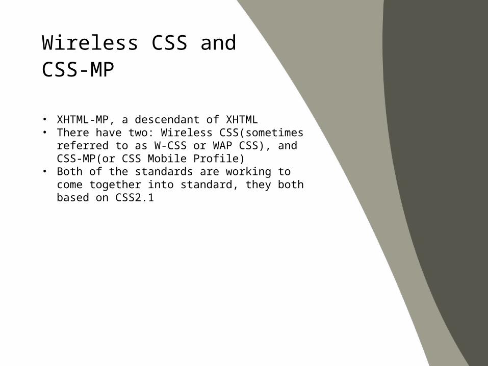
• XHTML-MP, a descendant of XHTML• There have two: Wireless CSS(sometimes referred
to as W-CSS or WAP CSS), and CSS-MP(or CSS Mobile Profile)
• Both of the standards are working to come together into standard, they both based on CSS2.1
Wireless CSS and CSS-MP
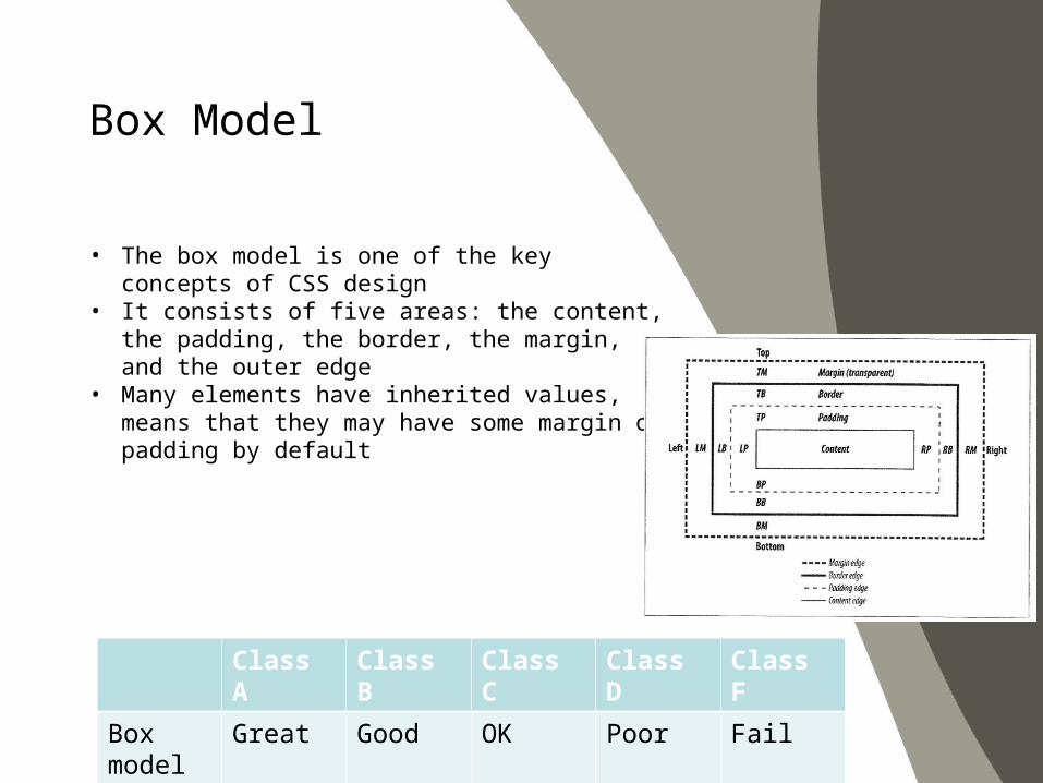
• The box model is one of the key concepts of CSS design
• It consists of five areas: the content, the padding, the border, the margin, and the outer edge
• Many elements have inherited values, means that they may have some margin or padding by default
Box Model
Class A Class B Class C Class D Class F
Box model
Great Good OK Poor Fail
• Selector is used to tell which markup elements it should apply rules to
• Universal• Type or element selectors• Contextual selectors (descendant, child and
adjacent sibling)• Class and ID selectors• Pseudoclasses• Pseudoelements
Selectors
• {font-family:serif;}• Selects all elements, defining the default
typeface or font size
Selectors – Universal selector
• h1{color: red;}• The type or element selector targets the
element by name
Selectors – Type selector
• Li a {color: red;}• The descendant selector targets elements
that are descendants of another element• The descendant selector is not
consistently supported on Class C or lower browser
Selectors – Descendant selector

• .error {background-color: red;}• The class selector targets any element
with the matching class• Class selectors are one of the more
common techniques used for cross-platform mobile designs
Selectors – Class selector
• #alert{background-color: yellow;}• The ID selector targets any element with
the matching ID• All IDs need to start with at least one letter
Selectors – ID selector
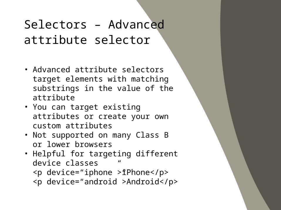
• Advanced attribute selectors target elements with matching substrings in the value of the attribute
• You can target existing attributes or create your own custom attributes
• Not supported on many Class B or lower browsers
• Helpful for targeting different device classes<p device=“iphone”>iPhone</p><p device=“android”>Android</p>
Selectors – Advanced attribute selector
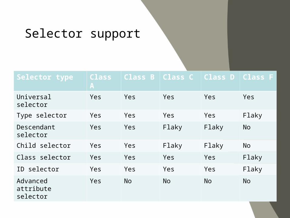
Selector support
Selector type Class A Class B Class C Class D Class F
Universal selector Yes Yes Yes Yes Yes
Type selector Yes Yes Yes Yes Flaky
Descendant selector Yes Yes Flaky Flaky No
Child selector Yes Yes Flaky Flaky No
Class selector Yes Yes Yes Yes Flaky
ID selector Yes Yes Yes Yes Flaky
Advanced attribute selector
Yes No No No No
• The typography options on mobile devices can be less
• We are seeing mobile browsers move closer to desktop
Font and Text Properties
• In mobile development, we can count on only two font options: serif and sans-serif
• In low-end devices, it only have one option – sans-serif
• In class B or higher, we can use Georgia, Times New Roman, Arial, and Helvetica and Courier New fonts
Font and Text Properties – Available fonts
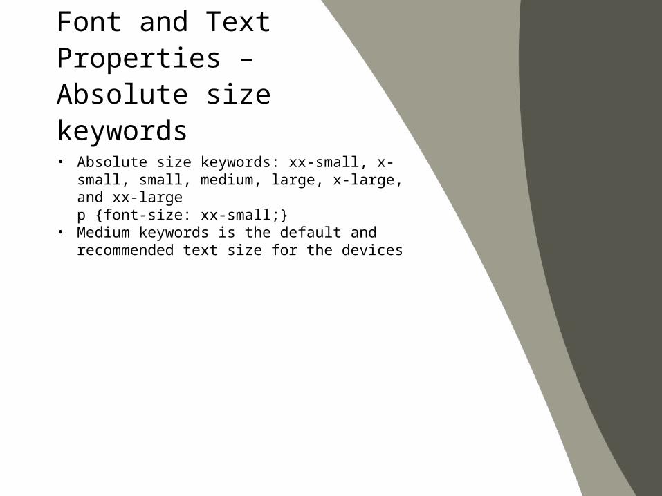
• Absolute size keywords: xx-small, x-small, small, medium, large, x-large, and xx-largep {font-size: xx-small;}
• Medium keywords is the default and recommended text size for the devices
Font and Text Properties – Absolute size keywords
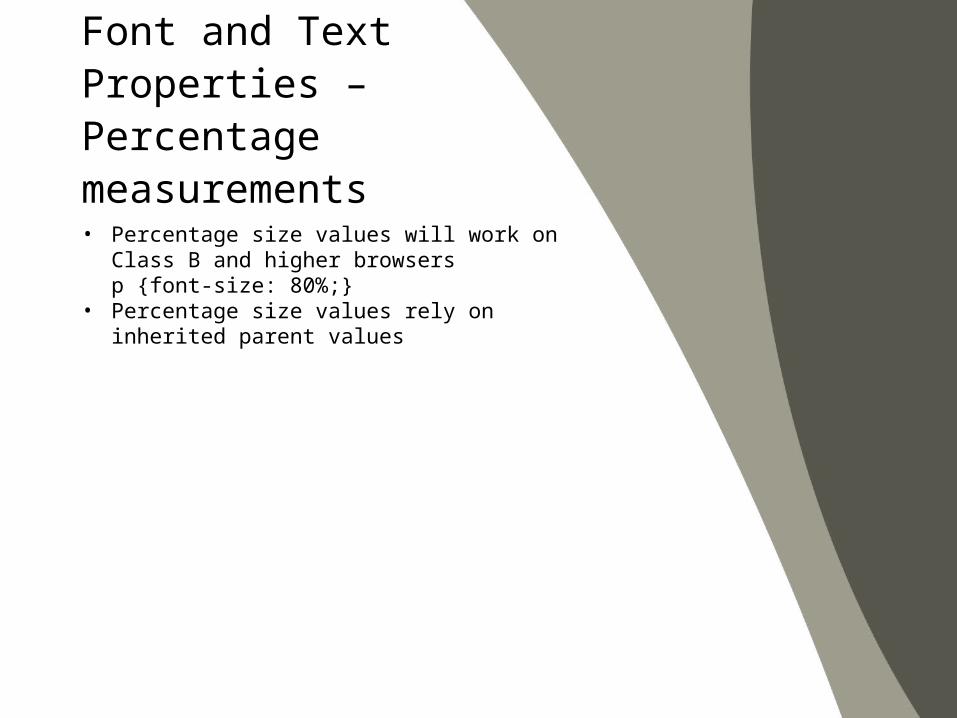
• Percentage size values will work on Class B and higher browsersp {font-size: 80%;}
• Percentage size values rely on inherited parent values
Font and Text Properties – Percentage measurements
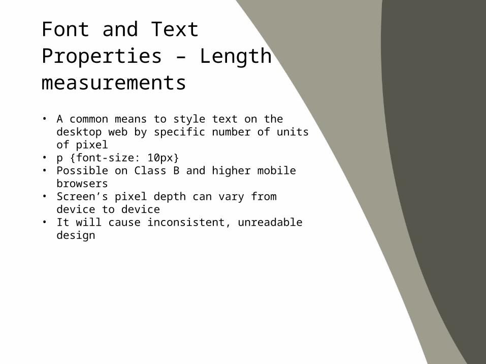
• A common means to style text on the desktop web by specific number of units of pixel
• p {font-size: 10px}• Possible on Class B and higher mobile browsers• Screen’s pixel depth can vary from device to device• It will cause inconsistent, unreadable design
Font and Text Properties – Length measurements
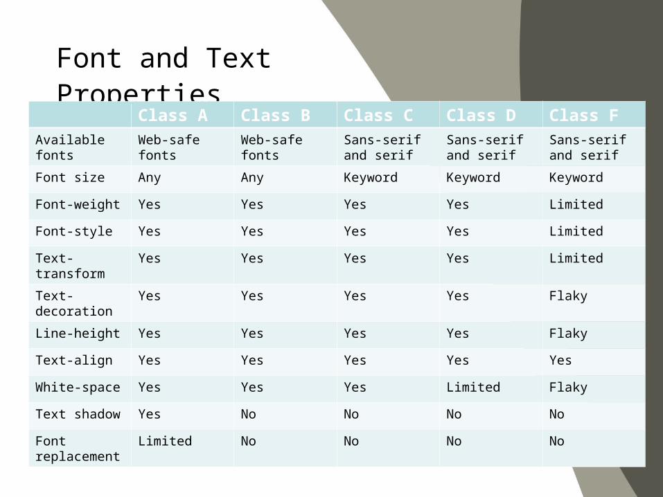
Font and Text PropertiesClass A Class B Class C Class D Class F
Available fonts Web-safe fonts Web-safe fonts Sans-serif and serif
Sans-serif and serif
Sans-serif and serif
Font size Any Any Keyword Keyword Keyword
Font-weight Yes Yes Yes Yes Limited
Font-style Yes Yes Yes Yes Limited
Text-transform Yes Yes Yes Yes Limited
Text-decoration
Yes Yes Yes Yes Flaky
Line-height Yes Yes Yes Yes Flaky
Text-align Yes Yes Yes Yes Yes
White-space Yes Yes Yes Limited Flaky
Text shadow Yes No No No No
Font replacement
Limited No No No No
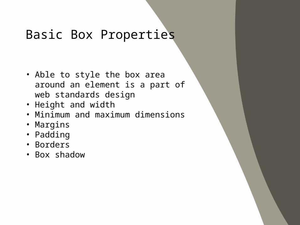
• Able to style the box area around an element is a part of web standards design
• Height and width• Minimum and maximum dimensions• Margins• Padding• Borders• Box shadow
Basic Box Properties
• Background color• Background image• Multiple background images
Color and Backgrounds
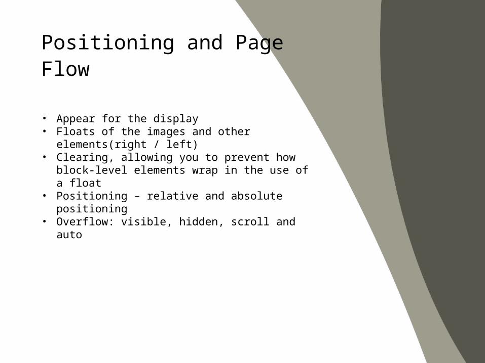
• Appear for the display• Floats of the images and other elements(right / left)• Clearing, allowing you to prevent how block-level
elements wrap in the use of a float• Positioning – relative and absolute positioning• Overflow: visible, hidden, scroll and auto
Positioning and Page Flow
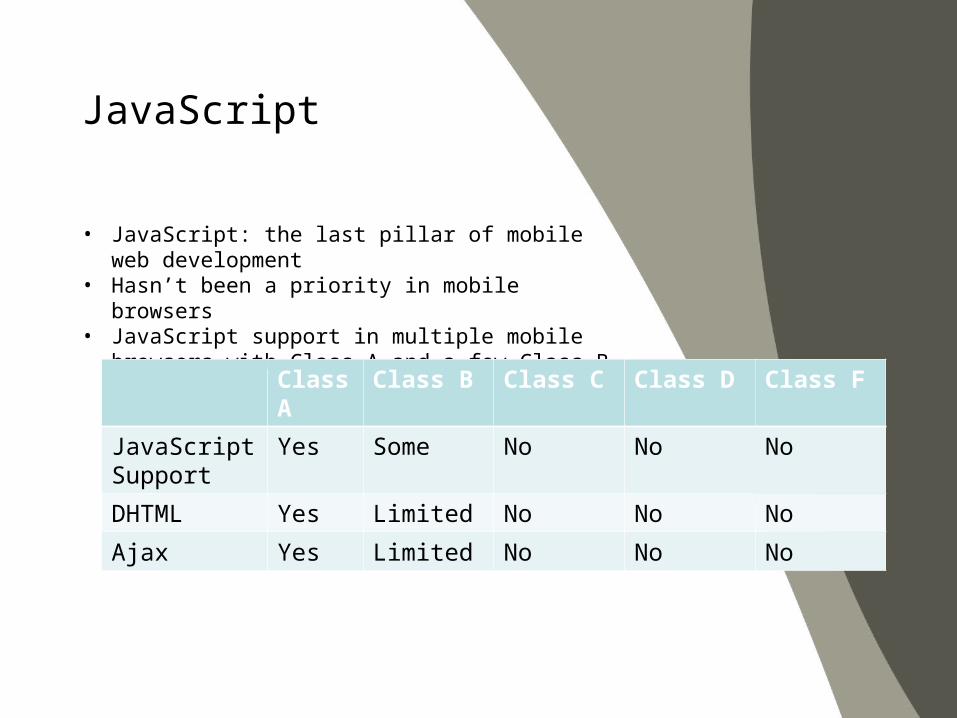
• JavaScript: the last pillar of mobile web development• Hasn’t been a priority in mobile browsers• JavaScript support in multiple mobile browsers with
Class A and a few Class B browsers
JavaScript
Class A
Class B Class C Class D Class F
JavaScript Support
Yes Some No No No
DHTML Yes Limited No No No
Ajax Yes Limited No No No
Recommended

![SHA Servo-Hydraulic Actuator SHA - Bosch Global...2017/09/15 · 120 @ 280bar 78 @ 250bar Max. velocity v [mm/s] Rapid = 380 Pressing = 105 280 * SHA E1 SHA A1 Large forces, high](https://img.pdfslide.tips/doc/110x75/60dd1e177b4cad374045ee02/sha-servo-hydraulic-actuator-sha-bosch-global-20170915-120-280bar-78.jpg)