Embed Size (px)
Citation preview
Bright colours attract target audience of children
Park shows ‘ideal’ – this is what your park could look like if you get involved with the regeneration
Contact information in bold so that it’s easily seen but doesn’t distract from the poster
Green colours link to our logo colour scheme so helps with our brand identity
‘Baldock’ in different colours shows clearly where we are aiming to regenerate so that people who live there can see and want to get involvedBold font makes the purpose of the campaign clear and the ‘order’ means that people feel compelled to helpCartoon style is the house style of our posters Logo is noticeable but not
distracting, so that it can be seen but doesn’t distract from the message of the poster
Logo to promote brand identity
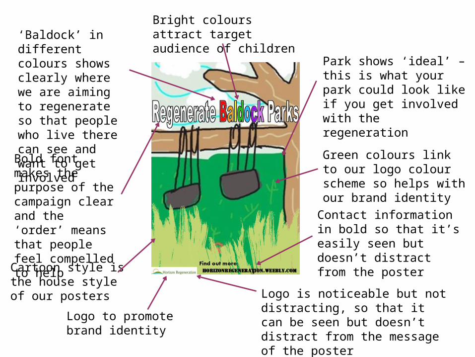
Childish drawings and bright colours are the house style of our posters
The word ‘our’ is a direct address so makes the audience feel compelled to get involved
‘save’ is emotive language so the audience will want to get involved and ‘save’ the parks for the childrenAgain the park shows an ‘ideal’ for the regeneration campaign to aim for
The child in the drawing gets sympathy from the audience - they want to help the child get the park from their drawings
Contact information is bold and easily seen
Logo to promote brand identity.
‘my park’ makes the audience want to help the child and give her her park
Bold font to add urgency – save the parks now
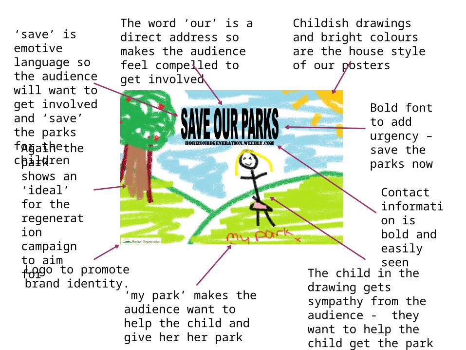
Bright colours and childish drawings are our house style
‘keep childhood alive’ makes the audience feel that without parks children are not fully living and that parks are an important part of childhood
Childish font to attract the audience
‘our’ is direct address so the audience feels compelled to get involved
Rainbow is associated with happiness and joy, especially in children, so it makes the audience think that if they regenerate the parks the children will be happy
Logo to promote brand identity. It’s not in the way of the message of the poster but is easily seen and remembered
Contact details so audience can find out more and get involved
Bold font makes the message clear and adds a sense of urgency