Embed Size (px)
Citation preview
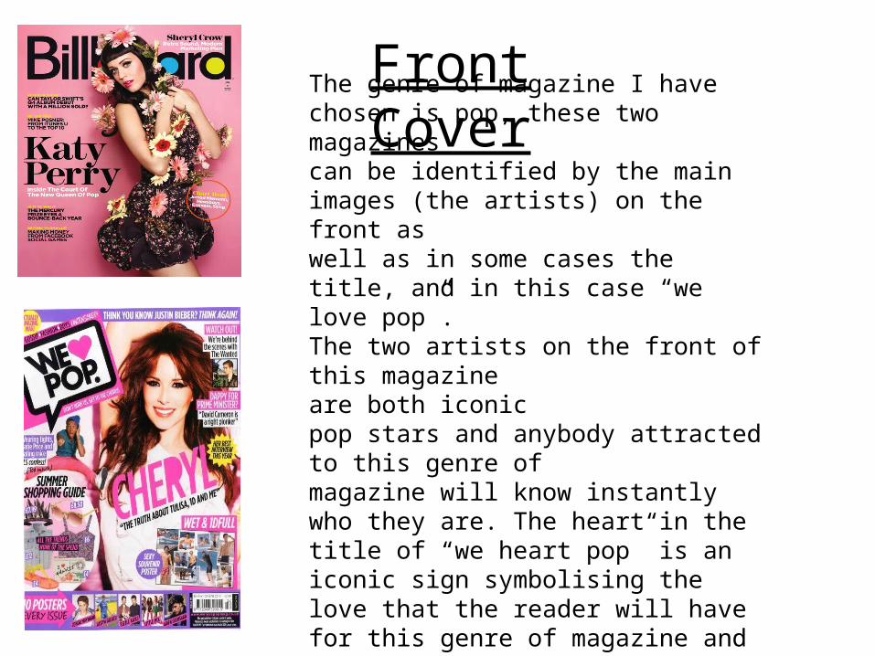
The genre of magazine I have chosen is pop, these two magazines can be identified by the main images (the artists) on the front as well as in some cases the title, and in this case “we love pop”. The two artists on the front of this magazine are both iconic pop stars and anybody attracted to this genre of magazine will know instantly who they are. The heart in the title of “we heart pop” is an iconic sign symbolising the love that the reader will have for this genre of magazine and type of music.
Front Cover
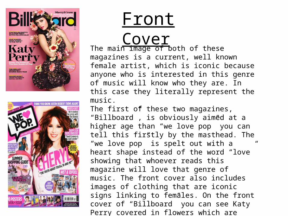
The main image of both of these magazines is a current, well known female artist, which is iconic because anyone who is interested in this genre of music will know who they are. In this case they literally represent the music. The first of these two magazines, “Billboard”, is obviously aimed at a higher age than “we love pop” you can tell this firstly by the masthead. The “we love pop” is spelt out with a heart shape instead of the word “love” showing that whoever reads this magazine will love that genre of music. The front cover also includes images of clothing that are iconic signs linking to females. On the front cover of “Billboard” you can see Katy Perry covered in flowers which are icon signs possibly representing femininity, linking to the target audience of this magazine. Again linking the target audience of females, “we love pop” has images of clothes on the cover showing that inside this magazine, fashion will be a feature.
Front Cover

The colour schemes for both of these magazines are pinks and purples, linking back with the target audience of females. The flowers that are placed around Katy Perry in the first image link with the flowers on her dress, maybe showing that either she herself, or her genre of music is delicate, as is a flower. In both of these magazines the main image used is a medium shot, showing only from about the waist up. Both women are wearing makeup that links back to the colour scheme of pink/purple (very light skin tones, with hints of pink blush on their cheeks). In both cases the artists are looking straight down the camera which could represent confidence. The main images need to be positive and incise the reader in.
Front Cover

The preferred reading of these two magazine covers are that these 2 women are pop icons that should be looked up to as idols by the female audience, both young and old, that these magazines are targeted at. “we love pop” is aiming for young girls to see the person on the front and aspire to be like her.
However the oppositional reading of these magazines would be that you need to look like someone like cheryl of katy perry to be successful in the music industry. It may be giving a bad message to young girls especially with the amount of makeup that has been plastered onto cheryls face during this photo shoot.
Front Cover
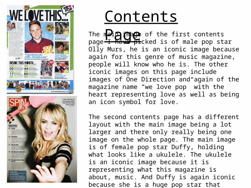
The main image of the first contents page I have picked is of male pop star Olly Murs, he is an iconic image because again for this genre of music magazine, people will know who he is. The other iconic images on this page include images of One Direction and again of the magazine name “we love pop” with the heart representing love as well as being an icon symbol for love.
The second contents page has a different layout with the main image being a lot larger and there only really being one image on the whole page. The main image is of female pop star Duffy, holding what looks like a ukulele. The ukulele is an iconic image because it is representing what this magazine is about, music. And Duffy is again iconic because she is a huge pop star that readers of this genre will know. She also looks enthusiastic which is enticing to readers.
Contents Page

The colour scheme for the first contents page is blue and green and may be looked upon as aimed at for boys, however the colour scheme for this particular issue is for Christmas. The colours may also represent the images of the people on the contents page all being male. The text is all very large and they have a theme running though all the text where the “o” shape of any letter is filled in completely black, this may be to stand out from any other less significant text on the page.
The second contents page has a much calmer colour scheme of grey, black and white. This background makes the main image stand out a lot more, especially as the ukulele is pink and it is the only object representing music, the genre of the magazine. The font for this contents page is a lot more basic and is obviously aimed at an older audience.
Contents Page

The preferred reading of this contents page is that young girls who read it can find male role models in music, and that they may choose to read it because one of their favourite male pop stars is included in the magazine. However the oppositional reading may be that all young girls are expected to want to read about boys and that once again the music industry is all about the way you look, not necessarily who you are or how much talent you may have.
The preferred reading of this contents page is that Duffy is a role model for women to look up to, as well as a talented musician, however the oppositional reading may be that she is wearing a lot of makeup and that the image does not truly show anything about pop music.
Contents Page

The iconic sign on the first double page spread is the main image of Nicki Minage.. She is iconic as everyone will know who she is. The actual ring that she is wearing here also says “icon” insinuating that she herself is iconic.
The 2 iconic images on this page are of 2 members of one direction. Again everyone will know who they are, so much so that their surnames are not even written next to them, its just their first name.
Double Page Spread

The colour scheme in the first page is light pink, which links back to the fact that this page is obviously about a female artist, pink being a very feminine colour. The text that spells out her name is also in pink making it stand out from the rest of the black text.
The colour scheme for this page is blue, shown in their outfits,the background and the text. The blue represents the fact that this page is about 2 male artists, and when it comes to the text the most important things are also written in this colour, e.g. Their names or the question.
Double Page Spread

The preferred reading of this is that Nicki Minage is a good role model within the pop industry and that young readers should look at her as an original upcoming artist. However some people do not agree with some of her music and the oppositional may be that music industry has turned from talent to looks.
The preferred reading of this page is that one direction are a huge pop band that a lot of young girls look up to and to see them talk about normal things like school in this case, will help some of the younger readers. However the oppositional may be that again girls that enjoy reading about pop music in general are expected to want to read about boy bands and their personal lives, when in some cases they just want to read about music.
Double Page Spread