Embed Size (px)
Citation preview
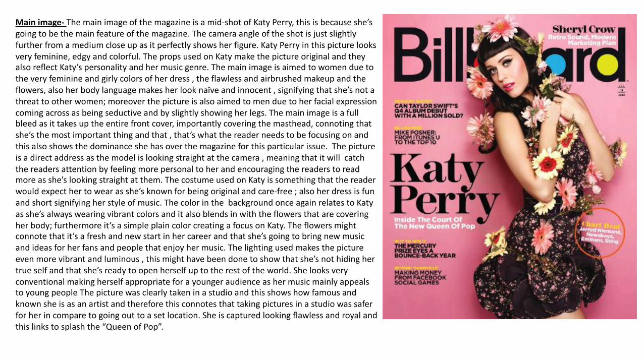
Mainimage- Themainimageofthemagazineisamid-shotofKatyPerry,thisisbecauseshe’sgoingtobethemainfeatureofthemagazine.Thecameraangleoftheshotisjustslightlyfurtherfromamediumcloseupasitperfectlyshowsherfigure.KatyPerryinthispicturelooksveryfeminine,edgyandcolorful.ThepropsusedonKatymakethepictureoriginalandtheyalsoreflectKaty’spersonalityandhermusicgenre.Themainimageisaimedtowomenduetotheveryfeminineandgirlycolorsofherdress,theflawlessandairbrushedmakeupandtheflowers,alsoherbodylanguagemakesherlooknaïveandinnocent,signifyingthatshe’snotathreattootherwomen;moreoverthepictureisalsoaimedtomenduetoherfacialexpressioncomingacrossasbeingseductiveandbyslightlyshowingherlegs.Themainimageisafullbleedasittakesuptheentirefrontcover,importantlycoveringthemasthead,connotingthatshe’sthemostimportantthingandthat,that’swhatthereaderneedstobefocusingonandthisalsoshowsthedominanceshehasoverthemagazineforthisparticularissue.Thepictureisadirectaddressasthemodelislookingstraightatthecamera,meaningthatitwillcatchthereadersattentionbyfeelingmorepersonaltoherandencouragingthereaderstoreadmoreasshe’slookingstraightatthem.ThecostumeusedonKatyissomethingthatthereaderwouldexpecthertowearasshe’sknownforbeingoriginalandcare-free;alsoherdressisfunandshortsignifyingherstyleofmusic.ThecolorinthebackgroundonceagainrelatestoKatyasshe’salwayswearingvibrantcolorsanditalsoblendsinwiththeflowersthatarecoveringherbody;furthermoreit’sasimpleplaincolorcreatingafocusonKaty.Theflowersmightconnotethatit’safreshandnewstartinhercareerandthatshe’sgoingtobringnewmusicandideasforherfansandpeoplethatenjoyhermusic.Thelightingusedmakesthepictureevenmorevibrantandluminous,thismighthavebeendonetoshowthatshe’snothidinghertrueselfandthatshe’sreadytoopenherselfuptotherestoftheworld.ShelooksveryconventionalmakingherselfappropriateforayoungeraudienceashermusicmainlyappealstoyoungpeopleThepicturewasclearlytakeninastudioandthisshowshowfamousandknownsheisasanartistandthereforethisconnotesthattakingpicturesinastudiowassaferforherincomparetogoingouttoasetlocation.Sheiscapturedlookingflawlessandroyalandthislinkstosplashthe“QueenofPop”.
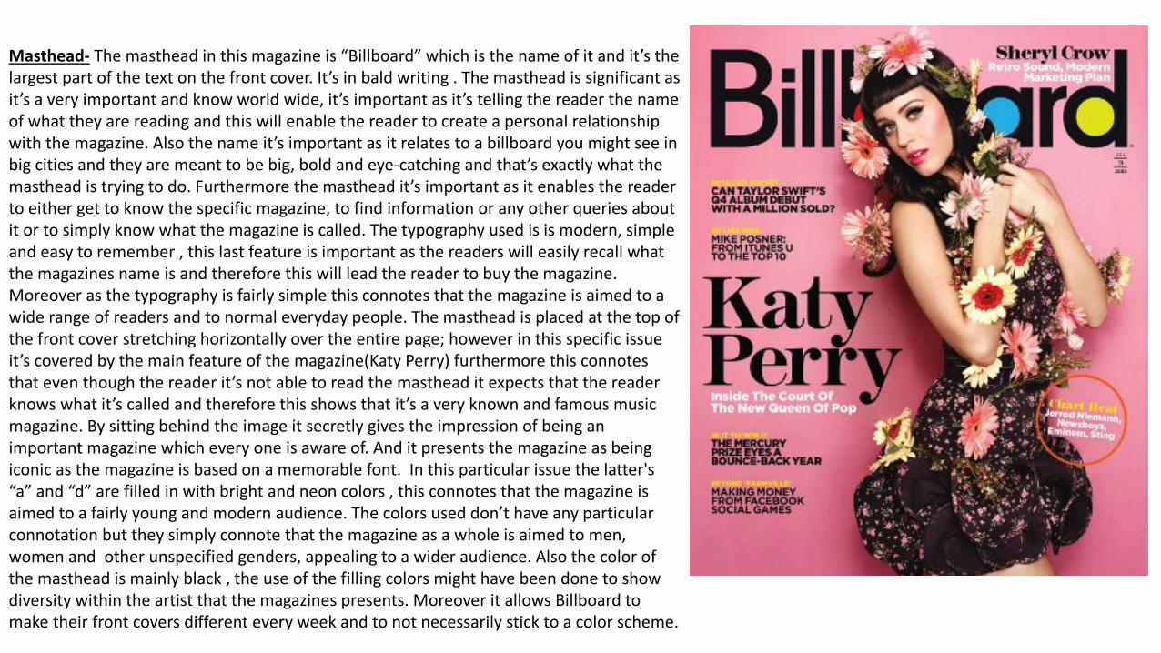
Masthead- Themastheadinthismagazineis“Billboard”whichisthenameofitandit’sthelargestpartofthetextonthefrontcover.It’sinbaldwriting.Themastheadissignificantasit’saveryimportantandknowworldwide,it’simportantasit’stellingthereaderthenameofwhattheyarereadingandthiswillenablethereadertocreateapersonalrelationshipwiththemagazine.Alsothenameit’simportantasitrelatestoabillboardyoumightseeinbigcitiesandtheyaremeanttobebig,boldandeye-catchingandthat’sexactlywhatthemastheadistryingtodo.Furthermorethemastheadit’simportantasitenablesthereadertoeithergettoknowthespecificmagazine,tofindinformationoranyotherqueriesaboutitortosimplyknowwhatthemagazineiscalled.Thetypographyusedisismodern,simpleandeasytoremember,thislastfeatureisimportantasthereaderswilleasilyrecallwhatthemagazinesnameisandthereforethiswillleadthereadertobuythemagazine.Moreoverasthetypographyisfairlysimplethisconnotesthatthemagazineisaimedtoawiderangeofreadersandtonormaleverydaypeople.Themastheadisplacedatthetopofthefrontcoverstretchinghorizontallyovertheentirepage;howeverinthisspecificissueit’scoveredbythemainfeatureofthemagazine(KatyPerry)furthermorethisconnotesthateventhoughthereaderit’snotabletoreadthemastheaditexpectsthatthereaderknowswhatit’scalledandthereforethisshowsthatit’saveryknownandfamousmusicmagazine.Bysittingbehindtheimageitsecretlygivestheimpressionofbeinganimportantmagazinewhicheveryoneisawareof.Anditpresentsthemagazineasbeingiconicasthemagazineisbasedonamemorablefont.Inthisparticularissuethelatter's“a”and“d”arefilledinwithbrightandneoncolors,thisconnotesthatthemagazineisaimedtoafairlyyoungandmodernaudience.Thecolorsuseddon’thaveanyparticularconnotationbuttheysimplyconnotethatthemagazineasawholeisaimedtomen,womenandotherunspecifiedgenders,appealingtoawideraudience.Alsothecolorofthemastheadismainlyblack,theuseofthefillingcolorsmighthavebeendonetoshowdiversitywithintheartistthatthemagazinespresents.MoreoveritallowsBillboardtomaketheirfrontcoversdifferenteveryweekandtonotnecessarilysticktoacolorscheme.
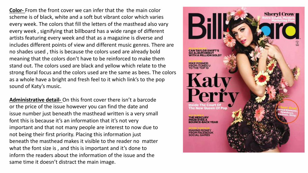
Color- Fromthefrontcoverwecaninferthatthethemaincolorschemeisofblack,whiteandasoftbutvibrantcolorwhichvarieseveryweek.Thecolorsthatfillthelettersofthemastheadalsovaryeveryweek,signifyingthatbillboardhasawiderangeofdifferentartistsfeaturingeveryweekandthatasamagazineisdiverseandincludesdifferentpointsofviewanddifferentmusicgenres.Therearenoshadesused,thisisbecausethecolorsusedarealreadyboldmeaningthatthecolorsdon’thavetobereinforcedtomakethemstandout.Thecolorsusedareblackandyellowwhichrelatetothestrongfloralfocusandthecolorsusedarethesameasbees.Thecolorsasawholehaveabrightandfreshfeeltoitwhichlink’stothepopsoundofKaty’smusic.
Administrativedetail- Onthisfrontcoverthereisn’tabarcodeorthepriceoftheissuehoweveryoucanfindthedateandissuenumberjustbeneaththemastheadwrittenisaverysmallfontthisisbecauseit’saninformationthatit’snotveryimportantandthatnotmanypeopleareinteresttonowduetonotbeingtheirfirstpriority.Placingthisinformationjustbeneaththemastheadmakesitvisibletothereadernomatterwhatthefontsizeis,andthisisimportantandit’sdonetoinformthereadersabouttheinformationoftheissueandthesametimeitdoesn’tdistractthemainimage.
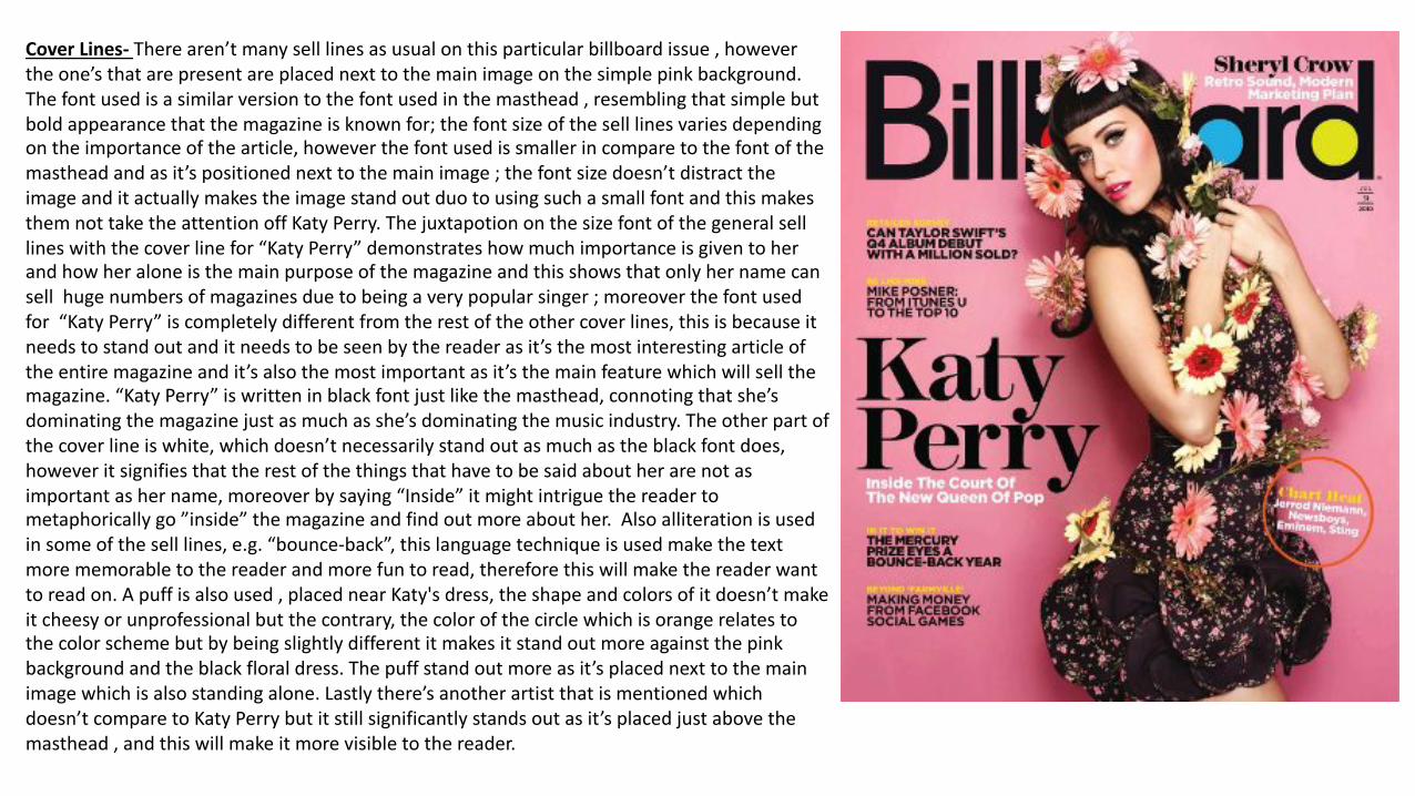
CoverLines- Therearen’tmanyselllinesasusualonthisparticularbillboardissue,howevertheone’sthatarepresentareplacednexttothemainimageonthesimplepinkbackground.Thefontusedisasimilarversiontothefontusedinthemasthead,resemblingthatsimplebutboldappearancethatthemagazineisknownfor;thefontsizeoftheselllinesvariesdependingontheimportanceofthearticle,howeverthefontusedissmallerincomparetothefontofthemastheadandasit’spositionednexttothemainimage;thefontsizedoesn’tdistracttheimageanditactuallymakestheimagestandoutduotousingsuchasmallfontandthismakesthemnottaketheattentionoffKatyPerry.Thejuxtapotiononthesizefontofthegeneralselllineswiththecoverlinefor“KatyPerry”demonstrateshowmuchimportanceisgiventoherandhowheraloneisthemainpurposeofthemagazineandthisshowsthatonlyhernamecansellhugenumbersofmagazinesduetobeingaverypopularsinger;moreoverthefontusedfor“KatyPerry”iscompletelydifferentfromtherestoftheothercoverlines,thisisbecauseitneedstostandoutanditneedstobeseenbythereaderasit’sthemostinterestingarticleoftheentiremagazineandit’salsothemostimportantasit’sthemainfeaturewhichwillsellthemagazine.“KatyPerry”iswritteninblackfontjustlikethemasthead,connotingthatshe’sdominatingthemagazinejustasmuchasshe’sdominatingthemusicindustry.Theotherpartofthecoverlineiswhite,whichdoesn’tnecessarilystandoutasmuchastheblackfontdoes,howeveritsignifiesthattherestofthethingsthathavetobesaidaboutherarenotasimportantashername,moreoverbysaying“Inside”itmightintriguethereadertometaphoricallygo”inside”themagazineandfindoutmoreabouther.Alsoalliterationisusedinsomeoftheselllines,e.g.“bounce-back”,thislanguagetechniqueisusedmakethetextmorememorabletothereaderandmorefuntoread,thereforethiswillmakethereaderwanttoreadon.Apuffisalsoused,placednearKaty'sdress,theshapeandcolorsofitdoesn’tmakeitcheesyorunprofessionalbutthecontrary,thecolorofthecirclewhichisorangerelatestothecolorschemebutbybeingslightlydifferentitmakesitstandoutmoreagainstthepinkbackgroundandtheblackfloraldress.Thepuffstandoutmoreasit’splacednexttothemainimagewhichisalsostandingalone.Lastlythere’sanotherartistthatismentionedwhichdoesn’tcomparetoKatyPerrybutitstillsignificantlystandsoutasit’splacedjustabovethemasthead,andthiswillmakeitmorevisibletothereader.
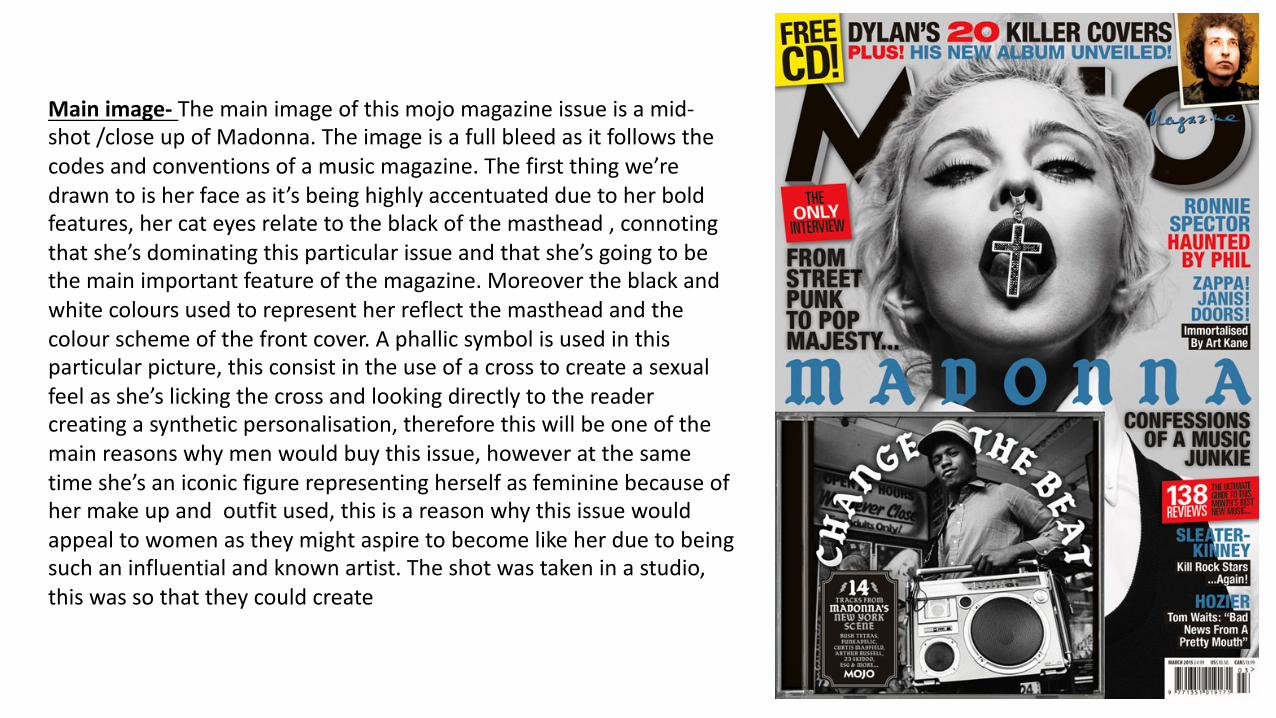
Mainimage- Themainimageofthismojomagazineissueisamid-shot/closeupofMadonna.Theimageisafullbleedasitfollowsthecodesandconventionsofamusicmagazine.Thefirstthingwe’redrawntoisherfaceasit’sbeinghighlyaccentuatedduetoherboldfeatures,hercateyesrelatetotheblackofthemasthead,connotingthatshe’sdominatingthisparticularissueandthatshe’sgoingtobethemainimportantfeatureofthemagazine.Moreovertheblackandwhitecoloursusedtorepresentherreflectthemastheadandthecolourschemeofthefrontcover.Aphallicsymbolisusedinthisparticularpicture,thisconsistintheuseofacrosstocreateasexualfeelasshe’slickingthecrossandlookingdirectlytothereadercreatingasyntheticpersonalisation,thereforethiswillbeoneofthemainreasonswhymenwouldbuythisissue,howeveratthesametimeshe’saniconicfigurerepresentingherselfasfemininebecauseofhermakeupandoutfitused,thisisareasonwhythisissuewouldappealtowomenastheymightaspiretobecomelikeherduetobeingsuchaninfluentialandknownartist.Theshotwastakeninastudio,thiswassothattheycouldcreate
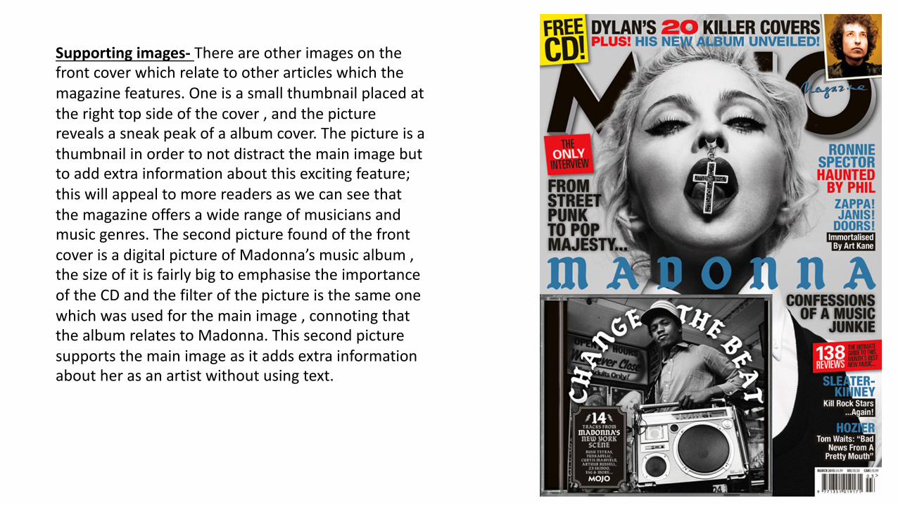
Supportingimages- Thereareotherimagesonthefrontcoverwhichrelatetootherarticleswhichthemagazinefeatures.Oneisasmallthumbnailplacedattherighttopsideofthecover,andthepicturerevealsasneakpeakofaalbumcover.Thepictureisathumbnailinordertonotdistractthemainimagebuttoaddextrainformationaboutthisexcitingfeature;thiswillappealtomorereadersaswecanseethatthemagazineoffersawiderangeofmusiciansandmusicgenres.ThesecondpicturefoundofthefrontcoverisadigitalpictureofMadonna’smusicalbum,thesizeofitisfairlybigtoemphasisetheimportanceoftheCDandthefilterofthepictureisthesameonewhichwasusedforthemainimage,connotingthatthealbumrelatestoMadonna.Thissecondpicturesupportsthemainimageasitaddsextrainformationaboutherasanartistwithoutusingtext.

Colour- Themaincolourschemeofthisparticularissueisblue,red,,blackandwithsomehintsofwhite.Therearetwomainbrightcoloursusedofwhichbrightredandbrightyellow,thistwocoloursstandoutandmakethefrontcovermodernbutvintageatthesametimetoreflecttheartistspersonality.There’samainthemeofblackandwhite,howevertoinsurethatthefrontcoverissuccessfulinpersuadingthereadertobuythemagazinetheusesofdifferentcoloursconnoteavarietyofdifferentstylesofmusicandartists,demonstratingthattheissueisnotonlyaboutthemainsinger;thiswillmakethereaderfeelmoresecuretobuythemagazineastheycanunderstandthatthere’savarietyofarticlestoreadandrelate.Howeveraspreviouslysaidthedominantcolourschememakesthemainartistcomeacrossthemostimportantfeatureoftheentiremagazineandthereforethismakesthereaderunderstandthatalotofattentionanddedicationwastakenwhenwritingandcreatingthearticleforthemainsinger.
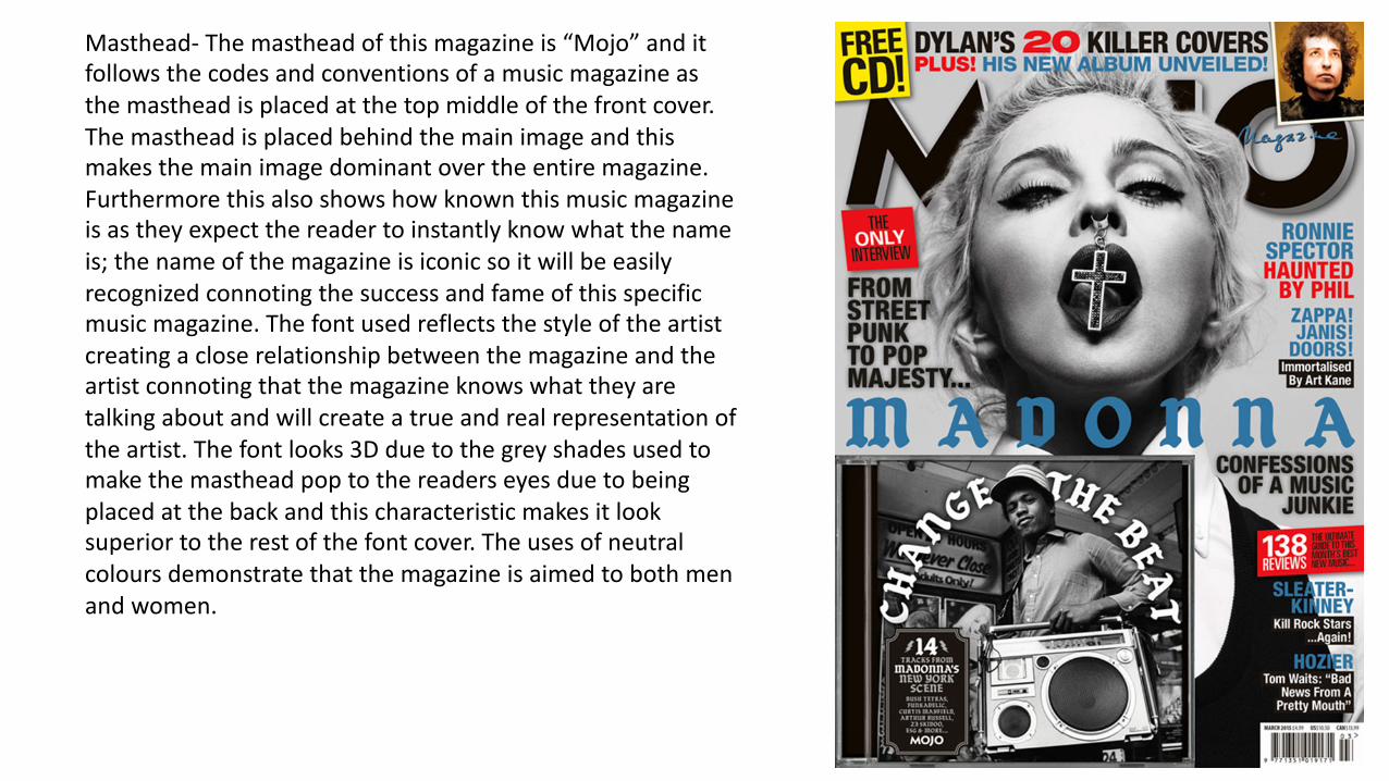
Masthead- Themastheadofthismagazineis“Mojo”anditfollowsthecodesandconventionsofamusicmagazineasthemastheadisplacedatthetopmiddleofthefrontcover.Themastheadisplacedbehindthemainimageandthismakesthemainimagedominantovertheentiremagazine.Furthermorethisalsoshowshowknownthismusicmagazineisastheyexpectthereadertoinstantlyknowwhatthenameis;thenameofthemagazineisiconicsoitwillbeeasilyrecognizedconnotingthesuccessandfameofthisspecificmusicmagazine.Thefontusedreflectsthestyleoftheartistcreatingacloserelationshipbetweenthemagazineandtheartistconnotingthatthemagazineknowswhattheyaretalkingaboutandwillcreateatrueandrealrepresentationoftheartist.Thefontlooks3Dduetothegreyshadesusedtomakethemastheadpoptothereaderseyesduetobeingplacedatthebackandthischaracteristicmakesitlooksuperiortotherestofthefontcover.Theusesofneutralcoloursdemonstratethatthemagazineisaimedtobothmenandwomen.
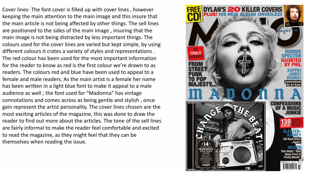
Coverlines- Thefontcoverisfilledupwithcoverlines,howeverkeepingthemainattentiontothemainimageandthisinsurethatthemainarticleisnotbeingaffectedbyotherthings.Theselllinesarepositionedtothesidesofthemainimage,insuringthatthemainimageisnotbeingdistractedbylessimportantthings.Thecoloursusedforthecoverlinesarevariedbutkeptsimple,byusingdifferentcoloursitcratesavarietyofstylesandrepresentations.Theredcolourhasbeenusedforthemostimportantinformationforthereadertoknowasredisthefirstcolourwe’redrawntoasreaders.Thecoloursredandbluehavebeenusedtoappealtoafemaleandmalereaders.Asthemainartistisafemalehernamehasbeenwritteninalightbluefonttomakeitappealtoamaleaudienceaswell;thefontusedfor“Madonna”hasvintageconnotationsandcomesacrossasbeinggentleandstylish,oncegainrepresenttheartistpersonality.Thecoverlineschosenarethemostexcitingarticlesofthemagazine,thiswasdonetodrawthereadertofindoutmoreaboutthearticles.Thetoneoftheselllinesarefairlyinformaltomakethereaderfeelcomfortableandexcitedtoreadthemagazine,astheymightfeelthattheycanbethemselveswhenreadingtheissue.
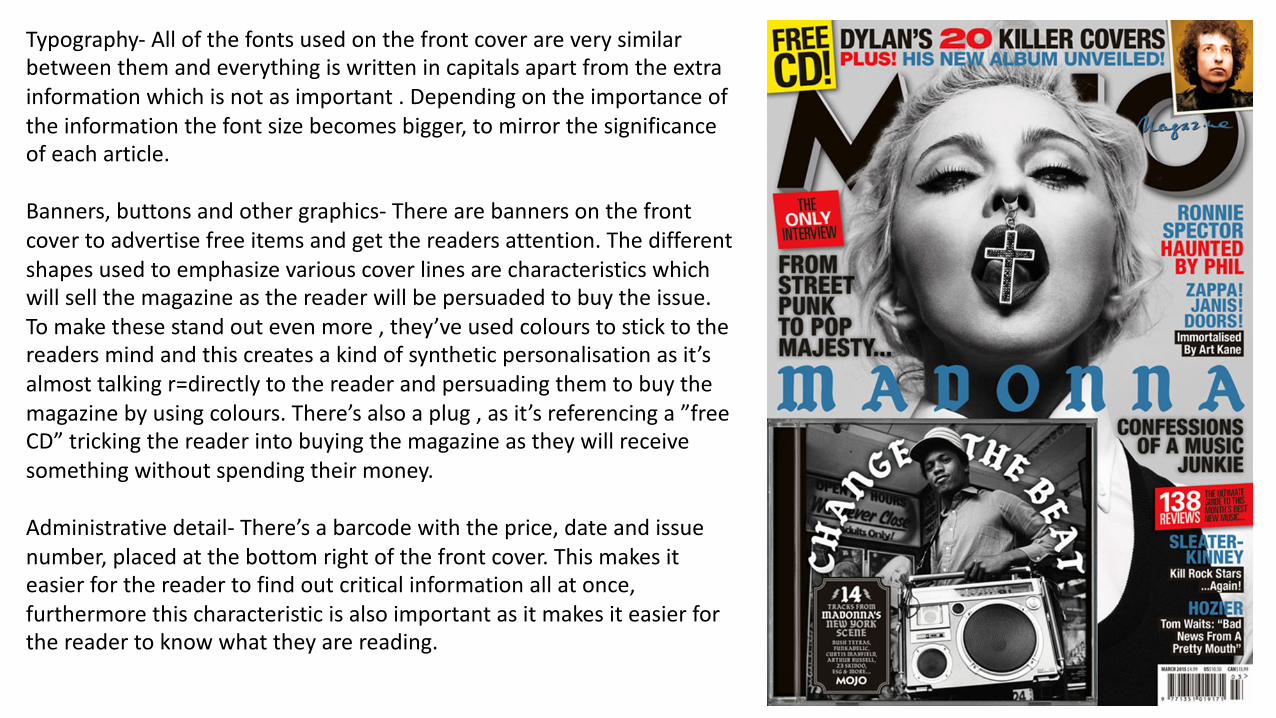
Typography- Allofthefontsusedonthefrontcoverareverysimilarbetweenthemandeverythingiswrittenincapitalsapartfromtheextrainformationwhichisnotasimportant.Dependingontheimportanceoftheinformationthefontsizebecomesbigger,tomirrorthesignificanceofeacharticle.
Banners,buttonsandothergraphics- Therearebannersonthefrontcovertoadvertisefreeitemsandgetthereadersattention.Thedifferentshapesusedtoemphasizevariouscoverlinesarecharacteristicswhichwillsellthemagazineasthereaderwillbepersuadedtobuytheissue.Tomakethesestandoutevenmore,they’veusedcolourstosticktothereadersmindandthiscreatesakindofsyntheticpersonalisationasit’salmosttalkingr=directlytothereaderandpersuadingthemtobuythemagazinebyusingcolours.There’salsoaplug,asit’sreferencinga”freeCD”trickingthereaderintobuyingthemagazineastheywillreceivesomethingwithoutspendingtheirmoney.
Administrativedetail- There’sabarcodewiththeprice,dateandissuenumber,placedatthebottomrightofthefrontcover.Thismakesiteasierforthereadertofindoutcriticalinformationallatonce,furthermorethischaracteristicisalsoimportantasitmakesiteasierforthereadertoknowwhattheyarereading.
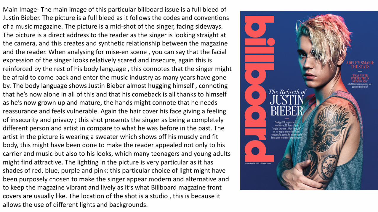
MainImage- ThemainimageofthisparticularbillboardissueisafullbleedofJustinBieber.Thepictureisafullbleedasitfollowsthecodesandconventionsofamusicmagazine.Thepictureisamid-shotofthesinger,facingsideways.Thepictureisadirectaddresstothereaderasthesingerislookingstraightatthecamera,andthiscreatesandsyntheticrelationshipbetweenthemagazineandthereader.Whenanalysingformise-enscene,youcansaythatthefacialexpressionofthesingerlooksrelativelyscaredandinsecure,againthisisreinforcedbytherestofhisbodylanguage,thisconnotesthatthesingermightbeafraidtocomebackandenterthemusicindustryasmanyyearshavegoneby.ThebodylanguageshowsJustinBieberalmosthugginghimself,connotingthathe’snowaloneinallofthisandthathiscomebackisallthankstohimselfashe’snowgrownupandmature,thehandsmightconnotethatheneedsreassuranceandfeelsvulnerable.Againthehaircoverhisfacegivingafeelingofinsecurityandprivacy;thisshotpresentsthesingerasbeingacompletelydifferentpersonandartistincomparetowhathewasbeforeinthepast.Theartistinthepictureiswearingasweaterwhichshowsoffhismusclyandfitbody,thismighthavebeendonetomakethereaderappealednotonlytohiscarrierandmusicbutalsotohislooks,whichmanyteenagersandyoungadultsmightfindattractive.Thelightinginthepictureisveryparticularasithasshadesofred,blue,purpleandpink;thisparticularchoiceoflightmighthavebeenpurposelychosentomakethesingerappearmodernandalternativeandtokeepthemagazinevibrantandlivelyasit’swhatBillboardmagazinefrontcoversareusuallylike.Thelocationoftheshotisastudio,thisisbecauseitallowstheuseofdifferentlightsandbackgrounds.
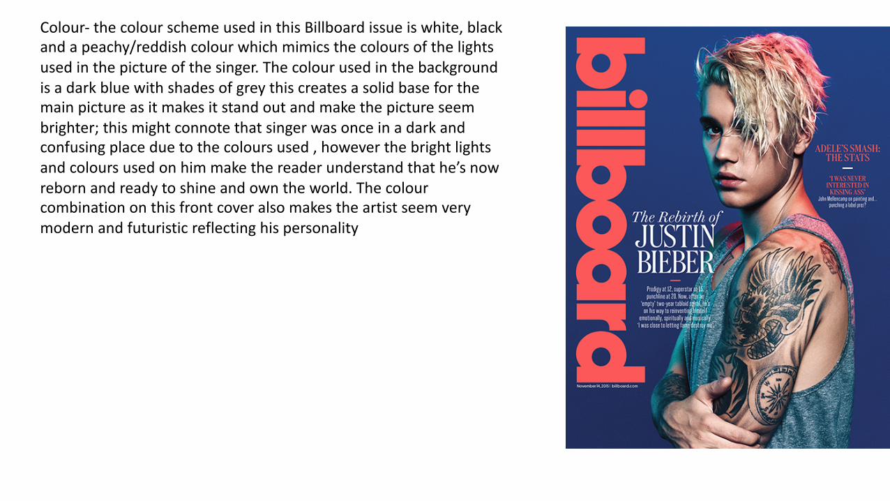
Colour- thecolourschemeusedinthisBillboardissueiswhite,blackandapeachy/reddishcolourwhichmimicsthecoloursofthelightsusedinthepictureofthesinger.Thecolourusedinthebackgroundisadarkbluewithshadesofgreythiscreatesasolidbaseforthemainpictureasitmakesitstandoutandmakethepictureseembrighter;thismightconnotethatsingerwasonceinadarkandconfusingplaceduetothecoloursused,howeverthebrightlightsandcoloursusedonhimmakethereaderunderstandthathe’snowrebornandreadytoshineandowntheworld.Thecolourcombinationonthisfrontcoveralsomakestheartistseemverymodernandfuturisticreflectinghispersonality
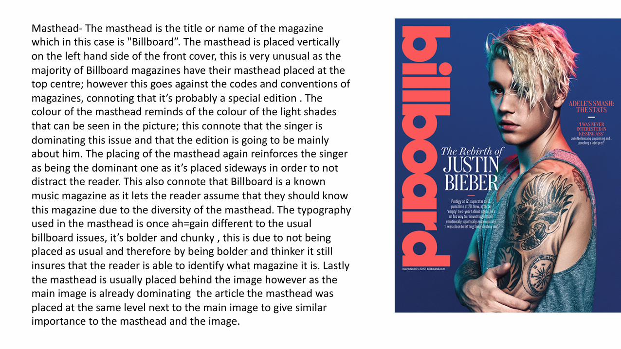
Masthead- Themastheadisthetitleornameofthemagazinewhichinthiscaseis"Billboard”.Themastheadisplacedverticallyonthelefthandsideofthefrontcover,thisisveryunusualasthemajorityofBillboardmagazineshavetheirmastheadplacedatthetopcentre;howeverthisgoesagainstthecodesandconventionsofmagazines,connotingthatit’sprobablyaspecialedition.Thecolourofthemastheadremindsofthecolourofthelightshadesthatcanbeseeninthepicture;thisconnotethatthesingerisdominatingthisissueandthattheeditionisgoingtobemainlyabouthim.Theplacingofthemastheadagainreinforcesthesingerasbeingthedominantoneasit’splacedsidewaysinordertonotdistractthereader.ThisalsoconnotethatBillboardisaknownmusicmagazineasitletsthereaderassumethattheyshouldknowthismagazineduetothediversityofthemasthead.Thetypographyusedinthemastheadisonceah=gaindifferenttotheusualbillboardissues,it’sbolderandchunky,thisisduetonotbeingplacedasusualandthereforebybeingbolderandthinkeritstillinsuresthatthereaderisabletoidentifywhatmagazineitis.Lastlythemastheadisusuallyplacedbehindtheimagehoweverasthemainimageisalreadydominatingthearticlethemastheadwasplacedatthesamelevelnexttothemainimagetogivesimilarimportancetothemastheadandtheimage.
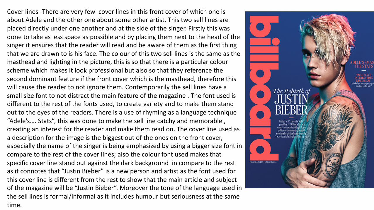
Coverlines- ThereareveryfewcoverlinesinthisfrontcoverofwhichoneisaboutAdeleandtheotheroneaboutsomeotherartist.Thistwoselllinesareplaceddirectlyunderoneanotherandatthesideofthesinger.Firstlythiswasdonetotakeaslessspaceaspossibleandbyplacingthemnexttotheheadofthesingeritensuresthatthereaderwillreadandbeawareofthemasthefirstthingthatwearedrawntoishisface.Thecolourofthistwoselllinesisthesameasthemastheadandlightinginthepicture,thisissothatthereisaparticularcolourschemewhichmakesitlookprofessionalbutalsosothattheyreferencetheseconddominantfeatureifthefrontcoverwhichisthemasthead,thereforethiswillcausethereadertonotignorethem.Contemporarilytheselllineshaveasmallsizefonttonotdistractthemainfeatureofthemagazine.Thefontusedisdifferenttotherestofthefontsused,tocreatevarietyandtomakethemstandouttotheeyesofthereaders.Thereisauseofrhymingasalanguagetechnique“Adele’s….Stats”,thiswasdonetomaketheselllinecatchyandmemorable,creatinganinterestforthereaderandmakethemreadon.Thecoverlineusedasadescriptionfortheimageisthebiggestoutoftheonesonthefrontcover,especiallythenameofthesingerisbeingemphasizedbyusingabiggersizefontincomparetotherestofthecoverlines;alsothecolourfontusedmakesthatspecificcoverlinestandoutagainstthedarkbackgroundincomparetotherestasitconnotesthat“JustinBieber”isanewpersonandartistasthefontusedforthiscoverlineisdifferentfromtheresttoshowthatthemainarticleandsubjectofthemagazinewillbe“JustinBieber”.Moreoverthetoneofthelanguageusedintheselllinesisformal/informalasitincludeshumourbutseriousnessatthesametime.
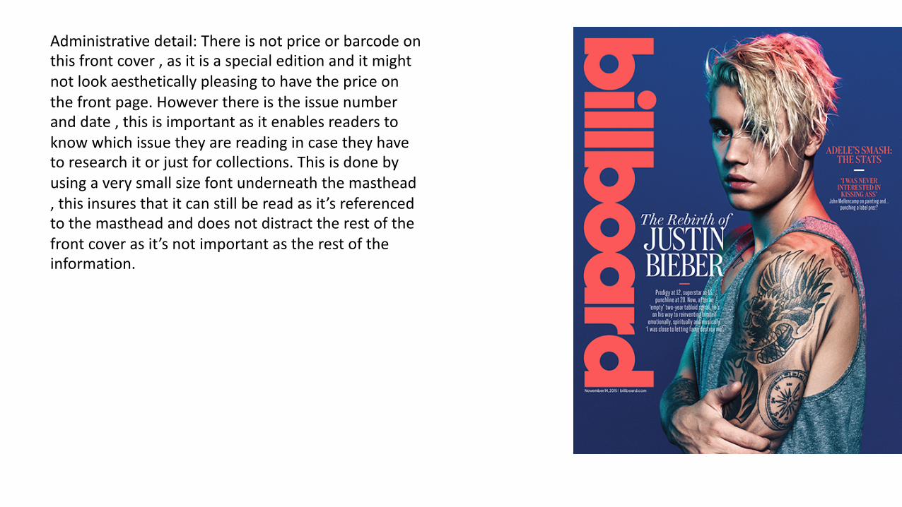
Administrativedetail:Thereisnotpriceorbarcodeonthisfrontcover,asitisaspecialeditionanditmightnotlookaestheticallypleasingtohavethepriceonthefrontpage.Howeverthereistheissuenumberanddate,thisisimportantasitenablesreaderstoknowwhichissuetheyarereadingincasetheyhavetoresearchitorjustforcollections.Thisisdonebyusingaverysmallsizefontunderneaththemasthead,thisinsuresthatitcanstillbereadasit’sreferencedtothemastheadanddoesnotdistracttherestofthefrontcoverasit’snotimportantastherestoftheinformation.