Embed Size (px)
Citation preview

WELCOME

SEMINARON
GRAPHICAL REPRESENTATION OF DATA
JIJO K SOCIAL SCIENCE
NSS TRAINING COLLEGE CHANGANACHERY
TOPIC:GRAPHICAL REPRESENTATION OF DATA
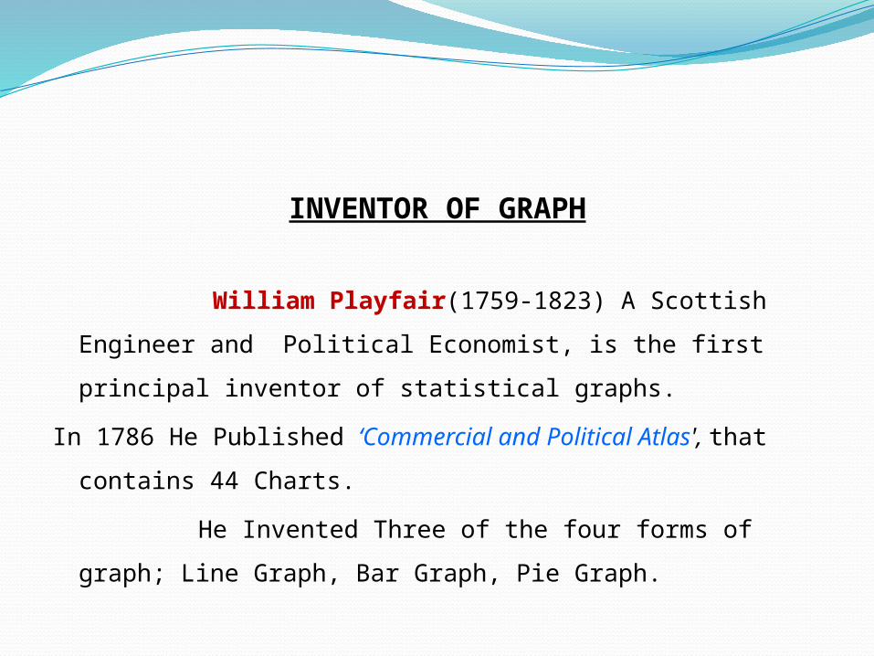
INVENTOR OF GRAPH
William Playfair(1759-1823) A Scottish Engineer and Political
Economist, is the first principal inventor of statistical graphs.
In 1786 He Published ‘Commercial and Political Atlas', that contains 44
Charts.
He Invented Three of the four forms of graph; Line Graph, Bar Graph,
Pie Graph.

WILLIAM PLAYFAIR
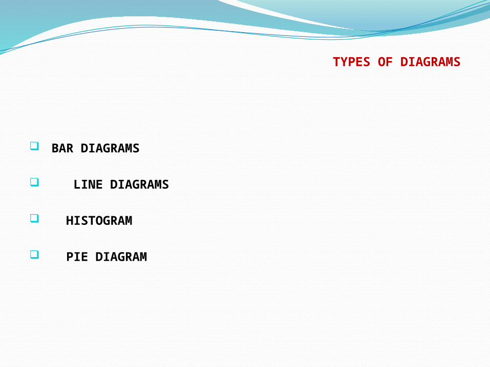
TYPES OF DIAGRAMS
BAR DIAGRAMS
LINE DIAGRAMS
HISTOGRAM
PIE DIAGRAM
INTRODUCTION
A Graphical representation is a visual display of data and
statistical results. it is more often and effective than presenting data in
tabular form. There are different types of graphical representation and
which is used depends on the nature of the data and the nature of the
statistical results.
Graphical representation is the visual display of data using plots and
charts. it is used in many academic and professional disciplines but most
widely so in the field of mathamatics,medicine and the science.
Graphical representation helps to quantify, sort and present data in a
method that is understandable to a large variety of audience.
Several types of mediums are used for expressing graphics, including
plots, charts and diagrams.
In mathematics line and dot plots are especially valuable for displaying
information.
Line plots which are number lines with the letter “X” placed above
numbers to show their freequency,are used to represent numerical data.
BAR DIAGRAM
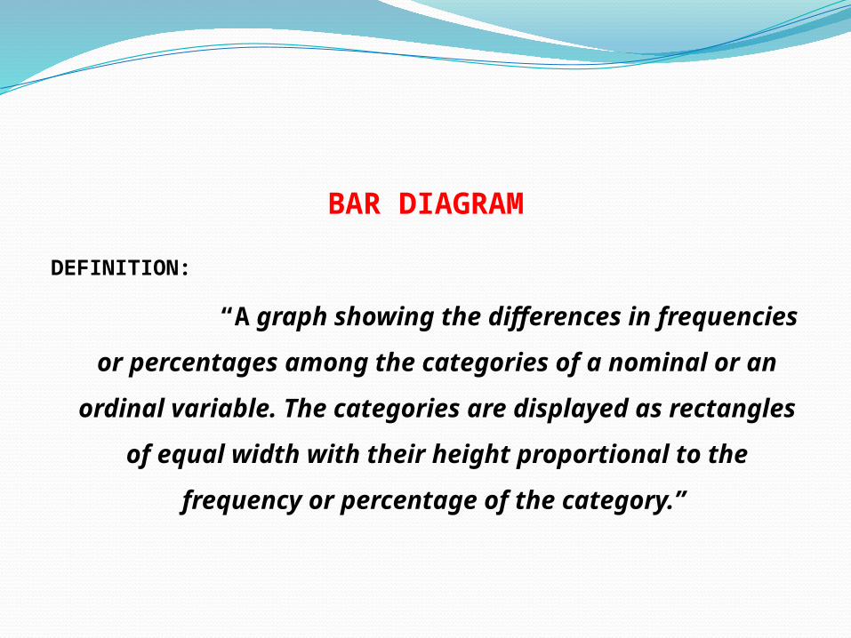
DEFINITION:
“A graph showing the differences in frequencies
or percentages among the categories of a nominal
or an ordinal variable. The categories are
displayed as rectangles of equal width with their
height proportional to the frequency or percentage
of the category.”
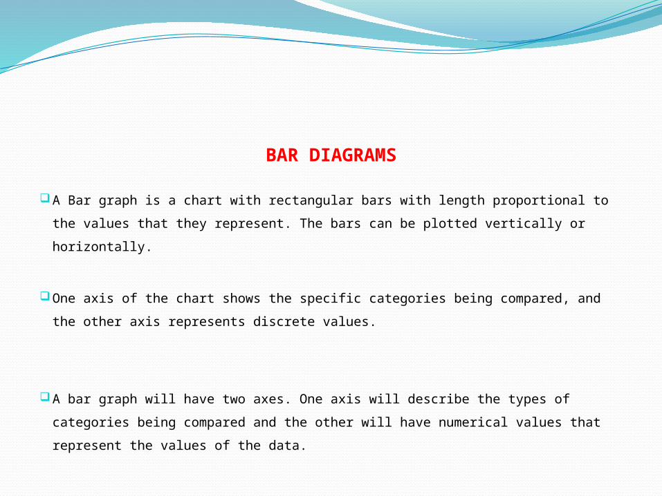
BAR DIAGRAMS
A Bar graph is a chart with rectangular bars with length proportional to the values that they
represent. The bars can be plotted vertically or horizontally.
One axis of the chart shows the specific categories being compared, and the other axis
represents discrete values.
A bar graph will have two axes. One axis will describe the types of categories being
compared and the other will have numerical values that represent the values of the data.
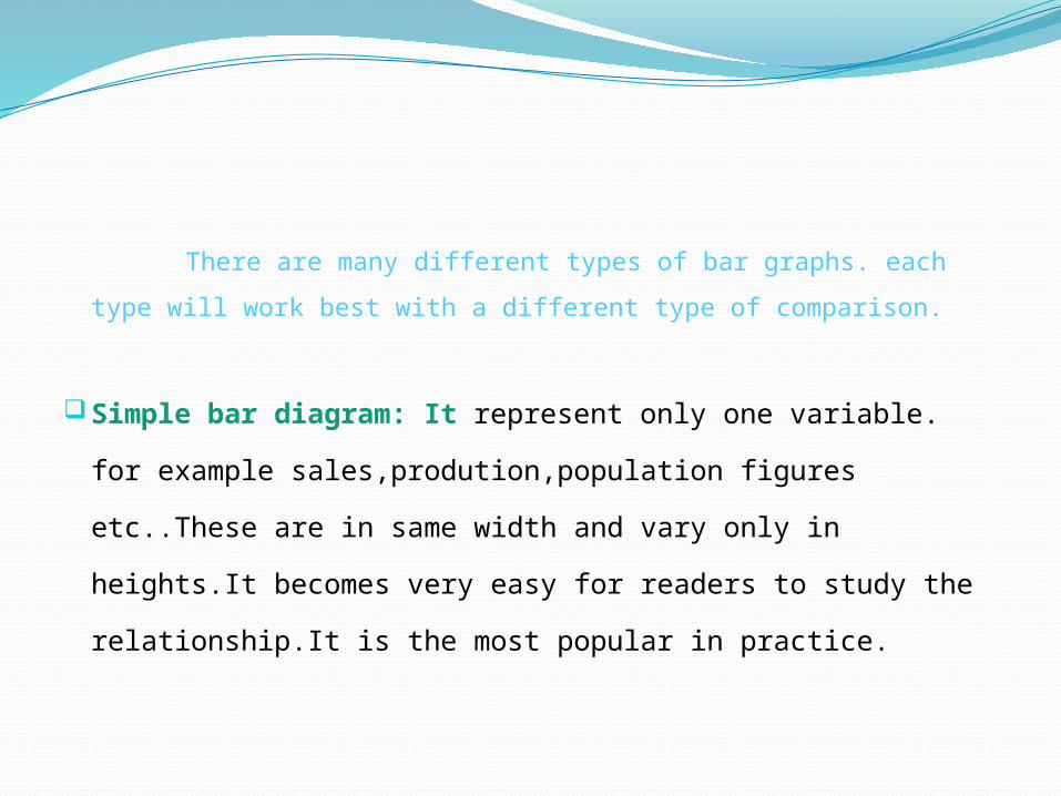
There are many different types of bar graphs. each type will work best
with a different type of comparison.
Simple bar diagram: It represent only one variable. for example
sales,prodution,population figures etc..These are in same width and
vary only in heights.It becomes very easy for readers to study the
relationship.It is the most popular in practice.

Sub divided bar diagram:While constructing such a diagram
the various components in each bar should be kept in the same
order.The components are shown with different shades or
colours with a proper index.

Multiple bar diagram: This method can be used for data which is made
up of two or more components. In this method the components are are
shown as separate adjoining bars. The components are shown by different
shades and colours.
Deviation bar diagram:Diviation bars are used to represent net quantities-
excess or deficit, for example net profit, net loss,etc.it have negative and
positive values.
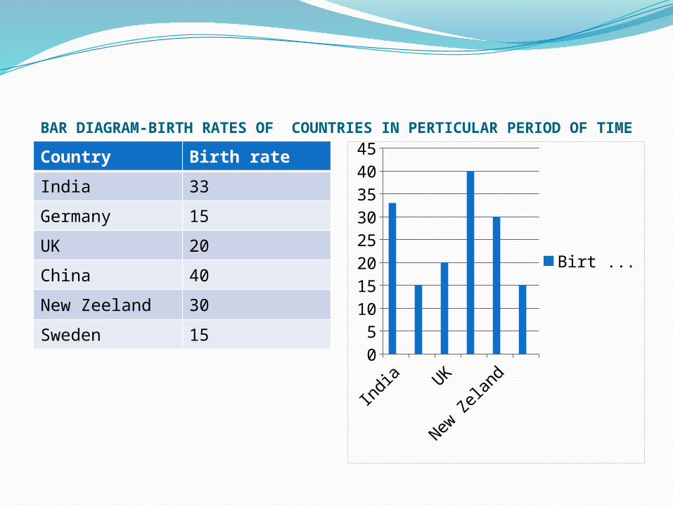
BAR DIAGRAM-BIRTH RATES OF COUNTRIES IN PERTICULAR PERIOD OF TIME
Country Birth rate
India 33
Germany 15
UK 20
China 40
New Zeeland 30
Sweden 15
Indi
aUK
New
Zel
and
05
1015202530354045
Birt Rate
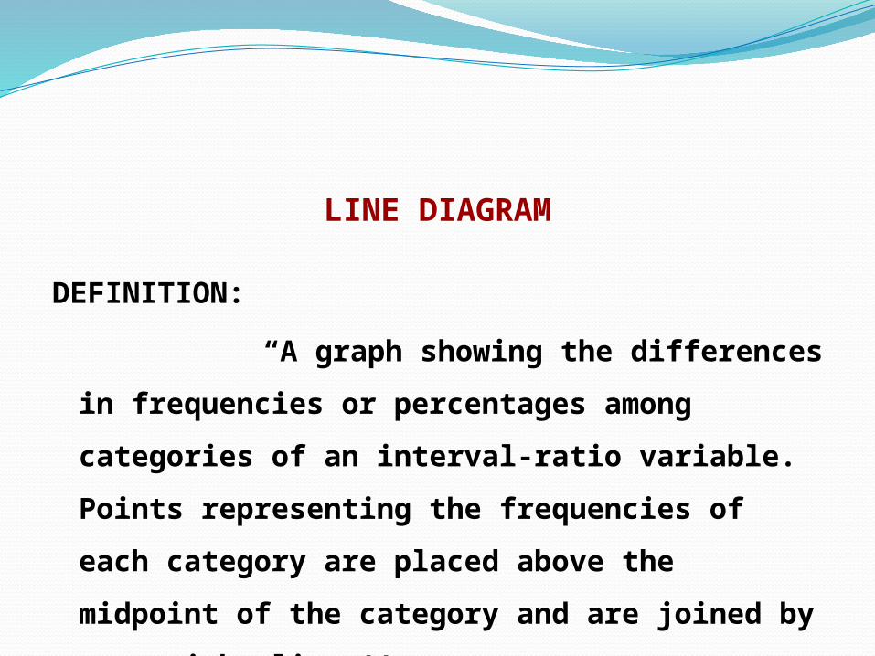
LINE DIAGRAM
DEFINITION:
“A graph showing the differences in frequencies or
percentages among categories of an interval-ratio variable.
Points representing the frequencies of each category are
placed above the midpoint of the category and are joined
by a straight line.’’
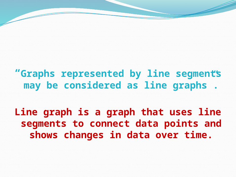
“Graphs represented by line segments may be considered as line graphs”.
Line graph is a graph that uses line segments to connect data points and shows changes in
data over time.
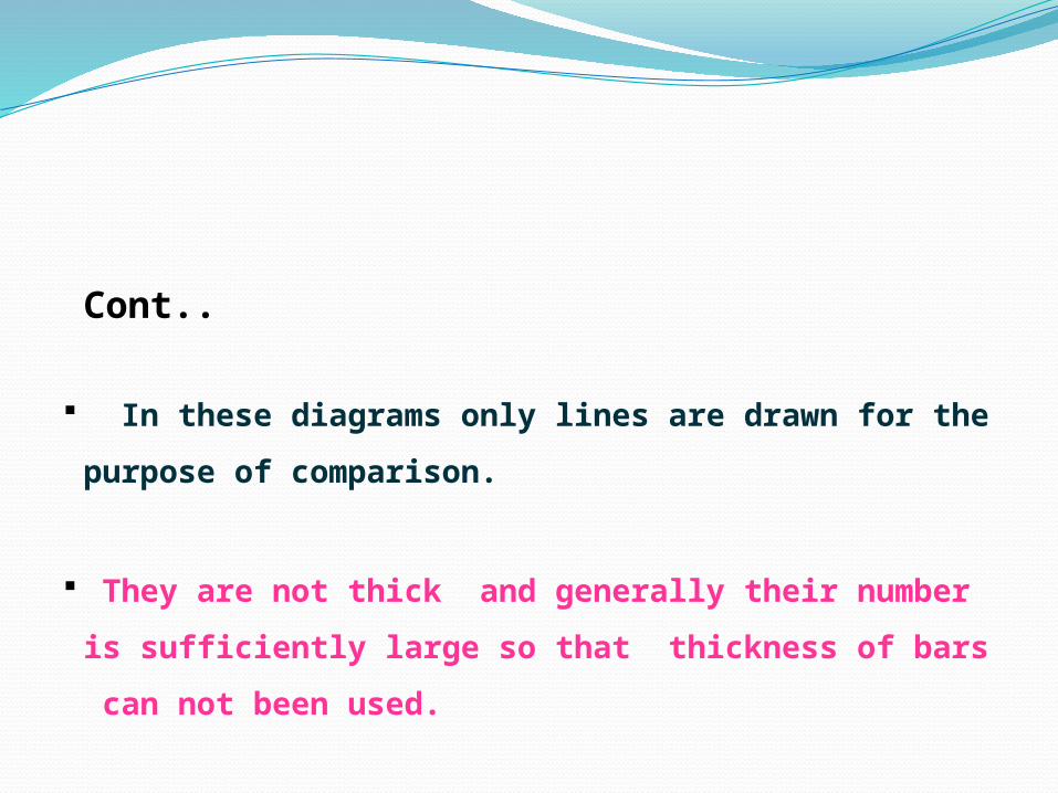
Cont..
In these diagrams only lines are drawn for the purpose of
comparison.
They are not thick and generally their number is sufficiently
large so that thickness of bars can not been used.
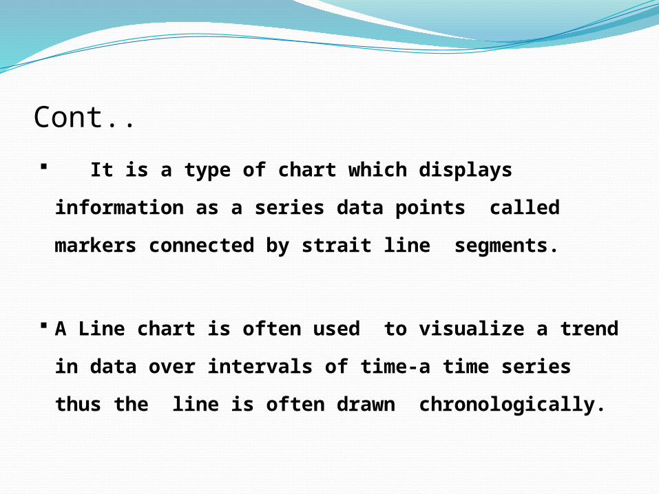
Cont..
It is a type of chart which displays information as a
series data points called markers connected by strait
line segments.
A Line chart is often used to visualize a trend in data
over intervals of time-a time series thus the line is often
drawn chronologically.
Cont..
In Line graph Y axis represent frequency and X axis represent time or period.
Line graph are usually drawn to represent the time series data. E.g. Temparature,Rain fall, Population growth,Birthrates etc.
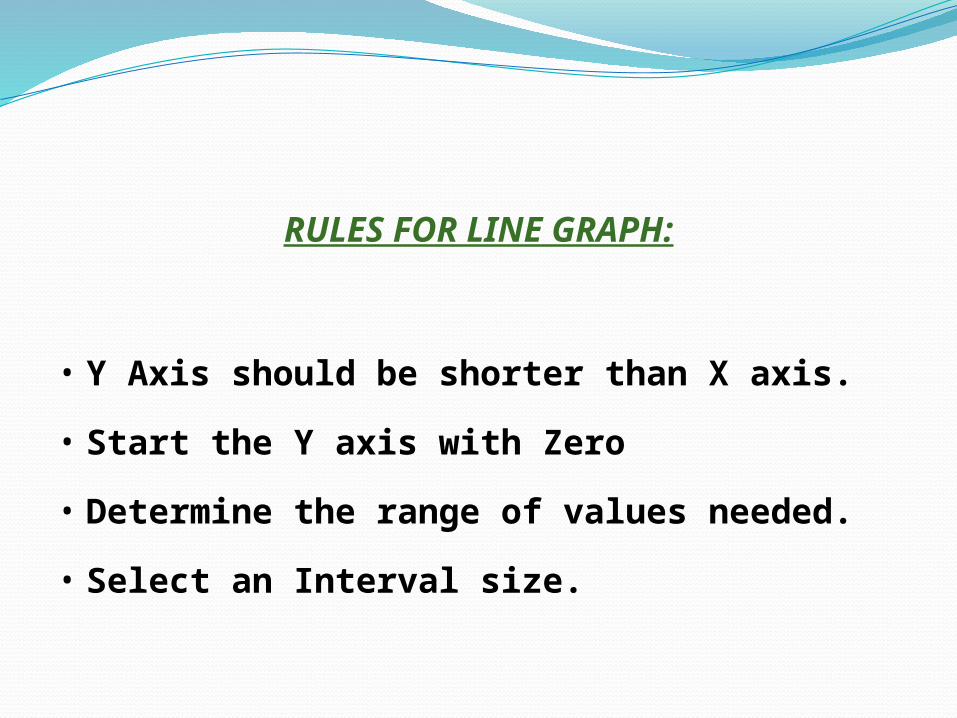
RULES FOR LINE GRAPH:
• Y Axis should be shorter than X axis.
• Start the Y axis with Zero
• Determine the range of values needed.
• Select an Interval size.
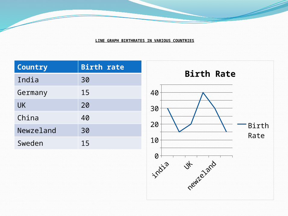
LINE GRAPH BIRTHRATES IN VARIOUS COUNTRIES
Country Birth rate
India 30
Germany 15
UK 20
China 40
Newzeland 30
Sweden 15
indi
aUK
newze
land
0
10
20
30
40
Birth Rate
Birth Rate
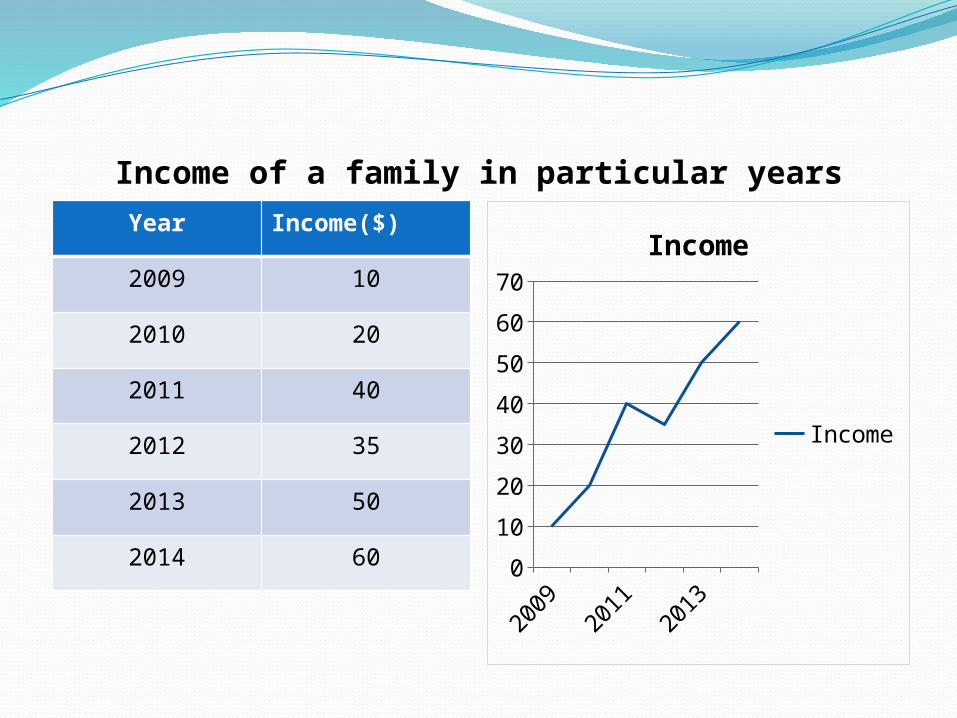
Income of a family in particular yearsYear Income($)
2009 10
2010 20
2011 40
2012 35
2013 50
2014 60
2009
2011
2013
0
10
20
30
40
50
60
70
Income
Income
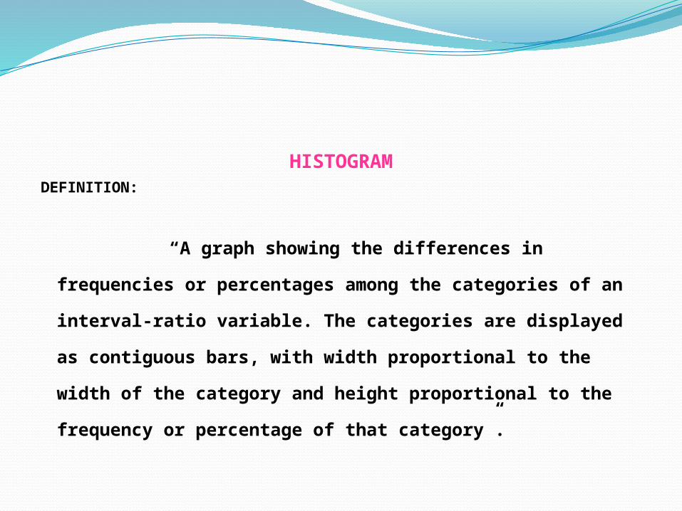
HISTOGRAMDEFINITION:
“A graph showing the differences in frequencies or
percentages among the categories of an interval-ratio
variable. The categories are displayed as contiguous bars,
with width proportional to the width of the category and
height proportional to the frequency or percentage of that
category”.
HISTOGRAM
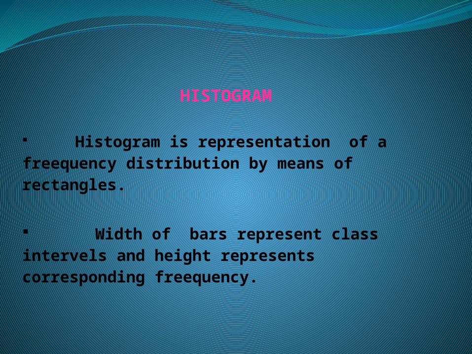
Histogram is representation of a freequency distribution by means of rectangles.
Width of bars represent class intervels and height represents corresponding freequency.
Histograms are diagrams of frequency distribution for
continues data. They Represent frequencies by areas and it
is useful in further analysis.
It is some times difficult to draw reasonable histogram.
‘Histogram was first introduced by Karl
Pearson in 1891’.
Histogram is similar to bar charts but the histogram groups
numbers into ranges and you decide what ranges to use.
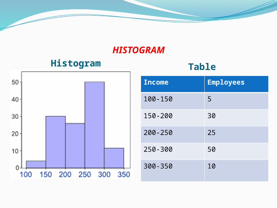
HISTOGRAMHistogram Table
Income Employees
100-150 5
150-200 30
200-250 25
250-300 50
300-350 10
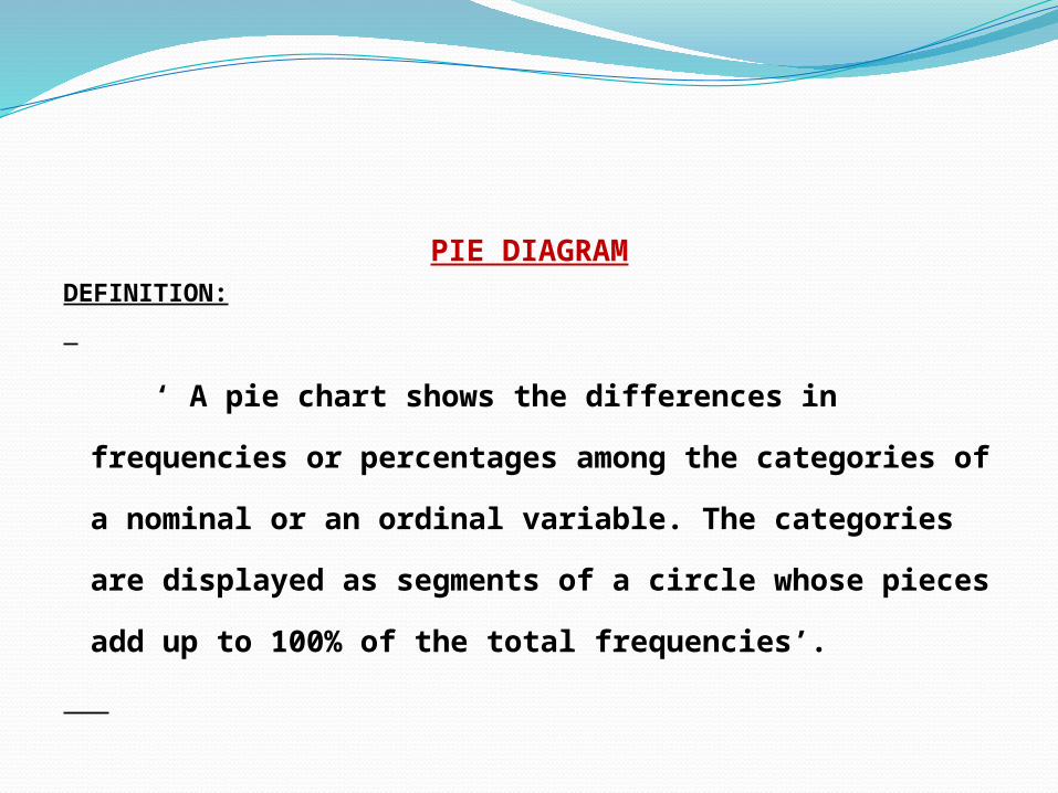
PIE DIAGRAMDEFINITION:
‘ A pie chart shows the differences in frequencies or
percentages among the categories of a nominal or an
ordinal variable. The categories are displayed as segments
of a circle whose pieces add up to 100% of the total
frequencies’.

PIE DIAGRAM
The Pie Chart is a commonly used graphical device for
presenting relative frequency distribution for qualitative data.
First draw a circle then use the relative frequencies to subdivide
the circle into sectors that correspondent to the relative
frequency for each class.
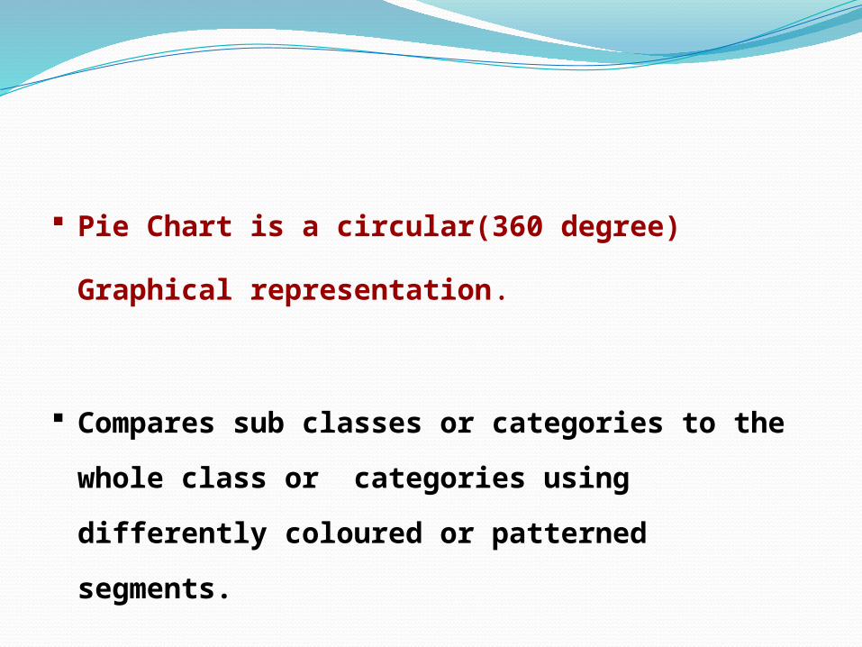
Pie Chart is a circular(360 degree) Graphical
representation.
Compares sub classes or categories to the whole class or
categories using differently coloured or patterned segments.

It is drawn to depict the total volume of the given
attribute using a circle, dividing the circle into
corresponding degrees of angles then represent the
sub sets of the data.
Hence it is also called divided circle diagram.
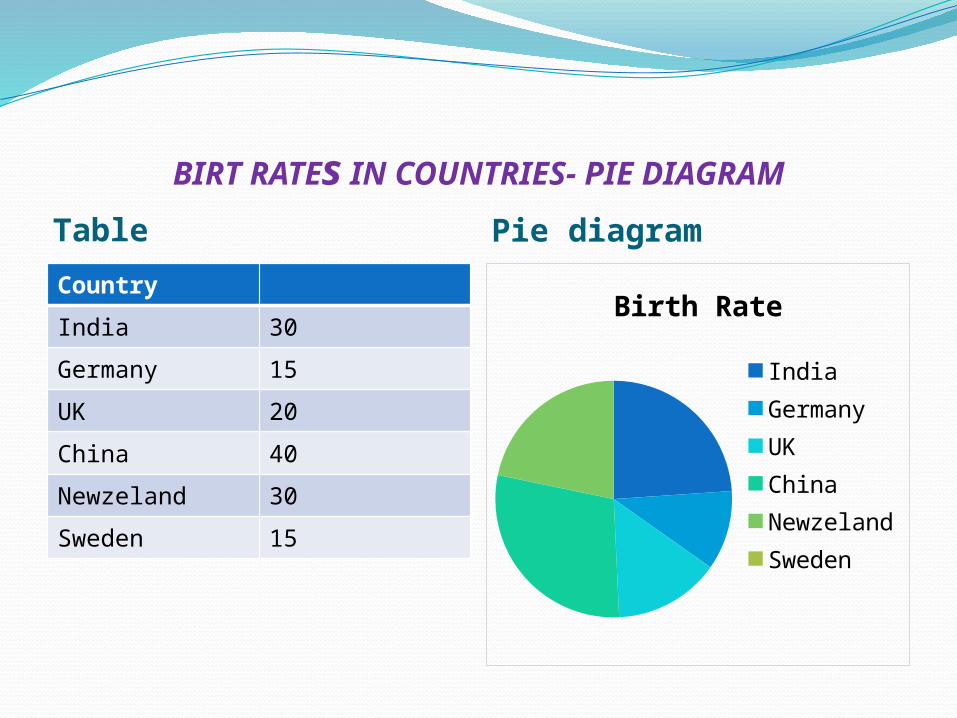
BIRT RATEs IN COUNTRIES- PIE DIAGRAM
Table Pie diagram
Country
India 30
Germany 15
UK 20
China 40
Newzeland 30
Sweden 15
Birth Rate
India GermanyUK ChinaNewze-land
Sweden
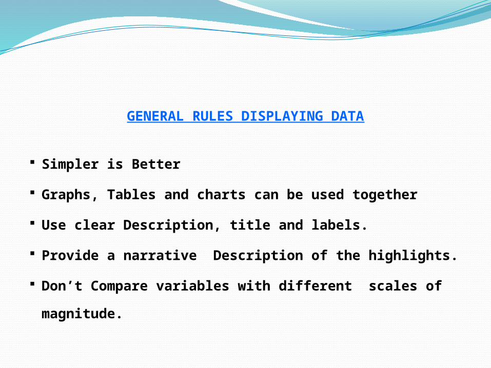
GENERAL RULES DISPLAYING DATA
Simpler is Better
Graphs, Tables and charts can be used together
Use clear Description, title and labels.
Provide a narrative Description of the highlights.
Don’t Compare variables with different scales of
magnitude.

A Diagram must be attractive, well propotioned,neat and pleasing to the eyes.
They should be geometrically Accurate.
Size of the diagram should be proportional to paper.should not be too big or too small.
Different colours should be used to classify datas.
CONCLUSION
Graphical forms makes it possible to easily draw visual
impression of data
Graphical representation of data enhances our
understandings.
It makes comparisons easily.
This kind of method create an imprint on mind for a long
period of time.

04/15/2023
THANK YOU