Embed Size (px)
Citation preview
Case:
Compare Whatsapp UXon
vs
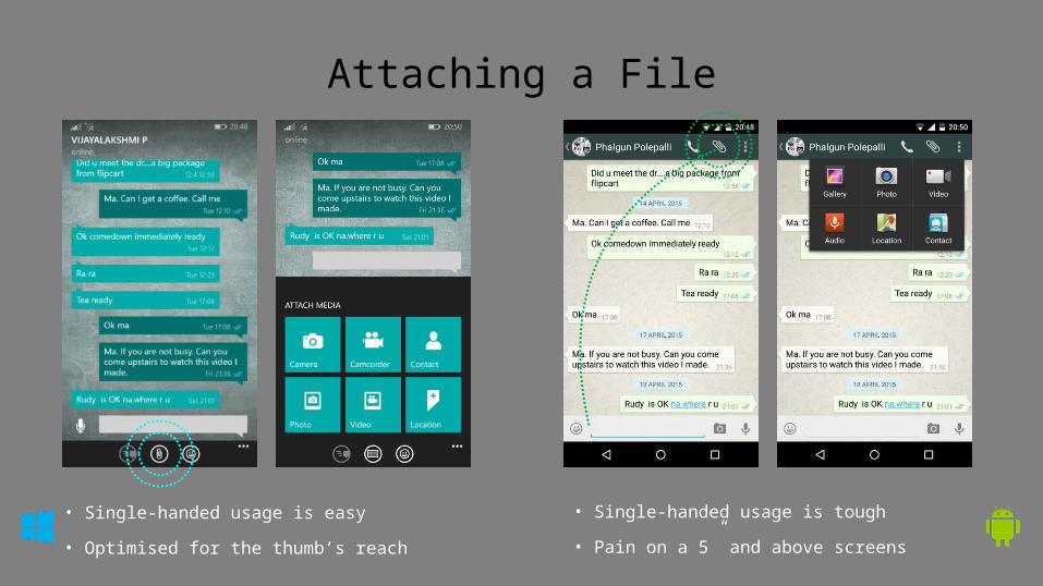
Attaching a File
• Single-handed usage is easy
• Optimised for the thumb’s reach
• Single-handed usage is tough
• Pain on a 5” and above screens
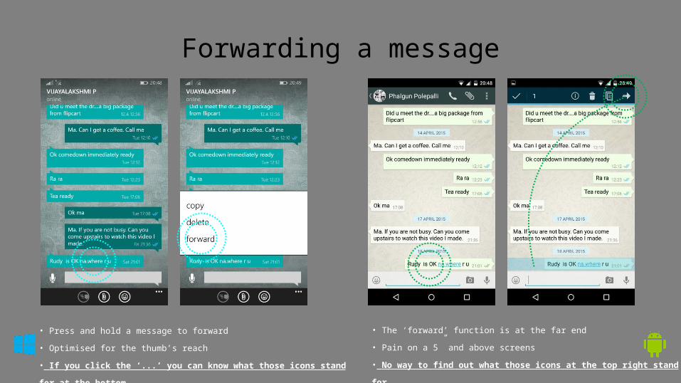
Forwarding a message
• Press and hold a message to forward
• Optimised for the thumb’s reach
• If you click the ‘...’ you can know what those icons stand for at
the bottom
• The ‘forward’ function is at the far end
• Pain on a 5” and above screens
• No way to find out what those icons at the top right stand for
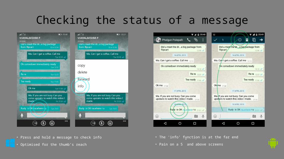
Checking the status of a message
• Press and hold a message to check info
• Optimised for the thumb’s reach
• The ‘info’ function is at the far end
• Pain on a 5” and above screens
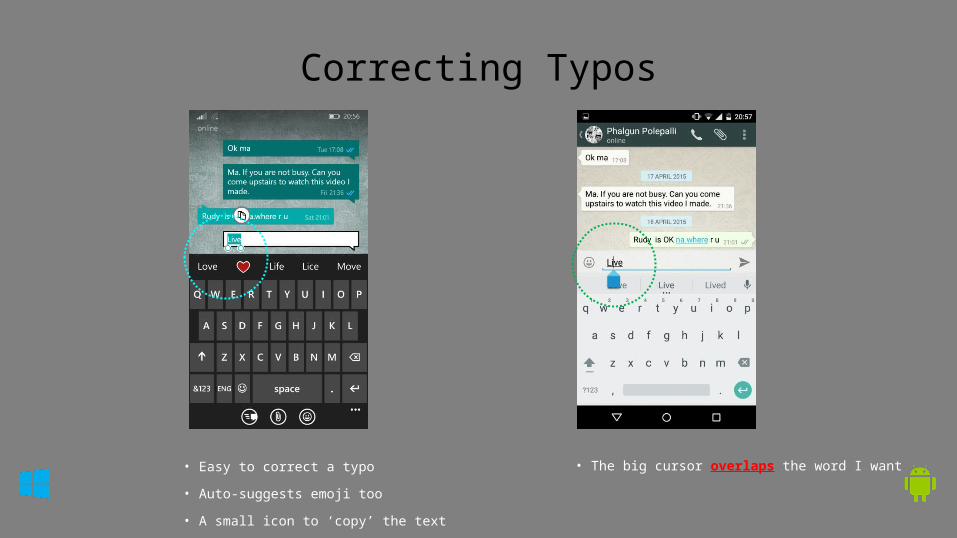
Correcting Typos
• Easy to correct a typo
• Auto-suggests emoji too
• A small icon to ‘copy’ the text
• The big cursor overlaps the word I want
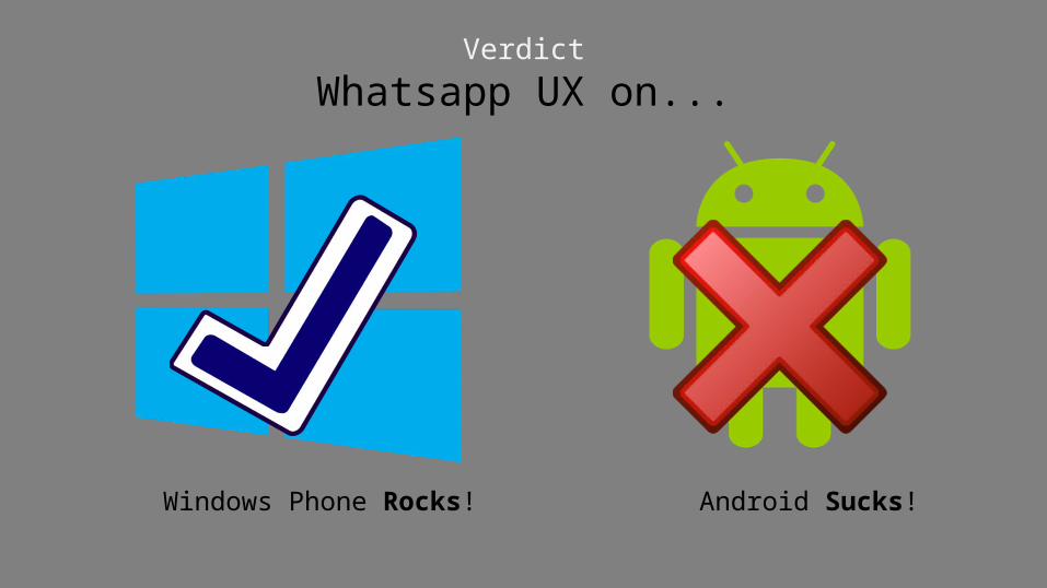
Verdict
Whatsapp UX on...
Windows Phone Rocks! Android Sucks!