Embed Size (px)
Citation preview
Xinyue Zhao Portfolio
Typography
Drawing
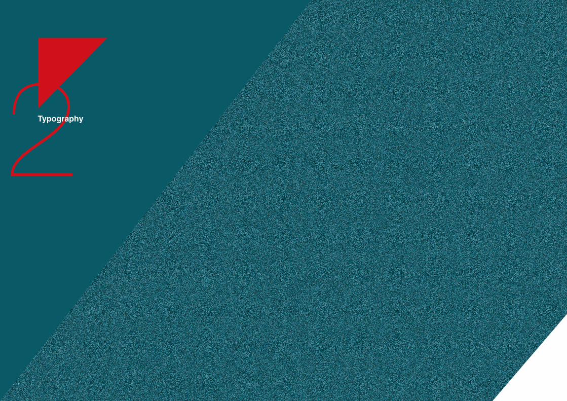
Rebirth of the Eagle
Taste It!
A Timeline
Portrait
ONYX
Jiu Fen
Inception
Ipr
Branding System
Illustration
2
20
10
17
2Typography
3
I am inspired by Maksim Mrvica’sCroatian Rhapsody. This talented Croation piano player expresses his anger and pride all throughout his music. I illustrate the eagle’s life in parallel with the rhythm of the music, which fits perfectly with theprocess of the war. Hence the book is named “Croatian Rhapsody.”
I experiment with different drawingstyles to show the rhythm of the story visually. Finally, I use curvylines and shapes to build a magnificent atmosphere of the war,and silent colors (dark red, black, grey) to describe the bitterness andthe pain of the revolution.
Rebirth of the Eagle
Cover Design 2013
Sketch
Ideation
3
This book narrates the process of an eagel’s rebirth.
No.1Rebirth of the Eagle
September 2013
3 4
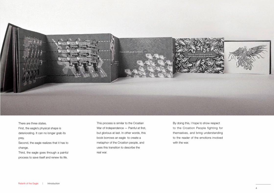
There are three states. First, the eagle’s physical shape isdeteriorating. It can no longer grab itsprey.Second, the eagle realizes that it has to change.Third, the eagle goes through a painful process to save itself and renew its life.
This process is similar to the Croatian War of Independence — Painful at first, but glorious at last. In other words, this book borrows an eagle to create a metaphor of the Croation people, and uses this transition to describe the real war.
By doing this, I hope to show respect to the Croation People fighting for themselves, and bring understanding to the reader of the emotions involved with the war.
Rebirth of the Eagle Introduction
Cover Design 2013
Sketch
September 2013
54
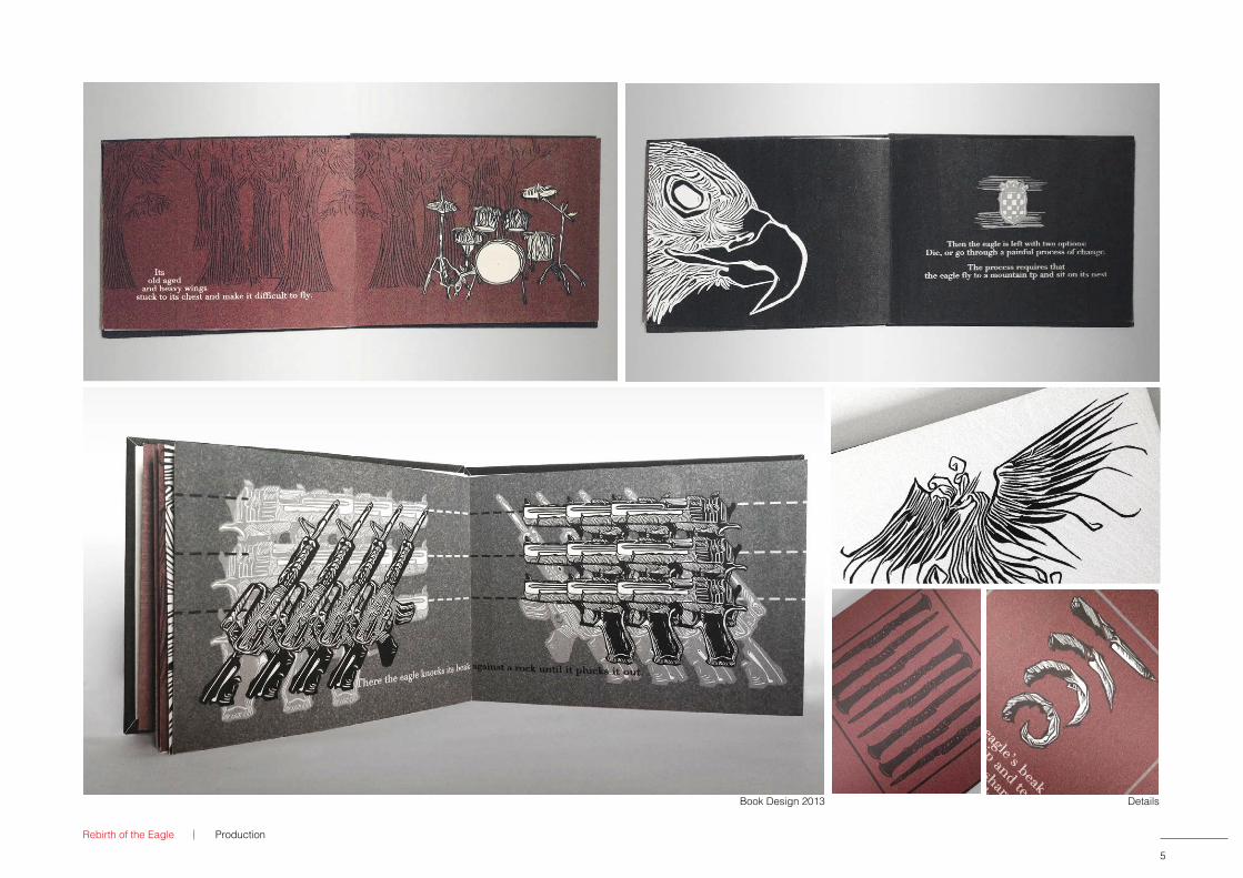
Rebirth of the Eagle
Book Design 2013 Details
Production
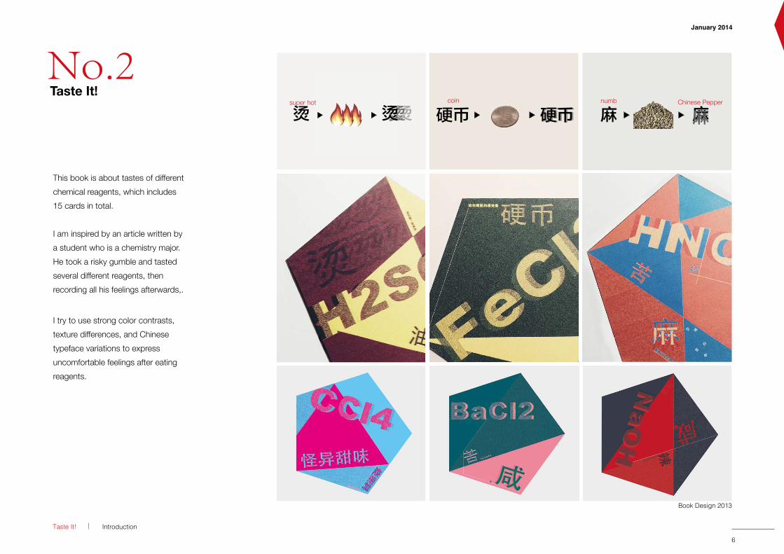
This book is about tastes of different chemical reagents, which includes 15 cards in total.
I am inspired by an article written by a student who is a chemistry major. He took a risky gumble and tastedseveral different reagents, thenrecording all his feelings afterwards,.
I try to use strong color contrasts,texture differences, and Chinese typeface variations to express uncomfortable feelings after eatingreagents.
Taste It!
Book Design 2013
Introduction
5 6
January 2014
Details
coin numb Chinese Pepper
烫super hot
烫烫烫烫烫烫烫烫烫烫烫
No.2Taste It!
Taste It!
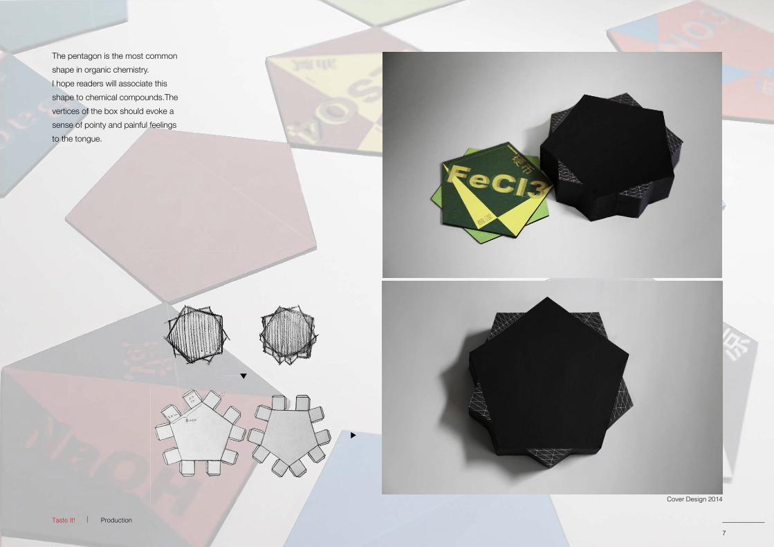
The pentagon is the most common shape in organic chemistry.I hope readers will associate thisshape to chemical compounds.The vertices of the box should evoke a sense of pointy and painful feelingsto the tongue.
Production
7
Cover Design 2014
7
Cover Design 2014
87
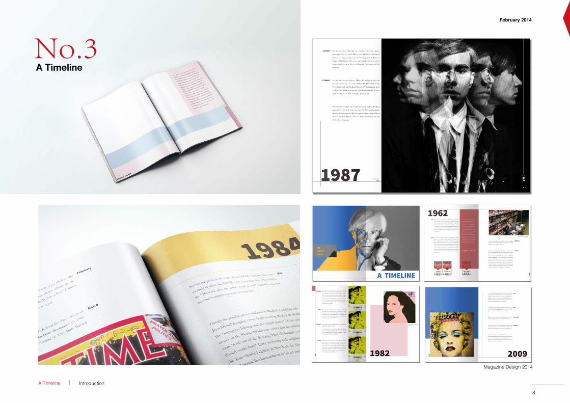
A Timeline Introduction
Magazine Design 2014
February 2014
No.3A Timeline
9
9Branding System
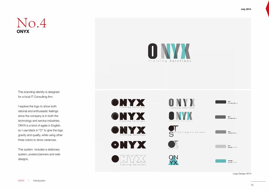
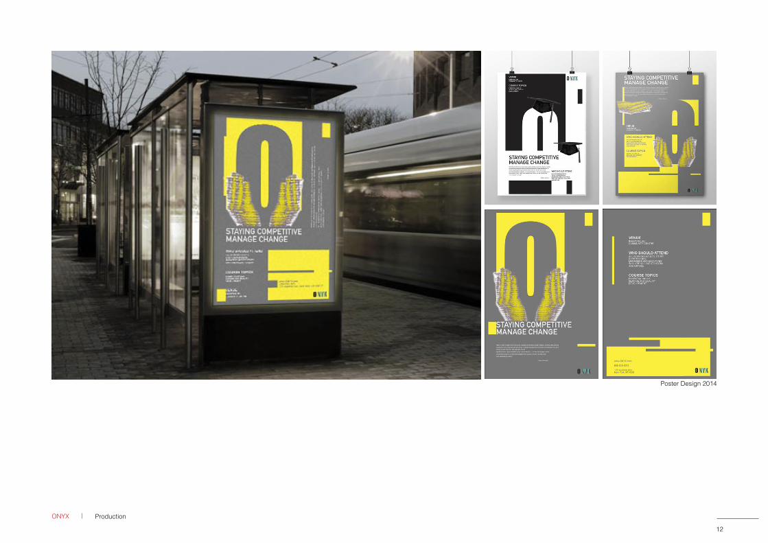
This branding identity is designed for a local IT Consulting firm.
I explore the logo to show both rational and enthusiastic feelings since the company is in both the technology and service industries. ONYX is a kind of agate in English, so I use black in “O” to give the logo gravity and quality, while using other three colors to show variances.
This system includes a stationary system, posters,banners and web designs.
Logo Design 2014
ONYX Introduction
T r a i n i n g S o l u t i o n
July 2014
grey 1C:77 M:72 Y:69 K:39
grey 2C:67 M:60 Y:56 K:6
grey 3C:52 M:44 Y:43 K:0
grey 4C:26 M:21 Y:21 K:0
blue greenC:61 M:7 Y:31 K:0
T r a i n i n g S o l u t i o n s
C:77 M:72 Y:69 K:39
C:67 M:60 Y:56 K:6
C:52 M:44 Y:43 K:0
grey 4C:26 M:21 Y:21 K:0
blue greenC:61 M:7 Y:31 K:0
grey 1C:77 M:72 Y:69 K:39
grey 2C:67 M:60 Y:56 K:6
grey 3C:52 M:44 Y:43 K:0
10
No.4ONYX
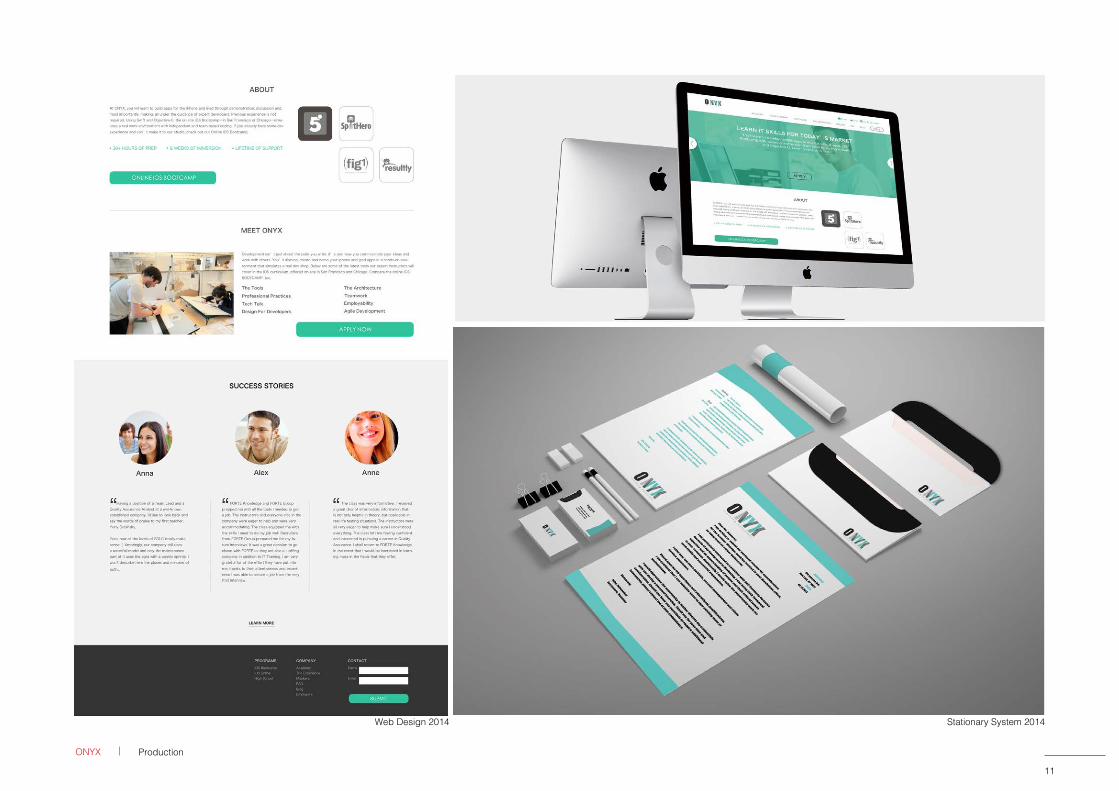
Web Design 2014 Stationary System 2014
11
ONYX Production
11
Stationary System 2014
11 12
ONYX Production
Poster Design 2014
4a
16a
4a
a
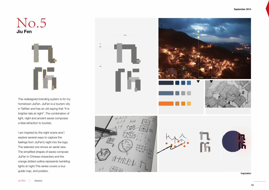
This redesigned branding system is for my hometown JiuFen. JiuFen is a tourism city in TaiWan and has an old saying that “It is brighter late at night”. The combination of light, night and ancient eaves composes a fatal attraction to tourists.
I am inspired by the night scene and I explore several ways to capture the feelings from JiuFen’s night into the logo.The selected one shows an aerial view.The simplified shapes of eaves compose JiuFen in Chinese characters and the orange dotted outline represents twinkling lights at night.This series covers a tour guide map, and posters.
Jiu Fen Ideation
13
September 2014
Inspiration
color shape
13
Inspiration
13
4a
16a
4a
a
No.5Jiu Fen
September 2014
Inspiration
13 14
Brochure Design 2014
ProductionJiu Fen
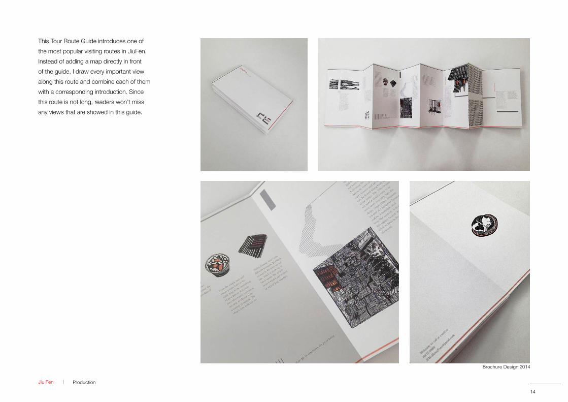
This Tour Route Guide introduces one of the most popular visiting routes in JiuFen. Instead of adding a map directly in front of the guide, I draw every important view along this route and combine each of them with a corresponding introduction. Since this route is not long, readers won’t miss any views that are showed in this guide.
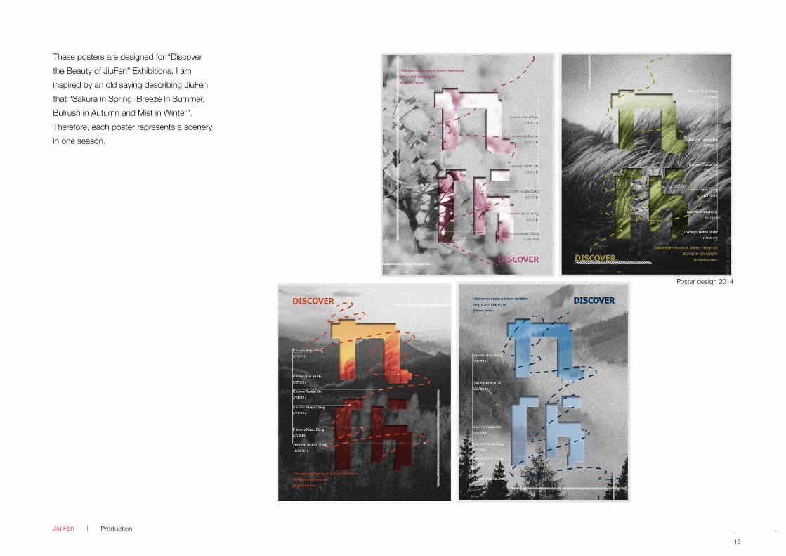
These posters are designed for “Discover the Beauty of JiuFen” Exhibitions. I am inspired by an old saying describing JiuFen that “Sakura in Spring, Breeze in Summer, Bulrush in Autumn and Mist in Winter”. Therefore, each poster represents a scenery in one season.
Poster design 2014
15
ProductionJiu Fen
15
Poster design 2014
16
15
Illustration
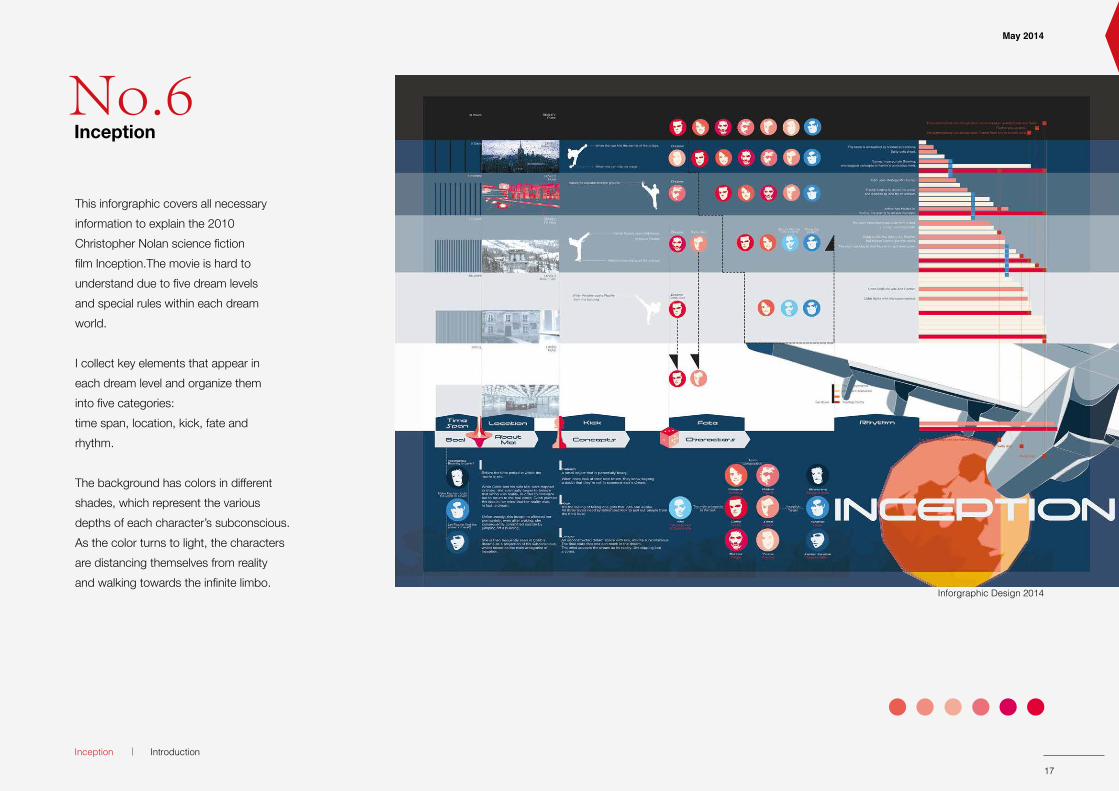
This inforgraphic covers all necessaryinformation to explain the 2010 Christopher Nolan science fiction film Inception.The movie is hard to understand due to five dream levels and special rules within each dream world.
I collect key elements that appear in each dream level and organize them into five categories:time span, location, kick, fate and rhythm.
The background has colors in different shades, which represent the various depths of each character’s subconscious.As the color turns to light, the characters are distancing themselves from reality and walking towards the infinite limbo.
Inforgraphic Design 2014
May 2014
Inception Introduction
17
No.6Inception
May 2014
17 1818
Inforgraphic Design 2014
ProductionIpr
Pregnancy
All in my head ???Author: eager momma3.44 am 3/24/2014
3 Replies
BackageAuthor: Armywife12:59 pm 3/24/2014
7 Replies
Pregnancy
Such a long wait!Author: babygeek 1 Replies
The Body LiesAuthor: trying for a thrid12:00 am 3/24/2014
6 Replies
WaitingggggggggggggAuthor: ky- “my love”6:00 am 3/26/2014
3:20 pm 3/25/2014
8 Replies
Two Weeks WaitPregnancy
2 DaysAuthor: dc_RR2:00 pm 3/28/2014
6 Replies2 DaysAuthor:2:00 pm 3/28/2014
Any TWW buddies?Author: rachel31102:05 pm 3/23/2014
6 replies
2:05 pm 3/23/2014
WaitingggggggggggggAuthor:6:00 am 3/26/2014
WaitingggggggggggggAuthor:
BackageAuthor:
3:20 pm 3/25/2014
Such a long wait!Author:
All in my head ???Author:
2:59 pm 3/24/2014
BackageAuthor:
3.44 am 3/24/2014
All in my head ???Author:
Author:12:00 am 3/24/2014
Any TWW buddies?Author:
The Body LiesAuthor:
March 2014Mon Tue Wed Thu Fri SatSun
1
2 3 4 5 6 7 8
9 10 11 12 13 14 15
16
1 2 3 4 530 31
17 18 19 20
28
28
27
27
26
26
25
25
24
24
23
23
Notes Info
03/13/2014
Exchange Information
LearnKnowledge
ShareExperiences
FindHomogeneous
People
StudySolutions
StudySolutions
Online Chat
Pregnancy Journal
Kate
08/15/2014
Week30
First Twins+
HighRisk
35+Pregnancy
TeenMoms
SingleParents General
NFP
PostpartumDepression
ProductReviews
SameSex
Families
Justfor
Dad
Second
Third
TTC General Nutrition
Fitness
Running
Yoga
BreastFeeding
Feeding
NewMoms
Stayat Home
Moms
WorkingHours
Parenting
TwoWeeksWait
Infertility
TrimestersSpecialInterest Pregnancy Postpartum Health
Week3
Week4
Week5
Week6
Week7
Week8
Week9
Week10
Track Stages
GainKnowledgeabout babies
Education
18 inches (45.7cm)
3.5 pounds (1588 g)
Length
Weight
Week30Week30
18 inches (45.7cm)
3.5 pounds (1588 g)
The amniotic fluid surrounding your baby will start to diminish as he/she takes upmore and more room. The brain is continuing to develop and wrinkle. If you could offer a finger, your baby now has the grasp to hold on.
You may be feeling like sleep - comfortable sleep - is hard to come by with the extendedbelly, heartburn and cramps.
Notes Info
Length
Weight
Development
PossibleFeelings
June 2014
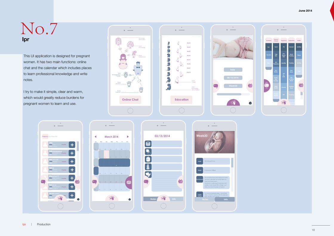
This UI application is designed for pregnant women. It has two main functions: online chat and the calendar which includes places to learn professional knowledge and write notes.
I try to make it simple, clear and warm, which would greatly reduce burdens for pregnant women to learn and use.
No.7Ipr

19
19Drawing
August 2014
Production
20
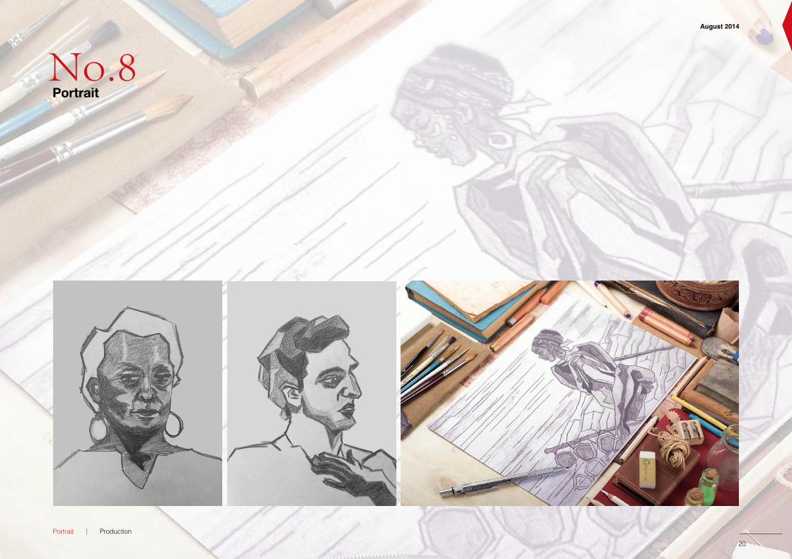
Portrait
19
No.8Portrait