Embed Size (px)
Citation preview

可視化周辺の進化がヤヴァイ 2016
〜Plotlyを中⼼として〜
Tokyo.R#55 2016-07-30 @kashitan
> summary(kashitan)
• TwitterID : @kashitan
• お仕事 : 某通信会社
2
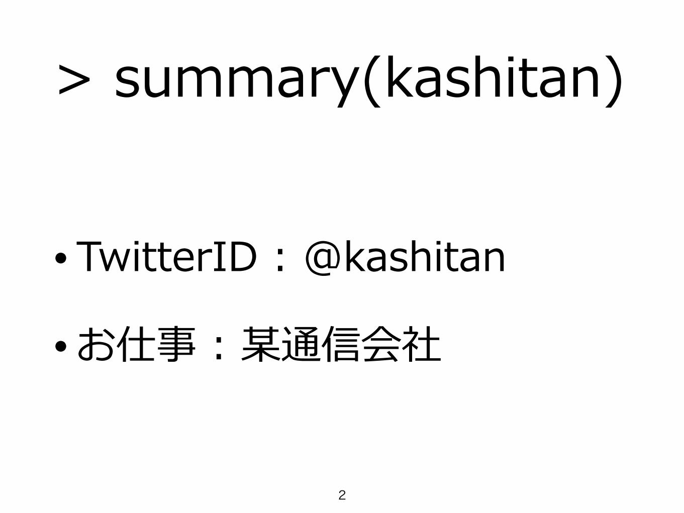
可視化に関する過去の発表
2013-06-01 第31回 R勉強会@東京
2010-06-26 第6回 R勉強会@東京
2015-02-21 第46回 R勉強会@東京
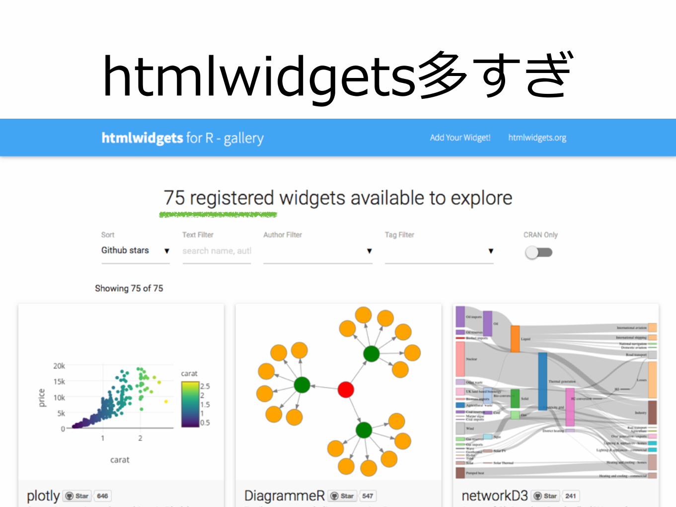
htmlwidgets多すぎ
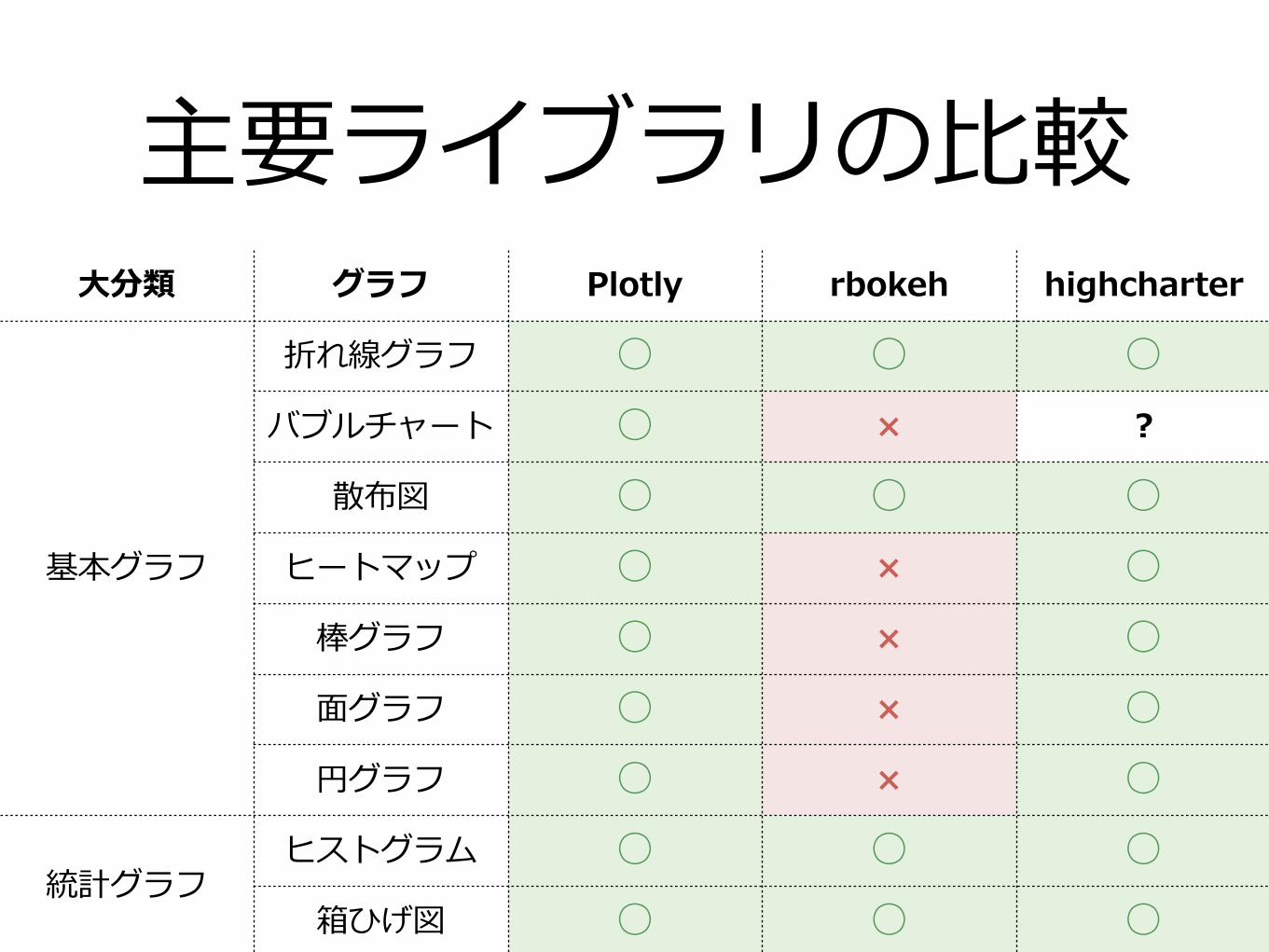
主要ライブラリの⽐較⼤分類 グラフ Plotly rbokeh highcharter
基本グラフ
折れ線グラフ ○ ○ ○バブルチャート ○ × ?
散布図 ○ ○ ○ヒートマップ ○ × ○
棒グラフ ○ × ○⾯グラフ ○ × ○円グラフ ○ × ○
統計グラフヒストグラム ○ ○ ○
箱ひげ図 ○ ○ ○
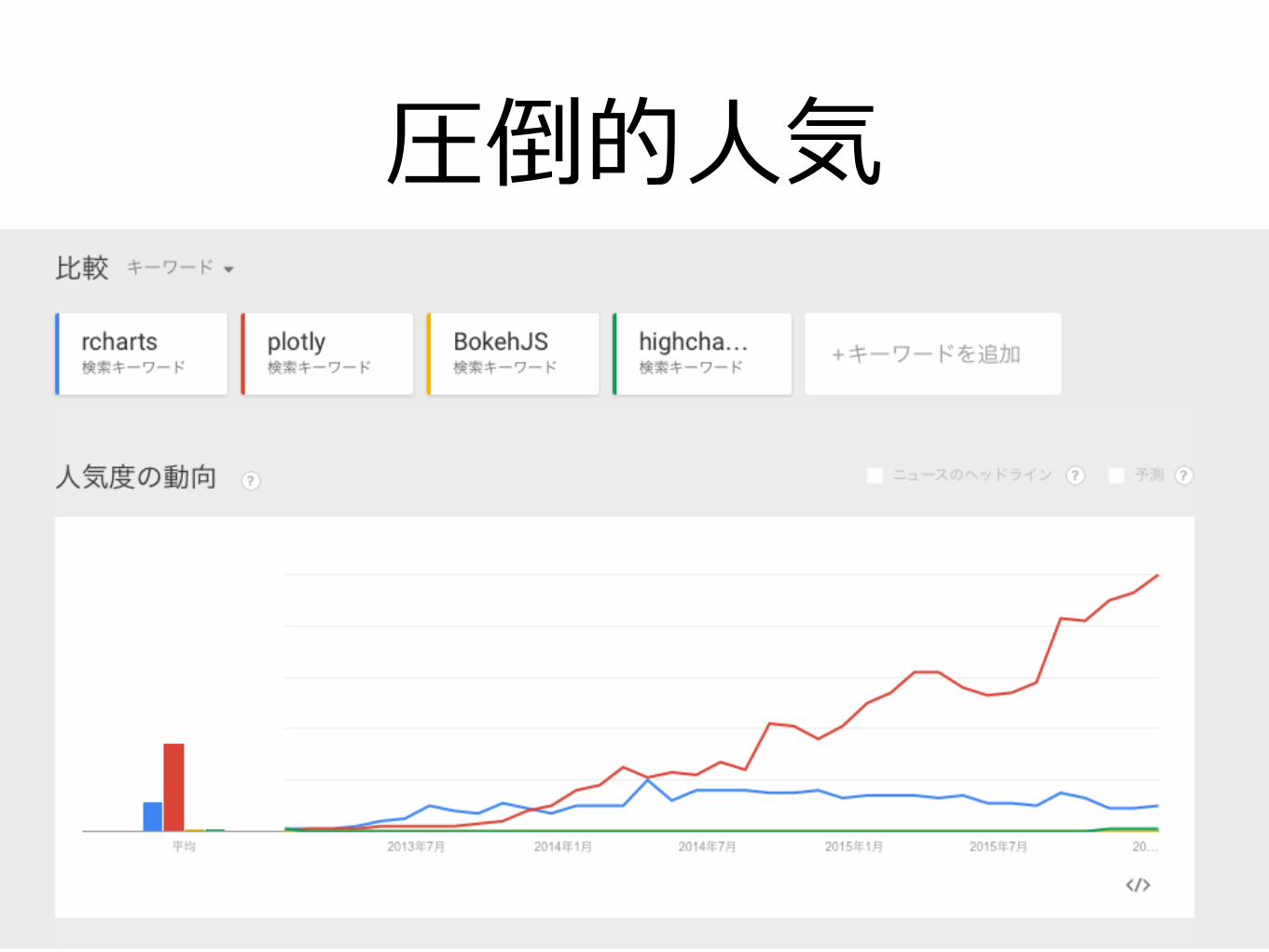
圧倒的⼈気

でも アカウント登録が 必要でしょう?

オープンソース化 されました!
(アカウント不要) ※highcharts.jsは商⽤利⽤だと有償

•plotlyデモ
•plotlyによるグラフの作成
•plotlyグラフの調整
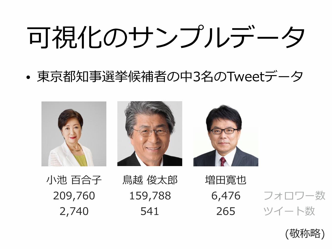
可視化のサンプルデータ• 東京都知事選挙候補者の中3名のTweetデータ
⼩池 百合⼦ 209,760 2,740
⿃越 俊太郎 159,788
541
増⽥寛也 6,476 265
(敬称略)
フォロワー数 ツイート数
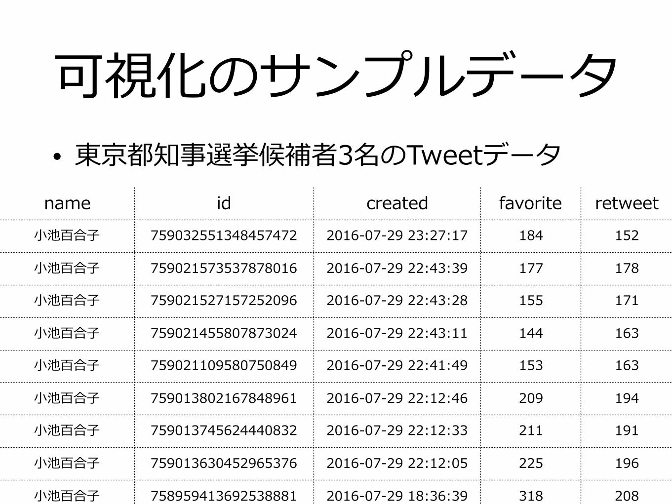
可視化のサンプルデータ• 東京都知事選挙候補者3名のTweetデータ
name id created favorite retweet⼩池百合⼦ 759032551348457472 2016-07-29 23:27:17 184 152
⼩池百合⼦ 759021573537878016 2016-07-29 22:43:39 177 178
⼩池百合⼦ 759021527157252096 2016-07-29 22:43:28 155 171
⼩池百合⼦ 759021455807873024 2016-07-29 22:43:11 144 163
⼩池百合⼦ 759021109580750849 2016-07-29 22:41:49 153 163
⼩池百合⼦ 759013802167848961 2016-07-29 22:12:46 209 194
⼩池百合⼦ 759013745624440832 2016-07-29 22:12:33 211 191
⼩池百合⼦ 759013630452965376 2016-07-29 22:12:05 225 196
⼩池百合⼦ 758959413692538881 2016-07-29 18:36:39 318 208

•plotlyデモ
•plotlyによるグラフの作成
•plotlyグラフの調整
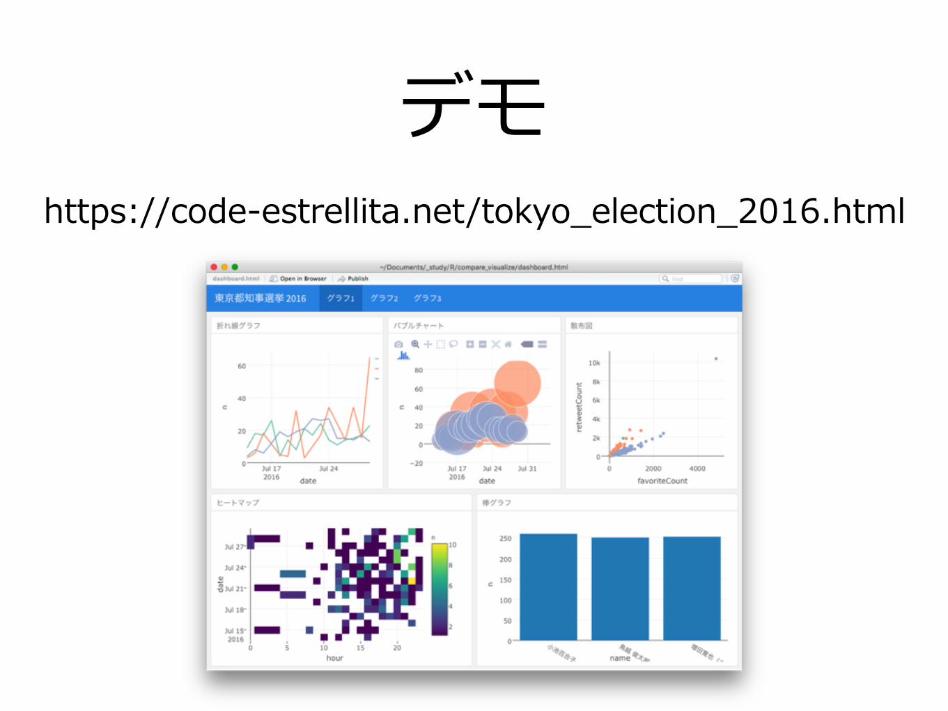
デモhttps://code-estrellita.net/tokyo_election_2016.html

•plotlyデモ
•plotlyによるグラフの作成
•plotlyグラフの調整
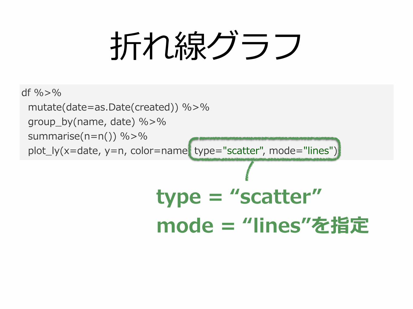
折れ線グラフdf %>% mutate(date=as.Date(created)) %>% group_by(name, date) %>% summarise(n=n()) %>% plot_ly(x=date, y=n, color=name, type="scatter", mode="lines")
type = “scatter” mode = “lines”を指定
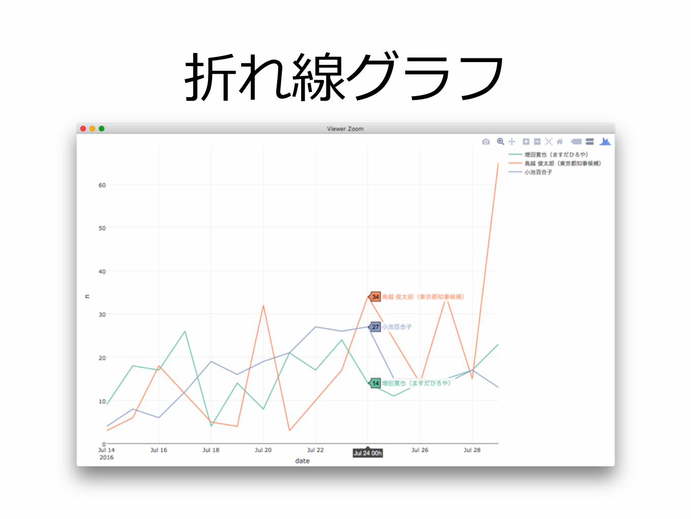
折れ線グラフ

バブルチャートdf %>% mutate(date=as.Date(created)) %>% group_by(name, date) %>% summarise(n=n(), retweet=sum(retweetCount)) %>% plot_ly(x=date, y=n, color=name, type="scatter", mode="markers", size=retweet)
type = “scatter” mode = “markers” sizeを指定
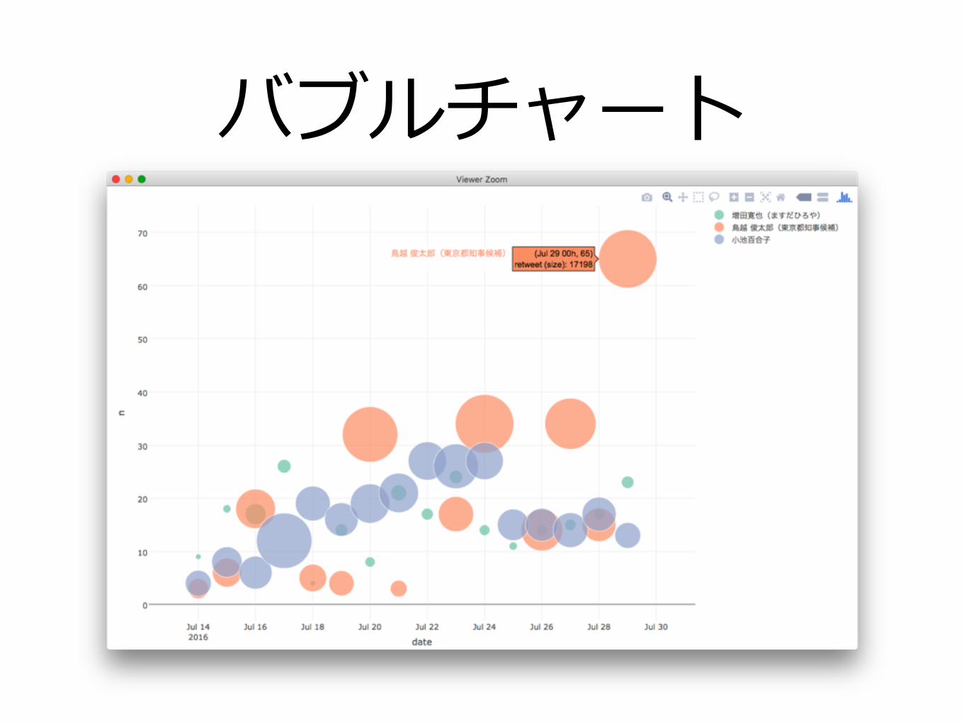
バブルチャート
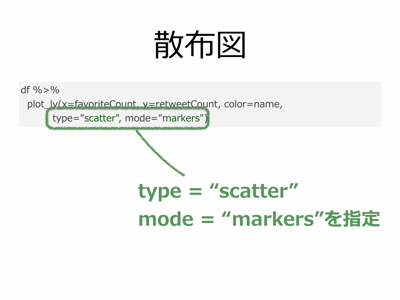
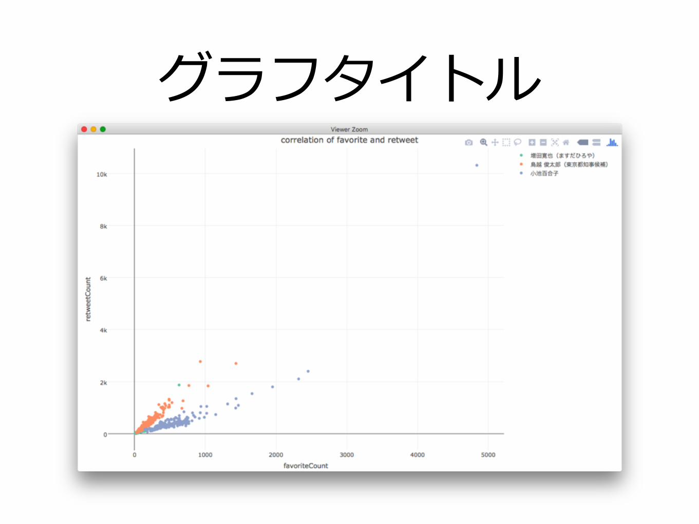
散布図df %>% plot_ly(x=favoriteCount, y=retweetCount, color=name, type="scatter", mode="markers")
type = “scatter” mode = “markers”を指定
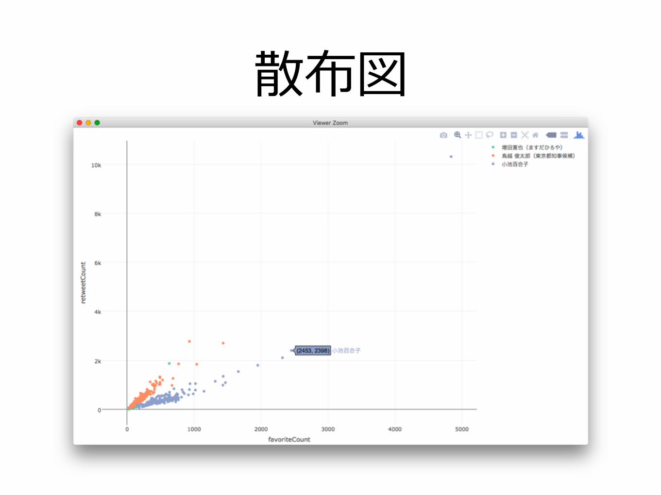
散布図

ヒートマップdf %>% filter(screenName == "ecoyuri") %>% mutate(date=as.Date(created), hour=hour(created)) %>% group_by(date, hour) %>% summarise(n=n()) %>% plot_ly(x=hour, y=date, z=n, type="heatmap")
type = “heatmap”を指定
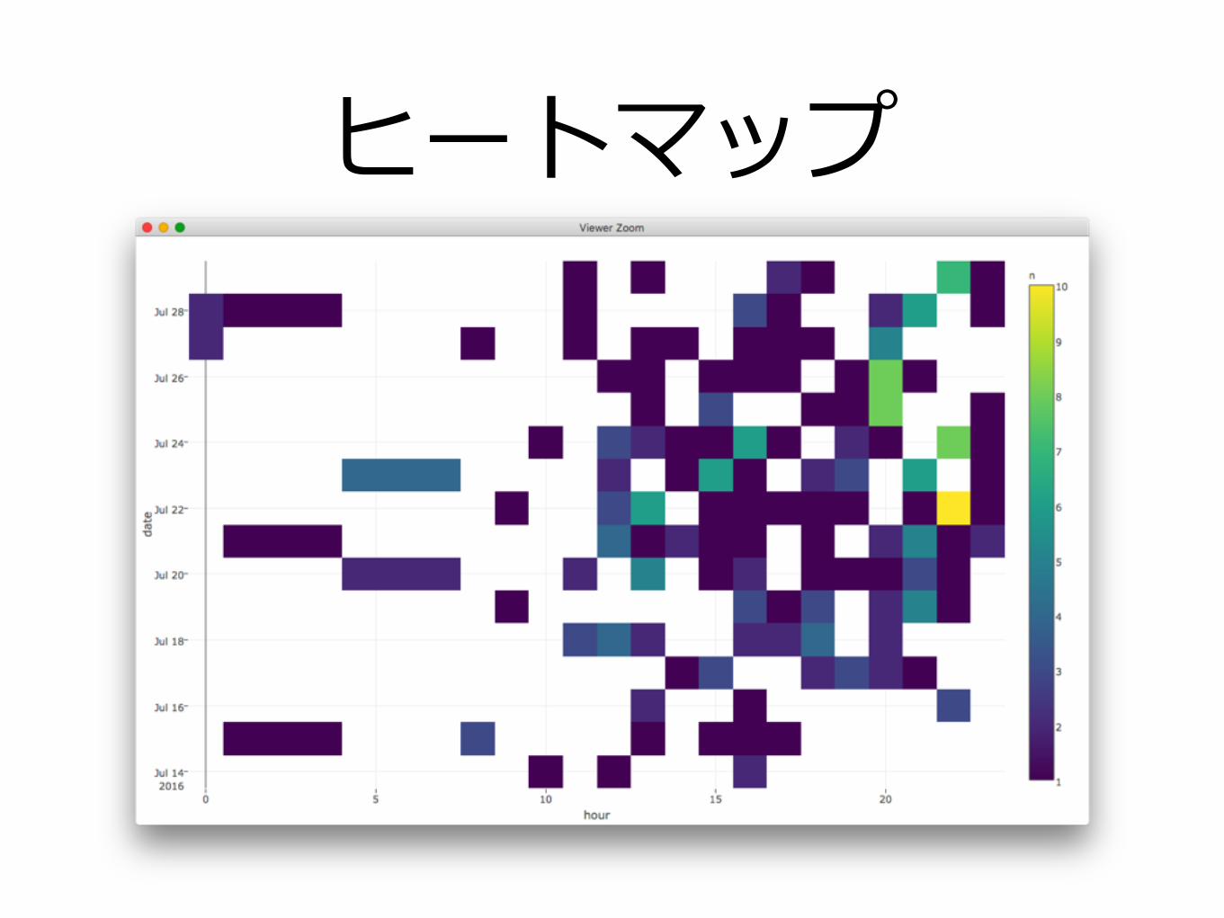
ヒートマップ
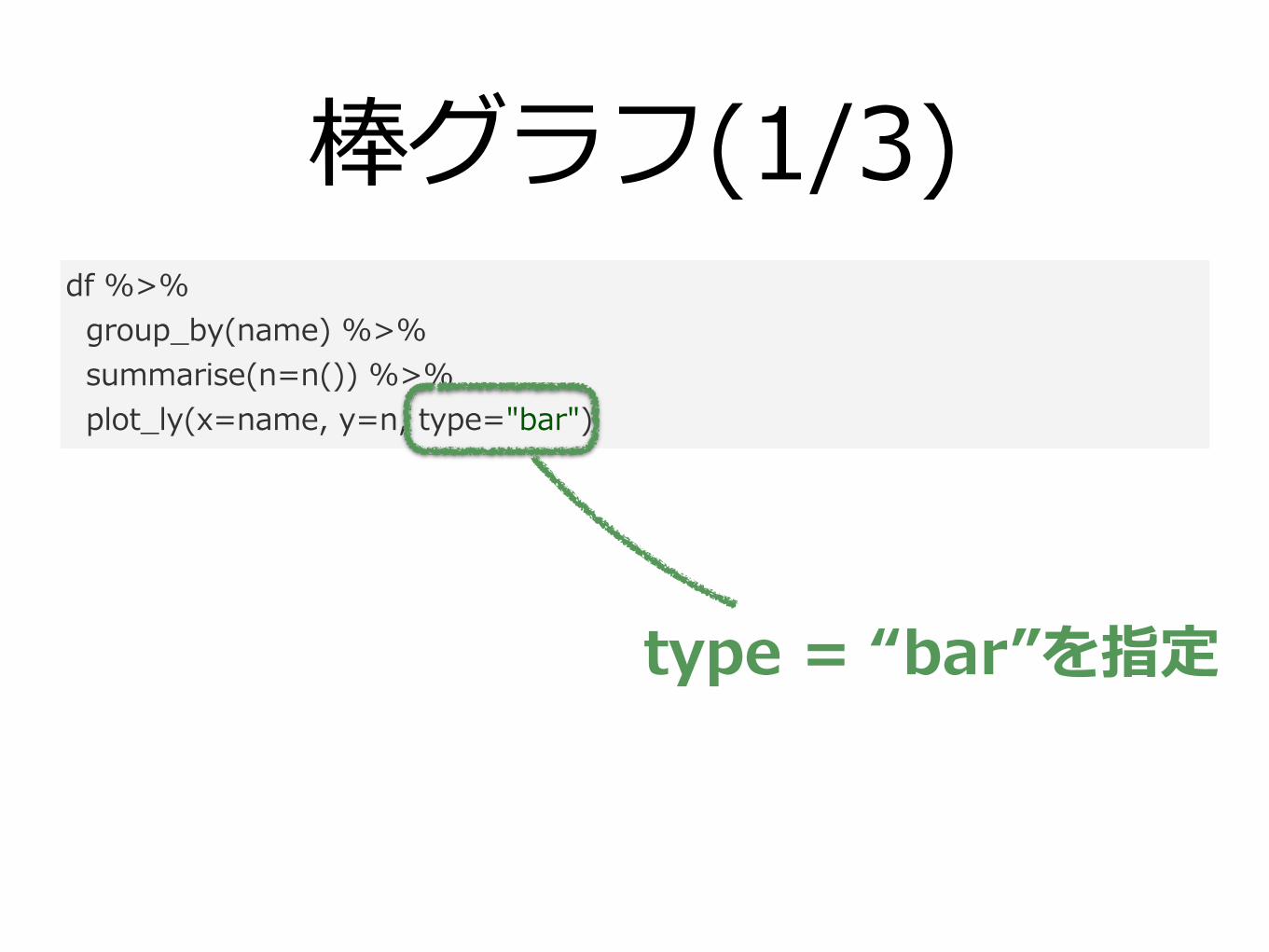
棒グラフ(1/3)df %>% group_by(name) %>% summarise(n=n()) %>% plot_ly(x=name, y=n, type="bar")
type = “bar”を指定
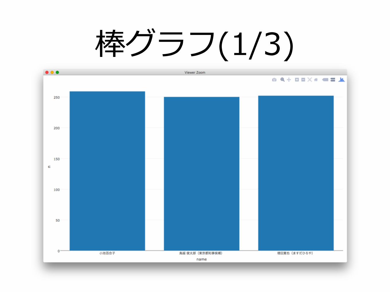
棒グラフ(1/3)
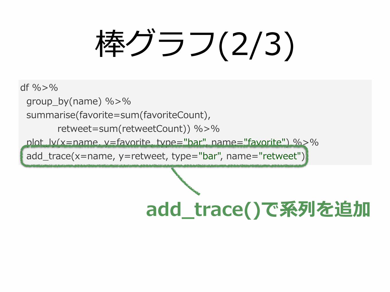
棒グラフ(2/3)df %>% group_by(name) %>% summarise(favorite=sum(favoriteCount), retweet=sum(retweetCount)) %>% plot_ly(x=name, y=favorite, type="bar", name="favorite") %>% add_trace(x=name, y=retweet, type="bar", name="retweet")
add_trace()で系列を追加
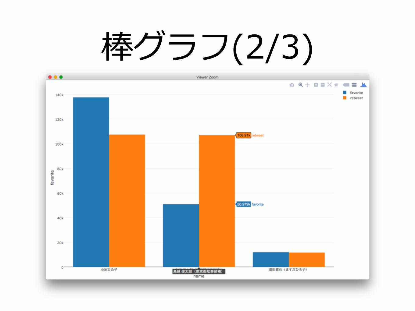
棒グラフ(2/3)
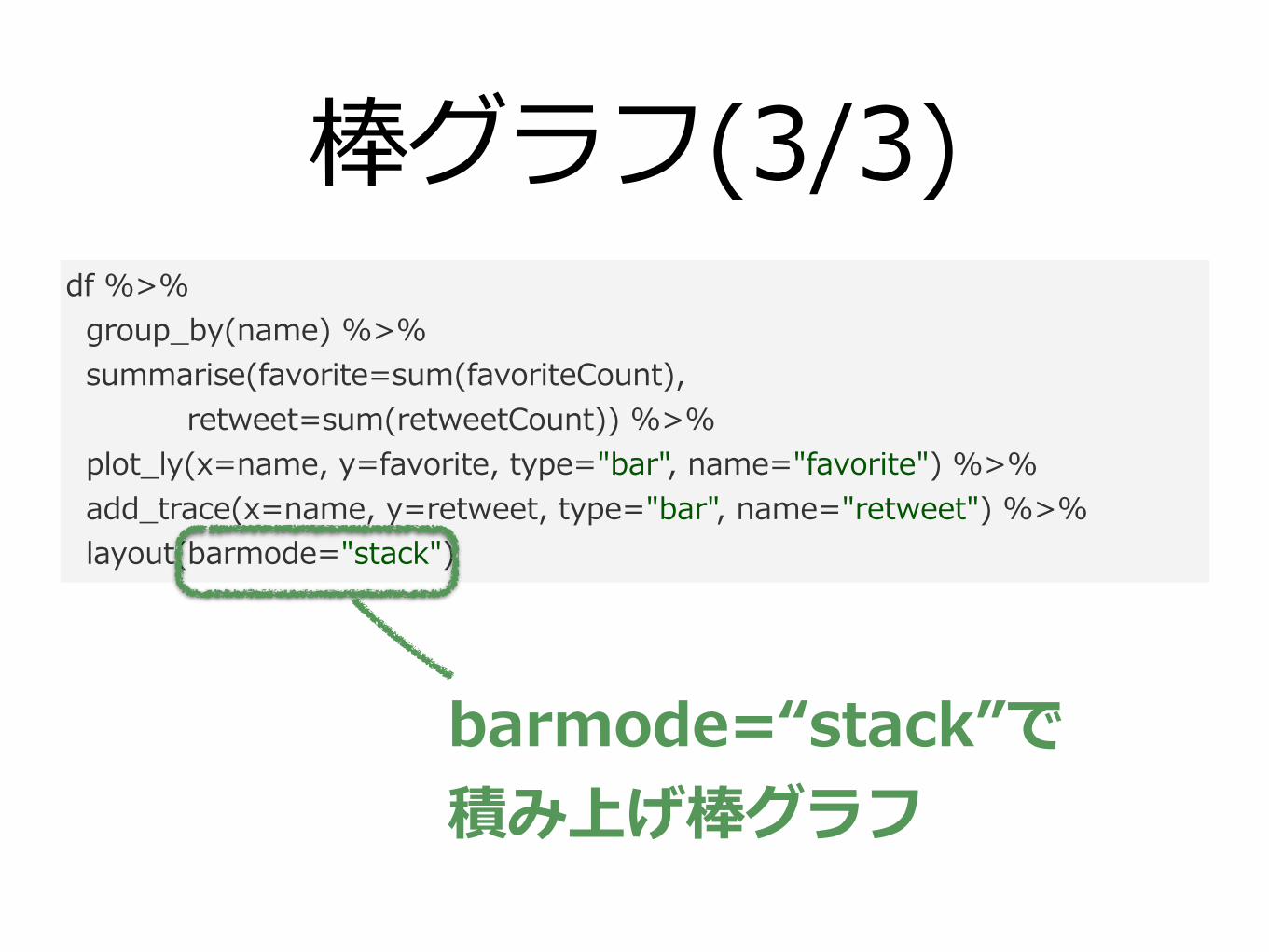
棒グラフ(3/3)df %>% group_by(name) %>% summarise(favorite=sum(favoriteCount), retweet=sum(retweetCount)) %>% plot_ly(x=name, y=favorite, type="bar", name="favorite") %>% add_trace(x=name, y=retweet, type="bar", name="retweet") %>% layout(barmode="stack")
barmode=“stack”で 積み上げ棒グラフ
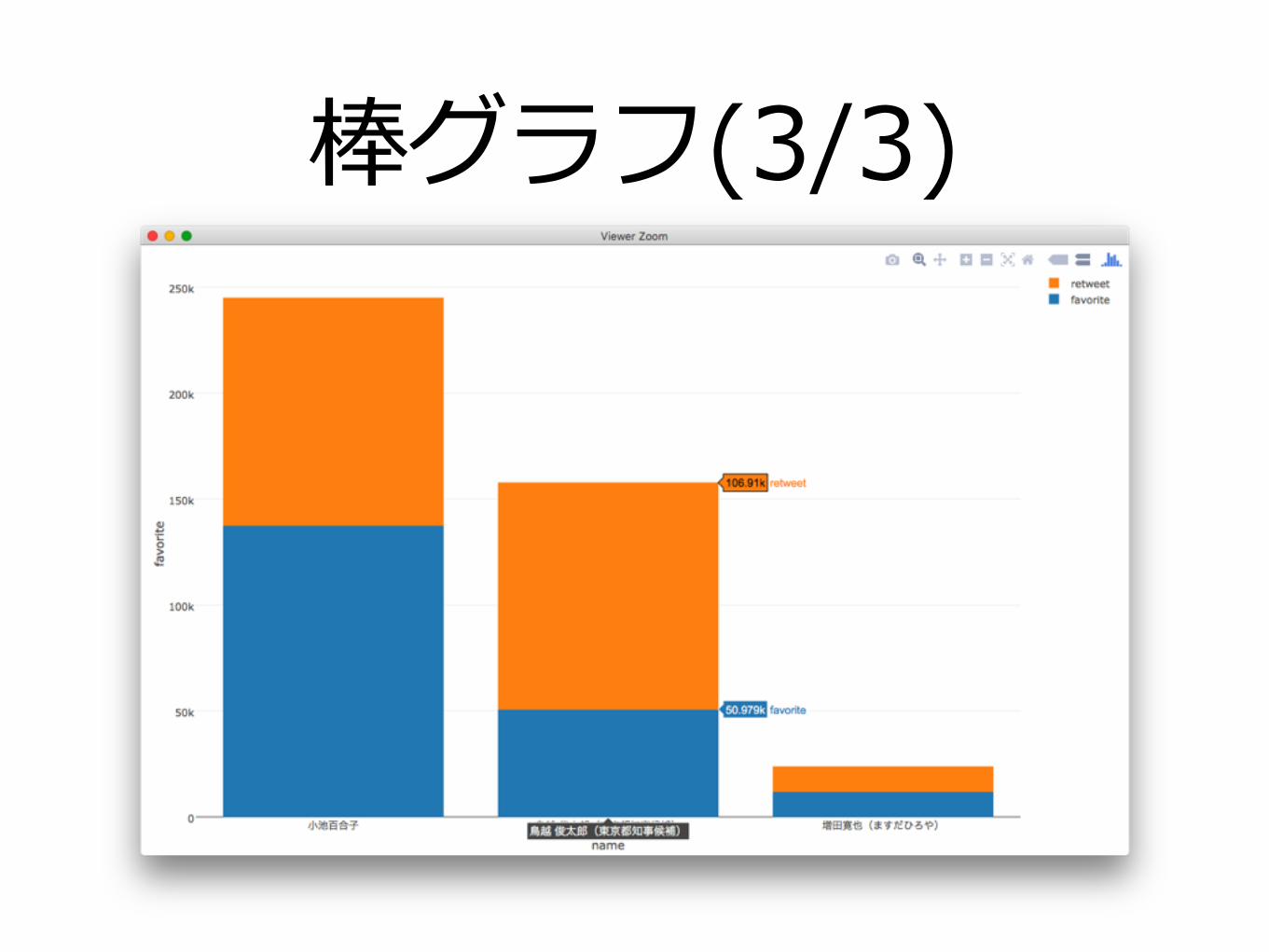
棒グラフ(3/3)
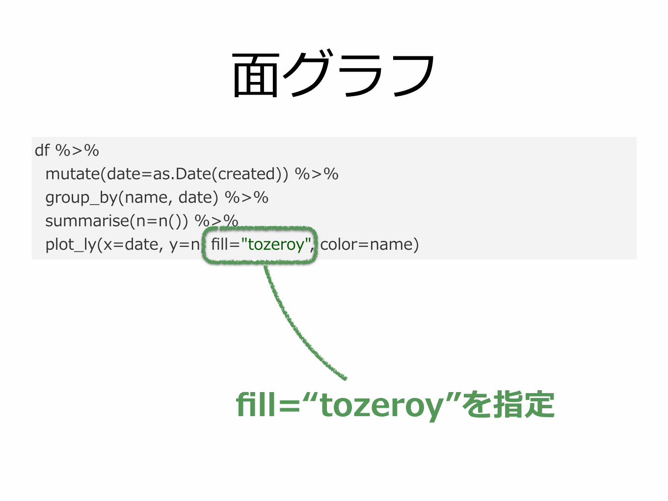
⾯グラフdf %>% mutate(date=as.Date(created)) %>% group_by(name, date) %>% summarise(n=n()) %>% plot_ly(x=date, y=n, fill="tozeroy", color=name)
fill=“tozeroy”を指定
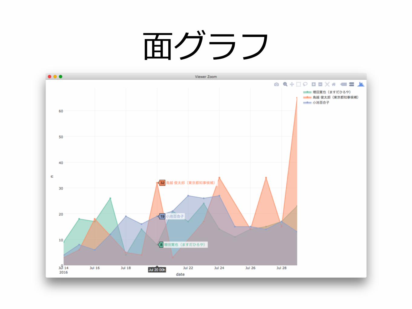
⾯グラフ
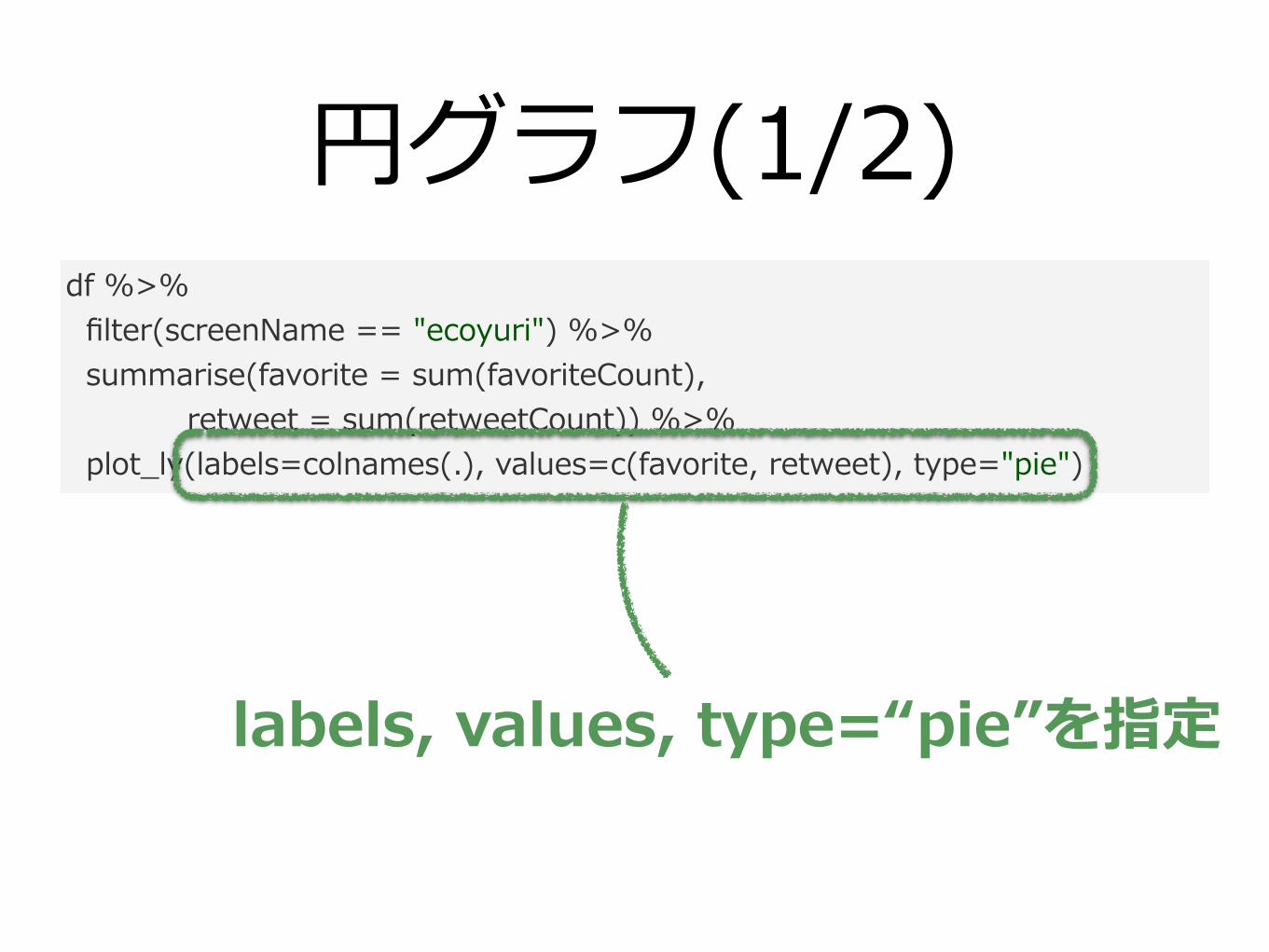
円グラフ(1/2)df %>% filter(screenName == "ecoyuri") %>% summarise(favorite = sum(favoriteCount), retweet = sum(retweetCount)) %>% plot_ly(labels=colnames(.), values=c(favorite, retweet), type="pie")
labels, values, type=“pie”を指定
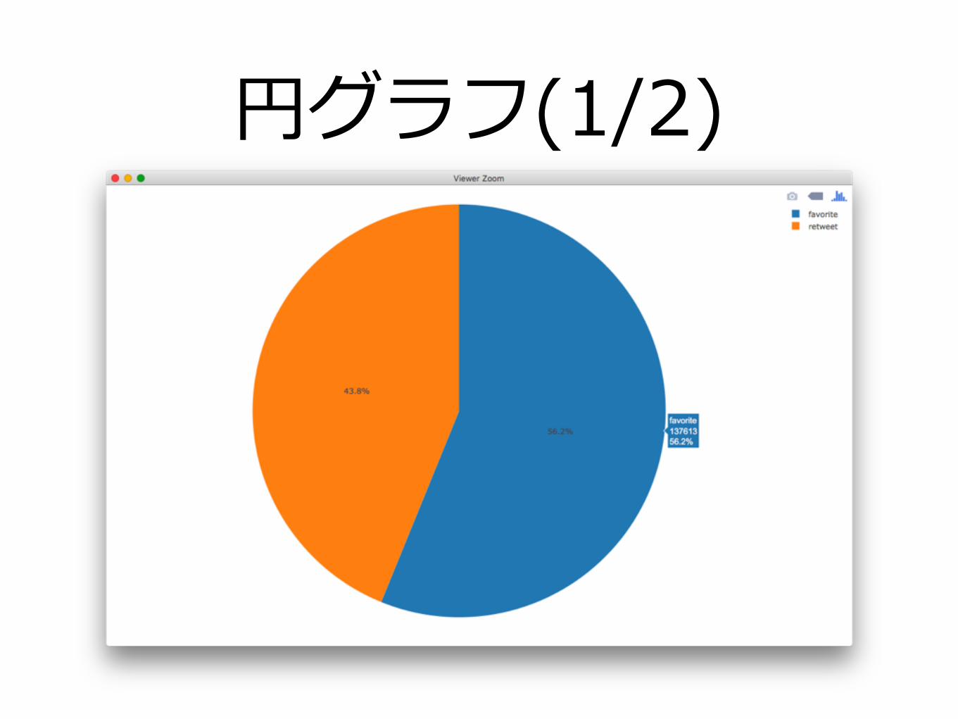
円グラフ(1/2)
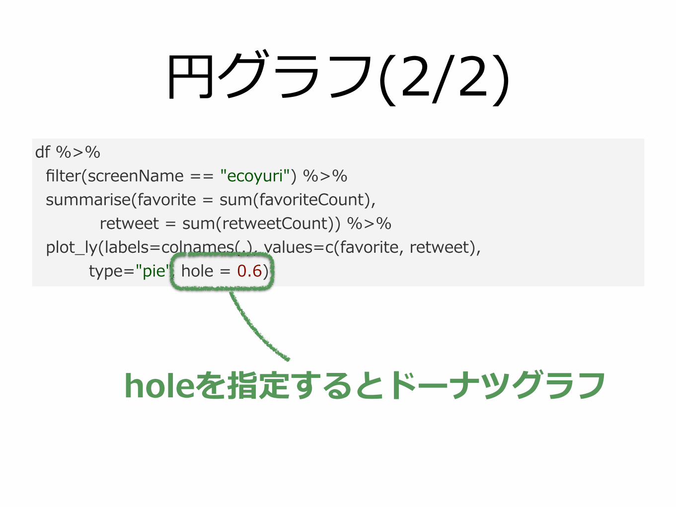
円グラフ(2/2)df %>% filter(screenName == "ecoyuri") %>% summarise(favorite = sum(favoriteCount), retweet = sum(retweetCount)) %>% plot_ly(labels=colnames(.), values=c(favorite, retweet), type="pie", hole = 0.6)
holeを指定するとドーナツグラフ
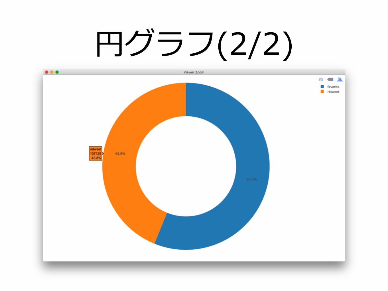
円グラフ(2/2)
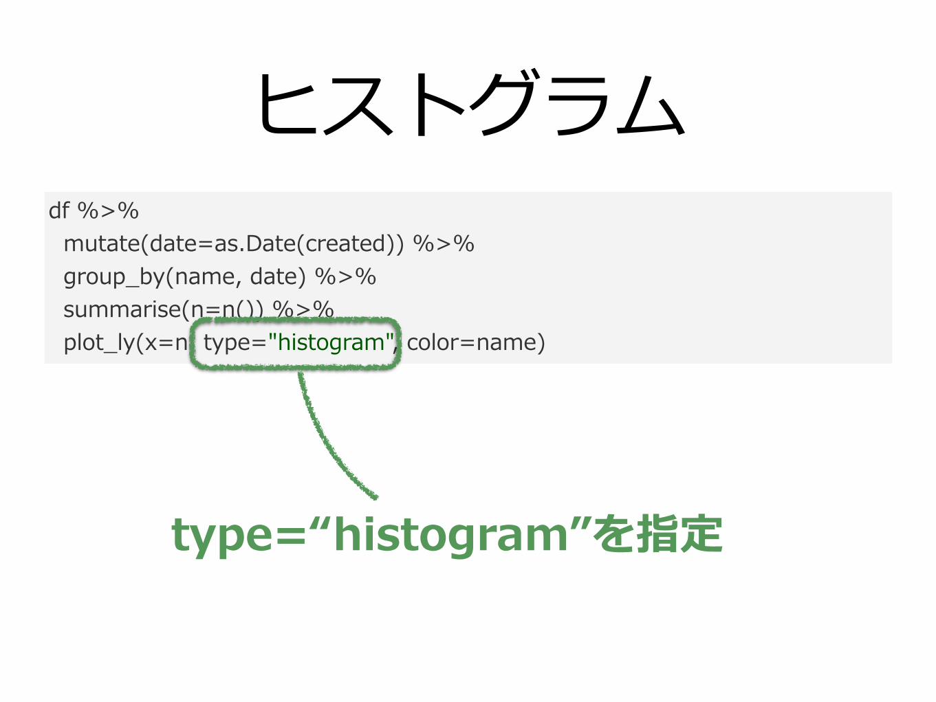
ヒストグラムdf %>% mutate(date=as.Date(created)) %>% group_by(name, date) %>% summarise(n=n()) %>% plot_ly(x=n, type="histogram", color=name)
type=“histogram”を指定
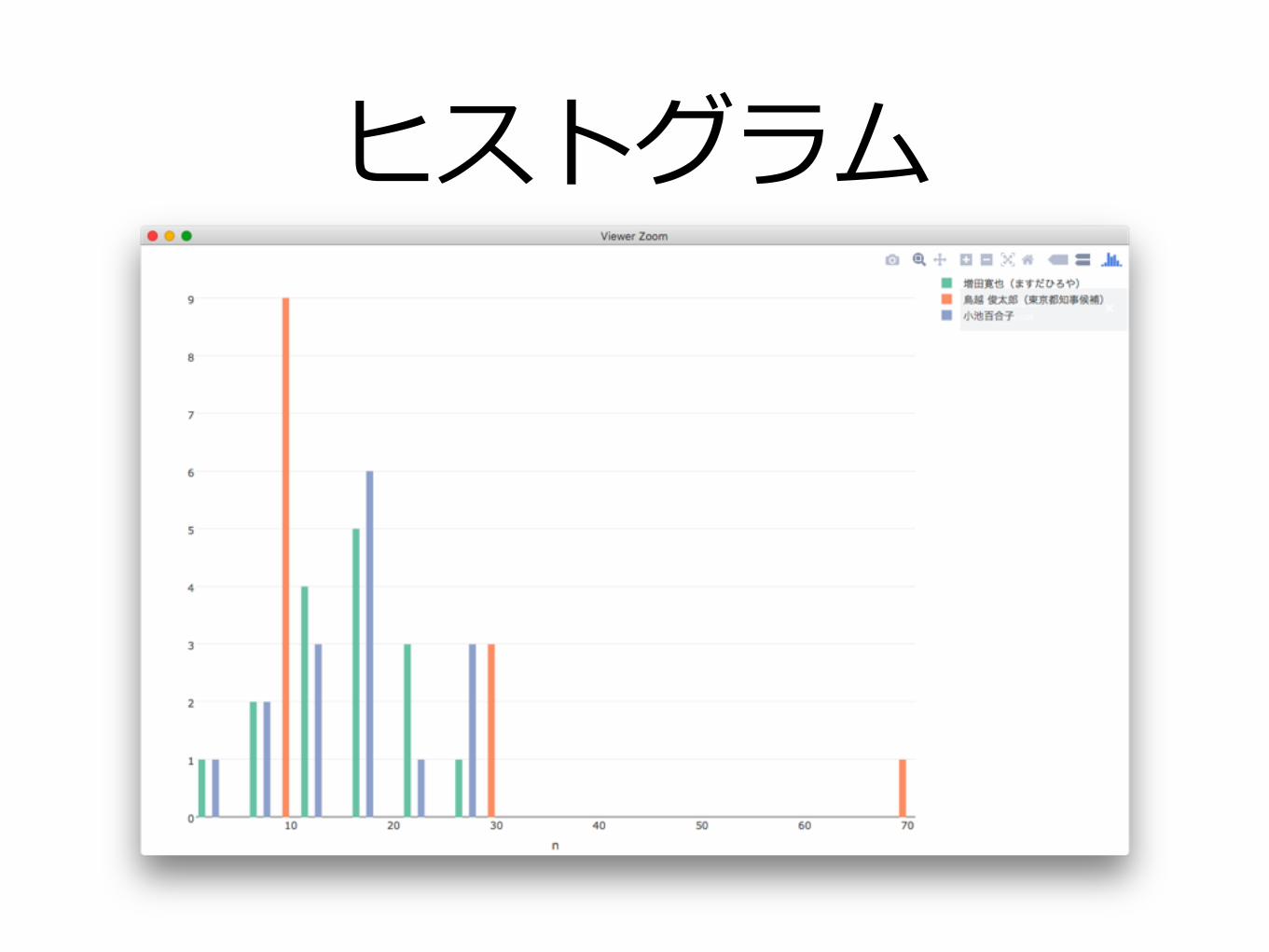
ヒストグラム
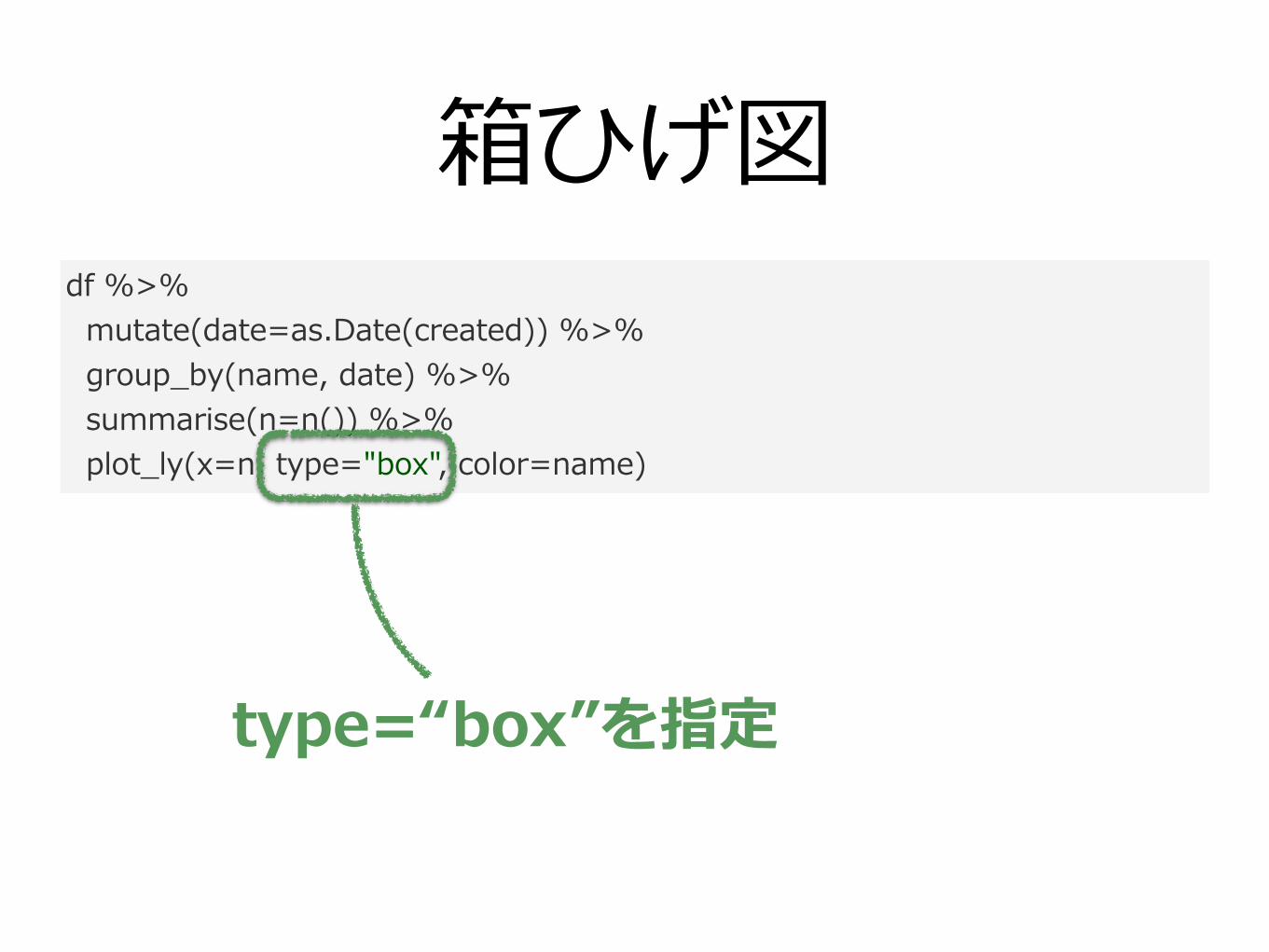
箱ひげ図df %>% mutate(date=as.Date(created)) %>% group_by(name, date) %>% summarise(n=n()) %>% plot_ly(x=n, type="box", color=name)
type=“box”を指定
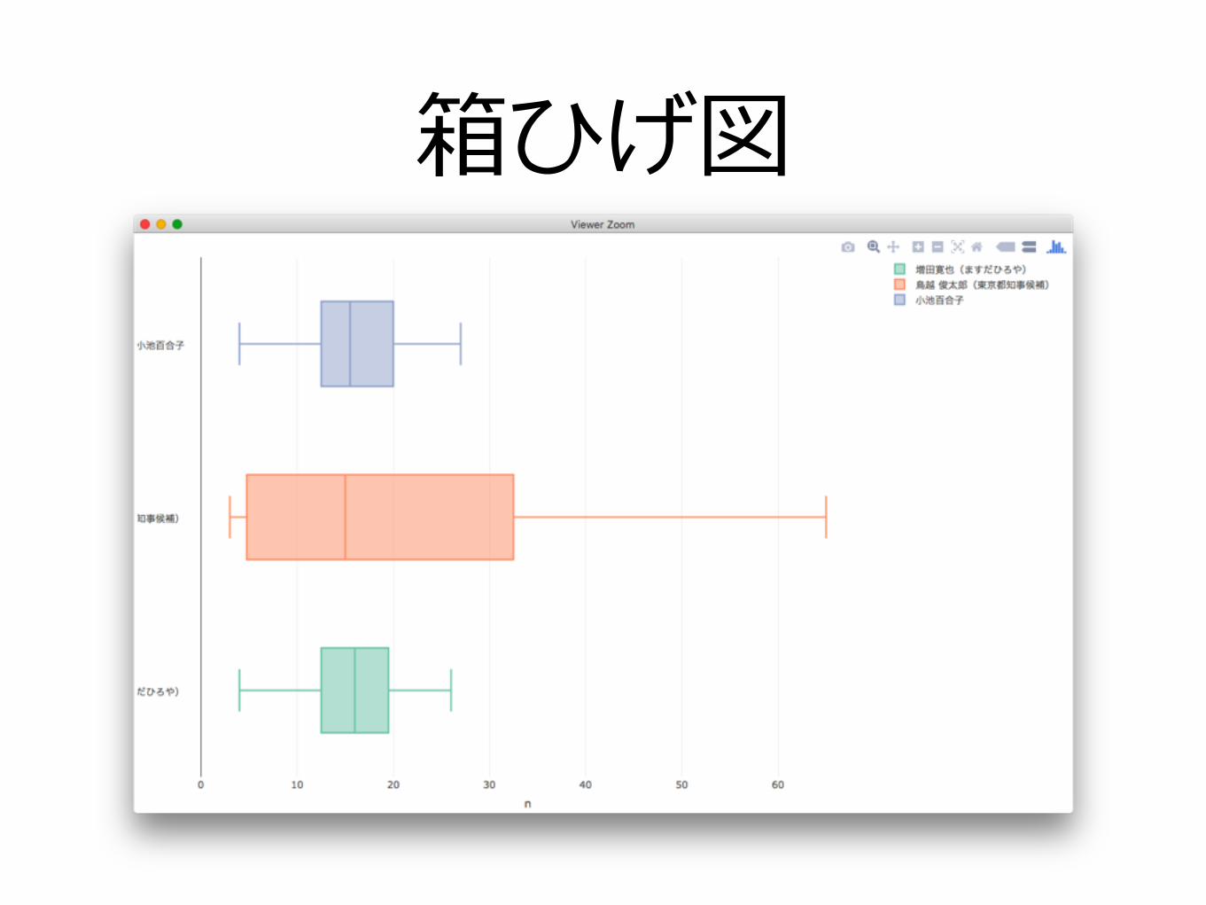
箱ひげ図

•plotlyデモ
•plotlyによるグラフの作成
•plotlyグラフの調整
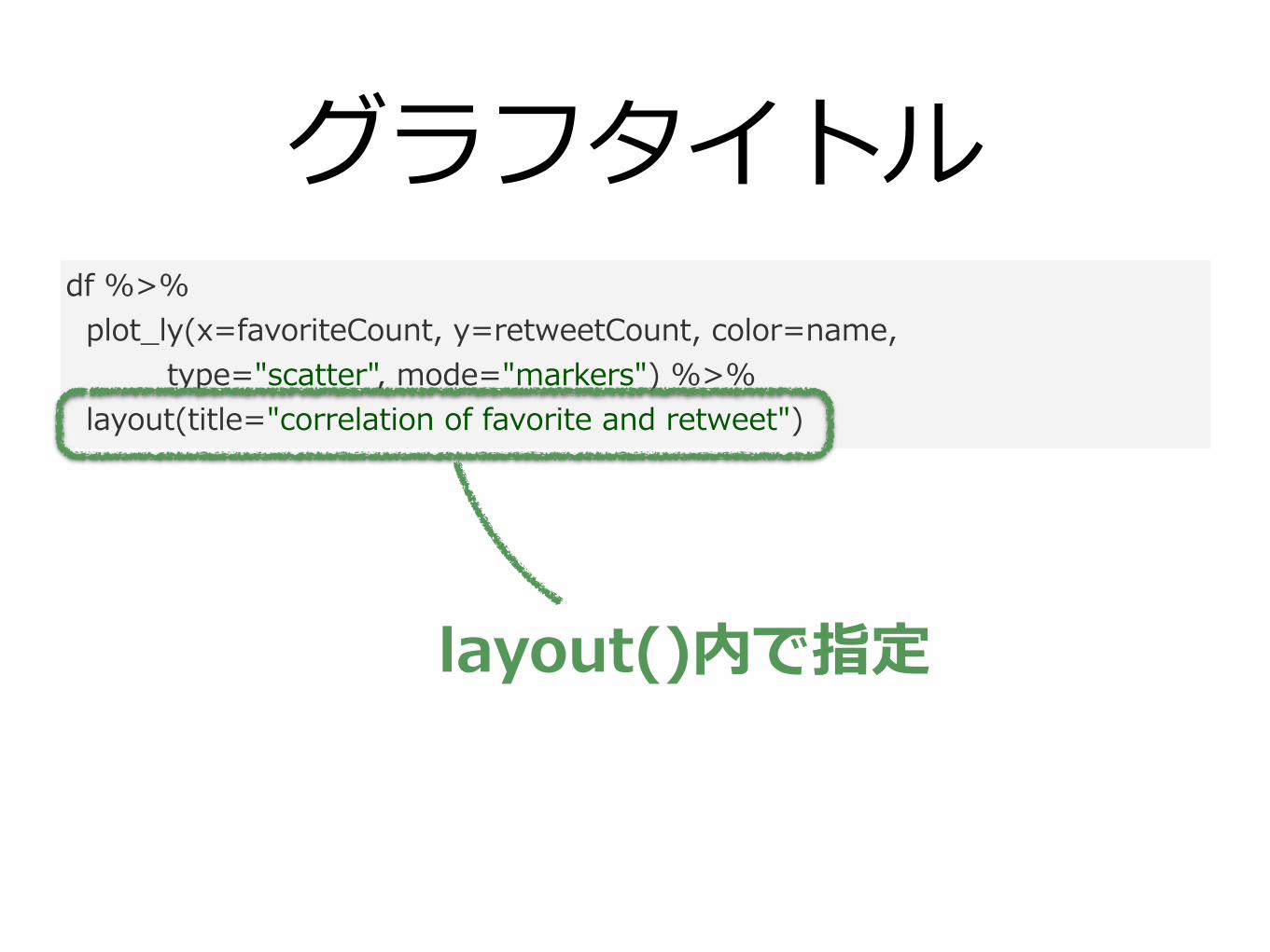
グラフタイトルdf %>% plot_ly(x=favoriteCount, y=retweetCount, color=name, type="scatter", mode="markers") %>% layout(title="correlation of favorite and retweet")
layout()内で指定
グラフタイトル
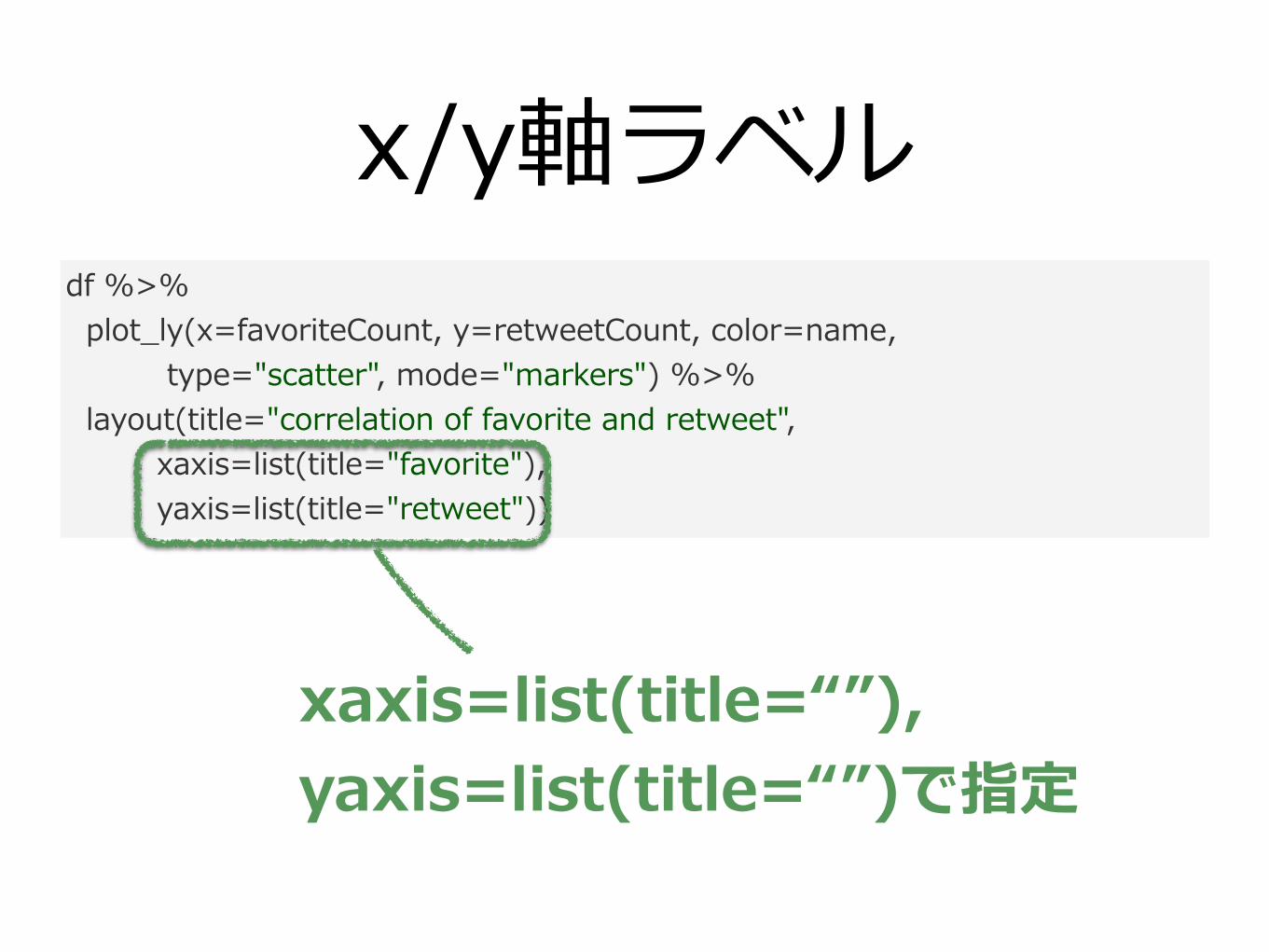
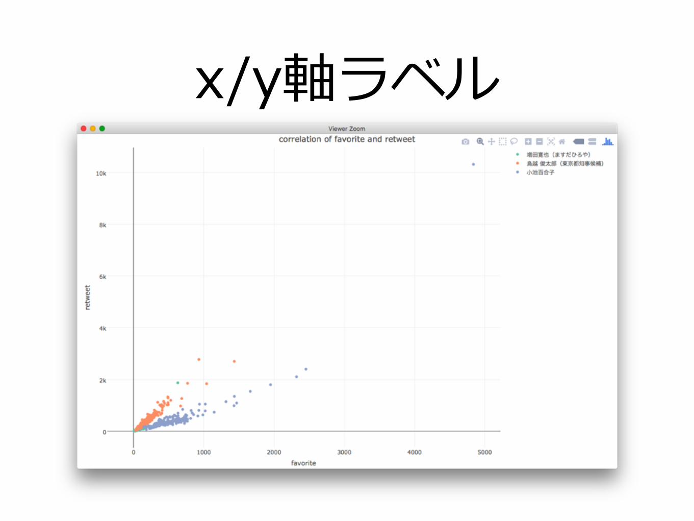
x/y軸ラベルdf %>% plot_ly(x=favoriteCount, y=retweetCount, color=name, type="scatter", mode="markers") %>% layout(title="correlation of favorite and retweet", xaxis=list(title="favorite"), yaxis=list(title="retweet"))
xaxis=list(title=“”), yaxis=list(title=“”)で指定
x/y軸ラベル
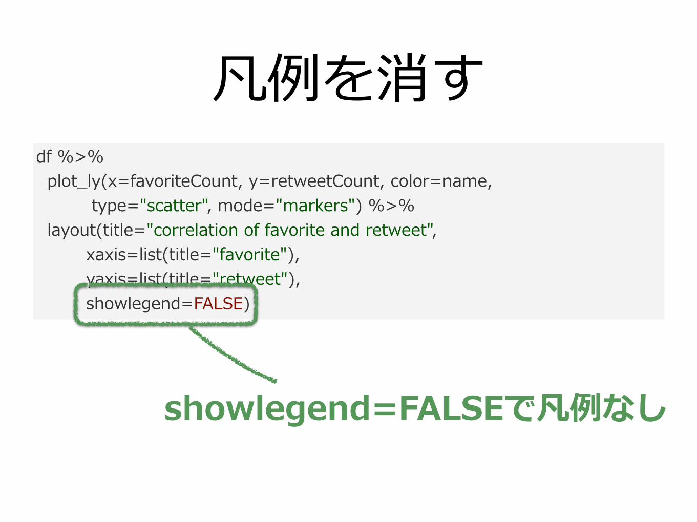
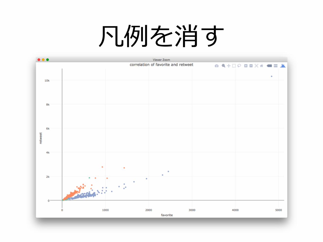
凡例を消すdf %>% plot_ly(x=favoriteCount, y=retweetCount, color=name, type="scatter", mode="markers") %>% layout(title="correlation of favorite and retweet", xaxis=list(title="favorite"), yaxis=list(title="retweet"), showlegend=FALSE)
showlegend=FALSEで凡例なし
凡例を消す
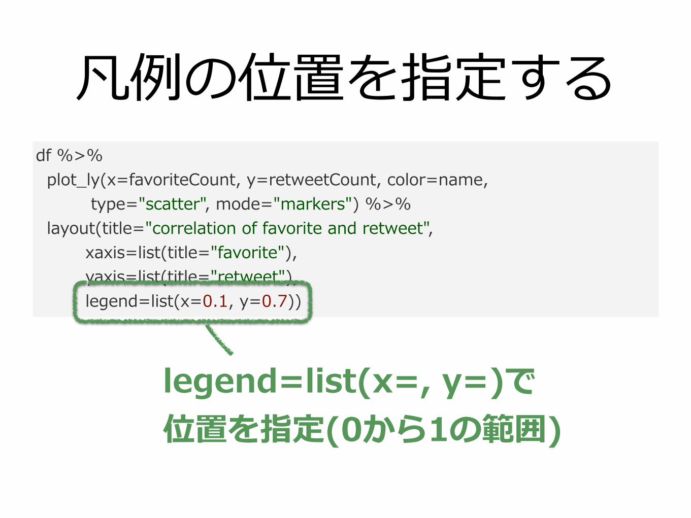
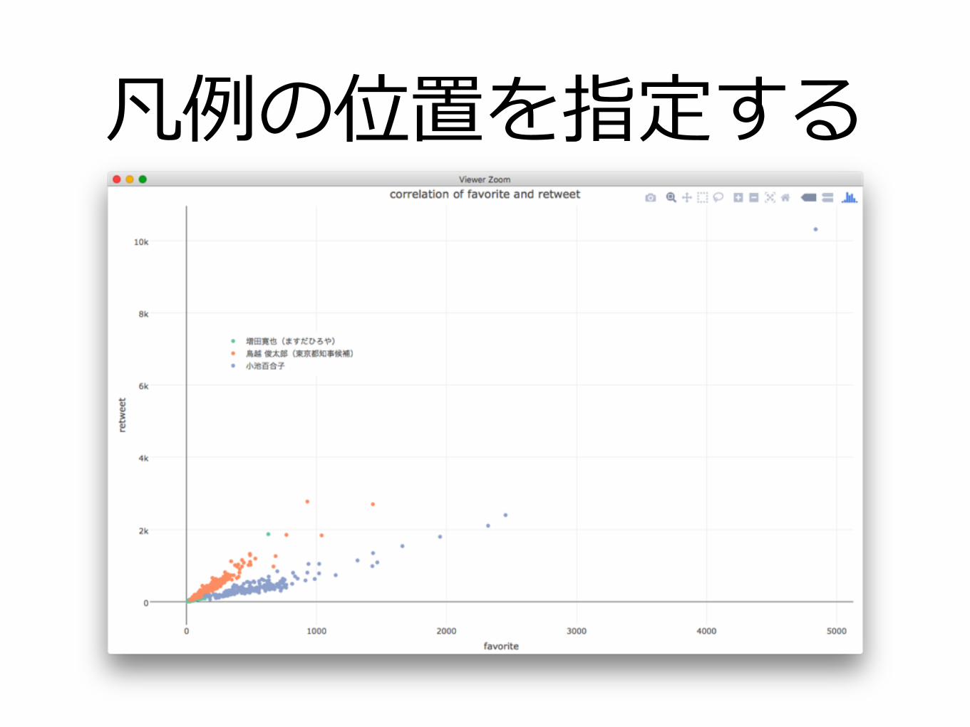
凡例の位置を指定するdf %>% plot_ly(x=favoriteCount, y=retweetCount, color=name, type="scatter", mode="markers") %>% layout(title="correlation of favorite and retweet", xaxis=list(title="favorite"), yaxis=list(title="retweet"), legend=list(x=0.1, y=0.7))
legend=list(x=, y=)で 位置を指定(0から1の範囲)
凡例の位置を指定する
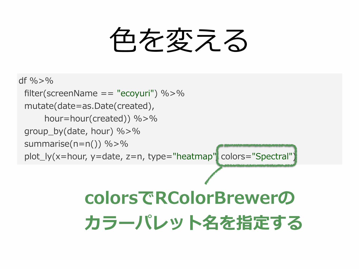
⾊を変えるdf %>% filter(screenName == "ecoyuri") %>% mutate(date=as.Date(created), hour=hour(created)) %>% group_by(date, hour) %>% summarise(n=n()) %>% plot_ly(x=hour, y=date, z=n, type="heatmap", colors="Spectral")
colorsでRColorBrewerの カラーパレット名を指定する
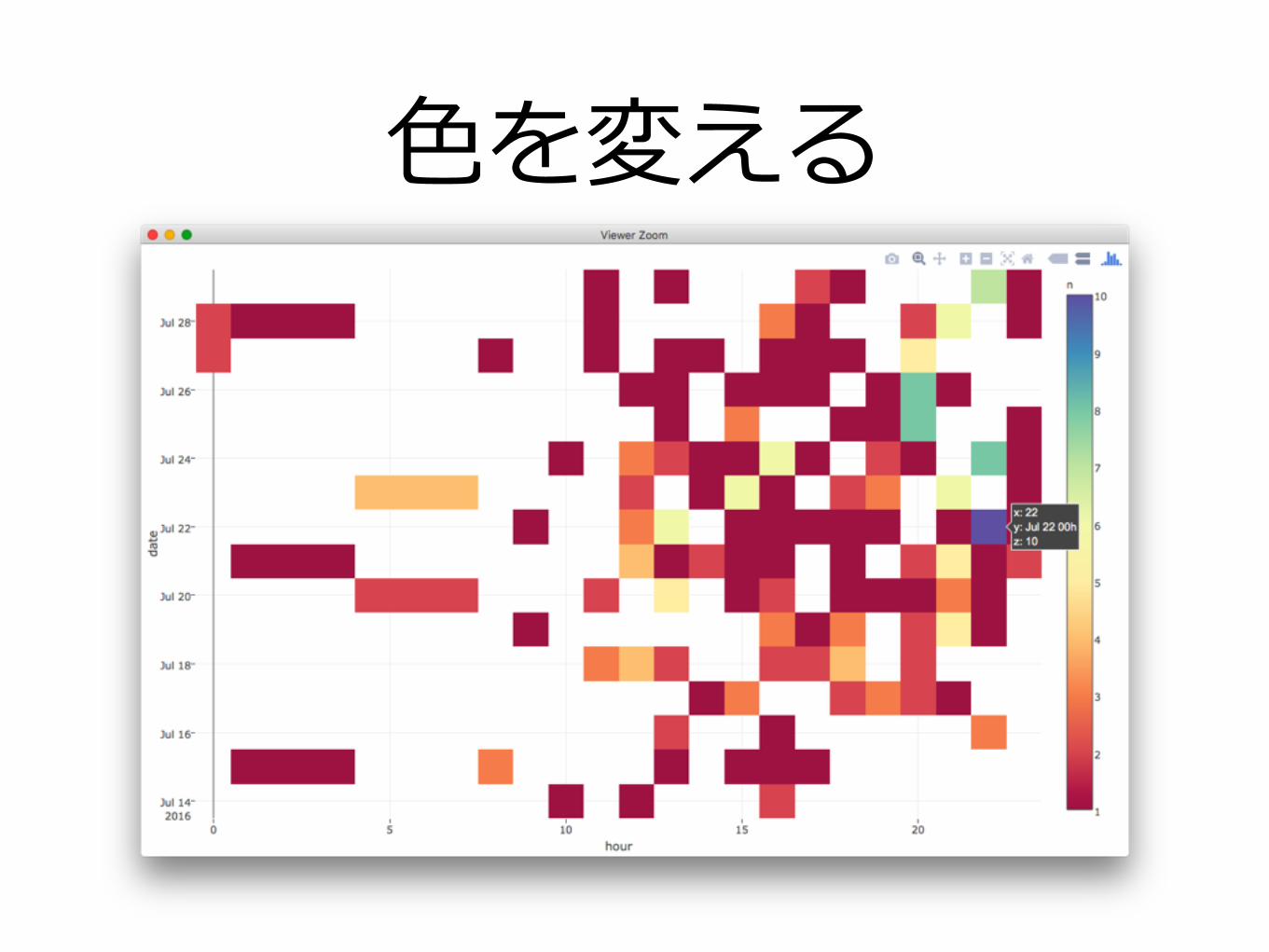
⾊を変える
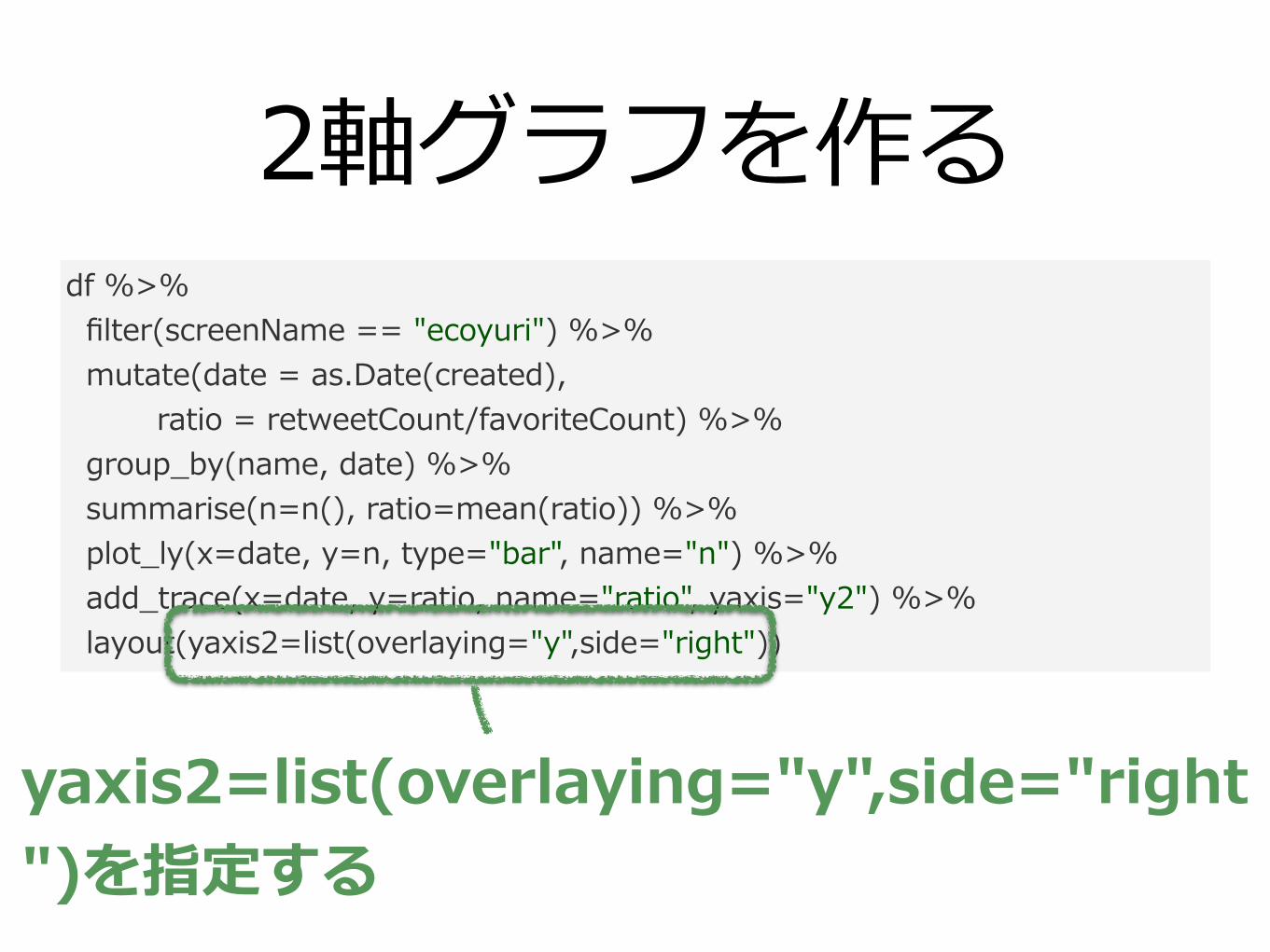
2軸グラフを作るdf %>% filter(screenName == "ecoyuri") %>% mutate(date = as.Date(created), ratio = retweetCount/favoriteCount) %>% group_by(name, date) %>% summarise(n=n(), ratio=mean(ratio)) %>% plot_ly(x=date, y=n, type="bar", name="n") %>% add_trace(x=date, y=ratio, name="ratio", yaxis="y2") %>% layout(yaxis2=list(overlaying="y",side="right"))
yaxis2=list(overlaying="y",side="right")を指定する
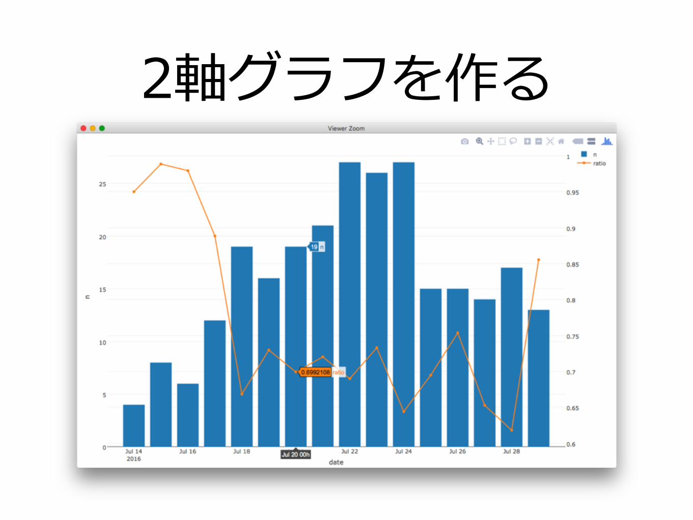
2軸グラフを作る
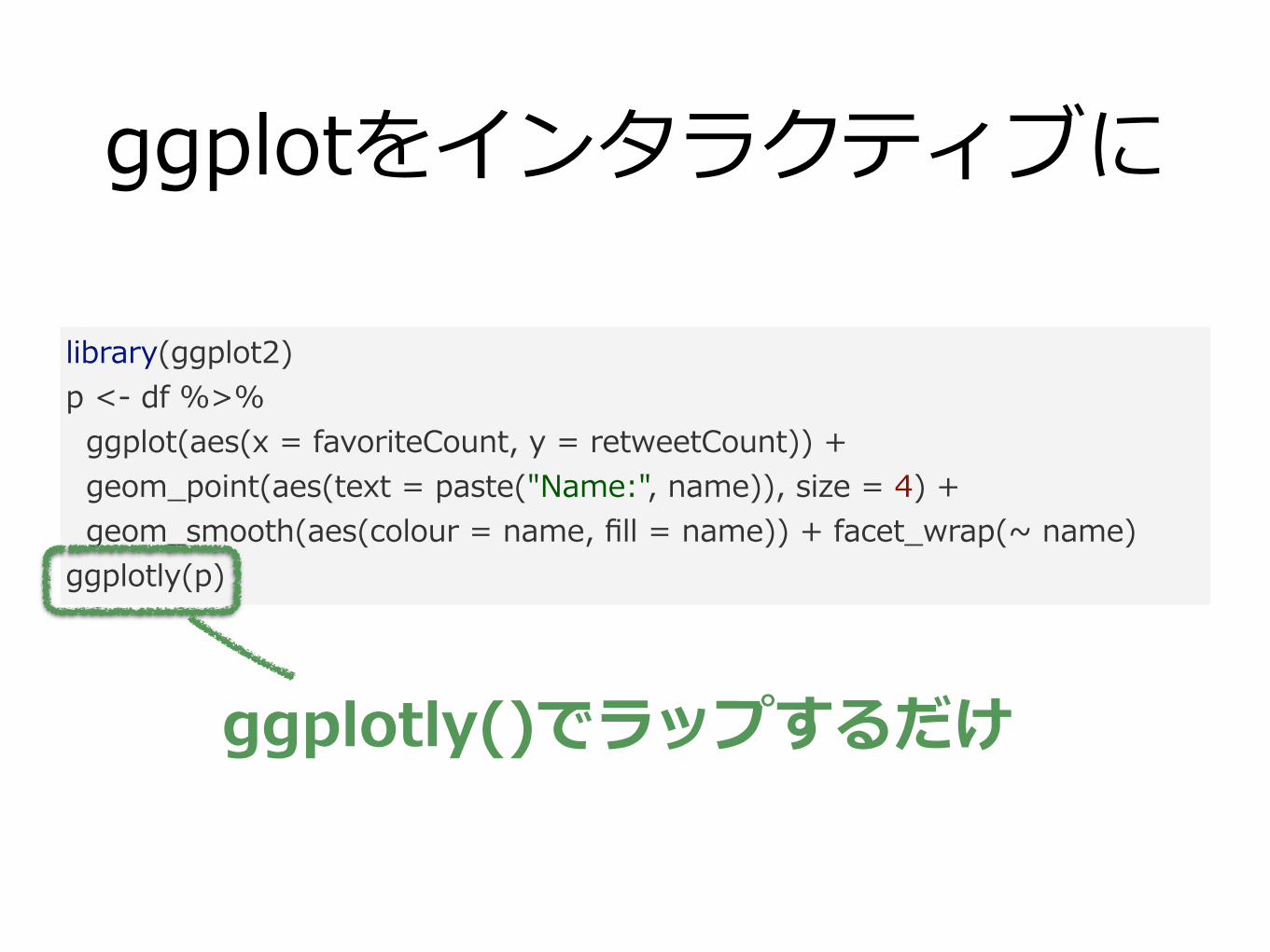
ggplotをインタラクティブに
library(ggplot2) p <- df %>% ggplot(aes(x = favoriteCount, y = retweetCount)) + geom_point(aes(text = paste("Name:", name)), size = 4) + geom_smooth(aes(colour = name, fill = name)) + facet_wrap(~ name) ggplotly(p)
ggplotly()でラップするだけ
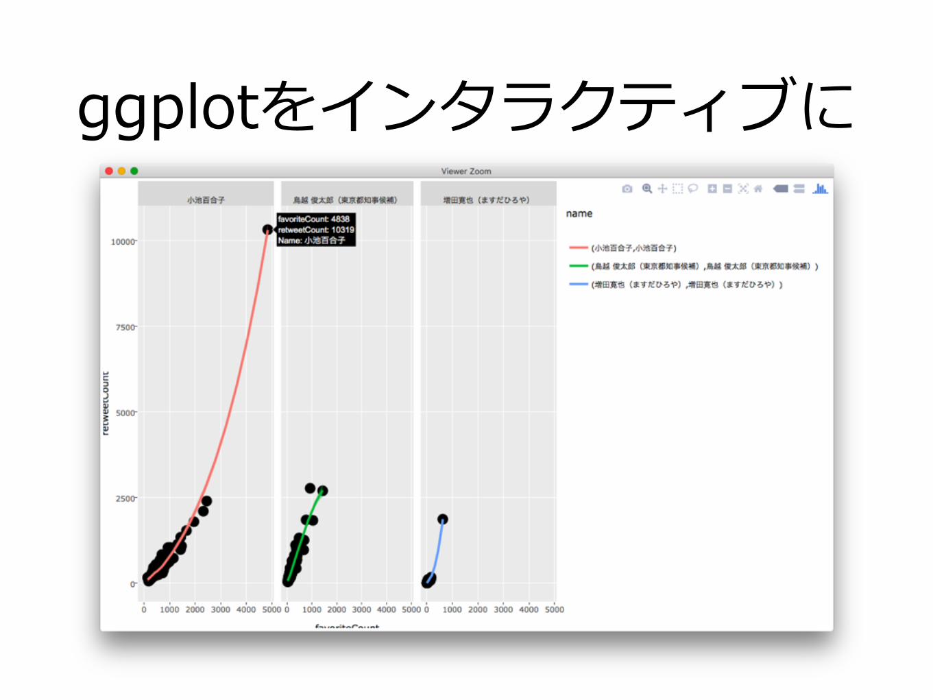
ggplotをインタラクティブに
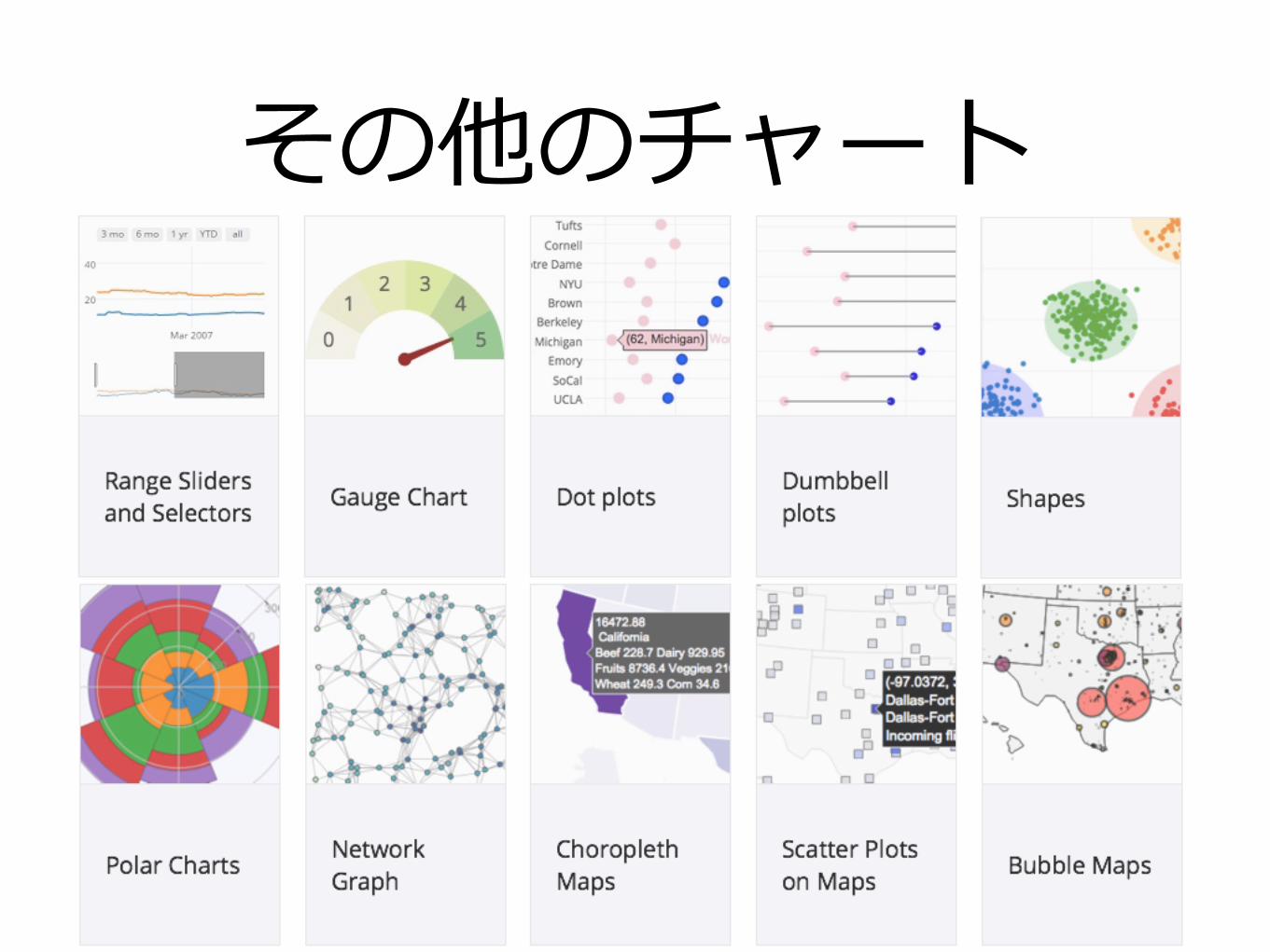
その他のチャート
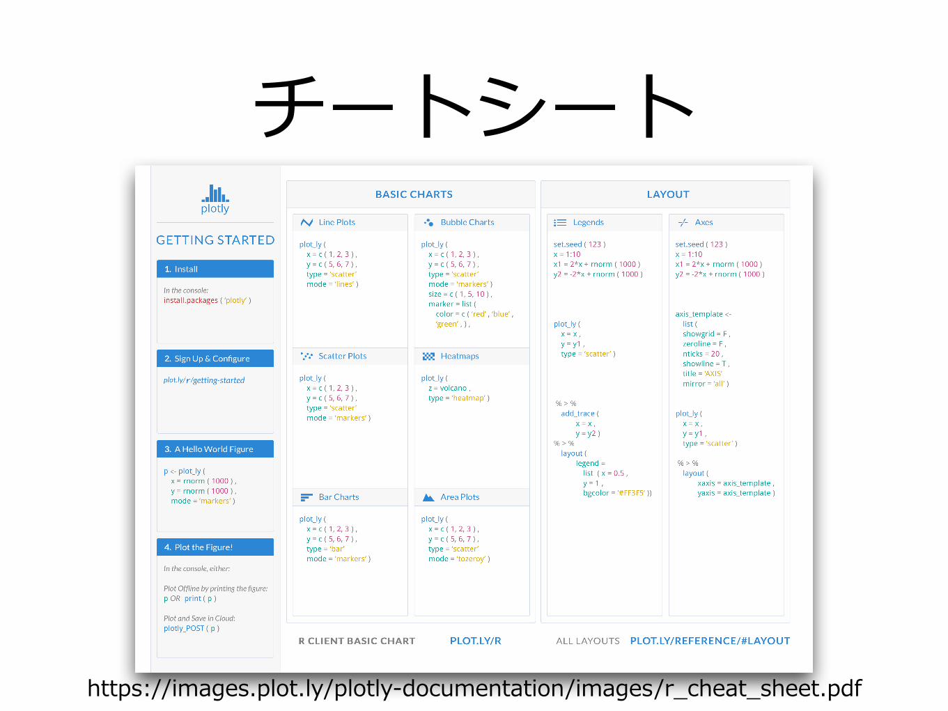
チートシート
https://images.plot.ly/plotly-documentation/images/r_cheat_sheet.pdf

まとめ

•plotlyデモ
•plotlyによるグラフの作成
•plotlyグラフの調整

おまけ

各候補者と単語の対応分析
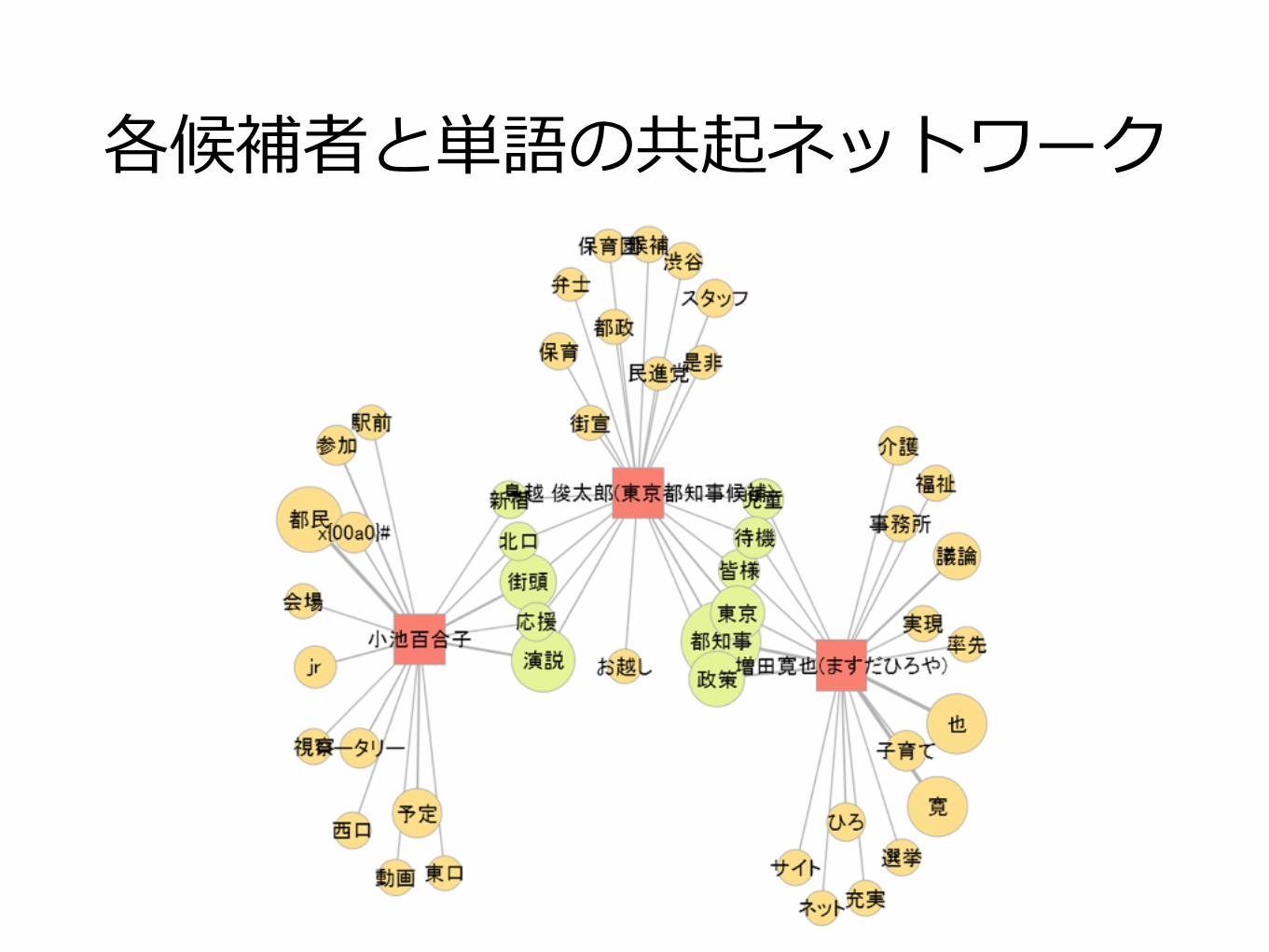
各候補者と単語の共起ネットワーク


![[GREE Tech Talk#10] ネットワークの可視化](https://img.pdfslide.tips/doc/110x75/58706db21a28ab48378b6dc3/gree-tech-talk10-.jpg)