Embed Size (px)
Citation preview

SKILLS
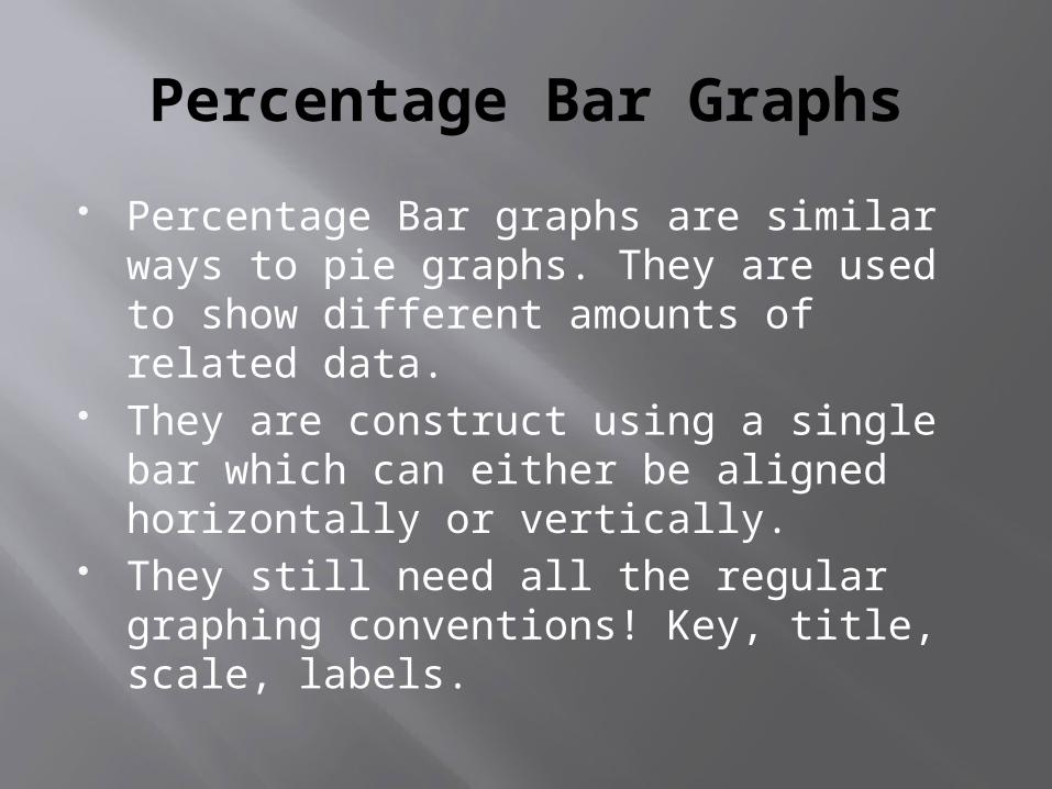
Percentage Bar Graphs
Percentage Bar graphs are similar ways to pie graphs. They are used to show different amounts of related data.
They are construct using a single bar which can either be aligned horizontally or vertically.
They still need all the regular graphing conventions! Key, title, scale, labels.
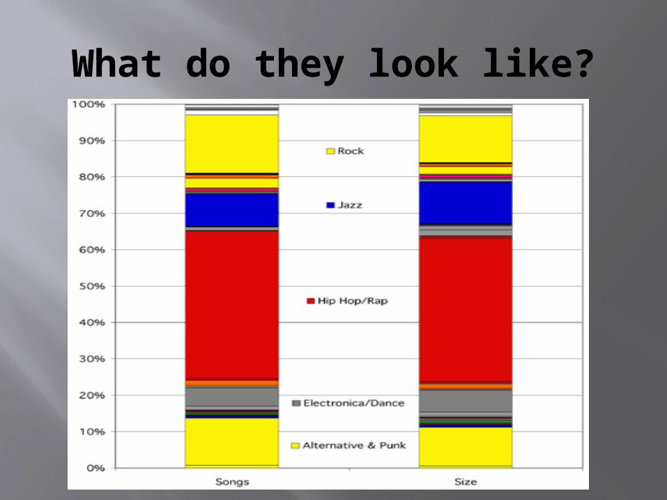
What do they look like?
Method
Give your bar graph a title. The title of the graph will be the same as the title of the table you are getting your data from.
Underline your title.
METHOD
Once you have sorted your data draw a bar. Depending on how much space you have and how much info you are going to put on it decides the size.
An easy way to do it is in multiples of ten as you can just take one decimal place off if needs be.
Method
At the bottom of the bar create a scale. The scale goes from 0 to 100 and increases in even MEASURED increments.
This requires you to put in a label. This label goes at the bottom of the graph and reads percent (%).
Then simply using your data you shade in the area each bit of data tells you i.e. if a piece of data is 15% you shade in 15% of your bar graph.
Method
Once you have filled in all the pieces of the percentage bar graph you will need a key.
Each symbol you use in the key has to be obviously different. Using completely different colours using coloured pencils is a good way to do this.
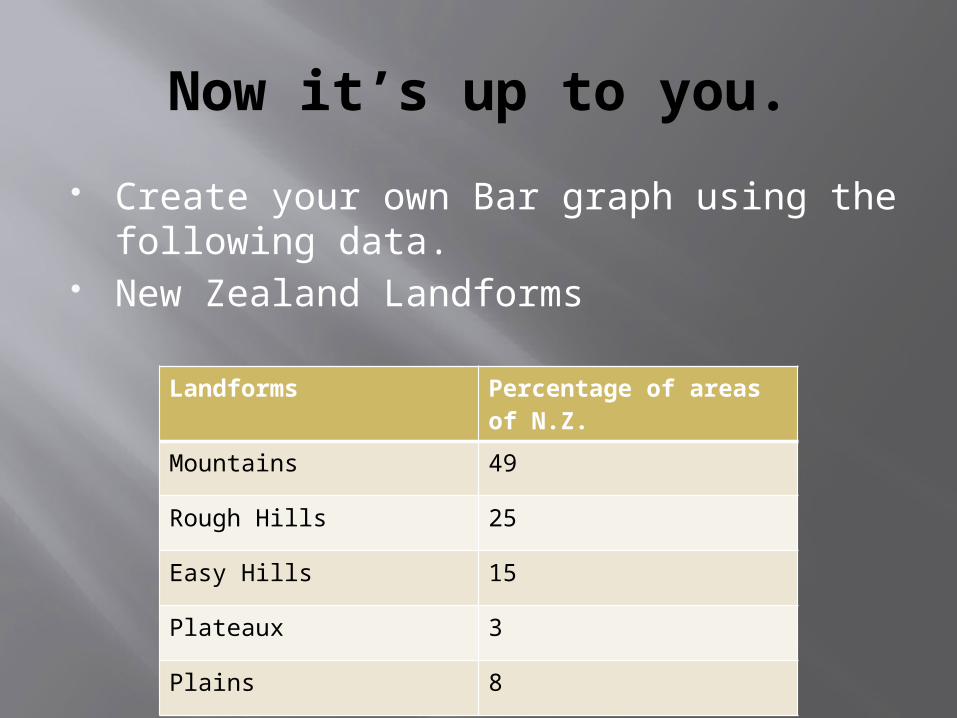
Now it’s up to you.
Create your own Bar graph using the following data.
New Zealand Landforms
Landforms Percentage of areas of N.Z.
Mountains 49
Rough Hills 25
Easy Hills 15
Plateaux 3
Plains 8
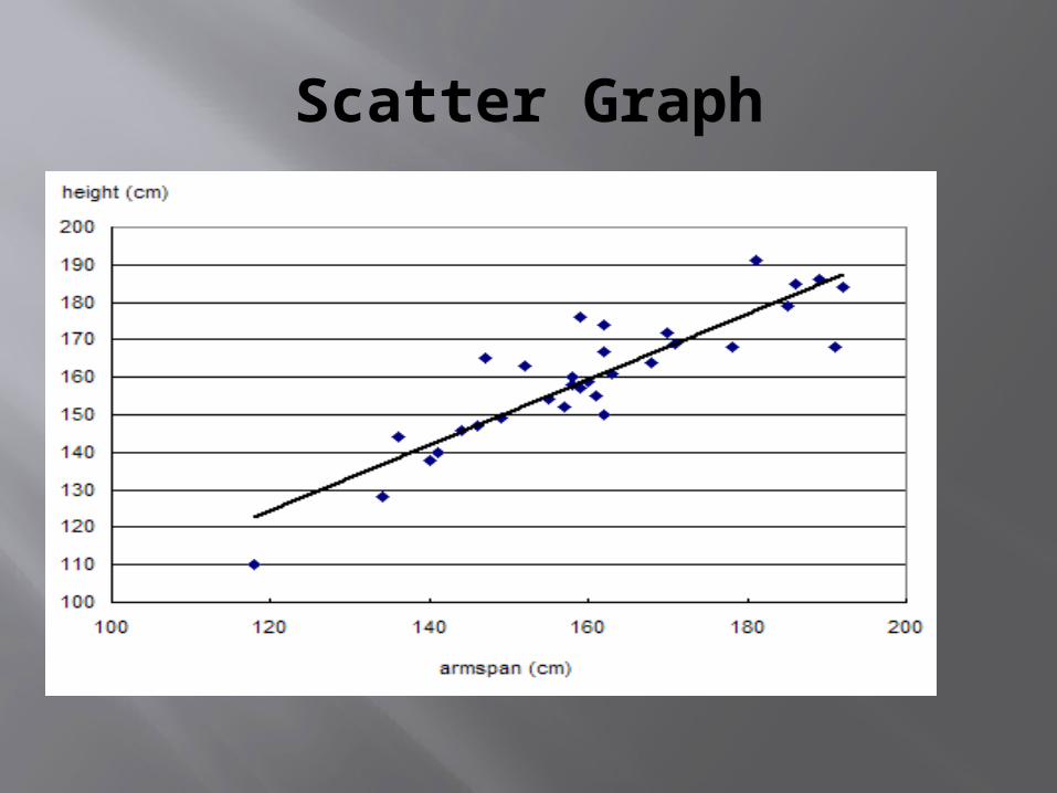
Scatter Graph.
Scatter graphs
Scatter graphs are very important tools to Geographers. They are used to show a relationship between Two
different sets of data. These two sets of data are called variables.
The relationships which can be found are Negative : As one variable increases the other decreases an example of this is as temperature increases electricity bills decrease
Positive: As one variable increases so does the other i.e. Population of a city increases so does the cities waste levels.
No Correlation where the variables have no relationship i.e. As the Weather gets hotter more people chew gum.
Scatter Graph
Scatter graph
Scattergraphs need all the normal graphing conventions these are of course.
Title, labelled axis, and they have to go up in even incriments.

How to make a scatter graph
Construct a Hypothesis this means try and predict what the data is going to show.
Data on Whiteboard. Now we have to data goes on which axis. This is done by placing the Dependant data on
the on the Y axis and… Placing the Independent data on the x axis. This may sound complicated but just remember
that the dependant data depends on the independent. The independent data however would exist without the dependant data
Scatter Graph
Next you fill out the axis like you would a normal line or bar graph making sure you go up in even increments. Also making sure you label both axis.
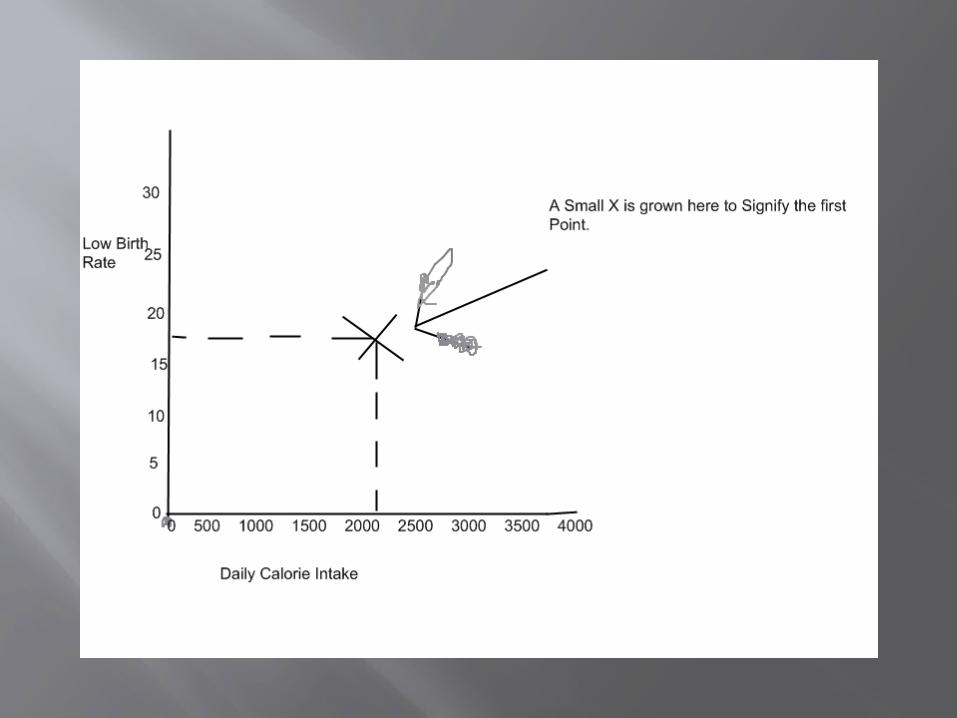
Now it is time to start plotting the point on our graph. To plot the graph you just line up the two points needed like….
Scatter Graph
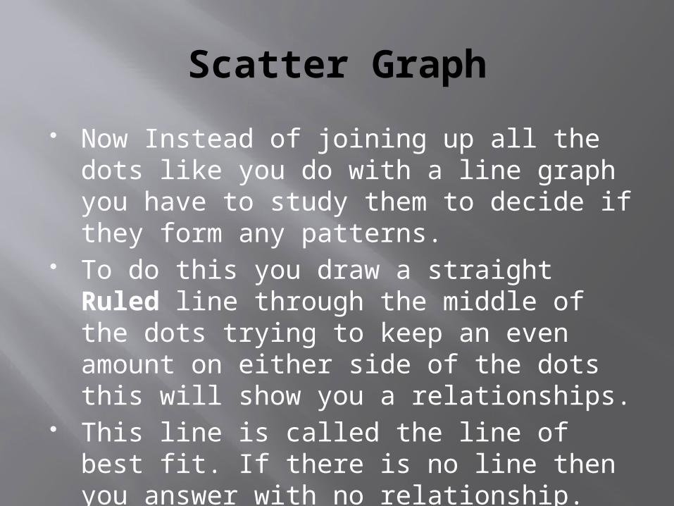
Now Instead of joining up all the dots like you do with a line graph you have to study them to decide if they form any patterns.
To do this you draw a straight Ruled line through the middle of the dots trying to keep an even amount on either side of the dots this will show you a relationships.
This line is called the line of best fit. If there is no line then you answer with no relationship.
Scatter graph
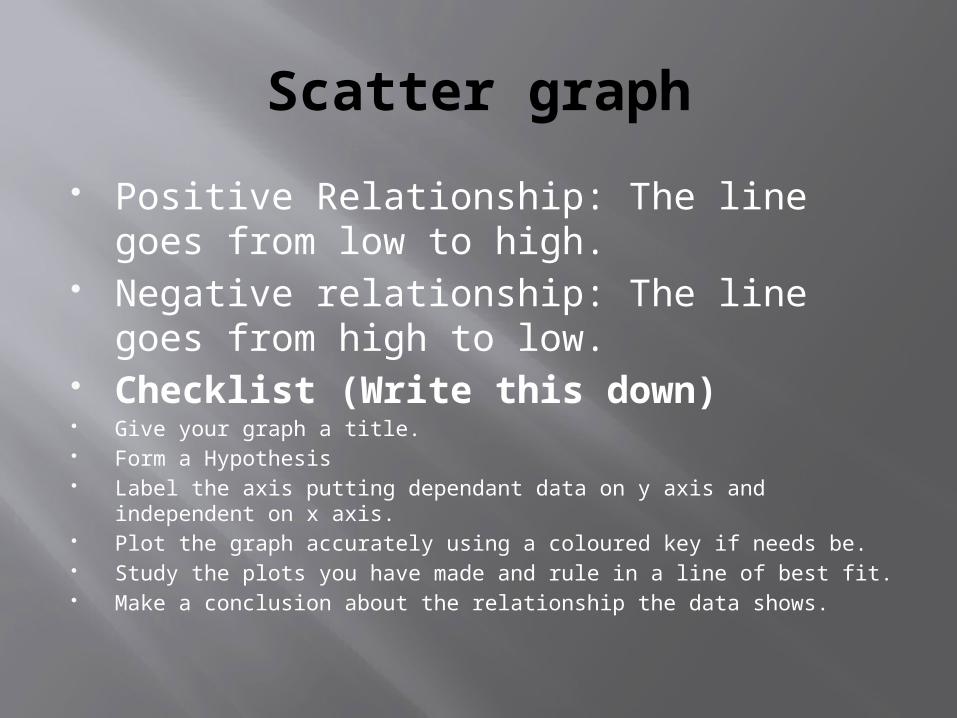
Positive Relationship: The line goes from low to high.
Negative relationship: The line goes from high to low.
Checklist (Write this down) Give your graph a title. Form a Hypothesis Label the axis putting dependant data on y axis and independent on x
axis. Plot the graph accurately using a coloured key if needs be. Study the plots you have made and rule in a line of best fit. Make a conclusion about the relationship the data shows.
Scatter graph
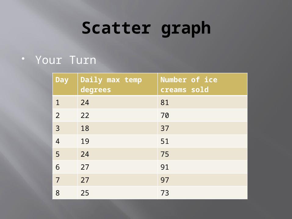
Your Turn
Day Daily max temp degrees
Number of ice creams sold
1 24 81
2 22 70
3 18 37
4 19 51
5 24 75
6 27 91
7 27 97
8 25 73

Pictographs
Pictographs
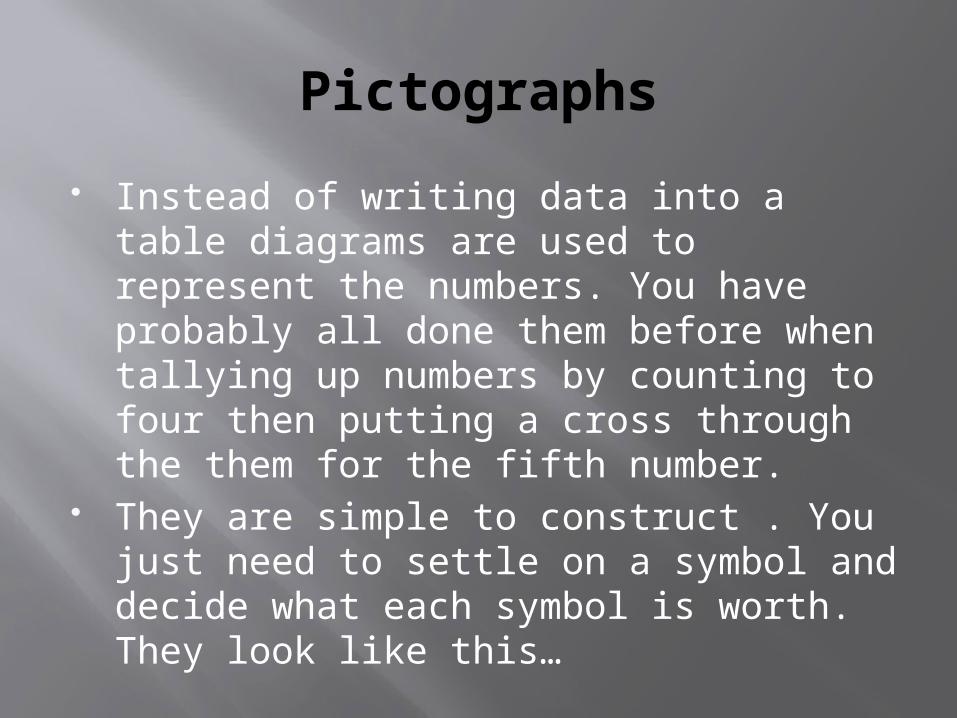
Instead of writing data into a table diagrams are used to represent the numbers. You have probably all done them before when tallying up numbers by counting to four then putting a cross through the them for the fifth number.
They are simple to construct . You just need to settle on a symbol and decide what each symbol is worth. They look like this…
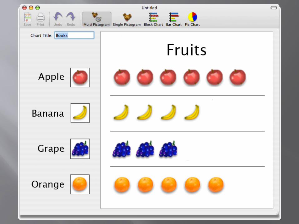
Pictographs
In the following slide each diagram of fruit represented one but if your give it a key it can represent different amounts.
Time for you to draw your own Pictograph.
SCALE
SCALE
Scale is something which once you know how to do is so easy! Every exam someone has a mind blank and forgets how to do it though.
Here is the remedy. Remember very seldom are maps drawn
the same size as the area they represent they in fact often are 50,000 times smaller.
SCALE
How to read a scale. On the map you are using there will be a
scale shown in some place. It will look like 1:5000 or 1:10000.
This means that for every 1cm you travel on your map is equal to 5000cm in real life.
So 1:10000 means? Usually they are done in measurements
which are the same as your rule i.e. 1cm=10km so using your ruler you can simply measure the distance and work it out.

Scale
Using pg 12 do activities: 4A,B Do activities using big map-
Grid Referencing
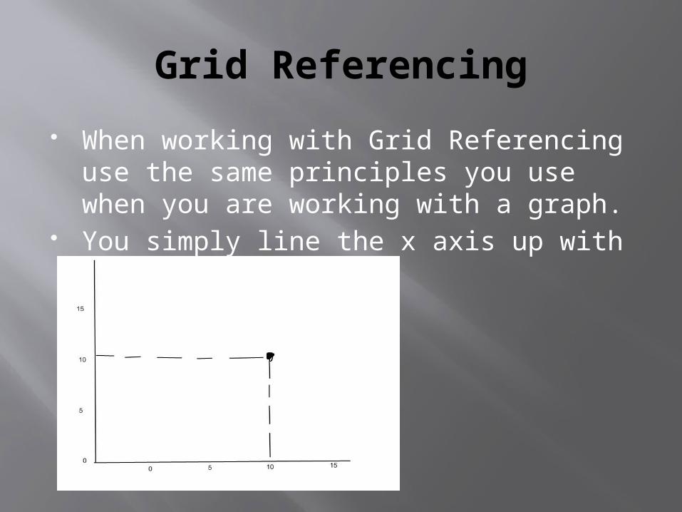
When working with Grid Referencing use the same principles you use when you are working with a graph.
You simply line the x axis up with the y axis.
Grid Referencing
Crawl before you Climb This means you always use the Easting's
which go from east to west first. When a grid reference is written they are written first.
Easting's go up and down on the page whereas nothings go from south to north.
On the whiteboard figure the grid reference:
0205,0101,0302,0203.
Grid Referencing
Now splitting each box into 10’s we can do 6 figure grid referencing.
Figure these grid references: 023,027 045,012 032,010 011,048
Grid Referencing
Find the following grid references using the large map provided.
The height at:139978 Height at: 394095 Feature at:308043 Feature at: 460130 What's at: 412022 210186 361102 480925 437912 415942 296026
Cross Sections
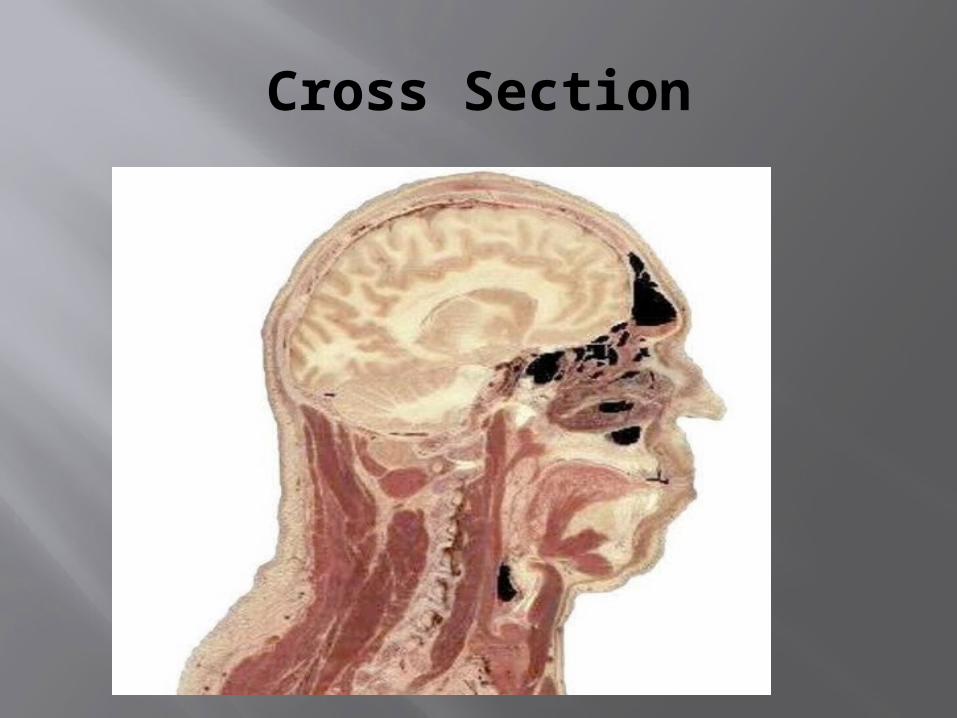
A cross section is an diagram which shows the actual altitude changes which on maps are shown by contour lines.
It is as if a giant knife has sliced so you can see the different layers and levels.
This is me standing side on to you as the class. If you cut me down the middle you would see what is inside me i.e. my organs my brain etc. The Cross section would look like…
Cross Section
Cross Section
You Draw cross sections by Figuring out which are the two site you want to draw the cross section of.
You mark this line X and Y. You then use another piece and mark where the
contour lines cut into the piece of paper. At each mark you have made you put in the
contour height. Now you draw a normal frame for your cross
section just like you would for a line graph. Remember it has to be as wide as the cross section on the x axis and as high on the Y axis.
Cont…
You then Mark out on the X axis the contour line points you have made and put a x at the height they went through your paper.
Now remember to not rule the lines between points instead draw a steady flow hand drawn line.
Shade in the area under the cross section.
Review
Mark an area X-Y. Use a piece of paper to mark the contour
lines. Put in each contour lines height. Draw up a frame should be as wide as the x-y
distance. Plot the cross section matching the contour
lines with the height on the axis. Draw in a line do not rule. Shade in underneath. Give it a title and labels!!!
Percentages.
To figure out percentages you use the formula:
n/total X 100 If the percentage we were trying to find
was 5 out of 10 the formula would look like..
5/10X100=50%
Median
To construct a mean you need to rank the data.
You then divide the number by two to find the half way point. For example there were 16 sets of data you divided it by two. This would give you 8. You will then find the 8th piece of data this is your median.

Mean
A mean is often called an average. To get the mean you add up all the
statistics given. You then divide them by the number of
sets of data. If all the information provide added up to
100. There are 10 sets of data which make this total then you simply divide 100 by 10 = 10
Mode
Mode is the number which occurs the most in any set of data.
Range
Rank data. Once data has been ranked you take the
highest number and subtract the lowest number this number is your range.