Embed Size (px)
Citation preview
BankAmeriDeals | Gen 2 Enhancements Usability Test Findings April 30 2012Usability Test Findings, April 30, 2012
Lisa R. Handalian,Usability EngineerUsability Engineer
San Francisco
Project Background/overviewBAmD, Gen 2 | Research Overview2
Eight usability test sessions were conducted on April 30, 2012 by a member of the eCommerce Research & Usability team. The one‐on‐one sessions (participant and
d ) l d i l 60 i hmoderator) lasted approximately 60 minutes each.
Participants were guided through a free‐form exploration using a high fidelity prototype of BankAmeriDeals functionality earmarked for both the August and the November 2012 releases.
All participants were required to have used OLB to access and manage their Bank of America deposit and debit and/or credit card accounts. (Participants were notof America deposit and debit and/or credit card accounts. (Participants were not excluded if they had accounts with other financial institutions.)
All were selected because they expressed interest in online offers and discounts and would have signed up for or redeemed an online offer within the pastand would have signed up for, or redeemed, an online offer within the past month. The participant grid is included before the Detailed Findings & Recommendations.
Bank of America ‐ confidential ‐ 2012
Project Background/overviewBAmD, Gen 2 | Learning Objectives & High Level Findings3
This study focused on the Select/Remove functionality on the Available screen, although other elements were also explored. Learning Objectives included understanding the following:
1. Do users understand what “hide” means / entails on the Available screen? Do they realize a deal was only being hidden from sight on the table and not removed from their card?
There was no confusion whatsoever as to what clicking the “hide” link would accomplish. Nor was there any interference with the use of “hide” on both the Available and the Credit Card Details screen.
2. Is hiding deals useful? And is it clear how to add them back to the list?
li h f d i bili fil li d h il hidi b h l d dIn light of an unexpected inability to filter, users relied heavily on hiding both selected and non‐selected deals. The “show hidden deals” link performed well, although several users were disappointed not to be able to view and cherry pick which ones to add back to their list. If the team wants to explore filtering and/or cherry picking hidden deals for a future l h i d drelease, research is recommended.
3. Does it make sense, or is it confusing, to hide offers that have already been selected? Is it likely that they would?
U d fi it l i t d b i bl t hid l t d d l Wh t d th iUsers definitely appreciated being able to hide selected deals. When presented the version where the hide link was removed, they expressed a strong desire to have it back because it helped them control and personalize their list in a way that was logical for them.
Bank of America ‐ confidential ‐ 2012
Project Background/overviewBAmD, Gen 2 | Learning Objectives & High Level Findings, cont.4
4. Does the “module” function as intended, and is it well‐received?
The prototype rendered the module fly‐out realistically, and it provided information that the users were looking for on the Available screen. Some were dissatisfied that they had to g yselect a deal in order to get this information, though, and most expected clicking on the logo would take them to the merchant website. On the AO screen the reaction to the “advertising” was extremely unfavorable. No one clicked on it on the AO until asked.
d l h hid b i d i ?5. Do users expect deals they hide to be carried across sessions?
Absolutely. Although this question was only posed in the four afternoon sessions, users’ vehemence was a strong predictor of dissatisfaction without that persistence.
6 W ld t t i l t t i i d l th h hidd ?6. Would users ever want to receive alerts containing deals they have hidden?
Users were very clear that they did not want to receive alerts for unselected deals that they hid (because they weren’t relevant to them). However, they did expect to receive alerts for deals they had selected but hidden (for list organization purposes).
7. Are design elements like iconography, visual language, and labeling effective?
Since the LLD wireframes had yet to receive finished visual design, certain elements require fine tuning, including the sorting parameter widgets and the lack of a round hide icon.
Labeling can also be improved somewhat, namely the confusing use of “offers” rather than “merchant.” Examples and recommendations are included in the Detailed Findings section.
Bank of America ‐ confidential ‐ 2012
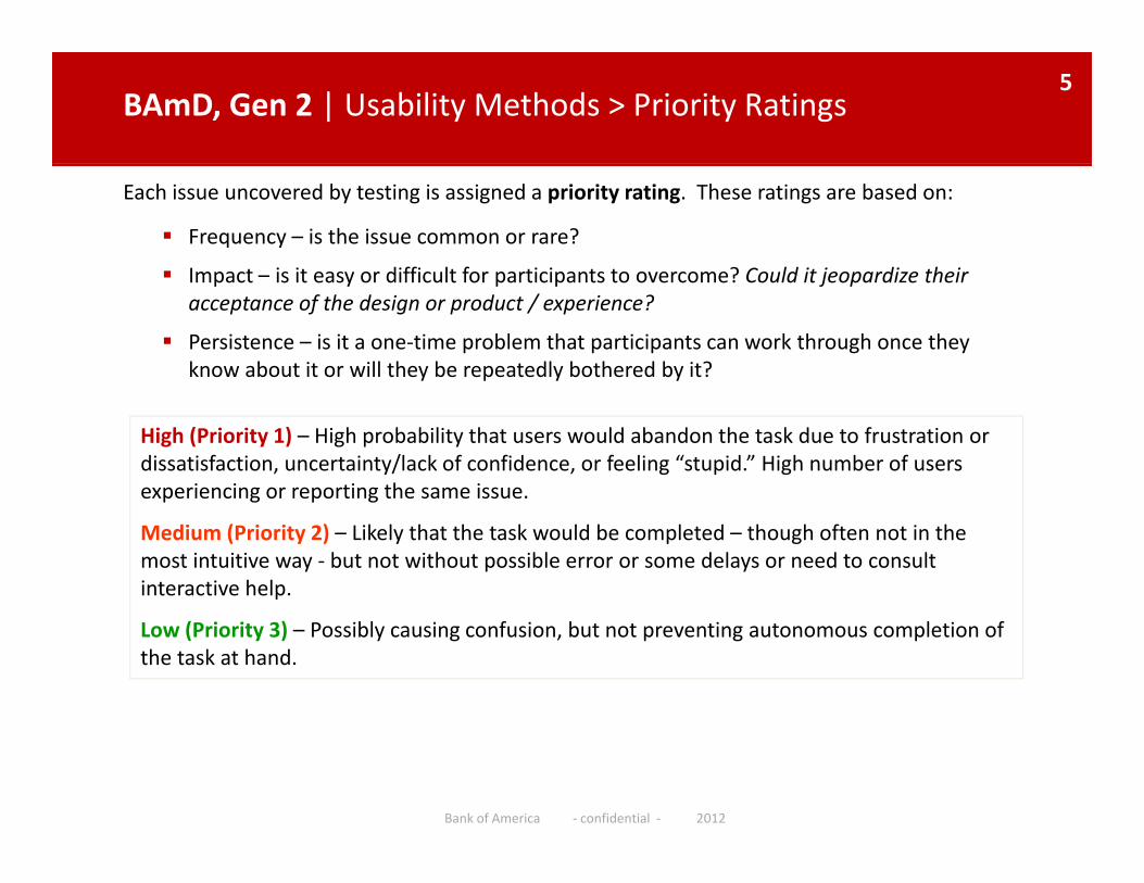
BAmD, Gen 2 | Usability Methods > Priority Ratings5
Each issue uncovered by testing is assigned a priority rating. These ratings are based on:
Frequency – is the issue common or rare?
Impact is it easy or difficult for participants to overcome? Could it jeopardize their Impact – is it easy or difficult for participants to overcome? Could it jeopardize their acceptance of the design or product / experience?
Persistence – is it a one‐time problem that participants can work through once they know about it or will they be repeatedly bothered by it?
High (Priority 1) – High probability that users would abandon the task due to frustration or dissatisfaction, uncertainty/lack of confidence, or feeling “stupid.” High number of users experiencing or reporting the same issue.experiencing or reporting the same issue.
Medium (Priority 2) – Likely that the task would be completed – though often not in the most intuitive way ‐ but not without possible error or some delays or need to consult interactive help.
Low (Priority 3) – Possibly causing confusion, but not preventing autonomous completion of the task at hand.
Bank of America ‐ confidential ‐ 2012
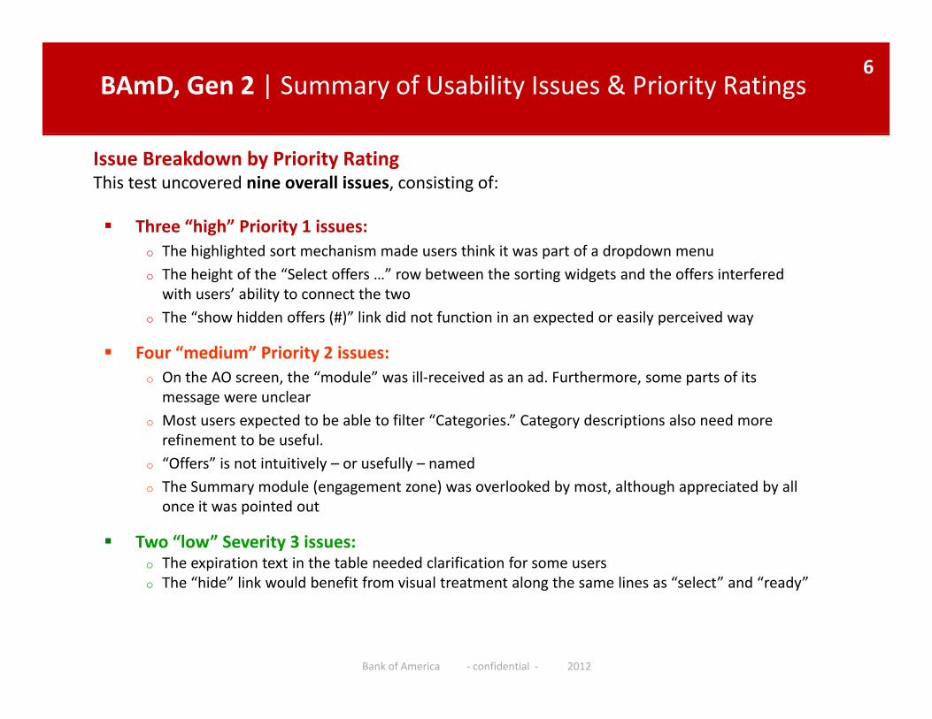
BAmD, Gen 2 | Summary of Usability Issues & Priority Ratings6
Issue Breakdown by Priority RatingThis test uncovered nine overall issues, consisting of:
Three “high” Priority 1 issues: Three “high” Priority 1 issues: o The highlighted sort mechanism made users think it was part of a dropdown menuo The height of the “Select offers …” row between the sorting widgets and the offers interfered with users’ ability to connect the twoTh “ h hidd ff (#)” li k did t f ti i t d il i do The “show hidden offers (#)” link did not function in an expected or easily perceived way
Four “medium” Priority 2 issues:o On the AO screen, the “module” was ill‐received as an ad. Furthermore, some parts of its message were unclear
o Most users expected to be able to filter “Categories.” Category descriptions also need more refinement to be useful.
o “Offers” is not intuitively – or usefully – namedo The Summary module (engagement zone) was overlooked by most, although appreciated by all once it was pointed out
Two “low” Severity 3 issues:o The expiration text in the table needed clarification for some userso The “hide” link would benefit from visual treatment along the same lines as “select” and “ready”o The hide link would benefit from visual treatment along the same lines as select and ready
Bank of America ‐ confidential ‐ 2012
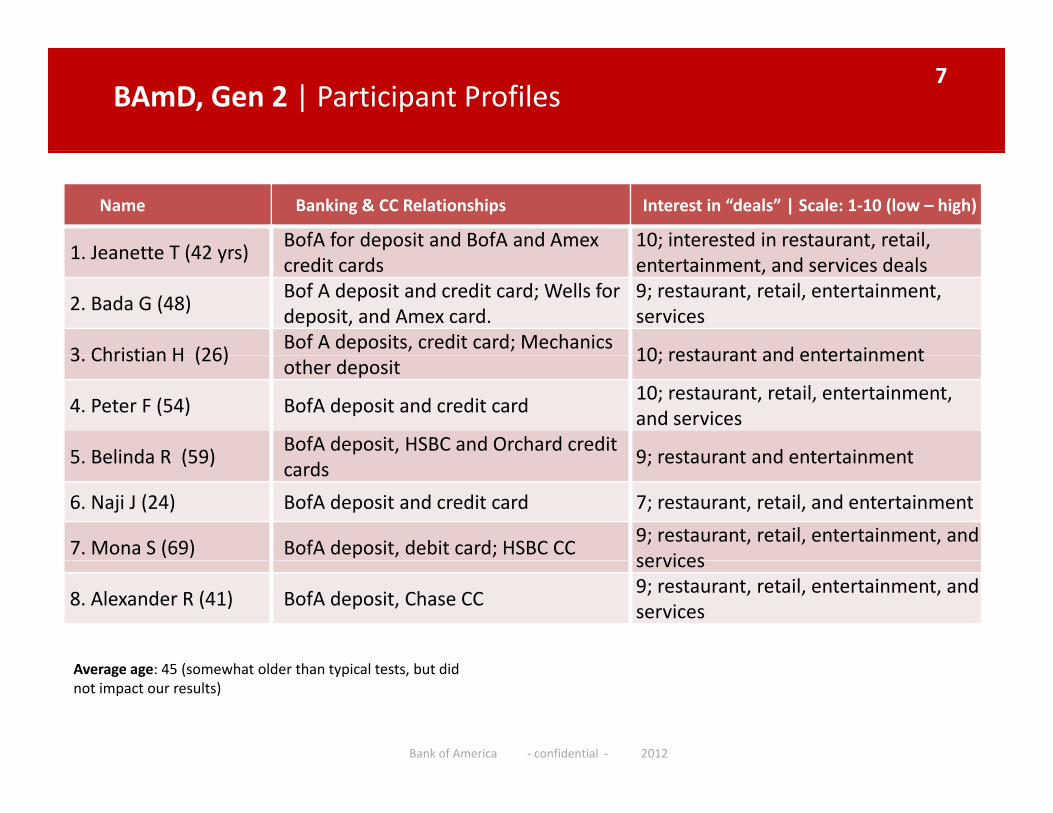
BAmD, Gen 2 | Participant Profiles7
Name Banking & CC Relationships Interest in “deals” | Scale: 1‐10 (low – high)
1 Jeanette T (42 yrs)BofA for deposit and BofA and Amex 10; interested in restaurant, retail,
1. Jeanette T (42 yrs)credit cards entertainment, and services deals
2. Bada G (48)Bof A deposit and credit card; Wells for deposit, and Amex card.
9; restaurant, retail, entertainment, services
3 Christian H (26)Bof A deposits, credit card; Mechanics
10; restaurant and entertainment3. Christian H (26)other deposit
10; restaurant and entertainment
4. Peter F (54) BofA deposit and credit card10; restaurant, retail, entertainment, and services
5 Belinda R (59)BofA deposit, HSBC and Orchard credit
9; restaurant and entertainment5. Belinda R (59)cards
9; restaurant and entertainment
6. Naji J (24) BofA deposit and credit card 7; restaurant, retail, and entertainment
7. Mona S (69) BofA deposit, debit card; HSBC CC9; restaurant, retail, entertainment, and servicesservices
8. Alexander R (41) BofA deposit, Chase CC9; restaurant, retail, entertainment, and services
(Average age: 45 (somewhat older than typical tests, but did not impact our results)
Bank of America ‐ confidential ‐ 2012
DETAILED FINDINGS & RECOMMENDATIONS
Bank of America ‐ confidential ‐ 2012
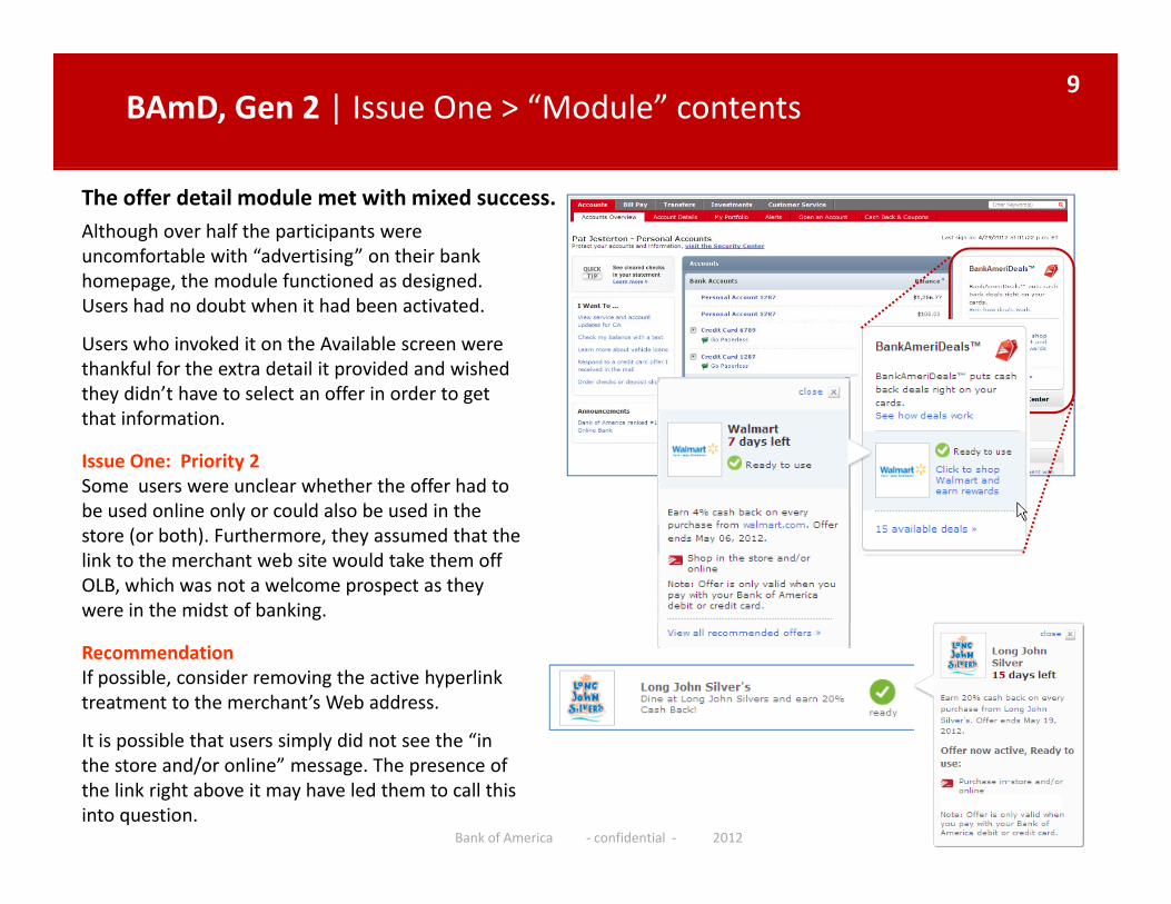
BAmD, Gen 2 | Issue One > “Module” contents 9
Although over half the participants were uncomfortable with “advertising” on their bank homepage the module functioned as designed
The offer detail module met with mixed success.
homepage, the module functioned as designed. Users had no doubt when it had been activated.
Users who invoked it on the Available screen were thankful for the extra detail it provided and wished they didn’t have to select an offer in order to getthey didn t have to select an offer in order to get that information.
Issue One: Priority 2 Some users were unclear whether the offer had to be used online only or could also be used in thebe used online only or could also be used in the store (or both). Furthermore, they assumed that the link to the merchant web site would take them off OLB, which was not a welcome prospect as they were in the midst of banking.
RecommendationIf possible, consider removing the active hyperlink treatment to the merchant’s Web address.
It is possible that users simply did not see the “inIt is possible that users simply did not see the “in the store and/or online” message. The presence of the link right above it may have led them to call this into question.
Bank of America ‐ confidential ‐ 2012
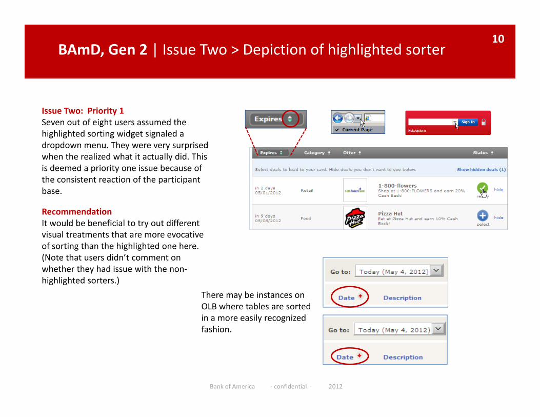
BAmD, Gen 2 | Issue Two > Depiction of highlighted sorter 10
Issue Two: Priority 1 Seven out of eight users assumed the highlighted sorting widget signaled a dropdown menu. They were very surprised when the realized what it actually did. This is deemed a priority one issue because of the consistent reaction of the participantthe consistent reaction of the participant base.
RecommendationIt would be beneficial to try out different visual treatments that are more evocativevisual treatments that are more evocative of sorting than the highlighted one here. (Note that users didn’t comment on whether they had issue with the non‐highlighted sorters.)
There may be instances on OLB where tables are sorted in a more easily recognized fashion.
Bank of America ‐ confidential ‐ 2012
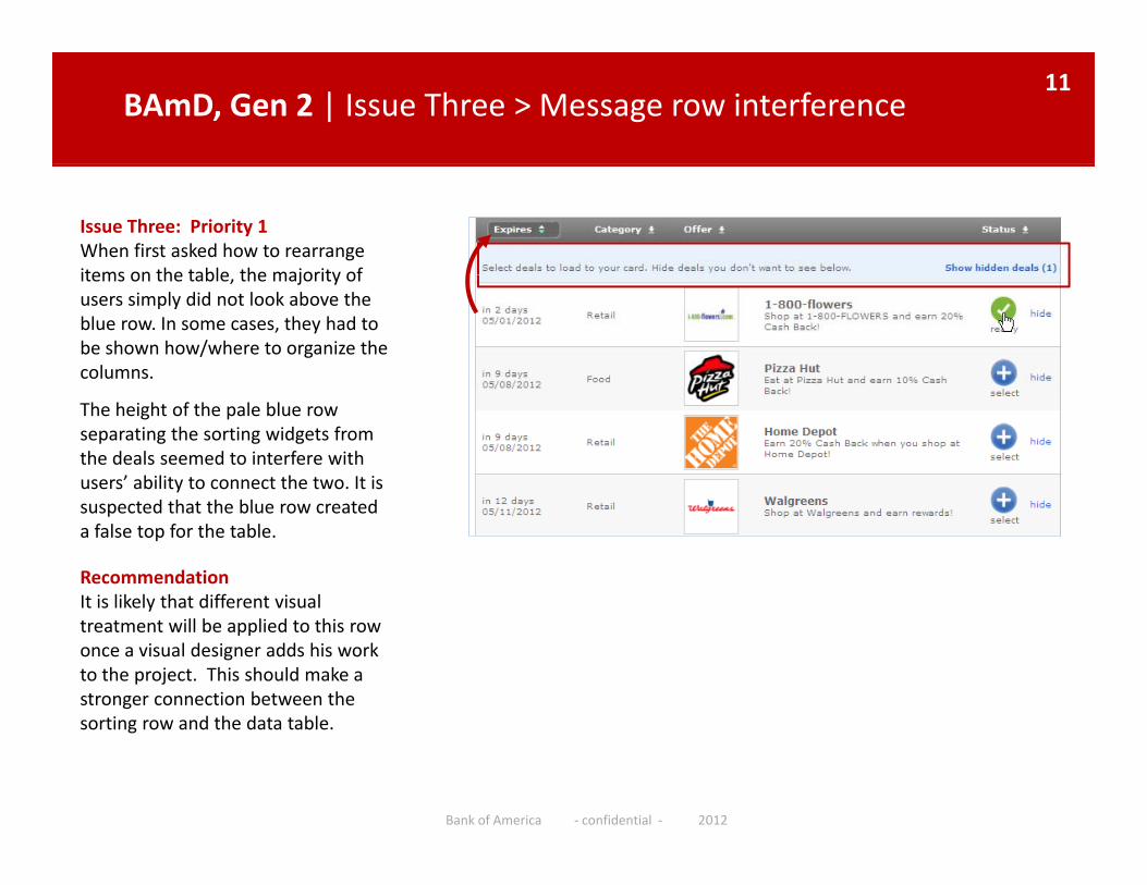
BAmD, Gen 2 | Issue Three > Message row interference11
Issue Three: Priority 1 When first asked how to rearrange items on the table the majority ofitems on the table, the majority of users simply did not look above the blue row. In some cases, they had to be shown how/where to organize the columns.
The height of the pale blue row separating the sorting widgets from the deals seemed to interfere with users’ ability to connect the two. It is suspected that the blue row created a false top for the table.
RecommendationIt is likely that different visual ytreatment will be applied to this row once a visual designer adds his work to the project. This should make a stronger connection between the sorting row and the data tablesorting row and the data table.
Bank of America ‐ confidential ‐ 2012
BAmD, Gen 2 | Issues Four & Five > Sorting labels and actions 12
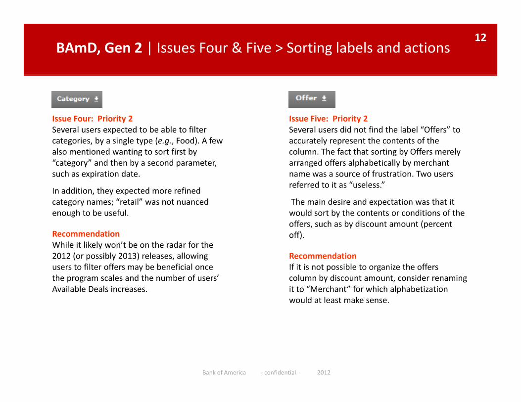
Issue Five: Priority 2 Issue Four: Priority 2Several users did not find the label “Offers” to accurately represent the contents of the column. The fact that sorting by Offers merely arranged offers alphabetically by merchant name was a source of frustration. Two users
Several users expected to be able to filter categories, by a single type (e.g., Food). A few also mentioned wanting to sort first by “category” and then by a second parameter, such as expiration date. name was a source of frustration. Two users
referred to it as “useless.”
The main desire and expectation was that it would sort by the contents or conditions of the offers, such as by discount amount (percent
such as expiration date.
In addition, they expected more refined category names; “retail” was not nuanced enough to be useful.
offers, such as by discount amount (percent off).
RecommendationIf it is not possible to organize the offers column by discount amount consider renaming
RecommendationWhile it likely won’t be on the radar for the 2012 (or possibly 2013) releases, allowing users to filter offers may be beneficial once the program scales and the number of users’ column by discount amount, consider renaming
it to “Merchant” for which alphabetization would at least make sense.
the program scales and the number of users Available Deals increases.
Bank of America ‐ confidential ‐ 2012
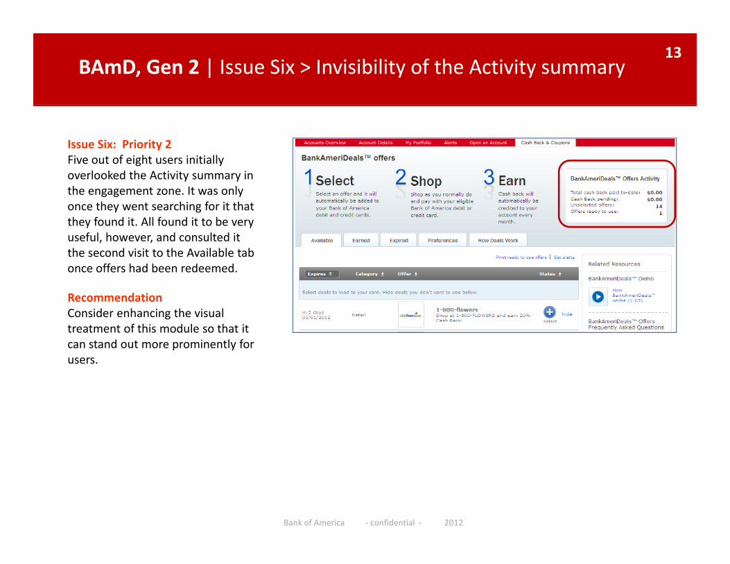
BAmD, Gen 2 | Issue Six > Invisibility of the Activity summary 13
Issue Six: Priority 2Five out of eight users initially overlooked the Activity summary inoverlooked the Activity summary in the engagement zone. It was only once they went searching for it that they found it. All found it to be very useful, however, and consulted it the second visit to the Available tab once offers had been redeemed.
RecommendationConsider enhancing the visual gtreatment of this module so that it can stand out more prominently for users.
Bank of America ‐ confidential ‐ 2012
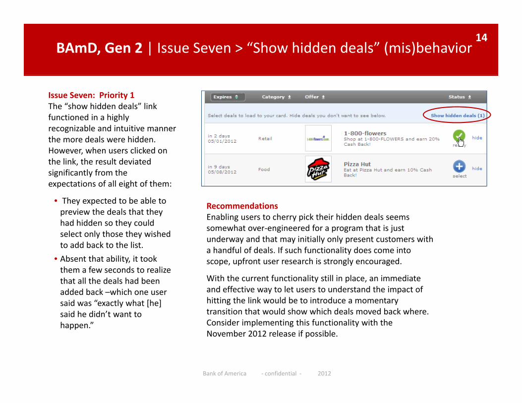
BAmD, Gen 2 | Issue Seven > “Show hidden deals” (mis)behavior 14
Issue Seven: Priority 1The “show hidden deals” link functioned in a highly
i bl d i i irecognizable and intuitive manner the more deals were hidden. However, when users clicked on the link, the result deviated significantly from the g yexpectations of all eight of them:
• They expected to be able to preview the deals that they had hidden so they could
RecommendationsEnabling users to cherry pick their hidden deals seems somewhat over engineered for a program that is justy
select only those they wished to add back to the list.
• Absent that ability, it took them a few seconds to realize h ll h d l h d b
somewhat over‐engineered for a program that is just underway and that may initially only present customers with a handful of deals. If such functionality does come into scope, upfront user research is strongly encouraged.
With the current functionality still in place an immediatethat all the deals had been added back –which one user said was “exactly what [he] said he didn’t want to happen.”
With the current functionality still in place, an immediate and effective way to let users to understand the impact of hitting the link would be to introduce a momentary transition that would show which deals moved back where. Consider implementing this functionality with the
Bank of America ‐ confidential ‐ 2012
ppNovember 2012 release if possible.
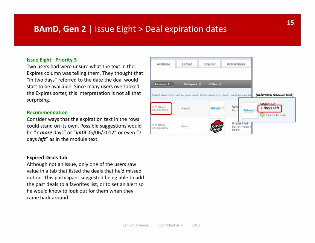
BAmD, Gen 2 | Issue Eight > Deal expiration dates15
Issue Eight: Priority 3Two users had were unsure what the text in the Expires column was telling them. They thought that p g y g“in two days” referred to the date the deal would start to be available. Since many users overlooked the Expires sorter, this interpretation is not all that surprising.
(activated module text)
RecommendationConsider ways that the expiration text in the rows could stand on its own. Possible suggestions would be “7 more days” or “until 05/06/2012” or even “7 days left” as in the module text.
Expired Deals TabAlthough not an issue, only one of the users saw value in a tab that listed the deals that he’d missed out on. This participant suggested being able to add the past deals to a favorites list, or to set an alert so he would know to look out for them when they came back around
Bank of America ‐ confidential ‐ 2012
came back around.
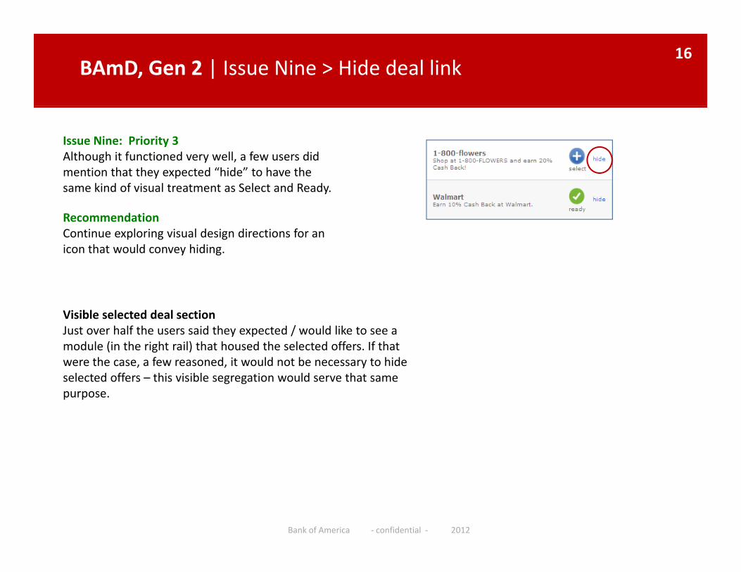
BAmD, Gen 2 | Issue Nine > Hide deal link16
Issue Nine: Priority 3Although it functioned very well, a few users did mention that they expected “hide” to have the y psame kind of visual treatment as Select and Ready.
RecommendationContinue exploring visual design directions for an icon that would convey hidingicon that would convey hiding.
Visible selected deal sectionJust over half the users said they expected / would like to see a module (in the right rail) that housed the selected offers. If that were the case, a few reasoned, it would not be necessary to hide selected offers – this visible segregation would serve that same purposepurpose.
Bank of America ‐ confidential ‐ 2012
Thank You!17
Please feel free to contact me with any follow up questions:
Tel. 415.436.5720
The link to the Discovery folder containing this report and the supporting usability documentation is:supporting usability documentation is:
http://discovery.bankofamerica.com/Discovery/livelink?func=ll&objid=75955642&objAction=browse&sort=name
Bank of America ‐ confidential ‐ 2012