Embed Size (px)
Citation preview
CLIMATE CHANGE AND SEA LEVEL RISE SCENARIOS FOR CALIFORNIA VULNERABILITY AND ADAPTATION ASSESSMENT A White Paper from the California Energy Commission’s California Climate Change Center
Prepared for: California Energy Commission
Prepared by: Scripps Institution of Oceanography
JULY 2012
CEC ‐500 ‐2012 ‐008
Dan Cayan
Mary Tyree
David Pierce
Tapash Das
Scripps Institution of Oceanography
DISCLAIMER This paper was prepared as the result of work sponsored by the California Energy Commission. It does not necessarily represent the views of the Energy Commission, its employees or the State of California. The Energy Commission, the State of California, its employees, contractors and subcontractors make no warrant, express or implied, and assume no legal liability for the information in this paper; nor does any party represent that the uses of this information will not infringe upon privately owned rights. This paper has not been approved or disapproved by the California Energy Commission nor has the California Energy Commission passed upon the accuracy or adequacy of the information in this paper.
ACKNOWLEDGEMENTS
Support for Dan Cayan, Mary Tyree, and David Pierce was provided by the State of California through the California Energy Commission’s Public Interest Energy Research (PIER) Program. Dan Cayan and Mary Tyree were also supported by the National Oceanic and Atmospheric Administration’s Regional Integrated Sciences and Assessments (RISA) Program and through the California Nevada Applications Center. Tapash Das was supported by a CALFED Bay-Delta Program Postdoctoral Fellowship. We thank the Program for Climate Model Diagnosis and Intercomparison and the World Climate Research Program (WCRP) Working Group on Coupled Modeling for the WCRP Coupled Model Intercomparison Project phase 3 (CMIP3) multimodel dataset. Support of this dataset is provided by the Office of Science, U.S. Department of Energy.
i
ABSTRACT
This white paper provides an evaluation of physical elements of climate change and sea level rise that are contained in the California Climate Change Vulnerability and Adaptation Assessment. The analyses use six global climate models, each run under the Intergovernmental Panel on Climate Change Special Report on Emissions Scenarios B1 and A2 scenarios. From the global climate models and associated downscaled output, these scenarios contain a range of warming, continued interannual and decadal variation of precipitation with incremental changes by the middle and end of twenty‐first century, substantial loss of mountain snow pack, and a range of sea level rise along the California coast.
Keywords: California climate change, precipitation, temperature, precipitation, snow pack, sea level rise
Please use the following citation for this paper:
Cayan, Dan, Mary Tyree, David Pierce, Tapash Das (Scripps Institution of Oceanography). 2012. Climate Change and Sea Level Rise Scenarios for California Vulnerability and Adaptation Assessment. California Energy Commission. Publication number: CEC‐500‐2012‐008.
ii
TABLE OF CONTENTS
Acknowledgements................................................................................................................................... i
ABSTRACT ............................................................................................................................................... ii
TABLE OF CONTENTS ......................................................................................................................... iii
LIST OF FIGURES .................................................................................................................................. iii
LIST OF TABLES ..................................................................................................................................... v
Introduction ................................................................................................................................................ 1
Section 1: Greenhouse Gas Emissions Scenarios ................................................................................ 1
Section 2: Global Climate Models .......................................................................................................... 3
Section 3: Downscaling ............................................................................................................................ 3
Section 4: Warming ................................................................................................................................... 4
Section 5: Precipitation Changes .......................................................................................................... 11
Section 6: Sea Level Rise ........................................................................................................................ 22
References ................................................................................................................................................. 26
Glossary ..................................................................................................................................................... 28
LIST OF FIGURES
Figure 1: Observed and projected carbon emissions and annual global atmospheric carbon dioxide (CO2) concentration. Emissions are shown by bars and dots, according to the scale on the right hand vertical axis. Recent emissions estimates for 2000-2010 are shown by black dots (from the Carbon Dioxide Information Analysis Center - CDIAC). Historical (observed) emissions are from fossil-fuel burning, cement manufacture and gas flaring. Decadal carbon emissions (GtC; gigatons of carbon), a recent (2010) estimate of carbon emissions is 9.1 GtC, as estimated by CDIAC. Projected emissions are from fossil-fuel burning and other CO2. 1 GtC corresponds to ~3.67 Gt CO2) are shown from historical observations (blue bars) and for two emission scenarios: B1 (brown bars) and A2 (red bars). The annual global atmospheric CO2 concentration (ppmv; parts per million by volume) is shown for the period of observations from 1961 to 2000 (blue line), and for the twenty first century under two emission scenarios: B1 (brown line) and A2 (red line). Recently observed CO2 concentration measured at Mauna Loa, Hawaii in 2011 (green star) is 392 ppmv. Pre-industrial estimate (red diamond) is 280 ppmv. ...................................................................................................................... 2
Figure 2: Annual temperature (oC) over three regions (Eureka, Sacramento, and San Diego) from BCSD statistical downscaling of six GCMs for two carbon emission scenarios (SRESB1 and SRESA2). The black line shows the median average temperature simulated for 1961–1990. Thin teal lines show values from SRESB1 simulations. Thin red lines show values from SRESA2 simulations. Thick lines show the 11-year smoothed median of the suite of SRESB1
iii

simulations (thick teal line) and of SRESA2 simulations (thick red line). The six global climate model simulations are listed to the lower left. ....................................................................................... 6
Figure 3: Yearly temperature change (C) (2060–2069 minus 1985–1994) from each downscaling technique applied to the GFDL 2.1 global model. The yearly temperature change from the global model is shown in panel f, for comparison. .................................................. 7
Figure 4: Monthly BCSD simulated temperature changes (oC) for Eureka, Sacramento, and San Diego for six GCMs. Changes (from 1961–1990) are shown for three time periods: early century (2005–2034; left), mid-century (2035–2064; middle) and late century (2070–2099; right). Changes are shown in each panel for January (left) to December (right). Black and red symbols show changes for B1 and A2 emission scenarios, respectively. Black (dashed; B1) and red (solid; A2) lines show the median value for the six GCMs, which are those listed in Figure 2. ....................................................................................................................................................... 9
Figure 5: Number of days (n), April–October, when maximum temperature (Tmax) exceeds the 98th percentile historical (1961–1990) level of 38oC (100.4oF) at Sacramento from four BCCA downscaled GCM’s. Brown carrots and red dots shown for B1 and A2 emission scenarios, respectively. Thick brown (B1) and red (A2) lines show median value from the four simulations. ...........................................................................................................................................
Figure 6: Simulated annual precipitation (cm) over three regions (Eureka, Sacramento, and San Diego) from six GCM’s for historical and projected twenty first Century for B1 and A2 emission scenarios. Thin black line shows the average precipitation simulated for 1961–1990. Thin green lines and brown lines show values from B1 and A2 simulations, respectively. Thick lines show 11-year running mean smoothed median of the six historical (black), B1 (green) and A2 (brown) simulations. GCMs used are those listed in Figure 2. .............................. 12
Figure 7: Difference of annual precipitation amongst 12 simulations, from A2 and B1 scenarios of 6 GCMs for the early (left; 2005–2034), middle (center; 2035–2064) and the late twenty-first century (right; 2070–2099). Values are median percent of difference from historical average (1961-1990). Brown and green circles indicate decreases and increases, respectively. Magnitude of change is shown by the size of the circle (largest circles showing a median change of 12 percent or more). Shading of circles indicates consistency across the simulations as given by the number of the 12 simulations that agree in sign (positive or negative) as indicated by brown color bar; green color bar (inverse of this) is not shown). Darker/ shading indicates that more of the simulations agree in sign with the median value. GCMs used are those listed in Figure 2. ................................................................................................ 14
Figure 8: Annual precipitation changes for three time periods: early century (2005–2034; left), mid-century (2035–2064; middle) and late century (2070–2099; right) for GCM and two statistical downscaling schemes for Sacramento. Percent of difference from historical average (1961-1990) from six GCMs, from six BCSD downscaled simulations, and from four BCCA downscaled simulations is shown at the top, middle and bottom for B1 and A2 scenarios. GCMs used are those listed in Figure 2. Light brown bars show percentages for a lower emission scenario simulation (B1). Light orange bars show percentages for a higher emission scenario simulation (A2). The median of the changes of A2 simulations and the B1 simulations percentage change is shown by the heavy black bars. .................................................. 15
iv

Figure 9: Yearly precipitation change (%, 2060–2069 compared to 1985–1994) from each downscaling technique applied to the GFDL 2.1 (top row) and CCSM3 (bottom row) global models. The yearly precipitation changes from the global models are shown in panels f and k, for comparison. ..................................................................................................................................... 16
Figure 10: Number of years, averaged across six GCMs, having annual precipitation amount that is within the lowest third of the historical distribution within a running sequence of 11-year periods through the climate simulation, from 1900 through 2099 for A2 simulations (dark, solid line) and for B2 simulations (dotted line) for Eureka, Sacramento, and San Diego regions. Values are plotted on the center year of each 11-year segment. ......................................... 17
Figure 11: Monthly changes in precipitation (cm) over three regions: Eureka, Sacramento, and San Diego. Changes are shown for three time periods and are relative to a historically simulated period (1961-1990). This analysis is drawn from six GCM results; monthly precipitation from statistical downscaled output (not shown) produces similar results. GCMs used are those listed in Figure 2. ............................................................................................................ 20
Figure 12: Spring (April 1) snow water equivalent (SWE) by decade for whole Sierra Nevada at elevations greater than 850 m, shown in inset map above. SWE is simulated from VIC hydrological model simulations derived from BCSD downscaled temperature and precipitation input for A2 scenario. Bars show 10 year mean SWE as percent of simulated historical (1961–1990) SWE for each of six GCMs. Dots are one standard deviation, calculated from the 10 years of each decade, above and below the 10 year mean. Over the 2090s decade, the mean SWE from the six GMCs is reduced to 25 percent of its historical (1961–1990) level; SWE for the six B1 simulations (not shown) is reduced to 51 percent of historical levels. GCMs used are those listed in Figure 2. ................................................................................................ 21
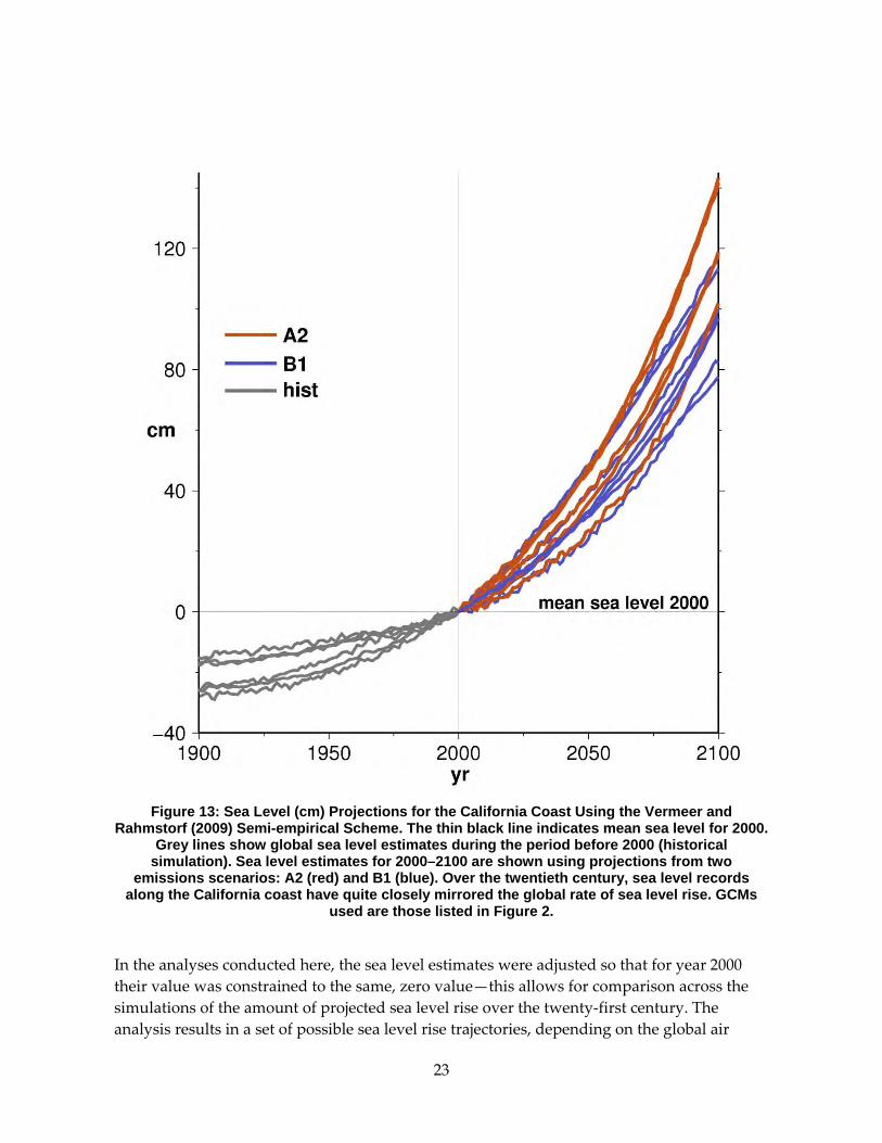
Figure 13: Sea level (cm) projections for California coast using Vermeer and Rahmstorf (2009) semi-empirical scheme. The thin black line indicates mean sea level for 2000. Grey lines show global sea level estimates during the period before 2000 (historical simulation). Sea level estimates for 2000–2100 are shown using projections from two emissions scenarios: A2 (red) and B1 (blue). Over the twentieth century, sea level records along the California coast have quite closely mirrored the global rate of sea level rise. GCMs used are those listed in Figure 2. . 23
Figure 14: Sea level rise and hours of extreme sea level projected for San Francisco (top) and La Jolla (bottom). Annual sea level (cm; black line) and total hours above the historical 99.99th percentile sea level (blue bars) from observations and from sea level hourly model computations using the GFDL CM2.1 simulation for the historical period and A2 emissions scenario as a representative example. Projected sea level rise (secular trend) based on Vermeer and Rahmstorf 2009. ................................................................................................................ 25
LIST OF TABLES
Table 1: Evaluation of significance of differences in the SRES B1 (top) and SRES A2 (bottom) for Shasta, Sacramento, and Los Angeles regions 30-year mean precipitation from historical (1961–1900) average as a percent of historical annual average precipitation. Percentile ranks were obtained from placing 30-year average precipitation from each of the simulations within a distribution from a set of 1000 Monte Carlo sequences of the model historical
v
vi
precipitation. Values that are significant at the 95% confidence level are highlighted with bold type. Precipitation is taken directly from the GCMs from the grid point nearest Shasta, Sacramento and Los Angeles, respectively. .......................................................................................... 18
Unless otherwise noted, all tables and figures are provided by the authors.
1
Introduction An evaluation of physical elements of climate change and sea level rise that are contained in the Vulnerability and Adaptation Assessment (V&A) builds upon a series of California Climate Change Scenarios Assessments (e.g., Franco et al. 2008; Cayan et al. 2008a) which have their origin in California Governor Schwarzenegger’s Executive Order S‐3‐05, which charges the Secretary of the California Environmental Protection Agency to “report to the Governor and the State Legislature by January 2006 and biannually thereafter on the impacts to California of global warming.”
The analyses presented here use global climate models and a set of downscaling techniques to focus on the potential occurrence of warming, changes in precipitation, loss of mountain snow pack, and sea level rise over the California region.
Section 1: Greenhouse Gas Emissions Scenarios Two emission scenarios are considered, to investigate the implications of a medium‐high and a relatively low emissions pathway. Although a new set of scenarios is now being used in the emerging set of climate simulations that will underpin the Fifth Intergovernmental Panel on Climate Change (IPCC) climate change assessment, these new simulations were not available at the outset of this California Vulnerability and Adaptation Study. Consequently, the global climate model (GCM) projections used here are members of the set of simulations from the Fourth IPCC assessment (AR4 or CMIP‐3), and are among the same ones that were used for the 2006 California climate change scenarios assessment (Cayan et al. 2008b).
The A2 emissions scenario represents a differentiated world in which economic growth is uneven; the income gap remains large between now‐industrialized and developing parts of the world; and people, ideas, and capital are less mobile, so that technology diffuses more slowly. The B1 emissions scenario presents a future with a high level of environmental and social consciousness, combined with a globally coherent approach to a more sustainable development. Carbon dioxide (CO2) emissions in the last several years (Friedlingstein et al. 2010) have kept pace with the higher emissions rate that is prescribed under the A2 emissions scenario, as shown in Figure 1.

2
Figure 1: Observed and Projected Carbon Emissions and Annual Global Atmospheric Carbon
Dioxide (CO2) Concentration. Emissions are shown by bars and dots, according to the scale on the right hand vertical axis. Recent emissions estimates for 2000–2010 are shown by black dots (from the Carbon Dioxide Information Analysis Center - CDIAC). Historical (observed)
emissions are from fossil-fuel burning, cement manufacture and gas flaring. Decadal carbon emissions (GtC; gigatons of carbon), a recent (2010) estimate of carbon emissions is 9.1 GtC, as estimated by CDIAC. Projected emissions are from fossil-fuel burning and other CO2. 1 GtC corresponds to ~3.67 Gt CO2) are shown from historical observations (blue bars) and for two emission scenarios: B1 (brown bars) and A2 (red bars). The annual global atmospheric CO2
concentration (ppmv; parts per million by volume) is shown for the period of observations from 1961 to 2000 (blue line), and for the twenty first century under two emission scenarios: B1
(brown line) and A2 (red line). Recently observed CO2 concentration measured at Mauna Loa, Hawaii in 2011 (green star) is 392 ppmv. Pre-industrial estimate (red diamond) is 280 ppmv.

3
As has been emphasized in the IPCC reports and in prior California climate change assessments, results of different mitigation strategies, as expressed by the two greenhouse gas (GHG) emission scenarios (A2 medium‐high emissions and B1 moderately low emissions; Figure 1) do not become very clear until after the middle of the twenty‐first century—they are much more distinctly evident in the following decades (IPCC 2007; Hayhoe et al. 2004; Cayan et al. 2008b). Observed CO2 emissions in recent years (Friedlingstein et al. 2010) appear to track quite closely the projected emissions in the B1 and A2 scenarios.
Section 2: Global Climate Models Six GCMs were selected for the Vulnerability and Adaptation Assessment, based upon their performance in replicating key features of observed climatology, reasonably realistic anomaly structure, and (not necessary, but very useful) providing daily level output, as described and defined in Cayan et al. (2009).
A larger set (16 or more) of GCMs was potentially available for these studies, but most of the V&A study teams are not able to manipulate and analyze such a large number of simulations, and not all of these simulations exhibited credible historical simulations of relevant California climate patterns and measures. The six selected GCMs include the:
• National Center for Atmospheric Research (NCAR) Parallel Climate Model (PCM)
• National Oceanic and Atmospheric Administration (NOAA) Geophysical Fluids Dynamics Laboratory (GFDL) model, version 2.1
• NCAR Community Climate System Model (CCSM3)
• Max Plank Institute ECHAM5/MPI‐OM model
• MIROC 3.2(medres) medium‐resolution model from the Center for Climate System Research of the University of Tokyo and collaborators
• French Centre National de Recherches Météorologiques (CNRM‐CM3) model
The number of simulations required in an ensemble to derive reliable estimates of regional climate change has been addressed by Pierce et al. 2009, who found that “skill” in the estimate increased most markedly in increasing from one to four simulations, but that 14 simulations, taken from five global models provided a reliable representation of the full set of 21 international GCM model results. Thus, for our purpose, even though it is a subset, the set of 12 simulations (6 GCMs each run under two different scenarios) employed here approaches an adequate sample of the present generation of climate change projections.
Section 3: Downscaling Two downscaling methods were employed in the 2009 California Assessment. These are: (1) bias corrected constructed analogues (BCCA), and (2) bias correction and spatial
4
downscaling (BCSD). BCSD is a bias‐correction/spatial downscaling method that relies solely on monthly large scale meteorology and re‐samples the historical record to obtain daily sequences. BCSD has been used in many applications and has recently been applied to a large set of IPCC 4th Assessment GCMs by a consortium led by the U.S. Bureau of Reclamation (Gangopadhyay et al. 2011). BCCA uses a quantile‐mapping bias correction on the large‐scale data prior to applying a constructed analogues approach from daily large‐scale anomalies. BCCA has the advantage that instead of re‐sampling to form daily observations, it constructs time series of daily values that conform, exactly, to the synoptic sequence of events that is contained in the large scale (GCM) environment.
Maurer et al. 2010 compare the two methods and find that they both perform reasonably well. Both methods have been used to downscale temperature (maximum and minimum) and precipitation over a grid covering California at 1/8 degree (12 kilometer [km]) horizontal resolution. A noteworthy difference between the two methods is that BCCA bases its estimates upon daily information, and thus preserves the daily evolution of weather that is provided by the GCMs. BCSD, on the other hand, uses monthly aggregated data from the GCMs and then uses a sampling of historical observations to produce sequences at the daily level; this method preserves statistical properties of daily temperature and precipitation but this does not yield series that maintain the time sequence in the GCM. BCSD downscaling of temperature and precipitation, for both B1 and A2 emissions scenarios, was implemented for all six GCMs. BCCA downscaling was conducted from the four GCMs that provided daily output: CNRM CM3, GFDL CM2.1, NCAR CCSM3, and NCAR PCM1. To derive land surface hydrological variables consistent with the downscaled forcing data, the variable infiltration capacity (VIC) model (Liang et al. 1994) was used. The VIC is a macroscale, distributed, physically based climatic change hydrologic model that balances both surface energy and water over a grid mesh. The VIC model has been applied in many studies of hydrologic impacts of climate variability and change (Wood et al. 2004; Christensen et al. 2004; Maurer and Duffy 2005; Das et al. 2009). For this study, the model was run at a 1/8‐degree resolution (measuring about 150 square kilometer [km2] per grid cell) over the entire California domain. Snow accumulation, runoff, and other hydrologic measures were saved for each day of the simulation. The VIC hydrological runs were conducted for each of the 12 BCSD simulations and the 8 BCCA simulations.
Section 4: Warming All of the projected climate model simulations exhibit warming, globally and regionally over California. From observed climate and hydrologic records and from the model historical simulations, it is seen that the model simulations begin to warm more substantially in the 1970s; this is likely a response to effects of GHG increases, which began to increase significantly during this time period (Bonfils et al. 2008). In the early part of the twenty‐first century, the degree of warming produced by the A2 scenario is not too much greater than that of B1, but warming in the A2 simulations become increasing larger than those from B1 through the middle and especially the latter part of the century.

5
Overall, the six models’ warming projections in mid‐century range from about 1°C to 3°C (1.8°F to 5.4°F), rising by end‐of‐twenty‐first century, from about 2°C to 5°C (3.6°F to 9°F), derived using BCSD statistical downscaling, as shown in Figure 2 . Over the last several decades, observed temperatures in California and the western United States have exhibiting warming trends that are not likely attributable to natural variation and likely, to some extent, to have been caused by anthropogenic greenhouse gas increases (Bonfils et al. 2008). To calibrate the projected changes, however, the upper part of the projected warming is considerably greater than the historical rates estimated from observed temperature records in California (Bonfils et al. 2008).

6
Figure 2: Annual Temperature (°C) over Three Regions (Eureka, Sacramento, and San Diego) from BCSD Statistical Downscaling of Six GCMs for Two Carbon Emission Scenarios (SRESB1 and SRESA2). The black line shows the median average temperature simulated for 1961–1990.
Thin teal lines show values from SRESB1 simulations. Thin red lines show values from SRESA2 simulations. Thick lines show the 11-year smoothed median of the suite of SRESB1 simulations (thick teal line) and of SRESA2 simulations (thick red line). The six global climate
model simulations are listed to the lower left.

7
There is variability in the temperature change between the six GCMs, but the lowest sensitivity model (the PCM) produces the lowest temperature rise in both cool and warm seasons. The model simulations contain decade‐to‐decade variability, but although this decadal component is evident it is not so large that it overwhelms mostly a steady, rather linear increase over the 2000–2100 period.
Figure 3: Yearly Temperature Change (°C) (2060–2069 Minus 1985–1994) from Each
Downscaling Technique Applied to the GFDL 2.1 Global Model. The yearly temperature change from the global model is shown in panel f, for comparison.
Source: Pierce et al. 2001, Figure 4.
The degree of warming produced by the GCMs and associated downscaled output increases from the California coast to the interior of the state. For example, this can be seen from annual averages in temperature from the GFDL 2.1 simulation, shown in Figure 3, for BCSD and BCCA, as well as from available dynamical downscaled results. A distinct Pacific Ocean influence occurs, wherein warming is more moderate in the zone of about 50 km from the coast, but warming is higher, reaching +4°C (7.2°F) higher, in the interior landward areas as
8
compared to the warming that occurs right along the coast. This, combined with the seasonal asymmetry in warming, wherein summer and fall over continental regions exhibit greater warming than winter and spring, indicate a mechanism involving differences in land surface (versus ocean surface), such as the effects of varying latent versus sensible heat fluxes due to seasonal soil moisture changes. Concerning the spatial gradient in warming, the bias correction that was implemented in BCSD downscaling removed the trend from the GCM before the downscaling process and subsequently replaced it. In the BCCA downscaling, this specification of the large‐scale trend was not included, so the BCCA trend and 10‐year average departures that emerge are dependent on the sequence of temperature values identified in the BCCA analogue scheme. Therefore, it is not so surprising that the (2060–2069) BCCA temperature change is not identical to that of the GFDL GCM, BCSD, and dynamical downscaled cases, as seen in particular by the relatively low temperature change value in the eastern portion of California. Whether the trend modification is appropriate given GCM biases, or if the raw simulated trend should be preserved through the downscaling procedure is, at this point, an open discussion.
Winter (January–March) temperature changes range from 1°C–4°C (1.8°F–7.2°F) in the six GCMs, under A2 and B1 GHG emissions scenarios, averaged over 30 years at the end of the twenty‐first century relative to the 1961–1990 climatology. It is important to note that by mid twenty‐first century, and especially by the late twenty‐first century, there is greater warming in summer and early fall than in winter and spring, as shown from BCSD downscaled data in Figure 4. Summer (July–September) temperature changes range from 1.5°C–6°C (2.7°F–10.8°F) over the six GCMs, under A2 and B1 GHG emissions scenarios. This seasonal asymmetry in warming is relatively small over the Pacific Ocean and the immediate coastal zone, but it grows large in the interior of North America, similar to other ocean‐continental margins. This gradient indicates that the summer‐ and fall‐amplified temperature increase is a result of the land surface response to climate warming. Being greater in fall than in spring, this suggests that soil drying is involved in producing this effect.

9
Figure 4: Monthly BCSD Simulated Temperature Changes (oC) for Eureka, Sacramento, and San Diego for Six GCMs. Changes (from 1961–1990) are shown for three time periods: early century (2005–2034; left), mid-century (2035–2064; middle) and late century (2070–2099; right). Changes
are shown in each panel for January (left) to December (right). Black and red symbols show changes for B1 and A2 emission scenarios, respectively. Black (dashed; B1) and red (solid; A2)
lines show the median value for the six GCMs, which are those listed in Figure 2.

10
The availability of simulated daily data from some of the model simulations enables an investigation of possible changes in certain kinds of weather events—it is often the case that the most severe impacts occur during short weather extremes. While it is important to avoid the generalization that all kinds of extreme events will become more frequent as climate changes, the simulations make it clear that heat waves will become increasingly commonplace. The model simulations indicate that as the twenty‐first century progresses, the occurrence of extremely warm days will increase considerably, as shown in Figure 5 by the number of days that warm season daytime temperatures exceed the 98 percentile historical level of approximately 4 days per year in Sacramento.
By about 2065, the occurrence of these extremely hot days in the A2 simulations has increased four to five fold and begins to grow larger than those from the B1 simulations. By the end of the twenty‐first century, the number of hot days in the A2 simulation exceeds 40 days per year—more than 10 times the historical occurrences. By 2030 (averaged over 2016–2045), a 38°C maximum daily temperature occurrence falls to a 94th percentile in both B1 and A2 scenarios, averaged across four simulations. By 2070 (averaged over 2056–2085), a 38°C maximum daily temperature occurrence falls to a 90th percentile occurrence for the B1 simulations and to an 85th percentile occurrence for the A2 simulations. In considering the temporal makeup of the extremely warm days (not shown), it can be seen that as the California climate warms, the duration of individual heat waves tends to grow longer, and the length of the heat wave season expands (earlier heat wave season start and later heat wave season end).
Figure 5: Number of Days (n), April–October, When Maximum Temperature (Tmax) Exceeds the 98th Percentile Historical (1961–1990) Level of 38oC (100.4oF) at Sacramento from Four BCCA
Downscaled GCMs. Brown carrots and red dots shown for B1 and A2 emission scenarios, respectively. Thick brown (B1) and red (A2) lines show median value from the four simulations.

11
Section 5: Precipitation Changes Precipitation in most of California is characterized by a strong Mediterranean pattern wherein most of the annual precipitation falls in the cooler part of the year between November and March. The climate change simulations from these GCMs indicate that California will retain its Mediterranean climate, with relatively cool and wet winters and hot, dry summers.
Another important aspect of the precipitation climatology is the large amount of variability, not only from month to month but from year to year and decade to decade, as illustrated by the ensemble of simulations and the median value for Eureka, Sacramento, and San Diego in Figure 6. This variability stands out when mapped across the North Pacific and western North America complex, and it is quite well represented by models in comparison to the observed level of variability from global atmospheric data, via the NOAA National Centers for Environmental Prediction (NCEP) Reanalysis. The simulated annual precipitation in Figure 6 demonstrates that the high degree of variability from year to year and even from decade to decade that has characterized the historical period will prevail during the next century, which would suggest that the region will remain vulnerable to drought and flooding. The examples presented here are oriented toward a few individual locations, but these should be more broadly representative, because precipitation, especially in the cool season months, tends to be coherent over regional scales in California. Also, to avoid any influence of downscaling on the trends, the results shown here are drawn directly from the GCMs.
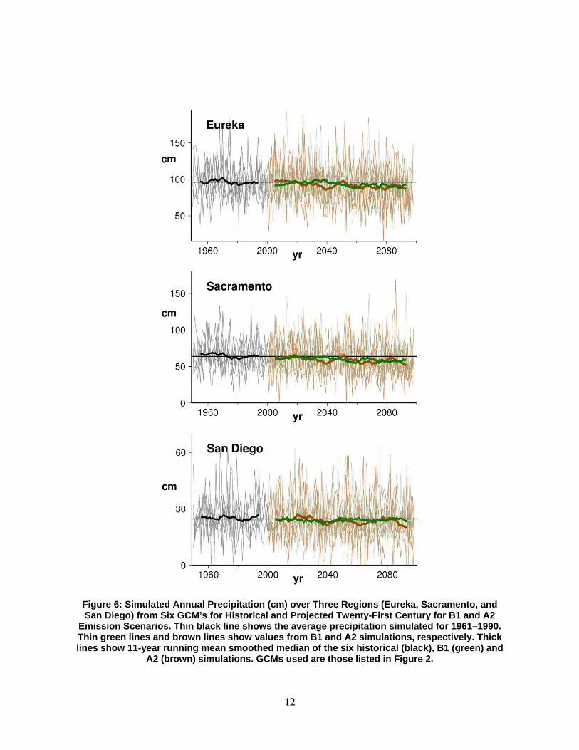
12
Figure 6: Simulated Annual Precipitation (cm) over Three Regions (Eureka, Sacramento, and San Diego) from Six GCM’s for Historical and Projected Twenty-First Century for B1 and A2
Emission Scenarios. Thin black line shows the average precipitation simulated for 1961–1990. Thin green lines and brown lines show values from B1 and A2 simulations, respectively. Thick lines show 11-year running mean smoothed median of the six historical (black), B1 (green) and
A2 (brown) simulations. GCMs used are those listed in Figure 2.
13
In addition to strong interannual‐decadal variability contained within the climate simulations, there is a drying tendency). By mid‐ and late‐twenty‐first century, all but one of the simulations has declined relative to its historical (1961–1990) average, shown in Figure 7 as a composite of the six GCMs. For the B1 simulation in mid‐twenty‐first century, two of the six simulations have a 30‐year mean precipitation in Sacramento that is more than 5 percent drier than its historical average, and by late‐twenty‐first century, three of the six have 30‐year averages that decline to more than 10 percent below their historical average. This drying tendency is consistent with the observation that, under climate warming, several of the GCMs exhibit a northward shift in the winter North Pacific Storm track (Salathé 2006).
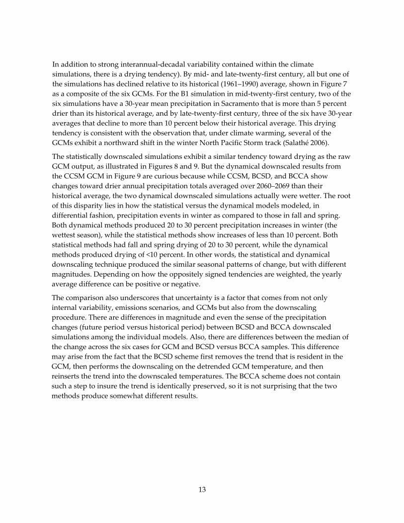
The statistically downscaled simulations exhibit a similar tendency toward drying as the raw GCM output, as illustrated in Figures 8 and 9. But the dynamical downscaled results from the CCSM GCM in Figure 9 are curious because while CCSM, BCSD, and BCCA show changes toward drier annual precipitation totals averaged over 2060–2069 than their historical average, the two dynamical downscaled simulations actually were wetter. The root of this disparity lies in how the statistical versus the dynamical models modeled, in differential fashion, precipitation events in winter as compared to those in fall and spring. Both dynamical methods produced 20 to 30 percent precipitation increases in winter (the wettest season), while the statistical methods show increases of less than 10 percent. Both statistical methods had fall and spring drying of 20 to 30 percent, while the dynamical methods produced drying of <10 percent. In other words, the statistical and dynamical downscaling technique produced the similar seasonal patterns of change, but with different magnitudes. Depending on how the oppositely signed tendencies are weighted, the yearly average difference can be positive or negative.
The comparison also underscores that uncertainty is a factor that comes from not only internal variability, emissions scenarios, and GCMs but also from the downscaling procedure. There are differences in magnitude and even the sense of the precipitation changes (future period versus historical period) between BCSD and BCCA downscaled simulations among the individual models. Also, there are differences between the median of the change across the six cases for GCM and BCSD versus BCCA samples. This difference may arise from the fact that the BCSD scheme first removes the trend that is resident in the GCM, then performs the downscaling on the detrended GCM temperature, and then reinserts the trend into the downscaled temperatures. The BCCA scheme does not contain such a step to insure the trend is identically preserved, so it is not surprising that the two methods produce somewhat different results.

14
Annual Precipitation Change (%)
Figure 7: Difference of Annual Precipitation Amongst 12 Simulations, from A2 and B1 Scenarios of 6 GCMs for the Early (left; 2005–2034), Middle (center; 2035–2064) and the Late
Twenty-First Century (right; 2070–2099). Values are median percent of difference from historical average (1961–1990). Brown and green circles indicate decreases and increases,
respectively. Magnitude of change is shown by the size of the circle (largest circles showing a median change of 12 percent or more). Shading of circles indicates consistency across the
simulations as given by the number of the 12 simulations that agree in sign (positive or negative) as indicated by brown color bar; green color bar (inverse of this) is not shown).
Darker/ shading indicates that more of the simulations agree in sign with the median value. GCMs used are those listed in Figure 2.

15
Figure 8: Annual Precipitation Changes for Three Time Periods: Early Century (2005–2034; left), Mid-century (2035–2064; middle) and Late Century (2070–2099; right) for GCM and Two
Statistical Downscaling Schemes for Sacramento. Percent of difference from historical average (1961–1990) from six GCMs, from six BCSD downscaled simulations, and from four BCCA downscaled simulations is shown at the top, middle and bottom for B1 and A2 scenarios. GCMs used are those listed in Figure 2. Light brown bars show percentages for a lower
emission scenario simulation (B1). Light orange bars show percentages for a higher emission scenario simulation (A2). The median of the changes of A2 simulations and the B1 simulations
percentage change is shown by the heavy black bars.
16
Figure 9: Yearly Precipitation Change (%, 2060–2069 Compared to 1985–1994) from Each
Downscaling Technique Applied to the GFDL 2.1 (top row) and CCSM3 (bottom row) Global Models. The yearly precipitation changes from the global models are shown in panels f and k,
for comparison.
Source: Pierce et al. 2011, Figure 14.
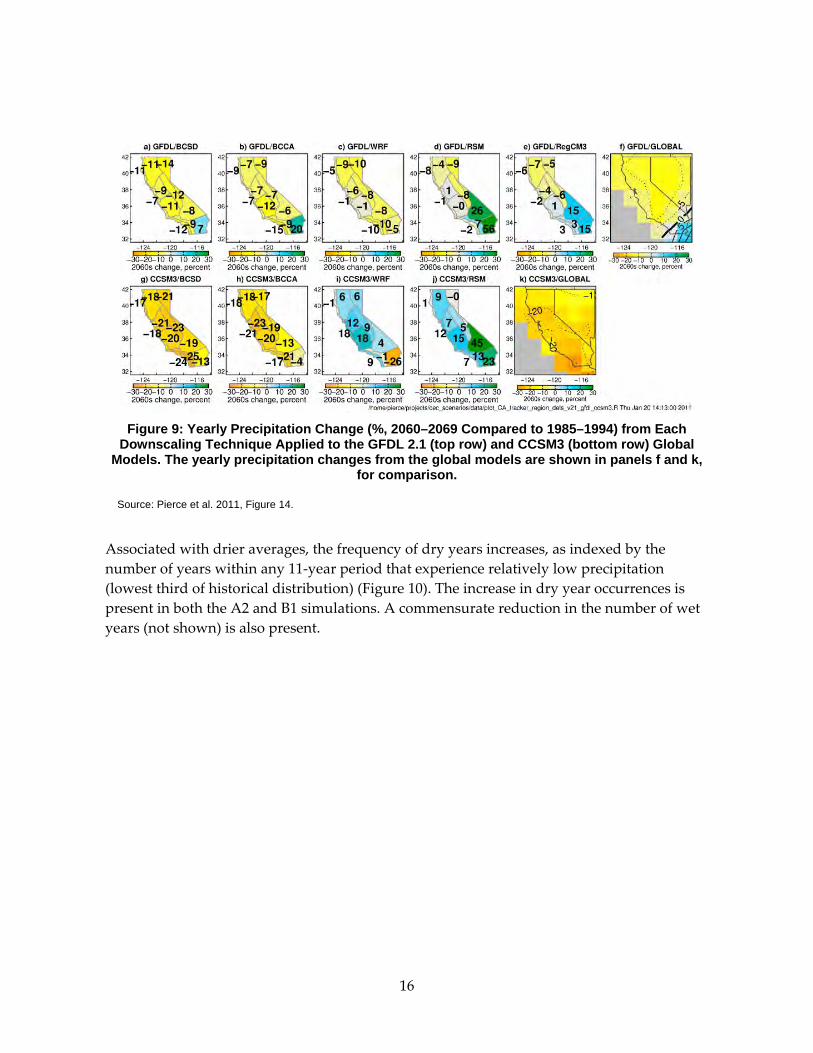
Associated with drier averages, the frequency of dry years increases, as indexed by the number of years within any 11‐year period that experience relatively low precipitation (lowest third of historical distribution) (Figure 10). The increase in dry year occurrences is present in both the A2 and B1 simulations. A commensurate reduction in the number of wet years (not shown) is also present.
17
Figure 10: Number of Years, Averaged Across Six GCMs, Having Annual Precipitation Amount That is within the Lowest Third of the Historical Distribution within a Running Sequence of 11-year Periods through the Climate Simulation, from 1900 through 2099 for A2 Simulations (dark, solid line) and for B2 Simulations (dotted line) for Eureka, Sacramento, and San Diego
Regions. Values are plotted on the center year of each 11-year segment.
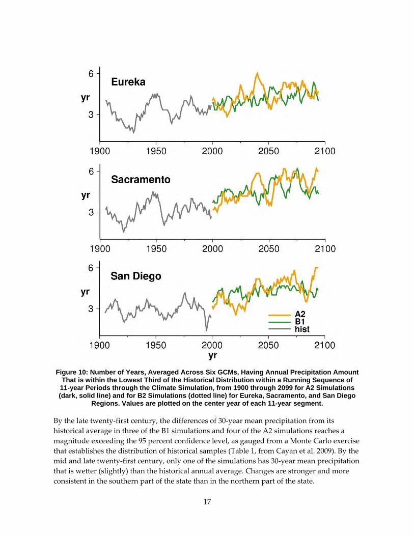
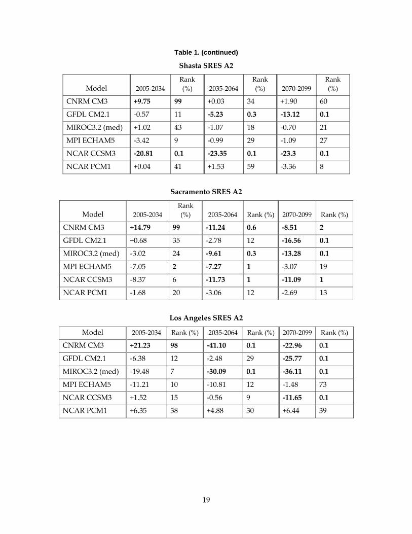
By the late twenty‐first century, the differences of 30‐year mean precipitation from its historical average in three of the B1 simulations and four of the A2 simulations reaches a magnitude exceeding the 95 percent confidence level, as gauged from a Monte Carlo exercise that establishes the distribution of historical samples (Table 1, from Cayan et al. 2009). By the mid and late twenty‐first century, only one of the simulations has 30‐year mean precipitation that is wetter (slightly) than the historical annual average. Changes are stronger and more consistent in the southern part of the state than in the northern part of the state.
18
Table 1: Evaluation of Significance of Differences in the SRES B1 (top) and SRES A2 (bottom) for Shasta, Sacramento, and Los Angeles Regions’ 30-year Mean Precipitation from Historical (1961–1900) Average as a Percent of Historical Annual Average Precipitation. Percentile ranks were obtained from placing 30-year average precipitation from each of the simulations within a
distribution from a set of 1000 Monte Carlo sequences of the model historical precipitation. Values that are significant at the 95% confidence level are highlighted with bold type.
Precipitation is taken directly from the GCMs from the grid point nearest Shasta, Sacramento and Los Angeles, respectively. This table is reproduced, verbatim, from Cayan et al. 2009,
Table 2.
Shasta SRES B1
Model 2005‐2034 Rank (%) 2035‐2064
Rank (%) 2070‐2099
Rank (%)
CNRM CM3 +0.03 34 +4.41 89 +7.45 99
GFDL CM2.1 +2.83 45 +0.19 16 ‐3.73 1
MIROC3.2 (med) ‐0.32 26 ‐2.07 11 +0.69 38
MPI ECHAM5 ‐2.13 18 ‐0.74 32 ‐5.91 1
NCAR CCSM3 ‐10.35 1 ‐7.91 4 ‐6.94 7
NCAR PCM1 +4.06 85 +4.27 87 +1.76 62
Sacramento SRES B1
Model 2005‐2034 Rank (%) 2035‐2064 Rank (%) 2070‐2099 Rank (%)
CNRM CM3 ‐6.07 8 ‐3.77 17 ‐0.53 39
GFDL CM2.1 +2.42 51 ‐1.72 17 ‐9.32 0.3
MIROC3.2 (med) ‐5.01 12 ‐10.17 0.2 ‐9.11 0.4
MPI ECHAM5 ‐1.64 31 ‐3.79 14 ‐12.65 0.1
NCAR CCSM3 ‐11.60 1 ‐8.89 4 ‐5.43 20
NCAR PCM1 +6.22 89 +1.65 52 ‐0.65 28
Los Angeles SRES B1
Model 2005‐2034 Rank (%) 2035‐2064 Rank (%) 2070‐2099 Rank (%)
CNRM CM3 ‐14.96 4 ‐24.76 0.1 ‐23.15 0.1
GFDL CM2.1 ‐2.14 31 ‐11.62 3 ‐22.59 0.1
MIROC3.2 (med) ‐18.40 11 ‐24.64 0.3 ‐35.93 0.1
MPI ECHAM5 ‐3.84 54 ‐4.00 54 ‐16.35 1
NCAR CCSM3 ‐8.07 0.4 +12.54 77 ‐1.13 8
NCAR PCM1 +16.96 94 ‐2.81 3 +7.18 45
19
Table 1. (continued)
Shasta SRES A2
Model 2005‐2034 Rank (%) 2035‐2064
Rank (%) 2070‐2099
Rank (%)
CNRM CM3 +9.75 99 +0.03 34 +1.90 60
GFDL CM2.1 ‐0.57 11 ‐5.23 0.3 ‐13.12 0.1
MIROC3.2 (med) +1.02 43 ‐1.07 18 ‐0.70 21
MPI ECHAM5 ‐3.42 9 ‐0.99 29 ‐1.09 27
NCAR CCSM3 ‐20.81 0.1 ‐23.35 0.1 ‐23.3 0.1
NCAR PCM1 +0.04 41 +1.53 59 ‐3.36 8
Sacramento SRES A2
Model 2005‐2034 Rank (%) 2035‐2064 Rank (%) 2070‐2099 Rank (%)
CNRM CM3 +14.79 99 ‐11.24 0.6 ‐8.51 2
GFDL CM2.1 +0.68 35 ‐2.78 12 ‐16.56 0.1
MIROC3.2 (med) ‐3.02 24 ‐9.61 0.3 ‐13.28 0.1
MPI ECHAM5 ‐7.05 2 ‐7.27 1 ‐3.07 19
NCAR CCSM3 ‐8.37 6 ‐11.73 1 ‐11.09 1
NCAR PCM1 ‐1.68 20 ‐3.06 12 ‐2.69 13
Los Angeles SRES A2
Model 2005‐2034 Rank (%) 2035‐2064 Rank (%) 2070‐2099 Rank (%)
CNRM CM3 +21.23 98 ‐41.10 0.1 ‐22.96 0.1
GFDL CM2.1 ‐6.38 12 ‐2.48 29 ‐25.77 0.1
MIROC3.2 (med) ‐19.48 7 ‐30.09 0.1 ‐36.11 0.1
MPI ECHAM5 ‐11.21 10 ‐10.81 12 ‐1.48 73
NCAR CCSM3 +1.52 15 ‐0.56 9 ‐11.65 0.1
NCAR PCM1 +6.35 38 +4.88 30 +6.44 39
20
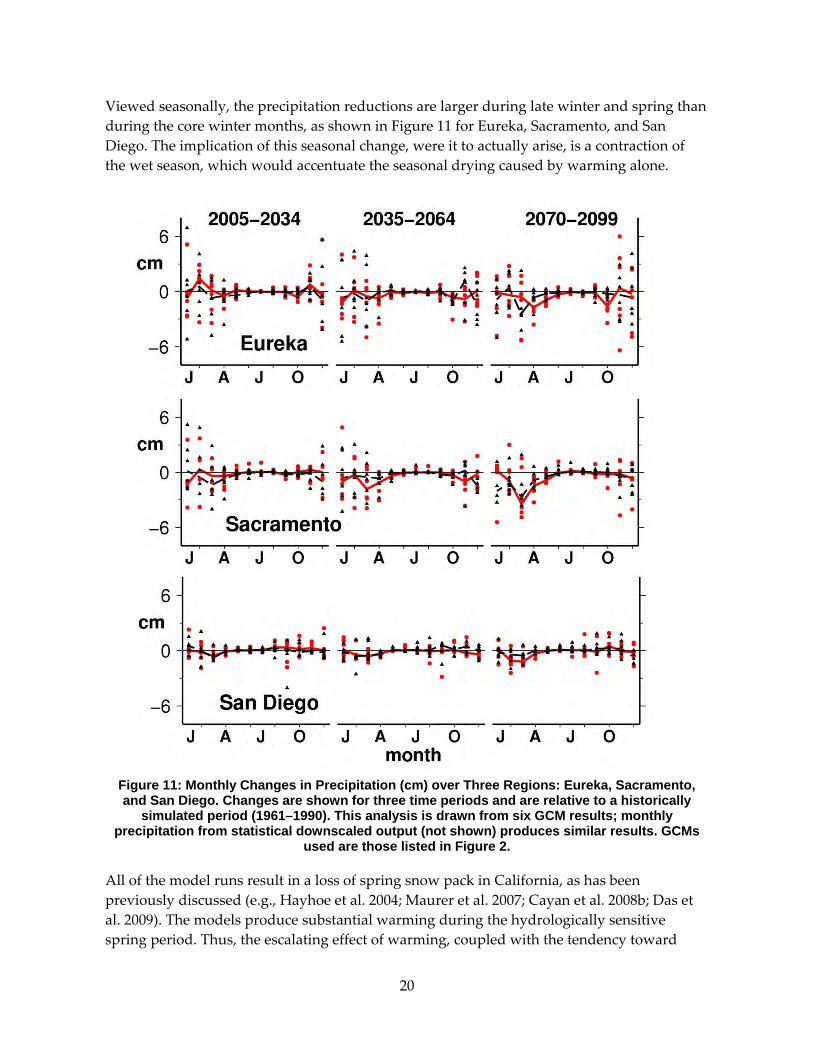
Viewed seasonally, the precipitation reductions are larger during late winter and spring than during the core winter months, as shown in Figure 11 for Eureka, Sacramento, and San Diego. The implication of this seasonal change, were it to actually arise, is a contraction of the wet season, which would accentuate the seasonal drying caused by warming alone.
Figure 11: Monthly Changes in Precipitation (cm) over Three Regions: Eureka, Sacramento, and San Diego. Changes are shown for three time periods and are relative to a historically
simulated period (1961–1990). This analysis is drawn from six GCM results; monthly precipitation from statistical downscaled output (not shown) produces similar results. GCMs
used are those listed in Figure 2.
All of the model runs result in a loss of spring snow pack in California, as has been previously discussed (e.g., Hayhoe et al. 2004; Maurer et al. 2007; Cayan et al. 2008b; Das et al. 2009). The models produce substantial warming during the hydrologically sensitive spring period. Thus, the escalating effect of warming, coupled with the tendency toward
21
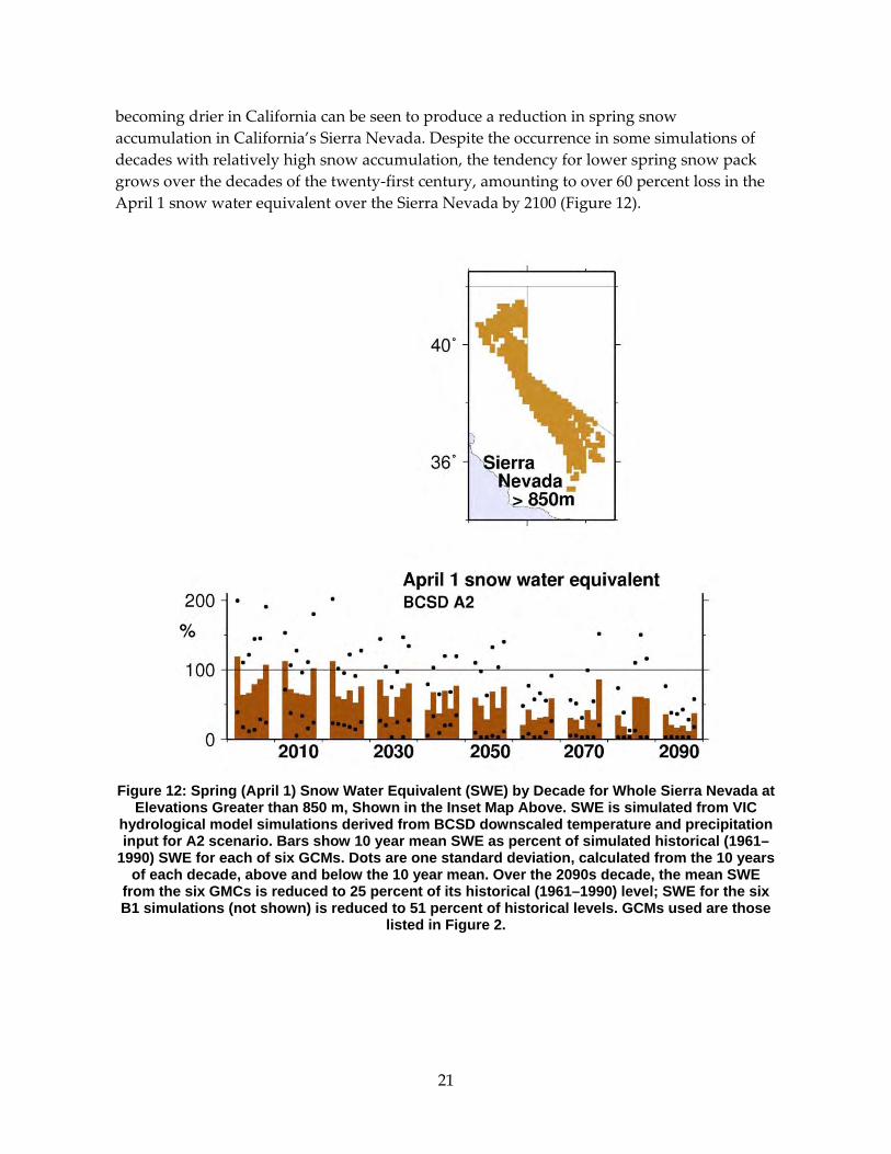
becoming drier in California can be seen to produce a reduction in spring snow accumulation in California’s Sierra Nevada. Despite the occurrence in some simulations of decades with relatively high snow accumulation, the tendency for lower spring snow pack grows over the decades of the twenty‐first century, amounting to over 60 percent loss in the April 1 snow water equivalent over the Sierra Nevada by 2100 (Figure 12).
Figure 12: Spring (April 1) Snow Water Equivalent (SWE) by Decade for Whole Sierra Nevada at
Elevations Greater than 850 m, Shown in the Inset Map Above. SWE is simulated from VIC hydrological model simulations derived from BCSD downscaled temperature and precipitation input for A2 scenario. Bars show 10 year mean SWE as percent of simulated historical (1961–
1990) SWE for each of six GCMs. Dots are one standard deviation, calculated from the 10 years of each decade, above and below the 10 year mean. Over the 2090s decade, the mean SWE
from the six GMCs is reduced to 25 percent of its historical (1961–1990) level; SWE for the six B1 simulations (not shown) is reduced to 51 percent of historical levels. GCMs used are those
listed in Figure 2.
22
Section 6: Sea Level Rise Over the past several decades, sea level measured at tide gages at sites thought to be relatively unaffected by land motion along the California coast has risen at a rate of about 17–20 centimeters (cm) per century (Flick 1998; Flick et al. 2003; Bromirski et al. 2003). This historical rate of sea level rise is nearly the same as that estimated for global sea level rise (Church and White 2006). Rahmstorf (2010) reviews recent efforts that develop and demonstrate that over available historical records, the observed global sea level rise can be reasonably strongly linked to global mean surface air temperature. This provides a methodology, a “semi‐empirical method” to estimate global sea level using the surface air temperature projected by the global climate model simulations, and it leads to larger rates of sea level rise than those produced by other recent estimates (Cayan et al. 2008c; Cayan et al. 2009). The present estimates include those from the Vermeer and Rahmstorf (2009) version of semi‐empirical sea level rise calculation, because this scheme yields estimates of sea level rise that are representative of recent estimates (Rahmstorf 2010) and also has the advantage that it can be applied to each GCM. An ensemble of sea level projections (scenarios, not predictions), derived from a subset of GCMs under B1 and A2 emissions scenarios, are shown in Figure 13, assuming that sea level rise along the Southern California coast will be the same as the global estimates (Cayan et al. 2008c).
23
Figure 13: Sea Level (cm) Projections for the California Coast Using the Vermeer and
Rahmstorf (2009) Semi-empirical Scheme. The thin black line indicates mean sea level for 2000. Grey lines show global sea level estimates during the period before 2000 (historical
simulation). Sea level estimates for 2000–2100 are shown using projections from two emissions scenarios: A2 (red) and B1 (blue). Over the twentieth century, sea level records
along the California coast have quite closely mirrored the global rate of sea level rise. GCMs used are those listed in Figure 2.
In the analyses conducted here, the sea level estimates were adjusted so that for year 2000 their value was constrained to the same, zero value—this allows for comparison across the simulations of the amount of projected sea level rise over the twenty‐first century. The analysis results in a set of possible sea level rise trajectories, depending on the global air
24
4 m.
of ea
temperature from the GCM projections. By 2050, sea level rise, relative to the 2000 level, ranges from 30 cm to 45 cm. By 2100, sea level rise ranges from approximately 0.9 m to 1.Because the differing climate sensitivities of the selected GCMs produce varying degrees of global warming, in some cases a B1 climate warming scenario from one GCM can exceed an A2 climate warming scenario from another; thus a few of the sea level rise trajectories from the A2 scenario actually fall below those from a few of those from the B1 scenario.
As sea level rises, the elevated mean water levels will result in an increased rate of extremehigh sea level events (Figure 14, using the GFDL CM2.1 GCM output along with Vermeer and Rahmstorf 2009 scheme), which usually occur during high astronomical tides, often when reinforced to by the added water elevation due to winter storms and sometimes exacerbated by El Niño occurrences (Cayan et al. 2008c). Consequently, over the coursethe twenty‐first century, these simulations contain an increasing tendency for heightened slevel events to persist for more hours, which would imply a greater threat of coastal erosion and other damage.

25
Figure 14: Sea Level Rise and Hours of Extreme Sea Level Projected for San Francisco (top) and La Jolla (bottom). Annual sea level (cm; black line) and total hours above the historical 99.99th percentile sea level (blue bars) from observations and from sea level hourly model computations using the GFDL CM2.1 simulation for the historical period and A2 emissions
scenario as a representative example. Projected sea level rise (secular trend) based on Vermeer and Rahmstorf 2009.

26
References Bonfils, C., B. D. Santer, D. W. Pierce, H. G. Hidalgo, G. Bala, T. Das, T. P. Barnett, D. R.
Cayan, C. Doutriaux, A. W. Wood, A. Mirin, and T. Nozawa. 2008. “Detection and Attribution of Temperature Changes in the Mountainous Western United States.” Journal of Climate 21: 6404–6424. DOI:10.1175/2008JCL12397.1.
Bromirski, P. D., R. E. Flick, and D. R. Cayan. 2003. “Decadal storminess variability along the California coast: 1858–2000.” J Clim 16:982–993.
Cayan, D. R., A. L. Luers, G. Franco, M. Hanemann, B. Croes, and E. Vine. 2008a. “Overview of the California climate change scenarios project.” Climatic Change 87: (Suppl 1): S1–S6, doi:10.1007.
Cayan, D. R., E. P. Maurer, M. D. Dettinger, M. Tyree, and K. Hayhoe. 2008b. “Climate Change Scenarios for the California Region.” Climatic Change published online, 26 Jan 2008, doi:10.1007/s10584-007-9377-6.
Cayan, D. R., P. D. Bromirski, K. Hayhoe, M. Tyree, M. D. Dettinger, et al. 2008c. “Climate change projections of sea level extremes along the California coast.” Climatic Change 87: 57–73.
Cayan, D., M. Tyree, M. Dettinger, H. Hidalgo, T. Das, E. Maurer, P. Bromirski, N. Graham, and R. Flick. 2009. Climate Change Scenarios and Sea Level Rise Estimates for the California 2009 Climate Change Scenarios Assessment. California Climate Change Center, publication #CEC-500-2009-014-F, 64 pages. August.
Christensen, N. S., A. W. Wood, N. Voisin, D. P. Lettenmaier, and R. N. Palmer. 2004. “Effects of Climate Change on the Hydrology and Water Resources of the Colorado River Basin.” Climatic Change 62: 337–363.
Church, J. A., and N. J. White. 2006. “A 20th century acceleration in global sea-level rise.” Geophys. Res. Lett. 33. L01602, doi:10.1029/2005GL024826.
Das, T., H. Hidalgo, D. Cayan, M. Dettinger, D. Pierce, C. Bonfils, T. P. Barnett, G. Bala, and A. Mirin. 2009. “Structure and origins of trends in hydrological measures over the western United States.” Journal of Hydrometeorology 10: 871–892. doi:10.1175/2009JHM1095.1.
Flick. R. E. 1998. “Comparison of California tides, storm surges, and mean sea level during the El Niño winters of 1982–1983 and 1997–1998.” Shore & Beach 66(3):7–11.
Flick, R. E., J. F. Murray, and L. C. Ewing. 2003. “Trends in United States tidal datum statistics and tide range.” J. Waterway, Port, Coastal and Ocean Eng., Amer Soc Civil Eng 129(4):155–164.
Franco, G., D. Cayan, A. Luers, M. Hanemann, and B. Croes. 2008. “Linking climate change science with policy in California.” Climatic Change 87: (Suppl 1):S7–S20, doi:10.1007/s10584-007-9359-8.
Friedlingstein P., R. A. Houghton, G. Marland, J. Hacker, T. A. Boden, et al. 2010. “Update on CO2 Emissions.” Nature Geoscience 3 811–812, doi 10-1038/ngeo1022.

27
Gangopadhyay, S., T. Pruitt, L. Brekke, and D. Raff. 2011. “Hydrologic projections for the western United States.” Eos Trans. AGU 92(48): 441, doi:10.1029/2011EO480001.
Hayhoe K., D. Cayan, C. B. Field, P. C. Frumhoff, E. P. Maurer, N. L. Miller, S. C. Moser, S. H. Schneider, K. N. Cahill, E. E. Cleland, L. Dale, R. Drapek, R. M. Hanemann, L. S. Kalkstein, J. Lenihan, C. K. Lunch, R. P. Neilson, S. C. Sheridan, and J. H. Verville. 2004. “Emissions pathways, climate change, and impacts on California.” Proc Natl Acad Sci U S A 2004 Aug 24;101(34):12422–7. Epub 2004 Aug 16.
IPCC. 2007. Climate Change 2007 - Impacts, Adaptation and Vulnerability. Contribution of Working Group II to the Fourth Assessment Report of the IPCC. Cambridge: Cambridge University Press.
Liang, X., D. P. Lettenmaier, E. Wood, and S. J. Burges. 1994. “A simple hydrologically based model of land surface water and energy fluxes for general circulation models.” J Geophys Res 99: 14415–14428.
Maurer, E. P., and P. B. Duffy. 2005. “Uncertainty in Projections of Streamflow Changes due to Climate Change in California.” Geophys. Res. Let. 32(3): L03704 doi:10.1029/2004GL021462.
Maurer, E. P., I. T. Stewart, C. Bonfils, P. B. Duffy, and D. Cayan. 2007. “Detection, attribution, and sensitivity of trends toward earlier streamflow in the Sierra Nevada.” J Geophysical Research 112, D11118. doi:10.1029/2006JD008088.
Maurer, E. P., H. G. Hidalgo, T. Das, M. D. Dettinger, and D. R. Cayan. 2010. “The utility of daily large-scale climate data in the assessment of climate change impacts on daily streamflow in California.” Hydrol Earth Syst Sci 14: 1125–1138.
Pierce, D. W., T. P. Barnett, B. D. Santer, and P. J. Gleckler. 2009. “Selecting global climate models for regional climate change studies.” Proc Nat Acad Sci 106:8441–8446.
Pierce, D. W., et al. 2011. Probabilistic estimates of California climate change by the 2060s using statistical and dynamical downscaling.
Rahmstorf, S. 2010. “A new view on sea level rise.” Nature Reports Climate Change 4:44–45.
Salathé, E. P. Jr., 2006. “Influences of a shift in North Pacific storm tracks on western North American precipitation under global warming.” Geophys. Res. Lett. 33: L19820, doi:10.1029/2006GL026882.
Vermeer, M., and S. Rahmstorf. 2009. “Global sea level linked to global temperature.” Proceedings of the National Academy of Sciences of the United States of America 106: 21527–21532.
Wood, A. W., L. R. Leung, V. Sridhar, and D. P. Lettenmaier. 2004. “Hydrologic implications of dynamical and statistical approaches to downscaling climate model outputs.” Climatic Change 62:189–216.
28
Glossary AR4 Fourth IPCC Assessment BCCA Bias Corrected Constructed Analogues BCSD Bias Correction and Spatial Downscaling CCSM3 NCAR Community Climate System Model CDIAC Carbon Dioxide Information Analysis Center cm centimeter CMIP3 Coupled Model Intercomparison Project phase 3 CNRM Centre National de Recherches Météorologiques CO2 carbon dioxide ECHAM5/MPI-OM Max Plank Institute ECHAM5/MPI-OM model GCM Global Climate Model GFDL Geophysical Fluids Dynamics Laboratory GFDL CM2.1 GFDL climate model, version 2.1 GHG greenhouse Gas GtC gigatons of carbon IPCC Intergovernmental Panel on Climate Change km kilometer km2 square kilometer MIROC 3.2 A medium-resolution model from the Center for Climate System Research of
the University of Tokyo and collaborators NCAR National Center for Atmospheric Research NCEP National Centers for Environmental Prediction NOAA National Oceanic and Atmospheric Administration PCM Parallel Climate Model PIER Public Interest Energy Research ppmv parts per million by volume RD&D research, development, and demonstration RISA Regional Integrated Sciences and Assessments SRES A2 Special Report on Emissions Scenarios SWE Snow Water Equivalent V&A Vulnerability and Adaptation Assessment VIC Variable Infiltration Capacity WCRP World Climate Research Program