Embed Size (px)
Citation preview
Western Reserve AcademyIdentity Guidelines
i
From studying abroad, to studying in the dorm or library with students from around the globe…
From getting advice in the classroom and on the playing field from the same caring and experienced teacher, to confiding in friends they will know for life…
From being a summer intern at the Cleveland Clinic, to showcasing art in the School’s exhibit hall…
WRA students experience a campus they call home, have friends, teammates and faculty they call family, and are academically challenged and prepared for advanced education. Most of all, Western Reserve Academy students are changed for life, leaving their legacy alongside the unique footprints of those who walked the halls and paths of Brick Row before them, while ensuring the values of this enriched academic community persevere.
Western Reserve Academy Hard work. Integrity. Authenticity. Compassion. Every aspect of life at Western Reserve Academy (WRA) is connected and sustained by these values—the same values that made the captivating campus a special place at its founding in 1826. Rooted in the quaint, yet progressive and accessible town of Hudson, Ohio, WRA offers students and their families the opportunity to join an inviting community of independent thinkers, passionate learners, athletes, risk-takers, innovators, philanthropists and care givers. Unlike any place else, WRA provides a transformational education and lifestyle where young adults can find and take their place in the world, dream, take steps to realize those dreams and step out of their comfort zones with confidence and guidance.
OVERVIEW
ii
contents
School Identity
The Seal History ...............2
Seal ...................................3
Logo Foundation ..............4
Logo Construction ...........5
Logotype ..........................6
Writing the Name .............7
Introduction
Overview ...........................i
Contents .......................... ii
Usage / Application
Clearspace ........................9
Size / Scale ......................10
Mark Don’ts ...................11
Merchandise ...................12
Color + Visual System
Brand Colors ..................15
Color Palette ...................16
Color Variations .............17
Typography .....................18
Stationery .......................21
Glossary
Requesting Logo / Letterhead ......................24
... 25
1
school identity
2
1882
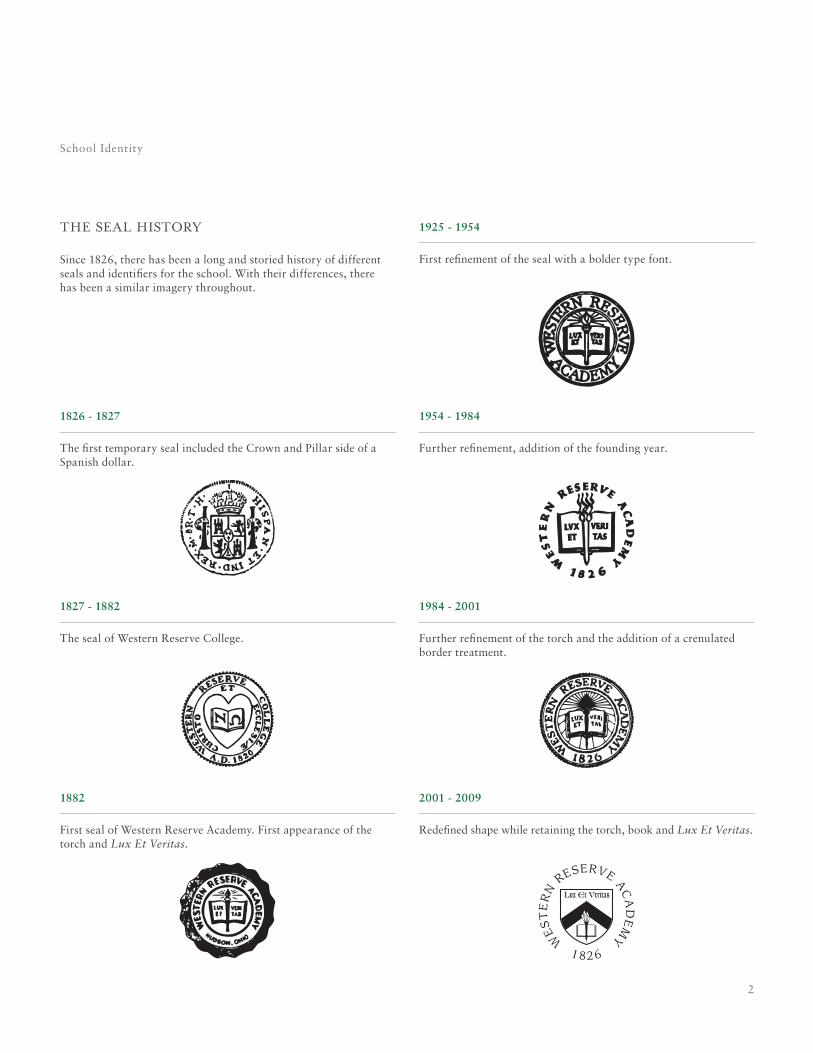
First seal of Western Reserve Academy. First appearance of the torch and Lux Et Veritas.
1925 - 1954
First refinement of the seal with a bolder type font.
the seal history
Since 1826, there has been a long and storied history of different seals and identifiers for the school. With their differences, there has been a similar imagery throughout.
School Identity
1826 - 1827
The first temporary seal included the Crown and Pillar side of a Spanish dollar.
1827 - 1882
The seal of Western Reserve College.
1954 - 1984
Further refinement, addition of the founding year.
1984 - 2001
Further refinement of the torch and the addition of a crenulated border treatment.
2001 - 2009
Redefined shape while retaining the torch, book and Lux Et Veritas.
3
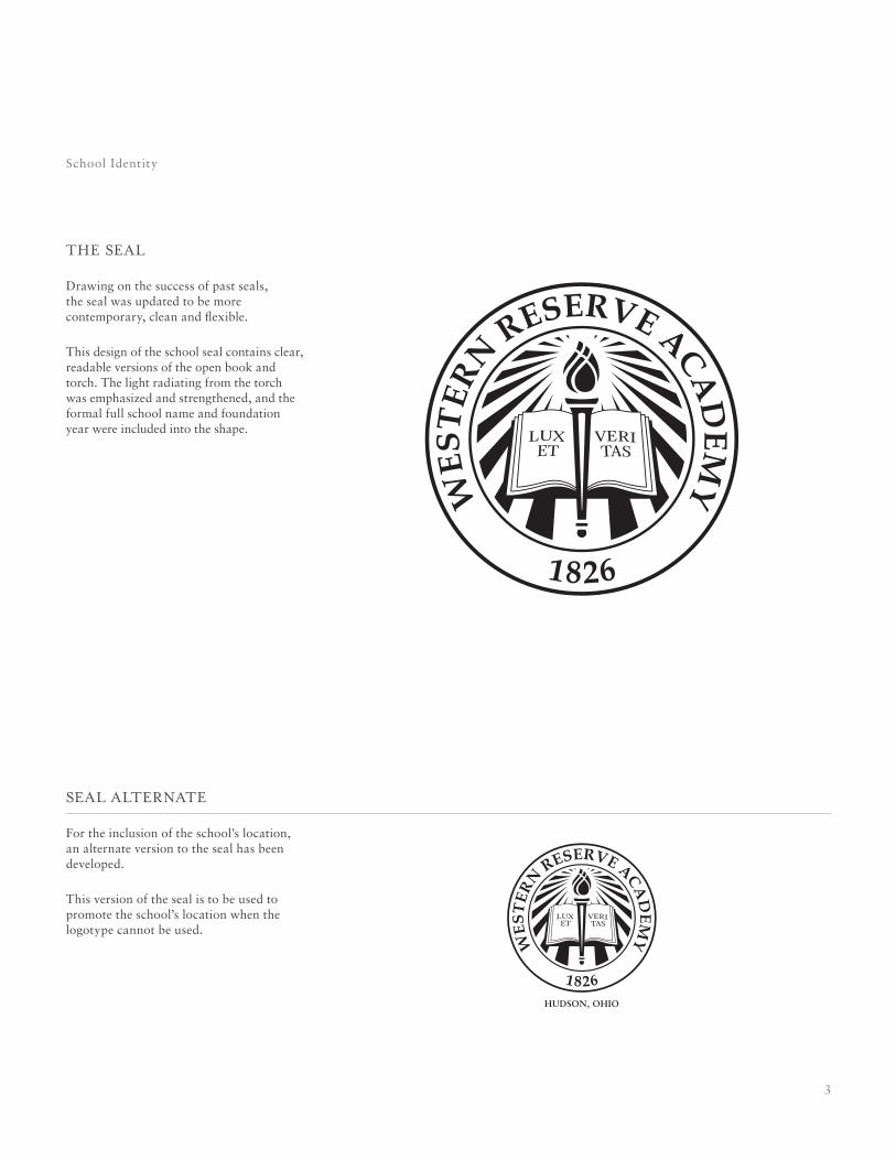
the seal
Drawing on the success of past seals, the seal was updated to be more contemporary, clean and flexible.
This design of the school seal contains clear, readable versions of the open book and torch. The light radiating from the torch was emphasized and strengthened, and the formal full school name and foundation year were included into the shape.
School Identity
seal alternate
For the inclusion of the school’s location, an alternate version to the seal has been developed.
This version of the seal is to be used to promote the school’s location when the logotype cannot be used.
4
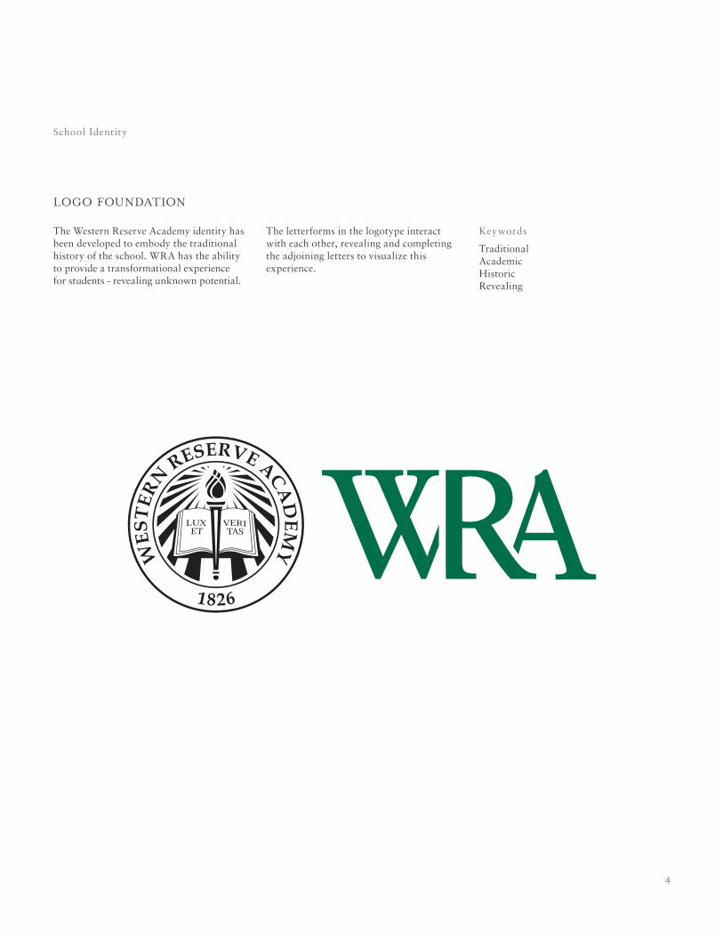
logo foundation
The Western Reserve Academy identity has been developed to embody the traditional history of the school. WRA has the ability to provide a transformational experience for students - revealing unknown potential.
School Identity
The letterforms in the logotype interact with each other, revealing and completing the adjoining letters to visualize this experience.
Keywords
TraditionalAcademicHistoricRevealing
5
logo construction
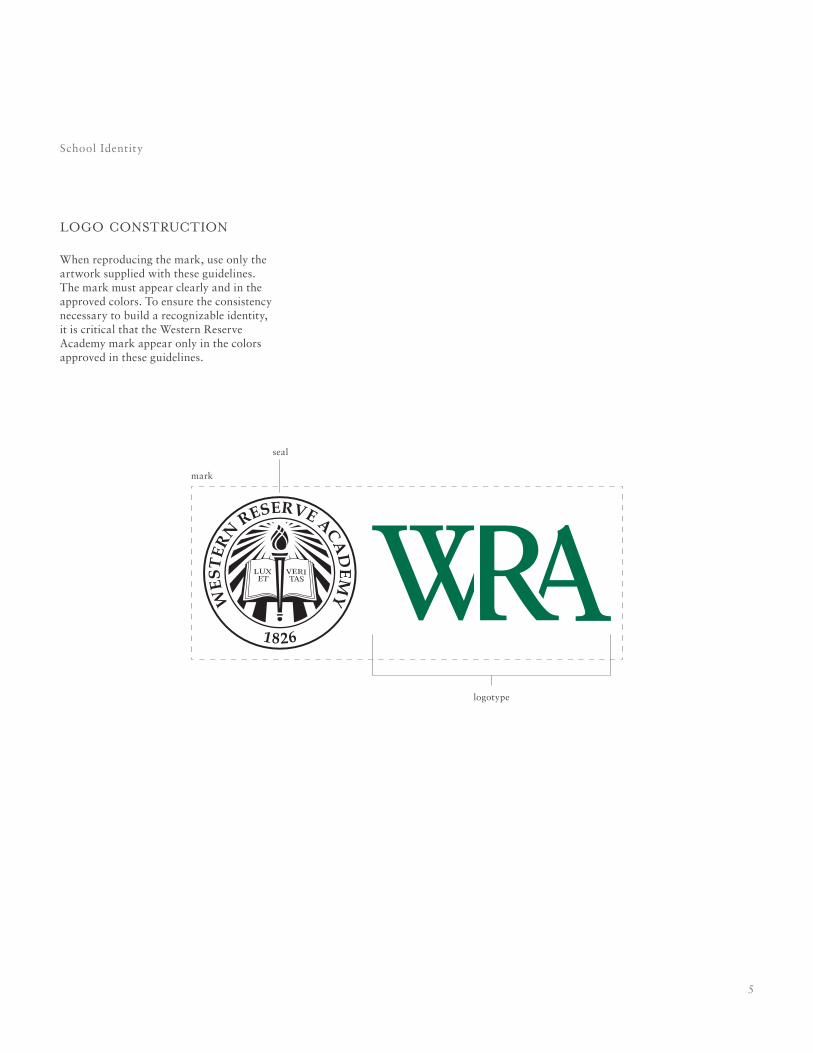
When reproducing the mark, use only the artwork supplied with these guidelines. The mark must appear clearly and in the approved colors. To ensure the consistency necessary to build a recognizable identity, it is critical that the Western Reserve Academy mark appear only in the colors approved in these guidelines.
School Identity
logotype
seal
mark
6
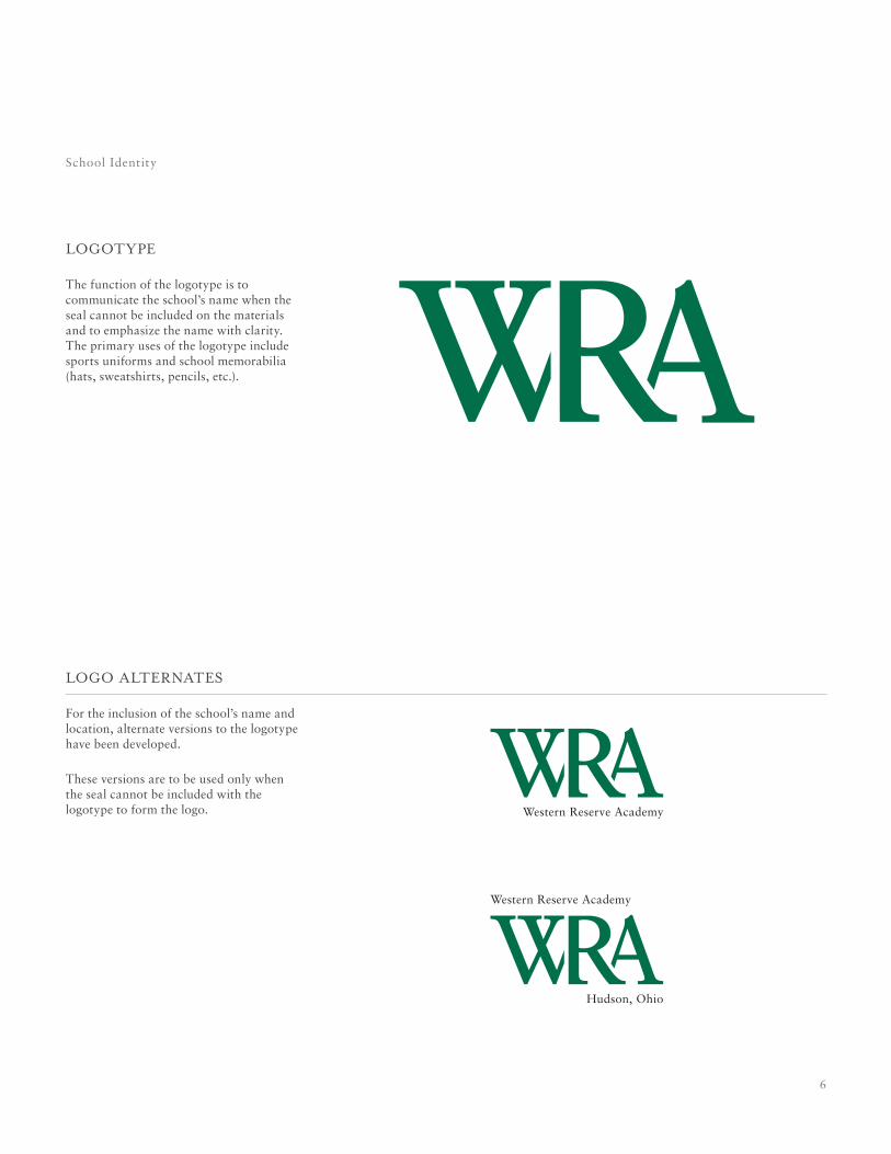
logotype
The function of the logotype is to communicate the school’s name when the seal cannot be included on the materials and to emphasize the name with clarity. The primary uses of the logotype include sports uniforms and school memorabilia (hats, sweatshirts, pencils, etc.).
School Identity
logo alternates
For the inclusion of the school’s name and location, alternate versions to the logotype have been developed.
These versions are to be used only when the seal cannot be included with the logotype to form the logo.
7
When written in text, the first instance of the school name should be written in full. The full text should be written as follows: Western Reserve Academy. In subsequent instances, the school may be referred to with the shortened name: WRA.
writing the name
While these guidelines focus mainly on the visual representation of Western Reserve Academy, the school brand should also be communicated consistently in text applications.
School Identity

8
usage / application
9
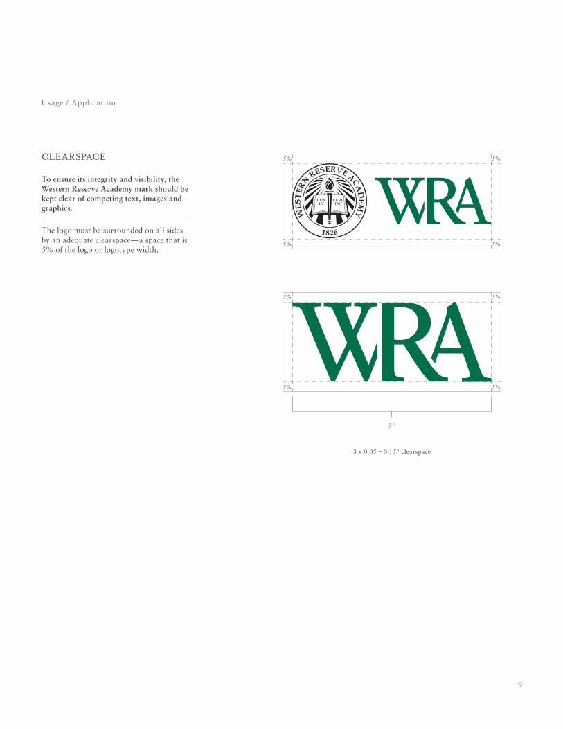
clearspace
To ensure its integrity and visibility, the Western Reserve Academy mark should be kept clear of competing text, images and graphics.
The logo must be surrounded on all sides by an adequate clearspace—a space that is 5% of the logo or logotype width.
Usage / Application
5% 5%
5% 5%
5% 5%
5% 5%
3"
3 x 0.05 = 0.15" clearspace
10
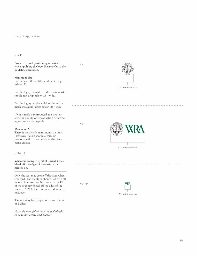
size
Proper size and positioning is critical when applying the logo. Please refer to the guidelines provided.
Minimum Size For the seal, the width should not drop below .5".
For the logo, the width of the entire mark should not drop below 1.5" wide.
For the logotype, the width of the entire mark should not drop below .25" wide.
If your mark is reproduced at a smaller size, the quality of reproduction or screen appearance may degrade.
Maximum Size There is no specific maximum size limit. However, its size should always be proportional to the content of the piece being created.
scale
When the enlarged symbol is used it may bleed off the edges of the surface it’s printed on.
Only the seal may crop off the page when enlarged. The logotype should not crop off in any circumstance. No more than 45% of the seal may bleed off the edge of the surface. A 20% bleed is preferred in most instances.
The seal may be cropped off a maximum of 2 edges.
Note: Be mindful of how the seal bleeds so as to not create odd shapes.
Usage / Application
logotype
.25" minimum size
1.5" minimum size
logo
.5" minimum size
seal
11
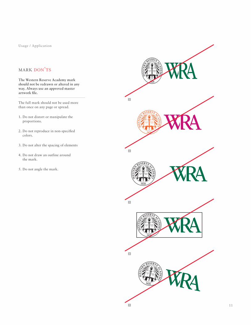
mark don’ts
The Western Reserve Academy mark should not be redrawn or altered in any way. Always use an approved master artwork file.
The full mark should not be used more than once on any page or spread.
1. Do not distort or manipulate the proportions.
2. Do not reproduce in non-specified colors.
3. Do not alter the spacing of elements
4. Do not draw an outline around the mark.
5. Do not angle the mark.
Usage / Application
1
2
4
5
3
12
Usage / Application
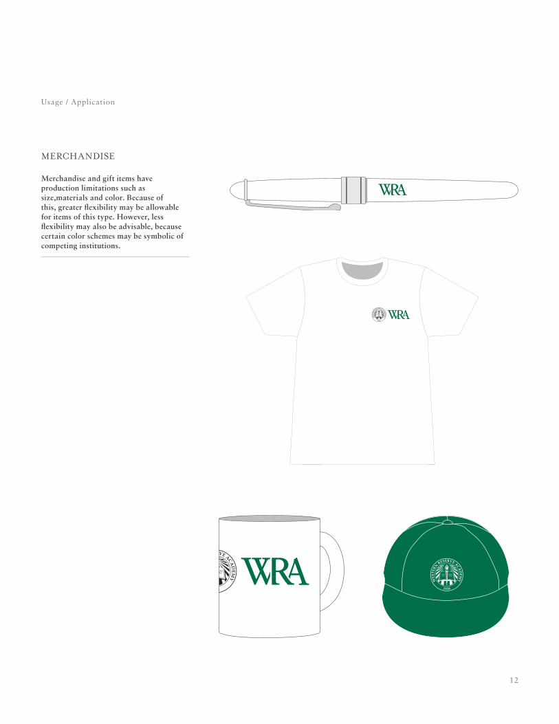
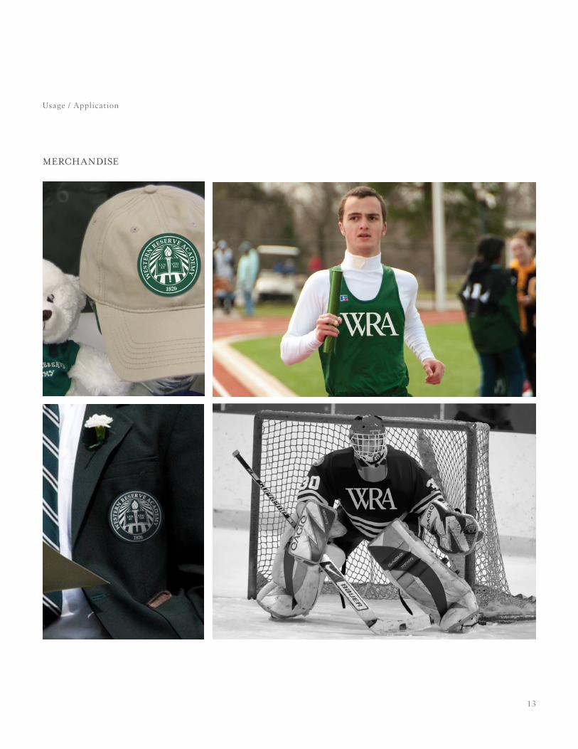
merchandise
Merchandise and gift items have production limitations such as size,materials and color. Because of this, greater flexibility may be allowable for items of this type. However, less flexibility may also be advisable, because certain color schemes may be symbolic of competing institutions.
13
Usage / Application
merchandise
14
colors + visual system
15
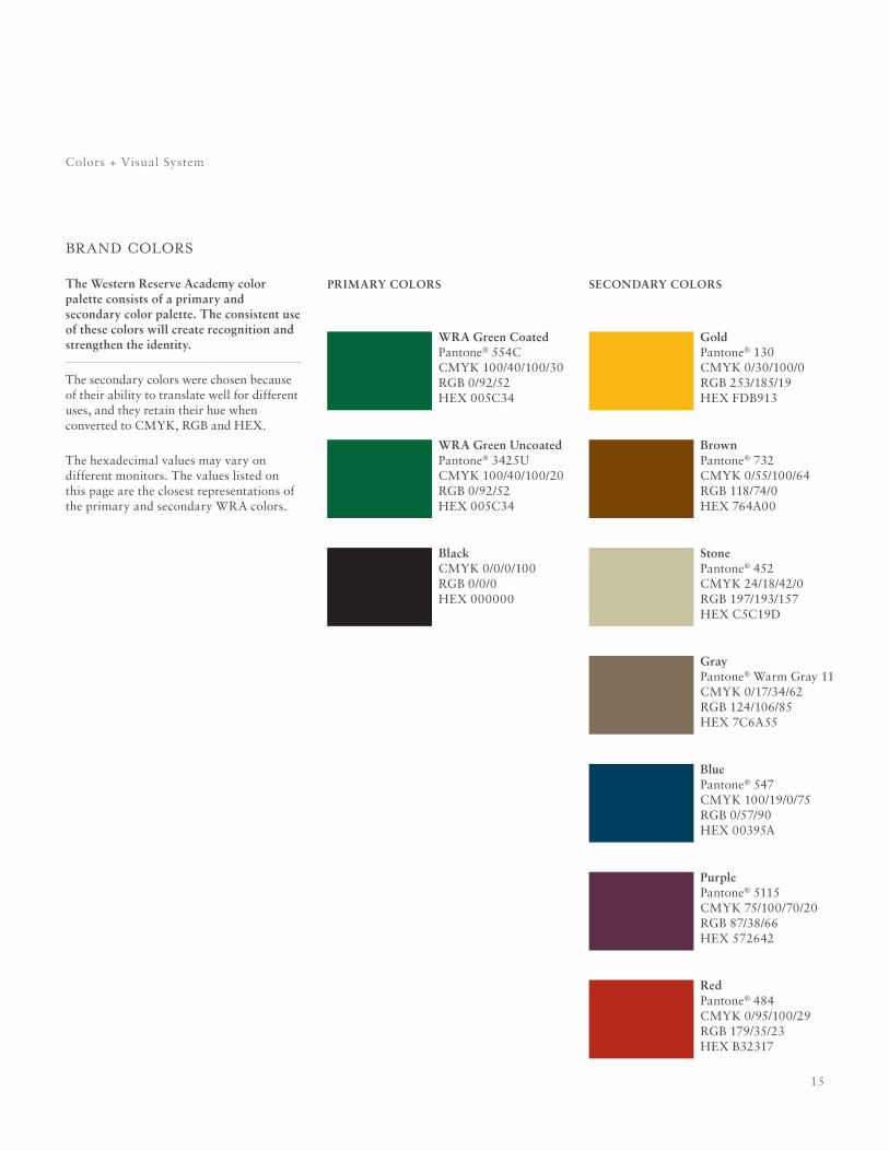
Colors + Visual System
WRA Green CoatedPantone® 554CCMYK 100/40/100/30RGB 0/92/52HEX 005C34
WRA Green UncoatedPantone® 3425UCMYK 100/40/100/20RGB 0/92/52HEX 005C34
BlackCMYK 0/0/0/100RGB 0/0/0HEX 000000
PRIMARy COlORS
GoldPantone® 130CMYK 0/30/100/0RGB 253/185/19HEX FDB913
StonePantone® 452CMYK 24/18/42/0RGB 197/193/157HEX C5C19D
PurplePantone® 5115CMYK 75/100/70/20RGB 87/38/66HEX 572642
GrayPantone® Warm Gray 11CMYK 0/17/34/62RGB 124/106/85HEX 7C6A55
RedPantone® 484CMYK 0/95/100/29RGB 179/35/23HEX B32317
BrownPantone® 732CMYK 0/55/100/64RGB 118/74/0HEX 764A00
BluePantone® 547CMYK 100/19/0/75RGB 0/57/90HEX 00395A
SECOndARy COlORS
brand colors
The Western Reserve Academy color palette consists of a primary and secondary color palette. The consistent use of these colors will create recognition and strengthen the identity.
The secondary colors were chosen because of their ability to translate well for different uses, and they retain their hue when converted to CMYK, RGB and HEX.
The hexadecimal values may vary on different monitors. The values listed on this page are the closest representations of the primary and secondary WRA colors.
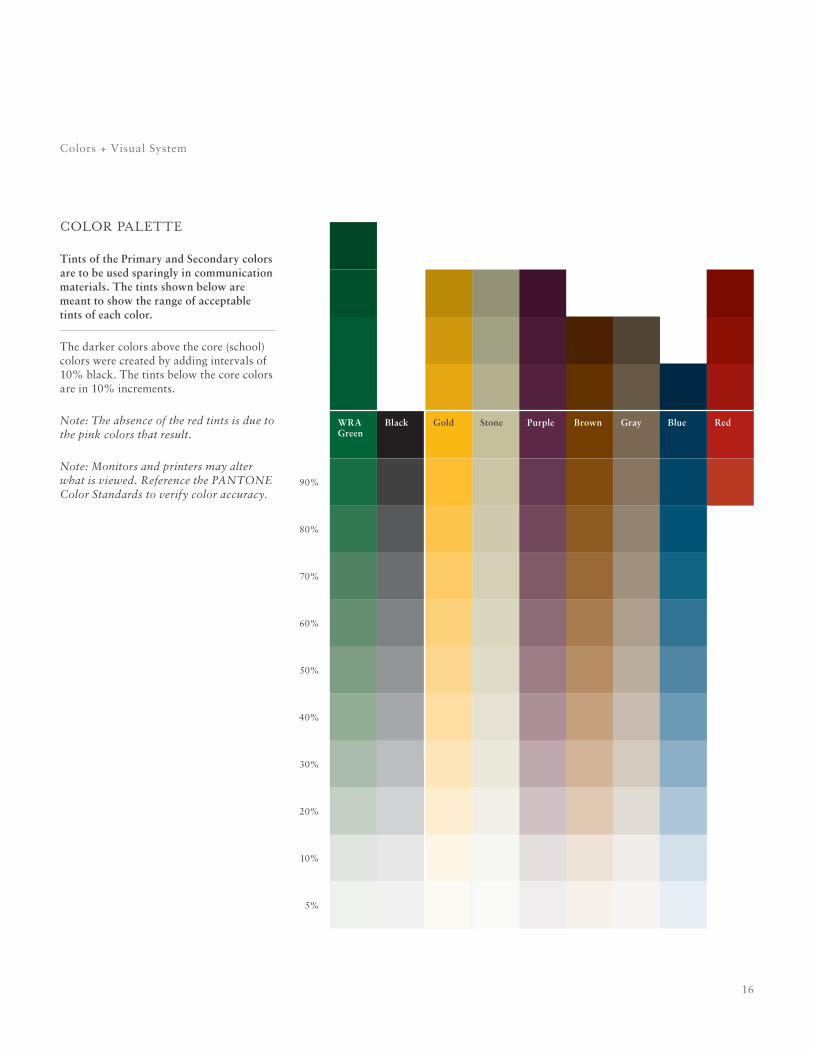
16
Colors + Visual System
90%
50%
70%
30%
10%
80%
40%
60%
20%
5%
Brown GrayPurple RedStone BlueGoldWRA Green
Black
color palette
Tints of the Primary and Secondary colors are to be used sparingly in communication materials. The tints shown below are meant to show the range of acceptable tints of each color.
The darker colors above the core (school) colors were created by adding intervals of 10% black. The tints below the core colors are in 10% increments.
Note: The absence of the red tints is due to the pink colors that result.
Note: Monitors and printers may alter what is viewed. Reference the PANTONE Color Standards to verify color accuracy.
17
Colors + Visual System
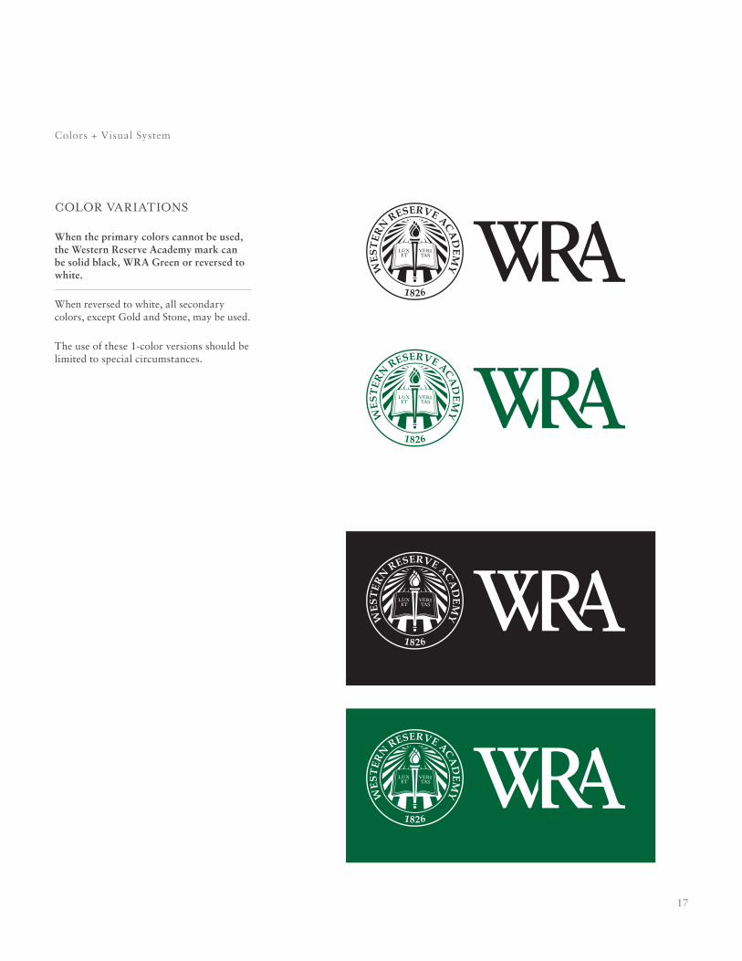
color variations
When the primary colors cannot be used, the Western Reserve Academy mark can be solid black, WRA Green or reversed to white.
When reversed to white, all secondary colors, except Gold and Stone, may be used.
The use of these 1-color versions should be limited to special circumstances.
18
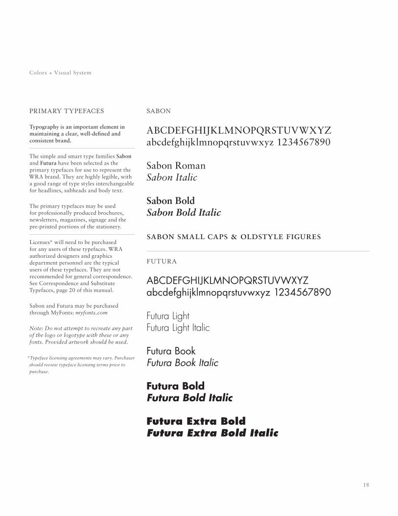
primary typefaces
Typography is an important element in maintaining a clear, well-defined and consistent brand.
The simple and smart type families Sabon and Futura have been selected as the primary typefaces for use to represent the WRA brand. They are highly legible, with a good range of type styles interchangeable for headlines, subheads and body text.
The primary typefaces may be used for professionally produced brochures, newsletters, magazines, signage and the pre-printed portions of the stationery.
Licenses* will need to be purchased for any users of these typefaces. WRA authorized designers and graphics department personnel are the typical users of these typefaces. They are not recommended for general correspondence. See Correspondence and Substitute Typefaces, page 20 of this manual.
Sabon and Futura may be purchased through MyFonts: myfonts.com
Note: Do not attempt to recreate any part of the logo or logotype with these or any fonts. Provided artwork should be used.
*Typeface licensing agreements may vary. Purchaser
should review typeface licensing terms prior to
purchase.
Colors + Visual System
sabon
ABCDEFGHIjKLMNOPqRSTUVWXYzabcdefghijklmnopqrstuvwxyz 1234567890
Sabon RomanSabon Italic
Sabon BoldSabon Bold Italic
sabon small caps & oldstyle figures
futura
abcdefghijklmnopqrstuvwxyzabcdefghijklmnopqrstuvwxyz 1234567890
Futura LightFutura Light Italic
futura bookFutura Book Italic
Futura BoldFutura Bold Italic
Futura Extra BoldFutura Extra Bold Italic
19
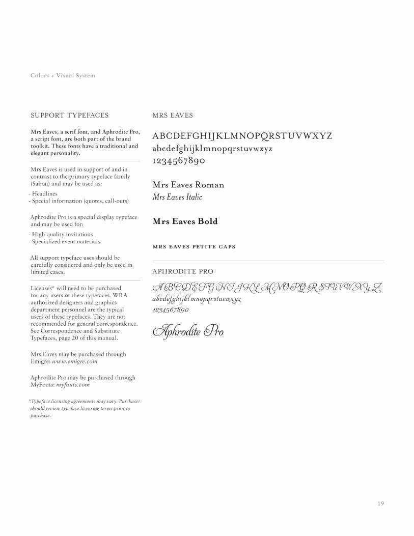
support typefaces
Mrs Eaves, a serif font, and Aphrodite Pro, a script font, are both part of the brand toolkit. These fonts have a traditional and elegant personality.
Mrs Eaves is used in support of and in contrast to the primary typeface family (Sabon) and may be used as:
- Headlines - Special information (quotes, call-outs)
Aphrodite Pro is a special display typeface and may be used for:
- High quality invitations - Specialized event materials
All support typeface uses should be carefully considered and only be used in limited cases.
Licenses* will need to be purchased for any users of these typefaces. WRA authorized designers and graphics department personnel are the typical users of these typefaces. They are not recommended for general correspondence. See Correspondence and Substitute Typefaces, page 20 of this manual.
Mrs Eaves may be purchased through Emigre: www.emigre.com
Aphrodite Pro may be purchased through MyFonts: myfonts.com
*Typeface licensing agreements may vary. Purchaser
should review typeface licensing terms prior to
purchase.
Colors + Visual System
mrs eaves
abcdefghijklmnopqrstuv wxyzabcdefghijklmnopqrstuvwxyz1234567890
mrs eaves romanMrs Eaves Italic
Mrs Eaves Bold
mrs eaves petite caps
aphrodite pro
A B c d e f G h ij k l m n O p q R st u v W X y Zabcdefghi jkl mnopqrstuvwxyz 1234567890
Aphrodite pro
20
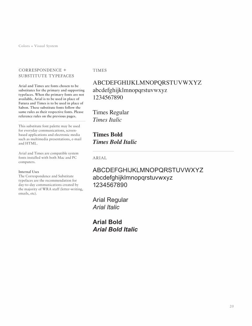
correspondence + substitute typefaces
Arial and Times are fonts chosen to be substitutes for the primary and supporting typefaces. When the primary fonts are not available, Arial is to be used in place of Futura and Times is to be used in place of Sabon. These substitute fonts follow the same rules as their respective fonts. Please reference rules on the previous pages.
This substitute font palette may be used for everyday communications, screen-based applications and electronic media such as multimedia presentations, e-mail and HTML.
Arial and Times are compatible system fonts installed with both Mac and PC computers.
Internal Uses The Correspondence and Substitute typefaces are the recommendation for day-to-day communications created by the majority of WRA staff (letter-writing, emails, etc).
Colors + Visual System
times
abcdefghijklmnopqrstuvwxyzabcdefghijklmnopqrstuvwxyz1234567890
times regularTimes Italic
Times BoldTimes Bold Italic
arial
abcdefghijklmnopqrstuvwxyzabcdefghijklmnopqrstuvwxyz1234567890
arial regular Arial Italic
Arial BoldArial Bold Italic
21
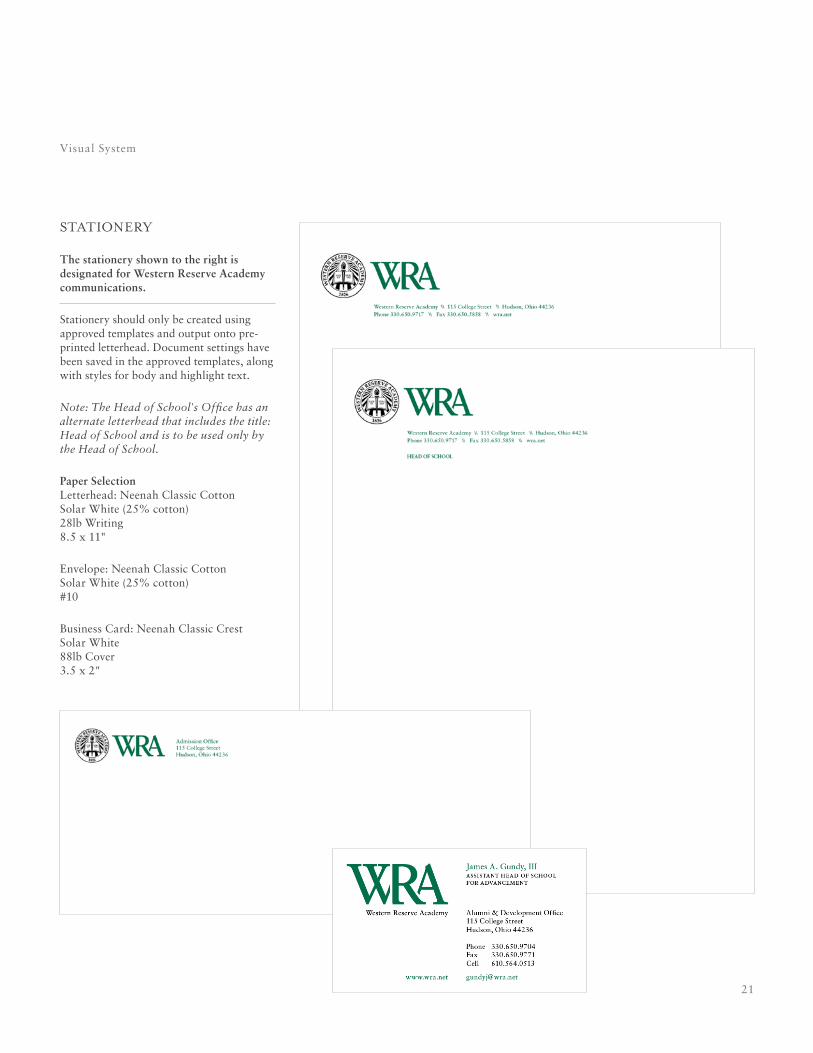
stationery
The stationery shown to the right is designated for Western Reserve Academy communications.
Stationery should only be created using approved templates and output onto pre-printed letterhead. Document settings have been saved in the approved templates, along with styles for body and highlight text.
Note: The Head of School's Office has an alternate letterhead that includes the title: Head of School and is to be used only by the Head of School.
Paper Selection Letterhead: Neenah Classic Cotton Solar White (25% cotton) 28lb Writing 8.5 x 11"
Envelope: Neenah Classic Cotton Solar White (25% cotton) #10
Business Card: Neenah Classic Crest Solar White 88lb Cover 3.5 x 2"
Visual System

23
glossary
24
requesting logo / letterhead
Glossary
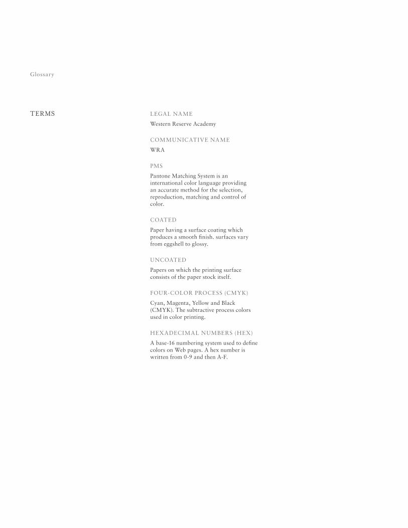
Glossary
LEGAL NAME
Western Reserve Academy
COMMUNICATIVE NAME
WRA
PMS
Pantone Matching System is an international color language providing an accurate method for the selection, reproduction, matching and control of color.
COATED
Paper having a surface coating which produces a smooth finish. surfaces vary from eggshell to glossy.
UNCOATED
Papers on which the printing surface consists of the paper stock itself.
FOUR-COLOR PROCESS (CMYK)
Cyan, Magenta, Yellow and Black (CMYK). The subtractive process colors used in color printing.
HEXADECIMAL NUMBERS (HEX)
A base-16 numbering system used to define colors on Web pages. A hex number is written from 0-9 and then A-F.
terms