Embed Size (px)
Citation preview
V I S I T M U S I C C I T Y. C O M
MUSIC CITYN A S H V I L L E C O N V E N T IO N & V I S T O R S C O R P
LO G O US AGE S TANDARD S
TABLE OF CONTENTS
About ��������������������������������������������������������������������������������������������������������������������� 2
Logo Size & Alignment ����������������������������������������������������������������������������������������� 3
Logo Clear Space ��������������������������������������������������������������������������������������������������� 4
Typography Standards & Logo Components ��������������������������������������������������������������������������������������������� 5
One-Color Usage ��������������������������������������������������������������������������������������������������� 6
Two-Color Usage ��������������������������������������������������������������������������������������������������� 7
Unacceptable Usage ���������������������������������������������������������������������������������������������� 8
Thanks For Your Support ��������������������������������������������������������������������������������������� 9
N A S H V I L L E C O N V E N T I O N & V I S I T O R S C O R P L O G O U S A G E S T A N D A R D S
ABOUT
Logo consistency and quality is essential in the development and growth of
a strong brand� The Nashville Convention & Visitors Corp has created this
guide to ensure our logo is used consistently and of the highest quality available
to all markets we serve, both externally and internally� Digital versions of the
logo are available here or by contacting the Nashville Convention & Visitors
Corp� To maintain the highest possible definition, color fidelity, and legibility
reproducing the Nashville logo from a previously-printed or photocopied version
is prohibited�
2N A S H V I L L E C O N V E N T I O N & V I S I T O R S C O R P L O G O U S A G E S T A N D A R D S
LOGO SIZE
The Nashville Music City logo is designed to retain its characteristics in a
variety of applications and sizes� To ensure readability, the logo may be used no
smaller than 1-inch wide� Certain applications, such as signage, may require
enlargements of the logo� Logo reproductions should be made from approved
electronic files� The Nashville Music City logo or its individual elements may
not be redrawn, reproportioned, distorted or altered in any way� Please preserve a
reasonable space on all sides of the logo for legibility�
ALIGNMENT
Align text, such as address, with the top letters in the logo� Text for an address
may hang below the bottom of the logo� Please preserve a reasonable space
between the right edge of the logo and text� (See logo clear space in next
section�)
3N A S H V I L L E C O N V E N T I O N & V I S I T O R S C O R P L O G O U S A G E S T A N D A R D S
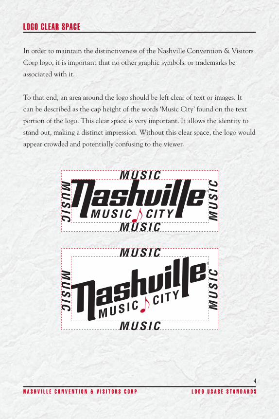
LOGO CLEAR SPACE
In order to maintain the distinctiveness of the Nashville Convention & Visitors
Corp logo, it is important that no other graphic symbols, or trademarks be
associated with it�
To that end, an area around the logo should be left clear of text or images� It
can be described as the cap height of the words ‘Music City’ found on the text
portion of the logo� This clear space is very important� It allows the identity to
stand out, making a distinct impression� Without this clear space, the logo would
appear crowded and potentially confusing to the viewer�
4N A S H V I L L E C O N V E N T I O N & V I S I T O R S C O R P L O G O U S A G E S T A N D A R D S
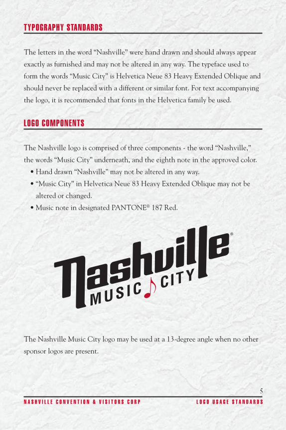
LOGO COMPONENTS
The Nashville logo is comprised of three components - the word “Nashville,”
the words “Music City” underneath, and the eighth note in the approved color�
• Hand drawn “Nashville” may not be altered in any way�
• “Music City” in Helvetica Neue 83 Heavy Extended Oblique may not be
altered or changed�
• Music note in designated PANTONE® 187 Red�
The Nashville Music City logo may be used at a 13-degree angle when no other
sponsor logos are present�
5N A S H V I L L E C O N V E N T I O N & V I S I T O R S C O R P L O G O U S A G E S T A N D A R D S
TYPOGRAPHY STANDARDS
The letters in the word “Nashville” were hand drawn and should always appear
exactly as furnished and may not be altered in any way� The typeface used to
form the words “Music City” is Helvetica Neue 83 Heavy Extended Oblique and
should never be replaced with a different or similar font� For text accompanying
the logo, it is recommended that fonts in the Helvetica family be used�
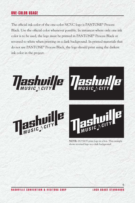
ONE-COLOR USAGE
The official ink color of the one-color NCVC logo is PANTONE® Process
Black� Use the official color whenever possible� In instances where only one ink
color is to be used, the logo must be printed in PANTONE® Process Black or
reversed to white when printing on a dark background� In printed materials that
do not use PANTONE® Process Black, the logo should print using the darkest
ink color in the project�
NOTE: DO NOT print logo in a box� This example shows reversed logo in a dark background�
6N A S H V I L L E C O N V E N T I O N & V I S I T O R S C O R P L O G O U S A G E S T A N D A R D S
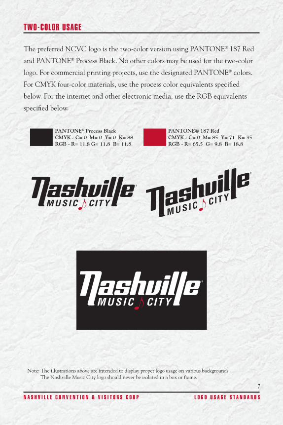
TWO-COLOR USAGE
The preferred NCVC logo is the two-color version using PANTONE® 187 Red
and PANTONE® Process Black� No other colors may be used for the two-color
logo� For commercial printing projects, use the designated PANTONE® colors�
For CMYK four-color materials, use the process color equivalents specified
below� For the internet and other electronic media, use the RGB equivalents
specified below�
PANTONE® Process BlackCMYK - C= 0 M= 0 Y= 0 K= 88RGB - R= 11.8 G= 11.8 B= 11.8
PANTONE® 187 RedCMYK - C= 0 M= 85 Y= 71 K= 35RGB - R= 65.5 G= 9.8 B= 18.8
Note: The illustrations above are intended to display proper logo usage on various backgrounds� The Nashville Music City logo should never be isolated in a box or frame�
7N A S H V I L L E C O N V E N T I O N & V I S I T O R S C O R P L O G O U S A G E S T A N D A R D S
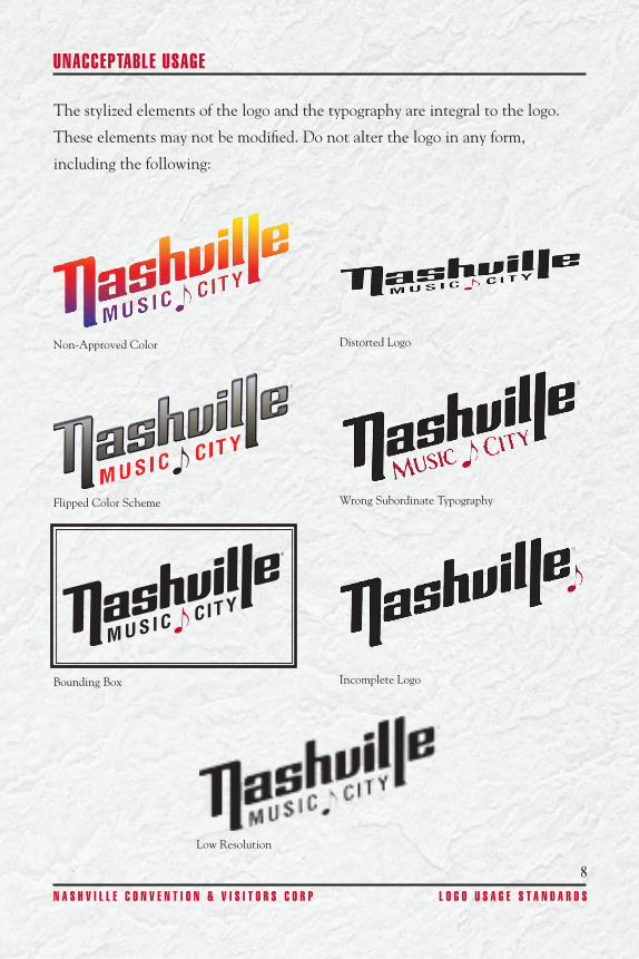
UNACCEPTABLE USAGE
The stylized elements of the logo and the typography are integral to the logo�
These elements may not be modified� Do not alter the logo in any form,
including the following:
Non-Approved Color Distorted Logo
Flipped Color Scheme Wrong Subordinate Typography
Bounding Box Incomplete Logo
Low Resolution
8N A S H V I L L E C O N V E N T I O N & V I S I T O R S C O R P L O G O U S A G E S T A N D A R D S
9V I S I T M U S I C C I T Y. C O M
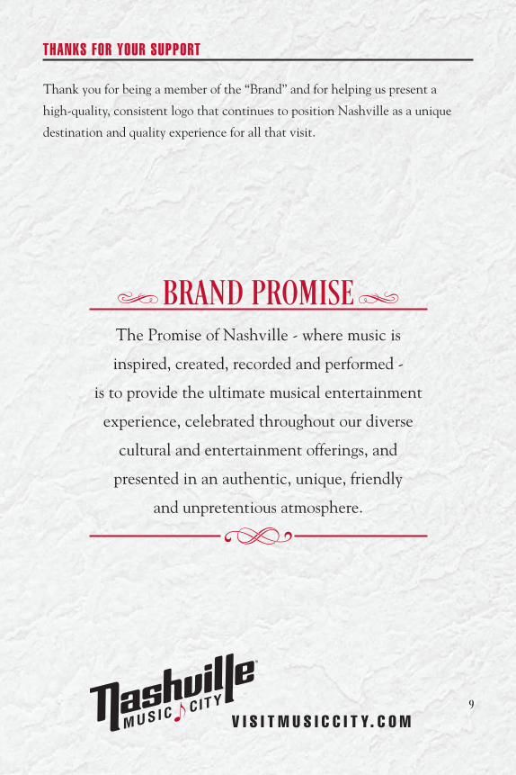
THANKS FOR YOUR SUPPORT
Thank you for being a member of the “Brand” and for helping us present a
high-quality, consistent logo that continues to position Nashville as a unique
destination and quality experience for all that visit�
BRAND PROMISEThe Promise of Nashville - where music is
inspired, created, recorded and performed -
is to provide the ultimate musical entertainment
experience, celebrated throughout our diverse
cultural and entertainment offerings, and
presented in an authentic, unique, friendly
and unpretentious atmosphere�
i j
h