Embed Size (px)
Citation preview

M AGYA R N EMZETI BA N K
MNB HaNdBooksNo. 8.
December 2016
ZoltáN Végh
Introduction to technical analysis: charts, opening and managing positions

MNB Handbooks
Zoltán Végh
Introduction to technical analysis:charts, opening and managing positions
MAGYAR NEMZETI BANK

Published by the Magyar Nemzeti Bank
Publisher in charge: Eszter Hergár
H-1054 Budapest, Szabadság tér 9.
www.mnb.hu
ISSN 2498-8413 (Print)
ISSN 2498-8421 (Online)
MNB Handbooks
Introduction to technical analysis: charts, opening and managing positions
Written by Zoltán Végh
(Directorate Money and Foreign Exchange Markets, Magyar Nemzeti Bank)
This Handbook was approved for publication by István Veres, Director
Contents
1 Introduction 5
2 analysis methods 7
2.1 Fundamental analysis 7
2.2 Technical analysis 8
2.3 Differences 9
3 Theories 11
3.1 Dow theory 11
3.2 Fibonacci sequence theory 13
3.3 Elliott wave theory 15
3.4 Random walk theory 17
4 Chart types 19
4.1 Line chart 19
4.2 Bar chart 20
4.3 Japanese candlestick 21
4.4 Histogram 22
5 Introduction to technical analysis 24
5.1 Trend 24
5.2 Support and resistance 27
5.3 Volume 28
5.4 Time horizon 29
6 Indicators 31
6.1 Trend following indicators 31
6.2 Momentum indicators 36
6.3 Volatility indicators 41
6.4 Volume-based indicators 44
7 Chart patterns 47
7.1 Continuation patterns 47
7.2 Reversal patterns 51
8 Technical analysis in practice 55
8.1 USD/TRY daytrade 55
8.2 EUR/USD daytrade + stop loss 56
8.3 EUR / USD double bottom 57
9 References 59
Introduction | 5
1 Introduction
The principles of technical analysis date back hundreds of years; some aspects of technical analysis already appeared in Joseph de la Vega’s “Confusion of Confusions”, which was published in 1688 and is considered to be the oldest book ever written on the stock exchange.
In Asia, one still highly popular technical analysis method was developed in the middle of the 18th century: the Japanese candlestick and the chart composed of it, which is associated with the name Homma Munehisa.
Some believe that the roots of modern-day technical analysis go back to the end of the 1800s when Charles H. Dow devised the first stock market index, calculated from the daily closing prices of twelve stocks. Dow’s basic tenets on stock price movements have become known as the Dow theory. To this day, the first and perhaps the most recognised stock market index, the Dow Jones Industrial Average, partly bears his name.1
We owe the practical applicability of the Dow theory to William Peter Hamilton, who succeeded Charles Dow as editor of The Wall Street Journal after his death and presented an in-depth analysis of the Dow theory in his book, The Stock Market Barometer, in 1922.2
In 1948, Robert D. Edwards and John Magee published Technical Analysis of Stock Trends. Dedicated to trend analysis and chart patterns, their book is still looked upon as one of the seminal works of technical analysis.
Initially, the application of technical analysis was limited almost exclusively to the analysis of charts, as technological limitations – the inadequate performance of computers – did not support the processing of high volumes of statistical data.
1 Steven B. Achelis (1995): Technical Analysis from A to Z. 2nd edition. DO-C. United States.2 Charles D. Kirkpatrick and J. R. Dahlquist (2007): The Complete Resource for Financial Market Technicians.
FT Press. United States.
6 | MNB Handbooks • Introduction to technical analysis
In the 20th century, along with the spread of new technical analysis tools and theories, rapid technological development increasingly shifted the focus to computer-assisted techniques and software applications. One of the current topics of modern days is high-frequency trading and its regulation.3
The purpose of this booklet is to give an insight into the fundamentals of technical analysis, to describe its main theoretical directions and to provide an overview of the technical analysis tools available (indicators, charts and patterns).
It is important to stress that, due to its limited scope, this booklet should be viewed only as an introduction to this particular branch of analysis.
3 Charles D. Kirkpatrick and J. R. Dahlquist (2007): The Complete Resource for Financial Market Technicians. FT Press. United States.
Analysis methods | 7
2 Analysis methods
Although the objectives of fundamental and technical analysis are nearly the same – to identify and mitigate risks and to predict the direction of future price changes with a view to maximising profits – their tools and methods are vastly different. While the former relies on the main assumption that prices are essentially determined by fundamental factors and investors’ decisions are based on an analysis of current political and economic events and financial indicators, in the case of the latter the analysis is fundamentally based on mathematics and statistics.
It should be emphasised that neither fundamental, nor technical analysis can guarantee the ultimate success of an investment.
2.1 Fundamental analysis
Fundamental analysis is typically used for stock valuation. Followers of the method seek an answer to the underlying factors behind stock price movements, focusing their analysis on the fundamentals of businesses’ financial management, financial results and indicators (“company analysis”), while also paying attention to the macroeconomic and industrial environment.
Fundamental analysts try to measure the “intrinsic value” of companies. They use this value to assess whether an investment opportunity (company) is underpriced or overpriced and to make a recommendation on buying or selling. Given that there may be a significant difference between the intrinsic value of a share and its current market price in the short run, the true relevance of the application of fundamental analysis lies in long-term investments.
In determining the value of a business, fundamental analysts examine the following indicators:
• Profitability indicators (ROA, ROE, ROS),
– measuring the company’s earning potential;
8 | MNB Handbooks • Introduction to technical analysis
• Efficiency indicators (inventory turnover, receivables and accounts payable turnover ratios),
– measuring how efficiently a company uses its assets;
• Leverage indicators (equity ratio, interest coverage ratio),
– indicating the company’s indebtedness;
• Liquidity indicators (current ratio, cash ratio, interval measure),
– indicating the company’s solvency; and
• Market indicators (market capitalisation, P/E, EPS, P/BV, dividend yield),
– measuring investors’ assessment of the company.
The fundamental analysis of foreign exchange (FX) markets is extremely complex. This is because the value of a foreign currency may be influenced by numerous fundamental factors, such as the relative interest rate and inflation level typical of the given currency or the performance of the economy concerned (generally as measured by GDP), as well as other macroeconomic indicators and monetary policy objectives. Due to its complexity, the use of this approach in the FX market is mainly limited to predicting long-term trends.
2.2 Technical analysis
In using technical analysis, investors try to predict the direction in market and price changes in consideration of historical and current market prices and volume. In order to determine possible outcomes, they identify various patterns (head and shoulders pattern, flags, triangles, etc.) and apply different indicators (moving averages, oscillators, etc.). While the identification of patterns is somewhat subjective, indicators can be calculated on the basis of mathematical/statistical formulas. Numerous trading strategies are based on the use of indicators.
Analysis methods | 9
The main principles of technical analysis are the following:
1. Market action discounts everything:
In other words, besides the interaction between supply and demand, the current market price already reflects not only all of the information known about a stock, but also investors’ future expectations.
Market volume, which is viewed as an internal attribute of the market, also plays a prominent role in market analysis and in determining the expected direction of prices.
2. History repeats itself:
One of the basic tenets of technical analysis is the assumption that in similar situations investors tend to repeat the behaviour of other investors.
Essentially, the system of technical analysis evolved from the study of these behaviour patterns. This theory is supported by observations on crowd psychology as described in psychological studies.
2.3 Differences
Perhaps one of the most important differences between technical and fundamental analysis is the fact that the information they use derives from entirely different sources. In the case of fundamental analysis, investors gain information primarily from corporate (flash) reports, while technical analysts mainly rely on price charts and volume.
Moreover, while the followers of fundamental analysis think long term, often in spans of years, the horizon of technical analysis disciples is far shorter: weeks, days (day-trading), or even hours or minutes.
Despite the considerable difference between the two methods, they complement each other fairly well. While fundamental analysis seeks an answer to the question “What?”, i.e. which stocks, bonds, foreign currency, commodity, etc. is worth investing in (or, as the case may be, disposing of ), technical analysis helps to decide “When?”. The levels identified with the
10 | MNB Handbooks • Introduction to technical analysis
assistance of technical analysis and the indicators used help investors to navigate the issue of overpricing or underpricing and define the stop-loss and take-profit4 levels. Trading exclusively on the basis of fundamentals suits investors who are prepared – and able – to endure relatively substantial unrealised losses even in the long term, as they confident that their assessment and evaluation of the current situation and the resulting decision are correct and the price movement of the given instrument will ultimately turn in their favour. By contrast, investors who depend solely on technical analysis typically take on short-term positions in the hope of realising quick profits.
4 Stop-loss, take profit – placing an order to close out a current position immediately.
Theories | 11
3 Theories
3.1 Dow theory5, 6
The Dow theory was named after its creator, Charles Henry Dow (1851–1902), an American financial journalist who, besides being one of the founding editors of The Wall Street Journal, is also thought to be a pioneer of modern technical analysis. The formulation of one of the oldest and still popular American market indicator, the Dow Jones Industrial Average (DJIA), is also associated with his name. Initially, the indicator devised by Dow consisted of 12 components; today it measures the stock market value of the top 30 companies of the United States.
Time-tested and proved effective even today, the Dow theory was published in 1902 after Dow’s death by A. C. Nelson in The Wall Street Journal.
The basic tenets of the theory
1. The most revolutionary novelty of the Dow theory was its assertion that stock prices reflect not only supply and demand, but also any new information as soon as it becomes available, including future expectations, and as such it can be used to predict future events.
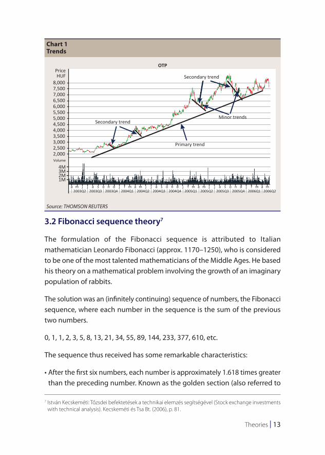
2. Based on the theory, three market trends prevail simultaneously in the market, each determined by the time horizon. The trend itself can be understood as the general direction of the market price.
We distinguish between primary, secondary and minor trends and all of these movements may be in progress at the same time in the market. Primary trends – the determinants of bull or bear markets – are the most significant of all. They are typically longer than a year in duration, but they may even encompass a decade.
5 Charles D. Kirkpatrick and J. R. Dahlquist (2007): The Complete Resource for Financial Market Technicians. FT Press. United States, Chapter 6.
6 Róbert Cselovszki (1993): A Dow-elmélet (The Dow Theory). Bank & Tőzsde, 1993/4, 12 February, p. 9.
12 | MNB Handbooks • Introduction to technical analysis
Secondary trends take the exact opposite direction, materialising as a sharp decline in a primary bull market or a rally in a primary bear market. These reaction generally last from weeks to several months.
The third, minor trend indicates the daily fluctuation of the prices; its direction is entirely random, and it can last from a couple of days to several weeks.
Besides the divergence in their time horizon, the three trends are also set apart by the fact that, while minor – and potentially, secondary – trends may be manipulated by major institutional investors (e.g. investment banks, hedge funds, sovereign wealth funds, pension funds), primary trends cannot be controlled.
3. Of the three trends, primary trends have the longest duration. They may well last for years, and they themselves consist of three phases: the “accumulation”, the “public participation” and the “distribution” phase. The emergence of individual phases within the trend can be attributed to the information asymmetry among market participants. In the first phase (during the emergence of a bull market), well-informed investors start actively buying certain stocks. In the second phase, technical analysts follow suit. Accordingly, in the second phase the market is on an upswing: it is characterised by general optimism, rising volumes and rapidly increasing prices. In the third phase, even risk-averse investors catch on and begin to participate, while astute investors already start exiting the market.
4. According to the Dow theory, the indicators confirm each other (“concept of confirmation”). In Hamilton’s words (25 June 1928): “Dow always ignored a movement of an average which was not confirmed by the other, and experience since his death has shown the wisdom of that method of checking the reading of the averages”.
5. Although transaction volume does not signal a trend reversal, increased volume confirms the trend and hence, it can serve as a reliable secondary indicator.
6. The trend continues until there is a clear indication of a reversal. Numerous tools of technical analysis may assist investors in pinpointing trend reversals.
Theories | 13
3.2 Fibonacci sequence theory7
The formulation of the Fibonacci sequence is attributed to Italian mathematician Leonardo Fibonacci (approx. 1170–1250), who is considered to be one of the most talented mathematicians of the Middle Ages. He based his theory on a mathematical problem involving the growth of an imaginary population of rabbits.
The solution was an (infinitely continuing) sequence of numbers, the Fibonacci sequence, where each number in the sequence is the sum of the previous two numbers.
0, 1, 1, 2, 3, 5, 8, 13, 21, 34, 55, 89, 144, 233, 377, 610, etc.
The sequence thus received has some remarkable characteristics:
• After the first six numbers, each number is approximately 1.618 times greater than the preceding number. Known as the golden section (also referred to
7 István Kecskeméti: Tőzsdei befektetések a technikai elemzés segítségével (Stock exchange investments with technical analysis). Kecskeméti és Tsa Bt. (2006), p. 81.
Chart 1Trends
8,000
PriceHUF
Volume
OTP
Secondary trend
Secondary trend
Minor trends
Primary trend
7,5007,0006,5006,0005,5005,0004,5004,0003,5003,0002,5002,000
4M3M2M1M
a a s o n dm2003Q2 2003Q3 2003Q4 2004Q1 2004Q2 2004Q3 2004Q4 2005Q1 2005Q2 2005Q3 2005Q4 2006Q1 2006Q2
j j j f m ma a s o n dj j j f m a m a s o n dj j j f m ma
Source: THOMSON REUTERS
14 | MNB Handbooks • Introduction to technical analysis
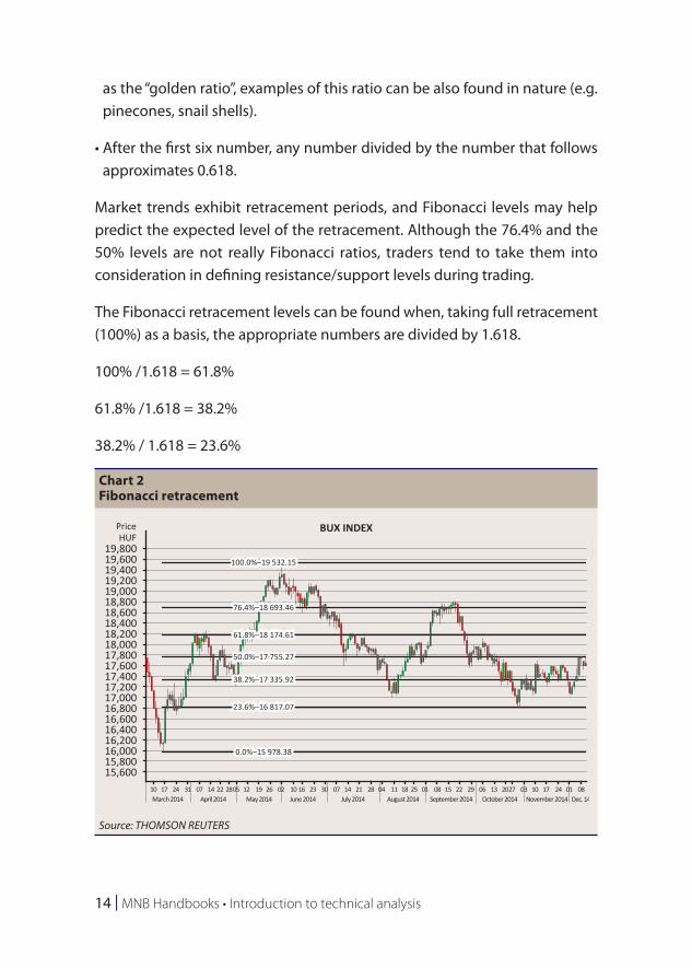
as the “golden ratio”, examples of this ratio can be also found in nature (e.g. pinecones, snail shells).
• After the first six number, any number divided by the number that follows approximates 0.618.
Market trends exhibit retracement periods, and Fibonacci levels may help predict the expected level of the retracement. Although the 76.4% and the 50% levels are not really Fibonacci ratios, traders tend to take them into consideration in defining resistance/support levels during trading.
The Fibonacci retracement levels can be found when, taking full retracement (100%) as a basis, the appropriate numbers are divided by 1.618.
100% /1.618 = 61.8%
61.8% /1.618 = 38.2%
38.2% / 1.618 = 23.6%
Chart 2Fibonacci retracement
19,800
PriceHUF
BUX INDEX
100.0%–19 532.15
76.4%–18 693.46
61.8%–18 174.61
50.0%–17 755.27
38.2%–17 335.92
23.6%–16 817.07
0.0%–15 978.38
19,60019,40019,20019,00018,80018,60018,40018,20018,00017,80017,60017,40017,20017,00016,80016,60016,40016,20016,00015,80015,600
10 17March 2014 April 2014 May 2014 June 2014 July 2014 August 2014 September 2014 October 2014 November 2014 Dec. 14
24 31 07 14 22 2805 12 19 26 02 10 16 23 30 07 14 21 28 04 11 18 25 01 08 15 22 29 06 13 2027 03 10 17 24 01 08
Source: THOMSON REUTERS
Theories | 15
Based on the chart, the BUX rose by a total of 3,554 points from 15,978 points to 19,532 points. Taking this increment as 100%, we receive the next Fibonacci level (61.8% at 18,174 points) when we add 3,554/1.618 = 2,196 to 15,978.
Since the Fibonacci levels are monitored by many market participants who adjust their trading decisions accordingly, they serve, in a manner of speaking, as self-fulfilling prophecies.
To chart these levels, draw a horizontal line at a designated minimum and maximum price to indicate the 0% and 100% levels, and then divide the distance by the key Fibonacci retracement levels.
With respect to the Fibonacci retracement levels, we can propose the following rules of thumb:
• The ideal retracement level is at 61.8%.
• When the retracement of a stock price does not break through the 38.2% level, a trend continuation pattern is likely to take shape.
• When the stock price breaks through the 38.2% level, it is very likely to reach the 61.8% retracement level as well.
• When the price exits the 0–100% band, it is very likely to reach the 161.8% retracement level as well.
3.3 Elliott wave theory8, 9
Ralph Nelson Elliott (1871–1948), the creator of one of the most famous theories of technical analysis that has been proved effective in monitoring price movements to this day, published his observations in a series of articles in Financial World magazine in 1939.
8 Róbert Cselovszki (1992): Elliott hullámelmélete I.-II (Elliott Wave Theory I.-II). Tőzsde Kurír, 1992/38,39. 17, 24 September.
9 Charles D. Kirkpatrick and J. R. Dahlquist (2007): The Complete Resource for Financial Market Technicians. FT Press. United States, Chapter 20
16 | MNB Handbooks • Introduction to technical analysis
In his theory Elliott posits that capital and money markets are not chaotic; indeed, stock price movements form a discernible pattern of repetitive waves of different degree and duration.
In Elliott’s wave theory, price movements are essentially determined by three elements:
• patterns, which take the shape of waves or wave formations;
• ratios, which can be used to measure the relationship between the waves and to identify pivot points more accurately;
• time, i.e. the length of the cycles, provides assistance in defining the pattern – and the ratio – more precisely.
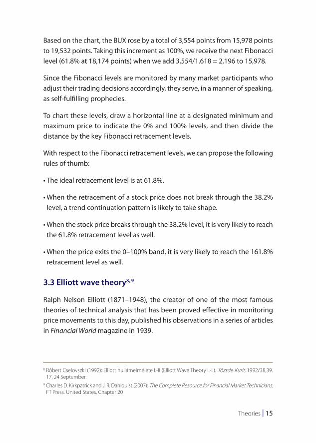
The Elliott cycle consists of the following eight phases. The chart shows an upward and a downward trend, with the upward trend consisting of 5 waves and its subsequent correction consisting of 3 waves.
The local peaks of the impulse wave are marked by 1, 3 and 5, and smaller reversals emerging in the upward trend are marked by the local troughs of 2 and 4.
1
2
3
4
5
A
B
C
Theories | 17
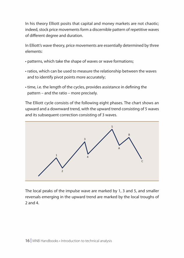
Following the 5-phase upward wave, a 3-phase corrective wave begins, represented by points A, B and C.
Similar to Dow’s assertion that 3 trends co-exist in the market simultaneously, in Elliott’s wave theory waves exist at several different levels. Major impulse waves determining the dominant trend can be subdivided into a set of lower-degree waves: they are composed of a set of minor waves.
3.4 Random walk theory
The Random walk theory was developed by American economist Burton G. Malkiel. His hypothesis, which calls into question the applicability of both technical and fundamental analysis in predicting the expected direction of prices, was first published in 1973 in his book, A Random Walk Down Wall Street.
In Malkiel’s opinion, a random walk occurs when future prices cannot be predicted by observing past price movements. According to Malkiel and his followers, stock prices follow a random walk and, since stock price movements cannot be predicted, there is no practical use for investment advisers, complicated charts or indicators. Supporters of the theory believe that higher-than-average returns can only be achieved by taking greater risk.
13
4
A
B
C
5
1
3
4A
C
1
2
3
4
5 B
A C5B
22

18 | MNB Handbooks • Introduction to technical analysis
Malkiel famously wrote in his bestselling book: “A blindfolded monkey throwing darts at a newspaper’s financial pages could select a portfolio that would perform just as well as one carefully selected by experts”.10
The theory was put to the test by The Wall Street Journal; after the first hundred days, “monkeys” (blindfolded staffers of The Wall Street Journal) won 39% of the time versus the pros and this ratio continuously improved over time.
10 Burton G. Malkiel (1992): A Random Walk Down Wall Street. International Training Center for Bankers. Budapest, p. 20.
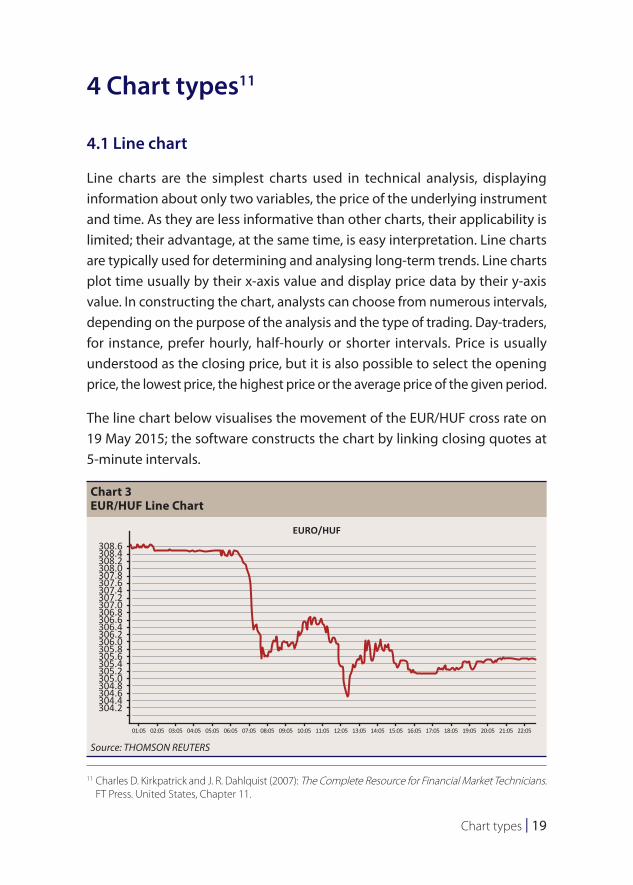
Chart types | 19
4 Chart types11
4.1 Line chart
Line charts are the simplest charts used in technical analysis, displaying information about only two variables, the price of the underlying instrument and time. As they are less informative than other charts, their applicability is limited; their advantage, at the same time, is easy interpretation. Line charts are typically used for determining and analysing long-term trends. Line charts plot time usually by their x-axis value and display price data by their y-axis value. In constructing the chart, analysts can choose from numerous intervals, depending on the purpose of the analysis and the type of trading. Day-traders, for instance, prefer hourly, half-hourly or shorter intervals. Price is usually understood as the closing price, but it is also possible to select the opening price, the lowest price, the highest price or the average price of the given period.
The line chart below visualises the movement of the EUR/HUF cross rate on 19 May 2015; the software constructs the chart by linking closing quotes at 5-minute intervals.
11 Charles D. Kirkpatrick and J. R. Dahlquist (2007): The Complete Resource for Financial Market Technicians. FT Press. United States, Chapter 11.
Chart 3EUR/HUF Line Chart
308.6EURO/HUF
308.4308.2308.0307.8307.6307.4307.2307.0306.8306.6306.4306.2306.0305.8305.6305.4305.2305.0304.8304.6304.4304.2
01:05 02:05 03:05 04:05 05:05 06:05 07:05 08:05 09:05 10:05 11:05 12:05 13:05 14:05 15:05 16:05 17:05 18:05 19:05 20:05 21:05 22:05
Source: THOMSON REUTERS
20 | MNB Handbooks • Introduction to technical analysis
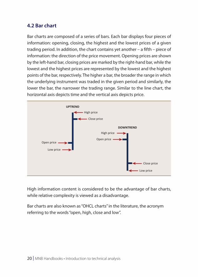
4.2 Bar chart
Bar charts are composed of a series of bars. Each bar displays four pieces of information: opening, closing, the highest and the lowest prices of a given trading period. In addition, the chart contains yet another – a fifth – piece of information: the direction of the price movement. Opening prices are shown by the left-hand bar, closing prices are marked by the right-hand bar, while the lowest and the highest prices are represented by the lowest and the highest points of the bar, respectively. The higher a bar, the broader the range in which the underlying instrument was traded in the given period and similarly, the lower the bar, the narrower the trading range. Similar to the line chart, the horizontal axis depicts time and the vertical axis depicts price.
High information content is considered to be the advantage of bar charts, while relative complexity is viewed as a disadvantage.
Bar charts are also known as “OHCL charts” in the literature, the acronym referring to the words “open, high, close and low”.
UPTREND
High price
Low price
Low price
High price
Close price
Close price
Open priceOpen price
DOWNTREND
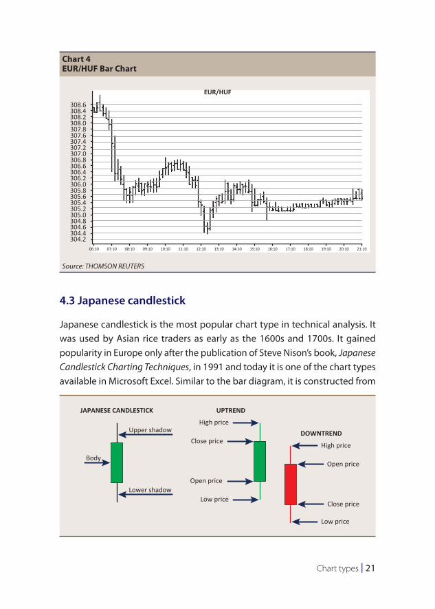
Chart types | 21
4.3 Japanese candlestick
Japanese candlestick is the most popular chart type in technical analysis. It was used by Asian rice traders as early as the 1600s and 1700s. It gained popularity in Europe only after the publication of Steve Nison’s book, Japanese Candlestick Charting Techniques, in 1991 and today it is one of the chart types available in Microsoft Excel. Similar to the bar diagram, it is constructed from
Chart 4EUR/HUF Bar Chart
308.6
EUR/HUF
308.4308.2308.0307.8307.6307.4307.2307.0306.8306.6306.4306.2306.0305.8305.6305.4305.2305.0304.8304.6304.4304.2
06:10 07:10 08:10 09:10 10:10 11:10 12:10 13:10 14:10 15:10 16:10 17:10 18:10 19:10 20:10 21:10
Source: THOMSON REUTERS
UPTRENDJAPANESE CANDLESTICK
High priceUpper shadow
Lower shadow
Body
Low price
Close price
Open price
High price
Low price
Close price
Open price
DOWNTREND
22 | MNB Handbooks • Introduction to technical analysis
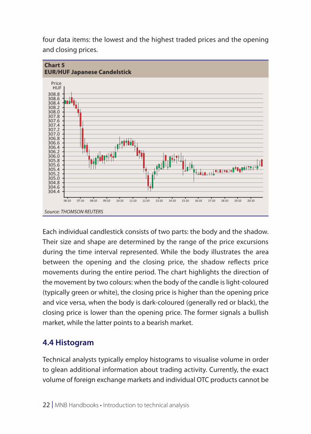
four data items: the lowest and the highest traded prices and the opening and closing prices.
Each individual candlestick consists of two parts: the body and the shadow. Their size and shape are determined by the range of the price excursions during the time interval represented. While the body illustrates the area between the opening and the closing price, the shadow reflects price movements during the entire period. The chart highlights the direction of the movement by two colours: when the body of the candle is light-coloured (typically green or white), the closing price is higher than the opening price and vice versa, when the body is dark-coloured (generally red or black), the closing price is lower than the opening price. The former signals a bullish market, while the latter points to a bearish market.
4.4 Histogram
Technical analysts typically employ histograms to visualise volume in order to glean additional information about trading activity. Currently, the exact volume of foreign exchange markets and individual OTC products cannot be
Chart 5EUR/HUF Japanese Candelstick
308.6308.4308.2308.0307.8307.6307.4307.2307.0306.8306.6306.4306.2306.0305.8305.6305.4305.2305.0304.8304.6304.4
06:10 07:10 08:10 09:10 10:10 11:10 12:10 13:10 14:10 15:10 16:10 17:10 18:10 19:10 20:10
308.8
PriceHUF
Source: THOMSON REUTERS
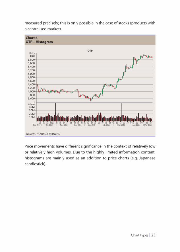
Chart types | 23
measured precisely; this is only possible in the case of stocks (products with a centralised market).
Price movements have different significance in the context of relatively low or relatively high volumes. Due to the highly limited information content, histograms are mainly used as an addition to price charts (e.g. Japanese candlestick).
Chart 6OTP – Histogram
5,800
PriceHUF
OTP
5,6005,4005,2005,0004,8004,6004,4004,2004,0003,8003,600
40MVolume
1
30M20M10M
29Sep. 2014 Oct. 2014 Nov. 2014 Dec. 2014 Jan. 2015 Feb. 2015 Mar. 2015 Apr. 2015 May 2015
06 13 20 27 03 10 17 24 01 08 15 22 05 12 19 25 02 09 16 23 02 09 16 23 30 07 13 20 27 04 11 18
Source: THOMSON REUTERS
24 | MNB Handbooks • Introduction to technical analysis
5 Introduction to technical analysis
5.1 Trend12, 13
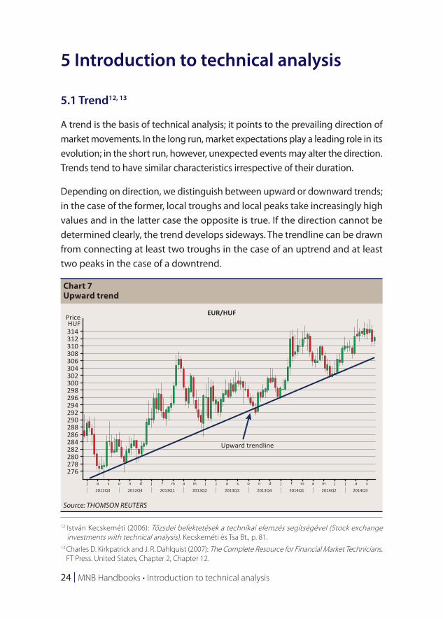
A trend is the basis of technical analysis; it points to the prevailing direction of market movements. In the long run, market expectations play a leading role in its evolution; in the short run, however, unexpected events may alter the direction. Trends tend to have similar characteristics irrespective of their duration.
Depending on direction, we distinguish between upward or downward trends; in the case of the former, local troughs and local peaks take increasingly high values and in the latter case the opposite is true. If the direction cannot be determined clearly, the trend develops sideways. The trendline can be drawn from connecting at least two troughs in the case of an uptrend and at least two peaks in the case of a downtrend.
12 István Kecskeméti (2006): Tőzsdei befektetések a technikai elemzés segítségével (Stock exchange investments with technical analysis). Kecskeméti és Tsa Bt., p. 81.
13 Charles D. Kirkpatrick and J. R. Dahlquist (2007): The Complete Resource for Financial Market Technicians. FT Press. United States, Chapter 2, Chapter 12.
Chart 7Upward trend
314
PriceHUF
EUR/HUF
Upward trendline
312310308306304302300298296294292290288286284282280278276
j a
2012Q3 2012Q4 2013Q1 2013Q2 2013Q3 2013Q4 2014Q1 2014Q2 2014Q3
s o n d j f m a m j j a s o n d j f m a m j j a s
Source: THOMSON REUTERS
Introduction to technical analysis | 25
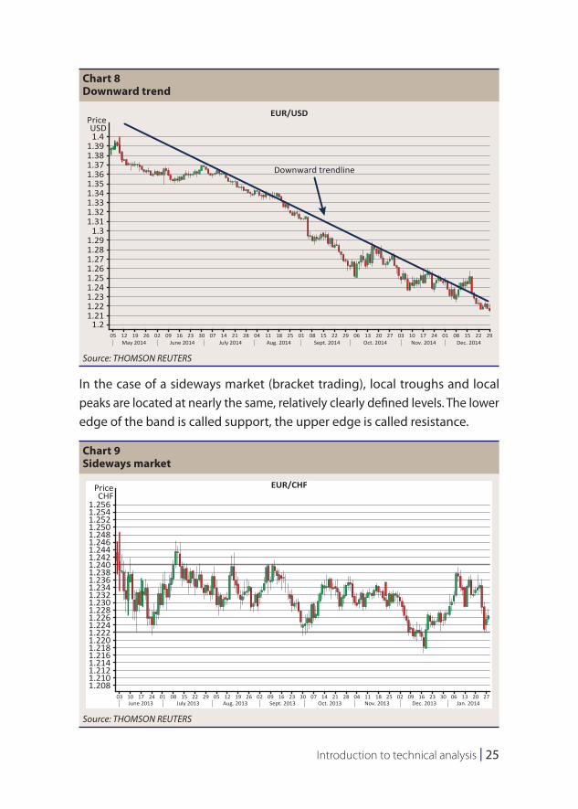
In the case of a sideways market (bracket trading), local troughs and local peaks are located at nearly the same, relatively clearly defined levels. The lower edge of the band is called support, the upper edge is called resistance.
Chart 8Downward trend
1.4
PriceUSD
EUR/USD
Downward trendline
1.391.381.371.361.351.341.331.321.31
1.31.291.281.271.261.251.241.231.221.21
1.205 12
May 2014 June 2014 July 2014 Aug. 2014 Sept. 2014 Oct. 2014 Nov. 2014 Dec. 201419 26 02 09 16 23 30 07 14 21 28 04 11 18 25 01 08 15 22 29 06 13 20 27 03 10 17 24 01 08 15 22 29
Source: THOMSON REUTERS
Chart 9Sideways market
1.256
PriceCHF
EUR/CHF
1.2541.2521.2501.2481.2461.2441.2421.2401.2381.2361.2341.2321.2301.2281.2261.2241.2221.2201.2181.2161.2141.2121.2101.208
03 10 17 24 01 08 15 22 29 05 12 19 26 02 09 16 23 30 07 14 21 28 04 11 18 25 02 09 16 23 30 06 13 20 27June 2013 July 2013 Aug. 2013 Sept. 2013 Oct. 2013 Nov. 2013 Dec. 2013 Jan. 2014
Source: THOMSON REUTERS
26 | MNB Handbooks • Introduction to technical analysis
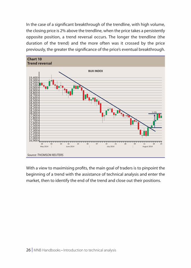
In the case of a significant breakthrough of the trendline, with high volume, the closing price is 2% above the trendline, when the price takes a persistently opposite position, a trend reversal occurs. The longer the trendline (the duration of the trend) and the more often was it crossed by the price previously, the greater the significance of the price’s eventual breakthrough.
With a view to maximising profits, the main goal of traders is to pinpoint the beginning of a trend with the assistance of technical analysis and enter the market, then to identify the end of the trend and close out their positions.
Chart 10Trend reversal
19,400
BUX INDEX
19,30019,20019,10019,00018,90018,80018,70018,60018,50018,40018,30018,20018,10018,00017,90017,80017,70017,60017,50017,40017,30017,200
17,00016,900
26 02 10 16 23 30 07 14 21 28 04 11 18 25
17,100
May 2014 June 2014 July 2014 August 2014
3.19%
Source: THOMSON REUTERS
Introduction to technical analysis | 27
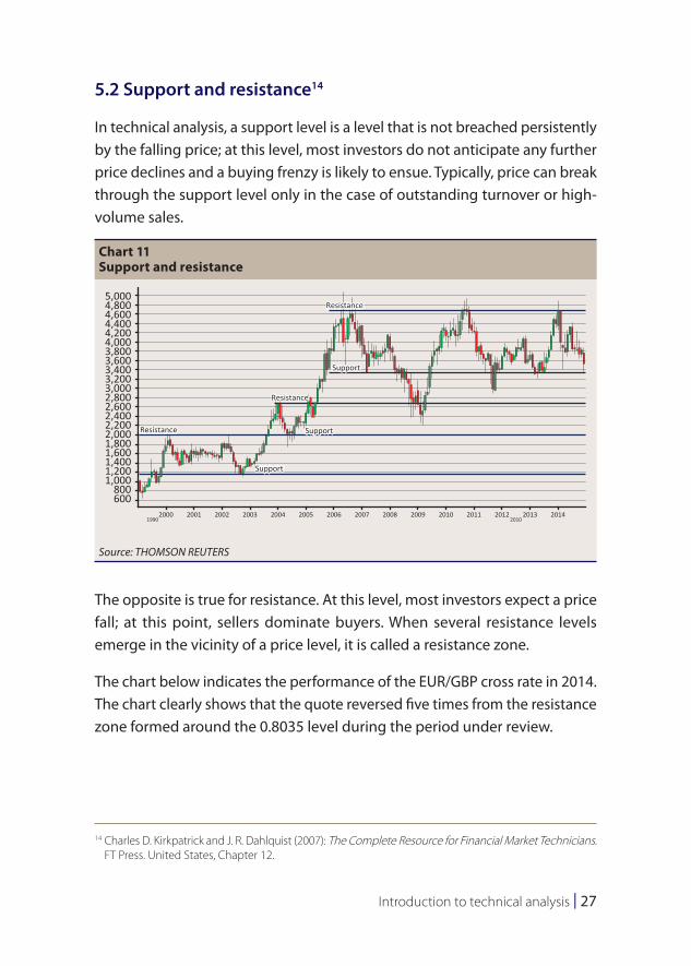
5.2 Support and resistance14
In technical analysis, a support level is a level that is not breached persistently by the falling price; at this level, most investors do not anticipate any further price declines and a buying frenzy is likely to ensue. Typically, price can break through the support level only in the case of outstanding turnover or high-volume sales.
The opposite is true for resistance. At this level, most investors expect a price fall; at this point, sellers dominate buyers. When several resistance levels emerge in the vicinity of a price level, it is called a resistance zone.
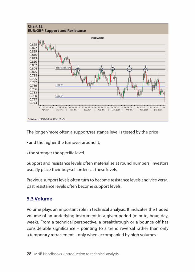
The chart below indicates the performance of the EUR/GBP cross rate in 2014. The chart clearly shows that the quote reversed five times from the resistance zone formed around the 0.8035 level during the period under review.
14 Charles D. Kirkpatrick and J. R. Dahlquist (2007): The Complete Resource for Financial Market Technicians. FT Press. United States, Chapter 12.
Chart 11Support and resistance
5,000Resistance
Resistance
Resistance
Support
Support
Support
RICHTER GEDEON
4,8004,6004,4004,2004,0003,8003,6003,4003,2003,0002,8002,6002,4002,2002,0001,8001,6001,4001,2001,000
800600
2000 2001 2002 2003 2004 2005 2006 2007 2008 2009 2010 2011 2012 20132010
20141990
Source: THOMSON REUTERS
28 | MNB Handbooks • Introduction to technical analysis
The longer/more often a support/resistance level is tested by the price
• and the higher the turnover around it,
• the stronger the specific level.
Support and resistance levels often materialise at round numbers; investors usually place their buy/sell orders at these levels.
Previous support levels often turn to become resistance levels and vice versa, past resistance levels often become support levels.
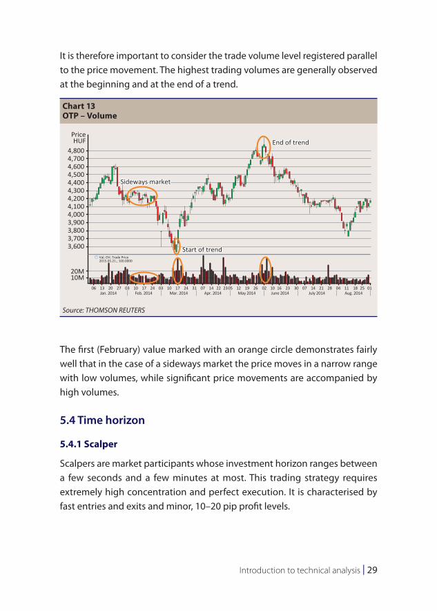
5.3 Volume
Volume plays an important role in technical analysis. It indicates the traded volume of an underlying instrument in a given period (minute, hour, day, week). From a technical perspective, a breakthrough or a bounce off has considerable significance – pointing to a trend reversal rather than only a temporary retracement – only when accompanied by high volumes.
Chart 12EUR/GBP Support and Resistance
0.825
EUR/GBP
1 2 3 4 5Resistance zone
Support
Support
0.8220.8190.8160.8130.8100.8070.8040.8250.7980.7950.7920.7890.7860.7830.7800.7770.774
07 14Apr. 2014 May 2014 June 2014 July 2014 Aug. 2014 Sept. 2014 Oct. 2014 Nov. 2014 Dec. 2014
21 28 05 12 19 26 02 09 16 23 30 07 14 21 28 04 11 18 25 01 08 15 22 29 06 13 20 27 03 10 17 24 01 08 15 22 29
Source: THOMSON REUTERS
Introduction to technical analysis | 29
It is therefore important to consider the trade volume level registered parallel to the price movement. The highest trading volumes are generally observed at the beginning and at the end of a trend.
The first (February) value marked with an orange circle demonstrates fairly well that in the case of a sideways market the price moves in a narrow range with low volumes, while significant price movements are accompanied by high volumes.
5.4 Time horizon
5.4.1 Scalper
Scalpers are market participants whose investment horizon ranges between a few seconds and a few minutes at most. This trading strategy requires extremely high concentration and perfect execution. It is characterised by fast entries and exits and minor, 10–20 pip profit levels.
Chart 13OTP – Volume
4,800
PriceHUF End of trend
Sideways market
Start of trend
4,7004,6004,5004,4004,3004,2004,1004,0003,9003,8003,7003,600
20M10M
06Jan. 2014 Feb. 2014 Mar. 2014 Apr. 2014 May 2014 June 2014 July 2014 Aug. 201413 20 27 03 10 17 24 03 10 17 24 31 07 14 22 2305 12 19 26 02 10 16 23 30 07 14 21 28 04 11 18 25 01
Val; OV; Trade Price2015.05.21.; 100.0000
Source: THOMSON REUTERS
30 | MNB Handbooks • Introduction to technical analysis
5.4.2 Daytrade
Day trading is a trading style where the investor trades only within a day and closes its open positions by the end of the day or, in any event, before the market closes for the trading day. The upside of day trading in comparison to other trading methods is that it rules out overnight risk completely. Overnight risks are understood as the risk of events between trading sessions, such as the disclosure of the quarterly report after the market has closed for the day, or an upgrade/downgrade by a rating company on a Friday evening after market close.
Forex markets are open for trading almost 24 hours a day; from 10 p.m. Sunday (Sidney opening time) until 10 p.m. Friday (New York closing time); strictly taking the trading hours, investors can trade at the domestic stock exchange from 9 a.m. until 5 p.m. on working days.
5.4.3 Swing trade
In the case of swing trade, the duration of the investment may range between a few days and a few weeks; investors’ objective is not to realise a quick profit, but to “ride the wave” of a minor or major market trend. Practitioners of this trading style typically use 30-minute or 1–4 hour charts to analyse market movements. As opposed to scalping or day trading, swing traders can place an order to open or close out a position for the next day even outside of regular trading hours.
5.4.4 Short, medium and long term
In technical analysis, depending on the length of the review/investment period, we distinguish between short, medium and long terms. The review period typically covers a period between one week and one month in the case of short term, one month to six months in the case of medium term, and a period of over six months in the case of long term. In examining the different time horizons, traders may examine hourly, daily, weekly or occasionally, monthly charts.
Indicators | 31
6 Indicators
Indicators are indispensable tools in technical analysis. They are functions/charts derived from historical data (price or volume data) or mathematical or statistical formulas.
Investors rely on indicators to answer a number of important questions: when to enter or exit a market, which market products are oversold or overbought, and where the support/resistance levels are.
The classification of indicators can vary. One of the most popular classification methods of the various alternatives distinguishes between four indicator types:
• trend following indicators,
• momentum indicators,
• volatility indicators,
• volume indicators.
6.1 Trend following indicators
The category of trend following indicators includes moving averages and other indicators based on moving averages (such as simple, exponential, or weighted moving average). These indicators are the oldest, simplest, and most commonly used indicators in technical analysis; their advantage is that they provide accurate signals; their disadvantage is that their signals always come with a lag.15 As trend following indicators are calculated from historical data; they are not suitable to signal trend reversals; however, they indicate the start and the direction of a trend fairly well.
15 István Kecskeméti (2006): Tőzsdei befektetések a technikai elemzés segítségével (Stock exchange investments with technical analysis). Kecskeméti és Tsa Bt., p. 100.
32 | MNB Handbooks • Introduction to technical analysis
6.1.1 Moving Average (MA)
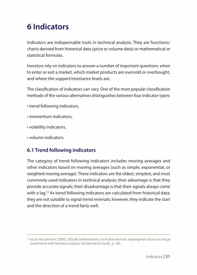
Market prices may fluctuate widely, even within the same day. Analysts use moving averages to smooth erratic data, making it easier to view the true underlying trend.16 Besides identifying the direction of a trend, moving averages are useful indicators in defining support and resistance levels. Some traders also use moving averages to identify buy or sell signals: when the price crosses above the moving average, it should be understood as a buy signal. A sell signal is the opposite: the price crosses below the moving average.
From a statistical perspective, when calculating moving averages, we assign a value to the t-th element of a time series by calculating an average figure from the elements around the t-th element. Over time, the oldest elements drop out continuously and are replaced by values assigned to the new element of the time series.17
16 Charles D. Kirkpatrick and J. R. Dahlquist (2007): The Complete Resource for Financial Market Technicians. FT Press. United States (2007), Chapter 14, p. 272.
17 István Kecskeméti (2006): Tőzsdei befektetések a technikai elemzés segítségével (Stock exchange investments with technical analysis). Kecskeméti és Tsa Bt., p. 104.
Chart 14Moving Average – MA
1.116
PriceUSD
EUR/USD
Sell signalSell signal
Buy signal
1.11551.115
1.11451.114
1.11351.113
1.11251.112
1.11151.111
1.11051.11
1.10951.109
1.10851.108
1.10751.107
1.10651.106
1.105505:35 06:05 06:35 07:05 07:35 08:05 08:35 09:05 08:35 10:05 10:35
20 May 201511:05 11:35 12:05 12:35 13:05 13:35 14:05 14:35 15:05 15:35 16:05 16:35
Source: THOMSON REUTERS
Indicators | 33
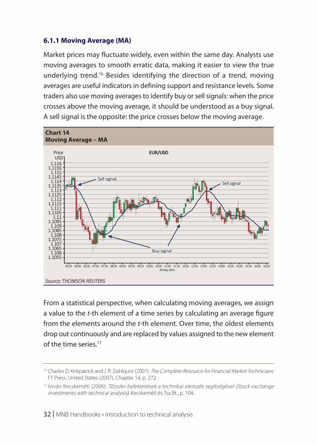
Although moving averages can be calculated for any time horizon; analysts and traders tend to prefer the 10, 20, 30, 50, 60, 100 and 200-day moving averages. Selecting the length of the examined time series is an important exercise: in the case of shorter time series, moving averages tend to respond to price movements more quickly and more sensitively; therefore, the probability of a false signal is higher than in the case of longer time series.
The three most well-known and most commonly used moving averages are the following:
• Simple Moving Average (SMA)
A simple moving average – also known as an arithmetic moving average – can be formed by computing a simple arithmetic mean. The simple moving average is one of the most popular indicators despite being a “lagging indicator”, which means that it follows market developments with a lag and assigns equal weight to each individual data item. Exponential and weighted moving averages are designed to correct this deficiency.18
• Exponential Moving Average (EMA)
The exponential moving average assigns greater significance to fresh data; therefore, as opposed to the simple moving average, it applies a greater weight to recent data items. The weighting itself is not subject to clear-cut rules. Since EMA reacts more sensitively to recent data, it signals trend reversals earlier.
EMA is calculated by multiplying the elements of the time series by the weights assigned to each element and dividing the product by the sum of the weights.19
• Weighted Moving Average (WMA)
Similar to the exponential moving average, the weighted moving average also applies greater weights to more recent data than to older data; the
18 Charles D. Kirkpatrick and J. R. Dahlquist (2007): The Complete Resource for Financial Market Technicians. FT Press. United States, Chapter 14, pp. 272–277.
19 István Kecskeméti (2006): Tőzsdei befektetések a technikai elemzés segítségével (Stock exchange investments with technical analysis). Kecskeméti és Tsa Bt., p. 105.
34 | MNB Handbooks • Introduction to technical analysis
difference between the two indicators is the fact that the weights do not increase exponentially in the case of WMA.
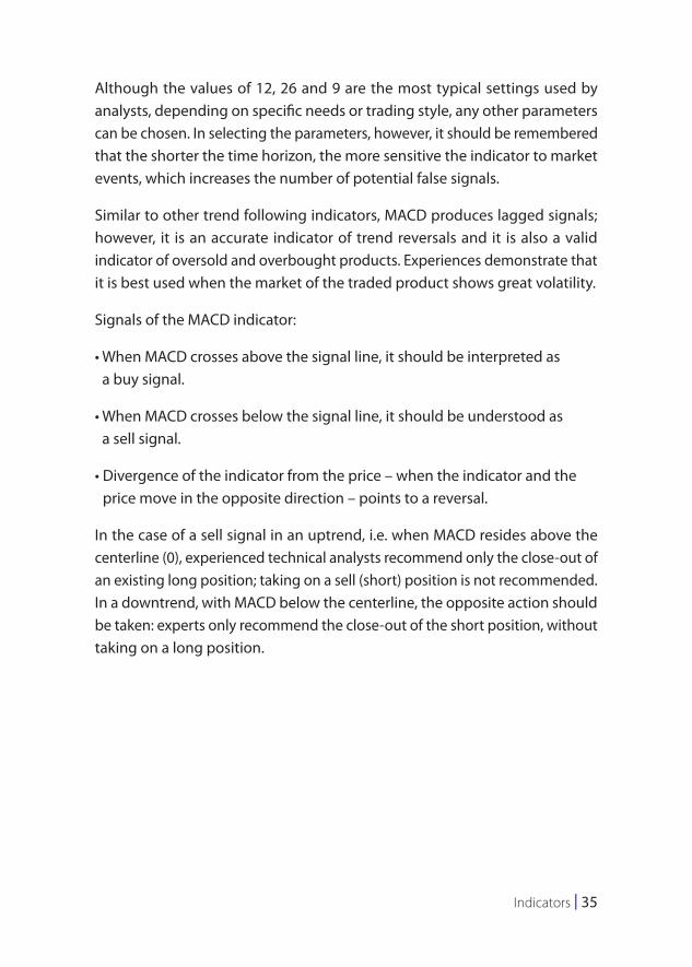
6.1.2 Moving Average Convergence/Divergence (MACD)20, 21
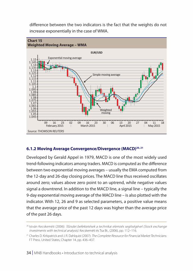
Developed by Gerald Appel in 1979, MACD is one of the most widely used trend-following indicators among traders. MACD is computed as the difference between two exponential moving averages – usually the EMA computed from the 12-day and 26-day closing prices. The MACD line thus received oscillates around zero; values above zero point to an uptrend, while negative values signal a downtrend. In addition to the MACD line, a signal line – typically the 9-day exponential moving average of the MACD line – is also plotted with the indicator. With 12, 26 and 9 as selected parameters, a positive value means that the average price of the past 12 days was higher than the average price of the past 26 days.
20 István Kecskeméti (2006): Tőzsdei befektetések a technikai elemzés segítségével (Stock exchange investments with technical analysis). Kecskeméti és Tsa Bt., (2006), pp. 112–116.
21 Charles D. Kirkpatrick and J. R. Dahlquist (2007): The Complete Resource for Financial Market Technicians. FT Press. United States, Chapter 14, pp. 436–437.
Chart 15Weighted Moving Average – WMA
1.151.145
1.141.135
1.131.125
1.121.115
1.111.105
1.11.095
1.091.085
1.081.075
1.071.065
1.061.055
1.051.045
09 16
Exponential moving average
Simple moving average
Weightedmoving
EUR/USD
23 02 09 16 23 30 06 13 20 27 04 11May 2015April 2015March 2015February 2015
18
Source: THOMSON REUTERS
Indicators | 35
Although the values of 12, 26 and 9 are the most typical settings used by analysts, depending on specific needs or trading style, any other parameters can be chosen. In selecting the parameters, however, it should be remembered that the shorter the time horizon, the more sensitive the indicator to market events, which increases the number of potential false signals.
Similar to other trend following indicators, MACD produces lagged signals; however, it is an accurate indicator of trend reversals and it is also a valid indicator of oversold and overbought products. Experiences demonstrate that it is best used when the market of the traded product shows great volatility.
Signals of the MACD indicator:
• When MACD crosses above the signal line, it should be interpreted as a buy signal.
• When MACD crosses below the signal line, it should be understood as a sell signal.
• Divergence of the indicator from the price – when the indicator and the price move in the opposite direction – points to a reversal.
In the case of a sell signal in an uptrend, i.e. when MACD resides above the centerline (0), experienced technical analysts recommend only the close-out of an existing long position; taking on a sell (short) position is not recommended. In a downtrend, with MACD below the centerline, the opposite action should be taken: experts only recommend the close-out of the short position, without taking on a long position.
36 | MNB Handbooks • Introduction to technical analysis
As shown on the chart, the divergence between MACD and the signal is often shown at the bottom of the chart in the form of a histogram.
6.2 Momentum indicators
In making trading decisions, investors should not only consider the direction of a trend, but also its quality.
The indicators presented so far signal market events and reversals with a lag. Momentum indicators are designed to counteract this deficiency by measuring the velocity at which the price of the underlying instrument changes and using this information – the change in the momentum of the market – to draw conclusions about the turn of a market trend well before the reversal takes place.22
22 Martin J. Pring (1991): Technical Analysis Explained, III. 3rd edition, McGraw-Hill. United States, p. 127.
Chart 16MACD
1.41
1.391.38
1.4
1.371.361.351.341.331.321.31
1.31.291.281.27
0–0.01–0.02–0.03
16Aug. 2010 Sep. 2010 Oct. 2010 Nov. 2010 Dec. 2010 Jan. 2010 Feb. 2010
23 30 06 13 20 27 04 11 18 25 01 08 15 22 29 06 13 20 27 03 10 17 24 31 07
ValueUSD
ValueUSD
PriceUSD
EUR/USD
Source: THOMSON REUTERS
Indicators | 37
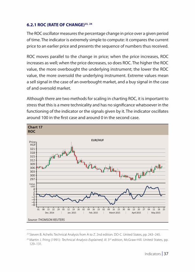
6.2.1 ROC (RATE OF CHANGE)23, 24
The ROC oscillator measures the percentage change in price over a given period of time. The indicator is extremely simple to compute: it compares the current price to an earlier price and presents the sequence of numbers thus received.
ROC moves parallel to the change in price; when the price increases, ROC increases as well; when the price decreases, so does ROC. The higher the ROC value, the more overbought the underlying instrument; the lower the ROC value, the more oversold the underlying instrument. Extreme values mean a sell signal in the case of an overbought market, and a buy signal in the case of and oversold market.
Although there are two methods for scaling in charting ROC, it is important to stress that this is a mere technicality and has no significance whatsoever in the functioning of the indicator or the signals given by it. The indicator oscillates around 100 in the first case and around 0 in the second case.
23 Steven B. Achelis: Technical Analysis from A to Z. 2nd edition. DO-C. United States, pp. 243–245.24 Martin J. Pring (1991): Technical Analysis Explained, III. 3rd edition, McGraw-Hill. United States, pp.
129–131.
Chart 17ROC
321
PriceHUF
EUR/HUF
318315312309306303300297
420
–2–4–6–8
01 08 15Dec. 2014 Jan. 2015 Feb. 2015 March 2015 April 2015 May 2015
22 29 05 12 19 26 02 09 16 23 02 09 16 23 30 06 13 20 27 04 11 18 25
ValueUSD
Source: THOMSON REUTERS
38 | MNB Handbooks • Introduction to technical analysis
Although this indicator is typically used for short-term analyses (the 12-day and the 25-day horizons are applied most frequently), it can obviously also be used to examine longer periods: the 13-week and the 26-week horizons are the most popular for medium-term analyses, and the 52-week horizon for long-term analyses.
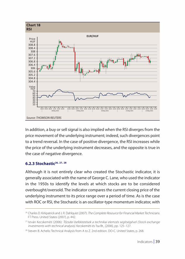
6.2.2 Relative Strength Index (RSI)25
The Relative Strength Index (RSI) was developed by J. Welles Wilder and published in his book New Concepts in Technical Trading Systems. Designed to assist in identifying the overbought or oversold status of a market, at first glance, the name of the Relative Strength Index might be misleading. Indeed, instead of measuring the strength of two instruments relative to each other, this technical tool measures the internal strength of an underlying instrument – relative to itself – by comparing the average price increases and decreases of the instrument over a given period of time.
The value of the indicator oscillates between 0% and 100%; in the chart the horizontal lines at the 30% and 70% levels indicate the boundaries of the oversold and overbought levels.
Using RSI may be useful for observing any – long-term or short-term – horizon; the creator of the index recommended the use of a 14-day timeframe.
It is equally true for this indicator that there is a negative correlation between its volatility and the review period: the longer the period, the smaller the magnitude of its fluctuations (the fewer the signals) and vice versa, the magnitude of the fluctuations and the number of signals grow in line with a decrease in the length of the period.
When the indicator moves upward from the oversold territory (level 30), it should be understood as a buy signal; when it turns downward from the overbought territory (level 70), it is a sell signal. Some traders prefer to observe stricter rules and monitor level 20 and level 80 instead.
25 The Technical Analyst (2010): Technical Trading Strategies. Global Markets Media Ltd. United Kingdom, pp. 56–59.
Indicators | 39
In addition, a buy or sell signal is also implied when the RSI diverges from the price movement of the underlying instrument; indeed, such divergences point to a trend reversal. In the case of positive divergence, the RSI increases while the price of the underlying instrument decreases, and the opposite is true in the case of negative divergence.
6.2.3 Stochastic26, 27, 28
Although it is not entirely clear who created the Stochastic indicator, it is generally associated with the name of George C. Lane, who used the indicator in the 1950s to identify the levels at which stocks are to be considered overbought/oversold. The indicator compares the current closing price of the underlying instrument to its price range over a period of time. As is the case with ROC or RSI, the Stochastic is an oscillator-type momentum indicator, with
26 Charles D. Kirkpatrick and J. R. Dahlquist (2007): The Complete Resource for Financial Market Technicians. FT Press. United States (2007), p. 442.
27 István Kecskeméti (2006): Tőzsdei befektetések a technikai elemzés segítségével (Stock exchange investments with technical analysis). Kecskeméti és Tsa Bt., (2006), pp. 125–127.
28 Steven B. Achelis: Technical Analysis from A to Z. 2nd edition. DO-C. United States, p. 268.
Chart 18RSI
308.8
PriceHUF
EUR/HUF
308.4308
307.6307.2306.8306.4
306305.6305.2304.8304.4
ValueHUF
70605040302010
00:00 04:00 08:00 12:0018 May 2015 19 May 2015 20 May 2015 21 May 2015 22 May 2015
16:00 20:00 02:00 06:00 10:00 14:00 18:00 22:00 02:00 06:00 10:00 14:00 18:00 22:00 02:00 06:00 10:00 14:00 18:00 22:00 02:00 06:00 10:00 14:00
Source: THOMSON REUTERS
40 | MNB Handbooks • Introduction to technical analysis
a value oscillating between 0% and 100%. 0% indicates that the closing price of the underlying instrument was the lowest closing price of the past period, while 100% indicates the peak of the range over the time period covered.
The chart of the indicator consists of two stochastic curves – a fast stochastic (%K) and a slow stochastic (%D) –, where the %D line is the moving average of %K. Owing to this attribute, %D is less sensitive to price fluctuations than %K.
Similar to RSI, a horizontal line is commonly drawn at the 20–30% and at the 70–80% levels as an indication of the boundaries of the oversold and overbought zones.
Signals generated by the indicator:
Buy signals:
• %K and %D fall below a specific (20-30%) level, and then rise above that level;
Chart 19Stochastic
311
PriceHUF
EUR/HUF
310309308307
305
303
306
304
302301300299298297296
%K
%D70605040302010
02 09 16 23 02 09 16 23 30 06 13 20 27 04 11
January 2015 February 2015 March 2015 April 2015 May 2015
Source: THOMSON REUTERS
Indicators | 41
• the %K line rises above the %D line;
• the %K line and the %D line rise within the oversold territory with a parallel price decline (divergence).
Sell signals:
• %K and %D rise above a specific (70-80%) level, and then fall below that level;
• the %K line falls below the %D line;
• the %K line and the %D line fall within the overbought territory with a parallel price increase (divergence).
6.3 Volatility indicators
Volatility indicators ignore the direction of price movements and measure the magnitude of price fluctuation. Below we present two volatility indicators: the Bollinger bands and the ATR.
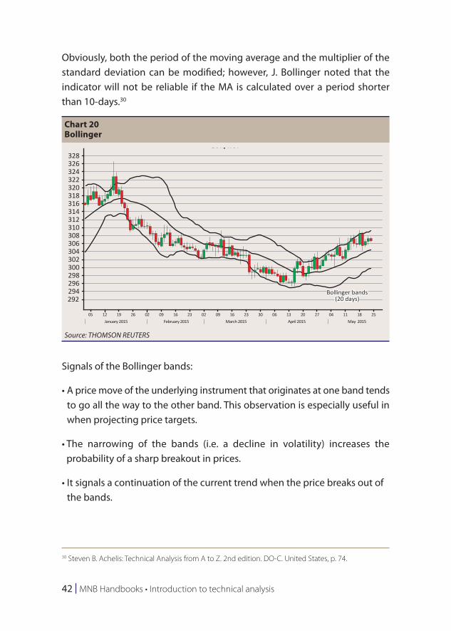
6.3.1 Bollinger bands
Developed in the early 1980s, the indicator was named after its creator, John A. Bollinger. Bollinger bands are channel (‘band’) type indicators. A distinctive characteristic of Bollinger bands is that the width of the price channel varies based on the volatility of the prices: during periods of extreme price changes (i.e. high volatility) the bands widen; during periods of low volatility, the bands tighten.29
The indicator consists of three bands. The middle band is a simple moving average (MA), typically calculated over a 20-day period. The lower and upper bands (the two edges of the channel) are respectively derived by shifting the medium line (MA) up and down by the number of the standard deviations of the underlying instrument (e.g. 2 deviations).
29 Steven B. Achelis: Technical Analysis from A to Z. 2nd edition. DO-C. United States, p. 72.
42 | MNB Handbooks • Introduction to technical analysis
Obviously, both the period of the moving average and the multiplier of the standard deviation can be modified; however, J. Bollinger noted that the indicator will not be reliable if the MA is calculated over a period shorter than 10-days.30
Signals of the Bollinger bands:
• A price move of the underlying instrument that originates at one band tends to go all the way to the other band. This observation is especially useful in when projecting price targets.
• The narrowing of the bands (i.e. a decline in volatility) increases the probability of a sharp breakout in prices.
• It signals a continuation of the current trend when the price breaks out of the bands.
30 Steven B. Achelis: Technical Analysis from A to Z. 2nd edition. DO-C. United States, p. 74.
Chart 20Bollinger
328EUR/HUF
Bollinger bands(20 days)
326324322320318316314312310308306304302300298296294292
05 12January 2015 February 2015 March 2015 April 2015 May 2015
19 26 02 09 16 23 02 09 16 23 30 06 13 20 27 04 11 18 25
Source: THOMSON REUTERS
Indicators | 43
• Bottoms and tops made outside the bands followed by bottoms and tops made inside the bands signal a reversal in the trend.31
6.3.2 ATR (Average True Range)
Technical analysts basically use two methods for measuring price volatility: one is the standard deviation around the moving average as applied in the Bollinger bands, the other is the ATR.
As the RSI, this indicator was also conceived by J. Welles Wilder. As suggested by its name, the ATR is the average of TR (the True Range); therefore, in order to compute ATR, it is indispensable to determine the value of the TR indicator first.
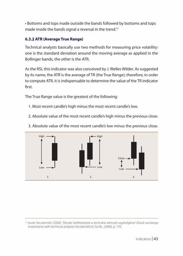
The True Range value is the greatest of the following:
1. Most recent candle’s high minus the most recent candle’s low.
2. Absolute value of the most recent candle’s high minus the previous close.
3. Absolute value of the most recent candle’s low minus the previous close.
31 István Kecskeméti (2006): Tőzsdei befektetések a technikai elemzés segítségével (Stock exchange investments with technical analysis). Kecskeméti és Tsa Bt., (2006), p. 139.
High High
Low
1. 2. 3.
LowLow
Close
44 | MNB Handbooks • Introduction to technical analysis
The Average True Range is a moving average (typically 14-days) of the above data series, i.e. the True Ranges.
Since the ATR measures volatility, its value is not an indication of the direction of the price movements; it generates neither buy nor sell signals. The indicator helps to spot reversals and identify the top and the bottom of the price range and in practice, it is generally used in conjunction with other indicators.32
6.4 Volume-based indicators
Volume means the sum of market activity within a specific period; although its level is independent of price, analysts can glean important information from this data about market sentiment and mood swings.
An important characteristic of volume-based indicators is the fact that their value is not derived from volume itself but from shifts in volume.
The use of volume-based indicators is based on the premise that changes in volume precede price changes in time. Therefore, they serve as an early warning for investors that a reversal in the trend is imminent.33 These signal types can only be used in the case of financial products where volume data are available real time.
6.4.1 OBV (ON BALANCE VOLUME)
Conceived by Joe E. Granville in the 1960s, the On Balance Volume indicator is a money-flow indicator, which is intended to use the price and volume of the underlying instrument to predict changes in the market of the underlying instrument and to assess whether capital is flowing into or out of the specific market.
32 István Kecskeméti (2006): Tőzsdei befektetések a technikai elemzés segítségével (Stock exchange investments with technical analysis). Kecskeméti és Tsa Bt., (2006), pp. 144–145.
33 Charles D. Kirkpatrick and J. R. Dahlquist (2007): The Complete Resource for Financial Market Technicians. FT Press. United States (2007), pp. 416–417.
Indicators | 45
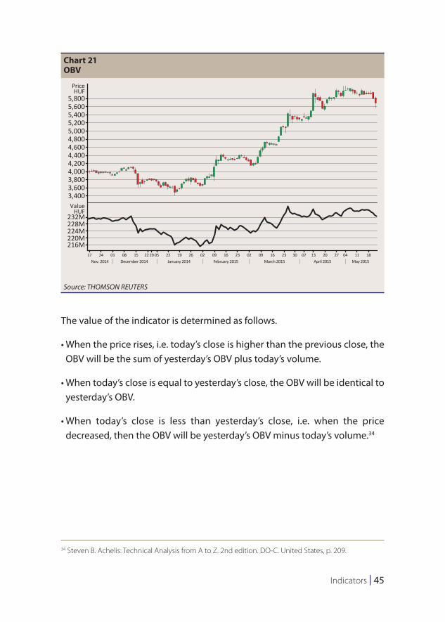
The value of the indicator is determined as follows.
• When the price rises, i.e. today’s close is higher than the previous close, the OBV will be the sum of yesterday’s OBV plus today’s volume.
• When today’s close is equal to yesterday’s close, the OBV will be identical to yesterday’s OBV.
• When today’s close is less than yesterday’s close, i.e. when the price decreased, then the OBV will be yesterday’s OBV minus today’s volume.34
34 Steven B. Achelis: Technical Analysis from A to Z. 2nd edition. DO-C. United States, p. 209.
Chart 21OBV
5,800
OTPPriceHUF
ValueHUF
5,6005,4005,2005,0004,8004,6004,4004,2004,0003,8003,6003,400
232M228M224M220M216M
17 24Nov. 2014 December 2014 January 2014
01 08 15 22 0529 22 19 26 02 09 16 23 02 09 16 23 30 07 13 20 27 04 11 18February 2015 March 2015 April 2015 May 2015
Source: THOMSON REUTERS
46 | MNB Handbooks • Introduction to technical analysis
Signals of the OBV indicator:
• The indicator confirms the trend when it reaches new peaks or troughs in parallel with the price curve.
• When the price movement precedes OBV movement (divergence), a trend reversal can be expected.
6.4.2 Accumulation/Distribution (A/D)35, 36
Developed by Marc Chaikin, the Accumulation/Distribution index is a version of OBV and like OBV, it is a momentum indicator that attempts the assess the relationship between demand and supply by examining whether the market of the underlying instrument is characterised by accumulation (the market is controlled by buyers) or distribution (the market is controlled by sellers).
In addition to volume, the following parameters are required for the calculation of the A/D index: closing price (C), low price (L) and high price (H). The calculation can be presented with the following formula:
A /D = volume×C − L( )− H−C( )
H− L⎛⎝⎜
⎞⎠⎟+1
An upward shift on the indicator points to accumulation, while a downward shift indicates distribution.
The trading signals of A/D are similar to those of OBV; in the case of divergence, a reversal can be expected.
35 Steven B. Achelis: Technical Analysis from A to Z. 2nd edition. DO-C. United States, pp. 52–53.36 Charles D. Kirkpatrick and J. R. Dahlquist (2007): The Complete Resource for Financial Market Technicians.
FT Press. United States (2007), pp. 420–421.
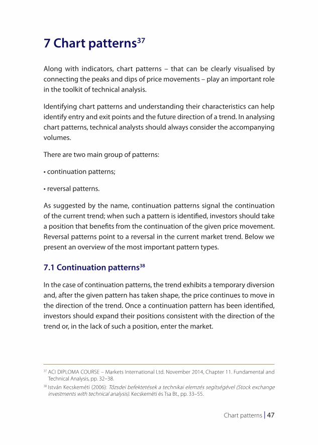
Chart patterns | 47
7 Chart patterns37
Along with indicators, chart patterns – that can be clearly visualised by connecting the peaks and dips of price movements – play an important role in the toolkit of technical analysis.
Identifying chart patterns and understanding their characteristics can help identify entry and exit points and the future direction of a trend. In analysing chart patterns, technical analysts should always consider the accompanying volumes.
There are two main group of patterns:
• continuation patterns;
• reversal patterns.
As suggested by the name, continuation patterns signal the continuation of the current trend; when such a pattern is identified, investors should take a position that benefits from the continuation of the given price movement. Reversal patterns point to a reversal in the current market trend. Below we present an overview of the most important pattern types.
7.1 Continuation patterns38
In the case of continuation patterns, the trend exhibits a temporary diversion and, after the given pattern has taken shape, the price continues to move in the direction of the trend. Once a continuation pattern has been identified, investors should expand their positions consistent with the direction of the trend or, in the lack of such a position, enter the market.
37 ACI DIPLOMA COURSE – Markets International Ltd. November 2014, Chapter 11. Fundamental and Technical Analysis, pp. 32–38.
38 István Kecskeméti (2006): Tőzsdei befektetések a technikai elemzés segítségével (Stock exchange investments with technical analysis). Kecskeméti és Tsa Bt., pp. 33–55.
48 | MNB Handbooks • Introduction to technical analysis
7.1.1 Flags and pennants
The formation of flags and pennants and their characteristics are essentially the same; the most important difference between the two patterns is in the shape of the pennants. In the consolidation phase, when the flag pattern begins to take shape, the price moves in a parallel band; when the pennant is being formed, the prices form a symmetrical triangle where the trendlines converge towards each other.
These formations take shape in a short period of time; initially – during the formation of the flagpole/mast – volume increases; however, the formation of the pennants is always accompanied by low volume in both cases. Another important similarity between the two patterns is the fact that the retracement cannot exceed 38.2% of the flag/mast in either case. While in the case of flags the slope of the pennants is in the opposite direction compared to the prevailing trend, this is not necessarily true for the pennant.
After the conclusion of the consolidation, the previous trend is expected to continue.
7.1.2 Ascending/descending triangle
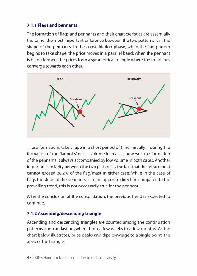
Ascending and descending triangles are counted among the continuation patterns and can last anywhere from a few weeks to a few months. As the chart below illustrates, price peaks and dips converge to a single point, the apex of the triangle.
FLAG PENNANT
Breakout Breakout
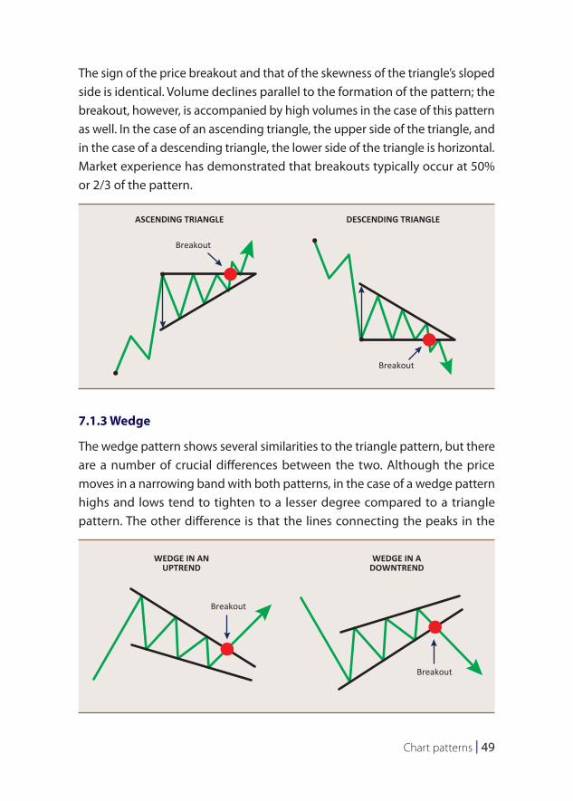
Chart patterns | 49
The sign of the price breakout and that of the skewness of the triangle’s sloped side is identical. Volume declines parallel to the formation of the pattern; the breakout, however, is accompanied by high volumes in the case of this pattern as well. In the case of an ascending triangle, the upper side of the triangle, and in the case of a descending triangle, the lower side of the triangle is horizontal. Market experience has demonstrated that breakouts typically occur at 50% or 2/3 of the pattern.
7.1.3 Wedge
The wedge pattern shows several similarities to the triangle pattern, but there are a number of crucial differences between the two. Although the price moves in a narrowing band with both patterns, in the case of a wedge pattern highs and lows tend to tighten to a lesser degree compared to a triangle pattern. The other difference is that the lines connecting the peaks in the
ASCENDING TRIANGLE DESCENDING TRIANGLE
Breakout
Breakout
WEDGE IN ANUPTREND
WEDGE IN ADOWNTREND
Breakout
Breakout
50 | MNB Handbooks • Introduction to technical analysis
wedge pattern typically point in the same direction and end in a peak at a rather great distance from the pattern itself. The direction of the pattern is always opposite that of the trend: upward trends are always broken by falling wedges and vice versa, downward trends are interrupted by rising wedges. The formulation of the pattern may take a period of 2 to 8 weeks.
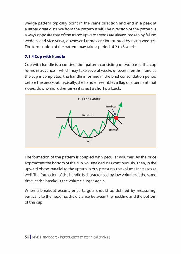
7.1.4 Cup with handle
Cup with handle is a continuation pattern consisting of two parts. The cup forms in advance – which may take several weeks or even months – and as the cup is completed, the handle is formed in the brief consolidation period before the breakout. Typically, the handle resembles a flag or a pennant that slopes downward; other times it is just a short pullback.
The formation of the pattern is coupled with peculiar volumes. As the price approaches the bottom of the cup, volume declines continuously. Then, in the upward phase, parallel to the upturn in buy pressures the volume increases as well. The formation of the handle is characterised by low volume; at the same time, at the breakout the volume surges again.
When a breakout occurs, price targets should be defined by measuring, vertically to the neckline, the distance between the neckline and the bottom of the cup.
CUP AND HANDLE
Breakout
Neckline
Handle
Cup
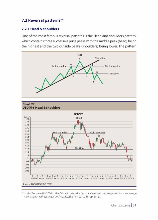
Chart patterns | 51
7.2 Reversal patterns39
7.2.1 Head & shoulders
One of the most famous reversal patterns is the Head and shoulders pattern, which contains three successive price peaks with the middle peak (head) being the highest and the two outside peaks (shoulders) being lower. The pattern
39 István Kecskeméti (2006): Tőzsdei befektetések a technikai elemzés segítségével (Stock exchange investments with technical analysis). Kecskeméti és Tsa Bt., pp. 58–68.
Left shoulder Right shoulder
Head
A
B D
F
G
E
C Trendline
Neckline
Chart 22USD/JPY Head & shoulders
134
USD/JPYHead
Left shoulder Right shoulder
Neckline
Price/USD
132130118116114122120118116114112110108106104102
a s2000Q3
o n d j f m a m j j a s o n d j f m a m j j a s o n d j f m a m j j a s o n2000Q4 2001Q1 2001Q2 2001Q3 2001Q4 2002Q1 2002Q2 2002Q3 2002Q4 2003Q1 2003Q2 2003Q3 2003Q4
Source: THOMSON REUTERS
52 | MNB Handbooks • Introduction to technical analysis
may form both at market peaks in an uptrend or at dips in a downtrend. An uptrend is broken by a decline, which forms the left shoulder (AB), then the uptrend continues and the head takes shape (C); this peak is followed by another decline. Thereafter, the trend resumes but it cannot rise above the previous peak (head), and the right shoulder is formed. While the left shoulder still belongs to the bullish market, the right shoulder already marks the beginning of the bearish market.
The peaks of the two shoulders do not need to be at the same level; however, both need to be located below the head. The horizontal line connecting the low points of the shoulders is called the neckline. Any time the price falls below this level (typically accompanied by an expansion in volume), it presages a further price decline and the reversal of the previous upward trend, indicating that sell (short) positions should be taken.
In the case of an inverse Head and shoulders pattern, the opposite is true: a downtrend turns into an uptrend.
Besides being easy to identify, another advantage of this chart pattern is its ability to predict trend reversals with relatively high certainty.
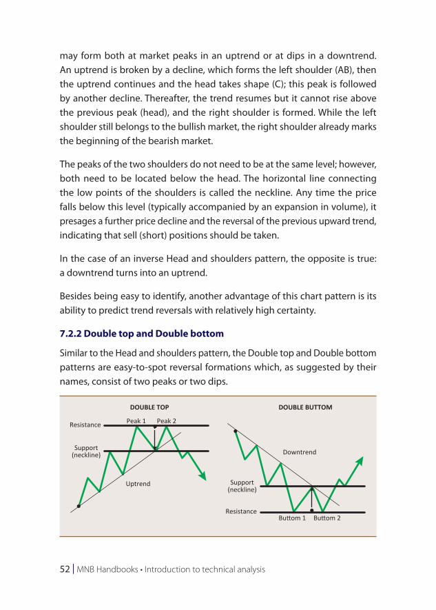
7.2.2 Double top and Double bottom
Similar to the Head and shoulders pattern, the Double top and Double bottom patterns are easy-to-spot reversal formations which, as suggested by their names, consist of two peaks or two dips.
DOUBLE TOP DOUBLE BUTTOM
DowntrendSupport(neckline)
Support(neckline)
Buttom 1 Buttom 2
Resistance
Resistance
Peak 1 Peak 2
Uptrend
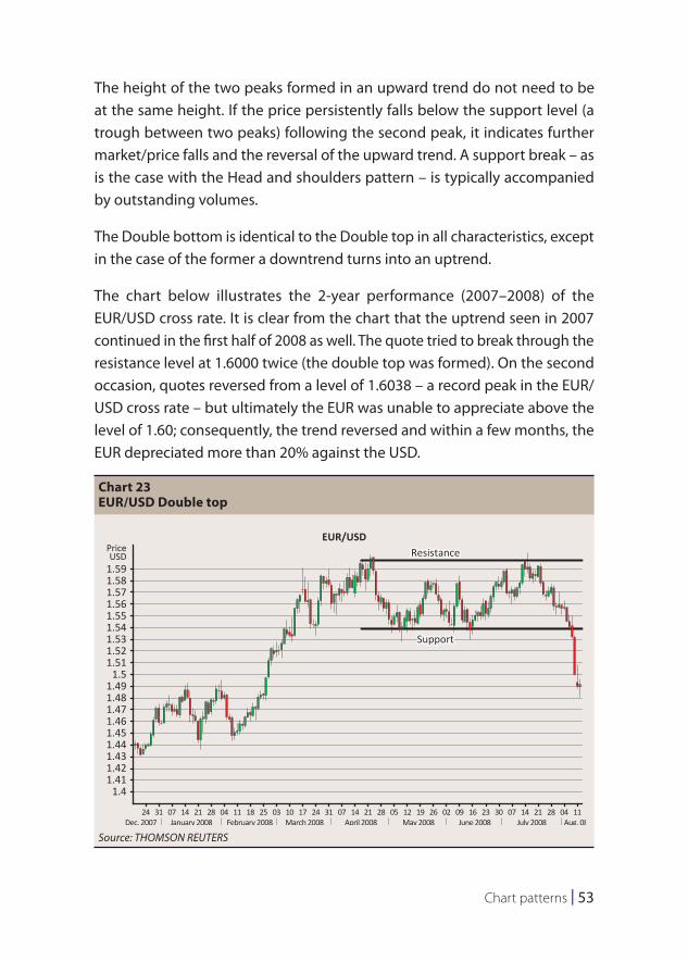
Chart patterns | 53
The height of the two peaks formed in an upward trend do not need to be at the same height. If the price persistently falls below the support level (a trough between two peaks) following the second peak, it indicates further market/price falls and the reversal of the upward trend. A support break – as is the case with the Head and shoulders pattern – is typically accompanied by outstanding volumes.
The Double bottom is identical to the Double top in all characteristics, except in the case of the former a downtrend turns into an uptrend.
The chart below illustrates the 2-year performance (2007–2008) of the EUR/USD cross rate. It is clear from the chart that the uptrend seen in 2007 continued in the first half of 2008 as well. The quote tried to break through the resistance level at 1.6000 twice (the double top was formed). On the second occasion, quotes reversed from a level of 1.6038 – a record peak in the EUR/USD cross rate – but ultimately the EUR was unable to appreciate above the level of 1.60; consequently, the trend reversed and within a few months, the EUR depreciated more than 20% against the USD.
Chart 23EUR/USD Double top
1.59
EUR/USDResistance
Support
PriceUSD
1.581.571.561.551.541.531.521.51
1.51.491.481.471.461.451.441.431.421.41
1.4
24 31Dec. 2007
07 14 21 28 04 11 18 25 03 10 17 24 31 07 14 21 28 05 12 19 26 02 09 16 23 30 07 14 21 28 04 11January 2008 February 2008 March 2008 April 2008 May 2008 June 2008 July 2008 Aug. 08
Source: THOMSON REUTERS
54 | MNB Handbooks • Introduction to technical analysis
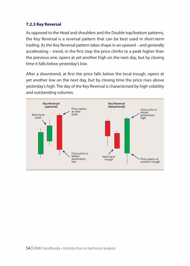
7.2.3 Key Reversal
As opposed to the Head and shoulders and the Double top/bottom patterns, the Key Reversal is a reversal pattern that can be best used in short-term trading. As the Key Reversal pattern takes shape in an upward – and generally accelerating – trend, in the first step the price climbs to a peak higher than the previous one, opens at yet another high on the next day, but by closing time it falls below yesterday’s low.
After a downtrend, at first the price falls below the local trough, opens at yet another low on the next day, but by closing time the price rises above yesterday’s high. The day of the Key Reversal is characterised by high volatility and outstanding volumes.
Key Reversal(downtrend)
Key Reversal(uptrend)
Price opensat newpeak
Price opens atanother trough
Close price isaboveyesterday’shigh
Close price isbelowyesterday’slow
New localpeak
New localtrough
Technical analysis in practice | 55
8 Technical analysis in practice
Below we present a few practical examples based on the analysis methods and tools described above.
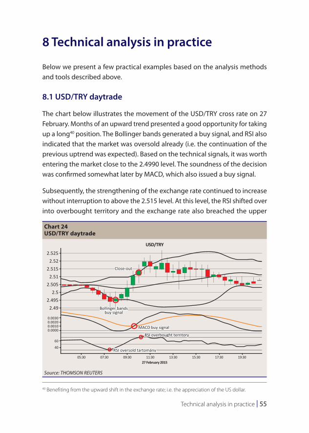
8.1 USD/TRY daytrade
The chart below illustrates the movement of the USD/TRY cross rate on 27 February. Months of an upward trend presented a good opportunity for taking up a long40 position. The Bollinger bands generated a buy signal, and RSI also indicated that the market was oversold already (i.e. the continuation of the previous uptrend was expected). Based on the technical signals, it was worth entering the market close to the 2.4990 level. The soundness of the decision was confirmed somewhat later by MACD, which also issued a buy signal.
Subsequently, the strengthening of the exchange rate continued to increase without interruption to above the 2.515 level. At this level, the RSI shifted over into overbought territory and the exchange rate also breached the upper
40 Benefiting from the upward shift in the exchange rate; i.e. the appreciation of the US dollar.
Chart 24USD/TRY daytrade
2.525
Close-out
Bollinger bandsbuy signal
MACD buy signal
RSI overbought territory
RSI oversold tartomány
2.522.515
2.512.505
2.52.495
2.49
0.00300.00200.00100.0000
60
40
05:30 07:30 09:30 11:30 13:3027 February 2015
USD/TRY
15:30 17:30 19:30
Source: THOMSON REUTERS
56 | MNB Handbooks • Introduction to technical analysis
Bollinger band, increasing the probability of a reversal – at this point, the previously opened position needed to be closed out. Subsequent exchange rate movements demonstrated that closing out the position at the 2.5120 level was premature, and it was also much later that MACD eventually issued a sell signal.
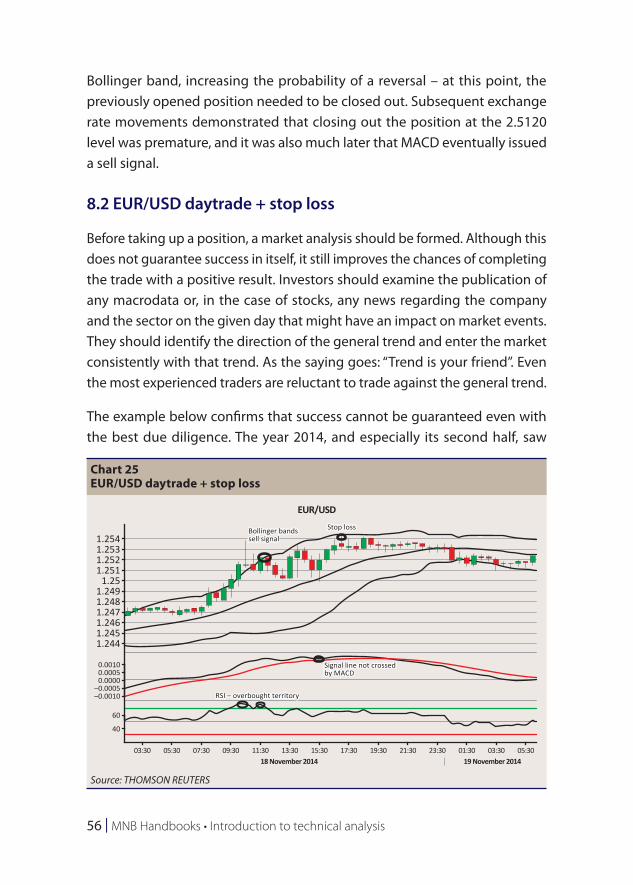
8.2 EUR/USD daytrade + stop loss
Before taking up a position, a market analysis should be formed. Although this does not guarantee success in itself, it still improves the chances of completing the trade with a positive result. Investors should examine the publication of any macrodata or, in the case of stocks, any news regarding the company and the sector on the given day that might have an impact on market events. They should identify the direction of the general trend and enter the market consistently with that trend. As the saying goes: “Trend is your friend”. Even the most experienced traders are reluctant to trade against the general trend.
The example below confirms that success cannot be guaranteed even with the best due diligence. The year 2014, and especially its second half, saw
Chart 25EUR/USD daytrade + stop loss
1.254Bollinger bandssell signal
Signal line not crossedby MACD
RSI – overbought territory
Stop loss
1.2531.2521.251
1.251.2491.2481.2471.2461.2451.244
0.00100.00050.0000
–0.0005–0.0010
60
40
03:30 05:30 07:30 09:30 11:30 13:3018 November 2014
EUR/USD
19 November 201415:30 17:30 19:30 21:30 23:30 01:30 03:30 05:30
Source: THOMSON REUTERS
Technical analysis in practice | 57
a strong appreciation of the USD. By the end of the year, the US currency had strengthened against the EUR from a level close to 1.4000 to 1.1500.
The Bollinger bands signalled a trend reversal and, hovering in overbought territory, the RSI also produced a sell signal. It appeared to be a sound decision to enter the market close to the 1.2530 level; the price target and the stop loss were defined at the level of 1.2500 and 1.2545, respectively; in terms of the risk/reward ratio, this translated to 33/12 = 2.75. The decision was expected to be confirmed by the MACD signal as well; however, it did not happen as the MACD did not cross the signal line and generated a sell signal only later, after punching through the stop-loss.
Ultimately, the exchange rate did not reach the 1.2500 level; the trend reversed just a few points before reaching the price target, and, after reaching the stop-loss level, the trade was closed out automatically.
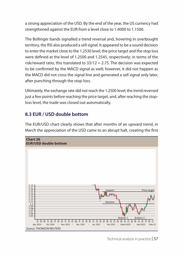
8.3 EUR / USD double bottom
The EUR/USD chart clearly shows that after months of an upward trend, in March the appreciation of the USD came to an abrupt halt, creating the first
Chart 26EUR/USD double bottom
1.31.291.281.271.261.25
Support
Neckline
Buttom 1 Buttom 2
Price target
1.241.231.221.21
1.21.191.181.171.161.151.141.131.121.11
1.11.091.081.071.061.05
22 29 06 13 20 27 03 10 17 24 01 08 15 22 29 05 12 19 26 02 09 16 23 02 09 16 23 30 06 13 20 27 04 11Sep. 2014 Oct. 2014 Nov. 2014
EUR/USD
Dec. 2014 Jan. 2015 Feb. 2015 March 2015 April 2015 May 15
Source: THOMSON REUTERS
58 | MNB Handbooks • Introduction to technical analysis
bottom close to the 1.0460 level. In the following weeks the exchange rate retraced to the 1.1000 level, and then the USD began to weaken once again, but failed to reach another minimum, and the second bottom was formed at the 1.0520 level. At that point, the direction reversed once again with the USD dynamically breaking through the neckline, which signalled a market entry. In this case, the price target was defined at the first support line, at the 1.1500 level.

References | 59
9 References
Malkiel, Burton G.: A Random Walk Down Wall Street. International Training Center for Bankers, Budapest
Kirkpatrick, C.D. – Dahlquist, J. R. (2007): The Complete Resource for Financial Market Technicians. FT Press. United States
Cselovszki, R. (1993): A Dow-elmélet (The Dow Theory). Bank & Tőzsde, 1993/4, 12 February
Cselovszki, R. (1992): Elliott hullámelmélete I.-II (Elliott Wave Theory I.-II). Tőzsde Kurír, 1992/38,39. 17, 24 September
Kecskeméti, I. (2006): Tőzsdei befektetések a technikai elemzés segítségével (Stock exchange investments with technical analysis). Kecskeméti és Tsa Bt.
Pring, M.J. (1991): Technical Analysis Explained. 3rd edition, McGraw-Hill. United States
Achelis, S.B. (1995): Technical Analysis from A to Z. 2nd edition. DO-C. United States
The Technical Analyst (2010): Technical Trading Strategies. Global Markets Media Ltd. United Kingdom
ACI DIPLOMA COURSE – Markets International Ltd. (November 2014)


MNB HANDBOOKS
INTRODUCTION TO TECHNICAL ANALYSIS:
CHARTS, OPENING AND MANAGING POSITIONS
Print: Prospektus–SPL consortium
H-8200 Veszprém, Tartu u. 6.