Embed Size (px)
Citation preview

Twenty Ninth International Conference on Information Systems, Paris 2008 1
THE SPATIAL NATURE OF THOUGHT: UNDERSTANDING
INFORMATION SYSTEMS DESIGN THROUGH DIAGRAMS Le Caractere Spatial de la Pensée: Comprendre la conception des systèmes
d'information grâce aux diagrammes
Completed Research Paper
Jeffrey V. Nickerson Stevens Institute of Technology
Hoboken, New Jersey, USA [email protected]
James E. Corter Teachers College, Columbia University
New York, New York, USA [email protected]
Barbara Tversky Teachers College, Columbia University
New York, New York, USA [email protected]
Doris Zahner Stevens Institute of Technology
Hoboken, New Jersey, USA [email protected]
Yun Jin Rho Teachers College, Columbia University
New York, New York, USA [email protected]
Abstract
Design entails the interaction of minds and the tools used to express the design, notably, diagrams. Systems designers use the affordances of the page when they generate structural diagrams of systems. Specifically, they use proximity to augment connectedness (path) information by grouping subsystems. They use horizontal position on the page to express sequence and vertical position to reflect actual spatial position. Finally, they use the permanence of diagrams to generate alternative designs. These conclusions were reached through the analysis of work by student designers, many of whom were practicing information technology professionals. The analysis of designs in topological and Euclidean space required the creation of computational tools that show promise as decision aids for designers, by separating the intertwined qualities of topological and Euclidean space, and by making visible the conceptual similarity of design alternatives. Keywords: Diagram understanding, information systems design, visualization, topology, affordance
Résumé
Les concepteurs de systèmes utilisent les concordances de la page lors de la génération des diagrammes de structure des systèmes, telles que la proximité, le chemin, la position ainsi que la constance. L'analyse de ces diagrammes a demandé la création d'outils de calcul d'aide à la décision.
Page 1 of 18

Design Theory and Research
2 Twenty Ninth International Conference on Information Systems, Paris 2008
Introduction
Information systems designers create structural diagrams to explore possible connections between people and machines. Because designers sketch on a flat surface we will call the page, they have available all the flexible qualities the page offers them. To extend a term of Gibson (1977; 1979), the page provides affordances that designers can use in creating systems diagrams. Here, we enumerate some of the affordances the page provides and show how designers use them to represent their conceptions of systems. Understanding how designers map their ideas onto a page brings us closer to modeling the design process and to designing aids to augment it.
We call this approach situated representation. Design is situated in a physical context that includes people, their tools, and the milieu in which design takes place. Designers convert internal representations of their ideas to external representations by drawing on a page, a cognitive tool. This process allows them to view and review their ideas, reducing mental load. However, the cognitive tool, whether pencil and paper or a drawing program, has its own properties, affordances, and constraints that affect the ways that ideas can be expressed. The pencil draws lines, the page has a specific orientation and a particular shape and dimensions in Euclidean space. This analysis leads to the prediction that designers will take advantage of four different affordances of the pencil and the page: paths, proximity, position, and permanence. These predictions are especially powerful in the context of design of information systems, as paths are the primary means of conveying the connectivity that structures information systems. The other affordances are not necessary, but are used, often to good effect. To foreshadow the results, we found that in addition to paths, designers used proximity to group conceptually related entities and separate conceptually different ones, page position to reflect temporal order and spatial location and permanence in the generation of alternative designs.
These discoveries were facilitated by new tools crafted to schematize, summarize, and analyze sketches in an ongoing project to understand information systems design (cf. Nickerson et al. 2008; Tversky et al. 2008). These tools have general applicability to analyses of diagrams and sketches. They also serve as a prototype for a design aid that, by making non-obvious relations visible, may assist designers and design teams in discovering new representations and design alternatives. They point to an inadequacy in some current diagram drawing packages, which snap elements to a grid, thereby removing or at least constraining the important affordance of proximity. Thus, the paper’s contribution is three-fold. It reveals how designers map their conceptions onto paper, it provides new tools to analyze sketches and diagrams, and it suggests how to develop aids to design.
Theoretical Background
Design, diagrams, sketches, visualizations, and the like play an essential role in many cognitive activities. Hence, they have been studied in computer science, architecture, mechanical engineering, graphic design, statistics, philosophy, medicine, geography, biology, physics, geology, and psychology among other disciplines. The theory we are proposing, situated representation, then, is rooted in considerable work of others. The approach is faithful to Simon's call for a part formal, part empirical design science (1969). The science of design is usually ascribed to Simon, whose focus at the time was problem solving, and design was seen as the search for a point in solution space that optimized a set of objectives. Gradually, it came to be recognized that design is better viewed as an open-ended exploration of possibilities than as optimization under well-defined constraints. Schön (1983) observed professionals, and believed that design was a form of reflection-in-action related to the situation, an idea he credited to Dewey (1933). Schön pointed to the critical role sketches play in design, in serving as a conversation partner to a designer. Alexander, in his studies of architecture, moved from formal approaches (1964) to human-centered approaches (1979). These approaches have encouraged more recent generative theories of human-centered design (e.g. Avital et al. 2006; Carroll 2000; Cross 2004; Hevner et al. 2004; Krippendorf 2006; Norman 2002; Winograd 1996) and recent studies of design representation (Visser 2006a; 2006b; 2006c), sketch use (Goldschmidt 1991; 1994; Suwa and Tversky 1997), and computational design (Bentley and Corne 2002; Holland 1975). Within information systems, the resurgence of interest in design science (Gross 2003; Hevner et al. 2004; Lee 2000; March et al. 2000) reflects an overall growing interest in design as a route to understanding creativity and innovation (Maher et al. 2005). Together, these projects called attention to the context of design, particularly sketching, and became part of the inspiration for a multitude of studies on the roles of external representations, how they are created, understood, and used to support thinking, in design and other arenas (e. g., Blackwell 1997; Glasgow et al. 1996; Larkin and Simon 1987; Tversky 2001).
The view that design is situated in the tools used for creation is a natural extension of Gibson’s ecological psychology (1977; 1979). Gibson's notion of affordances derived from experiments demonstrating that people
Page 2 of 18

Nickerson et al. / The Spatial Nature of Thought
perceive possibilities for action in an environment. Certain perceptual patterns and forms directly suggest grasping, others, climbing - that is, there is direct perception of how to act. Norman extended this idea to design (1999; 2002) imploring designers to build affordances into products so that people will know how to use them. The extension of affordance found its way into the information systems and organizational science literature (e.g. Gaver 1992). As Krippendorf points out (2006), the term human-centered design epitomizes affordance as a relation between people and the environment. Complementary theory in adaptive systems has observed that design is a process of adaption, because the alternatives generated by designers are created, combined, and culled as a consequence of their match to the environment (Holland 1975). Recent work in information systems has also used generative grammars as a way of modeling variation (Lee et al. forthcoming). The work of Suwa and Tversky (1997; 2001) reveals how this design evolution takes place: designers engage in a process of constructive perception. In this process, the designer creates a sketch, which changes the designer's environment. The designer responds to the sketch as something external, almost as if someone else created it, and, inspired by it, creates another variation, which restarts the cycle. The sketch allows the designer to see new configurations and the new configurations stimulate new ideas, ideas that were not intended when the sketch was created.
In this spirit, Visser (2006a) has sought to integrate design research and cognitive science by defining design as the construction of representations. These observations along with the ecological ideas of Gibson, Holland, Suwa and Tversky guide our theory of the use of diagrams in information systems design. Diagrams are external representations constructed in inquiry. The representations evolve as the designer inspects them, generates new representations, and responds to the new ones. Creators of diagrams will, as part of the inquiry process, learn and use the affordances of the page and use them to express and clarify the representations, both internal and external. This iterative process improves the representations’ chances for surviving or, alternatively, parents other solutions. We can then expect to see the different affordances of the page manifest in the diagrams of designers who are actively generating alternatives. The physical nature of the diagram is intertwined with the quality of the design, as the clearer the vision, the easier for the designer to engage with it through the diagram. This theory suggests that studying the properties of diagrams produced by designers is an avenue to understanding design.
More specifically, the situated representation theory predicts that we will see in the variations of designs the exploration of the affordances of the page. Even though many information systems can be expressed using just one affordance, path, the theory predicts that designers will find ways of utilizing other affordances such as proximity and position in the same way that people adapt to the possibilities of the physical environment. With respect to another affordance of the page, permanence, we predict that a series of designs will tend to proceed sequentially from one to the next. With respect to alternative generation, a group of designers should start from different points and evolve different solutions, so the space of alternatives should be much larger for a group than for a particular designer.
Method
Overview
As a laboratory, we used a Master’s level class in the design of information systems taught at Stevens Institute of Technology. The majority of the students in the class were practicing information technology professionals with several years of experience. The students had varied backgrounds: some were experienced programmers, some were experienced project managers, and some were just beginning their professional careers. The curriculum of the course is explained in detail elsewhere (Nickerson 2006). In brief, throughout the semester, the students were asked to solve a series of open-ended high-level systems architecture problems, and were exposed to, and critiqued, the other students’ designs. This particular study examined in detail a design project mid-way through the semester. The students were given versions of two problem scenarios, and asked to generate three alternative design sketches of the solution for each problem while in the classroom. We will focus in this paper on the first and most challenging problem, referred to here as Store. Study participants were instructed to behave as consultants generating alternative solutions for the client, a bookstore. The problem was presented as follows:
As Jenny approaches 57th Street and 8th Avenue she inputs “books” on her Google-enabled phone. She vaguely remembers there is a bookstore in the area: she gets back a hit: Borders – and an arrow pointing her North towards Columbus Circle. Along with it she sees an ad – 10% off any purchase within the next hour. She saves the coupon, and lets her phone guide her into Borders. While there, she finds a present for a friend, and electronically transfers the discount coupon to the cash register.
Page 3 of 18
Design Theory and Research
4 Twenty Ninth International Conference on Information Systems, Paris 2008
Our hypotheses concerned the affordances of the diagrams. We expected to see proximity and position effects in diagrams, augmenting topological information expressed in paths. We also expected to see the effects of permanence in the sequence of design alternatives generated. In order to test our hypotheses, we needed ways of measuring and comparing diagrams, which we describe next.
Diagram coding
Typical diagrams appear in Figures 1 through 3. They consisted of edges and nodes, often labeled and/or depicted. We coded the diagram into nodes and edges, converting them into formal graph structures that could be manipulated programmatically, and then wrote specialized functions to view the diagrams in terms of paths, proximities, and positions. Participants were not forewarned that we would be evaluating such formal properties of their diagrams.
The first step in the process was manual. We overlaid a transparent grid on the sketched diagram, lining up {0, 0} with the left bottom corner of the sketch, and record the locations of all nodes. We named the nodes according to the labeling of the students, and build up a collective set of node labels L. We then standardized the names so that like items in different graphs were given the same names. For example, the phone was sometimes labeled “phone” and other times as “device” – we standardized on “device”. Then we coded an edge between two nodes if there was a line connecting the nodes, or if an icon for a person was placed directly next to a computer of some kind. These nodes and edges constitute a graph.
In order that the process we followed can be replicated, we present a formal description of the transformation process. We begin with a surface diagram made up of a set of nodes, labels, and edges, all embedded in a Euclidean plane. By coding the location of nodes and the presence of edges, we form a graph made up of nodes and edges: G =
{V, E}. Edges are undirected, defined on pairs of nodes: e = {u, v} with u, v V, e E. Associated with the nodes is a labeling map, : V L, and also a point locator: p: V[0-50] [0-50], which indicates the planar location of the node in coordinates.
We also associate with nodes a type function, which yields the type of the node, t: V {element, network}. This differentiates between network nodes and the computational nodes (representing actors) that the network connects. Associated with the edges is distance function d: E R0
, (the non-negative real numbers) which yields the Euclidean distance between the nodes that define the edge.
This graph G is difficult to compare with other graphs, because the presence or absence of network nodes makes it hard to immediately tell which actor nodes are connected. We create a new graph called the logical graph, in which the network nodes are removed, and all nodes that were connected to the network are now connected to each other. In order to perform this operation, it is convenient to define a function nearby: VV V … that generates a list of the nodes that are directly connected to a particular node. Then for a particular network node, n, we find the set neighbors = nearby(n) and construct newedges, formed by taking all subsets of two nodes from neighbors. What we are doing is forming a complete graph of all the nodes that connect to a network, because, in most modern networks, and in particular Ethernet, each node connected to the network infrastructure can talk directly to all other connected nodes (Peterson and Davie 2007). We also find the set oldedges – that is, edges in G that contain n. We form a new graph in which the network nodes are removed, and direct connections between all nodes that were attached to the network are added. In other words, for a graph G containing a node n with t(n)=network, the transformed graph G' {VG n, EG oldedges newedges}. For a graph with more than one network node, the operation is performed iteratively until all network nodes have been removed. The resulting graph G' is used in the rest of our analysis.
From these structures we can then analyze the graph in terms of position by using the point locator function p. We can analyze the graph in terms of proximity by using the distance function d. And we can analyze the paths of the graph by looking at the edge set E. In particular, we can compare the topology of graphs by computing the graph edit distance (Sanfelieu and Fu 1983). We define this as the number of edges that must be subtracted and added to convert one graph into another.
After creating the graph structures, it becomes possible to extract and compare a number of different graph measures, using common algorithms in discrete mathematics (Pemmaraju and Skiena 2003), and building on these to perform customized comparisons of Euclidean and topological distance.
As a last step, we evaluated the subjective quality of the designs as reflected in the graphs. The instructor and an assisting postdoctoral researcher independently evaluated each set of solutions for each problem by each participant with respect to overall design quality on a scale from 1 to 9, considering several criteria including clarity,
Page 4 of 18

Nickerson et al. / The Spatial Nature of Thought
unusualness, domain appropriateness, and functionality. We measured the inter-rater reliability for the overall quality ratings using the simple Pearson correlation between the two experts’ ratings. This correlation was .853, (p < .001), indicating a high degree of reliability. We took the mean of the two experts' rating as the overall measure of quality.
Results
Figure 1. The first alternative from participant one. Figure 2. The second alternative from participant one.
Figure 3. The third alternative from participant one.
Three Alternatives in Depth
Here, we analyze the diagrams of one designer, participant 1, who drew alternative designs (Figures 1-3) for the Store problem presented earlier.
Page 5 of 18
Design Theory and Research
6 Twenty Ninth International Conference on Information Systems, Paris 2008
In Figure 1, the diagram is split into roughly three sections, corresponding to three subsystems – the customer/device/GPS, the store, and Google. We notice that the satellite is positioned at the top in the diagram, the store on the bottom, the person on the far left, and Google up in the air. These locations are not formal aspects of the diagram, but neither are they chosen arbitrarily, as we will discuss below.
On the upper left, there is a link scratched out between the GPS satellite and the person. We can guess why the line is deleted – the link to the satellite should go through the device. The mistake and its correction can also be seen as a manifestation of one of the difficulties faced by the student designers. There are several types of relations in the scenario: one between electronic systems, one between a human and an electronic system (the device, the cash register), one between a human and a location (the street, the store), one between a human and a product (a gift), and one between two humans (through gift giving, and through purchase). The industry-standard diagramming conventions of the Unified Modeling Language (Fowler 2003) are almost entirely intended to depict links between electronic systems. Interfaces between humans and systems are communicated most often in deployment diagrams by putting an icon of a person in proximity to the device. The other kinds of links are not conventionalized, and students either omit such relations, or improvise.
One of the central issues in this design is how the electronic coupon gets to the customer. In the first diagram, (Figure 1) an ad server is placed behind the Google element in the design. In the second diagram, (Figure 2), the ad server has been moved to the store local area network (LAN). Notice that in Figure 2 the designer had first drawn the ad server in the same place as in Figure 1 but then crossed it out. This could have happened because the designer decided that the ad server really belonged with the store. This movement of the ad server is a large physical move on the diagram – from top to bottom. It is also has a dramatic effect on the pragmatics of the design. In the first version, Google controls the ad. Thinking from the perspective of the book company, this might be good from a time-to-market perspective, but not from a company-control, or local-control perspective. In the second version, the bookstore controls the ad – and thus can more easily offer its own local promotions.
The two business models are both viable, and thus the designer has found two alternatives that a client might be interested in. Another change occurs in the diagram for Figure 2 – the satellite is dropped. A textual explanation is given by the designer at the top right – that the satellite can be replaced by having customers enter their locations themselves. This obviously involves another tradeoff – it calls for additional customer effort, but would reduce both the cost of the device and the expense of GPS communication. The third alternative (Figure 3) is a merger of the first two designs – the ad server is placed as in Figure 2, but the satellite is inserted back in. Also, the designer recognizes a potential error in the first two designs, where the customer is shown sending electronic coupons to the store. A new element, a computer, is added, and the communication is between the device and the computer, labeled PC on the design.
It appears from the diagram that the designer has separated the problem into subsystems. However, there is no direct indication of this in the diagram. If we were to analyze the topology of the diagram without reference to location and other spatial information, we could pick out biconnected components, but this would create overlapping cycles with no real hierarchical structure.
We assume that diagrams are designed not only to convey and manipulate connectivity through the topology of the specified graph, but also to incorporate meaningful information via spatial relations and location in the plane. This stance suggests that to discover hierarchical information in a designer’s diagrams, we must incorporate such spatial information into our analyses. Specifically, we can infer hierarchical structure through spatial location information by using a clustering methodology that takes as input the physical distances between nodes in the diagram. To do this, we first abstracted the graph topology, removing LANs and replacing them with complete graphs, and then assigned nodes the locations that corresponded to the center of mass of the drawn node. We then performed agglomerative clustering (Jain and Dubes 1988) on the distance matrix (among all pairs of nodes) defined by the shortest paths (Floyd 1962). The resulting clustering dendrogram (Figure 4d) matches our intuitions about the closeness of the items. Closest is the interface between the user and the handheld device (nodes 1 and 2). These link to the satellite. Then there is a cluster of Google-related nodes, followed by a cluster of store-related nodes. In the dendrogram representing the second design alternative (Figure 4e), node 4 has moved from one cluster to another. And in 2f, there is an additional node added to the store cluster – a computer which handles communication with the device. The designer was running out of space on the page – so some of the LANs are rotated 90 degrees, and the GPS bends down, forced by the diagrams on top.
The dendrograms indicate clearly that there is hierarchical information embedded in the Euclidean positions of the nodes. Furthermore, note that agglomerative clustering will not work on the topological distances – there are too
Page 6 of 18

Nickerson et al. / The Spatial Nature of Thought
many ties between different nodes. And biconnected component analysis also does not capture the separation between the major subsystems.
Figure 4a-f. The top diagrams (a-c) show the logical structure of the diagrams in Figures 1, 2, and 3. The bottom diagrams (d-f) show the corresponding dendrograms. The number key for nodes in this and the following diagrams is as follows: 1) person, 2) handheld device, 3) store, 4) coupon, 5) item 6) cash register, 7) GPS satellite, 8) information, 9) map, 10) Google, 11) computer, 12) retail application.
Thus, this example shows that at least one designer has found a way to use the embedding of a topological graph in the plane to convey information about the organization of subsystems. This result is in some sense an existence proof that spatial information in diagrams carries information above and beyond the topological connectivity of the deployment graph.
Affordances
The clusters in Figure 4 demonstrated the use of space to organize structure by one designer. But how extensive is this strategy? To answer this, we examine the collective view of structure that emerges from a set of designers. We took as our basic data the Euclidean distances for all edges in 86 graphs drawn by 29 students. We worked from a master set of nodes. Not all students picked the same nodes, so some edges are very common and other edges are rare or idiosyncratic. In order to eliminate rare/idiosyncratic edges, we analyzed only edges that occurred in at least 10 graphs. Because most students provided 3 diagrams, this threshold guaranteed that at least 3 students used the edge in a diagram. We call this the consensus edge set.
We took the median length of each of the edges in this set, and formed a new graph, which we call the consensus graph. We then created an all-pairs distance matrix using shortest paths in the consensus graph and clustered it (Figure 5) as we did for the individual graphs discussed above. The result can be viewed as representing the collective wisdom of the class. The dendrogram suggests three major clusters: {1, 2, 7}, {12, 4, 2, 5, 6}, and {9, 10, 8}, or, in words, {person, device, GPS}, {store, cash register, retail application, computer}, and {Google, map, information}. We see, interestingly, that the clustering is very close to the third graph of the first participant, shown in Figure 4f. The consensus clustering places the coupon system with the store versus with Google, the same solution the first participant eventually settled on.
Page 7 of 18

Design Theory and Research
8 Twenty Ninth International Conference on Information Systems, Paris 2008
Figure 5. Clustering of the median distances between nodes
Figure 6. Consensus graph, based on the median distance matrix, embedded with MDS scaling onto the plane
We also performed nonmetric multidimensional scaling (Kruskal and Wish 1978) on the distance matrix to find a configuration of locations in the plane that matched the distance constraints. MDS routines do not produce a unique solution – for example, all reflections and rotations about the X and Y axes are also valid solutions. The resulting MDS solution is shown in Figure 6. We have added to this plot the consensus edges, and also boxes around the three prominent high-level clusters evident in Figure 5.
This consensus solution for the Store problem is a surprisingly good drawing, clearly delineating subsystems. Because this solution is based on a composite data matrix comprised of median diagram edge lengths, we cannot be sure if the individual graphs exhibit the same degree of hierarchical structure. To find out, we computed for every
Page 8 of 18

Nickerson et al. / The Spatial Nature of Thought
individual graph the distances between nodes in the consensus edge set. We then compared the mean distance of the edges between clusters to the mean distance of the edges within clusters. If the proximity information in an individual graph exhibits strong hierarchical structure, then internode distances within a cluster should be smaller than between-cluster distances. Out of 86 graphs, 12 did not contain pairs of edges that allow comparisons. Of the remaining 74, in 62 graphs the mean distance between nodes within subsystems is less than the mean distance between nodes across subsystems, and in 12 the mean between-subsystem distance is less. The proportion of graphs that exhibit smaller within-subsystem distances than between-subsystem distances is significantly greater than chance by a sign test, z = 5.93, p < .05. This result shows that the use of Euclidean space to delineate hierarchy is a common tendency. Furthermore, this characteristic pattern of node distances is robust with respect to re-allocations of individual nodes to different clusters across individual graphs. To summarize, students largely agreed on how to cluster nodes into subsystems, and manifest this by separating the clusters from each other in space.
Having established that students use spatial proximity in diagrams to underscore the grouping of components into subsystems, it is natural to ask if this tendency reflects a maladaptive human bias, or results in better, more useful diagrams. To this end, we tested if graphs with greater separation between subsystems were rated higher in quality. First, for each graph we computed a measure based on the ratio of the mean between and within distances: (between - within)/(between + ), and averaged this measure across all the graphs of each participant. This measure correlated r = .45 with quality – that is, with the mean of the two raters' assessment of quality. The importance of this significant (p<.05) correlation is underscored by noting that no other simple graph measure was significantly correlated with the mean quality ratings – this included measures on counts of nodes, edges, mean degree, graph diameter, clustering coefficients, omissions, commissions, number of LANs represented, and the number of general networks represented. Thus, this measure of degree of hierarchical structure is a strong and unique predictor of quality. As Visser (2006b) points out, there have been few studies of design quality, and the few that exist have found that measures of design process do not correlate with quality, presumably because expert and novice designers alike deviate from prescribed methods. Hence it is particularly interesting that a formal aspect of the diagrams correlates with quality. There are at least two alternative explanations for this finding. First, perhaps the instructors were not good at rating such a slippery concept as the designs’ overall quality, but were instead just responding to the degree-of-hierarchy measure itself. This is possible – perhaps the separation of subsystems improves the clarity of communication. The second explanation is that the measure reflects a degree of sophistication on the designer’s part – an ability to split a system into subsystems and confidently delimit them – leading to quality designs. It may be that the two explanations are not that different – designers who create clear diagrams are communicating with themselves as well as with an outside observer, and thus are more likely to reflect on and respond to their own alternatives, thereby finding better solutions. This result implies that pedagogy might profitably focus on exercises where the students learn how to delimit subsystems, and how to represent the subsystems on the page. It also implies that design tools that restrict the placement of nodes may be doing designers a disservice. Some design tools default to a mode called Click-to-Grid, in which all new nodes are snapped to a coarse grid. The resulting designs have an organized look, but may sacrifice important Euclidean distance information.
Distances between the different alternatives in edit space
Each alternative diagram for a problem by a single participant may be represented as a node in a topological space. The alternatives are different from each other, as measured by the additions and deletions needed to transform one alternative into another. Tools that allow visualization and formalization of these edit operations may provide insight into the mental operations and transformations that designers use in producing these alternative designs.
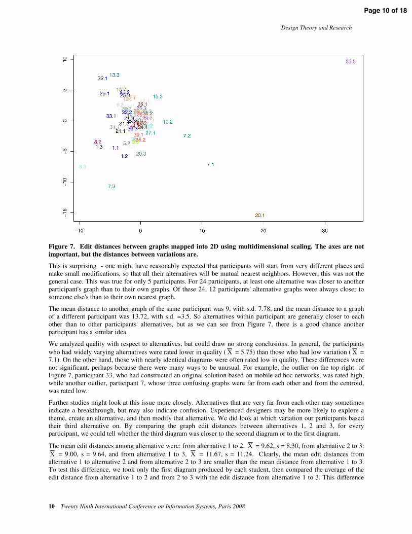
A graphical analysis can help to understand the overall range of the alternatives designers generate. In Figure 7 the distances in edit space among all the graphs are mapped into Euclidean space using multidimensional scaling (Kruskal, 1964; Kruskal and Wish 1978). It is relevant to note that graph edit distance is a metric (Sanfeliu and Fu 1983), as are distances in Euclidean space. The figure shows a clear center of mass. Each of the points represent one diagram – for example, 1.2 represents Participant 1's second alternative (the graph shown in Figure 2). Thus, by looking closely, we can see that all of Participant 1's graphs are close to each other, but that the third alternative is actually closer to Participant 8's second alternative.
Page 9 of 18
Design Theory and Research
10 Twenty Ninth International Conference on Information Systems, Paris 2008
Figure 7. Edit distances between graphs mapped into 2D using multidimensional scaling. The axes are not important, but the distances between variations are.
This is surprising - one might have reasonably expected that participants will start from very different places and make small modifications, so that all their alternatives will be mutual nearest neighbors. However, this was not the general case. This was true for only 5 participants. For 24 participants, at least one alternative was closer to another participant's graph than to their own graphs. Of these 24, 12 participants' alternative graphs were always closer to someone else's than to their own nearest graph.
The mean distance to another graph of the same participant was 9, with s.d. 7.78, and the mean distance to a graph of a different participant was 13.72, with s.d. =3.5. So alternatives within participant are generally closer to each other than to other participants' alternatives, but as we can see from Figure 7, there is a good chance another participant has a similar idea.
We analyzed quality with respect to alternatives, but could draw no strong conclusions. In general, the participants who had widely varying alternatives were rated lower in quality ( = 5.75) than those who had low variation ( = 7.1). On the other hand, those with nearly identical diagrams were often rated low in quality. These differences were not significant, perhaps because there were many ways to be unusual. For example, the outlier on the top right of Figure 7, participant 33, who had constructed an original solution based on mobile ad hoc networks, was rated high, while another outlier, participant 7, whose three confusing graphs were far from each other and from the centroid, was rated low.
Further studies might look at this issue more closely. Alternatives that are very far from each other may sometimes indicate a breakthrough, but may also indicate confusion. Experienced designers may be more likely to explore a theme, create an alternative, and then modify that alternative. We did look at which variation our participants based their third alternative on. By comparing the graph edit distances between alternatives 1, 2 and 3, for every participant, we could tell whether the third diagram was closer to the second diagram or to the first diagram.
The mean edit distances among alternative were: from alternative 1 to 2, = 9.62, s = 8.30, from alternative 2 to 3: = 9.00, s = 9.64, and from alternative 1 to 3, = 11.67, s = 11.24. Clearly, the mean edit distances from alternative 1 to alternative 2 and from alternative 2 to 3 are smaller than the mean distance from alternative 1 to 3. To test this difference, we took only the first diagram produced by each student, then compared the average of the edit distance from alternative 1 to 2 and from 2 to 3 with the edit distance from alternative 1 to 3. This difference
Page 10 of 18
Nickerson et al. / The Spatial Nature of Thought
was significant by a dependent-groups t test, t(20) = 2.36, p<.05. This result is consistent with the hypothesis that most participants worked from the second alternative to create the third alternative.
It may be useful for designers to know this – it is sometimes hard to determine where ideas have come from, and which parts of a design space still need exploring. In addition, the ability to search for the nearest possible match based on structural characteristics would be a boon for designers looking for alternative architectures for common problems. These matches might come from databases of old designs, or, as in our case, from the work of other designers working simultaneously.
Position Information in the Diagrams
The third type of information that designers consistently use in creating deployment diagrams is position information, that is, location of nodes in the two-dimensional plane of the paper. We have observed certain implicit conventions regarding node placement that are remarkably consistent across designers.
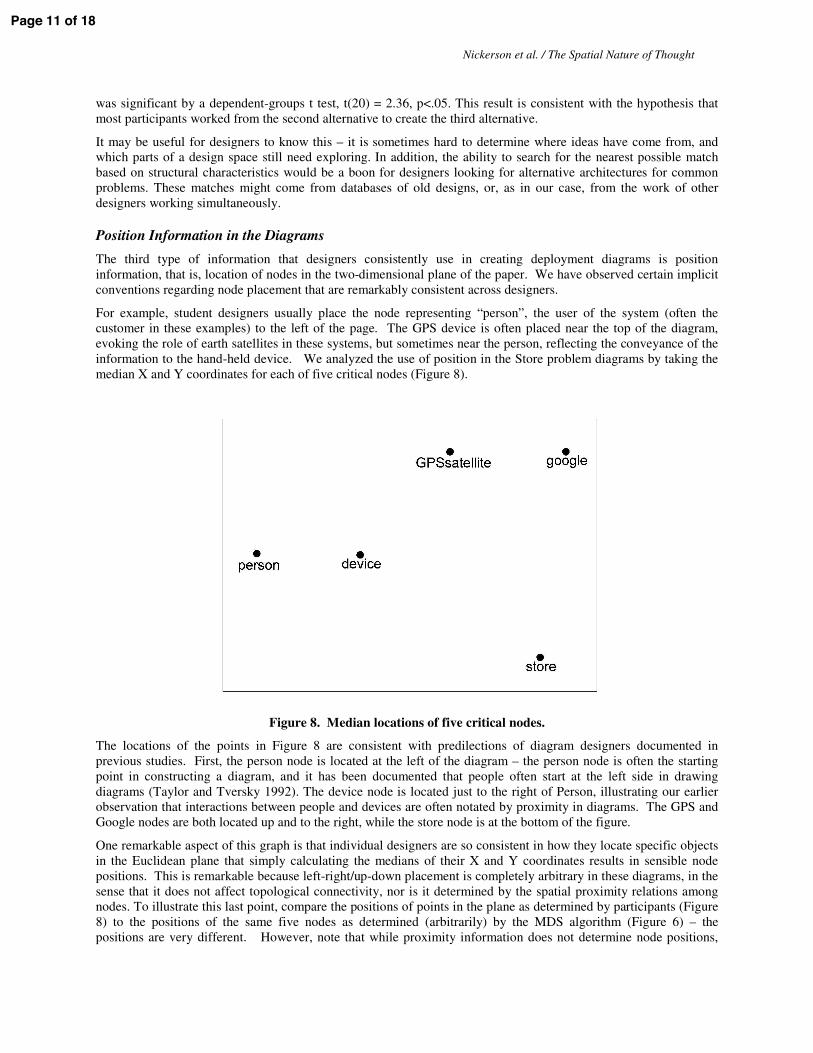
For example, student designers usually place the node representing “person”, the user of the system (often the customer in these examples) to the left of the page. The GPS device is often placed near the top of the diagram, evoking the role of earth satellites in these systems, but sometimes near the person, reflecting the conveyance of the information to the hand-held device. We analyzed the use of position in the Store problem diagrams by taking the median X and Y coordinates for each of five critical nodes (Figure 8).
Figure 8. Median locations of five critical nodes. The locations of the points in Figure 8 are consistent with predilections of diagram designers documented in previous studies. First, the person node is located at the left of the diagram – the person node is often the starting point in constructing a diagram, and it has been documented that people often start at the left side in drawing diagrams (Taylor and Tversky 1992). The device node is located just to the right of Person, illustrating our earlier observation that interactions between people and devices are often notated by proximity in diagrams. The GPS and Google nodes are both located up and to the right, while the store node is at the bottom of the figure.
One remarkable aspect of this graph is that individual designers are so consistent in how they locate specific objects in the Euclidean plane that simply calculating the medians of their X and Y coordinates results in sensible node positions. This is remarkable because left-right/up-down placement is completely arbitrary in these diagrams, in the sense that it does not affect topological connectivity, nor is it determined by the spatial proximity relations among nodes. To illustrate this last point, compare the positions of points in the plane as determined by participants (Figure 8) to the positions of the same five nodes as determined (arbitrarily) by the MDS algorithm (Figure 6) – the positions are very different. However, note that while proximity information does not determine node positions,
Page 11 of 18

Design Theory and Research
12 Twenty Ninth International Conference on Information Systems, Paris 2008
node positions do determine proximities. In fact, the proximities among the five nodes in Figure 8 are markedly similar to the proximities between the corresponding nodes in Figure 6. Thus, this automatic algorithm can replicate the proximities, but not the culturally determined positions that humans use.
The position effects do not show up only in the median node positions; individual designers show remarkably strong consistency in their use of positional information. This consistency is documented by Table 1, which reports the proportion of diagrams for which node x is placed to the left of (or above) node y for all pairs of nodes. The asterisks denote proportions that are significantly different from .5, although these results should be viewed as descriptive rather than inferential since the reported tests are not independent, and the observational units are individual diagrams, not participants. It is clear that store is generally positioned to the left of the other nodes, and Google to the right. In the vertical dimension, GPS is consistently positioned at the top and store at the bottom.
Table 1. Entries below the diagonal report the proportion of diagrams for which the column node is placed to the left of the row node in the diagram. Entries above the diagonal report the proportion of diagrams for
which the column node is placed above the row node.
person device store gps google
person -- 0.41 0.24* 0.70* 0.58
device 0.85* -- 0.26* 0.74* 0.64
store 0.86* 0.77* -- 0.72* 0.84*
gps 0.63 0.52 0.23* -- 0.29
google 0.83* 0.87* 0.61 0.71 --
Summary and Implications
The affordances of the pencil on the page
Paths. Our results establish that some designers, engaged in the creation of topological diagrams, use the affordances of the page to help create meaning. The first affordance, paths, the lines linking system components, are the essence of information system design, in fact, the only essential affordance of the page, the way that the long and complicated process of design negotiation is finally represented. Paths are afforded by the lines created by the instrument acting on the page. Because a line resembles a path, it is a natural way to express a link or connection or relationship between entities (Tversky et al. 2000). Paths are a common feature of diagrams, from diagrams of real spaces such as maps, especially route maps, to diagrams of virtual or abstract spaces, such as information systems, organization charts, and social networks. Paths are the primary means of showing links, relationships, connections, real or metaphoric.
Proximity. The other affordances, proximity, position, and permanence, are not essential to systems design, but facilitate expression of design ideas as well as design thinking. Designers went beyond indicating relations among components in their diagrams. They also grouped sets of components into subsystems. The affordance of proximity was used by designers to chunk the system into subsystems. This points to an important activity in design, hierarchical organization (e.g. Egan and Schwartz 1979; Simon 1969; Wand and Weber 1993). Hierarchical organization is a basic feature of all cognition, not just design (e. g., categorization, Rosch 1978; memory, Miller 1956; stories, Rumelhart 1980; events, Zacks and Tversky 2001). When a conceptual space grows large, it is partitioned and grouped, partitioned into subcategories and grouped into larger ones. The designers’ diagrams demonstrate clearly that their categorization processes rely on Euclidean space to separate categories. Grouping and sub-grouping reduce memory load by reducing the number of units the thinker must keep in mind. Designers can and do manipulate each group as a unit, ignoring the subunits for the moment. This is one of the abstraction processes in design so critical to becoming expert. The physical separation of clusters facilitates grouping and abstraction. Proximity, too, is common in diagrammatic reasoning. It underlies graphing, in which interval and ratio scales place values close on some abstract dimension close in space on a page. In solving algebra problems, for example, people operate on close units before far units even though the order of operation in no way affects solution (Landy and Goldstone 2007).
Page 12 of 18

Nickerson et al. / The Spatial Nature of Thought
The chunks participants made played a role in the creation of design variations. Especially interesting were modifications in which components were moved from one subsystem to another, as the formal move of a node sometimes corresponded to the move of an asset to different ownership. This changed the business model in profound ways. Thus, the external properties of the diagrams may have a deeper link to the pragmatics of the system and the expert designer may be one who senses which nodes can shift and how the shift impacts the system.
Position. Although the positions of entities in systems diagrams are not constrained, designers located system components systematically, and in two dimensions. For the most part, vertical location corresponded to vertical spatial location in the world and horizontal location corresponded left-to-right to temporal sequence in the information system. Time is frequently represented linearly in graphs, diagrams, language, and gesture. For readers of Western languages, time is ordered horizontally left-to-right (Boroditsky 2000; Tversky et al. 1991). In both comprehension and production of diagrams of varying content, reading order provides a default ordering when no other ordering is present (e. g., Taylor and Tversky 1992; Tversky et al. in press).
Permanence. Finally, the diagrams provided evidence for the influence of a fourth affordance of the page on design thinking, permanence. The persistence of a design on paper has at least two effects on design cognition. On the one hand, it reduces memory load; it is externalized so it does not have to be held in memory. This means that designers can use it to make inferences and mental revisions. However, its permanence also affects the designs that will be produced. Design sketches are also anchors that can potentially lead to fixation. In fact, designers’ second designs were rooted in their first designs and their third designs rooted in their second. Given that most real-world design problems entail creating progressive design versions, the affordance of permanence is bound to affect the design process.
Some designers work a theme, moving from one design to another (Akin 2001). In general, our participants worked from the last diagram they had created. The overall graph of the class (Figure 7) is interesting because it shows that collectively, groups of designers tended to cluster around sets of solutions, even for an open-ended problem. Some designers were too extreme in their shifts, making it difficult to understand their work, but most designers generated a moderate degree of change between alternatives. What would happen if designers were given the sketches of other designers? Would they then generate modifications similar to the first designer? Would they blend the ideas? Ignore the other’s sketch and start over? Such experiments would aid in the development of design aids that could observe what individual designers are doing and make suggestions about the alternatives being pursued or about what other designers have done. Thus, maybe the wisdom of crowds can be realized in design by providing a reflective capability that exchanges early sketches. This is seeking wisdom in the variety of the crowd, not in the average: by interacting with others’ sketches early on, designers may avoid fixation. In addition, the edit distance approach makes it possible to query databases for past designs that are within a certain number of changes from the present alternatives.
Situated Representations and Spatial Nature of Thought. Design is an interaction of minds and the tools used to express the design. Designers use properties of the page: paths, proximity, position, and permanence, to work through their ideas. The design process is iterative, progressing from internal representations to external ones and back again. It seems inevitable that the external expression of thought affects the internal representations, in the case of design, that the affordances of the pencil on page affect design ideas. It is not that the page determines the design, but rather that the designer’s choices are guided by the page, in the same way that a hiker’s choices are influenced by the terrain.
Other evidence points to the spatial nature of thought, to the prevalence of path, proximity, position, and permanence in reasoning in abstract domains. Time is mapped onto space in language and in reasoning (e. g., Clark 1973; Tversky et al. 1991; Boroditsky 2000). Time to judge the pleasantness or ferocity of animals depends on proximity and position (e. g., Banks and Flora 1977; Moyer, 1973). Gestures, which have many of the same properties as diagrams, also use space to express ideas, spatial and abstract (e. g. Goldin-Meadow 2003; Tversky et al. in press). From birth, and perhaps earlier, people act in space and learn its properties, yielding rich knowledge of space. This knowledge can serve as a metaphoric base for abstract thought (e. g. Tversky 2005). Whether the origin of the spatial nature of thought is the tools used to express thought, or metaphoric extensions of spatial reasoning to abstract reasoning, or both, cannot yet be decided.
Some kinds of research can only be performed after tools are built to observe and measure a phenomenon that otherwise would be unobservable. Here, we started with what appears to be a readily observable phenomenon – a set of sketched diagrams of information systems. Data can tell us a lot, and our unaided observations of the diagrams provided intuitions as to what to study more closely. But to study design more closely, we needed tools that
Page 13 of 18

Design Theory and Research
14 Twenty Ninth International Conference on Information Systems, Paris 2008
separated phenomena that appear interdependent by building software to manipulate and transform graphs. By separating connection from distance, we discovered that designers augment topological information with Euclidean, and partition systems into subsystems. With respect to the analysis of alternatives, topological graph manipulations are necessary to convert diagrams into comparable form so edit distances can be automatically calculated. Then weighted graph algorithms, such as all pairs shortest paths, calculated on Euclidean distances, provided additional information that allowed automatic clustering of the system into subsystems.
The tool demonstrated that the social space of design is an interesting one. Individuals sometimes generate solutions that are closest to their own best solutions, but other times they generate solutions that are close to another designer. The aggregate design space of many designers is perhaps an example of the wisdom of crowds – in that the crowd can generate more variations than an individual, and these variations might be of use to the sole designer. The distance measures we have defined provide a way of detecting identical and far-away graphs, but we have not yet created a tool for designers. We discuss this possibility in the next section.
Future directions
This paper is a step along a path in a larger research effort. It may be possible to use the analytic tool described here as base for a design tool that promotes reflection (e. g. Redmiles and Nakakoji 2004) by combining human evaluative skills with the search and combinatorial skills of the computer. Such tools are different in nature from the typical Computer Aided Software Engineering (CASE) tool, because CASE tools tend to generate systems from requirements, removing designer choice, whereas reflective tools provide feedback on already-created designs. The reflective tool we envision could effectively detect patterns of design, and evaluate distances between components and subsystems. The evaluation of the effects of a design would remain with the human designer. Thus, the design tool would help the designer generate alternatives and see implicit similarities and differences, and the designer would evaluate the results. Each subsystem, human and computational, would take advantage of the affordances of the other.
The analysis presented here can be extended to different design problems, and to different representations of the same problem to explore the boundaries of the phenomena. One question is whether the modality of presentation, text or diagram, affects the eventual design (cf. Tversky et al. 2008). The medium used to represent and solve the problem may also have an impact: we studied sketches on paper, but sketches made on computer screens may have different properties. If so the use of multiple media may provide a method for designers to help work around their natural design fixations.
The evaluation of design quality might be improved by scoring quality using a set of independent evaluators, and by breaking up quality subscales according to the dimensions suggested by Finke et al. in the context of creativity studies (1992). That is, solutions might be evaluated with respect to both their practicality and their originality. We might then have a better way of characterizing the space illustrated in Figure 7: diagrams that are far away from the center are original, but may or may not be practical. Finally, some designers take more naturally to the affordances of the page than another. If students are trained to diagram better, will they produce better designs? The theory of constructive perception (Suwa and Tversky 2001) suggests they will, because the diagrams and their interpretations are themselves a method for designers to think through problems.
From a socio-technical viewpoint, the reflective tools discussed here could be used to watch the emergence of new uses of a technology in an organization – tailorable technologies such as Wikis are often put to new uses in changing organizational contexts. Automated ways of characterizing the network (topological) aspects of such technologies could help to identify innovative adoptions, so that they could be identified and perhaps promoted.
Conclusions
Diagrams are the tools for information system design. Designers translate their internal representations to external representations on a page. They can then contemplate what they have produced and revise. Systems diagrams are topological, but they are embedded in a Euclidean space, a page. The qualities of the page provide affordances that are used to promote design thinking and serve to make designs clearer. These qualities can also constrain design. Designers used proximity to group components into subsystems and delineate those subsystems by placing components within a cluster close together and spatially separating clusters from each other. They used vertical position to reflect the spatial arrangement of components in the real world and horizontal position to reflect the temporal sequence of the components. Finally, they used the permanence of marks on a page to guide design of
Page 14 of 18

Nickerson et al. / The Spatial Nature of Thought
alternative configurations. Design is a product of the interaction of representations in the mind with representations on the page. Thus, the affordances and constraints of the page cannot help but shape the designs themselves.
This analysis of diagrams depended on tools we developed to abstract, summarize, and compare alternative designs. The tools have wide applicability, for example, for comparing and computing similarity of networks and for analyzing sketches in other domains. Notably, it has implications for aids for training and design. The tool could abstract the designers’ ideas, present alternatives, and be used to generate new design ideas. More research is needed to calibrate the tool, and that research will shed further light on the design process. Perhaps the most exciting potential use of this technology is in group design, in which the seeding of a team with initial designs separated in an alternative space might lead to increased diversity of ideas, and through this diversity, increased creativity in the design of software-intensive systems.
Acknowledgements
We are grateful for the support of the National Science Foundation under grant IIS-0725223 as well as to NSF REC-0440103 and the Stanford Regional Visualization and Analysis Center.
Page 15 of 18

Design Theory and Research
16 Twenty Ninth International Conference on Information Systems, Paris 2008
References
Akin, Ö. “Variants in Design Cognition”, in Design Knowing and Learning: Cognition in Design Education, Eastman, C., McCracken, M., and Newstetter, W. (Eds.), Elsevier, Amsterdam, Netherlands, 2001, pp. 105-124.
Alexander, C. Notes on the Synthesis of Form, Harvard University Press, Cambridge, MA, USA, 1964.
Alexander, C. The Timeless Way of Building, Oxford University Press, UK, 1979.
Avital, M., Lyytinen, K., Boland, R., Butler, B., Dougherty, D., Fineout, M., Jansen, W., Levina, N., Rifkin, W., and Venable, J. "Design With a Positive Lens: An Affirmative Approach to Designing Information and Organizations", Communications of the Association for Information Systems (18), 2006, pp. 519-545.
Banks, W. P., and Flora, J. “Semantic and Perceptual Processes in Symbolic Comparisons’’, Journal of Experimental Psychology: Human Perception and Performance (3), 1977, pp. 278 –290.
Bentley, P. J. and Corne, D. W. (eds.) Creative Evolutionary Systems, Morgan Kaufmann, San Francisco, 2002.
Blackwell, A. F. “Diagrams about Thoughts about Thoughts about Diagrams”, in Reasoning with Diagrammatic Representations II, Anderson, M. (Ed.), Technical Report FS-97-03, AAAI Press, Menlo Park, CA, USA, 1997, pp. 77-84.
Boroditsky, L. “Metaphoric Structuring: Understanding Time through Spatial Metaphors”, Cognition (75), 2000, pp. 1-28.
Carroll, J. M. Making Use: Scenario-Based Design of Human Computer Interactions, MIT Press, Cambridge, MA, USA, 2000.
Clark, H. H. “Space, Time, Semantics, and the Child”, in Cognitive Development and the Acquisition of Language, Moore, T.E. (Ed.), Academic Press, NY, USA, 1973, pp. 27-63.
Cross, N. “Expertise in Design. Introduction”, The Journal of Design Research (4:2), 2004.
Dewey, J. How We Think, D.C. Heath, MA, USA, 1933.
Egan, D. E., and Schwartz, B. J. “Chunking in Recall of Symbolic Drawings”, Memory and Cognition (7), 1979, pp. 149-158.
Finke, R. A,, Ward, T. B, Smith, Steven M. Creative Cognition, Theory Research and Applications, Cambridge MA: MIT Press 1992.
Floyd, R.W. "Algorithm 97: Shortest Path" Communications of the ACM (5:6), 1962, pp. 345.
Fowler, M. UML distilled: A Brief Guide to the Standard Object Modeling Language, Addison-Wesley, MA, USA, 2003.
Gaver, W. W. “The Affordances of Media Spaces for Collaboration”, in Proceedings of the ACM conference on Computer-supported cooperative work, 1992, pp.17-24.
Gibson, J. J. “The Theory of Affordances’’, in Perceiving, Acting, and Knowing, Shaw, R., and Bransford, J. (Eds.), Erlbaum, Hillsdale, NJ, USA, 1977.
Gibson, J. J. The Ecological Approach to Visual Perception, Houghton Mifflin, New York, USA, 1979.
Glasgow, J., Narayanan, N. H., and Chandrasekeran, G. Diagrammatic Reasoning: Cognitive and computational perspectives, Cambridge: MIT Press, Cambridge, MA, USA, 1995.
Goldin-Meadow, S. Hearing Gesture: How Our Hands Help Us Think, Belknap Press, Cambridge, MA, USA, 2003.
Goldschmidt, G. “The Dialectics of Sketching’’, Creativity Research Journal (4:2), 1991, pp. 123-143.
Goldschmidt, G. “On Visual Design Thinking: The Vis Kids of Architecture’’, Design Studies (15:2), 1994, pp. 158-174.
Page 16 of 18

Nickerson et al. / The Spatial Nature of Thought
Gross, M. D. “How is a Piece of Software Like a Building? Toward General Design Theory and Methods”, in the National Science Foundation (NSF) Invitational Workshop on Science of Design, Software Intensive Systems, Airlie Center, Virginia, November 2003.
Hevner, A. R., March, S. T., Park, J., and Ram, S. “Design Science in Information Research”, MIS Quarterly (28), 2004, pp. 75-105.
Holland, J. Adaptation in Natural and Artificial Systems, University of Michigan Press, Ann Arbor, MI, USA, 1975.
Jain, A. K., and Dubes, R. C. Algorithms for Clustering Data, Prentice Hall, New Jersey, USA, 1988.
Krippendorff, K. The Semantic Turn; A New Foundation for Design, Taylor & Francis CRC, New York, USA, 2006.
Kruskal, J., and Wish, M. Multidimensional Scaling, Sage Publishing, Newbury Park, CA, USA, 1978.
Landy, D., and Goldstone, R. L. “The Alignment of Order and Space in Arithmetic Computation”, in Proceedings of the Twenty-Eighth Annual Conference of the Cognitive Science Society, Lawrence Erlbaum Associates, Hillsdale, NJ, USA, 2007, pp. 382-387.
Larkin, J. H., and Simon, H. “Why a Diagram is (Sometimes) Worth Ten Thousand Words?”, Cognitive Science (11), 1987, pp. 65–99.
Lee, A. “Systems Thinking, Design Science and Paradigms: Heeding Three Lessons from the Past to Resolve Three Dilemmas in the Present to Direct a Trajectory for Future Research in the Information Systems Field”, in 11th International Conference on Information Management, 2000.
Lee, J., Wyner, G., and Pentland, B. T. (forthcoming) “Constraining the Search Space with Grammar-Based Design” MIS Quarterly, 2008.
March, S., Hevner, A., and Ram, S. "Research Commentary: An Agenda for Information Technology Research in Heterogeneous and Distributed Environments", Information Systems Research (11:4), 2000, pp. 327-341.
Maher, M. L., Merrick, K. and Macindoe, O. “Can Designs Themselves Be Creative?”, in Computational and Cognitive Models of Creative Design VI, Gero, J.S., and Maher, M.L. (Eds.), University of Sydney, Australia, 2005, pp. 111-126.
Miller, G. A. “The Magical Number Seven, Plus or Minus Two: Some Limits on Our Capacity for Processing Information’’, Psychological Review (63), 1956, pp. 81-97.
Moyer, R. S. “Comparing Objects in Memory: Evidence Suggesting an Internal Psychophysics”, Perception and Psychophysics (13), 1973, pp. 180-184.
Nickerson, J. V. Teaching the Integration of Information Systems Technologies, IEEE Transactions on Education, (49:2) 2006, pp. 271-277.
Nickerson, J. V., Corter, J. E., Tversky, B., Zahner, D., and Rho, Y.J. Diagrams as a tool in the design of information systems. In JS Gero and A Goel (eds), Design Computing and Cognition'08, Springer, Dordrecht, Netherlands 2008.
Norman, D. A. “Affordances, Conventions and Design”, Interactions (6:3), May 1999, pp. 38-43.
Norman, D. A. The Design of Everyday Things, Basic Books, New York, USA, 2002.
Pemmaraju S., and Skienna S. Computational Discrete Mathematics: Combinatorics and Graph Theory with Mathematica, Cambridge University Press, New York, 2003.
Peterson, L. L., and Davie, B. S. Computer Networks: A Systems Approach, Morgan Kaufmann, Amsterdam, Netherlands, 2007.
Redmiles, D., and Nakakoji, K. “Supporting Reflective Practitioners”, in Proceedings of the 26th International Conference on Software Engineering (ICSE’04), 2004, pp. 688 – 690.
Rosch, E. “Principles of Categorization’’, in Cognition and Categorization, Rosch, E., and Lloyd, B.B. (Eds.), Erlbaum, Hillsdale, NJ, USA, 1978, pp. 27-48.
Page 17 of 18

Design Theory and Research
18 Twenty Ninth International Conference on Information Systems, Paris 2008
Rumelhart, D. “On Evaluating Story Grammars’’, Cognitive Science (4), 1980, pp. 313-316.
Schön, D. A. The Reflective Practitioner: How Professionals Think in Action, Basic Books, Jackson, TN, USA, 1983.
Simon, H. A. The Sciences of the Artificial, MIT Press, Cambridge, MA, USA, 1969.
Sanfeliu, A., and Fu, K.S. “A Distance Measure between Attributed Relational Graphs for Pattern Recognition,” IEEE Transactions on Systems, Man, and Cybernetics (13), 1983, pp. 353-362.
Suwa, M., and Tversky, B. “What Do Architects and Students Perceive in Their Design Sketches? A Protocol Analysis”, Design Studies (18), 1997, pp. 385-403.
Suwa, M., and Tversky, B. “Constructive Perception in Design”, in Computational and Cognitive Models of Creative Design V, Gero, J.S., and Maher, M.L. (Eds.), University of Sydney, Australia, 2001, pp. 227-239.
Taylor, H. A., and Tversky, B. “Descriptions and Depictions of Environments”, Memory and Cognition (20), 1992, pp. 483-496.
Tversky, B. “Spatial Schemas in Depictions”, in Spatial Schemas and Abstract Thought, Gattis, M. (Ed), MIT Press, Cambridge, MA, USA, 2001, pp. 79-111.
Tversky, B. “Visualspatial Reasoning’’, in Handbook of Reasoning, Holyoak, K., and Morrison, R. (Eds.), Cambridge University Press, Cambridge, 2005, pp. 209-249.
Tversky, B., Corter, J. E., Nickerson, J. V., Zahner, D., Rho, Y. Transforming Descriptions and Diagrams to Sketches in Information System Design, in G. Stapleton, J. Howse, and J. Lee (eds), Diagrammatic Representation and Inference: Fifth International Conference, Diagrams 2008, Proceedings. Springer, LNAI 5223, 2008.
Tversky, B., Heiser, J., Lee, P. and Daniel, M.-P. (In press). “Explanations in Gesture, Diagram, and Word”, in Spatial Language and Dialogue, Coventry, K.R., Tenbrink, T., and Bateman, J. (Eds.), Oxford University Press, Oxford.
Tversky, B., Heiser, J., Lee, P. and Daniel, M.-P. (In press). “Explanations in Gesture, Diagram, and Word”, in Spatial Language and Dialogue, Coventry, K.R., Tenbrink, T., and Bateman, J. (Eds.), Oxford University Press, Oxford.
Tversky, B., Kugelmass, S., and Winter, A. “Cross-Cultural and Developmental Trends in Graphic Productions”, Cognitive Psychology (23), 1991, pp. 515-557.
Tversky, B., Zacks, J., Lee, P.U., and Heiser, J. “Lines, Blobs, Crosses, and Arrows: Diagrammatic Communication with Schematic Figures”, in Theory and Application of Diagrams, Anderson, M., Cheng, P., and Haarslev, V. (Eds.), Springer, Berlin, Germany, 2000, pp. 389-408.
Visser, W. The Cognitive Artifacts of Designing, Lawrence Erlbaum, Mahwah, NJ, USA, 2006a.
Visser, W. “Designing as Construction of Representations: A Dynamic Viewpoint in Cognitive Design Research”, Human-Computer Interaction, Special Issue "Foundations of Design in HCI", (21:1), 2006b, pp. 103-152.
Visser, W. “Both Generic Design and Different Forms of Designing”, in The 2006 DRS (Design Research Society) International Conference, Lisbon, Portugal, November 2006c.
Wand, Y., and Weber, R. “On the Ontological Expressiveness of Information Systems Analysis and Design Grammars”, Journal of Information Systems (3:4), 1993, pp. 217-237.
Winograd, T. Bringing Design to Sofware, Addison-Wesley, Boston, MA, USA, 1996.
Zacks, J., and Tversky, B. “Event Structure in Perception and Conception”, Psychological Bulletin (127), 2001, pp. 3-21.
Page 18 of 18