Embed Size (px)
Citation preview
Progression Of the Front Cover.Iram Dogar
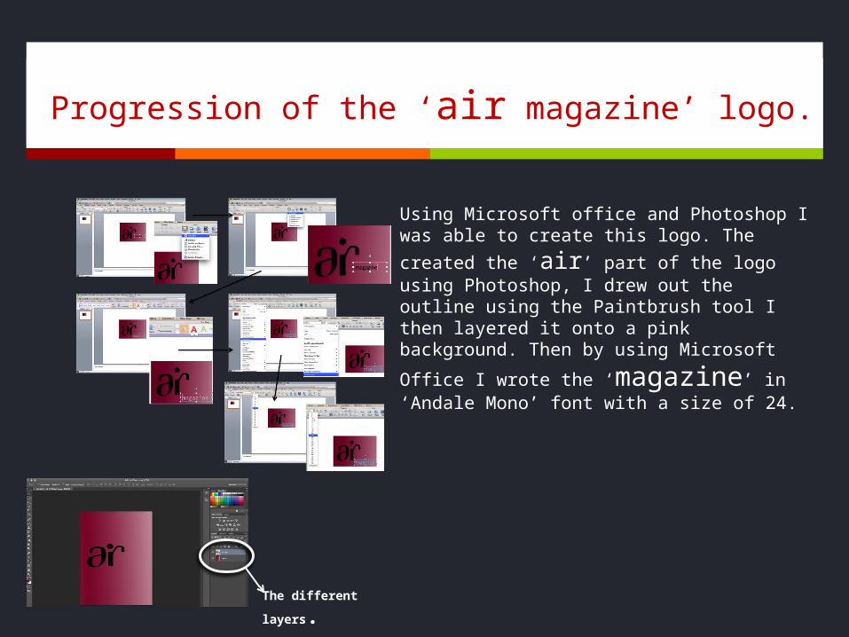
Progression of the ‘air magazine’ logo.
Using Microsoft office and Photoshop I was able
to create this logo. The created the ‘air’ part of the logo using Photoshop, I drew out the outline using the Paintbrush tool I then layered it onto a pink background. Then by using Microsoft Office
I wrote the ‘magazine’ in ‘Andale Mono’ font with a size of 24.
The different layers.
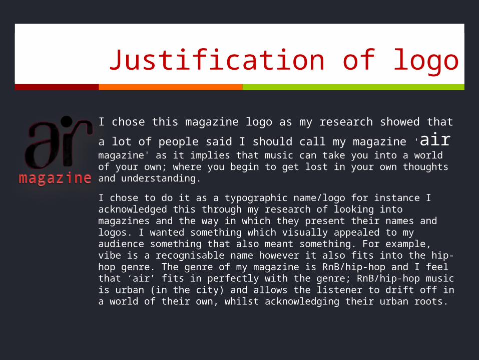
Justification of logo
I chose this magazine logo as my research showed that a lot of
people said I should call my magazine 'air magazine' as it implies that music can take you into a world of your own; where you begin to get lost in your own thoughts and understanding.
I chose to do it as a typographic name/logo for instance I acknowledged this through my research of looking into magazines and the way in which they present their names and logos. I wanted something which visually appealed to my audience something that also meant something. For example, vibe is a recognisable name however it also fits into the hip-hop genre. The genre of my magazine is RnB/hip-hop and I feel that ‘air’ fits in perfectly with the genre; RnB/hip-hop music is urban (in the city) and allows the listener to drift off in a world of their own, whilst acknowledging their urban roots.
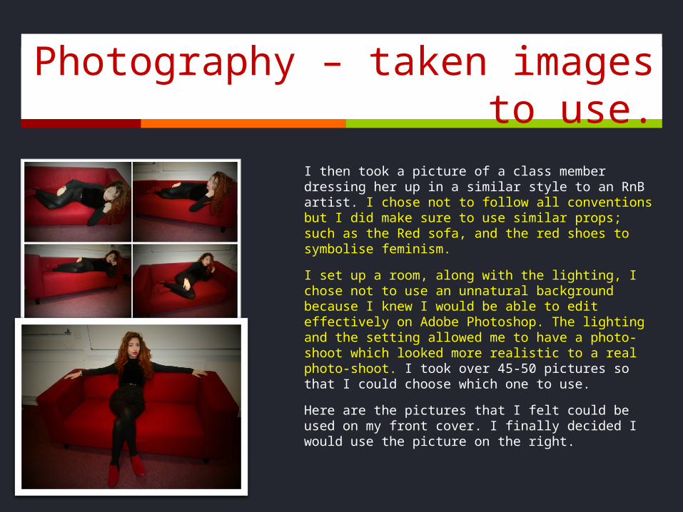
Photography – taken images to use.
I then took a picture of a class member dressing her up in a similar style to an RnB artist. I chose not to follow all conventions but I did make sure to use similar props; such as the Red sofa, and the red shoes to symbolise feminism.
I set up a room, along with the lighting, I chose not to use an unnatural background because I knew I would be able to edit effectively on Adobe Photoshop. The lighting and the setting allowed me to have a photo-shoot which looked more realistic to a real photo-shoot. I took over 45-50 pictures so that I could choose which one to use.
Here are the pictures that I felt could be used on my front cover. I finally decided I would use the picture on the right.
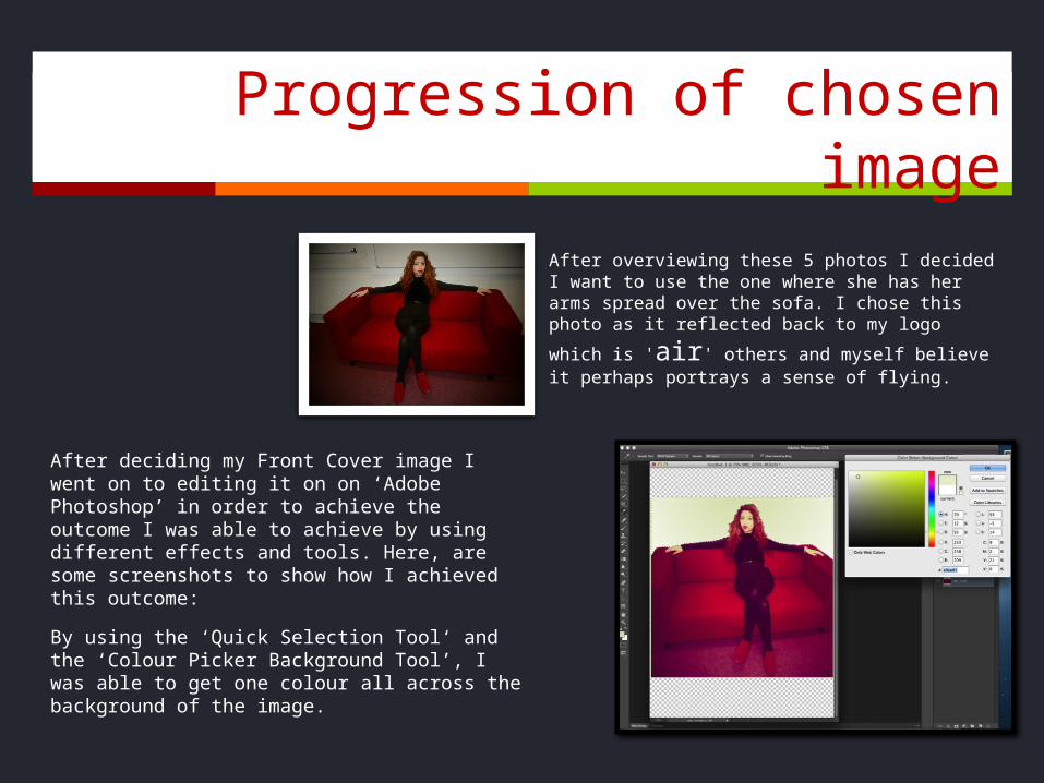
Progression of chosen image
After deciding my Front Cover image I went on to editing it on on ‘Adobe Photoshop’ in order to achieve the outcome I was able to achieve by using different effects and tools. Here, are some screenshots to show how I achieved this outcome:
By using the ‘Quick Selection Tool‘ and the ‘Colour Picker Background Tool’, I was able to get one colour all across the background of the image.
After overviewing these 5 photos I decided I want to use the one where she has her arms spread over the sofa. I chose this photo as it reflected
back to my logo which is 'air' others and myself believe it perhaps portrays a sense of flying.
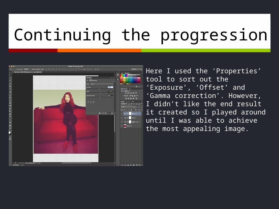
Continuing the progression
Here I used the ‘Properties’ tool to sort out the ‘Exposure’, ‘Offset’ and ‘Gamma correction’. However, I didn’t like the end result it created so I played around until I was able to achieve the most appealing image.
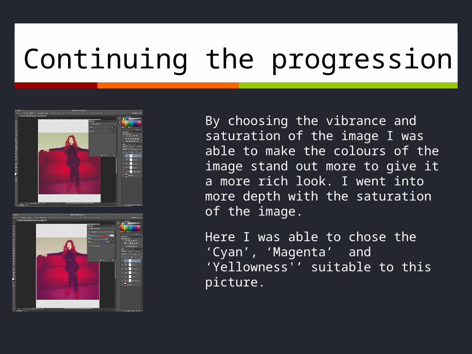
Continuing the progression
By choosing the vibrance and saturation of the image I was able to make the colours of the image stand out more to give it a more rich look. I went into more depth with the saturation of the image.
Here I was able to chose the ‘Cyan’, ‘Magenta’ and ‘Yellowness'’ suitable to this picture.
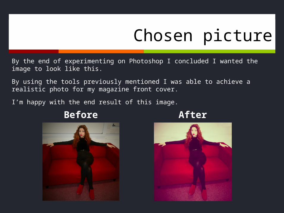
Chosen pictureBy the end of experimenting on Photoshop I concluded I wanted the image to look like this.
By using the tools previously mentioned I was able to achieve a realistic photo for my magazine front cover.
I’m happy with the end result of this image.
Before After
Justification of colours and fonts
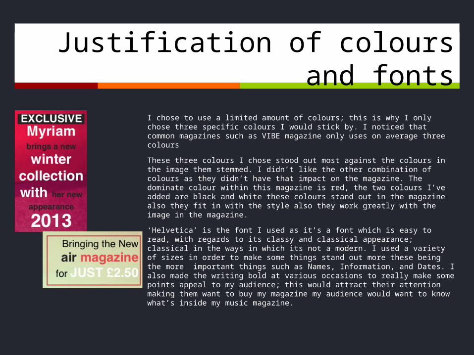
I chose to use a limited amount of colours; this is why I only chose three specific colours I would stick by. I noticed that common magazines such as VIBE magazine only uses on average three colours
These three colours I chose stood out most against the colours in the image them stemmed. I didn’t like the other combination of colours as they didn’t have that impact on the magazine. The dominate colour within this magazine is red, the two colours I’ve added are black and white these colours stand out in the magazine also they fit in with the style also they work greatly with the image in the magazine.
‘Helvetica’ is the font I used as it’s a font which is easy to read, with regards to its classy and classical appearance; classical in the ways in which its not a modern. I used a variety of sizes in order to make some things stand out more these being the more important things such as Names, Information, and Dates. I also made the writing bold at various occasions to really make some points appeal to my audience; this would attract their attention making them want to buy my magazine my audience would want to know what’s inside my music magazine.
Use of Quark
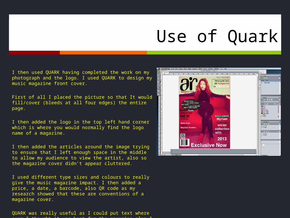
I then used QUARK having completed the work on my photograph and the logo. I used QUARK to design my music magazine front cover.
First of all I placed the picture so that It would fill/cover (bleeds at all four edges) the entire page.
I then added the logo in the top left hand corner which is where you would normally find the logo name of a magazine.
I then added the articles around the image trying to ensure that I left enough space in the middle to allow my audience to view the artist, also so the magazine cover didn’t appear cluttered.
I used different type sizes and colours to really give the music magazine impact. I then added a price, a date, a barcode, also QR code as my research showed that these are conventions of a magazine cover.
QUARK was really useful as I could put text where ever I thought it was best for the magazine also I could move it around also I could adjust sizes and produce an authentic piece of work.
Editing it the typefaces and position of text.
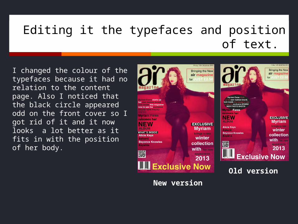
I changed the colour of the typefaces because it had no relation to the content page. Also I noticed that the black circle appeared odd on the front cover so I got rid of it and it now looks a lot better as it fits in with the position of her body.
New version
Old version
Further ideas for magazine logo
To begin with I created a questionnaire asking a wide selection of questions. I found the responses helpful however the responses for ‘what name would like the magazine to have?’ were poor. I didn’t like any of the suggestions therefore, I began to do more research and found names which related better to my music genre of RnB and Hip-hop.
I wanted to use a name which is more appealing to my target audience; this being an audience ranging between 18-24. and I came to realise that the names suggested weren’t the best for my target audience. I came up with the names Corner Culture, KERB or Wire.
The reason behind ‘Corner Culture’ and ‘KERB’ is because by researching into genre the artists who produce RnB/Hip-hop music a lot of times talk about drugs, sex, alcohol, women “Bitches (or) Hoes”, majority of the times the action of selling drugs (for instance) is done on the corners/curbs of the hood.
The reasoning behind ‘WIRE’ is for many reasons; it signifies the RnB culture since whenever there is a performance wires are involved in many ways. For instance, the cords which connect the amplifiers to the instruments. Its also the name of a very popular American drama which featured black American culture called ‘Wire’.
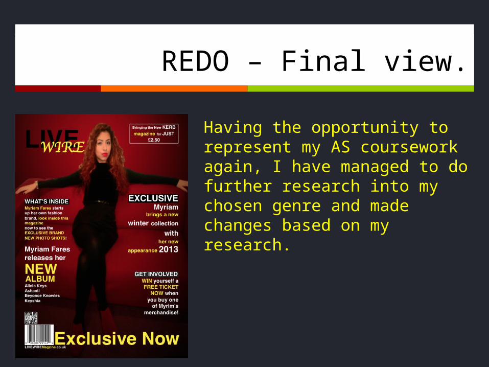
REDO – Final view.
Having the opportunity to represent my AS coursework again, I have managed to do further research into my chosen genre and made changes based on my research.
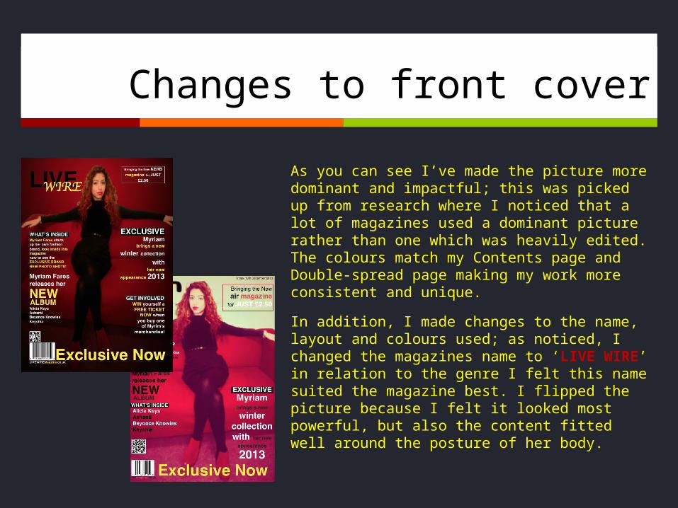
Changes to front cover
As you can see I’ve made the picture more dominant and impactful; this was picked up from research where I noticed that a lot of magazines used a dominant picture rather than one which was heavily edited. The colours match my Contents page and Double-spread page making my work more consistent and unique.
In addition, I made changes to the name, layout and colours used; as noticed, I changed the magazines name to ‘LIVE WIRE’ in relation to the genre I felt this name suited the magazine best. I flipped the picture because I felt it looked most powerful, but also the content fitted well around the posture of her body.