Embed Size (px)
Citation preview

CSS you’ve never known
Bogdan Rusinka

Rusinka Bohdan
Frontend Developer@BinaryStudio
Github:BogdanRusinka
http://www.binary-studio.com/

CSS evolution
1996 1997 1998 1999 … 2010 2011 2012 2013 2014 2015
?

Flex
http://codepen.io/anon/pen/oXbyRbhttp://codepen.io/anon/pen/oXbyRb?editors=110Flex

Why?
✓ Responsive layout✓ Vertical/horizontal alignment✓ Stretching blocks✓ Element positioning

Flexbox

Properties
Parent Child
★ display: flex★ flex-direction★ flex-wrap★ flex-flow★ justify-content★ align-items★ align-content
★ order★ flex-grow★ flex-shrink★ flex-basis★ flex★ align-self

Playground
http://b1narystudio.github.io/flex-playground/

Accordion
header .header-accordion .accordion {width: 100%;display: flex;
}
header .header-accordion .accordion .accordion-item {flex: 1;height: 250px;
background-size: cover; }

Photo gallery.main-photogallery-block .box {
display: flex;flex-flow: column nowrap;
width: 100%; height: 100%;}
.col-item {display: flex;flex-flow: row nowrap;
width: 100%; height: 100%; margin: 0 auto; flex: 1 2 20%;} .item {
flex: 1 2 20%;}

Grid system

Battlefield

What’s inside?

Flex-based grid
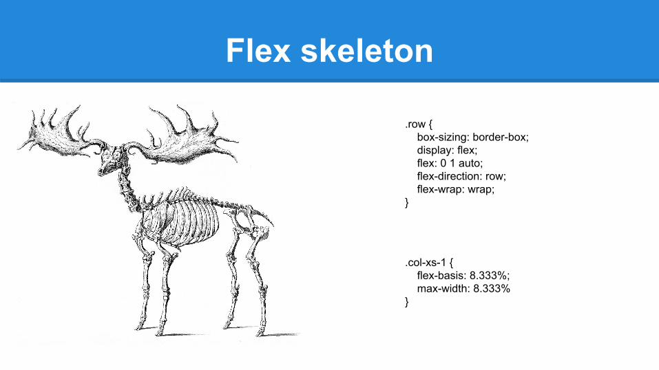
Flex skeleton
.col-xs-1 { flex-basis: 8.333%; max-width: 8.333%}
.row { box-sizing: border-box; display: flex; flex: 0 1 auto; flex-direction: row; flex-wrap: wrap;}

Compatibility

Pointer events

Why?
✓ Interaction with underlying element✓ Disabling interaction with current element✓ Speeding up scrolling

Speeding up
.hover .element:hover { box-shadow: 1px 1px 1px #000;}

Properties
.element {pointer-events: none
}
pointer-events: auto;
pointer-events: none;
pointer-events: visiblePainted;
pointer-events: visibleFill;
pointer-events: visibleStroke;
pointer-events: visible;
pointer-events: painted;
pointer-events: fill;
pointer-events: stroke;
pointer-events: all;
SVG only
Any

Examples

Clip-path

clip vs clip-path
.element { clip: rect(30px, 30px, 20px, 20px); }
vs
.element { clip-path: polygon(x1 y1, x2 y2, x3 y3, ...); }

Pros and cons
✓ Browser support✓ Pointer events✓ Any units
ㄨ All is clippedㄨ “Recommendation” stageㄨ Bugs

Firefox working with svg
<svg width="0" height="0"> <defs>
<clipPath id="clip-shape" clipPathUnits="objectBoundingBox"> <polygon points="0 1, 0 0, 1 0, 0.8 1" /></clipPath>
</defs></svg>
.element { clip-path: url("#clip-shape"); }

Usage
✓ Various polygon shapes✓ Animation changing forms✓ Add borders✓ Cool image effects
http://codepen.io/imohkay/pen/KpdBrw

will-change

Who rules?
https://dev.opera.com/articles/css-will-change-property/

Rectangles in Chrome

Hack
transform: translate3d(0, 0, 0);

Syntax
will-change: transform, opacity, scroll-position, content;

Dont’s
*,
*::before,
*::after {
will-change: all;
}

Give me more time
.element:hover {
will-change: transform;
transition: transform 2s;
transform: rotate(30deg) scale(1.5);
}
.element {
/* style rules */
transition: transform 1s ease-out;
}
.element:hover {
will-change: transform;
}
.element:active {
transform: rotateY(180deg);
}

Removing will-changevar el = document.getElementById('element');
el.addEventListener('mouseenter', hintBrowser);
el.addEventListener('animationEnd', removeHint);
function hintBrowser() {
this.style.willChange = 'transform, opacity';
}
function removeHint() {
this.style.willChange = 'auto';
}

Properties
★ auto★ scroll-position★ contents

https://css-tricks.com/guide-responsive-friendly-css-columns/?utm_content=buffera29d6&utm_medium=social&utm_source=facebook.com&utm_campaign=buffer
Responsive CSS columns

Column-count
.lead { -webkit-column-count: 3; -moz-column-count: 3; column-count: 3; }

Column-width
section {-webkit-column-width: 200px; -moz-column-width: 200px; column-width: 200px;}

Declare both
article { -webkit-column-count: 2; -moz-column-count: 2; column-count: 2; -webkit-column-width: 200px; -moz-column-width: 200px; column-width: 200px;}

Customize
❖ column-gap❖ column-rule❖ column-span❖ column-fill

Interaction media features

@media(hover:hover)@media (pointer:fine) {
/* ok to use small buttons/controls */
}
@media (hover:hover) {
/* ok to use :hover-based menus */
}
@media (pointer:coarse) {
/* make buttons and other “touch targets” bigger */
}
@media (hover:none), (hover:on-demand) {
/* suppress :hover-based menus */
}

Current specification

Support
/* Make radio buttons and check boxes larger if we have an inaccurate pointing device */@media (pointer:coarse) {
input[type="checkbox"], input[type="radio"] {min-width:30px;min-height:40px;background:transparent;
}}

Blend-modes

So much modes
● multiply● overlay● screen● darken● lighten● color-dodge● color-burn
● hard-light● soft-light● difference● exclusion● hue● saturation● color● luminosity

Syntax
.element { background: url('https://s3-us-west-2.amazonaws.com/s.cdpn.io/14179/image.jpg'); background-blend-mode: screen, difference, lighten;
}

Where to use
★ Mixing image with color (hover effects)★ Mixing images★ Text overlay★ Unexpected effects

More examples

Examples

Box-sizing

Box model. IE wins!

Calculations
padding + border + width = actual rendered widthpadding + border + height = actual rendered height

Problem?
Solution:
html { -webkit-box-sizing: border-box; -moz-box-sizing: border-box; box-sizing: border-box;}

Other properties
box-sizing: content-box;
box-sizing: padding-box;

CSS4

What’s new?
❖ parent selector
❖ grid-structural pseudo-classes: :column, :nth-column, :nth-last-column
❖ tree-structural pseudo-classes: :nth-match, :nth-last-match
❖ ui state pseudo-class: :indeterminate
❖ time-dimensional pseudo-classes: :past, :current, :future
❖ location pseudo-classes: :any-link, :local-link
❖ logical combinators: :matches, :not

Let’s look at examples...
p:not(.classy) { color: red; }
body :not(p) { color: green; }
<p>Some text.</p>
<p class="classy">Some other text.</p>
<span>One more text<span>
Some text.Some other text.One more text
:matches(section, article, aside, nav) :matches(h1, h2, h3, h4, h5, h6) { color: #BADA55;}
/* ... which would be the equivalent of: */section h1, section h2, section h3, section h4, section h5, section h6, article h1, article h2, article h3, article h4, article h5, article h6, aside h1, aside h2, aside h3, aside h4, aside h5, aside h6, nav h1, nav h2, nav h3, nav h4, nav h5, nav h6 { color: #BADA55;}

Variables
:root {
--main-bg-color: brown;
}
.one {
color: white;
background-color: var(--main-bg-color);
margin: 10px;
width: 50px;
height: 50px;
display: inline-block;
}
.three {
color: white;
background-color: var(--main-bg-color);
margin: 10px;
width: 75px;
}
.four {
color: white;
background-color: var(--main-bg-color);
margin: 10px;
width: 100px;
}
.five {
background-color: var(--main-bg-color);
}

Thanks!