Embed Size (px)
Citation preview

41
Chapter 3
Statistics: Numbers Looking for an Argument
Not everything that counts can be counted, and not everything that can be counted, counts.
— Sign hanging in Einstein ’ s Princeton offi ce
Measurement in one form or another is integral to life ’ s routine decisions. And statistics, one form of measurement, are becoming the “ language of the informed. ” Debates and discussions seem to be judged on who has the best (or the most) numbers. Whether you speak the language or not, you can still understand statistics: their strengths, their limitations, and how they help us understand risk in its many forms.
Statistics compress data into facts, but there are many so - called facts that data can support. One phrase I ’ ve heard to describe this is: “ Statistics means never having to say you ’ re certain. ” You ’ ve probably heard others, like “ liars fi gure and fi gures lie ” and “ there are lies, damned lies, and statistics. ” Statistics are used as ready ammunition in arguments; in many cases, opposing sides use the same data to develop statistically correct arguments in support of their side. To set the stage for the chapter let ’ s take a look at this list of 2009 salaries for the New York Yankees baseball team [1] .
I ’ m not trying to start an argument about whether or not professional athletes are overpaid. This table is used strictly for its value in comparing statistical inter-pretations of data. First let ’ s calculate the arithmetic mean, or average salary for the team members. By adding up all of the salaries in this list and dividing the total by the number of players, we compute the “ average ” player is making $8,021,117 a year.
Let ’ s look at the median salary, or the one halfway down the list. There are 25 players listed so the middle player is number 13, Damaso Marte, at a salary of
20% Chance of Rain: Exploring the Concept of Risk, First Edition. Richard B. Jones.© 2012 John Wiley & Sons, Inc. Published 2012 by John Wiley & Sons, Inc.

42 Chapter 3 Statistics: Numbers Looking for an Argument
$4,575,000 — that ’ s $3,446,117 less than the average salary. Half of the players make more than this amount and half make less.
Both the average and the median are valid statistical measures. Both represent the “ middle ” of a set of numbers. But as you can see in this case, the word “ middle ” has two interpretations. Both are correct but they cannot be used interchangeably. This is just one way data can support differing statistical conclusions. You can see how two parties can use the same data to reinforce different positions and both be technically correct. And by the way, neither the average nor the median is going to make a bit of difference to the wallets of the players at the bottom of the list!
Sometimes the use of statistics goes far beyond even the needs of the consumer. My wife purchased a broom - type vacuum cleaner and when she read a certain section of the booklet, she was surprised that the manufacturer would put such technical content in the same book that tells people how to unpack the thing from the box. Here is the exact text. Do you think this information would help you use the vacuum cleaner?
Cleaning Effectiveness Per Amp Rating
This is not an Amp rating. Amps do not measure dirt removal, only the amount of electricity used. Cleaning Effectiveness Per Amp is determined by dividing this model ’ s Cleaning Effectiveness * by its Amps.
* Cleaning Effectiveness is the percentage value obtained from dividing:
(a) the geometric mean of the amount of embedded carpet dirt removed in testing under ASTM Test Method F608 - 89, by
(b) the value 29 (the geometric mean of the midpoints of the % dirt pickup scales selected by [ brand na me] as a reference for its rating system).
This illustration shows why even the word “ statistics ” often causes pain to some people. It does have its own special jargon. Statistics examines the behavior of a population of things or events. It does not and cannot be used to accurately predict
Table 3.1 New York Yankees Salaries: 2009 Season
Alex Rodriguez 33,000,000 Jose Molina 2,125,000 Derek Jeter 21,600,000 Jerry Hairston Jr. 2,000,000 Mark Teixeira 20,625,000 Eric Hinske 1,500,000 A.J. Burnett 16,500,000 Melky Cabrera 1,400,000 CC Sabathia 15,285,714 Brian Bruney 1,250,000 Mariano Rivera 15,000,000 Joba Chamberlain 432,575 Jorge Posada 13,100,000 Brett Gardner 414,000 Johnny Damon 13,000,000 Phil Hughes 407,650 Hideki Matsui 13,000,000 David Robertson 406,825 Robinson Cano 6,000,000 Alfredo Aceves 406,750 Andy Pettitte 5,500,000 Phil Coke 403,300 Nick Swisher 5,400,000 Ramiro Pena 400,000 Damaso Marte 3,750,000
More Statistics Yields More ______? 43
singular, individual events. Nevertheless, the legal profession does use it in court-rooms with surprising results. Some examples have been compiled in a book of case studies, called Statistics for Lawyers [2] , describing how statistics can be used in trial law. It makes interesting, imaginative, and sometimes sad reading. Just like if you were on a jury listening to evidence, the message throughout this chapter is “ caveat emptor ” or “ buyer beware ” of exactly what is shown by the statistics you ’ re hearing and how they are derived.
Statistics have become integrated into many facets of our lives. They are no longer the esoteric language of scientists, technicians, and engineers. One powerful example comes from today ’ s world of “ rightsizing. ” Statistical tests are performed by corporations to ensure that layoffs are done in nondiscriminatory patterns. Before a layoff occurs, an analysis is done of the workers to be laid off to see if the distri-bution of the elderly, minorities, women, and others is fair or excessive. These studies sometimes become part of the company ’ s legal defense in the event of dis-criminatory lawsuits [3] .
Statistical interpretations and applications can be volatile subjects in certain situations. Why? One answer is often “ money, ” of course. But more broadly, the use of statistics is important to our understanding of our world, its hazards, and the risks we take living in it. Let ’ s begin exploring this subject in more detail.
MORE STATISTICS YIELDS MORE ______?
Consider the following partially completed sequence of statements:
Technology yields more data.
More data yield more statistics.
More statistics yield more __.
The cynic would complete this sequence with “ opportunity to prove anything you want. ” And there is some truth in this. But for now, let ’ s take the high road and explore some other possible answers.
Some people would say that the word that best completes the passage is “ knowl-edge. ” They would argue that, as a society, we are converting data into information at an ever - increasing rate. Information is being continuously processed to improve our technology, fi nances, health, and quality of life. I would agree that to some extent this is true, but let ’ s now hear from another point of view.
Other people would end the statement with the word “ confusion. ” You might wonder how anyone who lives today could believe that technological evolution is leading us down the pathway of confusion and possibly confl ict. In response, I chal-lenge you to pick up any newspaper and see if the statistics reported on any subject really convince you of anything. The numbers may give you an illusion of precision, true, but do they provide you a genuine package of knowledge? The title of this book is a perfect example. As I explained in the preface, a “ 20% chance of rain ” gives you a very precise, numeric weather forecast that is adequate for a general area, but for pinpointing what will happen right where you ’ re standing, it means

44 Chapter 3 Statistics: Numbers Looking for an Argument
almost nothing! Doppler Radar, color graphic display technologies, and computer - based weather models give us tremendous amounts of meteorological data, but the weather forecast is still a “ 20% chance of rain. ” The sequence “ Technology leads to data which lead to statistics which lead to … ” certainly could be ended with the word “ confusion. ” Concerning the weather forecast, all you know is that it might rain today. Weather forecasting is still an art, regardless of the technology, and with a forecast style of “ 20% chance of rain, ” meteorologists are never wrong!
Medical science has combined technology and measurement skills, but with mixed results. And sometimes, confl icting results do little to instill public confi dence in medical studies. For example, one report says caffeine is okay, while the next says that caffeine causes problems. Some say that butter is bad for you and margarine is okay; others say the opposite. The studies are not at fault. It is the interpretation of the statistics. This brings us back to the “ statistics lead to … ” sequence. The news media plays a role in this communication gap. There ’ s often insuffi cient time or space in sound bites and headlines to give the audience the complete story. It ’ s also true that sensational news sells better than does a lesson in survey statistics. We ’ ll revisit this issue once we have discussed some basic facts about the strengths and limitations of statistics.
FACTS OR STATISTICS?
Here ’ s a list of statistical statements that have varying degrees of truth. I ’ ve made some comments after each statement to get you thinking about their accuracy.
1. You are about as likely to get struck by lightning as you are to win the lottery. So what? The three states in the United States that have the most lightning deaths are Florida, North Carolina, and Texas. Do more people play the lottery in these states? Is there a correlation between people who play the lottery and those struck by lightning? If I play the lottery, am I more likely to be struck by lightning? Or, if I get struck by lightning, am I more likely to win the lottery? This statement is a classic example of pseudoprecision.
2. If you play Russian roulette with a six - shooter once, your chances of shooting yourself are 1 in 6. Suppose you take a revolver, empty the cylinder, put one bullet back in, spin the cylinder, put the gun to your head, squeeze the trigger, and are subse-quently killed by the bullet that just happened to be in the right (or wrong) place. What was your probability of shooting yourself? It was one — not one out of six for this singular event now in the past. Based on theory, the prob-ability of having the bullet in the right (wrong) cylinder may be one out of six, however, this statistic does not apply to individual behavior. You can consider statistics in making decisions, but the personal outcome of the uncertain event is real, not theory.

Facts or Statistics? 45
3. About one in every 123 people in the US will die each year. How does this apply to you?
4. Cigarettes are not habit - forming. Who do you think would have funded this study?
5. You can drown in a lake with an average depth of 1 inch. There is nothing wrong with this statement. It ’ s perfectly valid. Think of this example the next time you hear or read the word “ average ” in some context. Without more information, the statements surrounding the statistics ’ use can be misleading.
When you read these statements you can see that they could be true sometimes but that does not make them facts. Facts are true all of the time. But statements like these are often used together, in concert, sometimes interspersed with real facts to get people to believe in a certain point of view. If you remember anything from this chapter remember this : statistics do not, and cannot, prove anything. The fi eld of statistics is incapable of proving anything. Statistics can provide information to help us make decisions, but the decisions are still ours to make.
Let ’ s take a “ pure ” situation where there is only one answer and then generalize it to a circumstance where statistics apply. Suppose you want to measure the “ length ” of an object. If the object is square, then “ length ” has a unique numerical answer. However, if the object has a ragged, irregular edge, such as that possessed by a splintered board of wood, there is no single value for length. Statistics redefi nes “ length ” here as a variable, such as the average length, median length, or some other quantity. The result is a statistical value representing all of the individual values of the splintered board. Since this one value is designed to be the most representative length from all of the other values, it must be accompanied by information on how representative this special value is relative to the whole family of values from which it was derived. This information can be in the form of confi dence limits on the average, quartile or percentile values, the maximum and minimum values or other stuff. The point is that since statistical results (in this case for length) are representa-tive, single for a family of values, they need to be stated with some additional information that indicates the overall variability in the data.
Statistics are applied in many ways but we ’ ll restrict ourselves here to the area called inference, or trying to deduce information from data. This is the area that ’ s most visible to the general public, usually through the news media. Inference is a method of using data to support or not support ideas. It gets its name from the base word “ infer, ” meaning “ to derive a conclusion from facts or premises. ” This is the fi rst defi nition from the dictionary. The second meaning says the same thing but in a much more straightforward way. The second defi nition is “ guess, surmise. ” Take your choice. Either way, the process of inference is the process of guessing, but in a way that utilizes information in a structured manner.
Here ’ s another term that has special meaning in statistics: hypothesis. You usually don ’ t see the phrase “ statistical hypothesis ” in the newspapers, but you read and hear statistical hypotheses almost every day in the news. A hypothesis is a statement suggesting some relationship in a process. Hypotheses can be very simple
46 Chapter 3 Statistics: Numbers Looking for an Argument
or very esoteric, depending upon what ’ s being studied. Here are some typical examples:
1. Hypothesis: In one out of every seven weddings, either the bride or groom or both are getting married for the third time.
2. Hypothesis: A person is more likely to die in his or her bathtub than be killed by lightning.
3. Hypothesis: Sixty - fi ve out of every 100 men between the ages of 21 and 65 will suffer baldness or excessive hair loss.
4. Hypothesis: Flying in commercial airlines is safer than driving your car.
At least one study in each case has shown that they are statistically true. However, if taken as potential mathematical theorems, they would all be false. Why? For a mathematical theorem to exist, the statement must to be true all of the time. In each of the hypotheses listed above, a mathematician could prove each statement false by fi nding just one exception. Even though these statements are not mathematical theorems, some of them are generally true since the results were observed for some overall group. It ’ s this area of bringing quantitative information to practical applications where statistics plays a major role. The only drawback is that the results cannot be directly applied to a specifi c member of the group. When we look at risk, we are partially looking at the probability of an event happening within a group. If you are concerned about the behavior of groups and not about the behavior of individual items, then statistics works. If your concern is oriented towards the behavior of an individual then statistical results may be of little to no value.
INSIGHTS FROM S TATISTICAL I NFORMATION
We exist in a world in which we are exposed to great amounts of information in our everyday lives. Much of it is accompanied by “ the numbers ” that support the pre-senter ’ s point of view. Together with charts, graphs, and “ an attitude, ” statistics provide a seemingly compelling mechanism to support or reject certain facts. There is a general perception that the more quantitative or “ scientifi c ” the measurement tool, the more likely the result is correct. When people use numbers in a convincing manner, it is easy to suffer the illusion of accuracy and precision. The mystique of mathematics, the technical complexity of statistics, and the “ science of analysis ” lend themselves very well to abuse. The general population is poorly equipped to argue or even question “ the numbers. ”
When it comes to the proper use of statistics, there are serious pitfalls that many people, including the press and regulators, encounter. The use of measurements and conclusions based upon an application of statistics represents a powerful and con-vincing medium. However, the benefi ts are accompanied by a responsibility to communicate effectively, clearly, and completely.

Insights from Statistical Information 47
Let ’ s take some examples using what is probably the most used (and abused) statistic in the world: the arithmetic average. As we described in the example using the salary schedule for the New York Yankees, you compute the average of a set of values by taking their sum and dividing it by the number of terms in the sum. There is a saying that if your head is on fi re and your feet are freezing, on average, you ’ re doing just fi ne. The average is a statistic that “ measures the middle ” of a process. If the process contains wide variations, then the average, by itself, doesn ’ t mean much, as in the Yankees example. You ’ ll hear the term “ average ” used a lot on the news and in TV or radio commercials. The associated claims may be statistically correct, but they may not really describe the activity adequately.
In 2007 the U.S. “ average death rate ” for motor vehicle accidents was 14.3 deaths per billion vehicle - miles [4] , and about half of the deaths occurred during the night. This could lead you to conclude that there is no difference in risk driving or riding in cars during the night versus during the day. But here ’ s the missing piece of information. Even though the number of deaths from each time period is about the same, the number of people on the roads in the day and night is vastly different. Including this fact into the calculations shows the chance of death from car accidents is actually nearly three times greater at night than it is in the day. Driver age is another major factor. For teenagers between 15 and 19, the statistic is approximately 25 deaths per billion vehicle - miles. Factor in time of day, day of week, and day of year, and you ’ ll fi nd even more reasons to be concerned about teenagers and cars. This illustrates how useless and potentially misleading “ average ” statistics can be for your daily, nocturnal, weekend, and holiday roadway risk management decisions.
Here ’ s a case from nature. There is a growing amount of evidence that the genes for intelligence are located on the X - chromosome [5] . Men, genetically described as “ XY, ” inherit the X - chromosome only from their mothers, receiving the Y - chromosome from their fathers. If the evidence about the placement of genes for intelligence is valid, then men receive their intelligence from their mothers. Women, genetically XX, receive an X - chromosome from each parent, so they can inherit intelligence genes from both their father and mother. Although men and women tend to have the same average IQ scores, there are more males who are either geniuses or mentally retarded. Researchers argue that because a man has only one X - chromosome, he experiences the full effect of the intelligence genes it carries. Since women have X - chromosomes from both parents, they receive genetic intel-ligence information from each, buffering the expression of a single characteristic. So even though “ on the average ” men and women have IQs that are about the same, the distribution across each of the populations differs. The risk management lesson from this section is that if men want smart sons, they had better marry smart women!
There are more subtle uses of statistics that can make an uncertain, scientifi c result sound like a sure thing. Consider the ongoing case of talcum powder cancer risks. Talcum powder is made by grinding the mineral talc or hydrated magnesium silicate into a fi ne powder. It is similar in structure to asbestos and both substances are found in similar mining locations. In the 1970s, talcum powder was required by law not to contain asbestos, but the similar nature of talc and asbestos has prompted several studies analyzing its suspected carcinogenic properties.

48 Chapter 3 Statistics: Numbers Looking for an Argument
Talcum powder is commonly used today on babies to absorb moisture and odors and also by women in hygiene sprays. The concern is that the small fi bers in the powder, when applied to the genitals, might travel to the ovaries and trigger a process of infl ammation that enables cancer cell formation.
In the 1990s there were clinical studies performed to examine suspected ovarian cancer connections with talcum powder [6, 7] . The studies reportedly identifi ed a correlation, but they also admitted that the results were inconclusive due to the way the data were collected and analyzed. In 2000, another research project considered 121,700 female registered nurses in the United States who were aged 30 – 55 years at enrollment in 1976. Talc use was ascertained in 1982 by use of a self - administered questionnaire. After exclusions, 78,630 women formed the cohort for analysis. From this relatively large sample, scientists found that talc use in the genital area did not increase overall ovarian cancer risk [8] . This study did not stop the research, however. Additional studies with smaller sample populations under different conditions found a 30% increase in ovarian cancer for women who were regular talc users and in 2008, an Australian study also confi rmed the connection without specifying a defi ni-tive percentage increase [9] .
First of all, the incidence rate of ovarian cancer in the overall female population is about 12 out of every 100,000 women [10] . It is the eighth most frequent type of cancer. To put this into perspective, the number one cancer type for women, breast cancer, occurs in about 118 out of every 100,000 women. The number two type, lung and bronchus cancer, is 55 out of 100,000.
With ovarian cancer frequency just 12 in 100,000, statistically it is diffi cult to perform conclusive studies given the practical realities of acquiring a statistically ideal testing sample. Add on other risk factors such as age, obesity, reproductive history, gynecologic surgery, fertility drugs, diet, family history, androgens, estrogen and hormone surgery, personal history, analgesics, smoking, and alcohol use, you can see why it is tremendously diffi cult to isolate the effect of one risk factor over another or the effect of risk factor combinations. Adding talc powder to this list gives 14 risk factors, representing over 87 billion risk factor combinations. With a 12 per 100,000 ovarian cancer incidence rate, the number of women who can practically be involved in the research is small, so the talc powder effect statistical results are going to be stated with considerable uncertainty ranges. Nevertheless, the research is good science and you shouldn ’ t criticize the results or the researchers for develop-ing conclusions that appear to be contradictory. The studies represent how scientists use statistics to advance knowledge in their art. Each study provides not precision, but guidance and more insights to understand causality and the basic mechanisms of this horrible disease.
In this example, the term “ incidence rate ” was used; notice I did defi ne it. Differences in term defi nitions can cause people to misinterpret statistical conclu-sions. What makes the awareness of this dichotomy even more subtle is that terms can appear intuitive (as incidence rate does) yet the difference between intuition and actual defi nition can be signifi cant.
Interpreting statistical terminology is a basic requirement for the proper appli-cation of statistical results. This subject is large enough to fi ll another book, but

Insights from Statistical Information 49
I ’ ll include two examples here because they are used in many situations and the concepts have precise defi nitions. The terms are “ odds ratio ” and “ relative risk. ”
The odds ratio is exactly what it says. It is the ratio of the odds for two events. Let ’ s start by looking at what is meant by the term “ odds. ” Odds is the ratio or comparison of the number of winning possibilities and the number of other possibili-ties. For example, the odds of rolling a 1 on a single throw of a die is 1:5, or 1 to 5. This is not the same as the probability of rolling a 1, which is 1/6.
Consider perhaps a more relevant example in reviewing the odds of dying from various hazards shown in Table 3.2 [11] .
The lifetime odds are interpreted as “ 1 in X ” chance of dying by the type of accident. For example, the odds of dying by dog bite or dog strike are 1 in 117,127. These numbers are statistical averages over the U.S. population so they do not neces-sarily apply to you. You may not own a dog, live around dogs, or play with fi reworks.
The numbers in the table are not easily understood since they are all fairly large and the larger the odds, the smaller your chances. The odds ratio is more intuitive since it compares two hazards to show how more likely one is relative to the other. It is computed just as it says: by taking the ratio of the odds. Table 3.3 shows the odds ratios for the accident types given in Table 3.2 .
The table is read like this: the row is X times more likely to occur than is the column. For example, death by lightning is 1.5 times more likely to occur than death from a dog bite or dog strike. These comparisons are a lot easier to understand than the large numbers in Table 3.2 . That ’ s why they are used.
Both odds and odds ratio values compare the number of occurrences of one event to another. Relative risk compares the probability or percent chance of
Table 3.2 Odds of Death Due to Injury United States, 2005
Type of accident or manner of injury Lifetime odds
Electric transmission lines 39,042 Lightning 79,746 Bitten or struck by dog 117,127 Fireworks discharge 340,733
Table 3.3 Odds Ratios for Accident Types
Electric
transmission lines Lightning Bitten or
struck by dog Fireworks discharge
Electric transmission lines 1.0 2.0 3.0 8.7 Lightning 1.0 1.5 4.3 Bitten or struck by dog 1.0 2.9 Fireworks discharge 1.0
50 Chapter 3 Statistics: Numbers Looking for an Argument
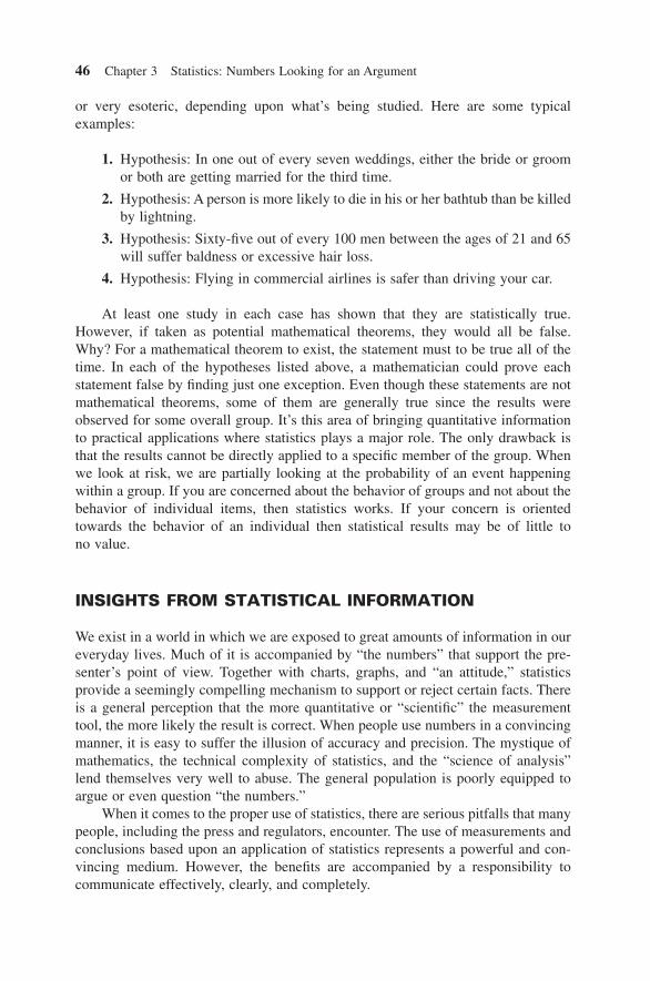
occurrence of two events. This is the difference between relative risk and the odds ratio. For an example, in 2003 a research note was published that discussed the safety issues with young drivers and sport utility vehicles. In this report [12] , the percent-age of SUV rollovers was studied as a function of age, gender, and vehicle type. Table 3.4 shows some of the results.
Table 3.4 shows the percentage of all vehicle crashes that involved a rollover. For example, in the 16 – 24 driver age group, 7.43% of all crashes involved rollovers in SUVs, and 3.14% involved rollovers in all other types of cars. The relative risk for this age group of rollovers in SUVs was (7.43/3.14) = 2.37. This is how relative risk is used. Yes, there are more details involved with these statistics, but this discus-sion is intended to provide you at least with the awareness that when you read or hear statistics being used, you should make sure you understand the exact meaning of the terms.
Statistics in many ways are like colors and textures to a painter. They are mixed together and applied to present a picture or portrait of a process, activity, or situation. “ Numerical artists ” use statistics as tools or instruments and different combinations produce the desired textures and colors. However, in some cases, what you see is not what you get.
There is no better example of how good, basic statistics have painted an inac-curate picture than with the issue of divorce, especially in the United States. The common “ statistic ” often quoted is: “ 50% of all marriages in the United States end in divorce. ”
This conclusion is simply and completely wrong. But where did this 50% divorce rate “ fact ” originate? No one knows for sure, but there is speculation that it was born from an improper conclusion drawn from valid statistics. Here ’ s the story.
In 1969, California under the leadership of Governor Ronald Reagan passed the fi rst “ no - fault ” divorce laws. Up to this point, divorce was a legal option only if the grounds included adultery, physical abuse, mental cruelty, desertion, imprisonment, alcohol or drug addiction, or insanity. This was the fi rst law of its type that allowed divorce without the labeling of a “ bad guy (or girl) ” in a relationship. Other states quickly followed by either replacing the old system or by adding the no - fault legal divorce option.
Table 3.4 Rollover Percentages and Relative Risk
Driver age
Rollover percentage
Relative risk
Vehicle type
SUV Non SUV
All 5.19 2.00 2.60 16 – 24 7.43 3.14 2.37 + 25 4.42 1.55 2.85

How Statistics Should Be Reported: Rules of Thumb 51
In the 1970s, when “ no - fault ” was implemented across the United States, there was an increase in the number of divorces that brought the issue to the attention of several professional groups. The divorce rate increased to its peak in 1981. The reported statistics indicated [13] :
Marriage rate: 10.6 per 1,000 total population
Divorce rate: 5.3 per 1,000 population
It is speculated that someone misinterpreted these facts and saw the divorce number was 50% of the marriage number and concluded (incorrectly of course) that 50% of all marriages end in divorce. The correct way to interpret the above statistics is to say that there was one divorce for every two marriages over the year. For compari-son, the 2009 (provisional) data on the annual number of marriages and divorces show about the same ‘ two for one ’ result [14] .
Marriage rate: 7.1 per 1,000 total population
Divorce rate: 3.45 per 1,000 population (44 reporting states and D.C.)
Let ’ s look at the data published by U.S. Census Bureau for 2004 [15] to see what the real numbers are. The number of men at or over the age of 15 was 109,830,000. Out of this group, 68.8% (75,563,040) were ever married and 20.7% (22,734,810) were ever divorced. Given that 75,563,040 men were married at least once, and 22,734,810 men were ever divorced, a more accurate representation of the male divorce rate is the ratio of these fi gures: 22,734,810/75,563,040, or 30.1% — not 50%.
Now the women: In 2004 there were approximately 117,677,000 at or over the age of 15. The number of women that were married at least once is 87,316,334 (74.2%) and the number ever divorced, 26,948,033 (22.9%). The female “ divorce rate ” estimate is then the ratio of these numbers, or 30.8% — again, not 50%.
In fact, there is no precise answer to this question. Referring back to the 50% divorce rate statement, the language may appear precise, but in mathematical terms, it ’ s vague. For example, does the statement refer to only fi rst marriages for people or for the second, third, or further marriages? Does the time interval of the “ 50% statistic ” apply over the lifetime of a marriage or for 2, 5, 10, 15, or another amount of married years? This subject is a current topic of research, so depending on how you analyze this complex issue, you will end up with different answers. The single point I am making here is that the basic premise for the “ 50% statistic ” appears to have been an improper interpretation of technically correct statistics.
HOW STATISTICS SHOULD BE REPORTED: RULES OF THUMB
So far I ’ ve made a big deal of the fact that people can be mistaken, misinformed, and misguided by inaccurate, imprecise, or incomplete reporting of statistics. So

52 Chapter 3 Statistics: Numbers Looking for an Argument
much for cursing the darkness. Let ’ s move on to how you can identify when the information you read is based on responsible statistical reporting and when it ’ s more akin to “ media jive. ” We ’ ll start with basic four points and add some others as we go on. Every statistic reported should contain elements from these essential areas.
I. Sample Size : How many items were counted in forming the statistic?
II. Event : What type of item was counted? How was it defi ned?
III. Time Period : Over what amount of time was data collected?
IV. Geographical or Other Limitations : What region, state, and general physical space, or other restrictions, were applied?
Let ’ s take an example from Chapter 13 : An Incomplete List of the Risks of Life, and see how you should interpret the statistic. Here it is:
“ One out of every 123 Americans will die this year. ”
Here are the guidelines for the correct reporting of statistics from the perspective of this example.
Sample: Population of U.S.
Time Period: One year, 2008
Event: Death
Geographical Limitations or other Limitations: U.S.
This statistic passes the quality test, except it has very little value for each of us. There are gender, age, behavioral, and several other factors that need to be con-sidered before such a statistic can be useful. Chapter 13 has some of them, just to show how such factors can infl uence mortality.
If you apply these guidelines to commercial advertising or news reporting, you ’ ll be surprised at the extent to which statistical abuse exists. There are a multi-tude of claims full of sound and fury, yet signifying little or nothing. Here are some examples of claims with little stated substance.
There is a general type of strategy I ’ ve seen in advertisements that can be elusive. Do you recall advertisement ploys that say things like: “ 4 out of 5 doctors recommend … ” ? What you don ’ t know from this type of advertisement relates to the type of doctors surveyed. To use an example, suppose the issue is baby food and the company claims 4 out of 5 doctors recommend its brand. We don ’ t know if the “ 4 out of 5 ” is across all doctors, or just those who recommend a particular brand of baby food. Not all doctors recommend products. Pay careful attention the next time you ’ re presented with such information.
I was in a limousine one rainy afternoon on the way to O ’ Hare Airport in Chicago. The driver asked me if I would like to read the newspaper. I usually can ’ t read in a moving car without getting a headache, but for some reason I accepted his offer and began reading. As I paged through the newspaper, one story stood out from all of the rest of the news. Here it is:

Scientifi c Studies: Caveat Emptor 53
HEADLINE: Dirty Air Killing 3,400 Yearly
Despite a signifi cant drop in pollution, dirty air still kills 3,479 people each year in metropolitan Chicago, a new study estimates.
What got my attention from the article ’ s fi rst sentence is its accuracy. This study says exactly 3,479 people are killed, not 3,480 or 3,478. How did they know this? I don ’ t think “ air pollution ” is a cause of death written on many toe - tags. And any prediction with such accuracy is absolutely nothing short of a miracle! This amazing article went on to say that there are 64,000 pollution - related deaths in some 239 metropolitan areas. (At least they didn ’ t say 63,999 deaths.) Finally, in the seventh paragraph of the nine - paragraph article, it did confess that estimating pollution deaths is an inexact science (What a surprise!). Critics of these fi gures say that even if pollution does not kill, lives are shortened by just a few days. Saying this state-ment is like saying that the majority of the health expense incurred by most Americans takes place in the last two weeks of life. We could cut healthcare tremendously if we just cut back costs in those last two weeks. The trouble with this is that no one knows exactly what day anyone will die, so it ’ s impossible to know when to start the clock.
Consider another headline example [16] : “ California Air Pollution Kills More People Than Car Crashes, Study Shows. ” According to a study performed by researchers at California State - Fullerton, improving the air quality of Southern California and the San Joaquin Valley would save more lives each year than the number killed in motor vehicle crashes in the two regions. The study goes on to state that 2,521 vehicle deaths were recorded in 2006 compared to 3,812 deaths attributed to air pollution causes in the two regions. In this example there are no computer models. There are real people behind these statistics in both cases. Yet the sudden and unanticipated nature of motor vehicle fatalities does not necessarily compare to people dying of lung cancer, bronchitis, or pneumonia. This study goes on to conclude that if pollution levels were improved just to federal standards, then there would be 3,860 fewer premature deaths, 3,780 fewer nonfatal heart attacks, 470,000 fewer worker sick days, 1.2 million fewer sick days for school children, a savings of $112 million in caregiver costs, and more than 2 million fewer cases of upper respiratory problems. That is quite a list of conclusions.
The analogy with auto deaths brings the air pollution health effects into perspec-tive for the readers and no one is ever going to argue that the air quality in these regions is good for you or that air pollution is not a major health factor. However, the different time - dependent nature of the deaths diminishes the comparison ’ s relevance.
SCIENTIFIC STUDIES: CAVEAT EMPTOR
In situations of uncertainty in which statistics are used, we are eager to believe so - called “ scientifi c studies ” because we have a simple desire to learn and sort out facts in our information - overloaded world. All of us search for the truth in complex issues and when science gives us information important to us, it ’ s easy to skip over the

54 Chapter 3 Statistics: Numbers Looking for an Argument
details, leading us to misguided or misleading conclusions. Sometimes, however, it ’ s not our fault. Scientifi c and statistical results can be distorted by inaccurate reporting. Here are some other examples.
One study concluded that left - handed people die an average of nine years earlier than those who are right - handed [17, 18] . This study included 987 people from two Southern California counties. Another study was performed with 2,992 people, and found the mortality rates between right - and left - handers just about equal, if you take into account the fact that left - handers over 60 years of age were often forced to change their dominant hand as children.
A fi nal example in this section has to do with the most watched athletic event in the world: the Super Bowl. It was claimed and largely believed that domestic violence increased on Super Bowl Sunday. The TV networks went so far as to run public service announcements before the football game to help quash the impending wave of violence. Afterward, however, investigations found little evidence to support this claim. What the investigators did fi nd in one instance were details of a press conference where antidomestic violence advocates cited a study performed in Virginia which showed a 40% increase in hospital emergency room admissions of women after football games won by the Washington Redskins. When the study author was contacted about the applicability of the work to the Super Bowl, the author denied the 40% fi gure and said that the study fi ndings had been misinter-preted. Of course, even an admission of bad facts couldn ’ t kill a good story. The morning of one Super Bowl found a Connecticut television reporter adamantly asserting that the Super Bowl led to the beating of women. He even challenged skeptical viewers to check emergency room numbers … on the following day. Interestingly enough, we must have missed the follow - up report he must have done to verify his own assertions … Hmmm … I wonder if his Super Bowl predictive powers were as good.
In 2003 researchers at Indiana University studied the connection between domestic violence and the Super Bowl and reported they did fi nd a specifi c correla-tion [19] . However, the study also reported that the correlation results were similar to the rise in domestic violence seen for other holidays in the year. Their conclusion was the correlation might be due to the “ holiday ” rather than to the Super Bowl itself.
This is a fairly typical example of how you must be careful when interpreting statistics, regardless of how they are quoted. Think for yourself and be careful of accepting or rejecting any statistics, unless you believe and trust in the study ’ s methods or its authors. Realistically, even if we wanted to, we have neither the time nor the knowledge to sift through all of the details in order to judge statistical research. How, then, can we ever really apply any statistics that are designed to help us better manage our own lives? My suggestion is that most of what you read and hear has at least a thread of truth to it. Use your own judgment to decide how much credibility you want to put in the information.
If you remember back in Chapter 2 , Southwest Airlines ’ on - time performance was held suspect because the fl ight crew gave the arrival times manually. Other airlines, whose track record was not as good, used an automatic system that trans-
Scientifi c Studies: Caveat Emptor 55
mitted arrival times to a central computer when the front cabin door was opened. Even though everyone knew Southwest ’ s performance record was outstanding, the mere possibility that the published arrival statistics could be fudged caused a lack of confi dence in the airline ’ s performance. In Southwest ’ s case, there was no impro-priety but their competition ’ s suspicions are noteworthy. The subtle fact is that statistics may be accurately reported, but the foundation on which they are based may contain powerful, hidden biases. This brings us some more issues to consider when judging the veracity of statistical results.
Issue #1: Who f unded the s tudy?
You might wonder how reputable research studies can be biased. Well, if the research is measuring the glacial ice distribution on Mars or the radiation profi le of a distant star cluster then there ’ s a pretty good chance that you can take the results at face value. However, let ’ s look at an example that is a lot closer to our experience, one involving the universe of nutritional choices we make every day.
In 2001, Senator Patrick Leahy (D - VT), introduced a bill to restrict sales of soft drinks in schools called “ The Better Nutrition for School Children Act of 2001. ” The legislation was intended to act on the statistical fi nding relating children ’ s soft drink consumption to obesity. At this time there was an “ independent ” study that demonstrated a strong link between these factors, yet another study that showed no connection. Sound confusing? Well, there is more. The study that showed the con-nection was funded by the neutral federal agencies: the Centers for Disease Control and Prevention and the National Institute of Diabetes and Digestive and Kidney Diseases. Both of these agencies have encouraged children to avoid soft drinks. Further investigation of the research authors show they have a history in researching childhood obesity and have also correlated obesity to diet and TV - watching habits. The study that showed no connection between obesity and soft drinks was based on two national surveys: The U.S. Department of Health and Human Services ’ National Health and Nutrition Examination Survey and the U.S. Department of Agriculture ’ s Continuing Survey of Food intake. From the analysis, the conclusions were:
• No relationship between carbonated soft drink consumption among 12 to 16 year olds and obesity
• Soft drinks did not reduce calcium consumption among 2 - to 20 - year - olds
• Teens who consumed more soft drinks were as physically active as those who consumed fewer soft drinks
• Soft drink consumption did not harm diet quality among children and teens as measured by the USDA ’ s Healthy Eating Index.
Now, guess who funded this study: The National Soft Drink Association. Even though the funding source had virtually no control over the outcome of the study, simply the mere possibility of bias can discredit conclusions where statistics play a major part.

56 Chapter 3 Statistics: Numbers Looking for an Argument
I am not implying a lack of integrity on the part of the players here, just the opposite. The point is studies using statistics can develop different conclusions for the same problem — the art is not exact. The teenage obesity – soft drink example is only one element of the larger issue. You could say that this example is an outlier and that funding source does not correlate generally to study results. You could — but read further …
A research project was undertaken at the Children ’ s Hospital in Boston to examine the relationship between funding source and conclusions among nutrition - related scientifi c articles. The particular area of nutrition was limited to nonalcoholic drinks including soft drinks, juices, and milk. Between 1999 and 2003, they reviewed 206 published articles, the conclusions drawn, and the funding sources. They con-cluded that articles sponsored exclusively by food and drink companies were four to eight times more likely to have conclusions favorable to the fi nancial interests of the sponsoring source than articles that were not sponsored by these types of com-panies [20] . And by the way, this study was sponsored by a grant from the Charles H. Hood Foundation and by discretionary funds from the Children ’ s Hospital. The report also notes that one of the investigators is an author of a book on childhood obesity.
I am not implying or suggesting that researchers are doing anything that is unethical. How can this apparent contradiction be resolved? The reason all of these different and obviously biased assumptions can be made is that no one really knows what the answers are. The types of measurements suggested by these assumptions are not the kind that can be answered by classical science. Scientists can measure the mass of the earth, the distance between stars, the characteristics of the atomic nucleus with unquestionable accuracy and error limits. It is ironic that in some ways we know more about the physical nuances of our universe than we do about the connection between adolescent soft drink consumption and obesity.
Permit me to elaborate on this point a little bit. We all have opinions and beliefs that direct our lives and yet we can ’ t really prove them. I can ’ t speak for you, but here are some of my own opinions. They pretty much fall into the same category as the soft drink infl uence on teenage obesity.
(Some) Beliefs of Rick Jones
• The likelihood, if you approach two glass doors to any building, that one will be locked is 90%.
• At fast - food restaurants there is always at least one french fry in the bottom of the bag (given that you ordered french fries).
• Murphy ’ s Laws work about 80% of the time.
• When driving, you always encounter more red traffi c lights when you are in a hurry.
• You cannot go on vacation without forgetting at least one thing.
I could go on, but you get the idea. Now, I could also organize a project team to design a testing and evaluation program to verify my beliefs or I could just use

Scientifi c Studies: Caveat Emptor 57
“ expert opinion. ” Expert opinion means the beliefs of somebody else who has hope-fully more experience in the subject area. Frankly, for the above laws, I think I ’ m an expert and I am sure you could come up with your own list for which you ’ re an expert. If you were funding a scientifi c study, wouldn ’ t you look around for ethical scientists who had the same beliefs as you? From a research fi rm ’ s viewpoint, if someone gives you a wheelbarrow full of money to research an issue, what do you think your chances for a renewed contract are if your results are contrary to the beliefs of the company that gave you the money? Generally, the company tries to fi nd a research fi rm that mirrors its beliefs. The infl uence of the sponsoring company is subliminal and indirect, but it is there and reinforced by their presence throughout the course of the work. (And by the way, what are the odds that a study with results adverse to the needs of its sponsor would be released?)
This brings us to conclude that there is more to know about statistics than the analytics. Since statistics are used to obtain information on unsolvable problems, how the tools are applied can have a major bearing on the veracity of the results. Sponsorship and intent are issues you must address before you accept a study ’ s fi ndings.
Issue #2: How w ere the q uestions w orded?
When it ’ s foggy, ships use radar to avoid collisions. Airplanes use radar to avoid severe weather. And in the foggy, sometimes murky world of public opinion, surveys are the radar of the commercial marketers, political media, and others. Let ’ s face it. There are too many people to just go ask everyone what they think, so some sort of statistical sampling with a structured set of questions is an effi cient way to get feed-back on specifi c issues.
On the surface it may seem simple to write up a set of questions and go ask a bunch of people and then compile the results. But the choice of question wording can strongly infl uence the results. Sometimes this is done intentionally if the inter-ested parties are seeking certain answers, though other times it is an unforeseen result of the survey ’ s construction.
There is no better place to go for examples than politics. In March 2004 an Associated Press - Ipsos poll used these two questions, asked to random samples of adults [21] .
• If you had to choose, would you prefer balancing the budget or cutting taxes?
• If you had to choose, would you prefer balancing the budget or spending more on education, healthcare, and economic development?
The results showed 61% or 36% were in favor of balancing the budget depend-ing on which question. You can guess which question solicited each response.
Ideally, measurement by polling should not affect the process, (Law #4, Chapter 2 ) yet there are polls that have been (and probably will be) designed to do just the opposite — infl uence the process under the camoufl age of unbiased polling. These are called “ push polls ” [22] and you hear about them mainly in political polling.

58 Chapter 3 Statistics: Numbers Looking for an Argument
A push poll attempts to feed false or damaging information about a candidate under the guise of conducting a survey of voter preferences. I am not going to discuss this subject here, just be aware of this subtle type of manipulation disguised as campaigning. This shady technique could be used for any poll so if you receive a call about a poll regarding a certain issue and the questions appear prefaced with a lot of negative or one - sided statements, the best thing you can do is just hang up.
However, not all mistakes are by politicians nor are they on purpose. In April of 1993, a poll commissioned by the American Jewish Committee, developed by the well - known pollster Burns W. Roper, drew widespread, shocked reaction from the Jewish community as well as emotional commentary from journalists [23, 24] . The problem was the question — not the real views of the polled population. The question construction, in attempting to stimulate a thoughtful response, obfuscated its real meaning with a double negative. The fl awed question read:
Does it seem possible or does it seem impossible to you that the Nazi extermination of the Jews never happened?
The survey results indicated that 22% of the adults and 20% of the high school students surveyed said they thought it was possible that the Nazi extermination of the Jews never happened. An additional 12% of the adults said that they did not know if it was possible or impossible. When the Gallup pollsters tested this same question they found a full 33% of the people thought that it was possible that the Nazi extermination of the Jews never happened.
The numbers changed, however, when the following, more direct question was used:
Do you doubt that the Holocaust actually happened or not?
Only 9% responded that they doubted it. When the question was put even more clearly, less than 0.5% responded that the Holocaust “ defi nitively ” did not happen, 2% said it “ probably ” did not happen, 79% said it “ defi nitely ” happened, and 17% thought it “ probably ” happened.
In today ’ s society, polls have become almost unquestioned sources of exactly what the public is thinking. And it is true that poll results do give an indication as to what ’ s on people ’ s minds. Yet the devil is in the details. It ’ s statistically possible to sample a small number of people and make conclusions about a population. However, there are so many technical details we cannot always validate to our sat-isfaction that a survey is free of error or bias. Questions about how people were selected and the exact wording of the questions are seldom mentioned along with the sound bite or headline conclusions.
We see today that our politicians use polls to measure public opinion regarding key news issues. The founding fathers of our constitution used the House of Representatives to ensure that public interests were being followed. I suspect that ’ s why the election period for these public servants is every two years. If someone is not adequately representing their district, the people can quickly elect someone else. Polls are taking on a power and role that was not defi ned by our government ’ s design. Sure, it ’ s true that polls were not around in 1776 and the polling process may just

Scientifi c Studies: Caveat Emptor 59
be another “ technology ” we need to understand. We have a long way to go. Why? Here ’ s one example from recent history. In 1998 an ABC poll asked people if they wanted “ Congress to censure President Clinton. ” A 61% to 33% ratio said they did. What ’ s wrong here? This assumes that the people knew what is meant by the term “ censure. ” Another poll indicated that 41% of those who favor censure admitted they “ don ’ t know ” what the term actually means.
What are the lessons here? The next time you fi ll out a questionnaire or answer polling questions, read or listen very, very carefully. And the next time you hear the results of a poll, ask yourself exactly who might have found the time to answer the pollster ’ s questions.
Issue #3: How w as the p roblem or q uantity b eing m easured or d efi ned?
An example of this issue is found by looking at the U.S. government ’ s poverty level defi nition. It shows a political side of statistics misuse that has persisted for over 30 years. Here ’ s the story.
Every year the Commerce Department in Washington, D.C. announces the number of Americans living in poverty. Along with this depressing statistic are other indicators such as household incomes and conclusions about the rich getting richer and the poor getting poorer. The stakes are high. Bureaucrats use these fi gures to set eligibility criteria for 27 federal programs including food stamps, Head Start, and school lunches. There ’ s nothing wrong with this process, but there is one little problem. The defi nition of the poverty level is fl awed and is not representative of today ’ s society. This fact is readily acknowledged in the halls of Congress and the Commerce Department. A committee of 13 academics was commissioned under the 1988 Family Support Act [25] to make recommendations on how to update the methodology used to defi ne poverty in today ’ s economy. One million dollars later, a 500 - page report was presented to Congress. So far nothing has happened. The reason it hasn ’ t changed for such a long time is that Congressional allocations have become routine and no one wants to upset the taxpayers with another redistribution, even if it means continuing with actions based on an inaccurate metric. You see, the Offi ce of Management and Budget uses census fi gures to determine poverty stan-dards and to distribute state funding. Congressional districts that have become accustomed to having this cash would not understand having it taken away. To displease your constituents like this is not a good way to be re - elected. So Congress ducks when the logic (or lack thereof) is questioned and these so - called poverty statistics are announced every year. To get an idea of how this all started, we must journey back to the Great Society of the Johnson Administration.
In 1963, a civil servant statistician in the Department of Health and Human Services named Mollie Orshansky [26] developed federal poverty thresholds. President Johnson, looking for a national measure for poverty, appropriated it in a context that neither Ms. Orshansky nor anyone else had intended. Johnson subse-quently used it in his speeches and in his policy - making.
60 Chapter 3 Statistics: Numbers Looking for an Argument
Let ’ s take a quick look to see what ’ s wrong with this measure. Orshanksy ’ s poverty level is based on an annual Agriculture Department estimate of the money required for food. This number is multiplied by three to account for all other expenses, and then is seasonally “ adjusted ” to refl ect family size. This is pretty vague, especially the word adjusted in the last sentence. Regardless of these details, here ’ s what ’ s wrong with the poverty level statistic.
The poverty line measures pretax income only, not including benefi ts like food stamps and Earned Income tax credits. Including items like these would decrease poverty signifi cantly. No allowance is made for childcare and transportation expenses, hence understating the number of working poor. If you have ever compared living in Birmingham, Alabama with living in New York City, you noticed a vast cost of living difference. Yet no regional effects are considered in Orshansky ’ s work. These errors cause the current poverty measure to overstate poverty in some areas and simultaneously deprive truly needy people of benefi ts in others [27] .
Some new methods have been tested. Their results contradict trends observed using the old poverty level. Using the new measures of poverty, the number of people at and below the poverty level is dropping and the gap between the so - called rich and poor is actually shrinking, not growing. The controversy isn ’ t over on this politi-cal science metric. And this is just one example. Do you think there could be other government indicators with the same type of history?
After reading all of these ways in which we are led to believe that certain facts are true or false, you could conclude that if someone wants to trick you with numbers they probably can. The sad and scary thing is I believe that this is true, and, worse still, it occurs more than we either know or are willing to admit.
The guidelines I ’ ve discussed here will help, but they are not a perfect defense against statistics misuse. There are other, more subtle ways that are almost impos-sible to stop. You see, one way to make your “ stats ” look good is to change the math, another is to change the data, but a third, more elegant approach for statistics misuse is to just not record or report events that go against your goals. An example of this is crime under - reporting. For example, I read in the newspaper that the crime rate in Tallahassee, Florida, for theft, assault, and rape is higher than in New York City. From the actual numbers, this is true. However, if you look more closely, you ’ ll fi nd that many, many crimes in New York City were simply not reported because people believed that nothing would be done and reporting all of the crimes will probably just make their insurance premiums go up. In fact, the NYPD appeared to implicitly discourage reporting of the low - level crimes simply because there are so many. In Tallahassee, it ’ s a completely different story. Because crime is not so widespread, every injustice is deemed signifi cant and is reported. And this is really why the stats just don ’ t seem to add up. There are examples of crime under - reporting in Great Britain [28] (to name one country), in U.S. schools [29] , and in U.S. cities [30] . Most likely this type of data censoring will be a growing problem as public opinion, politicians ’ careers, and other self - centered objectives are “ measured ” by data. In the growing digital world, the human is still the weakest link. Being a skeptic about believing anyone ’ s statistics should most likely become a “ best practice. ”

News Media Statistics 61
NEWS MEDIA STATISTICS
Statistics printed in newspapers, stated in news reports, and presented in other media are always subject to interpretation. Without qualifi cation, these numbers are abso-lutely useless. The quoting agency, however, is seldom held to the standard of proper reporting of numbers. This neglect can create fear and mistrust where none should exist.
Here are two examples of this media incompetence. Statistic: “ One out of eight women will get breast cancer. ” Before I start discussing this topic, let me state that breast cancer is a serious concern for women. I am not trying to minimize the health hazard. Periodic breast exams and mammograms are good preventive medicine. Nothing I am about to say here is designed to change your mind regarding their importance. They are worth the time and money without a doubt. I merely disagree with the partial “ truth ” in the reporting of the statistic. Let me explain.
Suppose you are a 35 - year - old woman and you fi nd a lump in your breast. The statistic goes through your head. “ Am I the one in eight? ” My wife and several of our closest friends and our families went through the mental agony and worry over the cancer threat when lumps were identifi ed, removed, and biopsied. The irrespon-sible propagation of the “ one in eight ” has caused unwarranted pain all because someone decided not to communicate the whole story.
And what is the whole story? It is not as dramatic as you might think. In fact, the little bit that is left out makes the “ one in eight ” statistic much less frightening. What the statistic does NOT tell you is that “ one in eight ” applies over a lifetime. We are all going to die of something. The ultimate cause of death for one out of eight women is breast cancer. This is a lot different that the media ’ s implication that one in every eight women gets breast cancer each year. In fact, most women who die from breast cancer are relatively old. In Table 3.5 is a more descriptive statement of the odds of contracting (but not dying from) breast cancer [31] :
A full description of the actual statistics is too long to be included in this text [32] , but here are some points worth mentioning. Even though the incidence of breast cancer has increased, the likelihood that it will be fatal has stayed about the same for American women. The median age (50th percentile) age for women to be
Table 3.5 Invasive Female Breast Cancer
Current age Probability of developing breast
cancer in next 10 yrs (%) 1 in:
20 0.06 1,760 30 0.44 229 40 1.44 69 50 2.39 42 60 3.40 29 70 3.73 27 Lifetime risk 12.08 8

62 Chapter 3 Statistics: Numbers Looking for an Argument
diagnosed with breast cancer is 64. The odds of a woman in her forties dying of breast cancer within the next ten years are approximately 0.4%. This is about 1 in 250. The actual death rate for breast cancer was about constant at 32 per 100,000 to about 1990. Since then it has declined to where it is now: the data says 24.5 out of every 100,000 American women died of breast cancer each year, not one in eight.
Finally, for the record, the National Cancer Institute does tell the whole story on this. For American women:
• 12.7% of women born today will be diagnosed with breast cancer at some time in their lives.
• Because rates of breast cancer increase with age, estimates of risk at specifi c ages are more meaningful than estimates of lifetime risk.
• An estimated risk represents the average risk for all women in the United States as a group. This estimate does not indicate the risk for an individual woman because of individual differences in age, family history, reproductive history, race/ethnicity, and other factors.
While the discussion here shows the disparity within how breast cancer statistics are reported, there is no getting around the fact that this disease is a very serious concern for women. According to the American Cancer Society, 40,170 women in the United States will die from breast cancer in 2009 [33] . This is nearly the same as the number of people killed by motor vehicles in 2008: 43,313.
Breast cancer is real and frightening, but sometimes the press can create news that wasn ’ t there, and, more shamefully still, play on the racial fears of Americans to sell their product. Here is a classic case of what risk analysts call “ media amplifi cation. ”
In the summer of 1996, responding to the reported increase in arson fi res at black churches in the south, President Clinton in a radio address stated, “ racial hostility is the driving force. ” He further stated, “ I want to ask every citizen in America to say … we are not slipping back to those dark days. ” However, the real fi re and arson statistics indicated there was no substantial evidence of an epidemic in black church arson [35] . It appears we were all misled by another incorrect use of statistics. Activist groups, manipulating the emotions of all Americans, played up the sad illusion to further their own cause.
Let ’ s have a look at the real evidence. The newspaper, which will go unnamed in this book, compiled what they termed “ the most comprehensive statistics available on church arsons in the South in the 1990s. ” This may be true, but they didn ’ t say they were accurate! Their chart showed a rapid rise in the number of black church arsons starting in 1994 and continuing. One problem with the statistics is that two states didn ’ t start reporting until 1993 and a third not until 1995 [36] . It ’ s not surpris-ing that the numbers went up when states were added. In short, the shape of the curve represents real data, but the number of states contributing also increased during the same time period. This is like saying your food budget increased without your mentioning you had added more people to your family. When you adjust the data for this, there was no increase in arsons and the epidemic went away. Furthermore,

News Media Statistics 63
data from federal agencies doesn ’ t add any evidence to the purported epidemic either. The largest private group that compiles data on church fi res is the National Fire Protection Association. While its data does not identify black churches, it does state that church arsons have decreased from 1,420 in 1980 to 520 in 1994 and this trend appears to be continuing.
You might be wondering where this black church arson epidemic came from anyway. The main sources were the National Council of Churches (NCC) and the activist group Center for Democratic Renewal (CDR). The stated mission of the CDR is to assist activists and organizations in building a movement to counter right - wing rhetoric and public policy initiatives. The CDR was originally called the National Anti - Klan Network, but changed its named after the Klan generally disor-ganized in the 1980s. In a March 1996 news conference, this group began to claim a tremendous surge of black church arsons. With the intense media coverage, the “ domestic terrorism ” theme fell on listening ears. A data search after the conference picked up over 2,200 articles on the subject. Hence the “ epidemic ” was born.
In June of 1997, the National Council Arson Task Force confi rmed what the data said all along. There was no conspiracy to burn black churches. The task force noted that a third of all suspected church arsonists arrested since January 1995 were black. This is more than twice the proportion of blacks in the general population. In 2003, a study at Mississippi State University [37] confi rmed this conclusion, although their work does note two spikes of violence that, along with the other aspects of this racially sensitive issue, fueled the epidemic ’ s fl ames.
There is a political component added to the statistical equation. That ’ s why in this equation, 1 + 1 does not equal 2. The data says no conspiracy, yet this is not what we heard from our leaders at this time. Both former President Clinton and former Vice President Gore, through their public statements, seemed to want us to believe the black church conspiracy did exist. We can only conjecture as to why.
There is a tragic aspect of this media amplifi cation. After the press moves on to new territory, the fear created by the distortion of the facts is still in the hearts of many people, both black and white. Worse yet, without resolution, the fear grows. And like other horrendous crimes, publicity breeds mimicry, making the fears more real still.
In this case, the so - called journalistic press is one irresponsible culprit, although, as you can see, there are others. In any case, journalism is the medium. Reporting the news and providing solid information, and not rhetoric, should be their objective, and most of the time they do a reasonable job.
There is one way in which you can feel confi dent that statistical conclusions are based on good, sound scientifi c principles. Check to see if a professional peer group reviewed the study. Scientifi c and professional disciplines have developed a very good quality control procedure to ensure that the public is not exposed to poor research work or conclusions based on biased results. Many journals that publish research fi ndings employ a small peer group to review and check papers before they are published. More often than not, the referees either fi nd mistakes or suggest improvements that necessitate rewriting or at least editing the work before publica-tion. If a journalist refers to a publication such as the Journal of the American

64 Chapter 3 Statistics: Numbers Looking for an Argument
Medical Association (JAMA), chances are the results will have truth in them. In this way, science ’ s self - discipline ensures as much as possible that numbers, logic, and statistics are used correctly and without bias.
The point of this lesson in economic history, crime statistics, and various other aspects of living in the second decade of a new millennium is that the defi nitions and procedures used in collecting data and in developing statistics makes a big dif-ference. Whether it is the government, your local newspaper, or a private research fi rm reporting statistics, I have one simple suggestion when it comes to conclusions based on statistical arguments:
The pure and simple truth is rarely pure and never simple.
— Oscar Wilde
DISCUSSION QUESTIONS
1. Choose an advertisement that uses statistics in its message and examine its accuracy using the content of this chapter. How would you rewrite it to be more precise?
2. Choose a news article that uses statistics in its content and examine its accuracy. Are there any relevant external factors the article has left out?
3. Crime statistics are often used by groups either to show some program is working or to document the need for changes. For a city or region of your choice, investigate the potential for crime under - reporting and estimate a range for what some actual statistics could be. Be sure to document all of your assumptions.
4. Identify and explain three reasonably current examples of media amplifi cation using statistics.
5. Develop ten poll questions for any hazard, exposure, or social issue using the scale: Strongly Agree, Agree, Disagree, Strongly Disagree, Don ’ t Know. Now examine the ques-tions for bias and ranges of interpretations.
Case Study: Probability and Statistics: A Legal (Mis - )Application
The People v . Malcolm Ricardo Collins , 68 Cal. 2d 319
In a court of law, the burden of proof lies with the accuser to show “ beyond a reasonable doubt ” that the defendant committed the crime. Statistical arguments are often used by both plaintiff and defendant attorneys providing evidence to convince the judge or jury that proof “ beyond a reasonable doubt ” has or has not been achieved. This case study represents a classic example of how not to use statistics and probability in legal proceed-ings. The case study has some interesting lessons.
This case stemmed from a woman being pushed to the ground by someone who stole her purse. She saw a young blond woman running from the scene. A man watering his lawn witnessed a blond woman with a ponytail entering a yellow car. The witness observed that a black man with a beard and mustache was driving the car.

Discussion Questions 65
Another witness testifi ed that the defendant picked up her housemaid at about 11:30 a.m . that day. She further testifi ed that the housemaid was wearing a ponytail and that the car that the defendant was driving was yellow. There was evidence that would allow the inference that there was plenty of time to drive from this witness ’ s house to participate in the robbery.
The suspects were arrested and taken into custody. At trial, the prosecution experi-enced diffi culty in gaining a positive identifi cation of the perpetrators of the crime. The victim had not seen the driver and could not identify the housemaid. The man watering his lawn could not positively identify either perpetrator.
The prosecutor called an instructor of mathematics who testifi ed that the “ probabil-ity of joint occurrence of a number of mutually independent events is equal to the product of the individual probabilities that each of the events will occur. ” For example, the prob-ability of rolling one die and coming up with a 2 is 1/6; that is, any one of the six faces of a die has a one chance in six of landing face up on any particular roll. The probability of rolling two 2s in succession is 1/6 x 1/6, or 1/36.
The prosecutor insisted that the factors he used were only for illustrative purposes — to demonstrate how the probability of the occurrence of mutually independent factors affected the probability that they would occur together. He nevertheless attempted to use factors which he personally related to the distinctive characteristics of the defendants.
The prosecutor then asked the professor to assume probability factors for each of the characteristics of the perpetrators. In his argument to the jury, he invited the jurors to apply their own factors, and asked defense counsel to suggest what the latter would deem as reasonable. The prosecutor himself proposed the individual probabilities set out in the list below. Although the transcript of the examination of the mathematics instructor and the information volunteered by the prosecutor at that time create some uncertainty as to precisely which of the characteristics the prosecutor assigned to the individual probabilities, he restated in his argument to the jury that the probabilities should be as follows:
Characteristic Individual Probability
A. Partly yellow automobile 1/10
B. Man with mustache 1/4
C. Girl with ponytail 1/10
D. Girl with blond hair 1/3
E. Negro man with beard 1/10
F. Interracial couple in car 1/1000
According to his “ illustrative argument ” the probability of an interracial couple, with a black man, with a beard and mustache, girl with blond hair and a ponytail, in partly yellow automobile is:
A B C D E F or in× × × × × = × −8 333 10 1 12 000 0008. , ,
Upon the witness ’ s testimony it was to be “ inferred that there could be but one chance in 12 million that defendants were innocent and that another equally distinctive couple actually committed the robbery. ” After testimony was completed, the jury con-victed the couple of second - degree robbery.

66 Chapter 3 Statistics: Numbers Looking for an Argument
On review, the Supreme Court of California found that the mathematical testimony was prejudicial and should not have been admitted. “ The prosecution produced no evi-dence whatsoever showing, or from which it could be in any way inferred, that only one out of every ten cars which might have been at the scene of the robbery was partly yellow, that only one out of every four men who might have been there wore a mustache, that only one out of every ten girls who might have been there wore a ponytail, or that any of the other individual probability factors listed were even roughly accurate. ” Another problem that the court found was the fact that the prosecution did not have adequate proof of the statistical independence of the six factors (i.e. that wearing a mustache is truly independent of wearing a beard). The court further expressed that “ few juries could resist the temptation to accord disproportionate weight to that index; only an exceptional juror, and indeed only a defense attorney schooled in mathematics, could successfully keep in mind the fact that the probability computed by the prosecution can represent, at best, the likelihood that a random couple would share the characteristics testifi ed to by the People ’ s witnesses — not necessarily the characteristics of the actually guilty couple. ”
The court found this admission of evidence to be a key error and reversed the jury ’ s guilty verdict. “ Undoubtedly the jurors were unduly impressed by the mystique of the mathematical demonstration but were unable to assess its relevancy or value … we think that under the circumstances the ‘ trial by mathematics ’ so distorted the role of the jury and so disadvantaged counsel for the defense, as to constitute in itself a miscarriage of justice. ”
In a criminal case, it was prejudicial error to allow the prosecution to offer, through an expert, a formula in statistical probability, logically irrelevant and evidentially inad-equate, from which the jurors were invited to infer that the odds against defendants ’ innocence were one in 12,000,000, where the circumstantial nature of the evidence and length of the jury deliberation showed that the case was a close one, and where, under the circumstances, the “ trial by mathematics, ” with which the jurors were not technically equipped to cope, so distorted their role and so disadvantaged defense counsel as to constitute a miscarriage of justice.
The prosecution ’ s misuse of mathematical probability statistics was prejudicial where the testimony lacked an adequate foundation in evidence and in statistical theory, where it was used to distract the jury and encourage them to rely on a logically irrelevant expert demonstration, where it foreclosed the possibility of an effective defense by an attorney unschooled in mathematical refi nements, and where it placed the jurors and defense counsel at a disadvantage in sifting relevant fact from inapplicable theory.
In this robbery prosecution, the prosecutor misused mathematical probability and statistics in an attempt to show that defendants were the robbers when there was no evidence relating to any of the six individual probability factors assigned to the distinct characteristics of defendants. No proof was presented that the characteristics selected were mutually independent, even though the mathematical expert witness acknowledged that such condition was essential to proper application of the statistical probability rules that he used in his testimony.
Case Study Questions
1. Knowing the outcome of this case on appeal, how could the defense attorney have improved his/her argument strategy to counter the reversal decision argument?

Endnotes 67
2. Independent of the strategy issues, what would be the correct way to compute this probability?
3. The use of statistics, or in this case probability, is always accompanied by an inherent error or uncertainty of occurrence that can have implications for both sides. Comment on the legal application of “ reasonable doubt ” using statistics. For example, if the chances the defendant was guilty were 1 in 10, 1 in 100, or 1 in 12,000,000, how could a jury decide which level constitutes reasonable doubt?
ENDNOTES
1 http://espn.go.com/mlb/teams/salaries?team = nyy (accessed November 10, 2009 ). 2 Michael O. Finkelstein and Bruce Levin , Statistics for Lawyers . New York : Springer - Verlag , 1990 . 3 Harriet Zellner , “ Reducing the Risk When Reducing the Force — It ’ s a Question of Impact and
Treatment , ” Business Law Today , November/December 1998 . 4 National Safety Council , Injury Facts ® , 2009 , Itasca, IL . 5 Gillian Turner , “ Intelligence and the X - Chromosome , ” Lancet , Vol. 347 , 1996 , pp. 1814 – 1815 . 6 Alice S. Whittemore et al., “ Personal and Environment Characteristics Related to Epithelial Ovarian
Cancer , ” American Journal of Epidemiology , Vol. 128 , No. 6 , 1988 , pp. 1228 – 1240 . 7 B. L. Harlow , “ A Review of Perinal Talc Exposure and Risk of Ovarian Cancer , ” Regulatory
Toxicology and Pharmacology , Vol. 21 , Issue 2 , 1995 , pp. 254 – 260 . 8 D. M. Gertig et al., “ Prospective Study of Talc Use and Ovarian Cancer , ” Journal of the National
Cancer Institute , Vol. 92 , No. 3 , 2000 , pp. 249 – 252 . 9 M. A. Merritt et al., “ Talcum Powder, Chronic Pelvic Infl ammation and NSAIDs in Relation to Risk
of Epithelial Ovarian Cancer , ” International Journal of Cancer , Vol. 122 , No. 1 , January 1, 2008 , pp. 170 – 176 .
10 U.S. Cancer Statistics Working Group , United States Cancer Statistics: 1999 – 2005 Incidence and Mortality Web - based Report . Atlanta, GA : Department of Health and Human Services, Centers for Disease Control and Prevention, and National Cancer Institute , 2009 .
11 National Safety Council estimates based on data from National Center for Health Statistics and U.S. Census Bureau. Deaths are classifi ed on the basis of the Tenth Revision of the World Health Organization ’ s “ The International Classifi cation of Diseases ” (ICD). Numbers following titles refer to External Cause of Morbidity and Mortality classifi cations in ICD - 10. One - year odds are approxi-mated by dividing the 2003 population (290,850,005) by the number of deaths. Lifetime odds are approximated by dividing the one - year odds by the life expectancy of a person born in 2003 (77.6 years).
12 John Kindelberger and A. M. Eigen , “ Younger Drivers and Sport Utility Vehicles , ” Traffi c Safety Facts , Research Note, September 2003 , DOT HS 809 636.
13 Vital Statistics of the United States, 1981, Volume III — Marriage and Divorce, U.S. Department of Health and Human Services, Public Health Services, National Center for Health, 1985 (PHS) 85 – l 121.
14 National Vital Statistics Reports, CDC, Vol. 58, No. 3, January 2009. 15 U.S. Census Bureau, Population Division, Fertility and Family Statistics Branch , “ Number, Timing,
and Duration of Marriages and Divorces: 2004, ” Last Revised August 27, 2008. 16 http://www.huffi ngtonpost.com/2008/11/13/california - air - pollution - _n_143521.html (accessed November
21, 2009 ). 17 D. F. Halpern and S. Coren , “ Do Right - Handers Live Longer? ” Nature , vol. 333 , 1988 , p. 213 . 18 D. F. Halpern and S. Coren , “ Handedness and Life Span , ” New England Journal of Medicine , Vol.
324 , 1991 , p. 998 .

68 Chapter 3 Statistics: Numbers Looking for an Argument
19 http://newsinfo.iu.edu/news/page/normal/977.html (accessed November 22, 2009 ). 20 L. I. Lesser , C. B. Ebbeling , M. Goozner , D. Wypij , and D. S. Ludwig , “ Relationship between Funding
Source and Conclusion among Nutrition - Related Scientifi c Articles , ” PLoS Medicine , Vol. 4 , No. 1 , 2007 , p. e5.
21 David S. Moore and William I. Notz , Statistics Concepts and Controversies , 6th edition . New York : W.H. Freeman , 2006 , pp. 65 – 70 .
22 Douglas N. Walton , Media Argumentation: Dialectic, Persuasion, and Rhetoric . Cambridge : Cambridge University Press , 2007 , pp. 229 – 230 .
23 “ 1 in 5 Polled Voices Doubt on Holocaust, ” New York Times , April 20, 1993 . 24 “ Poll Finds 1 Out of 3 Americans Open to Doubt There Was a Holocaust , ” Los Angeles Times , April
20, 1993 . 25 N. Gregory Mankiw , Principles of Microeconomics . Mason, OH : Southwestern , 2009 , p. 429 . 26 http://www.ssa.gov/history/orshansky.html (accessed November 27, 2009 ). 27 Rebecca M. Blank , “ How to Improve Poverty Measurements in the United States , ” University of
Michigan and Brookings Institution, November 2007 . 28 “ Metropolitan Police amongst 18 Forces to Have ‘ Under - reported Violent Crime for 10 Years, ’ ” http://
www.telegraph.co.uk/ , January 22, 2009 . 29 http://www.schoolsecurity.org/trends/school_crime_reporting.html (accessed November 27, 2009 ). 30 http://www.10news.com/news/5340605/detail.html (accessed November 27, 2009 ). 31 L. A. G. Ries , D. Harkins , M. Krapcho , et al., SEER Cancer Statistics Review, 1975 – 2003 . Bethesda,
MD : National Cancer Institute , 2006 . 32 M. J. Horner , L. A. G. Ries , M. Krapcho , N. Neyman , R. Aminou , N. Howlader , S. F. Altekruse ,
E. J. Feuer , L. Huang , A. Mariotto , B. A. Miller , D. R. Lewis , M. P. Eisner , D. G. Stinchcomb , and B. K. Edwards (eds.), SEER Cancer Statistics Review, 1975 – 2006 . Bethesda, MD : National Cancer Institute . http://seer.cancer.gov/csr/1975_2006/ , based on November 2008 SEER data submission, posted to the SEER web site, 2009.
33 National Cancer Institute, “ Breast Cancer Facts and Figures, 2009 – 2010. ” 34 http://www.cancer.org/downloads/stt/CFF2009_EstDSt_5.pdf (accessed November 28, 2009 ). 35 David G. Savage , “ Probe Finds No Conspiracy in Church Arsons , ” Los Angeles Times , June 9, 1997 . 36 Christopher B. Strain , Burning Faith: Church Arson in the American South . Gainesville : University
Press of Florida , 2008 , p. 159 . 37 “ MSU Study Offers New View of Past Decade Church Burnings, ” Mississippi State University Press
Release, March 4, 2003.