Embed Size (px)
Citation preview
Catarina Olander, Caroline Rosengren
Retail Purchasing Environments on the Internet
case studies on two commercial websites
1999:154
BACHELOR'S THESIS
Ekonomprogrammet C-nivå
Institutionen för Industriell ekonomi och samhällsvetenskapAvdelningen för Industriell marknadsföring
1999:154 • ISSN: 1402-1579 • ISRN: LTU-EKON-EX--99/154--SE
Retail Purchasing Environmentson the Internet
Case studies on two commercial Websites
CATARINA OLANDERCAROLINE ROSENGREN
Department of Business Administration and Social SciencesDivision of Industrial Marketing
1999-12-20
BACHELOR’S THESIS
Abstract
In recent years, the Internet has generated a tremendous level of excitement. Thepromise of electronic commerce and online shopping will depend to a great extent uponthe interface of how people interact with the computer. Electronic access to a globalmarketplace can bring more powerful and efficient purchasing, greater choice, morepersonalised service, and new kinds of products and services together with new ways topurchase. The purchase environment is of great importance in this new way of handlingbusinesses. The familiar layout of the physical store becomes, on the Website, alabyrinth of demolish menus, product indices and search features. A help button on thehome page of the Web shopping site replaces the sales clerk’s friendly advice andservice. The aim with this thesis is to investigate the purchase environment on theInternet by looking more closely at how the layout and design of Websites can bedescribed and how customer service is handled online. The result shows that it isimportant to take advantage of the creative ways of presenting information that comeswith the Internet, especially the opportunities to expose products in a different way thanin traditional stores. Aspects such as entertainment and customer support are twoimportant issues when operating on the Internet.
TABLE OF CONTENTS
1 INTRODUCTION .................................................................................................................... 1
1.1 BACKGROUND......................................................................................................................... 11.2 PROBLEM DISCUSSION........................................................................................................... 51.3 PURPOSE ................................................................................................................................. 71.4 RESEARCH QUESTIONS .......................................................................................................... 71.5 DEMARCATIONS ..................................................................................................................... 71.6 DISPOSITION ........................................................................................................................... 8
2 LITERATURE REVIEW ........................................................................................................ 9
2.1 LAYOUT AND DESIGN OF A WEBSITE.................................................................................... 92.1.1 FIRST VISIT ........................................................................................................................... 92.1.2 NAVIGATION FEATURES ....................................................................................................... 92.1.3 MENU BASED AND PATH BASED STRUCTURES .................................................................. 102.1.4 FRAMES AND MERCHANDISE.............................................................................................. 112.1.5 WEB ORGANISATION STRUCTURES .................................................................................... 112.1.6 CREATING A HIERARCHICAL WEB PAGE ............................................................................ 122.1.7 MENUS................................................................................................................................ 132.1.8 PRODUCT INFORMATION AND COLOUR .............................................................................. 132.1.9 MISTAKES OF WEBPAGE CREATION ................................................................................... 142.2 CUSTOMER SERVICE............................................................................................................ 162.2.1 CUSTOMER CONTACT ......................................................................................................... 162.2.2 FREQUENTLY ASKED QUESTIONS, FAQ’S .........................................................................172.2.3 SEARCH TOOL .....................................................................................................................172.2.4 E-MAIL POLICIES ................................................................................................................172.2.5 CUSTOMER COMPLAINTS....................................................................................................182.2.6 ARTIFICIAL INTELLIGENCE .................................................................................................182.2.7 RETURN POLICIES ...............................................................................................................182.2.8 EIGHT WAYS TO GREAT CUSTOMER SERVICE ON THE INTERNET.......................................19
3 CONCEPTUALISATION AND EMERGED FRAME OF REFERENCE ...................... 21
3.1 CONCEPTUALISATION.......................................................................................................... 213.2 EMERGED FRAME OF REFERENCE...................................................................................... 23
4 METHODOLOGY ................................................................................................................. 24
4.1 RESEARCH PURPOSE............................................................................................................ 244.2 RESEARCH APPROACH......................................................................................................... 244.3 RESEARCH STRATEGY ......................................................................................................... 254.4 DATA COLLECTION.............................................................................................................. 254.5 SAMPLE SELECTION............................................................................................................. 274.6 DATA ANALYSIS ................................................................................................................... 274.7 VALIDITY AND RELIABILITY ............................................................................................... 27
5 DATA PRESENTATION ...................................................................................................... 29
5.1 HENNES AND MAURITZ, H&M............................................................................................ 295.1.1 RESEARCH QUESTION ONE; LAYOUT AND DESIGN............................................................ 305.1.2 RESEARCH QUESTION TWO; CUSTOMER SERVICE............................................................. 345.2 SCANDINAVIAN AIRLINE SYSTEM, SAS.............................................................................. 365.2.1 RESEARCH QUESTION ONE; LAYOUT AND DESIGN ............................................................ 375.2.2 RESEARCH QUESTION TWO; CUSTOMER SERVICE ............................................................. 39
6 ANALYSIS .............................................................................................................................. 41
6.1 WITHIN-CASE ANALYSIS ..................................................................................................... 416.1.1 HENNES & MAURIZ, H&M,................................................................................................ 416.1.2 SCANDINAVIAN AIRLINES SYSTEM, SAS ........................................................................... 446.2 CROSS-CASE ANALYSIS........................................................................................................ 476.2.1 RESEARCH QUESTION ONE LAYOUT AND DESIGN ............................................................. 486.2.2 RESEARCH QUESTION TWO CUSTOMER SERVICE .............................................................. 51
7 CONCLUSIONS ..................................................................................................................... 53
7.1 RESEARCH QUESTION ONE; HOW CAN LAYOUT AND DESIGN OF WEBSITES AS APURCHASING ENVIRONMENT BE DESCRIBED?......................................................................... 537.2 RESEARCH QUESTION TWO; HOW IS CUSTOMER SERVICE HANDLED ONLINE?............ 547.3 IMPLICATIONS...................................................................................................................... 557.3.1 IMPLICATIONS FOR MANAGEMENT..................................................................................... 557.3.2 IMPLICATIONS FOR THEORY ............................................................................................... 557.3.3 IMPLICATIONS FOR FURTHER RESEARCH ........................................................................... 56
REFERENCESAPPENDIX AAPPENDIX B
List of Figures and Tables
Chapter ThreeFigure 3.1 The Emerged Frame of Reference of this Thesis
Chapter FourTable 4.1 Sources of Evidence: Strengths and Weaknesses of Documentation andDirect Observation
Chapter FiveFigure 5.1 The Homepage of the H&M’s WebsiteFigure 5.2 A Blurry Picture at the H&M’s WebsiteFigure 5.3 The Sitepilot of H&M’s WebsiteFigure 5.4 A Colour Contrast Mistake of the H&M’s WebsiteFigure 5.5 An Example of a Confusing Image at the H&M’s WebsiteFigure 5.6 The Customer Service Webpage of the H&M’s WebsiteFigure 5.7 The Homepage of the SAS’s Website
Chapter SixTable 6.1 Cross-case Analysis Research Question One: Layout and DesignTable 6.2 Cross-case Analysis Research Question Two: Customer Service
Chapter 1 Introduction
1
1 Introduction
n this chapter we will present the background, research problem, purpose,demarcations and the research questions to the selected topic.
In recent years, the Internet has generated a tremendous level of excitement. Businessmagazines are filled with articles describing how life will be different in a digital age.Some of the most sensational predictions have been made with regard to electroniccommerce (e-commerce). (Burke, 1997) It is possible to clearly see a Goldrushmentality – everybody is in a hurry to establish presence. The marketplace has rapidlymoved into the marketspace. (Brännbäck, 1997)
1.1 Background
Traditional shopping in stores is something we all are familiar with. Shopping is like astage performance, with the customer involved either as a member of the audience or asan active participant (Solomon and Askegaard, 1999). Retailing is all activities involvedin selling goods or services directly to the final consumer for their personal, non-business use. Many institutions, manufacturers, wholesales, and retailers do retailing.But most retailing is done by retailers: business whose sales primarily from retailing.(Kotler and Armstrong, 1996)
One important strategic decision in retailing is to create a positive, vibrant andinteresting image, therefore shopping malls and individual stores have to createenvironments that stimulate people and allow them to shop and to be entertained at thesame time. Thematized shopping centres and stores bear witness to the multitude ofstyles that flourish in the same attempt to attract consumers who seek more than just adistribution outlet. One obvious trend in the retailing sector in Europe is the wayshopping malls are constructed. Malls are becoming huge entertainment centres, almostto the point where their traditional retail occupants sometimes seem like an afterthought.(Solomon and Askegaard, 1999)
The physical component of the store image includes the layout and design of the store.(Gifford, 1997) The store image is composed of many different factors such as interiordesign, top to bottom.1 The design and general image of the store is central to theperception of the goods displayed there. Store features, coupled with such consumercharacteristics as shopping orientation, help to predict which shopping outlets peoplewill prefer. Some important dimensions of a store’s profile are location, merchandisesuitability and the knowledge and congeniality of the sales staff. (Solomon andAskegaard, 1999)
The layout of a retail space is a conscious design and a plan by which all of the interiorelements are arranged to meet management’s desire. Layout includes the process bywhich equipment and fixtures, merchandise, selling and sales support departments,checkout facilities, and all other items in a retail store are allocated and arranged.
1 Chain Store Age, (1997)
I
Chapter 1 Introduction
2
(Gifford, 1997) A store’s gestalt, (Gestalt is a German word, which roughly meanswhole, pattern or configuration) provides several principles relating to the way stimuliare organised. The saying ”the whole is greater than the sum of its parts” bestsummarises this perspective. A piecemeal perspective that analyses each component ofthe stimulus separately will be unable to capture the total effect. It’s recognised as a veryimportant aspect of the ”conscious designing of space and its various dimensions toevoke certain effects in buyers”. These dimensions include colours, scents and sounds.For example, stores done out in red tend to make people tense, while a blue decorimparts a calmer feeling. (Solomon and Askegaard, 1999)
Although most goods and services are sold through stores, in recent years nonstoreretailing has been growing much faster than store retailing. Traditional store retailers arefacing increasing competition from nonstore retailers who sell through catalogues, directmail, telephone, home TV shopping shows, online computer shopping services andother direct retailing approaches. (Kotler and Armstrong, 1996) One non-storealternative, which has potential to make significant changes in the retail structure, is theelectronic home shopping. At present the growth is relatively slow and many people arewaiting for its breakthrough. (Solomon and Askegaard, 1999) E-commerce is acomplete rethinking of business; it changes all the rules and does not just change themon the Web. (Marketing news, April 26, 1999) The promise of electronic commerce andonline shopping will depend to a great extent upon the interface of how people interactwith the computer.2
Marketplace versus MarketspaceThe traditional marketplace interaction between physical seller and physical buyer hasbeen eliminated when operating in the marketspace (the retail online environment). Infact everything about this new kind of transaction that Rayport and Sviokla, (1994), calla marketspace transaction - is different from what happens in the marketplace.• The content of the transaction is different, information of the product replace the
product itself.• The context in which the transaction occurs is different, an electronic on-screen
negotiation replaces a face-to-face negotiation.• The infrastructure that enables the transaction to occur is different; computers and
communication lines replace shelves and the store floor.
The traditional marketplace is bundle of physical locations, inventory, and tangibleproducts. Quite simply, in an information-defined transaction space, customers learnabout products differently, buy them differently, and have them delivered differently.How they assign their loyalty can also be different. This is a world where the traditionalmarketplace signposts of differentiation no longer matter, where ”content” may notautomatically mean ”product” and where ”distribution” may not mean ”physicallocation”. Today both marketplace and marketspace transactions are occurring. Somecompanies operate solely in the marketplace, others have begun to straddle the tworealms and there are also companies that operate exclusively in the marktespace. (ibid)
2 (http://www.techreview.com/articles/oct98/nielsen.htm)
Chapter 1 Introduction
3
Rayport and Sviokla, 1994, put it well when saying that one cannot compare theemergence of the marketplace alongside the marketspace with the one-to-one substitutelike for example Velcro for zippers. Once the customer moves from the marketplacetransaction of buying, to the marktespace transaction of subscribing, the opportunity forselling other information-based services become clear. Companies that do notunderstand the marketspace will miss opportunities even as they build information-defined relationships with their customers. A total mind-shift is required to change thecompany from a ”physical-world” business based on sales through representatives to adigital one where customers control the buying experience.1 Further, Rayport andSviokla, (1994) claim that the marketspace environment will eventually dominate themarket. Information-defined transactions are both inevitable and increasing in numberand complexity. As a result companies must learn how to manage in, and take advantageof this new area.
Changing pricing and buying models to make them user-friendlier for customers on theWeb and to strive for a hassle-free experience for the customer becomes important.Elements such as payment, service centres, pricing and research process, are changingwith the E-commerce. Certain traditional mode of procedures, for example negotiation,is hard to hold on to when dealing with the e-commerce, since most people do not wantto negotiate through their computers, especially not with a machine. The fact that theInternet is quite young and that dealing with computers on a everyday basis is a quitenew phenomenon for most people implies that it is still a bit awkward for most peopleto be confronted with the Internet and to operate on the marketspace.3
The InternetThe Internet is not a physical network of wires going from one individual computer toanother, although it functions like a network to share information and connectionsbetween computer users. It is a collective society, a wiry ball of agreements between theadministrators and users of independent computers hooked up to (or dialling in to)shared or linked computer resources. (Horton, Taylor, Ignacio, Hoft, 1996) The Internetis a global computer network that links millions of users and thousands of computers insystems with Transmission Control Protocols/ Internet protocols (TCP/IP) that describehow mail, text, multimedia and others files can be stored, relocated, retrieved, and used.(Flanders, 1994)
The Internet was started in 1969 by the Advanced Research Projects Agency(ARPANET) funded by the Department of defence in the USA. The purpose was toincrease the communication opportunities within the USA, even if the country would betarget for military attacks. In the beginning it was used by computer experts, engineersand scientists. Back then it was a very complex system that was difficult to use. This hasbeen changed over the years and both companies and private citizens are now using theInternet at work or at their spare time. (www.delphi.com)
Back in the1980s, National Science Foundation (NSF) gave the ARPANET a completeupgrade by implementing a more modern high-speed network. This new network
1 Marketing news, April 26, 1999 3 Paths to Web business success
Chapter 1 Introduction
4
upgraded the architecture and was called ”The Internet”, which linked governmentsupercomputers, educational institutions, and research facilities. In 1990 ARPANETceased to exist, but the Internet continued to grow 1 million computers in 1992, 2million computers in 1993. (Jakobsson, 1998) According to Kotha, 1998, there wereabout 50 million people, in over 170 countries, in 1998, that were connected to theInternet through their computers at 16 million servers.
Business and commercial organisations are now the growing amount on the Internet thathas begun to see the potential for the online market. The Internet as a market has thegreat potential to make business online more efficient. Especially after the birth of theWorld Wide Web in 1993, particular its graphical user-friendly interface offersopportunities, which were unimaginable during the text-based era of Internet. (Berthon,Pitt and Watson, 1996) Global data communications networks, especially the Internetand the World Wide Web, deliver greater and more flexible access to information. Aconsumer can learn about a supplier on the other side of the world as easily as about onearound the corner. Because suppliers are freed from the much greater cost of physicalpublication, more detailed information is likely to be available. A supplier can afford toinclude ideas on how to use a product rather than state only terse technical specification.Information is also likely to be more current because of the lower cost of changingelectronic information. (Heckman, 1998)
The World Wide WebThe World Wide Web (WWW or simply the Web) has attracted a great deal of attentionin recent years. It is a new medium based on broadcasting and publishing between actorsand allows anyone (organisation or individual) to have a 24-hour day presence on theInternet. Unlike traditional broadcast media, it facilitates a two-way communicationbetween actors. (Berthon et al. 1996)
The World Wide Web, the graphical interface of the Internet, is the collective name forall the computer files in the world that are accessible through the Internet andelectronically linked together, usually by ”tags” expressed in Hyper Text MarkupLanguage (HTML). It is simply a system within the Internet that makes the exchange ofdocuments easy and efficient, with the use of correct software. (Horton & Lynch, 1999)The World Wide Web (WWW) is perhaps the most rapidly developing new medium inhistory and as the fist two W’s imply, the Web can be used anywhere in the world.(Eighmey & McCord, 1998)
The Web is viewed, experienced, or retrieved through a ”browser” program running onthe computer. (Horton & Lynch, 1999) Web browsers are software programs that makeit possible to navigate through the WWW pages. A Website is the collection of Webpages from a person or a company that link together with hypertext links to form a placethat the user can visit on the Internet. (Collins, 1998)
The Web possesses unique characteristics that distinguish it in important ways fromtraditional commercial communications environments. Since the Web presents afundamentally different environment for retailing activities than traditional media doeswith its two way communication in between the actors, conventional marketingactivities are becoming transformed, as they are often difficult to implement in their
Chapter 1 Introduction
5
present form. This means that these marketing activities have to be reconstructed inmany cases, in forms that are more appropriate for the new medium.4
Berthon et al. (1996) states that the Web is like a cross between an electronic trade showand a community flea market. It can be considered as a giant international exhibitionhall where potential buyers can enter at will and visit prospective sellers. Like a tradeshow, they may do this passively, by simply wandering around, enjoying the sights andsounds, pausing to pick up a pamphlet or brochure here, and a sticker, key ring, orsample there. Alternative, they may become vigorously interactive in their search forinformation and want-satisfaction, by talking to fellow attendees, actively seeking thebooths of particular exhibitors, carefully examining products, soliciting richerinformation, and even engaging in sales transactions with the exhibitor.
Electronic CommerceTransactions online can include the advertising and promotion of products and services,the facilitation of contacts between traders, the provision of market intelligence,electronic procurement, support for shared business processes, and for the end customerpre-and post-sales customer service. (Thonemann, 1999) Electronic commerce (e-commerce) can be broadly defined as the exchange of value over interconnectednetworks i.e. business-to-customer commerce. (Jakobsson, 1995) It encompasses abroad range of activities. E-commerce includes electronic trading of physical goods andservices and of electronic material. It is expected to have a great impact oncompetitiveness in the market. (Thonemann, 1999)
Consumers and suppliers alike can enjoy benefits from electronic commerce notpossible form other means of selling goods and services. The number of consumersbuying through electronic commerce is already increasing rapidly. These benefitscoupled with the rapidly growing consumer use of personal computers and datacommunications services lead many experts to project dramatic growth in the quantityand breadth of the electronic commerce consumer marketplace. A wonderful world ofbuying power and convenience is getting closer to consumer keyboards. Electronicaccess to a global marketplace can bring more powerful and efficient purchasing, greaterchoice, more personalised service, and new kinds of products and services together withnew ways to purchase. (Heckman, 1998)
1.2 Problem Discussion
In order to keep up with the customers’ high expectations for point-and-click shopping,electronic-retailers are changing their merchandising strategies, site design,technological underpinnings and back-room operations. (Cleaver, 1999) Peoplepurchase magazines they happen to see at checkout counters, and they may click acrosscable channels while eating dinner. Similarly, they may also detour to surf throughWebsites after checking their e-mail or follow an unexpected lead that develops whenusing a WWW search engine. But what conditions are associated with continuing use ofInternet, once encountered? (Eighmey & McCord, 1998) According to Marketing News,1999 most merchants have their arms around how to build a high quality Web
4 http://ecommerce.vanderbilt.edu
Chapter 1 Introduction
6
experience but that does not necessarily mean that they know how to do merchandising.They do not know how to extract the maximum number of dollars from you when youvisit. (Cleaver, 1999) Kujubu (1999) believes that a whole new thinking appears withthe interaction over the Internet. The online shopping environment becomes diffuse asInternet service providers, online retailers and portal sites build up their commerceofferings in an effort to lure and retain customers. These measures make them lookmore and more like online malls.
There are large differences between a physical store and its electronic counterpart. Thefamiliar layout of the physical store becomes a labyrinth of demolish menus, productindices and search features A help button on the home page of the Web shopping sitereplaces the sales clerk’s friendly advice and service. Now more than ever, the promiseof e-commerce and online shopping will depend to a great extent upon the interface andhow people interact with the computer. It’s important to look at the relationship betweensales and user interface design. Limited menus, poor designed navigation and thedifficulty in comparing multiple products on the same screen all have adverse effects onelectronic shopping. (Lohse & Spiller, 1998)
Design is both a process and a plan. Design represents the thoughtful arrangement ofelements that are related to carrying out the function of the retail organisation. Design isthe result of arranging all of the elements that affect customer satisfaction. Good designbegins with the physical characteristics of the building exterior and carries over to thelayout of merchandise within the store. The design includes not only the placement ofselling equipment but their style, colour and texture. (Gifford, 1997) Good salespeopleassess a customer's wants, needs, and means, answer their questions, propose relevantproducts and packages, listen to feedback, make intelligent incentive offers, and closetransactions. And customers will return because of the positive experience they hadpurchasing the first time around. (Williams, 1997)
Moreover the Web represents a fundamental shift in the way business communicates.Bringing customers into a company through the Web will cause changes throughout theorganisation. Sterne (1996) and Tweney (1998) states that anyone who has used theInternet to purchase retail items knows that customer service is poor, if not non-existenton the majority of commerce sites. On the other hand Abramson and Hollingshead claimthat the lack of personal contact offered by online purchasing allows consumers tomaintain their privacy while receiving a high degree of customer service. According to amarket research done by Johan Wiley & Son Canada Limited, customers that aredissatisfied with service will share their experience to more than three people. Thus, it isreasonable to conclude that poor service will reduce the potential customer base.(Brown, 1996).
Web merchants and other companies are spending piles of cash on their online presence,but many customers still feel as if they are stuck in a department store after closing timeand there is no help to be found. (Karpinski, 1999) Most companies are aware that youhave to treat the customer like royalties. If not, they will walk away asking, "If they treatme this way before I am a customer, how are they going to treat me after they alreadyhave my money?" It is not about giving more service it is about giving differentiatedservice. It should be evident to the customer how it is like doing business with the
Chapter 1 Introduction
7
company. The best way to show them this is by offering them customer service. (Sterne,1996)
The Web provides a multimedia environment that is always open and lets customers askmany questions or obtain as much information as they want with virtually no waiting. Incontrast to call centres, which often subject customers to interminable waits.(Ghobadian et al. 1994) According to Briones, (1998) the new technology also allowscompanies to serve the customers needs better by using a database to track theirpreferences and buying patterns plus that the communication with the customers world-wide is faster and more easily by using e-mail.
As Collins (1998) explains, as more individuals and organisations connect tointernational networks, they are coming to expect an enhanced level of performancefrom service and information providers. A person who is used to instant response timearound the globe is no longer willing to wait days or even hours for a query to beacknowledged. Tomorrow becomes too late to find the answers or deliver the product: ifone company cannot meet these expectations, a competitor with a network connectionwill be happy to oblige.
The promise of electronic commerce and online shopping will depend to a great extentupon the interface how people interact with the computer. (Lohse & Spiller, 1998) Themost difficult connection on the Internet may be the one between the computer screenand the human mind. The visitors of a page follow wrong links. They cannot find whatthey want. They get lost, or they get bored, and move on5. After all, diligence inbrowsing a store is not what virtue retailers should expect from its online customers.(Computing Machinery, Jul 1998)
1.3 Purpose
The purpose with this thesis is to investigate retail purchasing environments on theInternet.
1.4 Research Questions
1. How can layout and design of Websites as a purchasing environment be described?2. How is customer service handled online?
1.5 Demarcations
We have limited our selves to exclusively look at design and layout together withcustomer service when describing the purchase environment on Websites. We are notgoing to look at checkout, security or payment online. The thesis is written in amarketer’s point of view.
5 http://www.techreview.com/articles/oct98/nielsen.htm
Chapter 1 Introduction
8
1.6 Disposition
This thesis is divided into six chapters. In the first chapter the background to theselected area is presented followed by a problem discussion that ends with a statedpurpose, the research questions of our study and finally the demarcations of the thesis.In Chapter two previous studies in the selected area will be presented. Chapter threecontains the methodology used in this thesis. In chapter four the empirical data receivedduring the data collection is presented. Chapter five contains an analysis of the empiricaldata. Finally in chapter six the conclusions and implications are presented.
Chapter 2 Literature Review
9
2 Literature Review
his chapter contains literature based on our research questions. The first sectionwill cover studies done on layout and design and the second section customerservice online.
2.1 Layout and Design of a Website
2.1.1 First Visit
The first time somebody visits a Website, they are going to look around and see whatthe site offers. Then they will familiarise themselves with the site to see what it has tooffer. The next time, and every time after that, they are going to come for something inparticular. It really does not take long to tire of random surfing. People want to cut thechase and find out what a site is going to do for them. They will come back to a site ifthey think it has got what they need at the moment. (Sterne, 1996)
In navigating a Website there are several factors to consider: At the top of a homepagethere is a thirty square inches area, that is the most visible area of the Website. (Horton& Lynch, 1999) The first screen the visitor sees is the first impression they will have ofthe site. If the first screen does not make a good impression the visitors may not stop,and if they do not stop they are not going to shop. (Flanders & Willis, 1998) In sitesdesigned for efficient navigation the density of links at the top of the home page shouldbe maximal, you never get a better chance to offer your readers exactly what they wantin the first page they see. (Horton & Lynch, 1999)
2.1.2 Navigation Features
When users are confronted with a new and complex information system they begin tobuild mental models, then they use these models to assess relationships among topics,and to make guesses about where to find things they have not seen before. The successof a Website as an organisation of information will largely be determined by how wellthe actual organisation system matches the user’s expectations. A logical siteorganisation allows the users to make successful predictions about where to find things.Consistent methods of grouping, ordering, labelling, and graphically arranginginformation allow users to extend their knowledge from pages they have visited to pagesthey are unfamiliar with. If the user is misled with a structure that is not logical (or hasno comprehensible structure at all), users will be constantly frustrated by the difficultiesof finding their way around. (ibid)
All Websites are organised around a home page that acts as a logical point of entry intothe system of Web pages in a site. The World Wide Web URL for a home page is theWeb ”address” that points users to the Website. Home page addresses are rapidlybecoming as important as home and business street addresses. Home pages perform avariety of functions. Some designs primarily take advantage of the high visibility of thehome page; it is the most visited page of the site and therefore the ideal for posting news
T
Chapter 2 Literature Review
10
and information. (ibid) According to Flanders and Willis, (1996) it is highly importantto display important information prominently within the site. Navigation schemes insites that use the home page for news and menu listing are often centred around thehome page, using it as the ”home base” for most navigation through the site. Otherhomepages designs use the home page as the first opportunity to steer audience intosubtopic or special interest areas of the site. The key is to assess the audience and thenchoose the entry that seems most appropriate. An elegant but not functional site willvery early become tedious. Horton and Lynch, (1997), stress the importance of notletting the design of the home page dominates the site design strategy. When designing alarge Website it is important to also consider the standard layout grid that all the internalpages of the site will share.
2.1.3 Menu Based and Path Based Structures
There are two examples of common home page design, menu-based, home pages andPath-based home pages. A menu-based home page can be recognised by a designdominated by a menu-like list of links, which is the most common type of home page.Menu style pages do not need to be dominated by plain lists of text-based HTML links,graphic imagemaps are often more space efficient, packing the maximal number of linksinto every square inch of the page. Sophisticated designs combine graphic imagemapsand blocks of text-based links. Path-based home pages are often used at larger and morecomplex sites. Large Websites offer so much information to so many audiences that itcan be impossible to represent the depth and breadth of the site content in a single homepage. In addition, readers often come to a Website with specific interests or goals inmind. In such cases is it often advantageous to use the home page to split the audienceimmediately into interest groups and offer them specific, more relevant information inmenu pages deeper within the site. (ibid)
According to Flanders and Willis (1998) there are three things a home page shouldconvey to the visitor:1. The site’s purpose- the who, what, when, where, and why.2. What kind of content is contained in the site.3. How to find that content.
Flanders and Willis, (1998) mentions three main navigation tools, which can be usedsingly or in combination: navigation graphics, text and frames. There are two categoriesof navigational graphics: buttons and imagemaps. A button is any graphic that is a link.Any time someone clicks a button, they should be taken to another page. Buttons makespowerful navigation tools but should be used carefully. If a graphic is being used it isimportant that it should be clear if a button is a button and should not be confused withother sort of links. (ibid)
An imagemap is an image that is treated by the browser as a navigation tool. Whencustomers click the imagemap, they are taken to a new page. Text and frames also arenavigation tools. Flanders and Willis (1998) believe it is imperative that if usingimagemaps as links there must be corresponding text links. Both because of the size ofgraphics, the text will show up before the images and do not have to wait for the imageto down load. Also because if the customer does not have time to wait for the image to
Chapter 2 Literature Review
11
download he or she will know what text is useful since it does not take long todownload. Further Flanders and Willis (1998) claim that they are more important thanuse of graphics and imagemaps as links. Though it can easily go a little overboard veryfew customers will spend time reading or scrolling through lots of text.
The online content directory within a site is an important aspect when looking at the e-commerce states. The main goal should be to find efficient ways to help consumers sortand search through the myriad of offerings available. Research in consumer decisionmaking suggests that, in the absence of heuristics, decision effectiveness degrade in thepresence of too much information. Thus the optimal will be to develop a rule-basedsystem for organisation of content that exploit the principles of network navigation andfacilitate flow. (Hoffman & Novak, 1996)
2.1.4 Frames and Merchandise
Frames were created by Netscape to answer the question, “How can I make my pageeasy to navigate?”. If used properly this is a well functional navigating aid. The mostcommon frame problem is not the actual creating of them but the use. AccordingFlanders and Willis, (1998), not all sites need frames. Frames if not well carried outtend to make the customers’ browser crash at unpredictable times. Frames cut upalready small screen real estate into even smaller segments. They also cause the page toload slower, which causes visitors to go away. Moreover, many search engines haveproblems indexing sites with frames. A good substitute for frames is tables. Manyframes can be moved into tables instead, to reduce the number of frames. If there still isa use for frames in the site they should be used sparsely to avoid the above problems.
Consumers infer information about quantity, quality, and variety of products from thebrand names or reputation of the physical store. Unfortunately, not all products availablein the merchant’s catalogue or real store are available online. This leads todisappointment with the customer. Customers prefer a large product selection. Thenumber of products in a store explains 17% of all variance in store traffic but has noeffect on sales according to a survey made by Lohse and Spiller. This implies big storesare less effective than small stores at converting traffic into sales, perhaps becauseconsumers are not finding the products they seek in large stores. The authors measured32 interface features for 28 online retail stores in August 1996. (ibid)
2.1.5 Web Organisation Structures
Websites are built around basic structural themes. These fundamental architecturesgovern the navigational interface of the Website and mold the user’s mental models ofhow the information is organised. Four essential structures can be used to build aWebsite: sequences, grids, hierarchies, and Webs. (Horton & Lynch, 1999)
The simplest way to organise information is to place it in a sequence. In a sequential sitethe reader is expected to go through a fixed set of material and the only links are thosethat support the linear path. A sequential site is most useful for less complex sites.Sequential ordering may be chronological, a logical series of topics progressing from the
Chapter 2 Literature Review
12
general to the specific, or alphabetical, as in indexes, encyclopaedias, and glossaries.Many procedural manuals, lists of university courses, and medical case descriptions arebest organised as a grid. Grids are good ways to correlate variables. To create asuccessful grid site, the individual units must share a highly similar structure of topicsand subtopics, so the audience understands the nature and the overall structure. Gridtopics often have no particular hierarchy of importance. In the Web structure the goal isoften to mimic associative thought and the free flow for ideas, allowing users followtheir interests in a unique, heuristic, idiosyncratic pattern. This organisational patterndevelops with dense links both to information elsewhere in the site and to information atother sites. Webs works best for small sites aimed at highly educated or experiencedusers looking for further education or enrichment and not for a basic understanding of atopic. (ibid)
Information hierarchies are the best way to organise most complex bodies ofinformation. Websites are usually organised around a single home page, thereforehierarchical schemes are more suited to Website organisation. Since hierarchicaldiagrams are familiar in corporate and institutional life, most users find the hierarchicalstructure easy to understand. A hierarchical organisation also imposes a useful disciplineon our own analytical approach to your content, because hierarchies are practical onlywith well-organised material. “When it comes to e-commerce any organisation needs ahierarchy of importance, if only to determine basic navigation structures for the user.”(ibid)
2.1.6 Creating a Hierarchical Web page
When it comes to e-commerce any organisation needs a hierarchy of importance, if onlyto determine basic navigation structures for the user. Most "chunks" of information canand should be ranked in importance and organised by the degree of interrelationshipamong units. Once a logical set of priorities is determined, a hierarchy can be built fromthe most important or most general concepts, down to the most specific or optionaltopics. Hierarchical organisations are virtually a necessity on the Web, because mosthome page-and-link schemes depend on hierarchies, moving from the most generaloverview of the site (the home page), down through submenus and content pages thatbecome increasingly more specific. 6
After the site is created, it should be should analysed, its aesthetics, and the practicalityand efficiency of the organisational scheme. No matter what organisational structure thatis chosen for the Website, proper World Website design is largely a matter of balancingthe structure and relationship of menu or "home" pages and individual content pages orother linked graphics and documents. The goal is to build a hierarchy of menus andpages that feels natural to the user, and doesn't interfere with their use of the Website ormislead them. Websites tend to grow almost organically, and often overwhelm what wasoriginally a reasonable menu scheme. WWW sites with too shallow a link hierarchydepend on massive menu pages that over time devolve into confusing "laundry lists" ofunrelated information, listed in no particular order. (Horton & Lynch, 1999)
6 http://info.med.yale.edu/caim/manual/contents.html (1999-05-20
Chapter 2 Literature Review
13
2.1.7 Menus
Menu schemes can be too deep, burying information beneath too many layers of menus.Nested menus, where the customer sometimes has to open many folders before you hitany content documents are crucial. Menus lose their value if they don’t carry at least fouror five links; text or list-based menu pages can easily carry a dozen links withoutoverwhelming the user or forcing users to scroll through long lists. Having to navigatethrough many layers of nested menus before reaching any real content is infuriating andunnecessary. (ibid)
If the Website is actively growing, the proper balance of menus and pages is a movingtarget. User feedback (and analysing the company’s own use of the Website) can helpdecide if the menu scheme has outlived its usefulness or has poorly designed areas.Complex document structures require deep menu hierarchies, but users should never beforced into page after page of menus if direct access is possible. The goal is to produce awell-balanced hierarchical tree that facilitates quick access to information and helpsusers understand how you have organised things. (ibid)
A uniform format for organising and presenting your information allows users to applytheir past experience with the site to future searches and explorations, and allows usersto predict how an unfamiliar section of the Website will be organised. Concise chunksof information are better suited to the computer screen, which provides a only limitedview of long documents. Very long Web pages tend to be disorienting, because theyrequire the user to scroll long distances and remember the organisation of things thathave scrolled off-screen. (Horton, Taylor, Ignacio & Hoft, (1996)
2.1.8 Product Information and Colour
What kind of unique information can a Website bring to entice consumer to visit andstay. Cigar sites can inform on how to light a cigar, record companies can let thecustomer listen to songs and tell them all about the artists, cooking sites can post recipesand auto sites can let you see images of the cars currently. According to Flanders &Willis, (1998) this is extremely imperative when selling online, “The name of the game”as they put it. The general idea is that the product needs to be described for thecustomer, by images or other sort of information and with a creative approach, use wellthought through links. As in the example with the recipes, where it can be useful to putin links to the different ingredients and tools being used.
Colour is an important topic when designing Websites. (Flanders & Willis, 1998)Colour plays a vitally important role in the world in which we live. Colour can swaythinking, change actions, and cause reactions. It can irritate or soothe eyes, raise bloodpressure or suppress appetite. As a powerful form on communication, colour isimportant. Red means "stop" and green means "go." Traffic lights send this universalmessage. Likewise, the colours used for a product, Website, business card, or logo causepowerful reactions. Colour sends a subliminal message, one that plays a role in successor failure. There are 216 “safe” colours a designer can use that will be seen by both
Chapter 2 Literature Review
14
Windows and Macintosh users without the image being dithered (messed up). Normallythe pre-existing logo is used as a norm, both for recognition and ease.7
As an example light colours impart a feeling if spaciousness and serenity, and signs inbright colours create excitement. (Solomon and Askegaard, 1999) The handling ofcombination of colours is especially delicate. (Flanders & Willis, 1998) The biggest sinis to use insufficient brightness contrast. Since discussing colours is difficult and no realgeneral rules can apply it is easier to look at common mistakes. It is also a commonmistake to pay attention only to aesthetics and use colour for colour sake without aspecific plan or colour scheme. Also a major problem is assigning different colours tothe same type or the same colour to different types. Neither is it good to create largefields of saturated colour or use too many colours. So how many colours should beused? Since colour is important for segmenting the image and for directing attention,overuse of colour will confuse the user. There are a wide variety of estimates on themaximum number of colours. Common values include 4-6, 3-7 and 5-11. The timerequired to search for information slowed after the use of 6 colours, but it is possible toincrease the number to nine colours, as long as they were widely separated. It’s notclear, however, whether this advice is talking about hues, or combinations of hue andsaturation. Though it is acceptable to use more colours if the design has desaturatedcolours.8
2.1.9 Mistakes of Webpage Creation
The Web authors Horton, Taylor, Ignacio & Hoft, (1996) claim that the eight mostcommon mistakes when creating a Webpage are as listed below:
• Over designingThe Web is a medium for creative expression. Unfortunately some Web authors takethe need for creative expression too far, putting it above their users’ needs forinformation. Often Web readers would rather be informed than entertained wouldrather have their questions answered than their senses dazzled.
• Failing to testNothing you fail to test will ever work. Even things that have been tested willsometimes go wrong. So test. Test again. Test the test. Test at midnight. Test at highnoon and imperatively test the pages the way users will access them.
• Not maintaining the Web pagesAre links still valid? Is the content stale? Is the last revised date and the revised datein the signature more than six months ago? With an infrequently updated site thevisit of customers/readers will decline.
• Trying too hard to self-promoteUsers want content. They want to know about the company that has the site, but theyneed more than sales pitch.
7 http://www.lava.net/~colorcom/entercolormatters.html8 http://www.ergogero.com/FAQ/Part5/15Mistakes.html
Chapter 2 Literature Review
15
• Enormous GraphicsRemember the users with poor equipment. It shouldn’t take to long to load andshouldn’t be so big that one need to scroll to see all of it.
• Words, words, wordsJust as bad as enormous graphics are pages that are nothing but wall-to-wall words.Web pages are not paper pages. Expectations for Web pages are set more by TV andvideo games tan by novels. If there are lot of word, they should be turned into tablesand lists that users can skim and scan, without having to read in detail and includemeaningful, appropriate sized graphics.
• Thinking locally, publishing globallyWhat is a petroleum engineer in Rio to make of a page that begins with theAmerican okay gesture (circle formed be thumb and forefinger), which in SouthAmerica has an obscene meaning? The Internet eliminates boundaries.
• Learning too littleNot knowing enough about for example HTML or the structure design of Webpages.
Chapter 2 Literature Review
16
2.2 Customer Service
The Internet offers a whole new way to communicate with the customers that willchange the way business are being made. It also offers a whole new way to establishrapport with the customers. Many things such as answering customer questions, solvingcustomer’s problems, and selling additional products to the customers can now becomputerised. The most important reason for Web-based customer service is thefeasibility of proffering full-time availability. New trends in business call for 24-houraccessibility. If the task is to find the right answers in a database, the solution is to letthe customers look for it themselves. (Sterne, 1996)
Web merchants and other companies are spending piles of cash on their online presence,but many customers still feel as if they are stuck in a department store after closing timeand there is no help to be found. (Karpinski, 1999) In order to be successful merchantsmust look at things from the perspective of the customer. Customers will patronisesuppliers who provide more benefits in the shopping experience than detriments.(Abramson and Hollingshead)
Tweney (1998) states that anyone who has used the Internet to purchase retail itemsknows that customer service is poor, if not non-existent on the majority of commercesites. On the other hand Abramson and Hollingshead claim that the lack of personalcontact offered by on-line purchasing allows consumers to maintain their privacy whilereceiving a high degree of customer service.
2.2.1 Customer Contact
Customer contact personnel are in regular contact with the customers. Through thisinteraction, they come to understand a great deal about customers’ expectations andperceptions. If the information they know can be passed on to top management, topmanagers understanding of their customers may improve.
Staff responsiveness to the customer service link is critical. The customer wants careful,continuous, useful communication, across geographic barriers, 24 hours a day, 365 daysper year. Service includes sales clerk service for merchandise selection, answers tofrequently asked questions (FAQ’s) and credit, return, and payment policies. (Lohse &Spiller, 1998) Customers want help with product selection (such as size, colour,fabrics), gift services, contract information for sales representatives, a FAQ section forspeedy answers, information about security of their transactions, company return,payment, and credit policies, information about shipping and handing-costs, guarantees,and statements about product quality. The floods of customer e-mail can create acustomer relation’s disaster when companies do not respond quickly. One way to reducethe barrage of e-mail is to use a FAQ section. (ibid)
The Web offers customers a way to shop quickly and efficiently. But not every sitemeets that ideal. Some retail companies use the Web to reduce their per-customer costs.One way they do this is to eliminate the need to pay salespeople that give personalattention to each customer. Tweney (1998) and Williams (1997) means that companieson the Internet are represented by computers and not by people. Therefore, computers
Chapter 2 Literature Review
17
must recreate the warm, fuzzy sales experience that would occur in the physical spaceover this electronic medium. According to Tweney (1998) personal service will alwaysbe better in person than over the Internet. Some sites are missing that key element:salespeople. Good salespeople assess a customer’s wants, needs, and means, answertheir questions, propose relevant products and packages, listen to feedback, makeintelligent incentive offers, and close transactions. And customers will return because ofthe positive experience they had purchasing the first time around. (Williams, 1997)
2.2.2 Frequently Asked Questions, FAQ’s
The FAQ’s is a place of introduction. FAQ means frequently asked questions. Itprovides the fundamentals and lets the casually curious as well as the intent hunter-seeker come up to speed as quickly as possible. The organisation of a FAQ pagedeserves serious thought. Those that are well organised will be used and save a greatdeal of telephone time for both the customers and the companies. The FAQ must beeasy to find on the site. It should be easy to read all the Web documents. It must also beeasy to navigate and proper expectations must be set so customers do not spend theirtime looking, only to be disappointed. The shorter the FAQ are the less potential help itwill be and lower the value. Dates containing last updates should not be published if thecompany is not planning to keep the FAQ page fresh. The pointer to the FAQ may be onthe homepage as a stand-out-button. It may then be one of the items on the button bar ofevery page. It should also be tied into all other documents on the site via hyperlinks, sopeople can find the FAQ drilling down into product information. (Sterne, 1996)
2.2.3 Search Tool
There is nothing more aggravating than looking for something on a Website and comingup empty. Especially if you know it is there from a previous visit. Therefore is itimportant that all serious Websites of any size offer a search tool. It should be accessiblefrom the homepage and it should be accessible from any page on the site. It should bepowerful and it should be easy to use. Placing a search icon on your homepage and asearch button on the generic, site-wide button bar is straightforward and easy to do. Thecustomers are much more interested in finding the right information fast than the wronginformation faster. (ibid)
2.2.4 E-mail Policies
E-mail is the glue that cements the Internet together. As wonderful as file transfers areand as great as the Web is, it is e-mail that is the common denominator and the mostpowerful tool we have. The true joy of e-mail is that it blows away time constraints. E-mails fall between the spoken word and the written word. It is fast it; is spontaneous.The best way is to create a company policy for using e-mail. The company shouldemphasise clarity and professionalism and also apply the same rules to the company’s e-mail capability as they do to the phone, the fax, and the copy machine. Responding to acustomer comment, question, or complaint via e-mail requires the same care used when
Chapter 2 Literature Review
18
responding over the phone and in writing. (ibid) Automatic e-mail notification when anorder is actually shipped. (Cleaver, 1999)
A more basic but no less important task is managing the inbound flow of e-mail. E-mailmay be the primary communication medium of Web commerce, but some sites arefinding it necessary to provide real-time interaction by enhancing their chat products tomore directly address Web customer service. (Karpinski, 1999) As Collins (1998)explains, now as more individuals and organisations connect to international networks,they are coming to expect an enhanced level of performance from service andinformation providers. A person who is used to instance response time around the globeis no longer willing to wait days or even hours for a query to be acknowledged.
2.2.5 Customer Complaints
People’s willingness to complain and the way that they do it have changed dramaticallyover recent years. Even though most people do not bother complaining, there is anoticeable rise in complaints in recent years. Therefore it is important to handle thecomplaints in a good way. Good complaint handling is a vital element of customerservice. In some areas where providers compete to supply a technically similar service,customer care is an area where an extra effort can make one company stand out from thecrowd. Good complaint handling can also provide opportunities to generate good PRand – at least as important – can avoid some of the worst PR traps. Good complaintshandling also reduces the risk that people will turn to one of the alternatives – of whichthe most obvious is legal action. (Williams, 1996)
2.2.6 Artificial Intelligence
Artificial intelligence, AI, is a technology that enables the automation of humanreasoning processes, such as communicating with natural language, making judgements,and solving problems. Artificial intelligence is an automated sales agent that answersquestions for interested consumers, makes product or service suggestions based oncustomer information and manages the overwhelming volume of electronic messagesthat often follows a successful Website opening. (ibid) One form of Artificialintelligence is ”product advisory function”, a program that asks logical questions basedon the product category that the customer is exploring to help the customer make a moreinformed choice and to feel more comfortable. If the customer is, for example, buying atent and doesn’t know what kind, this program will ask, ”Where will you be camping?With how many people?”. And this will narrow down the number of choices. (Cleaver,1999) On the other hand AI does not perform well at high-user volumes, which couldforce a company to re-implement with more robust software at the worst possible time,as their site is becoming successful. (Abbott, 1998)
2.2.7 Return Policies
Almost everything can be bought online but returning things is a different story. Thatprocess appears to be an undeveloped piece of many electronic-commerce sites.
Chapter 2 Literature Review
19
Although there is no evidence that shoppers are shunning Web stores because of that,observers said it could hurt online retailers over time. Customers want to be able to geton a Website and somehow let the company know that they are sending back a product.Instead, they may be required to pick up the phone and talk to a customer servicerepresentative. And if shoppers prefer to save shipping costs by returning their onlinepurchases at a brick-and mortar store, they often cannot do that, either. (Cole-Gemolski& Sliwa, 1999) Notifying customers of online return policies will be one key to avoidthis kind of confusion. (Machlis, 1997),
2.2.8 Eight ways to Great Customer Service on the Internet
According to Sterne (1996) there are eight main issues to consider when looking atcustomer service online;
1. Recognise that the World Has Changed. The Web represents a fundamental shift in the way businesses communicates.Bringing customers into a company through the Web will cause changes throughoutthe organisation.
2. Post a Frequently Asked Questions Document. An amazing number of calls to a company revolve around the same issues. Bytalking to the people who answer the phone the company can find out what thosequestions are, and then post the answers on the Website for all to see.
3. Respond to the e-mails. The Internet is a communication tool rather than a broadcast medium. Whencustomers use e-mail instead of the telephone, there is a need for somebody torespond to their questions. The e-mail should be answered in line with thecompany’s e-mail policy.
4. Create a Place for Discussion. Take advantage of bulletin boards and e-mail lists to give the customers a place tohave online discussions. They know things about using a company’s products andthey can help each other use the products better. It is also a great way to learn whatthe customers are thinking.
5. Track the Customers’ Visits. Keep logs of what your customers look at, how they navigate and what they searchfor. This will give the company a clue about the customers’ interests and how easythe site is to use.
6. Provide Access To As Much Information As Possible. The ideal Website has so much information that everybody who comes there canfind something that helps/interests them. Every time a company comes up with moretips, advice or pointers they should be aware that it is posted on their Website. Makethe site the vault of all knowledge and the customers will get used to looking therefirst.
Chapter 2 Literature Review
20
7. Give Customers Access to Live Information. The customers want to know more than just what colours the products come in.They want to know the time it takes to deliver their products, if the problem theyreported has been solved and if the new version will be out soon.
8. Treat Your Customers like Individuals.The customers are unique. Track them all as individuals. The Website can recogniseindividuals and treat them as such. It is time to put that database technology to a newpurpose.
Chapter 3 Conceptualisation and Emerged Frame of Reference
21
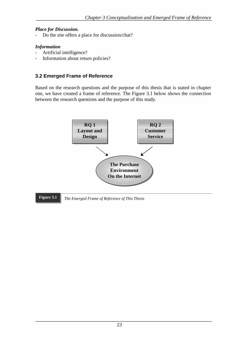
3 Conceptualisation and Emerged Frame of Reference
his chapter includes the conceptualisation and the emerged frame of referenceof this study. The conceptualisation is based on the previous studies presentedin chapter two and the research questions in chapter one. The frame ofreference presented at the end of this chapter explains the connection betweenthe purpose and the research questions of this thesis.
3.1 Conceptualisation
Research Question One; How Can Layout And Design of Websites as a PurchasingEnvironment be Described?
Regarding the first research question we are going to use the below listed authorsprevious studies which will be combined into an eclectic list. This eclectic list is basedon following authors studies; Horton & Lynch, (1999), Flanders and Willis, (1998),Horton and Lynch, (1997), Horton, Taylor, Ignacio & Hoft, (1996), Solomon andAskegaard, 1999, Lohse & Spiller, (1998) and a source from Internethttp://www.ergogero.com. The reason for this selection is that these studies were themost recent and specific ones.
Home Page- What is shown at the top of the home page?- How is the homepage used in the site?- How is the content posted at the homepage?- Does it show the visitor the content of the site?- How does the homepage indicate to the visitor how to find that content?- How is news and information posted at the homepage/ site?
Menus- Too deep?- Opening many files is required?- Contains too few links?- Direct access to all pages? Graphics Links and Frames- Does the site contain enormous graphics? Where and in what way?- How are links used within the site?- Imagemaps, text-links, blocks of text links, graphics?- Are links still valid?- Is the content stale?- Is the last revised date in the revised date in the signature more than six months ago?- How are frames used?- How is the balance between graphic imagemaps and blocks of text-based links?
Design versus Information- Is the site over designed?
T
Chapter 3 Conceptualisation and Emerged Frame of Reference
22
Navigation- Does the navigation within the site match the users expectations?- Is there a consistence in the navigation and how?
Words- Too much text?
Scrolling- Is the site disorienting?
Colour- Colour Contrast?- Colours Used?
Product Information- How are the products described?- Sufficient descriptions?- Easy to understand the product characteristics?
Product Range- Product range compared to traditional stores?
3.1.2 Research Question Two; How is Customer Service Handled Online?
Concerning the second research question the below listed authors previous studies willbe combined into an eclectic list. The eclectic is based on following authors studies;Sterne, (1996), Lohse & Spiller, (1998), Karpinski, (1999), Williams, (1997), andMachlis, (1997).
Frequently Asked Questions FAQ- Easy to find, read, navigate, understand?- Matches expectations- Relevant Questions?- Extensive?- Last updates?- Links to pages within the site? If how?- Tied into other documents?
E-mail- How long answering time?- E-mail notification when ordering?- Easy to complain with Internet?- Is there a possibility to search the site? Well function?
Search Tool- Accessible from the homepage?- Easy to use?
Chapter 3 Conceptualisation and Emerged Frame of Reference
23
Place for Discussion.- Do the site offers a place for discussion/chat?
Information- Artificial intelligence?- Information about return policies?
3.2 Emerged Frame of Reference
Based on the research questions and the purpose of this thesis that is stated in chapterone, we have created a frame of reference. The Figure 3.1 below shows the connectionbetween the research questions and the purpose of this study.
RQ 1Layout and
Design
RQ 2Customer
Service
The PurchaseEnvironment
On the Internet
The Emerged Frame of Reference of This ThesisFigure 3.1
Chapter 4 Methodology
24
4 Methodology
n this chapter will we discuss and justify methodological issues connected to ourresearch.
4.1 Research Purpose
The research can be classified into three basic purposes exploratory, descriptive andexplanatory.
An explorative research is suitable when a problem is difficult to demarcate, and when youhave not got a clear apprehension about what model to use and which characteristics andrelations are important. (Eriksson, Wiedersheim-Paul, 1997) An exploratory research isusually conducted with the expectation that subsequent research will be required to providesuch conclusive evidence. Descriptive research is often used when a problem is wellstructured and there is no intention to investigate cause/effect relations. (ibid) You knowwhat you want to find, but do not know the answers. (Zikmund, 1994) Different kinds ofstatistical selections and analysis are usually used during this kind of investigation.(Eriksson, Wiedersheim-Paul, 1997) An explanatory research’s purpose is to identify cause-and-effect relationships between variables. Experiment is the most common method inexplanatory researches. (ibid) However since it is our aim to provide conclusions at the end,it can be stated that we will also begin to explain.
The research purpose of this thesis is exploratory and descriptive since we are going toinvestigate how Web pages are being constructed in order to gain customer satisfaction. Inother words to investigate the effectiveness of the online shopping environment on Webpages. Since we are not going to investigate any causal relationship can our research not beclassified as an explanatory research, therefore have we excluded that kind of research.
4.2 Research Approach
The nature of the investigation determines the research approach of a study. The differentresearch approaches are qualitative and quantitative approaches.
Qualitative and Quantitative MethodsIn the social sciences there are two different methodological approaches, qualitative andquantitative (Holme & Solvang, 1991). Both approaches have their strengths andweaknesses and neither one of the approaches can be held better than the other can. Thebest research method to use for a study depends on that study’s research problem and theaccompanying research questions. (Yin, 1994) One typical characteristic of qualitativestudies is that they to a large extent are founded on description, that is, on the involvedperson’s own description, emotions and reactions.
I
Chapter 4 Methodology
25
We have used a qualitative method when conducting our empirical study since it was thealternative that best suited our research questions. We find that looking deeper and more indetail at a few Web pages will help us answer our research questions better than doing asuperficial investigation, as can be achieved when conducting a quantitative approach.
4.3 Research Strategy
According to Yin (1994) there are five primary research strategies in the social sciences.These include experiments, surveys, archival analysis, histories, and case studies. Anexperiment is not feasible, since we have no intention to investigate cause/effect relations,which an experiment often is used for. A neither suitable because it would have limited usto investigate what we have intended to investigate, since we could not go as deep into aWeb page and study it in detail Histories also not usable because the lack of previousstudies. An archival analysis is not either used.
A case study is an exploratory research technique that intensively investigates one or a fewsituations similar to the problem situation. The advantage of the case study is that it can beused to study an object in detail. (Zikmund, 1994) When conducting a case study, one orfew objects can be observed from different angles. (Wiedersheim-Paul & Eriksson, 1997)According to Yin (1994), a case study approach should be used when how or why questionsare being asked about a contemporary set of events over which the researcher has little ifany control. Since we are going to investigate the Web pages from different angles and ourstudy is based on research questions of how character, we chose to do a case studyapproach.
4.4 Data Collection
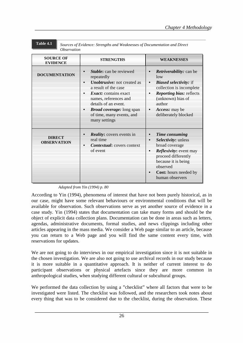
According to Yin (1994) case studies can be based on six different sources of evidence:documentation, archival records, interviews, direct observation, participant observation, andphysical artifacts. Yin (1994) states that a case study data collection gives the opportunity touse a number of different sources of evidence. This use of multiple sources of evidencemeans that the researcher has the opportunity to obtain many different sources of evidenceof the same phenomenon. This is what Yin (ibid.) refers to as ”triangulation” when adds tothe validity of one investigation.
The information in our case studies is primarily obtained through direct observation anddocumentation. Yin (1994) lists some strengths and weaknesses of documentation anddirect observation as shown in the figure below. Direct observations might be madethroughout a field visit, including those occasions during which other evidence is beingcollected. Observational evidence is often useful in providing additional information aboutthe topic being studied. (Yin, 1989) A direct observation can be done either bymeasurement or interpretation. (Eriksson & Wiedersheim-Paul, 1997) In our case study weare going to interpret how layout and design affect customers when shopping online andhow customer service is handled online.
Chapter 4 Methodology
26
According to Yin (1994), phenomena of interest that have not been purely historical, as inour case, might have some relevant behaviours or environmental conditions that will beavailable for observation. Such observations serve as yet another source of evidence in acase study. Yin (1994) states that documentation can take many forms and should be theobject of explicit data collection plans. Documentation can be done in areas such as letters,agendas, administrative documents, formal studies, and news clippings including otherarticles appearing in the mass media. We consider a Web page similar to an article, becauseyou can return to a Web page and you will find the same content every time, withreservations for updates.
We are not going to do interviews in our empirical investigation since it is not suitable inthe chosen investigation. We are also not going to use archival records in our study becauseit is more suitable in a quantitative approach. It is neither of current interest to doparticipant observations or physical artefacts since they are more common inanthropological studies, when studying different cultural or subcultural groups.
We performed the data collection by using a ”checklist” where all factors that were to beinvestigated were listed. The checklist was followed, and the researchers took notes aboutevery thing that was to be considered due to the checklist, during the observation. These
Source: Adapted from Yin (1994)
Sources of Evidence: Strengths and Weaknesses of Documentation and DirectObservation
Table 4.1
Adapted from Yin (1994) p. 80
• Stable: can be reviewedrepeatedly
• Unobtrusive: not created asa result of the case
• Exact: contains exactnames, references anddetails of an event.
• Broad coverage: long spanof time, many events, andmany settings
DOCUMENTATION
DIRECTOBSERVATION
SOURCE OFEVIDENCE
WEAKNESSES
• Reality: covers events inreal time
• Contextual: covers contextof event
• Retriverability: can below
• Biased selectivity: ifcollection is incomplete
• Reporting bias: reflects(unknown) bias ofauthor
• Access: may bedeliberately blocked
STRENGTHS
• Time consuming• Selectivity: unless
broad coverage• Reflexivity: event may
proceed differentlybecause it is beingobserved
• Cost: hours needed byhuman observers
Chapter 4 Methodology
27
notes were compiled one by one and were then put together in the empirical chapter. Duringthe observation the researchers were placed at different locations so they would notinfluence each other.
4.5 Sample Selection
According to Zikmund (1994) there are two alternative groups to take a sample: Probabilitysampling: Samples from a population is taken, where every element has a known non-zeroprobability of being selected, ideally an equal one for each element. Non-Probabilitysampling: Samples taken without knowing the probabilities of any particular memberchosen from the population considered, so the selection relies basically on personalattachments. We have chosen to investigate two company’s Websites are practising in thee-commerce business SAS (Scandinavian Airline System), and H&M (Hennes ochMauritz). Both are amongst the most well known companies in Sweden. The H&M site islisted among the ten top listed homepages in Sweden according to Veckans affärer number43, (1999) p. 49. SAS has conducted an extensive campaign on trying to become the marketleader when it comes to e-commerce within their business. The companies are alsooperating in different industries, services and traditional, which adds one more aspect to theinvestigation.
4.6 Data Analysis
Yin (1994) states that every case study should start with a general analytical strategy. Thesegeneral analytical strategies with regards to case studies provide the researcher with asystem by which he/she can set priorities for what it is they need to analyse and why. Theway in which the data will be analysed is very important for any research study. For thisstudy, it will involve the analysis of the conducted direct observations.
We started the analysis with a within case analysis where we analysed the empiricalfindings gathered from the direct observations of each case with the literature review. Thena cross case analysis was conducted, which means that you compare the information in thedifferent cases, that was received in the within case analysis, with each other in order to seeany matching.
4.7 Validity and Reliability
When conducting qualitative research it is often difficult to ensure the validity andreliability, because usually more abstract subjects and variables are researched and alsobecause personal experiences and perceptions are involved. (Patel & Davidson, 1991)Validity can shortly be defined as the ability, of the measuring instrument, to measure whatyou really intend to measure. (Carlsson, 1996) Similar formulations can be found by othersauthors. The validity in our empirical study might have been affected by different factors. In
Chapter 4 Methodology
28
order to improve the validity/ reliability we used two different computers during theresearch.
In order to see if the result would differ between the researchers, the computer differed withthe size of the monitor and the speed. Speed means the ability of the computers to performdifferent tasks when operating. We used a computer with a 14” monitor and one with a 17”monitor. The computer with the larger monitor was the quickest one. Since a slow computertakes more time to load a page and the pictures are smaller than on a big one, it wasinteresting to see if that had any impact on the researcher that used the slower computer, ina way that gives the researcher a negative understanding of the Web page.
Reliability means that a measuring instrument shall provide reliable and stable results(Wiedersheim & Eriksson, 1991). Yin (1994) stresses that reliability exists if a laterinvestigator followed exactly the same procedures as described by an earlier investigatorand conducted the same case study all over again, the later investigator should arrive at thesame findings and conclusions. Yin (1994) further claims that the goal of reliability is tominimise the errors and biases in a study. A high reliability implies that the procedure ofdata collecting, in our case the investigation of Websites can be repeated with the sameresult. If another person should make the same investigation, in the same manner, theresults and conclusions should be the same. (ibid)
Yin (1994) states to increase the reliability of observational evidence, a common procedureis to have more than a single observer making an observation, whether of the formal or thecasual variety. Thus, when resources permit a case study investigation should allow for theuse of multiple observers. Therefore we decided to both observe the Web pages. Toincrease the reliability even more we did the observation separately in order to not influenceeach other.
Because different investigators have different knowledge, it can be a big difference betweenseparate investigators when doing an observation. (Eriksson & Wiedersheim-Paul, 1991) Inorder to minimise those differences we have designed the checklist with detailedexplanations about the points to be investigated, so the researchers would notmisunderstand the points. Every point has then been reviewed in a dialog between theresearchers in order to be sure that they have fully understood the meaning of the points thatwere to be investigated.
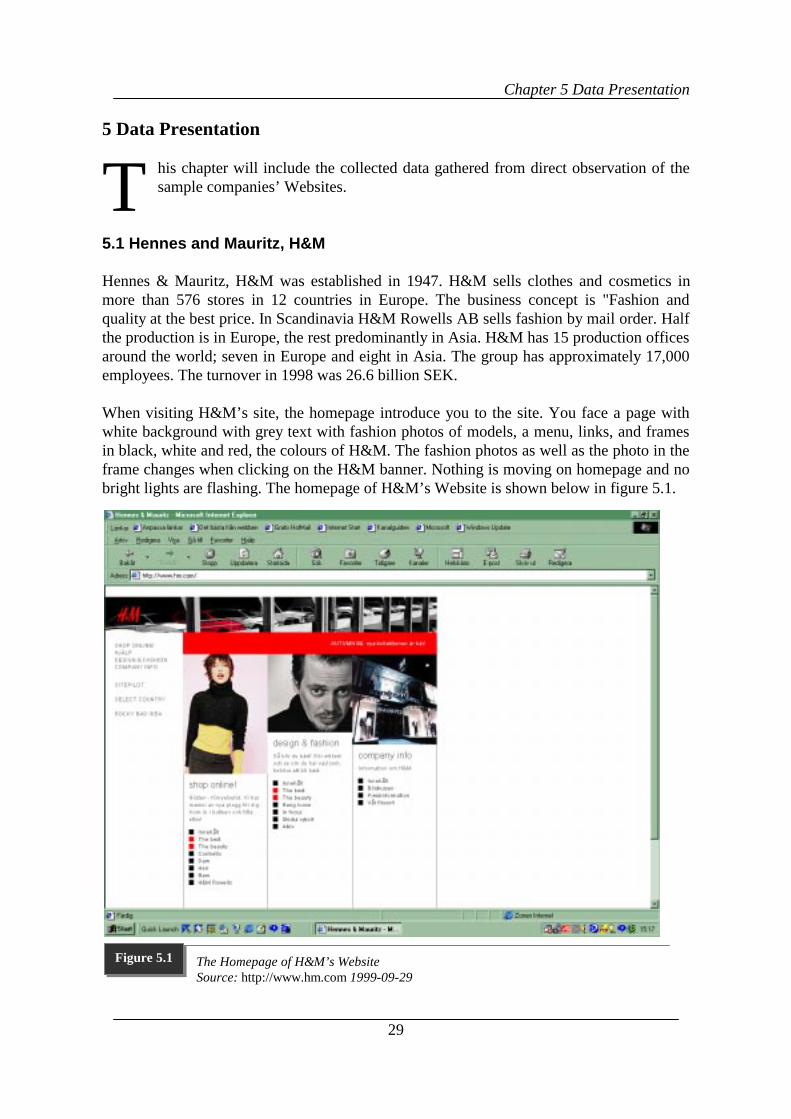
Chapter 5 Data Presentation
29
5 Data Presentation
his chapter will include the collected data gathered from direct observation of thesample companies’ Websites.
5.1 Hennes and Mauritz, H&M
Hennes & Mauritz, H&M was established in 1947. H&M sells clothes and cosmetics inmore than 576 stores in 12 countries in Europe. The business concept is "Fashion andquality at the best price. In Scandinavia H&M Rowells AB sells fashion by mail order. Halfthe production is in Europe, the rest predominantly in Asia. H&M has 15 production officesaround the world; seven in Europe and eight in Asia. The group has approximately 17,000employees. The turnover in 1998 was 26.6 billion SEK.
When visiting H&M’s site, the homepage introduce you to the site. You face a page withwhite background with grey text with fashion photos of models, a menu, links, and framesin black, white and red, the colours of H&M. The fashion photos as well as the photo in theframe changes when clicking on the H&M banner. Nothing is moving on homepage and nobright lights are flashing. The homepage of H&M’s Website is shown below in figure 5.1.
T
The Homepage of H&M’s WebsiteSource: http://www.hm.com 1999-09-29
Figure 5.1
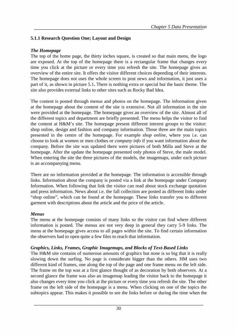
Chapter 5 Data Presentation
30
5.1.1 Research Question One; Layout and Design
The HomepageThe top of the home page, the thirty inches square, is created so that main menu, the logoare exposed. At the top of the homepage there is a rectangular frame that changes everytime you click at the picture or every time you refresh the site. The homepage gives anoverview of the entire site. It offers the visitor different choices depending of their interests.The homepage does not uses the whole screen to post news and information, it just uses apart of it, as shown in picture 5.1. There is nothing extra or special but the basic theme. Thesite also provides external links to other sites such as Rocky Bad Idea.
The content is posted through menus and photos on the homepage. The information givenat the homepage about the content of the site is extensive. Not all information in the sitewere provided at the homepage. The homepage gives an overview of the site. Almost all ofthe different topics and department are briefly presented. The menu helps the visitor to findthe content at H&M’s site. The homepage present different interest groups to the visitor:shop online, design and fashion and company information. Those three are the main topicspresented in the centre of the homepage. For example shop online, where you i.e. canchoose to look at women or men clothes or company info if you want information about thecompany. Before the site was updated there were pictures of both Milla and Steve at thehomepage. After the update the homepage presented only photos of Steve, the male model.When entering the site the three pictures of the models, the imagemaps, under each pictureis an accompanying menu.
There are no information provided at the homepage. The information is accessible throughlinks. Information about the company is posted via a link at the homepage under CompanyInformation. When following that link the visitor can read about stock exchange quotationand press information. News about i.e. the fall collection are posted as different links under“shop online”, which can be found at the homepage. These links transfer you to differentgarment with descriptions about the article and the price of the article.
MenusThe menu at the homepage consists of many links so the visitor can find where differentinformation is posted. The menus are not very deep in general they carry 5-9 links. Themenu at the homepage gives access to all pages within the site. To find certain informationthe observers had to open quite a few files to reach that information.
Graphics, Links, Frames, Graphic Imagemaps, and Blocks of Text-Based LinksThe H&M site contains of numerous amounts of graphics but none is so big that it is reallyslowing down the surfing. No page is considerate bigger than the others. HM uses twodifferent kind of frames, one along the top of the page and one frame menu on the left side.The frame on the top was at a first glance thought of as decoration by both observers. At asecond glance the frame was also an imagemap leading the visitor back to the homepage italso changes every time you click at the picture or every time you refresh the site. The otherframe on the left side of the homepage is a menu. When clicking on one of the topics thesubtopics appear. This makes it possible to see the links before or during the time when the
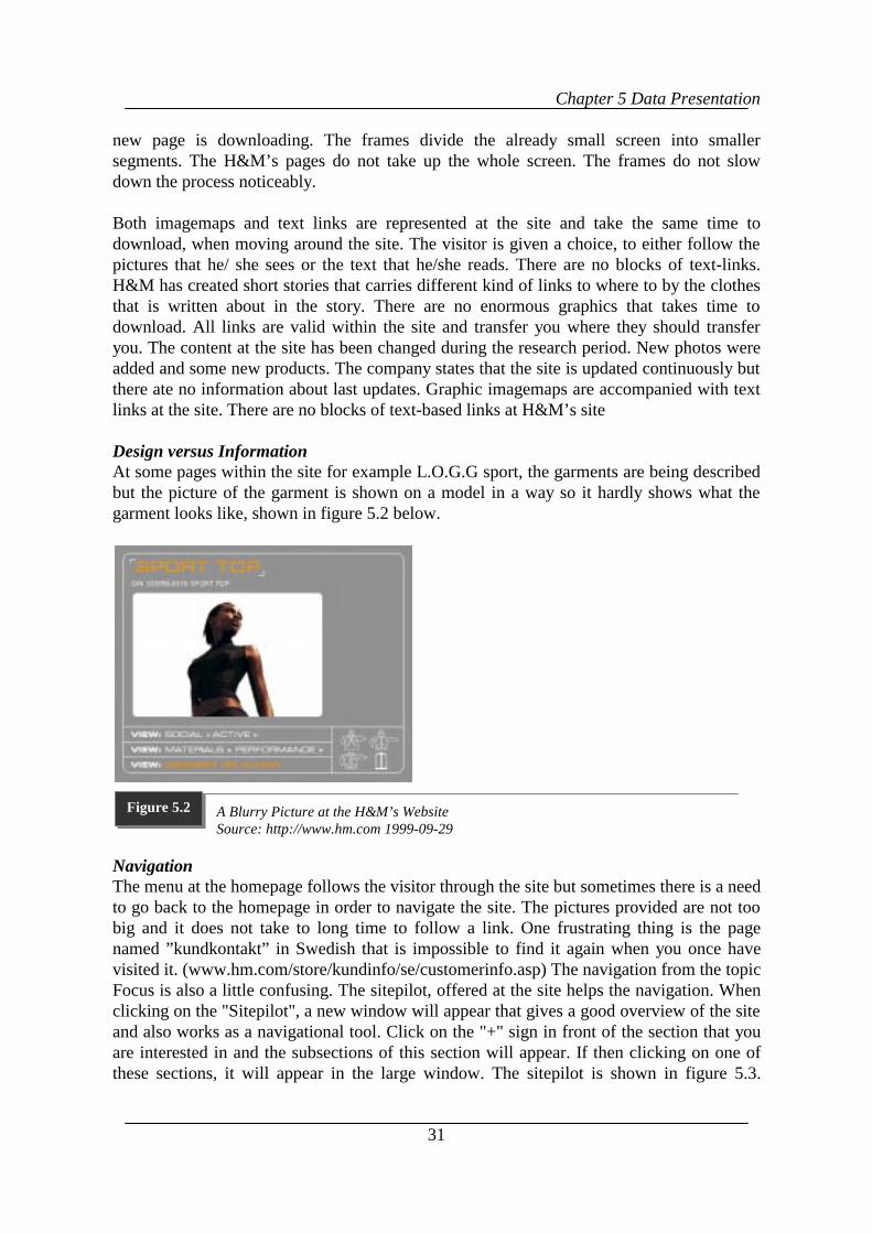
Chapter 5 Data Presentation
31
new page is downloading. The frames divide the already small screen into smallersegments. The H&M’s pages do not take up the whole screen. The frames do not slowdown the process noticeably.
Both imagemaps and text links are represented at the site and take the same time todownload, when moving around the site. The visitor is given a choice, to either follow thepictures that he/ she sees or the text that he/she reads. There are no blocks of text-links.H&M has created short stories that carries different kind of links to where to by the clothesthat is written about in the story. There are no enormous graphics that takes time todownload. All links are valid within the site and transfer you where they should transferyou. The content at the site has been changed during the research period. New photos wereadded and some new products. The company states that the site is updated continuously butthere ate no information about last updates. Graphic imagemaps are accompanied with textlinks at the site. There are no blocks of text-based links at H&M’s site
Design versus InformationAt some pages within the site for example L.O.G.G sport, the garments are being describedbut the picture of the garment is shown on a model in a way so it hardly shows what thegarment looks like, shown in figure 5.2 below.
NavigationThe menu at the homepage follows the visitor through the site but sometimes there is a needto go back to the homepage in order to navigate the site. The pictures provided are not toobig and it does not take to long time to follow a link. One frustrating thing is the pagenamed ”kundkontakt” in Swedish that is impossible to find it again when you once havevisited it. (www.hm.com/store/kundinfo/se/customerinfo.asp) The navigation from the topicFocus is also a little confusing. The sitepilot, offered at the site helps the navigation. Whenclicking on the "Sitepilot", a new window will appear that gives a good overview of the siteand also works as a navigational tool. Click on the "+" sign in front of the section that youare interested in and the subsections of this section will appear. If then clicking on one ofthese sections, it will appear in the large window. The sitepilot is shown in figure 5.3.
A Blurry Picture at the H&M’s WebsiteSource: http://www.hm.com 1999-09-29
Figure 5.2
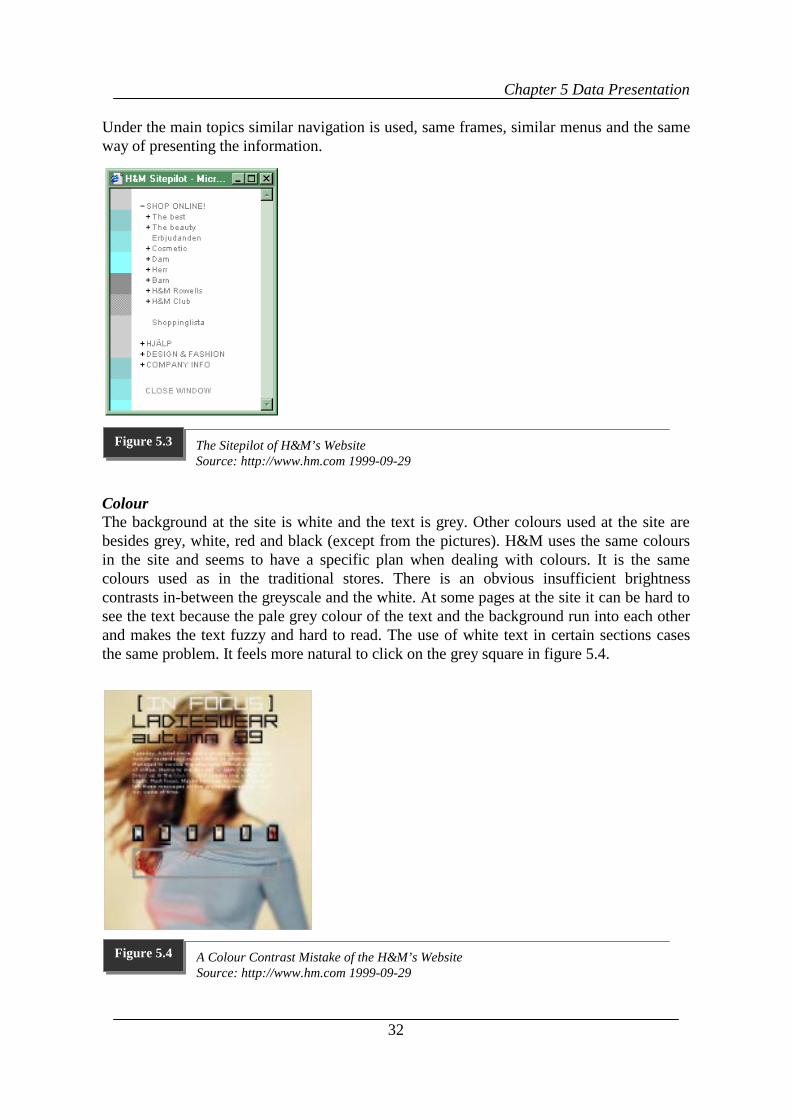
Chapter 5 Data Presentation
32
Under the main topics similar navigation is used, same frames, similar menus and the sameway of presenting the information.
ColourThe background at the site is white and the text is grey. Other colours used at the site arebesides grey, white, red and black (except from the pictures). H&M uses the same coloursin the site and seems to have a specific plan when dealing with colours. It is the samecolours used as in the traditional stores. There is an obvious insufficient brightnesscontrasts in-between the greyscale and the white. At some pages at the site it can be hard tosee the text because the pale grey colour of the text and the background run into each otherand makes the text fuzzy and hard to read. The use of white text in certain sections casesthe same problem. It feels more natural to click on the grey square in figure 5.4.
The Sitepilot of H&M’s WebsiteSource: http://www.hm.com 1999-09-29
Figure 5.3
A Colour Contrast Mistake of the H&M’s WebsiteSource: http://www.hm.com 1999-09-29
Figure 5.4
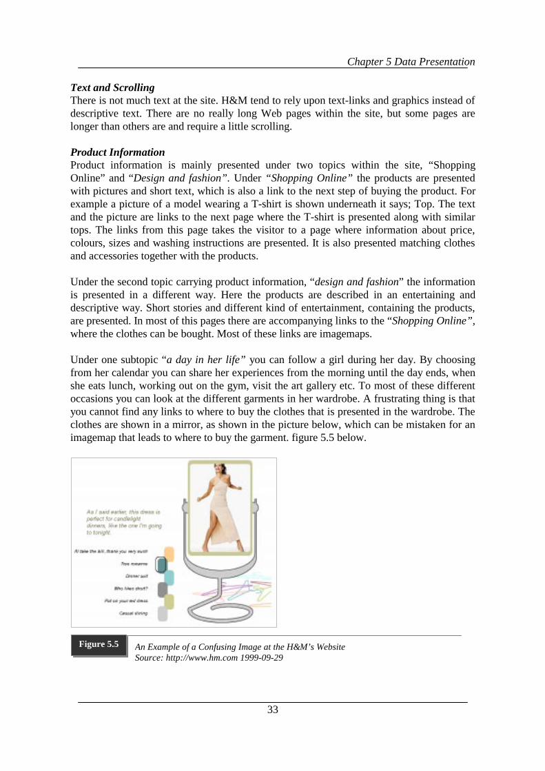
Chapter 5 Data Presentation
33
Text and ScrollingThere is not much text at the site. H&M tend to rely upon text-links and graphics instead ofdescriptive text. There are no really long Web pages within the site, but some pages arelonger than others are and require a little scrolling.
Product InformationProduct information is mainly presented under two topics within the site, “ShoppingOnline” and “Design and fashion”. Under “Shopping Online” the products are presentedwith pictures and short text, which is also a link to the next step of buying the product. Forexample a picture of a model wearing a T-shirt is shown underneath it says; Top. The textand the picture are links to the next page where the T-shirt is presented along with similartops. The links from this page takes the visitor to a page where information about price,colours, sizes and washing instructions are presented. It is also presented matching clothesand accessories together with the products.
Under the second topic carrying product information, “design and fashion” the informationis presented in a different way. Here the products are described in an entertaining anddescriptive way. Short stories and different kind of entertainment, containing the products,are presented. In most of this pages there are accompanying links to the “Shopping Online”,where the clothes can be bought. Most of these links are imagemaps.
Under one subtopic “a day in her life” you can follow a girl during her day. By choosingfrom her calendar you can share her experiences from the morning until the day ends, whenshe eats lunch, working out on the gym, visit the art gallery etc. To most of these differentoccasions you can look at the different garments in her wardrobe. A frustrating thing is thatyou cannot find any links to where to buy the clothes that is presented in the wardrobe. Theclothes are shown in a mirror, as shown in the picture below, which can be mistaken for animagemap that leads to where to buy the garment. figure 5.5 below.
An Example of a Confusing Image at the H&M’s WebsiteSource: http://www.hm.com 1999-09-29
Figure 5.5
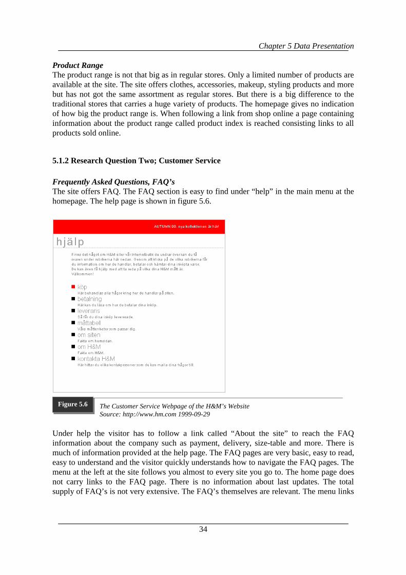
Chapter 5 Data Presentation
34
Product RangeThe product range is not that big as in regular stores. Only a limited number of products areavailable at the site. The site offers clothes, accessories, makeup, styling products and morebut has not got the same assortment as regular stores. But there is a big difference to thetraditional stores that carries a huge variety of products. The homepage gives no indicationof how big the product range is. When following a link from shop online a page containinginformation about the product range called product index is reached consisting links to allproducts sold online.
5.1.2 Research Question Two; Customer Service
Frequently Asked Questions, FAQ’sThe site offers FAQ. The FAQ section is easy to find under “help” in the main menu at thehomepage. The help page is shown in figure 5.6.
Under help the visitor has to follow a link called “About the site” to reach the FAQinformation about the company such as payment, delivery, size-table and more. There ismuch of information provided at the help page. The FAQ pages are very basic, easy to read,easy to understand and the visitor quickly understands how to navigate the FAQ pages. Themenu at the left at the site follows you almost to every site you go to. The home page doesnot carry links to the FAQ page. There is no information about last updates. The totalsupply of FAQ’s is not very extensive. The FAQ’s themselves are relevant. The menu links
The Customer Service Webpage of the H&M’s WebsiteSource: http://www.hm.com 1999-09-29
Figure 5.6
Chapter 5 Data Presentation
35
to a pages at the site and therefore links the FAQ pages together. The FAQ’s are not tiedinto other documents.
E-mail and Order NotificationObserver 1 has sent two e-mails to H&M. The first one was sent on the 7th of October 1999at 16,00 and has not been answered by October 29th 1999. The second e-mail that was senton the 24th of October 1999 at 19,00 has neither been answer by the 29th of October. Both e-mails were sent to [email protected]. Observer 2 sent an e-mail to H&M’s [email protected]. The e-mail was sent at the 26th of October 1999 at 00.28 AM and theanswer was received at 11.05 the same day.
The customer receives no automatic e-mail notification when the order is shipped. If youwant an e-mail notification when they receive your order you have to fill in your e-mailaddress when you are ordering at the site.
ComplaintsThe site does not offer any kind of online discussion at the H&M page. If a customer wantto transfer their point of view are there three e-mail options, mailing either the Web master,customer service or the H&M info. H&M also provides a phone number to customerservice. The information is easy to find with visibly clear links. The company does notindicate how fast you will get an answer. There is no encouragement to complain.
Search tool, Artificial Intelligence and Return PoliciesThe site does not offer a search tool so there is no possibility to search the site. Artificialintelligence does not exist at H&M’s site. There is information about return polices but itdoes not say how you should do to if you want to return a garment. It just tells you how youshould do if you receive the wrong size or the wrong garment.
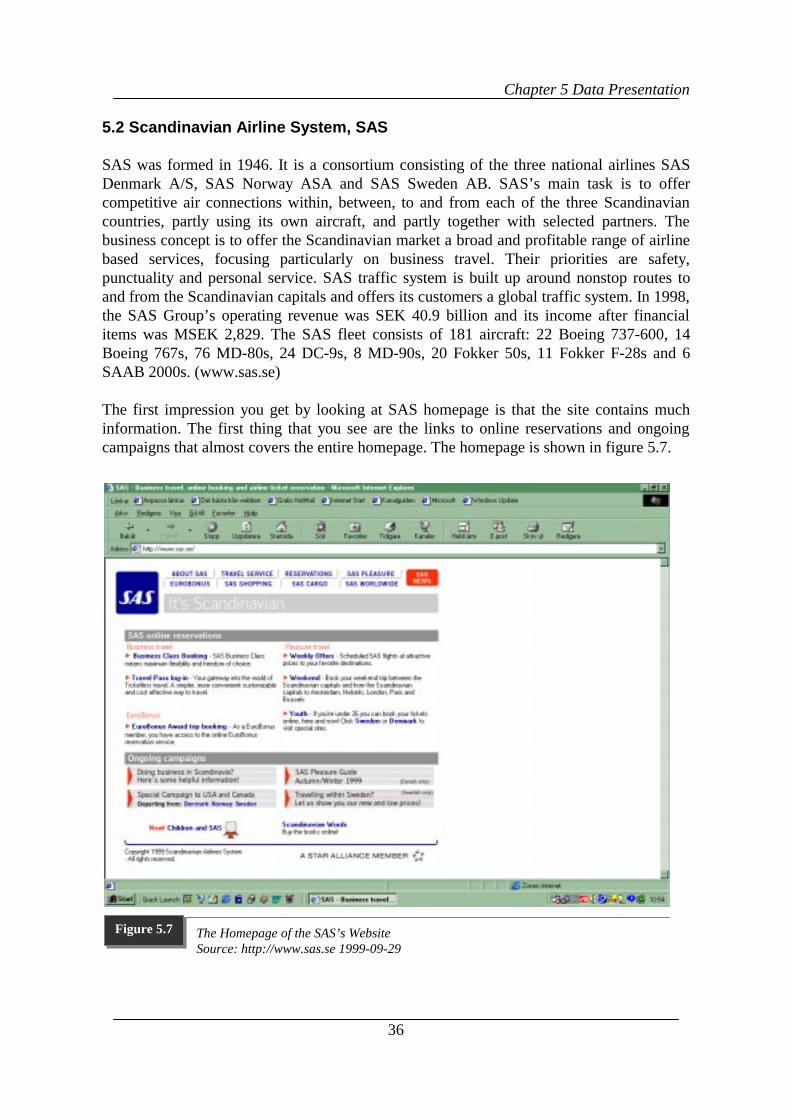
Chapter 5 Data Presentation
36
5.2 Scandinavian Airline System, SAS
SAS was formed in 1946. It is a consortium consisting of the three national airlines SASDenmark A/S, SAS Norway ASA and SAS Sweden AB. SAS’s main task is to offercompetitive air connections within, between, to and from each of the three Scandinaviancountries, partly using its own aircraft, and partly together with selected partners. Thebusiness concept is to offer the Scandinavian market a broad and profitable range of airlinebased services, focusing particularly on business travel. Their priorities are safety,punctuality and personal service. SAS traffic system is built up around nonstop routes toand from the Scandinavian capitals and offers its customers a global traffic system. In 1998,the SAS Group’s operating revenue was SEK 40.9 billion and its income after financialitems was MSEK 2,829. The SAS fleet consists of 181 aircraft: 22 Boeing 737-600, 14Boeing 767s, 76 MD-80s, 24 DC-9s, 8 MD-90s, 20 Fokker 50s, 11 Fokker F-28s and 6SAAB 2000s. (www.sas.se)
The first impression you get by looking at SAS homepage is that the site contains muchinformation. The first thing that you see are the links to online reservations and ongoingcampaigns that almost covers the entire homepage. The homepage is shown in figure 5.7.
The Homepage of the SAS’s WebsiteSource: http://www.sas.se 1999-09-29
Figure 5.7
Chapter 5 Data Presentation
37
5.2.1 Research Question One; Layout and design
The HomepageThe homepage is bright with a white background. The colours used at the site are red, blue,white and grey. The text is dark grey, except from the links that are blue. At the top leftcorner of the homepage the logotype is shown in blue with the white letters SAS in it. Atthe top there are eight links with blue letters; In the corner top right there is a red squarewith white letters saying SAS News. Under the rectangle there are links ongoingcampaigns, and online reservations. The homepage, shown in figure 4:7, gives an overviewof the site and offer the visitor different topics to chose from depending the interest of thevisitors. The frame at the top of the page, which consists of links to different topics withinthe site, follows the visitor throughout the site. The home page contains lots of information.It has big blocks of text that tells the visitor about highlights and special offers and provideslinks to different categories. There are no pictures on the home page. Exposed are menusand text blocks and the company logo. Some of the links transfer the visitor to externallinks to other sites that are related to SAS, such as Star alliance etc. That is representedwith the Star Alliance Logo on the bottom of the page. In most cases the visitor has to goback to the homepage to go in to a new topic. The logo in the upper left corner is a linkback to the homepage. The homepage presents eight different kind of entries to the visitor;About SAS, Travel service, Reservations, SAS pleasure, Eurobonus, SAS shopping, SASCargo and SAS World wide. Those are represented through links at the homepage
There is information provided directly at the homepage. Company information is presentedat a page called About SAS, which the visitor can find by following a link at the homepage.There the visitor can read the editorial report, the annual report, the environmental reportetc. News such as New offers and headlines are presented under ongoing campaigns at thehomepage, shown in figure 4:7. Under Press Centre an archive over the most resent pressreleases can be found.
MenusIf following a link at the homepage the visitor will face an entire new menu at the nextpage. When following the links further they get deeper into the site to a new menu. Eachmenu within the site do not carry more than 7 links in general per page but each topic isvery extensive and deep, since it contains of much information. On each new page withineach topic new menus is presented.
Graphics Links, Frames and ImagemapsThe site does not contain big graphics that take long time to download. Though, some pagestake longer to download than others but not in a disturbing way. The different kinds of linksused in the site are text links, block of text-based links, menus and index menus. There areno Imagemaps accompanying the text links. Imagemaps in general are used very sparselywithin the site. One of the few pages that contain imagemaps is www.sas.se/ungdom/se.
None of the observers could find a link that was not valid at SAS’s site. On most pagesthere are no information about last updates. Both observers found a page under SAS
Chapter 5 Data Presentation
38
shopping that had information about the last date the page was updated. The date was thesame when both observers visited the page 1999-10-01.
SAS is using frames. Mainly they use one at the top of the page. This frame is used aloneon the homepage. On other pages there are often two frames used, one at the top andanother on the left side. The one at the top carries the main menu with all the main topicswithin the site. When used, the frame on the left side carries a table of the content under thechosen topic. This table then stays with the visitor when looking through the pages underthis topic. The frames cut up the already small screen into even smaller segments. It doesnot take long time to download the frames, they down load in the same speed as the rest ofthe page. Blocks of text based links are used, but mainly on the homepage.
Design versus InformationThe homepage contains no typical design items such as for example moving figures orflashing lights. There are not that many pictures presented at the site. The pictures presentedat the site are of aircraft, tickets, and humans etc. The site contains of an extensive amountof information mainly through text, not menus. The text is grouped in text groups with linkswithin the text and block of text based links. At some pages does the text covers the wholepage.
ColourThe colours that are used at the site are red, blue, white and grey. The background is white.The colour of the text is readable on both computers used. All links are blue and when youhave visited a link it becomes purple indicating a previous visits.
Text and ScrollingThe site contains a lot of text especially at the homepage. Apart from the home page the restof the site contains less text and more menus are presented. Both observers found a lot ofpages that required scrolling. Some times more is needed some times less. For observer 1,with a 14-inch screen more scrolling was necessary than for observer 2. Some scrolling isneeded at some pages since SAS tend to use a very small part of the screen, which leads tolong columns of text. It was on some pages necessary to scroll long columns of text.
NavigationThe site is big and consists of a great amount of pages. Each page consists of muchinformation. Frames menus, and the way of presenting information appears in differentways on different pages. Mainly the way these things are used looks similar to the visitorbut does not function in the same way. For example the main menu changes into a differentmenu which looks the same but in order to navigate the site the visitor has to go back to thehomepage, but on pages that carries the main menu it is possible to navigate the sitedirectly. The main menu at the homepage follows the visitor to parts of the site. In otherparts there are new menus that covers the pages under that specific topic.
A thing that frustrated the observers were how to reach the “standby platstillgång” page. Byfollowing the link youth from the homepage the visitor transfers to a page where it saysReservations for people under 26. This page, reservations for people under 26, contains nolink to the “standby platstillgång” page. In order to find the page the visitor has to go to the
Chapter 5 Data Presentation
39
text link Sweden at the under the topic Youth at the homepage, see figure 6. By choosingSweden on the next page the visitor reaches the desired page.
Throughout the site the SAS logo in the upper left corner functions as a link back to thehomepage except from SAS Cargo. Under SAS Cargo, Youth / Sweden as well as theReservations/ Weekend trip, the logo appears in the same way as in the rest of the site butdoes not function as a link. SAS labels the logo SAS with different titles underneath it. TheSAS Pleasure logo appears on different pages other than the pages under the SAS Pleasuretopic. On these pages the logo does not function as a link back to the homepage nor to theSAS Pleasure topic.
Product/Service InformationThere is no information about prices and rebates. The timetable is not connected with thereservations. No information on group travels or travel with handicap as well as travellingwith animals were found. Descriptions about what is included and what is available in theaircraft and what the customer can shop at the airport when travelling with SAS is providedon a special page. There are information about meals and drinks onboard, entertainment,how it is to travel with children, tax-free shopping, and other information about what isoffered onboard, such as newspapers and magazines etc.
Product /Service RangeOnly by observing it is not possible to tell how big of a product range SAS has due to theconfusing presentation of products/services. For example the flight timetable is shownunder Travel service, which is the only way to get an overview of the flights offered. UnderReservation is it only possible to find information about the product/service if registeringwith the company. They then give the customer a traveller ID and a password, withexceptions of youth tickets. They are possible to reserve without login requirements.
When reserving a youth ticket the customer has to give his/hers personal identificationnumber. Without typing in the whole number it was, at the time of the research, notpossible to reserve a ticket. If a foreign person (youth) wants to reserve ticket he or she hasto phone their local office. Another thing that were observed was that it is not possible toreserve all kind of tickets online for persons under 26 The visitor can only makereservations to departures from Scandinavia online.
5.2.2 Research Question Two; Customer service
Frequently Asked Questions, FAQ’sThe FAQ’s only exists under Eurobonus, within that topic they are easy to read, find andnavigate. The observers found the questions relevant concerning the information displayedthere. Some answers contain more information than others do. There is no informationabout last updates. The FAQ are not tied into other documents at other pages nor have anyrelated links at the page. There is no link or stand-out-button on the homepage that points tothe FAQ page. In other parts of the site the help is provided in other forms than FAQ’s.
Chapter 5 Data Presentation
40
E-mailA link named e-mail can be found under About SAS/Contact SAS. On this page followinginformation was given: “For fare information and other travel related questions/requestsplease consult the SAS Reservations page.” Following this link it gives the visitor phoneand fax numbers, no e-mail address. Also posted is: “Customer Relations - [email protected]. Should you wish to inform us about your experience with SAS,please send us an e-mail” Other e-mail addresses posted on the e-mail page are EuroBonusMember Service, (EuroBonus members only), Euroshop, Euroshop Plus, SAS Wine Cluband SAS Flight Shop. Both observers chose to write to the customer relation address forinformation since this seamed to be the most suitable one. Observer 1 sent an e-mail to SASCustomer-Relations at 14.30, on the 29th of October 1999 and did not receive an answer.Observer 2 sent an e-mail to SAS at 20,12, on the 21st of October 1999 and received theanswer at 09,17 on the 22nd, the day after.
Ordering Notification, Search tool and Place for DiscussionNo information provided whether an e-mail notification is sent when the order is shipped.There is no possibility to search the site through a search engine. Nor does the site offer anykind of online discussion. But if a customer want to transfer their point of view SAS offersan e-mail address to SAS’s Customer Relations where it is possible to share formerexperiences with SAS. SAS also provides phone numbers to local offices and e-mailaddress to the headquarters.
Return Policies, Artificial Intelligence and InformationWhen reserving a ticket online SAS provides information about the directions that goeswith that ticket. There is information about how to cancel your ticket etc. An artificialintelligence does not exist at www.sas.com.
Chapter 6 Analysis
41
6 Analysis
n this chapter we will compare the collected data from each case with the literaturereview. First by doing a within case analysis as well as a cross-case analysis, wherewe compare the two cases with each other.
6.1 Within-case Analysis
In this section we will compare the data collected from the direct observation of theWebsites with the previous studies presented in chapter two. The cases will be presentedseparate from each other.
6.1.1 Hennes & Mauriz, H&M,
Research Question One; Layout and Design
The HomepageAt the top of H&M’s homepage frames, pictures, main menu, and imagemaps arepresented. This fits with what Horton and Lynch, (1999) recommended for the use of linksat the top of the homepage. The homepage gives an overview of the site. Almost all of thetopics and departments are briefly presented. The menu helps the visitor to find the contentat H&M’s site. This fits with what Flanders and Willis (1998) recommended about what ahomepages should convey to a visitor.
The homepage present different interest groups to the visitor: shop online, design andfashion and company information. This verifies what the authors Horton and Lynchrecommended about steering audience into subtopic or special interest areas of the site. Nonews or descriptive information is provided at the homepage. Information and news aboutthe company and the latest fashion are posted in the site through at link from the homepage.This does not fit with what Horton and Lynch (1999) stated about taking advantage of thehigh visibility of the homepage.
MenusThe menus are not very deep in general they carry 5-9 links. To find certain information theobservers had to open a few files to reach that information. The menu at the homepageconsists of many links so the visitor can find where different information is posted. Themenu at the homepage gives access to all pages within the site. This agrees with what theauthors Horton and Lynch (1999) stated about how a menu should be used in a homepage.
GraphicsThe H&M site contains of numerous amounts of graphics but none is so big that it is reallyslowing down the surfing. Both imagemaps and text-links are represented at the site andtake the same time to download. There are no blocks of text-links. This fits with the authorsFlanders and Willis (1998) recommendations.
I
Chapter 6 Analysis
42
LinksAll links are valid within the site. The company states that the site is updated continuously,ant the observers noticed that since the photos at the homepage changed during the researchperiod, but there ate no information about last updates. This verifies what Horton, Taylor,Ignacio & Hoft, (1996) recommended.
FramesThe frames function well and do not take long time to download. This fits with whatFlanders and Willis (1998) stated about frames. H&M use only a small part of the screenand the frames tend to divide the already small screen into smaller segments.
Imagemaps and Text- linksGraphic imagemaps are accompanied with text links at the site. There are no blocks of text-based links at H&M’s site. This fits with what Horton and Lynch (1997) and Flanders andWillis recommended.
NavigationThe menu at the homepage follows the visitor through the site but sometimes there is a needto go back to the homepage in order to navigate the site. The sitepilot, offered at the sitehelps the navigation. Under the main topics similar navigation is used, same frames, similarmenus with the same way of presenting the information. This verifies what Horton andLynch (1999) recommended about navigation.
Only one page at the site, “kundtjänst” appeared in an inconsistent way. Apart from this thenavigation was consitent throughout the site. Due to this we have concluded that it doesaccomplish Horton and Lynch’s (1999) guidelines on consistence in the navigation.
WordsThere is not much text at the site. H&M tend to rely upon text-links and graphics instead ofdescriptive text. This verifies what Horton, Taylor, Ignacio & Hoft, (1996) claimconcerning about using long texts.
ScrollingThere are no really long Web pages within the site, but some pages are longer than othersare and require a little scrolling. This follows the recommendations by Horton, Taylor,Ignacio & Hoft, (1996).
ColourThe background at the site is white and the text is grey. The pale grey colour on the whitebackground makes the text hard to read. There is an obvious insufficient brightness contrastbetween the greyscale and the white. This does not fit what the authors of the site(http://www.ergogero.com/) recommend about the brightness contrast. H&M uses the samecolours in the site and seems to have a specific plan when dealing with colours. It is thesame colours used as in the traditional stores. This agrees with the recommendations of theabove mentioned authors. Light and bright colours are used throughout the site. This fitswhat Solomon and Askegaard, 1999 says about light and bright colours.
Chapter 6 Analysis
43
Design versus InformationThe use of graphics, text, and links are used in such way so they do not take advantage ofthe visibility and the overview of a page. This agrees with what Horton, Taylor, Ignacio &Hoft, (1996) claim about not over designing. On the other hand the poor use of colourcontrast does get away of the visibility and the overview of a page, which is contradictory tothe recommendations of the same authors.
Product Information and Product RangeUnder “Shopping Online” the products are described with the size, colour, price andwashing instructions. They are also presented with matching clothes and accessories.“Design and fashion” contains product information in a descriptive and entertaining way.This fit with what the authors Flankers and Willis (1998) recommend, apart from theconfusing use of imagemaps under “design and fashion”. Flanders and Willis states (1998)that the li4nks should be used in a well thought through way. The way imagemaps wereused under “design and fashion” was very confusing to the observers and does not verifywhat the authors stated.
The product range is not that big as in regular stores. Only a limited number of products areavailable at the site. This does not fit with what Lohse & Spiller (1998) recommend.
Research Question Two; Customer Service
Frequently Asked QuestionsThe site offers FAQ. The FAQ section is easy to find under “help” in the main menu at thehomepage. The FAQ pages are very basic, easy to read, navigate, and to understand and thevisitor quickly understands how to navigate the FAQ-pages. The FAQ’s themselves arerelevant. The total supply of FAQ’s is not very extensive. There is no information about lastupdates. The home page does not carry links to the FAQ page. The FAQ’s are not tied intoother documents. This fits with what Sterne (1996) recommends.
E-mail, Order Notification, Search Tool and Place for Discussion.Observer 1 sent an e-mail to H&M’s e-mail address: [email protected] and did not receive anyanswer. Observer 2 sent an e-mail to [email protected]. This does not fit with whatLohse & Spiller (1998) and Sterne (1996) recommend. The customer receives no automatice-mail notification when the order is shipped. This does not fit with what Cleaver (1999)recommends. There is no possibility to search the site. This does not fit with what Sterne(1996) recommends. The site does not offer any kind of online discussion at the H&Mpage. If a customer want to transfer their point of view is there are three e-mail options tochoose from. This does not fit with what Sterne (1996) recommends about customerservice.
Artificial Intelligence and Return PoliciesArtificial intelligence does not exist at H&M’s site. This does not fit with what Williams(1997) recommends. There is information about return polices but it does not say how to do
Chapter 6 Analysis
44
to if wanting to return a garment. It only tells how to do if wrong size or the wrong garmenthave been received. This does not fit with what Machlis (1997) recommend.
6.1.2 Scandinavian Airlines System, SAS
Research Question One; Layout and Design
The HomepageAt the top left corner of the homepage the logotype is shown. At the top there are eightlinks. In the corner top right there is a red square saying SAS News. Under the logo and themain menu are links on online reservations. This fits with the recommendation by Horton &Lynch (1999) for the use of links at the top of the homepage. The homepage, shown ingives an overview of the site and offer the visitor different topics to chose from. The homepage contains lots of information. It has big blocks of text that tells the visitor abouthighlights and special offers and provides links to different categories. Exposed are menusand text blocks and the company logo. Some of the links transfer the visitor to externallinks to other sites that are related to SAS, such as Star alliance etc. This fits with whatFlander & Willis (1998) recommend about what a homepage should convey to a visitor.
The homepage presents eight different interest groups to the visitor; About SAS, Travelservice, Reservations, SAS pleasure, Eurobonus, SAS shopping, SAS Cargo and SASWorld wide. Those are represented through links at the homepage. This fits with what theauthors Horton & Lynch (1999) recommend about steering the audience into subtopics orspecial interest areas of the site. News and information are provided directly at thehomepage. Company information is presented at a page called About SAS, which the visitorcan find by following a link at the homepage. News such as New offers and headlines arepresented under Ongoing Campaigns and SAS News at the homepage. This fits with whatHorton & Lynch (1999) stated about taking advantage of the high visibility of thehomepage.
MenusEach menu within the site do not carry more than 7 links in general per page but each topicis very extensive and deep, since it contains of much information. If following a link at thehomepage the visitor will face an entire new menu at the next page. When following thelinks further they get deeper into the site to a new menu. On each new page within eachtopic new menus is presented. This agrees with what Horton & Lynch stated about how amenu should be used in a site.
Graphics, Links and FramesThe site does not contain big graphics that take long time to download. This fits withFlanders & Willis (1998) recommendations. None of the observers could find a link thatwas not valid at SAS’s site. On most pages there are no information about last updates.Both observers found a page under SAS shopping that had information about the last datethe page was updated. The date was the same when both observers visited the page 1999-10-01. This verifies what Horton, Taylor, Ignacio and Hoft (1996) recommend. SAS is
Chapter 6 Analysis
45
using frames. Mainly they use one at the top of the page. The frames function well and donot take long time to download, they down load in the same speed as the rest of the page.This fits with what Flanders and Willis (1998) stated about frames. Since SAS is using onlya small part of the screen the frames tend to cut up the already small screen into evensmaller segments.
Imagemaps and Text-linksImagemaps in general are used very sparsely within the site. There are no Imagemapsaccompanying the text links. This does not fit with what Horton and Lynch (1999) andFlanders and Willis recommend.
NavigationBy following the link youth from the homepage the visitor transfers to a page where it saysReservations for people under 26. But from there it was no links to the Standby page. Thisis a good example of the difficulties of finding specific pages. This does not fit with whatHorton and Lynch (1999) recommend about users expectations in the navigation.
Throughout the site it is a confusing use of SAS logo as a navigation tool. Nor is similarnavigation used under the main topics. Frames, menus, and the way of presentinginformation appear in different ways on different pages. The main menu at the homepagefollows the visitor to parts of the site. In other parts there are new menus that covers thepages under that specific topic. This does not fit with what Horton and Lynch (1999)recommended about navigation since they do not function in the same way even thoughthey look similar.
TextThe site contains a lot of text especially at the homepage. The rest of the site contains littleless text and more menus are presented. This does not fit with what Horton, Taylor, Ignacio,and Hoft (1996) claim concerning the use of text.
ScrollingThe site contains a lot of pages that require more or less scrolling. Some scrolling is neededat some pages since SAS tend to use a very small part of the screen, which leads to longcolumns of text. It was on some pages necessary to scroll long columns of text. This doesnot fit with what Horton, Taylor, Ignacio, and Hoft (1996) recommend.
ColourThe colours that are used at the site are red, blue, white and grey. The background is white.SAS uses the same colours in the site and seems to have a specific plan when dealing withcolours. It is the same colours as used by SAS in their advertisements and traditional stores.The colour of the text is readable on both computers used. All links are blue and when youhave visited a link it becomes purple indicating a previous visits. This fits with therecommendations of the authors of the site www.ergogero.com about the use of colour.
Design versus InformationThe homepage contains no typical design items such as for example moving figures orflashing lights. There are not that many pictures presented at the site. The information at the
Chapter 6 Analysis
46
site is presented mainly through text, not menus. This fits with what Horton, Taylor,Ignacio, and Hoft (1996) claim about a site not being over designed.
Product InformationDescriptions about what is included and what is available in the aircraft and what thecustomer can shop at the airport when travelling with SAS is provided on a special page.There is no information about prices and rebates. This does not fit with what Flanders andWillis (1998) recommend about product information due to the imperfect productinformation.
Product /Service RangeOnly by observing it is not possible to tell how big of a product range SAS has due to theconfusing presentation of products/services. Sufficient information could not be found toverify what Lohse and Spiller (1998) recommend by using the same product range as intraditional stores. This on the other hand implies that the presentation of the product rangeis not in line with what the authors believe.
Research Question Two; Customer Service
Frequently Asked Questions, FAQ’sThe FAQ’s only exists under Eurobonus, within that topic they are easy to read, find andnavigate. The observers found the questions relevant concerning the information displayedthere. This fits with what Sterne (1996) recommends about FAQ’s.
The FAQ are not tied into other documents at other pages nor have any related links at thepage. There is no link or stand-out-button on the homepage that points to the FAQ page.Due to the fact that FAQ’s only cover a smart of the information given at the site, this doesnot fit with the recommendations stated by Sterne (1996) by the use of FAQ’s at a site.Neither do the use of links and stand-out-buttons nor updates with the above namedauthor’s recommendations.
E-mailObserver 1 sent an e-mail to SAS Customer-Relations at 14.30, on the 22th of October 1999and has not received an answer by this date (1999-10-31). Observer 2 sent an e-mail to SASCustomer-Relations 20,12, on the 21st of October 1999 and received the answer at 09,17 onthe 22nd, the day after. This does not fit with what Lohse and Spiller (1998) and Sterne(1996) resommend about answering to e-mails.
Order NotificationThe customer receives no automatic e-mail notification when the order is shipped. Thisdoes not fit with what Cleaver (1999) recommends. SAS is launching a new way oftravelling using a travelpass. This is an electronic ticket there is no need to consider thisissue, since the ticket is delivered with the reservation.
Chapter 6 Analysis
47
Search ToolThere is no possibility to search the site. This does not fit with what Sterne (1996)recommends.
Place for Discussion.The site does not offer any kind of online discussion. This does not fit with what Sterne(1996) recommends about customer service. But if a customer want to transfer their pointof view SAS offers an e-mail address to SAS’s Customer Relations where it is possible toshare former experiences with SAS. SAS also provides phone numbers to local offices ande-mail address to the headquarters.
Artificial IntelligenceArtificial intelligence does not exist at SAS’s site. This does not fit with what Williams(1997) recommends.
Return PoliciesWhen reserving a ticket online SAS provides information about the directions that goeswith that ticket. There is information about how to cancel your ticket etc. This does not fitwith what Machlis (1997) recommend.
6.2 Cross-case Analysis
In this section a summary of the results from the individual within case analysis ispresented. The individual companies are compared to each other according to the researchquestions from the conceptualisation. Interpretations of similarities and differences havebeen made that could be helpful in order to draw conclusions.
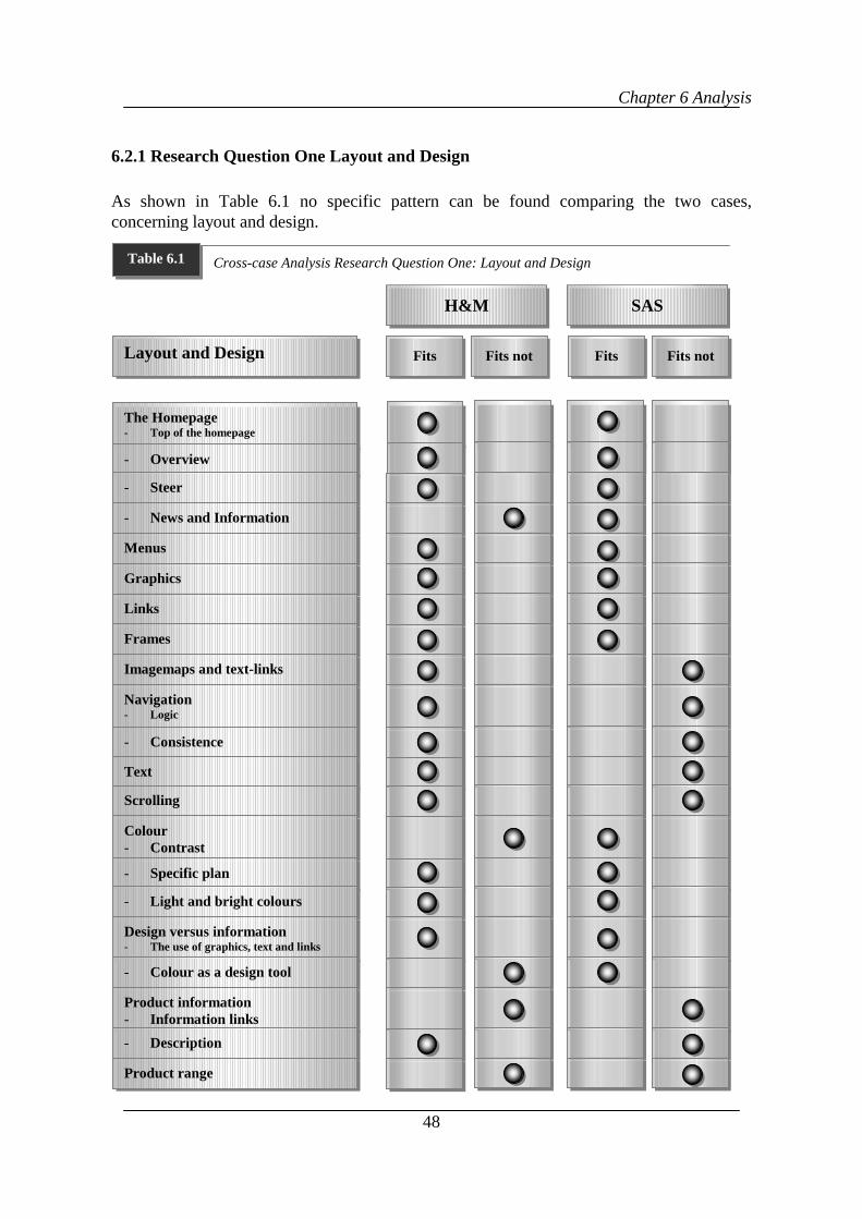
Chapter 6 Analysis
48
6.2.1 Research Question One Layout and Design
As shown in Table 6.1 no specific pattern can be found comparing the two cases,concerning layout and design.
Layout and Design
The Homepage- Top of the homepage
- Overview
- Steer
- News and Information
Menus
Graphics
Links
Frames
Imagemaps and text-links
Navigation- Logic
- Consistence
Text
Scrolling
Colour- Contrast
- Specific plan
- Light and bright colours
Design versus information- The use of graphics, text and links
- Colour as a design tool
Product information- Information links
- Description
Product range
H&M
Fits Fits not
SAS
Fits Fits not
Cross-case Analysis Research Question One: Layout and DesignTable 6.1
Chapter 6 Analysis
49
By comparing the companies it is shown that they contain some similarities concerningtheir purchase environment. The homepages on both sites provide an overview of thecontent of the site. They both use the most visible part, the thirty square inch on the top ofthe page in the same way, where both pages present the main menu. At the homepages bothcompanies take advantage of the ability to assess the visitor by giving them a choice ofdifferent entries to choose from. This is however done in a quite different way. Whilst theH&M homepage is more visible with graphics the SAS homepage is built up with text topresent the message.
Other similarities are the quick download of graphics and frames, this is especially truewithin the H&M site where more graphics are used. Menus are used in a similar way,mainly through frames and as indices at both sites. However the use of links is used in aslightly different way at the two sites. At the H&M site links are often used along withgraphics, while at the SAS site they can mainly be found in blocks of text. In the matter ofdesign versus information neither of the companies has overdesigned the site concerninggraphics, texts and links. The way H&M has used trendy colours such as light grey andwhite gets in the way the information. This is not the case with SAS all colours are ofsufficient brightness as well as in line with the company colour scheme.
Both companies Websites provide product information. On the H&M’s site the products aredescribed in an extensive way with information about size, colour, price and washinginstructions. Although descriptive and good product information is provided at H&M’ sitethey have got a confusing way of using links within the product information. Sometimeslinks are provided from the product information to the actual purchase place and sometimesnot. This is something that can be seen at the SAS’s site as well. SAS on the other hand hasa less extensive and creative way of describing their products. There is information aboutin-flight services such as meals, drinks entertainment etc., but it cannot be found any furtherinformation of the service. The information about the travel itself is not extensive. To reachspecific information such as prices or information about specific travels the visitor has tohave a traveller ID and a password. Compared to H&M this information is very poor andhard to find.
H&M’s product range is considerably smaller than in regular stores. Further it is difficult tocompare the supply between the two companies since it is hard to determine how big supplyof products SAS has got, it is however more extensive than what H&m presents. Thisimplies that SAS puts a bigger emphasis on the business online than H&M. Also theirmarketing efforts shows this where SAS frequently refers to their business online whilstH&M less carries this message in their advertising.
News and information are posted at the homepage at the SAS site, this is not the case at theH&M site where it requires to open several files to reach the information. H&M usesimagemaps accompanying with text-links. This is not the case at the SAS site. Overall SAShave been using imagemaps in a very sparsely manner.
The navigation of these Websites is not easy in both cases. In fact, the H&M site is the onethat presents the best navigation and structure. The SAS site is complicated since it buries
Chapter 6 Analysis
50
information beneath too many layers of menus, nor does it have constant navigation aids,which can take the surfer to any place within the site from anywhere. For instance the logois not clickable in all the parts of the site whereas in the H&M site has this helpful item.Nor are there any problems within the H&M site to understand and follow the navigationpattern. They even have a site pilot that makes navigation easier. Extensive amount of textis provided at the SAS site. To find information it requires time to read in order to get hintswhere to go and what links to follow. H&M on the other hand present information by usingfewer words and more pictures.
Both sites require more or less scrolling. At some pages at the SAS site they have presenteda lot of information and does not use the entire screen when posting it on the pages, whichleads to long documents that require lots of scrolling in order to see all of it. Further a lot oftext is presented at many of the pages, including the homepage, at the SAS site. Eventhough it requires less scrolling within the H&M site it is sometimes frustrating to scroll thesmall parts to see the entire page, especially since the use of only a small part of the screen.For example when there is a need to scroll only an inch in order to see the entire part of thescreen.
Both companies use light and bright colours that goes in the line with the companies’advertisements and the colours used in the traditional stores. When it comes to colourcontrast SAS uses a good balance between the colour of the text and the colour of thebackground. In contrast to H&M that uses colours that tend to run into each other. Bothcompanies use graphics, links and text in a good way so they do not take advantage of thehigh visibility and the overview of a page.
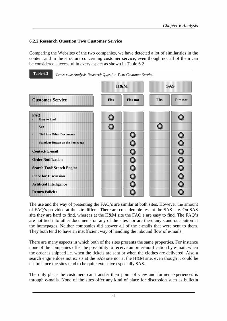
Chapter 6 Analysis
51
6.2.2 Research Question Two Customer Service
Comparing the Websites of the two companies, we have detected a lot of similarities in thecontent and in the structure concerning customer service, even though not all of them canbe considered successful in every aspect as shown in Table 6.2
The use and the way of presenting the FAQ’s are similar at both sites. However the amountof FAQ’s provided at the site differs. There are considerable less at the SAS site. On SASsite they are hard to find, whereas at the H&M site the FAQ’s are easy to find. The FAQ’sare not tied into other documents on any of the sites nor are there any stand-out-button atthe homepages. Neither companies did answer all of the e-mails that were sent to them.They both tend to have an insufficient way of handling the inbound flow of e-mails.
There are many aspects in which both of the sites presents the same properties. For instancenone of the companies offer the possibility to receive an order-notification by e-mail, whenthe order is shipped i.e. when the tickets are sent or when the clothes are delivered. Also asearch engine does not exists at the SAS site nor at the H&M site, even though it could beuseful since the sites tend to be quite extensive especially SAS.
The only place the customers can transfer their point of view and former experiences isthrough e-mails. None of the sites offer any kind of place for discussion such as bulletin
Customer Service
FAQ- Easy to Find-
- Use
- Tied into Other Documents
- Standout-Button on the homepage
Contact/ E-mail
Order Notification
Search Tool/ Search Engine
Place for Discussion
Artificial Intelligence
Return Policies
H&M
Fits Fits not
SAS
Fits Fits not
Cross-case Analysis Research Question Two: Customer ServiceTable 6.2
Chapter 6 Analysis
52
board or online chat. It is a useful way of improving their customer knowledge by takingpart of the customers’ point of view. Artificial Intelligence is not accessible on any of thesites.
On the H&M site there is information about return polices but it does not say how to do toif wanting to return a garment. It only tells how to do if wrong size or the wrong garmenthave been received. At the SAS site is information provided about the directions that gowith the ticket, but there is no information about how to cancel a ticket online.
Chapter 7 Conclusions
53
7 Conclusions
n this chapter, considering the analysis of all the data, the research questions can beanswered as a means to conclude this study. In the end of this chapter we will givesome implications for management, theory and future research.
The promise of electronic commerce and online shopping will depend to a great extentupon the interface of how people interact with the computer. When describing the creationof an online shopping environment, a high quality Web experience for the benefit of boththe customer and the merchant, we think that some conclusions can be drawn by mainlylook on aspects such as the product information, and how to navigate the site. This alongwith the extent of customer service provided should describe the shopping environment onthe Internet. What follows are the conclusions we drew from this investigation on thesubject.
7.1 Research Question One; How Can Layout and Design of Websites as aPurchasing Environment be Described?
Our conclusions concerning our first research question is that the investigated companieslack some important issues in the layout and design of their Websites.
The reason might be that the e-commerce business is more attractive to service companiesthan to regular companies when judging by the extent of the product range and thewillingness to perform online. Aspects such as entertainment and customer support feelvery important when looking at the purchase environment. Not at least with services. Theway products can be presented, which is given a taste of within the H&M site, isstimulating, both in a layout and service aspect. However when the navigation is difficultfor the visitor it becomes an insuperable obstacle for the visitor. Our finding pointed in thedirection that these aspects have not in any case reached perfection. Maybe the fact that oneof the companies, H&M, is more sensitive to fashion and design made them go one stepfurther in their way of creating creative new ways of presenting their products. The servicecompany that is in an even greater need to present their products, since they cannot be seen,has done this very poorly. Again we would like to stress the fact that the navigation isimperative to the customer. If the customer can find its way around nothing else will matter.Our findings that this was executed so poorly with to big well-known companies were verysurprising.
The online shopping environment does not contain of shelves and a store floor. Instead ithas links, menus, graphics and frames. These items are used for navigation within a site. Onthe investigated Websites the consistence in the in the navigation and the logic pattern inthe infrastructure, such as burying information under many layers of menus has a negativeimpact on the purchase environment. Depending on how well the layout and design of aWebsite is performed, the navigation becomes easier and helps the customers not to getlost.
I
Chapter 7 Conclusions
54
If a poor use of colour contrast are used at a Website, it will get away of the visibility if theinformation. This is very important to have in mind since the information is a highlyimportant part of the purchase environment online since if the visitor cannot read theinformation on the Website the information is useless. When presenting extensive amountof information it is important to present it in a well-structured manner such as menus,imagemaps, indices, and links, not through descriptive text.
On the Internet the product information replaces the product itself. Our findings suggestthat it require a whole new way of thinking. It opens possibilities to present products in away that is not possible in traditional stores. Therefore it is important to take advantage ofthe possibilities such as presenting how to use the product, not only state the technicalspecifications, as well as doing it in an entertaining way. The Internet opens creative waysto present information so it should not only be applied on traditional products it should alsobe applied when describing services.
7.2 Research Question Two; How is Customer Service Handled Online?
Tweney (1998) stated that anyone who has used the Internet to purchase retail items knowsthat customer service is poor, if not non-existent on the majority of commerce sites. Ourconclusions have to be that we agree. The customer service online is not handled in themost efficient and creative way. The Internet opens many doors to creative ways ofhandling customer service and we believe that companies do not take advantage of this. TheInternet offers the possibility for a company to interact with the customer in a way thatcannot be found in magazines or catalogues or even in traditional stores. Further does theInternet enables the opportunity to reach the customer in an individual and relaxed way. Ifusing any customer service tools online it is important to execute them in a appropriatemanner, i.e. as answering e-mails and provide information such as how to reach thecompany and company information. In general can be said that it is not a problem forcompanies to provide company information online for the benefit of the customer, themajor problem seems to be the difficulty to make the information visible and easy to find.Also dealing with new procedures and technology such as answering e-mail and makingFAQ’s really useful by linking them to other pages within the site seems to create troublefor the companies.
The result of the e-mail response testing showed that the customer service activity at bothcompanies was not completely acceptable. This indicates the poverty of customer serviceonline. This is supported by the fact that same eight investigated issues out of ten did notagree with the previous studies made in this area. Most of the companies that have apresence on the Internet are there for the customers. Therefore it is of highly importance toprovide a high quality of customer service, which cannot be said about the investigatedcompanies’ customer service online.
Frequently Asked Questions, FAQ’s, is of good use for the customer and for maximal usethey should be tied into other documents at the site. As our study showed the companies useFAQ’s to provide customer service, but in the way the FAQ’s are presented they do not
Chapter 7 Conclusions
55
fulfil their purpose. If they are not carried out well there is no point in providing them at theWebsite since most customers will either pick up the phone and call the company in orderto get the information or they will leave the Website. An extensive site requires and reallysuffers without a search engine. A search engine simplifies the navigation and is of goodhelp when looking for something special. FAQ’s and a search engine should be optimal andrepresented at all extensive and large Websites.
7.3 Implications
The conclusions drawn in the past section of this thesis can be useful for, theorist,managers, and researchers.
7.3.1 Implications for Management
Managers from companies that attempt to use the Internet as a commercial store should takethe use of FAQ’s into consideration by tying them into other documents in the site as wellas posting a stand-out-button on the homepage. It is also a good idea to provide all theFAQ’s together and divide them into different sections depending of the information theycontain. The management should also strongly consider adding a search engine whenoperating on extensive Websites or planning to expand the existent site. Today does notmany companies online use Artificial Intelligence. This is however an extent way ofhelping the customers and should be considered as an alternative for the Website by morecompanies. Though they should be aware of the complications of using ArtificialIntelligence in a highly frequently used site. We also recommend all companies that have apresence on the Internet to look over the use of colours and how the navigation functionswithin a Website.
7.3.2 Implications for Theory
This thesis covers a new area of research when observing the purchase environment onlinedirectly on Websites. Since this area of research is relatively new we have relied oncollected data from the Websites of each company in order to conduct our research.
This study contributed to theory, in the fact that it offers an observation of phenomenonwithin a specific setting. Previous research about purchase environments has provided uswith literature from which we have formed our research questions. These research questionsserve as a foundation for our case studies when trying to describe the purchase environmenton the World Wide Web.
Chapter 7 Conclusions
56
7.3.3 Implications for Further Research
• Investigate the differences in-between service companies and retail companies in theway they operate on the Internet.
• Examine the possibility of using Artificial intelligence as well as other ways ofinteractivity within commercial Websites.
• Investigate how to ensure a safety delivery/arrival of a product that is already paid foronline.
• Explore the safety in payment and personal information over the Internet.
• Examine the possibility of effective purchase stimulation.
• To further investigate how to treat customers in an individual way online.
57
References
Abbot, J. (1998) Online in one week. Catalog Age; New Canaan; Apr 1.
Abramson. J., Hollingshead. C. (19XX) Marketing on the Internet; Providing ConsumerSatisfaction.
Benassi, K., Flaherty, T, B., Honeycutt, E, D. (1998). Marketing Industrial Products on theInternet. Industrial Marketing Management. No. 27, p. 63-72.
Berthon, P., Pitt, L; F., and Watson, R,T. (1996). The World Wide Web as an advertisingmedium: Toward an understanding of conversion efficiency. Journal of AdvertisingResearch, Jan/Feb, Vol. 36 Issue 1, p43.
Briones, M. (1998). Customer Service the Key to Online Relationship. Marketing News.Chicago, Vol. 32, No. 24.
Brown, S. (1996). Break through customer service, John Wiley & Son Canada Ltd.
Brännbäck, M. (1997). Is the Internet changing the dominant logic of marketing?,European Management Journal, Dec97, Vol. 15 Issue 6, p698.
Burke, R. R. (1997). Do you see what I see The future of virtual shopping” Journal of theAcademy of Marketing Science. Vol. 25 Issue 4, p352.
Carlsson, B. (1991) Kvalitativa forskningsmetoder för medicin och beteendevetenskap. 1uppl. - Solna : Almqvist & Wiksell
Cleaver. (1999). Playtime’s Over Marketing news, April 26.
Cole-Gomolski, B., Sliwa. C. (1999) Return policies irk online shoppers Framingham;Computerworld; Jan 25
Collins, S (1998) Doing Business on the Internet, Kogan Page Limitid, London
Dahmström, K. (1991) Från datainsamling till rapport : att göra en statistisk undersökning /Lund : Studentlitteratur
Duncan, Hollander, and Savitt. Modern retailing management. Basic concepts and cases.(1983) imin, inc Homewood, Illinois 60430.
Eighmey, J., McCord, L. (1998) Adding value in the information age: Uses andgratifications of sites on the world wide web. Journal of business research 41, 187-194.
Eriksson. L. T., Wiedersheim-Paul. F. (1997) Att utreda, forska och rapportera. Liber AB.Upplaga 5:2.
58
Flanders, V., Willis, M.; (1998) Web Pages That Suck: learn good design by looking at baddesign. Sybex Inc. Almeda California
Frankling, C (1994) Selling Internet access. VAR Business
Ghobadian, A., Speller, A., Jones, M. (1994) Service Quality Concepts and Models.International Journal of Quality & Reliablility Management, Vol 11, No 9.
Ghosh, S. (1998) To asses the risks and opportunities you need to know what’s possible.Harvard business review. Mar/Apr, Vol. 76 Issue 2, p126.
Gifford, R. (1997) Environmental psychology: principles and practice. 2nd ed.
Greengard, S. (1997). Components of a frequently visited site; Workforce; Costa Mesa;
Heckman, (1998). Gateways to the global market, Consumers and electronic commerce.
Hoffman, D. L., Novak,T. P., (1996) A New Marketing Paradigm for ElectronicCommerce, Information Society, Jan-Mar97, Vol. 13 Issue 1.
Horton, W., Taylor, L., Ignacio, A., Hoft, N. The Web page design cookbook: all theingredients you need to create 5-star Web pages. New York : Wiley, cop. 1996
Jakobsson, P. (1995). Internet i marknadföringen & marknadskommunikationen.Studentlitteratur, Lund)
Karpinski, R. (1999) Customer Service Gets Online Boost. Internetweek; Manhasset
Kotha, S. (1998). Competing on the Internet: The Case of Amazon.com. EuropeanManagement Journal, Apr, Vol. 16 Issue 2, p212.
Kotler, P., Armstrong, G. (1996) Principles of marketing. Prentice-Hall, Inc .EnglewoodCliffs, NJ 07632
Lewis, B. (1999) Help for your website. Midrange Systems; Spring House
Lohse, G. L., Spiller, P. (1998) Association for computing Machinery. Communications ofthe ACM; New York; jul
Lynch, P., Horton, S. (1999) “Web Style Guide- Basic Design Principles for creating websites” Yale University, USA
Machlis, S. (1997) E-commerce (equals) E-returns Computerworld; Dec 22
Moore, D., Paciorek, N., Wong, D. (1999) Java-based mobile agents; Association forComputing Machinery. Communications of the ACM; New York; Mar 1999;
59
Orenstein, D. (1999) ‘Human touch' crucial to Internet retailers' success; Computerworld;Framingham; Jan 25.
Patel, R., Davidson, B. (1991). Forskningsmetodikens grunder : att planera, genomföra ochrapportera en undersökning, Lund : Studentlitteratur.
Rayport, J. F., Sviokla, J. J. (1994) Managing in the marketspace. Harvard Business review,november-december. Nov/Dec, Vol. 72 Issue 6, p141.
Sharples, H. (1999) On-line shopping flourishes. Graphic Arts Monthly; Newton.
Solmon. M. R., Askegaard. S., (1999) Consumer behaviour : a european perspective, 4thed.- New York : Prentice Hall, 1999
Spooner, N. (1997). Is my Web page effective? Management Today; London
Stout, R. (1997) “Web Site stats- Tracking Hits and Analyzing traffic” Osborne/McGraw-Hill Berkley, Californina U.S.A
Tweney, D. (1998) Online retailers: You can’t compete on customer service; InfoWorld;Framingham; Nov 9, 1998;
Williams, C. (1997) Chief Executive; New York; Jan/Feb 1997
Wilde, C. (1997). Do-it-yourself service. Information Week, No. 659
Yin, R. K. (1994) Case study research : design and methods 2nd ed. - Thousand Oaks, CA :Sage, cop.
Zikmund, W. (1994) Exploring marketing research 5. ed. - Fort Worth : Dryden Press, cop.
Anonymus. (1997) Customized ceilings add to environment Chain Store Age: New YorkJuly.
Internet
www.delphi.com
http://www.forrester.com/
http://www2000.ogsm.vanderbilt.edu/novak/new.marketing.paradigm.html
http://www.techreview.com/articles/oct98/nielsen.htm
Thonemann, H. (1999). An introduction to electronic commerce. European Commission.http://www.ispo.cec.be/ecommerce/introduc.html.
60
http://www.ergogero.com/FAQ/Part5/cfaqPart5.html
http://www.lava.net/~colorcom/entercolormatters.html
Other
Veckans affärer number 43, (1999) p. 49
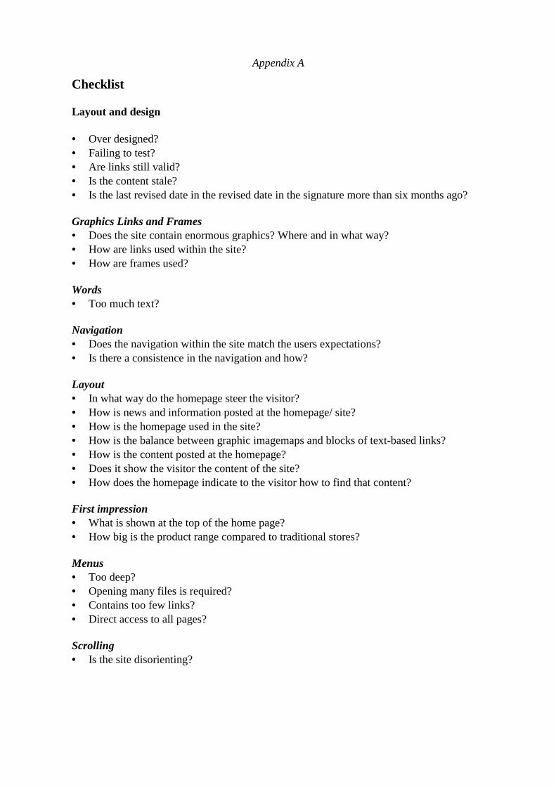
Appendix A
Checklist
Layout and design
• Over designed?• Failing to test?• Are links still valid?• Is the content stale?• Is the last revised date in the revised date in the signature more than six months ago? Graphics Links and Frames• Does the site contain enormous graphics? Where and in what way?• How are links used within the site?• How are frames used? Words• Too much text? Navigation• Does the navigation within the site match the users expectations?• Is there a consistence in the navigation and how? Layout• In what way do the homepage steer the visitor?• How is news and information posted at the homepage/ site?• How is the homepage used in the site?• How is the balance between graphic imagemaps and blocks of text-based links?• How is the content posted at the homepage?• Does it show the visitor the content of the site?• How does the homepage indicate to the visitor how to find that content? First impression• What is shown at the top of the home page?• How big is the product range compared to traditional stores? Menus• Too deep?• Opening many files is required?• Contains too few links?• Direct access to all pages? Scrolling• Is the site disorienting?
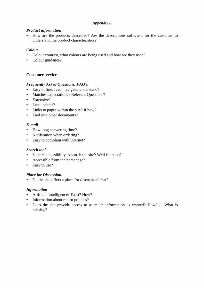
Appendix A
Product information• How are the products described? Are the descriptions sufficient for the customer to
understand the product characteristics?
Colour• Colour contrast, what colours are being used and how are they used?• Colour guidance?
Customer service Frequently Asked Questions, FAQ’s• Easy to find, read, navigate, understand?• Matches expectations / Relevant Questions?• Extensive?• Last updates?• Links to pages within the site? If how?• Tied into other documents? E-mail• How long answering time?• Notification when ordering?• Easy to complain with Internet?
Search tool• Is there a possibility to search the site? Well function?• Accessible from the homepage?• Easy to use? Place for Discussion.• Do the site offers a place for discussion/ chat? Information• Artificial intelligence? Exist? How?• Information about return policies?• Does the site provide access to as much information as wanted? How? / What is
missing?
Appendix B
Internet Glossary
ARPANET: Advanced Research Projects Agency Network: The precursor to the Internet.Developed in the late 60’s and early 70’s by the US Department of Defence as anexperiment in wide-area-networking that would survive a nuclear war.
Computer: A machine that takes information from a person, does something wit theinformation and then gives information back to the person.
Browser: A software program used to navigate through WWW pages stored at the Internet.
Click: When pushing the mouse button with the cursor over an item of interest.
Cursor: A marker on the screen that shows where keystrokes will appear.
Cyberspace: Term originated by author William Gibson in his novel Neuromancer theword Cyberspace is currently used to describe the whole range of information resourcesavailable through computer networks.
Download: The transfer of information from the Internet to a computer.
Electronic commerce, e-commerce: An exchange of values over interconnected networksi.e. business-to-customer commerce.
E-mail: Electronic mail: message sent over the Internet. The biggest use of the Internet is tosend Electronic mail. You can send messages to any other user on the Internet if you knowthe users address.
Frequently Asked Questions FAQ: document of often asked questions and answers.
Frame: A frame is the stripe that frames a page and which follows the visitor through allpages though out the site. They can contain pictures and text to menus.
Gopher: An (older) menu-based system that lets you navigate the Internet; has now beenmostly replaced by the WWW.
Home page: The opening page of a Website. The initial page on a WWW server, a wordwide Web welcome document.
HTML Hyper Text Markup Language: standard set of codes that describe formattingfunctions for Web pages including which text is bold, italic, different sizes and how theylink to other Web pages.
HTTP Hypertext transfer protocol: the language used by a browser to ask an Internet serverfor information about a Web page.
Appendix B
Internet: Millions of computers linked together to form a global network allowing users totransfer information between any two computers connected to the Internet. No one orperson or company controls the Internet.
Link: A link will transport you from one Internet site to another with just a click of yourmouse. Links can be text or graphic (imagemap) and are recognisable once you know whatto look for. Text links usually will be underlined and often a different colour than the rest ofthe text on your screen. A graphic link usually has a frame around it. For example at thebottom of this page the mailbox is a link as well as the text in the yellow boxes.
Load: Short for download and upload. If someone asks how long did the page take to load?He/ she is referring to the time it takes a page to appear on your screen. If a Web page isloading slowly it means that it’s taking a long time to fully appear on your screen. You canoften scroll through a page and look at the parts that have loaded while the rest of the pagecontinues to load. Also, you can usually click a link on the page you are loading and link toanother page without waiting for the current page to fully load.
Marketspace: The online retail environment.
Network: Any time you connect 2 or more computers together so that they can shareresources, you have a computer network. Connect 2 or more networks together and youhave an Internet
Non-store retailing: Retailing handled over the Internet.
Online: Having access to the Internet. You are online right now. Often people will say theyare online meaning they have access to the Internet and have an e-mail address, but may notnecessarily be connected to the Internet at that moment.
Online shopping: Shopping at the Internet.
Screen: A device to display information.
Scroll: To look at the parts of the page that fall below (or above) what you see on yourscreen. The long bar at the far right of this screen is a scroll bar. The small square in it willallow you to scroll through the rest of this page. Just place your mouse pointer over thesquare, hold down the left click button on the mouse and slide the square up or down. Youwill see this page move. You are now scrolling.
Search engine/ search tool: Search Engines are the automated card catalogues of the Web.Completely automated, Search Engines keep huge files with short catalogue entries ofliterally millions of Websites. Then, when you want to find information on "Cable TV usein Dallas" or "Printer Cartridge Suppliers," the search engines do their best to make a list ofall the catalogue entries that might be what you’re looking for.
Appendix B
Server: The communication system used by the WWW is often called a connection-lessclient-server relationship because a request is sent, a response returned and the connectionis then broken.
Surfing: The process of "looking around" the Internet.
TCP/IP Transmission Control Protocols/ Internet protocols: a set of communicationsprotocols developed by the US Department of Defence (DOD), originally for use in militaryapplications. TCP/IP bundles and unbundled sent and received data into packets, managespacket transmission and checks for errors across networks. Originally found binding Unixnetworks together.
URL Uniform resource locator: the full address that defines where a Web page is stored ona server connected to the Internet. The Web page address of a site.
Web page: Single file stored on a Web server that contains formatted text, graphics andhypertext links to other pages on the Internet. A Web page is created using HTML codes.
Web server: Computer that stores the collection of Web pages that make up a Website.
Website: Collection of Web pages from one person or company that link together withhypertext links to form a home that users can visit on the Internet.
WWW: World Wide Web: the collection of the millions of Websites and Web pages thattogether form the Web of information that allows a user to see a graphical view of theInternet and the information it contains.
Sources:Collin, S. (1998) Doing business on the Internet; 2nd edition: London, Great Britainhttp://www.onelook.com/http://www.matisse.net/files/glossary.htmlhttp://www.jaderiver.com/glossary.htmhttp://www.geocities.com/FashionAvenue/4869/desc.html