Embed Size (px)
Citation preview
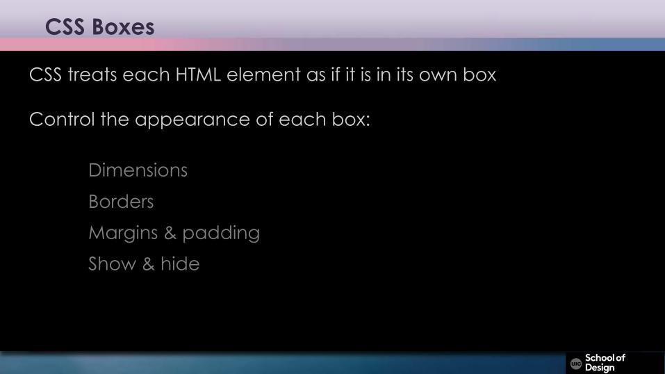
CSS Boxes
CSS treats each HTML element as if it is in its own box
Control the appearance of each box:
DimensionsBordersMargins & padding Show & hide
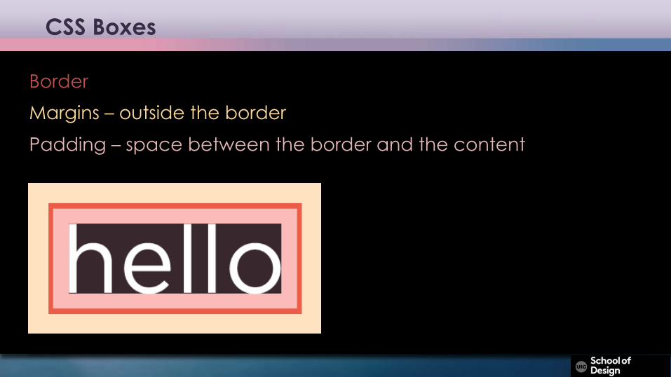
CSS Boxes
BorderMargins – outside the borderPadding – space between the border and the content
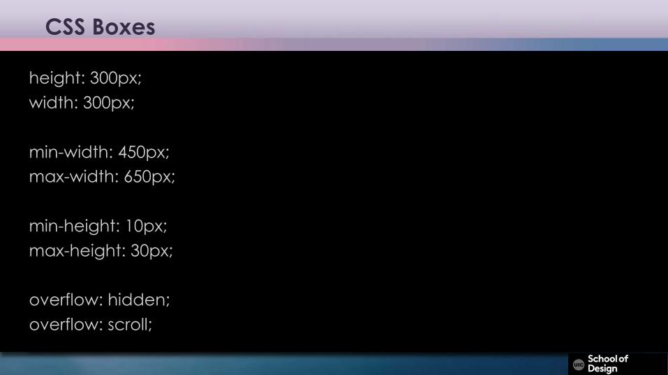
CSS Boxes
height: 300px;width: 300px;
min-width: 450px; max-width: 650px;
min-height: 10px;max-height: 30px;
overflow: hidden;overflow: scroll;
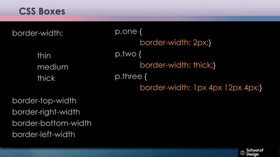
CSS Boxes
border-width:
thinmediumthick
border-top-width border-right-width border-bottom-width border-left-width
p.one {border-width: 2px;}
p.two {border-width: thick;}
p.three {border-width: 1px 4px 12px 4px;}
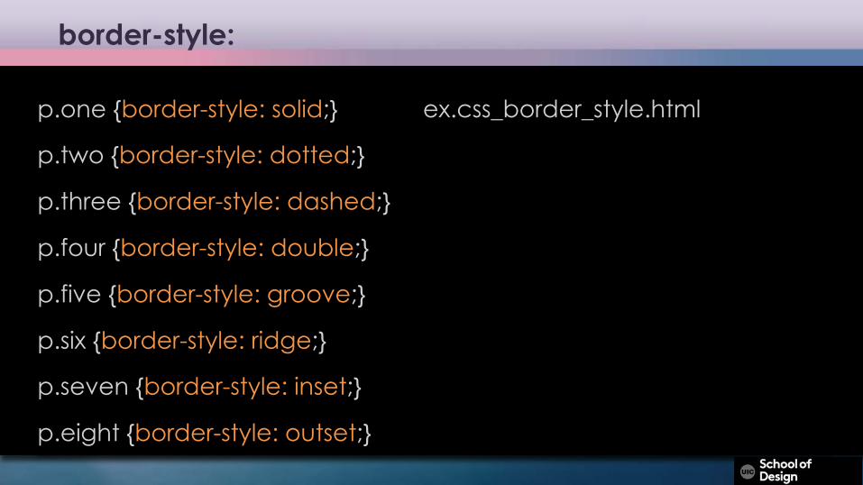
border-style:
p.one {border-style: solid;} ex.css_border_style.html
p.two {border-style: dotted;}
p.three {border-style: dashed;}
p.four {border-style: double;}
p.five {border-style: groove;}
p.six {border-style: ridge;}
p.seven {border-style: inset;}
p.eight {border-style: outset;}
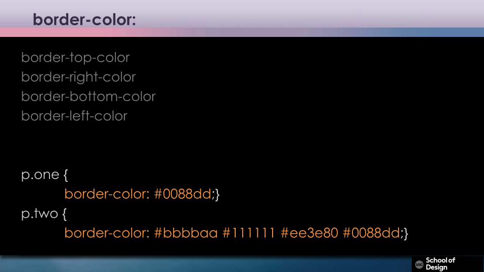
border-color:
border-top-color border-right-color border-bottom-color border-left-color
p.one {border-color: #0088dd;}
p.two {border-color: #bbbbaa #111111 #ee3e80 #0088dd;}
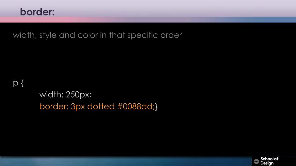
border:
width, style and color in that specific order
p {width: 250px;border: 3px dotted #0088dd;}
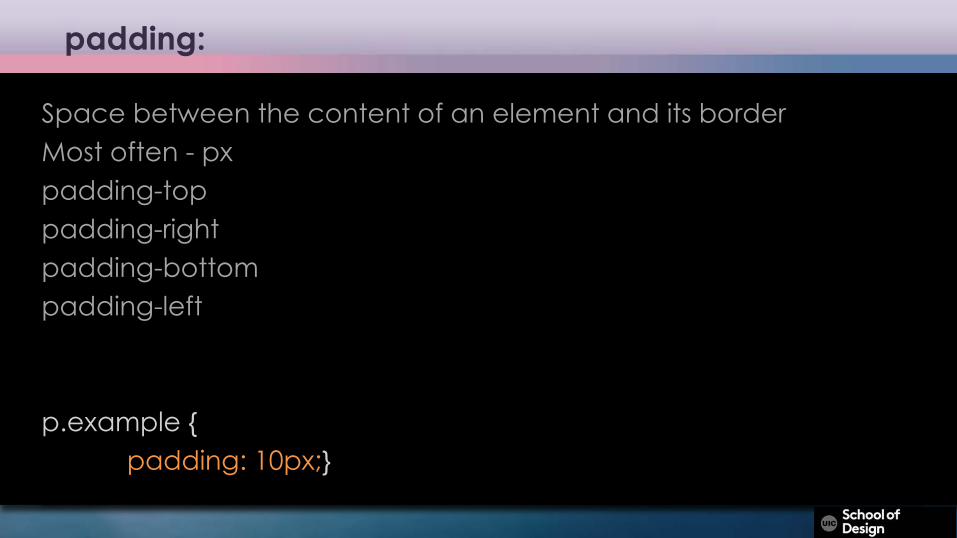
padding:
Space between the content of an element and its borderMost often - pxpadding-top padding-right padding-bottom padding-left
p.example {padding: 10px;}
margin:
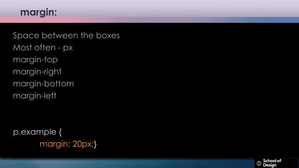
Space between the boxesMost often - pxmargin-top margin-right margin-bottom margin-left
p.example {margin: 20px;}
margin:
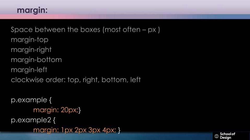
Space between the boxes (most often – px )margin-top margin-right margin-bottom margin-leftclockwise order: top, right, bottom, left
p.example {margin: 20px;}
p.example2 {margin: 1px 2px 3px 4px; }
Centering boxes
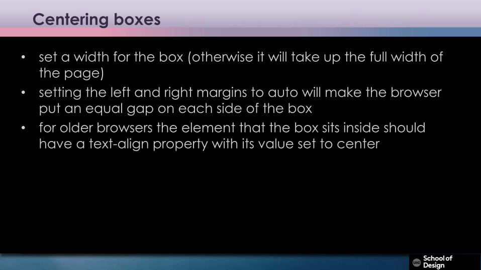
• set a width for the box (otherwise it will take up the full width of the page)
• setting the left and right margins to auto will make the browser put an equal gap on each side of the box
• for older browsers the element that the box sits inside should have a text-align property with its value set to center
display:
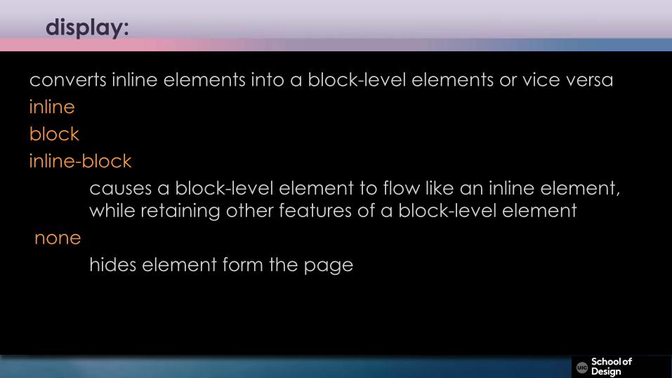
converts inline elements into a block-level elements or vice versa inlineblockinline-block
causes a block-level element to flow like an inline element, while retaining other features of a block-level element
nonehides element form the page
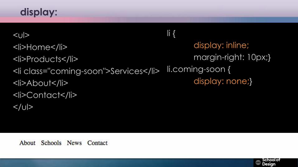
display:
<ul><li>Home</li><li>Products</li><li class="coming-soon">Services</li><li>About</li><li>Contact</li></ul>
li {display: inline;margin-right: 10px;}
li.coming-soon {display: none;}
display:
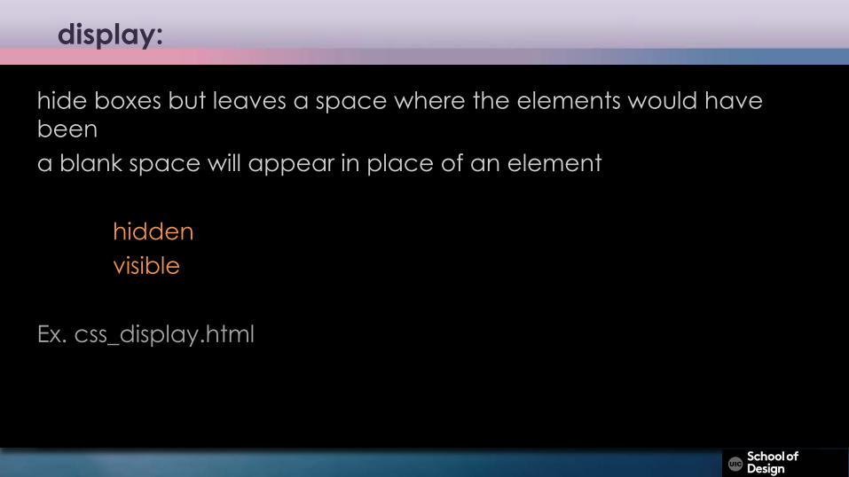
hide boxes but leaves a space where the elements would have beena blank space will appear in place of an element
hiddenvisible
Ex. css_display.html
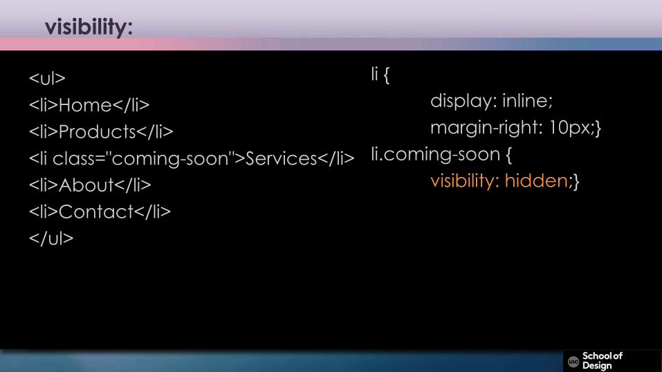
visibility:
<ul><li>Home</li><li>Products</li><li class="coming-soon">Services</li><li>About</li><li>Contact</li></ul>
li {display: inline;margin-right: 10px;}
li.coming-soon {visibility: hidden;}
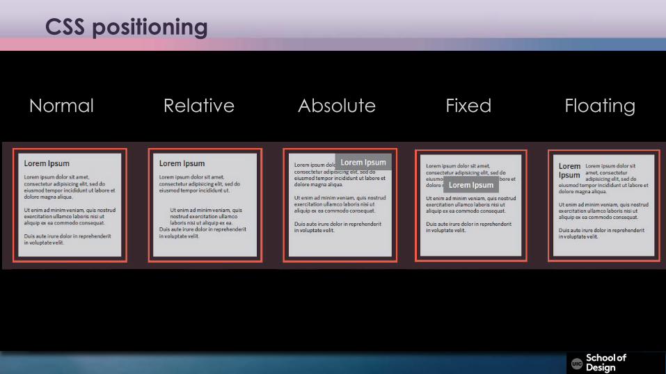
CSS positioning
Normal Relative Absolute Fixed Floating
CSS positioning
normal flow (static)• Every block-level element appears on a new line, causing each
item to appear lower down the page than the previous one –default
position: static;relative positioning• A relative positioned element is positioned relative to its normal
position• does not affect the position of surrounding elements; they stay in
the position they would be in in normal flowposition: relative;
CSS positioning
absolute positioning• An absolute position element is positioned relative to the first parent
element that has a position other than static. If no such element is found, the containing block is <html>
• Removed from the normal flow• The document and other elements behave like the absolutely
positioned element does not exist• can overlap other elements
position: absolute;• Due to the way different mobile browsers treat the viewport, fixed
positioning can be somewhat unreliable
CSS positioning
fixed positioning• An element with fixed position is positioned relative to the browser
window• will not move even if the window is scrolled
position: fixed;floating elements • Floated element is taken out of normal flow and positioned• it to the far left or right of a containing box• other content can flow around
float: right;
CSS positioning
floating elements • Floated element is taken out of normal flow and positioned• it to the far left or right of a containing box• other content can flow around
float: right;
Ex. css_float.html
CSS positioning
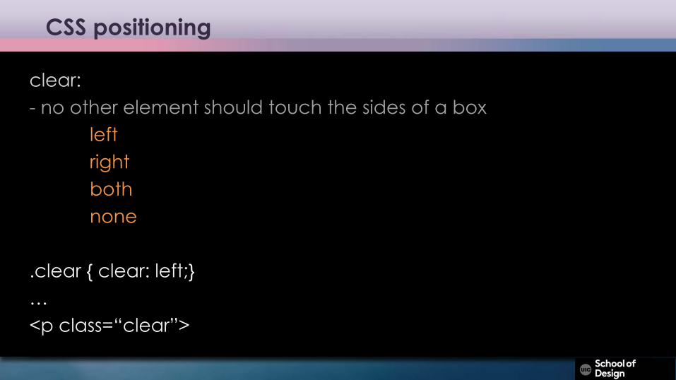
clear:- no other element should touch the sides of a box
leftrightbothnone
.clear { clear: left;}…<p class=“clear”>
CSS positioning
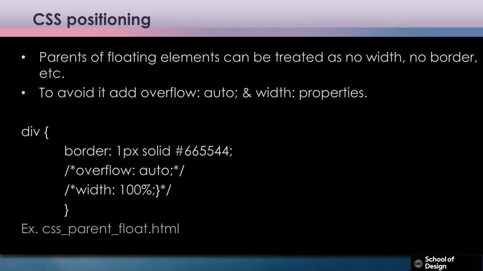
• Parents of floating elements can be treated as no width, no border, etc.
• To avoid it add overflow: auto; & width: properties.
div {border: 1px solid #665544;/*overflow: auto;*//*width: 100%;}*/}
Ex. css_parent_float.html
Multiple columns with <div> and floats
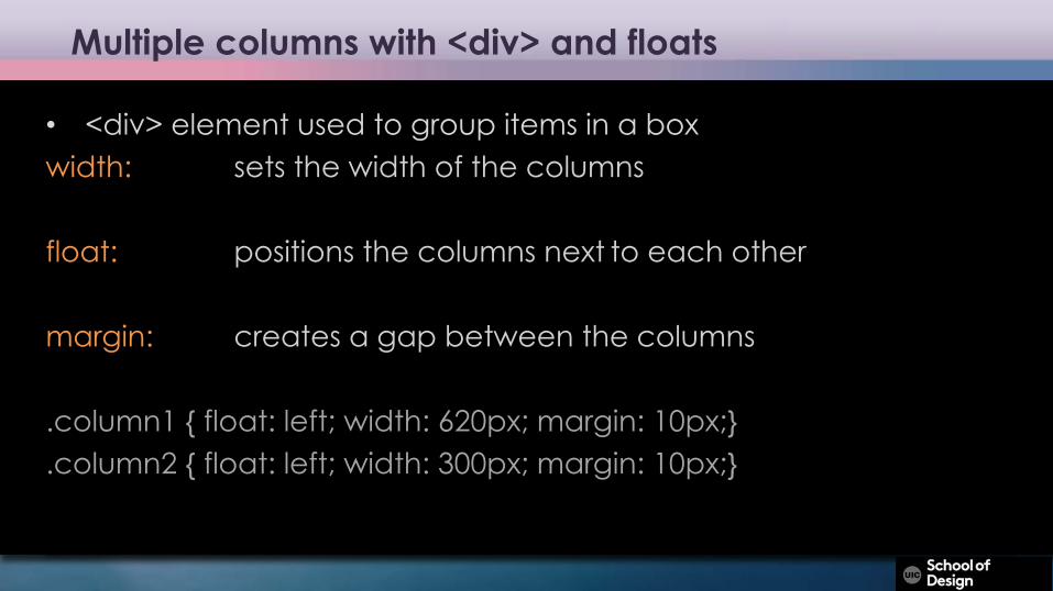
• <div> element used to group items in a boxwidth: sets the width of the columns
float: positions the columns next to each other
margin: creates a gap between the columns
.column1 { float: left; width: 620px; margin: 10px;}
.column2 { float: left; width: 300px; margin: 10px;}
CSS Layout
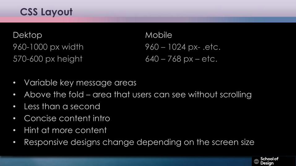
Dektop Mobile960-1000 px width 960 – 1024 px- .etc.570-600 px height 640 – 768 px – etc.
• Variable key message areas• Above the fold – area that users can see without scrolling• Less than a second• Concise content intro• Hint at more content• Responsive designs change depending on the screen size
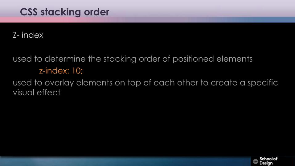
CSS stacking order
Z- index
used to determine the stacking order of positioned elementsz-index: 10;
used to overlay elements on top of each other to create a specific visual effect
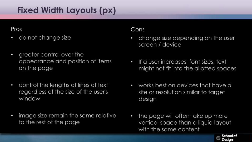
Fixed Width Layouts (px)
Pros• do not change size
• greater control over the appearance and position of items on the page
• control the lengths of lines of text regardless of the size of the user's window
• image size remain the same relative to the rest of the page
Cons• change size depending on the user
screen / device
• If a user increases font sizes, text might not fit into the allotted spaces
• works best on devices that have a site or resolution similar to target design
• the page will often take up more vertical space than a liquid layout with the same content
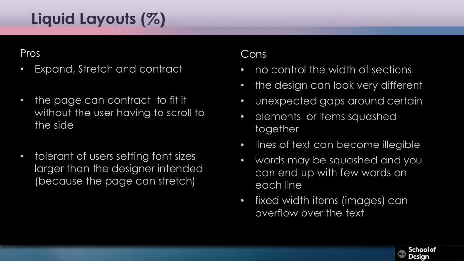
Liquid Layouts (%)
Pros• Expand, Stretch and contract
• the page can contract to fit it without the user having to scroll to the side
• tolerant of users setting font sizes larger than the designer intended (because the page can stretch)
Cons• no control the width of sections • the design can look very different • unexpected gaps around certain • elements or items squashed
together• lines of text can become illegible• words may be squashed and you
can end up with few words on each line
• fixed width items (images) can overflow over the text
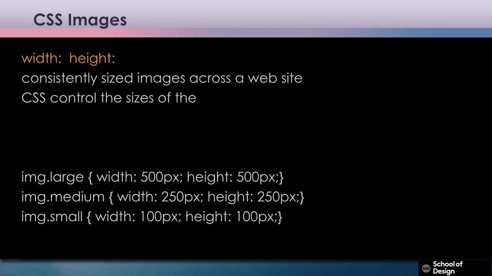
CSS Images
width: height:consistently sized images across a web siteCSS control the sizes of the
img.large { width: 500px; height: 500px;}img.medium { width: 250px; height: 250px;}img.small { width: 100px; height: 100px;}
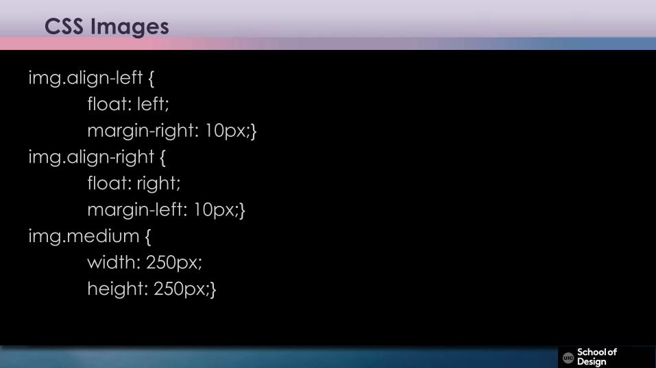
CSS Images
img.align-left {float: left;margin-right: 10px;}
img.align-right {float: right;margin-left: 10px;}
img.medium { width: 250px; height: 250px;}
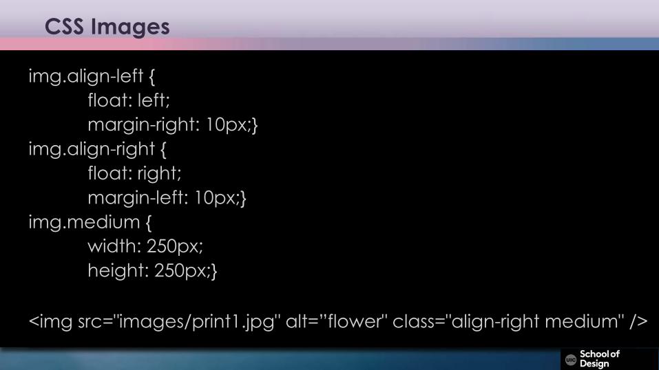
CSS Images
img.align-left {float: left;margin-right: 10px;}
img.align-right {float: right;margin-left: 10px;}
img.medium { width: 250px; height: 250px;}
<img src="images/print1.jpg" alt=”flower" class="align-right medium" />
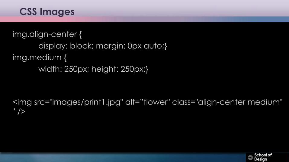
CSS Images
img.align-center { display: block; margin: 0px auto;}
img.medium { width: 250px; height: 250px;}
<img src="images/print1.jpg" alt=”flower" class="align-center medium" " />
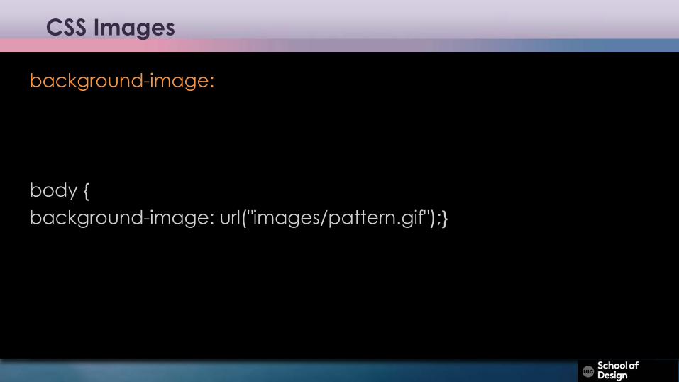
CSS Images
background-image:
body {background-image: url("images/pattern.gif");}
CSS Images
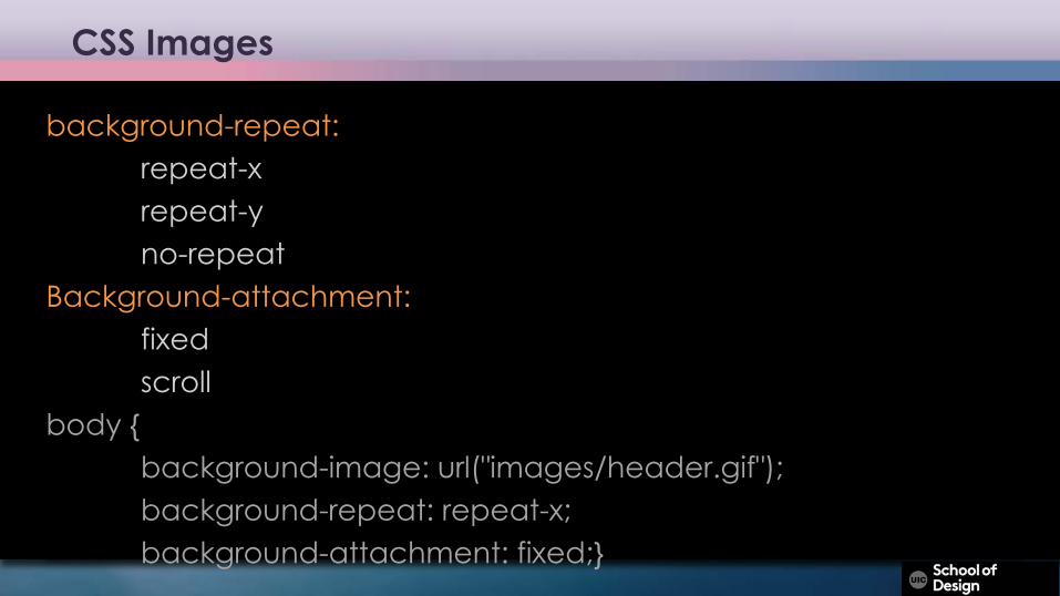
background-repeat:repeat-xrepeat-yno-repeat
Background-attachment:fixedscroll
body {background-image: url("images/header.gif");background-repeat: repeat-x;background-attachment: fixed;}
CSS Images
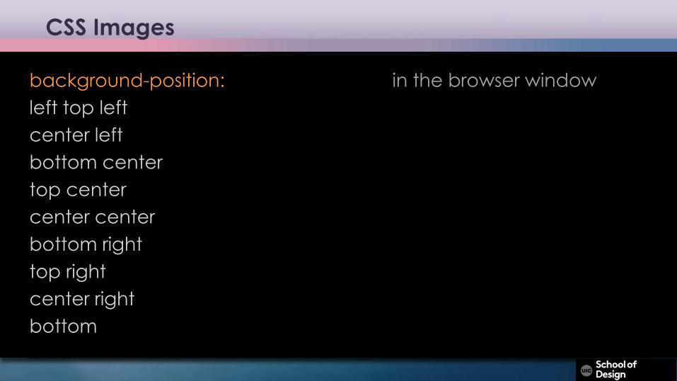
background-position: in the browser windowleft top left center left bottom center top center center center bottom right top right center rightbottom
CSS Images
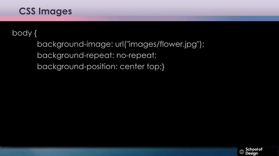
body {background-image: url("images/flower.jpg");background-repeat: no-repeat;background-position: center top;}
CSS Images
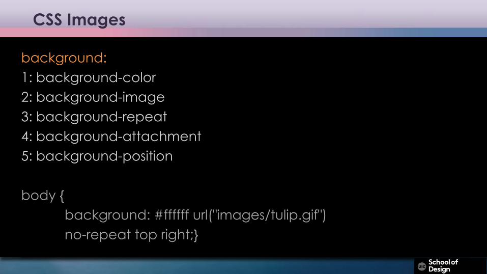
background:1: background-color2: background-image3: background-repeat4: background-attachment5: background-position
body {background: #ffffff url("images/tulip.gif")no-repeat top right;}


![表1 - Sangetsu Point 2 c.s.RÆ px-23'6—232a PX. 2328 2329 PX-2325—2327 PM. 2347—2349 PX-2316 NEW PX-2317 3,550B/m2 [4,800B/m) [6,470B/m] —nacPx-23305.-r') ... 3,550 [4,690B/m]](https://img.pdfslide.tips/doc/110x75/5abffe4a7f8b9ac6688b9dfe/1-sangetsu-point-2-csr-px-236232a-px-2328-2329-px-23252327-pm-23472349.jpg)