Embed Size (px)
Citation preview
7/23/2019 P9 Brianne Groom Portfolio
http://slidepdf.com/reader/full/p9-brianne-groom-portfolio 1/11
7/23/2019 P9 Brianne Groom Portfolio
http://slidepdf.com/reader/full/p9-brianne-groom-portfolio 2/11
Contact Information
1. Event Ad
2. Montage
3. Imaging
4. Web Page
5. Brochure
6. Flier
7. Logos
8. Business Card
9. Letterhead
Table of Contents
Brianne Groom
165 Crestview DriveRexburg Idaho, 83440
208.201.5264
7/23/2019 P9 Brianne Groom Portfolio
http://slidepdf.com/reader/full/p9-brianne-groom-portfolio 3/11
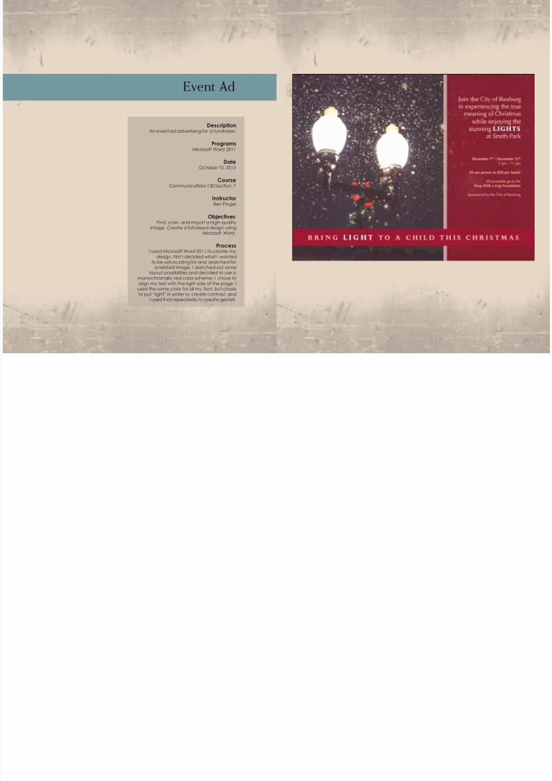
Event Ad
DescriptionAn event ad advertising for a fundraiser.
ProgramsMicrosoft Word 2011
DateOctober 10, 2015
CourseCommunications 130 Section 7
InstructorBen Pingel
ObjectivesFind, scan, and import a high-quality
image. Create a full-bleed design usingMicrosoft Word.
ProcessI used Microsoft Word 2011 to create my
design. First I decided what I wantedto be advocating for and searched for
a related image. I sketched out somelayout possibilities and decided to use a
monochromatic red color scheme. I chose to
align my text with the right side of the page. I
used the same color for all my font, but choseto put “light” in white to create contrast, and
I used that repeatedly to create gestalt.
7/23/2019 P9 Brianne Groom Portfolio
http://slidepdf.com/reader/full/p9-brianne-groom-portfolio 4/11
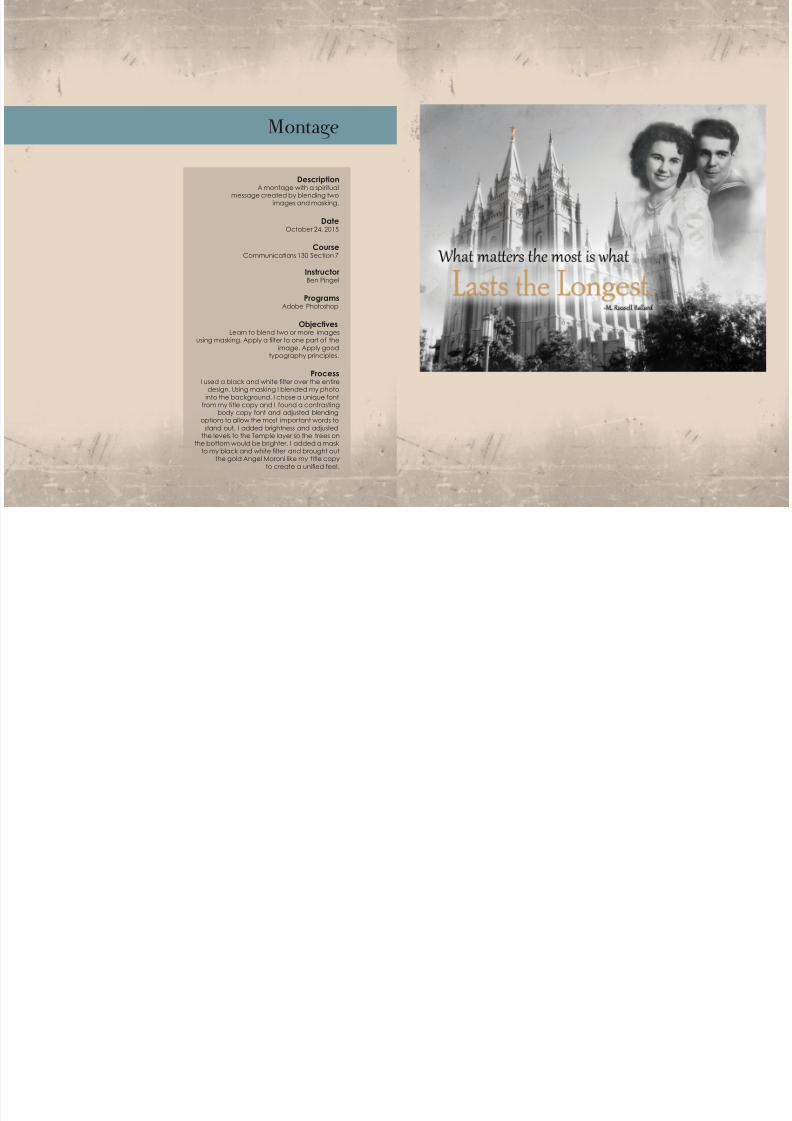
Montage
DescriptionA montage with a spiritual
message created by blending twoimages and masking.
DateOctober 24, 2015
CourseCommunications 130 Section 7
InstructorBen Pingel
ProgramsAdobe Photoshop
ObjectivesLearn to blend two or more images
using masking. Apply a lter to one part of the
image. Apply good typography principles.
ProcessI used a black and white lter over the entire
design. Using masking I blended my photo
into the background. I chose a unique fontfrom my title copy and I found a contrasting
body copy font and adjusted blendingoptions to allow the most important words to
stand out. I added brightness and adjustedthe levels to the Temple layer so the trees on
the bottom would be brighter. I added a maskto my black and white lter and brought out
the gold Angel Moroni like my title copy
to create a unied feel.
7/23/2019 P9 Brianne Groom Portfolio
http://slidepdf.com/reader/full/p9-brianne-groom-portfolio 5/11
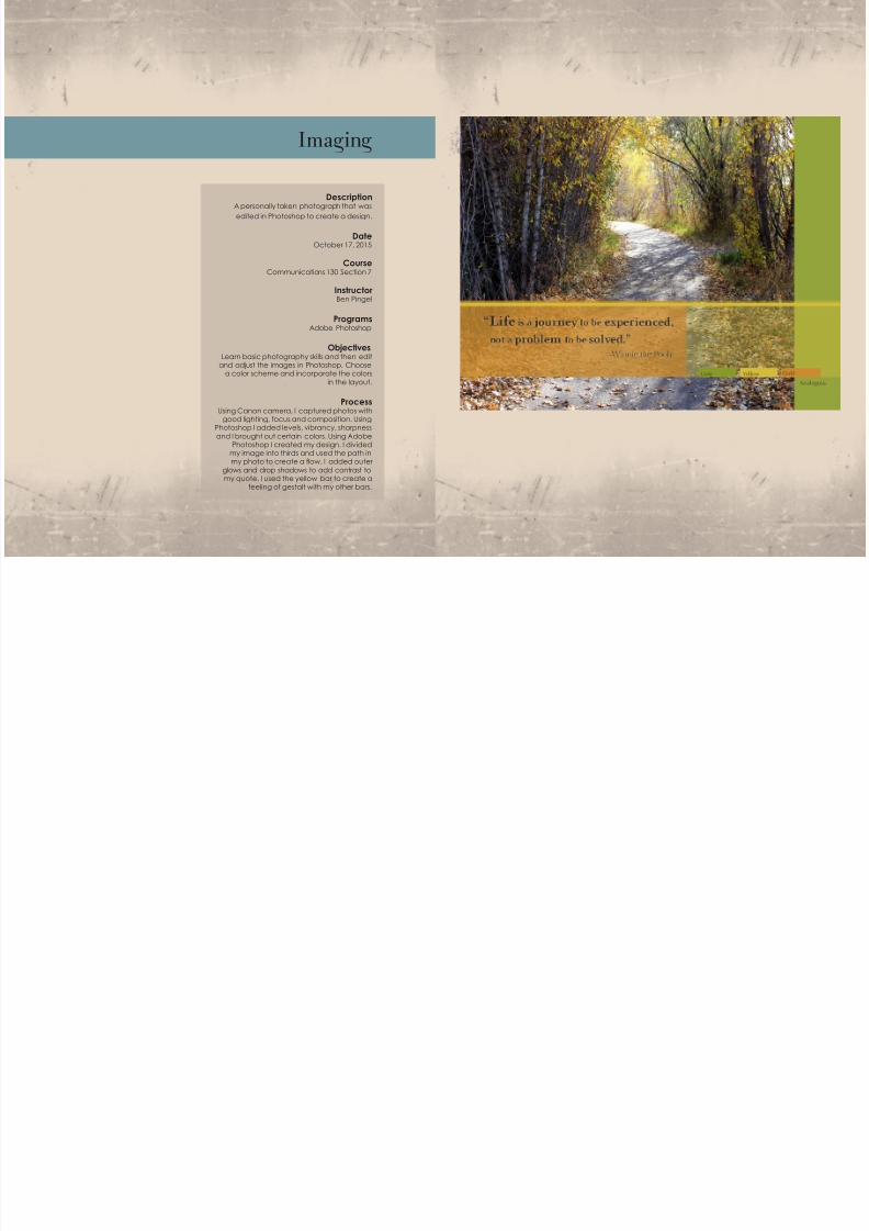
Imaging
DescriptionA personally taken photograph that was
edited in Photoshop to create a design.
DateOctober 17, 2015
CourseCommunications 130 Section 7
InstructorBen Pingel
ProgramsAdobe Photoshop
ObjectivesLearn basic photography skills and then edit
and adjust the images in Photoshop. Choosea color scheme and incorporate the colors
in the layout.
ProcessUsing Canon camera, I captured photos with
good lighting, focus and composition. UsingPhotoshop I added levels, vibrancy, sharpness
and I brought out certain colors. Using AdobePhotoshop I created my design. I divided
my image into thirds and used the path inmy photo to create a ow. I added outer
glows and drop shadows to add contrast tomy quote. I used the yellow bar to create a
feeling of gestalt with my other bars.
7/23/2019 P9 Brianne Groom Portfolio
http://slidepdf.com/reader/full/p9-brianne-groom-portfolio 6/11
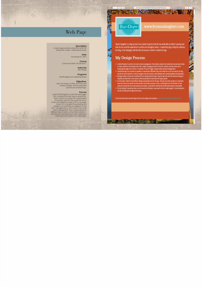
Web Page
DescriptionA web page created using HTML and CSS
along with a logo I created previously.
DateNovember 21, 2015
CourseCommunications 130 Section 7
InstructorBen Pingel
ProgramsTextWrangler and Adobe Illustrator
ObjectivesLearn the basics of HTML and CSS and
create a design that incorporates
a previously created logo.
ProcessI used TextWrangler to code this web page.
First I created the basic layout using HTML.Then I styled it up using CSS. Using Adobe
Photoshop I got the hex codes for all mycolors and resized my logo to t to my page.
Using CSS I changed the padding and
margins so everything was aligned on theleft. I changed all my font colors to be white
and to add gestalt. Then I made elementsdifferent sizes to add contrast and variation. Iplayed around positioning to add adequate
white space throughout my web page.
7/23/2019 P9 Brianne Groom Portfolio
http://slidepdf.com/reader/full/p9-brianne-groom-portfolio 7/11
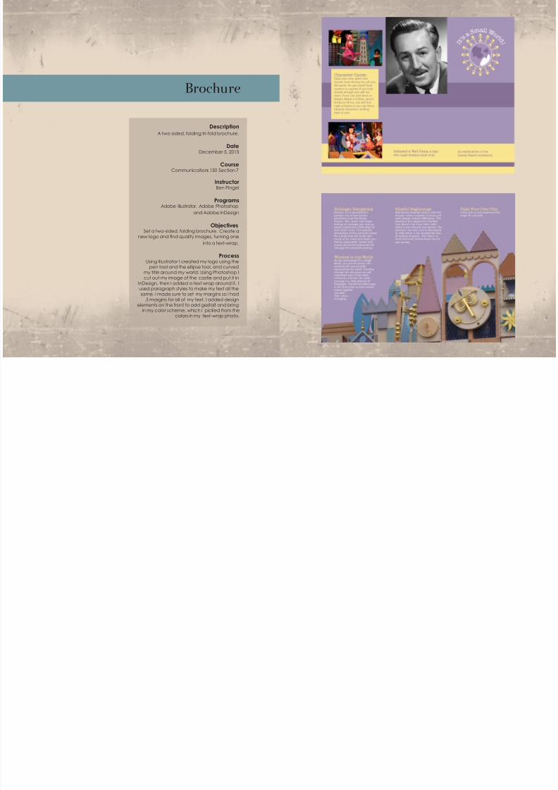
Brochure
DescriptionA two-sided, folding tri-fold brochure.
DateDecember 5, 2015
CourseCommunications 130 Section 7
InstructorBen Pingel
ProgramsAdobe Illustrator, Adobe Photoshop
and Adobe InDesign
ObjectivesSet a two-sided, folding brochure. Create a
new logo and nd quality images, turning one
into a text-wrap.
ProcessUsing Illustrator I created my logo using the
pen tool and the ellipse tool, and curvedmy title around my world. Using Photoshop I
cut out my image of the castle and put it inInDesign, then I added a text wrap around it. Iused paragraph styles to make my text all the
same. I made sure to set my margins so I had.5 margins for all of my text. I added design
elements on the front to add gestalt and bringin my color scheme, which I picked from the
colors in my text-wrap photo.
7/23/2019 P9 Brianne Groom Portfolio
http://slidepdf.com/reader/full/p9-brianne-groom-portfolio 8/11
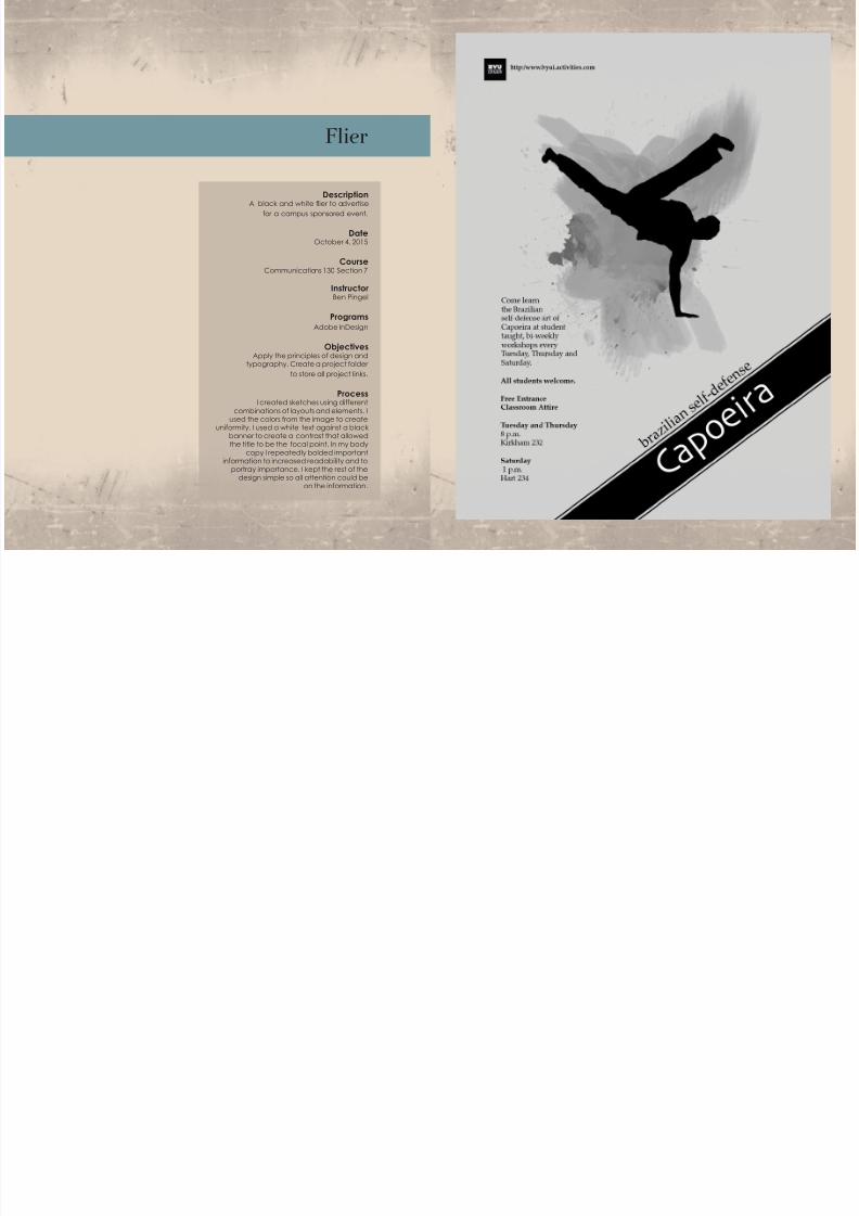
Flier
DescriptionA black and white ier to advertise
for a campus sponsored event.
DateOctober 4, 2015
CourseCommunications 130 Section 7
InstructorBen Pingel
ProgramsAdobe InDesign
ObjectivesApply the principles of design and
typography. Create a project folder
to store all project links.
ProcessI created sketches using different
combinations of layouts and elements. Iused the colors from the image to create
uniformity. I used a white text against a blackbanner to create a contrast that allowedthe title to be the focal point. In my body
copy I repeatedly bolded importantinformation to increased readability and to
portray importance. I kept the rest of thedesign simple so all attention could be
on the information.
7/23/2019 P9 Brianne Groom Portfolio
http://slidepdf.com/reader/full/p9-brianne-groom-portfolio 9/11
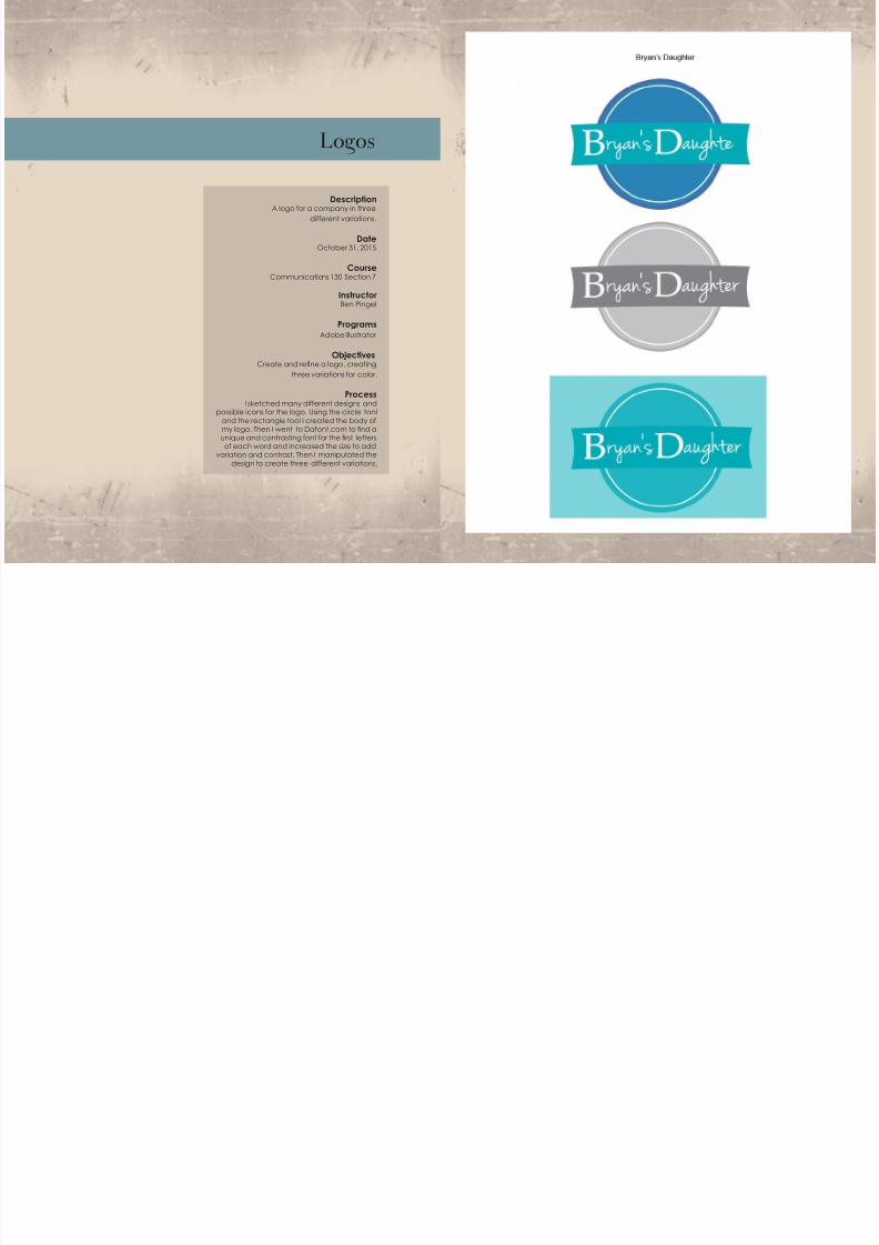
Logos
DescriptionA logo for a company in three
different variations.
DateOctober 31, 2015
CourseCommunications 130 Section 7
InstructorBen Pingel
ProgramsAdobe Illustrator
ObjectivesCreate and rene a logo, creating
three variations for color.
ProcessI sketched many different designs and
possible icons for the logo. Using the circle tool
and the rectangle tool I created the body ofmy logo. Then I went to Dafont.com to nd aunique and contrasting font for the rst lettersof each word and increased the size to add
variation and contrast. Then I manipulated the
design to create three different variations.
7/23/2019 P9 Brianne Groom Portfolio
http://slidepdf.com/reader/full/p9-brianne-groom-portfolio 10/11
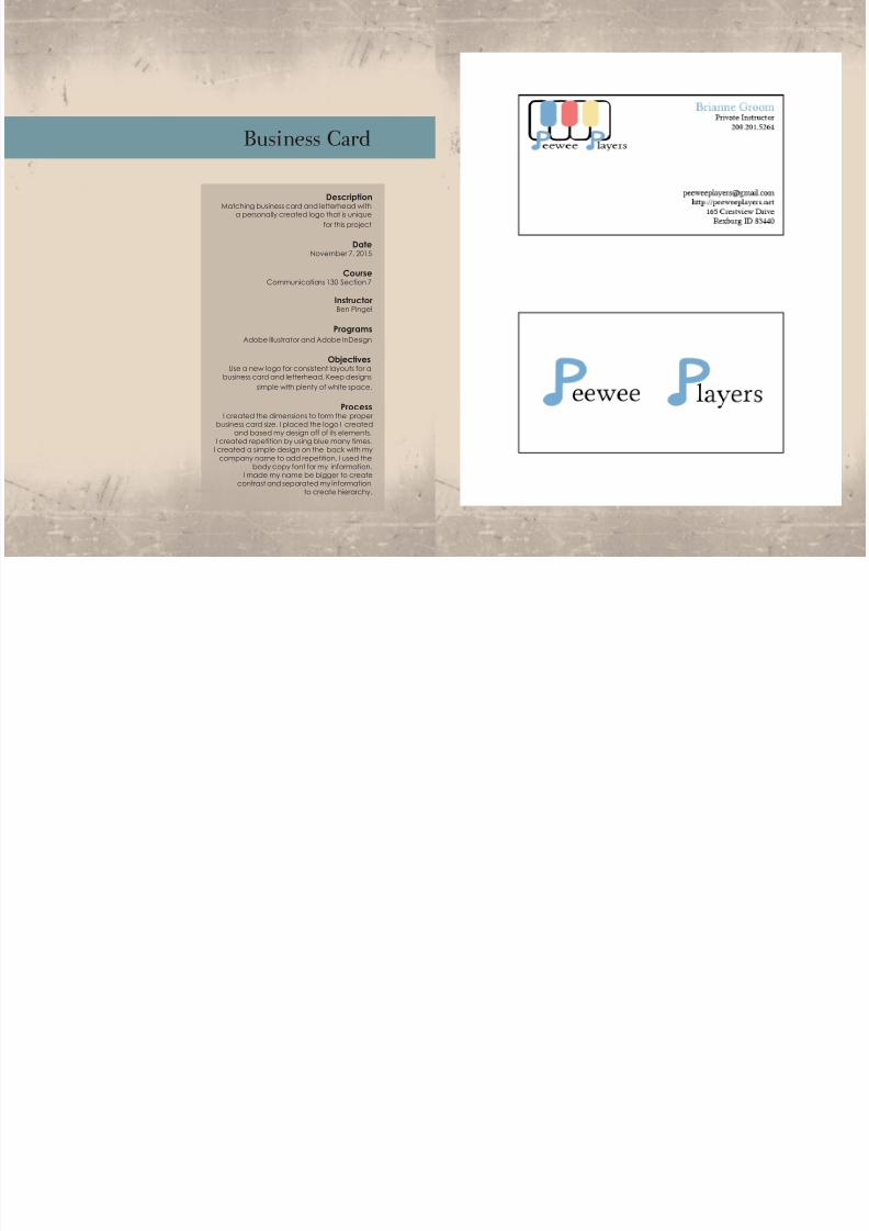
Business Card
DescriptionMatching business card and letterhead with
a personally created logo that is unique
for this project
DateNovember 7, 2015
CourseCommunications 130 Section 7
InstructorBen Pingel
ProgramsAdobe Illustrator and Adobe InDesign
ObjectivesUse a new logo for consistent layouts for a
business card and letterhead. Keep designs
simple with plenty of white space.
ProcessI created the dimensions to form the proper
business card size. I placed the logo I createdand based my design off of its elements.
I created repetition by using blue many times.I created a simple design on the back with my
company name to add repetition. I used thebody copy font for my information.
I made my name be bigger to createcontrast and separated my information
to create hierarchy.
7/23/2019 P9 Brianne Groom Portfolio
http://slidepdf.com/reader/full/p9-brianne-groom-portfolio 11/11
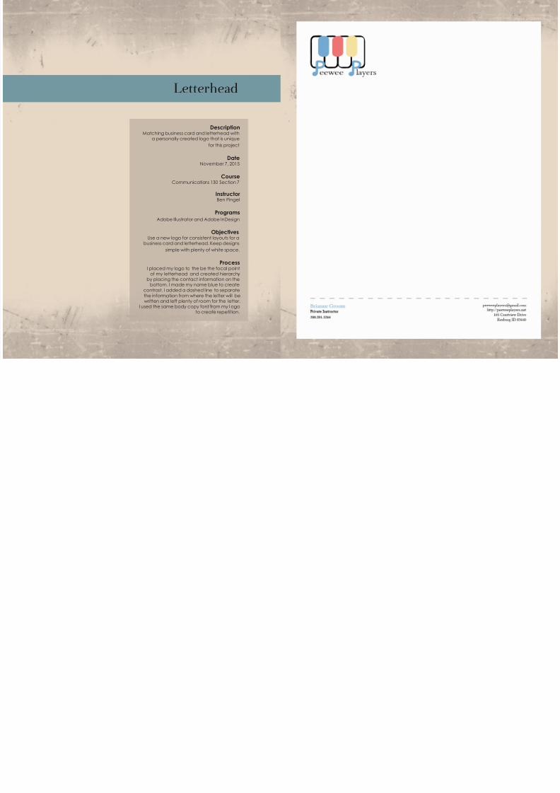
Letterhead
DescriptionMatching business card and letterhead with
a personally created logo that is unique
for this project
DateNovember 7, 2015
CourseCommunications 130 Section 7
InstructorBen Pingel
ProgramsAdobe Illustrator and Adobe InDesign
ObjectivesUse a new logo for consistent layouts for a
business card and letterhead. Keep designs
simple with plenty of white space.
ProcessI placed my logo to the be the focal point
of my letterhead and created hierarchyby placing the contact information on the
bottom. I made my name blue to createcontrast. I added a dashed line to separate
the information from where the letter will bewritten and left plenty of room for the letter.
I used the same body copy font from my l ogoto create repetition.