Embed Size (px)
Citation preview
1 | P a g e
ACCESS MONITORING REVIEW PLAN – 2016
State of Illinois
Primary Care Services
Physician Specialty Services
Home Health Services
Behavioral Health Services
Obstetrical Care Services

2 | P a g e
Table of Contents Topic Page
Overview ……………………………………………………….…………………………………….. 4
Illinois Medical Assistance Programs and Beneficiary Population....………………… 5
Beneficiary Perception of the Access to Care …………………………………………………… 7
State Regional Definitions ……………………………………………………………………………….. 10
Primary Care Services Access Monitoring Review Plan ……………………………………. 11
Availability of Providers ………………………………………………………………………. 11
Beneficiary Perception of the Access to Care………………………………………. 11
Utilization Data…………………………………………………………………………………… 13
Comparison Analysis of Payment Rates……………………………………………….. 15
Physician Specialist Services Access Monitoring Review Plan……………………………. 17
Availability of Providers………………………………………………………………………. 17
Beneficiary Perception of the Access to Care………………………………………. 19
Utilization Data…………………………………………………………………………………… 20
Comparison Analysis of Payment Rates……………………………………………….. 24
Home Health Services Access Monitoring Review Plan…………………………………….. 25
Availability of Providers………………………………………………………………………. 25
Beneficiary Perception of the Access to Care………………………………………. 26
Utilization Data…………………………………………………………………………………… 26
Comparison Analysis of Payment Rates………………………………………………. 29
Behavioral Health Services Access Monitoring Review Plan……………………………… 30
Availability of Providers………………………………………………………………………. 30
Beneficiary Perception of the Access to Care………………………………………. 32
Utilization Data…………………………………………………………………………………… 32
Comparison Analysis of Payment Rates………………………………………………. 36
3 | P a g e
Obstetrical Services………………………………………………………….………………………………. 36
Availability of Providers………………………………………………………………………. 36
Beneficiary Perception of the Access to Care………………………………………. 37
Utilization Data…………………………………………………………………………………… 38
Comparison Analysis of Payment Rates……………………………………………….. 41
4 | P a g e
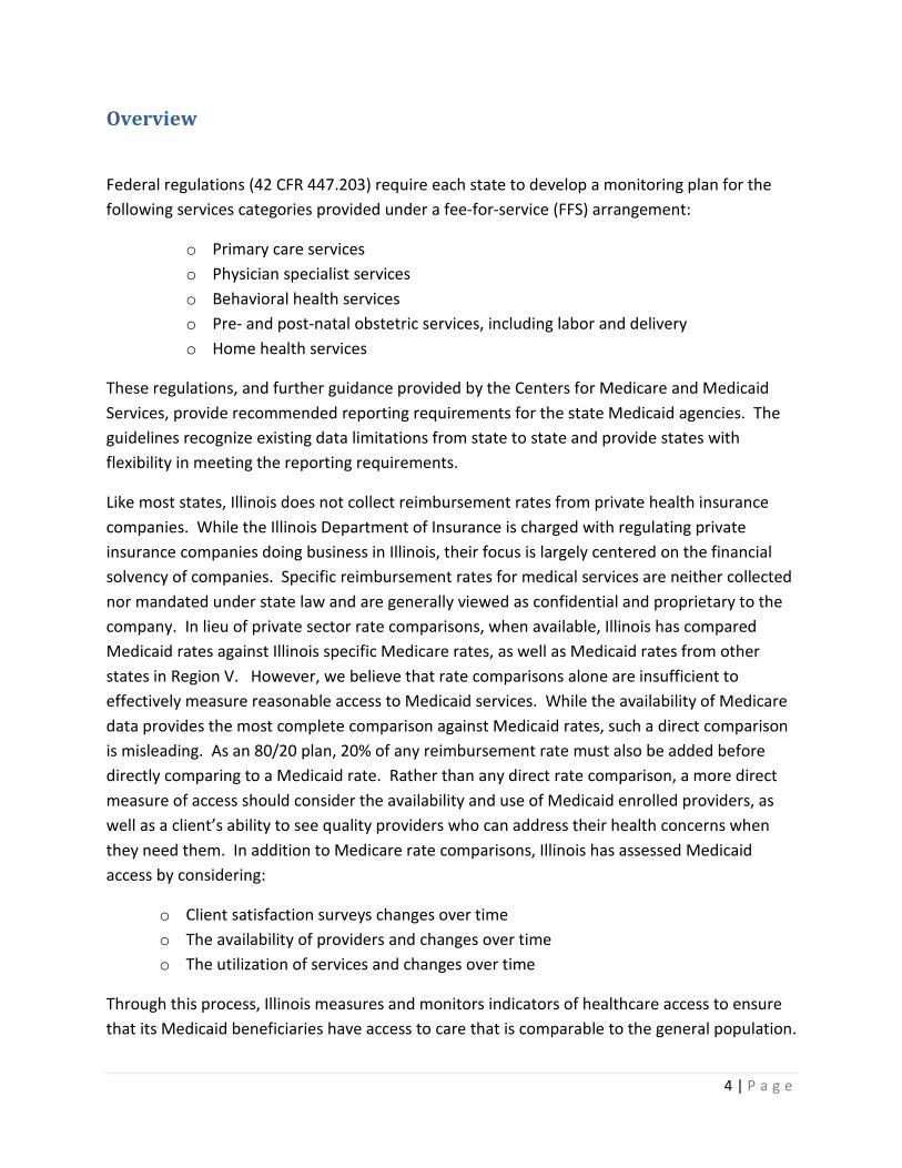
Overview
Federal regulations (42 CFR 447.203) require each state to develop a monitoring plan for the following services categories provided under a fee-for-service (FFS) arrangement:
o Primary care services o Physician specialist services o Behavioral health services o Pre- and post-natal obstetric services, including labor and delivery o Home health services
These regulations, and further guidance provided by the Centers for Medicare and Medicaid Services, provide recommended reporting requirements for the state Medicaid agencies. The guidelines recognize existing data limitations from state to state and provide states with flexibility in meeting the reporting requirements.
Like most states, Illinois does not collect reimbursement rates from private health insurance companies. While the Illinois Department of Insurance is charged with regulating private insurance companies doing business in Illinois, their focus is largely centered on the financial solvency of companies. Specific reimbursement rates for medical services are neither collected nor mandated under state law and are generally viewed as confidential and proprietary to the company. In lieu of private sector rate comparisons, when available, Illinois has compared Medicaid rates against Illinois specific Medicare rates, as well as Medicaid rates from other states in Region V. However, we believe that rate comparisons alone are insufficient to effectively measure reasonable access to Medicaid services. While the availability of Medicare data provides the most complete comparison against Medicaid rates, such a direct comparison is misleading. As an 80/20 plan, 20% of any reimbursement rate must also be added before directly comparing to a Medicaid rate. Rather than any direct rate comparison, a more direct measure of access should consider the availability and use of Medicaid enrolled providers, as well as a client’s ability to see quality providers who can address their health concerns when they need them. In addition to Medicare rate comparisons, Illinois has assessed Medicaid access by considering:
o Client satisfaction surveys changes over time o The availability of providers and changes over time o The utilization of services and changes over time
Through this process, Illinois measures and monitors indicators of healthcare access to ensure that its Medicaid beneficiaries have access to care that is comparable to the general population.
5 | P a g e
Analysis of the data and information contained in this report shows that Illinois Medicaid beneficiaries have access to healthcare that is similar to that of the general population in Illinois. This conclusion is based on the overall findings regarding a general satisfaction of clients with their providers, a general increase in enrolled providers, and most importantly, consistent client belief that they are able access needed medical care. The Department does note clients’ perception that the timeliness of accessing services has dropped from 2013 to 2015. While two points in time do not create a trend, it is an area that the Department will continue to monitor. However, the enrollment of providers remains strong. In addition, as federally required, the Department is implementing new public notice procedures that will solicit and consider provider concerns regarding any reduction in reimbursement rates.
During the 30 day comment period after publishing the Access Monitoring Review Plan on the Department’s website, comments were received from five different entities. In general, the comments were directed toward the methodology used in the development of the Access Plans. The Department followed the template and guidance that was issued by the federal government when developing the Access Monitoring Review Plan. Where appropriate, additional information has been incorporated based on the comments received.
The Department has created a web site, https://www.illinois.gov/hfs/info/AccessToCare/ for providers and beneficiaries to view the Access Plan and submit comments regarding access to care throughout the State. In addition, the Department has created a toll-free telephone number, 1-844-591-9053 that providers and beneficiaries can call to express any concerns regarding access to care. Information gathered from these mediums will be used in future access plans.
Illinois Medicaid Program and Beneficiary Population
Illinois is an above average size state, with a total population of 13 million. The State of Illinois Medicaid programs provide healthcare coverage for low-income individuals, including children, pregnant women, individuals with disabilities, elderly, parents and other adults. The Illinois Department of Healthcare and Family Services (HFS) is the single state agency that administers the Medicaid program within the state. In State fiscal year 2015, the Illinois Medicaid program provided coverage to approximately three million enrolled beneficiaries with total expenditures of approximately $17 billion. With 260 hospitals in Illinois and surrounding states and a large network of nearly 500 rural health clinics, federally qualified health centers, encounter rate clinics and hospital based clinics throughout Illinois, there are numerous options for Medicaid beneficiaries to receive healthcare.
6 | P a g e
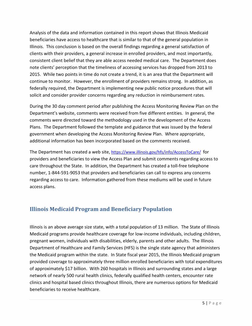
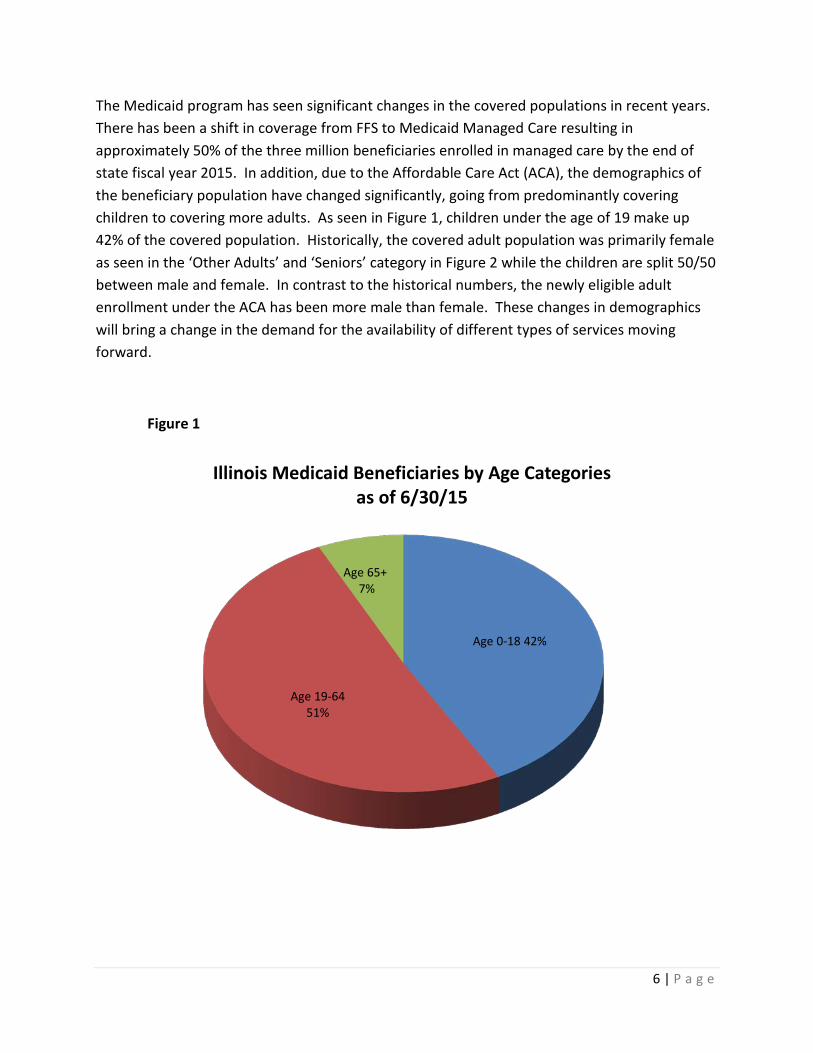
The Medicaid program has seen significant changes in the covered populations in recent years. There has been a shift in coverage from FFS to Medicaid Managed Care resulting in approximately 50% of the three million beneficiaries enrolled in managed care by the end of state fiscal year 2015. In addition, due to the Affordable Care Act (ACA), the demographics of the beneficiary population have changed significantly, going from predominantly covering children to covering more adults. As seen in Figure 1, children under the age of 19 make up 42% of the covered population. Historically, the covered adult population was primarily female as seen in the ‘Other Adults’ and ‘Seniors’ category in Figure 2 while the children are split 50/50 between male and female. In contrast to the historical numbers, the newly eligible adult enrollment under the ACA has been more male than female. These changes in demographics will bring a change in the demand for the availability of different types of services moving forward.
Figure 1
Age 0-18 42%
Age 19-64 51%
Age 65+ 7%
Illinois Medicaid Beneficiaries by Age Categories as of 6/30/15
7 | P a g e
Figure 2
Beneficiary Perceptions of Access to Care
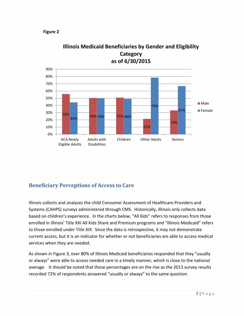
Illinois collects and analyzes the child Consumer Assessment of Healthcare Providers and Systems (CAHPS) surveys administered through CMS. Historically, Illinois only collects data based on children’s experience. In the charts below, “All Kids” refers to responses from those enrolled in Illinois’ Title XXI All Kids Share and Premium programs and “Illinois Medicaid” refers to those enrolled under Title XIX. Since the data is retrospective, it may not demonstrate current access, but it is an indicator for whether or not beneficiaries are able to access medical services when they are needed.
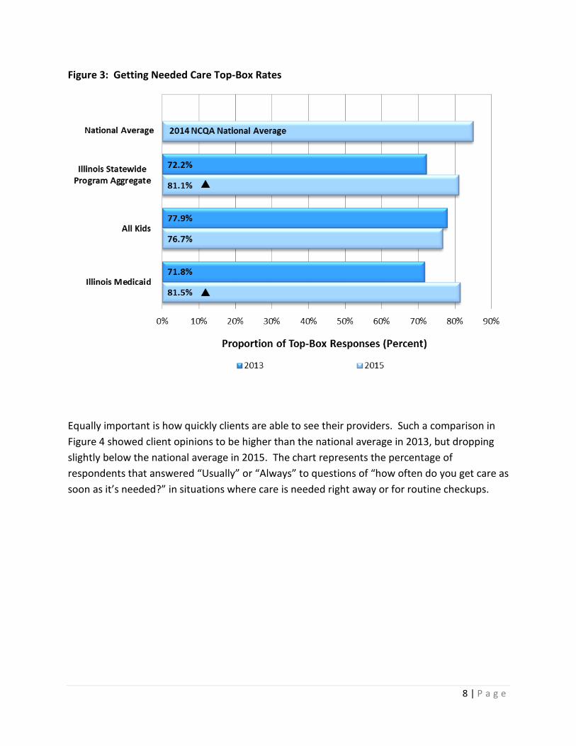
As shown in Figure 3, over 80% of Illinois Medicaid beneficiaries responded that they “usually or always” were able to access needed care in a timely manner, which is close to the national average. It should be noted that those percentages are on the rise as the 2013 survey results recorded 72% of respondents answered “usually or always” to the same question.
56% 50% 51%
21% 33%
44% 50% 49%
79% 67%
0%
10%
20%
30%
40%
50%
60%
70%
80%
90%
ACA NewlyEligible Adults
Adults withDisabilities
Children Other Adults Seniors
Illinois Medicaid Beneficiaries by Gender and Eligibility Category
as of 6/30/2015
Male
Female
8 | P a g e
Figure 3: Getting Needed Care Top-Box Rates
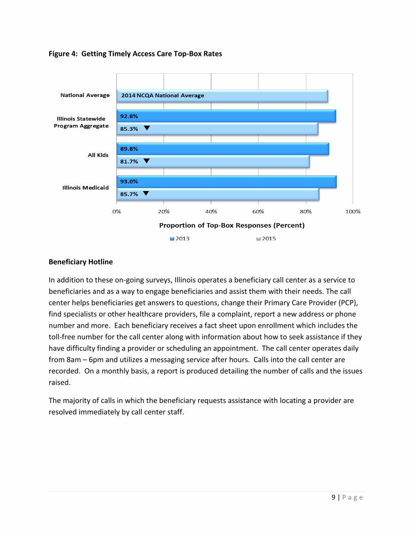
Equally important is how quickly clients are able to see their providers. Such a comparison in Figure 4 showed client opinions to be higher than the national average in 2013, but dropping slightly below the national average in 2015. The chart represents the percentage of respondents that answered “Usually” or “Always” to questions of “how often do you get care as soon as it’s needed?” in situations where care is needed right away or for routine checkups.
9 | P a g e
Figure 4: Getting Timely Access Care Top-Box Rates
Beneficiary Hotline
In addition to these on-going surveys, Illinois operates a beneficiary call center as a service to beneficiaries and as a way to engage beneficiaries and assist them with their needs. The call center helps beneficiaries get answers to questions, change their Primary Care Provider (PCP), find specialists or other healthcare providers, file a complaint, report a new address or phone number and more. Each beneficiary receives a fact sheet upon enrollment which includes the toll-free number for the call center along with information about how to seek assistance if they have difficulty finding a provider or scheduling an appointment. The call center operates daily from 8am – 6pm and utilizes a messaging service after hours. Calls into the call center are recorded. On a monthly basis, a report is produced detailing the number of calls and the issues raised.
The majority of calls in which the beneficiary requests assistance with locating a provider are resolved immediately by call center staff.
10 | P a g e
Regional Definitions
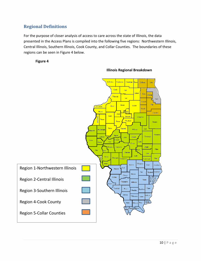
For the purpose of closer analysis of access to care across the state of Illinois, the data presented in the Access Plans is compiled into the following five regions: Northwestern Illinois, Central Illinois, Southern Illinois, Cook County, and Collar Counties. The boundaries of these regions can be seen in Figure 4 below.
Figure 4
Illinois Regional Breakdown
Region 1-Northwestern Illinois Region 2-Central Illinois Region 3-Southern Illinois Region 4-Cook County Region 5-Collar Counties

11 | P a g e
Primary Care Services
Availability of Primary Care Providers
Statewide, there are over 8,700 primary care providers enrolled as physicians, clinics, and dentists with the Department to provide services under the Medicaid program. From 2013 to 2015, the overall statewide number of primary care providers has increased by 10%. Figure 5 below displays the number of providers enrolled by region of the state from state fiscal year 2013 through 2015 by geographic region. The increase in provider enrollment does not indicate access issues for primary care services.
Figure 5: Number of Enrolled Providers by Region Providers Region 2013 2014 2015 Physician Northwest 595 604 605 Central 488 480 480 Southern 257 258 246 Cook 2249 2235 2437 Collar 1289 1321 1429 Clinics* Northwest 40 42 39 Central 114 117 117 Southern 136 135 129 Cook 155 158 163 Collar 29 30 31 Dentists Northwest 216 237 263 Central 226 239 261 Southern 172 183 199 Cook 1470 1605 1702 Collar 539 602 633 *Clinics include Rural Health Clinics, FQHC’s, Encounter Rate Clinics, and Hospital based clinics. Provider count is not reflective of number of staff employed at the clinics, but rather the number of clinics.
Beneficiary Perceptions of Primary Care Services
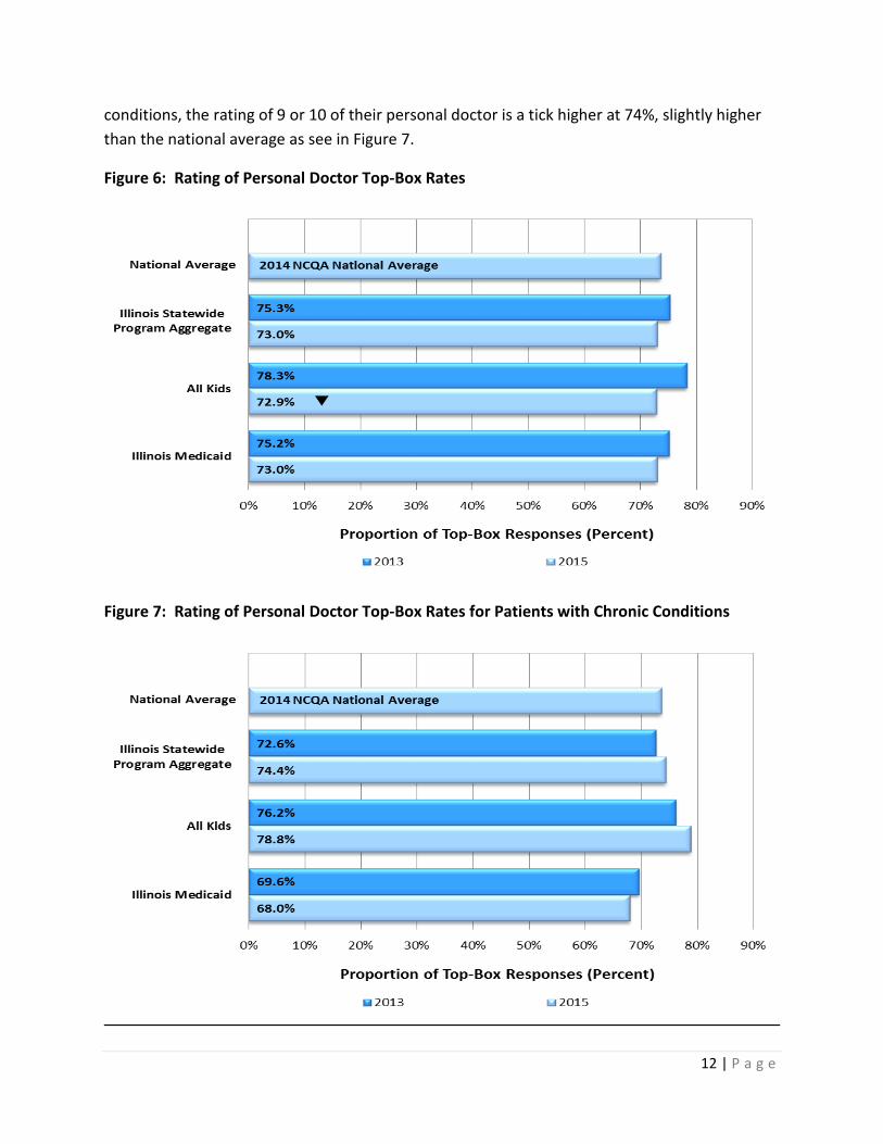
One of the areas the CAHPS survey covers is the primary care providers. Parents or caretakers of children covered by Medical Assistance programs were asked to rate their child’s personal doctor on a scale of 0 to 10, with 0 being the worst personal doctor possible and 10 being the best personal doctor possible. The top-level responses were defined as those responses with a rating of 9 or 10. As seen in Figure 6, 73% of beneficiaries were highly satisfied with their child’s personal doctor, a rate comparable to the national average. For children with chronic
12 | P a g e
conditions, the rating of 9 or 10 of their personal doctor is a tick higher at 74%, slightly higher than the national average as see in Figure 7.
Figure 6: Rating of Personal Doctor Top-Box Rates
Figure 7: Rating of Personal Doctor Top-Box Rates for Patients with Chronic Conditions

13 | P a g e
Utilization Data for Primary Care Providers
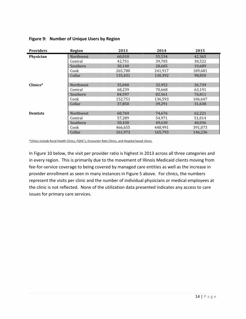
As stated in the Beneficiary Population section on page 3, the FFS enrollment has decreased dramatically from 2013 to 2015 due to the movement to enrollment into Medicaid Managed Care plans. Thus, the utilization numbers given in Figures 8 and 9 below reflect that transition as enrollment into managed care ramped up in 2014. It should be noted that while over 50% of enrollees have moved from FFS coverage to Managed Care from 2013 to 2015, the number of FFS patient visits as seen in Figure 8 has not dropped proportionately. This, as well as the increase in providers in Figure 5, can be attributed in part to the efforts of Managed Care companies to contract with providers that were not previously enrolled to provide services to Medicaid enrollees, thus broadening the Medicaid provider network. Figure 9 below shows the number of unique individuals that utilized services by type of provider within geographic regions. Dental visit data consists of initial or routine visits.
Figure 8: Number of Patient Visits by Region Providers Region 2013 2014 2015 Physician Northwest 144,366 123,607 87,383 Central 106,759 92,880 66,431 Southern 83,085 73,279 47,443 Cook 744,884 655,113 419,584 Collar 365,043 338,462 211,545 Clinics* Northwest 103,160 87,830 72,305 Central 237,383 229,362 186,136 Southern 289,899 257,946 253,102 Cook 435,765 369,671 241,042 Collar 101,343 100,761 66,368 Dentists Northwest 84,594 94,104 71,457 Central 73,053 71,486 61,868 Southern 63,312 61,733 46,381 Cook 664,301 643,539 494,655 Collar 219,897 222,944 170,956 *Clinics include Rural Health Clinics, FQHC’s, Encounter Rate Clinics, and Hospital based clinics.
14 | P a g e
Figure 9: Number of Unique Users by Region Providers Region 2013 2014 2015 Physician Northwest 60,010 55,534 42,365 Central 42,751 39,705 30,522 Southern 30,140 28,605 19,689 Cook 265,780 241,917 189,681 Collar 135,431 130,392 98,850 Clinics* Northwest 35,040 32,952 26,739 Central 68,239 70,668 63,191 Southern 84,597 82,561 76,811 Cook 152,751 136,593 106,647 Collar 37,850 39,291 31,638 Dentists Northwest 68,769 74,676 62,221 Central 57,289 54,971 51,014 Southern 50,430 49,630 40,036 Cook 466,655 448,991 391,073 Collar 161,973 165,793 146,236 *Clinics include Rural Health Clinics, FQHC’s, Encounter Rate Clinics, and Hospital based clinics.
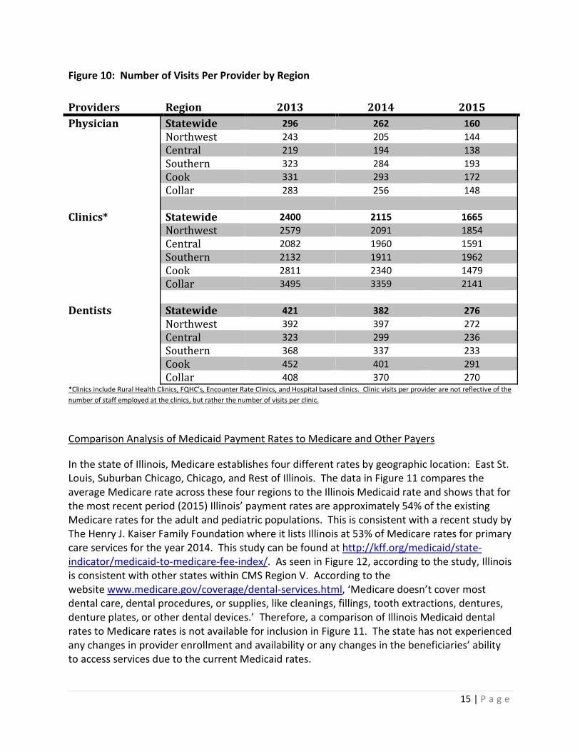
In Figure 10 below, the visit per provider ratio is highest in 2013 across all three categories and in every region. This is primarily due to the movement of Illinois Medicaid clients moving from fee-for-service coverage to being covered by managed care entities as well as the increase in provider enrollment as seen in many instances in Figure 5 above. For clinics, the numbers represent the visits per clinic and the number of individual physicians or medical employees at the clinic is not reflected. None of the utilization data presented indicates any access to care issues for primary care services.
15 | P a g e
Figure 10: Number of Visits Per Provider by Region Providers Region 2013 2014 2015 Physician Statewide 296 262 160 Northwest 243 205 144 Central 219 194 138 Southern 323 284 193 Cook 331 293 172 Collar 283 256 148 Clinics* Statewide 2400 2115 1665 Northwest 2579 2091 1854 Central 2082 1960 1591 Southern 2132 1911 1962 Cook 2811 2340 1479 Collar 3495 3359 2141 Dentists Statewide 421 382 276 Northwest 392 397 272 Central 323 299 236 Southern 368 337 233 Cook 452 401 291 Collar 408 370 270 *Clinics include Rural Health Clinics, FQHC’s, Encounter Rate Clinics, and Hospital based clinics. Clinic visits per provider are not reflective of the number of staff employed at the clinics, but rather the number of visits per clinic.
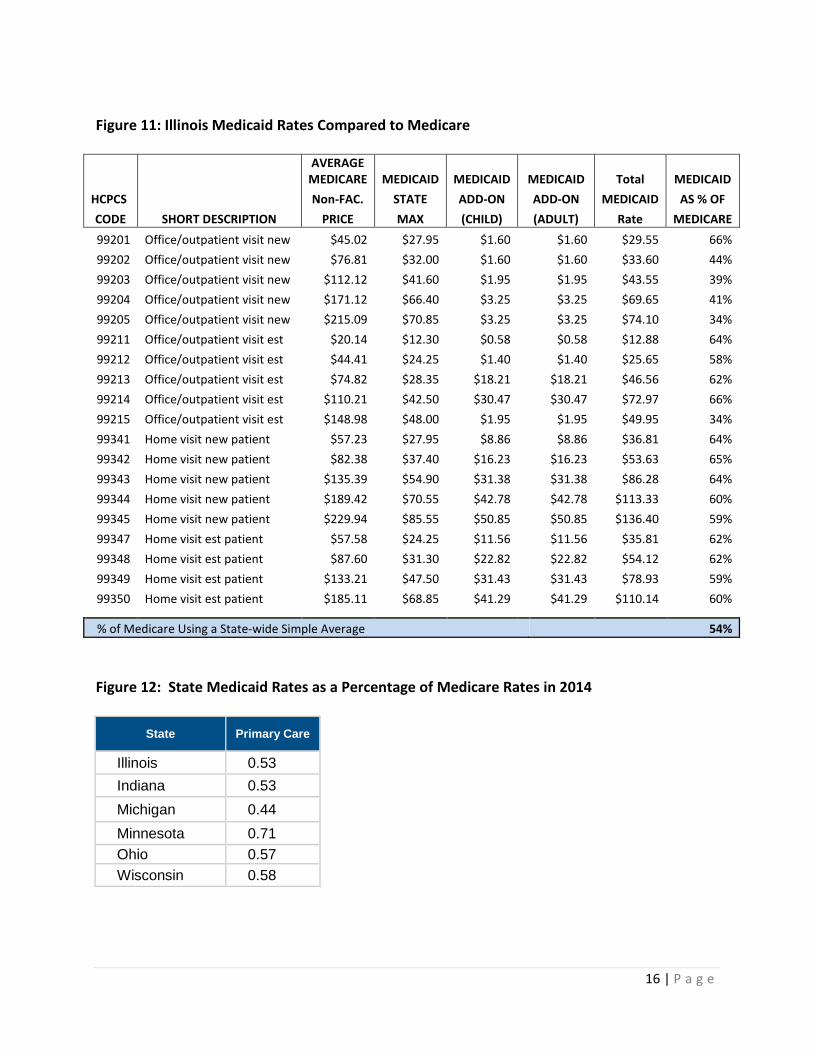
Comparison Analysis of Medicaid Payment Rates to Medicare and Other Payers
In the state of Illinois, Medicare establishes four different rates by geographic location: East St. Louis, Suburban Chicago, Chicago, and Rest of Illinois. The data in Figure 11 compares the average Medicare rate across these four regions to the Illinois Medicaid rate and shows that for the most recent period (2015) Illinois’ payment rates are approximately 54% of the existing Medicare rates for the adult and pediatric populations. This is consistent with a recent study by The Henry J. Kaiser Family Foundation where it lists Illinois at 53% of Medicare rates for primary care services for the year 2014. This study can be found at http://kff.org/medicaid/state-indicator/medicaid-to-medicare-fee-index/. As seen in Figure 12, according to the study, Illinois is consistent with other states within CMS Region V. According to the website www.medicare.gov/coverage/dental-services.html, ‘Medicare doesn’t cover most dental care, dental procedures, or supplies, like cleanings, fillings, tooth extractions, dentures, denture plates, or other dental devices.’ Therefore, a comparison of Illinois Medicaid dental rates to Medicare rates is not available for inclusion in Figure 11. The state has not experienced any changes in provider enrollment and availability or any changes in the beneficiaries’ ability to access services due to the current Medicaid rates.
16 | P a g e
Figure 11: Illinois Medicaid Rates Compared to Medicare
AVERAGE
MEDICARE MEDICAID MEDICAID MEDICAID Total MEDICAID HCPCS Non-FAC. STATE ADD-ON ADD-ON MEDICAID AS % OF CODE SHORT DESCRIPTION PRICE MAX (CHILD) (ADULT) Rate MEDICARE 99201 Office/outpatient visit new $45.02 $27.95 $1.60 $1.60 $29.55 66% 99202 Office/outpatient visit new $76.81 $32.00 $1.60 $1.60 $33.60 44% 99203 Office/outpatient visit new $112.12 $41.60 $1.95 $1.95 $43.55 39% 99204 Office/outpatient visit new $171.12 $66.40 $3.25 $3.25 $69.65 41% 99205 Office/outpatient visit new $215.09 $70.85 $3.25 $3.25 $74.10 34% 99211 Office/outpatient visit est $20.14 $12.30 $0.58 $0.58 $12.88 64% 99212 Office/outpatient visit est $44.41 $24.25 $1.40 $1.40 $25.65 58% 99213 Office/outpatient visit est $74.82 $28.35 $18.21 $18.21 $46.56 62% 99214 Office/outpatient visit est $110.21 $42.50 $30.47 $30.47 $72.97 66% 99215 Office/outpatient visit est $148.98 $48.00 $1.95 $1.95 $49.95 34% 99341 Home visit new patient $57.23 $27.95 $8.86 $8.86 $36.81 64% 99342 Home visit new patient $82.38 $37.40 $16.23 $16.23 $53.63 65% 99343 Home visit new patient $135.39 $54.90 $31.38 $31.38 $86.28 64% 99344 Home visit new patient $189.42 $70.55 $42.78 $42.78 $113.33 60% 99345 Home visit new patient $229.94 $85.55 $50.85 $50.85 $136.40 59% 99347 Home visit est patient $57.58 $24.25 $11.56 $11.56 $35.81 62% 99348 Home visit est patient $87.60 $31.30 $22.82 $22.82 $54.12 62% 99349 Home visit est patient $133.21 $47.50 $31.43 $31.43 $78.93 59% 99350 Home visit est patient $185.11 $68.85 $41.29 $41.29 $110.14 60%
% of Medicare Using a State-wide Simple Average 54% Figure 12: State Medicaid Rates as a Percentage of Medicare Rates in 2014
State Primary Care
Illinois 0.53 Indiana 0.53 Michigan 0.44 Minnesota 0.71 Ohio 0.57 Wisconsin 0.58
17 | P a g e
Data sources: Medicaid provider enrollment system Medicaid claims payment data (MMIS) Results of CAHPS survey (access-related questions) CMS.Gov Physician Fee Schedule Illinois Medicaid Professional Fee Schedule The Kaiser Family Foundation KFF.org Medicare.gov
Physician Specialist Services
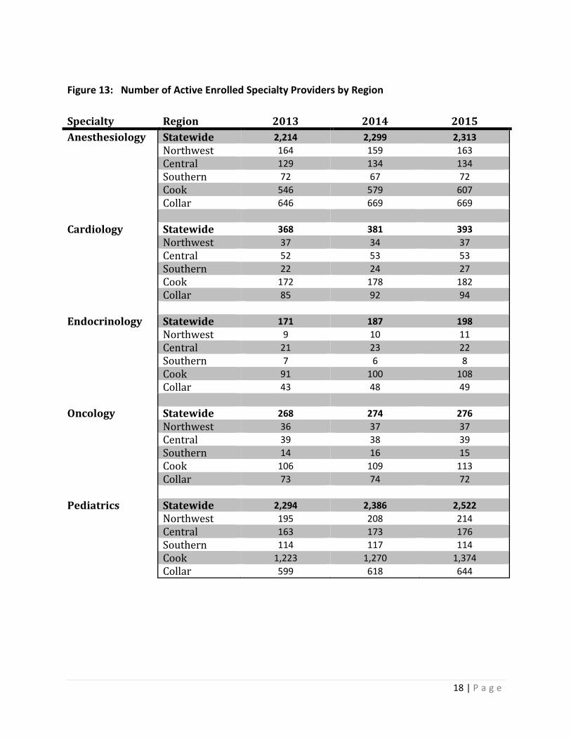
Availability of Physician Specialty Providers The Department currently has over 120,000 enrolled providers that offer specialty services to those enrolled in Illinois’ Medical Assistance programs throughout the state. While there are over 100 specialty categories ranging from internal medicine to neoplastic disorder, the Department selected the following five specialties for analysis based on significant levels of utilization: Anesthesiology, Cardiology, Endocrinology, Oncology, and Pediatrics. As seen in Figure 13, the five specialties selected see a general increase in statewide provider enrollment from 2013 to 2015 ranging from a 3% increase in the number of Oncologists to a 16% increase in the number of Endocrinologists enrolled with the Department. Within each region, the enrollment numbers have either remained constant or seen increases. Neither of those trends indicates an access to care issue due to declining numbers of specialists enrolling with the Department.
18 | P a g e
Figure 13: Number of Active Enrolled Specialty Providers by Region Specialty Region 2013 2014 2015 Anesthesiology Statewide 2,214 2,299 2,313 Northwest 164 159 163 Central 129 134 134 Southern 72 67 72 Cook 546 579 607 Collar 646 669 669 Cardiology Statewide 368 381 393 Northwest 37 34 37 Central 52 53 53 Southern 22 24 27 Cook 172 178 182 Collar 85 92 94 Endocrinology Statewide 171 187 198 Northwest 9 10 11 Central 21 23 22 Southern 7 6 8 Cook 91 100 108 Collar 43 48 49 Oncology Statewide 268 274 276 Northwest 36 37 37 Central 39 38 39 Southern 14 16 15 Cook 106 109 113 Collar 73 74 72 Pediatrics Statewide 2,294 2,386 2,522 Northwest 195 208 214 Central 163 173 176 Southern 114 117 114 Cook 1,223 1,270 1,374 Collar 599 618 644
19 | P a g e
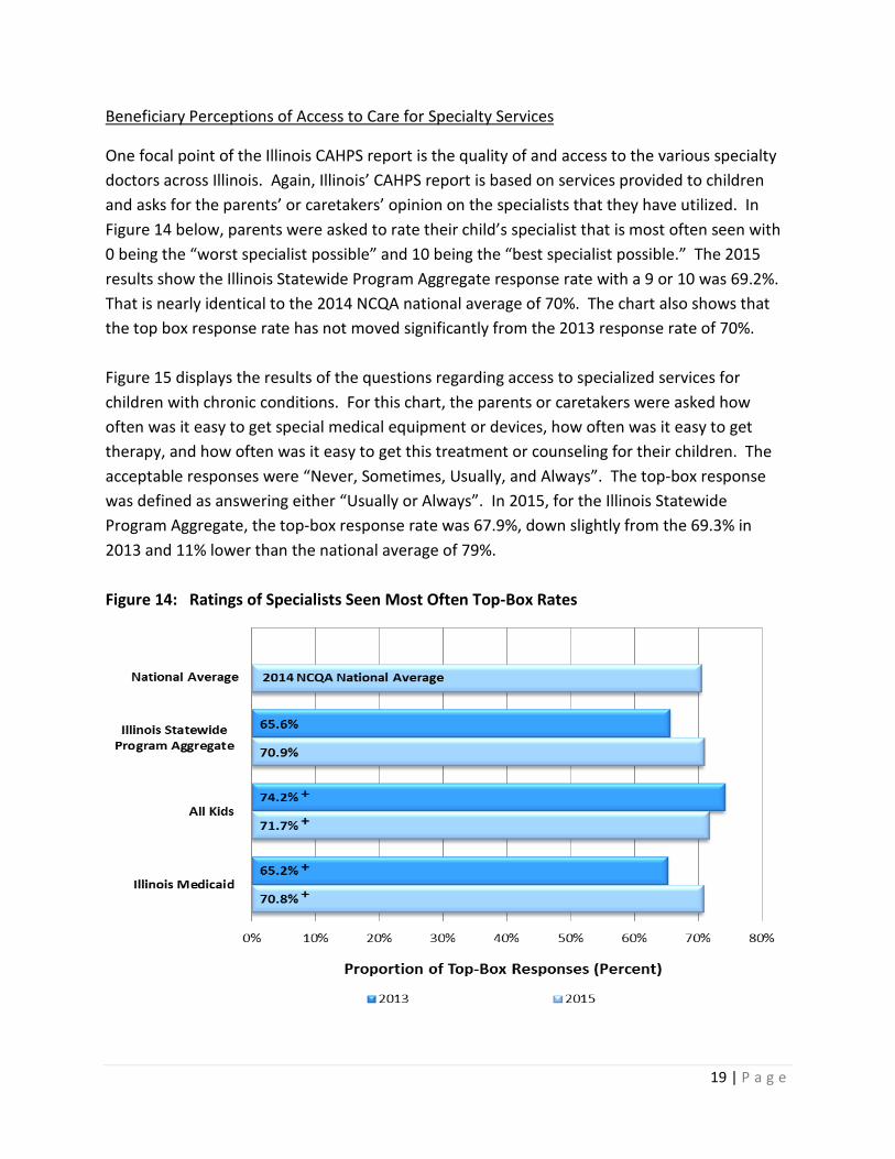
Beneficiary Perceptions of Access to Care for Specialty Services
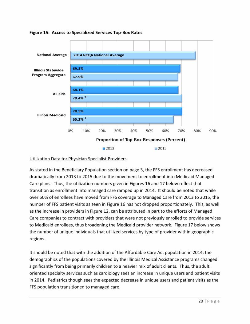
One focal point of the Illinois CAHPS report is the quality of and access to the various specialty doctors across Illinois. Again, Illinois’ CAHPS report is based on services provided to children and asks for the parents’ or caretakers’ opinion on the specialists that they have utilized. In Figure 14 below, parents were asked to rate their child’s specialist that is most often seen with 0 being the “worst specialist possible” and 10 being the “best specialist possible.” The 2015 results show the Illinois Statewide Program Aggregate response rate with a 9 or 10 was 69.2%. That is nearly identical to the 2014 NCQA national average of 70%. The chart also shows that the top box response rate has not moved significantly from the 2013 response rate of 70%. Figure 15 displays the results of the questions regarding access to specialized services for children with chronic conditions. For this chart, the parents or caretakers were asked how often was it easy to get special medical equipment or devices, how often was it easy to get therapy, and how often was it easy to get this treatment or counseling for their children. The acceptable responses were “Never, Sometimes, Usually, and Always”. The top-box response was defined as answering either “Usually or Always”. In 2015, for the Illinois Statewide Program Aggregate, the top-box response rate was 67.9%, down slightly from the 69.3% in 2013 and 11% lower than the national average of 79%. Figure 14: Ratings of Specialists Seen Most Often Top-Box Rates
20 | P a g e
Figure 15: Access to Specialized Services Top-Box Rates
Utilization Data for Physician Specialist Providers
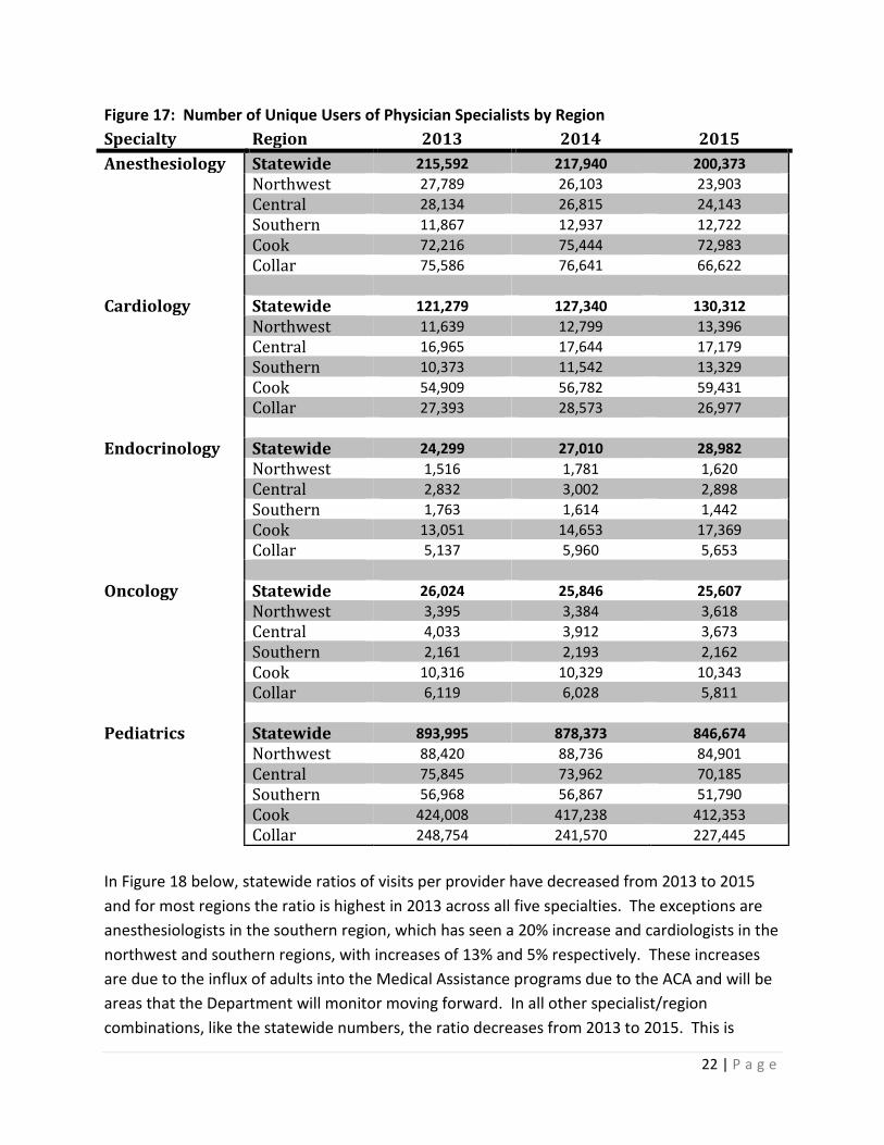
As stated in the Beneficiary Population section on page 3, the FFS enrollment has decreased dramatically from 2013 to 2015 due to the movement to enrollment into Medicaid Managed Care plans. Thus, the utilization numbers given in Figures 16 and 17 below reflect that transition as enrollment into managed care ramped up in 2014. It should be noted that while over 50% of enrollees have moved from FFS coverage to Managed Care from 2013 to 2015, the number of FFS patient visits as seen in Figure 16 has not dropped proportionately. This, as well as the increase in providers in Figure 12, can be attributed in part to the efforts of Managed Care companies to contract with providers that were not previously enrolled to provide services to Medicaid enrollees, thus broadening the Medicaid provider network. Figure 17 below shows the number of unique individuals that utilized services by type of provider within geographic regions. It should be noted that with the addition of the Affordable Care Act population in 2014, the demographics of the populations covered by the Illinois Medical Assistance programs changed significantly from being primarily children to a heavier mix of adult clients. Thus, the adult oriented specialty services such as cardiology sees an increase in unique users and patient visits in 2014. Pediatrics though sees the expected decrease in unique users and patient visits as the FFS population transitioned to managed care.

21 | P a g e
Figure 16: Number of Patient Visits for Physician Specialists by Region Specialty Region 2013 2014 2015 Anesthesiology Statewide 348,914 348,140 317,185 Northwest 42,386 39,320 36,450 Central 42,373 40,180 36,155 Southern 18,801 21,123 22,524 Cook 131,378 128,974 117,088 Collar 113,976 118,543 104,968 Cardiology Statewide 307,821 318,496 309,342 Northwest 24,560 27,565 27,908 Central 42,168 41,345 38,361 Southern 24,705 25,979 32,019 Cook 141,579 148,393 146,885 Collar 74,809 75,214 64,169 Endocrinology Statewide 63,636 68,303 64,575 Northwest 3,581 3,774 3,507 Central 6,433 6,183 5,853 Southern 5,349 3,531 2,378 Cook 36,766 39,207 39,688 Collar 11,507 15,608 13,149 Oncology Statewide 139,824 131,541 119,339 Northwest 20,153 19,586 19,185 Central 31,363 27,107 23,194 Southern 10,871 10,410 9,329 Cook 45,183 45,575 39,906 Collar 32,254 28,863 27,725 Pediatrics Statewide 8,669,500 8,102,638 5,722,899 Northwest 831,629 765,106 492,466 Central 693,773 669,289 454,443 Southern 525,657 501,799 282,075 Cook 4,134,539 3,819,880 3,025,079 Collar 2,483,902 2,346,564 1,468,836
22 | P a g e
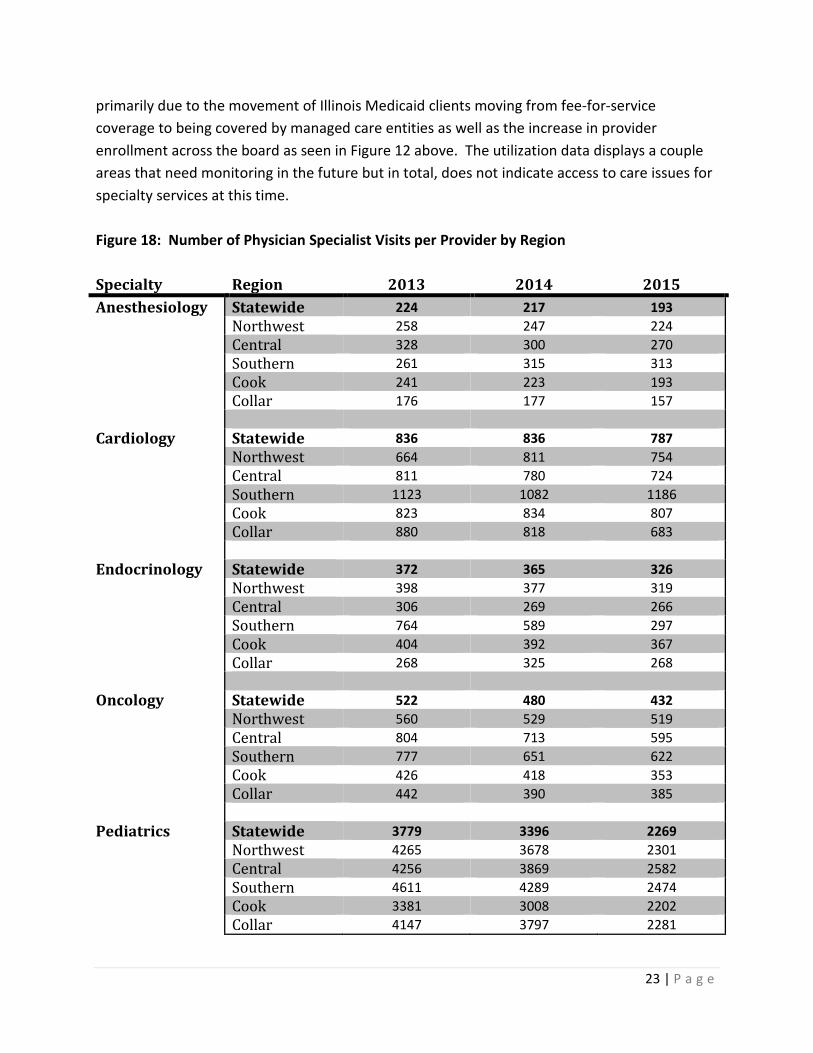
Figure 17: Number of Unique Users of Physician Specialists by Region Specialty Region 2013 2014 2015 Anesthesiology Statewide 215,592 217,940 200,373 Northwest 27,789 26,103 23,903 Central 28,134 26,815 24,143 Southern 11,867 12,937 12,722 Cook 72,216 75,444 72,983 Collar 75,586 76,641 66,622 Cardiology Statewide 121,279 127,340 130,312 Northwest 11,639 12,799 13,396 Central 16,965 17,644 17,179 Southern 10,373 11,542 13,329 Cook 54,909 56,782 59,431 Collar 27,393 28,573 26,977 Endocrinology Statewide 24,299 27,010 28,982 Northwest 1,516 1,781 1,620 Central 2,832 3,002 2,898 Southern 1,763 1,614 1,442 Cook 13,051 14,653 17,369 Collar 5,137 5,960 5,653 Oncology Statewide 26,024 25,846 25,607 Northwest 3,395 3,384 3,618 Central 4,033 3,912 3,673 Southern 2,161 2,193 2,162 Cook 10,316 10,329 10,343 Collar 6,119 6,028 5,811 Pediatrics Statewide 893,995 878,373 846,674 Northwest 88,420 88,736 84,901 Central 75,845 73,962 70,185 Southern 56,968 56,867 51,790 Cook 424,008 417,238 412,353 Collar 248,754 241,570 227,445 In Figure 18 below, statewide ratios of visits per provider have decreased from 2013 to 2015 and for most regions the ratio is highest in 2013 across all five specialties. The exceptions are anesthesiologists in the southern region, which has seen a 20% increase and cardiologists in the northwest and southern regions, with increases of 13% and 5% respectively. These increases are due to the influx of adults into the Medical Assistance programs due to the ACA and will be areas that the Department will monitor moving forward. In all other specialist/region combinations, like the statewide numbers, the ratio decreases from 2013 to 2015. This is
23 | P a g e
primarily due to the movement of Illinois Medicaid clients moving from fee-for-service coverage to being covered by managed care entities as well as the increase in provider enrollment across the board as seen in Figure 12 above. The utilization data displays a couple areas that need monitoring in the future but in total, does not indicate access to care issues for specialty services at this time. Figure 18: Number of Physician Specialist Visits per Provider by Region Specialty Region 2013 2014 2015 Anesthesiology Statewide 224 217 193 Northwest 258 247 224 Central 328 300 270 Southern 261 315 313 Cook 241 223 193 Collar 176 177 157 Cardiology Statewide 836 836 787 Northwest 664 811 754 Central 811 780 724 Southern 1123 1082 1186 Cook 823 834 807 Collar 880 818 683 Endocrinology Statewide 372 365 326 Northwest 398 377 319 Central 306 269 266 Southern 764 589 297 Cook 404 392 367 Collar 268 325 268 Oncology Statewide 522 480 432 Northwest 560 529 519 Central 804 713 595 Southern 777 651 622 Cook 426 418 353 Collar 442 390 385 Pediatrics Statewide 3779 3396 2269 Northwest 4265 3678 2301 Central 4256 3869 2582 Southern 4611 4289 2474 Cook 3381 3008 2202 Collar 4147 3797 2281
24 | P a g e
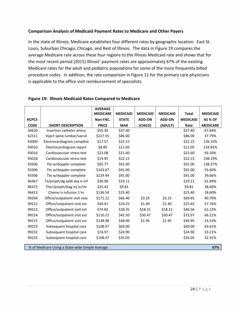
Comparison Analysis of Medicaid Payment Rates to Medicare and Other Payers
In the state of Illinois, Medicare establishes four different rates by geographic location: East St. Louis, Suburban Chicago, Chicago, and Rest of Illinois. The data in Figure 19 compares the average Medicare rate across these four regions to the Illinois Medicaid rate and shows that for the most recent period (2015) Illinois’ payment rates are approximately 67% of the existing Medicare rates for the adult and pediatric populations for some of the more frequently billed procedure codes. In addition, the rate comparison in Figure 11 for the primary care physicians is applicable to the office visit reimbursement of specialists.
Figure 19: Illinois Medicaid Rates Compared to Medicare
AVERAGE
MEDICARE MEDICAID MEDICAID MEDICAID Total MEDICAID HCPCS Non-FAC. STATE ADD-ON ADD-ON MEDICAID AS % OF CODE SHORT DESCRIPTION PRICE MAX (CHILD) (ADULT) Rate MEDICARE 36620 Insertion catheter artery $55.30 $37.40 $37.40 67.64% 62311 Inject spine lumbar/sacral $227.55 $86.00 $86.00 37.79% 93000 Electrocardiogram complete $17.57 $22.15 $22.15 126.10% 93010 Electrocardiogram report $8.85 $11.05 $11.05 124.82% 93016 Cardiovascular stress test $23.08 $21.60 $21.60 93.59% 93018 Cardiovascular stress test $14.95 $22.15 $22.15 148.19% 93306 Tte w/doppler complete $65.77 $91.00 $91.00 138.37% 93306 Tte w/doppler complete $163.67 $91.00 $91.00 55.60% 93306 Tte w/doppler complete $229.44 $91.00 $91.00 39.66% 96367 Tx/proph/dg addl seq iv inf $30.98 $19.11 $19.11 61.69% 96372 Ther/proph/diag inj sc/im $25.42 $9.81 $9.81 38.60% 96413 Chemo iv infusion 1 hr $136.54 $25.40 $25.40 18.60% 99204 Office/outpatient visit new $171.12 $66.40 $3.25 $3.25 $69.65 40.70% 99212 Office/outpatient visit est $44.41 $24.25 $1.40 $1.40 $25.65 57.76% 99213 Office/outpatient visit est $74.82 $28.35 $18.21 $18.21 $46.56 62.23% 99214 Office/outpatient visit est $110.21 $42.50 $30.47 $30.47 $72.97 66.21% 99215 Office/outpatient visit est $148.98 $48.00 $1.95 $1.95 $49.95 33.53% 99223 Subsequent hospital care $108.47 $69.00 $69.00 63.61% 99232 Subsequent hospital care $74.97 $24.90 $24.90 33.21% 99233 Subsequent hospital care $108.47 $35.05 $35.05 32.31%
% of Medicare Using a State-wide Simple Average 67%
25 | P a g e
Data sources: Medicaid provider enrollment system Medicaid claims payment data (MMIS) Results of CAHPS survey (access-related questions) CMS.Gov Physician Fee Schedule Illinois Medicaid Professional Fee Schedule
Home Health Services
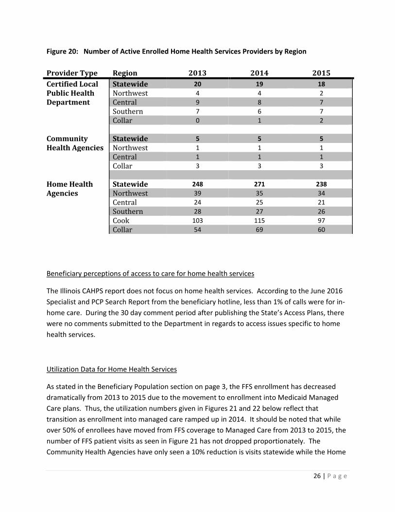
Availability of Home Health Services Providers Throughout the state, home health agencies are the primary provider of home health services. In some areas of the state, certified local public health departments and community health agencies also have provided home health services from 2013 to 2015. According to the enrollment data in Figure 20, the number of certified local public health departments and community health agencies that are providing home health services has primarily remained flat over the three year period while the number of enrolled home health agencies providing home health services has decreased slightly. By diving deeper into the enrollment numbers by region, the larger decline is occurring in the northwest and cook regions with gains in the collar region. This decline in the number of active providers alone does not signal an access to care issue but should be monitored if utilization numbers are trending upwards at the same time. Utilization data is discussed later in this section.
26 | P a g e
Figure 20: Number of Active Enrolled Home Health Services Providers by Region Provider Type Region 2013 2014 2015 Certified Local Statewide 20 19 18 Public Health Northwest 4 4 2 Department Central 9 8 7 Southern 7 6 7 Collar 0 1 2 Community Statewide 5 5 5 Health Agencies Northwest 1 1 1 Central 1 1 1 Collar 3 3 3 Home Health Statewide 248 271 238 Agencies Northwest 39 35 34 Central 24 25 21 Southern 28 27 26 Cook 103 115 97 Collar 54 69 60
Beneficiary perceptions of access to care for home health services
The Illinois CAHPS report does not focus on home health services. According to the June 2016 Specialist and PCP Search Report from the beneficiary hotline, less than 1% of calls were for in-home care. During the 30 day comment period after publishing the State’s Access Plans, there were no comments submitted to the Department in regards to access issues specific to home health services.
Utilization Data for Home Health Services
As stated in the Beneficiary Population section on page 3, the FFS enrollment has decreased dramatically from 2013 to 2015 due to the movement to enrollment into Medicaid Managed Care plans. Thus, the utilization numbers given in Figures 21 and 22 below reflect that transition as enrollment into managed care ramped up in 2014. It should be noted that while over 50% of enrollees have moved from FFS coverage to Managed Care from 2013 to 2015, the number of FFS patient visits as seen in Figure 21 has not dropped proportionately. The Community Health Agencies have only seen a 10% reduction is visits statewide while the Home
27 | P a g e
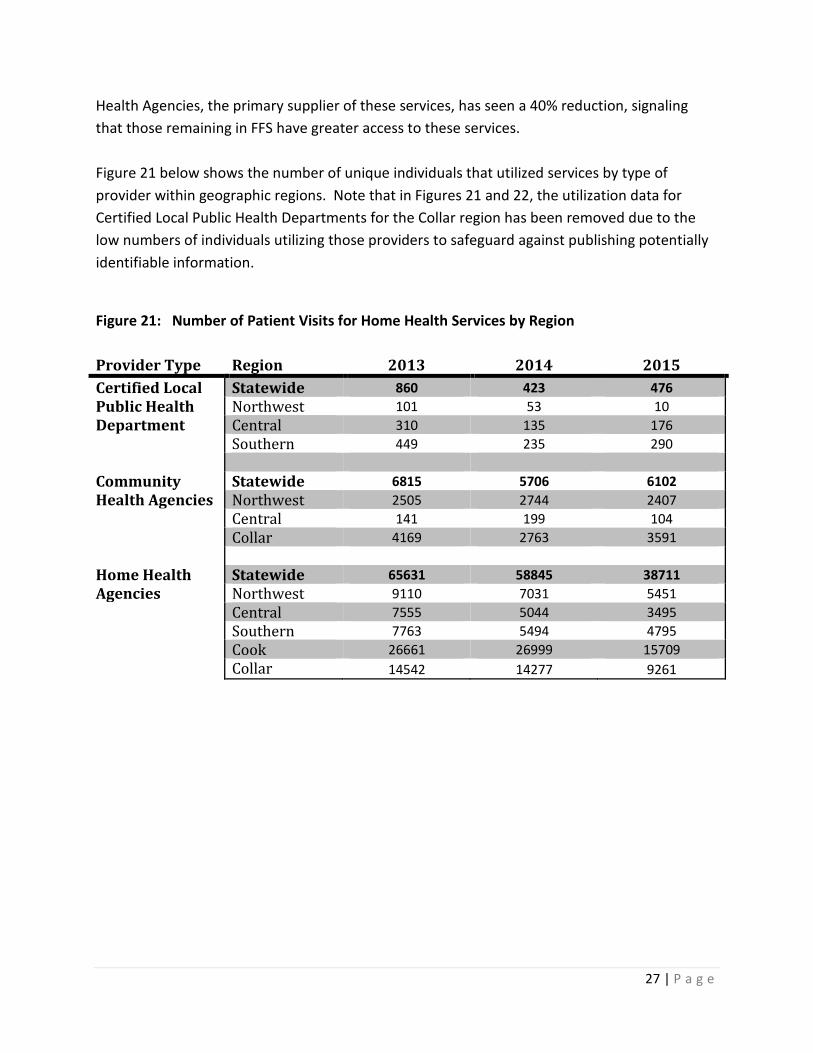
Health Agencies, the primary supplier of these services, has seen a 40% reduction, signaling that those remaining in FFS have greater access to these services. Figure 21 below shows the number of unique individuals that utilized services by type of provider within geographic regions. Note that in Figures 21 and 22, the utilization data for Certified Local Public Health Departments for the Collar region has been removed due to the low numbers of individuals utilizing those providers to safeguard against publishing potentially identifiable information.
Figure 21: Number of Patient Visits for Home Health Services by Region Provider Type Region 2013 2014 2015 Certified Local Statewide 860 423 476 Public Health Northwest 101 53 10 Department Central 310 135 176 Southern 449 235 290 Community Statewide 6815 5706 6102 Health Agencies Northwest 2505 2744 2407 Central 141 199 104 Collar 4169 2763 3591 Home Health Statewide 65631 58845 38711 Agencies Northwest 9110 7031 5451 Central 7555 5044 3495 Southern 7763 5494 4795 Cook 26661 26999 15709 Collar 14542 14277 9261
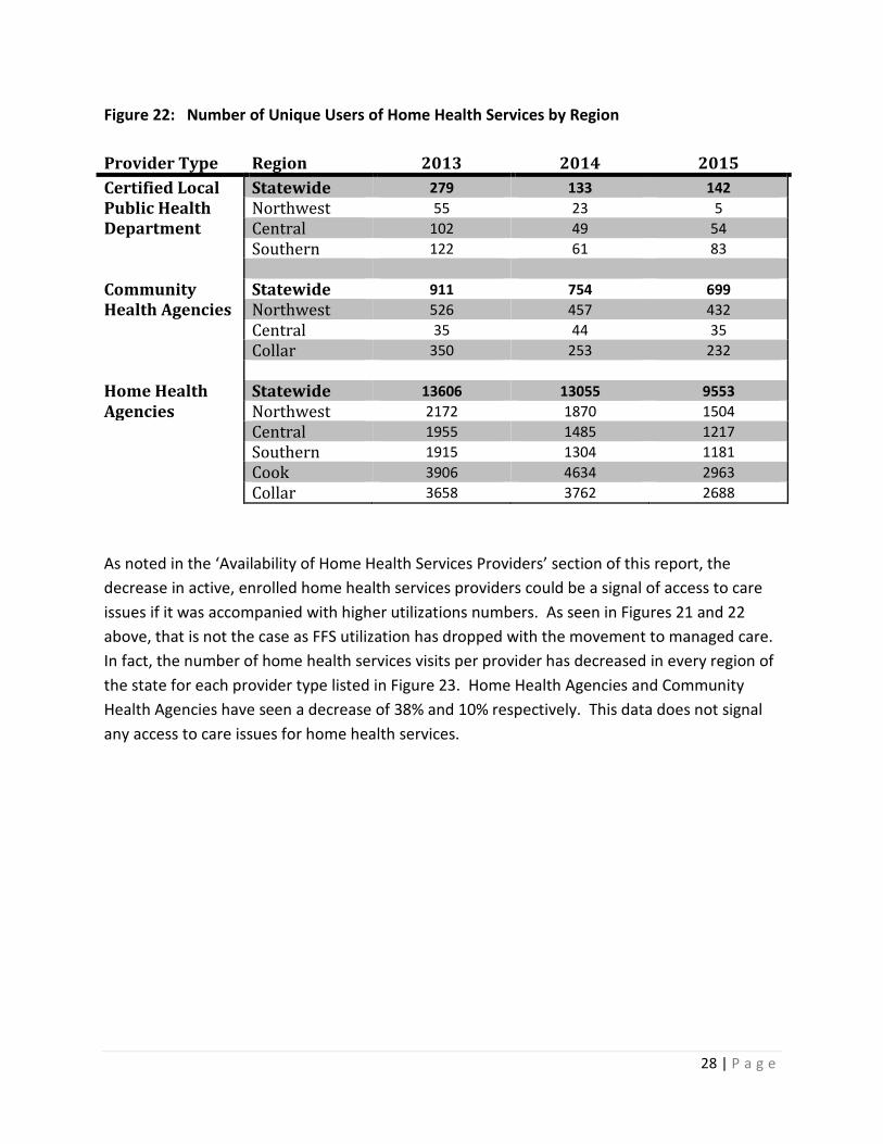
28 | P a g e
Figure 22: Number of Unique Users of Home Health Services by Region Provider Type Region 2013 2014 2015 Certified Local Statewide 279 133 142 Public Health Northwest 55 23 5 Department Central 102 49 54 Southern 122 61 83 Community Statewide 911 754 699 Health Agencies Northwest 526 457 432 Central 35 44 35 Collar 350 253 232 Home Health Statewide 13606 13055 9553 Agencies Northwest 2172 1870 1504 Central 1955 1485 1217 Southern 1915 1304 1181 Cook 3906 4634 2963 Collar 3658 3762 2688 As noted in the ‘Availability of Home Health Services Providers’ section of this report, the decrease in active, enrolled home health services providers could be a signal of access to care issues if it was accompanied with higher utilizations numbers. As seen in Figures 21 and 22 above, that is not the case as FFS utilization has dropped with the movement to managed care. In fact, the number of home health services visits per provider has decreased in every region of the state for each provider type listed in Figure 23. Home Health Agencies and Community Health Agencies have seen a decrease of 38% and 10% respectively. This data does not signal any access to care issues for home health services.
29 | P a g e
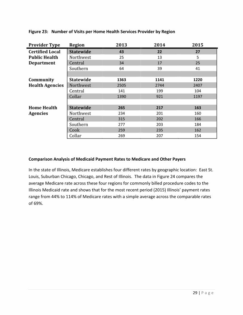
Figure 23: Number of Visits per Home Health Services Provider by Region Provider Type Region 2013 2014 2015 Certified Local Statewide 43 22 27 Public Health Northwest 25 13 5 Department Central 34 17 25 Southern 64 39 41 Community Statewide 1363 1141 1220 Health Agencies Northwest 2505 2744 2407 Central 141 199 104 Collar 1390 921 1197 Home Health Statewide 265 217 163 Agencies Northwest 234 201 160 Central 315 202 166 Southern 277 203 184 Cook 259 235 162 Collar 269 207 154
Comparison Analysis of Medicaid Payment Rates to Medicare and Other Payers
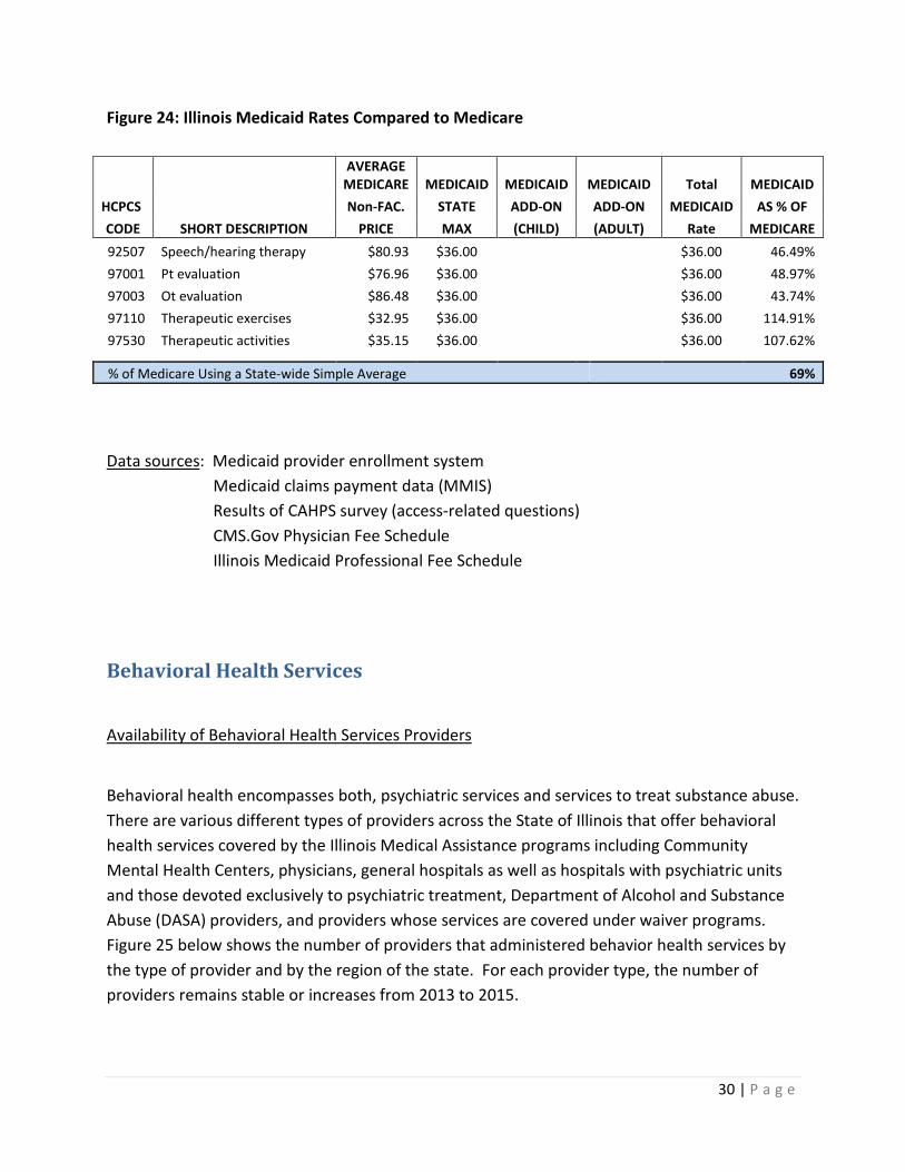
In the state of Illinois, Medicare establishes four different rates by geographic location: East St. Louis, Suburban Chicago, Chicago, and Rest of Illinois. The data in Figure 24 compares the average Medicare rate across these four regions for commonly billed procedure codes to the Illinois Medicaid rate and shows that for the most recent period (2015) Illinois’ payment rates range from 44% to 114% of Medicare rates with a simple average across the comparable rates of 69%.
30 | P a g e
Figure 24: Illinois Medicaid Rates Compared to Medicare
AVERAGE
MEDICARE MEDICAID MEDICAID MEDICAID Total MEDICAID HCPCS Non-FAC. STATE ADD-ON ADD-ON MEDICAID AS % OF CODE SHORT DESCRIPTION PRICE MAX (CHILD) (ADULT) Rate MEDICARE 92507 Speech/hearing therapy $80.93 $36.00 $36.00 46.49% 97001 Pt evaluation $76.96 $36.00
$36.00 48.97%
97003 Ot evaluation $86.48 $36.00 $36.00 43.74% 97110 Therapeutic exercises $32.95 $36.00
$36.00 114.91%
97530 Therapeutic activities $35.15 $36.00 $36.00 107.62%
% of Medicare Using a State-wide Simple Average 69%
Data sources: Medicaid provider enrollment system Medicaid claims payment data (MMIS) Results of CAHPS survey (access-related questions) CMS.Gov Physician Fee Schedule Illinois Medicaid Professional Fee Schedule Behavioral Health Services
Availability of Behavioral Health Services Providers
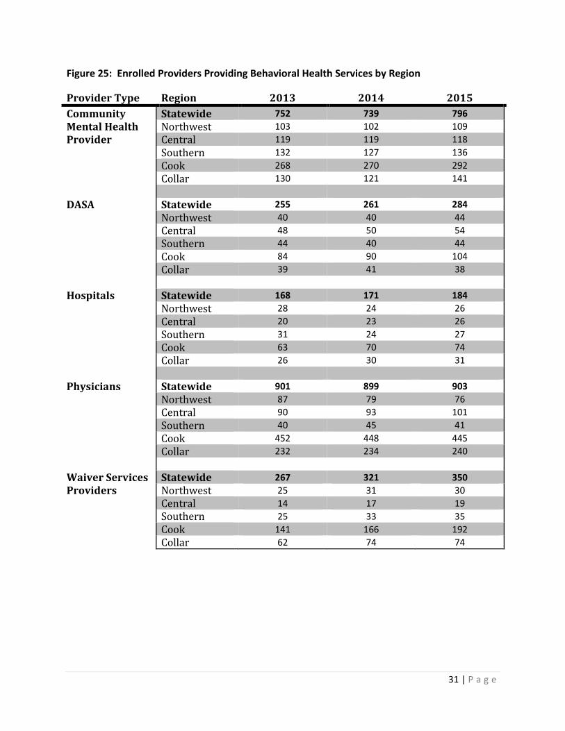
Behavioral health encompasses both, psychiatric services and services to treat substance abuse. There are various different types of providers across the State of Illinois that offer behavioral health services covered by the Illinois Medical Assistance programs including Community Mental Health Centers, physicians, general hospitals as well as hospitals with psychiatric units and those devoted exclusively to psychiatric treatment, Department of Alcohol and Substance Abuse (DASA) providers, and providers whose services are covered under waiver programs. Figure 25 below shows the number of providers that administered behavior health services by the type of provider and by the region of the state. For each provider type, the number of providers remains stable or increases from 2013 to 2015.
31 | P a g e
Figure 25: Enrolled Providers Providing Behavioral Health Services by Region
Provider Type Region 2013 2014 2015 Community Statewide 752 739 796 Mental Health Northwest 103 102 109 Provider Central 119 119 118 Southern 132 127 136 Cook 268 270 292 Collar 130 121 141 DASA Statewide 255 261 284 Northwest 40 40 44 Central 48 50 54 Southern 44 40 44 Cook 84 90 104 Collar 39 41 38 Hospitals Statewide 168 171 184 Northwest 28 24 26 Central 20 23 26 Southern 31 24 27 Cook 63 70 74 Collar 26 30 31 Physicians Statewide 901 899 903 Northwest 87 79 76 Central 90 93 101 Southern 40 45 41 Cook 452 448 445 Collar 232 234 240 Waiver Services Statewide 267 321 350 Providers Northwest 25 31 30 Central 14 17 19 Southern 25 33 35 Cook 141 166 192 Collar 62 74 74
32 | P a g e
Beneficiary Perceptions of Access to Care for Behavioral Health Services
The Illinois CAHPS report does not focus on behavioral health services. According to the June 2016 Specialist and PCP Search Report from the beneficiary hotline, 11% of calls were behavioral health related. During the 30 day comment period after publishing the State’s Access Plans, the comments received for the behavioral health access plan were not related to any specific access issues.
Utilization Data for Behavioral Health Services
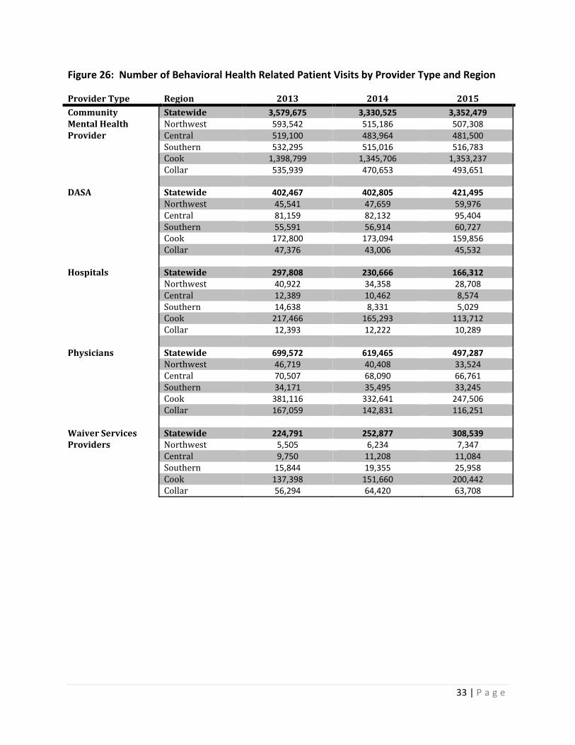
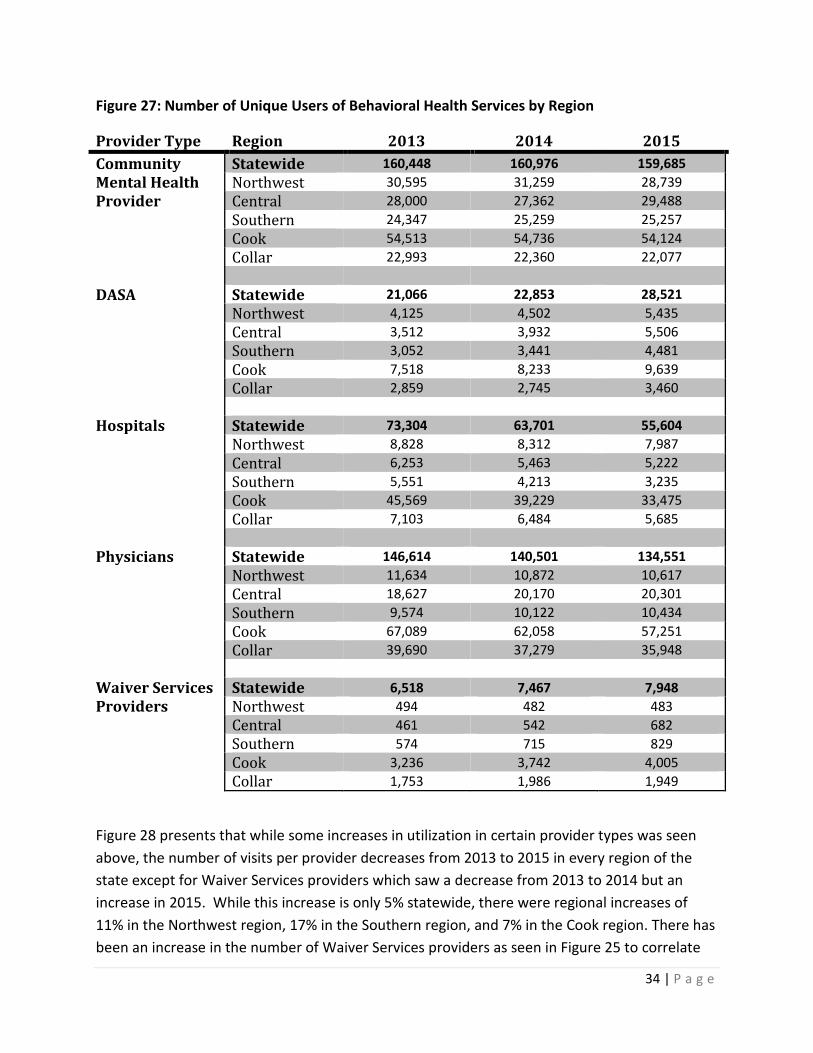
As stated in the Beneficiary Population section on page 3, the FFS enrollment has decreased dramatically from 2013 to 2015 due to the movement to enrollment into Medicaid Managed Care plans. There has not, however, been a sizeable reduction to the FFS utilization of these services from 2013 to 2015 as seen in Figure 26 below. In fact, while utilization of hospitals and physicians have seen decreases in utilization, DASA providers and Waiver Services providers have seen an increase with Community Mental Health provider utilization remaining fairly flat from 2014 to 2015 and slightly decreasing from 2013 to 2015. The same trends hold true for the number of unique users of each provider type in Figure 27.
33 | P a g e
Figure 26: Number of Behavioral Health Related Patient Visits by Provider Type and Region
Provider Type Region 2013 2014 2015 Community Statewide 3,579,675 3,330,525 3,352,479 Mental Health Northwest 593,542 515,186 507,308 Provider Central 519,100 483,964 481,500 Southern 532,295 515,016 516,783 Cook 1,398,799 1,345,706 1,353,237 Collar 535,939 470,653 493,651 DASA Statewide 402,467 402,805 421,495 Northwest 45,541 47,659 59,976 Central 81,159 82,132 95,404 Southern 55,591 56,914 60,727 Cook 172,800 173,094 159,856 Collar 47,376 43,006 45,532 Hospitals Statewide 297,808 230,666 166,312 Northwest 40,922 34,358 28,708 Central 12,389 10,462 8,574 Southern 14,638 8,331 5,029 Cook 217,466 165,293 113,712 Collar 12,393 12,222 10,289 Physicians Statewide 699,572 619,465 497,287 Northwest 46,719 40,408 33,524 Central 70,507 68,090 66,761 Southern 34,171 35,495 33,245 Cook 381,116 332,641 247,506 Collar 167,059 142,831 116,251 Waiver Services Statewide 224,791 252,877 308,539 Providers Northwest 5,505 6,234 7,347 Central 9,750 11,208 11,084 Southern 15,844 19,355 25,958 Cook 137,398 151,660 200,442 Collar 56,294 64,420 63,708
34 | P a g e
Figure 27: Number of Unique Users of Behavioral Health Services by Region
Provider Type Region 2013 2014 2015 Community Statewide 160,448 160,976 159,685 Mental Health Northwest 30,595 31,259 28,739 Provider Central 28,000 27,362 29,488 Southern 24,347 25,259 25,257 Cook 54,513 54,736 54,124 Collar 22,993 22,360 22,077 DASA Statewide 21,066 22,853 28,521 Northwest 4,125 4,502 5,435 Central 3,512 3,932 5,506 Southern 3,052 3,441 4,481 Cook 7,518 8,233 9,639 Collar 2,859 2,745 3,460 Hospitals Statewide 73,304 63,701 55,604 Northwest 8,828 8,312 7,987 Central 6,253 5,463 5,222 Southern 5,551 4,213 3,235 Cook 45,569 39,229 33,475 Collar 7,103 6,484 5,685 Physicians Statewide 146,614 140,501 134,551 Northwest 11,634 10,872 10,617 Central 18,627 20,170 20,301 Southern 9,574 10,122 10,434 Cook 67,089 62,058 57,251 Collar 39,690 37,279 35,948 Waiver Services Statewide 6,518 7,467 7,948 Providers Northwest 494 482 483 Central 461 542 682 Southern 574 715 829 Cook 3,236 3,742 4,005 Collar 1,753 1,986 1,949
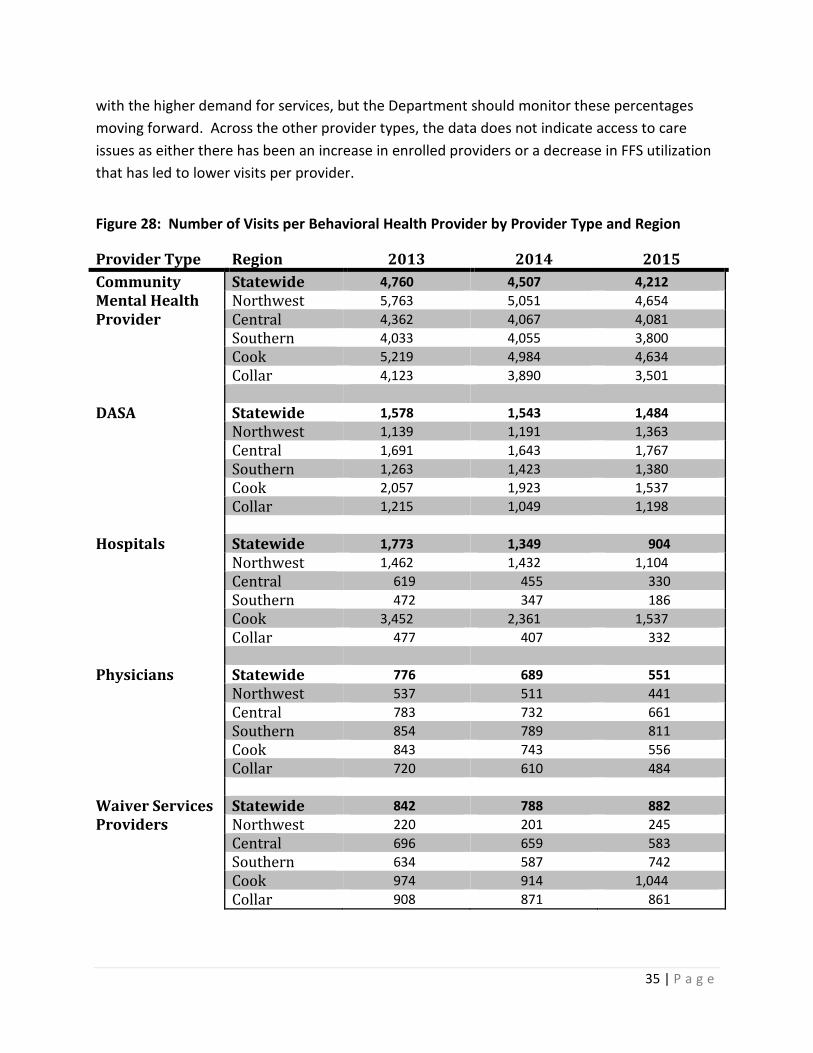
Figure 28 presents that while some increases in utilization in certain provider types was seen above, the number of visits per provider decreases from 2013 to 2015 in every region of the state except for Waiver Services providers which saw a decrease from 2013 to 2014 but an increase in 2015. While this increase is only 5% statewide, there were regional increases of 11% in the Northwest region, 17% in the Southern region, and 7% in the Cook region. There has been an increase in the number of Waiver Services providers as seen in Figure 25 to correlate
35 | P a g e
with the higher demand for services, but the Department should monitor these percentages moving forward. Across the other provider types, the data does not indicate access to care issues as either there has been an increase in enrolled providers or a decrease in FFS utilization that has led to lower visits per provider.
Figure 28: Number of Visits per Behavioral Health Provider by Provider Type and Region
Provider Type Region 2013 2014 2015 Community Statewide 4,760 4,507 4,212 Mental Health Northwest 5,763 5,051 4,654 Provider Central 4,362 4,067 4,081 Southern 4,033 4,055 3,800 Cook 5,219 4,984 4,634 Collar 4,123 3,890 3,501 DASA Statewide 1,578 1,543 1,484 Northwest 1,139 1,191 1,363 Central 1,691 1,643 1,767 Southern 1,263 1,423 1,380 Cook 2,057 1,923 1,537 Collar 1,215 1,049 1,198 Hospitals Statewide 1,773 1,349 904 Northwest 1,462 1,432 1,104 Central 619 455 330 Southern 472 347 186 Cook 3,452 2,361 1,537 Collar 477 407 332 Physicians Statewide 776 689 551 Northwest 537 511 441 Central 783 732 661 Southern 854 789 811 Cook 843 743 556 Collar 720 610 484 Waiver Services Statewide 842 788 882 Providers Northwest 220 201 245 Central 696 659 583 Southern 634 587 742 Cook 974 914 1,044 Collar 908 871 861
36 | P a g e
Comparison Analysis of Medicaid Payment Rates to Medicare and Other Payers
Illinois mental health rates are not easily comparable to Medicare. As shown above, mental health services are provided by a wide range of providers, including hospitals and physicians. Primary care and specialty care services are already analyzed in this report. However, the majority of mental health services are provided in a community setting which is reimbursed through Illinois specific service definitions that are not comparable to Medicare.
Data sources: Medicaid provider enrollment system Medicaid claims payment data (MMIS) Results of CAHPS survey (access-related questions) CMS.Gov Physician Fee Schedule Illinois Medicaid Professional Fee Schedule
Obstetrical Services
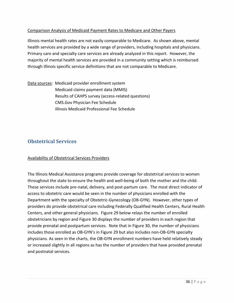
Availability of Obstetrical Services Providers
The Illinois Medical Assistance programs provide coverage for obstetrical services to women throughout the state to ensure the health and well-being of both the mother and the child. These services include pre-natal, delivery, and post-partum care. The most direct indicator of access to obstetric care would be seen in the number of physicians enrolled with the Department with the specialty of Obstetric-Gynecology (OB-GYN). However, other types of providers do provide obstetrical care including Federally Qualified Health Centers, Rural Health Centers, and other general physicians. Figure 29 below relays the number of enrolled obstetricians by region and Figure 30 displays the number of providers in each region that provide prenatal and postpartum services. Note that in Figure 30, the number of physicians includes those enrolled as OB-GYN’s in Figure 29 but also includes non-OB-GYN specialty physicians. As seen in the charts, the OB-GYN enrollment numbers have held relatively steady or increased slightly in all regions as has the number of providers that have provided prenatal and postnatal services.
37 | P a g e
Figure 29: Enrolled OB-GYN Specialty Physicians by Region Provider Type Region 2013 2014 2015 Obstetric- Statewide 1,415 1,439 1,499 Gynecology Northwest 139 142 151 Central 137 144 148 Southern 90 90 93 Cook 683 700 737 Collar 366 363 370 Figure 30: Number of Providers Billing Prenatal and Postpartum Services by Type and Region Provider Type Region 2013 2014 2015 Federally Statewide 92 77 83 Qualified Northwest 4 4 5 Health Centers Central 1 1 1 Southern 7 8 6 Cook 66 52 56 Collar 14 12 15 Rural Health Statewide 13 12 12 Centers Central 7 6 6 Southern 6 6 6 Physicians Statewide 1682 1677 1719 Northwest 184 176 177 Central 155 157 163 Southern 100 96 97 Cook 826 833 867 Collar 417 415 415 Beneficiary Perceptions of Access to Care for Obstetrical Services
As the Illinois CAHPS survey is dedicated to children, it does not address obstetrical care. From the month of June 2016, only 7% of calls fielded by the Department’s beneficiary help line were to locate an OB-GYN. During the 30 day comment period after publishing the State’s Access Plans, there were no comments submitted to the Department in regards to access issues specific to OB-GYN services.
38 | P a g e
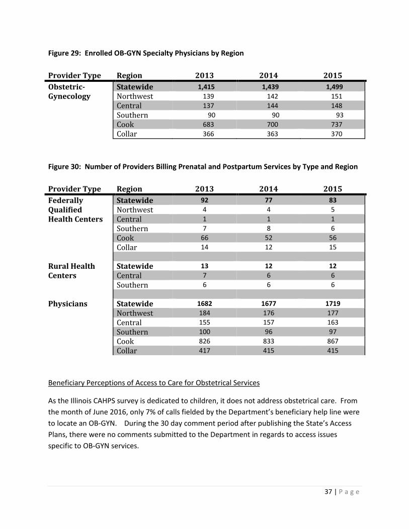
Utilization Data for Obstetrical Services
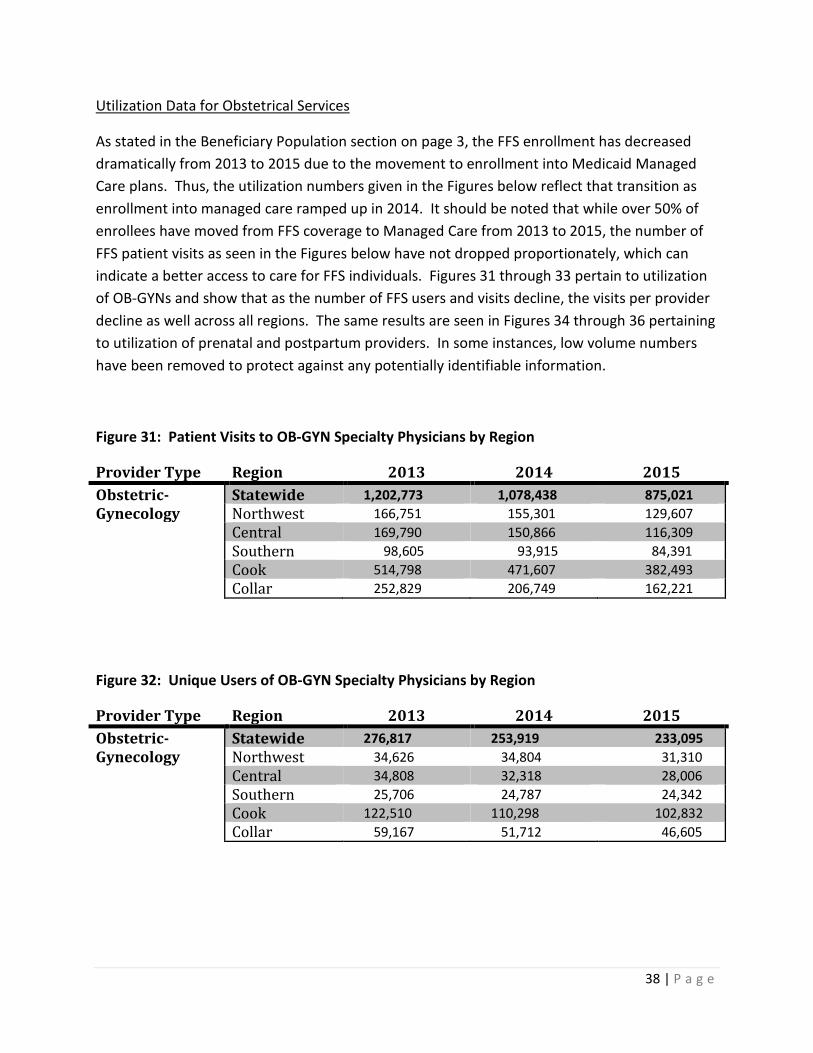
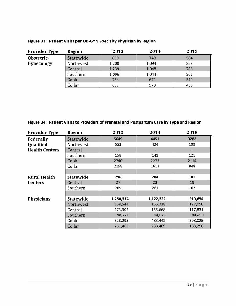
As stated in the Beneficiary Population section on page 3, the FFS enrollment has decreased dramatically from 2013 to 2015 due to the movement to enrollment into Medicaid Managed Care plans. Thus, the utilization numbers given in the Figures below reflect that transition as enrollment into managed care ramped up in 2014. It should be noted that while over 50% of enrollees have moved from FFS coverage to Managed Care from 2013 to 2015, the number of FFS patient visits as seen in the Figures below have not dropped proportionately, which can indicate a better access to care for FFS individuals. Figures 31 through 33 pertain to utilization of OB-GYNs and show that as the number of FFS users and visits decline, the visits per provider decline as well across all regions. The same results are seen in Figures 34 through 36 pertaining to utilization of prenatal and postpartum providers. In some instances, low volume numbers have been removed to protect against any potentially identifiable information.
Figure 31: Patient Visits to OB-GYN Specialty Physicians by Region
Provider Type Region 2013 2014 2015 Obstetric- Statewide 1,202,773 1,078,438 875,021 Gynecology Northwest 166,751 155,301 129,607 Central 169,790 150,866 116,309 Southern 98,605 93,915 84,391 Cook 514,798 471,607 382,493 Collar 252,829 206,749 162,221
Figure 32: Unique Users of OB-GYN Specialty Physicians by Region
Provider Type Region 2013 2014 2015 Obstetric- Statewide 276,817 253,919 233,095 Gynecology Northwest 34,626 34,804 31,310 Central 34,808 32,318 28,006 Southern 25,706 24,787 24,342 Cook 122,510 110,298 102,832 Collar 59,167 51,712 46,605
39 | P a g e
Figure 33: Patient Visits per OB-GYN Specialty Physician by Region
Provider Type Region 2013 2014 2015 Obstetric- Statewide 850 749 584 Gynecology Northwest 1,200 1,094 858 Central 1,239 1,048 786 Southern 1,096 1,044 907 Cook 754 674 519 Collar 691 570 438
Figure 34: Patient Visits to Providers of Prenatal and Postpartum Care by Type and Region
Provider Type Region 2013 2014 2015 Federally Statewide 5649 4451 3282 Qualified Northwest 553 424 199 Health Centers Central - - - Southern 158 141 121 Cook 2740 2273 2114 Collar 2198 1613 848 Rural Health Statewide 296 284 181 Centers Central 27 23 19 Southern 269 261 162 Physicians Statewide 1,250,374 1,122,322 910,654 Northwest 168,544 155,718 127,050 Central 173,302 155,668 117,831 Southern 98,771 94,025 84,490 Cook 528,295 483,442 398,025 Collar 281,462 233,469 183,258
40 | P a g e
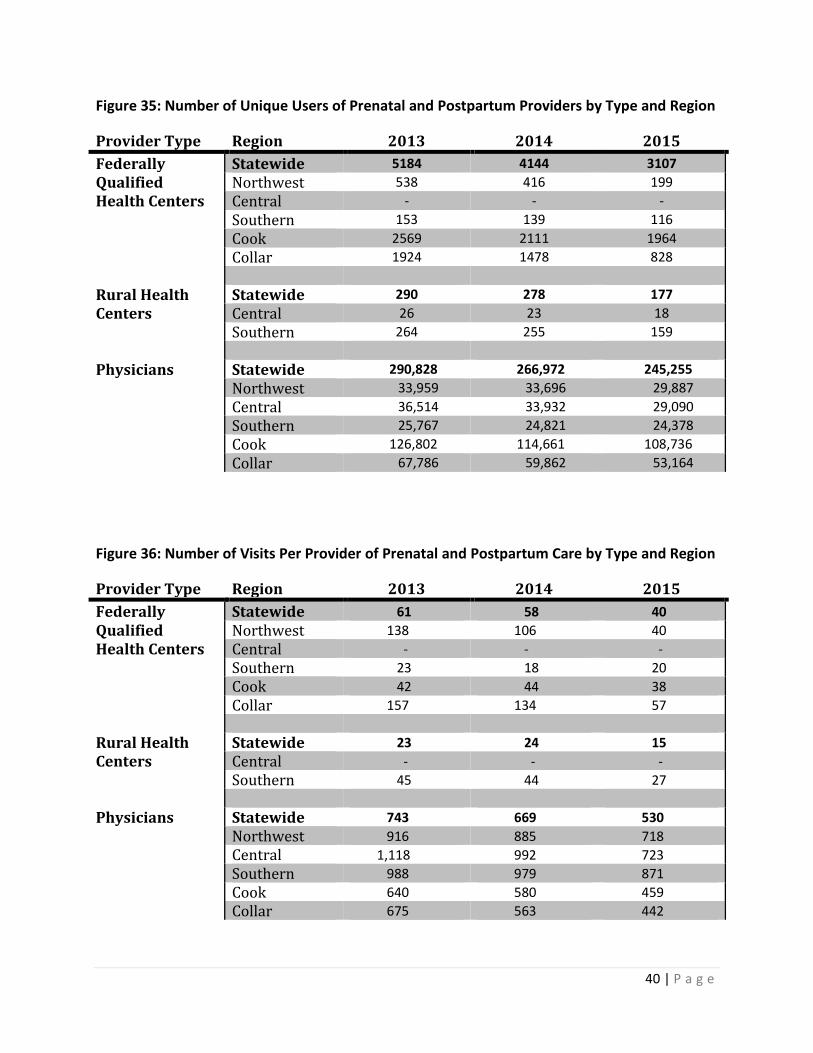
Figure 35: Number of Unique Users of Prenatal and Postpartum Providers by Type and Region
Provider Type Region 2013 2014 2015 Federally Statewide 5184 4144 3107 Qualified Northwest 538 416 199 Health Centers Central - - - Southern 153 139 116 Cook 2569 2111 1964 Collar 1924 1478 828 Rural Health Statewide 290 278 177 Centers Central 26 23 18 Southern 264 255 159 Physicians Statewide 290,828 266,972 245,255 Northwest 33,959 33,696 29,887 Central 36,514 33,932 29,090 Southern 25,767 24,821 24,378 Cook 126,802 114,661 108,736 Collar 67,786 59,862 53,164
Figure 36: Number of Visits Per Provider of Prenatal and Postpartum Care by Type and Region
Provider Type Region 2013 2014 2015 Federally Statewide 61 58 40 Qualified Northwest 138 106 40 Health Centers Central - - - Southern 23 18 20 Cook 42 44 38 Collar 157 134 57 Rural Health Statewide 23 24 15 Centers Central - - - Southern 45 44 27 Physicians Statewide 743 669 530 Northwest 916 885 718 Central 1,118 992 723 Southern 988 979 871 Cook 640 580 459 Collar 675 563 442
41 | P a g e
Comparison Analysis of Medicaid Payment Rates to Medicare and Other Payers
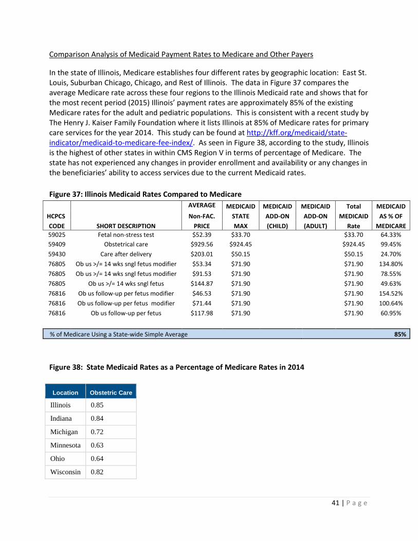
In the state of Illinois, Medicare establishes four different rates by geographic location: East St. Louis, Suburban Chicago, Chicago, and Rest of Illinois. The data in Figure 37 compares the average Medicare rate across these four regions to the Illinois Medicaid rate and shows that for the most recent period (2015) Illinois’ payment rates are approximately 85% of the existing Medicare rates for the adult and pediatric populations. This is consistent with a recent study by The Henry J. Kaiser Family Foundation where it lists Illinois at 85% of Medicare rates for primary care services for the year 2014. This study can be found at http://kff.org/medicaid/state-indicator/medicaid-to-medicare-fee-index/. As seen in Figure 38, according to the study, Illinois is the highest of other states in within CMS Region V in terms of percentage of Medicare. The state has not experienced any changes in provider enrollment and availability or any changes in the beneficiaries’ ability to access services due to the current Medicaid rates. Figure 37: Illinois Medicaid Rates Compared to Medicare
AVERAGE
MEDICAID MEDICAID MEDICAID Total MEDICAID HCPCS Non-FAC. STATE ADD-ON ADD-ON MEDICAID AS % OF CODE SHORT DESCRIPTION PRICE MAX (CHILD) (ADULT) Rate MEDICARE 59025 Fetal non-stress test $52.39 $33.70
$33.70 64.33%
59409 Obstetrical care $929.56 $924.45 $924.45 99.45% 59430 Care after delivery $203.01 $50.15
$50.15 24.70%
76805 Ob us >/= 14 wks sngl fetus modifier $53.34 $71.90 $71.90 134.80% 76805 Ob us >/= 14 wks sngl fetus modifier $91.53 $71.90
$71.90 78.55%
76805 Ob us >/= 14 wks sngl fetus $144.87 $71.90 $71.90 49.63% 76816 Ob us follow-up per fetus modifier $46.53 $71.90
$71.90 154.52%
76816 Ob us follow-up per fetus modifier $71.44 $71.90 $71.90 100.64% 76816 Ob us follow-up per fetus $117.98 $71.90
$71.90 60.95%
% of Medicare Using a State-wide Simple Average 85% Figure 38: State Medicaid Rates as a Percentage of Medicare Rates in 2014
Location Obstetric Care
Illinois 0.85
Indiana 0.84
Michigan 0.72
Minnesota 0.63
Ohio 0.64
Wisconsin 0.82

42 | P a g e
Data sources: Medicaid provider enrollment system Medicaid claims payment data (MMIS) CMS.Gov Physician Fee Schedule Illinois Medicaid Professional Fee Schedule The Kaiser Family Foundation KFF.org