Embed Size (px)
Citation preview
Energy Equity in Vermont:
Total Energy Visualization and Calculation
May 2017
Allie Aiello Peter Hayes
Emma Picardi Daniella Silva Ali Surdoval
Middlebury College Environmental Studies Senior Seminar (ENVS 0401A)
Kathryn Morse and Diane Munroe
2
Table of Contents
I. Introduction……………………………………………………………………...3
II. Methods………………………………………………………………………….4
A. Calculators………………………………..……………………………….4
B. Infographics………………………………..……………...………………4
III. Total Energy Calculator………………………………………………………...6
A. Calculator Criteria………………………………………..........................6
B. Evaluation of Chosen Calculators………………………………………...7
IV. Infographics and Artist Statements……………………………………………8
V. Conclusion……………………………………………………………………..25
VI. References……………………………………………………………………..26
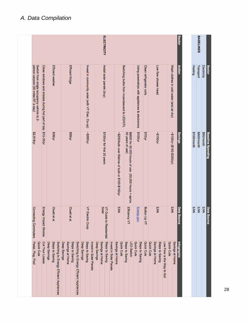
A. Data Compilation…………………………………………………………28
3
I. Introduction
In 2013, Vermont spent $5,196 per capita on energy, which was the 14th highest per
capita energy expenditure in the nation. At the same time, Vermont was ranked 44th regarding energy usage, thus making Vermont one of the most energy inefficient states in the nation.1 Over the past three months, ENVS0401A’s Total Energy Visualization and Calculation team has been working toward two goals in collaboration with Vermont’s Energy Action Network (EAN) in an effort to help solve this problem. Our first task involved research into “Total Energy Financial Calculators,” which are online tools that allow individuals to estimate their annual energy use and cost to operate specific products such as appliances. EAN is looking to add this kind of “calculator” to their Community Energy Dashboard, but wanted us to explore the pros and cons of existing options and make recommendations for how they might modify or streamline their own version. Through experimentation with numerous different calculators, which ranged from federally-sponsored to statewide to nonprofit-based calculation programs, we defined a set of criteria that we felt evaluated the effectiveness of any given calculator in helping the average Vermonter understand the savings they could generate with a transition to a more sustainable use of energy in their homes and on the road. Our second task was to create a series of infographics directed toward low to middle-income Vermonters. Our objective was to clearly demonstrate the economic advantages (i.e. potential savings) of transitioning to a more energy-efficient lifestyle within three energy sectors: heating, electricity, and transportation. These transitions range from the weatherization of a poorly insulated house to the installation of an electric heat pump to the purchase of an electric vehicle, all moving away from unnecessary consumption of fossil fuels and, ideally, towards lower energy expenditures.
1 Vermont Department of Public Service, “Comprehensive Energy Plan 2016,” pg. 64 https://outside.vermont.gov/sov/webservices/Shared%20Documents/2016CEP_Final.pdf
4
II. Methods
Calculators:
For the calculator deliverable, we gathered research on a multitude of calculators from all over the country, and determined the pros and cons of each calculator through our own experimentation. We then created a spreadsheet with our top 3 calculators, which were determined by factors such as user-friendliness of the calculator, the amount of detail that was needed as an input for the calculator, the specificity of information regarding appliances needed for the calculator, and the way the information was presented in the calculator. After reviewing our calculators with our community partner Linda McGinnis, we reached out to Cool California (the organization behind our calculator of choice) to inquire about the potential of redesigning or adapting their calculator to cater to Vermonters. While we have yet to hear back from them, we hope that the Energy Action Network can partner with Cool California or another organization whose calculator we reviewed to provide Vermonters with a valuable resource.
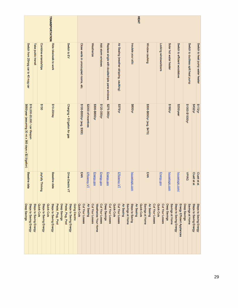
Infographics: We started this part of the project by first making a spreadsheet that outlined all of the potential switches and their associated savings that could be made across the three energy sectors.2 We thought this would not only help in visualizing all of the switches across sectors, but would also serve as a data source in order to keep our numbers consistent. Next, we proceeded to design infographics that covered a wide variety of options for energy saving switches. We decided to organize the infographics in a few different ways: by energy sector, switch effort, switch savings, or switch cost. Our goal was that, with multiple ways of displaying the information, our infographics could reach a broader audience and be used in a variety of settings. We also considered how to most effectively connect to low-middle income Vermonters. For example, we included factors beyond energy and financial savings in our infographics such as time savings and health benefits. On the suggestion of Linda, we designed our infographics with the help of a site called Venngage, which made the design and editing of the infographics a lot easier as it provided templates, icons and a number of different features that are useful for making engaging infographics. We approached this piece of our project individually at first, each creating two infographics, and then came back together to review our drafts and give each other feedback.
2 Spreadsheet attached at end of document for further reference.
5
Our infographics went through several stages of revision after receiving feedback from our peers, professors and Linda. We met with the environmental psychology professor at Middlebury, Professor McCauley, who provided useful suggestions for our infographics considering our audience’s particular cognitive load. She stressed how emphasizing savings versus what a switch may cost resonates more with consumers, particularly those of low-income. She also pointed out that making comparisons, such as highlighting how an unweatherized home is equivalent to having a two-foot hole in your wall during the winter is effective. In addition, she noted how using absolute values instead of percentages is a more effective, straightforward way of presenting information. Taking all of the suggestions we received into account, we edited our infographics as well as created new ones to fill in some of the gaps in our collection. We also decided to make a set of broad infographics that summarize switches within each energy sector requiring different levels of action, as well an infographic that tries to do this across all three energy sectors. Ideally these can stand alone or be used as a broad set by different energy programs.
We ended up creating a total of 16 infographics that use a variety of approaches to
highlight energy savings and resonate with different audiences. Because of the different approaches we took in both the presentation of the information and the aesthetics of the infographic, we are hoping our infographics can serve multiple purposes and be used under a range of contexts.
6
III. Total Energy Calculator
A. Calculator Criteria After experimenting with federal, nonprofit, and state-level calculators, we defined a number of different metrics on which to base our overall calculator assessments. As we tested a series of ten different calculators, we discussed the merits and drawbacks of each as a team and qualitatively ranked them, based on these metrics. Below are the six areas that we established as most important in determining the viability of any particular calculator.
1. Usability: How user-friendly is the calculator? To ensure that users have a positive experience with the calculator, it must be user-friendly. We all tested each calculator and recorded our findings on usability.
2. Savings Focus: Does the calculator focus on energy or cost savings? A calculator that generates energy savings may appeal to a different group of people than a calculator that generates cost savings, so we took into account each calculator’s focus.
3. Input Specificity: How general/specific does user energy use information need to be? Some calculators require very specific information that users may not know off hand, which may deter them from using the calculator. We sought out calculators that struck a balance between specific inputs that would enhance the actual calculations but potentially deter users and general or location-based estimates.
4. Energy Usage Categories: Which categories of energy use does the calculator take into consideration? A good energy calculator should take into account all aspects of energy use throughout the household. A total energy calculation should consider electricity, heating and transportation.
5. Suggested Tips or Actions for Users: What kind of tips/actions does the calculator offer to users based on their inputs? Some of the most comprehensive calculators offer suggestions to users for how they might reduce their energy usage and/or cost. An ideal version of this could also include strategies or resources for financing energy/cost reduction, especially for lower income brackets.
6. Aesthetic: How appealing is the calculator? As with any user tool, the overall appearance of the calculator matters for users. It impacts the user experience by clearly communicating results.
7
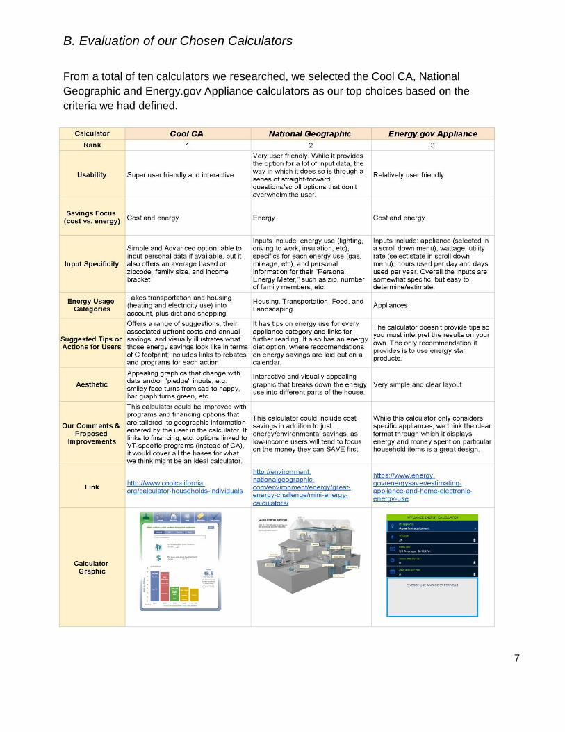
B. Evaluation of our Chosen Calculators From a total of ten calculators we researched, we selected the Cool CA, National Geographic and Energy.gov Appliance calculators as our top choices based on the criteria we had defined.
8
IV. Infographics and Artist Statements
*See companion pdf for larger versions of the infographics
9
broad
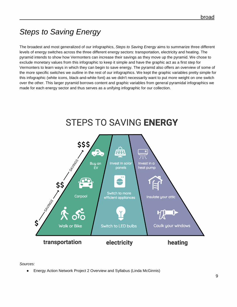
Steps to Saving Energy The broadest and most generalized of our infographics, Steps to Saving Energy aims to summarize three different levels of energy switches across the three different energy sectors: transportation, electricity and heating. The pyramid intends to show how Vermonters can increase their savings as they move up the pyramid. We chose to exclude monetary values from this infographic to keep it simple and have the graphic act as a first step for Vermonters to learn ways in which they can begin to save energy. The pyramid also offers an overview of some of the more specific switches we outline in the rest of our infographics. We kept the graphic variables pretty simple for this infographic (white icons, black-and-white font) as we didn't necessarily want to put more weight on one switch over the other. This larger pyramid borrows content and graphic variables from general pyramidal infographics we made for each energy sector and thus serves as a unifying infographic for our collection.
Sources: ● Energy Action Network Project 2 Overview and Syllabus (Linda McGinnis)
10
• Vermont Guide to Residential Solar (publicservice.vermont.gov)
• Vermont Public Interest Research Group (vpirg.org)
• Insulation Types and Tips (houselogic.com) • Solutions for Sustainable Living (eartheasy.com)
• Energy Action Network (eanvt.org) • Efficiency Vermont (efficiencyvermont.com) • Cluett, Rachel, Jennifer Amann, and Sodavy Ou.
“Building Better Energy Efficiency Programs for Low-Income Households.” American Council for an Energy-Efficient Economy, 2016.
broad
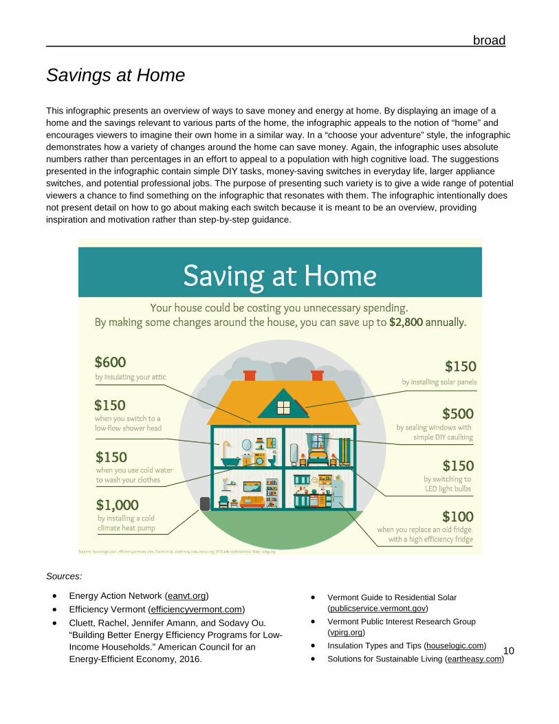
Savings at Home This infographic presents an overview of ways to save money and energy at home. By displaying an image of a home and the savings relevant to various parts of the home, the infographic appeals to the notion of “home” and encourages viewers to imagine their own home in a similar way. In a “choose your adventure” style, the infographic demonstrates how a variety of changes around the home can save money. Again, the infographic uses absolute numbers rather than percentages in an effort to appeal to a population with high cognitive load. The suggestions presented in the infographic contain simple DIY tasks, money-saving switches in everyday life, larger appliance switches, and potential professional jobs. The purpose of presenting such variety is to give a wide range of potential viewers a chance to find something on the infographic that resonates with them. The infographic intentionally does not present detail on how to go about making each switch because it is meant to be an overview, providing inspiration and motivation rather than step-by-step guidance.
Sources:
11
Sources: • Button Up VT (buttonupvermont.org) • EAN’s “Why Not” Presentation • Energy.gov
(energy.gov/energysaver/energy-saver) • FuelEconomy.gov (fueleconomy.gov) • Go! Vermont
(connectingcommuters.org) • Location Affordability Panel
(locationaffordability.info/lai.aspx)
broad
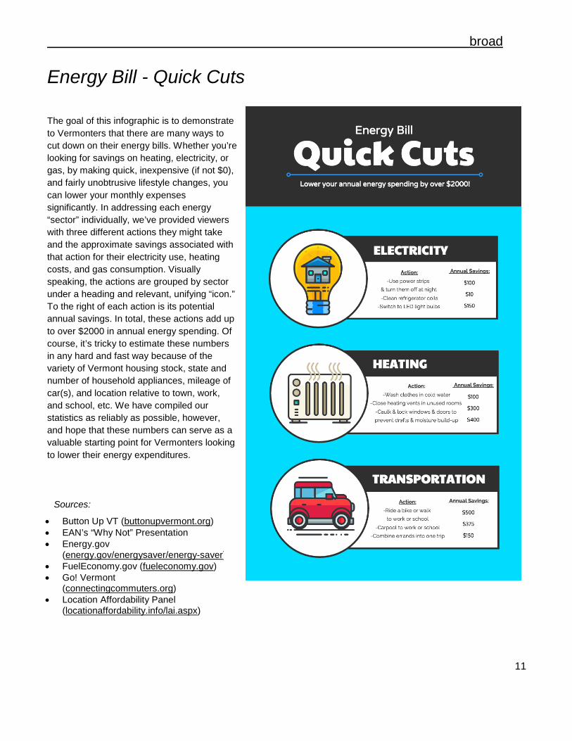
Energy Bill - Quick Cuts The goal of this infographic is to demonstrate to Vermonters that there are many ways to cut down on their energy bills. Whether you’re looking for savings on heating, electricity, or gas, by making quick, inexpensive (if not $0), and fairly unobtrusive lifestyle changes, you can lower your monthly expenses significantly. In addressing each energy “sector” individually, we’ve provided viewers with three different actions they might take and the approximate savings associated with that action for their electricity use, heating costs, and gas consumption. Visually speaking, the actions are grouped by sector under a heading and relevant, unifying “icon.” To the right of each action is its potential annual savings. In total, these actions add up to over $2000 in annual energy spending. Of course, it’s tricky to estimate these numbers in any hard and fast way because of the variety of Vermont housing stock, state and number of household appliances, mileage of car(s), and location relative to town, work, and school, etc. We have compiled our statistics as reliably as possible, however, and hope that these numbers can serve as a valuable starting point for Vermonters looking to lower their energy expenditures.
12
Sources:
• Cluett, Rachel, Jennifer Amann, and Sodavy Ou. “Building Better Energy Efficiency Programs for Low-Income Households.” American Council for an Energy-Efficient Economy, 2016.
• Drive Electric VT (driveelectricvt.com) • EAN’s “Why Not” Presentation • FuelEconomy.gov (fueleconomy.gov) • House Logic (houselogic.com) • VEC Co-Op Community Solar
(vermontelectric.coop/images/Coop_Community_Solar_FAQ_Oct_2016.pdf)
• “A Vermonter’s Guide to Rooftop Solar (publicservice.vermont.gov/sites/dps/files/documents/Renewable_Energy/Vt%20Guide%20to%20Residential%20Solar%202016.pdf)
• VPIRG (vpirg.org/news/air-source-heat-pumps- your-questions-answered/
broad
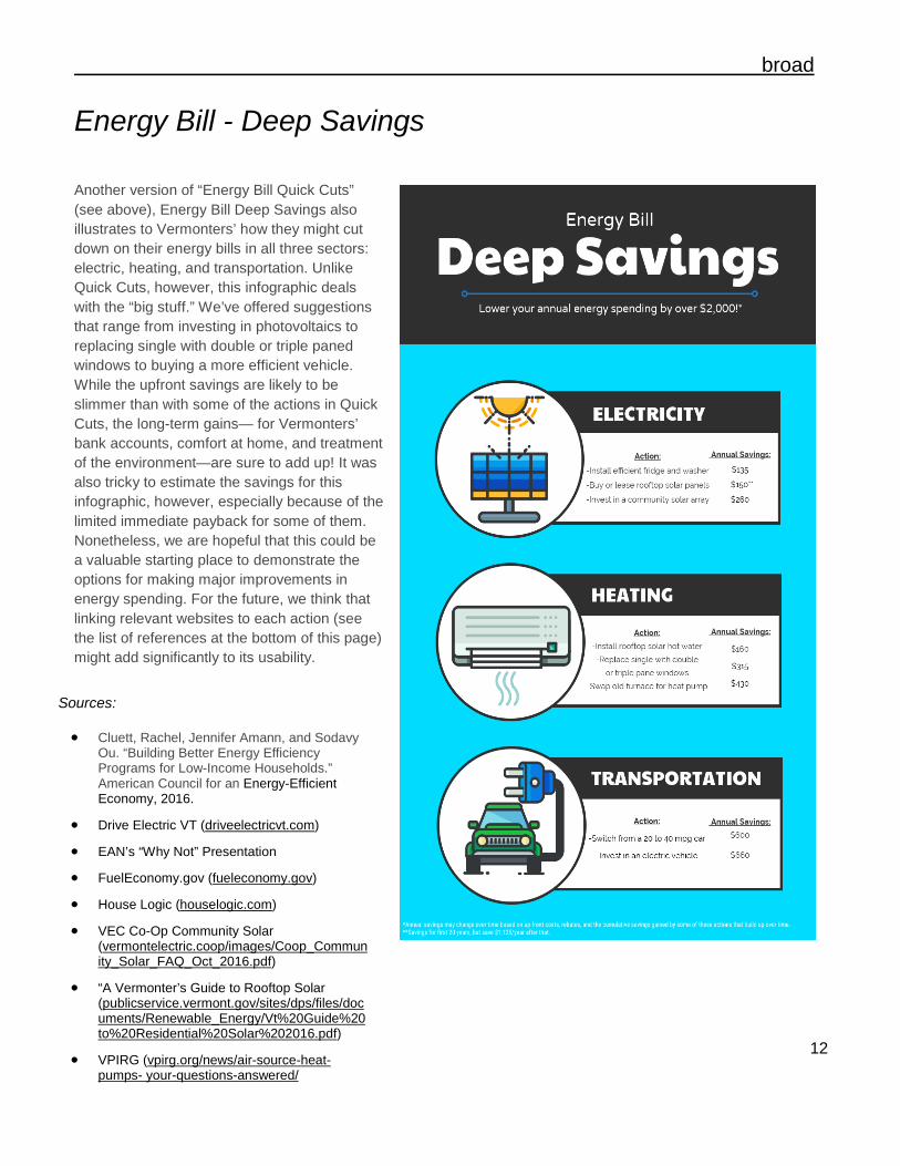
Energy Bill - Deep Savings Another version of “Energy Bill Quick Cuts” (see above), Energy Bill Deep Savings also illustrates to Vermonters’ how they might cut down on their energy bills in all three sectors: electric, heating, and transportation. Unlike Quick Cuts, however, this infographic deals with the “big stuff.” We’ve offered suggestions that range from investing in photovoltaics to replacing single with double or triple paned windows to buying a more efficient vehicle. While the upfront savings are likely to be slimmer than with some of the actions in Quick Cuts, the long-term gains— for Vermonters’ bank accounts, comfort at home, and treatment of the environment—are sure to add up! It was also tricky to estimate the savings for this infographic, however, especially because of the limited immediate payback for some of them. Nonetheless, we are hopeful that this could be a valuable starting place to demonstrate the options for making major improvements in energy spending. For the future, we think that linking relevant websites to each action (see the list of references at the bottom of this page) might add significantly to its usability.
13
transportation
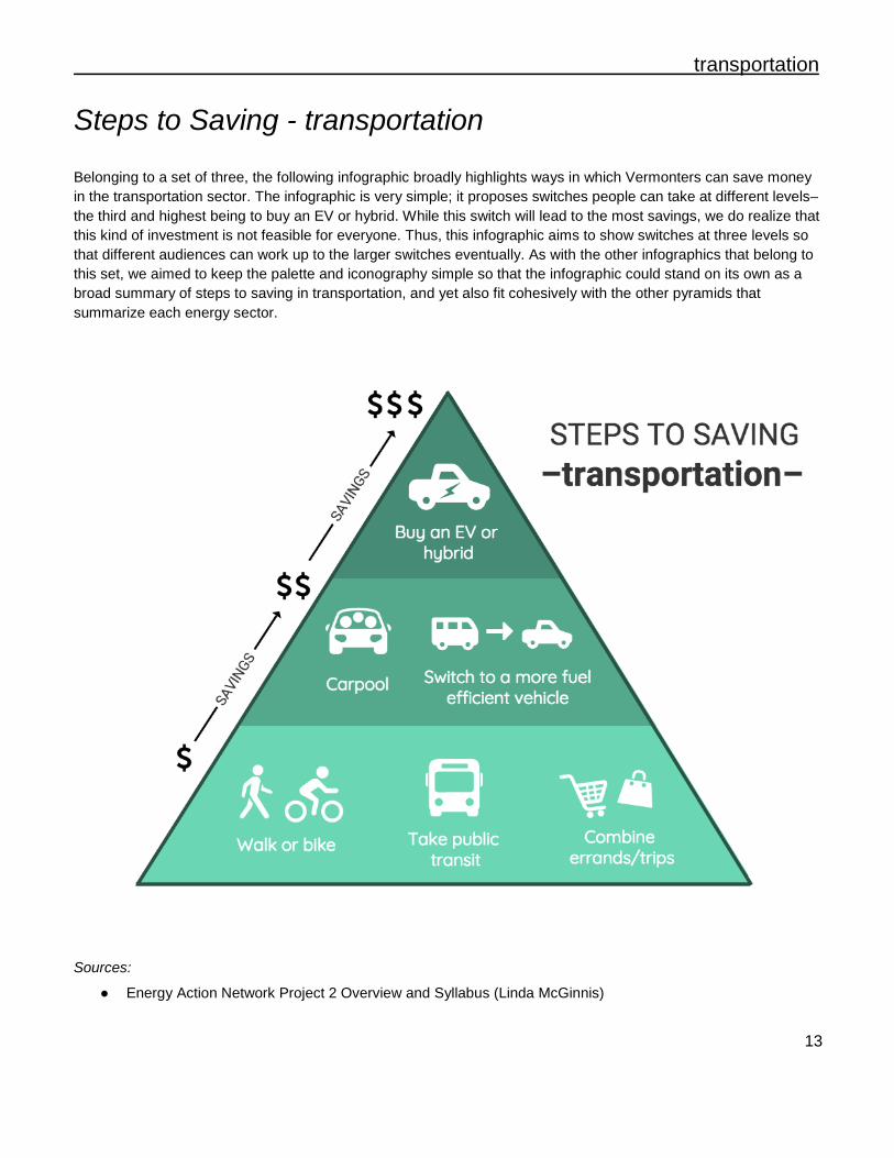
Steps to Saving - transportation Belonging to a set of three, the following infographic broadly highlights ways in which Vermonters can save money in the transportation sector. The infographic is very simple; it proposes switches people can take at different levels–the third and highest being to buy an EV or hybrid. While this switch will lead to the most savings, we do realize that this kind of investment is not feasible for everyone. Thus, this infographic aims to show switches at three levels so that different audiences can work up to the larger switches eventually. As with the other infographics that belong to this set, we aimed to keep the palette and iconography simple so that the infographic could stand on its own as a broad summary of steps to saving in transportation, and yet also fit cohesively with the other pyramids that summarize each energy sector.
Sources:
● Energy Action Network Project 2 Overview and Syllabus (Linda McGinnis)
14
transportation
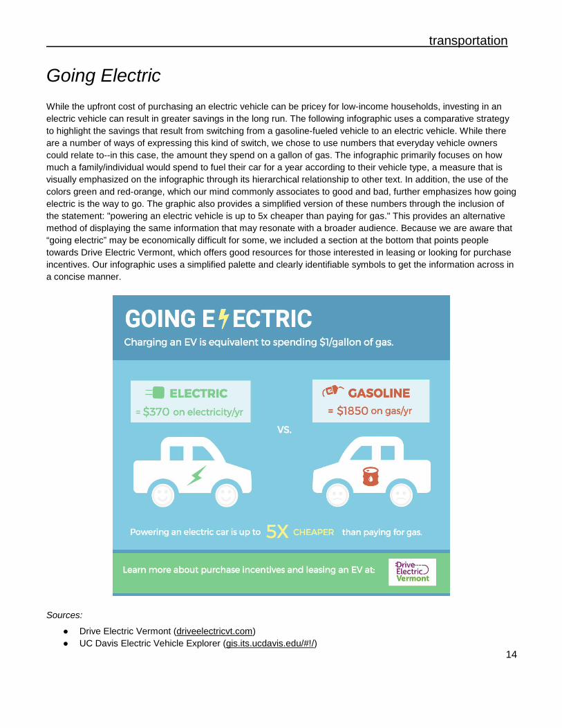
Going Electric While the upfront cost of purchasing an electric vehicle can be pricey for low-income households, investing in an electric vehicle can result in greater savings in the long run. The following infographic uses a comparative strategy to highlight the savings that result from switching from a gasoline-fueled vehicle to an electric vehicle. While there are a number of ways of expressing this kind of switch, we chose to use numbers that everyday vehicle owners could relate to--in this case, the amount they spend on a gallon of gas. The infographic primarily focuses on how much a family/individual would spend to fuel their car for a year according to their vehicle type, a measure that is visually emphasized on the infographic through its hierarchical relationship to other text. In addition, the use of the colors green and red-orange, which our mind commonly associates to good and bad, further emphasizes how going electric is the way to go. The graphic also provides a simplified version of these numbers through the inclusion of the statement: "powering an electric vehicle is up to 5x cheaper than paying for gas." This provides an alternative method of displaying the same information that may resonate with a broader audience. Because we are aware that “going electric” may be economically difficult for some, we included a section at the bottom that points people towards Drive Electric Vermont, which offers good resources for those interested in leasing or looking for purchase incentives. Our infographic uses a simplified palette and clearly identifiable symbols to get the information across in a concise manner.
Sources:
● Drive Electric Vermont (driveelectricvt.com) ● UC Davis Electric Vehicle Explorer (gis.its.ucdavis.edu/#!/)

15
transportation
Discount Driving: Pedal, Plug, Pool Centered on the high costs of driving, this infographic is designed to illustrate the potential for significant annual savings by bicycling, driving an electric car, or carpooling. Using the power of alliteration to break up the scheme visually, each of the three actions (and the alternative of conventional driving practices) is represented by a colored bar with a white icon on top. The icons—3 people in a car, a bicycle, a car with its charging battery—demonstrate the associated action, and the monetary figure below describes the relative costs. Beneath the bar graphs, each action is accompanied by a brief description and statistic, also in white. The main drawback of this design is its lack of data with respect to the up-front costs of investing in an electric vehicle. Clearly, this is not a simple figure to establish considering the model and make of the car, its prior use, the dealership, and the option to lease instead of buy. Nonetheless, our thought process was that, if a Vermonter were in the market for a new (or used!) car, the $1/gallon statistic might catch their eye and encourage them to look into the possibility of going electric instead of continuing to rely on gas.
Sources:
● Drive Electric VT (http://www.driveelectricvt.com) ● FuelEconomy.gov (http://www.fueleconomy.gov) ● Go! Vermont (http://www.connectingcommuters.org)
heat
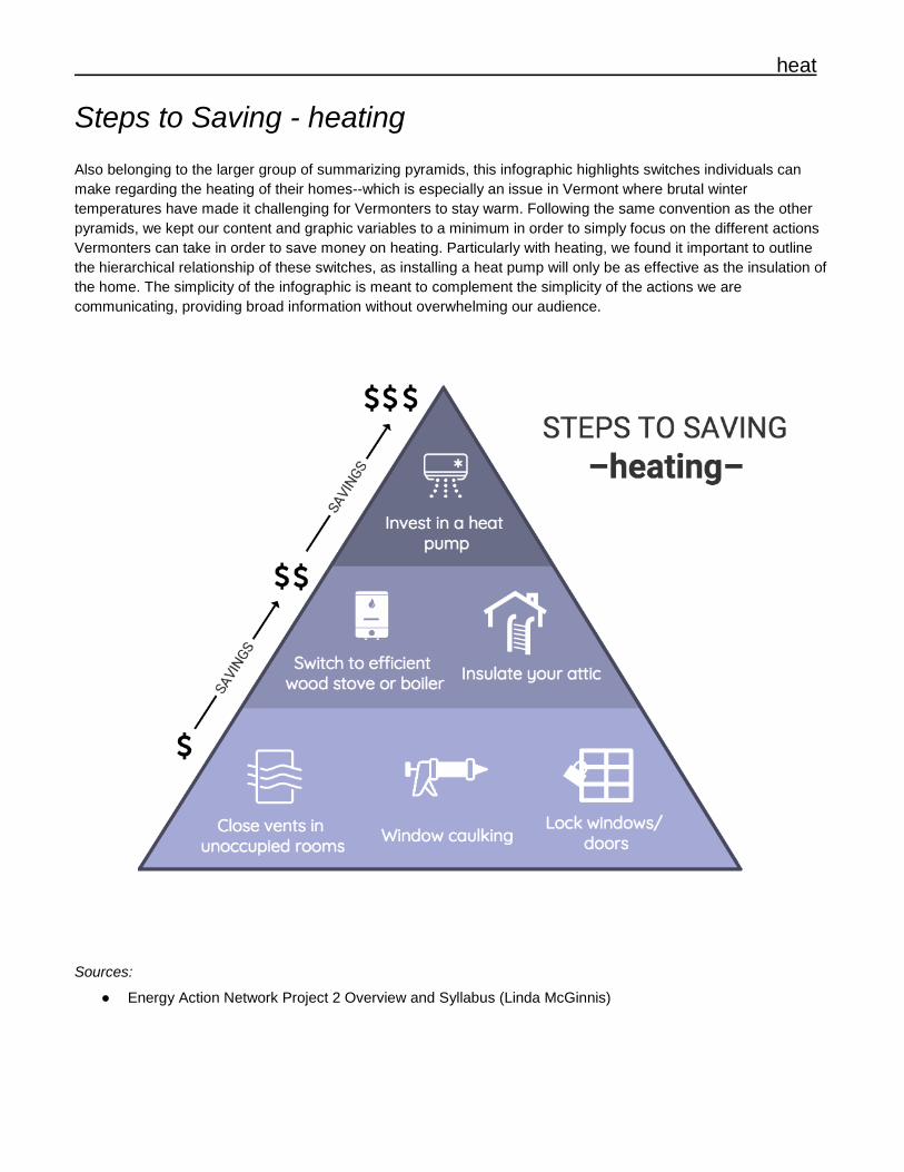
Steps to Saving - heating Also belonging to the larger group of summarizing pyramids, this infographic highlights switches individuals can make regarding the heating of their homes--which is especially an issue in Vermont where brutal winter temperatures have made it challenging for Vermonters to stay warm. Following the same convention as the other pyramids, we kept our content and graphic variables to a minimum in order to simply focus on the different actions Vermonters can take in order to save money on heating. Particularly with heating, we found it important to outline the hierarchical relationship of these switches, as installing a heat pump will only be as effective as the insulation of the home. The simplicity of the infographic is meant to complement the simplicity of the actions we are communicating, providing broad information without overwhelming our audience.
Sources: ● Energy Action Network Project 2 Overview and Syllabus (Linda McGinnis)
17
heat
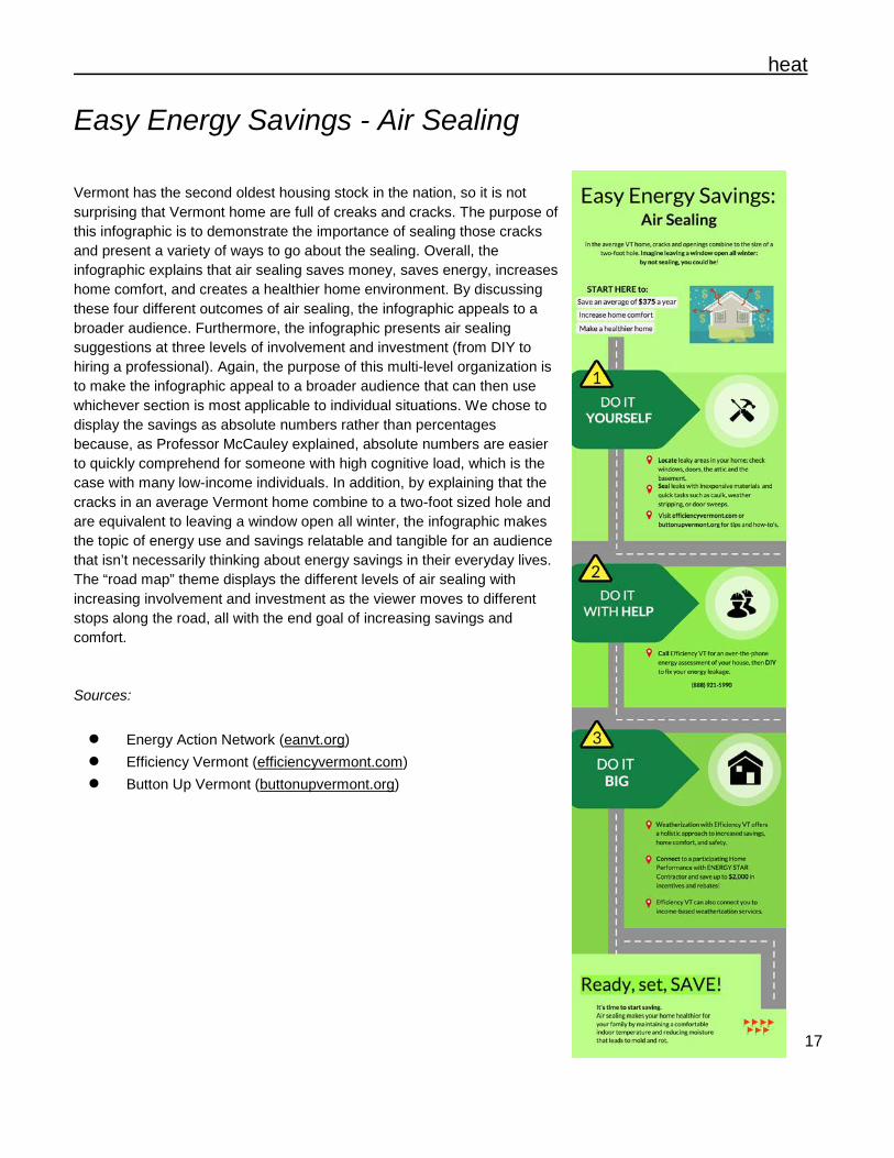
Easy Energy Savings - Air Sealing Vermont has the second oldest housing stock in the nation, so it is not surprising that Vermont home are full of creaks and cracks. The purpose of this infographic is to demonstrate the importance of sealing those cracks and present a variety of ways to go about the sealing. Overall, the infographic explains that air sealing saves money, saves energy, increases home comfort, and creates a healthier home environment. By discussing these four different outcomes of air sealing, the infographic appeals to a broader audience. Furthermore, the infographic presents air sealing suggestions at three levels of involvement and investment (from DIY to hiring a professional). Again, the purpose of this multi-level organization is to make the infographic appeal to a broader audience that can then use whichever section is most applicable to individual situations. We chose to display the savings as absolute numbers rather than percentages because, as Professor McCauley explained, absolute numbers are easier to quickly comprehend for someone with high cognitive load, which is the case with many low-income individuals. In addition, by explaining that the cracks in an average Vermont home combine to a two-foot sized hole and are equivalent to leaving a window open all winter, the infographic makes the topic of energy use and savings relatable and tangible for an audience that isn’t necessarily thinking about energy savings in their everyday lives. The “road map” theme displays the different levels of air sealing with increasing involvement and investment as the viewer moves to different stops along the road, all with the end goal of increasing savings and comfort. Sources:
● Energy Action Network (eanvt.org) ● Efficiency Vermont (efficiencyvermont.com) ● Button Up Vermont (buttonupvermont.org)
18
heat
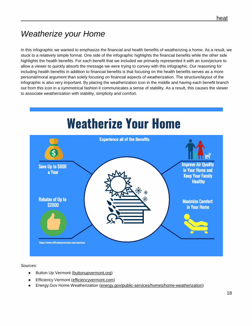
Weatherize your Home In this infographic we wanted to emphasize the financial and health benefits of weatherizing a home. As a result, we stuck to a relatively simple format. One side of the infographic highlights the financial benefits while the other side highlights the health benefits. For each benefit that we included we primarily represented it with an icon/picture to allow a viewer to quickly absorb the message we were trying to convey with this infographic. Our reasoning for including health benefits in addition to financial benefits is that focusing on the health benefits serves as a more personal/moral argument than solely focusing on financial aspects of weatherization. The structure/layout of the infographic is also very important. By placing the weatherization icon in the middle and having each benefit branch out from this icon in a symmetrical fashion it communicates a sense of stability. As a result, this causes the viewer to associate weatherization with stability, simplicity and comfort.
Sources:
● Button Up Vermont (buttonupvermont.org)
● Efficiency Vermont (efficiencyvermont.com) ● Energy.Gov Home Weatherization (energy.gov/public-services/homes/home-weatherization)
19
heat
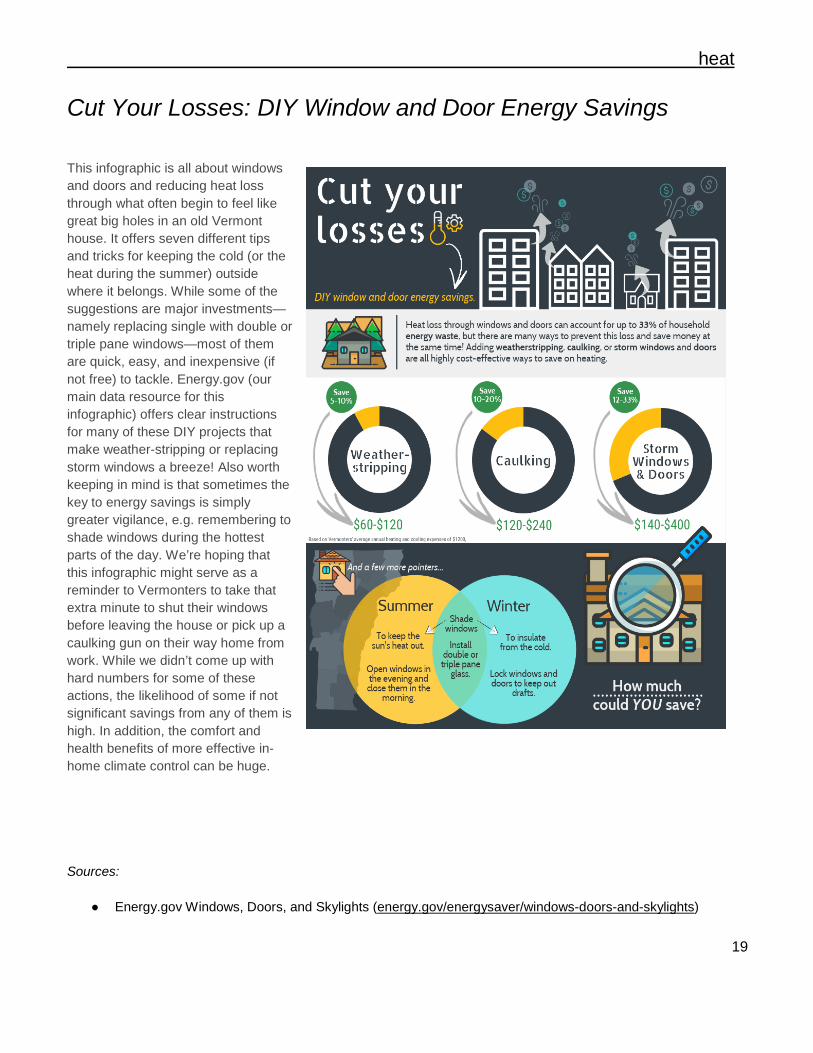
Cut Your Losses: DIY Window and Door Energy Savings This infographic is all about windows and doors and reducing heat loss through what often begin to feel like great big holes in an old Vermont house. It offers seven different tips and tricks for keeping the cold (or the heat during the summer) outside where it belongs. While some of the suggestions are major investments—namely replacing single with double or triple pane windows—most of them are quick, easy, and inexpensive (if not free) to tackle. Energy.gov (our main data resource for this infographic) offers clear instructions for many of these DIY projects that make weather-stripping or replacing storm windows a breeze! Also worth keeping in mind is that sometimes the key to energy savings is simply greater vigilance, e.g. remembering to shade windows during the hottest parts of the day. We’re hoping that this infographic might serve as a reminder to Vermonters to take that extra minute to shut their windows before leaving the house or pick up a caulking gun on their way home from work. While we didn’t come up with hard numbers for some of these actions, the likelihood of some if not significant savings from any of them is high. In addition, the comfort and health benefits of more effective in-home climate control can be huge. Sources:
● Energy.gov Windows, Doors, and Skylights (energy.gov/energysaver/windows-doors-and-skylights)
20
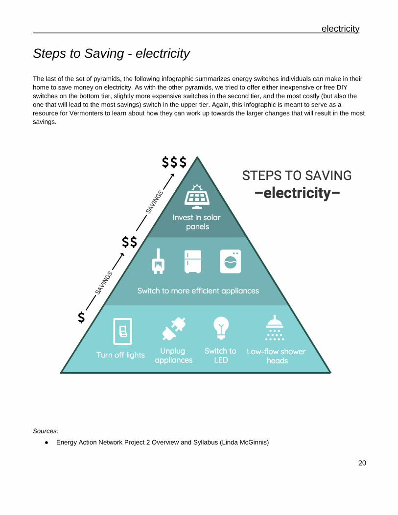
electricity
Steps to Saving - electricity The last of the set of pyramids, the following infographic summarizes energy switches individuals can make in their home to save money on electricity. As with the other pyramids, we tried to offer either inexpensive or free DIY switches on the bottom tier, slightly more expensive switches in the second tier, and the most costly (but also the one that will lead to the most savings) switch in the upper tier. Again, this infographic is meant to serve as a resource for Vermonters to learn about how they can work up towards the larger changes that will result in the most savings.
Sources:
● Energy Action Network Project 2 Overview and Syllabus (Linda McGinnis)
21
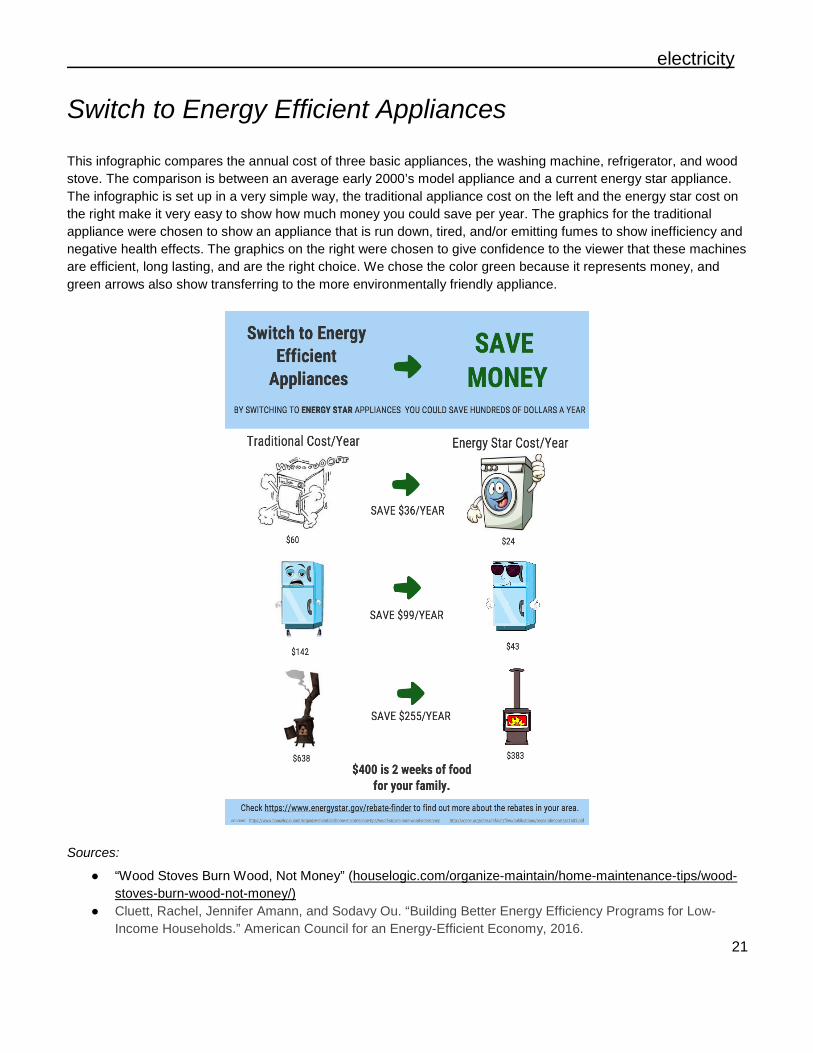
electricity
Switch to Energy Efficient Appliances This infographic compares the annual cost of three basic appliances, the washing machine, refrigerator, and wood stove. The comparison is between an average early 2000’s model appliance and a current energy star appliance. The infographic is set up in a very simple way, the traditional appliance cost on the left and the energy star cost on the right make it very easy to show how much money you could save per year. The graphics for the traditional appliance were chosen to show an appliance that is run down, tired, and/or emitting fumes to show inefficiency and negative health effects. The graphics on the right were chosen to give confidence to the viewer that these machines are efficient, long lasting, and are the right choice. We chose the color green because it represents money, and green arrows also show transferring to the more environmentally friendly appliance.
Sources:
● “Wood Stoves Burn Wood, Not Money” (houselogic.com/organize-maintain/home-maintenance-tips/wood-stoves-burn-wood-not-money/)
● Cluett, Rachel, Jennifer Amann, and Sodavy Ou. “Building Better Energy Efficiency Programs for Low-Income Households.” American Council for an Energy-Efficient Economy, 2016.
22
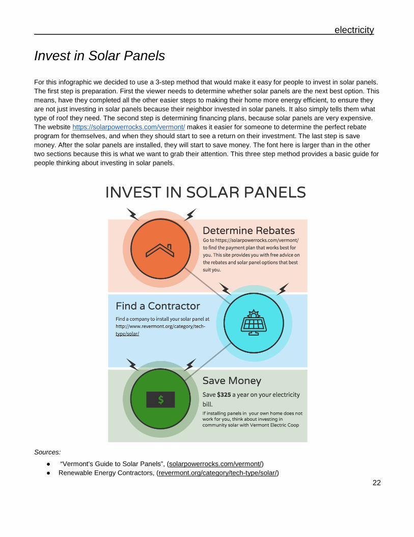
electricity
Invest in Solar Panels For this infographic we decided to use a 3-step method that would make it easy for people to invest in solar panels. The first step is preparation. First the viewer needs to determine whether solar panels are the next best option. This means, have they completed all the other easier steps to making their home more energy efficient, to ensure they are not just investing in solar panels because their neighbor invested in solar panels. It also simply tells them what type of roof they need. The second step is determining financing plans, because solar panels are very expensive. The website https://solarpowerrocks.com/vermont/ makes it easier for someone to determine the perfect rebate program for themselves, and when they should start to see a return on their investment. The last step is save money. After the solar panels are installed, they will start to save money. The font here is larger than in the other two sections because this is what we want to grab their attention. This three step method provides a basic guide for people thinking about investing in solar panels.
Sources:
● “Vermont’s Guide to Solar Panels”, (solarpowerrocks.com/vermont/) ● Renewable Energy Contractors, (revermont.org/category/tech-type/solar/)
23
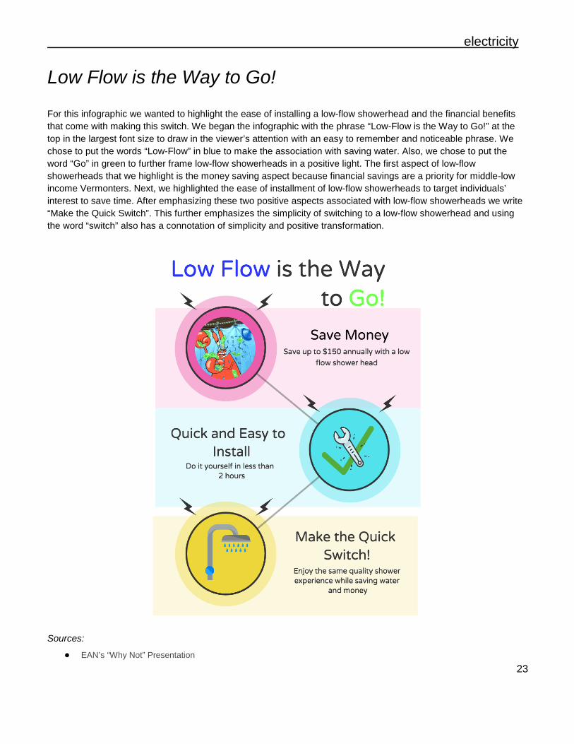
electricity
Low Flow is the Way to Go! For this infographic we wanted to highlight the ease of installing a low-flow showerhead and the financial benefits that come with making this switch. We began the infographic with the phrase “Low-Flow is the Way to Go!” at the top in the largest font size to draw in the viewer’s attention with an easy to remember and noticeable phrase. We chose to put the words “Low-Flow” in blue to make the association with saving water. Also, we chose to put the word “Go” in green to further frame low-flow showerheads in a positive light. The first aspect of low-flow showerheads that we highlight is the money saving aspect because financial savings are a priority for middle-low income Vermonters. Next, we highlighted the ease of installment of low-flow showerheads to target individuals’ interest to save time. After emphasizing these two positive aspects associated with low-flow showerheads we write “Make the Quick Switch”. This further emphasizes the simplicity of switching to a low-flow showerhead and using the word “switch” also has a connotation of simplicity and positive transformation.
Sources:
● EAN’s “Why Not” Presentation
24
electricity
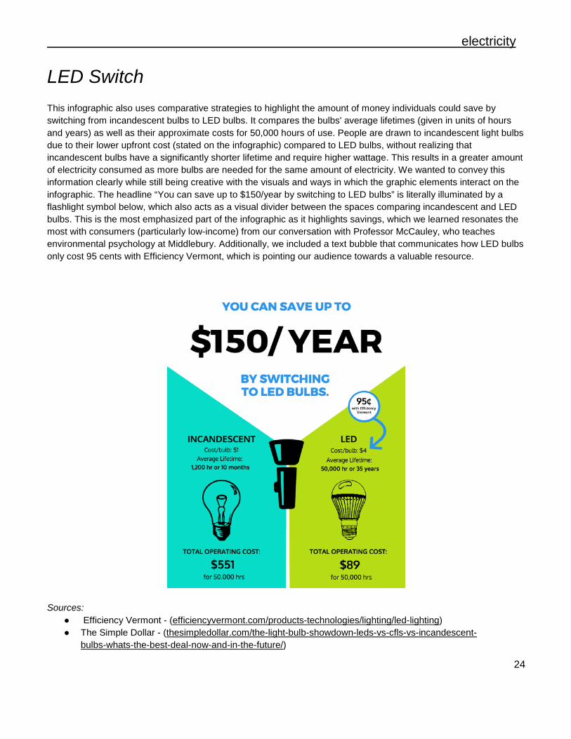
LED Switch This infographic also uses comparative strategies to highlight the amount of money individuals could save by switching from incandescent bulbs to LED bulbs. It compares the bulbs' average lifetimes (given in units of hours and years) as well as their approximate costs for 50,000 hours of use. People are drawn to incandescent light bulbs due to their lower upfront cost (stated on the infographic) compared to LED bulbs, without realizing that incandescent bulbs have a significantly shorter lifetime and require higher wattage. This results in a greater amount of electricity consumed as more bulbs are needed for the same amount of electricity. We wanted to convey this information clearly while still being creative with the visuals and ways in which the graphic elements interact on the infographic. The headline “You can save up to $150/year by switching to LED bulbs” is literally illuminated by a flashlight symbol below, which also acts as a visual divider between the spaces comparing incandescent and LED bulbs. This is the most emphasized part of the infographic as it highlights savings, which we learned resonates the most with consumers (particularly low-income) from our conversation with Professor McCauley, who teaches environmental psychology at Middlebury. Additionally, we included a text bubble that communicates how LED bulbs only cost 95 cents with Efficiency Vermont, which is pointing our audience towards a valuable resource.
Sources: ● Efficiency Vermont - (efficiencyvermont.com/products-technologies/lighting/led-lighting) ● The Simple Dollar - (thesimpledollar.com/the-light-bulb-showdown-leds-vs-cfls-vs-incandescent-
bulbs-whats-the-best-deal-now-and-in-the-future/)
25
V. Conclusion
Overall, through our assessment and selection of total energy calculators and the
creation and design of these infographics, we have taken the initial steps towards making the adoption and implementation of energy saving practices more accessible to Vermont residents. These calculators and infographics demonstrate that there exist a multiplicity of benefits associated with taking actions toward greater energy efficiency, including financial benefits, increased comfort and convenience, improved health, and reduced strain on the environment.
While we feel that we have achieved our ultimate goal of presenting these energy efficient actions in a way that encourages Vermonters to take initiative and make these switches, we faced a number of challenges when creating and designing our infographics. One of these challenges involved the pinning down of savings statistics to include in the infographics and how to portray these values in an easily understood format. While quantifying energy use is not necessarily difficult, taking into account all the factors that have an impact on these calculations presents a more complex, but also comprehensive picture. We have done our utmost to present numbers that we think are both representative of the energy statistics of the average low-middle income Vermonter and also account for variability in financial, physical, and logistical ability. An additional hurdle, determining how to highlight specific actions that homeowners can take to save energy and money while simultaneously portraying the broader connection between all of these different switches, posed a formidable challenge.
Finally, some further steps must be taken such as contacting “Cool California” to receive permission to utilize and adapt their total energy calculator for the Vermont region. Additionally, there are further directions in which this project can be taken such as focusing more on a specific energy sector (heating, electricity, transportation) or adapting this project to a larger geographic region beyond the borders of Vermont.

26
VI. References
Vermont Energy Programming Resources ● Button-Up Vermont
● Drive Electric Vermont
● Efficiency Vermont
● Energy Action Network
● Green Mountain Power
● Heat Saver
● LIHEAP
● NeighborWorks
● Property Assessed Clean Energy Financing
● Vermont Energy Investment Corporation
● Vital Communities Energy Equity Background Information Cluett, Rachel, Jennifer Amann, and Sodavy Ou. “Building Better Energy Efficiency
Programs for Low-Income Households.” American Council for an Energy-Efficient Economy, 2016.
Drehobl, Ariel and Lauren Ross. “Lifting the High Energy Burden in America’s Largest
Cities: How Energy Efficiency Can Improve Low Income and Underserved Communities.” American Council for an Energy-Efficient Economy, 2016.
Recchia, Christopher (Commissioner). “2016 Comprehensive Energy Plan.” Vermont
Department of Public Service, 2016. Teller-Ersberg, Jonathan, Benjamin Sovacool, Taylor Smith, Emily Laine. “Energy costs
and burden in Vermont: burdensome for whom?” Vermont Law School Institute for Energy and the Environment, 2014.
27
U.S. Energy Information Administration. “Vermont State Profile and Energy Estimates.”
Last modified June, 2016. https://www.eia.gov/state/?sid=VT#tabs-1 Vermont Energy Investment Corporation, Transportation Efficiency Group, Justine Sears. “Mapping Total Energy Burden in Vermont.” Vermont: Efficiency Vermont, 2016. Vermont Department of Public Service. “Comprehensive Energy Plan 2016”.
https://outside.vermont.gov/sov/webservices/Shared%20Documents/2016CEP_Final.pdf
Calculator Resources ACDoctor. “Energy Calculator.” https://www.acdoctor.com/energy-calculator.php Cool California. “Calculator for Households & Individuals.”
http://www.coolcalifornia.org/calculator-households-individuals Energy Saver. “Estimating Appliance and Home Electric Energy Use.” Energy.gov.
https://www.energy.gov/energysaver/estimating-appliance-and-home-electronic-energy-use
Naturally Better Insulation. “Insulation Saving Calculator.” Cellulose Insulation
Manufactures Association. https://www.acdoctor.com/energy-calculator.php Office of Energy Efficiency and Renewable Energy. “Energy- and Cost-Saving Calculators
for Energy-Efficient Products.” Energy.gov. https://energy.gov/eere/femp/energy-and-cost-savings-calculators-energy-efficient-products
Smarter Living. “Household Savings Calculator.” NRDC.
http://www.simplesteps.org/tools/house-savings-calculator# The Great Energy Challenge. “Mini-Calculators: Quick Energy Savings.” National
Geographic. http://environment.nationalgeographic.com/environment/energy/great-energy-challenge/mini-energy-calculators/
28
A. Data Compilation
29