Embed Size (px)
DESCRIPTION
Book compiling the basics of typography.
Citation preview
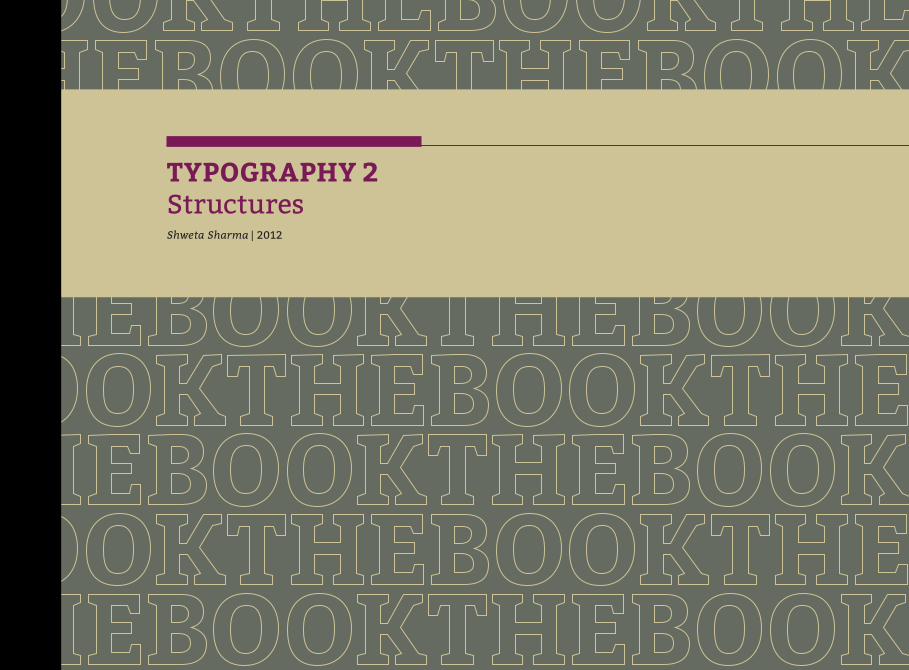
TYPOGRAPHY 2 StructuresShweta Sharma | 2012
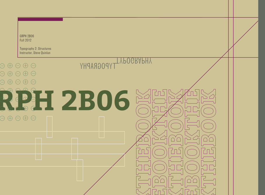
GRPH 2B06Fall 2012
Typography 2: StructuresInstructor, Steve Quinlan Book
GRPH 2B06
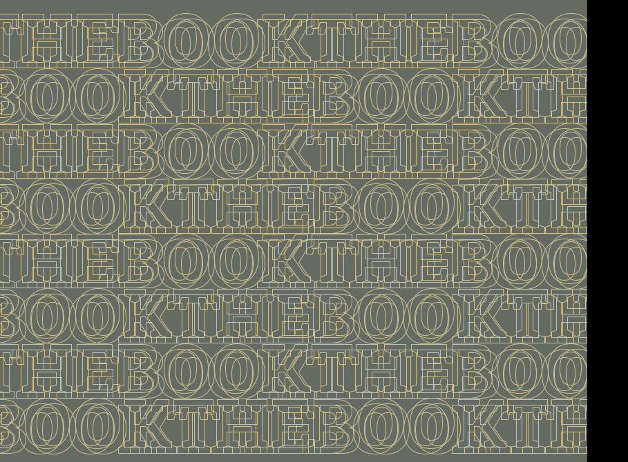
TYPOGRAPHYTYPOGRAPHY

BookBook
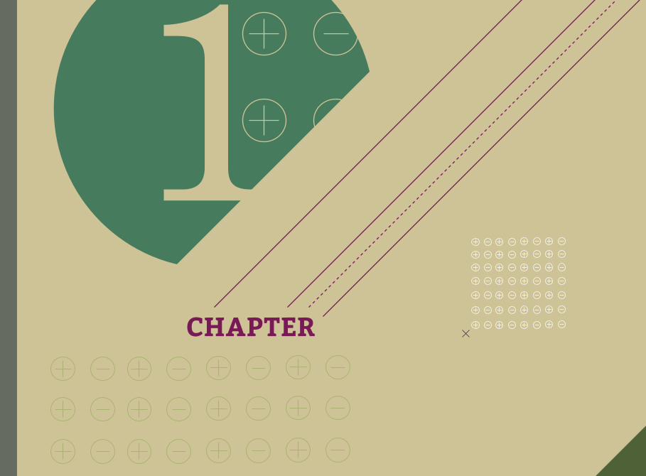
the CHAPTER
# Lorem ipsum dolor sit amet, consectetur adipiscing elit. Pellentesque elit magna, consectetur posuere imperdiet eu, rutrum eget massa. Vivamus hendrerit risus malesuada est convallis at congue massa tristique. Ut ut cursus ligula. Etiam ut elementum tortor.
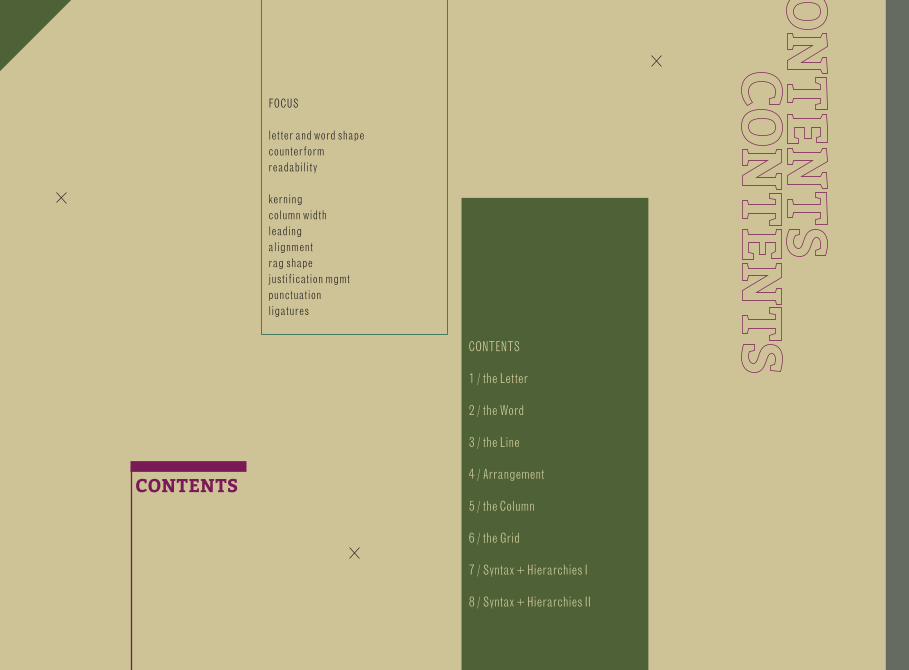
CONTENTS
FOCUS
letter and word shapecounterformreadability
kerningcolumn widthleadingalignmentrag shapejustification mgmtpunctuationligatures
CONTENTS
1 / the Letter
2 / the Word
3 / the Line
4 / Arrangement
5 / the Column
6 / the Grid
7 / Syntax + Hierarchies I
8 / Syntax + Hierarchies II
1CHAPTER
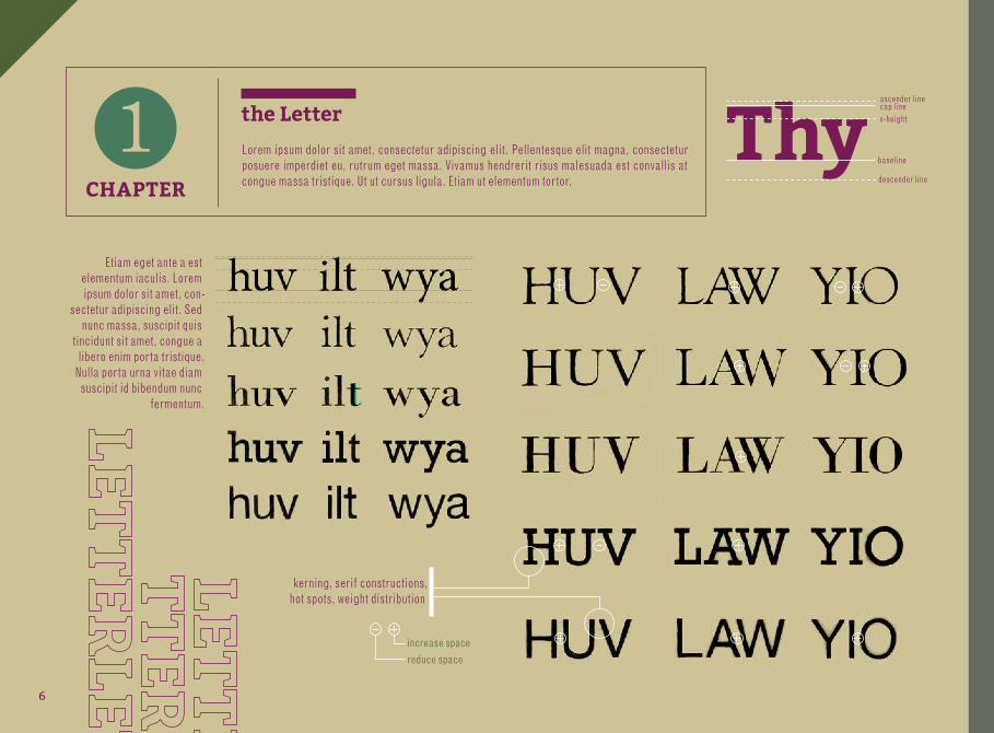
CHAPTER
1 the Letter
Lorem ipsum dolor sit amet, consectetur adipiscing elit. Pellentesque elit magna, consectetur posuere imperdiet eu, rutrum eget massa. Vivamus hendrerit risus malesuada est convallis at congue massa tristique. Ut ut cursus ligula. Etiam ut elementum tortor.
Thyascender linecap linex-height
baseline
descender line
kerning, serif constructions, hot spots, weight distribution
increase spacereduce space
Etiam eget ante a est elementum iaculis. Lorem ipsum dolor sit amet, con-
sectetur adipiscing elit. Sed nunc massa, suscipit quis
tincidunt sit amet, congue a libero enim porta tristique.
Nulla porta urna vitae diam suscipit id bibendum nunc
fermentum.
6
CHAPTER CHAPTER
CHAPTER
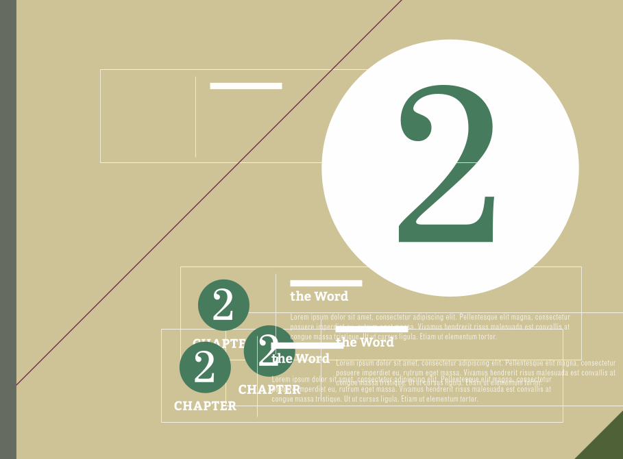
2 22
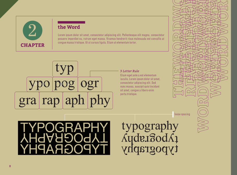
2the Word
the Word
the Word
Lorem ipsum dolor sit amet, consectetur adipiscing elit. Pellentesque elit magna, consectetur posuere imperdiet eu, rutrum eget massa. Vivamus hendrerit risus malesuada est convallis at congue massa tristique. Ut ut cursus ligula. Etiam ut elementum tortor.
Lorem ipsum dolor sit amet, consectetur adipiscing elit. Pellentesque elit magna, consectetur posuere imperdiet eu, rutrum eget massa. Vivamus hendrerit risus malesuada est convallis at congue massa tristique. Ut ut cursus ligula. Etiam ut elementum tortor.
Lorem ipsum dolor sit amet, consectetur adipiscing elit. Pellentesque elit magna, consectetur posuere imperdiet eu, rutrum eget massa. Vivamus hendrerit risus malesuada est convallis at congue massa tristique. Ut ut cursus ligula. Etiam ut elementum tortor.
CHAPTER
2 the WordLorem ipsum dolor sit amet, consectetur adipiscing elit. Pellentesque elit magna, consectetur posuere imperdiet eu, rutrum eget massa. Vivamus hendrerit risus malesuada est convallis at congue massa tristique. Ut ut cursus ligula. Etiam ut elementum tortor.
typography
typography
typographyTYPOGRAPHY
TYPOGRAPHY
TYPOGRAPHY
typ
graogrpogypo
rap aph phy
3 Letter Rule
loose spacing
3Etiam eget ante a est elementum iaculis. Lorem ipsum dolor sit amet, consectetur adipiscing elit. Sed nunc massa, suscipit quis tincidunt sit amet, congue a libero enim porta tristique.
8

3 3333CHAPTER
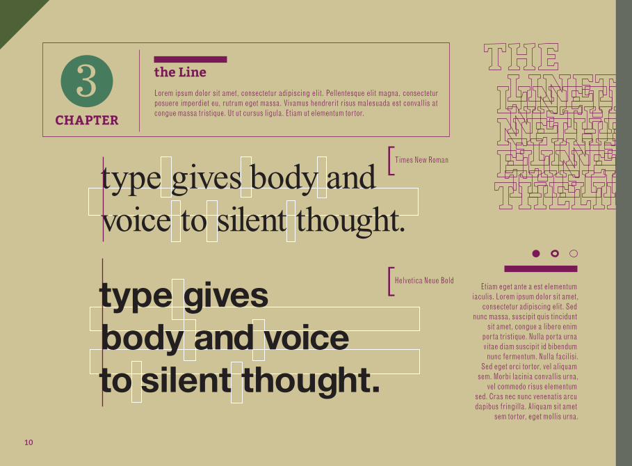
type gives body and voice to silent thought.
CHAPTER
3 the LineLorem ipsum dolor sit amet, consectetur adipiscing elit. Pellentesque elit magna, consectetur posuere imperdiet eu, rutrum eget massa. Vivamus hendrerit risus malesuada est convallis at congue massa tristique. Ut ut cursus ligula. Etiam ut elementum tortor.
type gives body and voice to silent thought. Times New Roman
Helvetica Neue Bold
[
[
Etiam eget ante a est elementum iaculis. Lorem ipsum dolor sit amet,
consectetur adipiscing elit. Sed nunc massa, suscipit quis tincidunt
sit amet, congue a libero enim porta tristique. Nulla porta urna vitae diam suscipit id bibendum nunc fermentum. Nulla facilisi.
Sed eget orci tortor, vel aliquam sem. Morbi lacinia convallis urna,
vel commodo risus elementum sed. Cras nec nunc venenatis arcu dapibus fringilla. Aliquam sit amet
sem tortor, eget mollis urna.
type gives body and voice to silent thought.
CHAPTER
3 the LineLorem ipsum dolor sit amet, consectetur adipiscing elit. Pellentesque elit magna, consectetur posuere imperdiet eu, rutrum eget massa. Vivamus hendrerit risus malesuada est convallis at congue massa tristique. Ut ut cursus ligula. Etiam ut elementum tortor.
type gives body and voice to silent thought.
Times New Roman
Helvetica Neue Bold
[
[type gives body and voice to silent thought.
Etiam eget ante a est elementum iaculis. Lorem ipsum dolor sit amet,
consectetur adipiscing elit. Sed nunc massa, suscipit quis tincidunt
sit amet, congue a libero enim porta tristique. Nulla porta urna vitae diam suscipit id bibendum nunc fermentum. Nulla facilisi.
Sed eget orci tortor, vel aliquam sem. Morbi lacinia convallis urna,
vel commodo risus elementum sed. Cras nec nunc venenatis arcu dapibus fringilla. Aliquam sit amet
sem tortor, eget mollis urna.
10
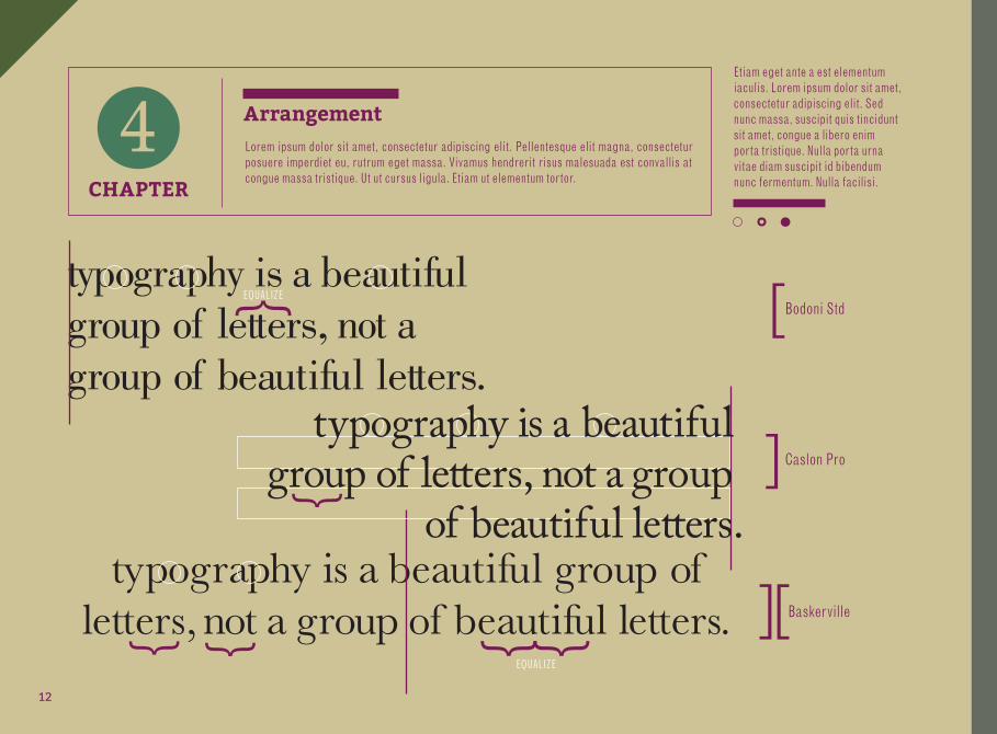
typography is a beautiful group of letters, not a group of beautiful letters.
typography is a beautiful group of letters, not a group of beautiful letters.
typography is a beautiful group of letters, not a group
of beautiful letters.
[
]
][4CHAPTER
CHAPTER
4 ArrangementLorem ipsum dolor sit amet, consectetur adipiscing elit. Pellentesque elit magna, consectetur posuere imperdiet eu, rutrum eget massa. Vivamus hendrerit risus malesuada est convallis at congue massa tristique. Ut ut cursus ligula. Etiam ut elementum tortor.
typography is a beautiful group of letters, not a group of beautiful letters.
typography is a beautiful group of letters, not a group of beautiful letters.
Bodoni Std EQUALIZE
EQUALIZE
Caslon Pro
Baskerville
[{{ {
{
{ {
]
][
typography is a beautiful group of letters, not a group
of beautiful letters.
Etiam eget ante a est elementum iaculis. Lorem ipsum dolor sit amet, consectetur adipiscing elit. Sed nunc massa, suscipit quis tincidunt sit amet, congue a libero enim porta tristique. Nulla porta urna vitae diam suscipit id bibendum nunc fermentum. Nulla facilisi.
12
5
5CHAPTER
CHAPTER
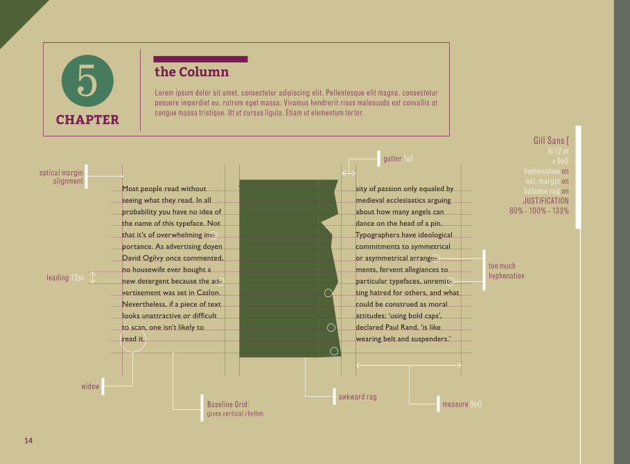
5 the ColumnLorem ipsum dolor sit amet, consectetur adipiscing elit. Pellentesque elit magna, consectetur posuere imperdiet eu, rutrum eget massa. Vivamus hendrerit risus malesuada est convallis at congue massa tristique. Ut ut cursus ligula. Etiam ut elementum tortor.
Most people read without
seeing what they read. In all
probability you have no idea of
the name of this typeface. Not
that it’s of overwhelming im-
portance. As advertising doyen
David Ogilvy once commented,
no housewife ever bought a
new detergent because the ad-
vertisement was set in Caslon.
Nevertheless, if a piece of text
looks unattractive or diffi cult
to scan, one isn’t likely to
read it.
Typographers live in a world
inhabited by serifs, counters,
kerns, ligatures and line feeds,
populated with Egyptian
Expands, Latin Extends and
Modern Romans. Wordage
is viewed in terms of colour
and weight, points, picas and
leading. The aesthetics involve
pace, proportion, scale, bal-
ance, harmony and order. As
you can see, there is more to
it than you thought. Further-
more, the options held by this
fraternity can excite an inten-
sity of passion only equaled by
medieval ecclesiastics arguing
about how many angels can
dance on the head of a pin.
Typographers have ideological
commitments to symmetrical
or asymmetrical arrange-
ments, fervent allegiances to
particular typefaces, unremit-
ting hatred for others, and what
could be construed as moral
attitudes; ‘using bold caps’,
declared Paul Rand, ‘is like
wearing belt and suspenders.’
widow
optical margin alignment
Baseline Grid:gives vertical rhythm
awkward ragmeasure 9p0
too muchhyphenationleading 12pt
Gill Sans [8/12 pt
x 9p0hyphenation onopt. margin onbalance rag onJUSTIFICATION
80% - 100% - 133%
gutter 1p1
14
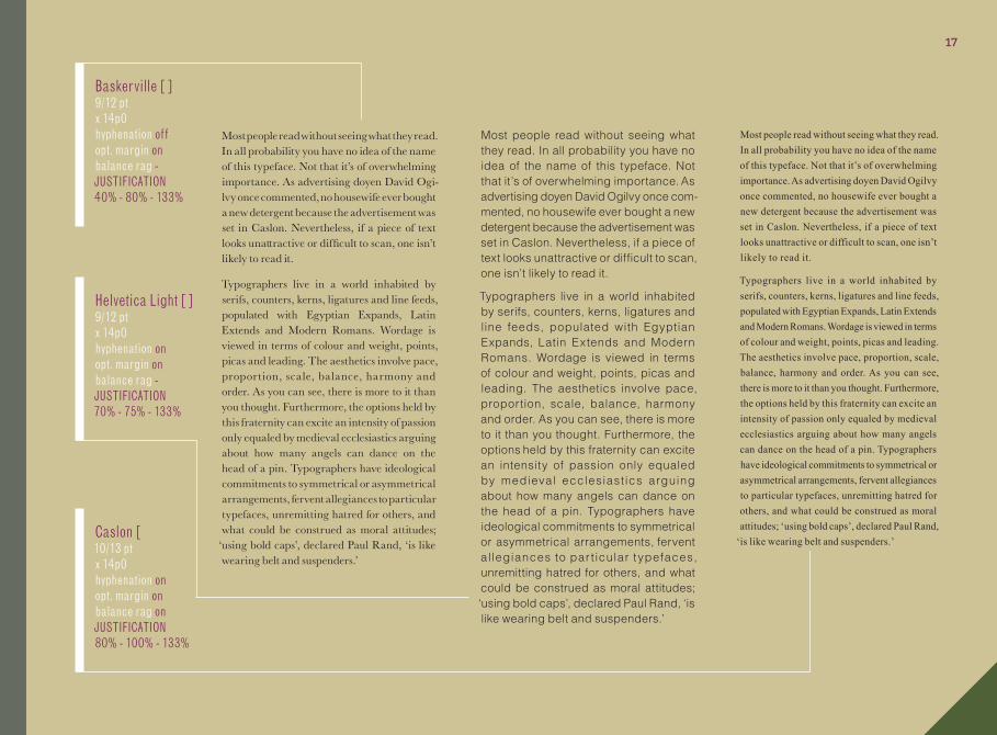
Most people read without seeing what they read. In all probability you have no idea of the name of this typeface. Not that it’s of overwhelming importance. As advertising doyen David Ogilvy once commented, no housewife ever bought a new detergent because the advertisement was set in Caslon.Nevertheless, if a piece of text looks unattractive or di� cult to scan, one isn’t likely to read it.
Typographers live in a world inhabited by serifs, counters, kerns, ligatures and line feeds, populated with Egyptian Expands, Latin Extends and Modern Romans. Wordage is viewed in terms of colour and weight, points, picas and leading. � e aesthetics involve pace, pro-portion, scale, balance, harmony and order. As you can see, there is more to it than you thought. Furthermore, the options held by this fraternity can excite an intensity of passion only equaled by medieval ecclesiastics
arguing about how many angels can dance on the head of a pin. Typographers have ideological commitments to symmetrical or asymmetrical arrangements, fervent allegiances to typefaces, unremitting hatred for others, and what could be construed as moral attitudes; ‘using bold caps’, declared Paul Rand, ‘is like wear-ing belt and suspenders.’
Most people read without seeing
what they read. In all probability
you have no idea of the name of
this typeface. Not that it’s of
overwhelming importance. As
advertising doyen David Ogilvy
once commented, no housewife
ever bought a new detergent be-
cause the advertisement was set in
Caslon. Nevertheless, if a piece of
text looks unattractive or diffi cult
to scan, one isn’t likely to read it.
Typographers live in a world
inhabited by serifs, counters, kerns,
ligatures and line feeds, populated
with Egyptian Expands, Latin
Extends and Modern Romans.
Wordage is viewed in terms of
colour and weight, points, picas
and leading. � e aesthetics involve
pace, proportion, scale, bal-ance,
harmony and order. As you can
see, there is more to it than you
thought. Furthermore, the options
held by this fraternity can excite an
intensity of passion only equaled
by medieval ecclesiastics arguing
about how many angels can dance
on the head of a pin. Typographers
have ideological commitments
to symmetrical or asymmetrical
arrangements, fervent allegiances
to particular typefaces, unremitting
hatred for others, and what could be
construed as moral attitudes; ‘using
bold caps’, declared Paul Rand, ‘is
like wearing belt and suspenders.’3
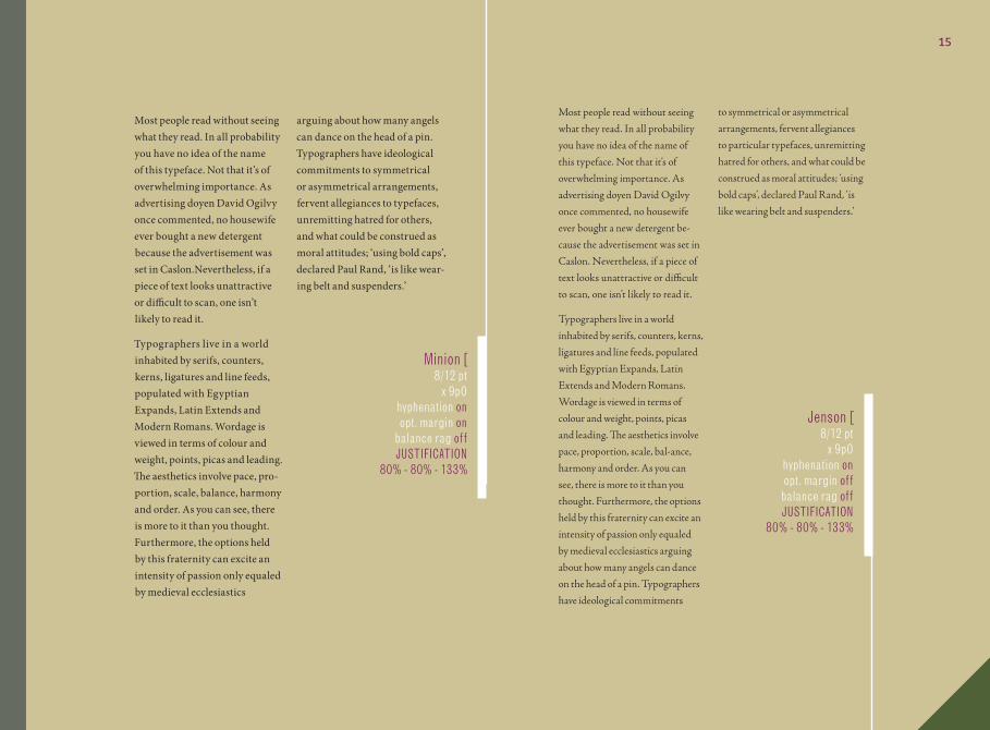
8/12 Minion Pro Regular[ x 9
8/12 Adobe Jenson Pro [ x 9
Minion [8/12 pt
x 9p0hyphenation onopt. margin on
balance rag offJUSTIFICATION
80% - 80% - 133%
Jenson [8/12 pt
x 9p0hyphenation onopt. margin offbalance rag offJUSTIFICATION
80% - 80% - 133%
Most people read without seeing what they read. In all probability you have no idea of the name of this typeface. Not that it’s of overwhelming importance. As advertising doyen David Ogilvy once commented, no housewife ever bought a new detergent because the advertisement was set in Caslon.Nevertheless, if a piece of text looks unattractive or di� cult to scan, one isn’t likely to read it.
Typographers live in a world inhabited by serifs, counters, kerns, ligatures and line feeds, populated with Egyptian Expands, Latin Extends and Modern Romans. Wordage is viewed in terms of colour and weight, points, picas and leading. � e aesthetics involve pace, pro-portion, scale, balance, harmony and order. As you can see, there is more to it than you thought. Furthermore, the options held by this fraternity can excite an intensity of passion only equaled by medieval ecclesiastics
arguing about how many angels can dance on the head of a pin. Typographers have ideological commitments to symmetrical or asymmetrical arrangements, fervent allegiances to typefaces, unremitting hatred for others, and what could be construed as moral attitudes; ‘using bold caps’, declared Paul Rand, ‘is like wear-ing belt and suspenders.’
Most people read without seeing
what they read. In all probability
you have no idea of the name of
this typeface. Not that it’s of
overwhelming importance. As
advertising doyen David Ogilvy
once commented, no housewife
ever bought a new detergent be-
cause the advertisement was set in
Caslon. Nevertheless, if a piece of
text looks unattractive or diffi cult
to scan, one isn’t likely to read it.
Typographers live in a world
inhabited by serifs, counters, kerns,
ligatures and line feeds, populated
with Egyptian Expands, Latin
Extends and Modern Romans.
Wordage is viewed in terms of
colour and weight, points, picas
and leading. � e aesthetics involve
pace, proportion, scale, bal-ance,
harmony and order. As you can
see, there is more to it than you
thought. Furthermore, the options
held by this fraternity can excite an
intensity of passion only equaled
by medieval ecclesiastics arguing
about how many angels can dance
on the head of a pin. Typographers
have ideological commitments
to symmetrical or asymmetrical
arrangements, fervent allegiances
to particular typefaces, unremitting
hatred for others, and what could be
construed as moral attitudes; ‘using
bold caps’, declared Paul Rand, ‘is
like wearing belt and suspenders.’3
8/12 Minion Pro Regular[ x 9
8/12 Adobe Jenson Pro [ x 9
15
Most people read without seeing what they read. In all probability you have no idea of the name of this typeface. Not that it’s of overwhelming importance. As advertising doyen David Ogilvy once commented, no housewife ever bought a new detergent because the advertise-ment was set in Caslon. Nevertheless, if a piece of text looks unattractive or diffi cult to scan, one isn’t likely to read it.
Typographers live in a world inhabited by serifs, counters, kerns, ligatures and line feeds, populated with Egyptian Expands, Latin Extends and Modern Romans. Wordage is viewed in terms of colour and weight, points, picas and leading. The aesthetics involve pace, proportion, scale, balance, harmony and order. As you can see, there is more to it than you thought. Furthermore, the options held by this fraternity can excite an intensity of passion only equaled by medieval ecclesiastics arguing about how many angels can dance on the head of a pin. Typographers have ideological commit-ments to symmetrical or asymmetrical arrangements, fervent allegiances to particular typefaces, unremitting hatred for others, and what could be construed as moral attitudes; ‘using bold caps’, declared Paul Rand, ‘is like wearing belt and suspenders.’
Most people read without seeing what they read. In all probability you have no idea of the name of this typeface. Not that it’s of overwhelming importance. As advertising doyen David Ogilvy once commented, no housewife ever bought a new detergent because the advertisment was set in Caslon. Nevertheless, if a piece of text looks unattractive or di� cult to scan, one isn’t likely to read it.
Typographers live in a world inhabited by serifs, counters, kerns, ligatures and line feeds, populated with Egyptian Expands, Latin Extends and Modern Romans. Word-age is viewed in terms of colour and weight, points, picas and leading. The aesthetics involve pace, proportion, scale, balance, harmony and order. As you can see, there is more to it than you thought. Furthermore, the options held by this fraternity can excite an intensity of passion only equaled by medieval ecclesiastics arguing about how many angels can dance on the head of a pin. Typographers have ideological com-mitments to symmetrical or asymmetrical arrangements, fervent allegiances to part-icular typefaces, unremitting hatred for others, and what could be construed as moral attitudes; ‘using bold caps’, declaredPaul Rand, ‘is like wearing belt and suspenders.’
Most people read without seeing what they read. In all probability you have no idea of the name of this typeface. Not that it’s of overwhelming importance. As advertising doyen David Ogilvy once commented, no housewife ever bought a new detergent because the advertisement was set in Caslon. Nevertheless, if a piece of text looks unattractive or diffi cult to scan, one isn’t likely to read it.
Typographers live in a world inhabited by serifs, counters, kerns, ligatures and line feeds, populated with Egyptian Expands, Latin Extends and Modern Romans. Wordage is viewed in terms of colour and weight, points, picas and leading. Th e aesthetics involve pace, proportion, scale, balance, harmony and order. As you can see, there is more to it than you thought. Further-more, the options held by this fraternity can excite an intensity of passion only equaled by medieval ecclesiastics arguing about how many angels can dance on the head of a pin. Typographers have ideological commitments to symmetrical or asymmetrical arrangements, fervent allegiances to particular typefaces, un-remitting hatred for others, and what could be construed as moral attitudes; ‘using bold caps’, declared Paul Rand, ‘is like wearing belt and suspenders.’
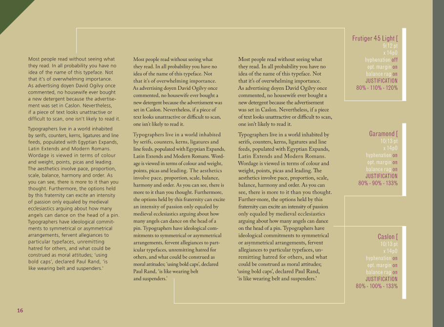
Frutiger 45 Light [9/12 pt x 14p0
hyphenation offopt. margin onbalance rag onJUSTIFICATION
80% - 110% - 120%
Garamond [10/13 pt
x 14p0hyphenation onopt. margin onbalance rag onJUSTIFICATION
80% - 90% - 133%
Caslon [10/13 pt
x 14p0hyphenation onopt. margin onbalance rag onJUSTIFICATION
80% - 100% - 133%
16
Most people read without seeing what they read. In all probability you have no idea of the name of this typeface. Not that it’s of overwhelming importance. As advertising doyen David Ogi-lvy once commented, no housewife ever bought a new detergent because the advertisement was set in Caslon. Nevertheless, if a piece of text looks unattractive or diffi cult to scan, one isn’t likely to read it.
Typographers live in a world inhabited by serifs, counters, kerns, ligatures and line feeds, populated with Egyptian Expands, Latin Extends and Modern Romans. Wordage is viewed in terms of colour and weight, points, picas and leading. The aesthetics involve pace, proportion, scale, balance, harmony and order. As you can see, there is more to it than you thought. Furthermore, the options held by this fraternity can excite an intensity of passion only equaled by medieval ecclesiastics arguing about how many angels can dance on the head of a pin. Typographers have ideological commitments to symmetrical or asymmetrical arrangements, fervent allegiances to particular typefaces, unremitting hatred for others, and what could be construed as moral attitudes;
‘using bold caps’, declared Paul Rand, ‘is like wearing belt and suspenders.’
Most people read without seeing what they read. In all probability you have no idea of the name of this typeface. Not that it’s of overwhelming importance. As advertising doyen David Ogilvy once com-mented, no housewife ever bought a new detergent because the advertisement was set in Caslon. Nevertheless, if a piece of text looks unattractive or difficult to scan, one isn’t likely to read it.
Typographers live in a world inhabited by serifs, counters, kerns, ligatures and line feeds, populated with Egyptian Expands, Latin Extends and Modern Romans. Wordage is viewed in terms of colour and weight, points, picas and leading. The aesthetics involve pace, proportion, scale, balance, harmony and order. As you can see, there is more to it than you thought. Furthermore, the options held by this fraternity can excite an intensity of passion only equaled by medieval ecclesiast ics arguing about how many angels can dance on the head of a pin. Typographers have ideological commitments to symmetrical or asymmetrical arrangements, fervent al legiances to par t icular t ypefaces, unremitting hatred for others, and what could be construed as moral attitudes; ‘using bold caps’, declared Paul Rand, ‘is like wearing belt and suspenders.’
Most people read without seeing what they read. In all probability you have no idea of the name of this typeface. Not that it’s of overwhelming importance. As advertising doyen David Ogilvy once commented, no housewife ever bought a new detergent because the advertisement was set in Caslon. Nevertheless, if a piece of text looks unattractive or difficult to scan, one isn’t likely to read it.
Typographers live in a world inhabited by serifs, counters, kerns, ligatures and line feeds, populated with Egyptian Expands, Latin Extends and Modern Romans. Wordage is viewed in terms of colour and weight, points, picas and leading. The aesthetics involve pace, proportion, scale, balance, harmony and order. As you can see, there is more to it than you thought. Furthermore, the options held by this fraternity can excite an intensity of passion only equaled by medieval ecclesiastics arguing about how many angels can dance on the head of a pin. Typographers have ideological commitments to symmetrical or asymmetrical arrangements, fervent allegiances to particular typefaces, unremitting hatred for others, and what could be construed as moral attitudes; ‘using bold caps’, declared Paul Rand,
‘is like wearing belt and suspenders.’
Helvetica Light [ ]9/12 pt x 14p0hyphenation onopt. margin onbalance rag -JUSTIFICATION70% - 75% - 133%
Caslon [10/13 pt x 14p0hyphenation onopt. margin onbalance rag onJUSTIFICATION80% - 100% - 133%
Baskerville [ ]9/12 pt x 14p0hyphenation offopt. margin onbalance rag -JUSTIFICATION40% - 80% - 133%
17
Most people read without seeing what they read. In all probability you have no idea of the name of this typeface. Not that it’s of overwhelming im-portance. As advertising doyen David Ogilvy once commented, no housewife ever bought a new detergent because the ad-vertisement was set in Caslon. Nevertheless, if a piece of text looks unattractive or difficult to scan, one isn’t likely to read it.
Typographers live in a world inhabited by serifs, counters, kerns, ligatures and line feeds, popu la ted w i th Egypt ian Expands, Latin Extends and Modern Romans. Wordage is viewed in terms of colour and weight, points, picas and leading. The aesthetics involve pace, proportion, scale, bal-ance, harmony and order. As you can see, there is more to it than you thought. Further-more, the options held by this fraternity can excite an intensity of passion only equaled by medieval ecclesiastics arguing about how many angels can dance on the head of a pin.
Typographers have ideological commitments to symmetrical or asymmetrical arrangements, fervent allegiances to particular typefaces, unremitting hatred for others, and what could be construed as moral attitudes; ‘using bold caps’, declared Paul Rand, ‘is like wearing belt and suspenders.’
4 cont’d
9/12 Helvetica Neue LT Std Light[ ] x 10
Most people read without seeing what they read. In all probability you have no idea of the name of this typeface. Not that it’s of overwhelming importance. As advertising doyen David Ogilvy once commented, no housewife ever bought a new detergent because the advertisement was set in Caslon. Nevertheless, if a piece of text looks unattractive or difficult to scan, one isn’t likely to read it.
Typographers live in a world inhabited by serifs, counters, kerns, ligatures and line feeds, populated with Egyptian Expands, Latin Extends and Modern Romans. Wordage is viewed in terms of colour and weight, points, picas and leading. The aesthetics involve pace, proportion, scale, balance, harmony and order. As you can see, there is more to it than you thought. Furthermore, the options held by this fraternity can excite an intensity of passion only equaled by medieval ecclesiastics arguing about how many angels can dance on the head of a pin. Typographers have ideological commitments to symmetrical or asymmetrical arrangements, fervent allegiances to particular typefaces, unremitting hatred for others, and what could be construed as moral attitudes; ‘using bold caps’, declared Paul Rand, ‘is like wearing belt and suspenders.’
Most people read without seeing what they read. In all probability you have no idea of the name of this typeface. Not that it’s of overwhelming importance. As advertising doyen David Ogilvy once commented, no housewife ever bought a new detergent because the advertisement was set in Caslon. Nevertheless, if a piece of text looks unattractive or diffi cult to scan, one isn’t likely to read it.
Typographers live in a world inhabited by serifs, counters, kerns, ligatures and line feeds, populated with Egyptian Expands, Latin Extends and Modern Romans. Wordage is viewed in terms of colour and weight, points, picas and leading. The aesthetics involve pace, proportion, scale, balance, harmony and order. As you can see, there is more to it than you thought. Furthermore, the options held by this fraternity can excite an intensity of passion only equaled by medieval ecclesiastics arguing about how many angels can dance on the head of a pin. Typographers have ideological commitments to symmetrical or asymmetrical arrangements, fervent allegiances to particular typefaces, unremitting hatred for others, and what could be construed as moral attitudes; ‘using bold caps’, declared Paul Rand,
‘is like wearing belt and suspenders.’
Most people read without seeing what they read. In all probability you have no idea of the name of this typeface. Not that it’s of overwhelming importance. As advertising doyen David Ogilvy once commented, no housewife ever bought a new detergent because the advertisement was set in Caslon. Nevertheless, if a piece of text looks unattractive or diffi cult to scan, one isn’t likely to read it.
Typographers live in a world inhabited by serifs, counters, kerns, ligatures and line feeds, populated with Egyptian Expands, Latin Extends and Modern Romans. Wordage is viewed in terms of colour and weight, points, picas and leading. The aesthetics involve pace, proportion, scale, balance, harmony and order. As you can see, there is more to it than you thought. Furthermore, the options held by this fraternity can excite an intensity of passion only equaled by medieval ecclesiastics arguing about how many angels can dance on the head of a pin. Typographers have ideological commitments to symmetrical or asymmetrical arrangements, fervent allegiances to particular typefaces, unremitting hatred for others, and what could be construed as moral attitudes; ‘using bold caps’, declared Paul Rand, ‘is like wearing belt and suspenders.’
5
10/12 Baskerville Regular[ ] x 18
9/12 Univers LT Std 45 Light[ ] x 18
Most people read without seeing what they read. In all probability you have no idea of the name of this typeface. Not that it’s of overwhelming importance. As advertising doyen David Ogilvy once commented, no housewife ever bought a new detergent because the advertisement was set in Caslon. Nevertheless, if a piece of text looks unattractive or diffi cult to scan, one isn’t likely to read it.
Typographers live in a world inhabited by serifs, counters, kerns, ligatures and line feeds, populated with Egyptian Expands, Latin Extends and Modern Romans. Wordage is viewed in terms of colour and weight, points, picas and leading. The aesthetics involve pace, proportion, scale, balance, harmony and order. As you can see, there is more to it than you thought. Furthermore, the options held by this fraternity can excite an intensity of passion only equaled by medieval ecclesiastics arguing about how many angels can dance on the head of a pin. Typographers have ideological commitments to symmetrical or asymmetrical arrangements, fervent allegiances to particular typefaces, unremitting hatred for others, and what could be construed as moral attitudes; ‘using bold caps’, declared Paul Rand,
‘is like wearing belt and suspenders.’
Most people read without seeing what they read. In all probability you have no idea of the name of this typeface. Not that it’s of overwhelming importance. As advertising doyen David Ogilvy once commented, no housewife ever bought a new detergent because the advertisement was set in Caslon. Nevertheless, if a piece of text looks unattractive or diffi cult to scan, one isn’t likely to read it.
Typographers live in a world inhabited by serifs, counters, kerns, ligatures and line feeds, populated with Egyptian Expands, Latin Extends and Modern Romans. Wordage is viewed in terms of colour and weight, points, picas and leading. The aesthetics involve pace, proportion, scale, balance, harmony and order. As you can see, there is more to it than you thought. Furthermore, the options held by this fraternity can excite an intensity of passion only equaled by medieval ecclesiastics arguing about how many angels can dance on the head of a pin. Typographers have ideological commitments to symmetrical or asymmetrical arrangements, fervent allegiances to particular typefaces, unremitting hatred for others, and what could be construed as moral attitudes; ‘using bold caps’, declared Paul Rand, ‘is like wearing belt and suspenders.’
5
10/12 Baskerville Regular[ ] x 18
9/12 Univers LT Std 45 Light[ ] x 18
10
Most people read without seeing what they read. In all probability you have no idea of the name of this typeface. Not that it’s of overwhelming importance. As advertising doyen David Ogilvy once commented, no housewife ever bought a new detergent because the advertisement was set in Caslon. Nevertheless, if a piece of text looks unattractive or diffi cult to scan, one isn’t likely to read it.
Typographers live in a world inhabited by serifs, counters, kerns, ligatures and line feeds, populated with Egyptian Expands, Latin Extends and Modern Romans. Wordage is viewed in terms of colour and weight, points, picas and leading. The aesthetics involve pace, proportion, scale, balance, harmony and order. As you can see, there is more to it than you thought. Furthermore, the options held by this fraternity can excite an intensity of passion only equaled by medieval ecclesiastics arguing about how many angels can dance on the head of a pin. Typographers have ideological commitments to symmetrical or asymmetrical arrangements, fervent allegiances to particular typefaces, unremitting hatred for others, and what could be construed as moral attitudes; ‘using bold caps’, declared Paul Rand, ‘is like wearing belt and suspenders.’
9/12 Marion Regular[ ] x 18
15 Most people read without seeing what they read. In all probability you
have no idea of the name of this typeface. Not that it’s of overwhelming
importance. As advertising doyen David Ogilvy once commented, no
housewife ever bought a new detergent because the advertisement
was set in Caslon. Nevertheless, if a piece of text looks unattractive or
diffi cult to scan, one isn’t likely to read it.
Typographers live in a world inhabited by serifs, counters, kerns,
ligatures and line feeds, populated with Egyptian Expands, Latin
Extends and Modern Romans. Wordage is viewed in terms of colour
and weight, points, picas and leading. The aesthetics involve pace,
proportion, scale, balance, harmony and order. As you can see,
there is more to it than you thought. Furthermore, the options held
by this fraternity can excite an intensity of passion only equaled
by medieval ecclesiastics arguing about how many angels can dance
on the head of a pin. Typographers have ideological commitments
to symmetrical or asymmetrical arrangements, fervent allegiances
to particular typefaces, unremitting hatred for others, and what
could be const-rued as moral attitudes; ‘using bold caps’, declared
Paul Rand, ‘is like wearing belt and suspenders.’
9/15 Helvetica 85 Heavy[ x 25
15Most people read without seeing what they read. In all probability you
have no idea of the name of this typeface. Not that it’s of overwhelming
importance. As advertising doyen David Ogilvy once commented, no
housewife ever bought a new detergent because the advertisement
was set in Caslon. Nevertheless, if a piece of text looks unattractive or
diffi cult to scan, one isn’t likely to read it.
Typographers live in a world inhabited by serifs, counters, kerns,
ligatures and line feeds, populated with Egyptian Expands, Latin
Extends and Modern Romans. Wordage is viewed in terms of colour
and weight, points, picas and leading. The aesthetics involve pace,
proportion, scale, balance, harmony and order. As you can see,
there is more to it than you thought. Furthermore, the options held
by this fraternity can excite an intensity of passion only equaled
by medieval ecclesiastics arguing about how many angels can dance
on the head of a pin. Typographers have ideological commitments
to symmetrical or asymmetrical arrangements, fervent allegiances
to particular typefaces, unremitting hatred for others, and what
could be const-rued as moral attitudes; ‘using bold caps’, declared
Paul Rand, ‘is like wearing belt and suspenders.’
9/15 Helvetica 85 Heavy[ x 25
Most people read without seeing what they read. In all probability you have no idea of the name of this typeface. Not that it’s of overwhelming importance. As advertising doyen David Ogilvy once commented, no housewife ever bought a new detergent because the advertise-ment was set in Caslon. Nevertheless, if a piece of text looks unattractive or difficult to scan, one isn’t likely to read it.
Typographers live in a world inhabited by serifs, counters, kerns, ligatures and line feeds, populated with Egyptian Expands, Latin Extends and Modern Romans. Wordage is viewed in terms of colour and weight, points, picas and leading. The aesthetics involve pace, proportion, scale, balance, harmony and order. As you can see, there is more to it than you thought. Furthermore, the options held by this fraternity can excite an intensity of passion only equaled by medieval ecclesiastics arguing about how many angels can dance on the head of a pin. Typographers have ideological commit-ments to symmetrical or asymmetrical arrangements, fervent allegiances to particular typefaces, unremitting hatred for others, and what could be construed as moral attitudes; ‘using bold caps’, declared Paul Rand, ‘is like wearing belt and suspenders.’
15 Most people read without seeing what they read. In all probability you
have no idea of the name of this typeface. Not that it’s of overwhelming
importance. As advertising doyen David Ogilvy once commented, no
housewife ever bought a new detergent because the advertisement
was set in Caslon. Nevertheless, if a piece of text looks unattractive or
diffi cult to scan, one isn’t likely to read it.
Typographers live in a world inhabited by serifs, counters, kerns,
ligatures and line feeds, populated with Egyptian Expands, Latin
Extends and Modern Romans. Wordage is viewed in terms of colour
and weight, points, picas and leading. The aesthetics involve pace,
proportion, scale, balance, harmony and order. As you can see,
there is more to it than you thought. Furthermore, the options held
by this fraternity can excite an intensity of passion only equaled
by medieval ecclesiastics arguing about how many angels can dance
on the head of a pin. Typographers have ideological commitments
to symmetrical or asymmetrical arrangements, fervent allegiances
to particular typefaces, unremitting hatred for others, and what
could be const-rued as moral attitudes; ‘using bold caps’, declared
Paul Rand, ‘is like wearing belt and suspenders.’
9/15 Helvetica 85 Heavy[ x 25
Baskerville [ ]9/12 pt x 14p0hyphenation offopt. margin onbalance rag -JUSTIFICATION40% - 80% - 133%
18
Most people read without seeing what they read. In all probability you have no idea of the name of this typeface. Not that it’s of overwhelming im-portance. As advertising doyen David Ogilvy once commented, no housewife ever bought a new detergent because the ad-vertisement was set in Caslon. Nevertheless, if a piece of text looks unattractive or difficult to scan, one isn’t likely to read it.
Typographers live in a world inhabited by serifs, counters, kerns, ligatures and line feeds, popu la ted w i th Egypt ian Expands, Latin Extends and Modern Romans. Wordage is viewed in terms of colour and weight, points, picas and leading. The aesthetics involve pace, proportion, scale, bal-ance, harmony and order. As you can see, there is more to it than you thought. Further-more, the options held by this fraternity can excite an intensity of passion only equaled by medieval ecclesiastics arguing about how many angels can dance on the head of a pin.
Typographers have ideological commitments to symmetrical or asymmetrical arrangements, fervent allegiances to particular typefaces, unremitting hatred for others, and what could be construed as moral attitudes; ‘using bold caps’, declared Paul Rand, ‘is like wearing belt and suspenders.’
4 cont’d
9/12 Helvetica Neue LT Std Light[ ] x 10
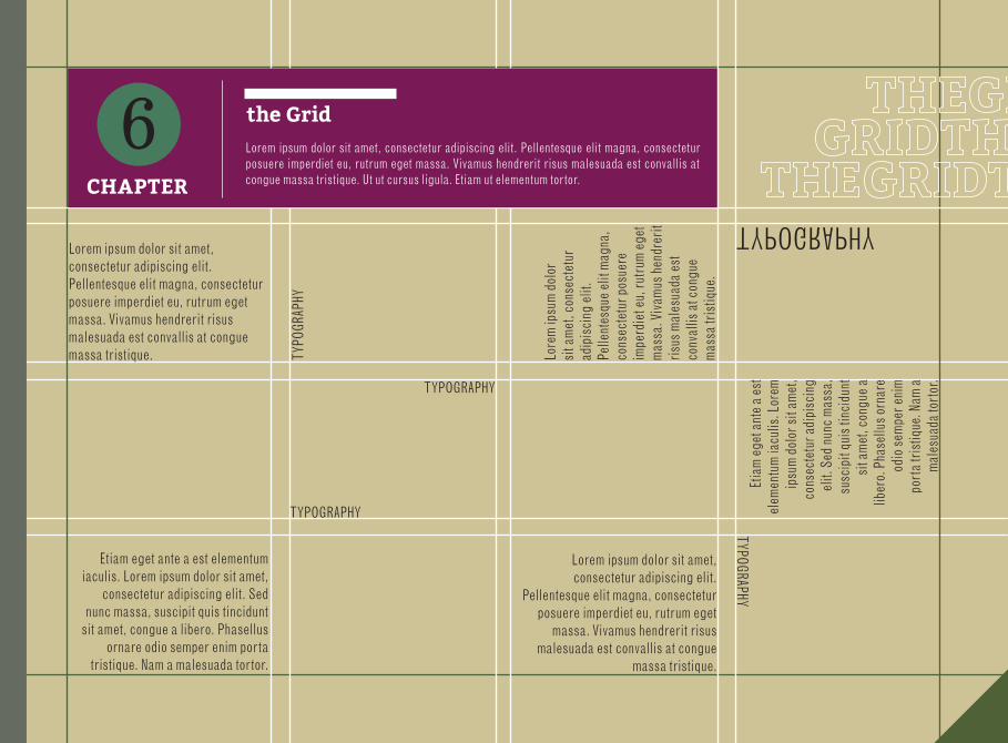
CHAPTER
6 the GridLorem ipsum dolor sit amet, consectetur adipiscing elit. Pellentesque elit magna, consectetur posuere imperdiet eu, rutrum eget massa. Vivamus hendrerit risus malesuada est convallis at congue massa tristique. Ut ut cursus ligula. Etiam ut elementum tortor.
TYPO
GRAP
HY
TYPOGRAPHY
TYPOGRAPHYTYPOGRAPHY
TYPOGRAPHY
Lorem ipsum dolor sit amet, consectetur adipiscing elit. Pellentesque elit magna, consectetur posuere imperdiet eu, rutrum eget massa. Vivamus hendrerit risus malesuada est convallis at congue massa tristique.
Lorem ipsum dolor sit amet, consectetur adipiscing elit.
Pellentesque elit magna, consectetur posuere imperdiet eu, rutrum eget
massa. Vivamus hendrerit risus malesuada est convallis at congue
massa tristique.
Lore
m ip
sum
dolo
r si
t am
et, c
onse
ctet
ur
adip
isci
ng e
lit.
Pelle
ntes
que
elit
mag
na,
cons
ecte
tur p
osue
re
impe
rdie
t eu,
rutru
m eg
et
mas
sa. V
ivam
us h
endr
erit
risus
mal
esua
da e
st
conv
allis
at c
ongu
e m
assa
tris
tique
.
Etia
m eg
et a
nte
a es
t el
emen
tum
iacu
lis. L
orem
ip
sum
dolo
r sit
amet
, co
nsec
tetu
r adi
pisc
ing
elit.
Sed
nun
c m
assa
, su
scip
it qu
is ti
ncid
unt
sit a
met
, con
gue
a lib
ero.
Pha
sellu
s orn
are
odio
sem
per e
nim
port
a tri
stiq
ue. N
am a
mal
esua
da to
rtor.
Etiam eget ante a est elementum iaculis. Lorem ipsum dolor sit amet,
consectetur adipiscing elit. Sed nunc massa, suscipit quis tincidunt
sit amet, congue a libero. Phasellus ornare odio semper enim porta
tristique. Nam a malesuada tortor.
CHAPTER
It may seem that many people point-blank refused to use the telephone because they might have to speak to someone to whom they had no formal introduction! Can’t get much less intimate than that can you.
The telephone survived the stupidity of snobbery and opened up a whole new world of intimacy. People could keep in touch. They could swap confidences in a way they would never think of in a face-to-face encounter. They could make their lives faster, more effi cient and easier.
In the 1990’s the mobile phone took the transformation of everyday life to another level altogether - constant communication. As the yuppie label faded rapidly, the mobile phone became the instrument of intimacy; the builder of relationships. If you wanted to be empathetic, you would
have to admit there was a hell of a lot to listen to. In an average day an adult can use as many as 40,000 words. That’s about fi ve hours of continuous speech. If you multiply this be 75, that’s about a billion words in a lifetime.
And what will all these words be about? Important issues of the day? Very few of them. Most of our talk could be termed trivial. It’s about the process of talking rather than the content; we talk about family and friends, the weather, local news, and (especially) the days goings-on. Gossip is the lifeblood of intimacy.
People automatically phone home to announce they are in the car and on the way home. Everyone is constantly calling everyone else to explain where they are, what is happening, what might happen. A point-by-
point tracking throughout our lives with our loved ones. Intimate talking has become a 24/7 activity. Forget grammar and argument. We’re talking haphazard, incomplete and emotional. This is not about communicating info-rmation as we know it. This is a constant sensing of where you are, where I am, and how we are both feeling.
To me commitment is one of the most demanding Lovemark attributes. Remember that great definition of the difference between being committed and being involved? In a plate of bacon and eggs, the pig is committed and the chicken is involved. Working with P&G I was introduced to Cape Town academics Jan Hofmeyr and Butch Rice from Commitment-Led Marketing. We all agree that loyalty is not enough. As Hofmeyr and Rice point out,
loyalty can just be consumers acting on autopilot, continuing to buy the same brand because they can’t be bothered to make another choice. But commitment can transform loyalty from an unthinking acceptance to a real state imbued with real emotions- loyalty beyond reason.
This continuation of loyalty and commitment is the powerful force we need to harness for Lovemarks. Getting to the crucial place where people are beyond the information stage and point-by-point compar-isons. They have made their choice. They have committed to it before friends and family. It is part of them and they are not going to change now.
HEAD
GUTT
ER
MARGIN
FOOT
COLUMN
20
CHAPTER
CHAPTER
77
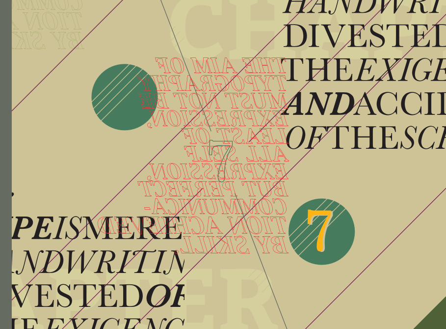
YPEISMERELY HANDWRITING DIVESTEDOFTHEEXIGENCIES ANDACCIDENTS OFTHESCRIBES
T
YPEISMERELY HANDWRITING DIVESTEDOFTHEEXIGENCIES ANDACCIDENTS OFTHESCRIBES
T

GODISINTH
E
DETA
ILS
CHAPTER
7 Syntax/Hierarchy ILorem ipsum dolor sit amet, consectetur adipiscing elit. Pellentesque elit magna, consectetur posuere imperdiet eu, rutrum eget massa. Vivamus hendrerit risus malesuada est convallis at congue massa tristique. Ut ut cursus ligula. Etiam ut elementum tortor. Sed nunc massa, suscipit quis tincidunt sit amet, congue a libero enim porta tristique.
I DO N O T F E E L I H A V E W I S D OM ENOUGHTOLOVE T H AT WH I C H I S
GLYU
REALISMCORRUPTIONREALITY
IS A
OF
IF YOU DON’T KNOW WHERE
YOU’RE GOING,
ALL ROADS LEAD THERE
YPEISMERELY HANDWRITING DIVESTEDOFTHEEXIGENCIES ANDACCIDENTS OFTHESCRIBES
T
Etiam eget ante a est elementum iaculis. Lorem ipsum dolor sit amet, consectetur adipiscing elit. Sed nunc massa, suscipit quis tincidunt sit amet, congue a libero enim porta tristique. Nulla porta urna vitae diam suscipit id bibendum nunc fermentum. Nulla facilisi.
Ut at velit vitae orci adipiscing tincidunt. Aenean arcu sem, facilisis in porttitor id, suscipit eget risus. Donec imperdiet, ipsum quis posuere sodales, libero massa pellentesque eros, eu ornare ante nulla sed justo. Etiam rutrum, mauris eu hendrerit sodales, turpis arcu tempus dolor, a vestibulum tortor neque ac dolor. Aenean sit amet nunc ut sem consequat rutrum sit amet non metus. Integer ipsum dolor, faucibus et dictum sed, porta id mauris.
Ut at velit vitae orci adipiscing tincidunt. Aenean arcu sem, facilisis in porttitor id,
suscipit eget risus.
CHAPTER
22
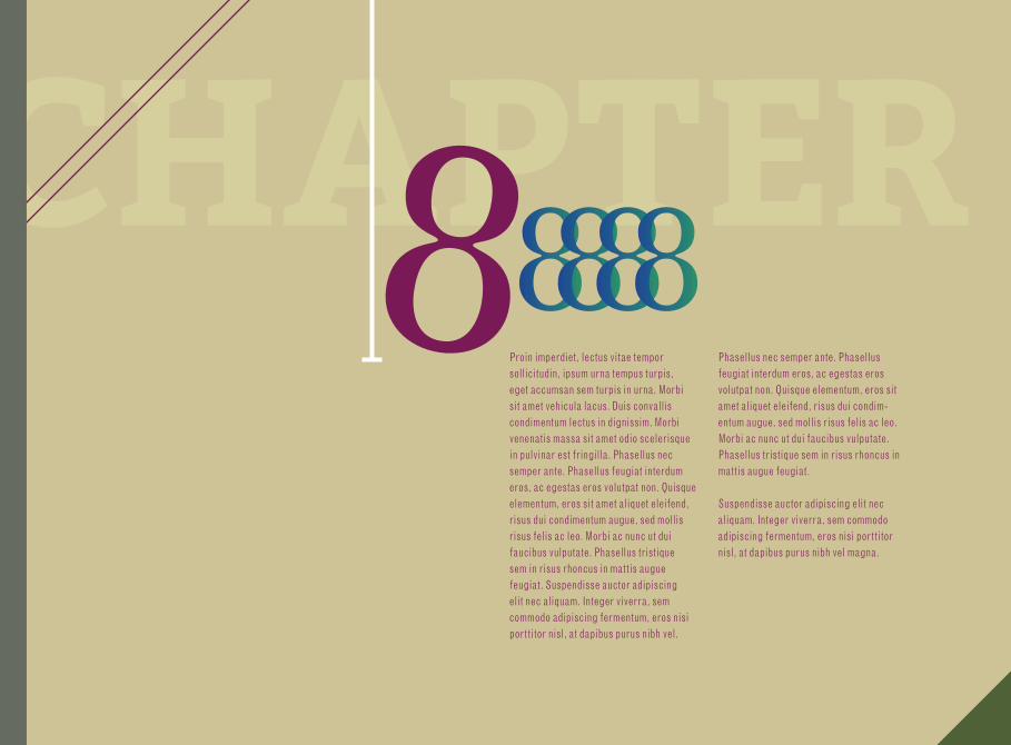
CHAPTER88888Proin imperdiet, lectus vitae tempor sollicitudin, ipsum urna tempus turpis, eget accumsan sem turpis in urna. Morbi sit amet vehicula lacus. Duis convallis condimentum lectus in dignissim. Morbi venenatis massa sit amet odio scelerisque in pulvinar est fringilla. Phasellus nec semper ante. Phasellus feugiat interdum eros, ac egestas eros volutpat non. Quisque elementum, eros sit amet aliquet eleifend, risus dui condimentum augue, sed mollis risus felis ac leo. Morbi ac nunc ut dui faucibus vulputate. Phasellus tristique sem in risus rhoncus in mattis augue feugiat. Suspendisse auctor adipiscing elit nec aliquam. Integer viverra, sem commodo adipiscing fermentum, eros nisi porttitor nisl, at dapibus purus nibh vel.
Phasellus nec semper ante. Phasellus feugiat interdum eros, ac egestas eros volutpat non. Quisque elementum, eros sit amet aliquet eleifend, risus dui condim-entum augue, sed mollis risus felis ac leo. Morbi ac nunc ut dui faucibus vulputate. Phasellus tristique sem in risus rhoncus in mattis augue feugiat.
Suspendisse auctor adipiscing elit nec aliquam. Integer viverra, sem commodo adipiscing fermentum, eros nisi porttitor nisl, at dapibus purus nibh vel magna.
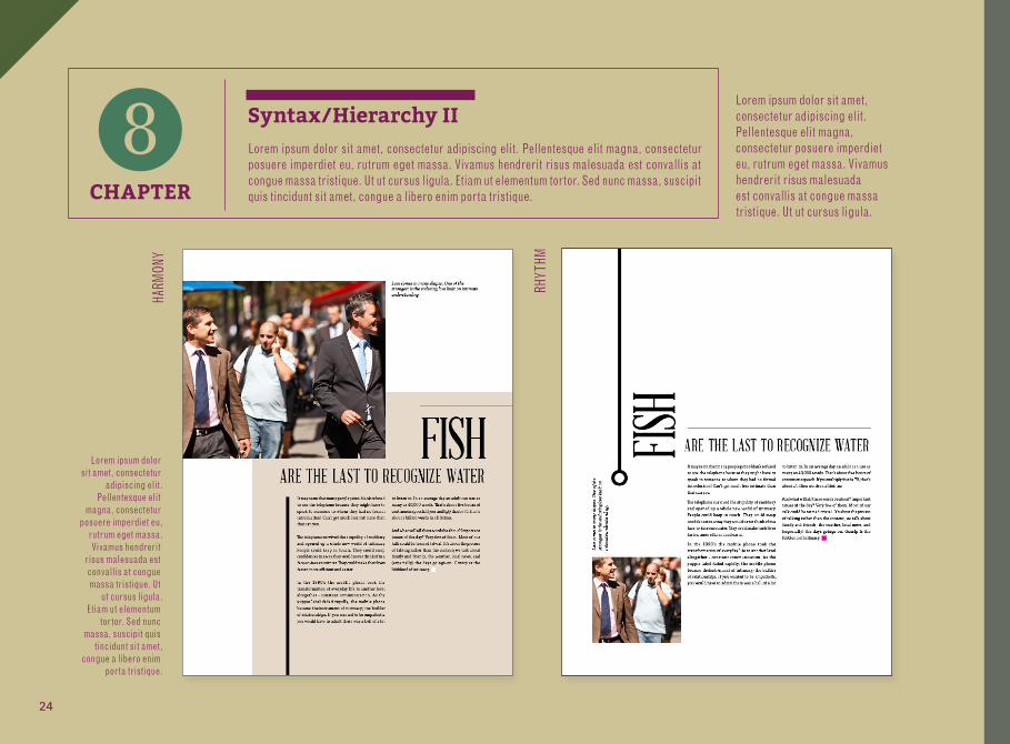
CHAPTER
8 Syntax/Hierarchy IILorem ipsum dolor sit amet, consectetur adipiscing elit. Pellentesque elit magna, consectetur posuere imperdiet eu, rutrum eget massa. Vivamus hendrerit risus malesuada est convallis at congue massa tristique. Ut ut cursus ligula. Etiam ut elementum tortor. Sed nunc massa, suscipit quis tincidunt sit amet, congue a libero enim porta tristique.
Lorem ipsum dolor sit amet, consectetur
adipiscing elit. Pellentesque elit
magna, consectetur posuere imperdiet eu,
rutrum eget massa. Vivamus hendrerit
risus malesuada est convallis at congue massa tristique. Ut
ut cursus ligula. Etiam ut elementum
tortor. Sed nunc massa, suscipit quis
tincidunt sit amet, congue a libero enim
porta tristique.
Lorem ipsum dolor sit amet, consectetur adipiscing elit. Pellentesque elit magna, consectetur posuere imperdiet eu, rutrum eget massa. Vivamus hendrerit risus malesuada est convallis at congue massa tristique. Ut ut cursus ligula.
HARM
ONY
RHYT
HM
24

Lorem ipsum dolor sit amet, consectetur adipiscing elit. Pellentesque elit magna,
consectetur posuere imperdiet eu, rutrum eget massa. Vivamus hendrerit risus
malesuada est convallis at congue massa tristique. Ut ut cursus ligula.
Donec vitae quam risus. Suspendisse id odio vel mauris sollicitudin ultrices. Fusce
justo ipsum, egestas at auctor sodales, posuere nec risus. Maecenas imperdiet
adipiscing pretium. Praesent condimentum faucibus velit eget pulvinar. Aenean erat lorem, fermentum at condimentum quis,
rhoncus ut ipsum. Integer a lorem augue, vel elementum diam. Nullam elit velit,
egestas vitae pellentesque nec, vestibulum sed ipsum.
Proin imperdiet, lectus vitae tempor sollicitudin, ipsum urna tempus turpis, eget accumsan sem turpis in urna. Morbi sit amet vehicula lacus. Duis convallis condimentum lectus in dignissim. Morbi venenatis massa sit amet odio scelerisque in pulvinar est fringilla. Phasellus nec semper ante. Phasellus feugiat interdum eros, ac egestas eros volutpat non. Quisque elementum, eros sit amet aliquet eleifend, risus dui condimentum augue, sed mollis risus felis ac leo. Morbi ac nunc ut dui faucibus vulputate. Phasellus tristique sem in risus rhoncus in mattis augue feugiat. Suspendisse auctor adipiscing elit nec aliquam. Integer viverra, sem commodo adipiscing fermentum, eros nisi porttitor nisl, at dapibus purus nibh vel magna.
the last to recognize waterIt may seem that many people point-blank refused to use the telephone because they might have to speak to someone to whom they had no formal introduction! Can’t get much less intimate than that can you.
The telephone survived the stupidity of snobbery and opened up a whole new world of intimacy. People could keep in touch. They could swap confidences in a way they would never think of in a face-to-face encounter. They could make their lives faster, more effi cient and easier.
In the 1990’s the mobile phone took the transformation of everyday life to another level altogether - constant communication. As the yuppie label faded rapidly, the mobile phone became theinstrument of intimacy; the builder of relationships. If you wanted to be empathetic, you would have to admit there was a hell of a lot to listen to. In an average day an adult can use as many as 40,000 words. That’s about five hours of continuous speech. If you multiply this be 75, that’s about a billion words in a lifetime.
And what will all these words be about? Important issues of the day? Very few of them. Most of our talk could be termed trivial. It’s about the process of talking rather than the content; we talk about family and friends, the weather, local news, and (especially) the days goings-on. Gossip is the lifeblood of intimacy.
� sh
PG28
HEADLINE(primary)
PHOTO
HEADLINE (secondary)
TEXT