Embed Size (px)
Citation preview

by Mike Wilcox, June 2016
Dangerous CSS
CLUB AJAX


Inheritance vs Cascade• Inheritance refers to to what the style of the element will be based on its parent
elements • Adding font-family: Arial; will apply that sale to all elements of the page, unless the element
specifies its own, overridng style
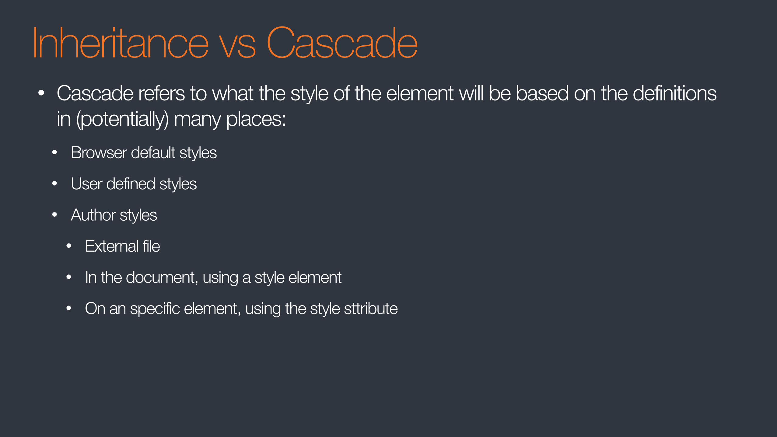
Inheritance vs Cascade• Cascade refers to what the style of the element will be based on the definitions
in (potentially) many places: • Browser default styles • User defined styles • Author styles
• External file • In the document, using a style element • On an specific element, using the style sttribute

Specificity• What is the background color of the following element? <div id="content" class="myContent" custom="true" style="background: white;"> This is my content</div>
div{ background: yellow; }
.myContent{ background: darkred; }
div:first-child-of-type{ background: blue; }
#content{ background: black; }
div[custom="true"]{ background: orange; }
1
23
45
6
https://css-tricks.com/specifics-on-css-specificity/
Don’t Try These Things at Home…

Inline Styles• Don’t: <div style=“width: 18px; color: #000;”>My Content</div>
• Breaks separation of concerns
• In frameworks, code must be rebuilt to see changes
• Specificity is way too high for general styling
Instead:• All styles should go in a style sheet
BR• Do not use <br> to increase the gap between lines of text
• it's not semantic. If you want two items, you probably want different elements
• It is an attempt at styling via markup
• Browsers will give different results
Instead:• Use margins to separate elements
• Use <p> or <div> or other block styled element

• In HTML, elements containing nothing but whitespace is considered empty and
have zero height
• An "empty" paragraph has zero height, so its vertical margins will collapse
• The space taken will depend on font size
Instead:• Use padding to take up space
• Use margins to separate elements
IDs• Styling IDs is overly specific
• IDs are unique, so the style cannot be reused
• NOTE: In JS frameworks, you shouldn’t be using IDs anyway
Instead:• Use a className

Tables (for layout)• Bad semantics
• Tables are for tabular data
• Often one table is not enough - nested tables are a nightmare
• a11y - Tables do not work well with screen readers
• Does not work well with RWD
Instead:• Use best practices

Floats• Designed to support magazine style layouts where text floats around the image
• Causes unwanted bugs or unpredictable side effects
Instead:• Use inline-block, absolute positioning, or flex-box
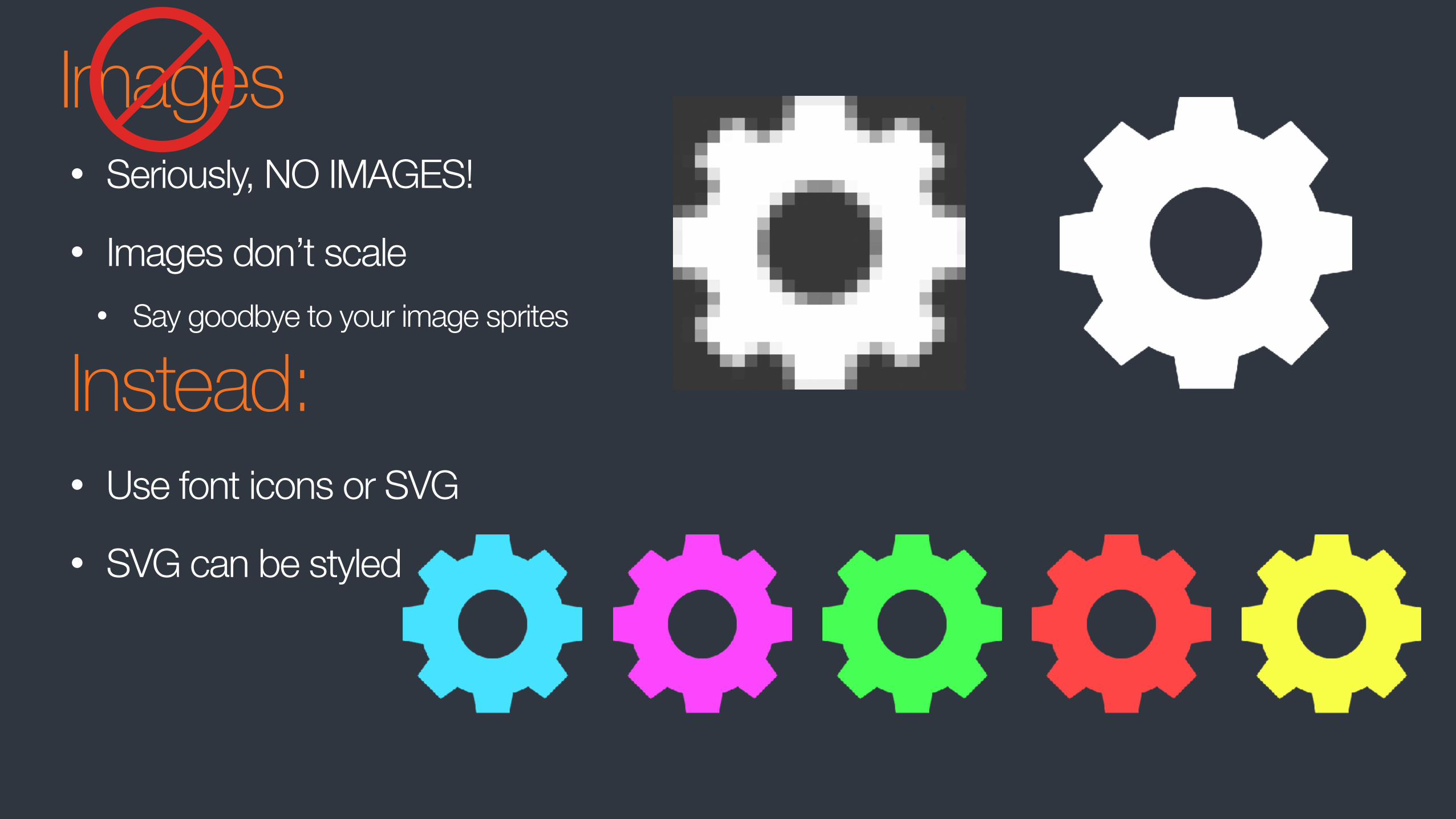
Images• Seriously, NO IMAGES!
• Images don’t scale • Say goodbye to your image sprites
Instead: • Use font icons or SVG
• SVG can be styled
Do These…
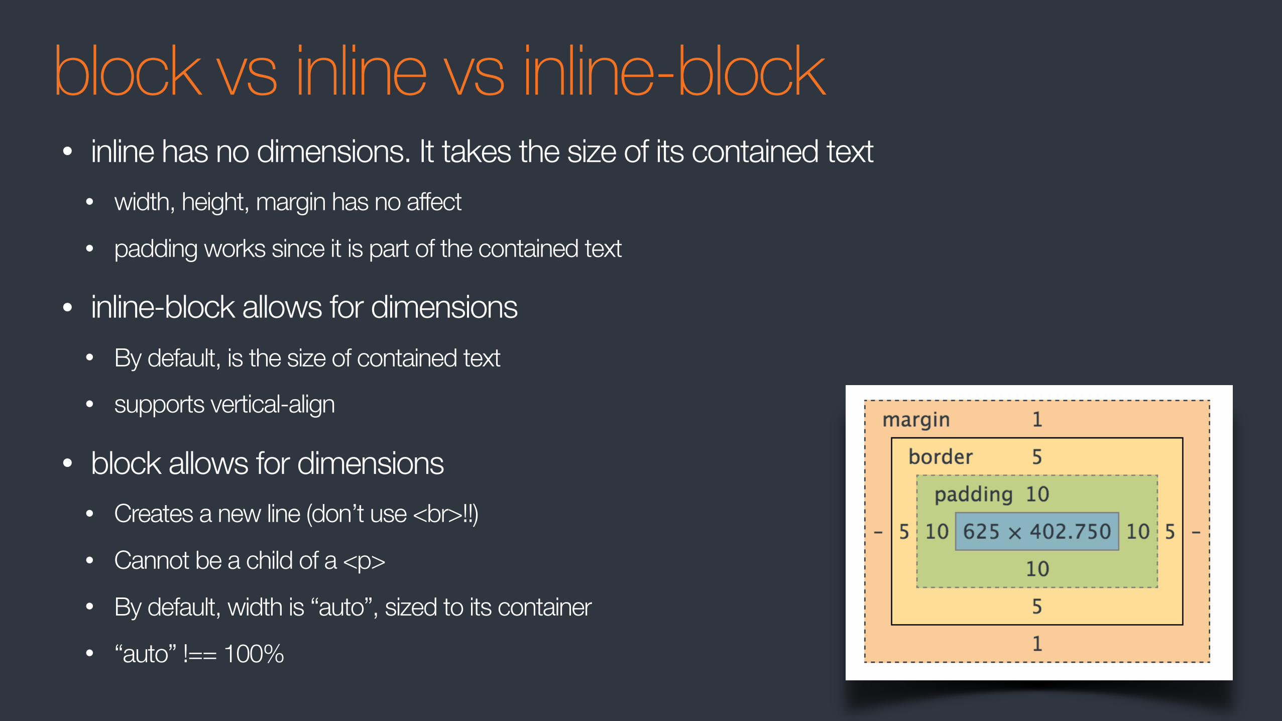
block vs inline vs inline-block• inline has no dimensions. It takes the size of its contained text
• width, height, margin has no affect • padding works since it is part of the contained text
• inline-block allows for dimensions • By default, is the size of contained text • supports vertical-align
• block allows for dimensions • Creates a new line (don’t use <br>!!) • Cannot be a child of a <p> • By default, width is “auto”, sized to its container • “auto” !== 100%

REM & EM• px is a fixed width
• em is relative to its container size • body{ font:10px} / body div{ font:0.5em} [5px] / body div div{ font:0.5em} [2.5px]
• rem is relative to root size • body{ font:10px} / body div{ font:0.5em} [5px] / body div div{ font:0.5em} [5px]
• Use px for dimensions and borders
• Use a combination of em and rem for text, borders, and margins
• em works best for media queries • Test all browsers - Safari is buggy
http://zellwk.com/blog/media-query-units/
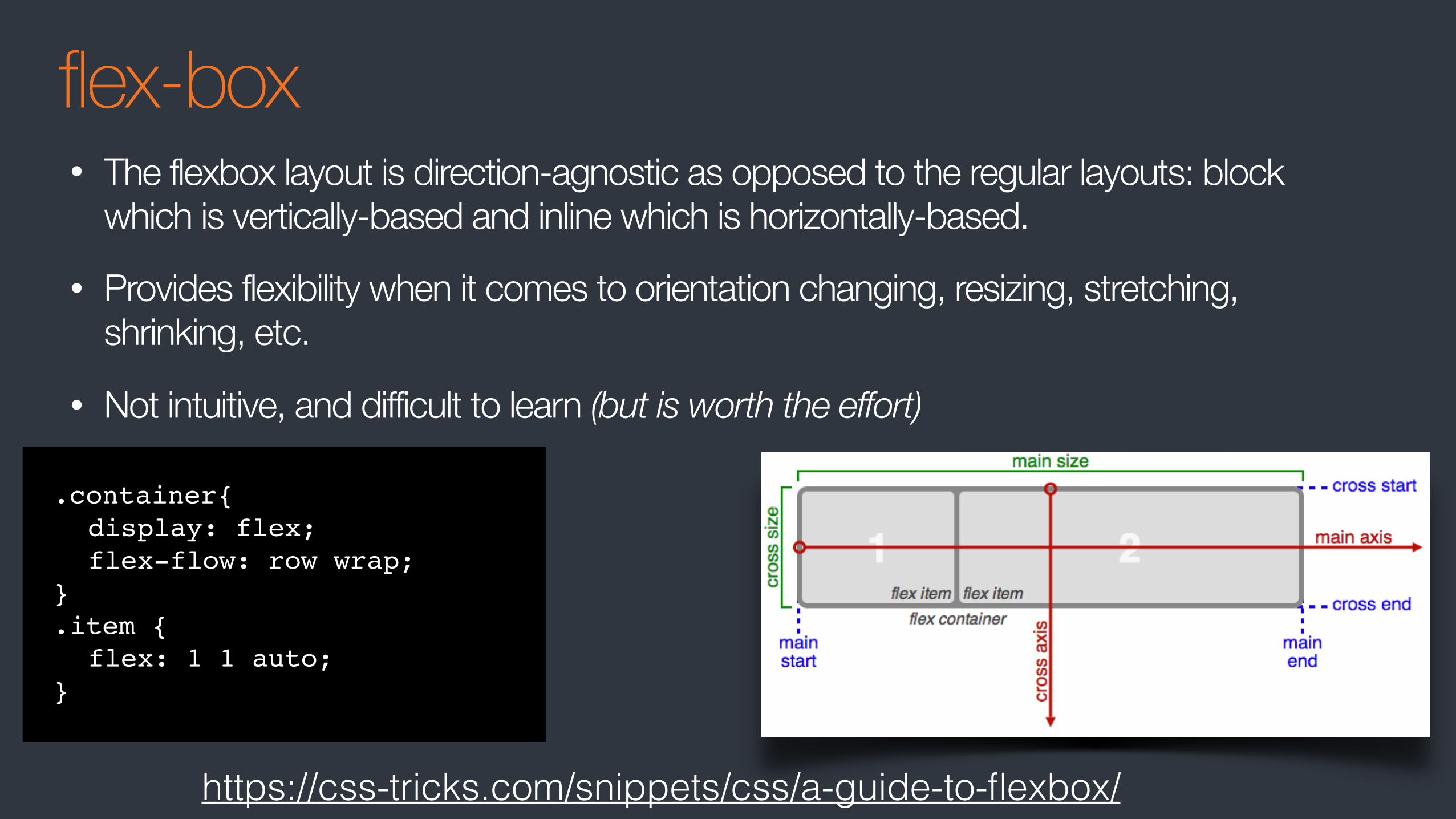
flex-box• The flexbox layout is direction-agnostic as opposed to the regular layouts: block
which is vertically-based and inline which is horizontally-based.
• Provides flexibility when it comes to orientation changing, resizing, stretching, shrinking, etc.
• Not intuitive, and difficult to learn (but is worth the effort)
.container{display: flex;flex-flow: row wrap;
}.item {
flex: 1 1 auto;}
https://css-tricks.com/snippets/css/a-guide-to-flexbox/

CSS Grid Layout (NA)• The solution to layouts
• Works well with flex box
• The spec is still be worked on
.container{ grid-template-columns: 40px 50px auto 50px 40px; grid-template-rows: 25% 100px auto;}
https://css-tricks.com/snippets/css/complete-guide-grid/
Organizing

React Inline-styles• Solves the “problem” of all CSS styles being global
• Is this a problem you even knew you had?
• This will be solved by the Shadow DOM
• Prevents CSS rot of large code bases
• Very likely a problem if you do not practice good modularity
• Already mixing HTML and JS, so, why not?
• While dynamic HTML adds to the spec, the same can not be said for CSS where functionality such as cascading, inheritance, and reusability is removed or reduced
Not so much condemning this approach as much as expressing concern with introducing it to our stack
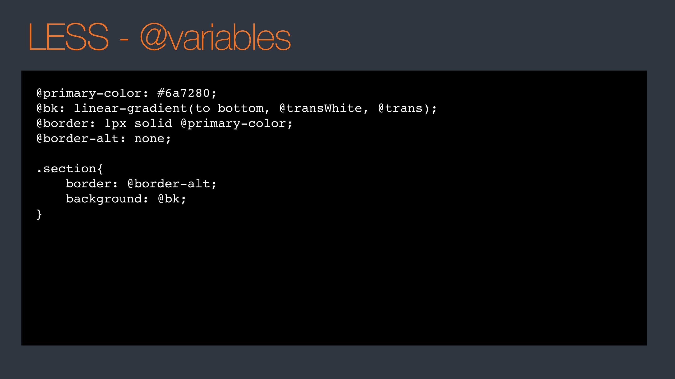
LESS - @variables@primary-color: #6a7280;@bk: linear-gradient(to bottom, @transWhite, @trans);@border: 1px solid @primary-color;@border-alt: none;
.section{ border: @border-alt; background: @bk;}

LESS - modularity.widget{ &:focus{ border: 1px solid blue; } &.collapsed{ height: 0; } .title{ font-weight: bold; .closeBtn{ .abs-right; } }}
.widget{ display: block;}.widget:focus{ border: 1px solid blue;}.widget.collapsed{ height: 0;}.widget .title{ font-weight: bold;}.widget .title .closeBtn{ position: absolute; right: 5px;}

DEMOS

CLUB AJAX


![[HTML, Css] HTML & Css Learning](https://img.pdfslide.tips/doc/110x75/55cf9813550346d0339570eb/html-css-html-css-learning.jpg)