Embed Size (px)
Citation preview
27
THE EFFECT OF PACKAGING COLOR SCHEME ON PERCEPTIONS, PRODUCT PREFERENCES, PRODUCT TRIAL, AND PURCHASE
INTENTION
Wirania Swasty1*, Mediany Kriseka Putri 2, Mohammad Isa Pramana Koesoemadinata3, Ahmad Nur Sheha Gunawan4
1,3,4 School of Creative Industries, Telkom University, Jl. Telekomunikasi No.1, Terusan Buahbatu, Bandung, Jawa Barat 40257, Indonesia
2 School of Economics and Business Telkom University, Jl. Telekomunikasi No.1, Terusan Buahbatu, Bandung, Jawa Barat 40257, Indonesia
Email:1* [email protected], [email protected], [email protected], [email protected]
*Corresponding author
Abstract
This study aimed to understand the effect of different color scheme in perceptions and food product
preference, product trial, and purchase intention. Using quantitative approach, the questionnaires data were cross tested by chi square and one-way ANOVA. The study found there were no significant differences between the price perception, the perceived quality, product preferences, product trial and intense to buy in the different color schemes, except white dominant color in perceived quality aspect. Respondents assessed the use of monochrome color schemes tended to have higher price perceptions and higher quality than white, yellow, analog, and complementary color schemes. It was expected to be a reference to provide an understanding of packaging design strategy especially food products by using color scheme.
Keywords: Color scheme, packaging, product preference, perception, SME
Introduction
Consumers’ attitudes and preferences toward the
brand can be influenced by using the visual design element such as its packaging (Husić-Mehmedović, Omeragić, Batagelj, & Kolar, 2017; Velasco, Pathak, Woods, Corredor, & Elliot, 2020). Positive effect can be achieved by manipulating one or more packaging variables, including packaging color. In the retail industry itself, products are competing for the attention of buyers. Whether realized or not, color can affect a person in buying goods. The response to color is a blend of culture and personal experience accumulated throughout his life (Triedman, 2015). On the other hand, the more familiar and efficient the process, the more likely it is to be driven by mental processes outside of consciousness. Often the purchase action is carried out without involving one's awareness, but instead with the packaging branding and the placement on a consistent shelf (Graves, 2015). Therefore, in deepening the color, it is important to understand the responses of a person and the population group psychologically and socially.
Along with the government support, small and medium enterprises (SMEs) from the creative industries are increasingly emerging. One of the sub-sectors of the creative industry that is fostered by many SME practitioners is the culinary industry (food and beverages). However, many SMEs in the city of
Bandung lacked both managerial and technical as-pects. Some of the common problems faced by SMEs are in the field of marketing, production, and finance. In the field of marketing itself, SMEs experience branding, logo and packaging problems (Swasty, 2015; Windharto, 2014).
Meanwhile, good packaging design can also be means of visual communication product content and product quality. This is also confirmed in some pre-vious studies. An approved packaging can be an effective marketing tool that can increase sales in retail places; triggering the purchase decision process (Mo-hebbi, 2014). With the increasing number of products offered in the market, naturally SME products are facing fierce competition. For that reason, the research on the packaging of SMEs products to have com-petitive advantage is needed. In addition, the results of this study can also be used as a reference for other si-milar SME products; one of which determines the colors to be marketed on certain segments of Social Economic Status (SES). By predicting consumer be-havior, companies can predict consumer tastes (Sanga-ji & Sopiah, 2013).
From the prior study (Swasty, Koesoemadinata, Gunawan, & Putri, 2019), it was revealed that the most important components in packaging design were packaging shape (36%), followed by illustrations of images/photos on packaging (34%) and packaging colors (25%). Despite the color rank three as the
JMK, VOL. 23, NO. 1, MARCH 2021, 27–39 DOI: 10.9744/jmk.23.1.27–39
ISSN 1411-1438 print / ISSN 2338-8234 online
JURNAL MANAJEMEN DAN KEWIRAUSAHAAN, VOL. 23, NO. 1, MARCH 2021: 27–39
28
important components from our pilot study, however many extant studies emphasize the influence of color in purchase intentions (Beneke, Mathews, Munthree, & Pillay, 2015; Huang & Lu, 2016; Yu et al., 2018). Thus, it is worth to examine the colors in the packaging designs associated with perceptions and preferences. It was also revealed that student respondents most liked the illustrated images as illustrations on banana chips packaging (68%) in addition to a scheme of product photos and illustrated images or just photos of banana chips. This will be a visual concept illustration on the prototype of banana chips packaging to be the main research object.
Although some research has been carried out on color preferences of packaging, very little attention has been paid to the SMEs food products. This study focuses on the packaging color of the SMEs food products. Banana chips were selected as the objects of study because the color of packaging is quite varied (after surveyed in some retails in Bandung). When compared to cassava chips which are predominantly red as the color of packaging, banana chips have more varied color and harmony colors.
The formulations of this research problem were as follows: firstly, how are colors and color schemes perceived by adolescent consumers? Secondly, what is the relation between color perceptions and product preferences on adolescent consumers with A-C Social Economic Status (SES)? Therefore, this study aims to explore colors and color schemes perceived by ado-lescent consumers; as well as to identify the correlation between color perceptions and product preferences on adolescent consumers with social economic status (SES).
Definition and Function of Packaging Packaging is the activity of designing and pro-
ducing containers or wrappers for a product (Keller, 2013). Packaging is categorized into three types as follows: Primary packaging, direct contact with the product contents; Secondary packaging as wrapper of primary packaging and an advertising medium; Ship-ment packaging, used for shipping and storage pur-poses (Kotler & Keller, 2016). Preventing damage to food quality caused by environmental influences, packaging can also contribute to effective delivery, sales, and consumption. The main function of the packaging is to maintain the durability and safety of the delivery of food products until they are consumed. The second main function of the packaging is marketing (Wahyudi & Satriyono, 2017).
Packaging viewed from two perspectives - both the company and the customer, has the following
functions: identifying the brand and differentiate from other brand (Singh, 2018), conveying descriptive and persuasive information about the product offered (Ribeiro, Carneiro, Ramos, Patterson, & Pinto, 2018), protecting the product in the distribution need, assisting for storage, and increasing product consumption (Kotler & Keller, 2016). In addition to fulfilling the functional aspects, the packaging must also consider the aesthetic aspects, both in shape, size, color, ma-terials and other graphic elements (Swasty, 2016).
Theory of Colors Many color spaces are used to describe colors,
one of them is the HCL (hue, chroma, luminance) model. Hue is the pigment or the light wavelength, identified by the name, such as yellow, green, blue. Chroma is the saturation, measured as a percentage, with 100% is the fully saturated color. Luminance shows the value or the brightness, its whiteness or blackness, where 0% is always black and 100% is always pure white (Greiner & Stephanides, 2020). Scientists agree that there are two types of colors. Subtractive colors are colors that come from pigments - Cyan, Magenta and Yellow are called CMY color models. If all pigment colors are mixed, it will get a blackish brown color. The additive primary colors which consist of red, green, and blue, are often called the RGB color model. If all spectrum colors of light are mixed, then white will be produced. Brewster classifies the color into four colors which are primary, secondary, tertiary and neutral. Johannes Iten creates a color circle and formulates a color balance theory consisting of dyadic (complementary), triadic (Split complementary), and tetradic (Triedman, 2015) which are called color harmony or color combination (Gong & Lee, 2019).
Scientists classify colors into two main extremes of color: hot and cold colors. Hot or warm colors are red, orange, brown and yellow. These colors are active, stimulating, positive and aggressive, and often asso-ciated with fire, blood and the sun. While cold or cool colors are blue, green and purple. These colors are calm, safe, reverse, and negative, also associated with water, the sky and mountains (Kauppinen-Räisänen & Jauffret, 2018; Triedman, 2015).
The Roles of Color in Packaging Design Many products are recognized from packaging
designs, and a color is an important element in building brand image (Baxter, Ilicic, & Kulczynski, 2018; Cunningham, 2017; Dalgin, Sraiheen, & Akcay, 2018; Kim, 2019). Consistent color usage in a packaging
Swasty: The Effect of Packaging Color Scheme on Perceptions
29
design or a product line makes a color, as a brand identifier, can prevent competitors from deliberately duplicating product wrappings (Klimchuk & Kra-sovec, 2012). Color packaging can help branding a product. For example, green bottle cans packaging of Sprite or blue bottles plastic of Aqua have successfully built the brand identity of the company so that the brand is embedded in the minds of consumers.
The color of the packaging is related to the content of the product (Garaus & Halkias, 2020). In addition to providing information about its products, packaging colors play a role in communicating products. The red color gives the message that the product tastes spicy, while the blue color gives the product a cold message. In addition, colors also com-municate the content of the product. For example, green tea flavored beverage products use green packaging, while brown packaging shows the taste of coffee. In addition to capture the attention of con-sumers and affecting preferential judgements, pac-kaging colors can communicate information about the product at the point of purchase (Mohebbi, 2014). Moreover, colors can identify products, differentiate a product with a competitor's product especially in the retail industry. Appropriate selection and use of colors can differentiate product variety - the composition, taste or flavor variant - in a product line (Klimchuk & Krasovec, 2012). A color - as a marketing tool - can be a persuasive force. As a visual element, colors can attract attention, cool the eyes, play a role in de-termining the success of a product (Triedman, 2015). Packaging colors can affect consumer perceptions of the product (Keller, 2013; Wei, Ou, Luo, & Hutchings, 2012).
Perception arises from sensation (rapid response of the senses to basic stimuli). According to Stanton (in Sangaji & Sopiah, 2013), perception is a meaning that is linked based on past experiences and stimuli received through the five senses. The perception that someone formed influences the mind and the envi-ronment. The process of perception includes (1) Perceptual selection, the consumer capturing and selecting a stimulus based on a series of psycho-logically owned; (2) Perceptual organizations, con-sumers group information into a comprehensive sense of understanding and action; (3) Perceptual interpretation, based on the use of past experience stored in long-term memory (Sangaji & Sopiah, 2013). Pride and Ferrel (in Sangaji & Sopiah 2013) divides factors that influence consumer behavior into three groups: (1) personal factors including demographic factors (sex, age, expenditure); (2) Psychological factors include perceptions; (3) Social factors include social classes.
In addition, extant literature suggest that color can
also be used as a signal for price or quality (Beneke et
al., 2015; Singh, 2006). Price perception is consumer’s
willing to pay for its cost fulfill its requirement (Mirza
& Ali, 2017). Perceived quality is the customer's
opinion toward the overall quality of a product brand
or a service (Shakeel, 2015). Therefore, hypothesis in
this case can be developed as follows:
H1: There is a significant difference between the price
perception in different color schemes.
H2: There is a significant difference between the
quality in different color schemes.
In packaging design, colors have roles, as the
brand identity, communicative and persuasive design.
The selection of colors and attractive schemes on
product packaging can make the product preferred by
consumers than similar competitors’ products. A color
on a packaging is a stimulus in the beginning of the
consumer purchase decision process. Stimulation is
influenced by environmental factors which are psy-
chology and consumer characteristics. This study
limits the perceptions and social classes of consumers.
These perceptions and social classes can influence the
buying decision process in the stage of seeking infor-
mation and alternative evaluation; which will bring
consumers to the formation of likes or preferences
(Sangaji & Sopiah, 2013). Engel et al. (in Sangaji &
Sopiah, 2013) put forward five stages of consumer be-
havior in making purchasing decisions, which are: (1)
introduction of needs; (2) information search; (3)
evaluation of alternatives, the process of evaluating
product or brand choices by comparing selected
brands. This will lead consumers to the formation of
preferences and subsequent buying desire; (4) buying
decision; (5) results (satisfied or not satisfied).
Purchase intention is influenced by the product
price and the brand’s service quality (Mirza & Ali,
2017). Another study points out that consumers’
perception and purchase intention can also be influ-
enced by package color (Huang & Lu, 2016;
Witkowska, 2018; Yu et al., 2018). In this case,
product preference as well as product trial and
purchase intention can be created through packaging
design (DuPuis & Silva, 2011). Color is one of the
fundamental elements that have a psychological effect
on the consumer's mind and its purchasing behavior
(Babolhavaeji, Vakilian, & Slambolchi, 2015). Study
by Javed and Javed (2015) emphasize that consumers’
preference was based on color scheme than on time
constraints. The study suggests that business owners,
brand managers, and marketers cannot ignore the sig-
nificance of packaging color schemes in bringing
JURNAL MANAJEMEN DAN KEWIRAUSAHAAN, VOL. 23, NO. 1, MARCH 2021: 27–39
30
variation in consumers’ buying preferences. Previous
research on color perception and preferences studies
point out that women prefer softer colors whereas men
prefer bold colors when it comes to hues, shades, and
tints (Karthikeyan & Joy, 2018).
Therefore, the hypothesis can be developed as
follows:
H3: There is a significant difference between the
product preference in different color schemes.
H4: There is a significant difference between product
trial in different color schemes.
H5: There is a significant difference between pur-
chase intention in different color schemes.
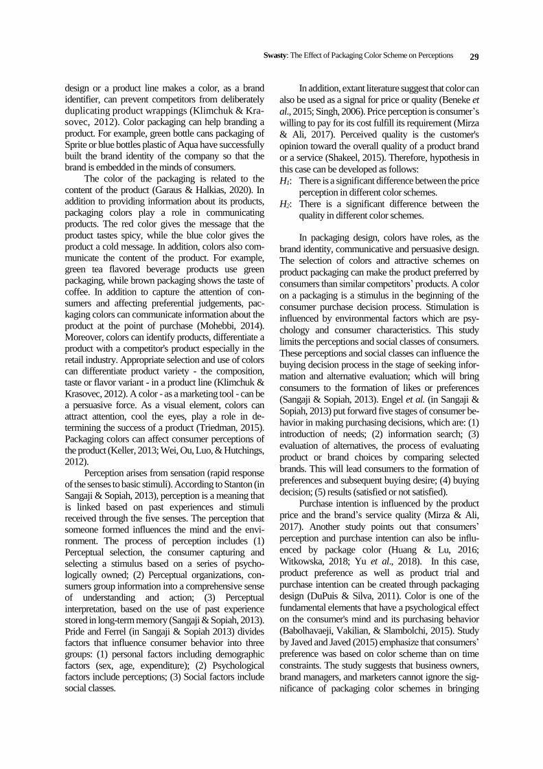
Figure 1. The conceptual research framework
Research Methods
This study used a quantitative approach. The data
collecting was begun by the literature study from
reference books, scientific journals, and similar re-
search to find the theory as the initial foundation in
searching for research problems and what aspects will
be measured or compared. To retrieve primary data,
observation techniques are carried out through a
market observation of the existing packaging. This
observation aims to collect data related to the pac-
kaging design that becomes the object of the research.
The study was begun with a pilot study as a trial run
that was undertaken in preparation for this study. The
collection of pilot study was carried out by spreading
the questionnaires online (via Google Form). Ques-
tionnaires were distributed to undergraduate students
aged 17–25 years. The results of these questionnaires
became a reference for the creation of banana chips
Primary Display Panel (PDP) packaging prototype as
the object of study (Swasty et al., 2019).
The second stage was begun with the creation of
various schemes of colors for banana chips packaging
prototypes that are dominant white color, yellow color,
analog colors scheme, complementary, and mo-
nochrome. Prior study on color packaging and
consumer perception (Martinez, Silva, Martinez, &
Abreu, 2018; Mead & Richerson, 2018; Yu et al.,
2018) have used an experimental method to test the
hypotheses. Hence, this study used an experimental
color scheme of packaging as prior research suggest.
The foundation for designing the different color
scheme of packaging prototype research was based on
the results of the pilot study (Swasty et al., 2019). The
next stage was the data collection with the spread of the
questionnaires offline.
The Participants
Questionnaires were distributed offline to the
prescribed respondents. The target population were
undergraduate visual communication design students
in six large public and private universities in Bandung,
Indonesia. Our justifications are design students can
predict, assess, and appreciate a design work, as well
as have knowledge in color schemes. Moreover,
design students are chosen as participants as this study
used convenience sampling and design students are
more approachable by researchers. Not to mention,
students are active consumers in buying snack foods.
One of the variables questioned was the demographic
factor of monthly expenditure. The demographic data
was later cross-examined with questions such as color
perception, price, quality, preference and purchase
intention. The results of these questionnaires were
expected to answer the formulation of this research
problems. The respondent profile is described in Table
1.
Table 1
Respondents’ Profile
Item Freq. %
Age 18
19
20
21
22
23
24
25
3
19
50
26
5
6
0
1
2.7%
17.3%
45.5%
23.6%
4.5%
5.5%
0
0.9%
Gender Male
Female
56
54
51%
49%
Study
Program
VCD 110 100%
Univ. Maranatha
ITHB
ITB
ITENAS
Widyatama
Telkom
10
10
10
17
13
50
9.1%
9.1%
9.1%
15.5%
11.8%
45.4%
SES C-D
A-B
86
24
78.2%
21.8%
Swasty: The Effect of Packaging Color Scheme on Perceptions
31
Respondents who participated in this study were
110 undergraduate students of Visual Communication
Design (VCD) department from six large universities
in Bandung, Indonesia. Those six large and wellknown
universities in Bandung were selected as they have
Visual Communication Design department. The age of
respondents ranged from 18 to 25 years, with the
majority of respondents 20 years old by 45.5%.
The current definition of Socio Economic Status
(SES) has been adopted since the 1970s, using a single
measure: Routine Monthly Household Expenditure
(Nielsen, 2013). The ABCDE classification by Nielsen
Admosphere is defined as the categorization of house-
hold socioeconomic scores; which consists of 8
categories A, B, C1, C2, C3, D1, D2 and E (Nielsen,
2017). In this case, from 110 respondents, it is known
as 86 respondents or 78.2% have expenditure of IDR
600,000 –1,750,000 and categorized as SES C-D and
the remaining 24 or 21.8% have expenses of IDR
1,750,000–3,500,000 which are categorized as SES A-
B. These SES (A-B and C-D) are the control group.
Procedure, Stimulus and Measurement
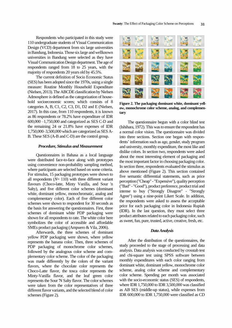
Questionnaires in Bahasa as a local language were distributed face-to-face along with prototypes using convenience non-probability sampling method, where participants are selected based on some criteria. For stimulus, 15 packaging prototypes were shown to all respondents (N= 110) with three different variant flavours (Choco-latte, Minty Vanilla, and Sour 'n Salty), and five different color schemes (dominant white, dominant yellow, monochromatic, analog and complementary color). Each of five different color schemes were shown to respondent for 30 seconds as the basis for answering the questionnaires. First, three schemes of dominant white PDP packaging were shown for all respondents to rate. The white color here symbolizes the color of accessible and affordable SMEs product packaging (Ampuero & Vila, 2006).
Afterwards, the three schemes of dominant yellow PDP packaging were shown, where yellow represents the banana color. Then, three schemes of PDP packaging of monochrome color schemes, followed by the analogous color scheme and com-plementary color scheme. The color of the packaging was made differently by the colors of the variant flavors, where the chocolate color represents the Choco-Latte flavor, the tosca color represents the Minty-Vanilla flavor, and the leaf green color represents the Sour 'N Salty flavor. The color schemes were taken from the color representatives of three different flavor variants, and the selected blend of color schemes (Figure 2).
Figure 2. The packaging dominant white, dominant yell-
ow, monochrome color scheme, analog, and complemen-
tary
The questionnaire begun with a color blind test
(Ishihara, 1972). This was to ensure the respondent has
a normal color vision. The questionnaire was divided
into three sections. Section one began with respon-
dents’ information such as age, gender, study program
and university, monthly expenditure, the most like and
dislike colors. In section two, respondents were asked
about the most interesting element of packaging and
the most important factor in choosing packaging color.
In section three, respondents evaluated the stimulus as
above mentioned (Figure 2). This section contained
five semantic differential statements, such as price
perception ("Cheap" - "Expensive"), quality perception
("Bad" - "Good"), product preference, product trial and
intense to buy ("Strongly Disagree" - "Strongly
Agree") using a nine-point Likert Scale. In addition,
the respondents were asked to assess the acceptable
price for each packaging color in Indonesia Rupiah
(IDR). In the last question, they must select three
product attributes related to each packaging color, such
as sweet, fun, pure, trusted, active, creative, fresh, etc.
Data Analysis
After the distribution of the questionnaires, the
study proceeded to the stage of processing and data
analysis. Data analysis was conducted by crosstab test
and chi-square test using SPSS software between
monthly expenditures with each color ranging from
dominant white, dominant yellow, monochrome color
scheme, analog color scheme and complementary
color scheme. Spending per month was associated
with the socio-economic status (SES) of respondents,
where IDR 1,750,000 to IDR 3,500,000 was classified
as AB SES (middle-up status), while expenses from
IDR 600,000 to IDR 1,750,000 were classified as CD
JURNAL MANAJEMEN DAN KEWIRAUSAHAAN, VOL. 23, NO. 1, MARCH 2021: 27–39
32
SES (middle-low status). Description of expenditures
for later was grouped A-B SES and C-D SES. To see
the significant differences between price perception
group and quality in the different color schemes, one-
way ANOVA test was conducted.
Results and Discussion
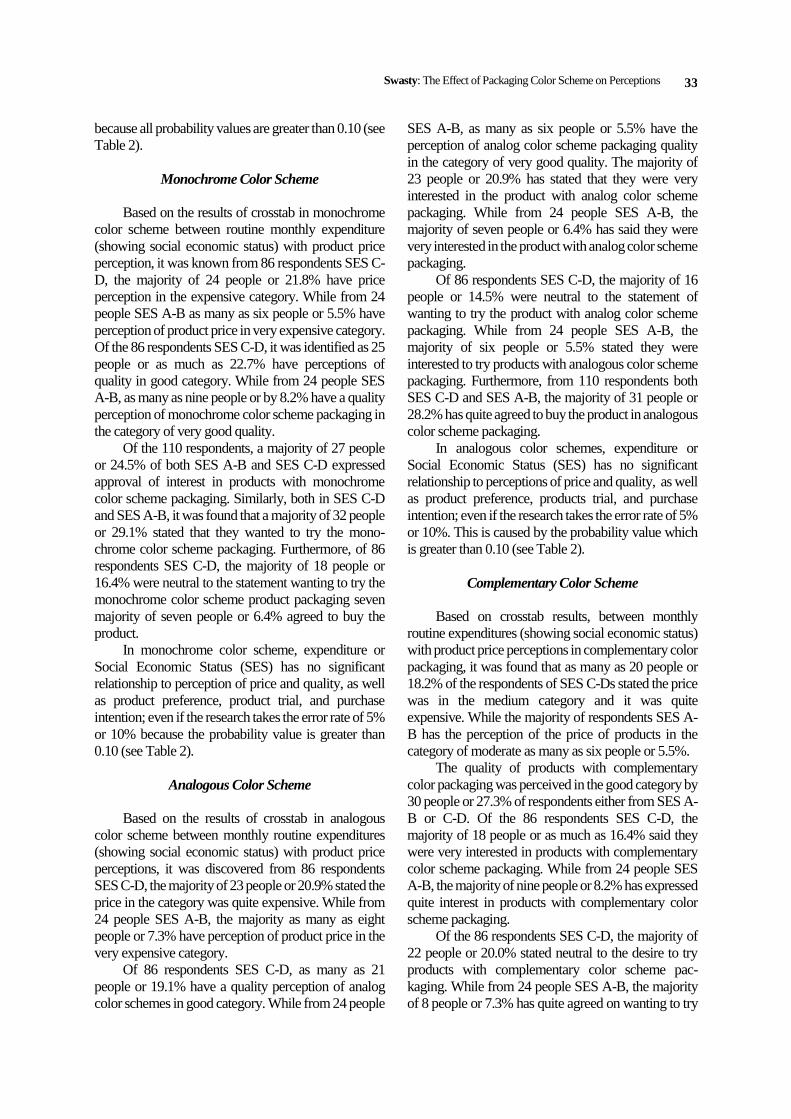
Result of Crosstab Test and Chi-Square Test
The Dominant white color
Based on the result of crosstab on dominant white
color conducted between monthly routine expenditure
(showing social economic status or SES) with the
product price perception, it was known there were two
tendencies of respondent perception, i.e. cheap and
expensive. Of 86 respondents SES C-D or 78.2% have
expenditures of IDR 600,000–1,750,000 known as 26
people or as much as 23.6% said the price in the
category was quite expensive. While from 24 people
with SES A-B or 21.8% of respondents who have ex-
penses of IDR 1,750,000–3,500,000, the majority of
respondents, as many as 10 people or 9.1% rated the
price of products in the category was moderate.
From 86 respondents SES C-D, identified as 32
people or 28.9% have perception of quality in good
category. While from 24 people SES A-B, as many as
8 people or by 6.8% have the perception of dominant
white color packaging quality in the category of very
good quality. Of the 86 respondents SES C-D, it was
recognised that the majority of 27 people or 28.1%
have expressed approval of interest in products with
dominant white packaging. Similarly, from 24 people
with SES A-B, 9 people or 7.9% stated the same agree-
ment.
Of the 86 respondents with SES C-D, it was
known that the majority of 23 people or as much as
21.1% have expressed the agreement to tried products
with dominant white packaging. While from 24 people
with SES A-B, the majority as many as 10 people or
6.5% said they really wanted to try the product.
Furthermore, it was known from 110 respondents, the
majority of both SES C-D and SES A-B agreed to buy
the product that are 31 people (28.2%).
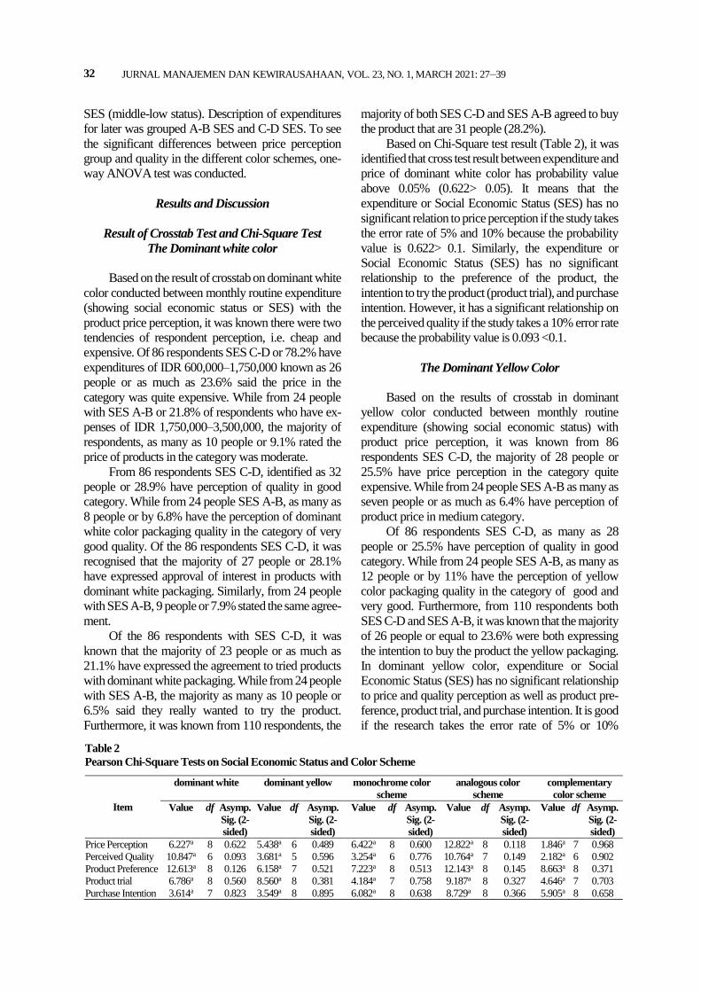
Based on Chi-Square test result (Table 2), it was
identified that cross test result between expenditure and
price of dominant white color has probability value
above 0.05% (0.622> 0.05). It means that the
expenditure or Social Economic Status (SES) has no
significant relation to price perception if the study takes
the error rate of 5% and 10% because the probability
value is 0.622> 0.1. Similarly, the expenditure or
Social Economic Status (SES) has no significant
relationship to the preference of the product, the
intention to try the product (product trial), and purchase
intention. However, it has a significant relationship on
the perceived quality if the study takes a 10% error rate
because the probability value is 0.093 <0.1.
The Dominant Yellow Color
Based on the results of crosstab in dominant
yellow color conducted between monthly routine
expenditure (showing social economic status) with
product price perception, it was known from 86
respondents SES C-D, the majority of 28 people or
25.5% have price perception in the category quite
expensive. While from 24 people SES A-B as many as
seven people or as much as 6.4% have perception of
product price in medium category.
Of 86 respondents SES C-D, as many as 28
people or 25.5% have perception of quality in good
category. While from 24 people SES A-B, as many as
12 people or by 11% have the perception of yellow
color packaging quality in the category of good and
very good. Furthermore, from 110 respondents both
SES C-D and SES A-B, it was known that the majority
of 26 people or equal to 23.6% were both expressing
the intention to buy the product the yellow packaging.
In dominant yellow color, expenditure or Social
Economic Status (SES) has no significant relationship
to price and quality perception as well as product pre-
ference, product trial, and purchase intention. It is good
if the research takes the error rate of 5% or 10%
Table 2
Pearson Chi-Square Tests on Social Economic Status and Color Scheme
Item
dominant white dominant yellow monochrome color
scheme
analogous color
scheme
complementary
color scheme
Value df Asymp.
Sig. (2-
sided)
Value df Asymp.
Sig. (2-
sided)
Value df Asymp.
Sig. (2-
sided)
Value df Asymp.
Sig. (2-
sided)
Value df Asymp.
Sig. (2-
sided)
Price Perception 6.227a 8 0.622 5.438a 6 0.489 6.422a 8 0.600 12.822a 8 0.118 1.846a 7 0.968
Perceived Quality 10.847a 6 0.093 3.681a 5 0.596 3.254a 6 0.776 10.764a 7 0.149 2.182a 6 0.902
Product Preference 12.613a 8 0.126 6.158a 7 0.521 7.223a 8 0.513 12.143a 8 0.145 8.663a 8 0.371
Product trial 6.786a 8 0.560 8.560a 8 0.381 4.184a 7 0.758 9.187a 8 0.327 4.646a 7 0.703
Purchase Intention 3.614a 7 0.823 3.549a 8 0.895 6.082a 8 0.638 8.729a 8 0.366 5.905a 8 0.658
Swasty: The Effect of Packaging Color Scheme on Perceptions
33
because all probability values are greater than 0.10 (see
Table 2).
Monochrome Color Scheme
Based on the results of crosstab in monochrome
color scheme between routine monthly expenditure
(showing social economic status) with product price
perception, it was known from 86 respondents SES C-
D, the majority of 24 people or 21.8% have price
perception in the expensive category. While from 24
people SES A-B as many as six people or 5.5% have
perception of product price in very expensive category.
Of the 86 respondents SES C-D, it was identified as 25
people or as much as 22.7% have perceptions of
quality in good category. While from 24 people SES
A-B, as many as nine people or by 8.2% have a quality
perception of monochrome color scheme packaging in
the category of very good quality.
Of the 110 respondents, a majority of 27 people
or 24.5% of both SES A-B and SES C-D expressed
approval of interest in products with monochrome
color scheme packaging. Similarly, both in SES C-D
and SES A-B, it was found that a majority of 32 people
or 29.1% stated that they wanted to try the mono-
chrome color scheme packaging. Furthermore, of 86
respondents SES C-D, the majority of 18 people or
16.4% were neutral to the statement wanting to try the
monochrome color scheme product packaging seven
majority of seven people or 6.4% agreed to buy the
product.
In monochrome color scheme, expenditure or
Social Economic Status (SES) has no significant
relationship to perception of price and quality, as well
as product preference, product trial, and purchase
intention; even if the research takes the error rate of 5%
or 10% because the probability value is greater than
0.10 (see Table 2).
Analogous Color Scheme
Based on the results of crosstab in analogous
color scheme between monthly routine expenditures
(showing social economic status) with product price
perceptions, it was discovered from 86 respondents
SES C-D, the majority of 23 people or 20.9% stated the
price in the category was quite expensive. While from
24 people SES A-B, the majority as many as eight
people or 7.3% have perception of product price in the
very expensive category.
Of 86 respondents SES C-D, as many as 21
people or 19.1% have a quality perception of analog
color schemes in good category. While from 24 people
SES A-B, as many as six people or 5.5% have the
perception of analog color scheme packaging quality
in the category of very good quality. The majority of
23 people or 20.9% has stated that they were very
interested in the product with analog color scheme
packaging. While from 24 people SES A-B, the
majority of seven people or 6.4% has said they were
very interested in the product with analog color scheme
packaging.
Of 86 respondents SES C-D, the majority of 16
people or 14.5% were neutral to the statement of
wanting to try the product with analog color scheme
packaging. While from 24 people SES A-B, the
majority of six people or 5.5% stated they were
interested to try products with analogous color scheme
packaging. Furthermore, from 110 respondents both
SES C-D and SES A-B, the majority of 31 people or
28.2% has quite agreed to buy the product in analogous
color scheme packaging.
In analogous color schemes, expenditure or
Social Economic Status (SES) has no significant
relationship to perceptions of price and quality, as well
as product preference, products trial, and purchase
intention; even if the research takes the error rate of 5%
or 10%. This is caused by the probability value which
is greater than 0.10 (see Table 2).
Complementary Color Scheme
Based on crosstab results, between monthly
routine expenditures (showing social economic status)
with product price perceptions in complementary color
packaging, it was found that as many as 20 people or
18.2% of the respondents of SES C-Ds stated the price
was in the medium category and it was quite
expensive. While the majority of respondents SES A-
B has the perception of the price of products in the
category of moderate as many as six people or 5.5%.
The quality of products with complementary
color packaging was perceived in the good category by
30 people or 27.3% of respondents either from SES A-
B or C-D. Of the 86 respondents SES C-D, the
majority of 18 people or as much as 16.4% said they
were very interested in products with complementary
color scheme packaging. While from 24 people SES
A-B, the majority of nine people or 8.2% has expressed
quite interest in products with complementary color
scheme packaging.
Of the 86 respondents SES C-D, the majority of
22 people or 20.0% stated neutral to the desire to try
products with complementary color scheme pac-
kaging. While from 24 people SES A-B, the majority
of 8 people or 7.3% has quite agreed on wanting to try
JURNAL MANAJEMEN DAN KEWIRAUSAHAAN, VOL. 23, NO. 1, MARCH 2021: 27–39
34
products with complementary color scheme packa-
ging. Furthermore, of 86 respondents SES C-D, the
majority of 22 people or 20.0% stated neutral to the
desire to buy products with complementary color
scheme packaging. While from 24 people SES A-B,
the majority of eight people or 7.3% has quite agreed
on wanting to buy products with complementary color
scheme packaging.
In complementary color schemes, expenditure or
Social Economic Status (SES) has no significant
relationship to perception of price and quality, as well
as product preference, product trial, and purchase
intention; even if the research takes the error rate of 5%
or 10% because the probability value is greater than
0.10 (see Table 2).
One-Way ANOVA Test
One-way ANOVA (Analysis of Variance) was conducted using two colors (white and yellow) and color scheme (monochrome, analogous and comple-mentary) as independent variables to analyze whether there is a significant difference between price per-ception, perceived quality, product interest, product trial, and purchase intention in different color scheme of PDP packaging. The tendency of buyers was viewed from the respondent's perception of alternative answers on each variable. Based on the calculation, the sig value of the sample is greater than 0.05. It can be concluded that the population variant is homogeneous, so it can be tested one-way ANOVA because it does not meet the provisions of the ANOVA test re-quirements.
Based on the calculation, Ftable for sig value 0.05, total sample of 110 and the number of variables 5, it was obtained Ftable of 2.296. Based on data processing (Table 3), Fcount> Ftable. This means, there is a sig-nificant difference in the perception of price, quality, product preference, product trial, and purchase in-tention in different color schemes. Furthermore, the post hoc tests were conducted to determine which groups have differences.
Table 3
ANOVA
Sum of
Squares
df Mean
Square
Fcount Sig.
Price perception 46.956 4 11.739 4.959 .001 Quality perception
25.080 4 6.270 2.972 .019
Product preference
72.036 4 18.009 5.346 .000
Product Trial 63.771 4 15.943 4.447 .002 Purchase intention
31.829 4 7.957 2.339 .054
Post Hoc Test of Price Perception
Based on Table 4, there are significant differences
in price perception on the dominant white color with
the price group of monochrome color schemes and
analog color schemes. The dominant price of white has
a lower average price, which is -0.718 compared to the
monochrome color scheme group. Similarly, the
average price of the dominant group of white color has
a lower average price of -0.591 from the price average
of analogous color scheme group. While in the price
group with the dominant yellow and complementary
scheme does not have a significant difference in prices
with the average price of the dominant white color.
In the dominant yellow, there was a significant
difference between the average price of monochrome
color schemes. The dominant group of yellow has a
lower average price, that is -0.591 of the monochrome
color scheme group. As for the dominant group of
white, complementary, and analog schemes there is no
significant difference in the average price.
In the monochrome color scheme, there were
significant differences with dominant groups of white,
yellow, and complementary color. The average price
of the dominant group of monochrome color has a
higher average price that is 0.718 of the dominant
group of white, 0.591 of the dominant group of yellow
and 0.636 of the dominant group of complementary
colors. While in the analog color scheme group there is
no significant difference in the average price.
In the analogous color schemes, there was a
significant difference between the average price of the
dominant group of white color. The average price of
the analogous scheme color group has a higher average
price, which is 0.591 of the dominant group of white.
While in the dominant group of yellow, the mo-
nochrome color scheme and complementary there was
no significant differrence in the price of the price.
In the complementary color schemes, there was a
significant difference between the average price of
monochrome color schemes. The average price of the
complementary color scheme group has a lower
average price, that is -0.636 of the monochrome color
scheme group. While in the dominant group of white
yellow and analog color schemes, there was no
significant difference in average prices.
Based on Table 5, for the price aspect, dominant
white group has the lowest average price, that is equal
to 5.64. Meanwhile, the group of complementary color
schemes is 5.72. The dominant group of yellow is 5.76
and the analog color scheme group is 6.23. Lastly, the
monochrome color scheme group is 6.35. It can be
Swasty: The Effect of Packaging Color Scheme on Perceptions
35
concluded that respondents evaluate the use of mo-
nochrome color schemes tends to have higher price
perception than the dominant groups of white, comple-
mentary, yellow, and analog. While the dominant use
of white color has the opposite tendency (perception of
cheaper price).
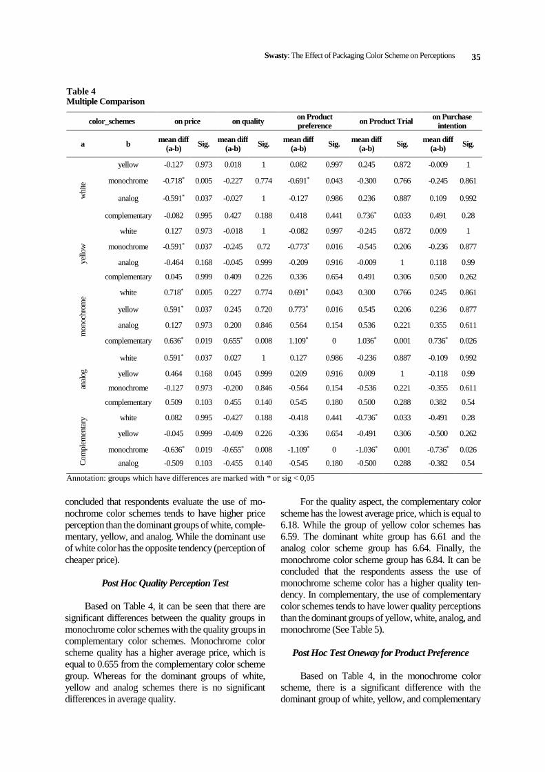
Post Hoc Quality Perception Test
Based on Table 4, it can be seen that there are
significant differences between the quality groups in
monochrome color schemes with the quality groups in
complementary color schemes. Monochrome color
scheme quality has a higher average price, which is
equal to 0.655 from the complementary color scheme
group. Whereas for the dominant groups of white,
yellow and analog schemes there is no significant
differences in average quality.
For the quality aspect, the complementary color
scheme has the lowest average price, which is equal to
6.18. While the group of yellow color schemes has
6.59. The dominant white group has 6.61 and the
analog color scheme group has 6.64. Finally, the
monochrome color scheme group has 6.84. It can be
concluded that the respondents assess the use of
monochrome scheme color has a higher quality ten-
dency. In complementary, the use of complementary
color schemes tends to have lower quality perceptions
than the dominant groups of yellow, white, analog, and
monochrome (See Table 5).
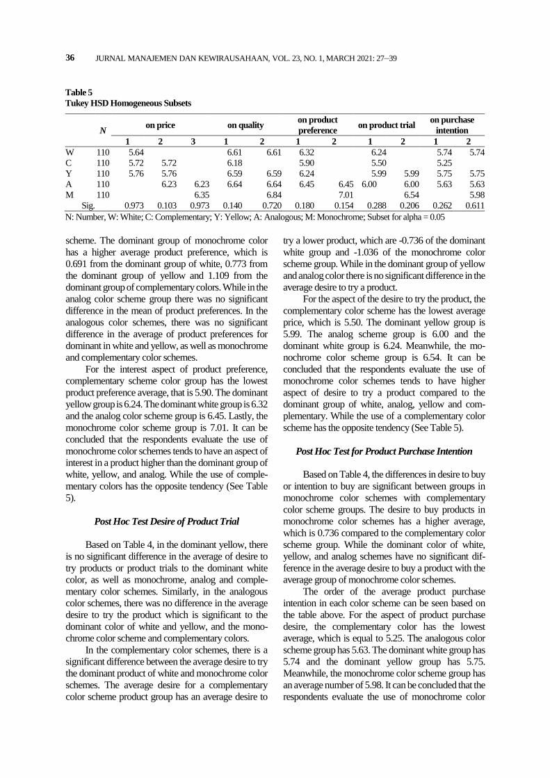
Post Hoc Test Oneway for Product Preference
Based on Table 4, in the monochrome color
scheme, there is a significant difference with the
dominant group of white, yellow, and complementary
Table 4 Multiple Comparison
color_schemes on price on quality on Product preference
on Product Trial on Purchase
intention
a b mean diff
(a-b) Sig.
mean diff (a-b)
Sig. mean diff
(a-b) Sig.
mean diff (a-b)
Sig. mean diff
(a-b) Sig.
white
yellow -0.127 0.973 0.018 1 0.082 0.997 0.245 0.872 -0.009 1
monochrome -0.718* 0.005 -0.227 0.774 -0.691* 0.043 -0.300 0.766 -0.245 0.861
analog -0.591* 0.037 -0.027 1 -0.127 0.986 0.236 0.887 0.109 0.992
complementary -0.082 0.995 0.427 0.188 0.418 0.441 0.736* 0.033 0.491 0.28
yel
low
white 0.127 0.973 -0.018 1 -0.082 0.997 -0.245 0.872 0.009 1
monochrome -0.591* 0.037 -0.245 0.72 -0.773* 0.016 -0.545 0.206 -0.236 0.877
analog -0.464 0.168 -0.045 0.999 -0.209 0.916 -0.009 1 0.118 0.99
complementary 0.045 0.999 0.409 0.226 0.336 0.654 0.491 0.306 0.500 0.262
mon
ochr
om
e
white 0.718* 0.005 0.227 0.774 0.691* 0.043 0.300 0.766 0.245 0.861
yellow 0.591* 0.037 0.245 0.720 0.773* 0.016 0.545 0.206 0.236 0.877
analog 0.127 0.973 0.200 0.846 0.564 0.154 0.536 0.221 0.355 0.611
complementary 0.636* 0.019 0.655* 0.008 1.109* 0 1.036* 0.001 0.736* 0.026
anal
og
white 0.591* 0.037 0.027 1 0.127 0.986 -0.236 0.887 -0.109 0.992
yellow 0.464 0.168 0.045 0.999 0.209 0.916 0.009 1 -0.118 0.99
monochrome -0.127 0.973 -0.200 0.846 -0.564 0.154 -0.536 0.221 -0.355 0.611
complementary 0.509 0.103 0.455 0.140 0.545 0.180 0.500 0.288 0.382 0.54
Com
ple
men
tary
white 0.082 0.995 -0.427 0.188 -0.418 0.441 -0.736* 0.033 -0.491 0.28
yellow -0.045 0.999 -0.409 0.226 -0.336 0.654 -0.491 0.306 -0.500 0.262
monochrome -0.636* 0.019 -0.655* 0.008 -1.109* 0 -1.036* 0.001 -0.736* 0.026
analog -0.509 0.103 -0.455 0.140 -0.545 0.180 -0.500 0.288 -0.382 0.54
Annotation: groups which have differences are marked with * or sig < 0,05
JURNAL MANAJEMEN DAN KEWIRAUSAHAAN, VOL. 23, NO. 1, MARCH 2021: 27–39
36
scheme. The dominant group of monochrome color
has a higher average product preference, which is
0.691 from the dominant group of white, 0.773 from
the dominant group of yellow and 1.109 from the
dominant group of complementary colors. While in the
analog color scheme group there was no significant
difference in the mean of product preferences. In the
analogous color schemes, there was no significant
difference in the average of product preferences for
dominant in white and yellow, as well as monochrome
and complementary color schemes.
For the interest aspect of product preference,
complementary scheme color group has the lowest
product preference average, that is 5.90. The dominant
yellow group is 6.24. The dominant white group is 6.32
and the analog color scheme group is 6.45. Lastly, the
monochrome color scheme group is 7.01. It can be
concluded that the respondents evaluate the use of
monochrome color schemes tends to have an aspect of
interest in a product higher than the dominant group of
white, yellow, and analog. While the use of comple-
mentary colors has the opposite tendency (See Table
5).
Post Hoc Test Desire of Product Trial
Based on Table 4, in the dominant yellow, there
is no significant difference in the average of desire to
try products or product trials to the dominant white
color, as well as monochrome, analog and comple-
mentary color schemes. Similarly, in the analogous
color schemes, there was no difference in the average
desire to try the product which is significant to the
dominant color of white and yellow, and the mono-
chrome color scheme and complementary colors.
In the complementary color schemes, there is a
significant difference between the average desire to try
the dominant product of white and monochrome color
schemes. The average desire for a complementary
color scheme product group has an average desire to
try a lower product, which are -0.736 of the dominant
white group and -1.036 of the monochrome color
scheme group. While in the dominant group of yellow
and analog color there is no significant difference in the
average desire to try a product.
For the aspect of the desire to try the product, the
complementary color scheme has the lowest average
price, which is 5.50. The dominant yellow group is
5.99. The analog scheme group is 6.00 and the
dominant white group is 6.24. Meanwhile, the mo-
nochrome color scheme group is 6.54. It can be
concluded that the respondents evaluate the use of
monochrome color schemes tends to have higher
aspect of desire to try a product compared to the
dominant group of white, analog, yellow and com-
plementary. While the use of a complementary color
scheme has the opposite tendency (See Table 5).
Post Hoc Test for Product Purchase Intention
Based on Table 4, the differences in desire to buy
or intention to buy are significant between groups in
monochrome color schemes with complementary
color scheme groups. The desire to buy products in
monochrome color schemes has a higher average,
which is 0.736 compared to the complementary color
scheme group. While the dominant color of white,
yellow, and analog schemes have no significant dif-
ference in the average desire to buy a product with the
average group of monochrome color schemes.
The order of the average product purchase
intention in each color scheme can be seen based on
the table above. For the aspect of product purchase
desire, the complementary color has the lowest
average, which is equal to 5.25. The analogous color
scheme group has 5.63. The dominant white group has
5.74 and the dominant yellow group has 5.75.
Meanwhile, the monochrome color scheme group has
an average number of 5.98. It can be concluded that the
respondents evaluate the use of monochrome color
Table 5
Tukey HSD Homogeneous Subsets
N on price on quality
on product
preference on product trial
on purchase
intention
1 2 3 1 2 1 2 1 2 1 2
W 110 5.64 6.61 6.61 6.32 6.24 5.74 5.74
C 110 5.72 5.72 6.18 5.90 5.50 5.25
Y 110 5.76 5.76 6.59 6.59 6.24 5.99 5.99 5.75 5.75
A 110 6.23 6.23 6.64 6.64 6.45 6.45 6.00 6.00 5.63 5.63
M 110 6.35 6.84 7.01 6.54 5.98
Sig. 0.973 0.103 0.973 0.140 0.720 0.180 0.154 0.288 0.206 0.262 0.611
N: Number, W: White; C: Complementary; Y: Yellow; A: Analogous; M: Monochrome; Subset for alpha = 0.05
Swasty: The Effect of Packaging Color Scheme on Perceptions
37
schemes tends to have higher purchase intention than
the dominant group of complementary colors, white
analogs, and yellow. While the use of complementary
color schemes has the opposite tendency (See Table 5).
Conclusion and Implications
This study is conducted to explore the color
scheme perceived by adolescent consumers in term of
price and quality, the relevance to the interest of the
product, also the desire to try and purchase the product.
Another objective is to identify the correlation between
price and quality perceptions and product preference,
product trial and purchase intention on adolescent
consumers with Social Economic Status (SES). The
analysis are using cross-tab test, chi square test, and
ANOVA. The findings suggest that in different color
schemes packaging, the expenditure and SES does not
have any impact on the price, whether the price is high
or low. Furthermore, this study has identified that the
expenditure and SES has no significant difference in
product preference, product trial, and purchase
intention. There is still the possibility of the product
being purchased. In other words, consumers might
prefer, try and buy the food product regardless their
income/ expenditure and the product price. Similarly,
the expenditure and SES does not have significant
differences in perceived quality, except for dominant
white product packaging.
Based on the HSD tukey test on one-way
ANOVA, it can be seen that the respondents rated the
use of monochrome color schemes tends to have more
expensive price perceptions and higher quality per-
ceptions. While the dominant use of white color has a
tendency of cheaper price perception. This is aligned
with study by Ampuero and Vila (2006) who point out
that light color mainly white is considered as accessible
products and reasonably priced. The use of comple-
mentary color schemes tends to have lower quality per-
ceptions than other color schemes, which confirms the
study by Witkowska (2018). Similarly, higher results
are discovered in the aspects of product interest, also
the desire to try and to buy the product, the respondents
agree that the use of monochrome color schemes tends
to be higher than the dominant of white and yellow, as
well as analogous and complementary color schemes
in the packaging design. Surprisingly, this study con-
tradicts with the prior research by Witkowska (2018)
who propose packaging in analogous colors are more
likely to be purchased.
This study contributes to the knowledge by
adding insight about color combination in marketing,
while other studies usually address the color (hue)
solely. As consumer analyse the food product pac-
kaging prior purchasing, the findings of this study are
beneficial for SMEs food producers to create better
packaging design as a promotion strategy to boost
sales. Designers can select a monochrome color com-
bination to apply in packaging design for SMEs food
products as the monochrome scheme perceived higher
price and higher quality by consumers, therefore affect
the preference, product trial and purchase intention.
This confirms the study by Mirza and Ali (2017) who
argue that purchase intention is influenced by the
product price and quality.
It is unfortunate that the involvement of Visual
Communication Design students in Bandung city and
county on banana chips packaging limits the generali-
zation of the invention for all products and segmenta-
tion. The respondents who are design students make
these findings less generalisable to consumers. The
design students are considered as experts especially in
color study. For further research, it is advisable to
examine the needs to apply different product category
packaging to students from various disciplines and/ or
respondents with different education background and
Social-Economic Status (SES). This paper only des-
cribes the homogeneity test on SES. The homogeneity
test should be tested on all control variables such as
age, gender, and color preference on the study varia-
bles to ensure that these variables are not significant
and to enhance the generalisability of the results.
Another issue that the size of the sample, which is 110
participants, can be considered too small, given the
number of variables tested and combinations presented
to the respondents. Therefore, it is recommended to
confirm these results in a larger sample.
For future study, intergroup analysis (e.g. three
experiment groups, each group have specific flavour
with five different colour schemes) can be considered.
This would alter the quality of their responses as they
would not be exposed with too many stimuli at the
same time. In addition, this study still uses conven-
tional quantitative data collection techniques in the
form of questionnaires, although there are many new
techniques in the characterization of sensory and pro-
filing consumers, such as eye-tracking, brain-tracking/
electroencephalogram (EEG) and Big Data Analytics.
Therefore, it would be appealing if the further research
uses a scheme of eye-tracking and brain-tracking in the
collection of data, especially related to the visual
stimuli, which one of them is color. The Big Data
analysis is the process of collecting, organizing and
analyzing a large pool of data to obtain patterns and
useful information in understanding information and
also helping to identify the most important data for
JURNAL MANAJEMEN DAN KEWIRAUSAHAAN, VOL. 23, NO. 1, MARCH 2021: 27–39
38
current and future business decisions (Miranda, 2014);
especially in packaging design decisions as one of the
brand identity and information media in product mar-
keting.
References
Ampuero, O., & Vila, N. (2006). Consumer per-ceptions of product packaging. Journal of Con-
sumer Marketing, 23(2), 102–114. https://doi. org/10.1108/07363760610655032
Babolhavaeji, M., Vakilian, M. A., & Slambolchi, A. (2015). The role of product color in consumer
behavior. Advanced Social Humanities and Ma-
nagement, 2(1), 9–15. Baxter, S. M., Ilicic, J., & Kulczynski, A. (2018).
Roses are red, violets are blue, sophisticated brands have a Tiffany Hue: The effect of iconic
brand color priming on brand personality judg-ments. Journal of Brand Management, 25(4),
384–394. https://doi.org/10.1057/s41262-017-0086-9
Beneke, J., Mathews, O., Munthree, T., & Pillay, K. (2015). The role of package colour in influencing
purchase intent of bottled water Implications for SMEs and entrepreneurs. Journal of Research in
Marketing and Entrepreneurship, 17(2), 165–192. https://doi.org/10.1108/JRME-05-2015-0030
Cunningham, M. K. (2017). The value of color rese-arch in brand strategy. Open Journal of Social
Sciences, 05(12), 186–196. https://doi.org/10.42 36/jss.2017.512014
Dalgin, M. H., Sraiheen, A., & Akcay, O. (2018).
Gender differences in product color importance, color choice, and meaning of color: A cross-
country study. Journal of Business and Behavior Sciences, 30(1), 88–99.
DuPuis, S., & Silva, J. (2011). Package design work-book. Gloucester, MA: Rockport Publishers.
Garaus, M., & Halkias, G. (2020). One color fits all: Product category color norms and (a) typical
package colors. Review of Managerial Science, 14, 1077–1099. https://doi.org/10. 1007/s11846-
018-0325-9 Gong, S. M., & Lee, W. Y. (2019). Colour harmony of
two-colour combinations using a 3D colour configuration. Coloration Technology, 135(4),
292–304. https://doi.org/10.1111 /cote.12405 Graves, P. (2015). Consumer.ology: Mitos riset pasar,
kebenaran tentang konsumen, dan psikologi
berbelanja. Jakarta: PT Elex Media Komputindo. Greiner, B., & Stephanides, M. (2020). The economics
of color: A null result. Retrieved from https://epub.wu.ac.at/7388/1/wp2020-02.pdf
Huang, L., & Lu, J. (2016). The impact of package
color and the nutrition content labels on the
perception of food healthiness and purchase
intention. Journal of Food Products Marketing,
22(2), 191–218. https://doi.org/10.1080/104544
46. 2014.1000434
Husić-Mehmedović, M., Omeragić, I., Batagelj, Z., &
Kolar, T. (2017). Seeing is not necessarily liking:
Advancing research on package design with eye-
tracking. Journal of Business Research, 80, 145–
154. https://doi.org/10.1016/j.jbusres.2017.04.019
Ishihara, S. (1972). Test for colour-blindness. Tokyo,
Japan: Kanehara Shuppan.
Javed, S. A., & Javed, S. (2015). The impact of pro-
duct’s packaging color on customers’ buying
preferences under time pressure. Marketing and
Branding Research, 2(November), 3–14.
https://doi.org/10.19237/M BR.2015.01.01
Karthikeyan, C., & Joy, R. (2018). An exploratory
study on colour psychology in marketing: A
techno-leadership perspective. International Jour-
nal of Research in Social Sciences, 8(9), 65–92.
Kauppinen-Räisänen, H., & Jauffret, M. N. (2018).
Using colour semiotics to explore colour mean-
ings. Qualitative Market Research, 21(1), 101–
117. https://doi.org/10. 1108/QMR-03-2016-0033
Keller, K. L. (2013). Strategic brand management:
Building, measuring, and managing brand equ-
ity. Global Edition. New Jersey, NJ: Pearson
Education Limited.
Kim, Y. J. (2019). The influence of color on brand
extension: Mediation role of processing style.
Japanese Psychological Research, 1–11.
https://doi.org/10.1111/jpr.12269
Klimchuk, M. R., & Krasovec, S. A. (2012). Pac-
kaging design: Successful product branding from
concept to shelf (2nd ed). New Jersey, NJ: John
Wiley & Sons. Kotler, P., & Keller, K. L. (2016). Marketing mana-
gement (15th Ed.). New Jersey, NJ: Pearson Education.
Martinez, L. M., Silva, M., Martinez, L. F., & Abreu, A. M. (2018). Colour contrast in packaging and consumer product perception. Proceedings of the International Colour Association (AIC) Confe-rence 2018: Colour & Human Comfort - Lisbon, Portugal, 353–360.
Mead, J. A., & Richerson, R. (2018). Package color saturation and food healthfulness perceptions. Journal of Business Research, 82, 10–18. https://doi.org/10.1016/j.jbusres.201 7.08.015
Miranda, E. (2014). Big data analytics. Retrieved from
https://sis.binus.ac.id/2014/04/14/big-data-analy-
tics/
Swasty: The Effect of Packaging Color Scheme on Perceptions
39
Mirza, B., & Ali, M. (2017). An assessment of relation-
ship among service quality, price perception and
customer satisfaction in the formation of
consumer’s purchase intention. Kuwait Chapter
of the Arabian Journal of Business and Manage-
ment Review, 6(12), 10–21. http://dx.doi.org/10.
12816/0041751
Mohebbi, B. (2014). The art of packaging: An
investigation into the role of color in packaging,
marketing, and branding. International Journal
of Organizational Leadership, 3(2), 92–102.
https://doi.org/10.33844/ijol. 2014.60248
Nielsen. (2013). Nielsen new approach for Indonesia
socio economic status. Retrieved from http://
perpi.or.id/wp-content/uploads/2013/ 04/Nielsen-
New-Approach-for-Indonesia-Socio-Economic-
Status-to-share.pdf
---------- (2017). ABCDE socio-economic classifi-
cation:Specification for year 2018. Retrieved
from http://www.nielsen-admosphere.eu/wp-con
tent/uploads/2014/06/Nielsen-Admosphere-AB
CDE-classification-specificat ion-2018.pdf
Ribeiro, A. P. L., Carneiro, J. de D. S., Ramos, T. D.
M., Patterson, L., & Pinto, S. M. (2018). Deter-
mining how packaging and labeling of Requeijão
cheese affects the purchase behavior of con-
sumers of different age groups. British Food
Journal, 120(6), 1183–1194. https://doi.org/10.
1108/BFJ-02-2017-0081
Sangaji, E. M., & Sopiah. (2013). Perilaku konsumen:
Pendekatan praktis disertai himpunan jurnal
penelitian. Yogyakarta: Penerbit ANDI.
Shakeel, A. (2015). The role of brand credibility on
purchase intention on fast food sector in Pakistan.
International Journal of Information, Business
and Management, 7(4), 158–168.
Singh, R. K. (2018). The effect of packaging attributes
on consumer perception. International Journal
for Innovative Research in Multidisciplinary
Field, 4(5), 340–346.
Singh, S. (2006). Impact of color on marketing. Ma-
nagement Decision, 44(6), 783–789. https://doi.
org/10.1108/00251740610673332.
Swasty, W. (2015). Business model innovation for small medium enterprises. The Winners, 16(2), 85–95.
------------- (2016). Branding: Memahami dan meran-cang strategi merek. Bandung: PT Remaja Ros-dakarya.
Swasty, W., Koesoemadinata, M. I. P., Gunawan, A. N. S., & Putri, M. K. (2019). Student’s perception and preference of food package design: A pilot study. A paper presented in the 6th Bandung Creative Movement 2019, Telkom University, Bandung, Indonesia.
Triedman, K. (2015). Color: The professional’s guide: Understanding, appreciation and mastering co-lor in art and design. USA: HOW Books
Velasco, C., Pathak, A., Woods, A. T., Corredor, A., & Elliot, A. J. (2020). The relation between sym-metry in food packaging and approach and av-oidance words. Quarterly Journal of Experi-mental Psychology, 73(5), 654–663. https://doi. org/10.1177/17470218 19887172
Wahyudi, N., & Satriyono, S. (2017). Mantra kemasan juara. Jakarta: PT Elex Media Komputindo.
Wei, S.-T., Ou, L.-C., Luo, L.-C., & Hutchings, J. B. (2012). The relationship between visual percep-tions and taste expectations using food colours. Predicting Perceptions: Proceedings of the 3rd International Conference on Appearance, April, 157–160. http:// opendepot.org/1085/
Windharto, A. (2014). Design development of food & beverage product packaging for SMEs co in Java and West Nusa Tenggara, economic corridor. IPTEK Journal of Proceeding Series, 1(1), 420–424. https://doi. org/10.12962/j23546026.y20 14 i1.394.
Witkowska, Z. A. (2018). The influence of colour con-trast in packaging on consumer behaviour. Retrieved from https://run.unl.pt/bitstream/ 03 62/53140/1/Witkowska_2019.pdf
Yu, L., Westland, S., Li, Z., Pan, Q., Shin, M. J., & Won, S. (2018). The role of individual colour preferences in consumer purchase decisions. Co-lor Research and Application, 43 (2), 258–267. https://doi.org/10.1002/col.22 180.