Embed Size (px)
Citation preview
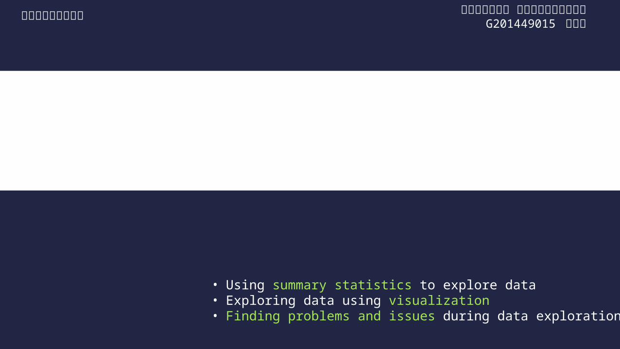
• Using summary statistics to explore data• Exploring data using visualization• Finding problems and issues during data exploration
3 Exploring data
서울시립대학교 전기전자컴퓨터공학과G201449015 이가희
고급컴퓨터알고리듬

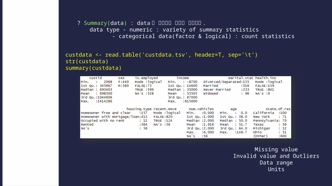
? Summary(data) : data 의 전반적인 형태를 보여준다 .data type - numeric : variety of summary statistics
- categorical data(factor & logical) : count statistics
custdata <- read.table('custdata.tsv', header=T, sep='\t')str(custdata)summary(custdata)
Using sum-mary statis-tics to exploring data
https://github.com/WinVector -> zmPDSwR.zip
? Summary(data) : data 의 전반적인 형태를 보여준다 .data type - numeric : variety of summary statistics
- categorical data(factor & logical) : count statistics
custdata <- read.table('custdata.tsv', header=T, sep='\t')str(custdata)summary(custdata)
Using sum-mary statis-tics to exploring data
Missing valueInvalid value and Outliers
Data rangeUnits
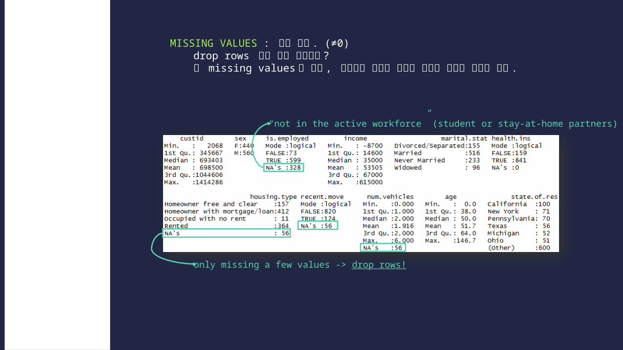
MISSING VALUES : 값이 없다 . (≠0)drop rows 만이 해결 방법일까 ?왜 missing values 가 있고 , 이것들이 사용할 가치가 있는지 판단할 필요가 있다 .
Typical prob-lems reveal by sum-maries-Missing value!!!
“not in the active workforce” (student or stay-at-home partners)
only missing a few values -> drop rows!
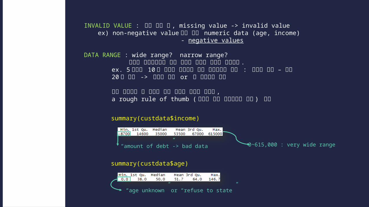
INVALID VALUE : 의미 없는 값 , missing value -> invalid valueex) non-negative value 여야 하는 numeric data (age, income)
- negative values
DATA RANGE : wide range? narrow range? 무엇을 분석하느냐에 따라 필요한 데이터 범위도 달라진다 .
ex. 5 세에서 10 세 사이의 어린이를 위한 읽기능력을 예측 : 유용한 변수 – 연령
20 대 이상 -> 데이터 변환 or 빈 연령대로 변환
만약 예측해야 할 문제에 비해 데이터 범위가 좁다면 , a rough rule of thumb ( 평균에 대한 표준편차의 비율 ) 활용
Typical prob-lems reveal by sum-maries-Invalid value andOutliers-Data range
summary(custdata$income)
summary(custdata$age)
“age unknown” or “refuse to state”
“amount of debt”-> bad data 0~615,000 : very wide range
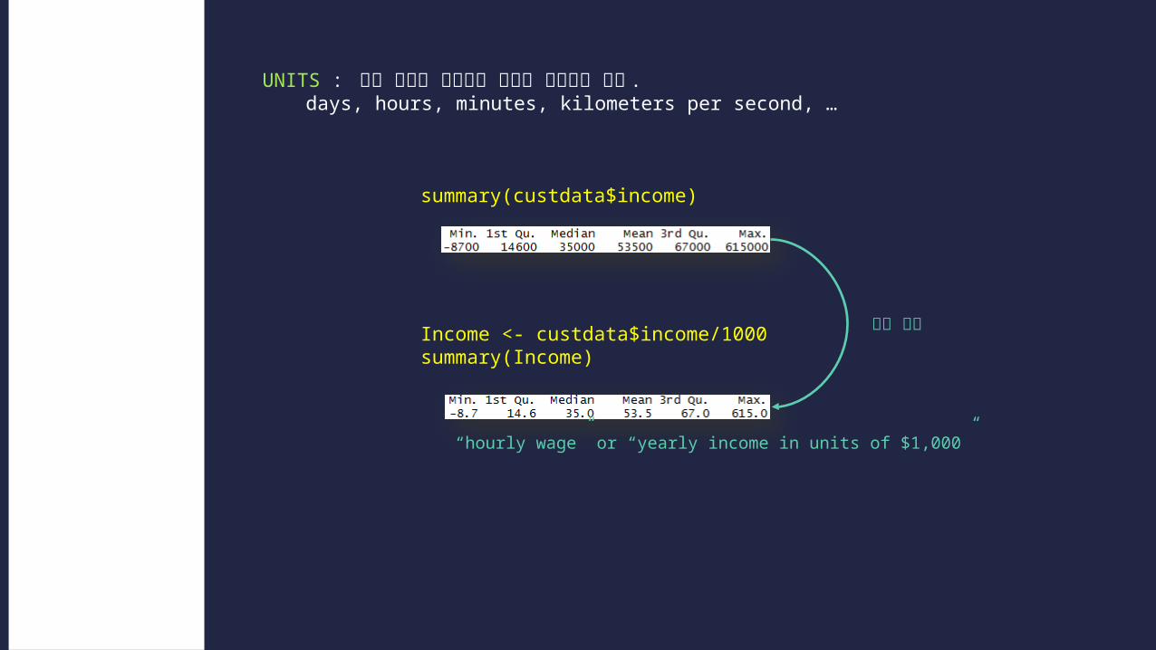
UNITS : 어떤 단위로 구성되어 있는지 확인해야 한다 .days, hours, minutes, kilometers per second, …
Typical prob-lems reveal by sum-maries-Units
summary(custdata$income)
Income <- custdata$income/1000summary(Income)
범위 축소
“hourly wage” or “yearly income in units of $1,000”
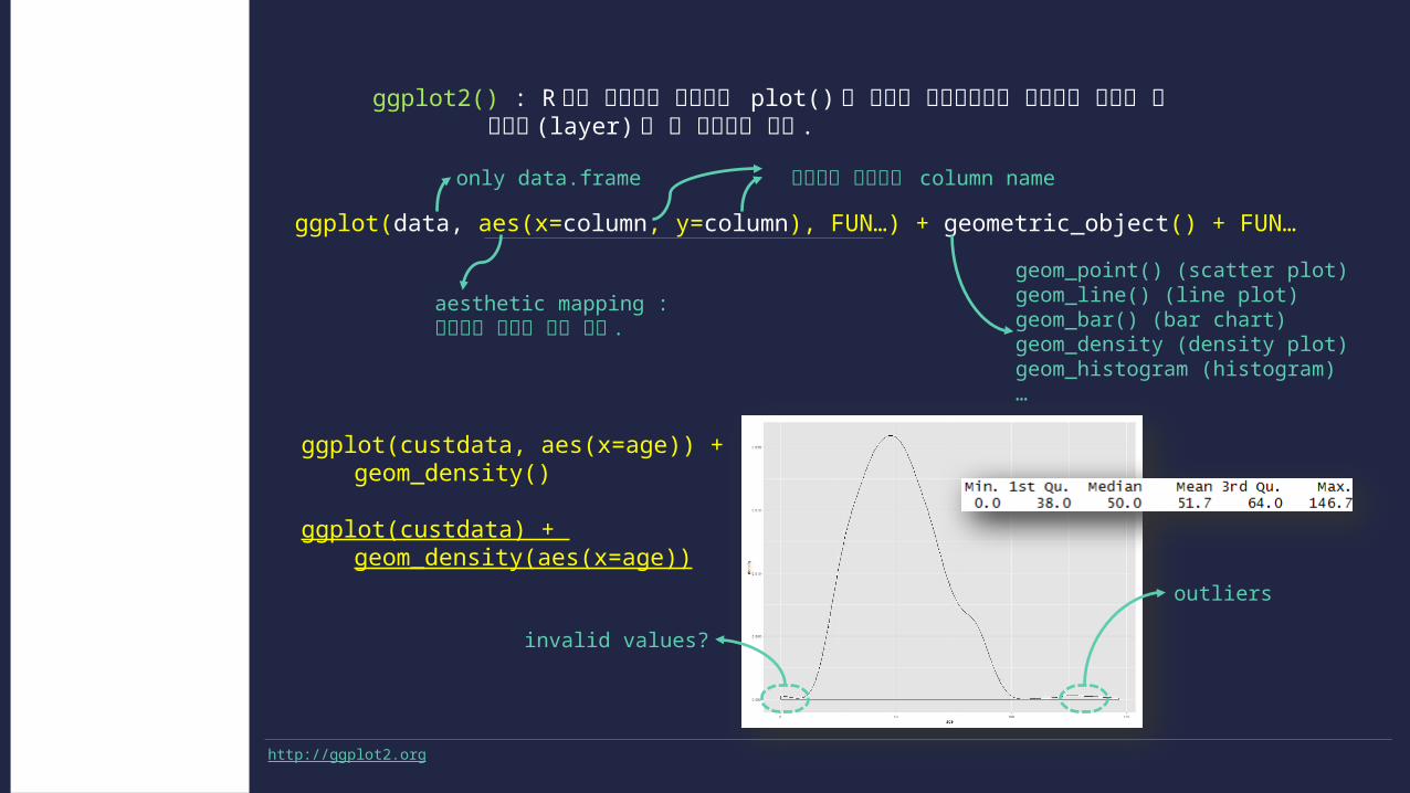
ggplot2() : R 에서 기본으로 제공하는 plot() 과 유사한 인터페이스를 제공하는 시각화 툴 레이어 (layer) 를 잘 활용해야 한다 .
Spotting prob-lem using graphic and visualization
ggplot(custdata, aes(x=age)) + geom_density()
ggplot(custdata) + geom_density(aes(x=age))
invalid values?
outliers
http://ggplot2.org
ggplot(data, aes(x=column, y=column), FUN…) + geometric_object() + FUN…
only data.frame 플로팅할 데이터의 column name
geom_point() (scatter plot)geom_line() (line plot)geom_bar() (bar chart)geom_density (density plot)geom_histogram (histogram)…
aesthetic mapping : 데이터를 플로팅 할때 쓴다 .

1 HISTOGRAM : bin 을 기준으로 데이터의 분포를 보여준다 .
examines data rangecheck number of modeschecks if distribution is normal/lognormalchecks for anomalies and outliers
Spotting prob-lem using graphic and visualization-Asingle variable
ggplot(custdata) + geom_histogram(aes(x=age), binwidth=5, fill='gray')
invalid values outliers

2 DENSITY PLOT : bin 에 따라 그래프의 모양이 변하는 히스토그램에 비해 그래프 모양이 변하지 않는다 .bin 의 경계에서 분포가 확연히 달라지지 않는다 . ( 곡선형태 )
examines data rangecheck number of modeschecks if distribution is normal/lognormalchecks for anomalies and outliers
Spotting prob-lem using graphic and visualization-Asingle variable
ggplot(custdata) + geom_density(aes(x=income)) + scale_x_continuous(labels=dollar)
continuous position scales
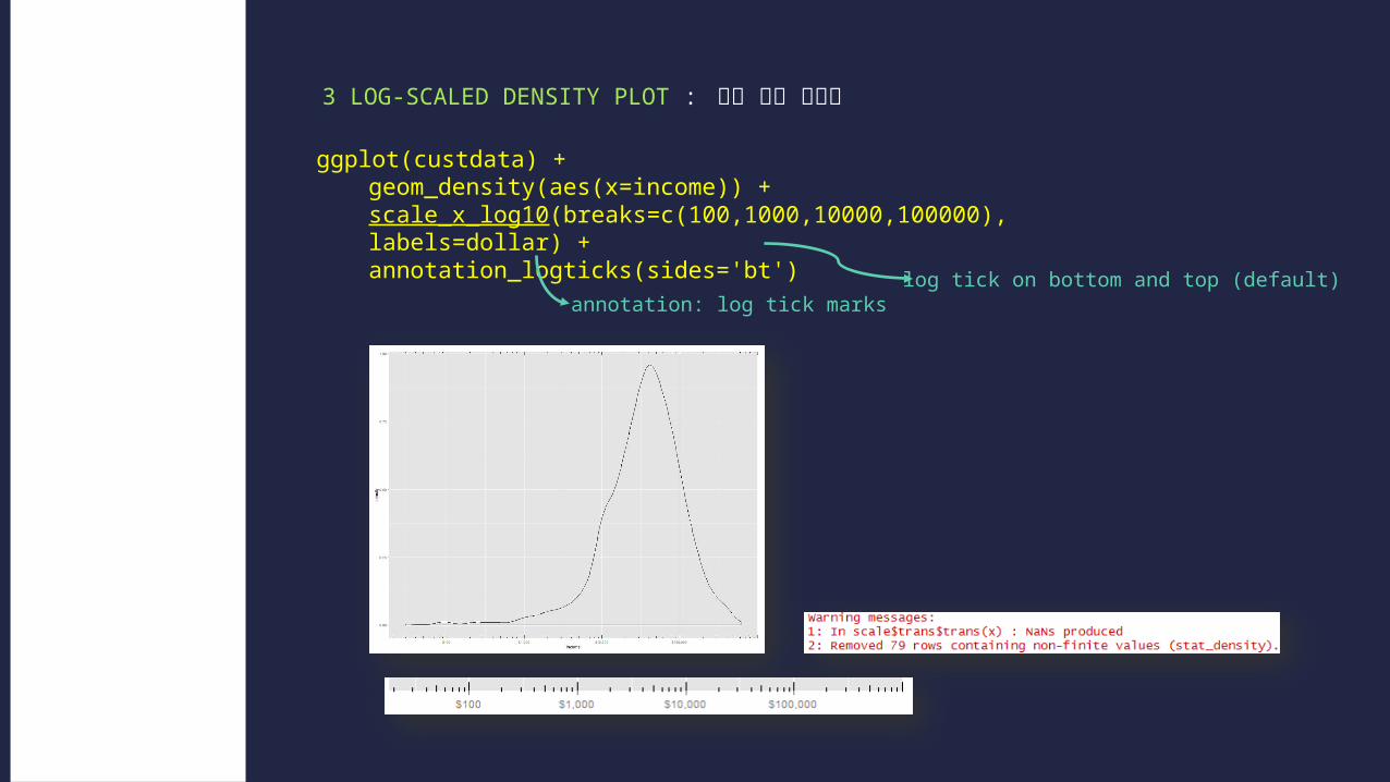
3 LOG-SCALED DENSITY PLOT : 로그 밀도 그래프
Spotting prob-lem using graphic and visualization-Asingle variable
ggplot(custdata) + geom_density(aes(x=income)) + scale_x_log10(breaks=c(100,1000,10000,100000), labels=dollar) + annotation_logticks(sides='bt')
annotation: log tick markslog tick on bottom and top (default)
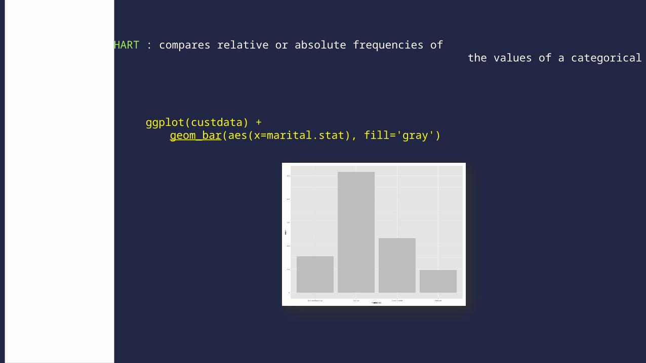
4 BAR CHART : compares relative or absolute frequencies of the values of a categorical variable
Spotting prob-lem using graphic and visualization-Asingle variable
ggplot(custdata) +geom_bar(aes(x=marital.stat), fill='gray')

5 HORIZONTAL BAR CHART
Spotting prob-lem using graphic and visualization-Asingle variable
ggplot(custdata) + geom_bar(aes(x=state.of.res), fill='gray') +coord_flip() +theme(axis.text.y=element_text(size=rel(0.8)))
flipped cartesian coordinates
to modify theme settingsrelative sizing for theme elements
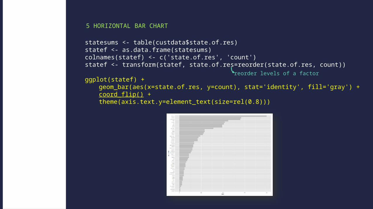
5 HORIZONTAL BAR CHART
Spotting prob-lem using graphic and visualization-Asingle variable
statesums <- table(custdata$state.of.res)statef <- as.data.frame(statesums)colnames(statef) <- c('state.of.res', 'count')statef <- transform(statef, state.of.res=reorder(state.of.res, count))
ggplot(statef) + geom_bar(aes(x=state.of.res, y=count), stat='identity', fill='gray') + coord_flip() + theme(axis.text.y=element_text(size=rel(0.8)))
reorder levels of a factor

6 STACKED BAR CHART : var1 값 안에서의 var2 값의 분포를 보여준다 .
7 SIDE-BY-SIDE BAR CHART : 각각의 var1 에 대한 var2 값을 나란히 배치
8 FILLED BAR CHART : 일정한 틀 안에서 var2 의 상대적인 비율을 보여준다 .
Spotting prob-lem using graphic and visualization-Relationship two variables
ggplot(custdata) +geom_bar(aes(x=marital.stat, fill=health.ins), )
, position=‘dodge' , position=‘fill'
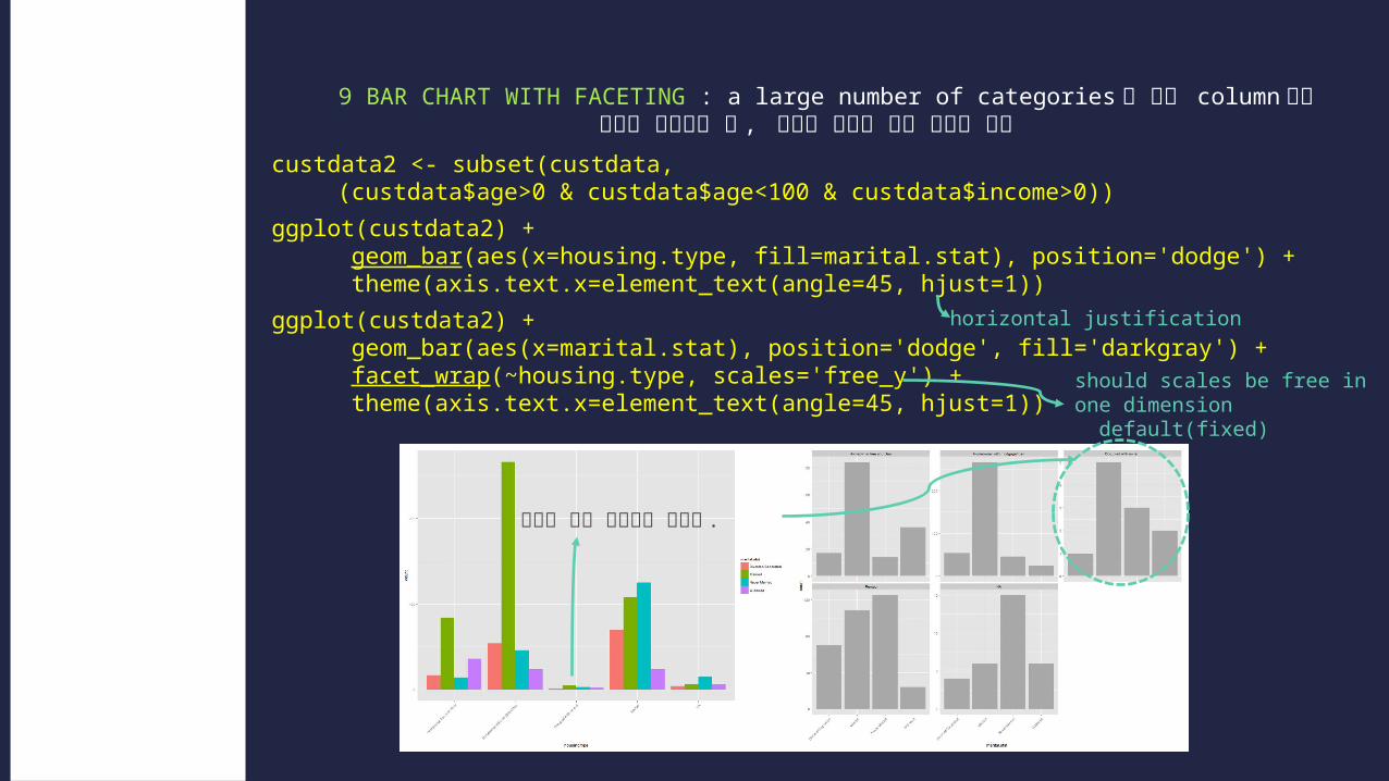
9 BAR CHART WITH FACETING : a large number of categories 를 가진 column 들을 차트로 나타냈을 때 , 각각의 항목에 대해 나눠서 보자
Spotting prob-lem using graphic and visualization-Relationship two variables
custdata2 <- subset(custdata, (custdata$age>0 & custdata$age<100 & custdata$income>0))
ggplot(custdata2) + geom_bar(aes(x=housing.type, fill=marital.stat), position='dodge') + theme(axis.text.x=element_text(angle=45, hjust=1))
ggplot(custdata2) + geom_bar(aes(x=marital.stat), position='dodge', fill='darkgray') + facet_wrap(~housing.type, scales='free_y') + theme(axis.text.x=element_text(angle=45, hjust=1))
horizontal justification
should scales be free in one dimension
default(fixed)
분포를 거의 알아보기 힘들다 .
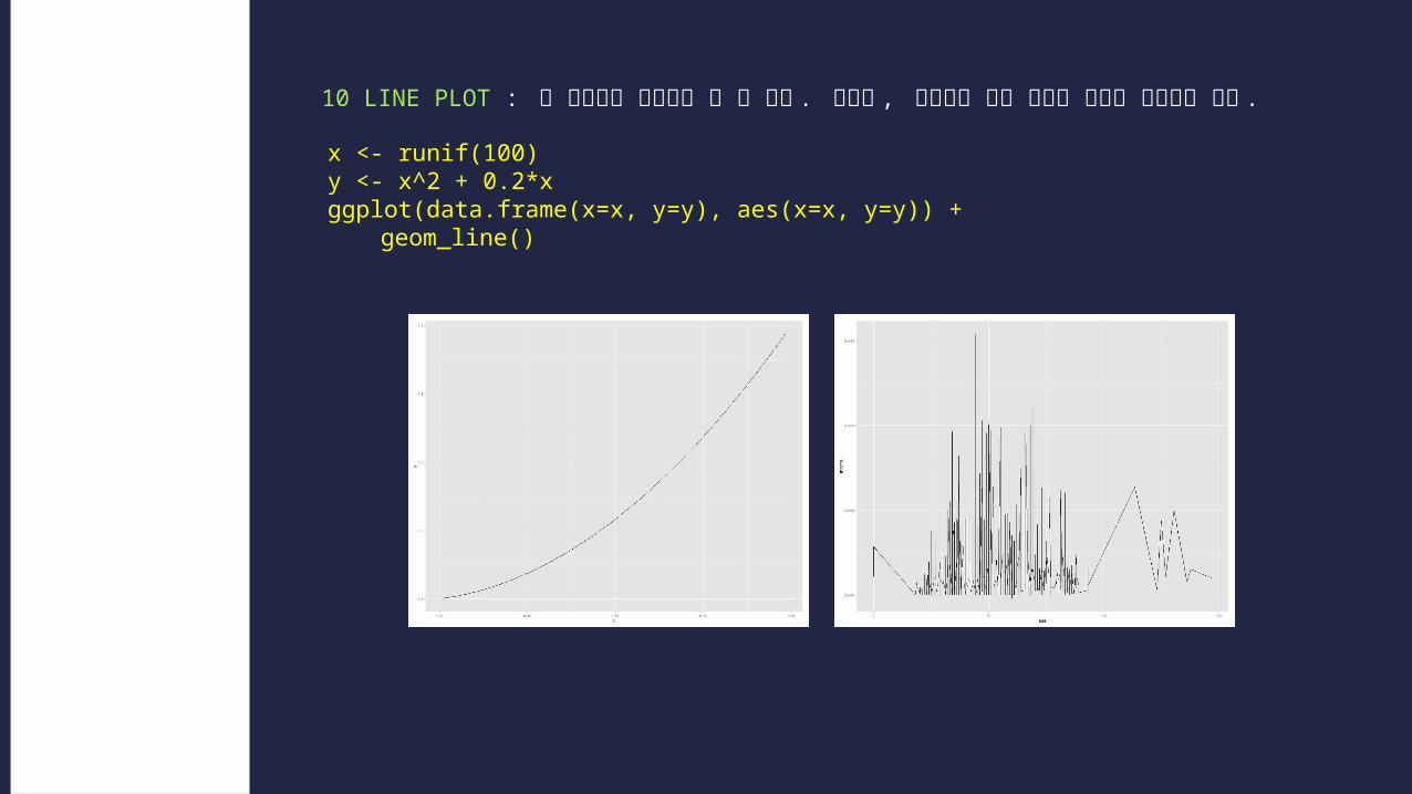
10 LINE PLOT : 두 변수간의 연관성을 볼 수 있다 . 하지만 , 데이터가 서로 관련이 없으면 유용하지 않다 .
Spotting prob-lem using graphic and visualization-Relationship two variables
x <- runif(100)y <- x^2 + 0.2*xggplot(data.frame(x=x, y=y), aes(x=x, y=y)) +
geom_line()

11 SCATTER PLOT + α : two numeric variables relationship!
Q. age, income … relationship?
Spotting prob-lem using graphic and visualization-Relationship two variables cor(custdata2$age, custdata2$income)
ggplot(custdata2, aes(x=age, y=income)) + geom_point() + ylim(0, 200000)
ggplot(custdata2, aes(x=age, y=income)) + geom_point() + stat_smooth(method='lm') + ylim(0, 200000)
correlation
연관관계를 알아보기 힘들다
smoothing method
선 그리기
* se (default) = true
???
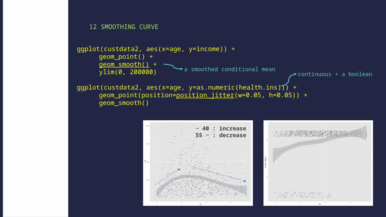
12 SMOOTHING CURVE
Spotting prob-lem using graphic and visualization-Relationship two variables
ggplot(custdata2, aes(x=age, y=income)) + geom_point() + geom_smooth() + ylim(0, 200000)
ggplot(custdata2, aes(x=age, y=as.numeric(health.ins))) + geom_point(position=position_jitter(w=0.05, h=0.05)) + geom_smooth()
a smoothed conditional mean
~ 40 : increase55 ~ : decrease
continuous + a boolean

13 HEXBIN PLOT : 2-dimensional histogram
Spotting prob-lem using graphic and visualization-Relationship two variables ggplot(custdata2, aes(x=age, y=income)) +
geom_hex(binwidth=c(5, 10000)) + geom_smooth(color='white', se=F) + ylim(0, 200000)
• 모델링 하기 전에 데이터를 살펴보는 시간을 갖자 .
• Summary() : helps you spot issues with data range, units, data type, and missing or invalid values.
• Visualization : 변수 사이의 데이터 분포와 이들 간의 관계성을 보는데 도움을 준다 .
Key point!