Embed Size (px)
Citation preview
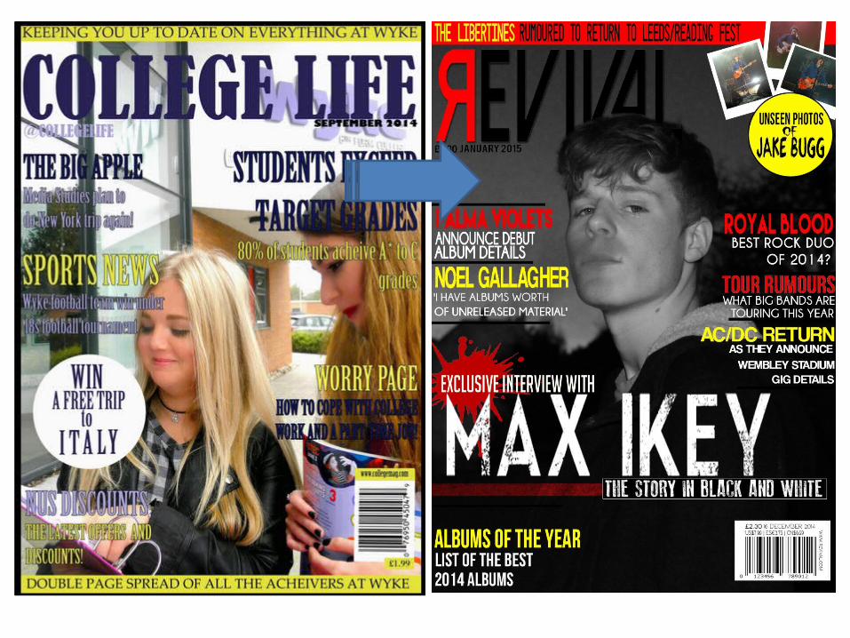
LOOKING BACK AT YOUR PRELIMINARY TASK, WHAT DO YOU FEEL YOU HAVE LEARNT IN THE PROGRESSION FROM IT TO THE FULL PRODUCT?
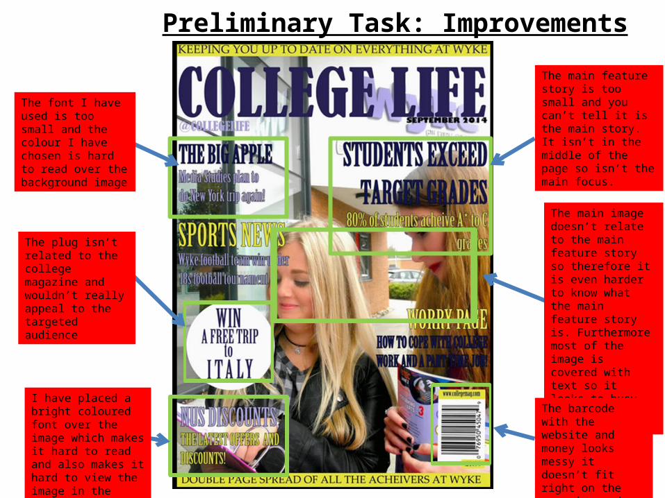
The font I have used is too small and the colour I have chosen is hard to read over the background image
The plug isn’t related to the college magazine and wouldn’t really appeal to the targeted audience
I have placed a bright coloured font over the image which makes it hard to read and also makes it hard to view the image in the background
The main feature story is too small and you can’t tell it is the main story. It isn’t in the middle of the page so isn’t the main focus.
The main image doesn’t relate to the main feature story so therefore it is even harder to know what the main feature story is. Furthermore most of the image is covered with text so it looks to busy and hard to look at.
The barcode with the website and money looks messy it doesn’t fit right on the magazine and looks too big on the front cover.
Preliminary Task: Improvements
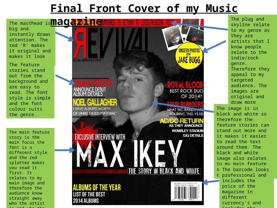
The masthead is big and instantly draws attention. The red ‘R’ makes it original and makes it look edgy.
The feature stories stand out from the background and are easy to read. The font style is simple and the font colour suits the genre.
The main feature story is the main focus the font is a different style and the red splatter makes you read it first. It relates to my main image and therefore the audience know straight away who the artist is and who the main feature story is on.
The plug and skyline relate to my genre as they are artists that I know people relate to the indie/rock genre. Therefore they appeal to my targeted audience. The images are original and draw more attention to the plug whilst the skyline colours contrast and make it stand out.
The image is in black and white so therefore the feature stories can stand out more and it makes it easier to read the text around them. The black and white image also relates to my main feature story which adds continuity.
The barcode looks professional and includes the price of the magazine in different currency's and includes the website and date of the issue of the magazine.
Final Front Cover of my Music magazine
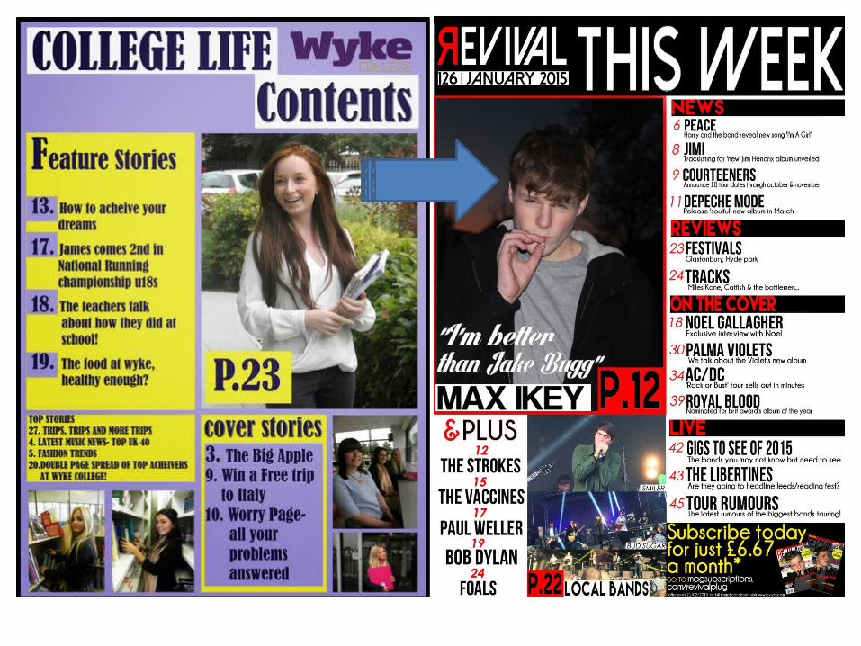
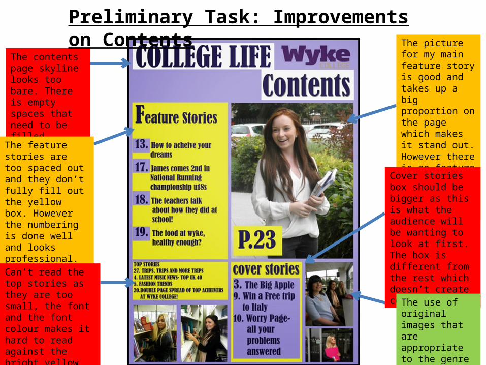
The contents page skyline looks too bare. There is empty spaces that need to be filled.
The feature stories are too spaced out and they don’t fully fill out the yellow box. However the numbering is done well and looks professional.
Can’t read the top stories as they are too small, the font and the font colour makes it hard to read against the bright yellow background.
The picture for my main feature story is good and takes up a big proportion on the page which makes it stand out. However there is no feature story addressing what is on page 23.
Preliminary Task: Improvements on Contents
Cover stories box should be bigger as this is what the audience will be wanting to look at first. The box is different from the rest which doesn’t create consistency.
The use of original images that are appropriate to the genre of my magazine is good.
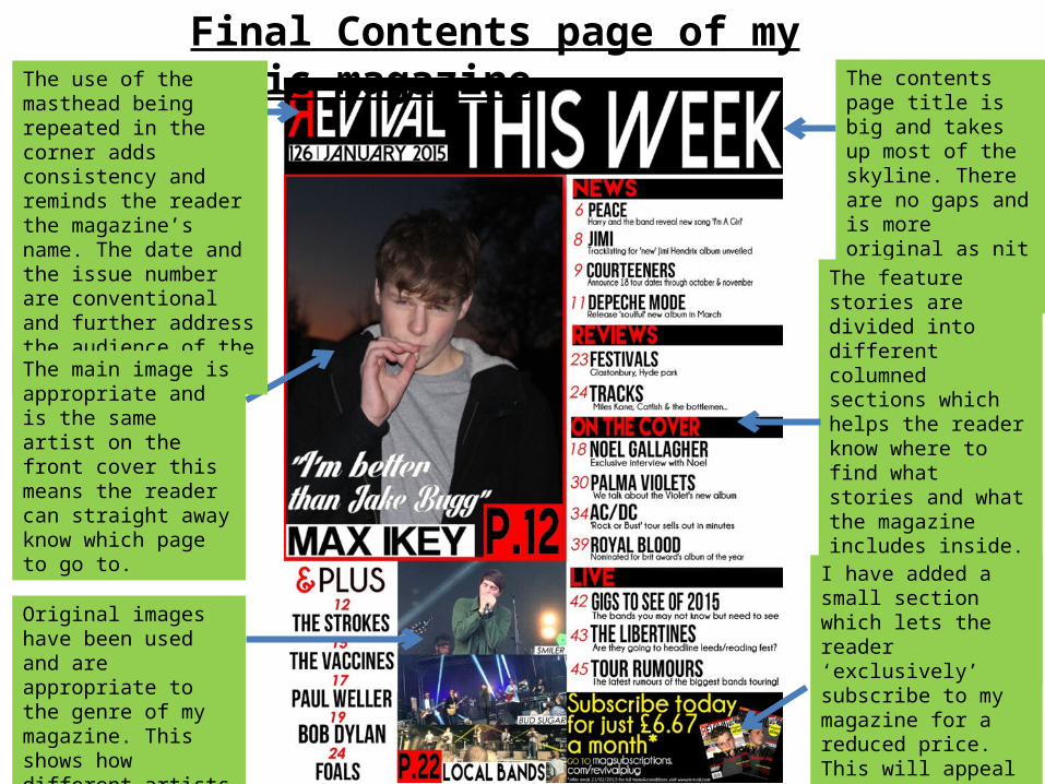
Final Contents page of my Music magazineThe use of the masthead being repeated in the corner adds consistency and reminds the reader the magazine’s name. The date and the issue number are conventional and further address the audience of the magazine’s date.
The main image is appropriate and is the same artist on the front cover this means the reader can straight away know which page to go to.
Original images have been used and are appropriate to the genre of my magazine. This shows how different artists are included in my magazine.
The contents page title is big and takes up most of the skyline. There are no gaps and is more original as nit doesn’t just say ‘contents’.
The feature stories are divided into different columned sections which helps the reader know where to find what stories and what the magazine includes inside. The colour scheme is consistent and therefore looks professional.
I have added a small section which lets the reader ‘exclusively’ subscribe to my magazine for a reduced price. This will appeal to my younger audience as they may not be able to afford the normal price.
Why was the preliminary task useful?
It was useful as it helped me understand the codes and conventions of magazines so that when it came to creating my music magazine I knew how to produce a more professional front cover and contents page.
As well as doing my planning and research on music magazines, my preliminary task meant I could understand how to take photo’s properly. Through my preliminary task I learnt how to properly frame an image and that I need to use correct lighting and props to reflect the genre I am trying to achieve. Lighting needs to be bright enough to see the artist and props need to be appropriate so they reflect the chosen genre.
Why was the preliminary task useful?
Through my preliminary task I also learnt how to layout my magazine. This helped me when creating my music magazine as I understood where to put my masthead, feature stories, main image etc. It also meant I knew more about conventions and what to do to make my magazine look professional because if I avoided things that I knew didn’t work in my preliminary magazine (making my background simple so the text can be easily read when placed above it) it would look more professional and look more realistic.
I also learnt how to use Photoshop and although I have used it before I didn’t know specific skills to create a conventional front cover. For instance I learnt how to use different tools to edit my images to make my model look flawless and appropriate to the genre. I also learnt how to use layers to add different text and overlap them on top of each other. Furthermore, simple things like adjusting the levels, brightness and contrast of my images and changing font colour/style where techniques I learnt from my preliminary task to make my music magazine front cover look more conventional and professional than my college magazine.
Overall, I believe my preliminary task was very useful as it taught me how to follow codes and conventions of a magazine whilst also teaching
and developing different techniques and skills to use when It came to creating my music
magazine. I think I have improved since my preliminary task as I thoroughly developed my
knowledge on how to create a conventional music magazine and through the use of my
analysis of development it is clear that I have learnt how to use magazine conventions
appropriately to create a professional looking magazine.