Embed Size (px)
Citation preview

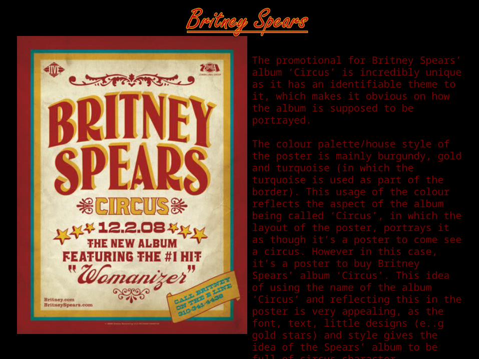
The promotional for Britney Spears’ album ‘Circus’ is incredibly unique as it has an identifiable theme to it, which makes it obvious on how the album is supposed to be portrayed.
The colour palette/house style of the poster is mainly burgundy, gold and turquoise (in which the turquoise is used as part of the border). This usage of the colour reflects the aspect of the album being called ‘Circus’, in which the layout of the poster, portrays it as though it’s a poster to come see a circus. However in this case, it’s a poster to buy Britney Spears’ album ‘Circus’. This idea of using the name of the album ‘Circus’ and reflecting this in the poster is very appealing, as the font, text, little designs (e..g gold stars) and style gives the idea of the Spears’ album to be full of circus character.
With the feature of including Spears’ number one single ‘Womanizer’ it portrays the release of the album, as huge and important event that everybody should know about.
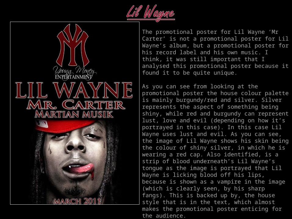
The promotional poster for Lil Wayne ‘Mr Carter’ is not a promotional poster for Lil Wayne’s album, but a promotional poster for his record label and his own music. I think, it was still important that I analysed this promotional poster because it found it to be quite unique.
As you can see from looking at the promotional poster the house colour palette is mainly burgundy/red and silver. Silver represents the aspect of something being shiny, while red and burgundy can represent lust, love and evil (depending on how it’s portrayed in this case). In this case Lil Wayne uses lust and evil. As you can see, the image of Lil Wayne shows his skin being the colour of shiny silver, in which he is wearing a red cap. Also identified, is a strip of blood underneath’s Lil Wayne’s tongue as the image is portrayed that Lil Wayne is licking blood off his lips, because is shown as a vampire in the image (which is clearly seen, by his sharp fangs). This is backed up by, the house style that is in the text, which almost makes the promotional poster enticing for the audience.
Something that I found noticeable, was the fact that Lil Wayne included the logo of his record label ‘Young Money’ at the top of the page, which shows clear identification why the promotional poster is being advertised.
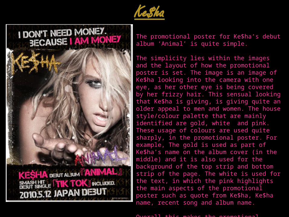
The promotional poster for Ke$ha’s debut album ‘Animal’ is quite simple.
The simplicity lies within the images and the layout of how the promotional poster is set. The image is an image of Ke$ha looking into the camera with one eye, as her other eye is being covered by her frizzy hair. This sensual looking that Ke$ha is giving, is giving quite an older appeal to men and women. The house style/colour palette that are mainly identified are gold, white and pink. These usage of colours are used quite sharply, in the promotional poster. For example, The gold is used as part of Ke$ha’s name on the album cover (in the middle) and it is also used for the background of the top strip and bottom strip of the page. The white is used for the text, in which the pink highlights the main aspects of the promotional poster such as quote from Ke$ha, Ke$ha name, recent song and album name.
Overall this makes the promotional poster quite youthful, as it includes a lot of features that make it appealing in to youth target audience, in some cases, but it mainly appeals to older target audience range (e.g. young adults).
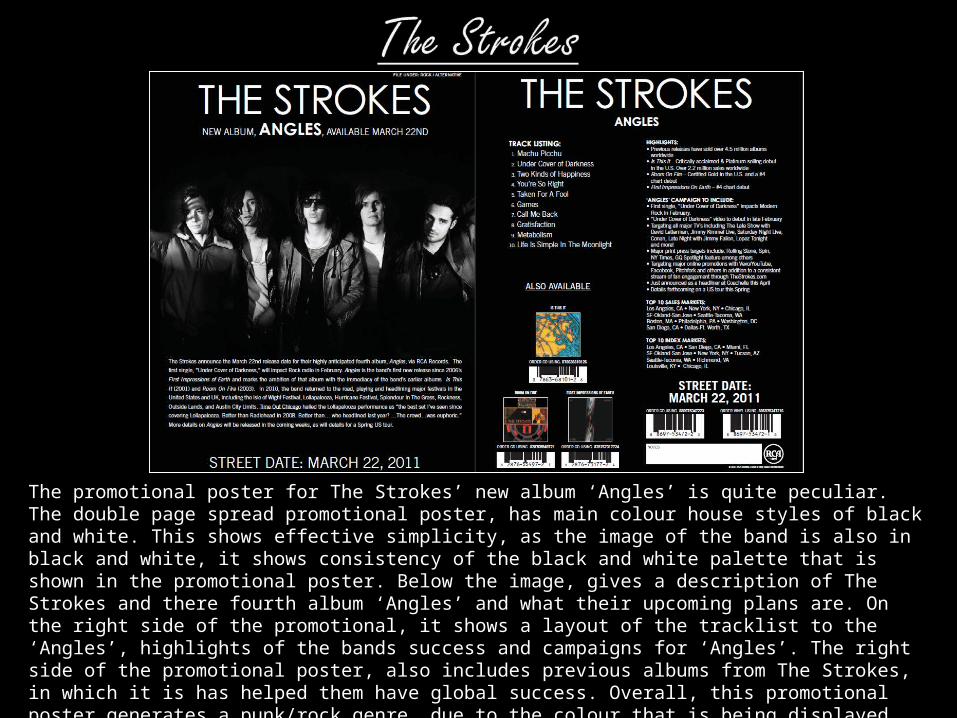
The promotional poster for The Strokes’ new album ‘Angles’ is quite peculiar. The double page spread promotional poster, has main colour house styles of black and white. This shows effective simplicity, as the image of the band is also in black and white, it shows consistency of the black and white palette that is shown in the promotional poster. Below the image, gives a description of The Strokes and there fourth album ‘Angles’ and what their upcoming plans are. On the right side of the promotional, it shows a layout of the tracklist to the ‘Angles’, highlights of the bands success and campaigns for ‘Angles’. The right side of the promotional poster, also includes previous albums from The Strokes, in which it is has helped them have global success. Overall, this promotional poster generates a punk/rock genre, due to the colour that is being displayed and the punk/rock that is been shown through the style of the band (shown through the image).
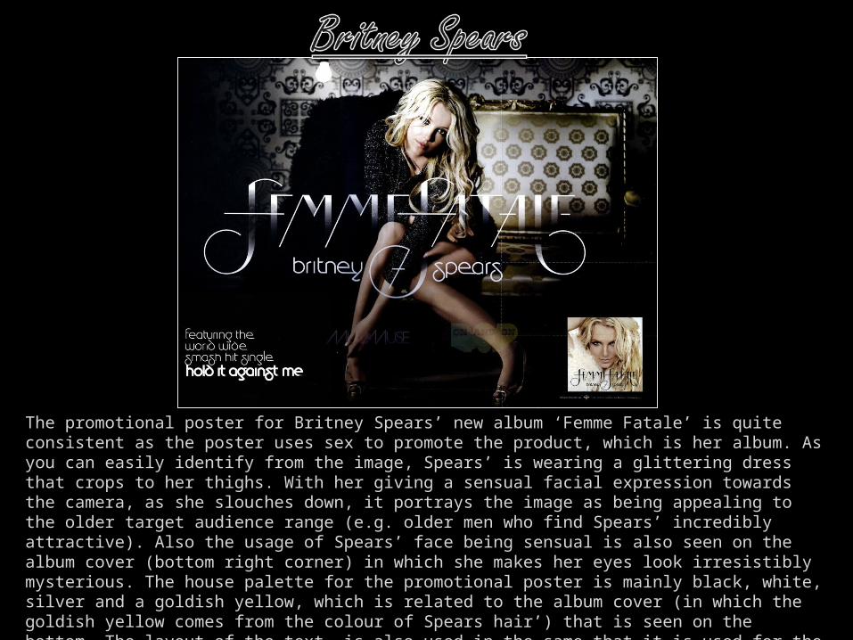
The promotional poster for Britney Spears’ new album ‘Femme Fatale’ is quite consistent as the poster uses sex to promote the product, which is her album. As you can easily identify from the image, Spears’ is wearing a glittering dress that crops to her thighs. With her giving a sensual facial expression towards the camera, as she slouches down, it portrays the image as being appealing to the older target audience range (e.g. older men who find Spears’ incredibly attractive). Also the usage of Spears’ face being sensual is also seen on the album cover (bottom right corner) in which she makes her eyes look irresistibly mysterious. The house palette for the promotional poster is mainly black, white, silver and a goldish yellow, which is related to the album cover (in which the goldish yellow comes from the colour of Spears hair’) that is seen on the bottom. The layout of the text, is also used in the same that it is used for the album cover, which makes the promotional poster consistent and appealing to the target audience.
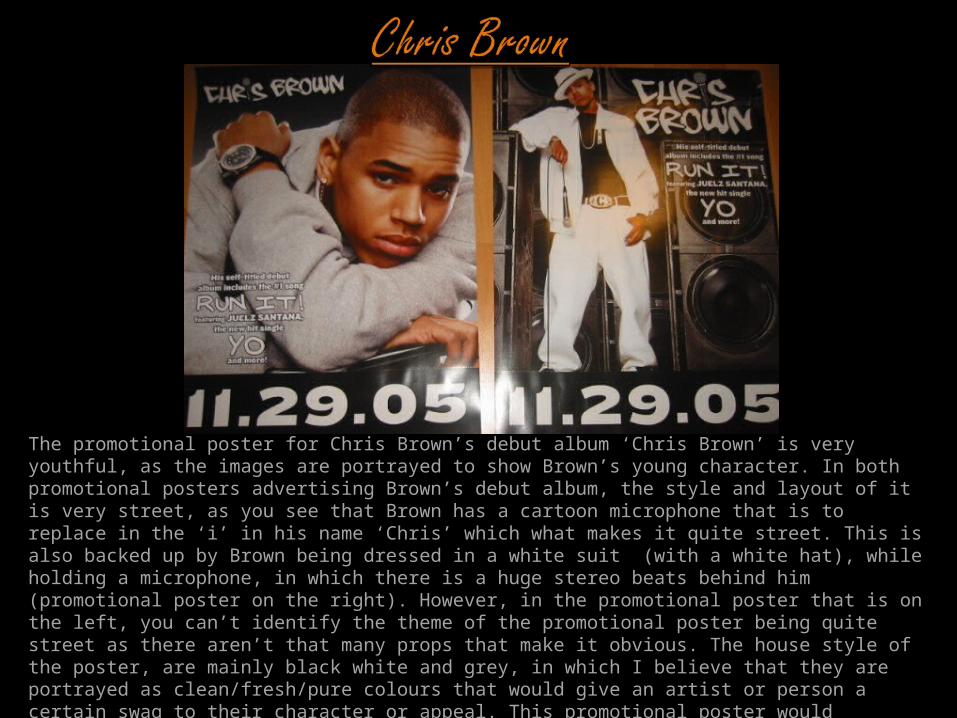
The promotional poster for Chris Brown’s debut album ‘Chris Brown’ is very youthful, as the images are portrayed to show Brown’s young character. In both promotional posters advertising Brown’s debut album, the style and layout of it is very street, as you see that Brown has a cartoon microphone that is to replace in the ‘i’ in his name ‘Chris’ which what makes it quite street. This is also backed up by Brown being dressed in a white suit (with a white hat), while holding a microphone, in which there is a huge stereo beats behind him (promotional poster on the right). However, in the promotional poster that is on the left, you can’t identify the theme of the promotional poster being quite street as there aren’t that many props that make it obvious. The house style of the poster, are mainly black white and grey, in which I believe that they are portrayed as clean/fresh/pure colours that would give an artist or person a certain swag to their character or appeal. This promotional poster would therefore be appealing to the younger target audience, ranging into the older audience (e.g. teenagers and young adults) because of the style and layout of the promotional poster and how it has a youthful attraction.